Most small apartment living rooms look fine in photos and feel wrong in person. The furniture is too big, the layout blocks the door, and somehow it still lacks storage. These real-world examples prove that size has very little to do with how good a room feels.
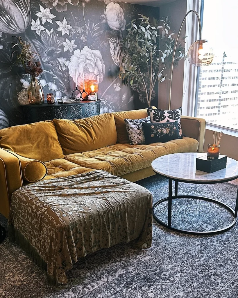
Painting a small room white is the standard advice, but this mustard velvet sofa against a dramatic dark floral wallpaper shows a different truth: high contrast and strong visual weight can make a space feel intentional rather than cramped. The round marble coffee table keeps the centre open and reflects light without cluttering the floor.
Designer Advice: If you go dark, go all in on one wall and pair it with warm-toned lighting at table height to stop the room from feeling cave-like.
2. One Large Art Print Does More Than a Gallery Wall
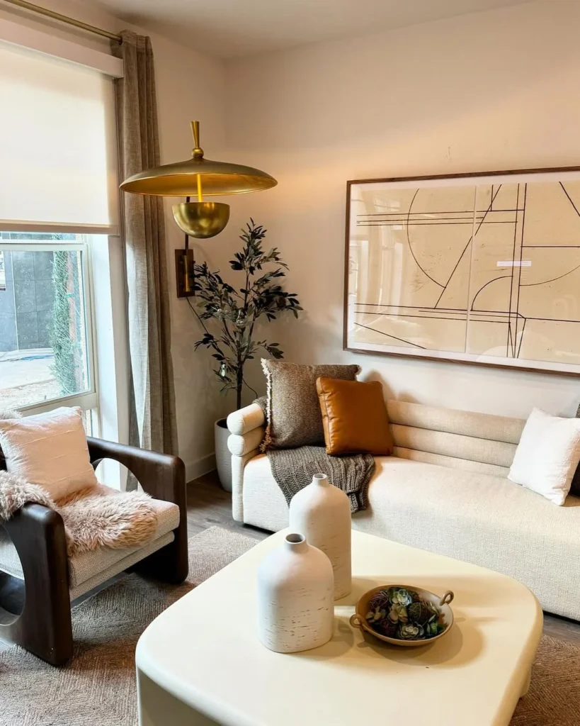
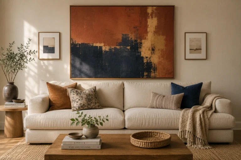
When every surface in a small room competes for attention, nothing stands out. Here, a single oversized abstract print in a simple walnut frame creates a clear focal point without adding visual clutter, and the brass wall sconce swaps a floor lamp for a wall-mounted fixture that frees up floor space entirely. This combination of one strong art piece and layered sconce lighting is something professional designers return to repeatedly in tight rooms because it works every time.
Pro Move: Hang your art so the centre sits at 140 to 145 cm from the floor, which keeps the wall from feeling top-heavy and anchors the sofa below it.
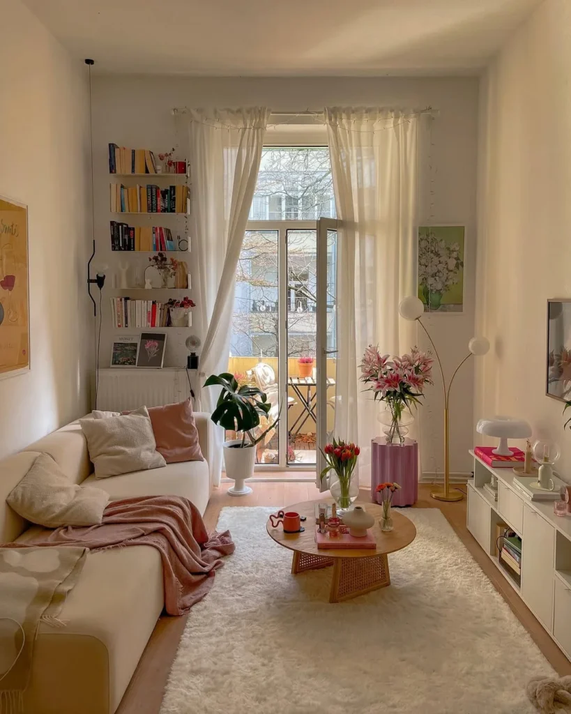
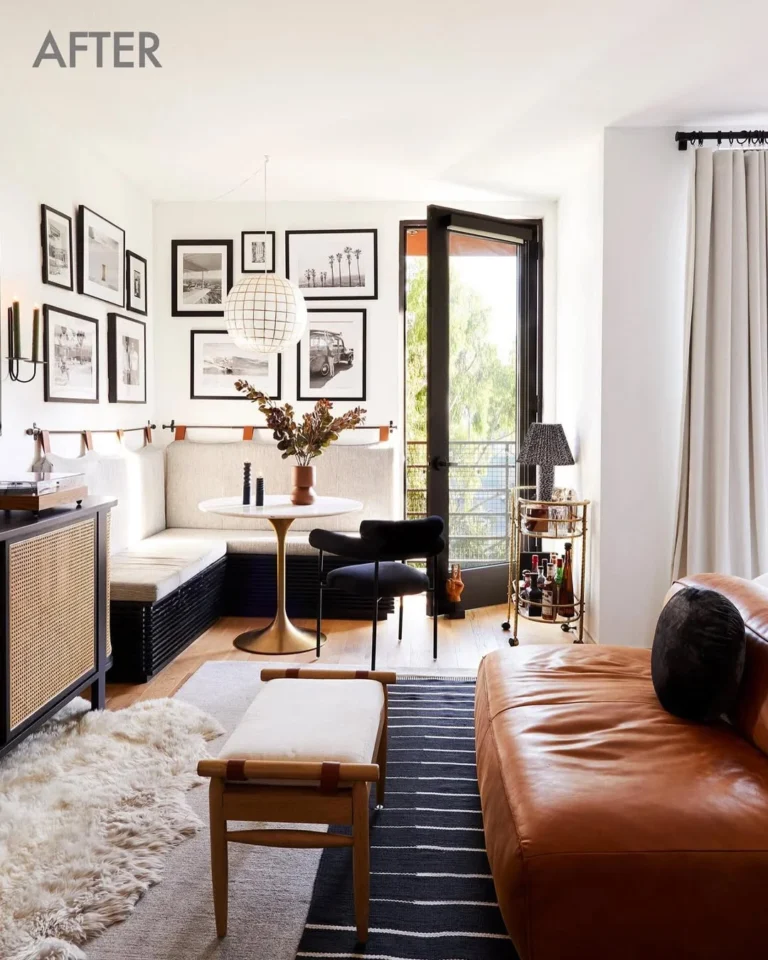
This narrow apartment looks significantly longer and taller than it is because sheer linen curtains are mounted directly at ceiling height rather than at the top of the window frame, pulling the eye upward and lengthening every wall. Floating shelves keep books and decor off the floor entirely, and a white shaggy rug defines the seating zone without interrupting the flow of light timber flooring beneath.
Quick Tip: Buy curtains at least 30 cm longer than your window and mount the rod within 10 cm of the ceiling for the most dramatic height effect.
4. The Eclectic Apartment That Uses Personality as a Spacer
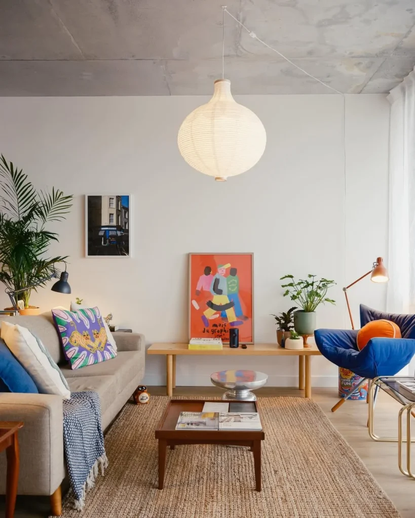
Counterintuitively, a room full of personality can feel more spacious than a sparse one because interesting objects give the eye places to travel and rest rather than bouncing off bare walls. The oversized rice paper pendant light here draws attention upward and makes the ceiling feel higher, while bold art pieces leaned against the wall rather than hung keep things flexible for renters who cannot put holes in walls.
Reality Check: Eclecticism only works in small spaces when one clear colour story binds everything together, otherwise it reads as clutter rather than curation.
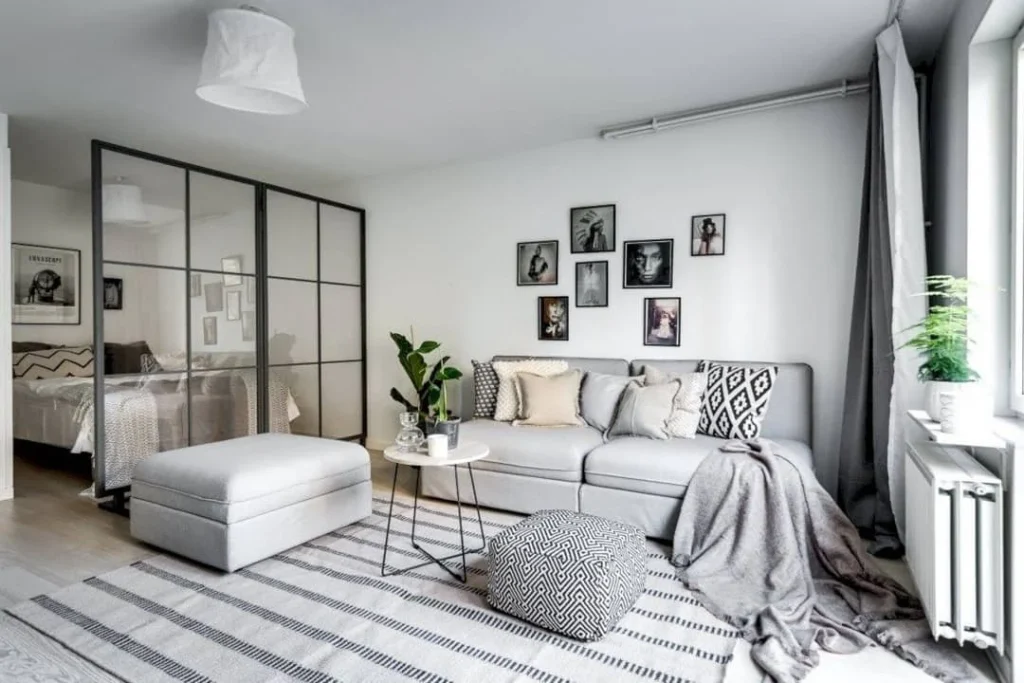
5. A Glass Partition That Separates Without Stealing Light
In a studio where the bed sits just behind the living area, a slim black-framed glass partition creates the psychological separation of two rooms while letting natural light pass straight through both zones. The grey sofa and matching ottoman work as a visual unit that reduces the number of separate items the eye has to process, and a black-and-white gallery wall anchors the seating zone without colour that would compete with the sleeping area.
Heads Up: Glass partitions work best when both sides share a consistent palette, because seeing a clash of styles through the glass defeats the purpose entirely.
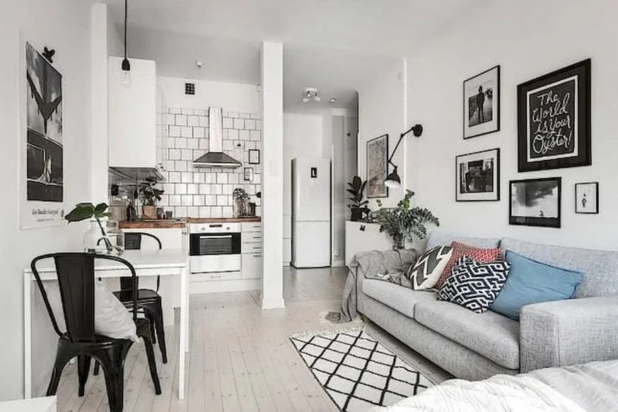
6. When the Living Room and Kitchen Share One Wall
In an open-plan studio where the kitchen is fully visible from the sofa, keeping both zones in a shared neutral palette makes the space read as one cohesive room rather than two cramped ones fighting for attention. The black Tolix-style chairs at a slim white dining table add a graphic contrast that gives the dining zone its own visual identity without a partition, and wall-mounted art on both the kitchen and living sides ties the two zones together.
Quick Tip: Match your kitchen cabinet fronts to the dominant tone in your living room rug or sofa to make an open-plan studio feel pulled together.
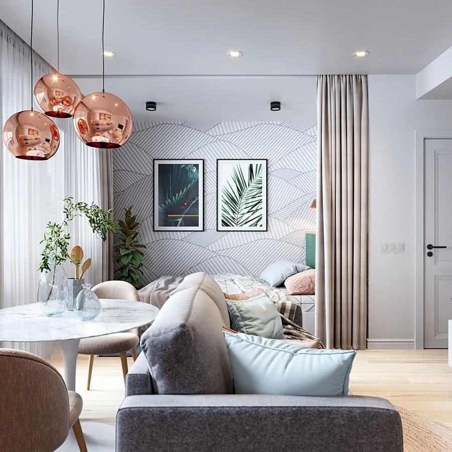
7. Copper Pendants as the Secret Weapon in an Open-Plan Room
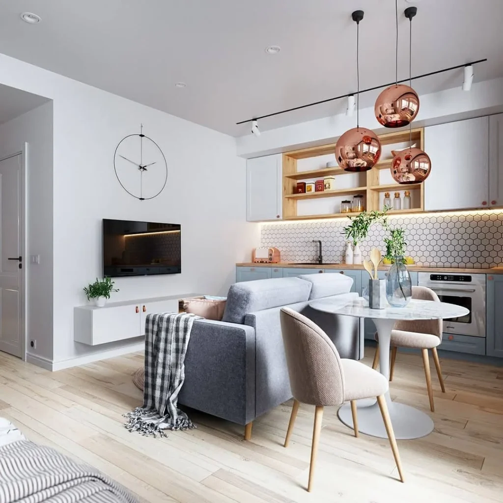
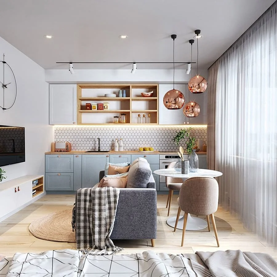
The trio of copper mirror-ball pendants here does something no ceiling light can: it defines the dining zone within an open-plan space without using walls, rugs, or furniture as zone markers. Pendant lights hung low over a dining table create a ceiling-to-table visual column that the brain reads as a separate room, and the white Tulip-style table in marble keeps the zone from feeling heavy.
Designer Advice: Hang dining pendants so the bottom of the shade sits 70 to 75 cm above the tabletop, low enough to define the zone but high enough not to block eye contact.
Ways to Zone a Small Open-Plan Apartment at a Glance
Method
Cost
Light Impact
Best For
Glass partition frame
Mid-range
None – fully transparent
Studios wanting permanent separation
Floor-to-ceiling curtains
Budget
Blocks light when closed
Renters who need flexibility
Sofa as room divider
Free (you own it)
None
Open-plan layouts with no entryway
Statement rug per zone
Budget to mid-range
None
Defining areas without any physical barrier
Pendant light cluster
Budget to mid-range
Adds it – defines the zone below
Dining zones in open-plan apartments
Low bookcase or bench
Budget
Minimal
Creating division with extra storage
8. Going Dark in an Open-Plan Room and Making It Work
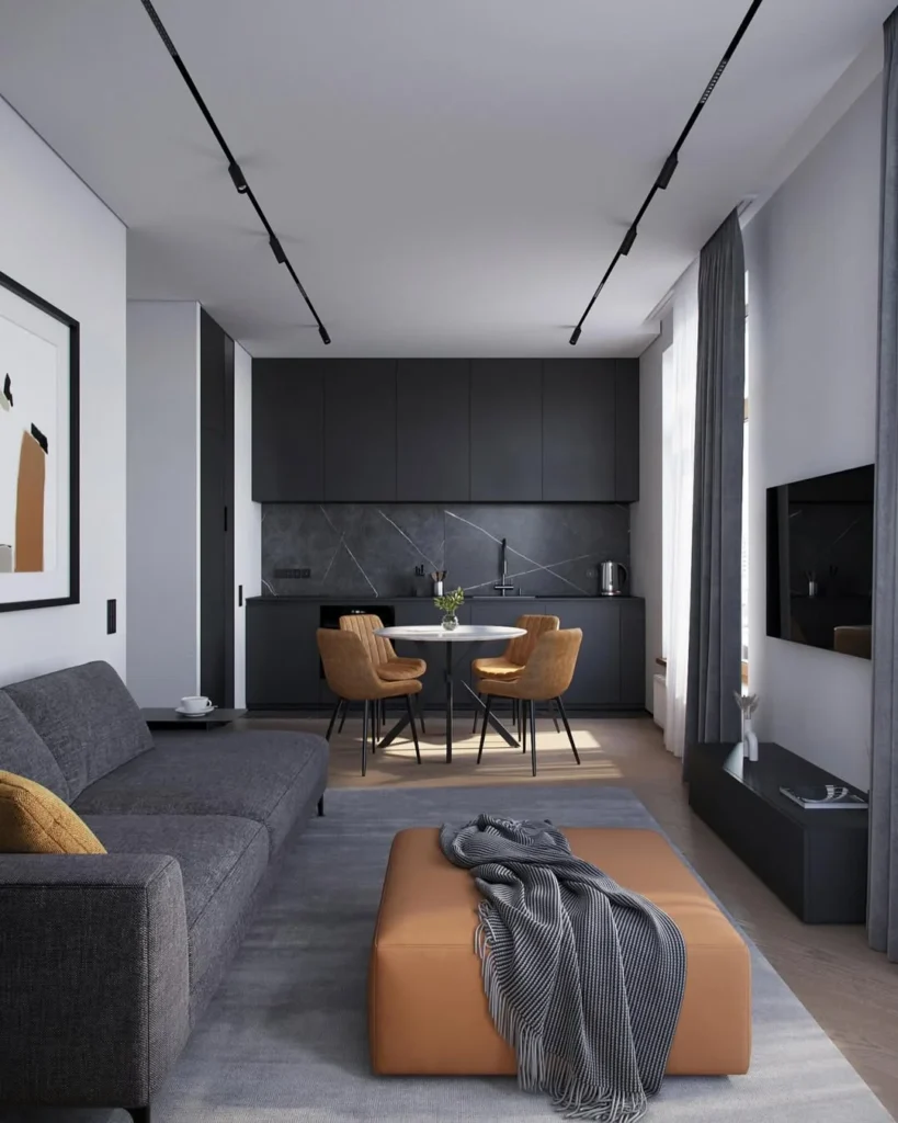
This all-grey open-plan apartment challenges the idea that small spaces need light walls to feel spacious, and it wins because the dark palette is completely consistent from wall to cabinetry to rug, removing the visual interruptions that make rooms feel smaller. Track lighting on the ceiling replaces floor lamps entirely, keeping every surface clear and giving the space a gallery-like quality, while the single cognac leather bench acts as the sole warm accent that stops the room reading as monochrome.
Pro Move: Use track lighting in dark open-plan apartments rather than floor lamps: it keeps every surface clear and lets you direct light exactly where zones need it.
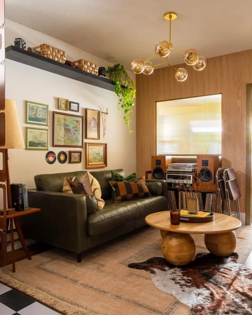
What looks layered and full in this retro-styled room is actually very efficient: every decorative item sits on a floating shelf, hangs on a wall, or lives within the footprint of an existing piece, so the floor stays clear. The dark olive leather sofa has a compact profile with no visible legs, reducing its visual mass, and trailing pothos plants on the high shelf add height and life without occupying any floor space at all.
Reality Check: Maximalist rooms in small spaces only work when the floor stays clear: the moment items start living on the ground, the room tips from curated to chaotic.
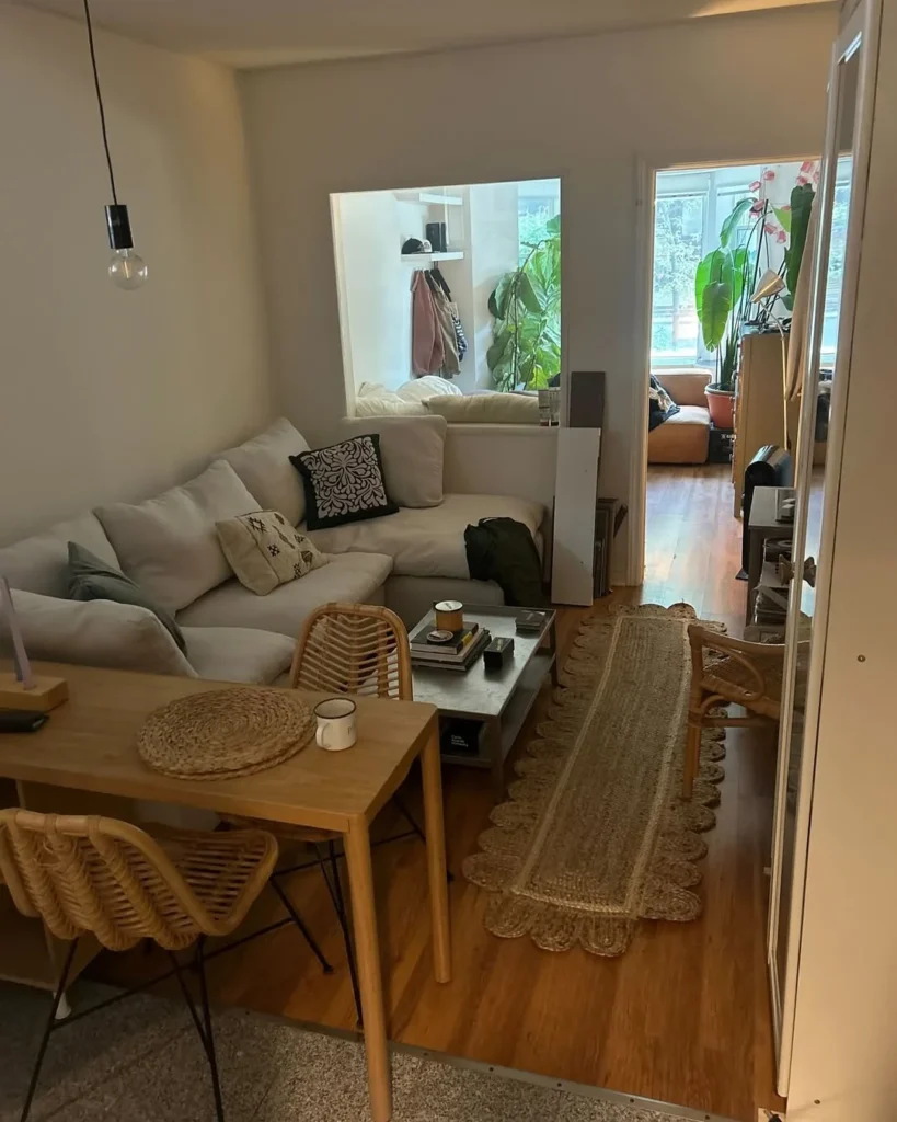
A large plain mirror leaned against the wall opposite a window does not just reflect light, it creates the illusion of a second room by doubling the visible depth of the space. In this compact apartment the mirror reflects the dining area and makes a room that fits one table and a sofa look like it extends far beyond its walls, while the rattan chairs and jute rug handle warmth and texture so the mirror can stay minimal.
Quick Tip: A leaning mirror that spans from 10 cm off the floor to near the ceiling is more effective at creating depth than a wall-hung mirror at standard picture height.
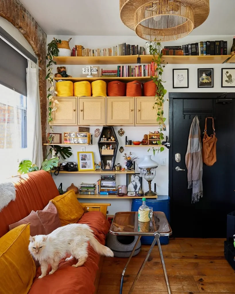
When storage is built all the way to the ceiling on one full wall, it stops reading as furniture and starts reading as a structural feature of the room, which is one of the most effective ways to add massive storage capacity without making a small room feel cluttered. The colour-coded baskets on the upper shelves here do real organisational work while creating a graphic pattern that turns a storage wall into a display wall.
Designer Advice: Group items in containers by colour on the upper shelves and save the lower shelves for books and objects, so the storage wall looks intentional from across the room.
12. Low-Profile Furniture That Makes Ceilings Feel Taller
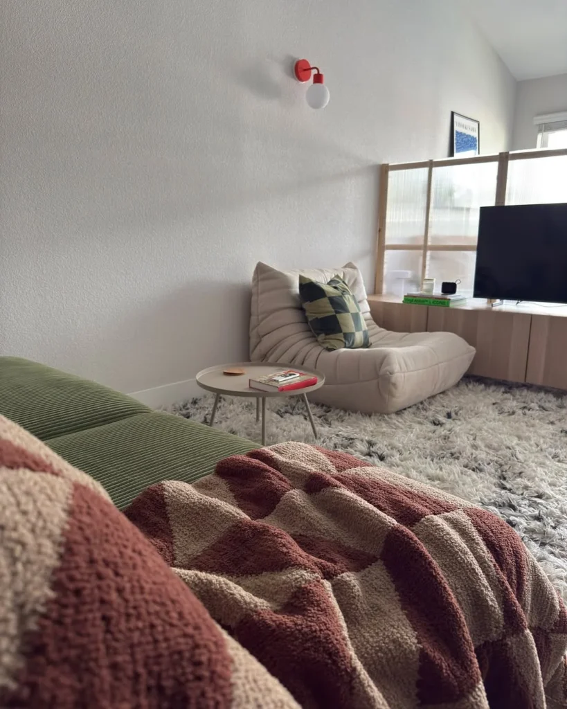
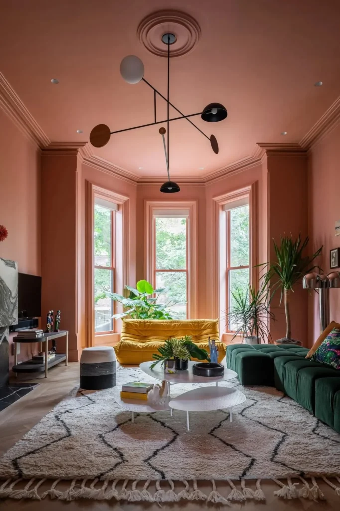
Choosing furniture with a low seat height and no raised backrest increases the amount of blank wall visible above every piece, which the eye reads directly as room height. This Togo-style armless lounge chair is practically floor-level and the effect is that the wall behind it looks significantly taller than it is, while a single red wall sconce in place of a floor lamp frees the entire floor area around the seating zone.
Pro Move: A wall-mounted sconce in an accent colour does the work of a lamp while adding a design detail that standalone lamps almost never deliver in a compact room.
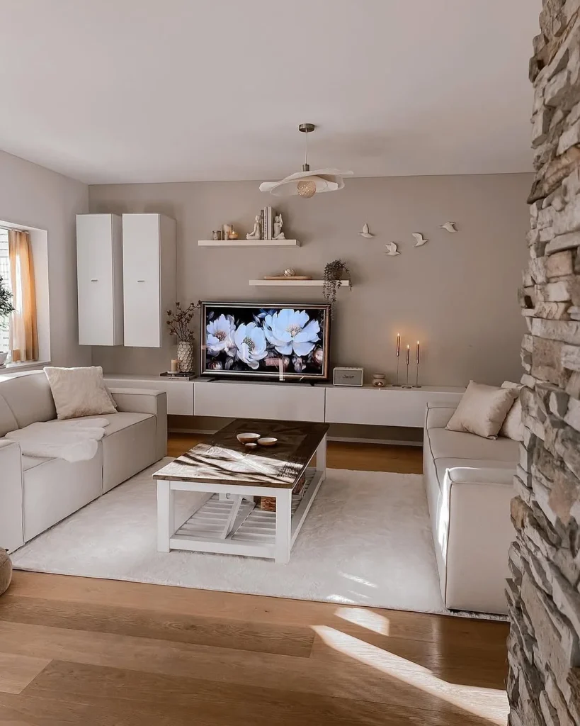
An all-neutral palette in cream, greige, and warm white does not have to be forgettable: the key is texture variation between the plush rug, the flat sofa upholstery, the matte wall paint, and the raw wooden coffee table surface, all of which catch light differently and create visual interest without any colour contrast. A Samsung Frame TV styled as art completely removes the visual penalty of having a screen on the wall.
Quick Tip: In a neutral room, vary the finish of every surface: matte walls, gloss ceramics, knit textiles, and raw wood create richness that colour alone cannot.
14. Ambient Lighting That Makes a Small Room Feel Like an Event
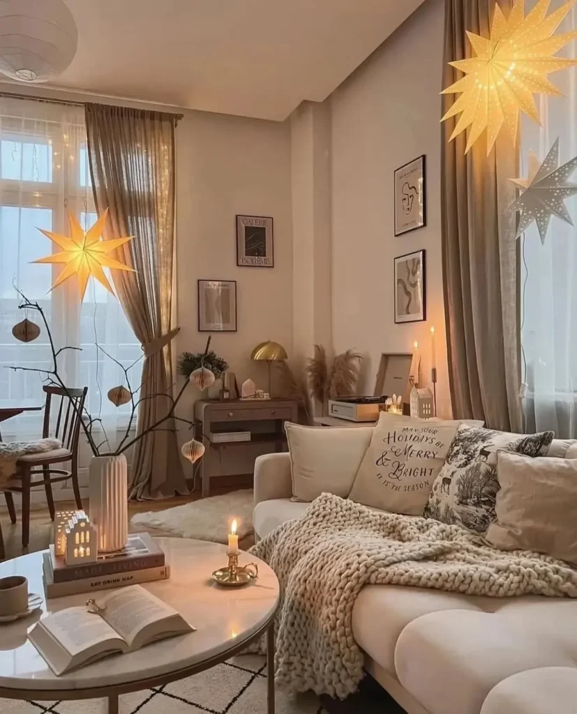
The reason this apartment feels so warm despite its size has nothing to do with the furniture layout and everything to do with light layering: multiple warm-toned sources at different heights, from the Moravian star pendants down to the brass candlestick on the coffee table, create depth that overhead lighting alone never achieves. Layered lighting is one of the most affordable upgrades in a rented apartment because it requires nothing more than a few plug-in fixtures.
Reality Check: A room with a single ceiling light and no other sources will always feel flat regardless of how well the furniture is arranged, because flat light kills dimension.
15. A Gallery Wall That Covers Half the Room and Works Beautifully
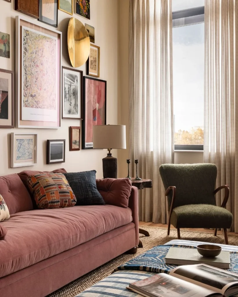
The gallery wall in this room extends from floor to ceiling on a corner wall, which feels excessive but in practice creates the effect of a grand reading room rather than a small box. The trick is that no single frame dominates: mixed frames in varied sizes create a composition the eye reads as a whole, and the rose-pink velvet sofa sits against it confidently because its colour connects to the warm pinks in several of the art prints.
Designer Advice: Start a floor-to-ceiling gallery wall by placing your two or three largest pieces first, then fill around them keeping consistent spacing of 5 to 8 cm between every frame.
16. When the Studio Bedroom and Living Room Share the Same Mood
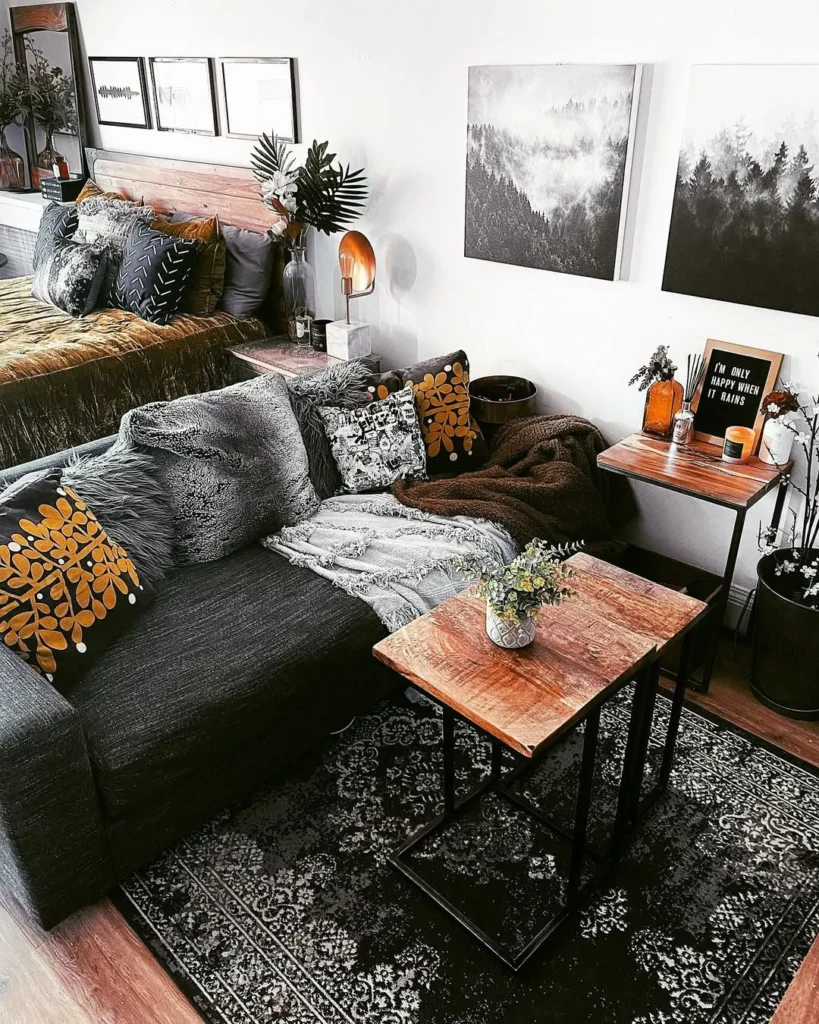
The most common mistake in a studio is trying to make the bedroom corner look different from the living area, which draws attention to the fact that they share one room. This space takes the opposite approach: the charcoal sofa, the dark vintage rug, the industrial nesting tables, and the warm wood headboard visible behind all share the same moody, textured palette so the room reads as cohesive from every angle.
Heads Up: In a studio, match the bedding and throw colour to the sofa colour so the sleeping and living zones feel like two parts of one room rather than two rooms sharing a space.
17. Wall Moulding as a Budget Architecture Upgrade
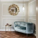
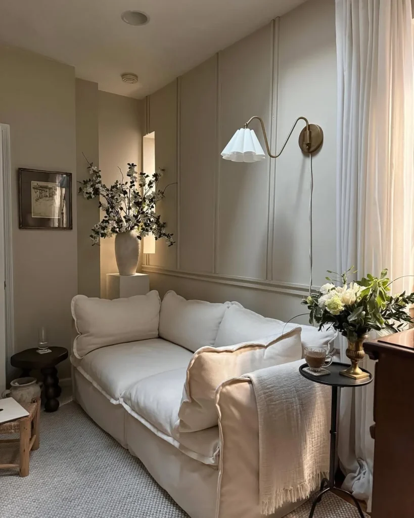
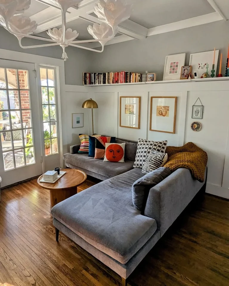
Wall panelling or applied moulding adds architectural detail that the brain associates with expensive, well-crafted spaces, which makes the room feel more substantial than its square footage suggests. This room pairs the moulded wall with a brass wall sconce rather than a floor lamp so every surface around the sofa stays clear, and an oversized ceramic vase with blossoming branches directs attention vertically and makes the ceiling feel higher.
Pro Move: Apply simple rectangular moulding panels with MDF strips and filler for under 100 dollars, paint everything the same colour, and the effect reads as original period architecture.
18. A Decorative Room Divider That Does Double Duty
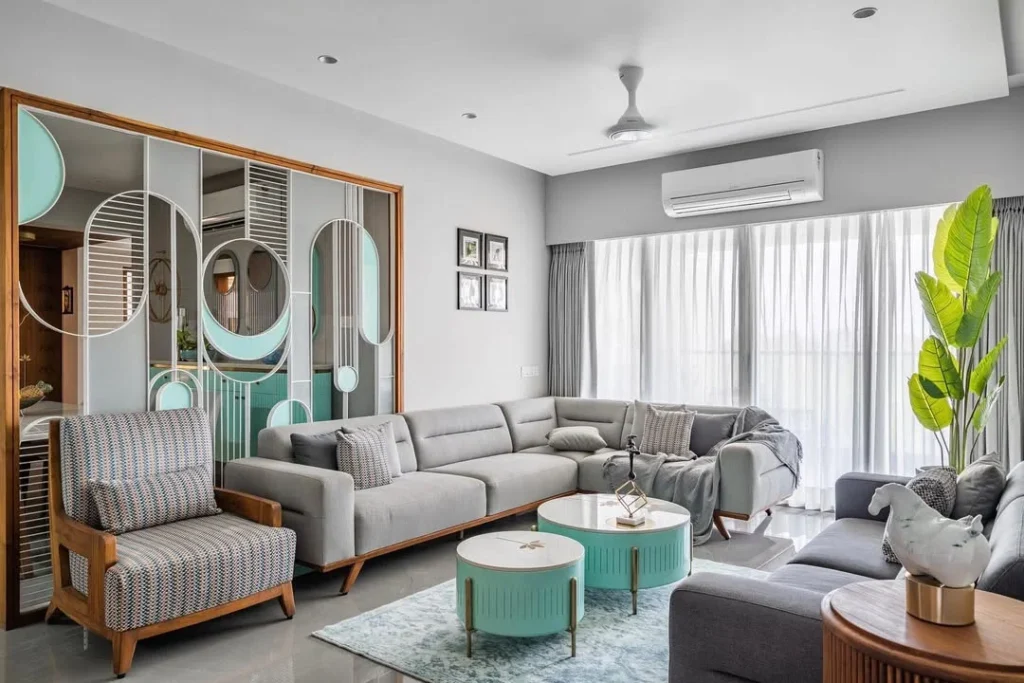
A geometric metal and glass partition solves the studio apartment’s hardest problem: it visually separates the entry from the living area without blocking light or making the room smaller, because the open frame allows the eye to see through and understand the full depth of the space. The teal round coffee tables are a smart choice for a room this size because round furniture has no corners to navigate around and the pair can be separated to serve different zones.
Quick Tip: A metal-framed room divider with an open geometric pattern adds privacy and architecture without the wall-like visual weight of solid furniture used as a partition.
19. The Dining-Living Combo That Leans Into Its Constraints
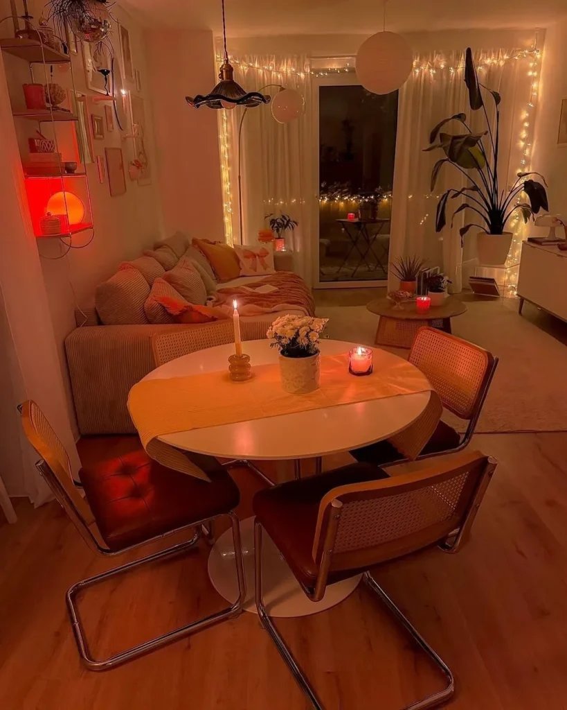
Rather than pretending this apartment has a separate dining room, the round Saarinen-style tulip table is positioned to work as the social and dining hub of the whole space, with the sofa sitting close enough to feel part of the same conversation zone. The warm amber glow of string lights along the curtain rail and the sunset lamp on the shelf eliminate the need for overhead lighting in the evening, turning a practical dining spot into an atmospheric one.
Reality Check: A round dining table with a tulip base that has no legs to navigate around is the single best piece of furniture for a combined living-dining room in a small apartment.
20. The Open-Plan Studio That Gets Every Zone Right
What makes this open-plan studio feel larger than it is comes down to one decision made consistently throughout: every piece of furniture is raised off the floor on visible legs, which means the eye can read the floor as a continuous surface from wall to wall, and a continuous floor reads as a large floor. The blue-grey kitchen cabinetry flows into the living zone through a shared palette so the transition between kitchen and sofa feels intentional rather than accidental.
Designer Advice: Choose all your furniture with visible legs in the same finish, because the uninterrupted floor line they create is the fastest way to make a room feel twice the size.
21. Painting the Ceiling a Bold Colour and Never Looking Back
Most designers recommend painting ceilings white in small rooms, and most designers are playing it safe. This apartment proves that a terracotta-rose ceiling painted to match the walls creates an immersive envelope effect that makes the room feel like a place rather than a box, and the yellow Togo sofa and dark green sectional work because both colours exist within the warm terracotta family.
Pro Move: Paint your ceiling the same colour as your walls, or one shade deeper, and the room will feel architecturally intentional in a way that white ceilings in coloured rooms never achieve.
22. Filling a Small Room With Plants the Smart Way
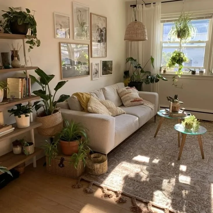
A living room full of plants feels larger than an equivalent room without them because greenery gives the eye an organic texture to rest on rather than bouncing off smooth walls, and the depth of a large leaf plant creates a visual layer that reads as space. The open ladder-style shelving here keeps every plant elevated so the floor remains clear, which is the non-negotiable rule for plant-heavy small rooms: the moment pots start living on the floor, the room contracts.
Heads Up: Keep all pots in a consistent earthy palette of terracotta, white, and natural wicker so a large plant collection reads as a design choice rather than an accumulation.
In this studio, a floor-to-ceiling curtain panel in warm sand linen conceals the sleeping area from the living and dining zone, which is one of the cheapest and most effective ways to create the feeling of separate rooms without building walls or buying a partition. The copper pendants on the dining side and the geometric leaf-pattern wallpaper on the bedroom side create two distinct visual identities that make the spaces feel separate even when the curtain is open.
Quick Tip: A ceiling-mounted curtain track rather than a rod gives the smoothest, most architectural finish when using curtains as a room divider in a studio apartment.
24. The Micro-Studio That Proves Less Is Genuinely More
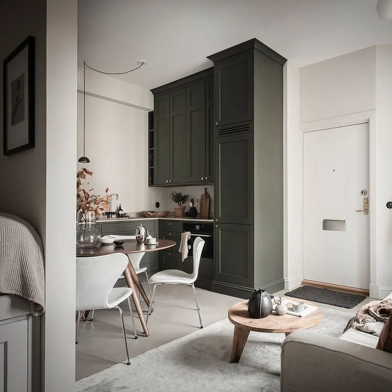
This tiny studio demonstrates a principle that is often stated but rarely executed: when every item earns its place, a small room reads as considered and calm rather than tight and lacking. The dark olive kitchen cabinetry running floor-to-ceiling creates a single storage wall that holds everything, freeing the rest of the apartment to breathe, and a round walnut dining table with two Series 7-style chairs sits neatly between kitchen and living zone without blocking either pathway.
Designer Advice: In a micro-studio, choose one colour for all your storage and cabinetry and let every other surface stay light, because the contrast creates order without needing a designer’s eye to pull it off.
Finding Your Own Version of This
Small apartment living rooms are not a design problem to be solved once and forgotten. They are a practice of making intentional choices about what stays, what earns its place, and what the room is actually for on a given evening. The rooms in this article share one trait regardless of their style: every decision was made with the full picture in mind, not just the sofa in isolation or the rug on its own. Whether your space is a moody studio with a floral wall or a micro-apartment with olive cabinetry, the same logic applies: commit to your approach, keep the floor clear, and trust that a small room that knows what it is will always feel better than a large one that does not.