Most articles about decorating apartments for men start with leather sofas and dark walls and stop there. The real range is far wider. These are the spaces men actually build when they let their own taste lead rather than following a generic masculine checklist.
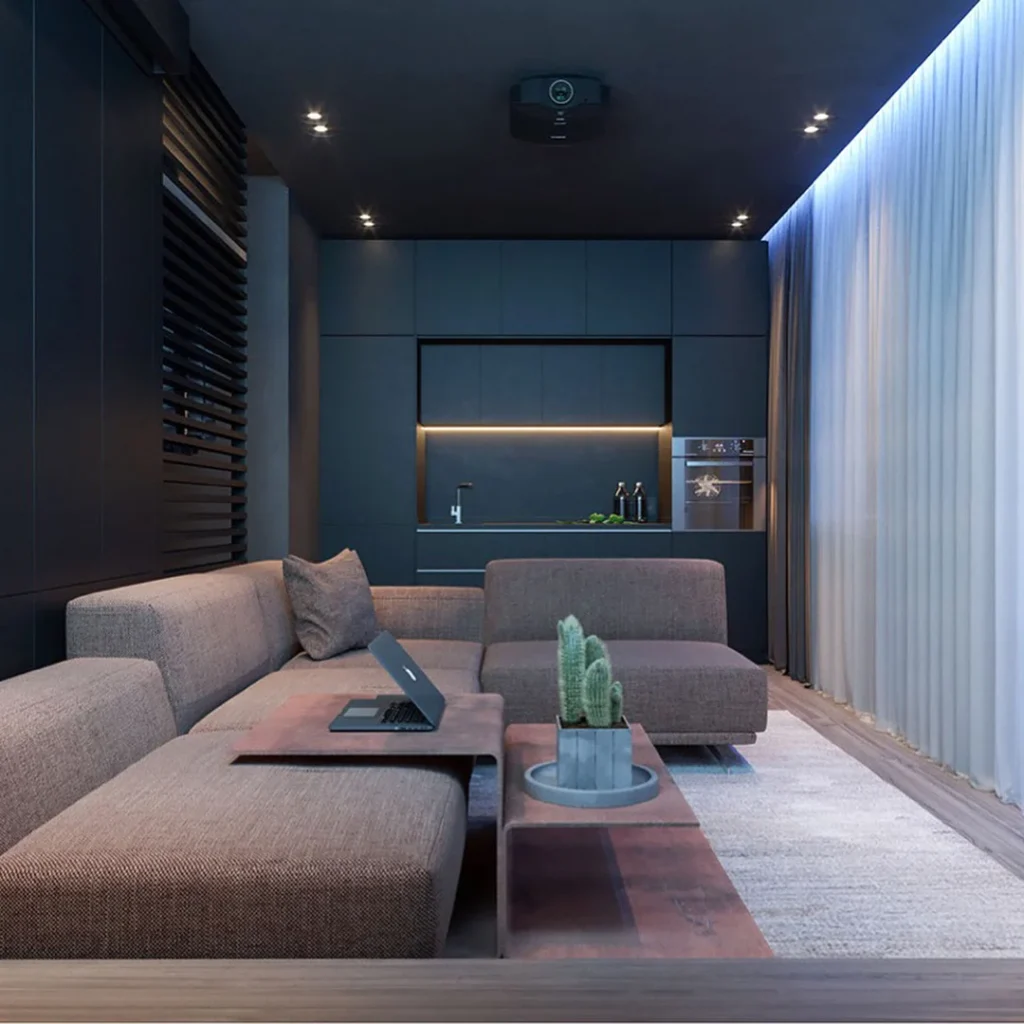
A fully matte-dark apartment with a ceiling-mounted projector, flat-panel cabinetry, and strip LED lighting hidden in the ceiling coffer is the most committed version of the dark aesthetic because it removes every visual distraction and turns the room into a pure experience space. The key to making this work in practice is that every surface, the walls, the cabinetry, the sofa upholstery, and even the rug, must sit within two or three tones of each other so the room reads as one intentional volume rather than a dark room with dark things in it. A corten-effect side table and a small cactus in a concrete planter are the only accents this kind of room needs.
Designer Advice: In an all-dark apartment, the lighting design carries the entire room: use recessed strip LEDs at ceiling height and keep all other light sources at table level or below.
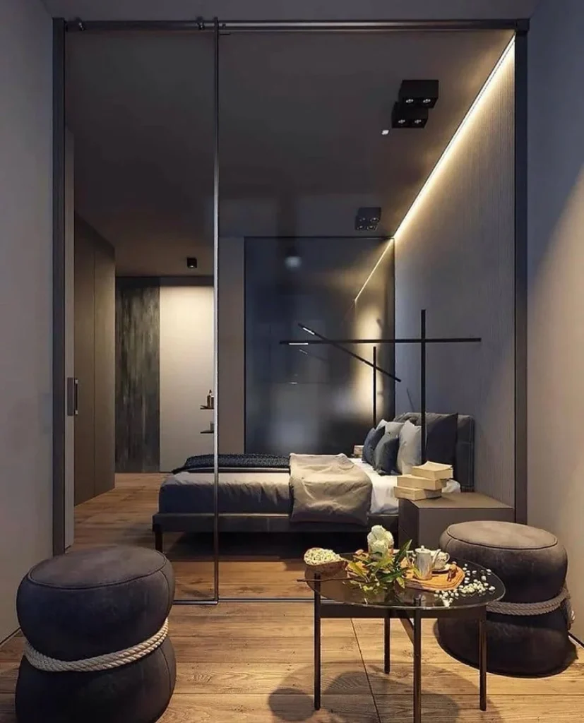
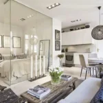
A frosted or semi-transparent glass partition between the sleeping zone and the living area creates a hotel suite quality in a one-bedroom apartment that standard walls or curtains cannot replicate, because the visual connection between zones remains while the separation is complete. The dark grey tonal palette here, from the linen bedding to the velvet ottomans to the matte black pendant above the bed, is consistent enough that the bedroom reads as a continuation of the living space rather than a different room with a window into it. In practice, a sliding glass partition on a ceiling-mounted track is a renter-installable solution that adds genuine architectural value and is fully reversible.
Pro Move: A frosted glass partition between bedroom and living area requires the same material palette on both sides to work: if the palettes clash, the partition draws attention to the gap rather than bridging it.
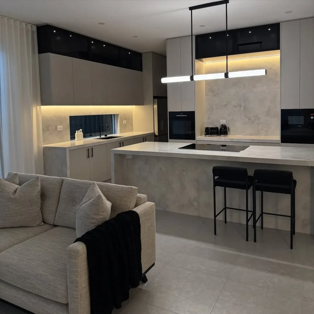
3. The Moody Open-Plan Kitchen That Means Business
Concrete-effect surfaces, matte black hardware, black upper cabinet fascias, and a linear black pendant over a white stone island create a kitchen that reads as seriously designed rather than simply dark, because the variety of materials and finishes within the same tonal range creates depth rather than flatness. The under-cabinet LED strip lighting here does the same work as expensive pendant clusters for a fraction of the cost, warming the concrete-effect splashback and creating a zone that photographs like a luxury hotel kitchen. Black barstool frames in a backless silhouette keep the island from feeling heavy and let the stone surface read as the room’s centrepiece.
Quick Tip: Under-cabinet LED strip lighting at 2700K warm white is the most effective and affordable upgrade in any dark kitchen: it adds warmth, defines the workspace, and looks expensive without requiring an electrician.
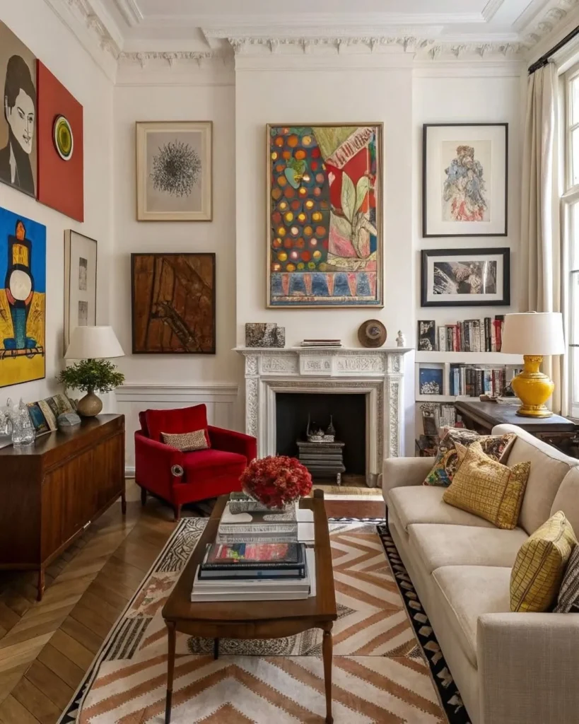
A room where the art collection is the architecture is the most confident decorating statement available in a rented apartment, because it requires no structural changes and costs nothing to dismantle when you move. The key to making a collection look like a collection rather than random art is treating the wall as a single composition: here the white painted walls and white ornate fireplace act as the neutral field against which the bold and varied frames read as one curated statement. The red velvet accent chair works because its colour echoes the red in several of the paintings, and that single colour connection transforms an armchair into part of the art.
Reality Check: A gallery wall of original or secondhand artworks only reads as a collection when at least one visual thread connects the pieces: shared frame tone, a recurring colour, or a consistent subject matter.
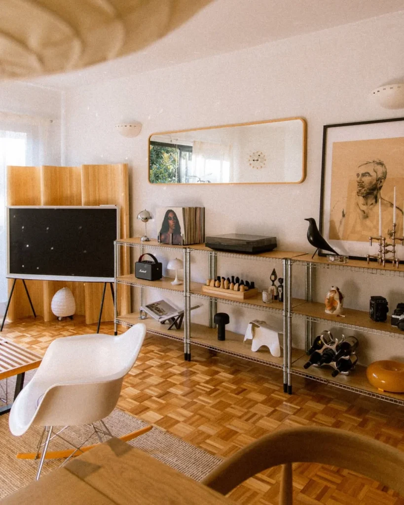
A long industrial-style open shelving unit running the full width of one wall turns a personal collection of design objects into the room’s central feature, replacing the need for framed wall art entirely. The objects here, a Vitra Eames elephant, a Marshall Kilburn speaker, a chess set, a record player, and a Flowerpot lamp, are all things the owner actually uses, which is the defining difference between a collection and a prop display. Framing the shelving unit with a large framed figurative portrait to the right and a rectangular mirror above creates a horizontal composition that the eye reads as a single installation rather than a storage unit.
Designer Advice: Limit a display shelf to one consistent backdrop colour, either the wall behind painted the same colour or a panel of ply or cork, so the objects read against a unified field and the shelf disappears.
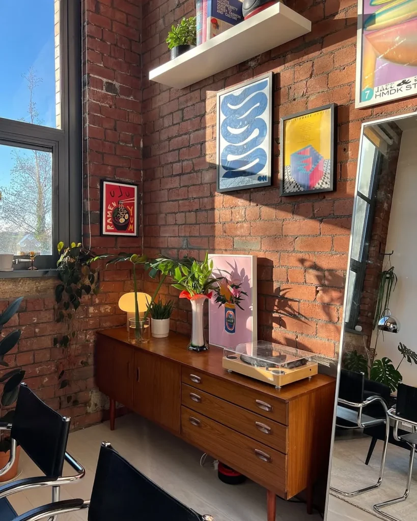
An exposed brick wall is one of the most coveted architectural features in apartment hunting for a reason: it adds material texture, warmth, and age that no paint finish can replicate, and it is a ready-made backdrop for any art style from graphic prints to photography to original painting. Here a vintage teak sideboard with a working turntable on top transforms a wall of records and bold graphic prints into a functioning music and art space rather than just a decorative display. The Mushroom table lamp in amber glass next to the turntable adds the warm light source that makes this corner feel like a late-night listening room rather than a display case.
Pro Move: A turntable on a sideboard is the most-commented-on object in any apartment because it starts conversations and signals taste: it does not need to be expensive, just visibly present and well-positioned.
7. The Loft Gallery Wall That Scales With the Space
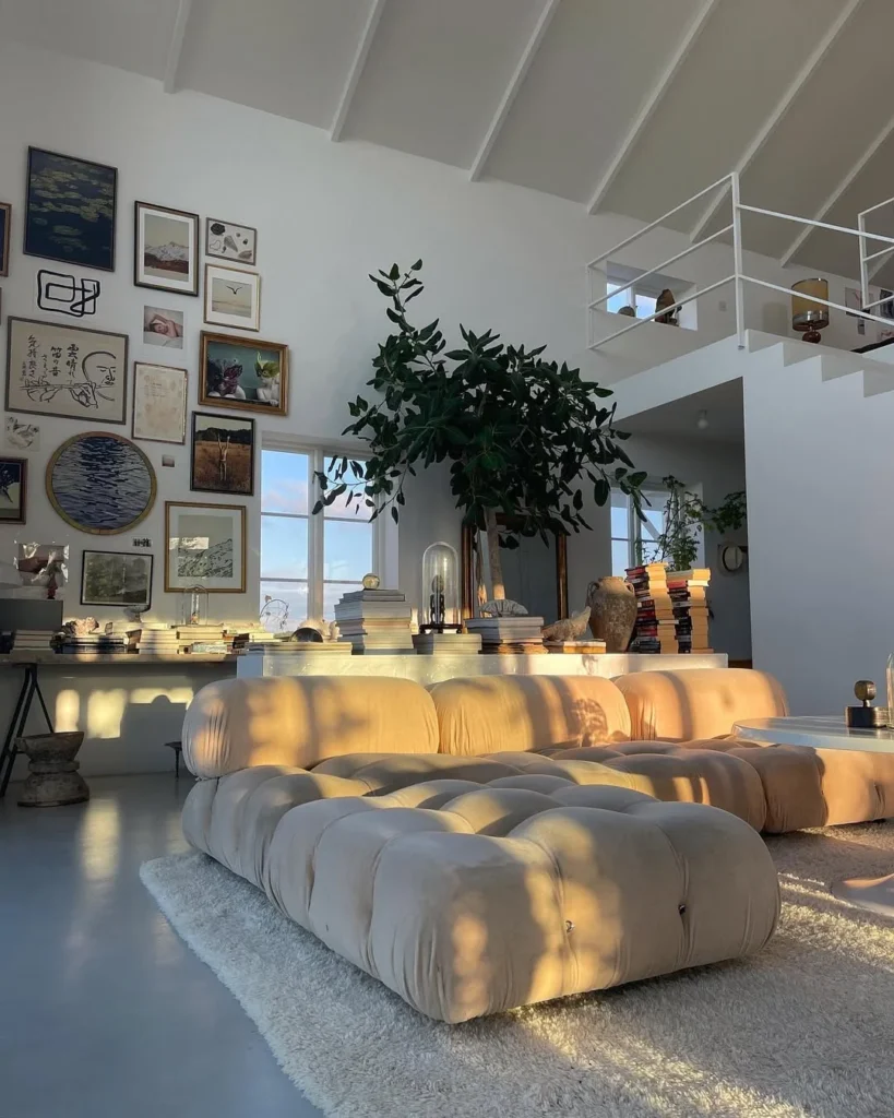
In a high-ceilinged loft apartment, a gallery wall needs to scale to the architecture rather than cluster at eye level, and the approach here of spreading frames from the skirting board to well above door-frame height treats the wall as a full canvas rather than a picture rail zone. The mix of framed photography, original paintings, watercolours, and prints keeps the wall from feeling like a purchased collection, and the large modular Camaleonda-style sofa in cream bouclé sits in front of it with genuine visual weight that matches the scale of the wall behind. Stacks of books on the floor along the base of the gallery wall add horizontal mass that grounds the vertical composition.
Heads Up: A gallery wall in a high-ceilinged room needs pieces at two or three different scales: at least one print or canvas that is notably larger than the others anchors the composition and stops it feeling like random nails.
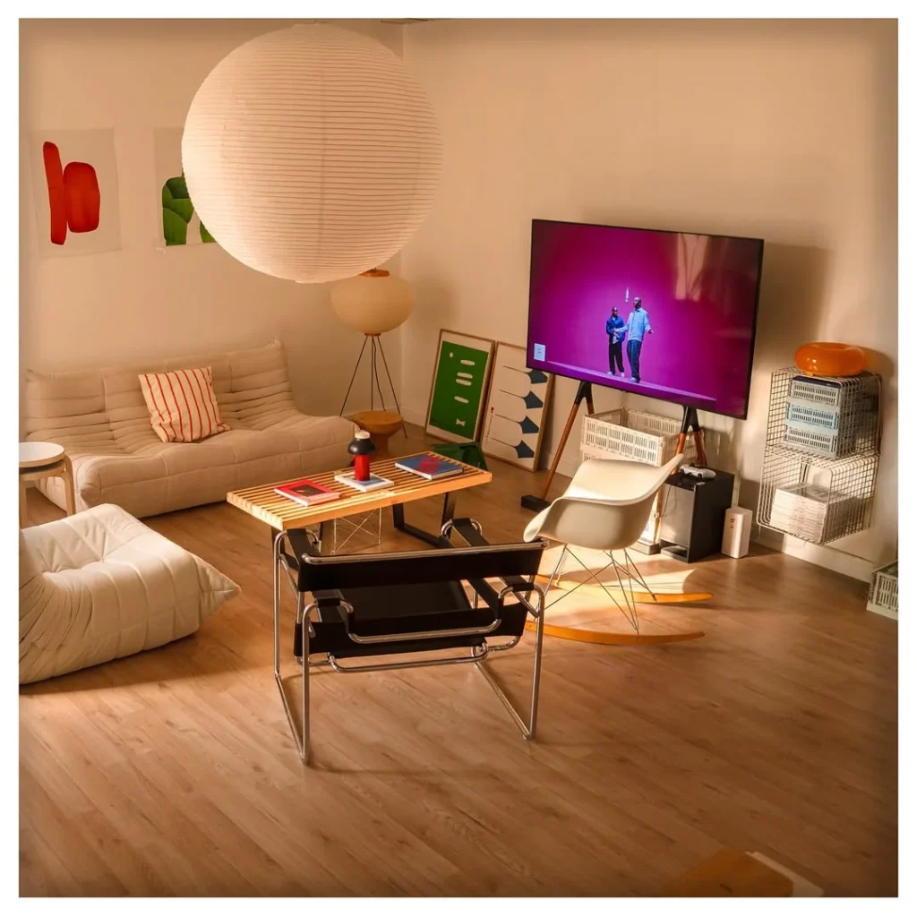
Owning a Togo sofa, an Eames rocking chair, a Wassily chair, and a Noguchi paper pendant in one room is either the result of a very specific collecting habit or a very deliberate design philosophy, and in either case the room works because every piece was designed as a complete object that holds its own in any company. The slat coffee table and the TV on a leaning easel-style stand are the contemporary touches that stop the room from feeling like a design museum, and the artwork leaned rather than hung reinforces the idea that this is a space where the objects are the art. In practice, one genuine design classic surrounded by simpler pieces outperforms a room full of near-misses.
Quick Tip: One genuine design classic, an Eames shell chair, a genuine Togo, a real Flowerpot lamp, surrounded by simple, honest pieces reads as far more considered than a room full of high-end furniture with no clear point of view.
9. The Warm Home Studio With Modular Desk and Amber Light
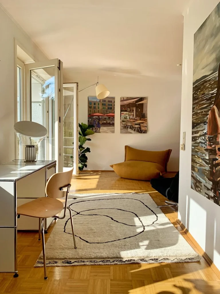
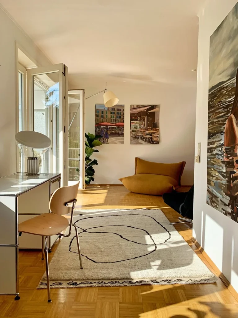
A USM Haller modular desk system in white with a Tolomeo wall-mounted task lamp and a Verner Panton Flowerpot table lamp in amber is the full creative-professional setup: functional, beautifully designed, and warm enough to feel like a room worth spending time in rather than just a workspace. The mustard-yellow bean bag chair in the corner and the abstract rug with looping lines create a reading and thinking zone that is both casual and intentional, demonstrating that a home studio does not have to be separated from the rest of the apartment’s personality. A large oil painting on the wall to the right, cut off at the edge of the frame, signals that the rest of the apartment continues in the same spirit.
Designer Advice: In a home studio, invest in the lamp before the desk: a well-designed task light like a Tolomeo or Anglepoise models does more for the room’s aesthetic than the desk surface it sits on.
10. The Eclectic Collector’s Open Shelf With Pop Art Energy
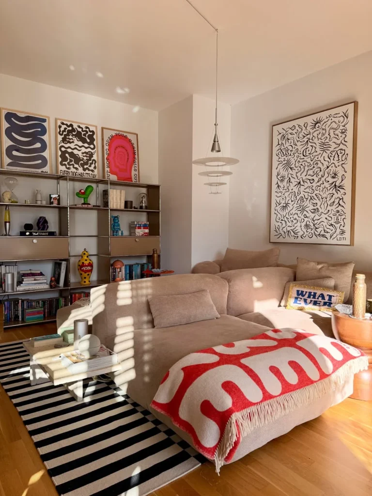
A full-height USM Haller metal shelving unit loaded with art books, design collectibles, KAWS figures, and bold graphic art prints across the top shelf creates a room that reads as a creative person’s space without any effort to explain itself. The large abstract line drawing print leaned against the sofa wall and the bold graphic throw in red and white on the sectional sofa make confident design statements that connect to the shelf collection without matching it. In a room like this, the collector’s instinct and the designer’s eye are the same thing: every object on that shelf was chosen, not accumulated, which is why it reads as intentional from across the room.
Reality Check: A shelf full of collectibles only works when the objects have visual scale variation: mix small figures, medium books, tall vases, and occasional large objects so the composition has rhythm rather than flat density.
The Warm Eclectic
11. The Parquet Apartment With Vinyl Records and a Navy Sofa
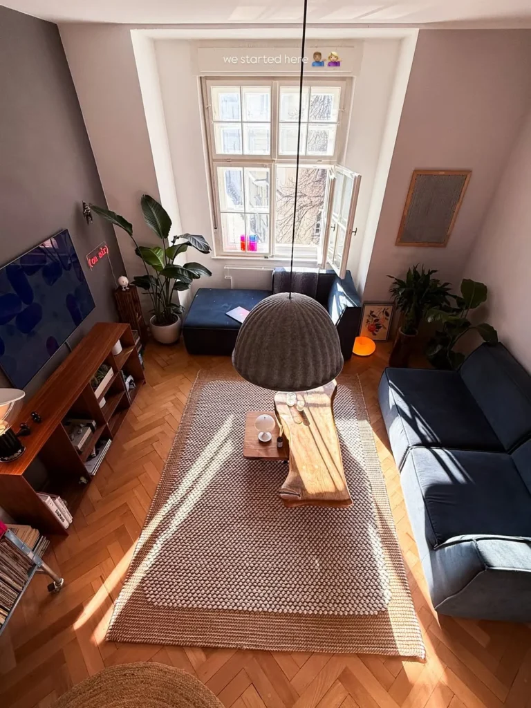
A bird’s-eye view of an apartment reveals the layout logic that makes it work or not, and from above this apartment reads perfectly: the navy sectional anchors the seating zone, the vinyl record shelving on the left gives the room a purpose beyond sitting, and the felt pendant light above the coffee table pulls every zone into one composition. The parquet flooring, herringbone-laid, is the room’s most expensive feature and the one that gives every object in it a quality footing it would not otherwise have. A large tropical plant in each corner and a small neon above the TV are low-cost personality additions that ground and warm the room without competing with the vinyl collection.
Quick Tip: Vinyl record storage in a living room is the most effective hobby display available because the spines are colourful, orderly, and immediately communicate something specific about the person who lives there.
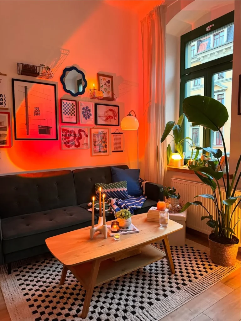
A sunset lamp or Halo light projector that throws warm amber and orange light across one wall transforms a standard apartment living room into something that looks completely different after dark, and since it plugs into a standard socket and costs under sixty dollars, it is one of the highest-impact low-cost decorating moves available to renters. Here the orange glow plays across a gallery wall of bold prints and a scallop-edged mirror, warming everything it touches and making the white-walled apartment feel rich and atmospheric in a way that standard warm-white lighting alone cannot achieve. A navy tufted sofa and a large tropical plant hold the rest of the room together during the day when the lamp is off.
Pro Move: A sunset lamp is the one decorating purchase that changes how a room feels more than how it looks: positioned behind the sofa at floor level pointed upward, it creates a gradient of warm orange light that reads as architectural rather than gimmicky.
13. The Lived-In Eclectic With Metal Shelving and Bold Art
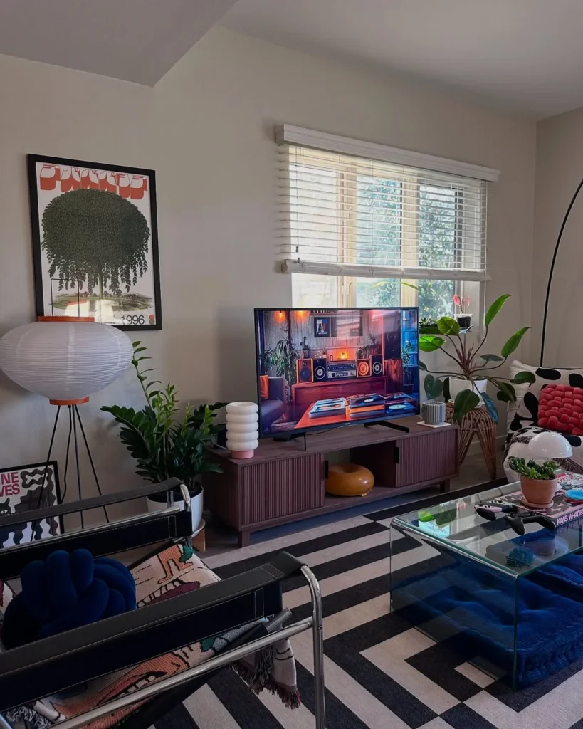
An apartment where the TV unit, the shelving, the rug, and the art all come from different design eras and different aesthetic traditions works when the owner has a strong enough point of view to let everything coexist without forcing it. The bold graphic striped rug here anchors the seating zone and its high visual contrast stops the room from feeling vague, while the modular walnut-toned media unit with its ribbed front panels is restrained enough to let the paper lantern floor lamp and the Wassily chair make their own statements beside it. A blue velvet accent chair visible in the corner and multiple plant species at varying heights fill the room’s negative space without cluttering the floor.
Heads Up: An eclectic room needs one object with enough visual authority to anchor the mix: here it is the giant striped rug, elsewhere it might be a large sofa, a statement painting, or a single oversized plant.
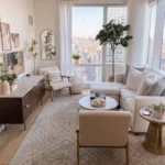
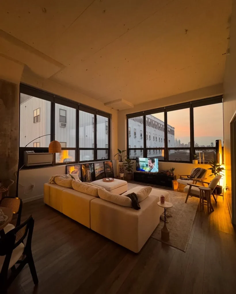
Floor-to-ceiling windows on two walls, a cream modular sofa facing the view, art leaned informally against the glass, a warm arc lamp in amber, and nothing on the walls: this is the city minimalist’s apartment in its ideal form, and what makes it work is not the absence of things but the confidence of having chosen exactly the right things. The dark wood floors absorb the golden light and stop the cream sofa from floating, the rattan dining chairs visible at the edge of the frame keep the room human, and the single amber pendant at the far side creates a second warm zone that extends the room visually into the corner. In a city apartment with a strong view, the single most important decorating decision is what not to put in front of the windows.
Reality Check: If your apartment has a genuine view, your furniture layout should face it and your window treatments should keep the glass clear: no art, no shelving, and no tall plants positioned to block what the apartment is actually about.
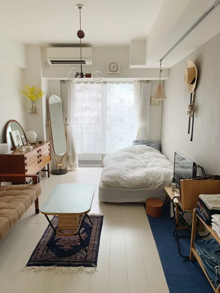
A compact Japanese-influenced studio where a teak credenza, a brass full-length mirror, a glass-top coffee table on a Persian kilim, and a single white bed occupy one calm, ordered space demonstrates that minimal does not mean sparse: it means every object has been chosen for both its utility and its visual quality. The small shelf mounted high on the right wall holds a folded straw hat, a dried flower bunch, and a candle, which is styling at its most restrained, and it works because each item has its own clear silhouette against the white wall behind. A warm Edison pendant on a long cord provides the one strong light source that pulls the eye to the centre of the room when the linen curtains filter the daylight.
Quick Tip: In a studio apartment, store all items with no clear visual value behind closed doors and leave only the objects you would be comfortable displaying in a gallery: the editing is the design.
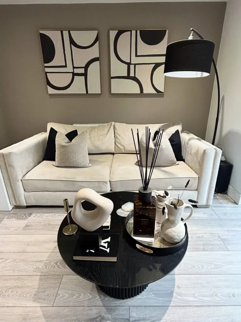
16. The Black and White Living Room With Geometric Art
Two large canvas prints in black-and-white geometric abstraction hung symmetrically above a cream velvet sofa create an extremely clean and confident living room focal point that costs almost nothing to replicate: the prints can be commissioned from any digital print shop at A0 size, stretched on canvas for under forty dollars each. The round black fluted coffee table and the black arc floor lamp carry the black from the prints down into the furniture zone so the room reads as a deliberate palette rather than white furniture with black art. A reed diffuser in black and a few white ceramic objects on the table surface are the only accessories this room needs.
Designer Advice: Two matching prints in identical frames hung symmetrically is the most graphic and most confident art arrangement in a living room: asymmetry requires more confidence to pull off, but symmetry always reads as intentional.
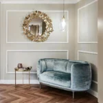
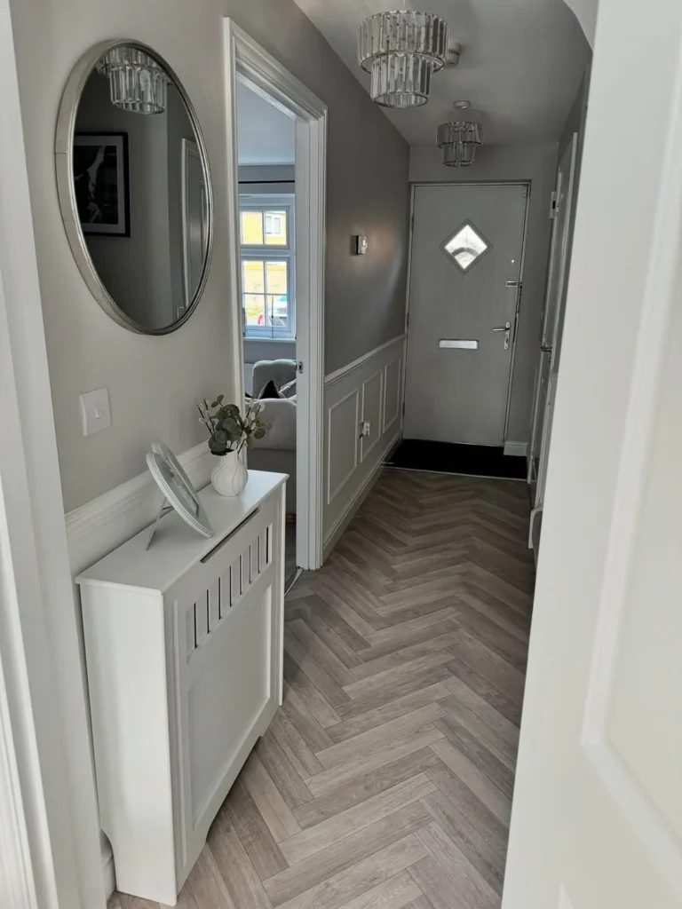
A hallway is the first room every visitor enters and most men put nothing in it, which is a missed opportunity because a well-considered hallway tells anyone who walks through the front door exactly what kind of space they are about to enter. Grey panel moulding on the walls at dado height, herringbone tile flooring, a simple oval silver mirror, and a slim radiator cover used as a console table with two or three objects on top is a combination that reads as a properly finished home rather than an apartment. Crystal chandelier-style pendants in a narrow hallway are unexpected enough to make an impression without requiring any structural work.
Pro Move: Apply peel-and-stick wainscoting panels at dado height in a hallway, paint them the same colour as the wall above, and add one good mirror: the hallway will feel twice as intentional as it did the day before.
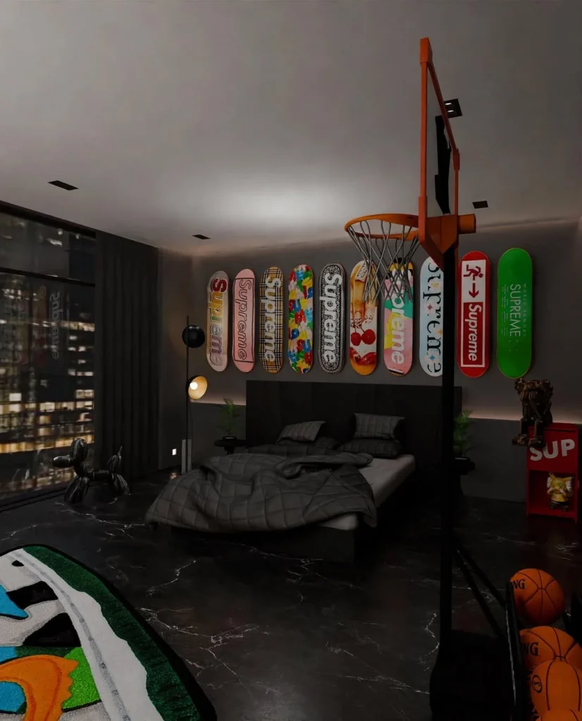
Mounting a collection of skateboard decks horizontally above the bed in a row is one of the cleanest and most personal forms of wall art available to anyone who actually owns the pieces, because it turns a collection of objects into a graphic installation that no print or canvas can replicate. The addition of a full-size basketball hoop mounted above the TV on the opposite wall commits fully to the room’s identity, and in a dark marble-floored apartment with floor-to-ceiling windows at night, the combination reads as a premium streetwear editorial rather than a teenager’s bedroom because the surrounding architecture holds the weight. A KAWS figure as bedside object, black bedding, and a low-profile dark headboard keep the furnishings intentionally simple so the collection is always the first thing the eye goes to.
Reality Check: Displaying a personal collection as wall art only works when the collection has genuine visual consistency: mixed item types in different sizes need framing or a uniform background to prevent the wall from reading as cluttered.
19. The Bold Colour Kitchen That Refuses to Be Neutral
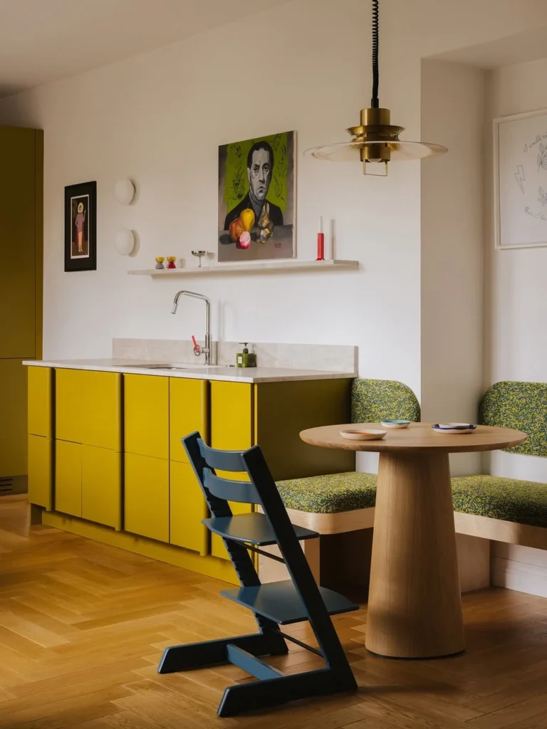
A chartreuse-yellow kitchen with a round oak dining table, green floral banquette seating, and a dark navy accent chair demonstrates that a man’s kitchen can be the boldest room in the apartment without looking chaotic, because the warm yellow and the earthy green sit within the same colour family and the oak table and herringbone parquet floor provide the neutral field that stops the colour from feeling overwhelming. The brass PH-style pendant above the table grounds the top of the space and the simple floating shelf with a few objects above the hob keeps the kitchen side clean enough to let the cabinet colour be the story. Painting or replacing kitchen cabinet fronts in a single bold colour is the highest-impact room change available in most apartments.
Quick Tip: Bold cabinet colour works in a kitchen when the walls above stay white and the worktop is a natural stone or light wood tone: the contrast between the bold base and the calm above is what makes the colour feel like a design decision.
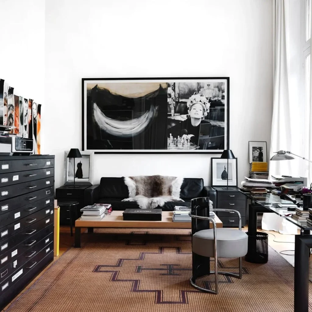
A black flat-file cabinet, a large black-and-white photography print spanning the full sofa width, a black leather sofa with a natural fur throw, and a glass-and-wood desk to the right create a home workspace that reads as a creative professional’s environment rather than a home office with a sofa in it, because every object has been chosen for its relation to the work. The geometric kilim rug in warm terracotta anchors the seating zone and connects to the warm wood of the desk surface, while the table lamp and the desk lamp are both functional objects with enough form quality that they register as design choices. This room demonstrates that a workspace integrated into a living room works when the desk faces the same direction as the sofa so the occupant is always choosing which zone to occupy rather than sitting in both at once.
Designer Advice: A home studio integrated into a living space works best when the desk is positioned perpendicular or parallel to the sofa, never facing it: facing each other forces a choice between work and rest that neither zone wins.
21. The Dark Masculine Bedroom With Personal Sporting History
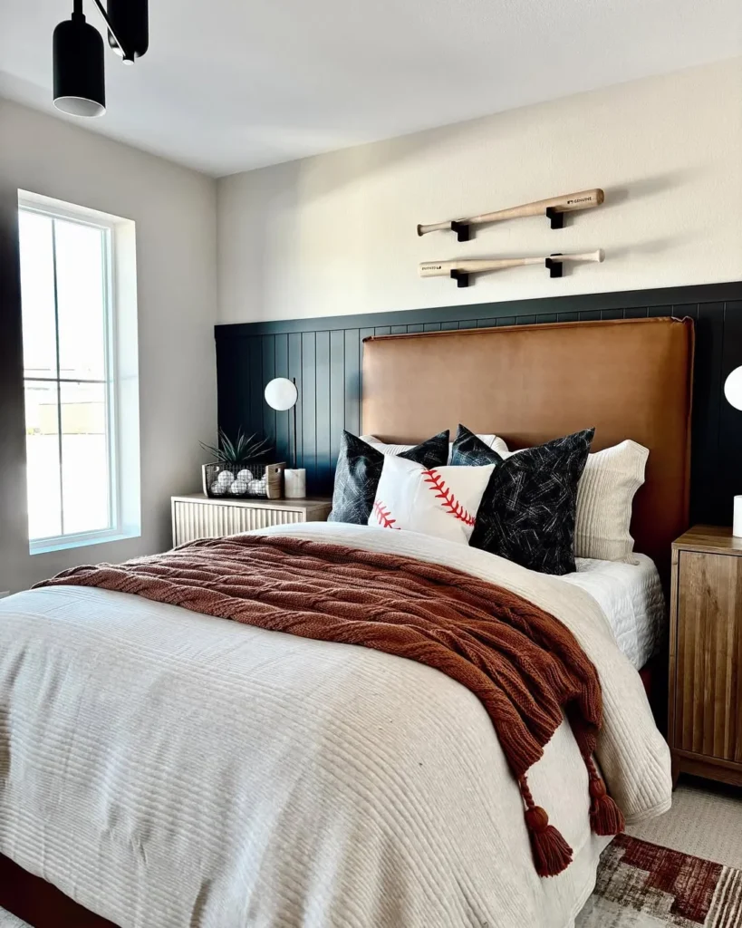
A tan leather headboard set against a dark navy shiplap feature wall, with two baseball bats mounted on horizontal wall brackets above the headboard as art, is a bedroom that is confident enough in its references to make them architectural rather than decorative. The rust cable-knit throw, the mismatched nightstands in different finishes, and the dark Persian rug at the foot of the bed all exist within a palette of warm neutrals that takes the weight of the dark shiplap wall without competing with it. In practice, mounting any personal sporting equipment, hockey sticks, surfboards, climbing gear, or bats, on purpose-made wall brackets above the bed turns a collection into an installation without requiring a gallery wall’s worth of frames.
Pro Move: Any sporting equipment mounted on custom brackets at ceiling height above the bed reads as architectural rather than decorative because the height removes it from the room’s functional zone and places it in the display zone.
22. The Traditional Dining Room That Earns Its Place
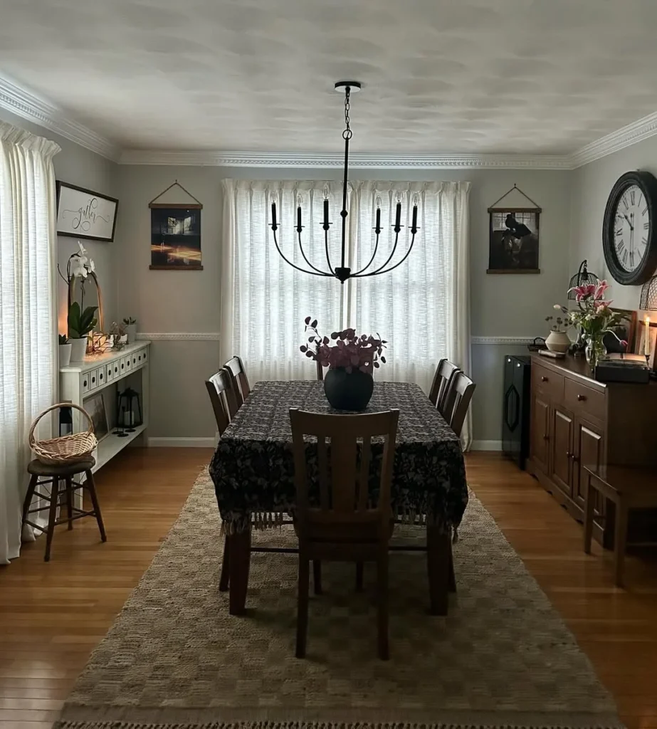
A round dark wood dining table with matching chairs, sage-grey walls, an iron wagon-wheel chandelier, and a warm jute rug beneath it is the classic masculine dining room and it works because the combination of dark furniture, muted wall colour, and warm light is deeply familiar to anyone who has eaten a good meal in a well-considered restaurant. The canvas wall hangings with leather binding detail and the oversized wall clock to the right add to the room’s sense of deliberate craft rather than generic decoration, and the sideboard loaded with florals and candles shows that a man’s dining room can be layered and warm without being feminine or generic. A tablecloth with a botanical or geometric weave pattern on a round table is one of the most underused and most effective dining room details available.
Reality Check: A round dining table seats one more person than a rectangular table of equivalent width, takes up less visual floor space, and has no sharp corners: for a man living alone or entertaining regularly, it is almost always the right call.
23. The Luxury Entry Foyer That Announces the Apartment
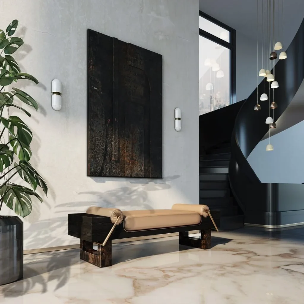
A raw textured concrete-plaster wall with two pill-shaped marble wall sconces, a large dark abstract artwork in a slim black frame, a long black-and-caramel leather daybed, a clustered pendant installation above the adjacent staircase, and a monstera in a dark ceramic planter create an entry foyer that delivers on arrival before the rest of the apartment is even visible. This level of finish requires a larger budget but the principle, that the entry should be styled as intentionally as any other room, applies at any cost: a good mirror, a single strong piece of art or object, and a source of warm light at table height does the same psychological work for a fraction of the cost. The entry is the only room every visitor sees every time, which makes it the most valuable single surface in any apartment.
Quick Tip: An oversized dark abstract artwork in a slim black frame hung at a height where its centre sits at 145 cm from the floor will make any entry hall feel like the beginning of something considered.
24. The German Minimal Apartment With One Great Rug
A home office and living zone sharing one long room works when the two functions are clearly separated by a rug: the USM Haller desk on bare parquet and the amber bean bag on the abstract-pattern rug create two zones with completely different temperatures that make the room feel larger than its square footage suggests. The Tolomeo wall-mounted task lamp extends and retracts over the desk without taking any surface space, the Flowerpot lamp in amber glass fills the corner with warmth, and a large oil painting cut off at the edge of the right wall implies a world of art beyond the frame. What this apartment demonstrates is that a minimal room with genuinely excellent objects does not need more: the quality speaks for itself without requiring quantity.
Heads Up: Two separate rugs in the same room define two zones but must share at least one tonal connection, whether in colour, texture, or scale, otherwise the room reads as two rooms that happened to collide.
25. The Warm Brick Loft With an Art Wall and Plants
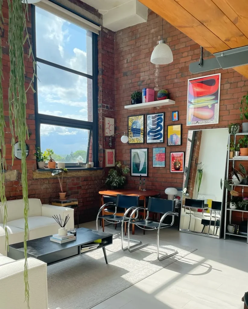
Exposed brick, floor-to-ceiling industrial windows, a pine beam ceiling, and a wall of colourful gallery prints is the apartment that sits at the intersection of every male decorating aspiration: raw, warm, bright, full of art, and clearly lived in by someone with a specific point of view. The blue Brno-style cantilever chairs around a dark round dining table bring a Bauhaus sensibility to the brick loft environment that connects the rough industrial architecture with the intentional design collection on the shelves to the right. In practice, this apartment is a reminder that the best decoration does not come from purchasing the right objects but from committing to a consistent point of view and living with it long enough for it to feel earned.
Pro Move: A leaning full-length mirror placed near the gallery wall reflects the art and doubles its visual presence in the room without requiring any additional hanging: it works in any apartment size.
The Only Rule That Matters
There is no single way an apartment should look when a man decorates it. The range in these rooms, from all-dark cinema dens to sun-filled lofts to brick collector spaces to minimal Japanese studios, makes that obvious. What connects them is not a colour palette or a furniture style but the sense that someone made deliberate choices rather than defaulting to what came with the lease or what was easiest to buy. That deliberateness is the thing. Start there and the rest follows.