Most people know their home could look better. They just aren’t sure where to start, and the advice they find online tends to be so broad it becomes useless. Buy a statement piece. Layer your lighting. Add texture. Great, but what does that actually mean when you’re standing in a room that feels off and you can’t quite figure out why? The truth is, good interior design is less about a huge budget or a degree in aesthetics, and more about knowing a handful of practical rules that change how a space feels at a very fundamental level.
These tips come from years of paying close attention to what works in real homes, not magazine spreads or showroom displays where nothing has to function on a Tuesday morning. The ideas here are specific, honest, and genuinely actionable. Some will cost you nothing. Others are worth every penny. All of them are worth knowing.
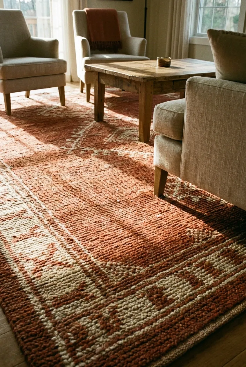
Here is a mistake that happens constantly: someone buys a sofa they love, places it in the room, and then realizes the rug they already own looks completely wrong with it. Suddenly everything feels mismatched and expensive to fix. In practice, it works far better to choose the area rug first and build the rest of the furniture selection around it. A rug is one of the hardest things to return and one of the easiest things to get wrong, so treat it as your anchor. Look for a rug with at least two or three colors in it, because those become your palette for the entire room, pulling everything else into a cohesive relationship. For sizing, go bigger than you think you need: in a living room, the rug should sit under the front legs of every sofa and chair at a minimum, and ideally under all four legs. A rug that is too small makes a room feel cramped and disconnected, even when the individual pieces are nice. Wool rugs are the most durable and age well, but a good-quality polypropylene option works well for families with kids or pets and sits at a much more forgiving price point.
Designer Note: Bring a large swatch of your rug to the furniture store, or order fabric samples before you commit to upholstery. The side-by-side comparison in natural light will save you from an expensive mismatch.
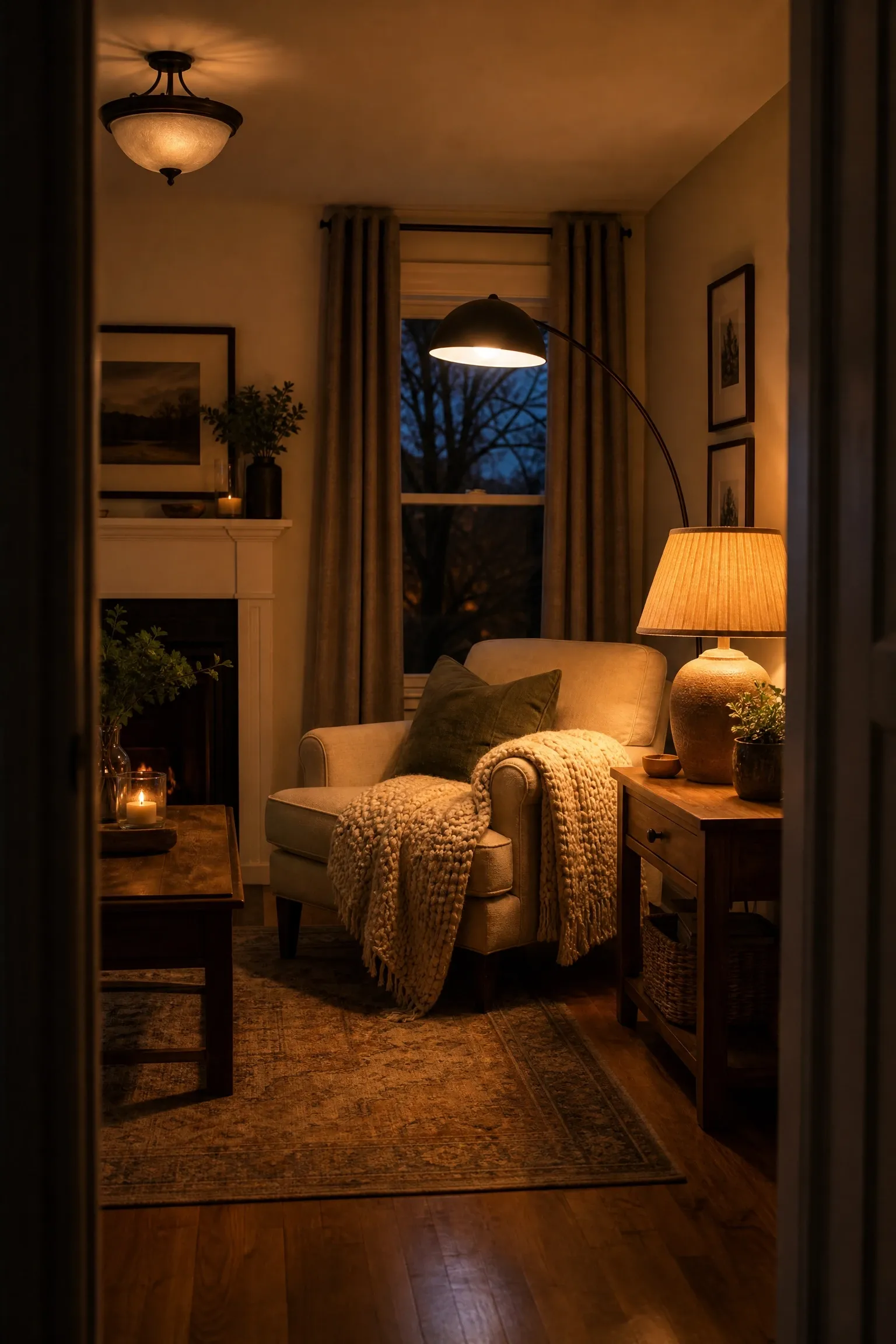
Walk into almost any home that feels warm and inviting, and you will notice the lighting is working hard in multiple ways. Walk into a room that feels cold or flat despite nice furniture, and nine times out of ten, that single overhead light is doing all the work on its own. Professional designers rely on what is called layered lighting, which simply means combining ambient light (the general overhead source), task lighting (focused light for reading, cooking, or working), and accent lighting (light that draws attention to a specific feature, artwork, or architectural detail). A living room with only a ceiling fixture feels like a waiting room. The same room with a floor lamp in the corner, a table lamp on the console, and a warm-toned pendant overhead suddenly feels like a place where people want to stay. Color temperature matters just as much as placement: bulbs in the 2700K to 3000K range produce a warm, amber-toned light that flatters both people and interiors, while anything above 4000K starts to feel clinical and cold. Dimmer switches are a relatively inexpensive addition and give you an enormous amount of control over the mood of a room at different times of day.
Designer Note: Aim for at least three separate light sources in any main living space. If installing new fixtures feels like too much, plug-in sconces and table lamps are a fast, budget-friendly solution that avoids any electrical work.
3. Hang Your Curtains Higher Than the Window Frame
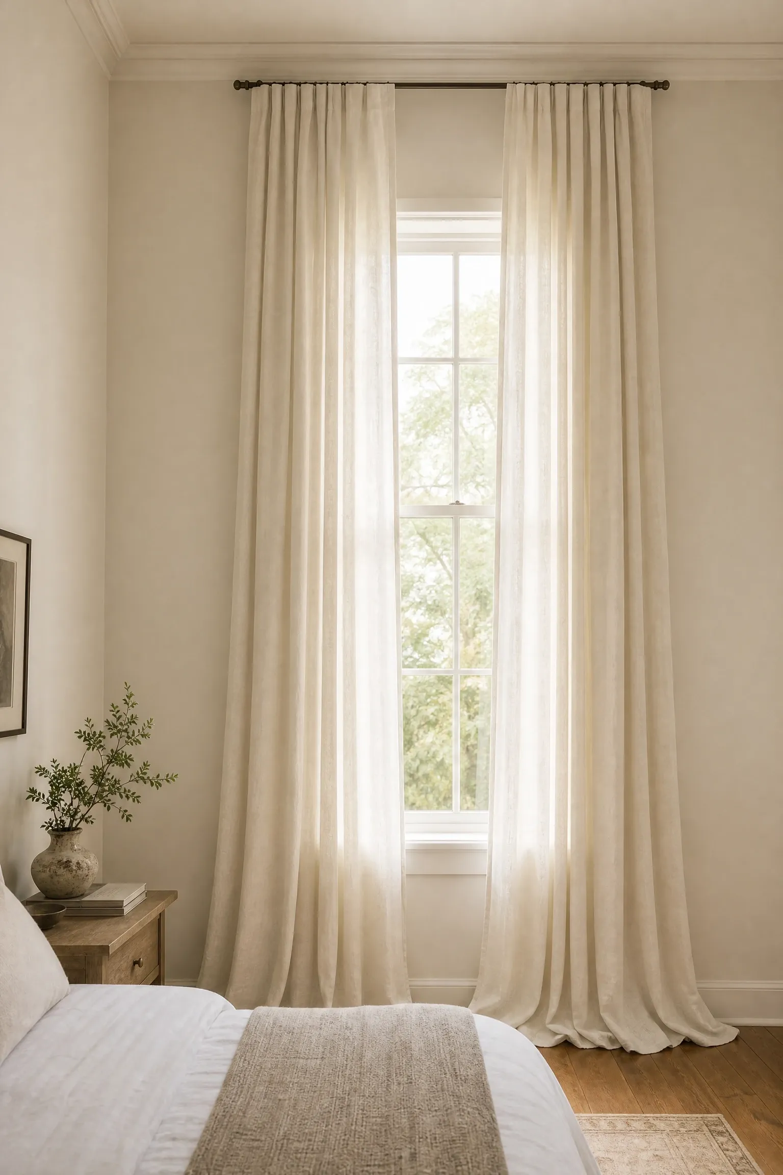
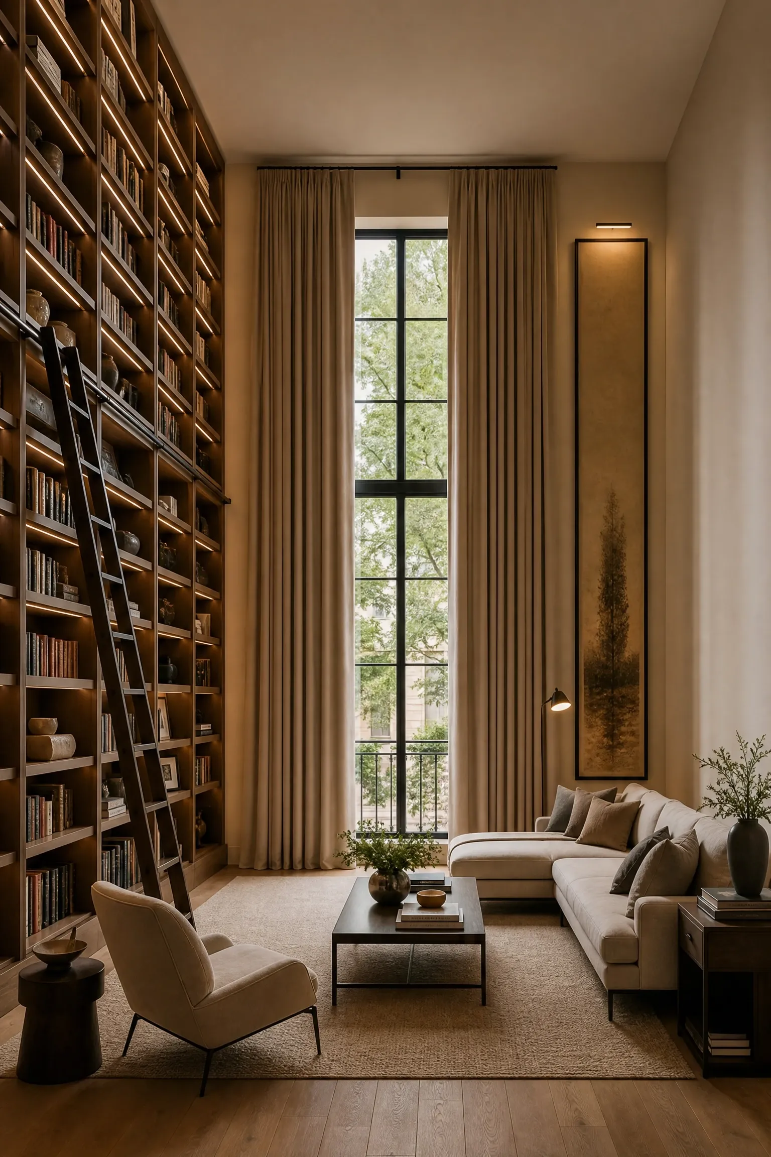
This is one of those adjustments that costs almost nothing extra and makes an immediate, visible difference. Most people hang curtain rods just above the window frame, which is understandable but visually limiting. When you mount the rod as close to the ceiling as possible and let the curtains fall all the way to the floor, the eye reads the height of the ceiling rather than the height of the window, and the room feels dramatically taller and more considered. Floor-length curtains in a heavyweight fabric like linen, velvet, or interlined cotton also create a sense of luxury that shorter panels simply cannot match, regardless of how expensive the fabric is. For width, the panels should extend well beyond the sides of the window when drawn back, ideally sitting mostly off the glass to let in maximum light and make the window appear wider than it actually is. This tip is especially useful in rooms with awkward or undersized windows, where the curtain placement does a lot of the work of making the proportions feel intentional. A word of honesty: high curtain rods require longer panels, and good-quality long curtains can be an investment. IKEA’s Sanela and Merete ranges offer a reasonable budget option if you’re not ready to commit to something more permanent.
Designer Note: The standard rule is to mount the rod 4 to 6 inches above the window frame at a minimum. Ceiling-height installation is even better whenever the ceiling height allows for it.
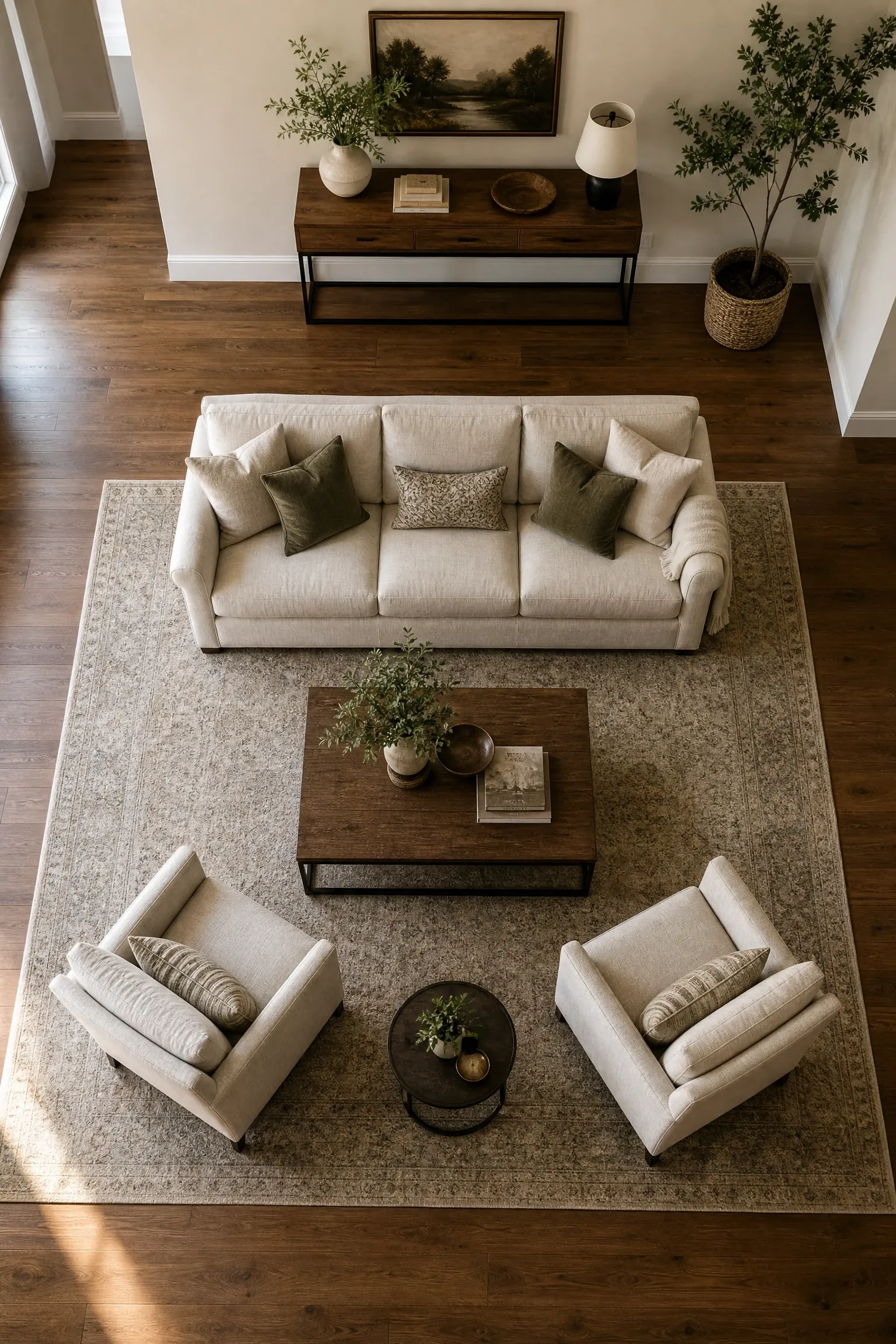
Pushing every piece of furniture flush against the walls is one of the most common instincts people have in a new space, and it is almost always the wrong move. The thinking is that keeping furniture against the walls will make the room feel bigger, but what it actually does is make the center of the room feel empty and awkward, like the furniture is trying to avoid itself. Pulling sofas and chairs even 6 to 12 inches away from the wall creates a more intimate, intentional grouping that encourages conversation and makes the room feel like it has been designed rather than just filled. This is particularly effective in living rooms: arrange seating pieces so they face each other at a slight angle, with the rug anchoring them together and a coffee table centered within reach of everyone. The negative space between furniture and wall also gives the eye somewhere to rest and creates a sense of visual breathing room that a wall-hugging layout never achieves. In smaller rooms, this technique needs a little more care, but even a few inches of clearance makes a difference. Just make sure the traffic flow through the room remains clear, with at least 30 to 36 inches for main pathways.
Designer Note: If your sofa is in a large open-plan space, a console table placed directly behind it works beautifully to define the seating zone and give the back of the sofa a finished, intentional look.
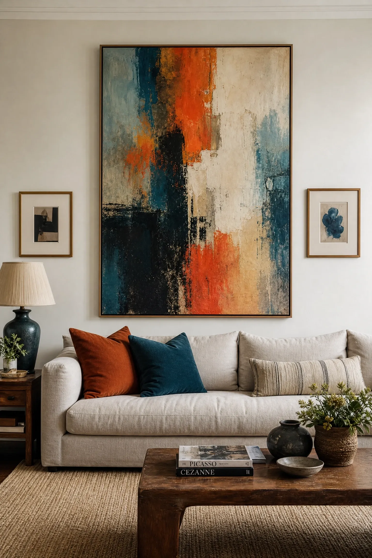
Color is where a lot of people get stuck, and it usually comes down to one of two problems: either everything in the room is the same safe neutral and it feels lifeless, or there are too many competing colors and the room feels chaotic. The approach that professional designers use is simple: pick three to five colors that will repeat throughout the space, with a clear hierarchy among them. A dominant color covers the largest surfaces (walls, large upholstery, major flooring), a secondary color appears in medium-scale items (accent chairs, curtains, shelving), and one or two accent colors punch in through cushions, artwork, throws, and small accessories. The ratio that tends to work is roughly 60% dominant, 30% secondary, and 10% accent. What makes this effective is the repetition: when the same terracotta that appears in your rug also shows up in a throw pillow and a piece of wall art, the room starts to feel coherent rather than assembled. The palette does not need to be complicated. A warm off-white, a deep sage green, and a touch of warm walnut brown is all you need to create a room that feels sophisticated and complete. Where people go wrong is treating every new purchase as a chance to introduce a completely new color rather than deepening an existing one.
Designer Note: Pull your palette from something you already love and own, whether that is a piece of artwork, a patterned cushion, or even a favorite piece of clothing. The colors you are drawn to in those things are the ones that will make you feel at home.
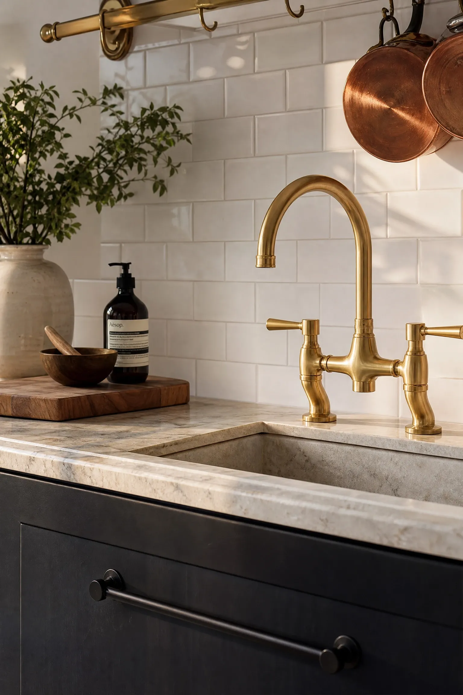
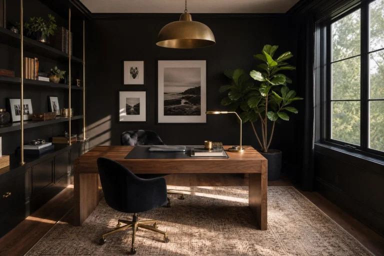
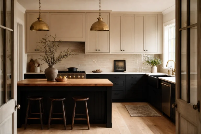
There was a time when matching all your metals was considered non-negotiable, and plenty of people still believe it. In reality, mixed metals are one of the hallmarks of a room that looks intentional rather than bought-all-at-once. The key is to mix with intention rather than accident: choose one dominant metal that appears in the larger, more visible pieces (light fixtures, cabinet hardware, faucets) and let the secondary metal appear in smaller, more decorative elements. Brass and matte black is a combination that has been popular among designers for a while now, and for good reason: the warmth of brass and the graphic sharpness of matte black balance each other beautifully across a range of interior styles from mid-century modern to contemporary. Brushed nickel and warm bronze also work well together, sitting close enough on the warm-cool spectrum that they feel related without being matchy. What to avoid is the random mixing that happens when hardware is replaced one piece at a time over the years without any overarching plan: chrome faucet, gold towel rail, silver mirror frame, and brass sconce all in the same bathroom creates a room that reads as neglected rather than layered. Decide on your two metals upfront and edit everything else accordingly.
Designer Note: The finish matters as much as the metal family. Mixing polished brass with brushed brass can actually look more interesting than polished brass alone, because the variation in sheen adds depth without introducing a whole new color.
7. Use Mirrors to Solve Problems, Not Just Fill Wall Space
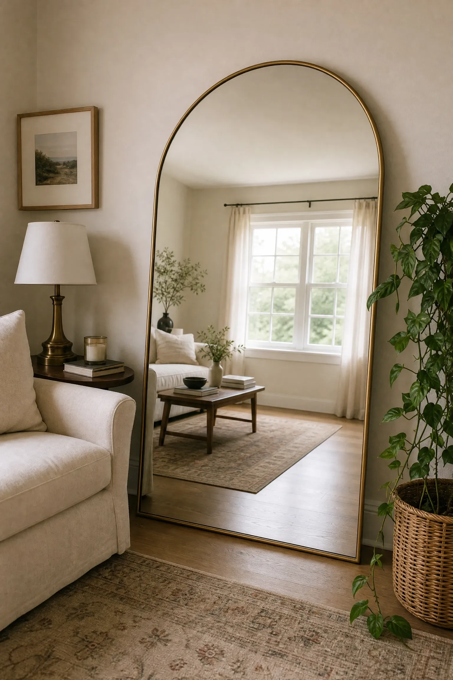
Mirrors are one of the most functional and underused tools in interior design, and the way most people use them (hanging a medium-sized mirror above a console because it seems like the right thing to do) barely scratches the surface of what they can do. A mirror placed directly across from a window will bounce natural light deep into a room that might otherwise feel dark and heavy. A large floor mirror leaned against a wall creates the illusion of a doorway and makes even a small room feel like it continues beyond its actual boundaries. In a dining room, a full-length mirror or a row of framed mirrors along one wall dramatically increases the sense of space and makes candlelit dinners feel genuinely atmospheric. The frame style matters too: an ornate gilded mirror in an otherwise minimal room becomes a statement piece that reads as intentional eclecticism, while a simple frameless mirror in a maximalist room provides visual breathing room. What to be careful of is the reflection the mirror is capturing: a beautiful mirror that faces a cluttered hallway or an ugly HVAC unit is just drawing attention to the problem. Position mirrors so they reflect something worth seeing, whether that is a window, a piece of art, or a well-styled shelf.
Designer Note: For maximum impact in a small room, look for a single large mirror rather than a cluster of small ones. One oversized mirror does far more work optically than several modest-sized ones.
8. Layer Textures Instead of Just Adding More Stuff
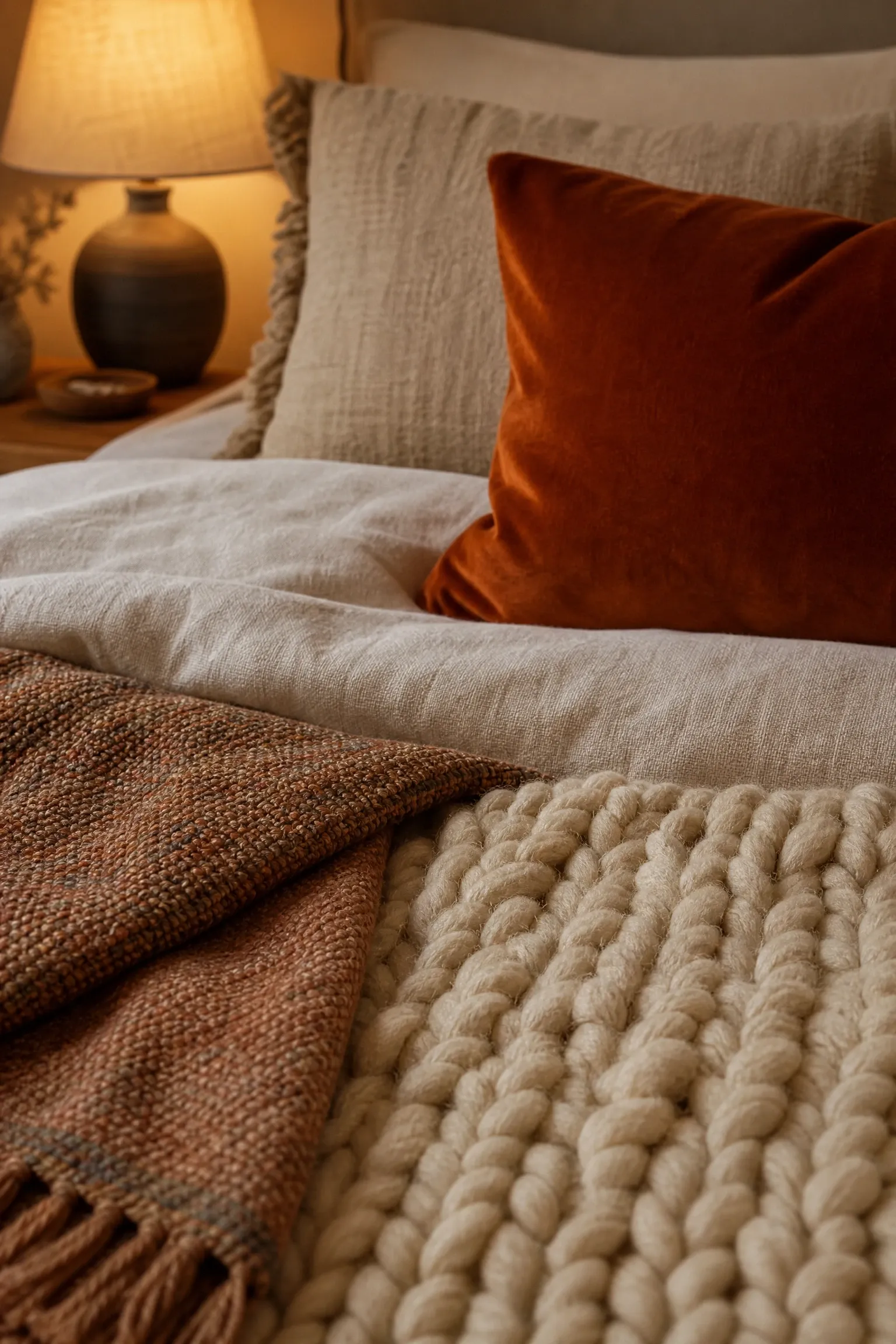
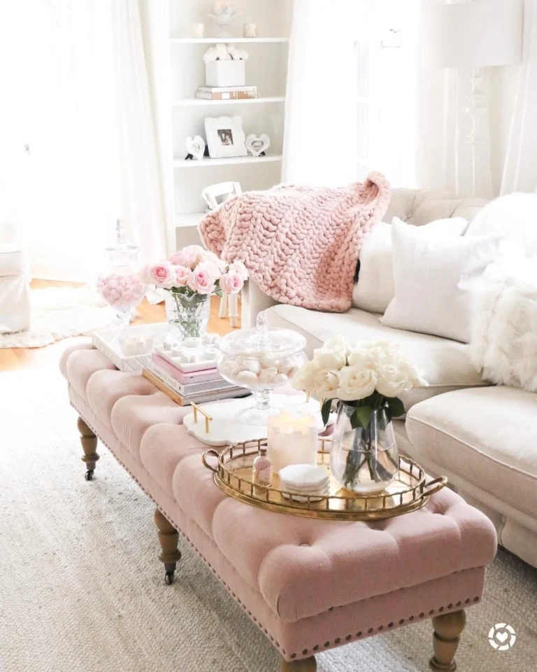
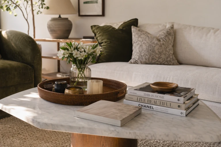
A room can have great furniture, a good color palette, and decent lighting and still feel flat. When that happens, the culprit is almost always a lack of textural variation. Texture is what gives a room its physical character and makes it feel rich and layered rather than showroom-flat. In practice, this means deliberately bringing together materials with contrasting tactile qualities: a linen sofa against a chunky wool throw, a smooth marble coffee table next to a rattan side chair, a glossy ceramic vase on a rough-hewn wooden shelf. The contrast between smooth and rough, soft and hard, matte and shiny is what creates visual interest and makes a room feel genuinely inhabited rather than staged. This is where a lot of budget decorating wins happen, because texture is often more affordable than furniture: a woven jute basket, a velvet cushion, a knitted blanket, a raw clay pot. None of these are expensive individually, but together they add enormous depth to a space. The Japandi aesthetic, which blends Japanese minimalism with Scandinavian functionality, is particularly good at demonstrating how texture can do the work that color and pattern do in busier interiors. If your room feels boring but you are not sure why, add texture before you add anything else.
Designer Note: Aim for a minimum of four different textures in any main room. Start with the largest surfaces (upholstery, flooring, walls) and work inward to smaller accessories and soft furnishings.
When you walk into a well-designed room, your eye knows immediately where to look first. That is the focal point at work, and every room needs one. In rooms that lack a clear focal point, the eye wanders without landing anywhere satisfying, and the space ends up feeling directionless and a little uncomfortable even if you cannot articulate why. In some rooms, the focal point is given to you: a fireplace, a large window with a great view, an architectural feature like a coffered ceiling or an exposed brick wall. In rooms without these natural anchors, you have to create one. A large piece of artwork hung at eye level above the sofa or bed is the most straightforward approach. A dramatic wallpapered accent wall is another. A gallery wall with a clear center of gravity, or a statement light fixture positioned over a dining table, can also serve this purpose effectively. Once you have identified or created the focal point, every other element in the room should support rather than compete with it. Furniture should orient toward it, lighting should highlight it, and the color palette should give it the visual weight it deserves. A common mistake is having multiple competing focal points in one room, which creates visual noise and makes the space feel unsettled.
Designer Note: If you are working with a blank, featureless room, consider a bold paint color or removable wallpaper on a single accent wall as a fast and relatively low-commitment way to establish a focal point.
10. Invest in One Statement Light Fixture Per Room
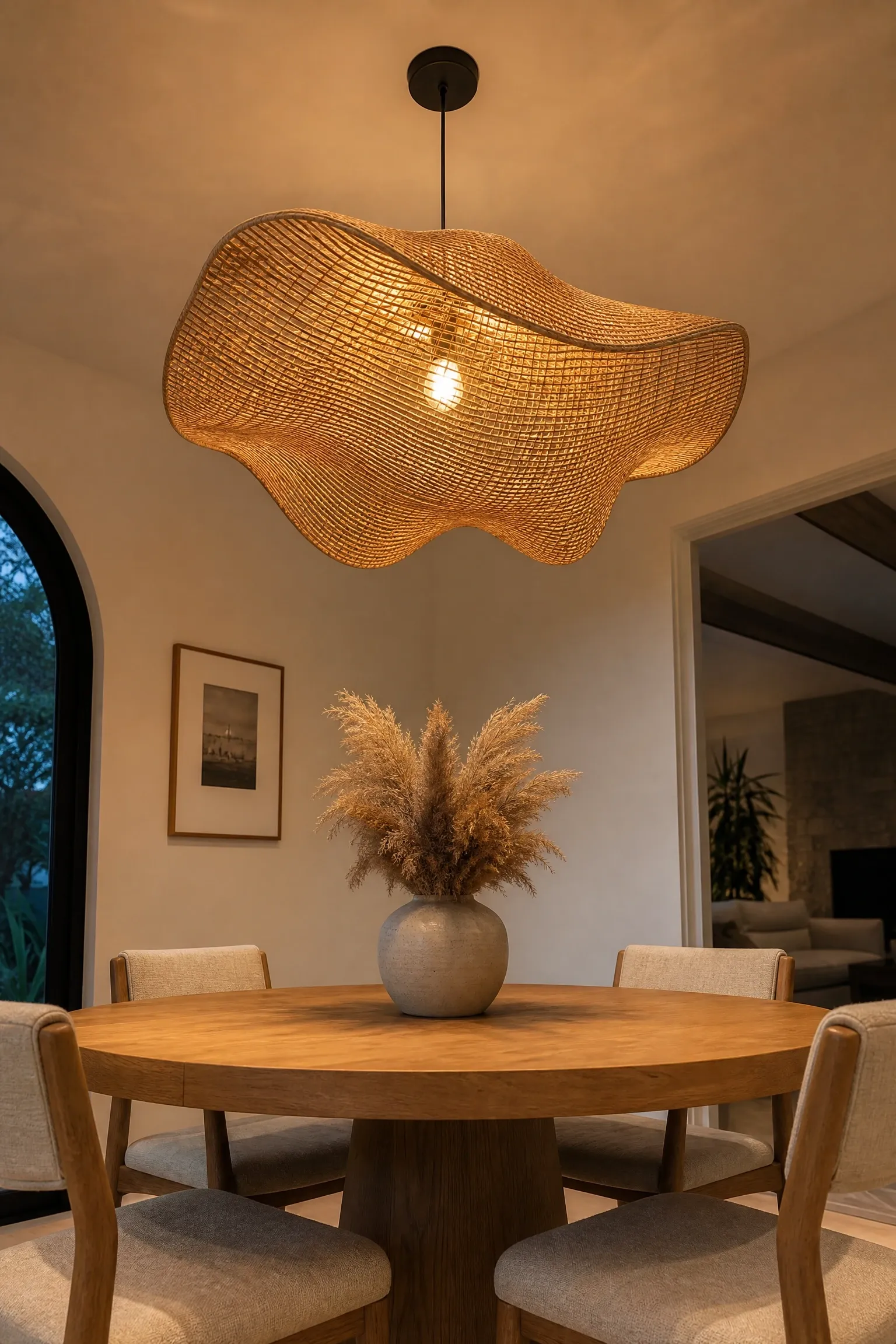
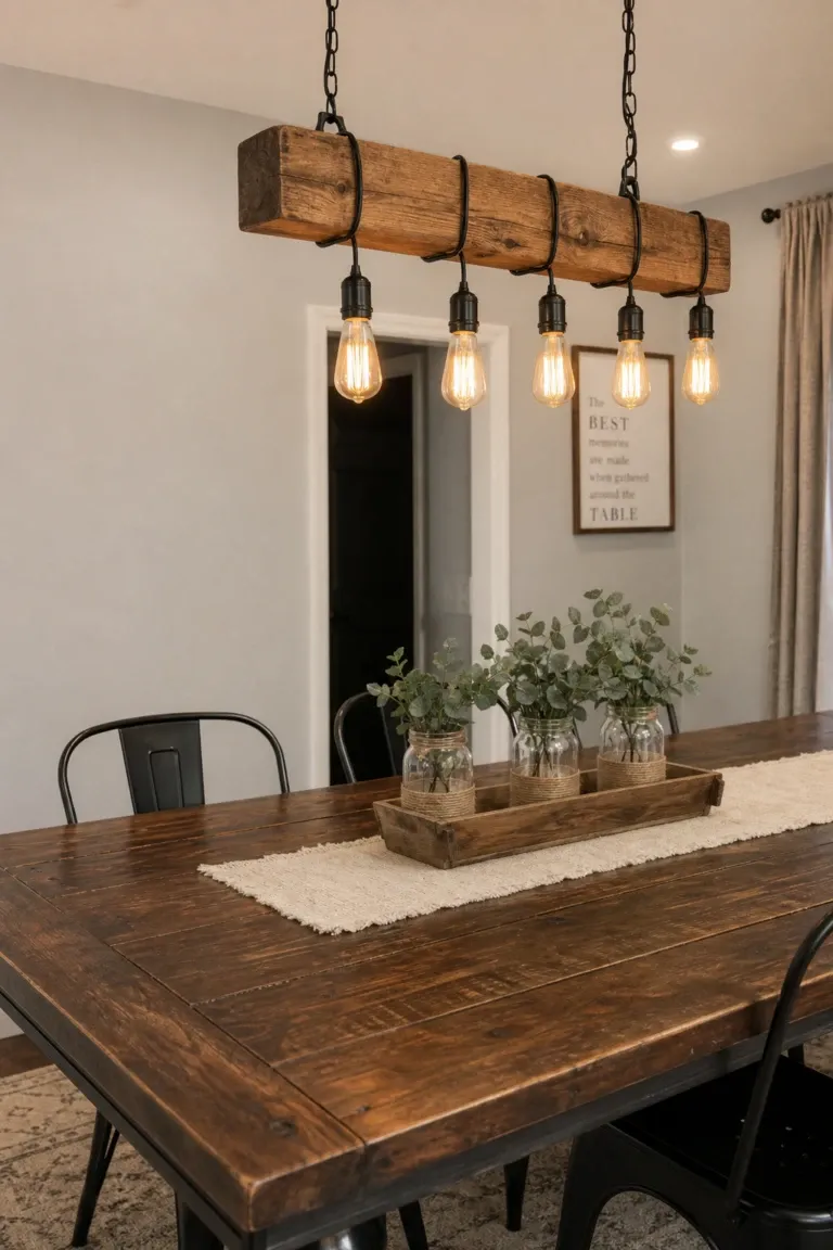
If there is one place in a room where spending a little more makes a disproportionate difference, it is the main light fixture. A beautiful pendant, chandelier, or sculptural ceiling light functions simultaneously as a light source and a piece of art, and its effect on the overall feel of a room is significant. People often spend considerable amounts on sofas, rugs, and artwork, and then fit a builder-grade flush mount ceiling light that undercuts everything else in the room. Swapping out that fixture for something with real presence, whether that is a rattan pendant for a boho coastal look, a cluster of glass globes for something more contemporary, or a plaster dome for a minimal Japandi-influenced room, instantly signals that the space has been thought about. Dining rooms and entryways are particularly good candidates for this investment because the fixture is unobstructed and becomes a genuine centrepiece. In bedrooms and living rooms, a pendant or chandelier works best when paired with additional lower-level lighting, as it sets the mood rather than doing all the functional heavy lifting. If a high-quality fixture is not in the budget right now, a well-chosen floor lamp with an interesting silhouette can achieve something similar at a lower price point while you save up.
Designer Note: When sizing a pendant or chandelier for a dining table, the fixture should be roughly half to two-thirds the width of the table, and hang 30 to 36 inches above the table surface.
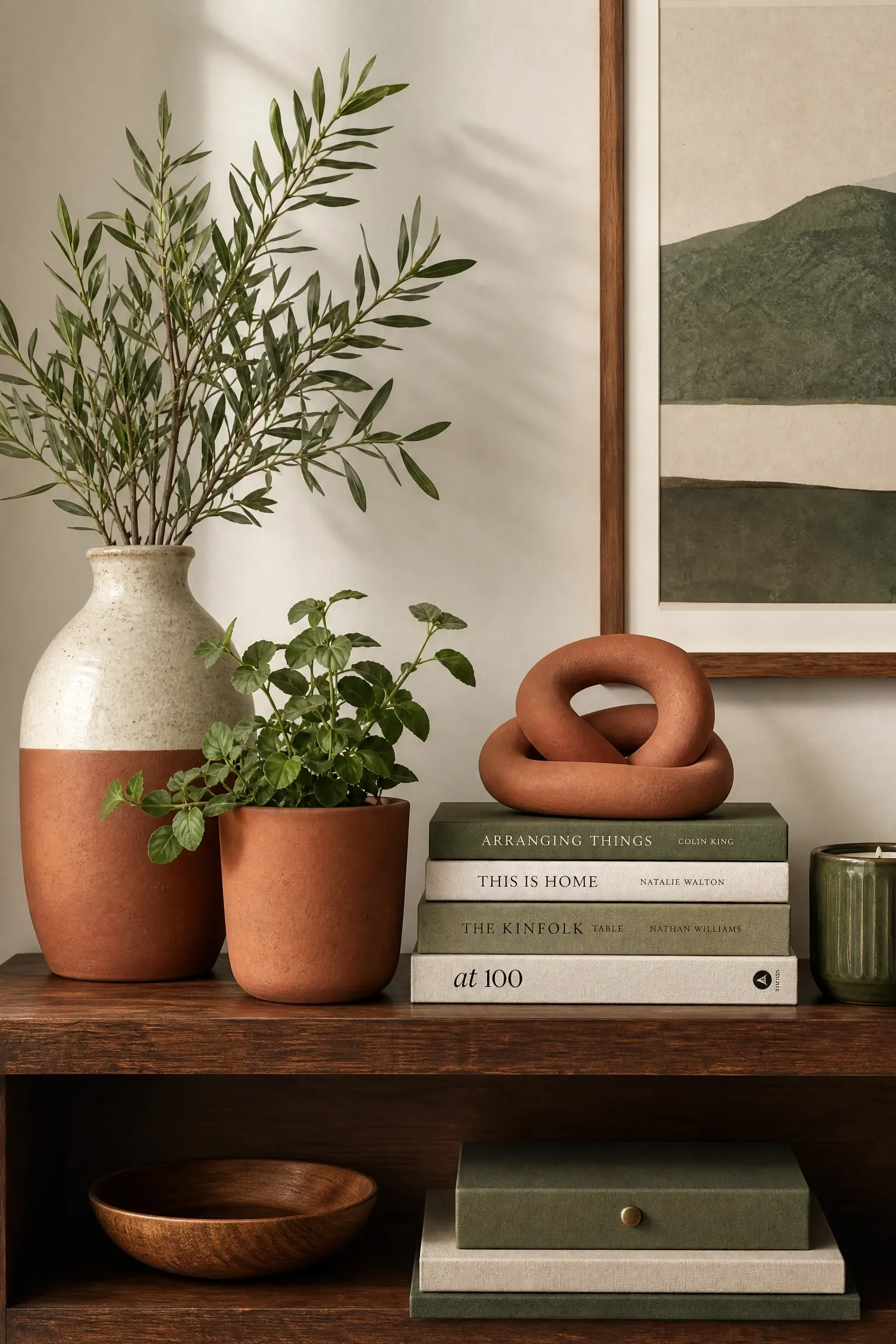
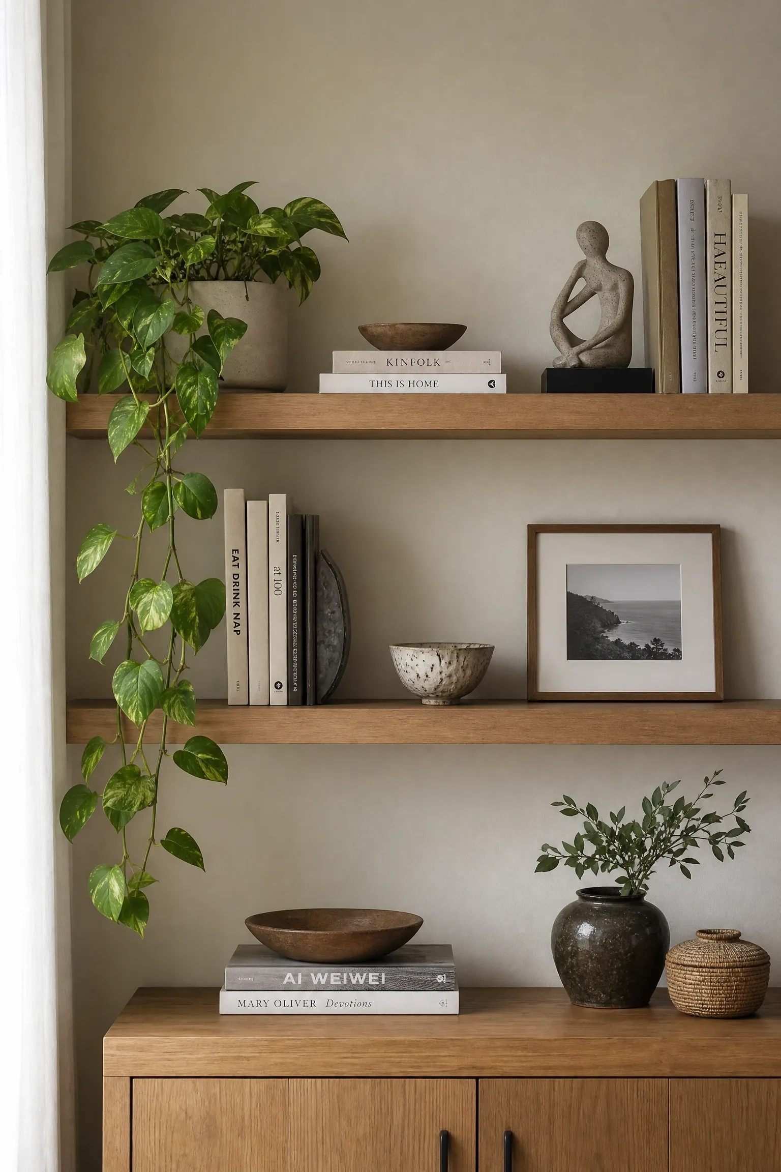
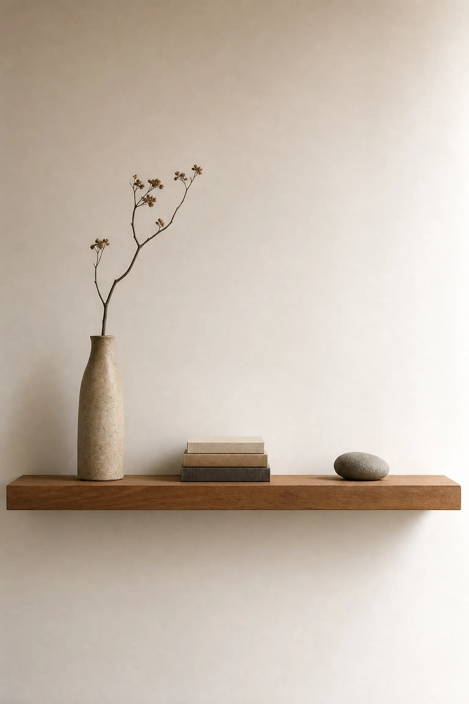
A shelf that is completely full looks cluttered. A shelf that is completely empty looks forgotten. The sweet spot sits somewhere in between, and getting there requires a little editing that most people skip. The approach that tends to work best is grouping objects in odd numbers, mixing varying heights within each group, and leaving deliberate negative space between clusters so the eye has a place to rest. Books are a natural shelf staple, but they do not have to stand spine-out in the traditional way. Stacking a few horizontally and placing a small object on top creates visual variety and breaks the monotony of a single row. Plants add life and color, and trailing varieties like pothos or string of pearls add movement that static objects cannot provide. The scale of objects matters too: one large ceramic vase will always read as more sophisticated than five small ones crowded together, and one substantial sculpture creates a stronger focal point than a collection of tiny figurines. If your shelves feel chaotic, the first step is to remove about a third of what is on them. What remains will almost certainly look better immediately, and from there you can begin to rearrange with intention.
Designer Note: A simple styling formula: books (stacked and standing), something living (a plant or fresh branch), something personal (a travel find or inherited piece), and something architectural (a geometric sculpture or interesting vessel). Repeat across shelves with variation.
12. Use Paint to Work With Your Light, Not Against It
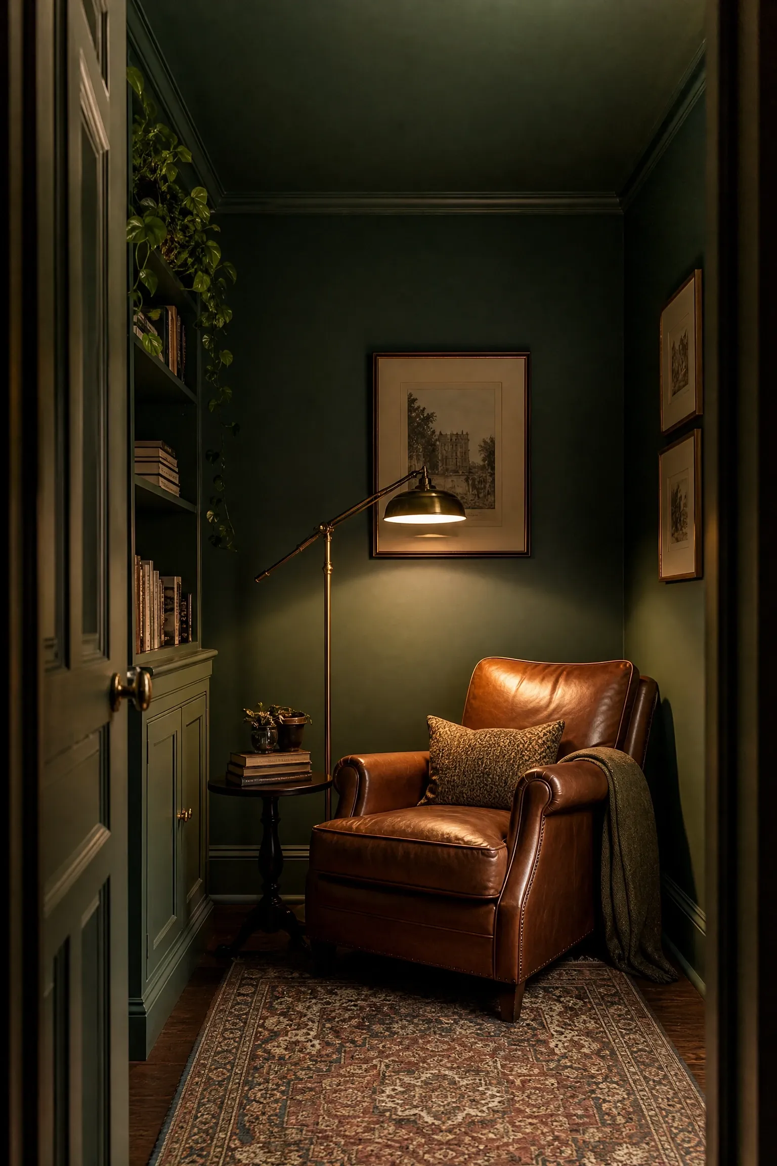
Paint is the most affordable and most impactful thing you can do in a home, and getting it right comes down almost entirely to understanding how your light works. A color that looks warm and inviting on a north-facing wall in a design showroom can look flat and dull in your south-facing living room, and a shade you loved in the paint shop might feel overwhelming once it covers 400 square feet. Always, always test paint on the actual walls of the actual room before committing, and observe the sample at different times of day and under both natural and artificial light. In rooms with limited natural light, very dark colors can work surprisingly well: a deep navy or forest green on all four walls creates a cocooning, intimate atmosphere that a pale greige simply cannot achieve. In sunny rooms, softer whites and warm neutrals tend to perform better than pure bright white, which can read as harsh and stark in strong light. The finish matters too: matte and eggshell finishes are forgiving on imperfect walls and feel luxurious, while satin and semi-gloss are more practical in high-traffic or moisture-prone areas but reflect more light and can highlight wall flaws. Painting the ceiling the same color as the walls, or slightly lighter, is a technique designers use to make low-ceilinged rooms feel more cohesive and envelope-like.
Designer Note: When testing paint samples, paint a piece at least 12 by 12 inches on the actual wall, not on a white card or piece of paper. The surrounding colors and the room’s light sources will change how the color reads significantly.
13. Bring in Plants as a Design Element, Not an Afterthought
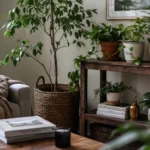
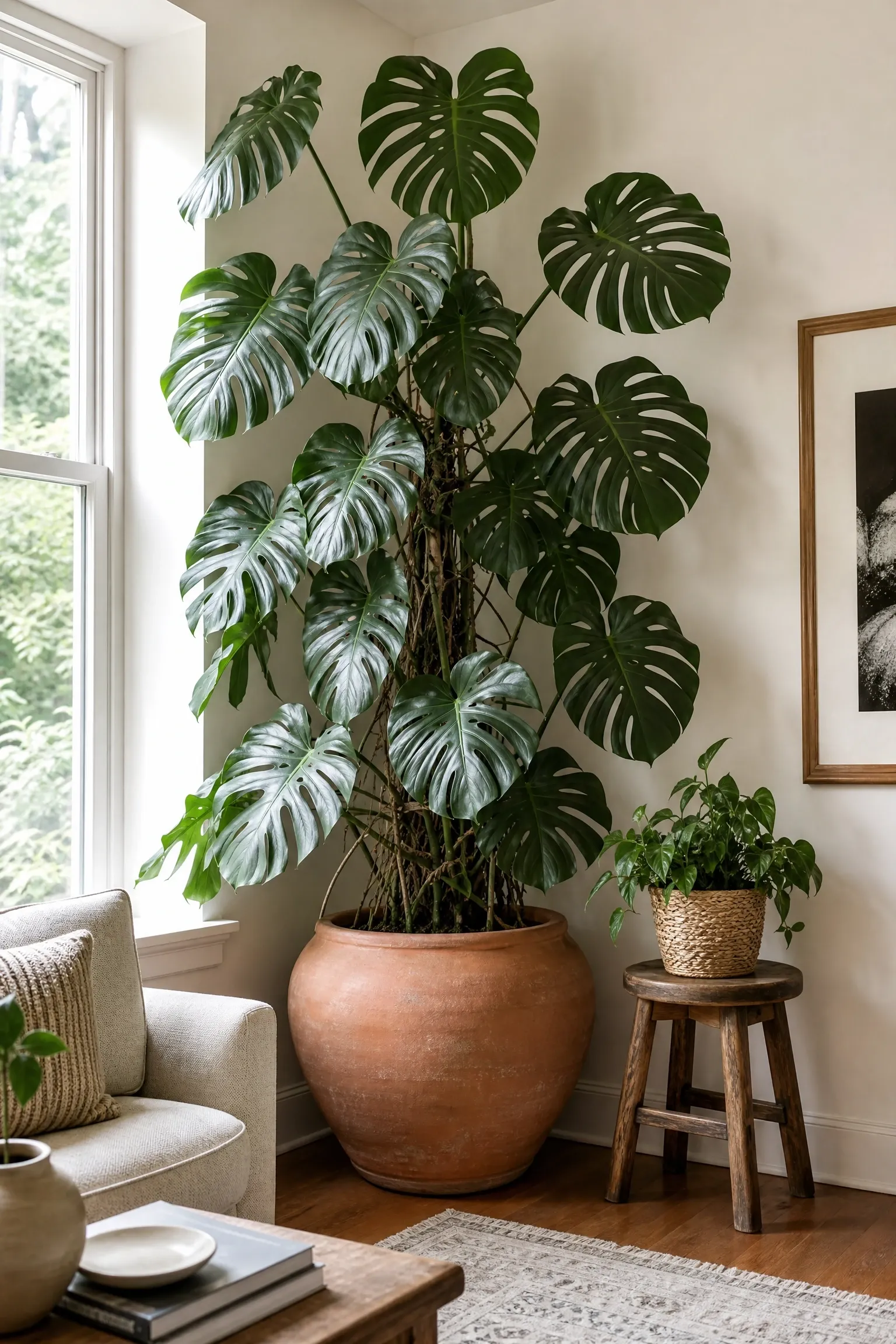
There is a reason every well-styled home you have admired in a design publication has plants in it. Beyond the obvious air-purifying benefits, plants add color, scale, texture, and most importantly a quality of aliveness that no object can replicate. The key is treating plants the way you would treat any other design element: with attention to scale, placement, and variety. A single large fiddle-leaf fig or Monstera deliciosa in a well-chosen ceramic pot can anchor a corner of a living room in a way that a side table never could, filling vertical space and introducing a strong organic silhouette against clean walls. Smaller plants grouped at different heights on a shelf or side table create depth and dimension. Trailing plants hung at ceiling height or placed on top of a wardrobe add movement and soften architectural hard edges. The honest caveat here is that some popular interior plants require more attention than their reputation suggests: fiddle-leaf figs are notoriously fussy about light and watering consistency, while Monsteras and pothos are significantly more forgiving and still look beautiful. If you tend to forget about plants, lean toward drought-tolerant options like snake plants, ZZ plants, or cast iron plants, which thrive on neglect and look genuinely architectural in the right pot.
Designer Note: The pot matters as much as the plant. A generic plastic nursery pot in a beautiful room will undercut everything around it. Repot into terracotta, ceramic, or woven baskets that suit the room’s material palette.
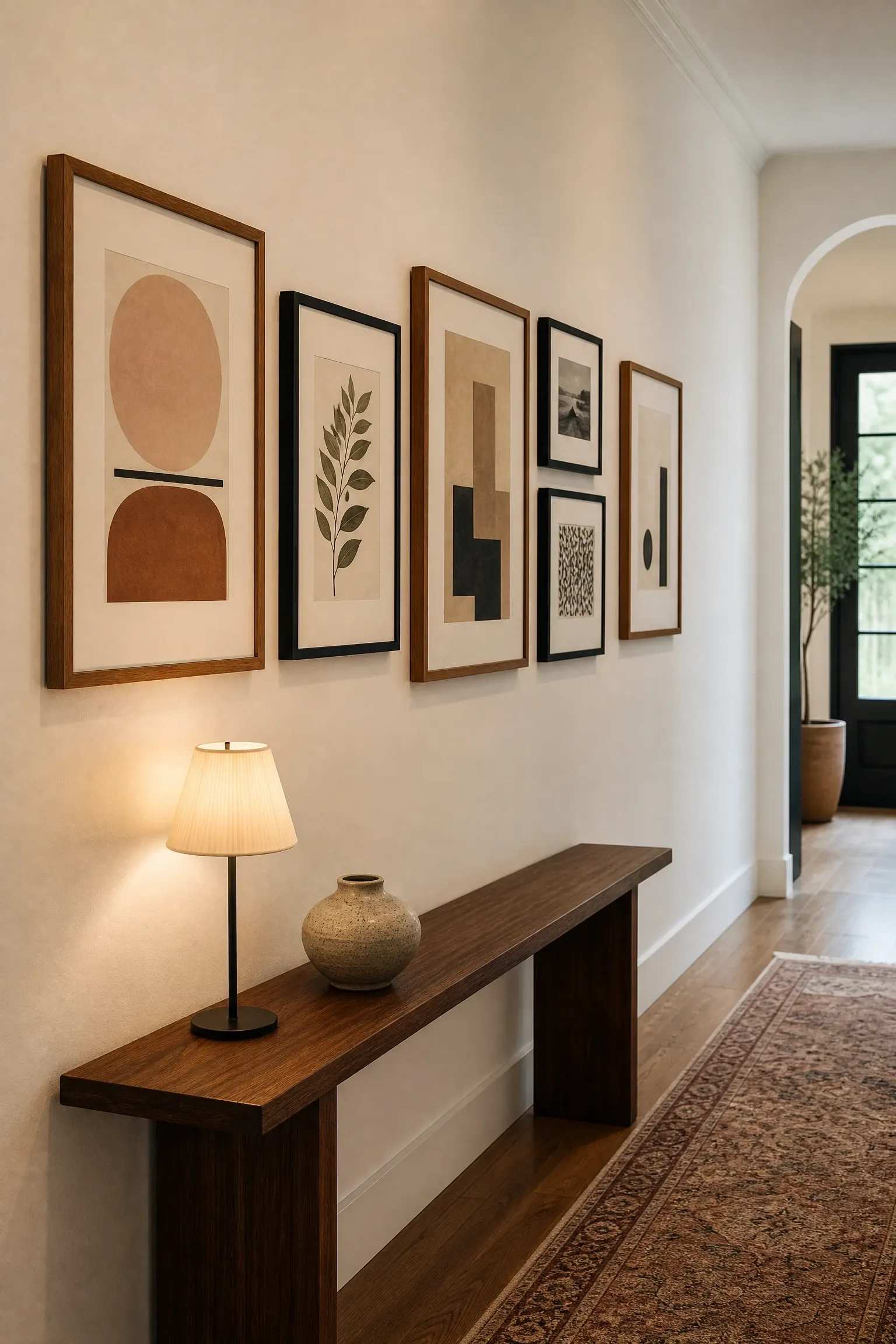
This is one of those tips that takes about 30 seconds to understand and immediately makes you notice every piece of art that has been hung too high. The standard rule used by galleries and professional designers alike is that the center of the artwork should sit at roughly 57 to 60 inches from the floor, which corresponds to average eye level for a standing adult. Most people hang art too high, which forces the eye upward and disconnects the piece from the furniture and objects below it, making the room feel unbalanced. Above a sofa, the artwork should sit 6 to 8 inches above the back of the sofa, and should be roughly two-thirds to three-quarters the width of the sofa for proper visual proportion. A narrow piece of art above a wide sofa looks lost; a piece that is nearly as wide as the sofa feels too close in scale. For gallery walls, the goal is to treat the entire arrangement as a single piece: find the center of the wall space and work outward from there, keeping the gaps between frames consistent at 2 to 3 inches. Mixing frame sizes works well; mixing too many different frame finishes tends to look scattered rather than collected unless there is a strong colour thread running through the artwork itself.
Designer Note: Before hammering a single nail, cut out paper templates of each piece and tape them to the wall. Rearrange until you are happy, then use the templates to mark your hanging points precisely.
There is a tendency, especially in a home you have lived in for a while, to accumulate objects until every surface is covered and every shelf is full. The instinct is understandable: these things have meaning, they were gifts, they represent memories. But overcrowding a room is one of the fastest ways to make it feel smaller, more anxious, and harder to clean. Negative space, which is the deliberate empty area around and between objects, is not wasted space. It is what allows the eye to appreciate the things that are there. In a room that breathes, a single beautiful object on a wide shelf carries ten times more visual weight than the same object crowded among ten others. The editing process is uncomfortable at first. A useful technique is to remove everything from a surface or shelf, live with it empty for a day or two, and then add things back selectively, only returning items that genuinely earn their place. Things that are sentimental but not beautiful can find a home in a drawer, a box, or a memory book rather than on display. Wabi-sabi, the Japanese design philosophy that finds beauty in imperfection and simplicity, is a useful mindset here: a few meaningful, imperfect objects displayed with space around them will always feel more personal and more sophisticated than a crowded shelf of perfect things.
Designer Note: If you find it hard to part with objects permanently, try a rotation system: box up a portion of your decorative items and swap them seasonally. Everything gets displayed eventually, and your surfaces never feel overloaded.
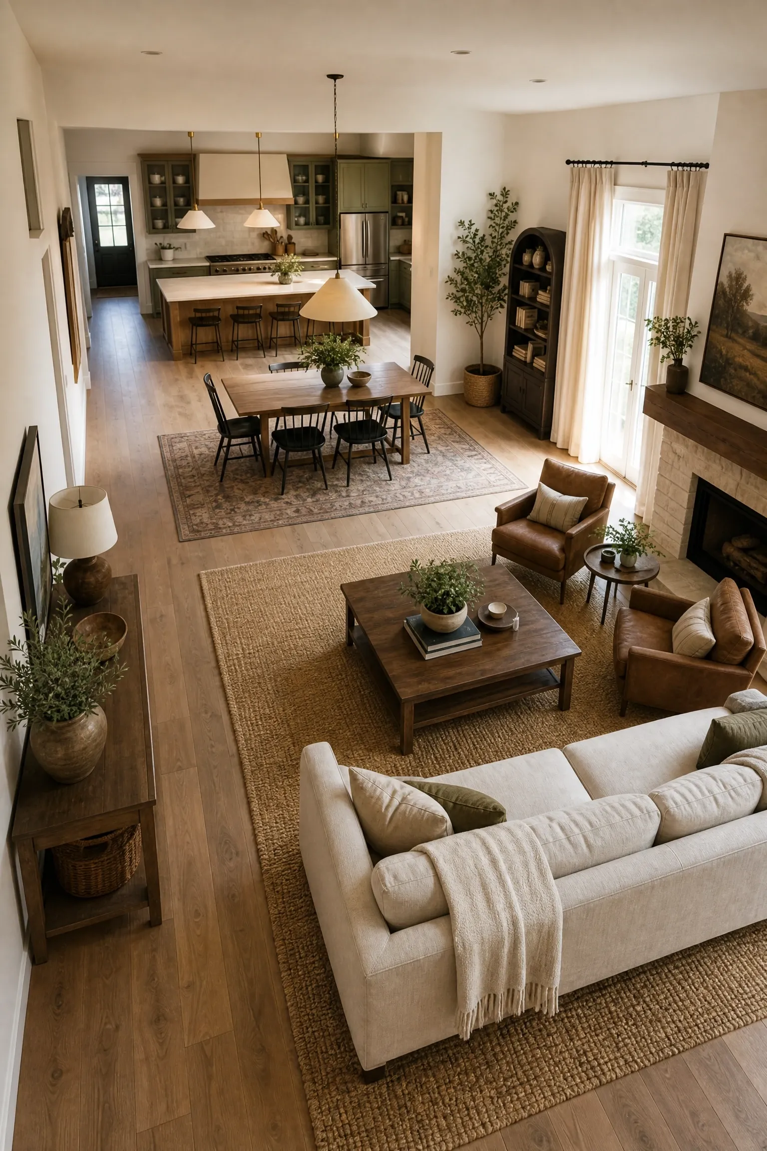
Open-plan living sounds appealing in theory, and in practice it can be wonderful, but it comes with a real design challenge: without walls to define where one activity ends and another begins, the whole space can feel like one large, undifferentiated room that is difficult to decorate and even harder to relax in. The solution is to use furniture, rugs, and lighting to create clear, distinct zones within the open plan without breaking up the visual flow. In a combined kitchen, dining, and living space, the area rug is your most powerful zoning tool: one rug under the sofa grouping defines the living area, and the visual boundary it creates is immediately readable even without a wall. Pendant lights positioned directly above the dining table anchor the dining zone even when it shares the same floor space as the kitchen. A sofa or bookcase placed with its back to the kitchen creates a psychological barrier between cooking and relaxing without blocking light or line of sight. Color can also help: using the same wall color throughout but varying the accent colors in cushions, art, and accessories in each zone creates subtle variation that signals a change in purpose without disrupting cohesion.
Designer Note: Each zone should have its own dedicated light source positioned within or directly above it. Overhead recessed lighting that covers the whole room evenly is functional but does nothing to define zones or create atmosphere.
Rooms that feel cold and uninviting despite good furniture and a decent color palette are often missing one key ingredient: natural materials. Synthetic materials, while practical, tend to have a visual flatness and a certain sameness that natural ones simply do not. Wood, stone, rattan, linen, cotton, wool, leather, clay, and marble all have a quality of irregularity and depth that comes from being grown or formed naturally, and that quality reads as warmth even before you touch anything. A wooden dining table with visible grain, a stone countertop with natural variation, a linen sofa that creases and softens with use: these things age in a way that feels human rather than manufactured. This does not mean filling your home with rustic or country-style objects. Natural materials work just as effectively in contemporary, minimal, and even industrial interiors. A sleek, minimal bedroom in grey and white becomes immediately warmer with the addition of a linen duvet, a wooden bedside table, and a wool rug. The biophilic design movement, which is increasingly referenced in residential design, is built on the proven idea that human beings respond psychologically and physiologically to natural materials in their environment, experiencing lower stress levels and higher comfort. Budget-conscious tip: rattan, water hyacinth, and seagrass are among the most affordable natural materials and are widely available in a range of furniture and accessory styles.
Designer Note: If a full furniture overhaul is not on the cards, introduce natural materials through accessories first: a wooden tray, a clay pot, a jute rug, a linen cushion cover. The cumulative effect is significant even at small scale.
Low ceilings are one of the most common complaints people have about their homes, and while you cannot actually raise a ceiling without significant construction, you can absolutely make it feel higher through a few reliable visual tricks. Vertical lines are the most powerful tool here: floor-to-ceiling bookshelves draw the eye upward and make the ceiling feel further away. Vertical-stripe wallpaper or panelling has the same effect. Hanging curtains at ceiling height (as mentioned earlier) is one of the single most effective ways to add perceived height. Furniture with lower visual weight, meaning pieces with slimmer legs, lower profiles, and open bases rather than solid bases, keeps the eye low and lets the wall space above breathe. Painting the ceiling the same colour as the walls is counterintuitive but effective: it removes the visual boundary between wall and ceiling and makes the room feel like a continuous envelope rather than a box with a lid. Conversely, painting the ceiling slightly lighter than the walls makes it feel higher. Tall, narrow artwork also guides the eye upward in a way that wide, horizontal pieces do not. In rooms with particularly low ceilings, it is worth avoiding anything that hangs down significantly: pendant lights and chandeliers that drop too low will only reinforce the ceiling height you are trying to conceal.
Designer Note: Avoid horizontal stripes and wide, low-slung furniture in rooms where you want to emphasize height. They work in the opposite direction and will make a low ceiling feel even more pressing.
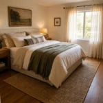
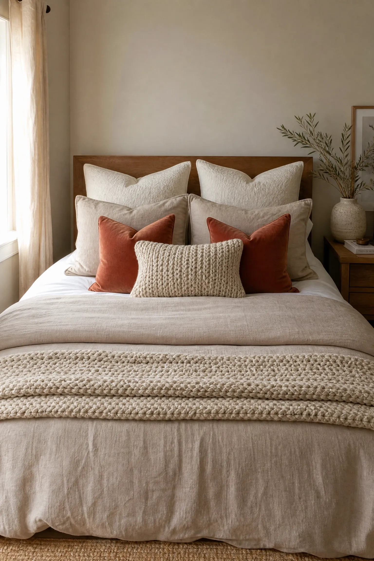
A bedroom that looks pulled-together almost always comes down to the bed, because the bed is the largest object in the room and the eye goes there first. The difference between a bed that looks like a hotel suite and one that looks like it was just straightened up in a hurry is almost entirely about layering. Start with a well-fitted, high thread count base sheet in white or a soft neutral, because it will always photograph well and always coordinate with whatever you put on top. Add a duvet or quilt in your primary bedroom color, then fold a second blanket or coverlet across the foot of the bed in a complementary texture, such as a chunky knit or a linen throw. Pillows are where the layering really happens: two sleeping pillows at the back, two euro shams in front of those for height, two standard decorative shams in the middle, and two to three throw cushions at the front creates that full, considered look without being excessive. The key is keeping the fabrics related in tone even if they vary in texture: a linen duvet with a velvet throw pillow and a chunky knit blanket all in the same warm neutral family will feel deliberately layered rather than mismatched. This is genuinely achievable on a budget because the most visible elements, the throw cushions and the decorative blanket, do not need to be expensive to look good.
Designer Note: If you only do one thing in your bedroom, switch to white base sheets. White bedding instantly feels cleaner, more luxurious, and more hotel-like than any patterned alternative, regardless of what goes on top.
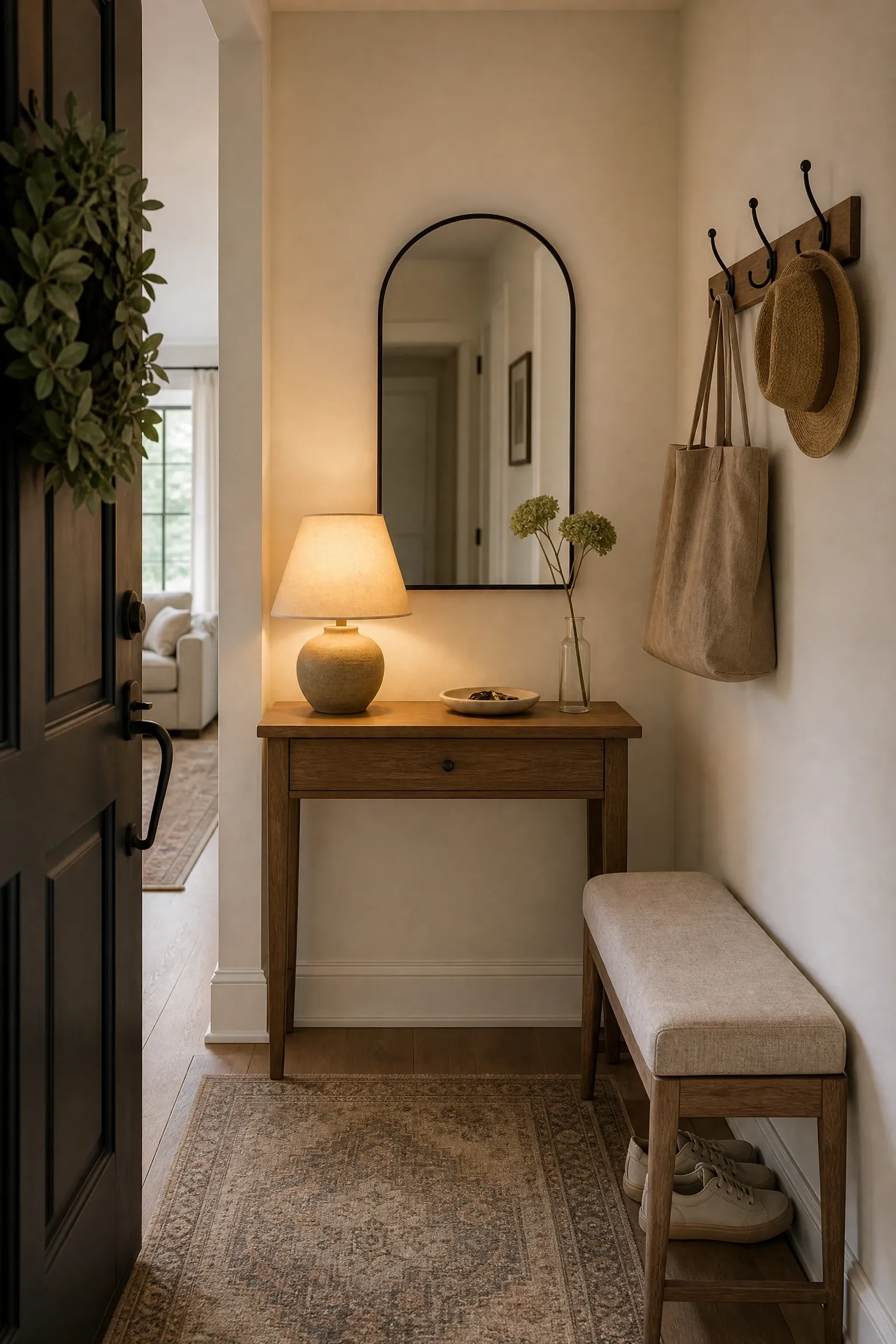
The entryway is the first thing anyone sees when they come into your home, and it sets the tone for everything that follows. Yet it is often the most neglected space in a house, treated as a dumping ground for coats, bags, shoes, and post rather than as a room in its own right. Even a very small entryway can feel intentional and welcoming with a few deliberate choices. A console table with a lamp creates immediate warmth because lamps signal habitation and care in a way that overhead lights simply do not. A mirror above the console serves double duty: it makes the space feel larger and provides somewhere to check your reflection before heading out. A single piece of art, a small plant, and a tray for keys and everyday items on the surface of the console is all you need to turn an entry from chaotic to composed. If the entry is genuinely tiny, a shallow floating shelf at hip height can replace the console table and perform the same function without taking up floor space. Hooks for coats and bags positioned at a consistent height look significantly more organized than a collection of mismatched hooks at different levels, and a low bench or stool provides a place to sit while putting on shoes, which is one of those practical details that dramatically improves daily life in a small but meaningful way.
Designer Note: A small entryway with a lamp, a mirror, one piece of art, and a plant will always feel more designed than a large entryway with nothing in it. Scale is less important than intentionality.
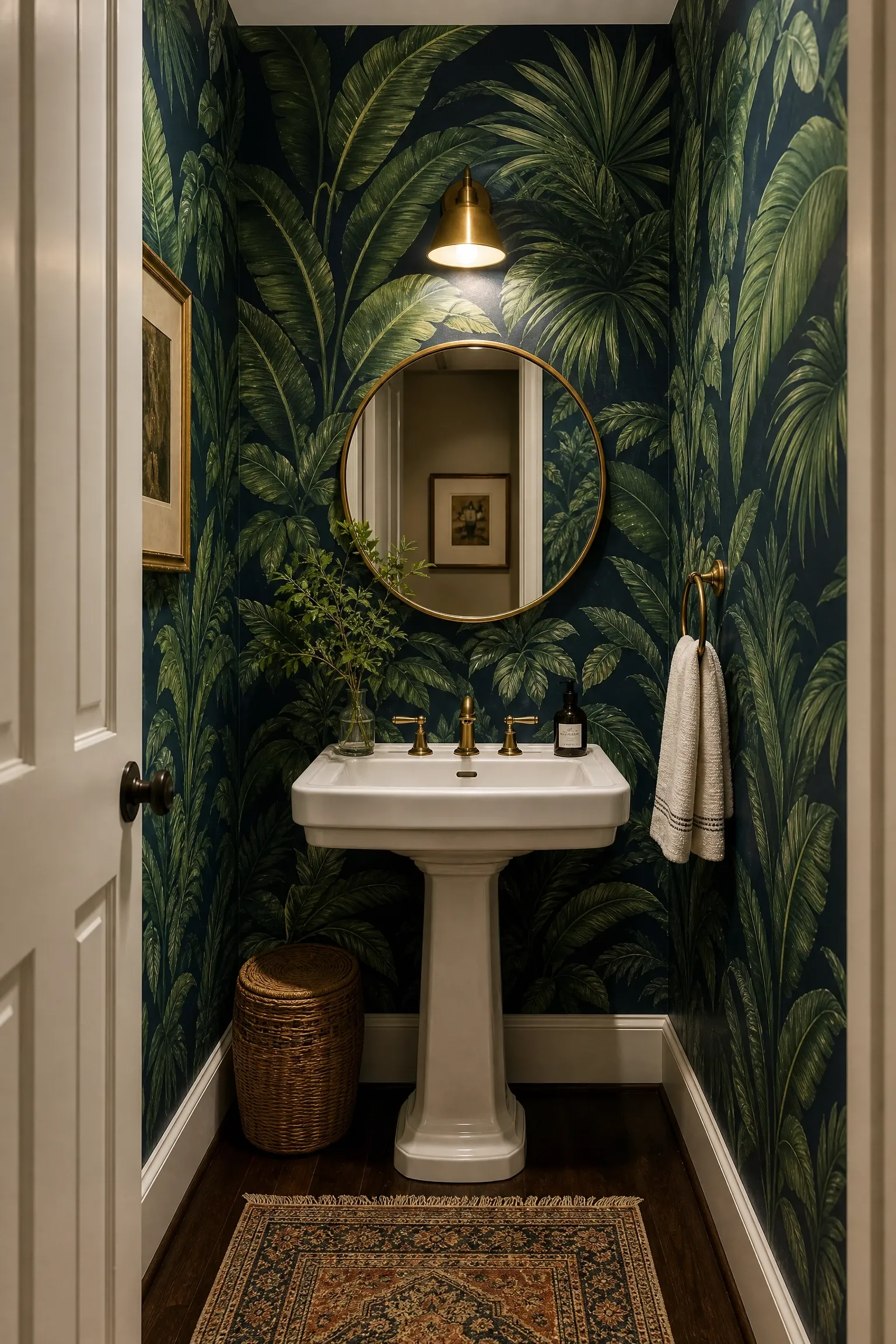
Wallpaper has made a significant comeback in recent years, and the way designers are using it now has moved well beyond the feature wall in a living room. Some of the most interesting applications are in the rooms people least expect: the inside of a bookcase, the ceiling of a small powder room, the back wall of a built-in wardrobe, or the wall behind open shelving in a kitchen. These smaller-scale applications are particularly good for people who love a bold pattern but are nervous about committing to it across a full room, because the impact is significant while the coverage (and therefore the cost) is far more manageable. A powder room, for instance, is one of the best rooms in the house to go bold: it is a small space that people spend only a few minutes in, so a dramatic wallpaper that might feel overwhelming in a bedroom feels perfectly theatrical and fun in a bathroom. Removable peel-and-stick wallpaper has improved enormously in quality over the past few years and is a genuinely good option for renters or anyone who wants the flexibility to change their mind. The honest limitation is that even the best removable options do not always replicate the textural richness and longevity of traditional paste-the-wall varieties, so if you are in your forever home and you love a pattern, it is worth investing in the real thing.
Designer Note: Wallpaper the inside back panel of a bookcase for a fraction of the cost and effort of a full room installation. It frames the objects on the shelves beautifully and adds pattern without overwhelming the space.
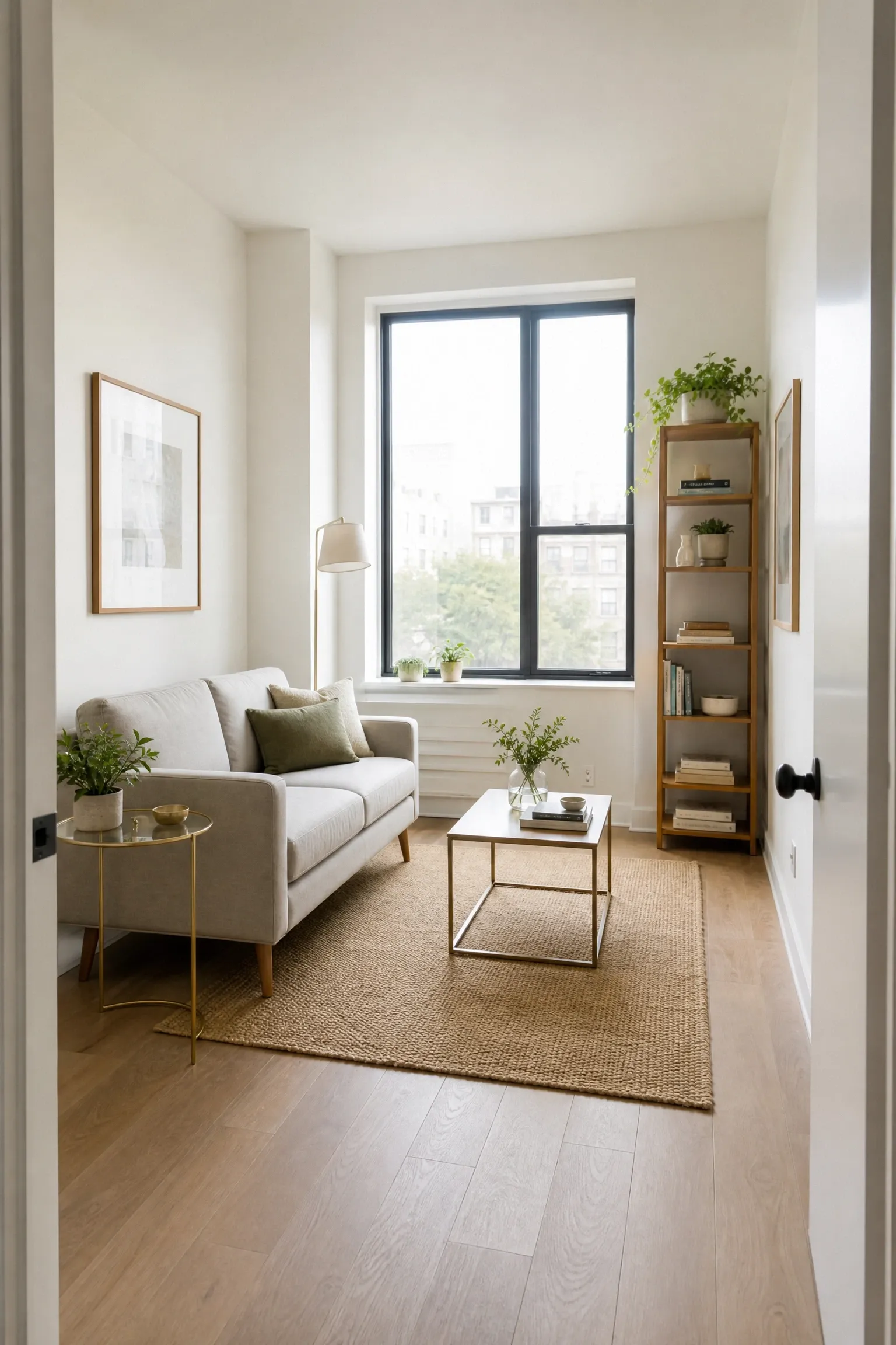
One of the most common reasons a room feels wrong is that the furniture is the wrong scale for the space it is in. A large, deep sectional sofa in a small apartment living room will not feel cozy; it will feel suffocating. A delicate, spindly loveseat in a large, high-ceilinged room will not feel refined; it will feel lost. Scale is about the relationship between the size of your furniture and the size of your room, and getting it right requires measuring both before you buy anything. In a small room, furniture with slimmer legs, more compact proportions, and lighter visual weight (glass, lucite, lighter-toned woods) helps the room feel less crowded and keeps sight lines clearer. In a large room, you need furniture with enough presence to fill the space: a generous sofa, a substantial dining table, a large rug. The mistake in large rooms is often under-furnishing: a few small pieces scattered across a big floor plan look timid and unresolved. Visual weight matters here: a solid, dark-stained wooden table reads as heavier and more grounding than a glass table of the same size, which makes it a better choice for large rooms where you want to anchor the space. Always measure your doorways, hallways, and stairwells before purchasing large furniture pieces, particularly sofas and wardrobes, as the number of beautiful purchases that have failed to make it past the front door is almost too painful to contemplate.
Designer Note: Use painter’s tape on the floor to mark out the footprint of a piece of furniture before you buy it. Living with that outline for a day or two will tell you immediately whether the scale feels right in the actual room.
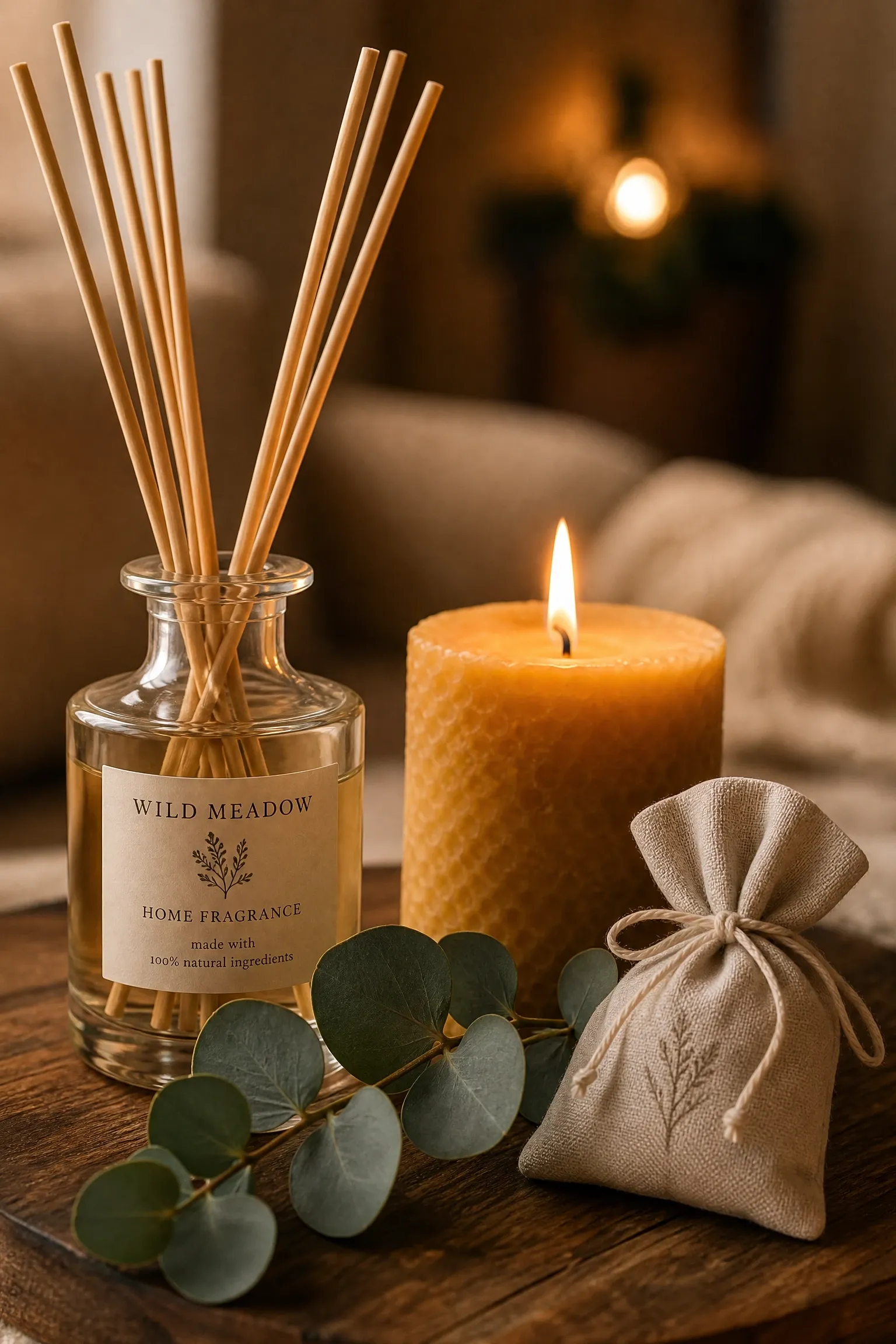
This is the tip that people most often leave out of their interior design thinking, and it is arguably one of the most powerful. Scent is processed by the limbic system, the part of the brain most directly linked to emotion and memory, which is why a particular smell can shift your mood faster than almost any visual change. A home that smells good feels more designed, more cared for, and more welcoming, and that quality is immediately noticeable even to guests who cannot consciously identify why the space feels so inviting. This does not mean aggressive synthetic air fresheners or plug-in diffusers that smell like the cleaning aisle. The best approach is subtle: a quality reed diffuser in a scent that complements the room’s overall character (woody and warm for a living room, clean and herbal for a bathroom, soft and floral for a bedroom), a natural beeswax or soy candle burned for an hour in the evening, or simply the smell of fresh flowers or herbs kept in a vase. Real estate agents have known for decades that the smell of baking bread or fresh coffee makes a home feel immediately more comfortable and appealing. In your own home, developing a signature scent that runs through several rooms creates a sense of cohesion and signature that is surprisingly effective. Just be careful with intensity: a scent that is too strong is as unwelcoming as one that is absent.
Designer Note: Choose scents from the same family for different rooms to create continuity. For example, a cedar and sandalwood diffuser in the living room paired with a lighter vetiver candle in the bedroom will feel related rather than conflicting.
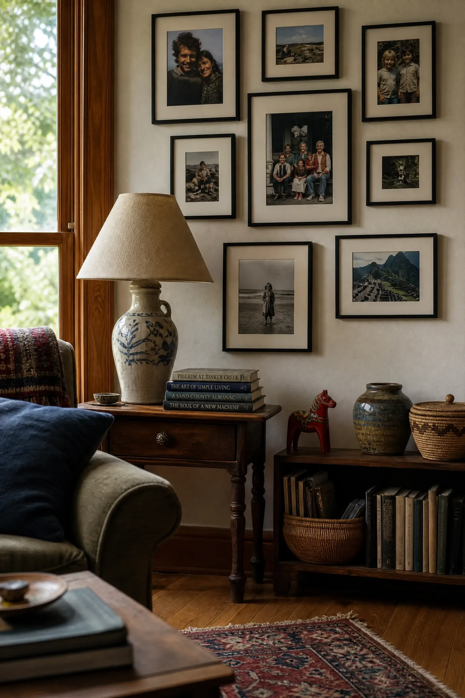
All of the tips above are tools, and like any tools they are most effective when used in service of something personal. The rooms that stay with you after you have visited them are rarely the ones that looked most like a showroom. They are the ones that felt genuinely inhabited: a shelf lined with books that were clearly all read, a wall of family photographs arranged with obvious care, a piece of furniture that has a story attached to it, a collection of objects gathered from travels and markets and inherited with meaning. Personal objects are not obstacles to good design; they are the point of it. The goal is not to hide who you are behind a perfectly intentional neutral palette, but to find a way to express who you are with enough intention and craft that the room feels both personal and beautiful. This might mean building a gallery wall entirely of family photographs printed in black and white and framed consistently. It might mean displaying a collection of vintage ceramics in a color that works with your palette. It might mean keeping a piece of furniture from your grandmother even though it does not perfectly match everything else, because the room is richer for having something in it that no one could buy. A home designed with intention and honesty, where every object has a reason for being there, will always feel more compelling than a perfectly staged room with nothing personal in it at all.
Designer Note: The most successful personal collections are displayed with some consistency, whether in frame color, object color, material, or theme. Consistency changes a group of random objects into a collected collection.
Bringing It All Together
Good interior design is not about having a big budget or a natural gift for style. It is about understanding a handful of principles well enough to apply them thoughtfully in your own home, in rooms of your own dimensions, with furniture you already own and money you actually have. The 24 tips in this article cover most of what separates a home that feels considered from one that feels random. Some of them, like hanging curtains higher or pulling furniture away from walls, you can act on this weekend for almost no cost. Others, like investing in quality lighting or building a coherent color palette, take more time and thought but pay dividends for years.
The advice that holds across all of them is the same: be intentional. Choose things because they work in your specific room and your specific life, not because they looked good somewhere else. Edit more than you add. Let your home reflect who you are rather than who you think you should be. A home that feels genuinely yours, designed with care and lived in with pleasure, is always going to be more interesting and more comfortable than a home that looks like it came from a catalog. Start with one room, apply a few of these principles, and see what changes. The difference is usually faster and more noticeable than you expect.
Frequently Asked Questions
What is the most important interior design tip for beginners?
If you are starting from scratch or trying to fix a room that has never felt right, lighting is the single most impactful place to begin. Most rooms rely on one overhead light source, which flattens the space and creates a harshness that no amount of nice furniture or good paint can overcome. Adding a floor lamp, a table lamp, and a dimmer switch to your existing overhead light will change the feel of a room more dramatically than almost any other single investment.
How do I make a small room feel bigger without knocking down walls?
Several of the tips here work together to expand a small space visually. Hang curtains at ceiling height to add perceived height. Use a large mirror placed opposite a window to double the sense of depth and light. Choose furniture with slimmer legs and lighter visual weight. Keep the color palette cohesive and relatively light on the main surfaces. And resist the urge to push all furniture against the walls: counterintuitively, grouping furniture slightly away from walls with space behind it makes a small room feel more intentional and less cramped.
How do I choose a color palette if I have no idea where to start?
Start with something you already own and love: a rug, a piece of art, a cushion, or even a piece of clothing. Pull three to five colors from that object and use them in the 60/30/10 ratio described in Tip 5. If you do not have a starting object, look at the colors you tend to wear most often. The shades you reach for repeatedly in your wardrobe are a reliable guide to the palette that will make you feel most at home in your space.
Is it expensive to follow these interior design tips?
Many of the most impactful tips here cost very little or nothing at all. Pulling furniture away from walls, hanging art at the right height, editing your shelves, and rearranging your lighting are all free. Others, like swapping a ceiling fixture, buying a quality rug, or investing in floor-length curtains, involve more spending but deliver results that last for years. A useful approach is to identify the two or three changes that would have the highest impact in your specific room and prioritize those, rather than trying to do everything at once.
How do I mix different furniture styles without it looking chaotic?
The key is finding a common thread between pieces that have different styles. That thread can be color (all your furniture sits within a warm-toned palette), material (wood appears in multiple pieces across different styles), or silhouette (clean lines throughout, even in pieces from different design eras). Mid-century modern and contemporary pieces often mix well because they share clean lines and functional forms. Bohemian and maximalist pieces mix well through shared pattern and color energy. What tends not to work is mixing pieces with no discernible relationship at all. Give your mix a reason to coexist.
How often should I update my home decor?
There is no rule here, and chasing every trend is an expensive and ultimately unsatisfying way to approach your home. A better mindset is to invest in quality for the larger, more permanent pieces (sofa, dining table, bed frame, rugs, curtains) in styles that feel genuinely you rather than fashionable right now, and save flexibility for smaller, less expensive accessories and textiles that can change seasonally or whenever you feel like a refresh. A well-chosen sofa in a good neutral can last 10 to 15 years and look current through multiple rounds of updated cushions, throws, and side tables.