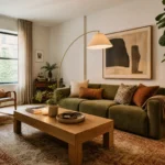
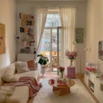
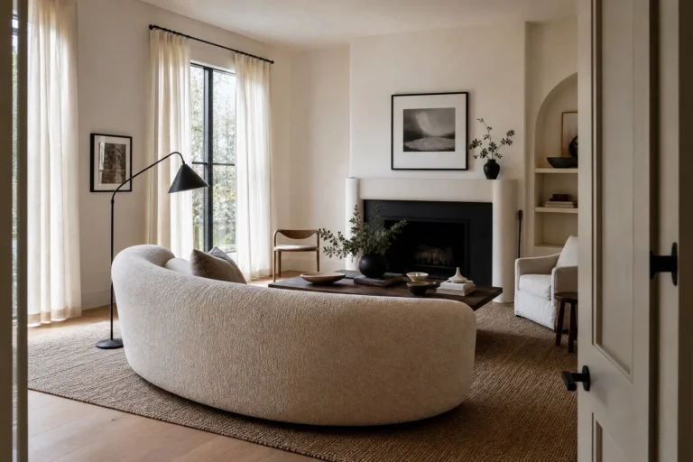
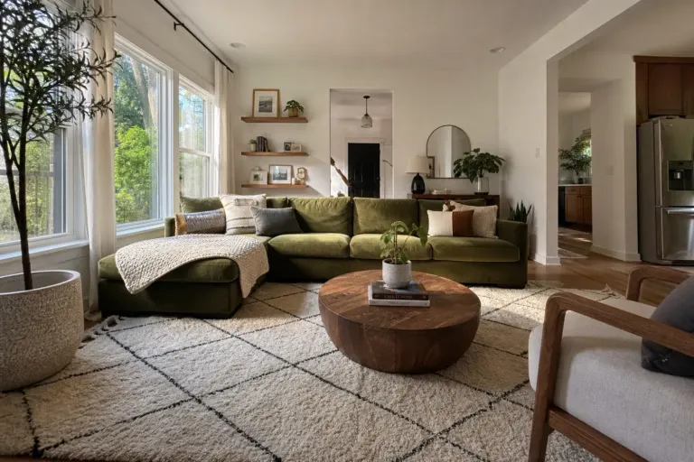
Beige and pink is one of those combinations that sounds almost too safe on paper, until you see it done well and realize how genuinely beautiful it can be. These two colors share the same warm undertone family, which means they don’t fight each other the way contrasting colors can. Instead, they layer together easily, letting you create a room that feels put-together without looking like you tried too hard. Start with a single pink throw or cushion against your existing beige to test the tone before committing to anything permanent.
What makes beige and pink such a workable pairing in a living room specifically is the flexibility. Beige can carry the walls, the larger furniture, and the flooring, while pink does the expressive work through cushions, curtains, artwork, or a statement chair. Or you can flip it entirely and let a dusty rose sofa anchor the room while warm beige tones wrap everything else around it. In this article, you will find 21 ideas organized by style and mood, so you can find the approach that actually matches how you live, not just how a room looks in a photo.
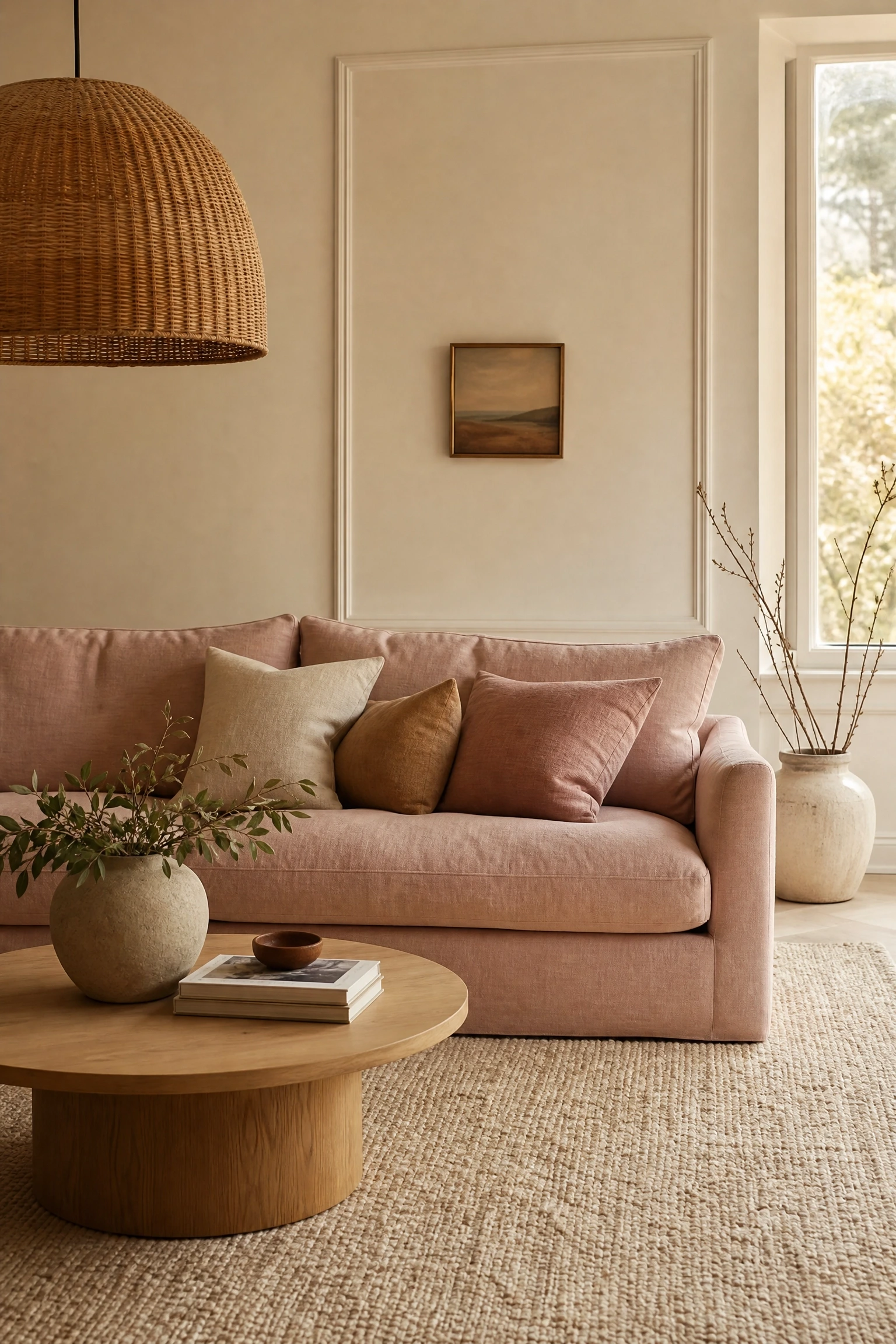
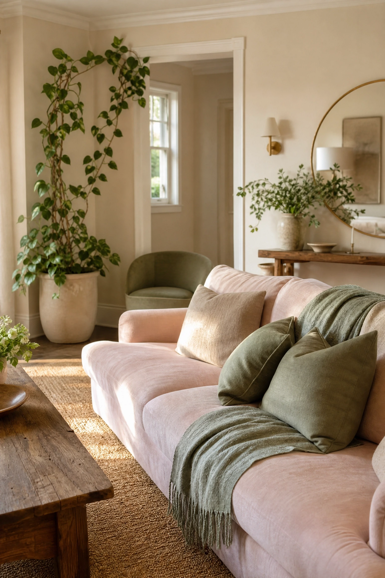
A blush linen sofa is one of the most elegant anchor pieces you can put in a beige-toned living room, and in practice it works better than most people expect because linen carries warmth without looking glossy or overdone. Pair it with ivory or warm cream walls rather than bright white, since stark white will pull the undertone too cool and make the blush read more pink than you probably want. Style the sofa with cushions in caramel, oatmeal, and a deeper dusty rose to build out the tonal layering. For lighting, a linen or rattan shade pendant above a low oak coffee table keeps the material story cohesive. This approach reads as quiet luxury, popular in design publications right now, without the heavy price tag if you source the sofa from mid-market retailers who do slipcover or loose-back linen styles. One honest note: linen shows dust and pet hair quickly, so it works better in lower-traffic rooms or in homes without pets.
Designer Advice: Choose a blush linen sofa with a loose-back cushion style rather than a tight-back for a more relaxed, lived-in feel that still looks intentional.
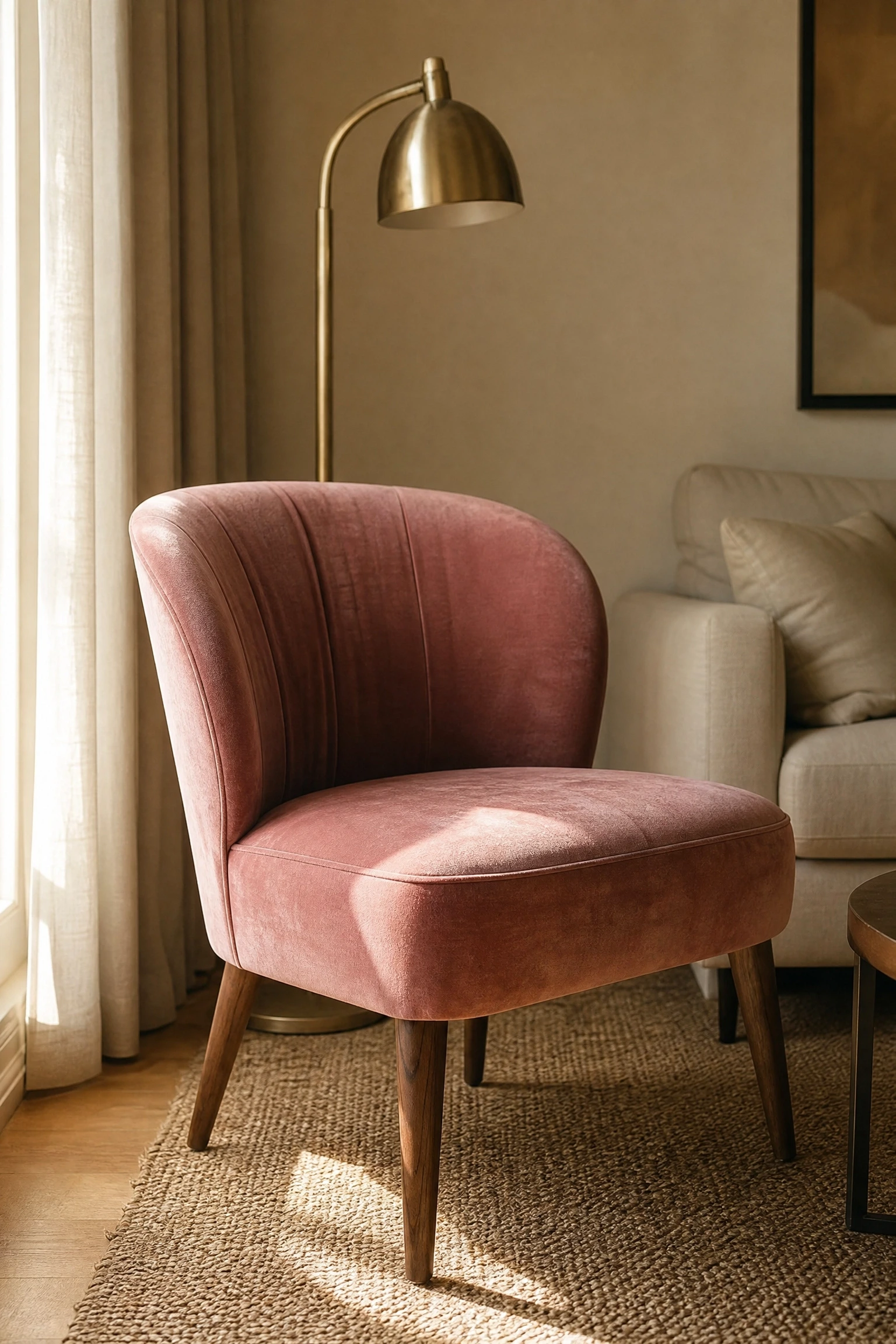
If you are not ready to commit an entire sofa to a pink tone, one dusty rose velvet accent chair can do a remarkable amount of work in a beige living room. Velvet’s light-shifting quality means the chair reads richer in the evening and softer in daylight, which keeps the room feeling dynamic rather than flat. Place it near a window and angle it slightly toward the seating group rather than straight against the wall, which is a common mistake that makes accent chairs look like they forgot to show up. Ground it with a warm taupe or natural jute rug and add a slim brass floor lamp beside it to make the spot feel intentional. This is genuinely one of the most budget-conscious ways to introduce the palette since a single quality accent chair costs far less than reupholstering a sofa. It also lets you test how much pink you are comfortable with before going further.
Quick Tip: Look for chairs with tapered wooden legs in a warm walnut or honey oak finish, which ties the piece into a beige room far more naturally than chrome or black legs would.
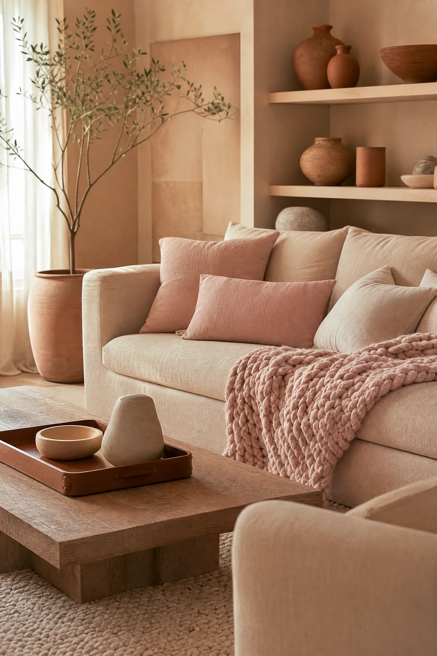
Tonal layering is a technique that professional designers use constantly, where you build a room almost entirely from shades of the same color family rather than introducing sharp contrasts, and in the beige-pink world it produces beautifully calm, cohesive spaces. Think pale peach walls, a warm sand-colored sofa, blush throw cushions, a cream wool rug with a subtle blush undertone, and terracotta clay pots on the shelves. The trick is to vary texture so the room does not feel monotonous: smooth plaster walls, a chunky knit throw, a leather-edged tray, linen cushion covers, and a wicker side table all read differently in the same light while staying within the family. This works especially well in rooms with good natural light, which allows the subtle differences between tones to show up clearly. In low-light rooms, the layers can merge into a single muddy tone, so add a warm-bulb floor lamp to separate them in the evening.
Pro Move: Use a tonal color fan deck at a paint shop to pick three shades from the same strip, one for walls, one for soft furnishings, and one for accessories, so the undertones are guaranteed to match.
4. Plaster Pink Walls with a Neutral Beige Sectional
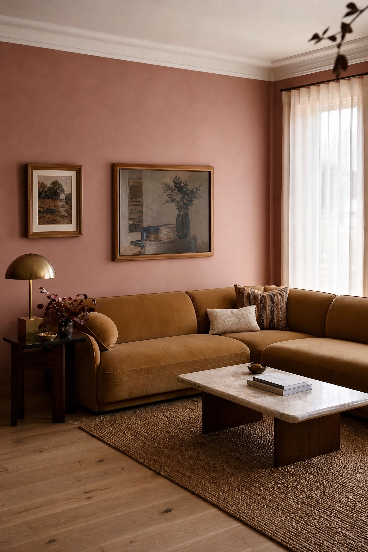
Plaster pink is having a genuine moment right now, and for good reason. It is the kind of pink that interior designers are reaching for as a replacement for flat beige because it has depth, an almost earthy quality that changes character as light moves across the day. When you pair a plaster pink wall with a warm beige or camel sectional, the result feels sophisticated and far more original than the typical white-wall-with-pink-cushions approach. Keep the flooring warm, either a light oak wood floor or a natural sisal rug, to prevent the room from reading too cool. On the walls, skip artwork with heavy black frames because the harshness will cut through the softness of the palette. Instead, go for warm wood, rattan, or thin brass frames with gentle figurative or abstract prints. This idea suits mid-sized to larger living rooms best, since plaster pink on walls can feel heavy in very small spaces with limited natural light.
Heads Up: Plaster pink paint colors vary hugely between brands. Test at least two or three large swatches on your actual wall before committing, since some read lavender and others read salmon depending on your light source.
Warm and Textured: Natural Materials and Earthy Depth
5. Rattan, Jute, and Blush for a Warm Bohemian Feel
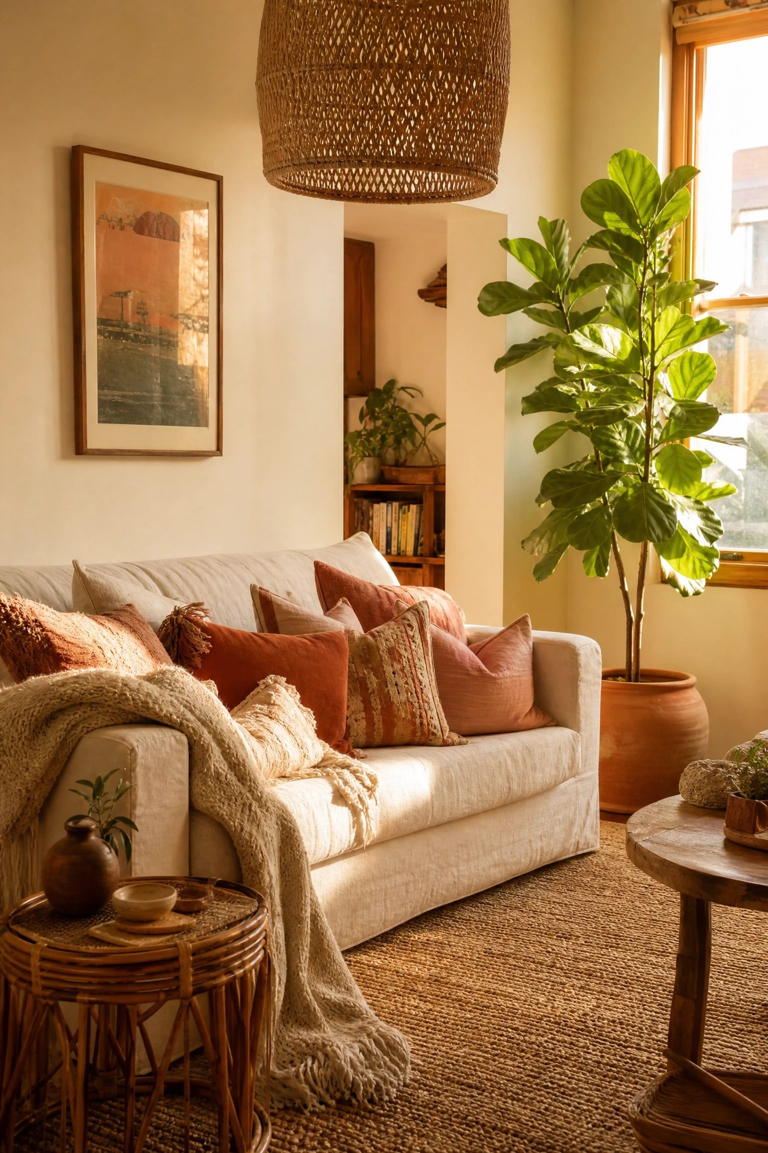
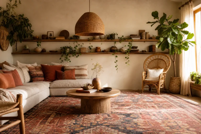
The bohemian approach to the beige-pink palette swaps out the polished for the relaxed, and it works beautifully in casual living rooms where you want warmth without formality. A beige or natural cotton sofa forms the base, layered with blush and terracotta cushions in mixed prints, chunky knit throws, and a large jute or sisal rug that grounds the whole arrangement. Rattan is the hero texture here: a rattan pendant light, a round rattan side table, and even a rattan picture frame or mirror give the room an organic, handmade quality that pairs really well with the softness of blush pink. Potted trailing plants or a fiddle leaf fig in a terracotta pot add life and color without disrupting the palette. This is one of the most budget-friendly versions of the beige-pink living room because rattan and jute pieces are widely available at affordable price points, and secondhand finds often look even better than new.
Reality Check: Natural rattan and jute can shed or fray in high-humidity rooms. If your living room gets damp, look for wicker or water hyacinth alternatives that handle moisture better.
Terracotta sits in the same warm, earthy family as both blush pink and sandy beige, which makes it an incredibly natural third tone to bring into this palette without breaking the mood. Start with warm beige walls and a blush sofa, then introduce terracotta through a ceramic table lamp, a few clay pots on open shelves, a woven throw in amber and rust, or a framed print that pulls all three tones together. This combination is popular in Southwestern and Mediterranean-inspired interiors, but it also works in contemporary spaces as long as you keep the furniture clean-lined rather than rustic. Terracotta can skew warm quite quickly, so use it as a true accent rather than a second base color. One or two terracotta pieces go a long way. The addition makes the room feel grounded and slightly earthy in a way that pure blush-and-beige alone can sometimes lack.
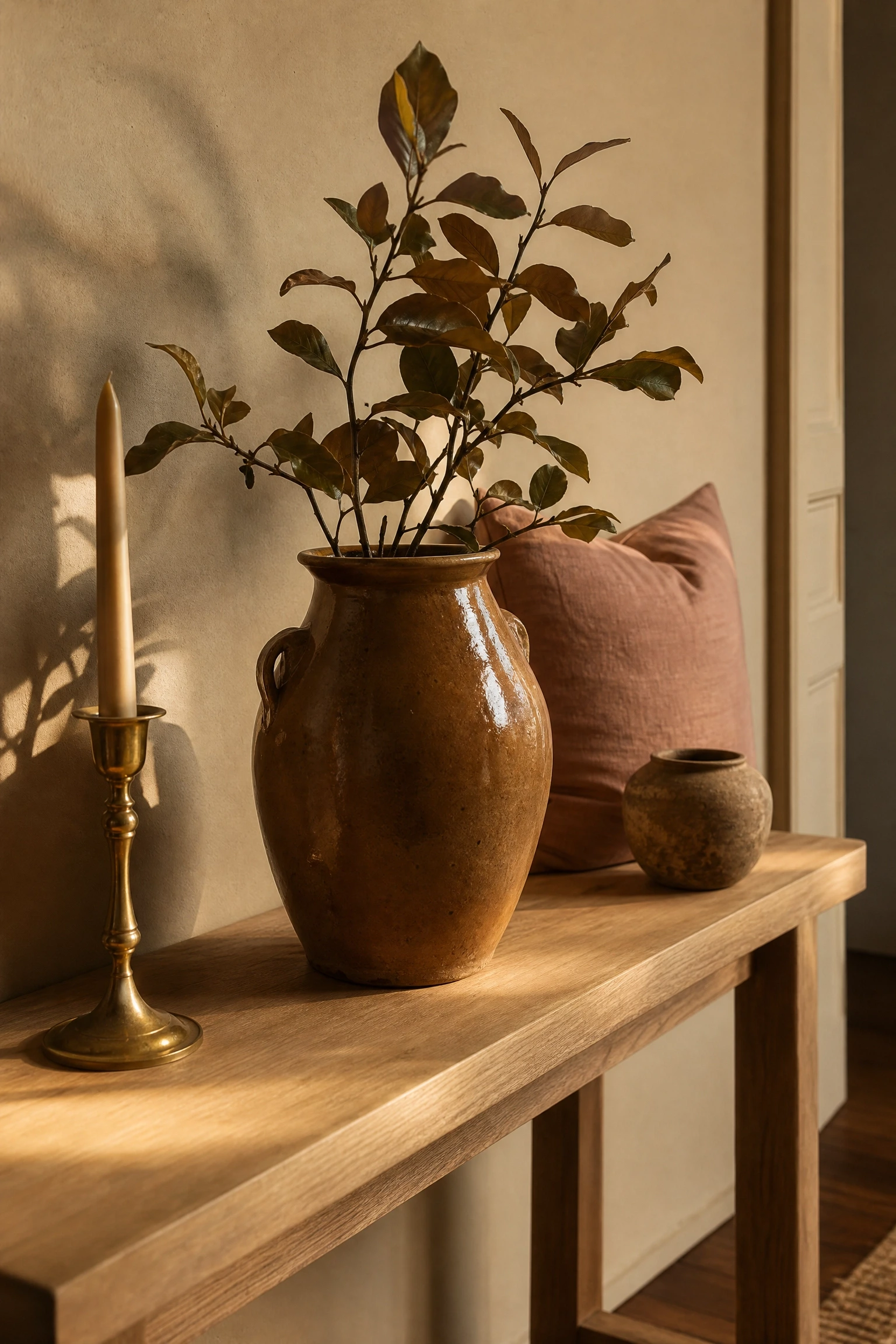
Designer Advice: A single large terracotta-glazed ceramic vase on a low console table carries more visual weight than several small pieces, and it reads more intentional than a cluster of mismatched pots.
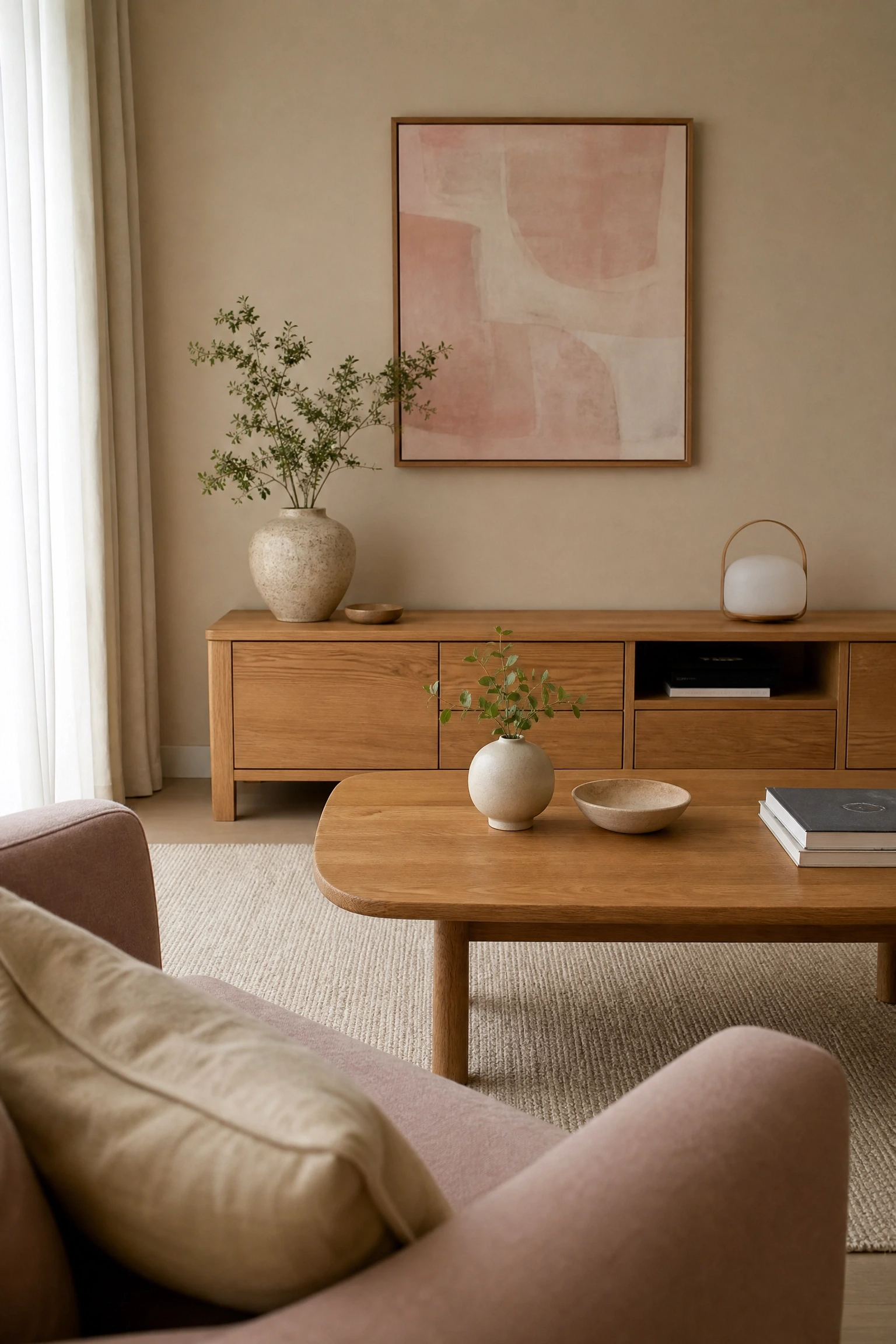
Warm oak furniture is one of the best supporting elements in a beige and pink living room because its honey-yellow undertone bridges the gap between the neutral beige base and the warm pink accents naturally. An oak coffee table, a slatted oak media unit, or a pair of oak side tables all bring material warmth that feels organic and lived-in rather than decorative. Against beige walls, blush linen cushions, and a pink-tinted abstract artwork above a console, the oak pieces act as anchors that prevent the room from feeling too soft or insubstantial. This is fundamentally a Japandi-adjacent approach, meaning Scandinavian simplicity crossed with Japanese warmth, and it tends to photograph well while also being genuinely comfortable to live in. Keep the room free of black accents, which can feel jarring here. Warm brass hardware and fittings work far better and stay within the tonal family.
Pro Move: Source oak furniture with a matte or natural oil finish rather than a shiny lacquer, which keeps the material looking authentic and prevents the pieces from looking cheap even at lower price points.
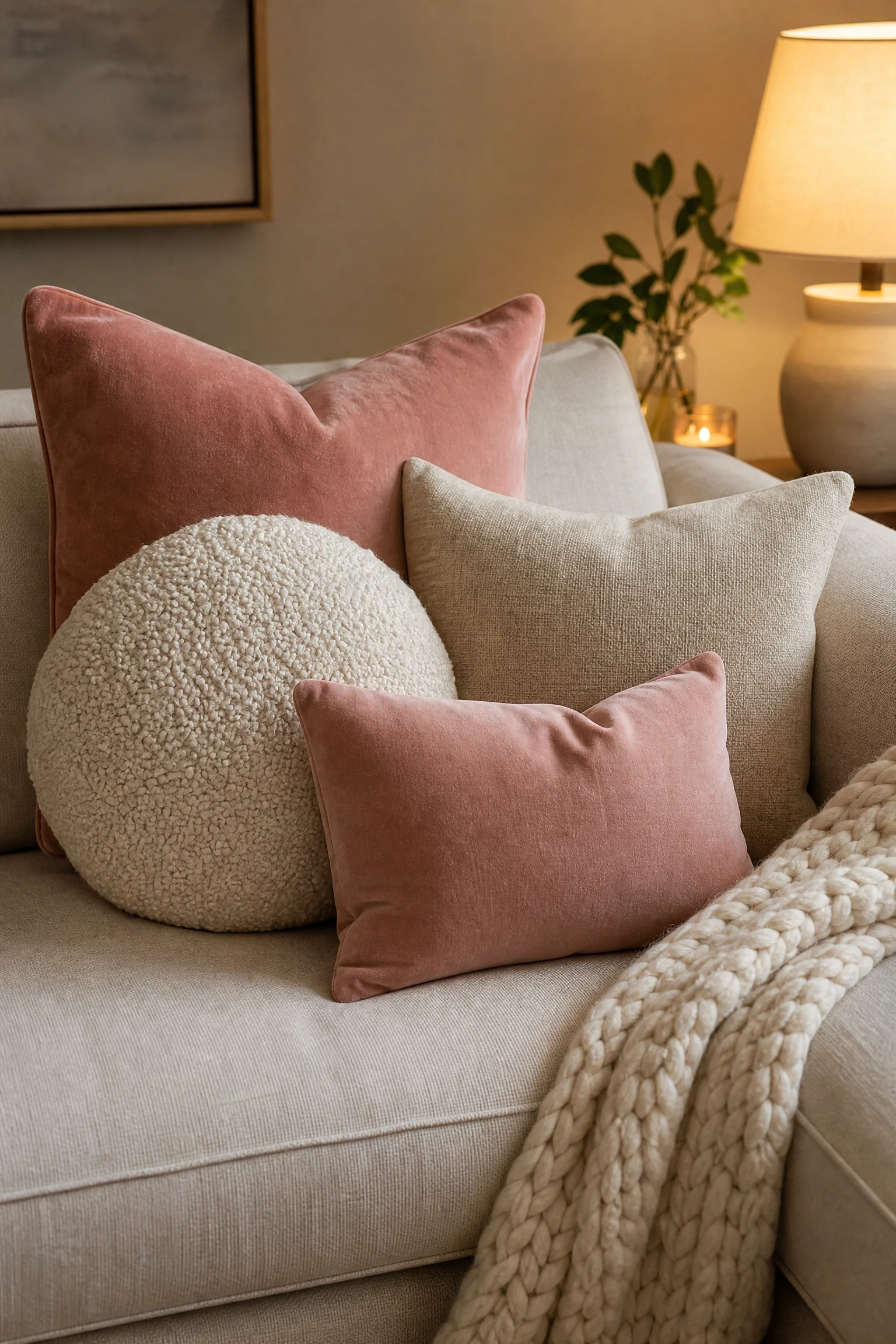
Texture is what separates a beige and pink living room that looks like a hotel brochure from one that actually feels inviting to sit in, and the most impactful place to add it is across the sofa. A chunky knit throw in warm cream or dusty rose draped casually over one arm reads as lived-in and cozy, which is the goal. Combine it with cushions in at least three different textures: a smooth velvet in blush, a linen square in oatmeal, and a boucle round in pale pink or ivory. Varying the shapes matters too. Round, square, and rectangular cushions together create visual rhythm rather than the flat sameness of matching sets. This idea works on any budget since textured cushion covers are available at virtually every price point, and mixing cushions from different sources often looks more considered than buying a pre-packaged set. Just keep the palette within the warm beige-pink family and the mixed textures will hold together.
Quick Tip: The odd number rule genuinely works here. Five cushions on a sofa always looks more natural than four or six, no matter how they are arranged.
Gold and Glamour: Adding Metallic Warmth
9. Brass Accents Throughout a Blush and Beige Room
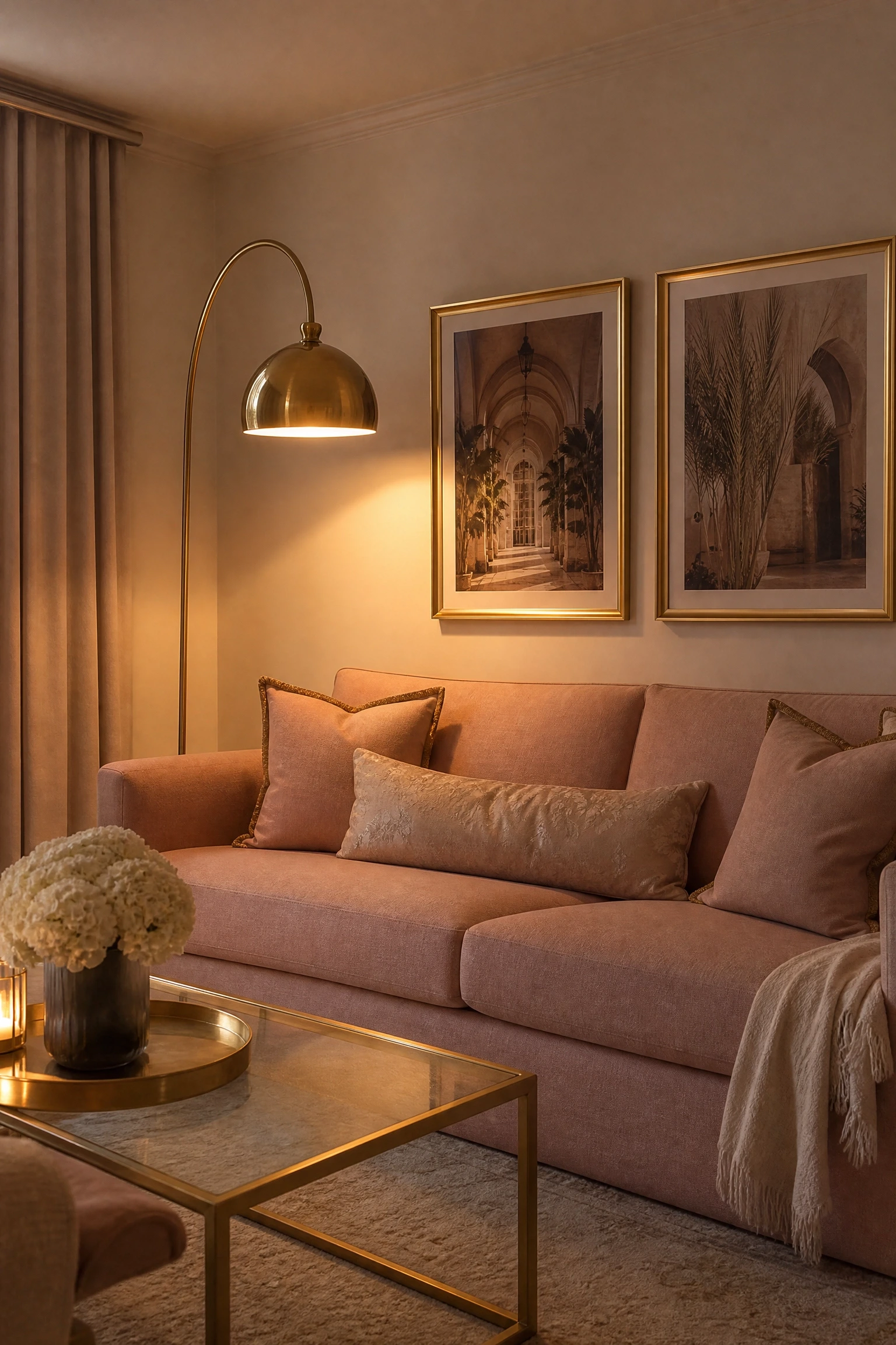
Brass is the metallic of choice for the beige and pink palette, and this is not a trend thing. It is a color temperature thing. Brass has a yellow warmth that sits in perfect harmony with both blush pink and sandy beige, reinforcing the palette rather than fighting it the way silver or chrome would. Introduce brass through a coffee table with a brass-framed base, brushed gold picture frames, a statement brass floor lamp with an off-white shade, decorative objects in burnished brass, and cushion covers with subtle brass-threaded trim. The key in practice is to use brass consistently enough that it reads as intentional rather than accidental. Two or three pieces often look collected rather than coordinated. Aim for four to six brass elements of varying scale across the room, from a small brass tray on the coffee table to a tall brass arc lamp, so the eye moves around the room rather than landing on one spot.
Heads Up: Polished brass looks glamorous but shows fingerprints constantly. Brushed or antique brass finishes are far more practical for everyday living rooms.
10. A Gold-Framed Mirror as a Centrepiece Wall Moment
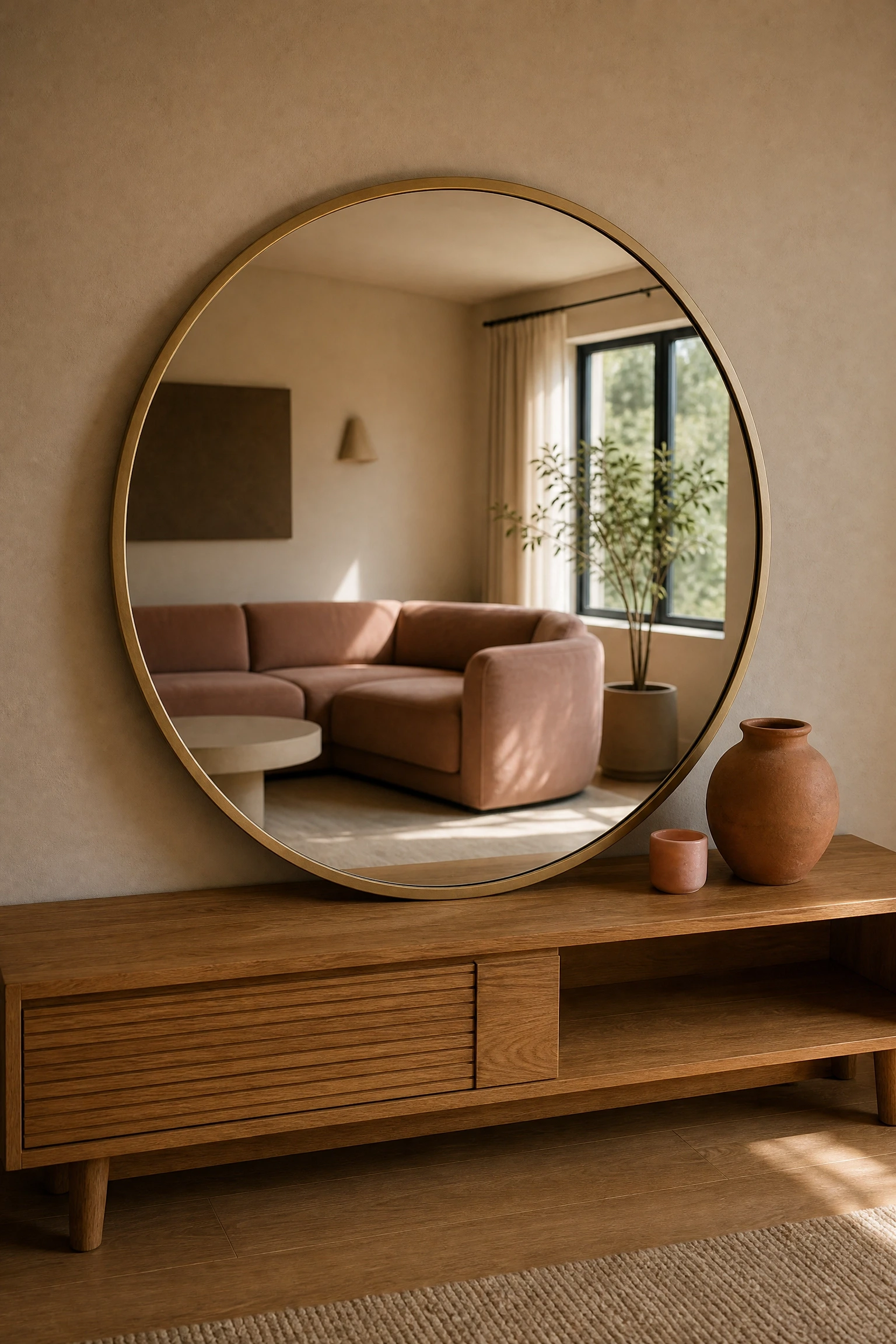
A large gold or brass-framed mirror above a console table or fireplace does two things at once in a beige and pink living room: it bounces light around the room and it adds a metallic anchor that makes the whole palette feel more intentional. The frame style matters quite a bit here. An ornate gilded frame feels Art Deco or maximalist, which works if that is your direction. A thin brushed brass frame reads more contemporary and minimal. A rattan or wood-trimmed mirror with brass detailing sits between the two and suits the warm bohemian approach covered earlier. In smaller living rooms, a large mirror is especially useful because it visually expands the space, which is one of the honest interior design tricks that actually delivers on its promise. Hang it so the lower edge sits roughly at eye level when seated to capture the right reflection of the room rather than just ceiling.
Designer Advice: Lean the mirror against the wall rather than hanging it if you rent or want flexibility. A large leaning mirror has the same visual impact and skips the wall damage.
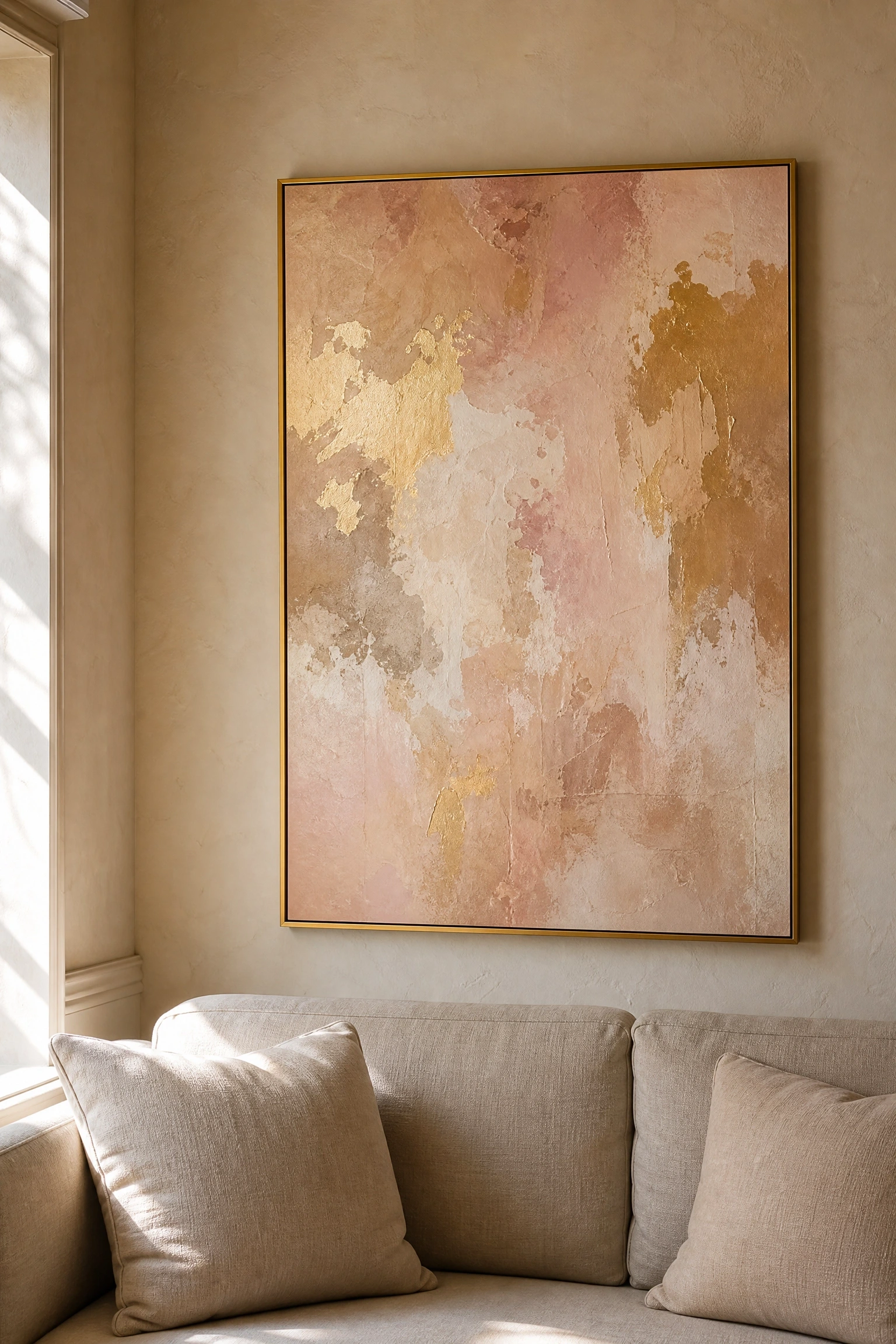
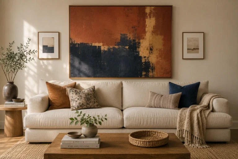
Artwork is often the last thing people think about in a living room and the first thing that pulls a palette together or tears it apart. In a beige and pink room, abstract art with warm gold, blush, sand, and terracotta tones does the same work as a throw pillow but at a much larger scale and with far more visual impact. Look for prints or originals that use loose gestural marks or large color fields in your palette tones, framed in warm brass or unfinished wood. Gallery walls work here too, but a single large-scale piece hung above the sofa on a beige wall tends to feel cleaner and more confident than a cluster of small frames. This is one of the highest-impact changes you can make to a living room at a relatively low cost since art prints are widely available from independent artists through online marketplaces at accessible prices.
Reality Check: Avoid prints that include cool gray, bright white, or blue-toned elements since even a small amount of the wrong undertone can make the whole palette feel off.
Pattern and Print: Adding Character Without Chaos
12. A Floral or Botanical Print in Blush and Cream
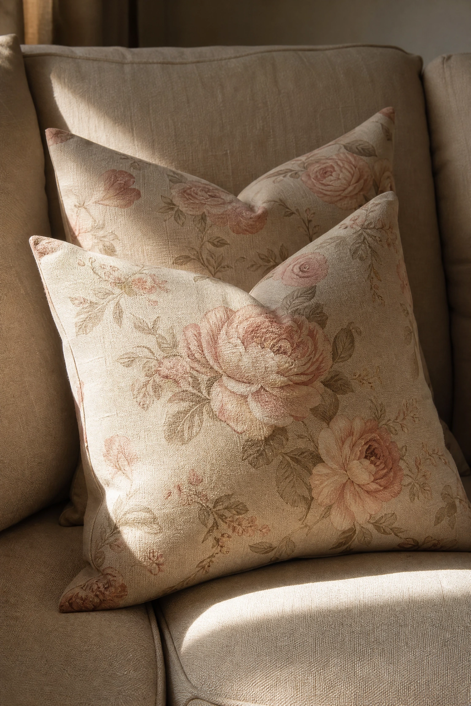
Floral prints in the blush, cream, and warm beige family have been popular in traditional and country-style living rooms for decades, but when you use them with restraint and pair them with clean-lined furniture, they can work beautifully in contemporary spaces too. The key is limiting the floral to one element: either a cushion fabric, a statement armchair upholstery, a throw pillow pair, or a single framed botanical print. Using floral in more than one place starts to feel busy very quickly. A blush and cream floral cushion on a plain beige linen sofa looks considered. The same floral on the cushions, the curtains, and the armchair starts to look like a wallpaper sample book. Keep everything else in the room in solid, textured tones within the palette and let the print be the one moment of pattern. This is a mid-range to investment approach depending on whether you choose printed fabric from a budget retailer or a more specialist fabric brand.
Quick Tip: Choose a floral scale that matches your room size. Large blooms suit bigger rooms and smaller, more delicate prints work better in compact living spaces.
13. A Pink and Beige Vintage-Style Rug as the Room’s Foundation
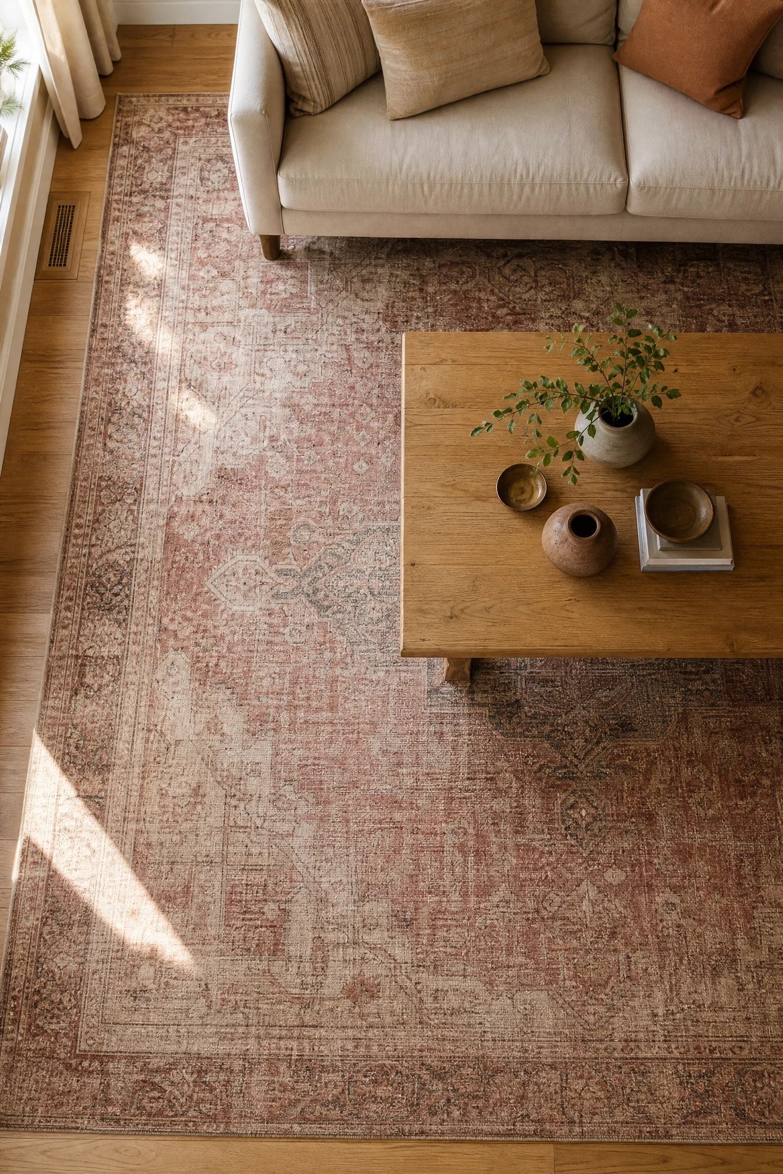
A vintage or vintage-style rug in muted rose, blush, and sandy beige tones can anchor an entire living room and give you a ready-made palette to build from. One thing that works really well here is choosing the rug first and then pulling furniture and accent colors from the tones within it, rather than trying to find a rug that matches what you have already bought. Look for Persian, Moroccan, or Turkish-inspired flat-weave or pile rugs in faded, sun-washed tones rather than bright or sharp colors, since the muted quality keeps the palette sophisticated. A large rug is always better than a small one in a living room because it needs to sit under all the main furniture legs, or at least the front legs of the sofa and chairs, to visually hold the seating group together. Small rugs that float in the middle of a large sofa group are one of the most common mistakes in living room decorating.
Pro Move: Genuine vintage rugs hold their value and often improve with age. Check rug dealers, estate sales, and online vintage marketplaces before buying new.
14. Striped or Geometric Pink Cushions on a Plain Beige Sofa
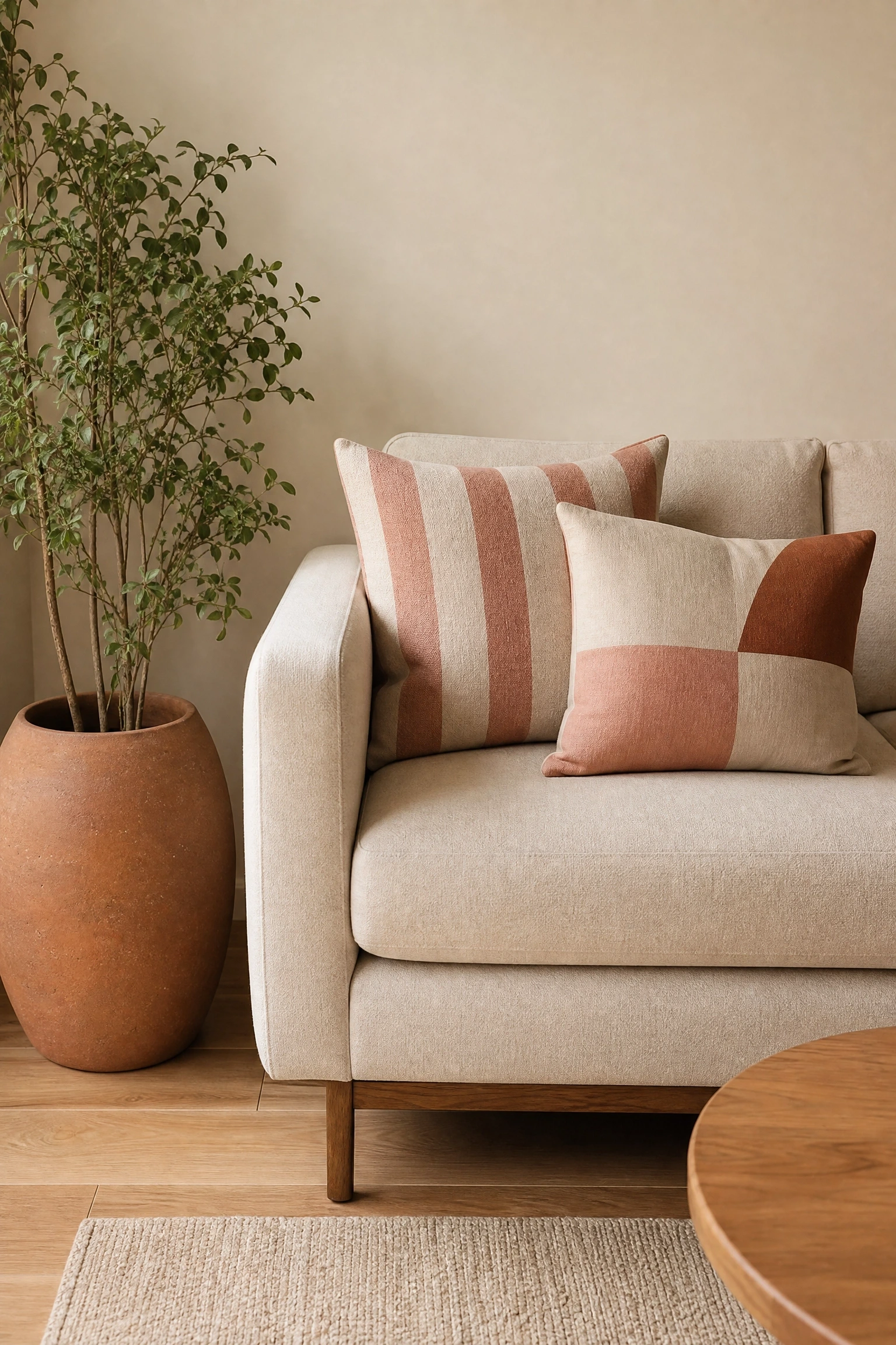
If you find florals too soft or vintage-feel rugs too busy, a geometric or striped cushion in blush and cream is a cleaner, more graphic way to bring pattern into the beige and pink palette. A pair of cushions with a thin vertical stripe in dusty rose and natural linen reads preppy and crisp. A block-colour geometric in a mix of blush, oatmeal, and warm terracotta leans more contemporary. Either way, you are adding visual interest without committing to a romantic or traditional feel, which makes this approach well-suited to modern living rooms. Keep the rest of the accessories in the room solid and unfussy so the cushion pattern has room to read clearly against the beige sofa. A pale natural wood coffee table, a simple brass lamp, and a single large plant in a plain clay pot keeps the room feeling deliberate rather than decorated.
Heads Up: Geometric patterns with very sharp contrast, like bright white and hot pink, can overwhelm a soft beige room. Stick to muted, chalky versions of the colors for a cohesive look.
15. Chinoiserie or Toile Wallpaper in Blush and Ivory
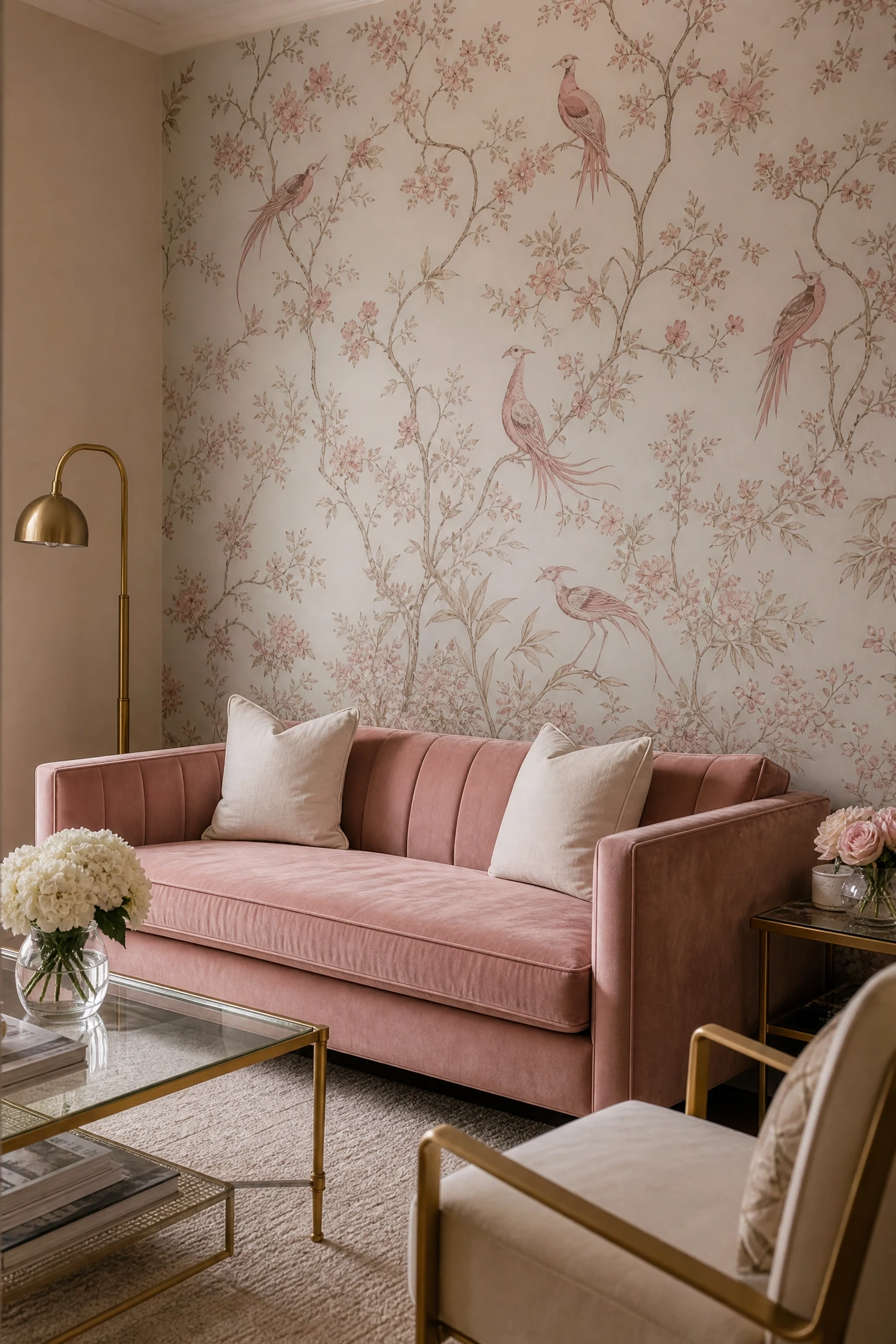
For a living room with genuine character and historical depth, a chinoiserie or toile wallpaper in blush and ivory on a single feature wall is one of the most striking things you can do in the beige-pink palette. Chinoiserie prints, which feature hand-painted-style motifs of birds, branches, and botanicals, read as sophisticated and layered in a way that is difficult to achieve with paint alone. Pair the wallpapered feature wall with a plain warm beige on the remaining walls to let it breathe and avoid the room feeling enclosed. Furniture in this context should be kept relatively simple and well-proportioned: a tuxedo sofa in blush velvet or a classic Chesterfield in camel leather both sit beautifully against this kind of backdrop. This is unquestionably an investment approach in terms of wallpaper cost and installation, but it is also the kind of design decision that can define an entire room’s character for years.
Designer Advice: Install chinoiserie paper on the wall behind your sofa or fireplace rather than a side wall, since that is the view most people have on entering the room and it will make the strongest first impression.
Bold and Confident: More Pink, More Personality
16. A Mauve Pink Sectional as the Room’s Statement Piece
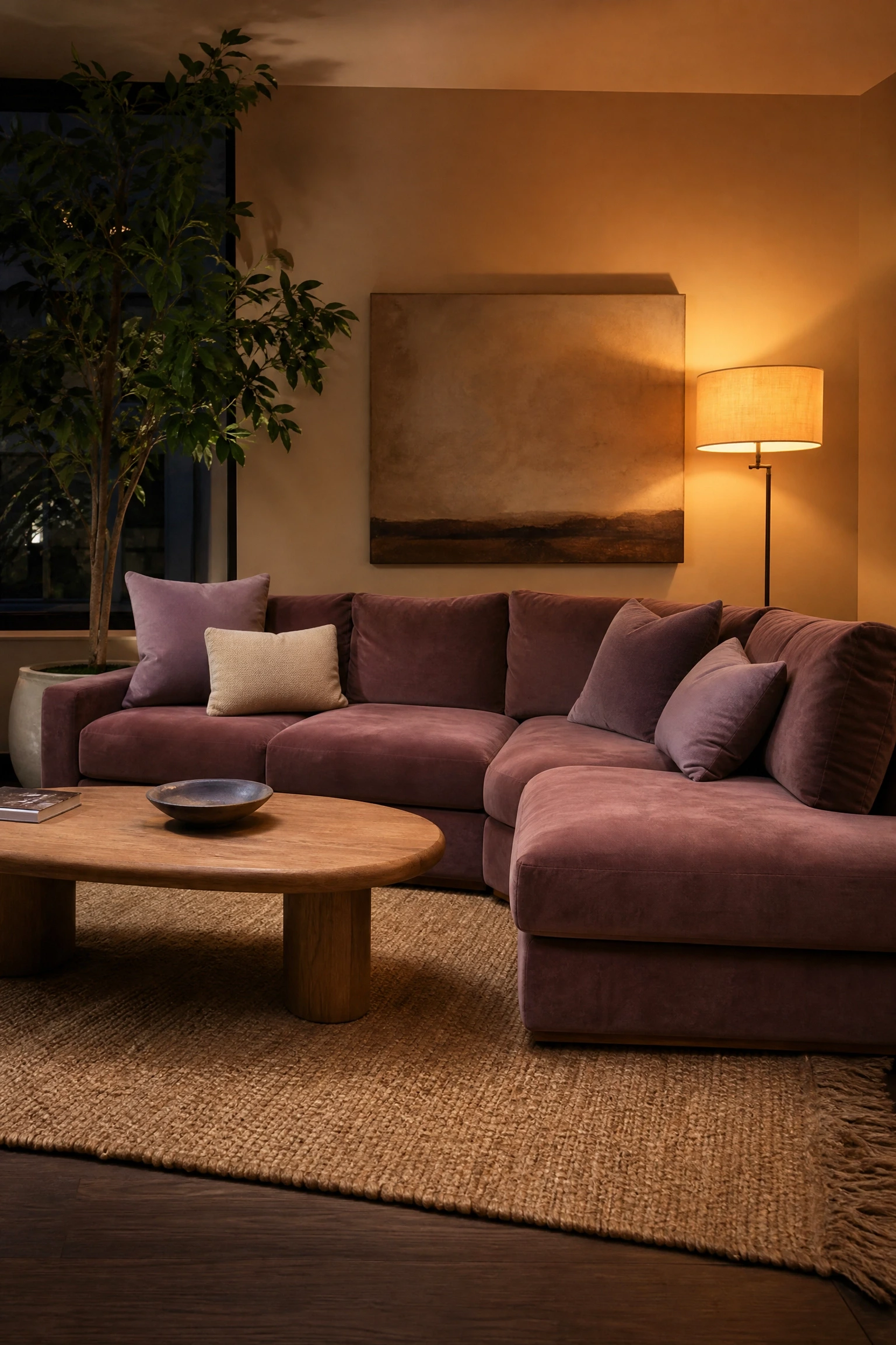
Mauve is where pink starts to grow up. It sits between dusty rose and purple-pink and carries a natural sophistication that pure blush sometimes lacks. A mauve velvet sectional is a bold move in a living room, but when you balance it against warm beige walls, a natural jute rug, and lavender or ivory cushions, the combination is extraordinarily refined. This is not a trend-chasing choice. Mauve upholstery has appeared in editorial interior design publications consistently for the past several years, and unlike trend colors, it photographs beautifully in both natural and artificial light. The honest caveat here is that a sectional is a significant investment and a commitment, so if you are uncertain about the depth of color, spend time with large fabric swatches in your actual room before ordering. Velvet in particular changes dramatically between daylight and evening light, and what looks dusty rose in a showroom can read quite purple in your home depending on the exposure.
Reality Check: Mauve velvet can read more purple than pink under cool or blue-toned LED lighting. If you use cool-temperature bulbs, switch to warm-white bulbs of around 2700 to 3000K throughout the room before committing.
17. Deep Rose Curtains as a Dramatic Framing Device
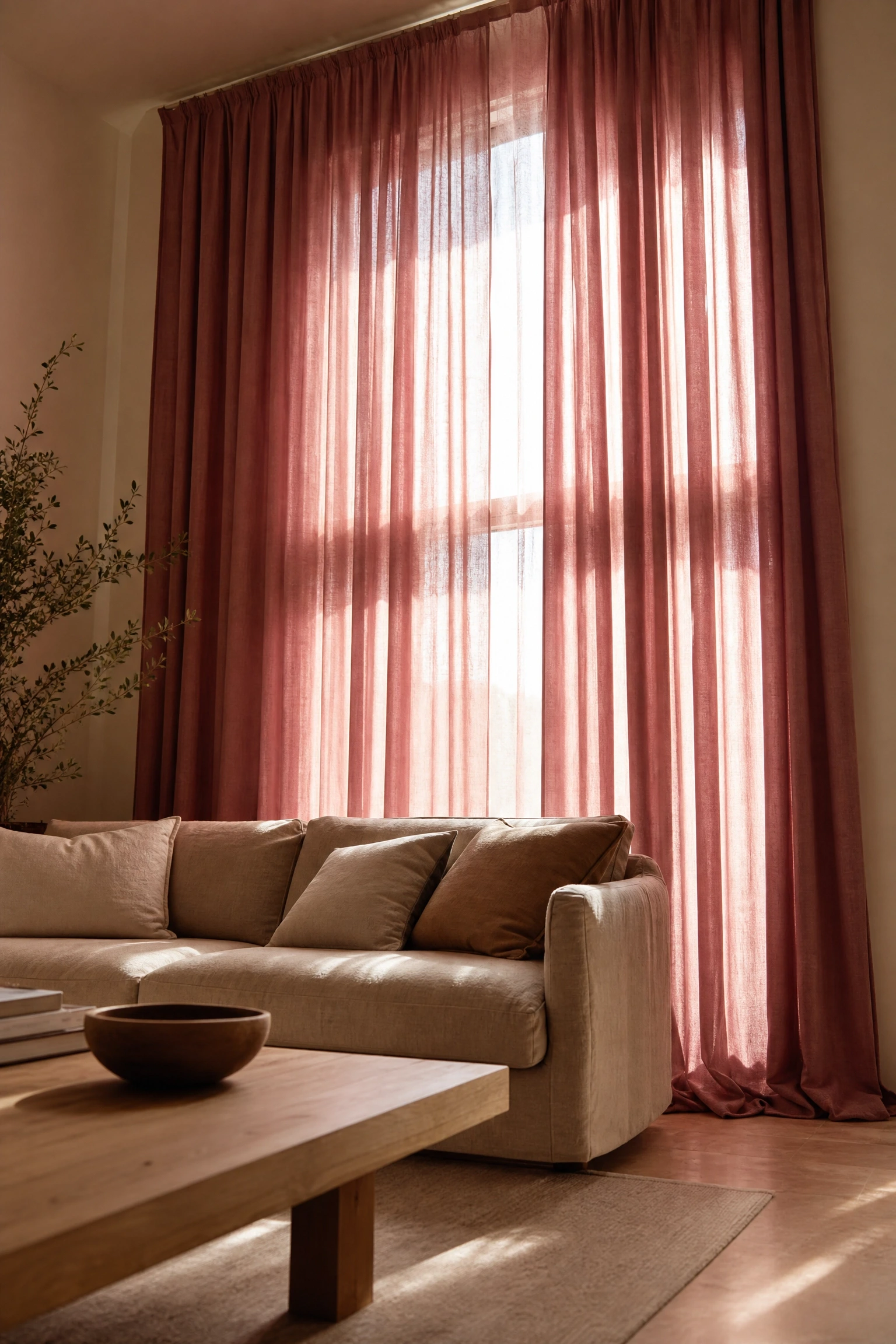
Floor-to-ceiling curtains always add height and grandeur to a living room, and in a beige and pink palette a deep rose or dark dusty pink works as one of the most effective ways to add drama without painting the walls or buying new furniture. Hang the curtain rod as close to the ceiling line as possible and let the fabric pool slightly on the floor, both of which are designer tricks that make ceilings feel taller and rooms feel larger. The rest of the room should be kept largely in beige and warm neutral tones so the curtains carry the full visual weight of the pink. A beige sofa, a light oak coffee table, warm cream walls, and then deep rose curtains as the frame creates a very strong focal point around the window without overwhelming the space. Lined curtains in a cotton-velvet or heavy linen fabric hold their color better over time than unlined sheers, which can fade or shift in direct sun.
Pro Move: Buy curtain panels that are at least two to two and a half times the width of your window for full, luxurious folds. Flat, barely-wide curtains are the single thing that makes a room look most budget, regardless of fabric quality.
18. Pink Painted Fireplace Surround in an Otherwise Neutral Room
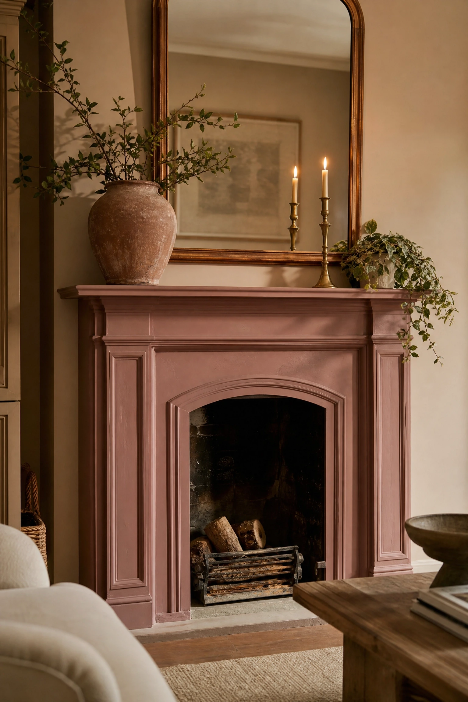
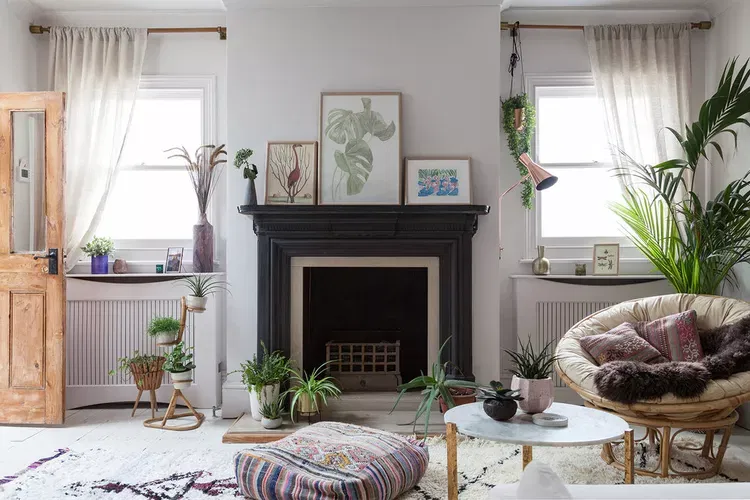
Painting a fireplace surround is one of the most impactful and reversible things you can do in a living room, and in a beige room a dusty pink or antique rose fireplace surround becomes an instant focal point that requires no furniture moving or major renovation. The contrast between the warm beige walls and the pink-painted surround gives the room a layered quality that looks more intentional than a matching-everything approach. Style the mantel with simple, carefully chosen objects: a large ceramic vase in a complementary tone, one or two brass candlesticks, a trailing plant, and a single piece of artwork in a warm frame. Because the fireplace is already the focal point of the room, the mantel styling does not need to be complex. Simplicity is more powerful here. This is a genuinely low-cost idea since a tin of chalk paint or specialty mineral paint is far cheaper than new furniture and takes an afternoon to apply.
Quick Tip: Use a chalk finish or limewash paint on the surround rather than a standard emulsion, since the matte, slightly chalky surface reads more authentically as a design choice and hides brush marks far better.
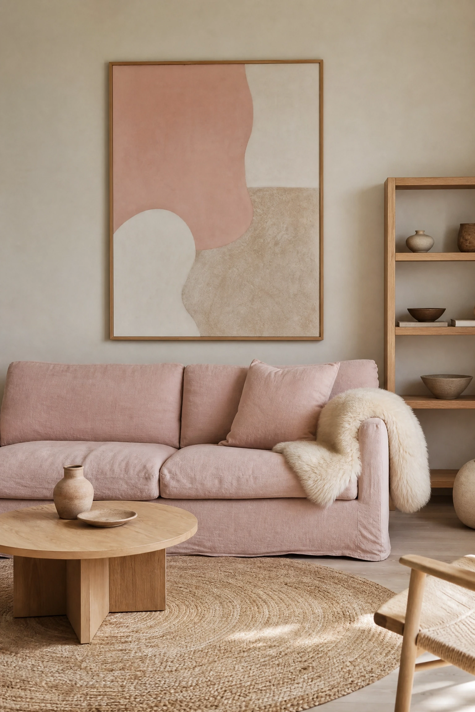
The Scandinavian approach to the beige and pink palette is one of the most liveable versions you can choose because it prioritizes function and simplicity alongside warmth. Clean-lined furniture in light natural wood, a pale rose sofa in simple linen, warm beige walls, a sheepskin throw, a round jute rug, and a small collection of carefully chosen ceramic objects create a living room that feels completely uncluttered while still being genuinely warm. The restraint of this approach is what makes the pink and beige palette read as sophisticated and considered rather than pretty or decorative. Negative space matters as much as the objects here, so resist the urge to fill every shelf and every surface. A single large piece of abstract art in soft blush and oat tones above the sofa is more powerful than a gallery wall of six smaller frames. This is also one of the most budget-conscious approaches overall since the simplicity means fewer pieces and the emphasis is on quality in the few items chosen rather than volume.
Designer Advice: In a Scandi-style room, leave at least thirty percent of every shelf and surface empty. Visual breathing room is a design element, not wasted space.
20. A Single Pink Ceramic Table Lamp as a Quiet Statement
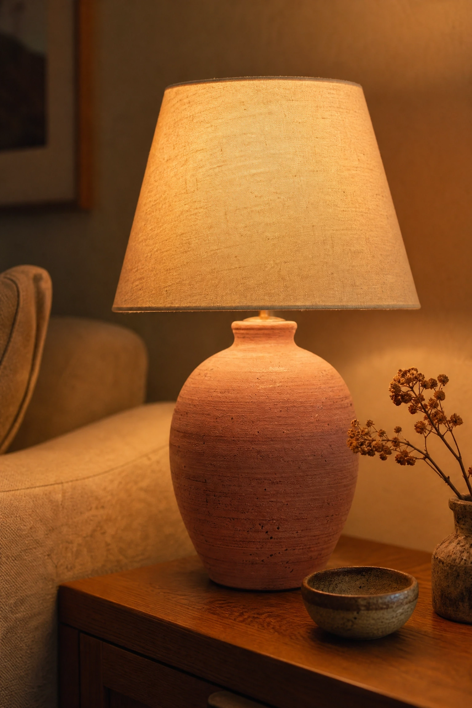
Sometimes the most effective way to bring a color into a room is through the smallest and most functional object. A hand-thrown ceramic table lamp in a dusty rose or blush pink glaze, placed on a warm oak side table beside a beige sofa, adds color, texture, and warm light all at once without committing to any single large furniture choice. Good ceramic lamp bases have a handmade quality that reads as genuinely artistic, and they are one of the most accessible ways to own something that feels considered and original without a large budget. The shade matters here just as much as the base: a natural linen shade in cream or warm white will cast the most beautiful warm glow, while a white cotton shade reads cooler and crisper. In practice, the warm linen shade suits the beige-pink palette better because it keeps the light color-temperature consistent with the rest of the room’s warmth. Place one on each end table if you want symmetry or use a single lamp with a floor lamp companion on the opposite side of the sofa for an asymmetric but balanced arrangement.
Quick Tip: A lamp with a warm 2700K bulb and a linen shade will cast a noticeably more flattering and room-warming glow than a cool or bright white equivalent, even with identical wattage.
21. Mixing Sage Green into a Pink and Beige Room for Fresh Contrast
While the beige and pink palette is complete on its own, adding a carefully chosen third tone can give the room a freshness and botanical energy that keeps it from reading too inward. Sage green is the best choice here because it shares the muted, dusty quality of both blush pink and warm beige, which means it joins the family rather than disrupting it. Introduce sage through a pair of cushions, a linen throw, a potted plant arrangement on a low shelf, or a single sage green side chair tucked into a corner. What makes this combination so effective in practice is the visual logic of it: blush is a warm pink that looks like a flower, sage is a dusty green that looks like a leaf, and beige is the warmth of earth. The palette evokes something almost botanical and natural without being literal about it. Keep the sage as a true accent rather than a second feature color and the room will feel considered and fresh rather than confused.
Pro Move: Choose a sage green that leans warm and dusty rather than cool or minty. Cool sage will shift the undertone of the entire room toward cooler territory and undermine the warmth you have built.
Beige and pink is one of those rare color combinations that genuinely gets better the more thought you put into it. The first instinct is often to keep it simple, a beige sofa and a few pink cushions, and while that works well enough, the ideas in this article show how much further you can take it when you think about texture, scale, lighting, pattern, and material choices more deliberately. The palette rewards careful layering far more than bold contrast, which means small changes, a new rug, a ceramic lamp, a set of velvet cushions, a painted fireplace surround, can shift the feel of the whole room significantly. That also makes it one of the most accessible palettes to build gradually rather than doing everything at once. The direction is clear: go warm with your undertones, vary your textures, keep the lighting soft and layered, and let the pink be expressive in at least one key element. The result will be a living room that feels as good to live in as it looks in the photos.
Frequently Asked Questions
What shades of pink work best with beige in a living room?
The most successful pinks for a beige living room are those in the muted, warm family: dusty rose, blush, antique pink, plaster pink, mauve, and warm nude pink. These feel sophisticated and liveable rather than playful. Avoid bright, candy, or neon pinks, which have cool or blue undertones that clash with the warmth of beige.
What accent colors go well with beige and pink?
The best accent colors share the same warm undertone as the base palette. Warm gold and brass metallics are the most versatile choice. Terracotta and rust add earthy depth. Sage green and olive provide a fresh contrast that feels natural alongside pink and beige. Caramel and warm brown ground the palette. Avoid cool-toned accents like bright white, silver, or cool gray, since these create an undertone conflict that makes the palette feel unsettled.
Is a beige and pink living room only suitable for women?
Not at all. The idea that pink is exclusively feminine has been fullly overturned by contemporary interior design. A pink and beige living room executed with confidence through muted tones, natural materials, and clean-lined furniture reads as elegant and universal. The key is in the execution: dusty rose, plaster pink, and mauve are very different from candy pink, and pairing them with warm beige, natural wood, and brass creates a sophisticated space that has broad appeal.
How do I make a small living room feel larger with beige and pink?
Use lighter shades of beige on the walls and ceiling and opt for pink accents in smaller, movable items to keep the space feeling open. A large mirror in a warm frame bounces light and visually expands the room. Keep furniture scaled appropriately for the space, and avoid large rugs that are too small for the sofa group, since a too-small rug shrinks a room visually. Floor-to-ceiling curtains hung as close to the ceiling as possible make the ceiling feel higher.
What flooring works best in a beige and pink living room?
Warm-toned flooring works best. Light oak or honey-toned wood floors are ideal because they share the same warm undertone as both pink and beige. Natural sisal or jute rugs over a neutral floor add texture and warmth. Avoid cool gray stone or white-washed floors, which can pull the palette too cool and undermine the warmth you are trying to build throughout the room.
Can I use wallpaper in a beige and pink living room?
Wallpaper works beautifully in a beige and pink living room when used on a single feature wall rather than all four walls. Chinoiserie prints in blush and ivory, botanical prints in rose and cream, or textured grasscloth in a warm beige with pink-toned flecks all add character and depth that paint alone cannot achieve. Stick to one patterned wall and keep the remaining walls in a plain, warm beige to give the pattern room to breathe.