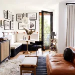
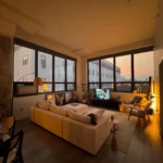
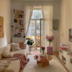
Blue and orange are complementary colors, which means they sit opposite each other on the color wheel and make each other look more vivid. That is both the promise and the danger. Done right, the pairing is energetic and warm, cool and cozy at once. Done wrong, it looks like a sports team exploded in your living room. The difference is ratio. One color must lead and the other must accent, roughly a 60-30-10 split with a neutral holding the rest. These 24 ideas are organized by exactly that logic: blue leading, orange leading, and the rooms where each version shines.
Blue Leads, Orange Pops
This is the safest version of the pairing and the one designers recommend most. Blue covers the big surfaces, orange shows up in small, deliberate hits. The room feels calm first, lively second.
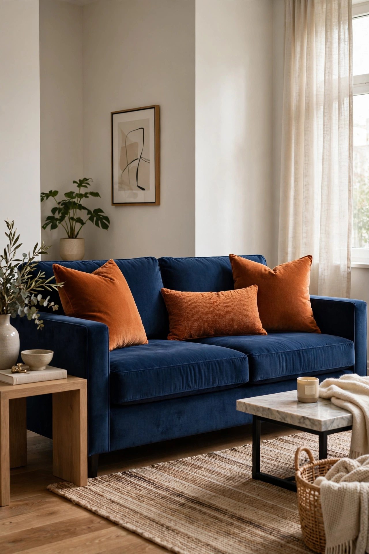
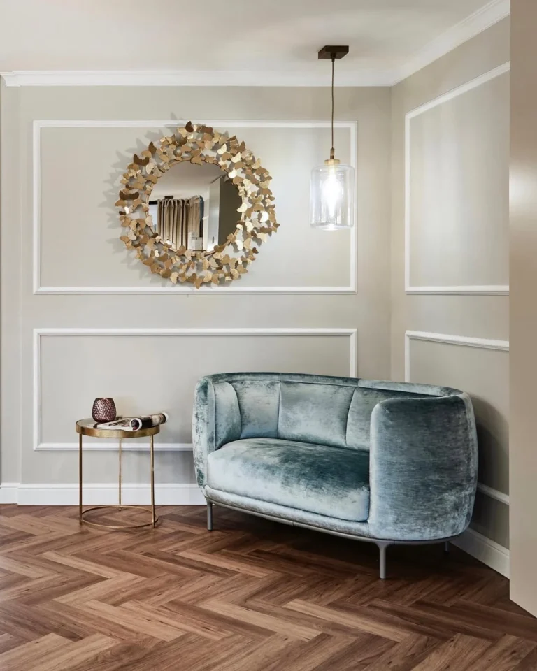
A navy sofa is the anchor of this whole color story. It is dark enough to feel sophisticated, blue enough to set the palette, and endlessly pairable. Add burnt orange throw pillows, not bright orange, and the contrast feels rich rather than loud. Burnt orange has brown undertones that sit comfortably next to navy. Two pillows are enough; the sofa does the rest. This is the starter kit for the entire scheme.
Quick Tip: Navy shows lint. Keep a roller nearby or choose a textured weave that hides it.
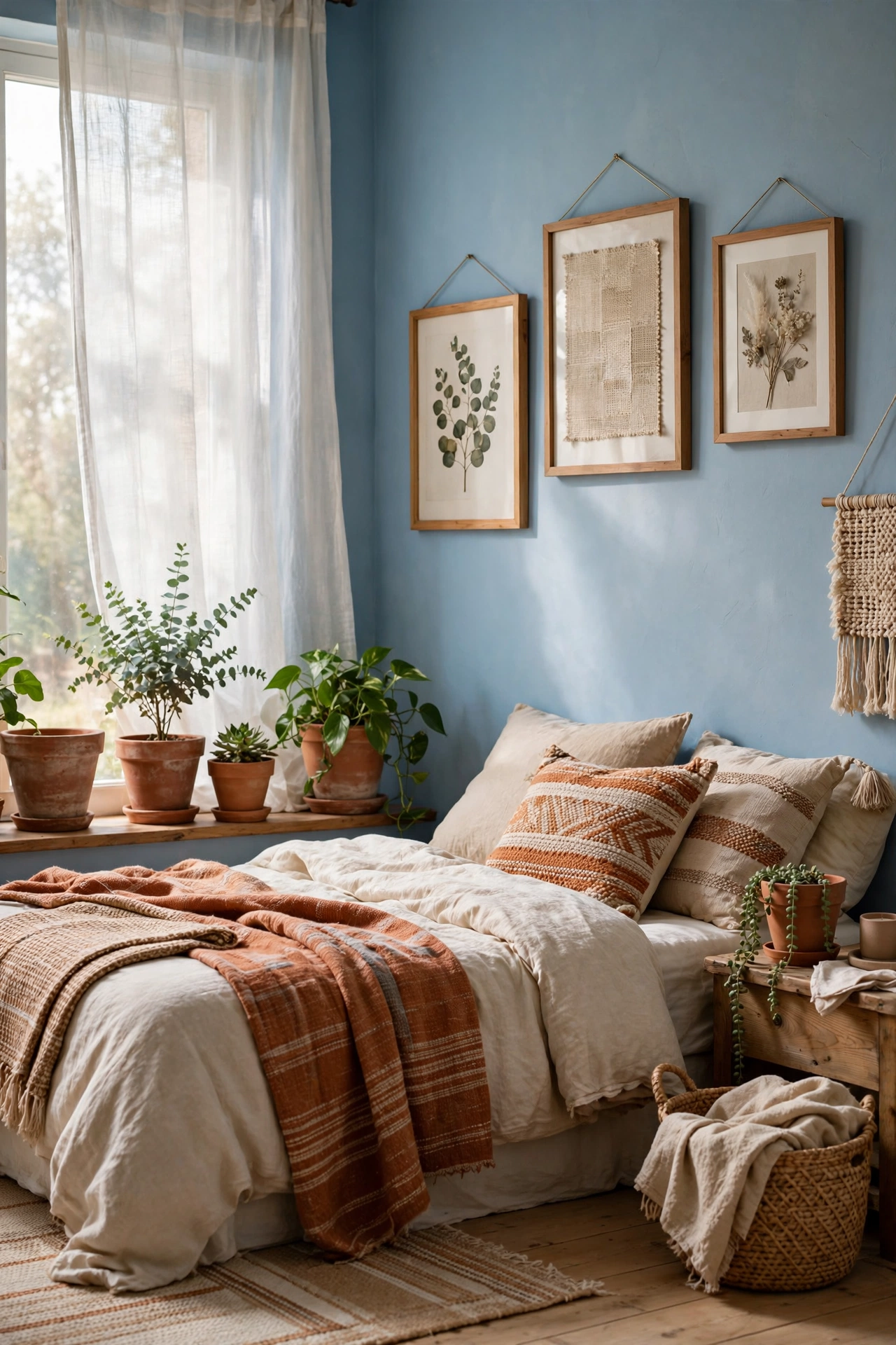
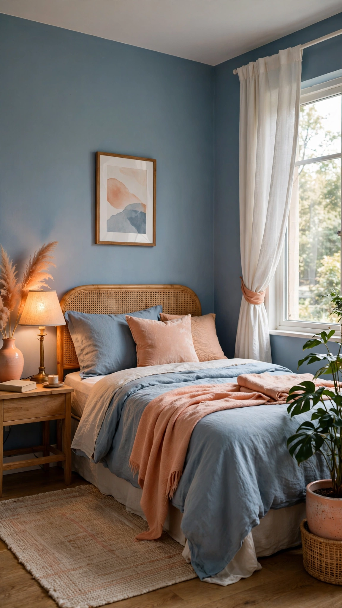
Sky blue walls with terracotta pots, frames, and textiles give you the pairing at its softest. The light blue keeps the room airy while terracotta adds earthy warmth without shouting. This version works beautifully in bedrooms where you want calm with a pulse. Keep the terracotta to natural materials, clay, wood, woven fibers, and the whole room feels collected rather than decorated.
Good to Know: Test sky blue in your actual light. It can go icy in north-facing rooms.
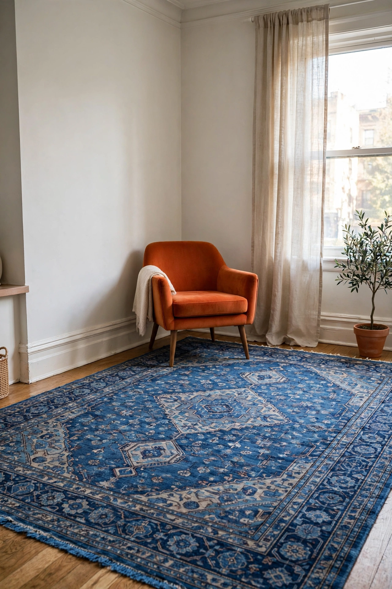
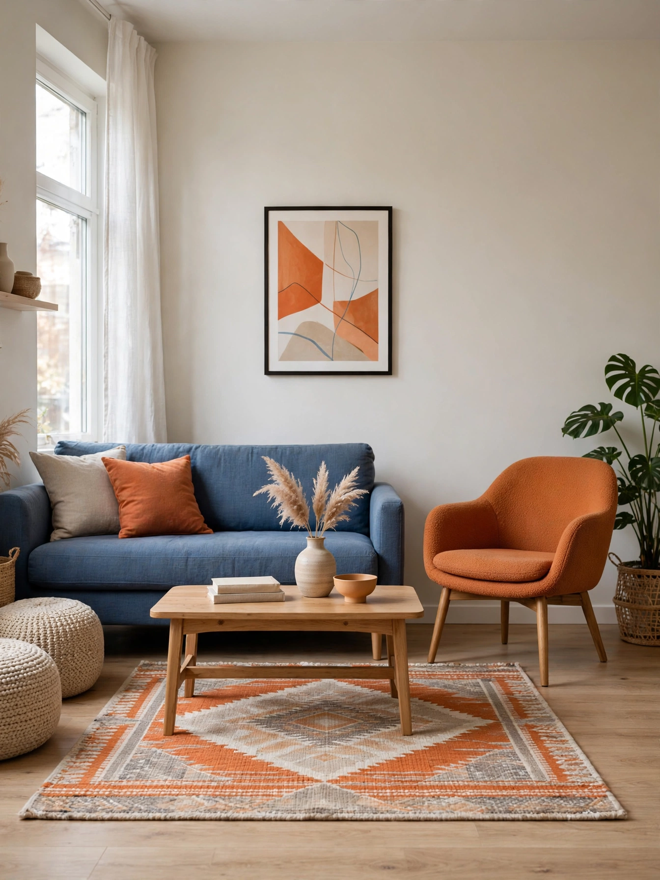
A large blue patterned rug grounds the room while a single orange accent chair provides the pop. The rug does quiet work underfoot; the chair does loud work in the corner. This is the classic designer formula: big blue, small orange. The chair becomes the thing guests remember. Everything else can stay neutral and the scheme still reads clearly.
Designer Trick: Pull one blue from the rug and one orange from the chair, then repeat those exact shades in small accessories to tie it together.
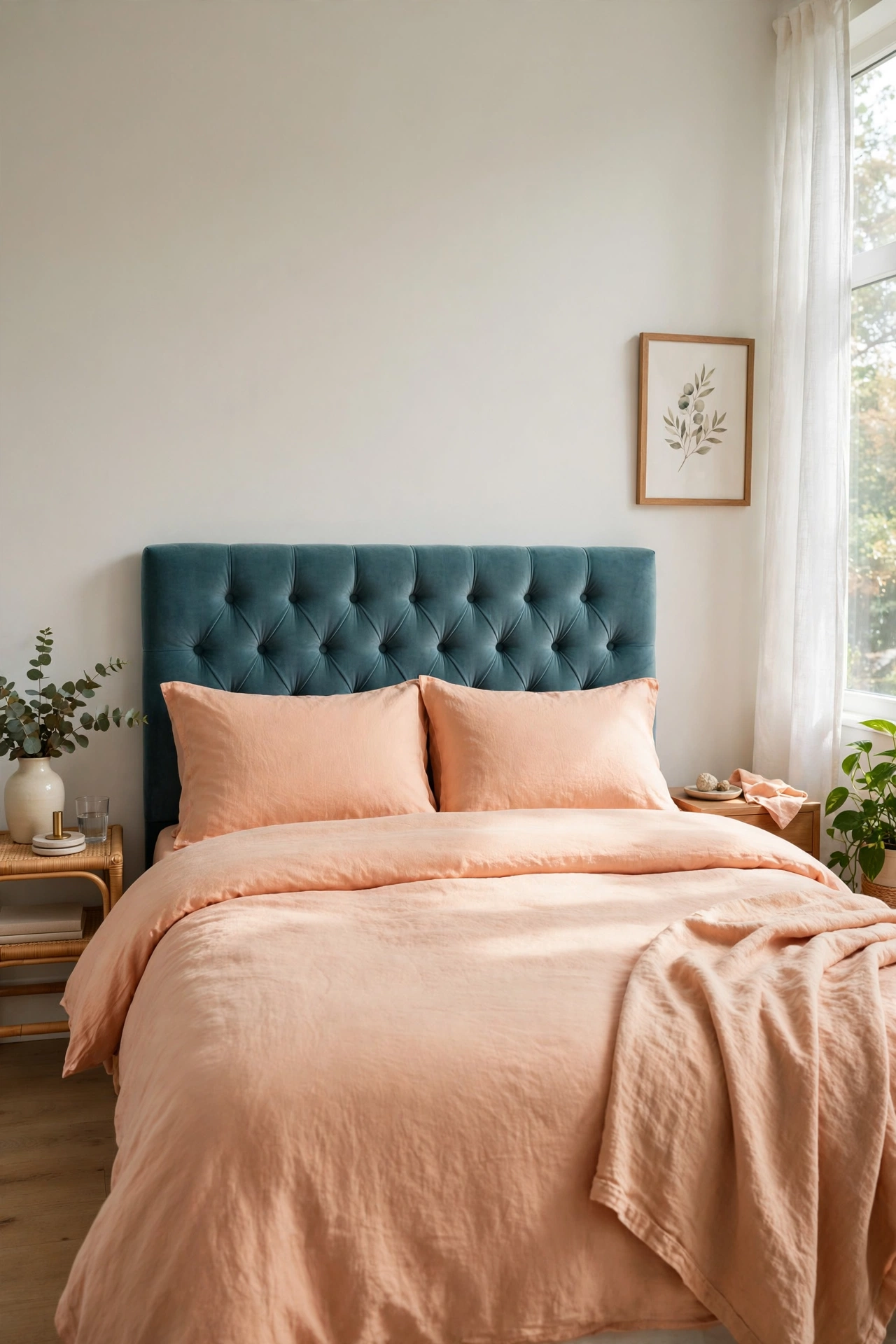
A teal upholstered headboard with apricot or peach bedding brings the pairing into the bedroom at a whisper. Teal is blue with green warmth, which makes it friendlier than navy for sleep spaces. Apricot bedding glows in morning light. The combination feels fresh, not themed. Add white sheets to keep it crisp. This is the version you could live with for a decade.
Style Note: Teal and peach need white between them. Without it, the two colors can bleed together visually.
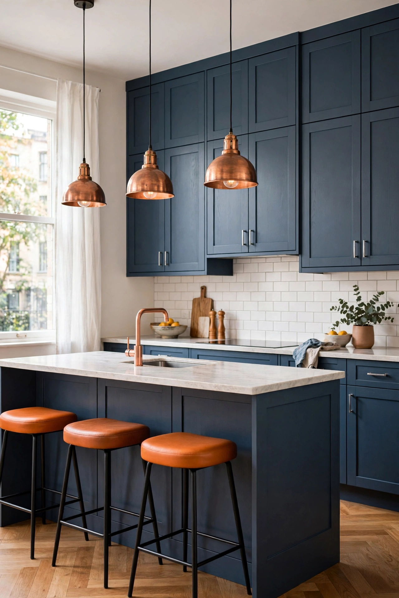
Blue lower cabinets, deep slate or dusty blue, with orange bar stools is the kitchen version that actually works in real homes. The cabinets are a commitment; the stools are not, which is the right way around. If you tire of orange, stools are a weekend swap. Copper pendant lights bridge the two colors beautifully. This kitchen photographs like a magazine and cooks like a kitchen.
Worth Knowing: Paint cabinets before buying stools. Match the stool orange to the finished cabinet color, not the paint chip.
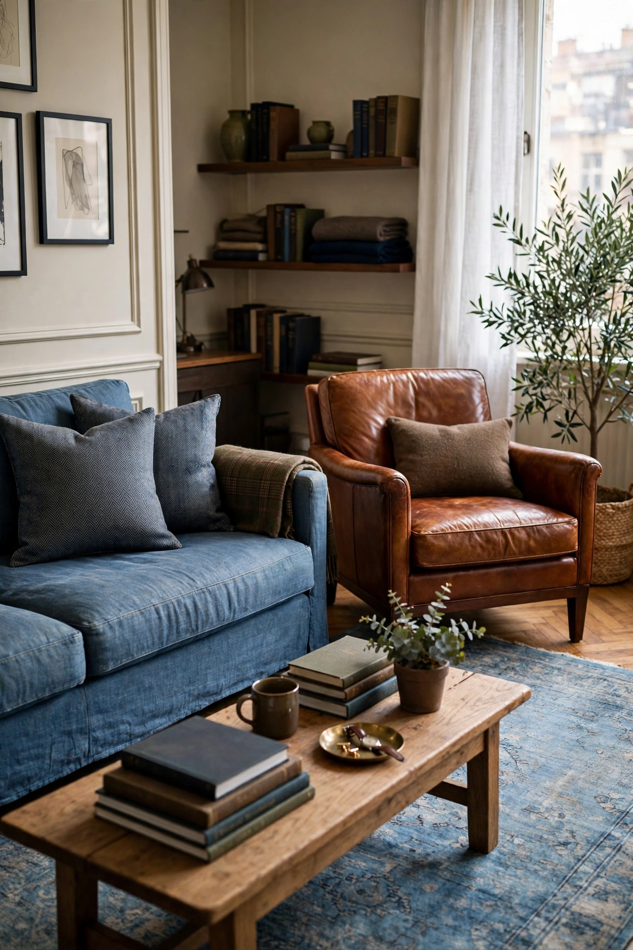
Worn denim-blue textiles with cognac leather is the menswear version of this palette. A blue linen sofa, a cognac leather armchair, a faded blue rug. The materials do the talking: soft, aged, touchable. Orange appears as leather’s natural tone rather than a paint color, which makes it feel grown-up. This is the pairing for people who flinch at bright colors but still want warmth.
Honest Take: Real leather patinas beautifully; fake leather peels. Buy the best you can afford or skip it.
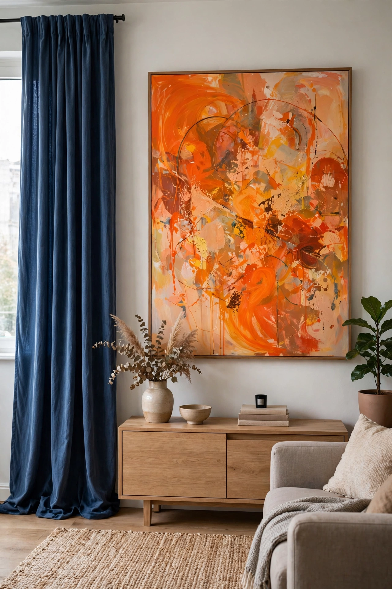
Floor-length blue curtains frame the windows while a large orange abstract painting anchors the wall. The curtains are the quiet blue; the art is the loud orange. This works because the orange is contained in one frame, it cannot spread and take over. Everything else stays neutral. One bold painting can carry an entire color scheme if you let it. Let it.
Quick Tip: Hang the art where you see it from the sofa. Color schemes work when the pairing is visible in one glance.
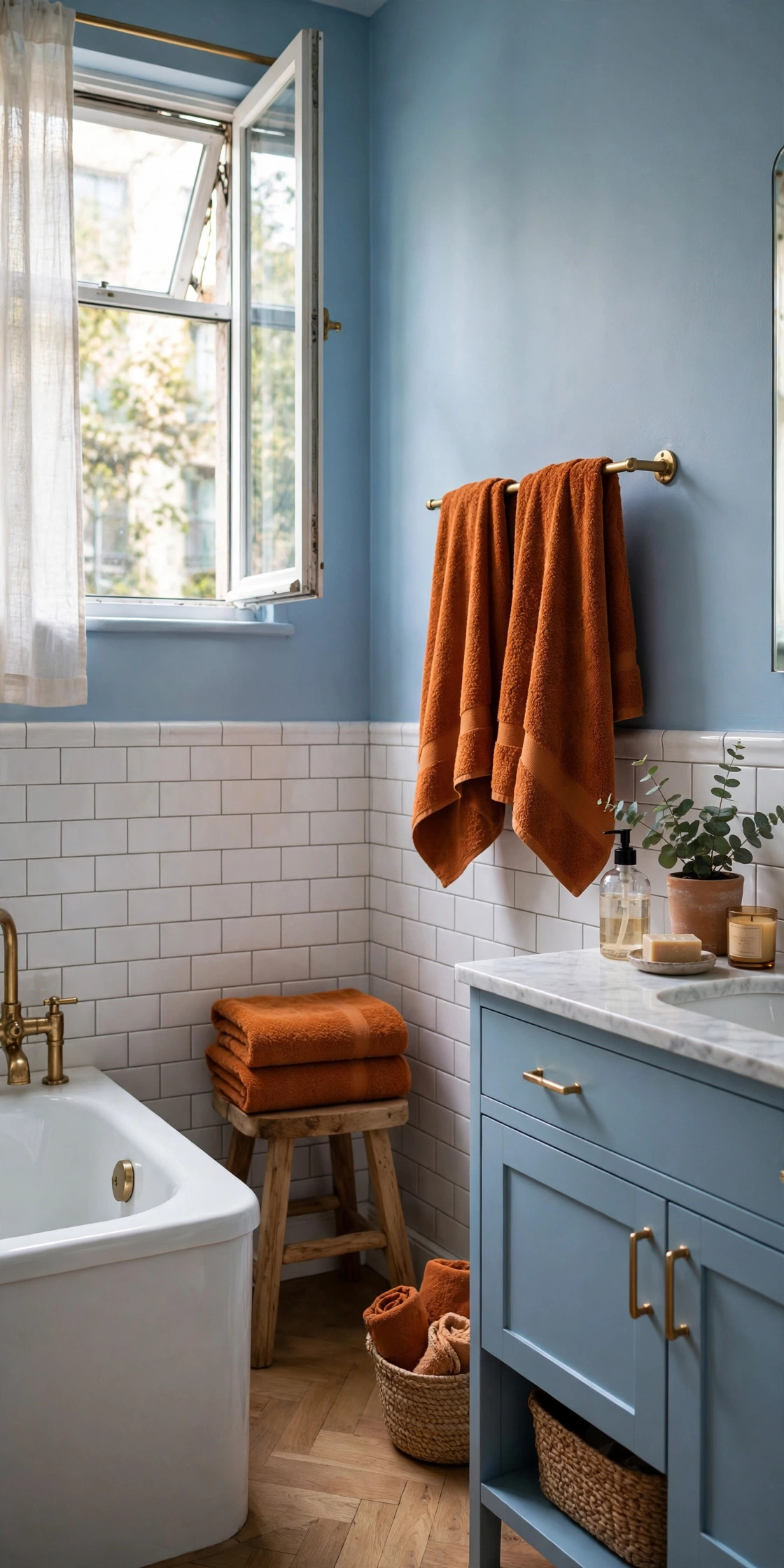
A powder blue bathroom with burnt orange towels and a small stool is the easiest room to try this in. Bathrooms are small, so the commitment is tiny and the impact is big. The cool tile against warm textiles feels like a spa with personality. Swap the towels seasonally if you want. This is the low-stakes experiment that convinces people to go bigger.
Good to Know: Orange towels fade faster than blue ones. Wash in cold water to keep them vivid.
Shade Pairings That Work
Blue shade
Orange shade
Mood
Navy
Burnt orange
Rich, sophisticated
Sky blue
Terracotta
Soft, airy
Teal
Apricot
Fresh, calm
Slate blue
Cognac
Warm, masculine
Powder blue
Coral
Playful, bright
Royal blue
Tangerine
Bold, maximalist
Orange Leads, Blue Cools
The bolder direction. Orange takes the big pieces and blue keeps it from overheating. This is for confident decorators and rooms that can handle energy, living rooms, dining rooms, creative spaces.
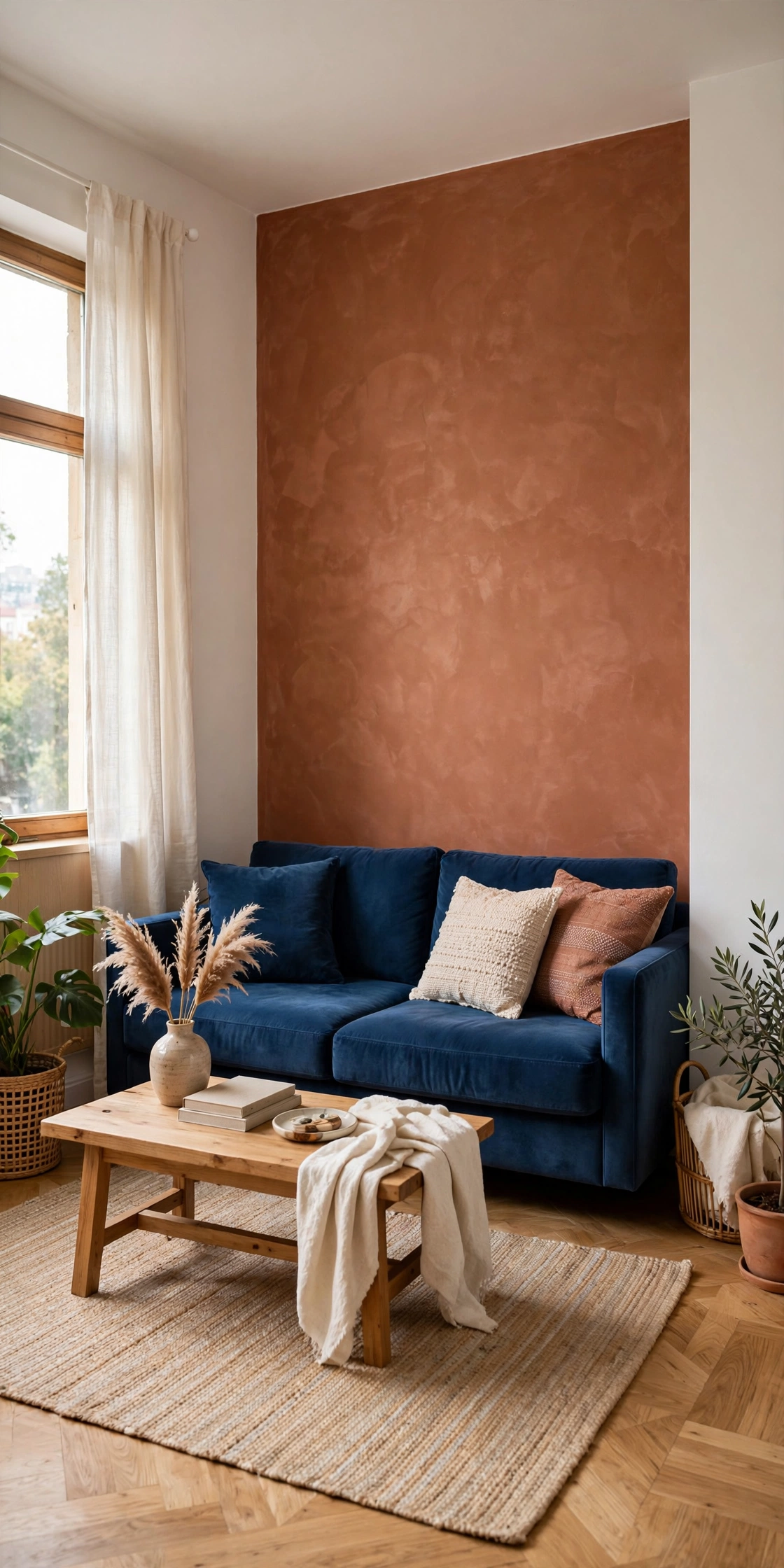
A terracotta accent wall behind a deep blue sofa is the statement version of this pairing. The warm wall wraps the room while the cool sofa gives your eyes somewhere to rest. This needs good light; terracotta goes muddy in dark rooms. Keep the other walls warm white and the floor light. One wall of courage, and the whole apartment feels intentional.
Reality Check: Paint a large test swatch and live with it for three days. Terracotta shifts dramatically with light.
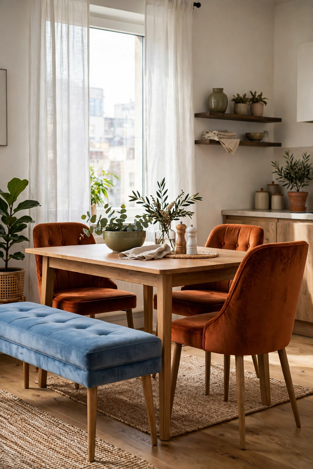
A pair of burnt orange velvet dining chairs around a table with blue upholstered seating is dining-room drama done right. Velvet deepens the orange so it reads luxurious, not loud. The blue balances it at the table itself. This is the setup that makes guests ask who your designer is. The answer is a color wheel and some nerve.
Style Note: Velvet in dining rooms and real life: choose performance velvet or accept the patina.
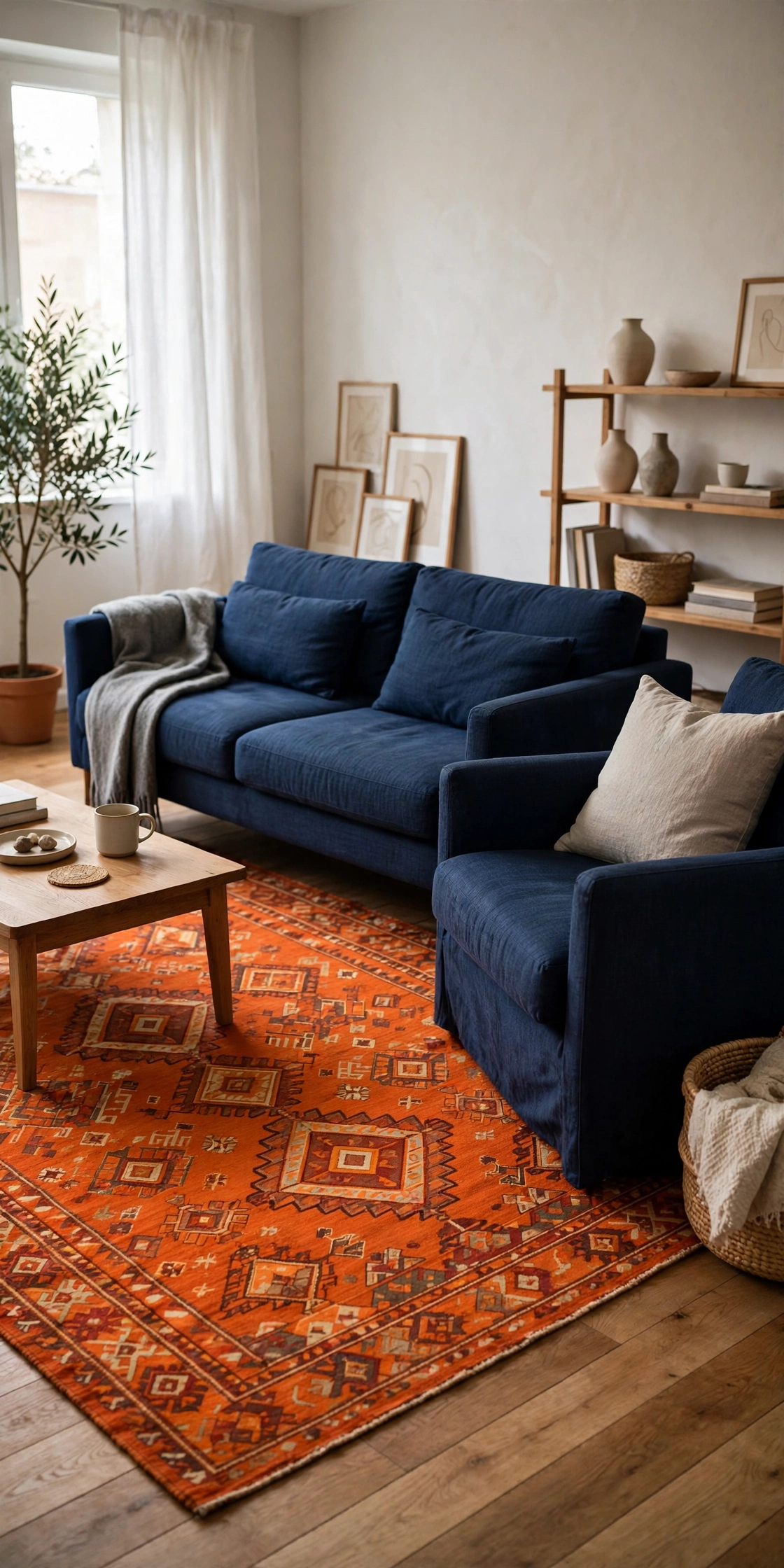
An orange patterned rug under navy furniture flips the usual formula and it works because the rug is pattern, not solid. The pattern breaks up the orange so it never overwhelms. Navy furniture on top anchors everything. This is the maximalist-friendly version: bold floor, calm furniture, neutral walls. The rug becomes the room’s artwork.
Quick Tip: A rug pad is non-negotiable under a statement rug. It keeps the pattern crisp and the rug in place.
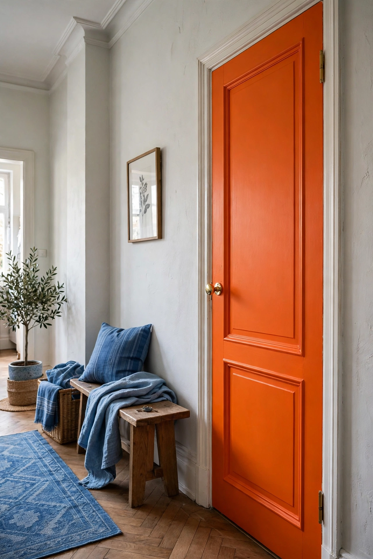
Take the tangerine front door trend inside: paint an interior door, a bookshelf back, or a radiator cover in vivid tangerine, then cool the room with blue textiles. The orange is concentrated in one architectural moment, which keeps it chic instead of chaotic. It is the smallest possible commitment to the boldest possible color. Renters, this is your peel-and-stick wallpaper moment.
Good to Know: One vivid architectural accent per room. Two starts to look like a theme park.
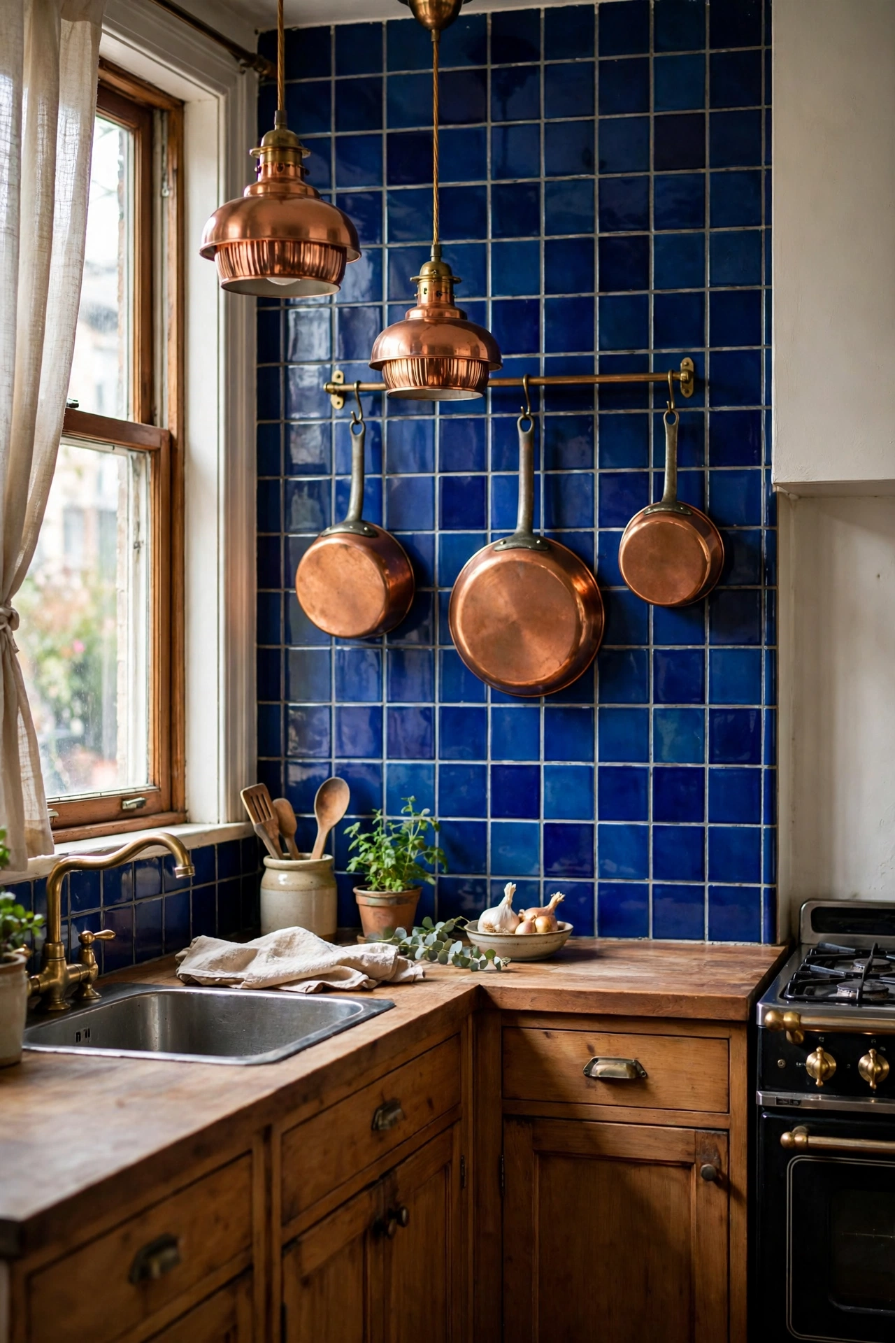
Copper pots, pendants, and hardware against cobalt blue tile is the kitchen that stops scrollers. Copper is orange’s sophisticated metallic cousin, and cobalt is blue at its most confident. The pairing feels both vintage and modern. Open shelving shows off the copper; the tile handles the blue. Small kitchen, huge personality.
Worth Knowing: Copper needs polishing or it dulls. Lacquered copper keeps the shine with zero maintenance.
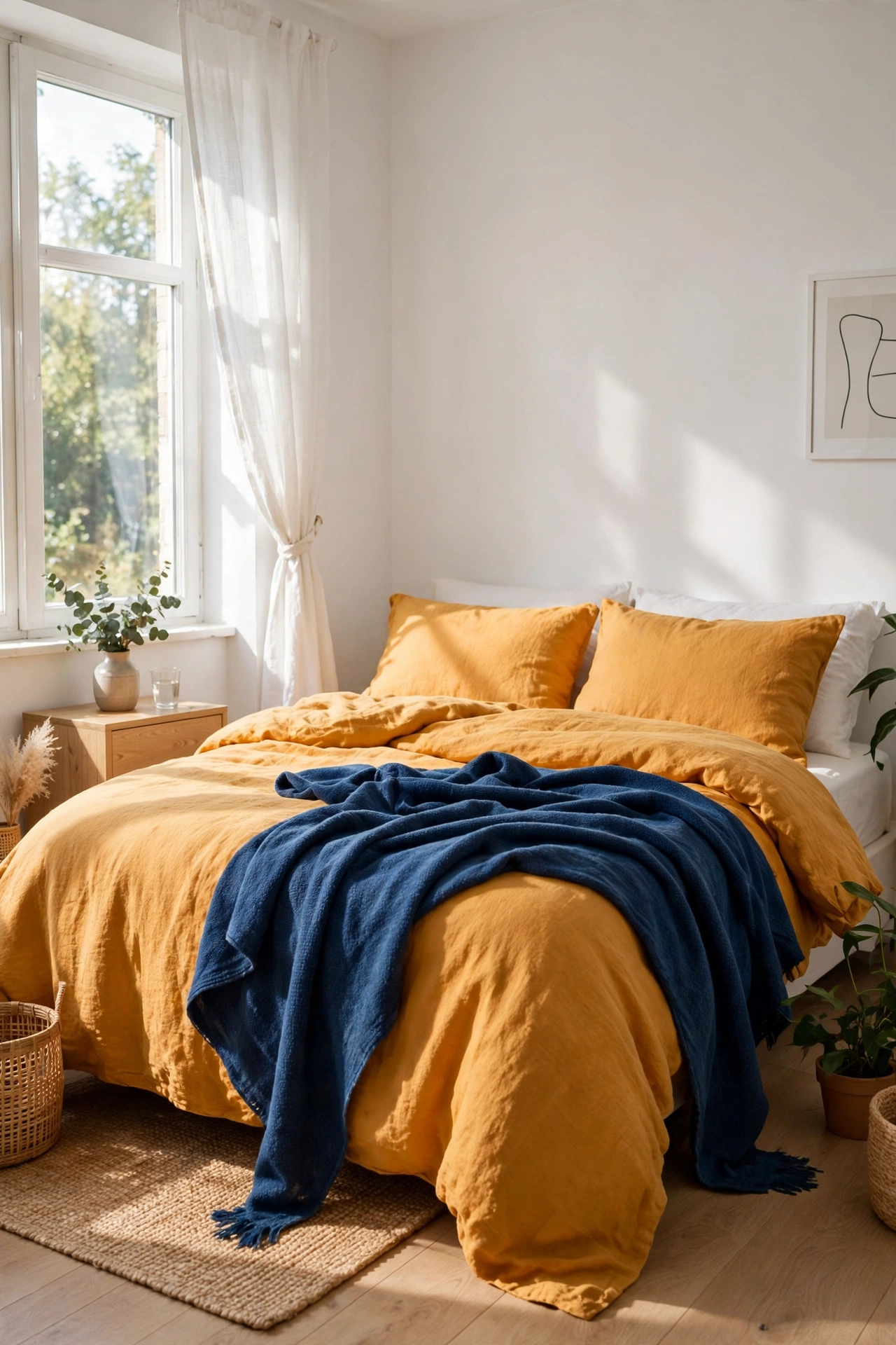
Marigold yellow-orange bedding with indigo throw blankets and pillows is the bedroom at its sunniest. The warm bedding makes the bed the happiest thing in the room; the indigo throws keep it grounded. This is a lot of color for a bedroom, so keep walls white and art minimal. Wake up to sunshine, even in February.
Honest Take: This much warm color can feel stimulating. If you sleep hot, visually and literally, stick with the blue-leads version.
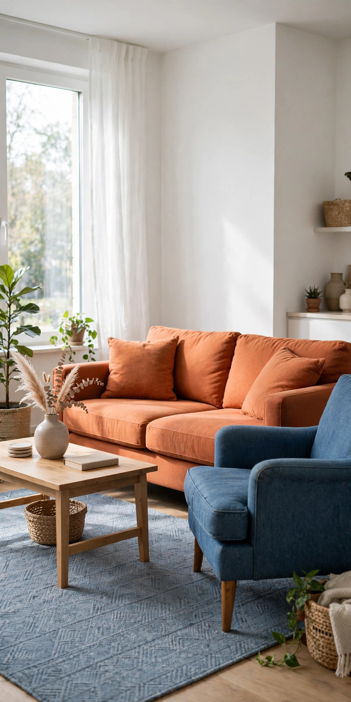
A persimmon orange sofa is the bravest furniture buy in this article, and in the right room it is magnificent. Keep everything around it blue and neutral: denim blue armchair, blue-gray rug, white walls. The sofa is the sun; everything else orbits. This only works if you truly love the color, because you will see it every day. Commitment furniture for commitment people.
Reality Check: Sit on it before you buy it. Bold color never compensates for an uncomfortable sofa.
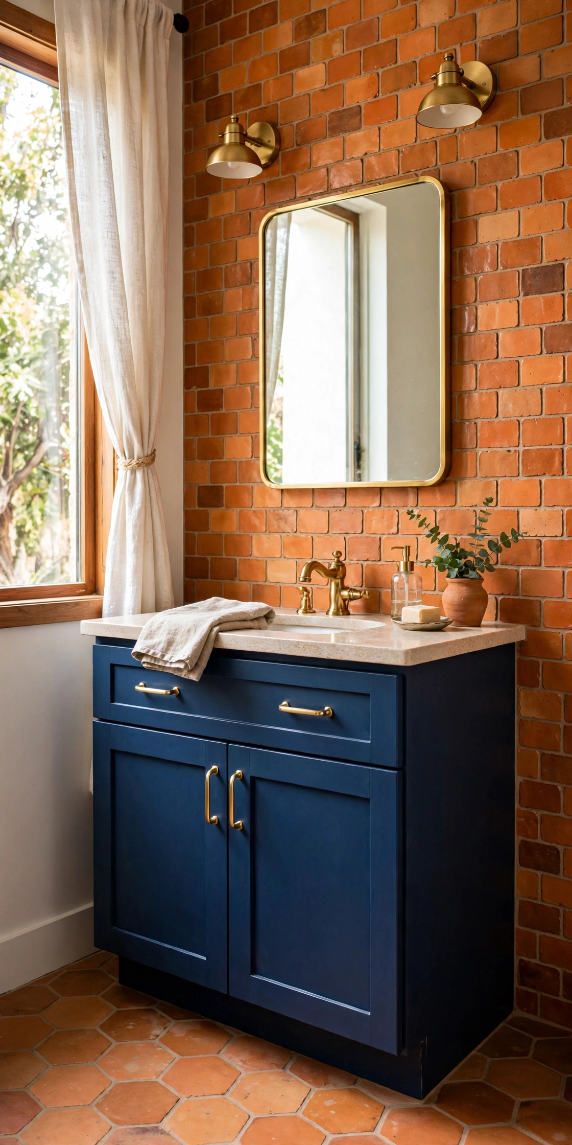
Handmade-look clay tiles in warm orange tones with a deep blue vanity make a bathroom that feels like a boutique hotel. The tile variation keeps the orange from feeling flat; the blue vanity grounds it. Brass fixtures bridge both colors. This is a renovation-level commitment, but it is also the bathroom guests photograph. Small space, big memory.
The Cost: Handmade-look tile runs pricier than basic ceramic. Budget for it or use it as an accent band only.
Why This Pairing Vibrates, and How to Stop It
Put pure orange directly against pure blue at equal intensity and the edge between them seems to shimmer. Designers call it simultaneous contrast, and it is why equal-ratio blue-orange rooms feel jittery. The fixes are simple: separate the colors with neutrals, use different values like deep navy with soft peach, or let one color dominate. Every idea in this article uses at least one of these tricks. That is why they work.
Room by Room
The pairing behaves differently in every room. Here is how to land it in the spaces the other sections did not cover.
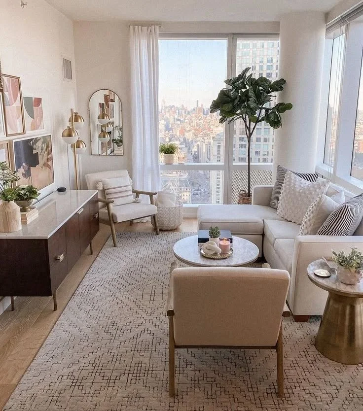
The living room formula: neutral walls, blue sofa, orange in three places, rug, one chair, art. Three is the magic number for the accent color; one looks accidental, five looks scattered. Distribute the orange in a triangle around the room so the eye travels. This formula has never failed because it respects the ratio. Memorize it and freestyle from there.
Quick Tip: Photograph the room and squint at the photo. The color balance is easier to judge in a small image.
Bedrooms want the softest version: dusty blue walls or bedding, peach or apricot accents, warm white everything else. Keep the orange muted and the blue grayed-out, and the room stays restful. Avoid vivid tangerine near the bed; it is the opposite of sleepy. This is the pairing with the volume turned down to two. Calm with a heartbeat.
Good to Know: Warm bulbs, 2700K, make peach and dusty blue glow. Cool bulbs make them look washed out.
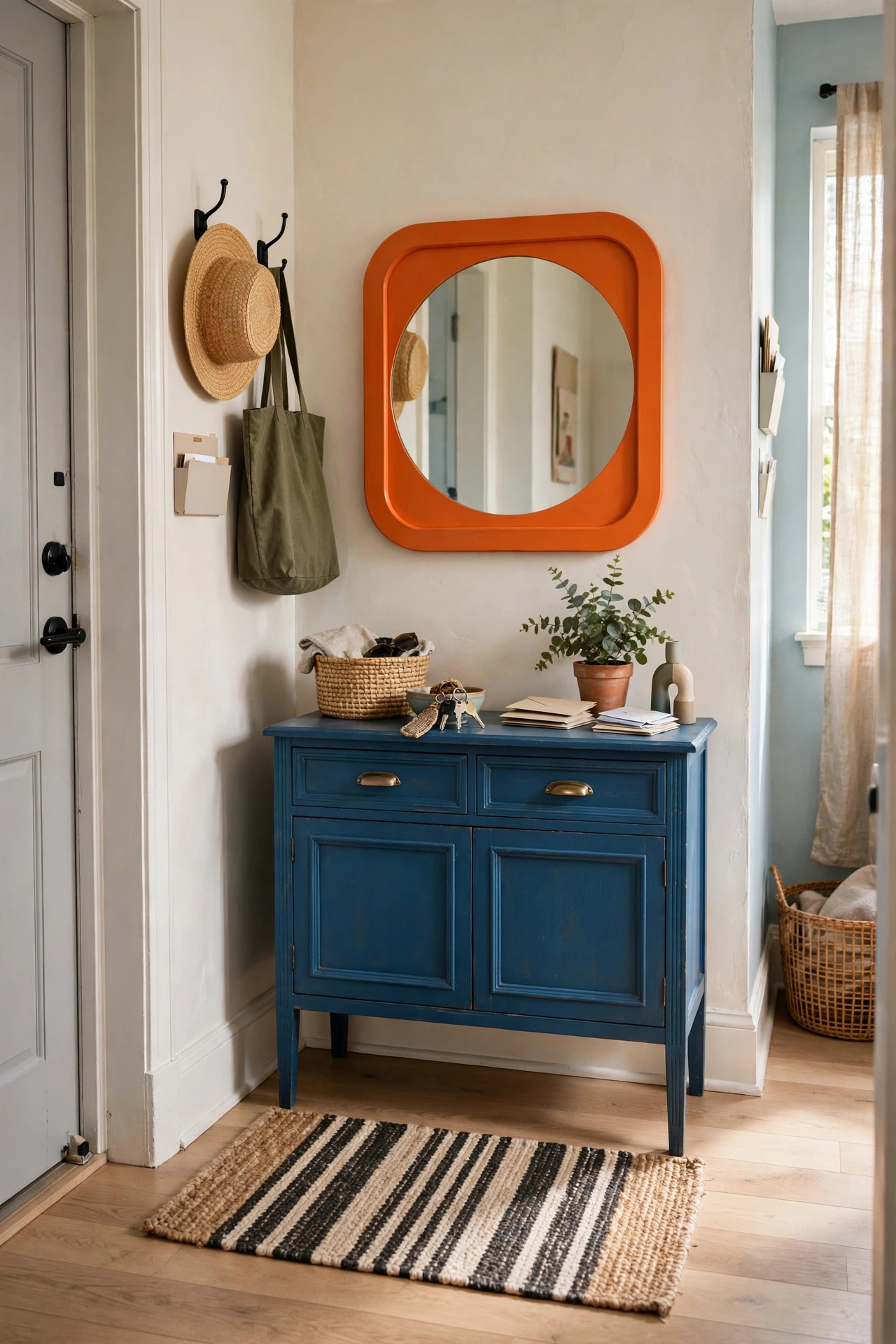
The entryway is the perfect place for a bold first impression because you only pass through. A blue console with an orange mirror frame, or orange hooks on a blue board, sets the palette at the door. Small space, brave choices, zero fatigue. Guests get the theme immediately. This is the trailer for the rest of the apartment.
Style Note: Entryways photograph well for listings. If you rent out or sell someday, this vignette earns its keep.
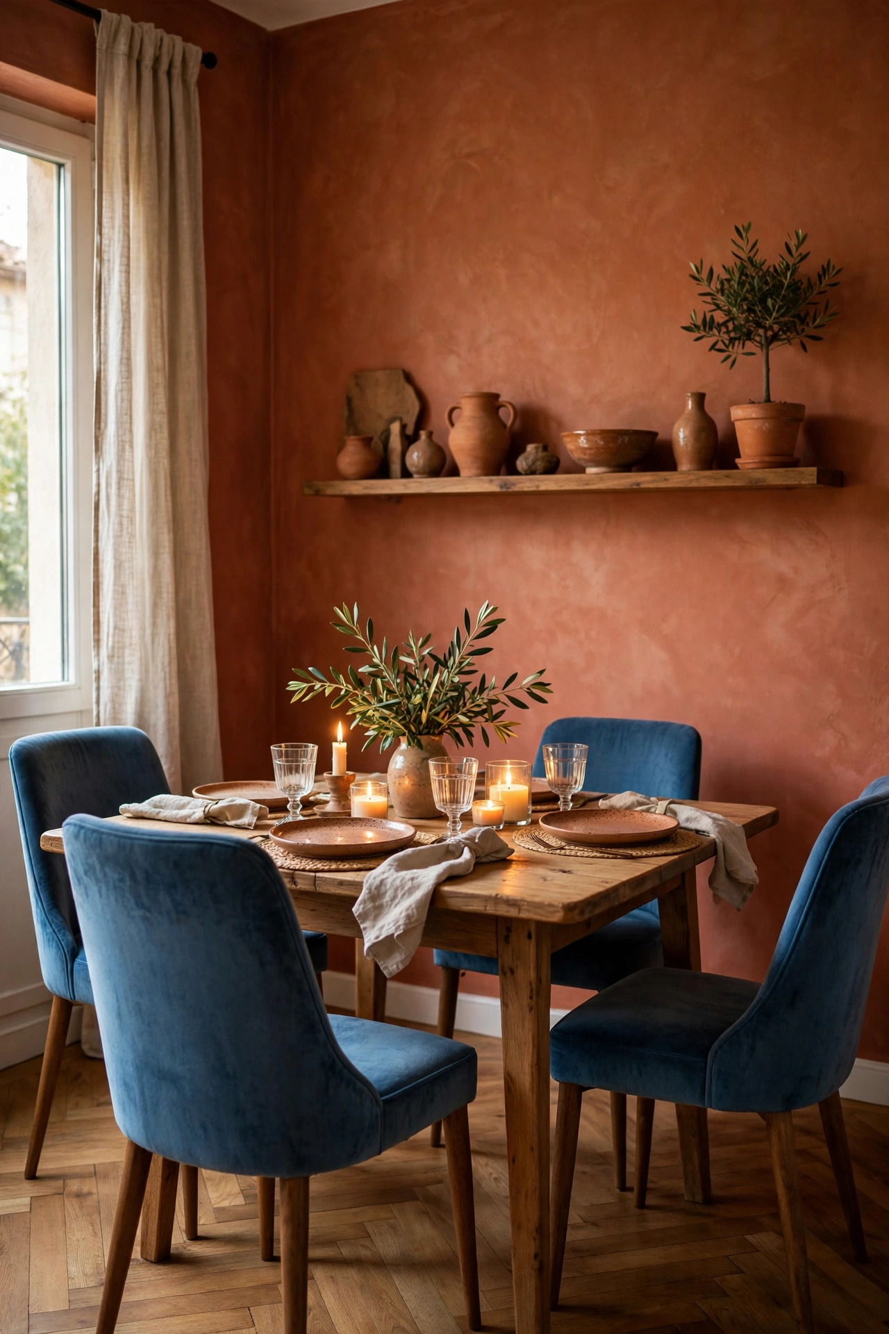
Dining rooms love warm color, so let orange lead here: terracotta walls or a burnt orange rug, with blue in the chairs or a sideboard. Candlelight on orange tones is flattering to everyone at the table. Blue keeps it from feeling like a pizza restaurant. Dinner parties in this room feel like occasions. The color does half the hosting.
Worth Knowing: Orange is appetite-stimulating, which is why restaurants use it. Your dining room can too.
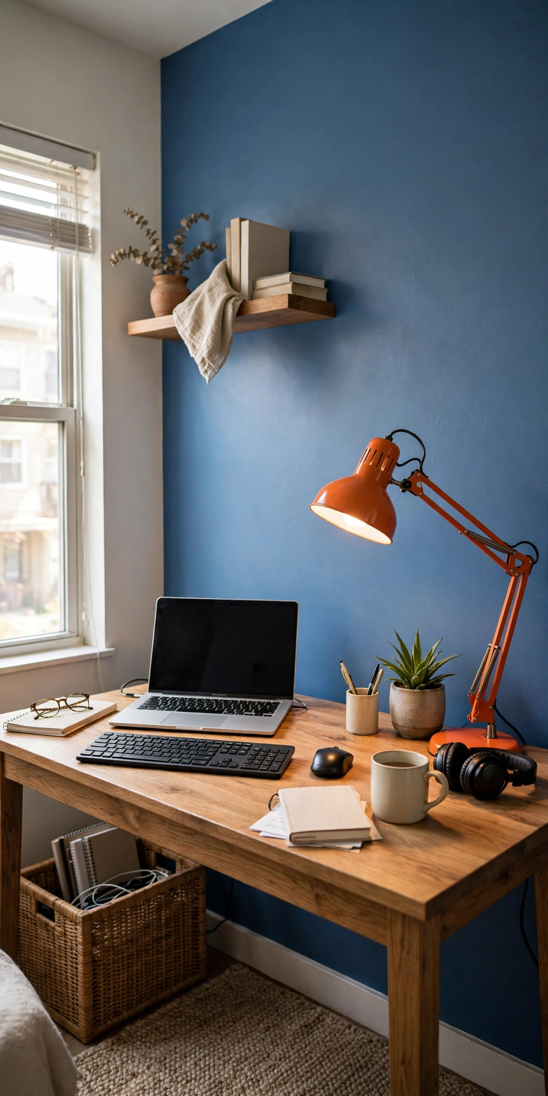
Home offices need the pairing at its most disciplined: blue walls for focus, one orange object for energy. A blue accent wall behind the desk with an orange desk lamp or chair is enough. Studies on color and productivity suggest blue aids concentration while orange sparks creativity, which is exactly the combination a workday needs. Functional color theory, applied.
Quick Tip: Keep the orange out of your video-call background unless you want to be remembered as the orange person.
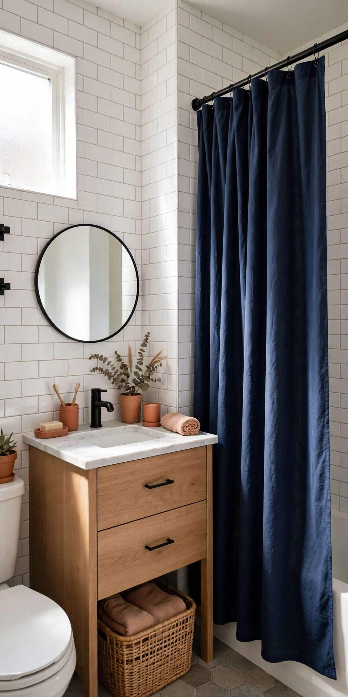
Beyond the powder-blue version above: white tile, a navy shower curtain, and terracotta accessories. The white keeps it clean, the navy adds depth, the terracotta warms it up. Three colors, each with a job. Bathrooms are small enough that you can be decisive. This is a weekend makeover with a designer result.
Good to Know: Navy shower curtains show soap scum. Rinse and shake them out weekly.
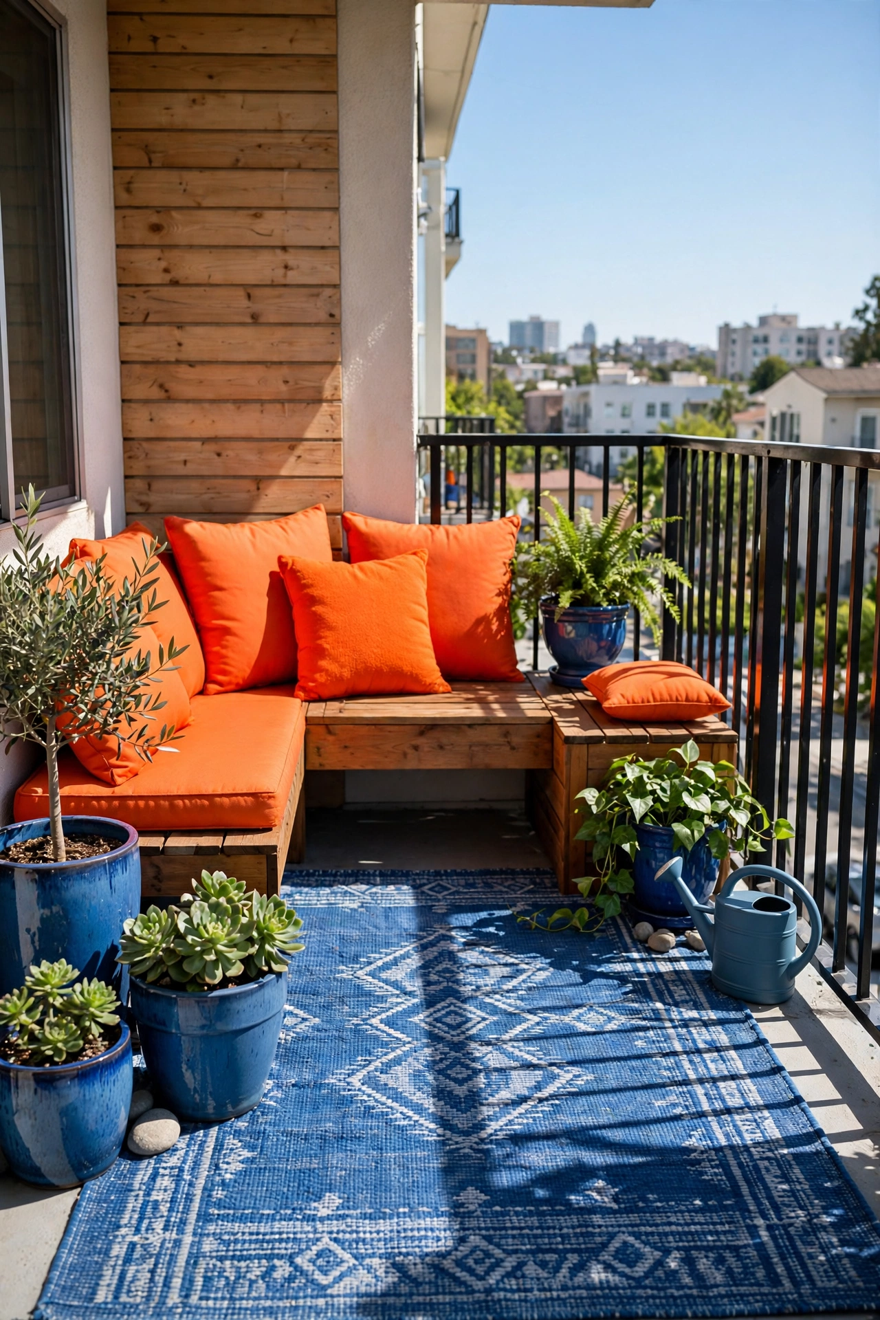
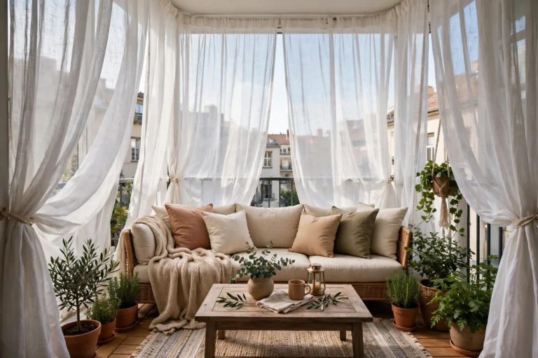
Balconies are ideal for the bold version because they are separate from the interior palette. Orange outdoor cushions with blue planters, or a blue rug with terracotta pots. The sunlight makes both colors sing. Since it is outside the main rooms, you can go brighter than you would indoors. The balcony is the playground; let the colors play.
Style Note: Outdoor fabrics fade. Solution-dyed acrylic holds orange and blue equally well.
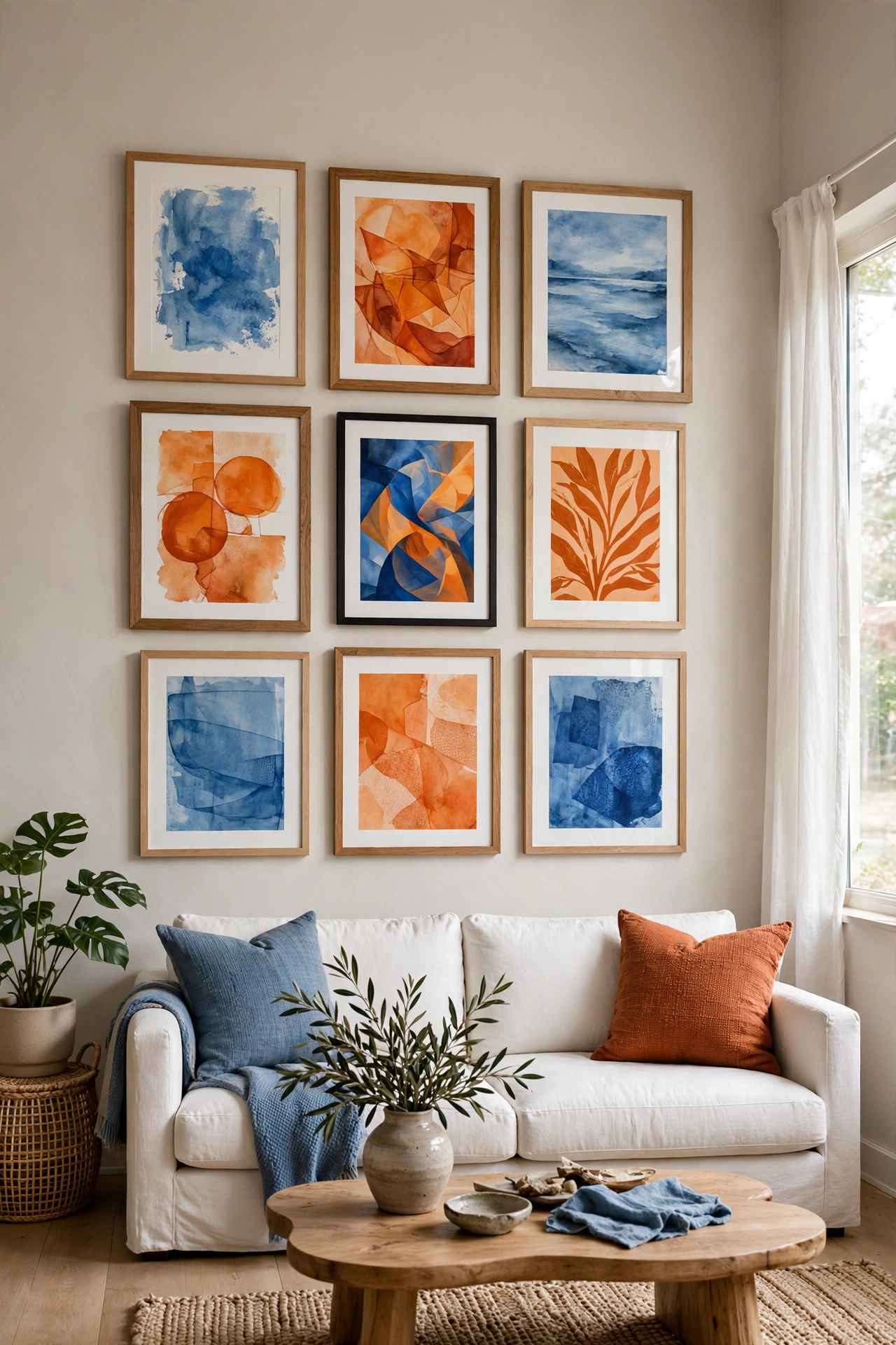
A gallery wall mixing blue and orange art ties together a neutral room without any colored furniture. This is the commitment-phobe’s version: white sofa, wood table, and the color lives entirely in frames. Rearrange the art when you want a change. It is also the cheapest way to test whether you actually like living with the pairing. Try before you buy the sofa.
Honest Take: Thrifted frames painted blue and orange cost almost nothing and look completely intentional.
The 60-30-10 Checklist
60 percent: a neutral or your lead color on walls and big pieces.
30 percent: your secondary color on the sofa, rug, or curtains.
10 percent: the accent color in three small hits around the room.
Never split blue and orange 50-50 at full intensity. Someone must lead.
When in doubt, mute one of them. Muted plus vivid always beats vivid plus vivid.
Let One Color Win
Every beautiful blue-and-orange room has a winner and a runner-up. The winner takes the walls or the sofa; the runner-up gets the pillows, the art, the small moments. That hierarchy is the entire secret. Pick your lead based on the mood you want, calm or energy, then let the other color do its supporting work in threes. The color wheel gave you the pairing. The ratio makes it yours.