Your apartment has four walls you cannot touch and a landlord you would rather not call. Yet some of the best-looking spaces out there are rentals that have been smartly rethought from the inside out, without a single wall moved or a contractor called.
The trick is knowing which changes actually stick and which just look good in a Pinterest photo. This article covers the ideas that hold up in real life, pulled from the design decisions that working designers and clever renters keep returning to again and again.
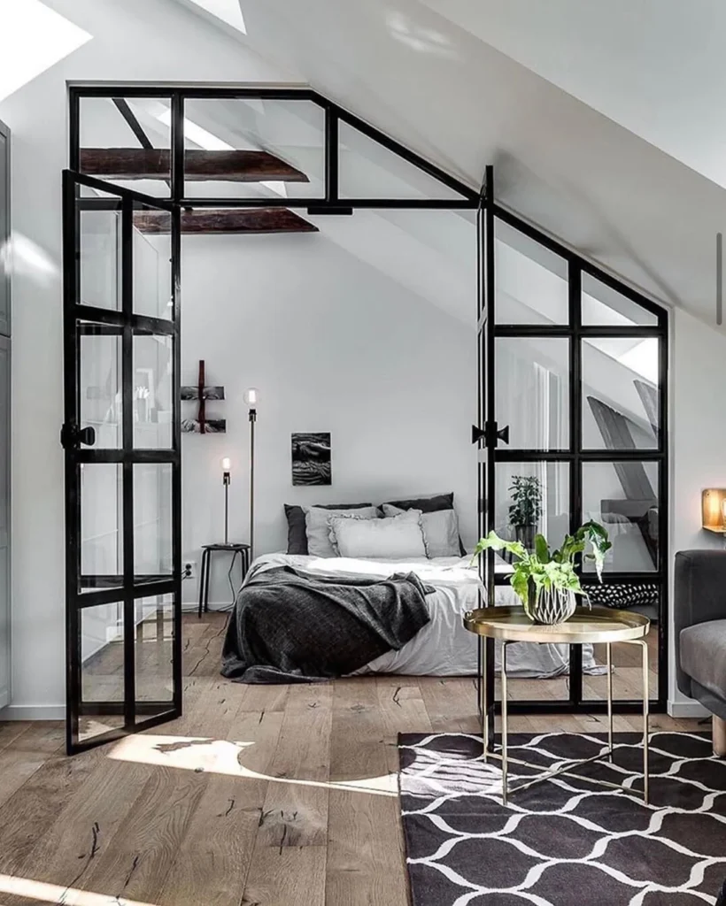
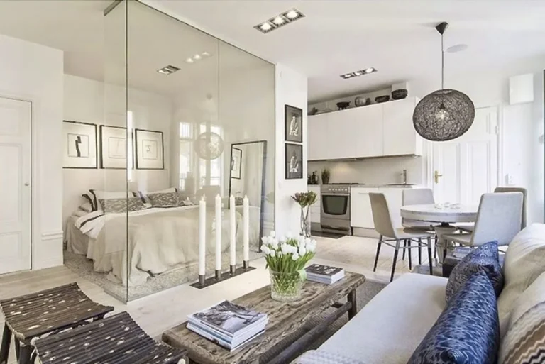
A steel-frame glass door or partition is the closest a renter or apartment owner gets to a proper architectural upgrade without touching a single structural wall. You can buy freestanding Crittall-style frame units, or have a slim partition installed between two rooms that replaces a hollow-core door, and the effect is immediately magazine-worthy.
It works because light keeps travelling through the space while zones are clearly defined, so a bedroom behind one feels like its own room, not just a mattress in a corner. In smaller apartments, this is far more effective than a solid wall or a curtain because it adds visual weight without visual mass.
Pro Move: For maximum impact, go floor-to-ceiling with the frame even if the glass panels only reach three-quarters of the height.
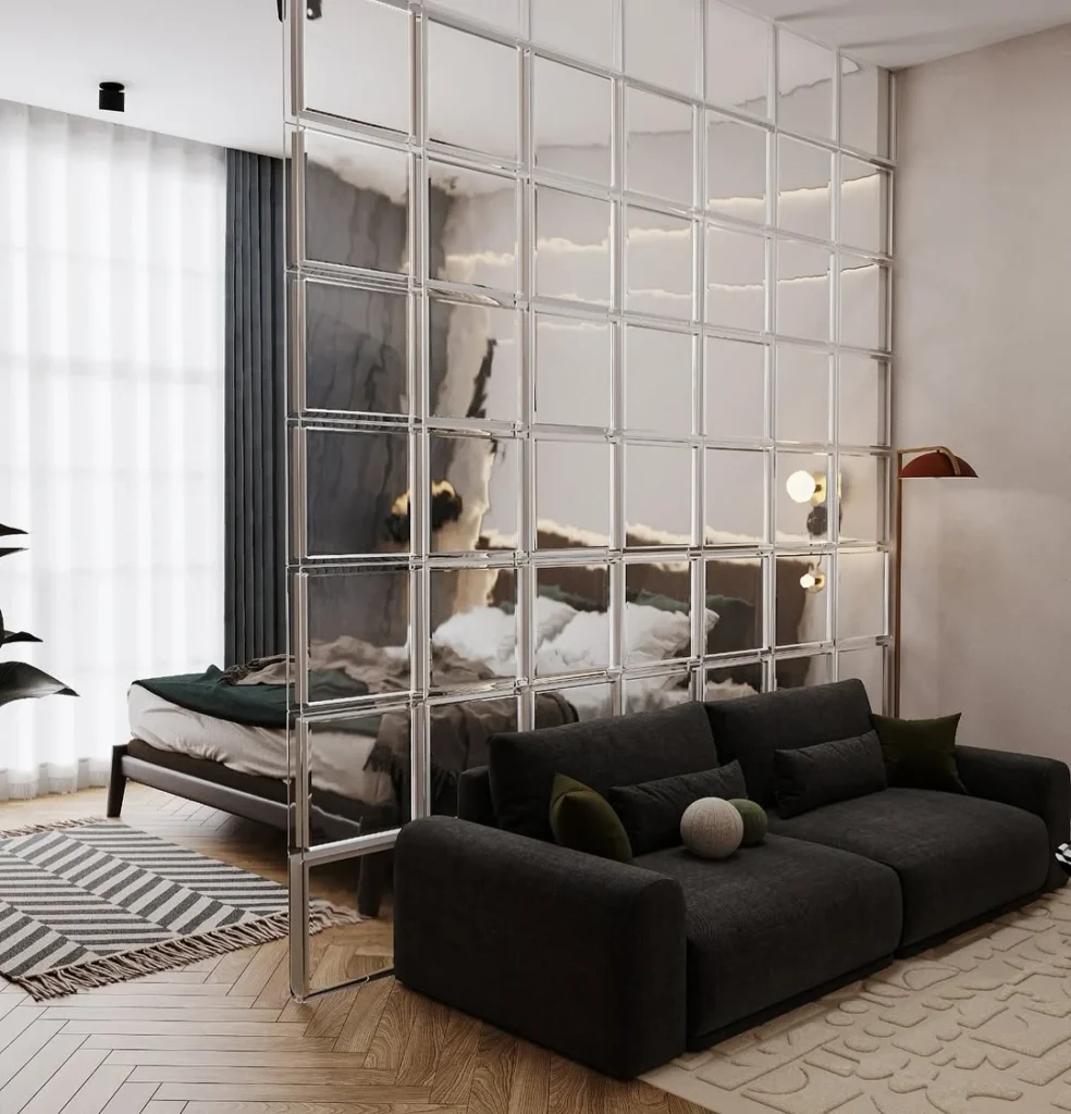
A floor-to-ceiling mirrored grid divider does two jobs at once: it separates a sleeping zone from a living area while simultaneously bouncing light and making the room feel almost double its actual size. The example here uses polished chrome-framed mirror squares arranged in a 5×7 grid, and the effect is closer to an art installation than a functional partition.
This approach works best in apartments where natural light comes from one side only, because the mirror catches it and redirects it into the darker half of the room. At a mid-range investment (expect $300 to $700 for quality mirror dividers), this is one of the higher-impact changes you can make without altering a single square metre of the apartment itself.
Designer Advice: Keep the furniture on either side of the divider low-profile and push it back slightly so the mirror reads as a full wall panel, not a floating screen.
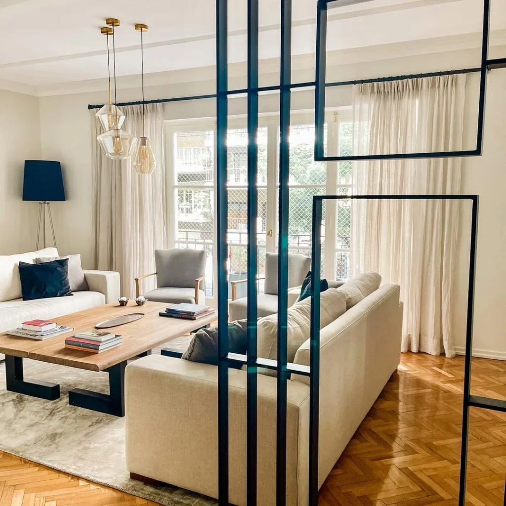
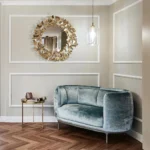
A slim black steel-frame open partition placed between a living room and a dining or entryway zone is one of those solutions that looks expensive but is actually achievable for a few hundred dollars with off-the-shelf steel partition frames. The key here is that the frame does not need glass to work: the geometry alone creates a visual boundary and a sense of architecture.
In practice, this particular look works best in apartments that already have warm herringbone or parquet flooring, because the dark steel frame creates enough contrast to read clearly. It also pairs beautifully with pendant clusters hung on the living room side, creating a focal point that signals you have entered a different zone of the apartment without physically going through a door.
Heads Up: If your ceiling height is below 2.7 metres, scale the partition down rather than going full height to avoid making the room feel cramped.
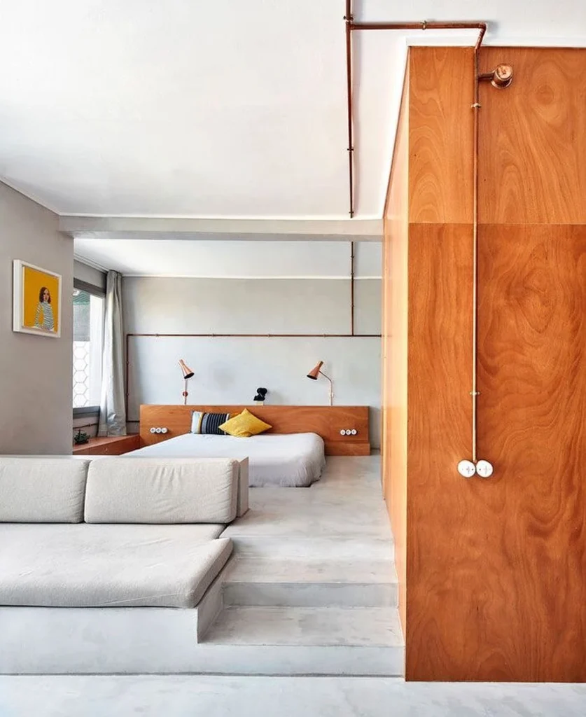
Plywood or timber sheet panels used as a partial room divider are having a real moment among apartment dwellers who want warmth, texture, and definition without committing to a permanent structure. Here, a full-height plywood panel separates a sleeping platform from a minimal living area while warm copper pipe details run along it as functional-meets-decorative accents.
The sleeping platform raised a few centimetres off the main floor level is another layer of the spatial storytelling: it signals zone change through both texture and level change, which is something designers call multi-sensory zoning. This is a more ambitious DIY project, but the result is a studio that reads as a proper one-bedroom in terms of psychological separation.
Reality Check: Exposed plywood needs sealing or waxing to prevent it from looking unfinished after six months; Danish oil works well and brings out the grain beautifully.
If you are weighing up which type of divider to use in your own apartment, this at-a-glance breakdown covers the main options:
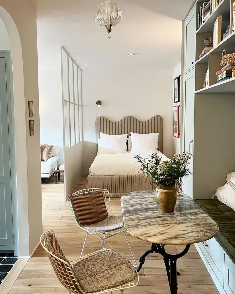
A verrière (an internal glazed screen or window used between two rooms) is a classic Parisian apartment trick that splits an open-plan room into bedroom and living zones while keeping both spaces light. Here you can see it used as a partial glass wall behind the bed, allowing borrowed light to travel through from the main living room while the scalloped upholstered headboard and marble bistro table anchor the bedroom zone with texture and character.
What makes this feel genuinely luxurious rather than merely functional is the layering around it: built-in shelving to one side, worn oak floors, a Murano-style pendant, and wire-frame chairs that bring negative space into the composition. In practice, a fixed verrière starts at around $600 installed, but freestanding glass-panel screens are available for under $200 if permanence is not possible.
Quick Tip: Pair a verrière with a wall sconce on the bedroom side rather than a table lamp so the bedside surface stays clear and the light stays directional.
Zone Two: How You Light and Layer
6. A Mirror Wall Panel That Reflects the Whole Room
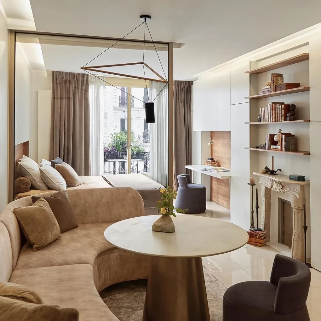
A large frameless or slim-framed mirror panel positioned behind a curved sofa does something a single decorative mirror cannot: it reflects the entire furniture arrangement back at you, doubling the perceived depth of the room and making the furniture feel deliberately composed rather than just placed. Here the effect is enhanced by a mirrored sliding door used to conceal a sleeping alcove, and the two mirror surfaces together make a small Parisian studio feel genuinely spacious.
Layered lighting is critical to making this work: the geometric pendant light, the cove lighting above, and the reading lamp on the floating desk each operate on a different plane, which means the mirror catches multiple light sources at once rather than just bouncing one overhead light around the room. Budget note: large wall mirrors run from $80 at discount retailers up to $400 for quality frameless panels, making this one of the most cost-effective spatial illusions available.
Pro Move: Position your mirror so it reflects a window rather than a wall; the light it returns will feel like a second natural source, not a reflection.
7. Mismatched Pendant Clusters for Layered Lighting
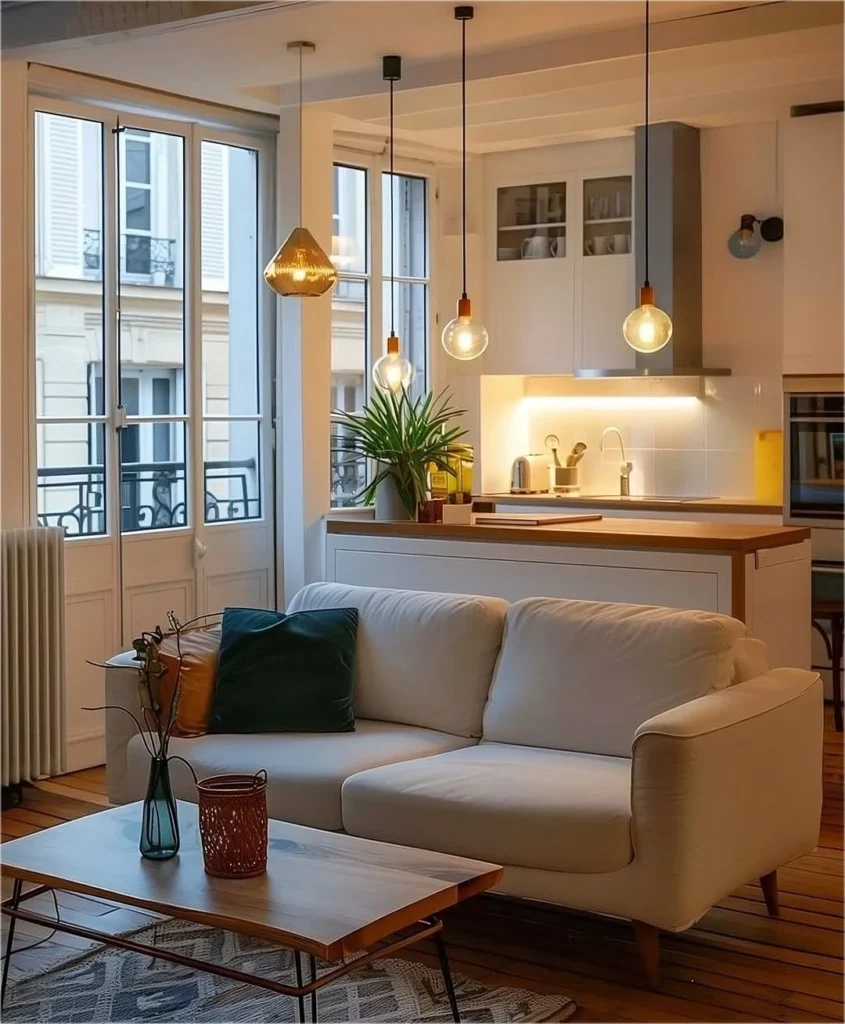
Three different pendant lights hung at varying heights over an open-plan kitchen and living area is a move that top designers call organised eclecticism: each pendant has its own character (amber geometric, bare-bulb Edison, tinted glass globe) but they share enough in common, warm filament bulbs, dark cord, similar scale, to read as a deliberate collection rather than a mismatched mistake.
In a compact Parisian-style apartment with white walls and warm parquet floors, this kind of pendant cluster works as the visual anchor of the whole space, giving you a focal point that draws the eye upward and makes low ceilings feel more deliberate than limiting. This approach costs very little to execute: three pendants on IKEA or Wayfair cord sets can come in under $150 total and the electrician time is minimal if you are replacing existing ceiling roses.
Designer Advice: Always use warm-white or amber bulbs (2700K or lower) in pendant clusters over living areas; cool-white at 4000K or above will make the space feel clinical regardless of how good the pendants look.
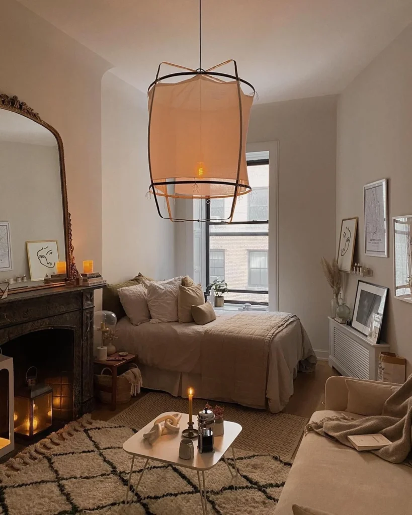
A single large statement pendant hung low over a seating area, especially a fabric or woven lantern-style fitting, changes the entire atmosphere of a room in a way that almost no other single purchase can. Here, an oversized natural-linen drum pendant transforms what is essentially a small, busy studio into something that feels curated and cozy, where the gilded vintage mirror, the layered rugs, and the candles all feel intentional beneath it.
The reason this works so well in rentals is that swapping pendant fittings is usually one of the few electrical changes a landlord permits (you keep the original and reinstall it when you leave), and the scale of the fitting relative to the room is what changes the spatial hierarchy: a large pendant commands attention and pulls the eye down and in, making a small room feel deliberately intimate rather than just small.
Reality Check: Before buying a large pendant, hang a piece of cardboard cut to the same diameter from your existing ceiling point and live with it for a day to check the scale works in the room.
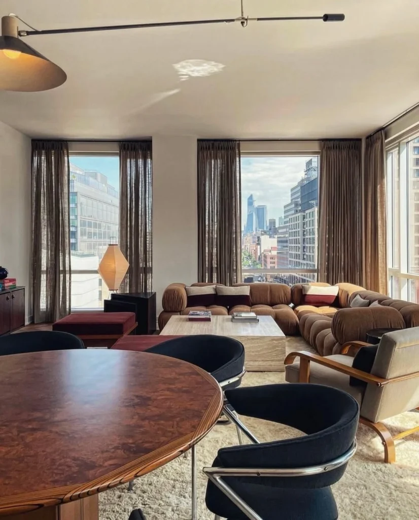
When a burl-veneer dining table sits in front of floor-to-ceiling sheer curtains and a city skyline, alongside a modular tufted sofa and mid-century armchairs, what you are looking at is the result of a deliberate approach to furniture selection that interior designers call patina layering: mixing warm, aged textures (the burl wood, the woven chairs, the arc floor lamp) with cooler modern forms (the sectional, the glass, the clean-lined pendant).
In practice this is one of the most budget-accessible high-end looks because burl-veneer furniture is widely available secondhand, and the key to the look is contrast in texture rather than expensive individual pieces. One genuinely aged or characterful piece, a good lamp, and a well-considered rug can do more for an apartment than a full set of matching new furniture.
Quick Tip: When buying secondhand furniture for this approach, look for pieces with interesting grain or worn patina rather than pieces in perfect condition; the character is the point.
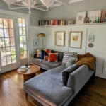
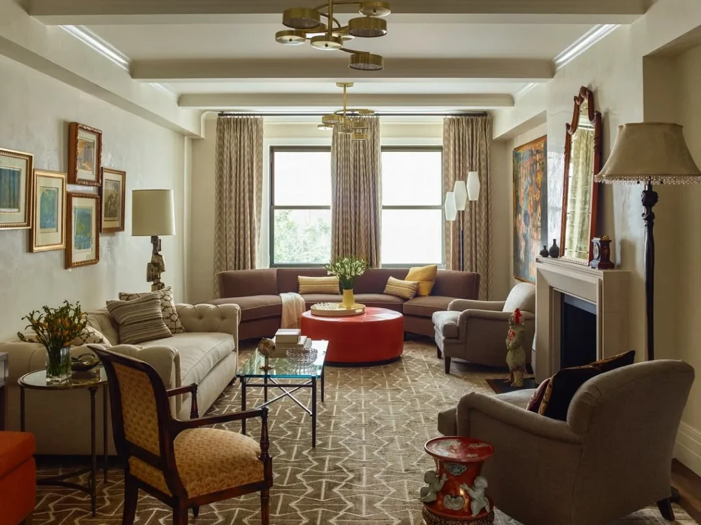
A curved or semi-circular sectional placed in the centre of a room rather than pushed against the walls is one of the best decisions you can make in a classic apartment with good ceiling height and original architectural features. It creates a conversation pit effect without any structural work, it defines the seating zone clearly, and it allows you to float the furniture away from the walls, which paradoxically makes the room feel larger.
The bold red circular coffee table functions as a colour anchor and provides a visual counterpoint to the muted tonal sofa and taupe walls. Professional designers often use one high-contrast piece in a neutral room to give the eye somewhere to land, and a round coffee table at this scale does exactly that without overwhelming the room’s existing proportions. This kind of layout works best in rooms of at least 4×4 metres.
Designer Advice: Floating furniture away from the walls by at least 40cm on each side is the single most effective way to make a living room feel professionally designed rather than just furnished.
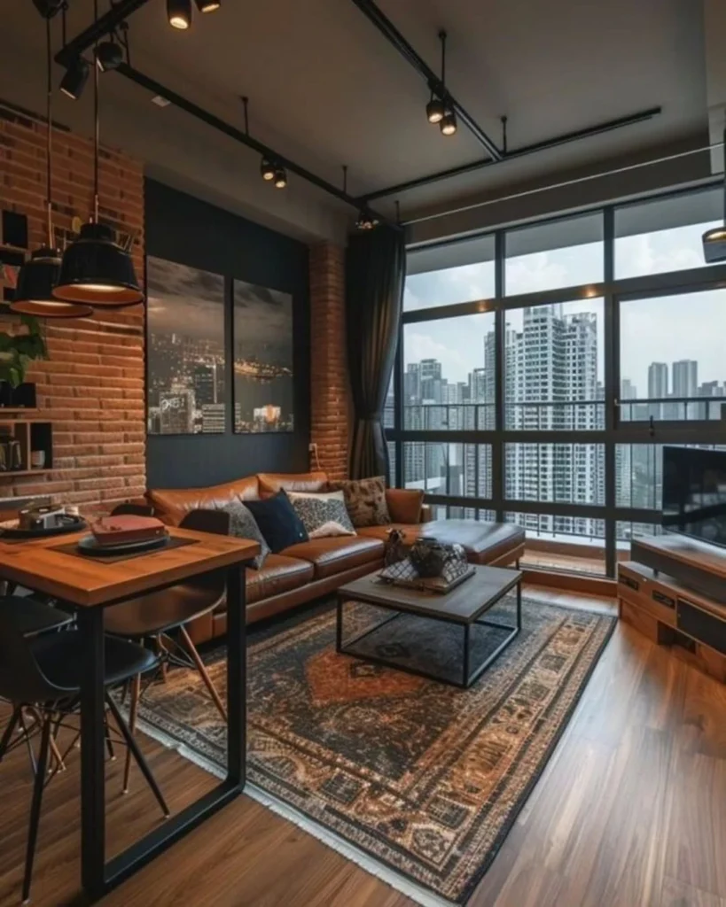
Apartments with exposed brick walls are often treated as a problem to paint over, but in the right context, that wall is the most valuable surface in the room. Here the brick anchors an industrial-style living space alongside track lighting on black rails, cognac leather sofa, a vintage Persian rug, and a reclaimed-wood dining table, and the combination reads as sophisticated rather than rough.
Track lighting is worth calling out specifically because it is one of the most renter-friendly electrical upgrades available: you plug a track light system into an existing ceiling point, position the individual heads wherever you need them, and take the whole thing with you when you leave. For apartments where the fixed lighting is poor (and most rental apartments have terrible fixed lighting), a track system running $80 to $250 is one of the best investments you can make.
Pro Move: On an exposed brick wall, avoid hanging art directly on the brick and instead lean large canvases or frames against it for an approach that is easier to move and tends to look more considered.
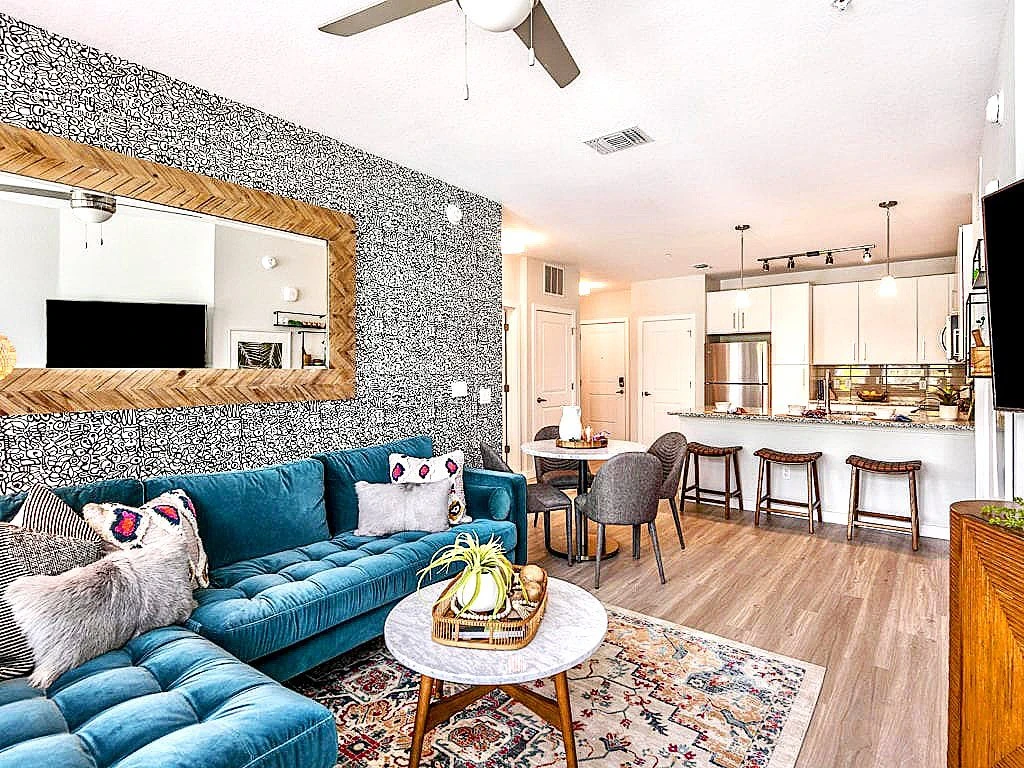
A peel-and-stick patterned wallpaper accent wall behind a sofa is the fastest, most reversible way to change the entire personality of a living room without touching the landlord. The graphic black-and-white abstract pattern here is paired with a teal velvet tufted Chesterfield sofa and a large wood-framed mirror, which together create a maximalist-light look: strong pattern, bold colour, and one oversized reflective piece that keeps the room from feeling cluttered.
The wood-chevron-framed mirror is doing important work here beyond decoration: at this scale and this placement, it reads as a secondary focal point that competes with the wallpaper in a way that feels balanced rather than chaotic. In practice, peel-and-stick wallpaper from brands like Chasing Paper or Tempaper runs $4 to $8 per square foot and can be removed cleanly from most painted surfaces, making it one of the safest bets for renters who want real impact.
Heads Up: Before applying peel-and-stick wallpaper, test a small patch in a hidden corner of the wall for 24 hours to confirm it removes without lifting paint, because not all wall paint finishes behave the same way.
13. A Large Antiqued Mirror Wall as the Focal Point
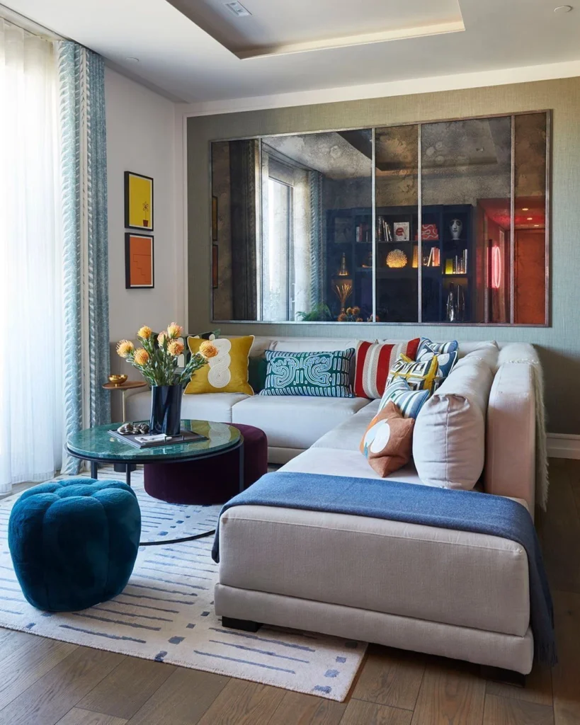
A full-width antiqued or foxed mirror panel positioned behind a sofa is a decorator’s trick that appears in high-end hotel lobbies for a reason: the aged, slightly clouded surface reflects the room without creating the disorienting clarity of a standard mirror, so the space feels expanded and atmospheric rather than duplicated. Here it is paired with bold, eclectic cushions, a green marble-top coffee table, and a teal velvet pouf, and the combination is vivid without being exhausting.
Antiqued mirror panels can be custom-made for a few hundred dollars by local glass suppliers, or sourced as ready-made wall tiles that you arrange and affix with mirror adhesive. The critical installation detail is ensuring the panels are flush and evenly gapped: an uneven antiqued mirror looks unintentional, whereas a well-set one looks like bespoke joinery.
Reality Check: Antiqued mirror works best in rooms with multiple light sources at different heights; in a room with only overhead lighting, the effect is far less interesting and can read as just a old mirror.
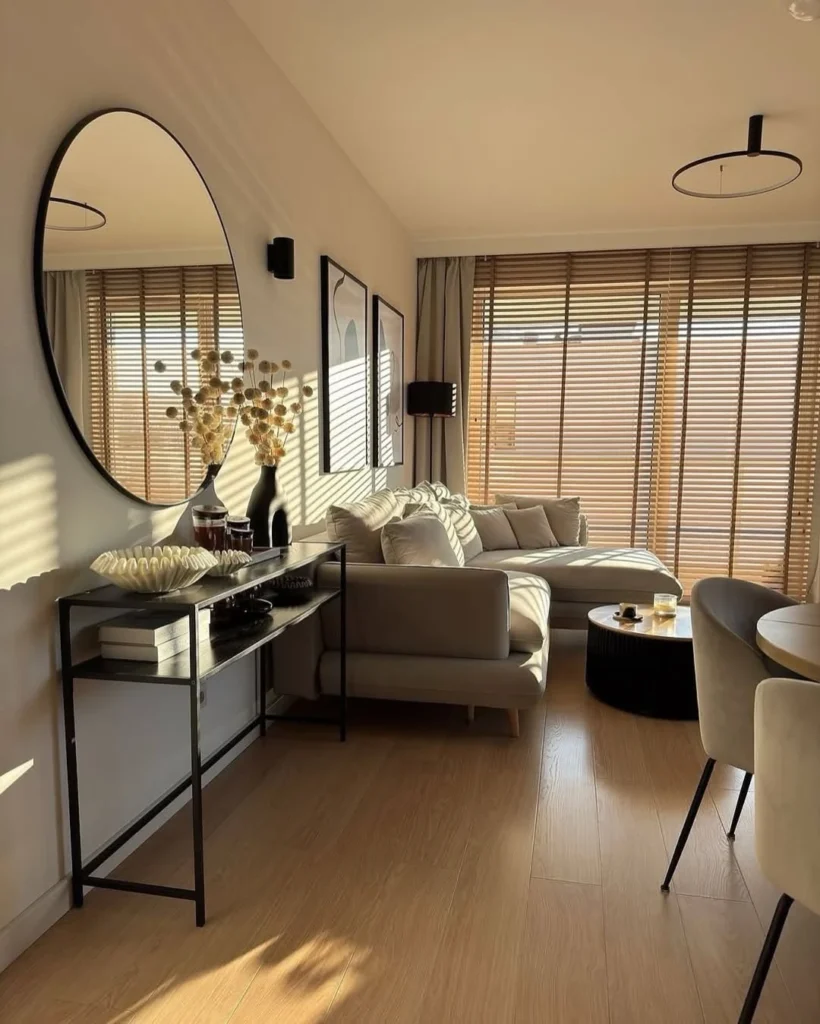
A large round mirror with a slim black frame placed above a narrow black console table is a pairing that works in almost any apartment with a long blank wall, and it solves three problems at once: the mirror expands the room visually, the console provides surface storage without depth, and together they create a styled focal point that makes an entrance or living wall feel finished.
The warm-toned Venetian timber blinds in this apartment are doing something subtle but important: they filter natural light into warm horizontal stripes that bounce across the oak floor and the sofa, creating a quality of light that makes the whole room feel sun-drenched even on a grey day. Venetian timber blinds run from $80 to $250 per window and are one of the more significant window upgrades available without permanently altering the window frame.
Quick Tip: Always mount a round mirror at eye level for the average standing height in the room (around 155 to 165cm to the centre), not at picture-hanging height, which is usually too low.
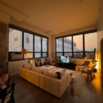
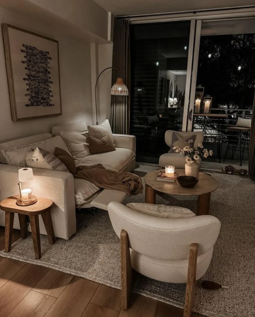
There is a version of this apartment at 9am with the daylight coming through the glass doors, and it probably looks pleasant. But the version pictured here, with the rattan arc lamp, the small bedside table candle, the arrangement of dried flowers catching the light, and the bouclé armchairs pulling the eye around the room, is the version that makes an apartment feel like a home worth staying in.
This is the principle of layered lighting in practice: ambient (the overhead or arc lamp), accent (the candles), and functional (the small table lamp for reading), all working together at different intensities. The key investment here is the arc lamp, which costs $150 to $350 for a quality rattan or metal model, and the principle is to never have the overhead light as the only source on in the evening if you can help it.
Pro Move: Invest in smart bulbs for your main floor lamp and set them to a warm 2200K scene at night; the difference in atmosphere compared to standard bulbs is immediate and the cost is under $30.
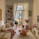
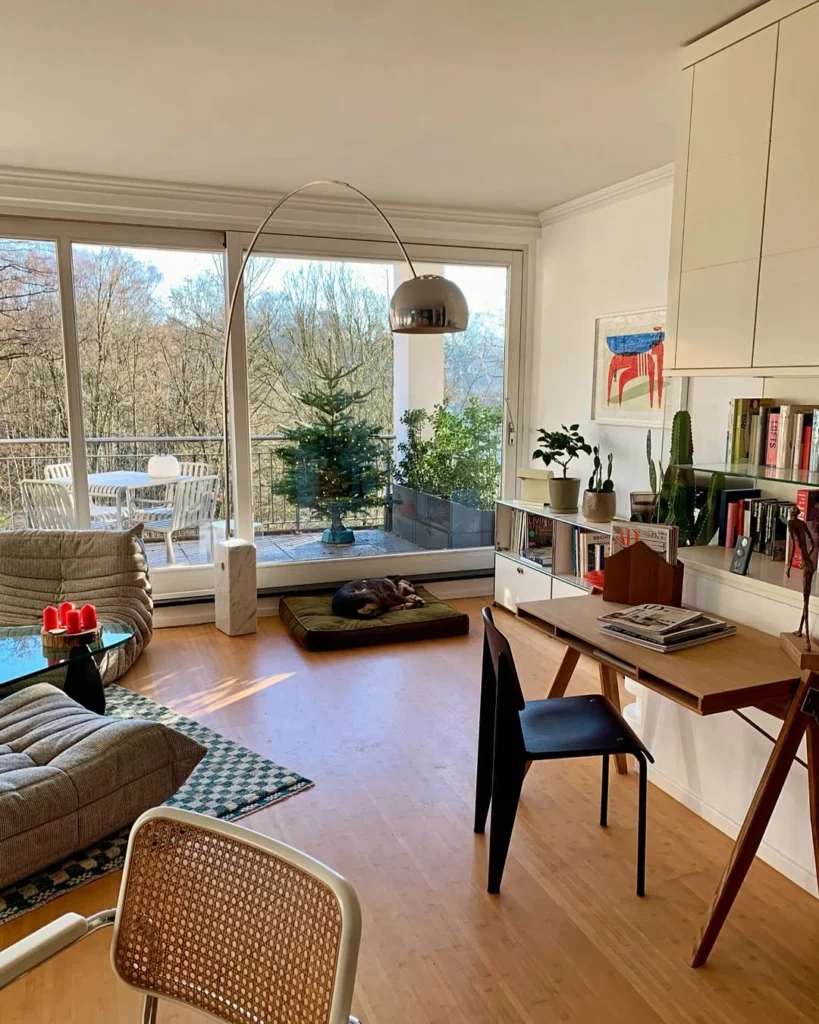
Carving out a dedicated work zone in an apartment without a spare room is one of the most-searched apartment challenges online, and the answer most people miss is that the desk and chair matter far less than the visual separation around them. Here a writing desk is positioned perpendicular to a white storage unit, the Arco arc lamp swings across from the seating area but can pivot to the desk, and a curated collection of books, plants, and small art pieces on shelves signal that this corner is its own world.
The sliding glass doors to the balcony also do functional work here: they separate inside from outside without a wall, and the greenery beyond the glass blurs the boundary between the workspace and the natural world, which is something that genuinely affects focus and wellbeing rather than being purely aesthetic. For renters who work from home, a freestanding bookcase placed at a right angle to a desk is the most accessible version of this zone-defining move.
Designer Advice: A work zone needs both task lighting (bright and directed) and ambient lighting (soft and warm) to switch between focus and rest modes; a single overhead bulb satisfies neither.
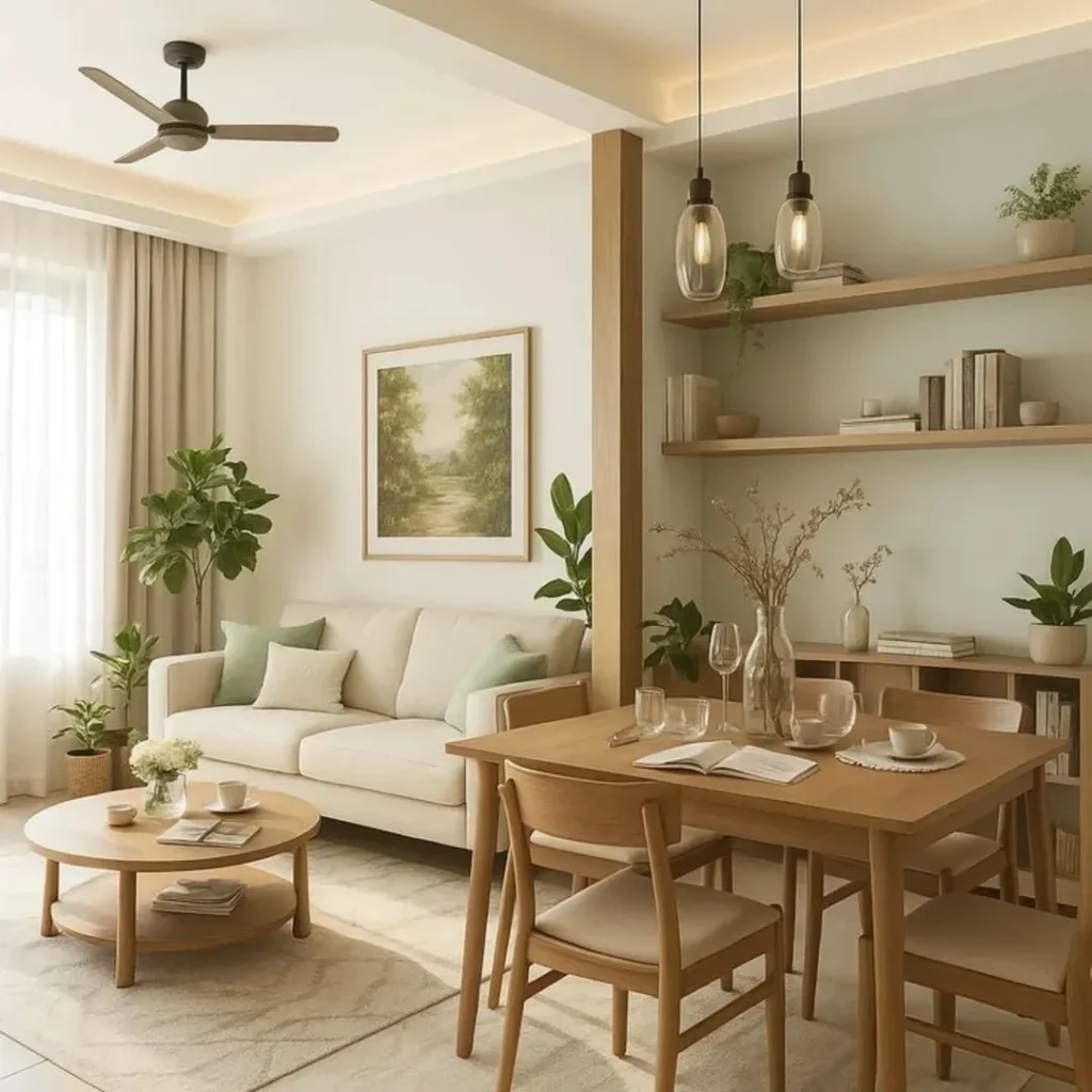
Japandi (the Japanese-Scandinavian design hybrid) has become one of the most searched interior aesthetics precisely because it solves the small-apartment paradox: it looks warm and collected without accumulating visual clutter. Here the palette is white walls, natural oak furniture, sage green cushions, and honey-toned open shelving, and every surface is occupied but not crowded.
The structural column wrapped in natural timber is worth noting because it is a very common apartment feature that most people try to hide. Here it becomes the vertical anchor of the space, separating the dining zone from the living area and carrying pendant lights from its top, which turns an architectural limitation into the design’s central feature. Natural timber wrap on a column costs around $100 to $200 in materials and is fully removable.
Heads Up: In a Japandi scheme, resist the urge to add colour through cushions or art; the warmth in the palette should come entirely from natural materials and wood tones, which last longer and read more cohesively.
18. The Monochrome Open-Plan: Letting Light Do the Work
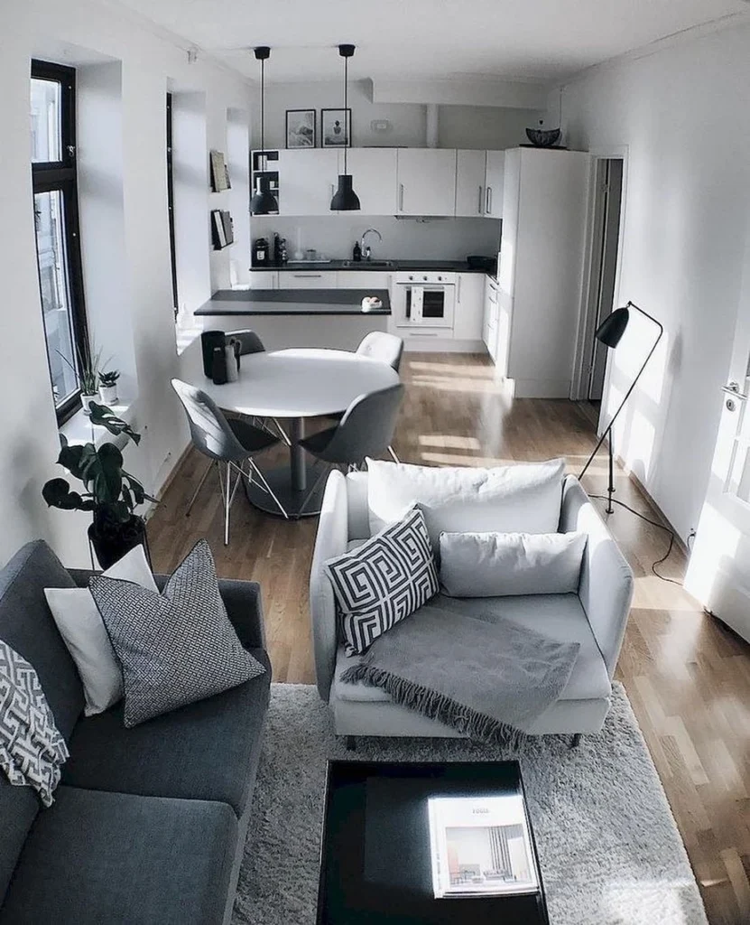
An all-grey and white open-plan apartment sounds like it should feel cold and clinical, but when the palette is executed with tonal variation (light grey sofa, darker grey accent chair, white kitchen, grey-toned wood floor) and flooded with natural light, the effect is the opposite: calm, expansive, and genuinely elegant. The round Tulip-style dining table is the right furniture choice for a narrow apartment because it has no corners to navigate around and creates a natural flow between zones.
The aerial perspective of this image shows something you cannot appreciate from the floor: how much the furniture placement matters. The sofa and chairs are positioned so that sightlines are kept clear from the entrance through to the windows, which makes the apartment read as much longer and wider than its floor plan suggests. This is the principle of negative space applied to furniture layout: what you leave empty is as important as what you put in.
Reality Check: A monochrome scheme only works if the textures are varied (matte, gloss, woven, smooth) because without texture contrast, the result is flat and one-dimensional rather than considered.
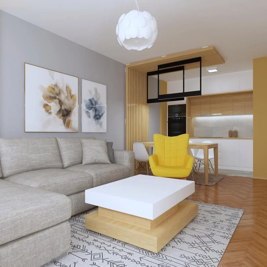
Vertical timber slats used as a partial room divider between a kitchen and a living area are one of those ideas that reads as far more expensive and architectural than it actually is. Here the slat panel runs from the dining zone through to a built-in TV recess and is finished with a raw timber ceiling detail, creating a continuous material story that makes the kitchen feel like part of the living room design rather than a functional afterthought bolted on.
The yellow velvet accent chair is a bold move in what is otherwise a natural-toned space, and it works because it provides the one point of deliberate colour contrast that the room needs to feel intentional rather than cautious. In an apartment where the palette is dominated by wood, grey, and white, one vivid accent chair (in velvet, boucle, or chenille) earns its place more effectively than half a dozen smaller accessories.
Quick Tip: Slatted timber divider panels are available as flat-pack freestanding screens for $200 to $500 at most furniture retailers, or can be built from standard pine battens and a sheet of plywood for under $150 in materials.
20. Maximalist Done Right: Plants, Pattern, and Personality
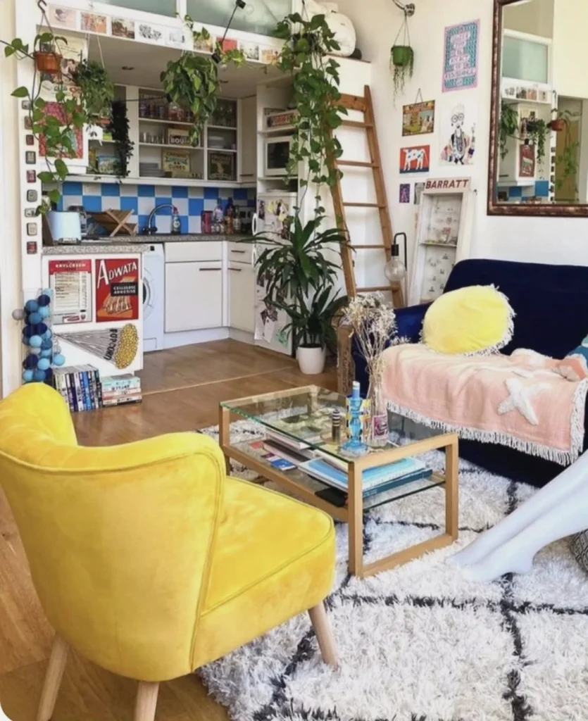
Not every apartment remodel is about restraint. This studio shows what happens when maximalism is applied with genuine conviction: trailing pothos from every shelf, a ladder for vertical storage, gallery walls that actually cover the walls, a yellow velvet armchair opposite a navy velvet sofa, and a checkerboard kitchen backsplash, and it all holds together because every element is doing a job and reflecting a genuine personality rather than following a trend.
The ladder shelf is particularly worth noting as a practical apartment remodel tool: it adds significant vertical storage and display space without attaching anything to a wall, it is completely portable, and it draws the eye upward in a room, which increases the perceived height of the ceiling. A quality wooden ladder shelf runs $80 to $200 and is one of the most versatile pieces in a small apartment.
Heads Up: Maximalism requires editing: every few months, remove one third of what is on display, reassess what still feels right, and only return what earns its place. Without this, maximalism becomes clutter.
Remodeling an apartment without moving walls is less about limitation and more about clarity: knowing which changes genuinely alter how a space feels versus which ones just look good in isolation. The ideas here span room dividers, lighting overhauls, furniture strategies, and styling approaches, and most can be executed without a contractor, without calling a landlord, and without a budget that would frighten anyone. Start with the one idea that solves your most immediate frustration, whether that is a lack of zones, poor evening light, or a living room that has never quite felt finished. One well-considered change almost always leads to three more, and that is how apartments stop feeling like temporary spaces and start feeling like actual homes.