Blue and gold is the easiest pairing to get wrong, because both colours think they are the star. Gold everywhere turns brassy and cheap, blue everywhere turns cold, and the rooms that work all follow one rule: blue does the big jobs and gold does the finishing. Walls, sofas and rugs in blue; frames, lights and table edges in gold.
These 26 rooms are grouped by where the blue lives, walls first, then sofas, then pattern and small doses, then the rooms where gold takes the final bow. Pick the level of blue your room can handle, then let gold do what it does best, which is glint, not shout.
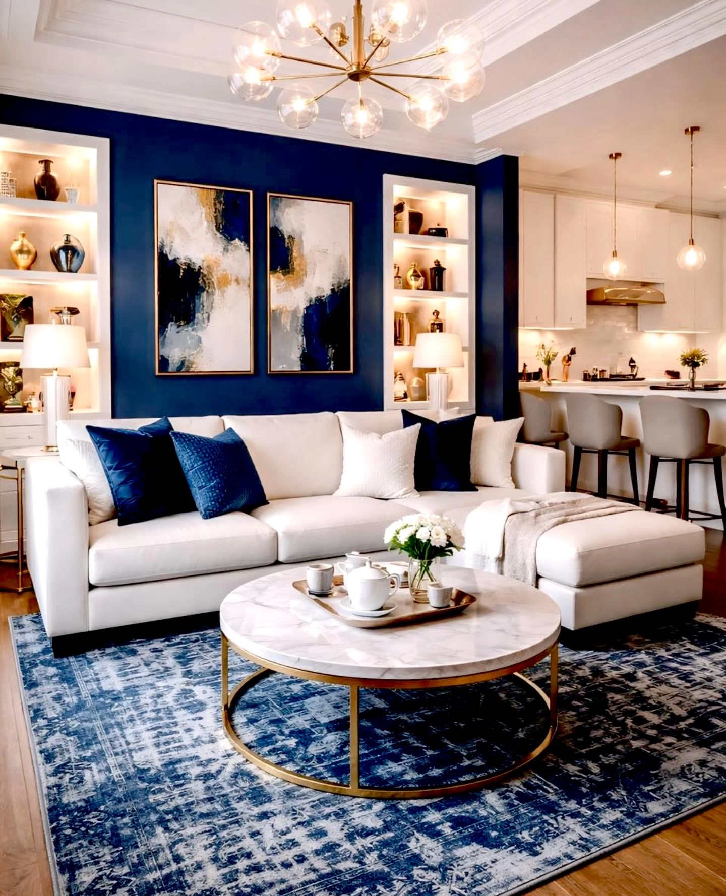
One navy wall behind a white sectional, navy cushions on the sofa, a blue patterned rug and a round coffee table with a gold ring base under a starburst chandelier. This is the starter version of the whole look, and it is nearly foolproof: the blue is contained on one wall and repeated in soft things, while the gold stays in the metalwork. Open plan rooms love this layout because the navy wall tells you where the living room starts. If you copy one room from this list, copy this one.
Starter ratio:One blue wall, blue cushions, blue rug. Three blues at three depths, and gold only where metal already lives.
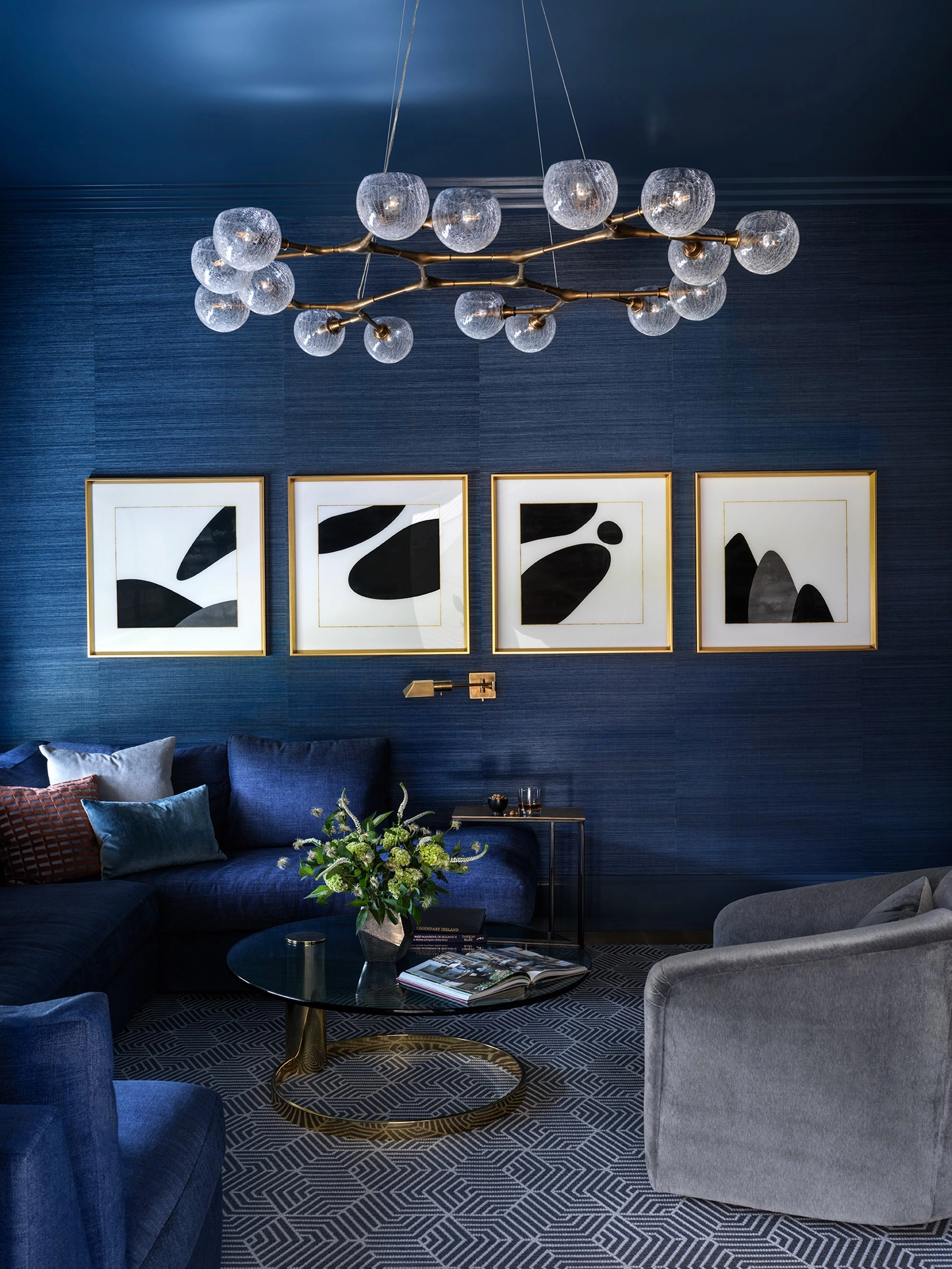
A room taken all the way: navy walls and ceiling, a navy sectional in the corner, and a branching bubble chandelier in brass and glass doing the glamour. When the walls and furniture are both navy, the gold has to come from light itself, and a chandelier with exposed globes spreads it everywhere. The gold framed prints keep the art from vanishing into the dark. Rooms this deep in blue need their lighting planned like a restaurant: several sources, all warm, none overhead and harsh.
All-in rule:If walls and sofa are both navy, your gold budget goes on lighting first. Dark rooms are lit rooms or they are caves.
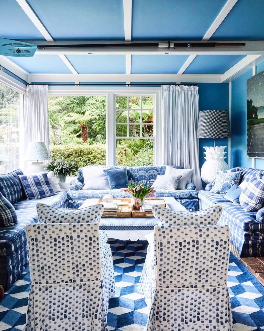
A sunroom with vivid blue walls and a blue coffered ceiling, blue and white patterned sofas, dotted white chairs and a blue geometric rug over brick. Painting the ceiling the wall colour is the boldest move in this list, and a glass room is the safest place for it, because daylight keeps the blue bright instead of moody. Blue and white pattern everywhere makes the room feel like a garden pavilion. Gold barely appears, a tray here, a frame there, which is exactly right in a room this patterned.
Ceiling courage:A coloured ceiling works when the room has glass on at least two sides. In a dark room it lowers the sky onto your head.
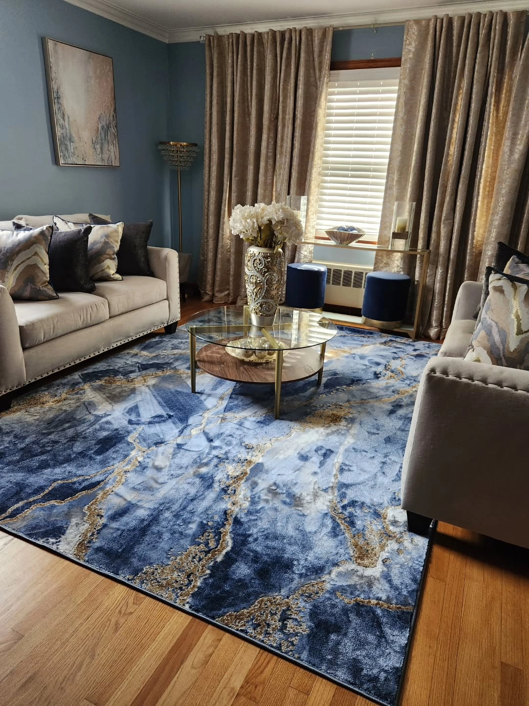
Dusty blue walls, two beige sofas and a huge blue marble pattern rug with gold veining across the floor, a glass coffee table with gold legs in the middle. The rug is the idea: it carries both colours in a pattern that looks like stone, so the room gets its blue and gold in one purchase. Beige sofas are the peace treaty between them. If your walls are a mid blue and you cannot decide on furniture, a marble pattern rug plus neutral sofas is the safest strong look going.
Rug as recipe:A blue and gold marble rug does the work of three shopping trips. Build the room around it, not after it.
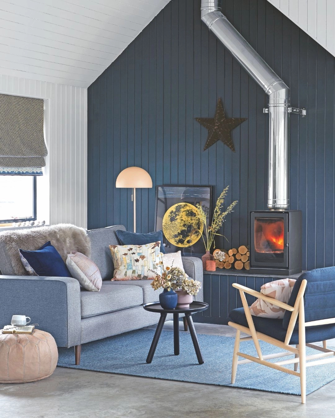
A navy board and batten end wall in a cottage style room, a pale sofa in front of it, a wood stove in the corner and a round gold moon picture hanging centre stage. Board and batten in navy gives the colour texture, so it reads crafted rather than painted on. The gold moon is the room’s single piece of jewellery, and its round shape softens all the straight boards. One gold object, chosen well and hung dead centre, can carry a whole wall.
One jewel rule:A single gold piece on a navy wall should be round. Circles calm the geometry of panelling and frames.
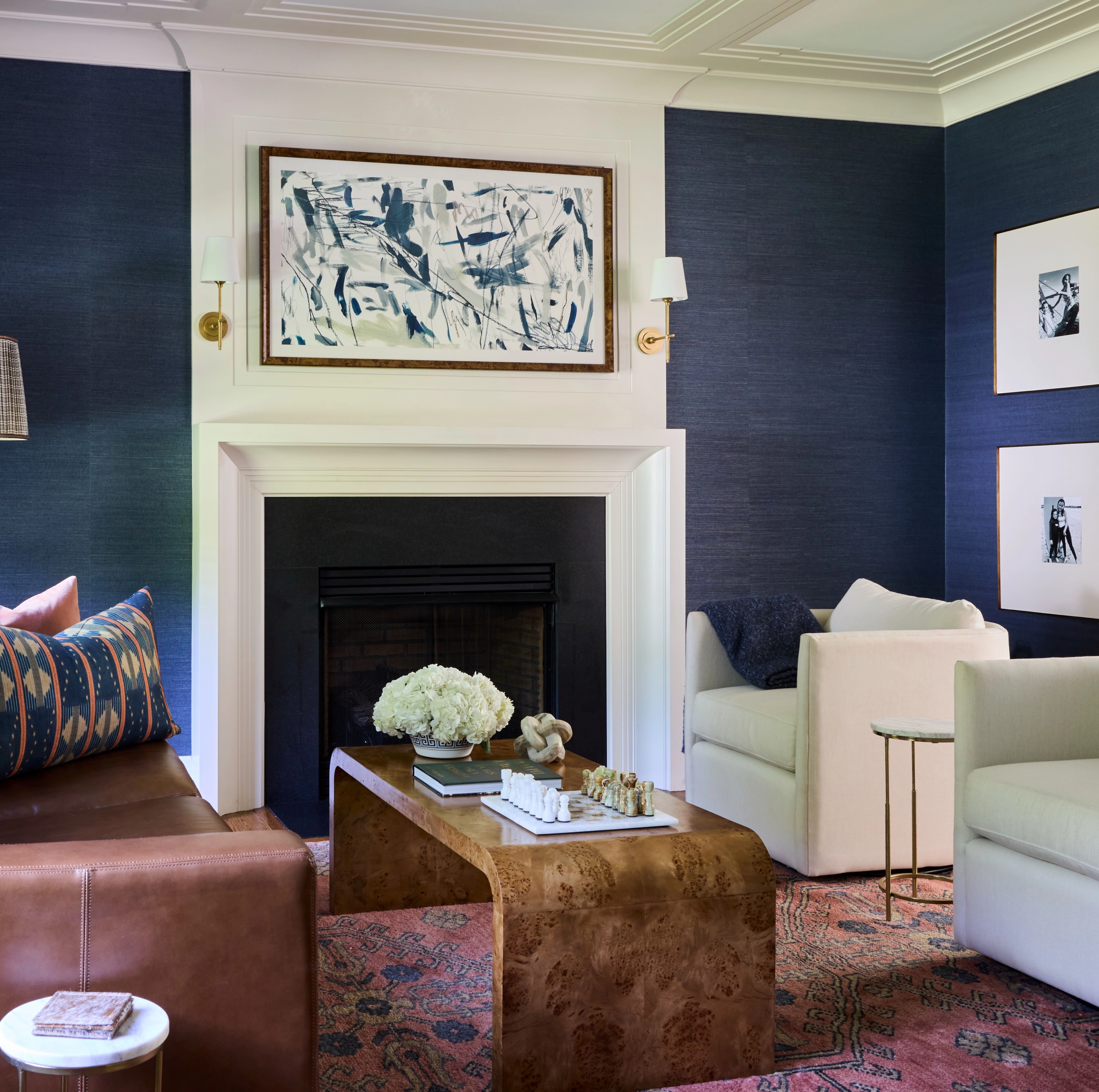
Navy grasscloth walls wrapping a white fireplace, a burl wood coffee table, cream armchairs and a leather sofa edge. Grasscloth is the grown up way to do navy walls: the woven texture catches light unevenly, so the walls shimmer slightly as you move, and gold is almost unnecessary because the wall is doing the richness itself. A white fireplace surround against navy is the crisp contrast that keeps the room tailored. Burl wood in the middle warms everything without adding another colour.
Texture discount:The richer the wall texture, the less gold the room needs. Grasscloth and panelling both cut the gold bill.
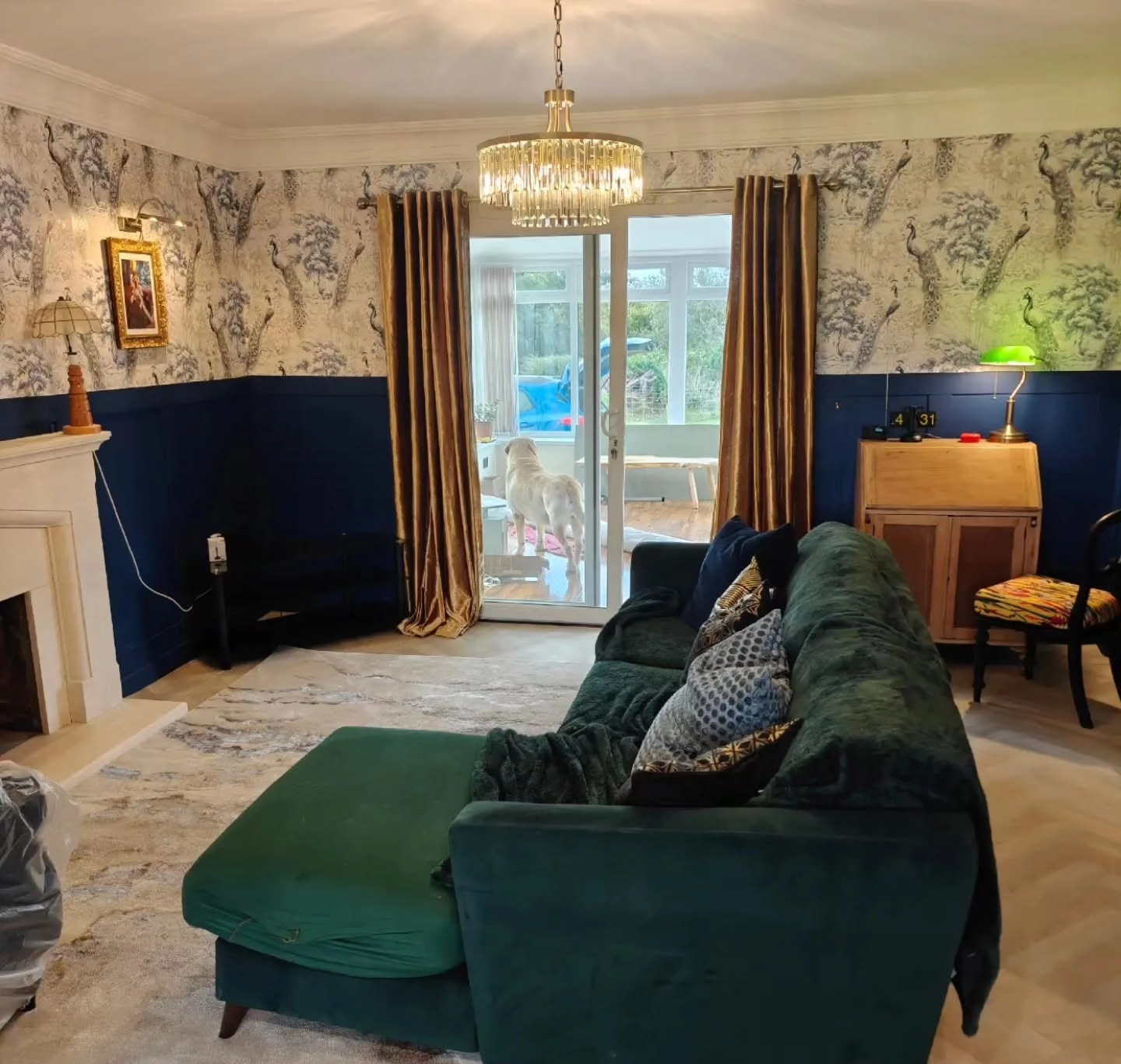
Navy wainscoting below, blue and white toile wallpaper above, gold curtains at the doors, a crystal chandelier and a deep green velvet chaise in front. Splitting the wall at chair rail height is how traditional rooms handle strong colour: navy below where hands and furniture live, pattern above where the eye rests. The green chaise is the surprise guest that proves blue rooms can host other jewel colours for an evening. Gold curtains are a commitment, but against navy they read as candlelight made fabric.
Half wall maths:Dark below, pattern above. It is the oldest split in decorating and still the easiest way to use navy without darkening a room’s whole mood.
The ratio that keeps blue and gold honest:
Blue 60: the big surfaces, one wall or the sofa or the rug, plus its repeats in cushions and art.
Neutral 30: cream, white, wood or grey doing the quiet work between the two colours.
Gold 10: frames, one light fitting, table edges and small objects. Past a tenth of the room, gold stops glinting and starts shouting.
Count gold by sightings, not items: if you can spot more than seven gold things from the doorway, two of them need to leave.
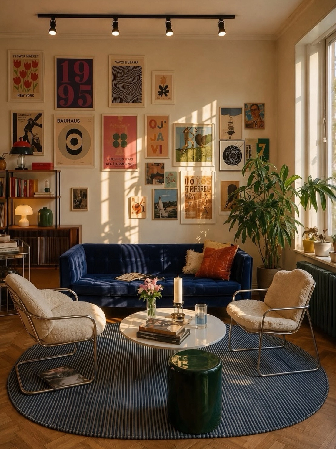
A deep royal blue velvet sofa against a wall of framed posters, cream boucle chairs, a round white coffee table and a navy striped rug. Velvet is blue’s best fabric because it shifts shade as light moves, so one sofa gives you three blues by evening. The gallery wall keeps the room young; without it this much velvet could turn formal. A striped round rug under a long sofa is a quiet trick too, the stripes run across the sofa’s length and make the seating area feel wider.
Velvet care:Brush velvet weekly with a clothes brush in one direction. It keeps the pile even and the colour deep where hands touch.
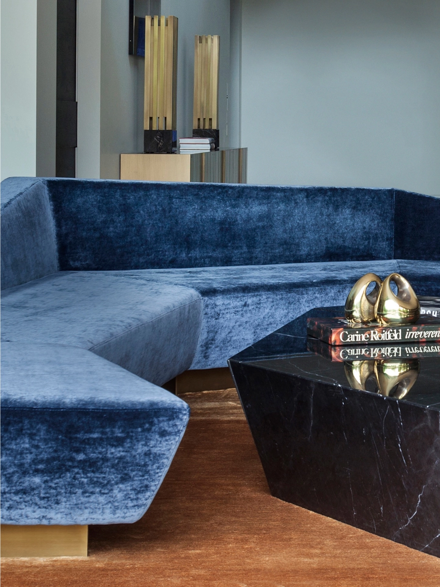
A cobalt blue velvet curved sofa photographed close, brass lamps behind it and a black marble coffee table in front with a brass object on top. Curved sofas in strong blue are sculpture first and seating second, and they need plain surroundings to work: pale walls, dark table, one metal repeated. Brass and cobalt are natural partners because both are loud in the same confident way. If you buy a statement sofa this strong, clear the wall behind it. Art above a curved back always looks like it is sliding off.
Curve clearance:Give a curved sofa a bare wall and a two metre halo. Crowding a curve kills the very shape you paid for.
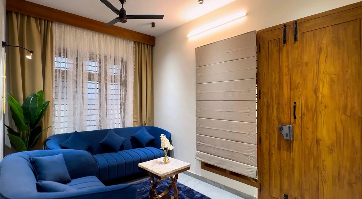
Two royal blue curved sofas facing across a small marble topped table, wooden doors to one side and blinds behind. Facing curves make a conversation bowl, the most sociable layout a living room can have, and in matching blue the pair reads as one designed gesture rather than two purchases. Gold stays in the small things, a vase, warm wood tones, because two blue curves are already the loudest sentence in the room. Symmetry forgives boldness: the eye reads matched pairs as order, however bright they are.
Pair power:One bright sofa is a risk; a matched pair is a scheme. If you love a strong blue, buy its twin and the room calms down.
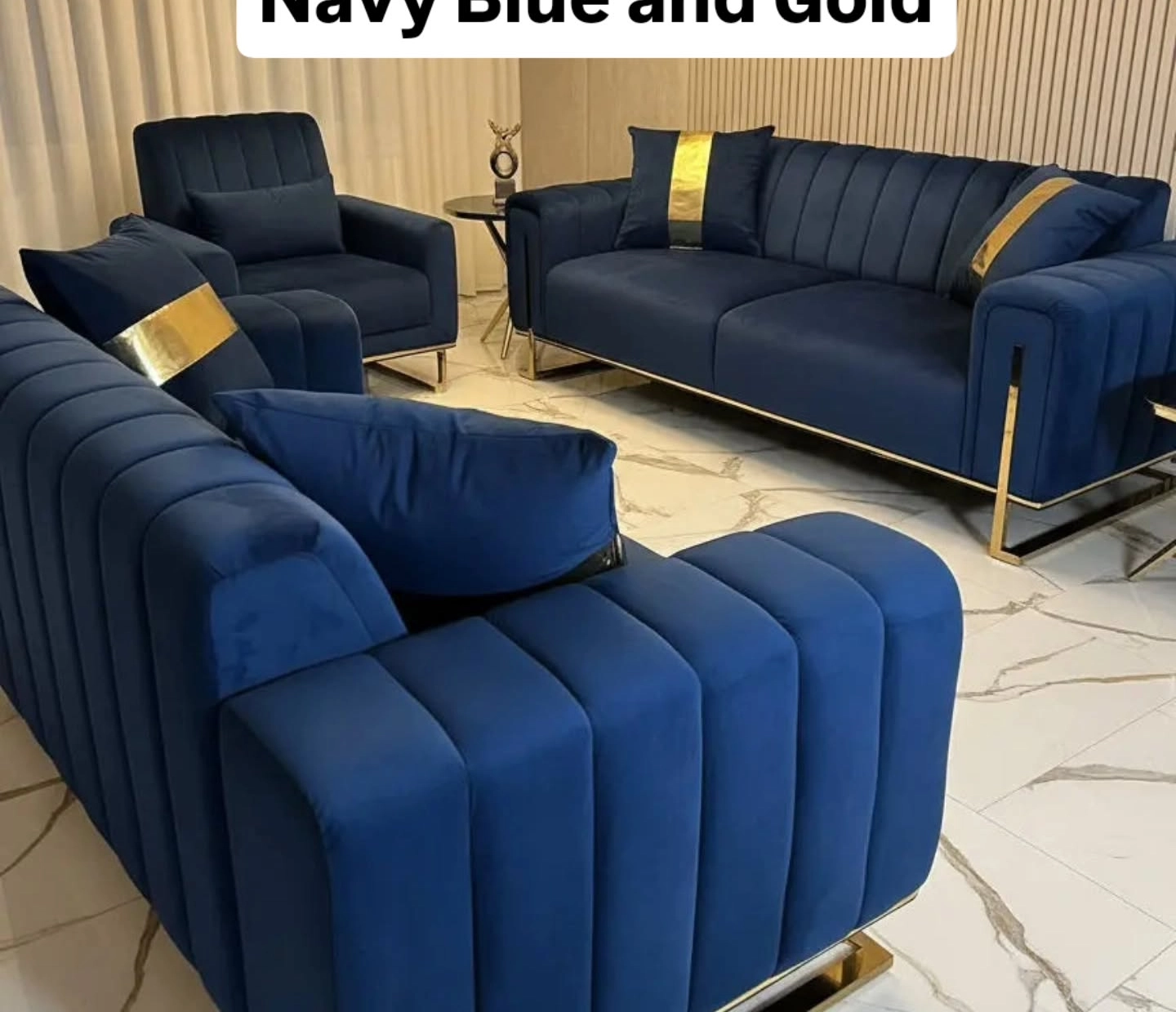
A navy channel tufted three piece set with gold legs, gold trim and gold stripe cushions on a white marble floor. Matching sets fell out of fashion, but this shows their hidden strength: when every seat wears the same navy and gold, the room needs almost nothing else. The gold legs lift the navy off the pale floor so the set floats instead of squatting. If you inherit or buy a matching set, lean in: keep walls plain, add one plant, and let the set be the room.
Set styling:A matching navy set wants bare walls and one green plant. Anything more competes with the upholstery’s own pattern of tufts and trim.
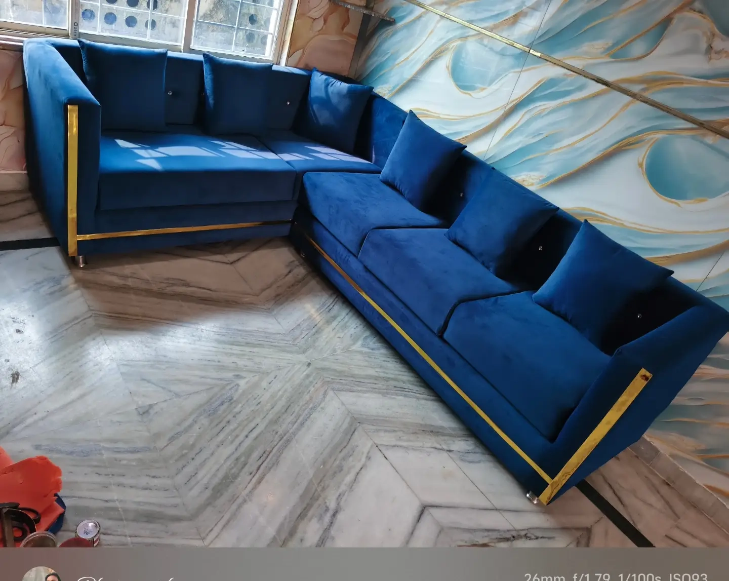
A royal blue velvet sectional with gold trim running along its base and arms, set against a blue and gold marbled feature wall on a herringbone floor. Trim is how furniture wears jewellery: a line of gold at the base catches light every time someone walks past. The marbled wall repeats the sofa’s two colours at large scale, which is why the room holds together despite being maximal. When the biggest surface and the biggest furniture share a palette, everything between them can relax.
Trim test:Gold trim on a sofa only works if the room repeats gold at least twice more, or the trim looks like a price tag left on.
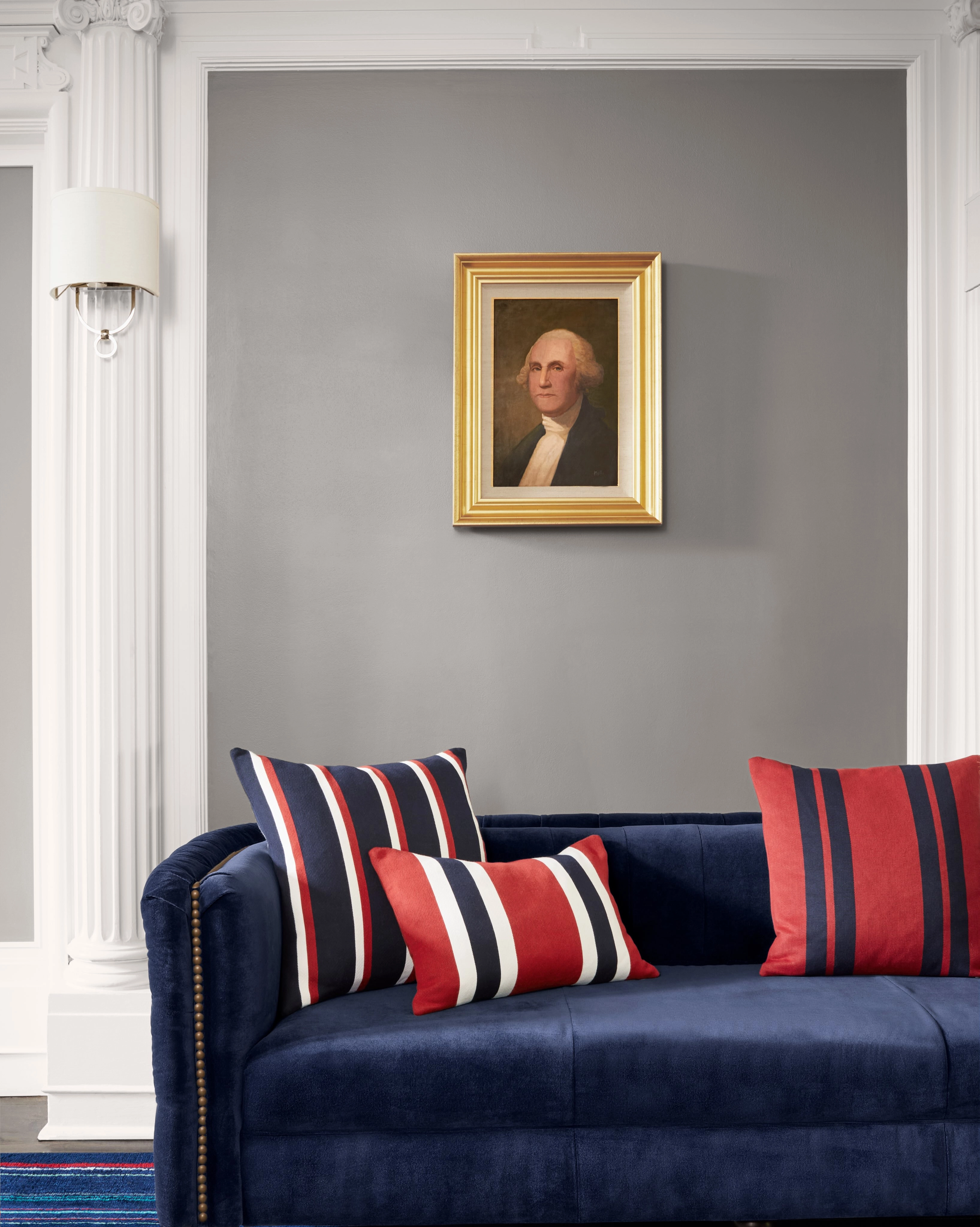
A navy velvet sofa with brass stud trim and red striped cushions, a gold framed portrait of Washington on the grey wall above it. Studs are the tailored end of gold: small, regular, and they catch light in a dotted line that suits formal rooms. The portrait in its heavy gold frame is the kind of inherited looking piece that makes a new sofa feel established. Red cushions on navy is an old club colour pairing, and in small doses it warms blue better than any orange or yellow can.
Stud lighting:Brass studs earn their keep under lamplight. Place a lamp at one end of a studded sofa and the whole trim line glows after dark.
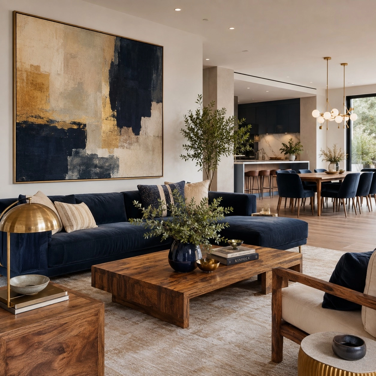
A navy velvet sectional under a huge abstract painting in navy, cream and gold, a brass dome lamp in front and wood furniture warming the edges. The painting is the room’s recipe written large: every colour in it appears below it in furniture form. This is the most reliable way to build a colour scheme, buy or commission the art first and shop from it. The brass lamp echoes the painting’s gold so the art seems to drip its colour into the room.
Art first:Hang the big painting before the sofa arrives if you can. Matching a sofa to art is easy; matching art to a sofa is a year of searching.
Blue
Feels like
Best gold partner
Watch out
Navy
Formal, evening, library
Antique brass, candle style lights
Goes black in low light; warm bulbs are a must
Royal and cobalt
Confident, gallery, modern
Polished brass, black marble beside it
Velvet only; flat fabrics look cheap in this shade
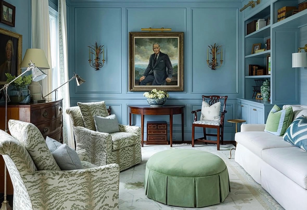
Powder blue panelled walls with a large portrait in a gold frame, white sofa, green ottoman and armchairs in a leafy patterned fabric. Powder blue walls are the traditional route into this pairing: they flatter gold frames and old portraits the way a gallery does. Patterned chairs carry the blue in their fabric, so the walls can stay serene. Rooms in this style are built from inherited looking pieces, and the powder blue is what stops them feeling like a museum. It is fresh where cream would be dusty.
Powder rule:Powder blue wants gold with a patina, not a shine. Antique finish frames suit it; mirror bright gold fights it.
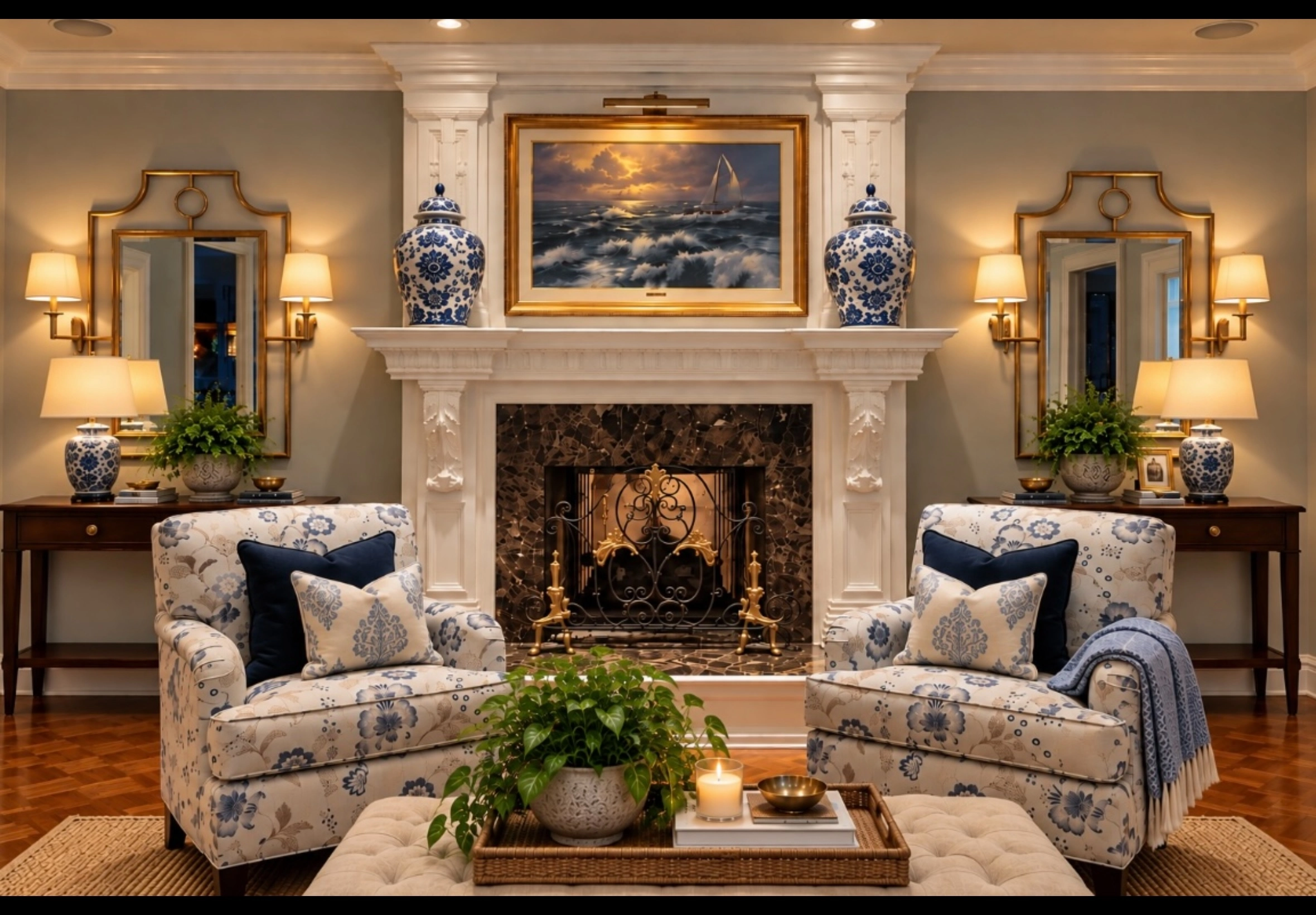
16. Blue and White Floral Chairs at the Marble Fireplace
A marble fireplace with a landscape in a gold frame, brass mirrors and blue porcelain vases on the mantel, and two armchairs in blue and white floral fabric facing the fire. Blue and white porcelain is the bridge between the two colours: it has decorated gold rimmed rooms for centuries. Floral chairs in blue and white do the same job in fabric, giving a formal room a garden note. A pair of patterned chairs at a fireplace is the most traditional arrangement in this whole list, and still one of the prettiest.
Porcelain trick:Two blue and white vases on a mantel tell the eye the gold frames and blue chairs belong together. It is a three hundred year old cheat code.
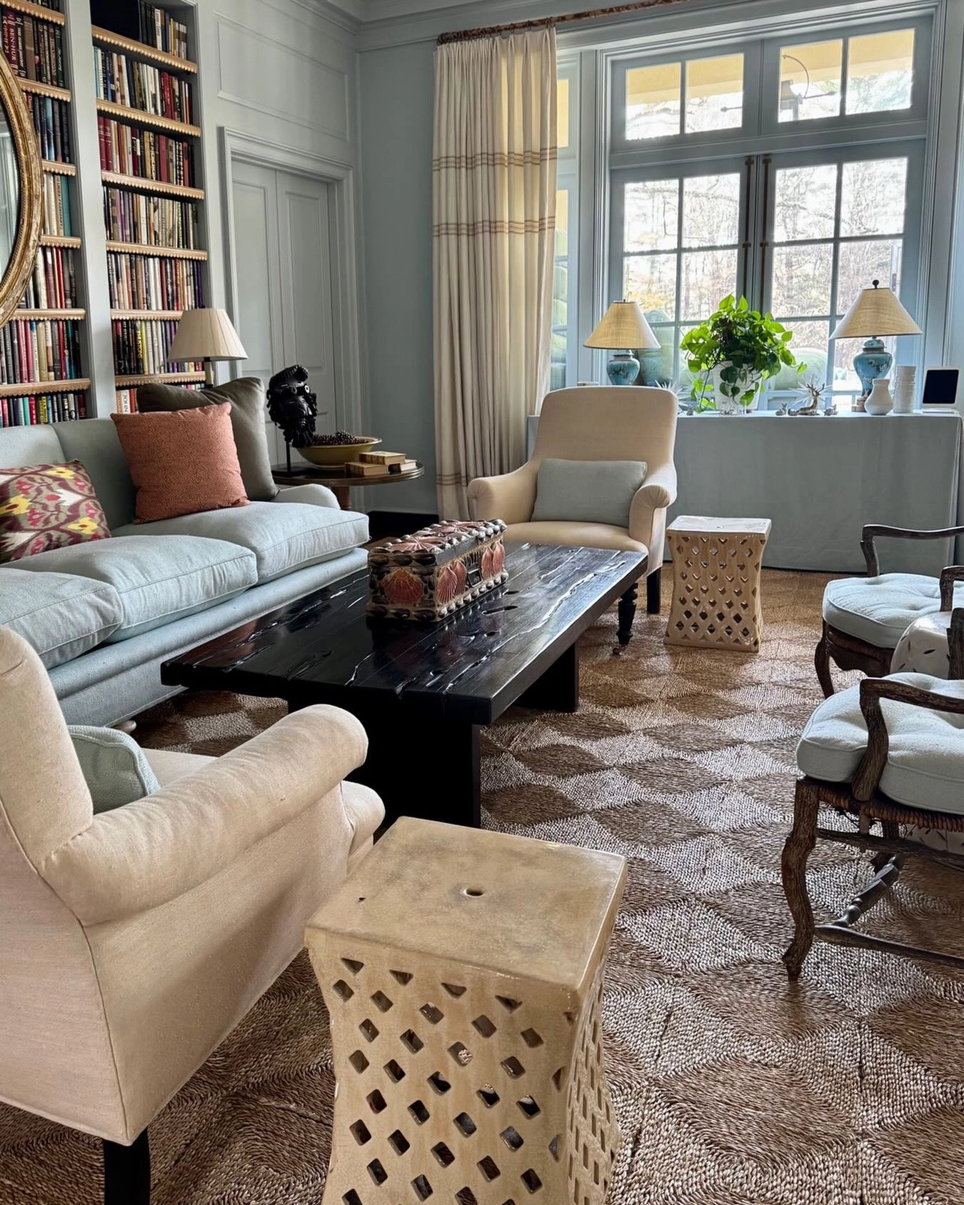
A pale blue grey room with a light blue sofa, cream armchairs, bookshelves along one wall, a dark wood coffee table and stone lattice side tables. This is blue at whisper level, and the gold is nearly absent, a lamp base here, a frame there, because a library room’s richness comes from books. The lesson travels: in a room that already has a strong texture, books, brick, stone, the blue and gold can both step back. Not every room in the pairing has to shout both colours.
Book balance:A wall of books counts as pattern and colour both. In a library room, keep blue pale and gold minimal or the shelves look upstaged.
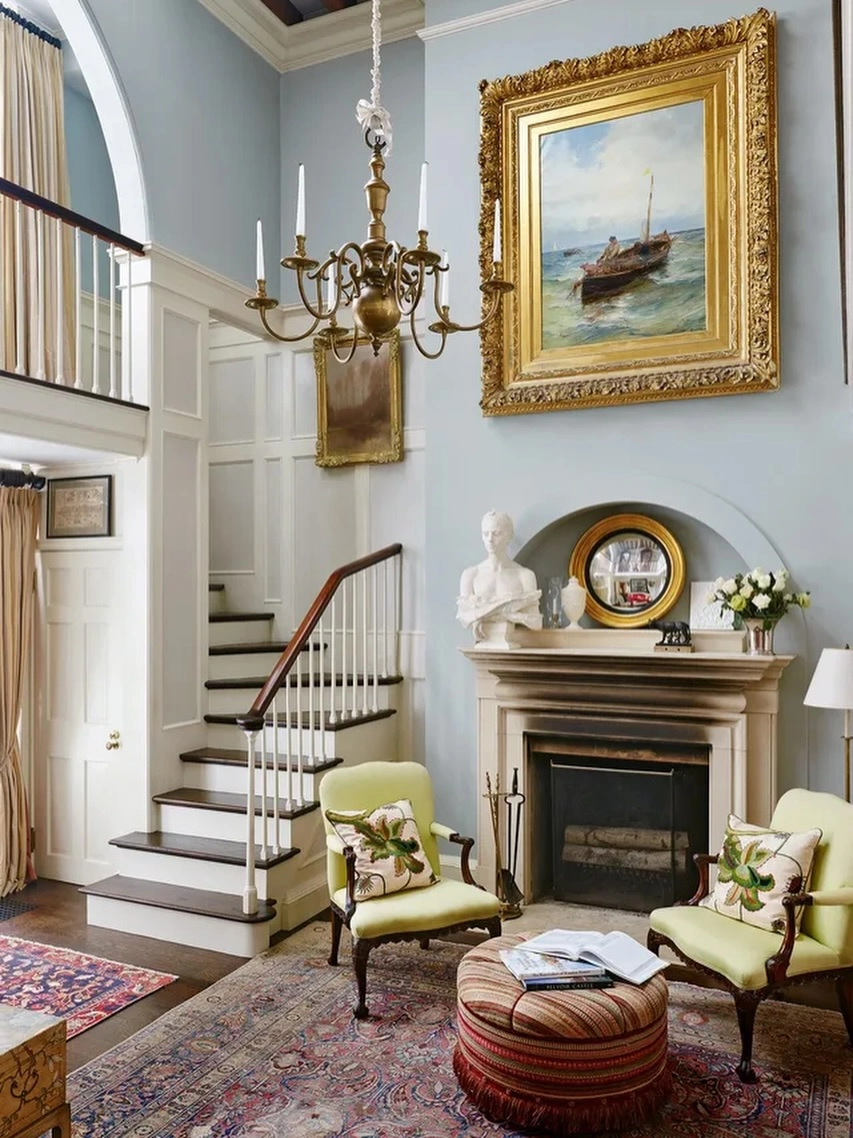
A tall pale blue hall room with a stone fireplace, two green armchairs, and over the mantel an enormous seascape in a heavy ornate gold frame, a brass chandelier above it. Sometimes the gold leads through one huge antique frame and the blue stays in the walls and the painting’s own sea. A frame this grand needs height and plain company; the pale walls give it both. If you ever inherit an oversized gilt frame, build the room exactly like this: soft blue walls, simple furniture, and let the frame be the palace.
Frame scale:A statement frame should be at least two thirds the width of the mantel. Smaller looks like a mistake; bigger looks like a decision.
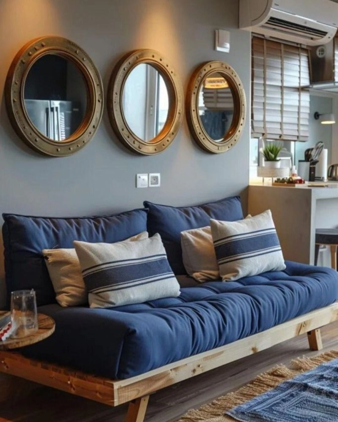
A navy futon sofa with striped cushions under three round brass framed mirrors in a row on a grey wall. Round mirrors in brass are the nautical cousin of the gold frame, and in a row of three they make a simple sofa look styled. Mirrors over a sofa should hang low enough to feel connected to it, about a hand’s width above the back cushions. The striped cushions repeat the mirrors’ casual mood. Small rooms take note: three small mirrors bounce more useful light than one big one, and cost less.
Mirror row:Hang sofa mirrors so their bottoms sit a hand’s width over the back cushions. Floating high mirrors belong to nobody.
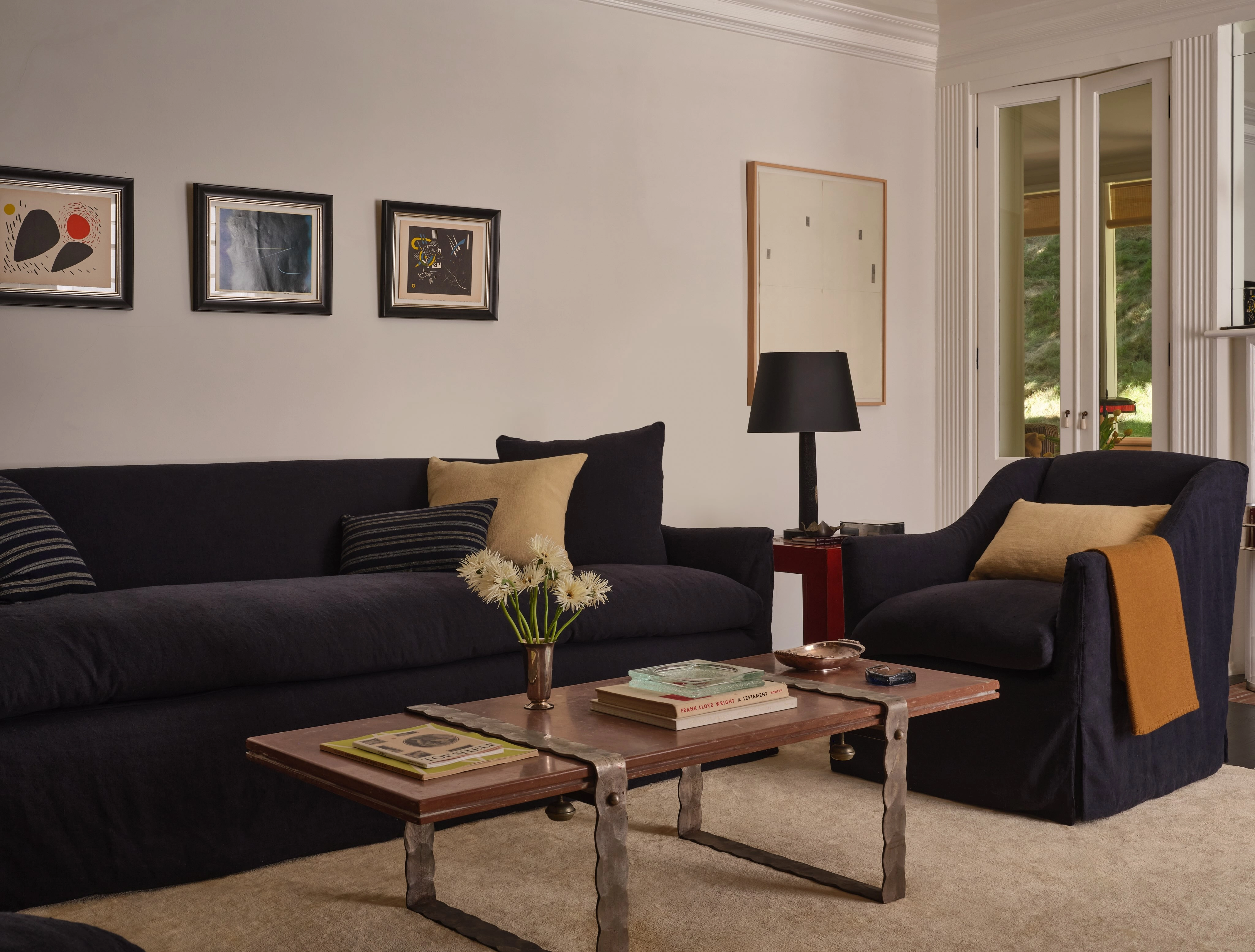
A dark navy slipcovered sofa and armchair in a calm room, a low wood coffee table with a small brass vase and a black lamp. Slipcovers make navy practical: the whole cover goes in the wash, which matters when the sofa is this dark and shows every crumb and hair. The styling is deliberately plain, one brass vase doing all the gold work, proof that the pairing survives at its quietest. Family rooms that want the look without the formality should start here.
Washable navy:Choose slipcovers or performance fabric for navy in family rooms. Dark blue shows lint like a magnet; washable is not optional.
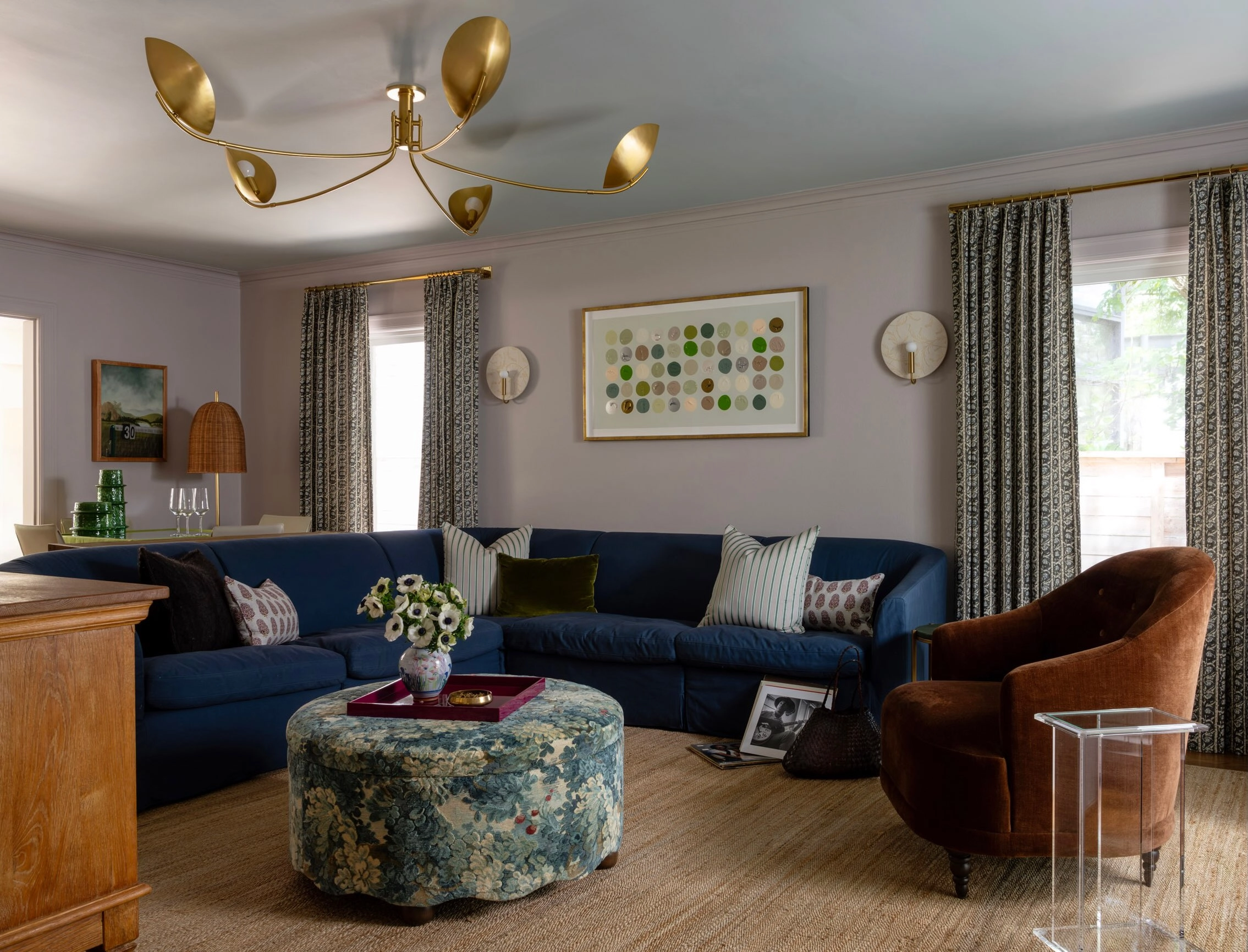
A navy sectional in a grey lavender room under a sculptural brass ceiling light like a golden branch, a patterned ottoman and a rust coloured armchair. One spectacular light fitting can be a room’s entire gold allowance, and a branching shape spreads the metal across the ceiling so the eye meets it from every seat. The rust armchair is the warm bridge between the cool navy and the warm brass. Every blue and gold room benefits from one rust, cognac or tan piece; it stops the pairing feeling like a hotel logo.
Warm bridge:Add one rust or tan leather piece between blue and gold. It is the handshake that makes the two colours feel like friends.
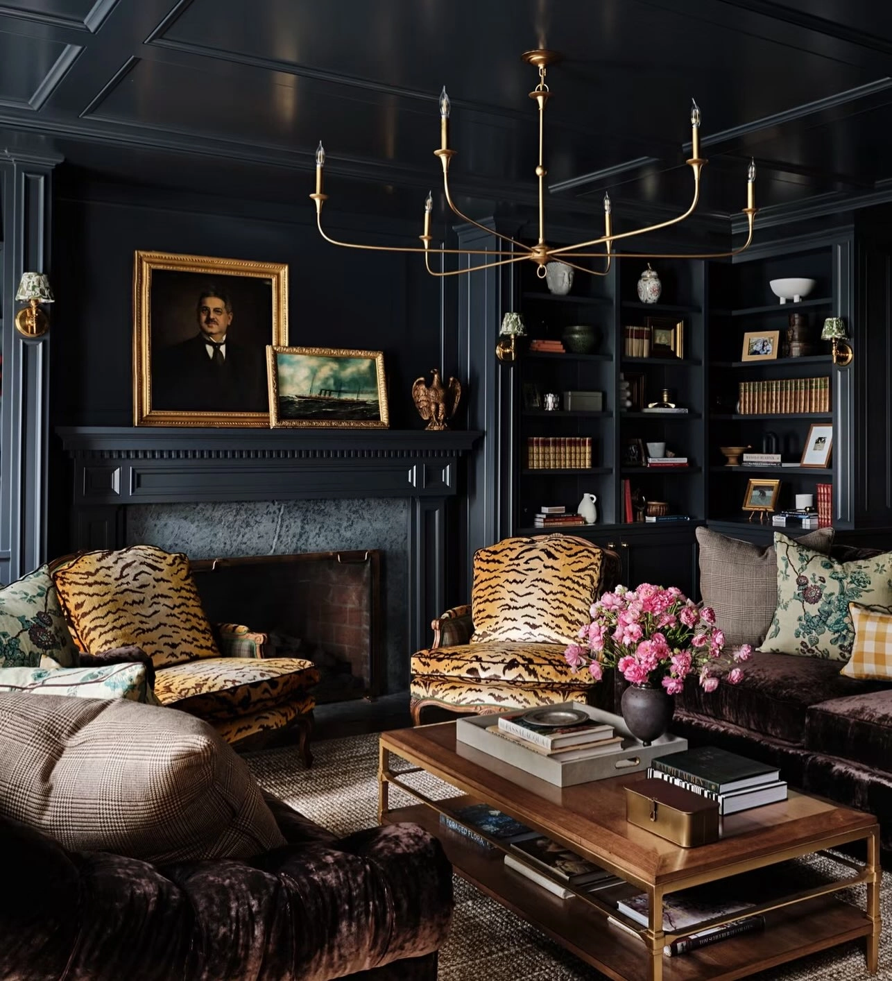
A near black navy library with bookcases, a marble fireplace, tiger print chairs and a brass candle chandelier over the coffee table, gold portrait frames on the walls. Candle style chandeliers suit navy rooms because their light is low, warm and flickering in feel, even when electric. The tiger chairs are the maximal flourish that dark rooms can carry and pale rooms cannot. In a room this dark, gold frames stop portraits sinking into the walls; they become windows of light.
Dark room frames:In navy rooms, frame art in gold and hang it slightly closer together than feels right. Dark walls eat space between frames.
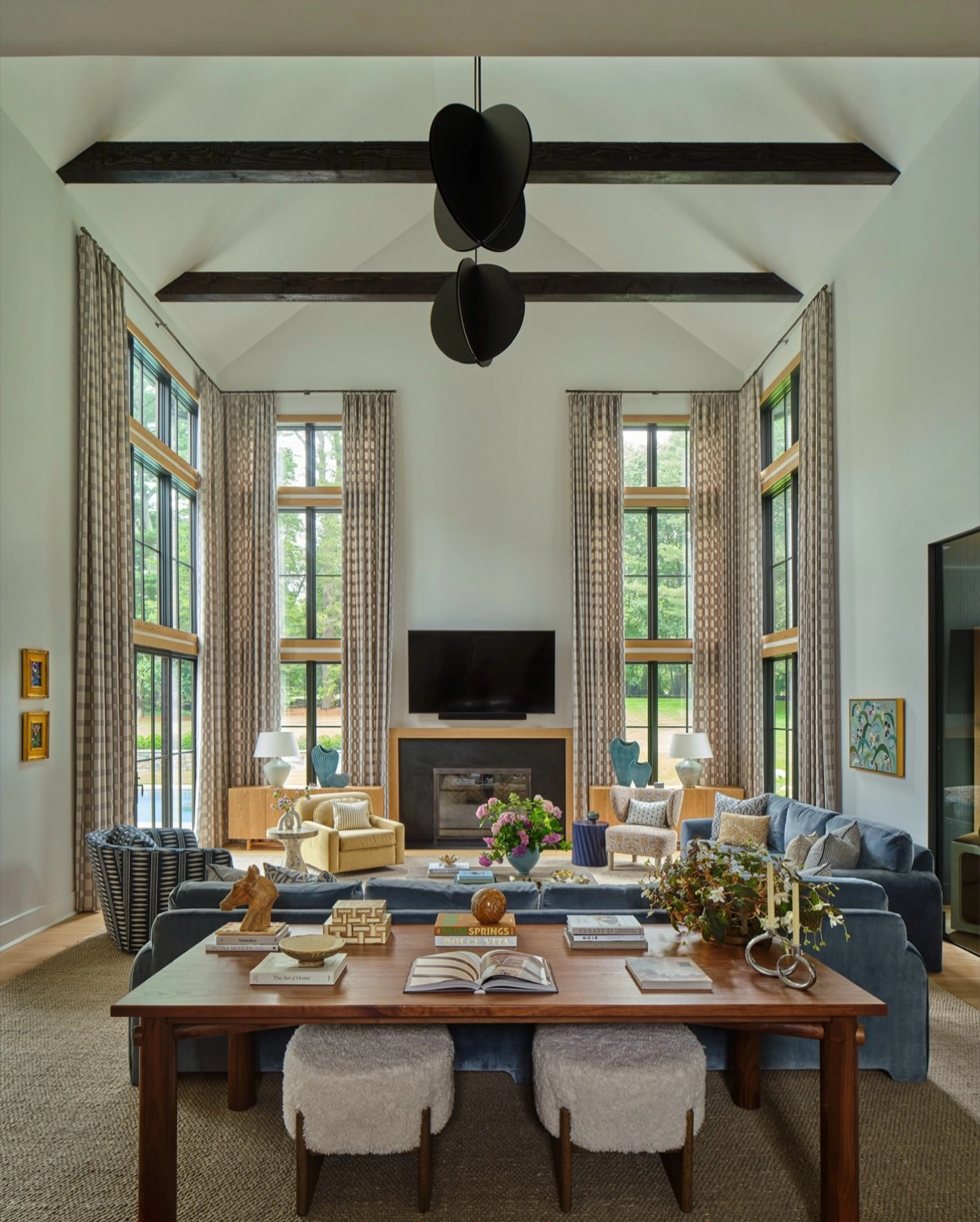
A vaulted family room with slate blue sofas around a long dining style table, brass candlesticks on the table and a fireplace at the far end. Candlesticks are the most flexible gold there is: they move from table to mantel to shelf as the room changes, and in a row they give height without bulk. Slate blue, softer than navy, suits big bright rooms where navy would go black in the corners. The long table as coffee table is a farmhouse habit worth stealing for rooms that host crowds.
Candlestick maths:Odd numbers, varied heights, one metal. Brass candlesticks are the only gold you can buy one charity shop at a time and never mismatch.
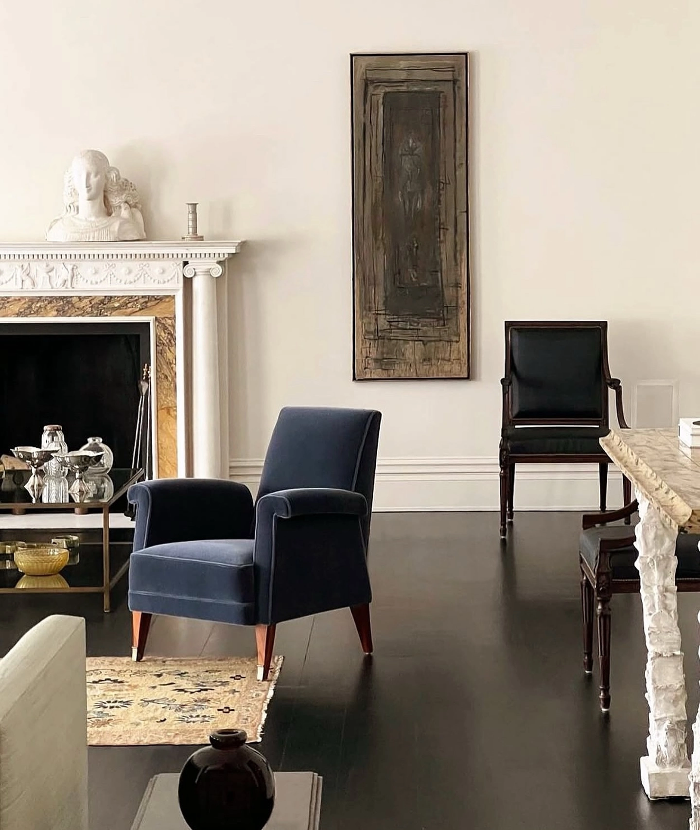
A navy armchair beside a white fireplace with brass trim, a small gold bowl on the hearth table and a tall dark artwork panel on the wall. Fireplace trim is gold with a job: it marks the fire’s frame the way a mount marks a picture. A single navy chair by a white fireplace shows how little blue the pairing needs when the gold is well placed, an armchair’s worth. This is the rental friendly end of the look, one chair, one bowl, trim that came with the house.
Minimum viable pairing:One navy chair plus gold on the fireplace. If a room can only take two changes, those are the two.
A contemporary room with wood panelling, navy lounge chairs and poufs, a cream sling chair and glass walls to the garden. Mid century shapes keep navy light on its feet: low chairs, slim legs, open space under everything. The gold here is mostly warm metal and wood tones working together, proof that in modern rooms brass can be implied by teak and tan leather. Blue poufs are the playful note, extra seats that read as colour blocks. Keep modern navy rooms matte; shine belongs to the traditional ones.
Modern metal rule:In mid century rooms, let wood tones do half the gold’s work. Teak plus a little brass reads warmer than brass alone.
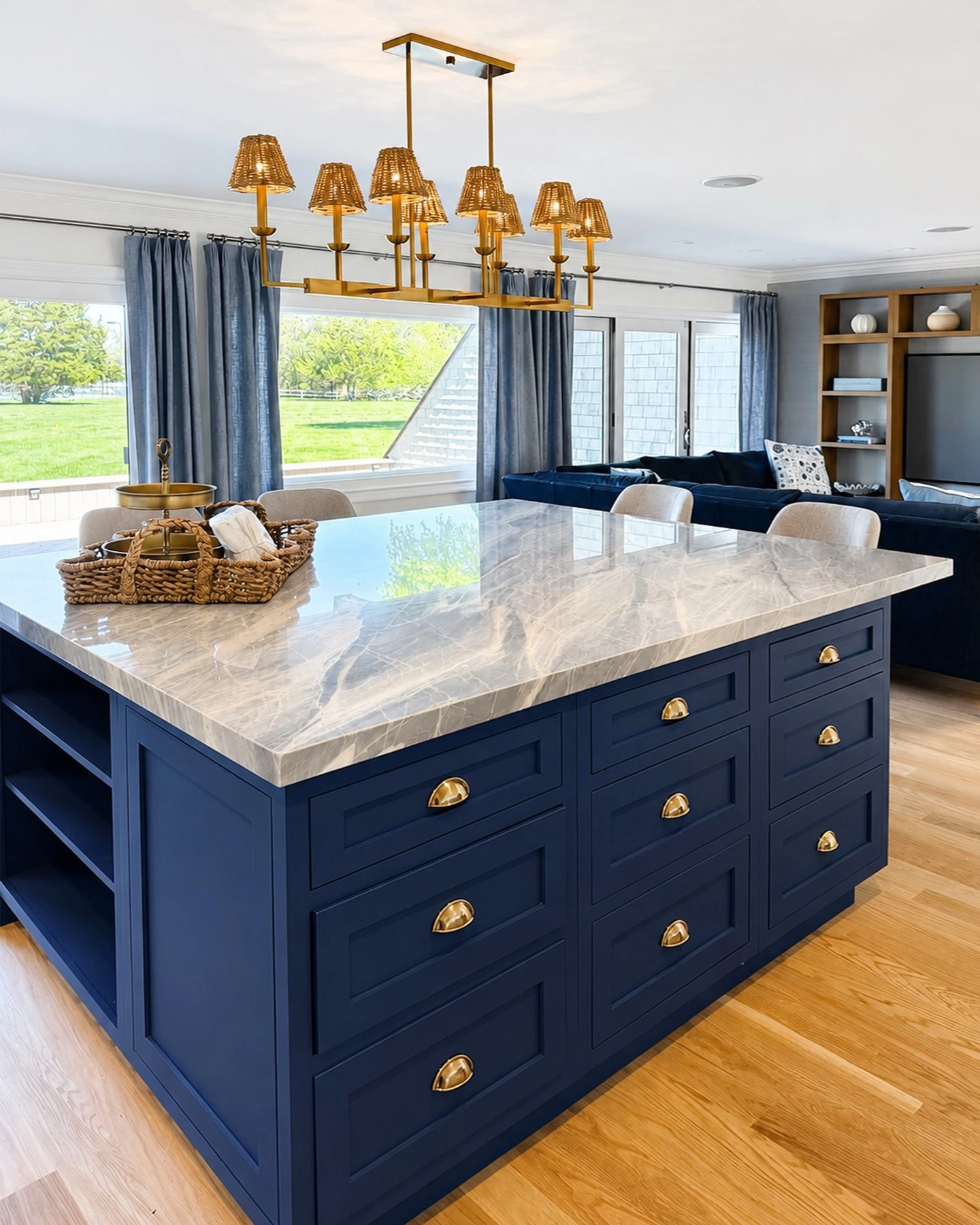
An open plan space where a navy kitchen island with brass cup pulls and a row of brass shaded pendants stands in front of the family room, its navy sofa visible beyond. Open plan homes get the pairing twice, once in the kitchen metal and cabinet colour, once in the living room furniture, and the echo is what makes a big space feel designed rather than zoned by accident. Brass pendants over an island are the most seen gold in the house, so they set the finish every other metal must match.
Echo rule:In open plan rooms, repeat the island’s metal on one living room item, a lamp, a table frame, a tray, or the two zones drift apart.
Before you buy anything gold:
Photograph the room at night. Gold is bought for lamplight, so judge it under lamplight, not shop light.
Pick one finish, antique, brushed or polished, and hold every later purchase to it.
Check the metal against your blue in daylight too; brass can turn greenish next to teal blues.
Buy the largest gold piece first, usually the light fitting. Small pieces are easy to match to it later.
Leave one surface gold free. A room where everything glints has nowhere for the eye to rest.
Final Thoughts
Blue first, gold second. Let blue take the walls, the sofa or the rug, the big quiet surfaces, and let gold take the frames, the lights and the edges, the places where a glint catches as you cross the room. Every room in this list obeys that order, whether it whispers it in a slipcovered family room or declares it under a candle chandelier. Choose your blue’s job, give gold the finishing work, and the pairing will never look like a theme. It will look like a room.