15 Captivating Living Room Paint Color Ideas to Transform Your Space

15 Captivating Living Room Paint Color Ideas to Transform Your Space

Introduction: The Power of Color in Your Living Room

The living room, often considered the heart of a home, is where memories are made, stories are shared, and comfort is paramount. The paint color you choose for this central space plays a pivotal role in defining its ambiance, reflecting your personal style, and influencing the mood of everyone who enters. Beyond mere aesthetics, color psychology suggests that different hues can evoke specific emotions and perceptions, making the selection of your living room paint color a decision with significant impact [1].

In this comprehensive guide, we delve into 15 captivating living room paint color ideas, drawing inspiration from contemporary trends and timeless classics. We will explore how each color can transform your space, offering insights into their psychological effects, ideal pairings, and practical application tips. Whether you seek a serene sanctuary, a vibrant social hub, or a sophisticated retreat, these ideas will illuminate the path to a living room that truly resonates with your vision.

The process of choosing a paint color is often more complex than it initially appears. It involves considering the architectural features of the room, the amount and quality of natural light it receives, and the existing furniture and decor. A color that looks stunning in a showroom might appear completely different on your walls due to these variables. Therefore, understanding the nuances of color and how it interacts with its environment is essential for achieving a successful outcome.

Understanding Color Psychology in Living Spaces

Before diving into specific color recommendations, it is crucial to understand the fundamental principles of color psychology as they apply to interior design. Colors are not just visual stimuli; they are powerful communicators that can influence our emotions, energy levels, and even our perception of space [2].

* **Warm Colors (Reds, Oranges, Yellows):** These hues are often associated with energy, warmth, and intimacy. They can make a large room feel cozier and more inviting, stimulating conversation and activity. However, overuse can lead to feelings of restlessness or overwhelm. For instance, a bright red might be too stimulating for a room intended for relaxation, whereas a soft terracotta can provide a gentle, welcoming warmth.

* **Cool Colors (Blues, Greens, Purples):** Typically linked to calmness, serenity, and relaxation. Cool tones can make a small room appear larger and more open, fostering a tranquil environment. Excessive use might lead to a feeling of coldness or detachment. A light sky blue can create an airy, expansive feel, while a deep navy can offer a sense of security and sophisticated calm.

* **Neutrals (Grays, Beiges, Whites):** These foundational colors provide a versatile backdrop, promoting balance and sophistication. They offer flexibility for decor changes and can create a sense of spaciousness and understated elegance. The undertones of neutrals are crucial, as they can lean warm or cool. A gray with a blue undertone will feel crisp and modern, while a gray with a yellow undertone will feel warmer and more traditional.

By thoughtfully considering these psychological impacts, you can select a paint color that not only looks appealing but also contributes positively to the desired atmosphere of your living room.

The Importance of Lighting and Orientation

Lighting is perhaps the most significant factor influencing how a paint color appears in a room. Natural light varies throughout the day and changes with the seasons, while artificial lighting can have its own color temperature that shifts the perception of the paint.

* **North-Facing Rooms:** These rooms typically receive cool, bluish light. Warm colors or neutrals with warm undertones can help counteract this coolness and make the space feel more inviting. Avoid cool grays or blues, as they may appear flat or even slightly chilly.

* **South-Facing Rooms:** These rooms are blessed with abundant, warm natural light throughout the day. Almost any color will look good here, but cool tones can help balance the warmth, while pale shades will appear even brighter. Bold, saturated colors can also thrive in this intense light.

* **East-Facing Rooms:** These rooms receive bright, warm light in the morning and cooler light in the afternoon. Consider how you primarily use the room; if it’s for morning coffee, a color that looks good in warm light is key. If it’s for evening relaxation, prioritize how the color appears in cooler or artificial light.

* **West-Facing Rooms:** These rooms have cool morning light and intense, warm light in the late afternoon and evening. Warm tones can become quite vivid in the late sun, so consider muted versions of warm colors if you find the evening light too overwhelming.

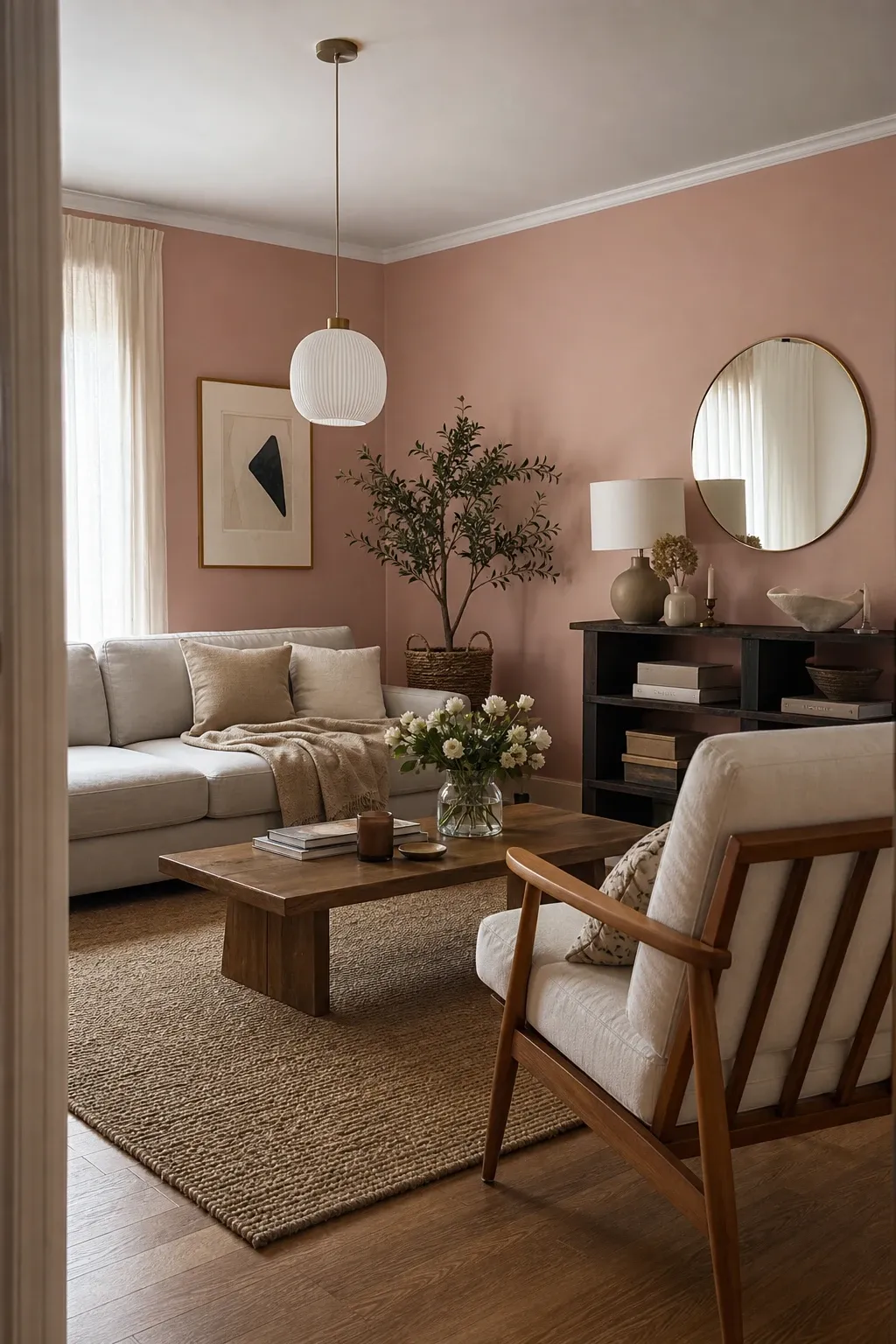
1. Go Soft and Subtle Pink: A Touch of Gentle Warmth

Soft and subtle pinks, far from being overly saccharine, offer a delicate warmth and a sophisticated charm to any living room. These muted tones, such as dusty rose, blush, or “millennial pink,” create an inviting and serene atmosphere without overwhelming the senses. They are particularly effective in spaces where a gentle, comforting embrace is desired.

### The Psychology of Soft Pink

Soft pink hues are known for their calming properties, promoting a sense of tranquility and well-being. They are often associated with compassion, nurturing, and kindness. In a living room, these colors can soften harsh lines and add a touch of romantic elegance, making the space feel more intimate and welcoming. Unlike bolder reds, soft pinks provide the warmth of red without the high energy, making them ideal for relaxation.

### Styling and Pairings

This color is incredibly versatile. For a modern, sophisticated look, pair soft pink walls with charcoal gray or navy blue furniture. For a more traditional or “shabby chic” feel, combine it with whites, creams, and light-toned woods. Metallic accents like brass, copper, or rose gold can add a touch of glamour and highlight the pink’s warm undertones.

Incorporate natural textures like linen, wool, and light-colored rattan to enhance the cozy ambiance. Greenery is also a fantastic companion; the contrast between the soft pink and the vibrant green of indoor plants creates a fresh, balanced, and lively environment.

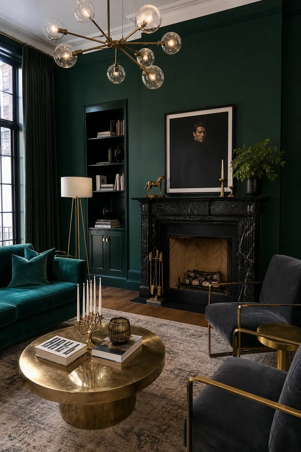
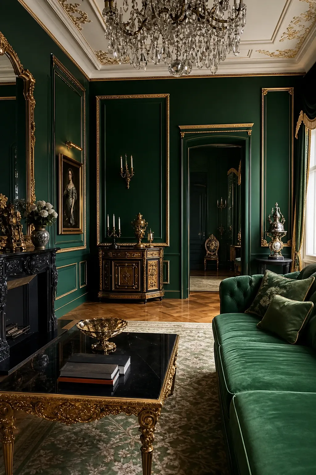
2. Make a Bold Statement with Jewel Green: Luxurious Depth

Jewel green, encompassing shades like emerald, jade, or deep forest green, is a color that exudes luxury, sophistication, and a profound connection to nature. Painting your living room walls in a jewel green hue is a bold choice that promises a dramatic and unforgettable space. This rich color adds significant depth and character, transforming an ordinary room into an extraordinary retreat.

### The Allure of Deep Greens

These deep greens are often associated with growth, harmony, and renewal. They create a sense of calm and stability while simultaneously making a powerful visual statement. Jewel greens can evoke the feeling of being enveloped in a lush, natural environment, promoting relaxation and a sense of well-being. Historically, deep greens were often used in libraries and studies to create a focused, scholarly atmosphere.

### Designing with Jewel Green

To complement the richness of jewel green walls, opt for furniture in deep, luxurious fabrics like velvet or leather. A cognac leather sofa or a navy velvet armchair can look stunning against an emerald backdrop. Gold or brass accents will enhance the opulent feel, while dark wood furniture, such as mahogany or walnut, can ground the space.

Consider incorporating patterns with botanical motifs or abstract designs to add visual interest. Ample lighting is essential; use a combination of overhead fixtures, floor lamps, and table lamps to highlight the color’s depth and prevent the room from feeling too dark. Mirrors can also help reflect light and add a sense of spaciousness to a room with dark walls.

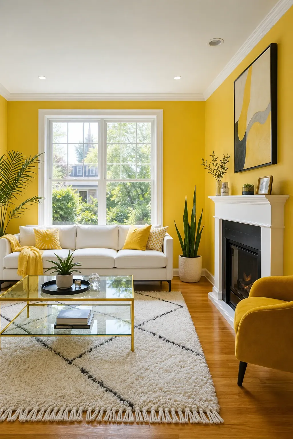
3. Brighten Things Up with Sunshine Yellow: Radiant Optimism

Sunshine yellow is a vibrant and cheerful color that instantly infuses a living room with warmth, energy, and an undeniable sense of optimism. This radiant hue is perfect for spaces that lack natural light or for those who wish to create an uplifting and inviting atmosphere. It’s a color that promises to brighten not just the room, but also the spirits of those within it.

### The Psychological Impact of Yellow

Yellow is universally recognized as a color of happiness, creativity, and intellect. In a living room, sunshine yellow can stimulate conversation, encourage laughter, and create a perpetually sunny disposition. It is known to boost serotonin levels, which can improve mood and energy. However, because it is a high-energy color, it’s often best used in rooms where social interaction is common.

### Balancing the Vibrancy

To balance the intensity of sunshine yellow, pair it with crisp white trim and neutral furnishings in shades of gray, beige, or even a light taupe. This prevents the yellow from becoming overwhelming. For a more daring look, consider accents in complementary colors like purple or deep blue.

Introduce natural wood elements to add warmth and an organic touch. Light-colored woods like ash or maple work well for a modern look, while darker woods can provide a more traditional contrast. Keep window treatments light and airy—think sheer white curtains—to maximize natural light and enhance the cheerful, expansive feel of the room.

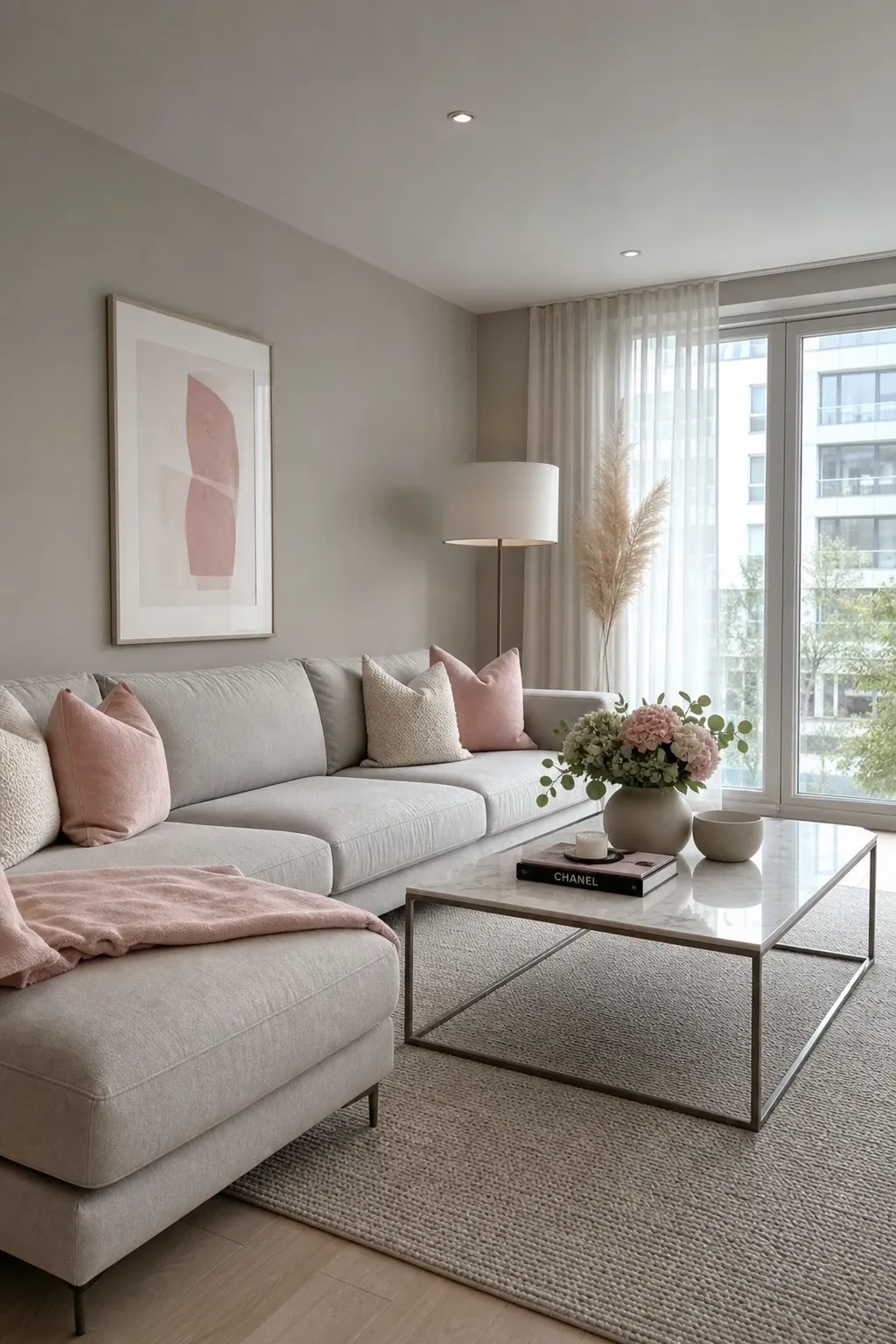
4. Use Gray with Blush Accents: Modern Serenity

Combining a muted gray base with blush accents creates a living room that is both modern and inviting, striking a perfect balance between serene sophistication and gentle warmth. This pairing offers a contemporary aesthetic that feels fresh, calm, and effortlessly chic. It’s an ideal choice for those who appreciate minimalist design with a touch of softness.

### The Synergy of Gray and Blush

Gray provides a versatile and grounding backdrop, symbolizing stability, composure, and maturity. When infused with blush pink, it gains a subtle warmth and a hint of playfulness, preventing the space from feeling cold or impersonal. This combination promotes a sense of calm and balance, making the living room a peaceful retreat for relaxation and quiet contemplation.

### Implementation Strategies

Start with a light to medium gray on the walls. Be mindful of the undertones; a “greige” (gray-beige) can provide a warmer base that complements blush perfectly. Introduce blush through textiles like cushions, throws, or a large area rug. This allows you to easily adjust the amount of pink in the room.

Metallic finishes, particularly copper or rose gold, can beautifully enhance this color scheme. Incorporate clean-lined, modern furniture to maintain the contemporary aesthetic. Fresh flowers, especially in shades of pink or white, can further soften the look and add a natural, fragrant element to the room.

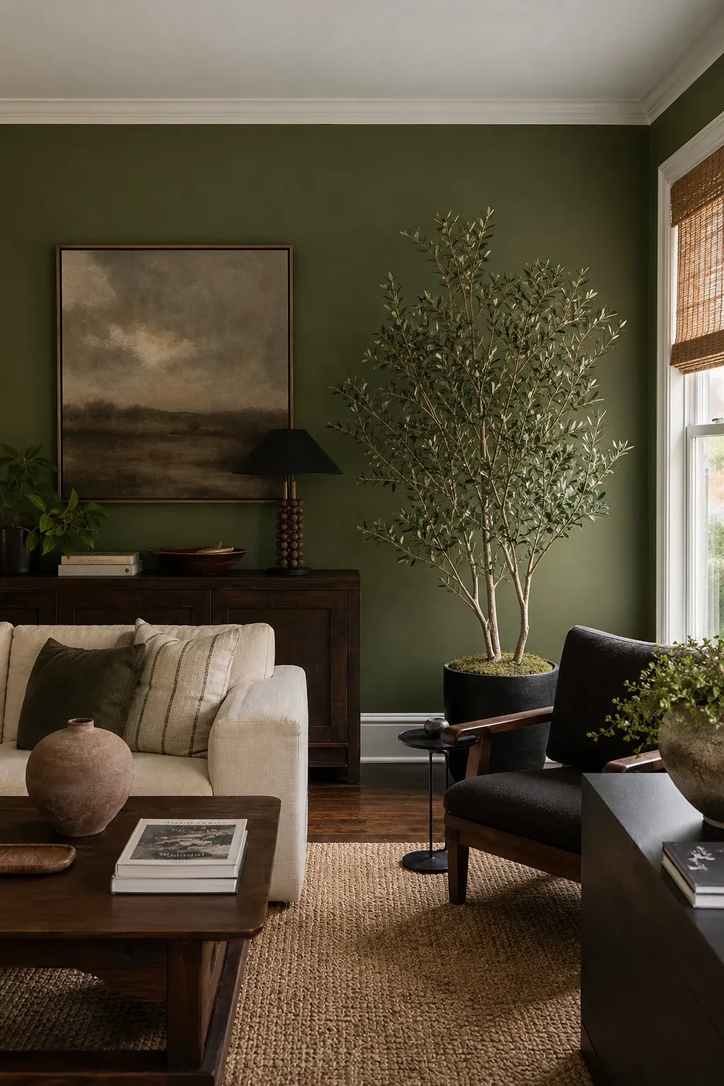
5. Try Deep Olive Walls: Earthy Sophistication

Deep olive green walls bring an unparalleled sense of earthy sophistication and calming depth to a living room. This rich, muted green hue is reminiscent of natural landscapes, offering a grounding presence that feels both luxurious and comforting. It’s an excellent choice for creating a cozy, introspective atmosphere that encourages relaxation and connection with nature.

### The Character of Olive Green

Olive green is often associated with peace, harmony, and resilience. In interior design, it provides a sophisticated alternative to more vibrant greens, offering a mature and timeless appeal. It has a unique ability to feel both historic and modern, depending on the surrounding decor. Deep olive walls can make a room feel more intimate, perfect for creating a snug reading nook or a tranquil space for unwinding.

### Styling for an Earthy Feel

Pair deep olive walls with natural materials such as dark wood furniture, rattan accents, and textured fabrics like wool, tweed, or linen. Cream or off-white upholstery can provide a striking contrast, brightening the space and preventing it from feeling too heavy or “muddy.”

Introduce metallic elements in bronze or antique gold to add a touch of refined elegance. Soft, diffused lighting—think lamps with warm-toned shades—will enhance the color’s depth and create a warm, inviting glow. Consider incorporating artwork with natural themes, such as landscapes or botanical prints, to complement the earthy palette.

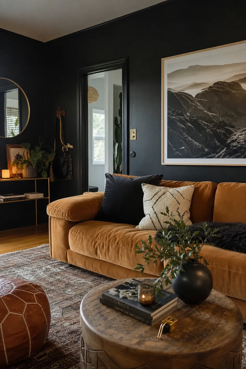
6. Go Moody with Charcoal Black: Bold and Cozy

Embracing charcoal black on your living room walls is a daring yet incredibly rewarding design choice. Far from making a room feel small or oppressive, charcoal black creates a dramatic, sophisticated, and surprisingly cozy atmosphere. It’s a color that commands attention, offering a chic backdrop that allows other elements in the room to truly shine.

### The Drama of Black

Black, particularly in its charcoal or “off-black” iterations, symbolizes power, elegance, and mystery. In a living room, it can create a sense of intimacy and enclosure, making the space feel like a luxurious cocoon. It’s an excellent choice for highlighting artwork, creating a gallery-like feel, or simply making a bold statement. When balanced correctly with light and texture, charcoal black can be incredibly inviting.

### Creating Balance and Texture

To prevent a charcoal black living room from feeling too stark, it is crucial to pair it with warm furniture and rich, varied textures. Think plush velvet sofas in jewel tones like deep red or sapphire, natural wood tables, and soft, layered lighting. Use rugs with a high pile or interesting patterns to add warmth to the floor.

Introduce metallic accents in gold, copper, or silver to add sparkle and a sense of luxury. Large mirrors are particularly effective in black rooms, as they reflect light and prevent the space from feeling too enclosed. Incorporate vibrant artwork or colorful textiles to provide contrast and ensure the room feels dynamic and welcoming.

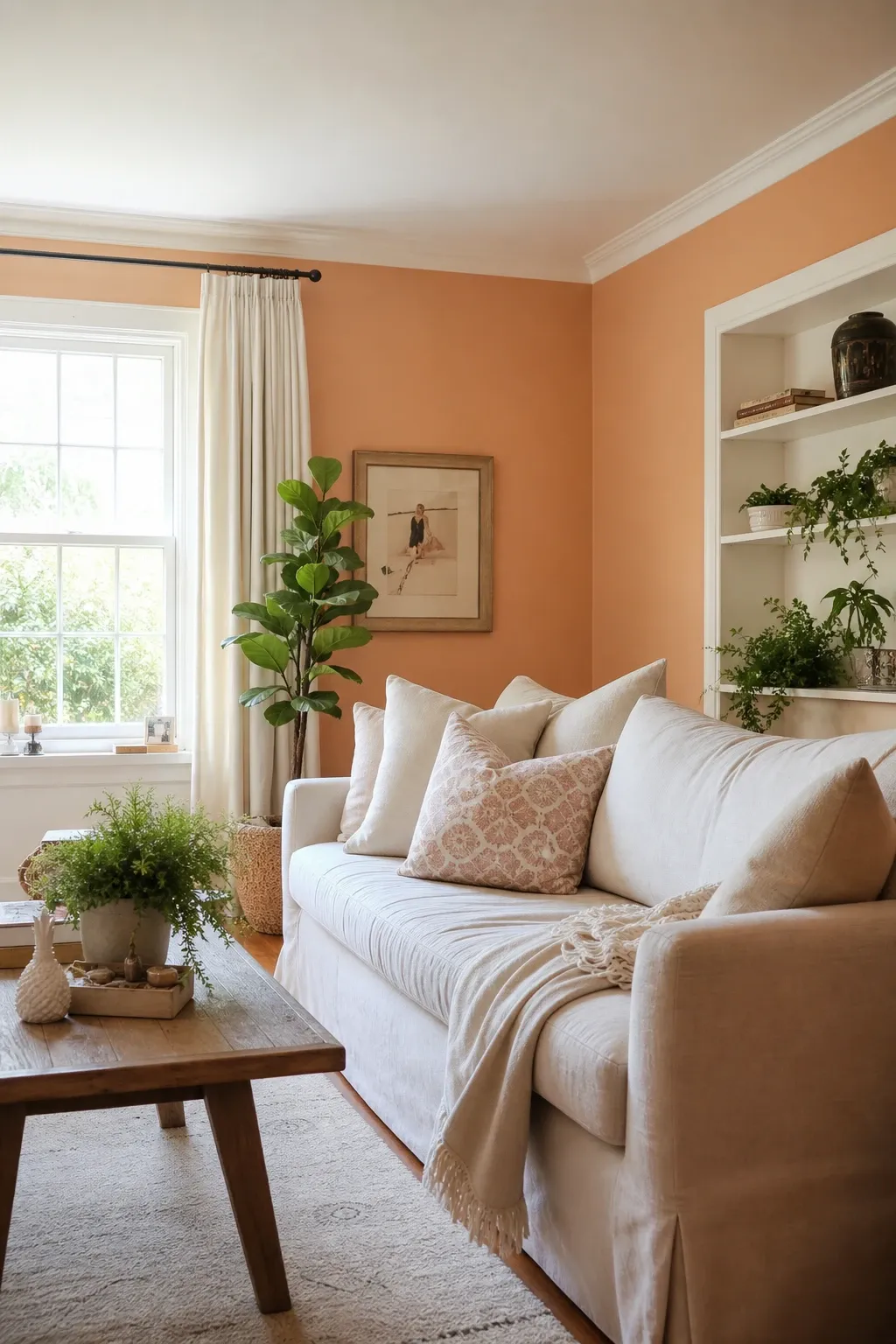
7. Add Warm Peach: Subtle Brightness and Comfort

Warm peach tones bring a subtle yet significant warmth to a living room, creating an atmosphere that feels bright, understated, and incredibly comfortable. This gentle hue, a softer and more muted cousin to orange, offers a delicate balance between invigorating and calming, making it an excellent choice for a relaxed and airy living room ambiance.

### The Comfort of Peach

Peach is often associated with comfort, friendliness, and encouragement. In a living room, it can evoke a sense of hospitality and ease, making it an ideal color for fostering a welcoming environment. Its subtle warmth can brighten a room without the intensity of a bolder color, providing a soft, healthy glow that is both uplifting and soothing.

### Achieving a Relaxed Look

Pair warm peach walls with light-colored furniture in creams, whites, or natural linen to enhance its airy quality. Introduce natural wood elements, such as bamboo, light oak, or pine, to complement its organic feel. This creates a “Scandi-boho” vibe that is very popular in contemporary design.

Green plants, especially those with broad, lush leaves like a Monstera or a Fiddle Leaf Fig, will provide a refreshing contrast. Consider incorporating textures like woven jute rugs, macrame wall hangings, or ceramic decor to add depth and visual interest. Soft, diffused lighting will further enhance the gentle glow of peach, creating a truly inviting and peaceful space.

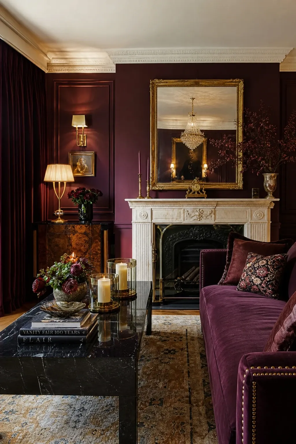
8. Use Deep Berry Hues: Luxurious Warmth and Elegance

Deep berry hues, such as rich burgundy, plum, or raspberry, infuse a living room with a touch of opulent luxury and profound warmth. These sophisticated colors make a powerful statement, transforming the space into an inviting and stylish sanctuary. They are perfect for those who desire a living room that feels both grand and intimately cozy.

### The Opulence of Berry Tones

Deep berry colors are often associated with passion, richness, and creativity. In a living room, they can create a sense of drama and elegance, making the space feel more formal and refined. These hues are excellent for fostering a cozy atmosphere, particularly in larger rooms where a sense of enclosure is desired. They provide a stunning, high-contrast backdrop for artwork and metallic accents.

### Styling for Sophistication

To enhance the luxurious feel of deep berry walls, pair them with furniture in rich fabrics like velvet, silk, or high-quality leather. Gold or brass accents are a natural fit, adding a touch of traditional glamour. Dark wood furniture can ground the space, while lighter neutrals in upholstery can provide a necessary visual break.

Consider incorporating patterned rugs or throw pillows that feature complementary colors like deep blues or forest greens to add further depth. Strategic lighting is key; use dimmable fixtures to create a moody, intimate atmosphere in the evening, and ensure there’s enough light during the day to prevent the color from feeling too heavy.

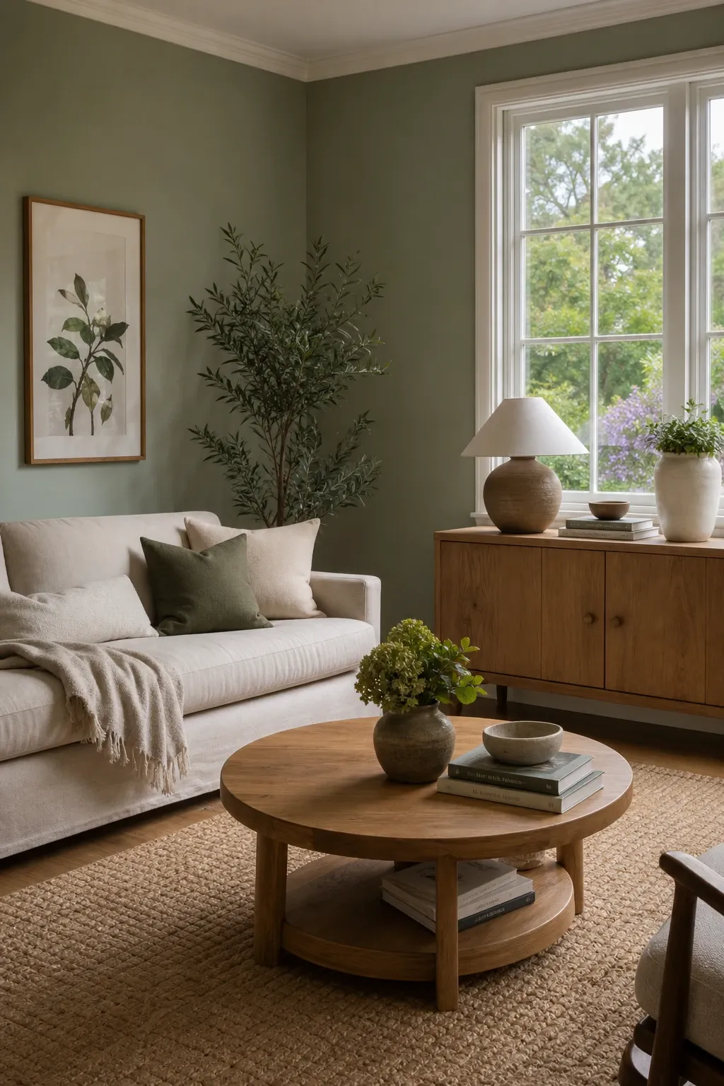
9. Add Fresh Sage Green: Tranquil and Natural

Fresh sage green walls bring a natural, calming vibe to any living room, creating a tranquil space that feels deeply connected to nature. This muted, earthy green hue is renowned for its soothing properties, making it an ideal choice for fostering an environment of peace and relaxation. It’s a color that feels both contemporary and timeless.

### The Serenity of Sage

Sage green is often associated with growth, harmony, and healing. In a living room, it promotes a sense of serenity and well-being, helping to reduce stress and create a restful atmosphere. Its subtle gray undertones allow it to act as a sophisticated neutral, providing a gentle backdrop that is easy on the eyes and highly adaptable to different decor styles.

### Bringing the Outdoors In

Pair fresh sage green walls with natural wood furniture in light to medium tones, such as birch, oak, or maple. Introduce textures like linen, cotton, and woven materials to enhance the organic feel. White or cream upholstery can brighten the space and create a crisp, clean look.

Subtle metallic accents in brushed nickel or matte black can add a modern touch without disrupting the calm. Abundant green plants will further amplify the natural aesthetic, creating a cohesive and refreshing environment. Consider incorporating artwork with botanical prints or soft, abstract landscapes to complement the tranquil theme.

10. Combine Terracotta and Blush: Earthy Warmth with Softness

Layering terracotta and blush in a living room creates a unique combination that offers earthy warmth infused with delicate softness. This pairing results in a space that feels cozy, inviting, and subtly refined. It’s an excellent choice for those who appreciate a bohemian aesthetic or a Mediterranean-inspired warmth with a contemporary twist.

### The Harmony of Earth and Air

Terracotta, with its rich, reddish-brown tones, evokes the warmth of sun-baked earth and ancient craftsmanship, symbolizing grounding and stability. Blush pink introduces a gentle, romantic counterpoint, softening the intensity of terracotta and adding a touch of modern elegance. Together, they create a balanced, harmonious palette.

### Implementing the Palette

Consider using terracotta on a main wall or for large furniture pieces, with blush introduced through textiles, decorative objects, or even a smaller accent wall. Natural materials are essential for this look: think raw wood, woven rugs, and ceramic decor.

Cream or off-white upholstery can provide a light contrast, while metallic accents in copper or bronze can enhance the earthy richness. Incorporate plenty of greenery to add freshness. Textured elements, such as chunky knit throws or patterned cushions with ethnic motifs, will add depth and tactile appeal to the room.

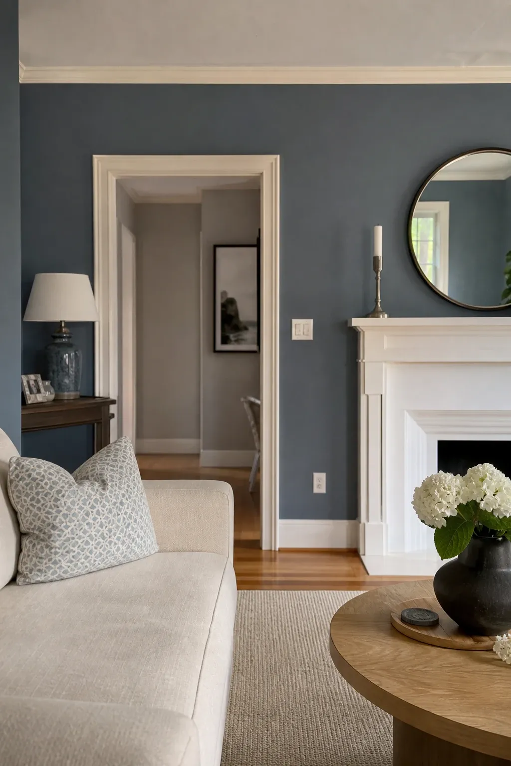
11. Opt for Slate Blue: Serene Sophistication

Slate blue creates a serene and sophisticated atmosphere in a living room, offering a versatile backdrop that works beautifully with both modern and traditional decor styles. This muted, grayish-blue hue is reminiscent of a calm, overcast sky or deep ocean waters, bringing a sense of tranquility and understated elegance to any space.

### The Calm of Slate Blue

Blue is well-known for its calming and stabilizing effects, and slate blue is a particularly refined version. Its grayish undertones give it a mature quality, preventing it from feeling too “baby blue” or overly vibrant. It promotes a sense of peace, clarity, and introspection, making the living room an ideal space for unwinding after a long day.

### Versatile Styling Options

Pair slate blue walls with furniture in light neutrals like cream, beige, or light gray to maintain an airy and open feel. Dark wood furniture can add a touch of classic, stately elegance, while metallic accents in silver or chrome can enhance a more modern, industrial aesthetic.

Introduce pops of warmer colors, such as mustard yellow, coral, or even a soft orange, through throw pillows or artwork to add visual interest and a bit of energy. Layered lighting, including table lamps and floor lamps with soft-white bulbs, will help to create a cozy and inviting ambiance, highlighting the subtle blue-gray nuances.

12. Go Bold with Emerald Green: A Statement of Grandeur

Emerald green walls make a striking statement, infusing a living room with a bold, elegant, and undeniably luxurious feel. This vibrant, deep green hue, reminiscent of precious gemstones and lush forests, transforms a space into a grand and sophisticated haven. It’s a color choice that speaks of confidence and refined taste.

### The Grandeur of Emerald

Emerald green is often associated with wealth, royalty, and nature’s abundance. In a living room, it creates a powerful visual impact, evoking a sense of drama and depth. It promotes feelings of balance and rejuvenation, making the space feel both invigorating and comforting. This rich color is excellent for creating a clear focal point in the home.

### Decorating for a High-End Look

To complement the grandeur of emerald green walls, opt for furniture in luxurious materials like velvet, silk, or dark, polished leather. Gold or brass accents are a natural pairing, significantly enhancing the opulent aesthetic. Dark wood furniture, such as mahogany or walnut, can further ground the space.

Introduce contrasting colors through artwork or decorative elements—deep blues, rich purples, or even a touch of bright coral can create a dynamic and visually engaging environment. Ensure adequate lighting to showcase the color’s richness and prevent the room from feeling too dark or enclosed.

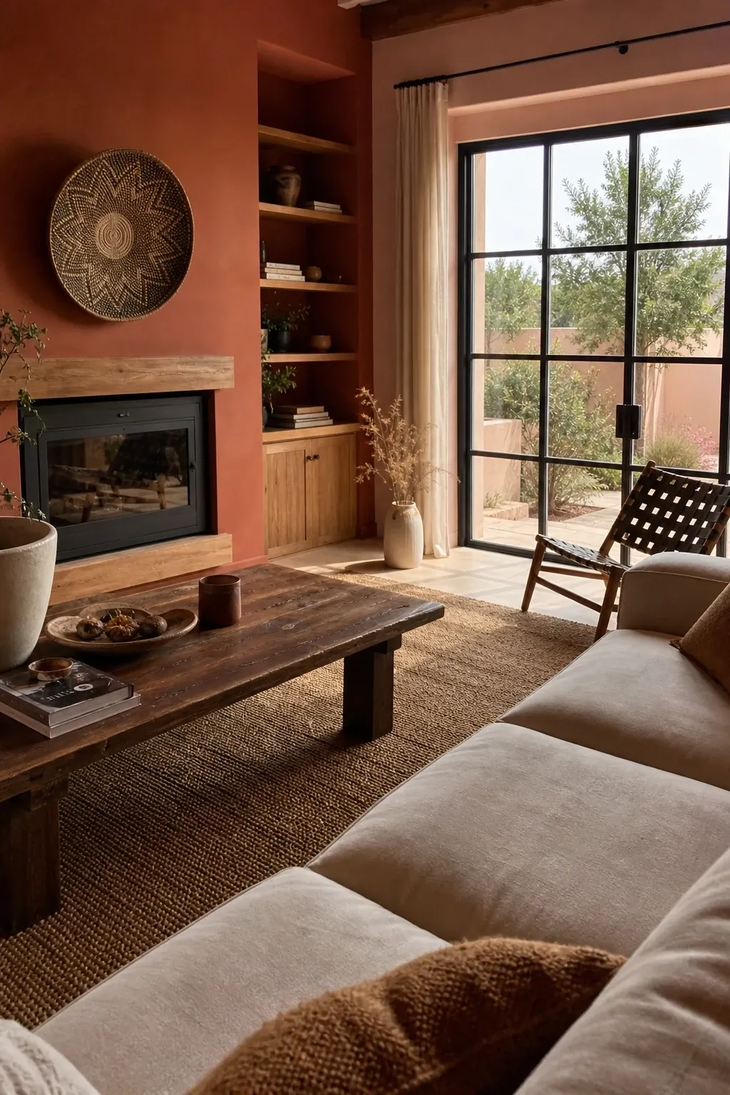
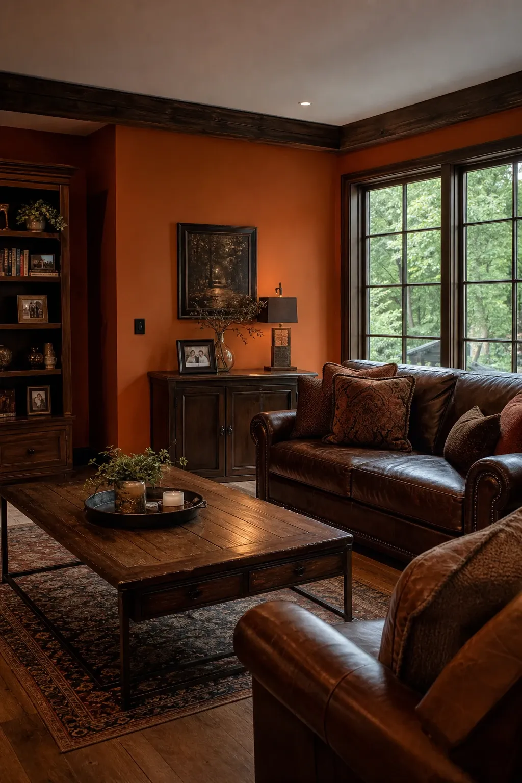
13. Warm Up with Burnt Orange: Earthy and Inviting

Burnt orange walls create a warm, earthy vibe in a living room, perfect for cultivating a cozy, welcoming atmosphere that is both stylish and inviting. This rich, muted orange hue, reminiscent of autumn leaves and desert landscapes, brings a sense of grounded comfort and natural beauty to any space.

### The Energy of Burnt Orange

Burnt orange is associated with warmth, creativity, and passion, but in its muted form, it also evokes a sense of stability and connection to the earth. In a living room, it can stimulate conversation and foster a sense of togetherness, making it an ideal color for social gatherings. Its inherent warmth makes a room feel instantly cozier and more intimate.

### Styling for a Cozy Vibe

Pair burnt orange walls with natural materials like dark wood furniture, leather accents, and woven textiles such as jute, wool, or sisal. Cream or off-white upholstery can provide a soft contrast, brightening the space. Introduce metallic elements in bronze or antique gold for a touch of refined elegance.

Green plants with deep green foliage will provide a refreshing and natural contrast. Consider incorporating patterns with geometric or tribal motifs to add visual interest and enhance the earthy, global aesthetic. Soft, ambient lighting—perhaps even a fireplace—will further enhance the cozy and inviting glow of burnt orange.

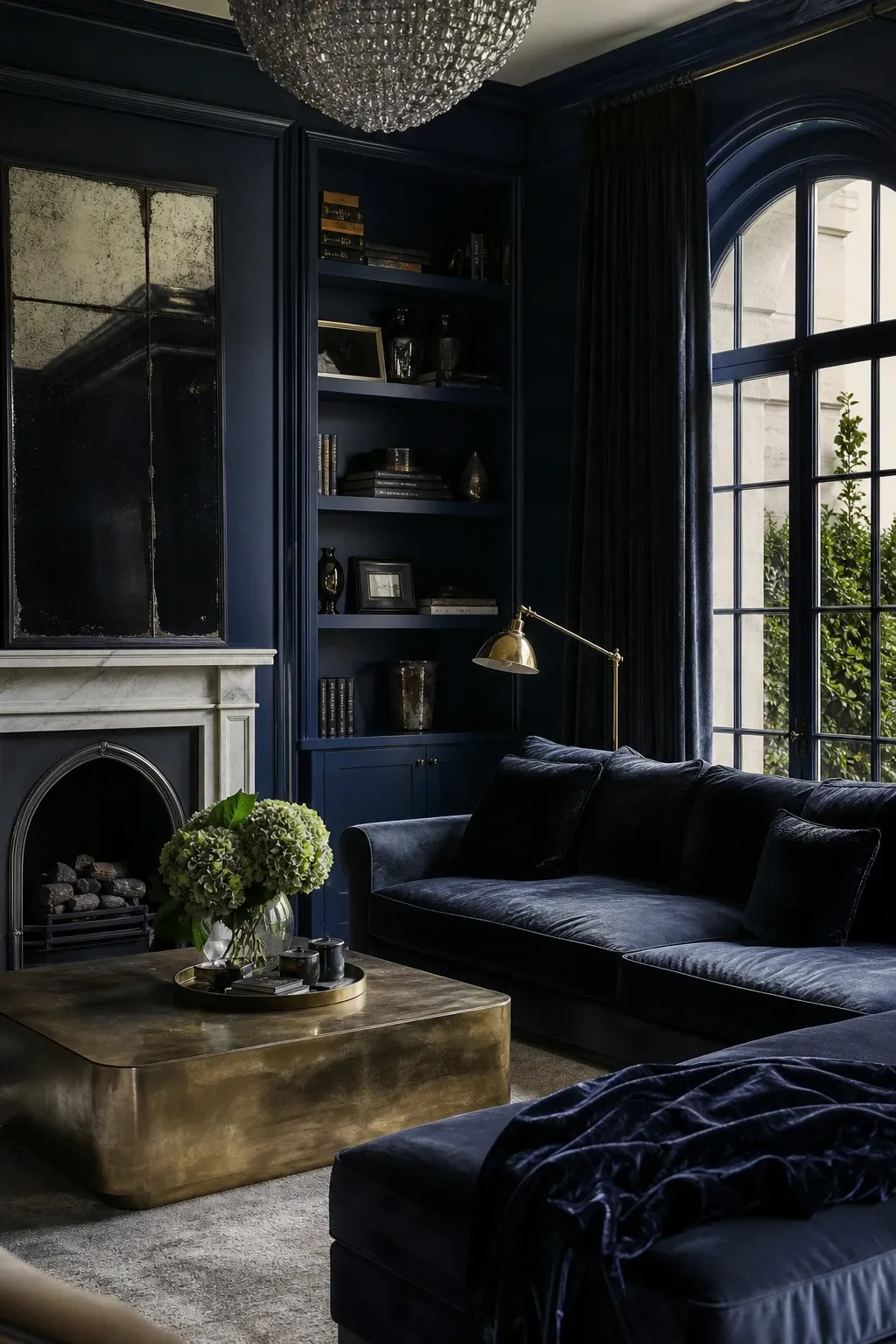
14. Go Dramatic with Midnight Blue: Luxurious Depth and Calm

Midnight blue adds a touch of profound luxury and dramatic depth to a living room, transforming the space into a sophisticated and serene retreat. This deep, inky blue hue, reminiscent of a clear night sky, creates an atmosphere of calm elegance and quiet contemplation.

### The Depth of Midnight Blue

Blue, particularly in its deepest shades, is strongly associated with tranquility, stability, and wisdom. Midnight blue, with its almost black intensity, evokes a sense of mystery and high-end sophistication. In a living room, it can create a cocoon-like effect, making the space feel incredibly cozy and secure.

### Creating a Sophisticated Retreat

To enhance the luxurious feel of midnight blue walls, pair them with metallic accents in gold, silver, or brass. These reflective elements will pop against the deep blue, adding sparkle and glamour. Lighter furniture in creams, grays, or even crisp white upholstery will provide a striking and necessary contrast.

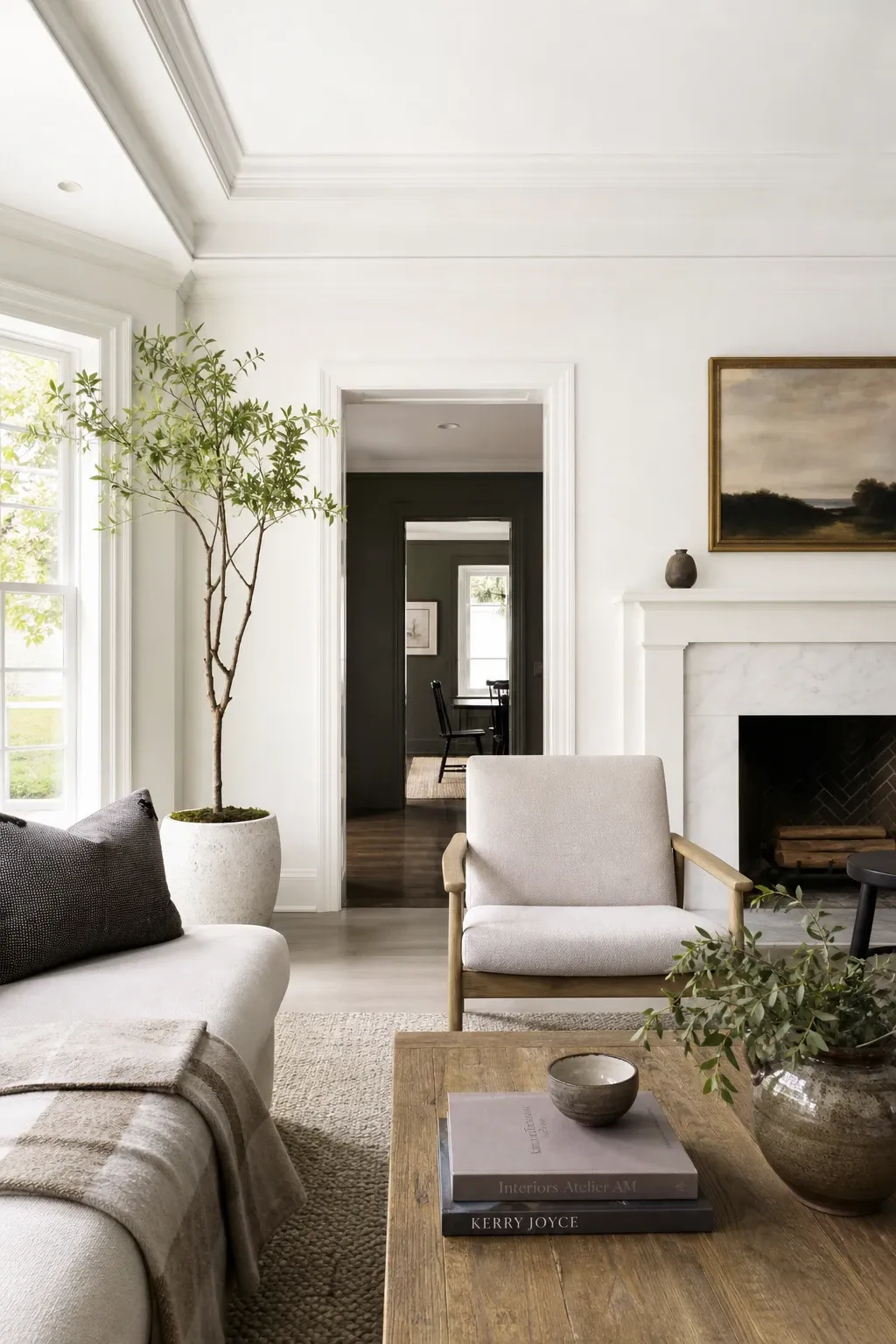
Introduce rich textures through velvet cushions, silk throws, or a plush, high-quality rug to add to the opulent ambiance. Strategic lighting is crucial; use elegant lamps and perhaps a statement chandelier to illuminate the space and highlight the color’s incredible depth. Artwork with vibrant colors or metallic leaf can also provide a beautiful focal point.

15. Embrace Classic White: Timeless Purity and Versatility

Classic white walls keep things simple, elegant, and timeless in a living room, offering a canvas of purity and unparalleled versatility. It’s a choice that makes your living room feel bright, open, and endlessly adaptable to any decor style or seasonal change.

### The Versatility of White

White is universally associated with purity, cleanliness, and new beginnings. In a living room, it creates a sense of spaciousness and airiness, making even small rooms feel larger. It reflects light beautifully, enhancing natural illumination. White also provides the ultimate neutral backdrop, allowing your furniture, artwork, and collections to take center stage.

### Adding Warmth and Interest to White

To prevent a white living room from feeling sterile or cold, focus on layering textures and incorporating natural materials. Think chunky knit throws, linen curtains, wool rugs, and wooden furniture in various tones. This “tonal” approach adds depth without needing bold color.

Introduce pops of color through artwork, throw pillows, or decorative objects—this is where you can easily change the mood of the room. Green plants will bring life and freshness, creating a vibrant contrast. Consider using different shades of white or off-white (like cream or ivory) in your decor to add subtle depth and warmth to the overall look.

Choosing the Right Paint Finish

Once you’ve selected the perfect color, choosing the right finish (or sheen) is the next critical step. The finish affects both the appearance and the durability of the paint.

* **Flat/Matte:** This finish has no sheen and is excellent for hiding imperfections on the wall. It provides a deep, rich look but is the least durable and hardest to clean. Best for low-traffic areas or ceilings.

* **Eggshell:** A very popular choice for living rooms. It has a slight hint of shine, similar to an actual eggshell. it’s more durable than flat paint and can be gently cleaned, making it a good balance for most spaces.

* **Satin:** Has a more noticeable sheen and is more durable and easier to clean than eggshell. It’s a great choice for high-traffic living rooms or for those with children and pets.

* **Semi-Gloss:** Highly durable and easy to clean, with a significant shine. Usually reserved for trim, doors, and architectural details rather than full walls in a living room.

* **High-Gloss:** The most durable and reflective finish. It creates a dramatic, lacquer-like look but highlights every single imperfection on the wall. Best used sparingly for a high-impact statement.

Sustainability and Eco-Friendly Paint Choices

In today’s world, considering the environmental impact of your paint choice is increasingly important. Many traditional paints contain Volatile Organic Compounds (VOCs), which can “off-gas” into your home for years, affecting indoor air quality.

* **Low-VOC and Zero-VOC Paints:** These are now widely available from most major paint brands. They have significantly lower levels of harmful chemicals, making them better for both the environment and your family’s health.

* **Natural Paints:** Some companies offer paints made from natural ingredients like clay, lime, or plant oils. These are often the most eco-friendly options but may have different application requirements and a more limited color palette.

* **Recycled Paint:** Some programs collect unused paint and reprocess it into new colors, reducing waste and providing a more sustainable option.

Conclusion: Crafting Your Ideal Living Room Atmosphere

Choosing the perfect paint color for your living room is a journey of self-expression and thoughtful design. Each hue possesses a unique ability to shape the mood, perception, and overall character of your space. From the gentle embrace of soft pink to the dramatic allure of midnight blue, and the timeless purity of classic white, the possibilities are as diverse as your imagination.

By considering the psychological impact of colors, understanding the crucial role of lighting, and envisioning the atmosphere you wish to create, you can transform your living room into a reflection of your personal style and a true haven of comfort. Remember that paint is not merely a covering; it is a powerful tool for storytelling, capable of turning a house into a home. Embrace these ideas, experiment with combinations, and confidently select the colors that will bring your living room to life, making it a space where every moment feels perfectly curated and deeply cherished.

References

[1] Addicted to Organization. “41 Trendy Living Room Paint Color Ideas You Must See.” [https://addictedtoorganization.com/living-room-paint-color-ideas/](https://addictedtoorganization.com/living-room-paint-color-ideas/)

[2] Sherwin-Williams. “Color Psychology: How Room Colors Affect Your Mood.” [https://www.sherwin-williams.com/en-us/project-center/paint/color-psychology](https://www.sherwin-williams.com/en-us/project-center/paint/color-psychology)

[3] Real Simple. “6 Living Room Paint Color Trends Designers Are Loving This Year.” [https://www.realsimple.com/2026-living-room-paint-color-trends-11943149](https://www.realsimple.com/2026-living-room-paint-color-trends-11943149)

[4] Robern. “Color Psychology for Your Home: Room Paint Color & Mood.” [https://www.robern.com/article/color-psychology-for-home](https://www.robern.com/article/color-psychology-for-home)

[5] Extra Space. “17 Mood-Boosting Paint Color Ideas.” [https://www.extraspace.com/blog/home-organization/mood-boosting-paint-color-ideas/](https://www.extraspace.com/blog/home-organization/mood-boosting-paint-color-ideas/)

[6] Octane Seating. “What Color Should I Paint My Room? Colors and Moods.” [https://octaneseating.com/blog/room-color-and-moods/](https://octaneseating.com/blog/room-color-and-moods/)

Similar Posts

Leave a Reply

Your email address will not be published. Required fields are marked *