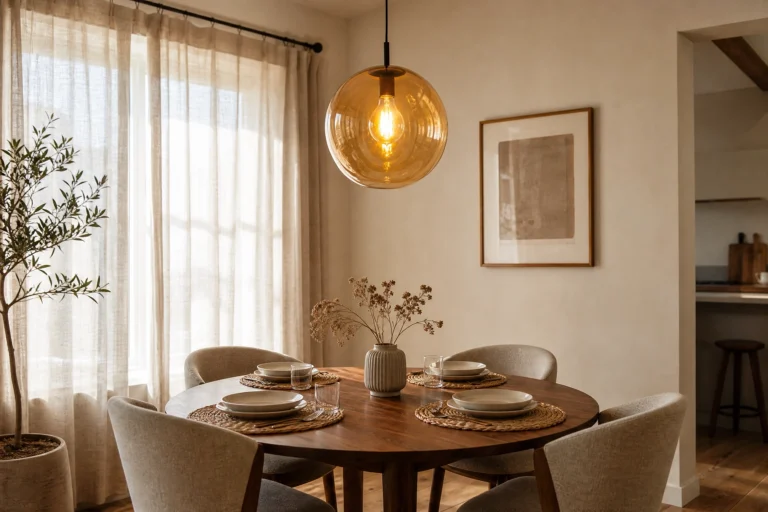
The wall behind your dining table does a lot more work than most people realize. When guests sit down to eat, that wall is directly in their sightline for the entire meal. It sets the mood, tells people what kind of space they’re in, and either holds the room together or quietly undermines everything else you’ve done. An accent wall in a dining room is not just decoration. It’s the backdrop for every dinner party, every Sunday breakfast, every birthday cake moment. Getting it right matters more in here than in almost any other room in the house.
What makes a dining room accent wall different from a living room or bedroom treatment is the context it lives in. You’re working with a room that typically has a large piece of furniture anchoring the center, overhead pendant lighting that draws the eye up, and a mix of people seated at varying heights. The wall needs to hold visual weight from across the table, look good under warm dining light, and complement whatever you’ve already got going on without competing with it. The ideas below are organized around the specific design principle that makes each one work in a dining room, not just anywhere. That’s what separates a wall that looks intentional from one that just looks busy.
1. Deep Burgundy Paint with Visible Brushstroke Texture
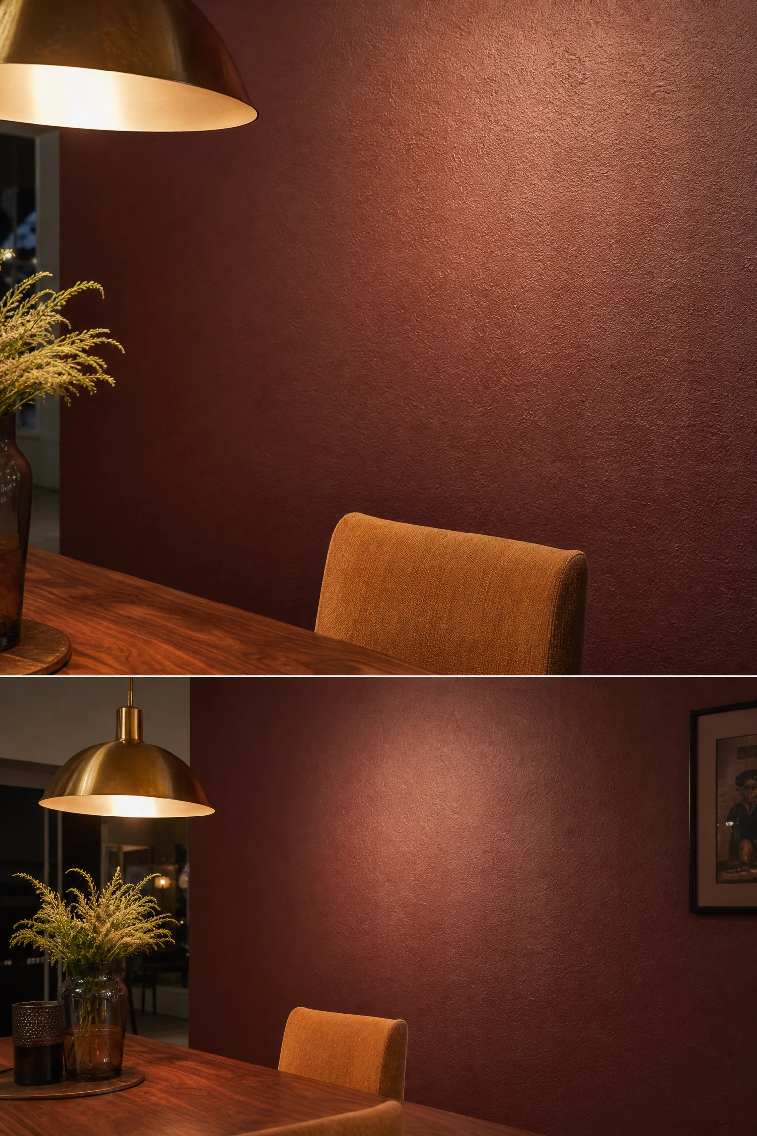
The principle here is what designers call “visual warmth,” and it works especially well in dining rooms because the space is experienced almost entirely under artificial light, usually in the evening. Deep burgundy, think Farrow & Ball’s Preference Red or Benjamin Moore’s Moroccan Spice, absorbs overhead light rather than reflecting it, which creates a cocoon-like intimacy that genuinely makes people linger at the table longer. In practice, this look comes together best when you apply it with a wide natural-bristle roller and leave slight texture rather than chasing a perfectly smooth finish. Those micro-ridges catch candlelight in a way that flat paint never does. Pair this wall with a solid walnut dining table, brass pendant lighting, and linen dining chairs in a warm oat or camel tone to keep everything in the same temperature family. One honest limitation: burgundy reads very differently in a room with low ceilings. It can make the space feel smaller, so it works best when ceiling height is at least nine feet, or when you run the color all the way to the ceiling to avoid a chopped effect.
Pro Move: Carry the burgundy about six inches onto the adjacent walls to soften the hard edge and make the focal wall feel like a deliberate design decision rather than a last-minute paint job.
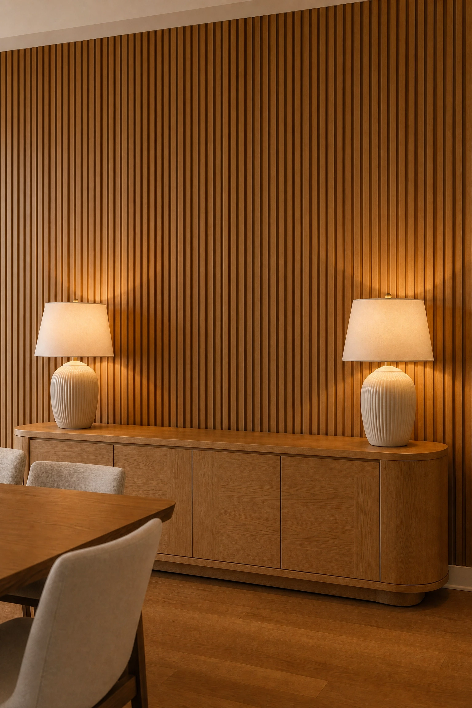
Fluted paneling, meaning vertical panels with a rhythmic series of rounded ridges, works in dining rooms because of a principle called “tactile contrast.” The room already contains hard, flat surfaces: the tabletop, the floor, the ceiling. Adding a wall treatment with genuine three-dimensional depth at seated eye level gives the eye somewhere to rest and creates a sense of craftsmanship that flat paint simply cannot replicate. Natural oak is the right call here because its warm, honey-toned grain picks up and amplifies pendant light, especially the warm-white bulbs (around 2700K) that work best in dining spaces. Install the panels floor-to-ceiling for maximum impact, then hang nothing on them. The texture is the decoration. A long oak or rattan credenza pushed against this wall, topped with a pair of matching table lamps, ties the horizontal and vertical elements together beautifully. Budget note: solid oak fluted panels are an investment (expect $40-$80 per square foot installed), but MDF fluted panels painted in a complementary warm white or sage green offer the same visual payoff at a fraction of the cost.
Designer Advice: Space your pendant light so it sits slightly in front of the fluted wall rather than flush against it. This creates a shadow play across the ridges that looks completely different from day to night.
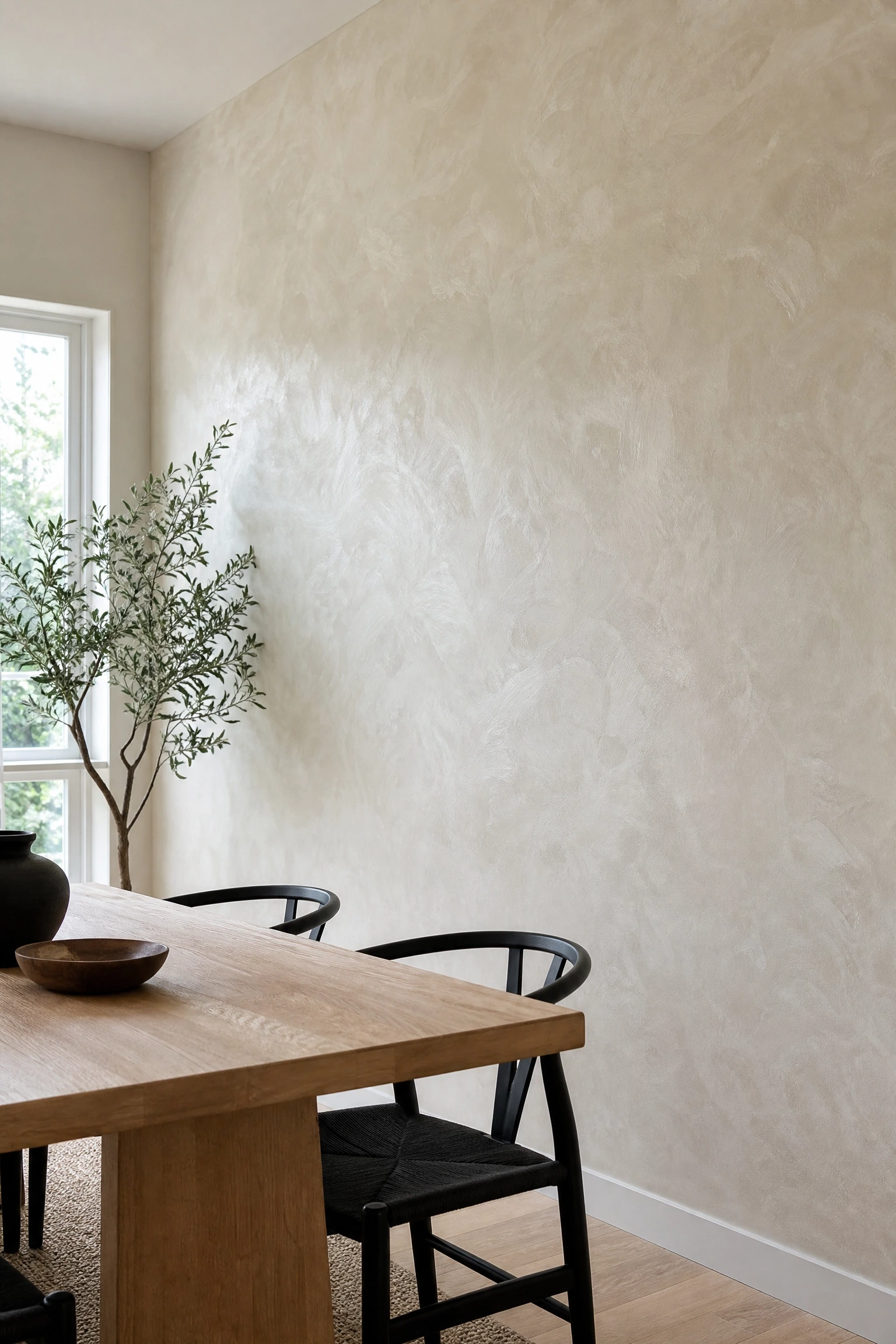
Limewash has been used on interior walls for centuries, and there’s a reason professional designers keep returning to it: the finish has a depth and variation that synthetic paint cannot fake. Each section of the wall looks slightly different depending on the angle and the light, which makes it genuinely interesting to look at over the course of a meal without being distracting. In a dining room, an off-white or soft putty limewash wall functions as a kind of polished neutral. It works with nearly any furniture style, from a rustic farmhouse table to a sleek Japandi-inspired setup with a marble top and black steel chairs. The cloudy, mottled quality also hides small marks and scuffs far better than standard flat paint, which is worth thinking about in a room where chairs are constantly moving in and out. Application does require some technique: you brush it on in overlapping, diagonal strokes and wipe back sections while still wet to get that characteristic faded-fresco look. Kits from brands like Portola Paints make this approachable as a DIY weekend project.
Heads Up: Limewash is a commitment in terms of application time but an easy one to touch up. Just blend a small amount back into dry patches with a damp sponge, and the repair disappears.
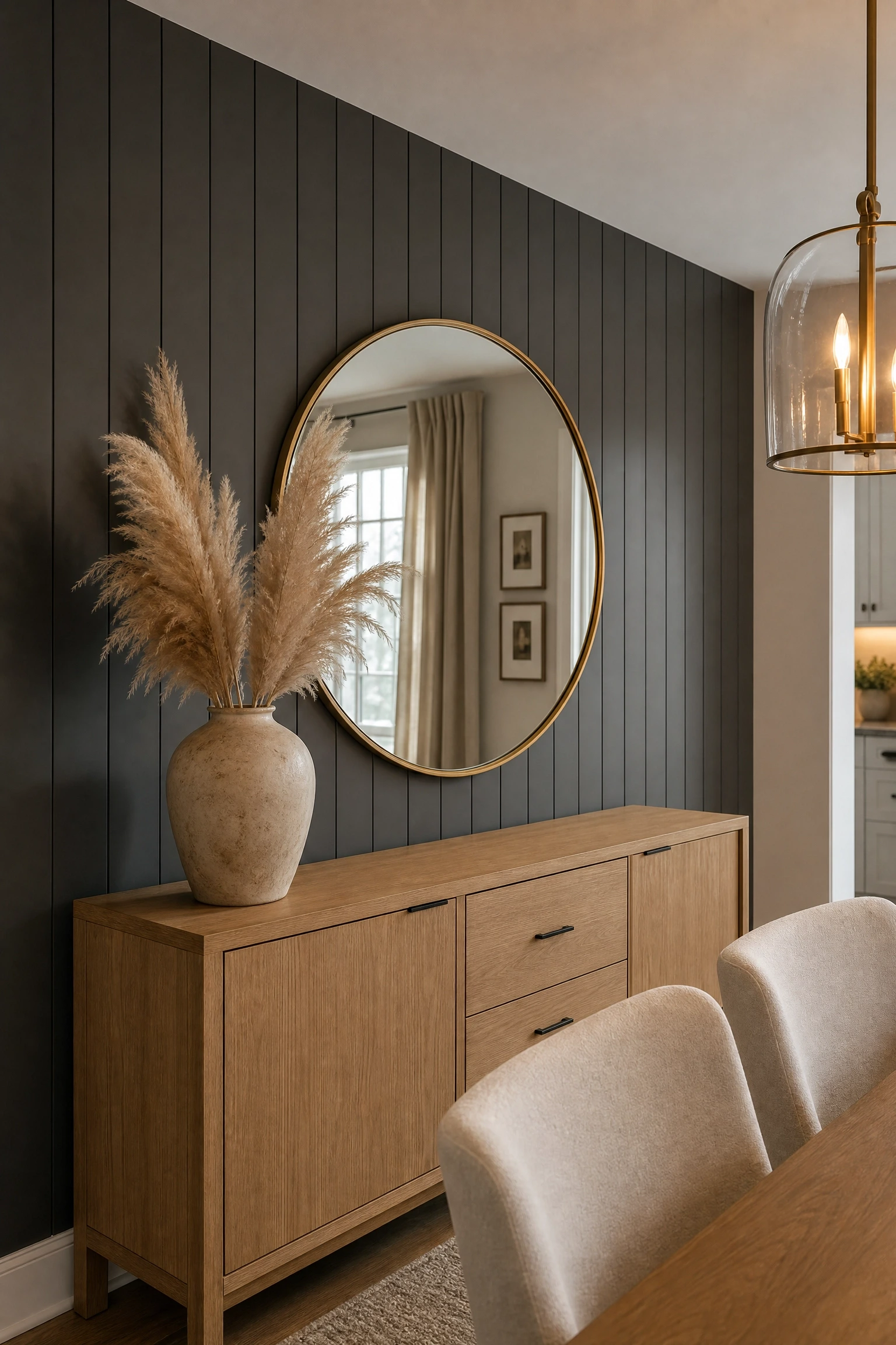
Most people picture shiplap installed horizontally, and horizontal boards do read as relaxed and casual. But vertical shiplap operates on a completely different design principle. It draws the eye upward and creates the perception of height, which is exactly what you want in a dining room where the focal wall is framed by a chandelier or pendant above and a low credenza below. Charcoal gray (Sherwin-Williams Peppercorn is a reliable standby, or try Benjamin Moore’s Wrought Iron for a slightly warmer undertone) is the right color for this treatment because it gives the shadow lines between boards enough contrast to read clearly without going full black. Layer in a large oval or arch-shaped mirror on this wall to bounce light back into the room, and choose dining chairs with light upholstery, cream, blush, or a warm ivory, to keep the palette from tipping into moodiness. This is a genuinely affordable DIY-friendly option: pine shiplap boards cost around $1-$2 per linear foot, and installation requires only basic carpentry skills and a nail gun.
Quick Tip: Paint the wall behind the shiplap the same charcoal color before you install the boards. The shadow lines will look intentionally deep rather than like unpainted gaps.
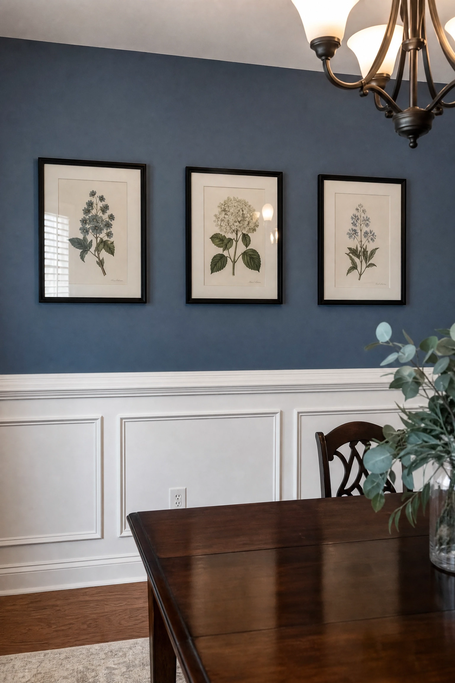
Wainscoting is one of those treatments where understanding the design principle completely changes how you approach it. The reason it works so well in dining rooms specifically is “zone definition.” The chair rail that tops the wainscoting sits at roughly the same height as the back of a dining chair, which means it visually echoes the furniture and anchors the lower portion of the room to the human scale of people seated at the table. The upper half of the wall is where the real creative decision lives. Instead of the classic white-on-white approach, try painting the upper section a saturated dusty blue or deep forest green and the wainscoting panels below in a crisp white. That contrast is what makes the room feel layered and intentional rather than builder-grade. Add a simple picture rail at the top of the wall and hang two or three botanical prints or abstract pieces in simple black frames to complete the look. This approach works especially well in formal dining rooms and sits comfortably in traditional, transitional, and even some modern-classic interiors.
Reality Check: Traditional wainscoting height is typically 32-36 inches, but in rooms with higher ceilings you can push it to 48 inches. Trust your eye and use a laser level to keep the chair rail perfectly horizontal.
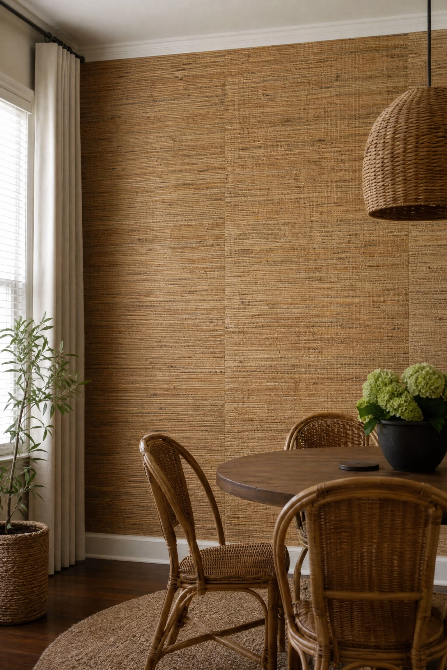
Natural-fiber wallpapers, including grasscloth woven from jute or seagrass, or printed rattan patterns on a textured ground, bring something into a dining room that no paint can: organic irregularity. Every panel of true grasscloth is slightly different in color and texture because it’s made from actual plant fibers, and those variations create a wall that feels genuinely alive, especially under warm evening light. The design principle at work is “softening contrast.” In a dining room full of hard edges (table corners, chair frames, window mullions), a natural-fiber wall introduces softness without sacrificing visual interest. Pair this wallpaper with a round dining table rather than a rectangular one to echo the organic shapes, then bring in natural rattan or wicker dining chairs to build out the material story. One honest limitation here: grasscloth is not washable, so this treatment is better suited to a formal dining room that sees structured mealtimes rather than a casual eat-in kitchen with kids and daily activity.
Designer Advice: Leave the seams between grasscloth panels exposed rather than trying to hide them. They read as a design feature rather than an imperfection, especially in rooms with a relaxed or organic aesthetic.
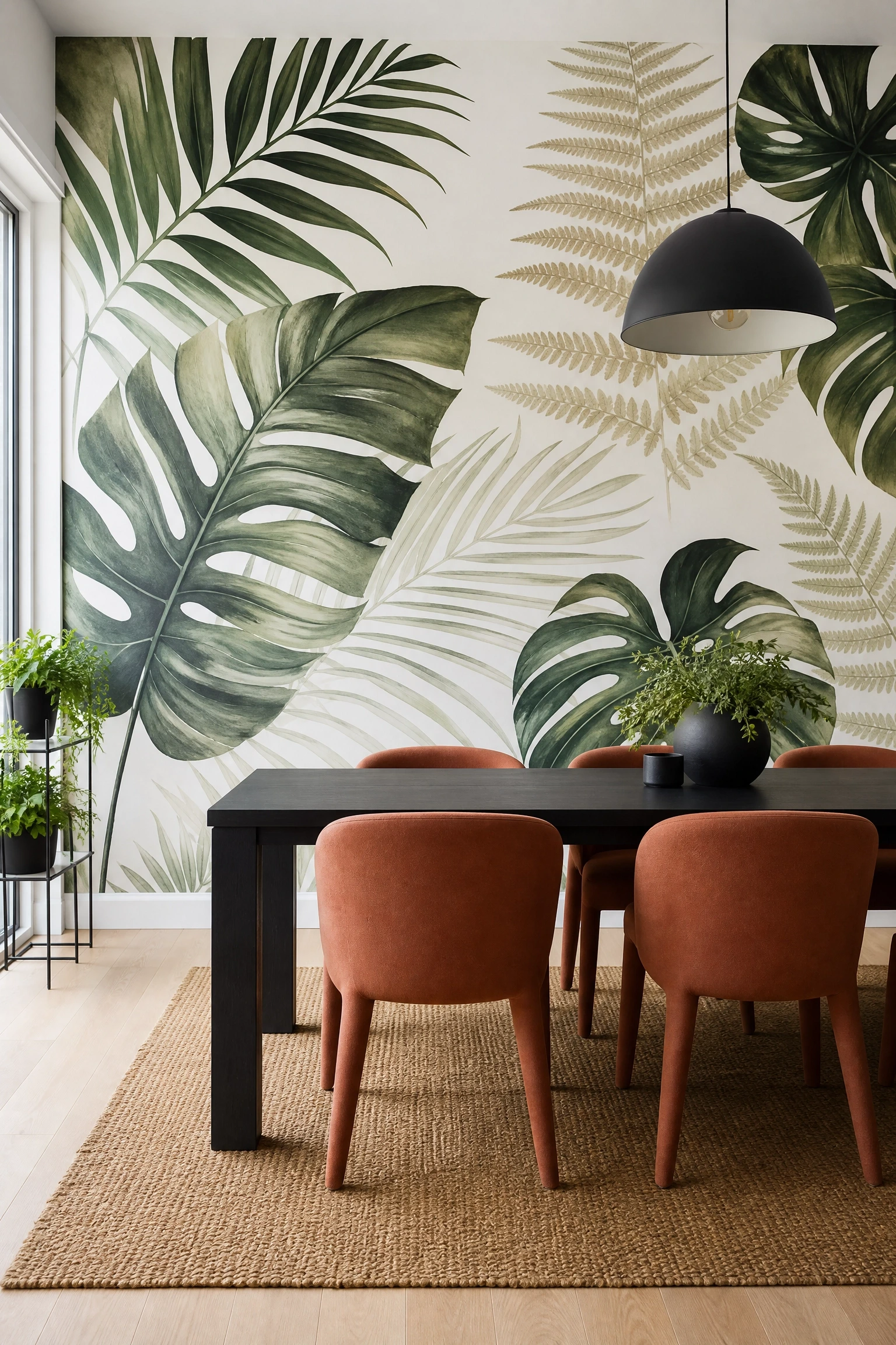
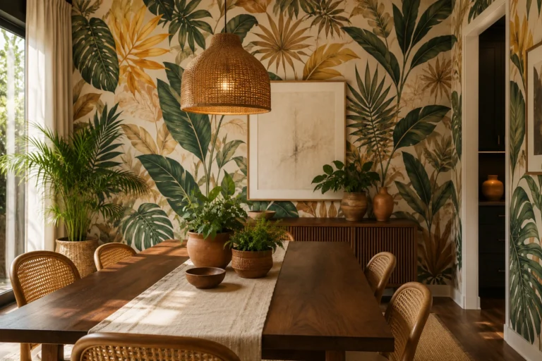
A painted or wallpapered mural works in a dining room because of the principle of “scale inversion.” When you take something from the natural world and blow it up to wall size, you flip the expected relationship between the viewer and the subject, which creates a sense of drama and immersion that you genuinely cannot get from framed art or patterned wallpaper. A botanical mural, with oversized palm leaves, magnolia branches, or tropical ferns, is the right choice for a dining room because it references growth, abundance, and nature, all associations that feel genuinely comfortable in a space built around food and gathering. Keep the rest of the room extremely quiet: a simple white or black dining table, chairs in a single solid color, no other art on any wall. The mural carries the whole room, and anything else competing with it will make the space feel chaotic. Removable peel-and-stick murals from companies like Photowall or Rebel Walls make this idea accessible without permanent commitment, and many can be ordered in custom sizes to fit your exact wall dimensions.
Pro Move: Position your dining table so the mural centers behind the host’s chair rather than behind the guests. The person framed by the mural becomes the natural focal point of the table, which is a subtle but genuinely effective hosting trick.
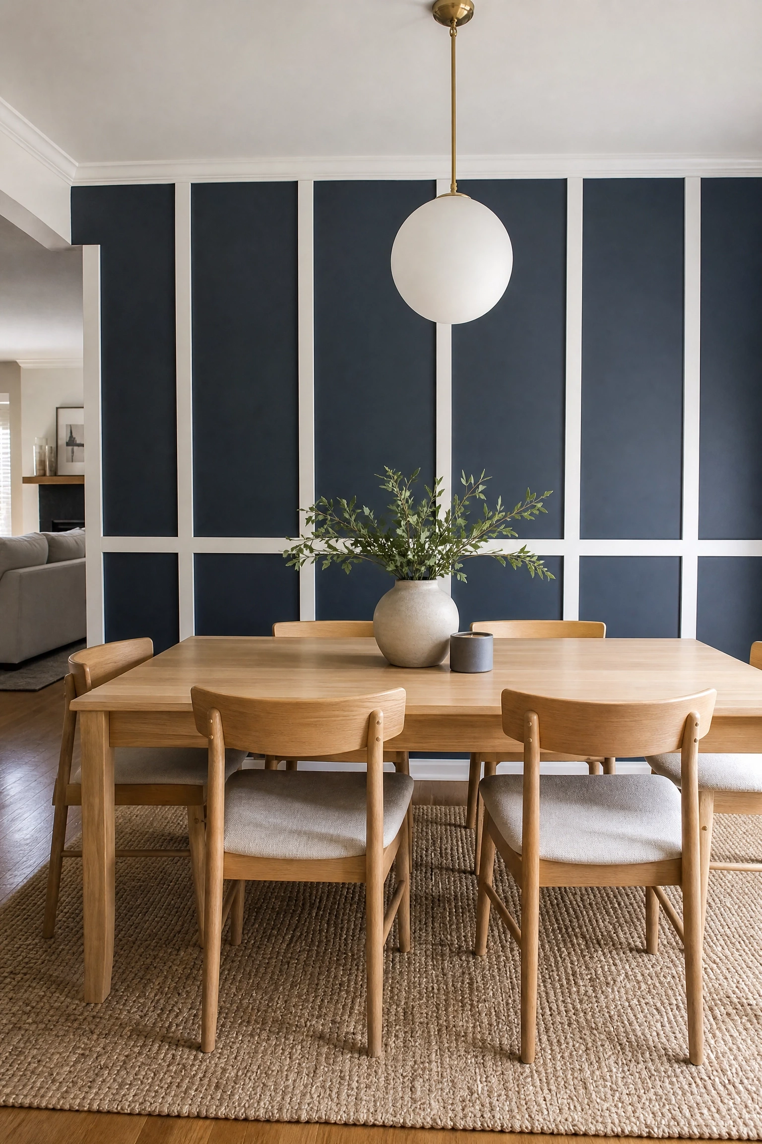
Board and batten, meaning vertical flat boards (battens) applied over a solid backing panel to create a grid-like pattern, is having a genuine design moment, and it deserves its place in dining rooms because it solves a specific problem: how to add architectural interest to a completely flat, featureless wall without spending money on structural changes. The two-tone approach is what separates a board and batten wall that looks current from one that looks like a builder upgrade. Paint the backing panel a deep, rich color, such as slate blue, deep olive, or terracotta, and paint the battens themselves in a crisp white or soft cream. The battens become a graphic grid that plays against the background color, and the result has a rhythm and formality that suits a dining room better than almost any other space. This treatment reads particularly well in mid-century modern, Scandinavian, and transitional interiors. Board and batten is very DIY-friendly: MDF boards, a miter saw, a nail gun, and one long weekend is genuinely all it takes, and material costs typically run $150-$400 depending on the size of the wall.
Quick Tip: Use a consistent batten spacing of 12-16 inches on center. Too far apart and the wall looks like an unfinished grid. Too close and it starts to feel like a cage.
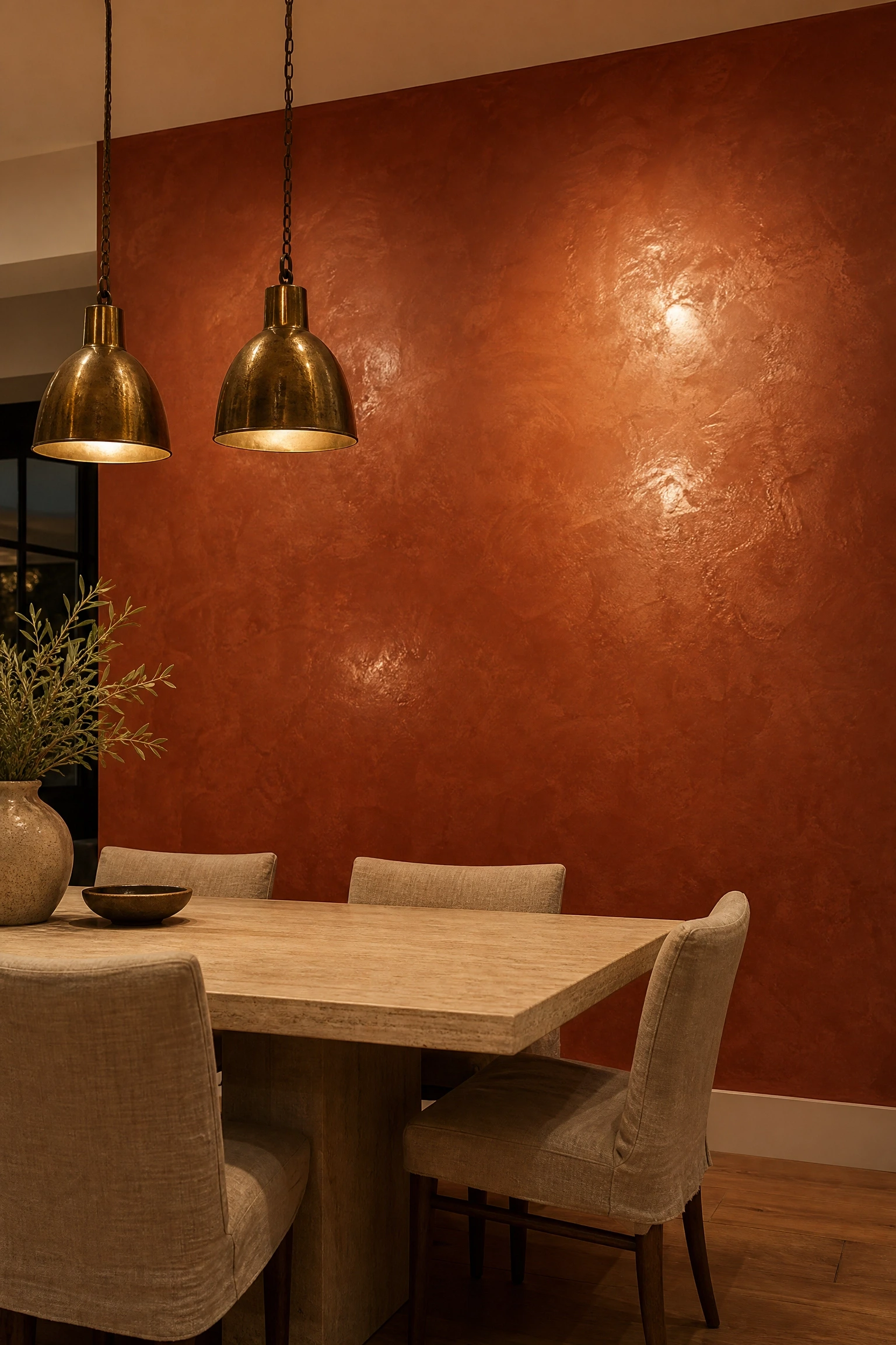
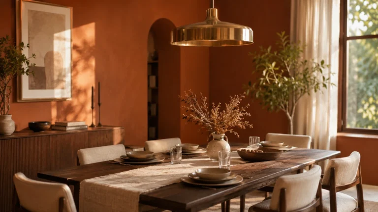
Venetian plaster is a finish with genuine Italian roots, and it belongs in this list not because it’s popular right now but because it does something that no other wall treatment quite manages: it creates the impression that the wall has depth, like you could reach into it. This effect comes from the way tinted plaster is applied in multiple thin layers, each burnished while still slightly wet to build up a glossy, marble-like surface. In a dining room, warm terracotta Venetian plaster operates on a principle called “color grounding.” The earthy orange-red tones pull the room into a warm, enveloping atmosphere that feels genuinely Mediterranean and completely at home under the amber light of a pendant or chandelier. Pair this wall with simple white plaster or limewash on the remaining walls, a long travertine-topped dining table, aged brass hardware and light fixtures, and linen chairs in a natural undyed tone. This is not a beginner DIY project, as genuine Venetian plaster requires practice and the right tools, but professional application costs are often worth it for a room this important. The finish, properly sealed, will outlast virtually any other wall treatment.
Heads Up: Venetian plaster is sensitive to moisture during curing, so avoid hanging anything on the wall or placing furniture directly against it for at least two weeks after application.
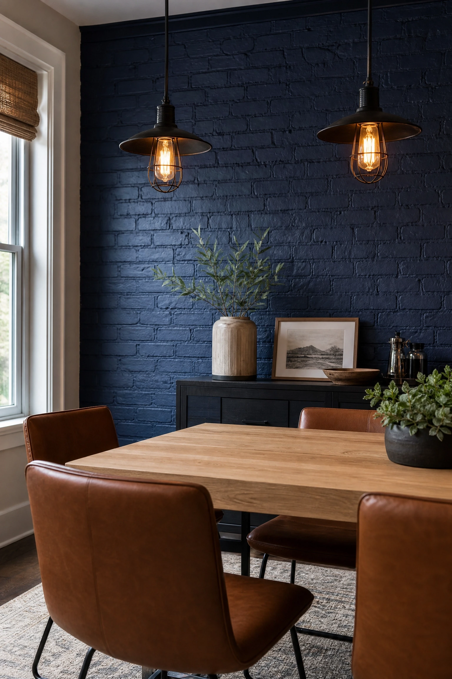
Exposed brick painted in a deep, saturated color, such as navy, forest green, or near-black, solves a design challenge that many homeowners face: how to keep the raw texture of brick without letting it feel like it belongs in a pizza restaurant. The principle at work is “material modernizing.” You retain the tactile, dimensional quality of the masonry surface but shift its personality entirely by adding color. Navy-painted brick, for instance, reads as sophisticated and almost editorial when paired with a white oak dining table, black steel pendant lights with exposed Edison bulbs, and leather dining chairs in a caramel tan. For those without real brick, high-quality faux brick panels (available at most home improvement stores or online) are now convincing enough that the distinction barely matters from across a dining table. The one thing to know about painting real brick is that it’s a one-way road. Brick is difficult to strip once painted, so make sure you’re committed to the color before you start. If you have exposed brick and want to keep the natural look, simply sealing it with a matte brick sealer is a perfectly valid choice that still functions as an accent wall treatment.
Reality Check: Paint real brick only with a masonry-specific primer and exterior-grade latex paint. Standard interior wall paint will peel within a year because brick is porous and needs a product formulated to breathe.
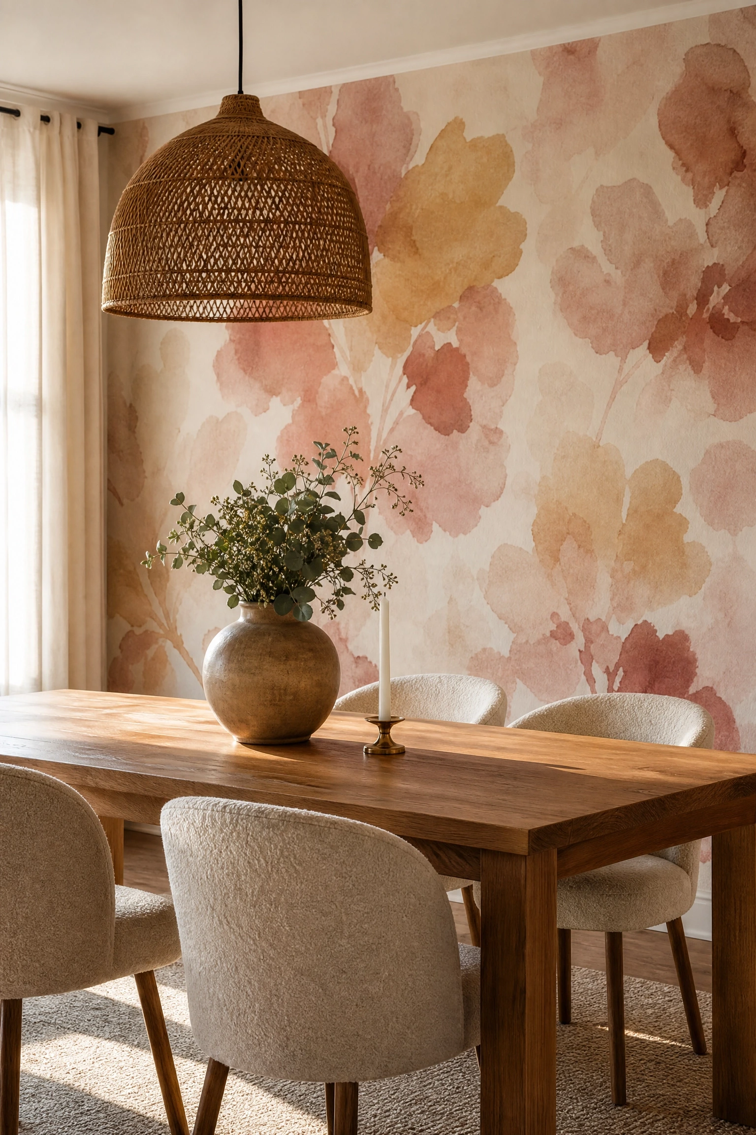
Abstract watercolor wallpaper, with loose, painterly patterns in washes of color that don’t resolve into any specific image, works in dining rooms because of a principle called “comfortable ambiguity.” Unlike a geometric pattern that demands to be read and understood, a watercolor abstraction creates mood and atmosphere without requiring the eye to do any interpretive work. This makes it ideal for a room where the primary visual task is engaging with the people at the table rather than the walls. For dining rooms specifically, look for patterns in warm, earthy tones. Dusty rose, warm ochre, sage green, and soft rust make for a particularly lovely combination that works well under evening lighting and doesn’t clash with food colors the way cool blues and purples sometimes can. Keep the wallpaper on the single focal wall behind the dining table and leave the remaining walls in a warm white pulled from one of the paper’s background tones. Linen or boucle dining chairs and a natural wood table let the wallpaper do its job without competition.
Pro Move: Order at least one extra roll when you buy abstract wallpaper. Pattern matching is less of an issue than with geometric papers, but having a spare means you can make repairs years later without hunting for a discontinued pattern.
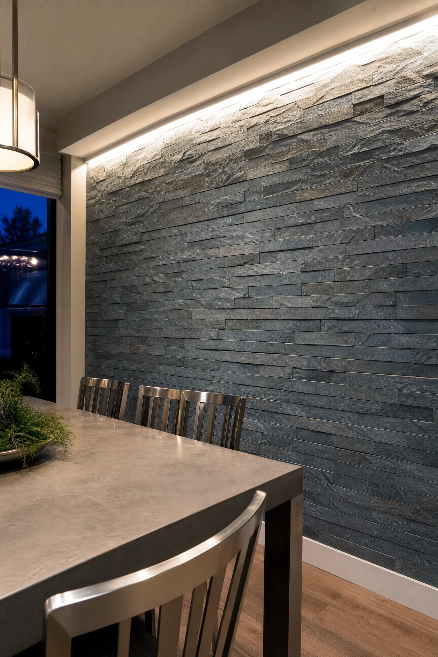
Thin stone veneer, meaning real quarried stone sliced to about half an inch thick and mounted in a dry-stack pattern without visible mortar joints, brings an authenticity to a dining room accent wall that manufactured materials simply cannot replicate. The design principle is “material honesty,” and in a space where people gather to share food and conversation, there’s something genuinely fitting about surrounding them with a material that came directly from the earth. Dry-stack installation, where the stones sit flush against each other with no grout lines, gives the wall a clean, almost sculptural quality that works as well in a contemporary setting as it does in a rustic one. The difference lies entirely in what you pair it with. For a modern look, choose a smooth-faced slate or quartzite in grey-blue tones and pair it with a concrete-topped dining table and brushed nickel lighting. For a warmer, earthier feel, choose tumbled limestone or travertine and pair with a round wood table, rattan chairs, and a woven jute runner. Stone veneer is heavier than it looks and does require proper wall preparation and adhesive, so a professional installation is recommended for walls over 20 square feet.
Designer Advice: Add low-voltage LED strip lighting at the top of the stone wall, angled downward. The raking light across the surface texture makes the wall look completely different after dark and creates genuinely dramatic dinner party atmosphere.
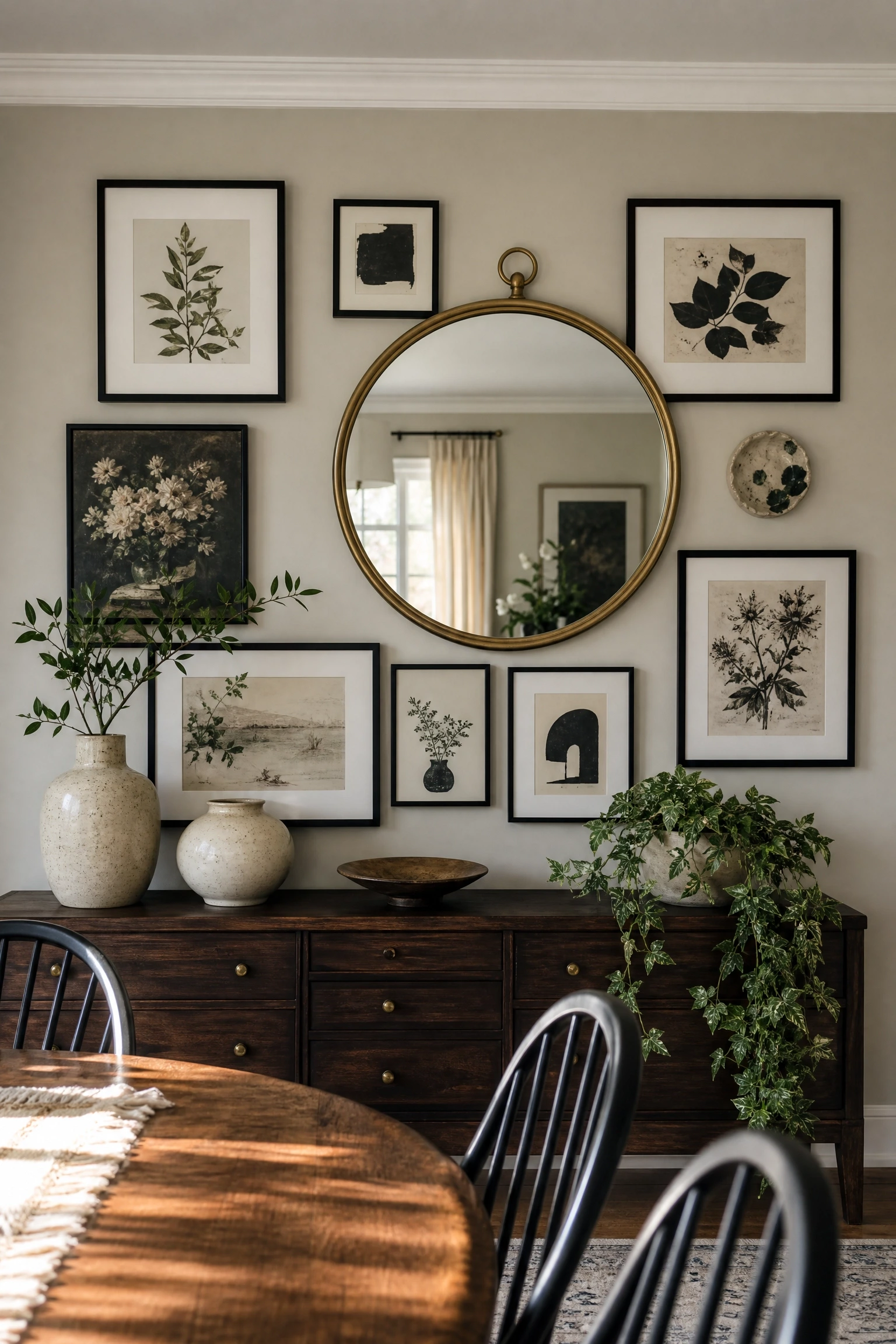
A gallery wall built around a single large mirror is a specific format that works in dining rooms for reasons most listicles never explain: the mirror does two jobs simultaneously. First, it reflects light from windows or pendants back into the room, which is especially useful in dining rooms that tend toward dimness. Second, it reflects the table and the people seated at it back into itself, which creates a sense of the room being larger and more alive than it actually is. The art and objects arranged around the mirror should be treated as a collection rather than a random selection. Think a consistent frame finish (all black, all brass, or all natural wood), a unified color palette in the artwork itself, and a mix of sizes that creates visual rhythm without feeling cluttered. In a dining room, the gallery wall format works best when it lives behind the buffet or sideboard rather than directly behind the table, giving you a functional surface below that ties the vertical and horizontal elements together. Budget-friendly note: thrift stores, estate sales, and online marketplaces are genuinely excellent sources for mismatched vintage frames that can be repainted in a uniform finish for a cohesive, collected look.
Quick Tip: Lay your gallery arrangement out on the floor before hammering a single nail. Photograph it from above and compare it to the actual wall space to check scale before you commit.
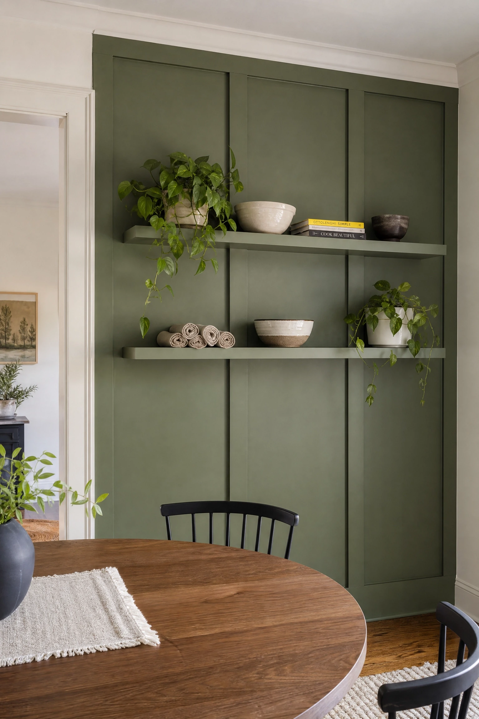
A wall treatment that incorporates shelving is worth including here because it addresses a real problem: dining rooms often lack storage, and a beautifully styled set of floating shelves built into a paneled accent wall solves that problem without the bulk of a freestanding cabinet. The design principle is “functional decoration.” Every element on the wall earns its place by being either useful or beautiful, and ideally both. The paneling (board and batten, raised panel molding, or simple flat painted panels) provides the backdrop and gives the shelves something to anchor to visually, while the shelves themselves carry dining accessories: a collection of ceramic bowls, linen napkins rolled in brass rings, a small stack of cookbooks, a few trailing plants, and one or two pieces of interesting pottery. Paint the entire wall and shelves in the same color, such as deep sage, warm navy, or a sophisticated terracotta, so the objects on the shelves stand out against a unified backdrop rather than fighting with a complex background pattern. This look is a genuine showcase for personal collections, which means it adds the kind of authenticity that generic accent walls don’t: it shows the room belongs to a specific person, not a showroom.
Reality Check: Keep the shelving height below 72 inches in a dining room. Anything higher requires a step stool to access and starts to feel more like a library wall than a dining room feature.
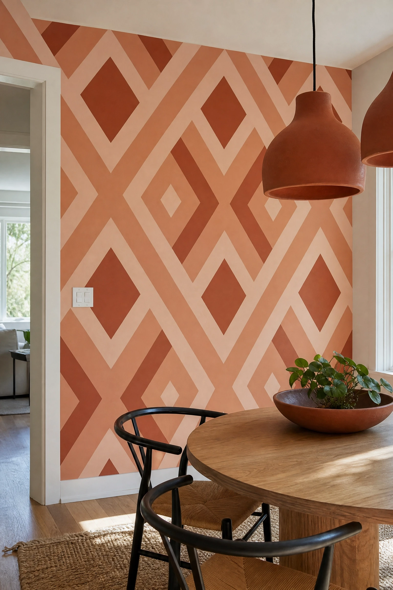
15. Geometric Painted Pattern in a Tonal Color Palette
A geometric painted pattern, such as diamonds, hexagons, half-circles, or overlapping arches, applied in two or three tones of the same color family creates visual complexity without the maintenance commitment of wallpaper or the permanence of textured treatments. The design principle here is “controlled contrast”: the shapes are different enough in value (light vs. medium vs. dark) to read as a pattern, but because they all live within the same hue family, the wall feels cohesive rather than chaotic. In dining rooms, this works particularly well with a dusty terracotta family, using a pale blush backing, a muted clay mid-tone, and a deeper rust for the foreground shapes, which creates warmth and depth that holds up beautifully under the orange-amber light that most people use in dining spaces. Painter’s tape is your best friend here: the cleaner your tape lines, the more intentional and professional the finished wall looks. In practice, the effort is moderate but the payoff is enormous. A geometric wall looks expensive and custom even when the entire project costs under $50 in paint and tape.
Heads Up: Use a level and a chalk line when taping geometric patterns. Even a two-degree tilt in your lines will be immediately obvious once the tape comes down and the shapes are revealed.
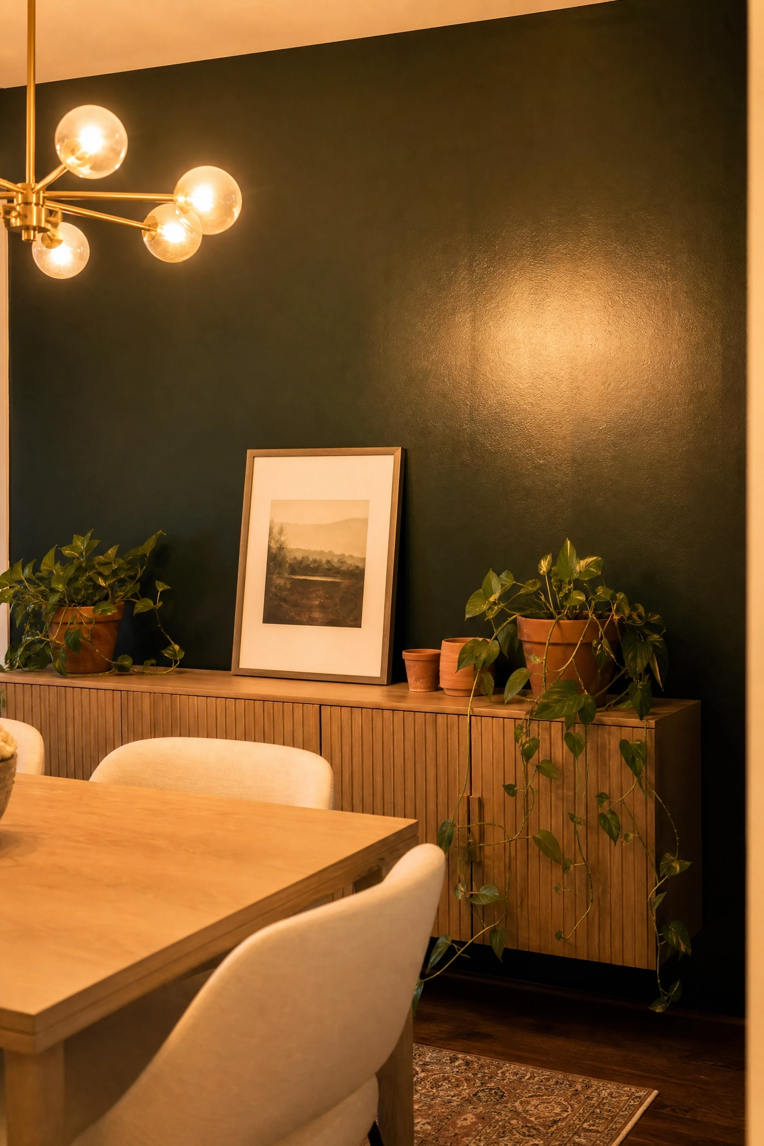
Dark green, specifically the kind of saturated, bottle-dark forest green that appears in professional design publications rather than on beginner Pinterest boards, works in dining rooms because of the principle of “chromatic intimacy.” Green sits in the middle of the visible spectrum, which means it’s processed by the eye as the least visually aggressive of the saturated colors, even when it’s quite dark. This makes it possible to go quite bold with a dark green dining room wall without the space feeling oppressive or anxiety-inducing the way a dark red or dark purple sometimes can. A satin finish (rather than matte) is the right choice here because satin paint under dining room pendant lights creates a subtle glow that makes the color look rich and intentional rather than flat and cave-like. Pair dark green with warm brass fixtures, a bleached or light oak dining table, cream or white dining chairs, and a few plants in terracotta pots on the sideboard to build the connection between the wall color and something living. If you’re nervous, paint one wall first, live with it for two weeks, and then decide whether the remaining walls should follow.
Designer Advice: Dark green walls read very differently under cool daylight versus warm evening light. Test your sample in both conditions before committing, because a green that looks murky in daylight can look sumptuous at dinner.
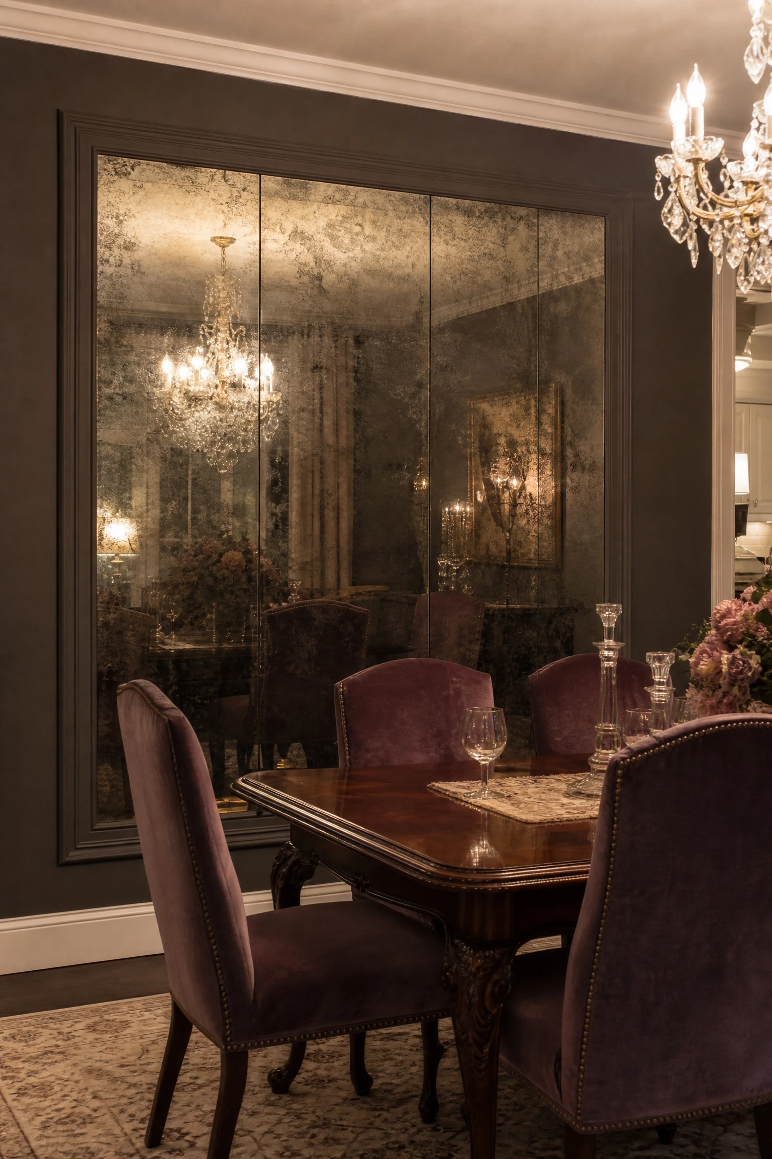
An antique mirror accent wall, made up of panels of mirror glass treated with an acid or silver-nitrate process to create a cloudy, foxed appearance, occupies a specific design niche that makes it particularly well-suited to dining rooms. Unlike a plain mirror, which reflects everything with perfect clarity and can feel cold or industrial, antique mirror has a softness to its reflection that adds depth and mystery to the room without the clinical quality of standard mirror glass. The design principle is “reflective warmth.” You get all the light-doubling and space-expanding benefits of mirror without the hard, contemporary edge. This treatment tends to work best in dining rooms with traditional or transitional furnishings: a carved-leg dining table, upholstered chairs in a velvet or damask fabric, and vintage-style brass or crystal chandelier lighting. Antique mirror panels can be purchased pre-made from specialty suppliers in standard sizes, or you can commission a custom installation cut to your exact wall dimensions. This is a higher-investment treatment (expect $200-$600 per panel depending on size and finish), but it is genuinely one of those accent wall choices that looks like it came from a professional interior design project.
Pro Move: Frame the antique mirror panel with a simple flat molding painted the same color as the surrounding walls. This keeps the mirror from looking like it was just leaned against the wall and gives it the appearance of a built-in architectural feature.
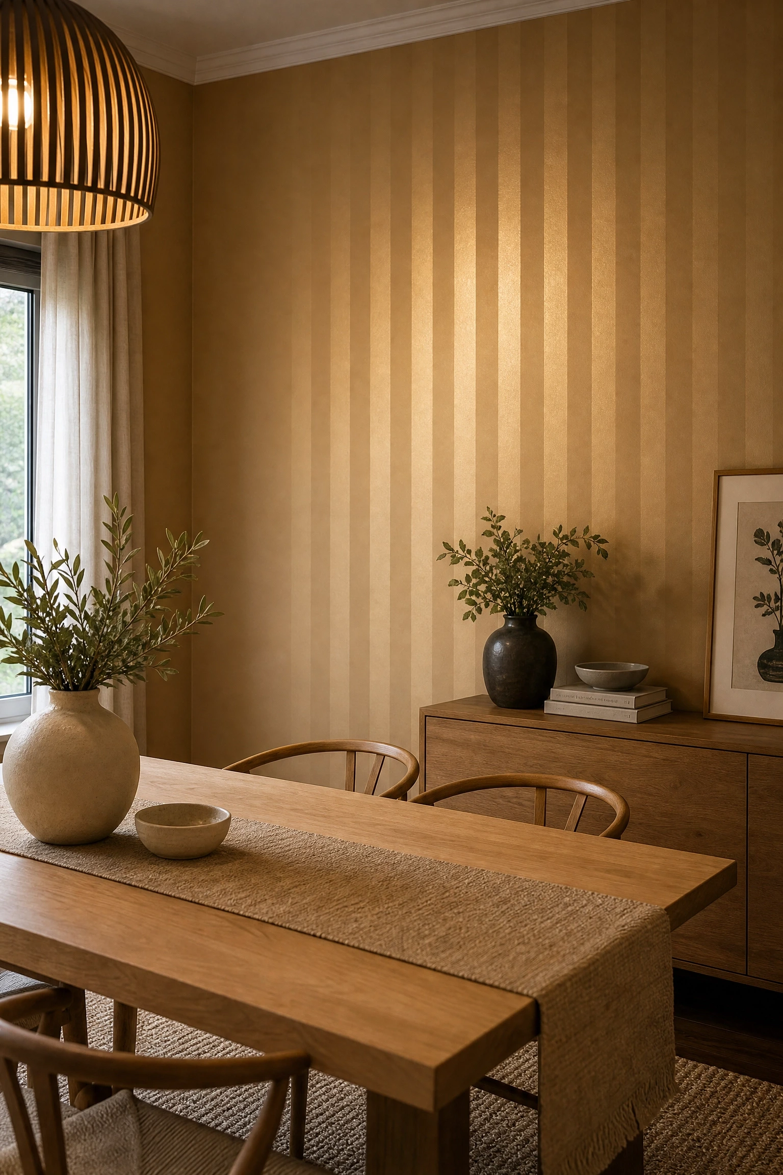
Color drenching, the practice of painting walls, trim, ceiling, and moldings all in the same color or closely related tones, is one of the most discussed techniques in current interior design, and it takes on an interesting dimension when combined with a subtle striped pattern on the dining room accent wall. By using the same base color in two different sheens, matte for the background and satin for the stripes, you create a pattern that is visible in raking or angled light but nearly invisible in flat, diffused light. The result is a wall that has quiet depth and texture without any of the visual noise of a traditional contrasting stripe. In a dining room, this technique works especially well because the light quality changes throughout a meal, from bright at the start to dimmer and more candle-lit by dessert, which means the wall itself subtly shifts its presence over the course of the evening. Any color can work, but the technique tends to look most sophisticated in mid-toned colors: a warm camel, a dusty mauve, or a deep clay. This is one of the most affordable accent wall ideas on this list, requiring only two cans of paint in the same color from the same brand, with one in matte and one in satin.
Quick Tip: Make your stripe width at least 8 inches. Narrower stripes in matching sheens are nearly impossible to see and the effort goes entirely unrewarded.
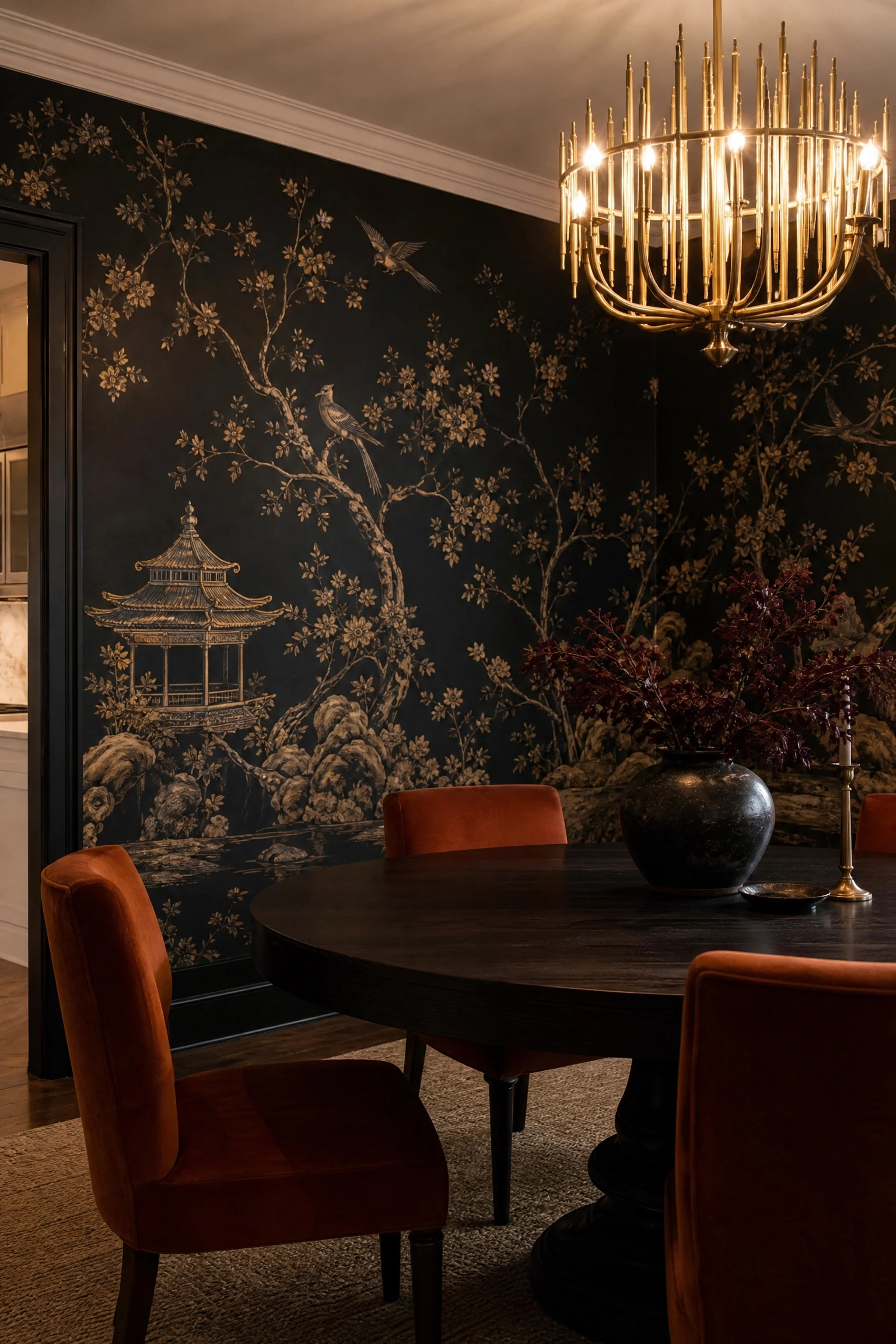
19. Wallpaper with an Oversized Chinoiserie Pattern
Chinoiserie, the European interpretation of Chinese artistic motifs typically featuring pagodas, birds, blossoming branches, and flowing landscapes, has been used in dining rooms since the 18th century, and the reason it keeps coming back is rooted in design principle: it is one of the few pattern styles that is complex enough to sustain long scrutiny (important in a room where people sit and look at the walls for an extended period) while remaining visually comfortable rather than tiring. Modern chinoiserie wallpapers have evolved significantly from the traditional blue-and-white or green-and-gold colorways. Contemporary versions come in charcoal and gold on a black ground, blush and ivory on a warm grey, and deep jewel tones that feel genuinely current. This is a statement treatment that works best in a formal dining room or a dining space that is slightly separated from the open-plan living area, where the busy pattern has room to breathe. Keep the dining furniture simple and low-contrast: a round pedestal table in a dark wood, chairs upholstered in a solid that pulls one tone from the wallpaper, and a single statement chandelier with visible warm-white bulbs.
Reality Check: Chinoiserie wallpaper can be expensive, with some premium brands running $300-$800 per roll, but since you’re only covering one wall, the per-room cost is far more manageable than it sounds.
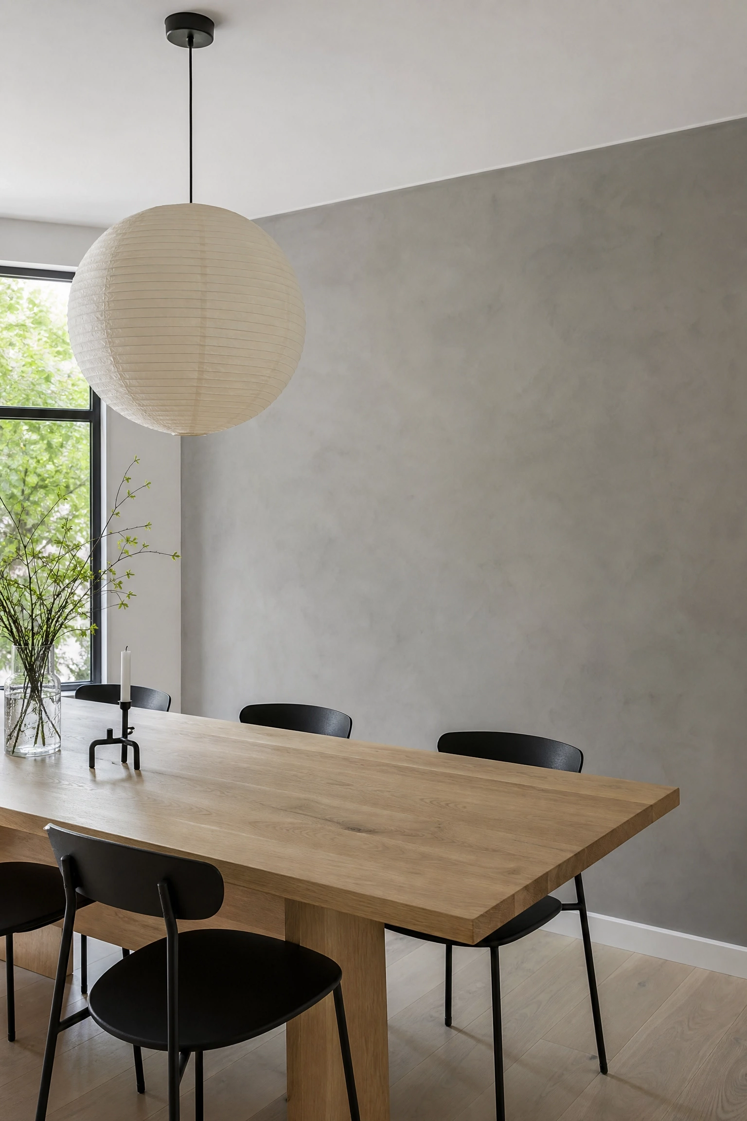
Microcement is a polymer-modified cement product applied directly over existing walls in multiple thin layers, then sealed to a smooth, matte finish. Unlike raw poured concrete, microcement can be applied anywhere and in any color, making it a flexible material that carries the industrial aesthetic of concrete without requiring structural work. In a dining room, the design principle it operates on is “textured minimalism.” It adds visual interest and material depth while keeping the overall palette extremely restrained, which lets furniture, lighting, and tableware do the decorative work. The finish looks particularly strong in dining rooms furnished in a Japandi or minimalist-modern style: a simple microcement wall, a long low dining table in white oak or blackened ash, matte black chairs, and a single cluster pendant in washi paper or rattan. One practical consideration: microcement requires a professional applicator in most cases, as the multiple-layer technique and final sealing process are tricky to get right without practice. An uneven application looks significantly worse than no treatment at all. However, once it’s down and sealed, it’s one of the most durable surface finishes available and will genuinely outlast painted walls by decades.
Heads Up: Always specify a food-safe or non-toxic sealer when applying microcement in a dining room. Some industrial sealers off-gas VOCs for weeks after application.
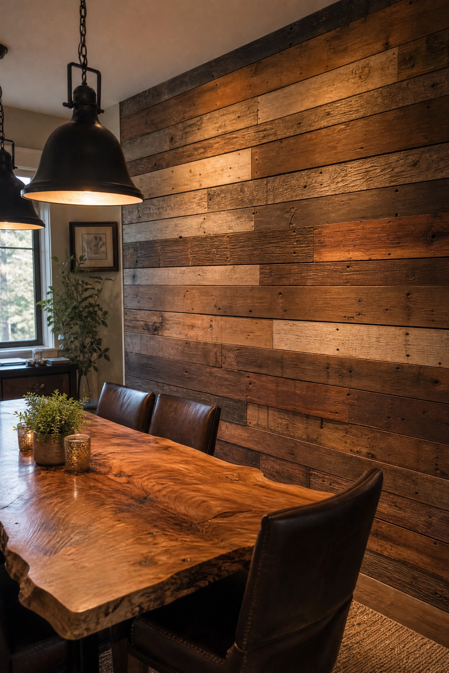
21. Reclaimed Wood Planks in a Mixed-Width Installation
Reclaimed wood, salvaged from old barns, factories, warehouses, or demolished buildings, brings something into a dining room that new materials cannot: a genuine history. Each board has its own grain pattern, nail holes, surface marks, and patina built up over decades of actual use, and when you install these planks on a dining room accent wall in a mixed-width pattern (alternating wide and narrow boards rather than uniform widths), the result is a wall that looks like it evolved organically rather than being designed all at once. The principle at work is “earned character,” and it resonates particularly strongly in dining rooms because the space is itself associated with accumulation, of meals, of people, of time spent together. Pair reclaimed wood with a live-edge dining table in a similar wood tone, black iron pendant lighting, and leather or woven seating to build a cohesive material story. A word of caution: reclaimed wood should always be properly cleaned, kiln-dried, and treated for insects before installation. Untreated salvaged wood can harbor pests or moisture that will cause problems in an interior setting over time.
Pro Move: Install reclaimed planks horizontally in a smaller dining room to make the wall feel wider and the room feel longer. Vertical installation emphasizes height, which works better in rooms with low ceilings.
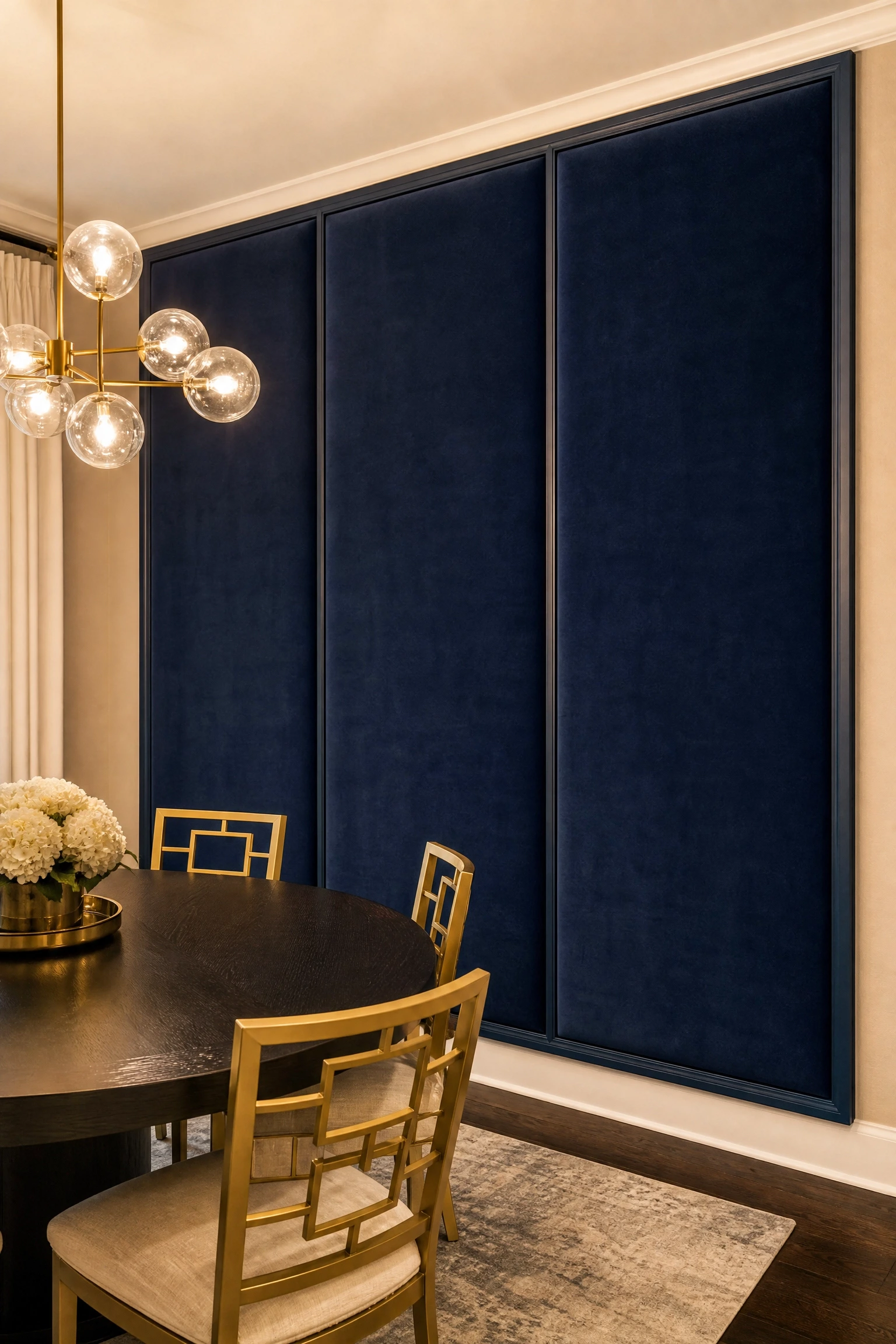
An upholstered fabric panel accent wall is one of the least common ideas on this list and, for the right dining room, one of the most impactful. The design principle is “acoustic softening.” Dining rooms are often acoustically harsh because of all the hard surfaces (tile or hardwood floors, glass windows, hard table and chair surfaces), and a fabric wall panel absorbs sound in a way that makes dinner conversation noticeably more pleasant, especially in larger rooms or during bigger gatherings. The fabric choice is everything: velvet in a deep jewel tone (sapphire, plum, or forest green) is the most dramatic and luxurious option, while linen or bouclé in a warm neutral reads as quieter and more versatile. The panels are typically constructed with a simple wood frame, a layer of batting or thin foam, and the fabric stretched over and stapled to the back. It’s genuinely a manageable DIY project. Hang these panels edge-to-edge on the accent wall behind the dining table, framed in a simple painted molding, and the effect reads as intentionally architectural rather than improvised.
Designer Advice: Choose a fabric with a tight, dense weave rather than a loose one for dining rooms. Loose weaves absorb cooking odors and are significantly harder to spot-clean.
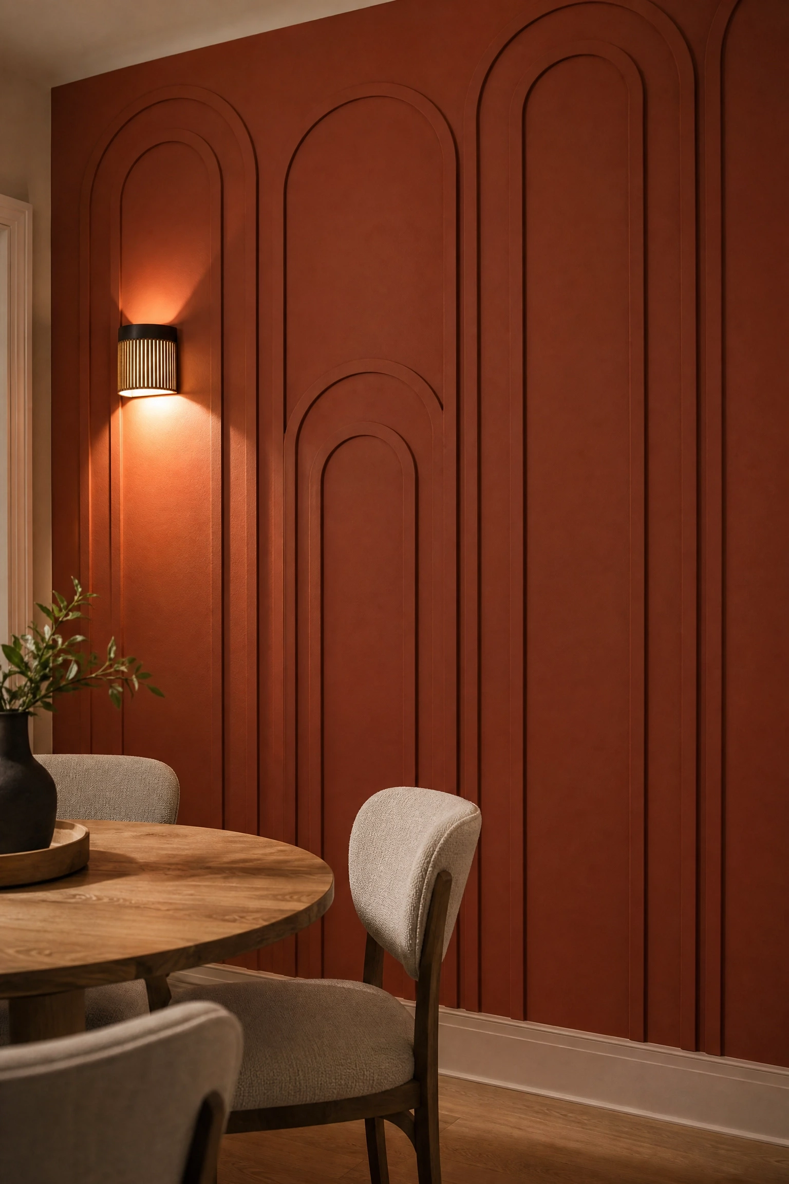
Decorative molding applied directly to a flat painted wall, arranged in scallop, arch, or half-circle patterns in a repeating grid, is one of those design ideas that photographs beautifully and has the added benefit of being genuinely affordable and DIY-accessible. The design principle is “architectural illusion”: by applying a three-dimensional molding profile to an otherwise flat wall, you create the impression that the room has built-in architectural detail that was part of the original construction, even in a house with no historical pedigree. In a dining room, this works especially well on the wall behind the table because the curved shapes introduce a softness that rectangular rooms often lack, and the repeating pattern has a rhythm that rewards the long, seated glance of someone sitting through a multi-course meal. Paint the molding the same color as the wall for a tone-on-tone look that’s subtle in bright light but pops in the raking shadows of evening. Alternatively, paint the wall a deep color and the moldings a bright white for maximum graphic contrast. Flexible molding strips from brands like Ekena Millwork or MD Building Products can be bent to create curved shapes and are available at most home improvement stores.
Quick Tip: Use construction adhesive rather than nails wherever possible when applying decorative molding. Nails leave holes that need filling, while adhesive holds just as firmly and leaves a cleaner finished surface.
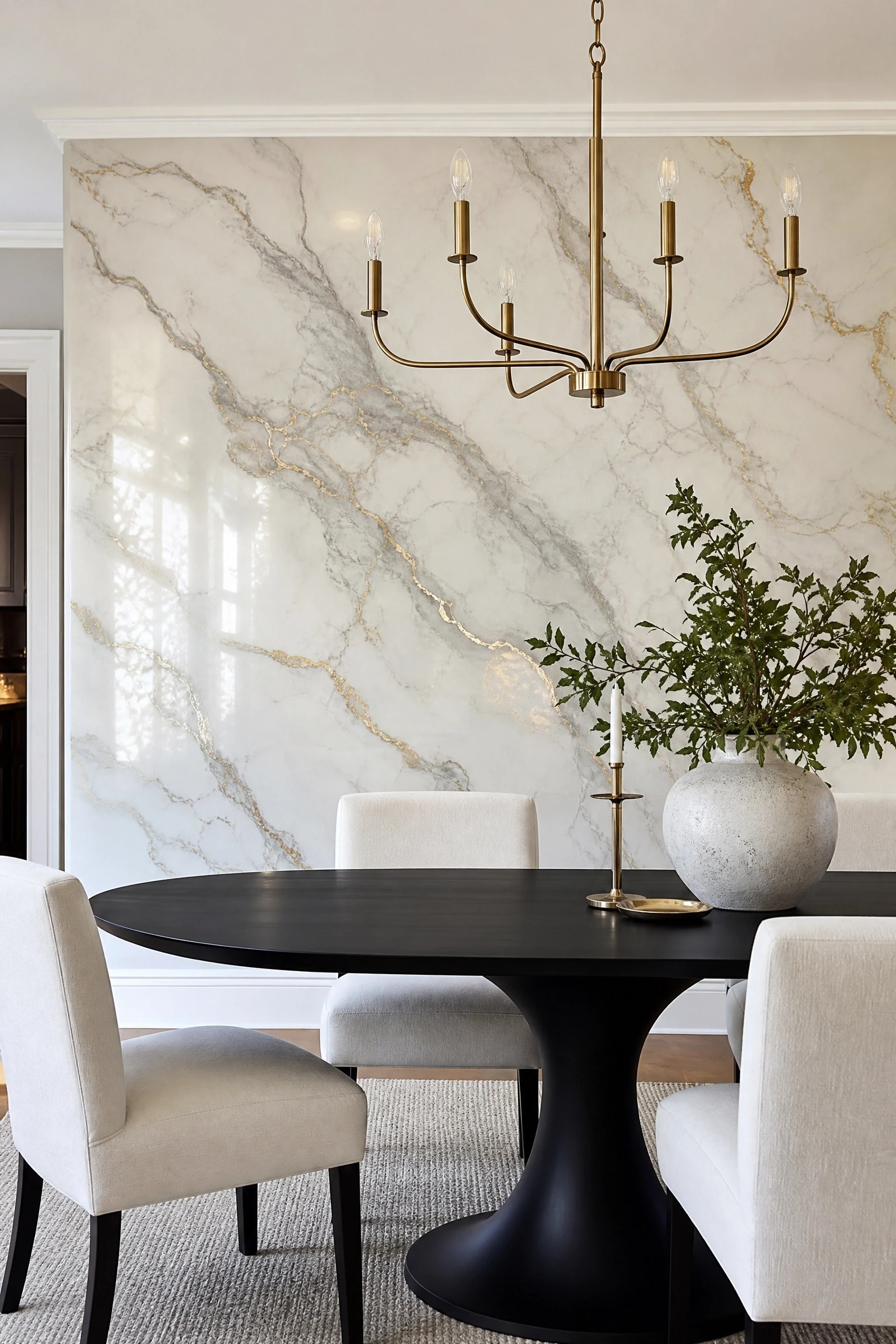
A faux marble finish, painted directly onto the wall using a specific technique involving sponging, feathering, and veining with a fine artist’s brush, is a legitimate alternative to Venetian plaster or real stone veneer, and it belongs in this list because it does something technically interesting: it uses the visual language of luxury materials to create atmosphere without the weight, installation complexity, or cost of the real thing. In a dining room, the marbling effect works best in warm, creamy tones. Italian Bianco Carrara whites, warm beige Botticinno tones, or the dramatic black-and-gold of Nero Marquina are colors that already read as “dining room” in the cultural memory of anyone who has eaten in a restaurant with real stone surfaces. The technique requires practice but is learnable: YouTube tutorials from decorative painting professionals (look for instructors specifically trained in trompe-l’oeil) can get a motivated DIYer to a convincing result over a weekend. The honest limitation is that a poorly executed faux marble looks like exactly that, so if you’re not confident in your painting skills, a sample board is essential before committing to an entire wall.
Reality Check: The veining is the make-or-break element of faux marble. Use an irregular, jittery stroke with a fine artist’s brush rather than a smooth line, because real marble veins always have organic variation.
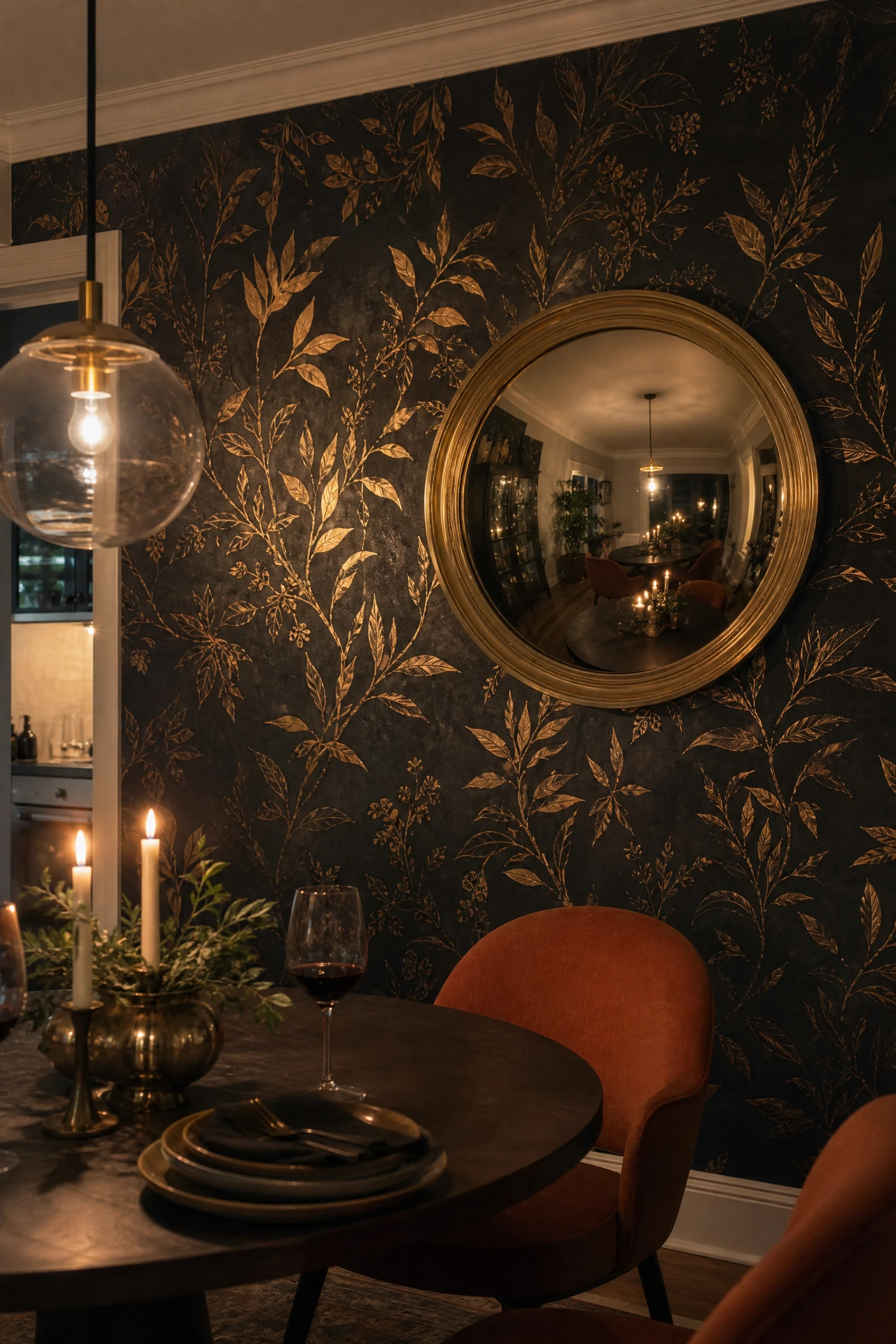
A deep, dark wallpaper, whether charcoal, near-black, or inky navy, with a pattern that incorporates metallic gold elements (botanical forms, geometric repeats, celestial motifs, or abstract marks) is one of the most consistently impressive accent wall treatments for dining rooms, and the design principle behind it explains exactly why. It operates on “dramatic contrast” combined with “light activation.” The gold elements in the pattern catch and reflect candlelight and pendant light in a way that makes the wall look literally different depending on where you stand and how bright the room is. It reads as intimate and rich in the evening, then more defined and graphic in daylight. This treatment is a natural fit for a formal dining room but also works in a less formal space if the furniture keeps things grounded: a simple round table, chairs in a solid warm tone (terracotta, rust, or caramel), and clean-lined lighting that echoes the metallic warmth of the gold. Several brands produce excellent options at accessible price points, including Graham & Brown, Brewster Home Fashions, and York Wallcoverings. Look for a paste-the-wall paper rather than paste-the-paper for easier installation and alignment of the pattern.
Pro Move: Hang a single large convex mirror on this wallpaper rather than a collection of art. It reflects the metallic pattern back across the room in a distorted, kaleidoscopic way that looks genuinely extraordinary under dining room lighting.
The right accent wall for your dining room is not necessarily the most dramatic one, the most expensive one, or the one that photographs best for social media. It’s the one that makes the room feel like it belongs to you, like it was thought through rather than thrown together. Every idea in this list operates on a specific principle: warmth, depth, texture, contrast, scale, or material honesty. When you understand why a treatment works, not just what it looks like, you’re in a much better position to make a decision that holds up over years of meals, gatherings, and everyday life in that room. Start by standing in your dining room at dinner time, with the lights and candles on, and looking at the wall from the seat you occupy most often. That perspective is your real starting point. Then pick one idea that fits both your aesthetic and your honest skill level, whether that’s a weekend DIY or a professional installation, and commit to it fully. A dining room accent wall done well is one of the highest-impact, lowest-regret upgrades you can make in a home.
Frequently Asked Questions
Which wall should be the accent wall in a dining room?
The wall behind the dining table is almost always the best choice. It’s the wall guests look at from their seats for the duration of the meal. Alternatively, the wall you see first when you walk into the room works well if the behind-the-table wall has windows or other interruptions that make it hard to treat as a single surface.
Do accent walls still look current or are they dated?
Accent walls done with intention, meaning a thoughtful material, a clear design reason, and a connection to the rest of the room, are absolutely still current. What feels dated is a random single painted wall with no logic behind it. As long as the treatment serves a purpose (adds texture, creates warmth, defines the space), it will read as a considered design decision rather than a trend remnant.
What is the best color for a dining room accent wall?
There’s no single best color, but dining rooms specifically favor warm tones, including burgundy, terracotta, deep green, warm navy, or earthy ochre, because they look rich and inviting under the warm, lower-light conditions that most dining rooms use in the evening. Cool colors like grey-blue or pale lavender can work but often look better in dining rooms with strong natural light.
How much does a dining room accent wall cost to do?
The range is enormous. A painted geometric pattern can cost under $50 in materials. A board-and-batten DIY installation typically runs $150-$400. Quality wallpaper on a single wall usually costs $300-$800 including materials and installation. Venetian plaster, stone veneer, or antique mirror panels can run into the thousands. Most of the ideas in this article have a DIY-friendly version and a professional version, so budget does not have to be the limiting factor.
Can I do an accent wall in a small dining room without making it feel smaller?
Yes, but the treatment matters. Light-colored limewash, grasscloth wallpaper in a natural tone, or a tone-on-tone striped paint technique will add visual interest without shrinking the room. Avoid very dark paints or heavily textured treatments on all four walls. Keep the accent wall concept intact (one feature wall, the rest quieter) and the room will feel larger rather than smaller.
Is it better to hire a professional or DIY a dining room accent wall?
It depends on the treatment. Painting, board and batten, peel-and-stick wallpaper, and decorative molding are all genuinely manageable for a motivated DIYer with a weekend and the right tools. Venetian plaster, microcement, tile installation, and stone veneer are significantly more technical and tend to look worse when attempted without practice. Be honest about your skill level. A professionally done simple treatment will always look better than a badly executed complex one.