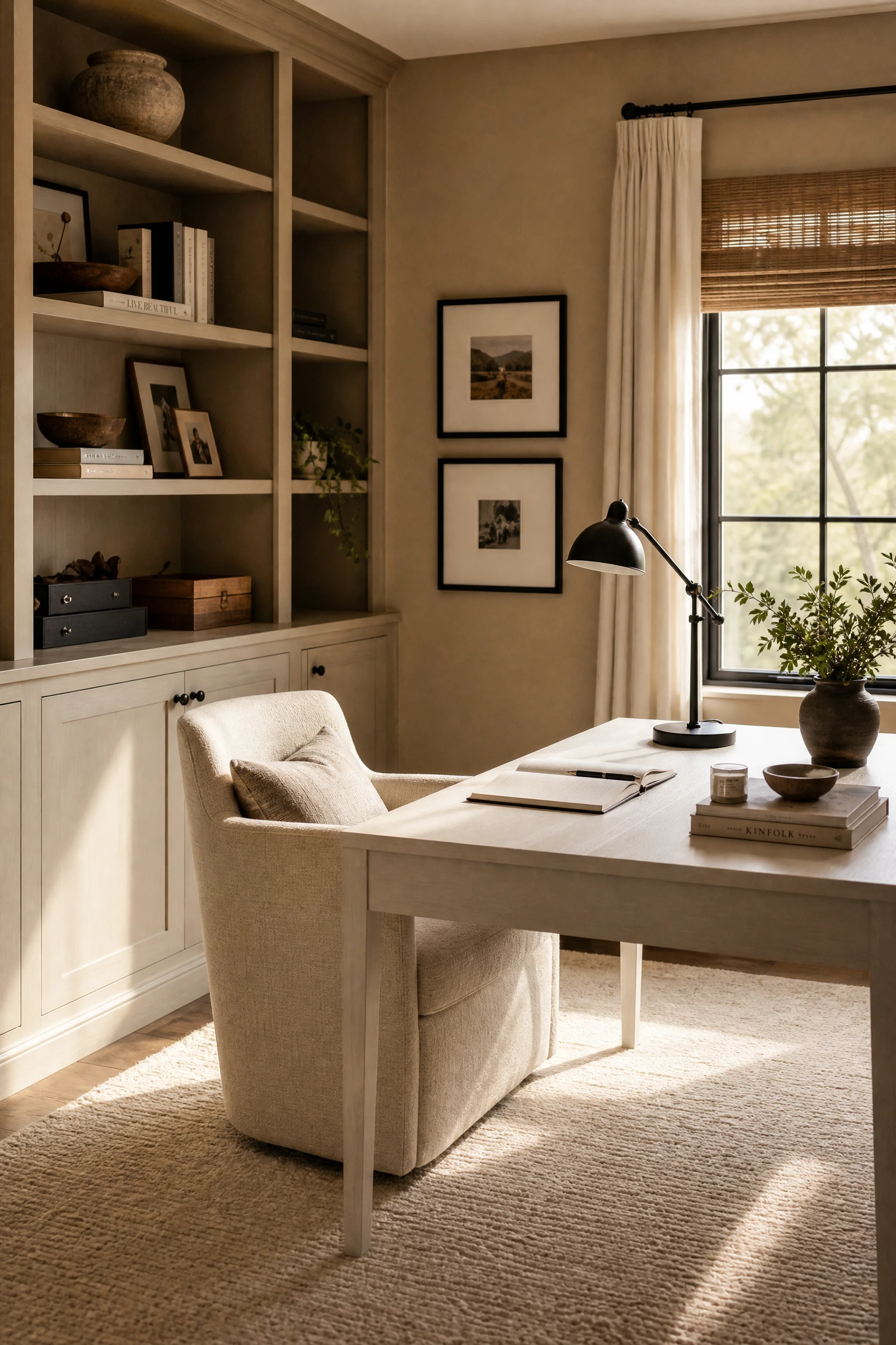
If you have been staring at a plain, uninspiring workspace and wondering why you can never seem to get in the zone, the color palette around you might have more to do with it than you think. Beige and black is one of those combinations that looks effortless when it is done well, and that is exactly why designers keep coming back to it. Beige brings warmth, calm, and visual breathing room. Black adds structure, contrast, and definition. Together they create a space that feels polished without being cold, and focused without being sterile.
What makes this pairing work so well in a home office specifically is the way it handles visual weight. A workspace needs to feel grounded and purposeful, not chaotic or overly decorative. Beige walls or large furniture pieces give the eye somewhere to rest, while black accents pull the room together with intention. These 24 ideas will show you exactly how to make beige and black work hard and look good doing it, in any size room.
1. Contrast Through Scale: The Oversized Black Desk Anchor
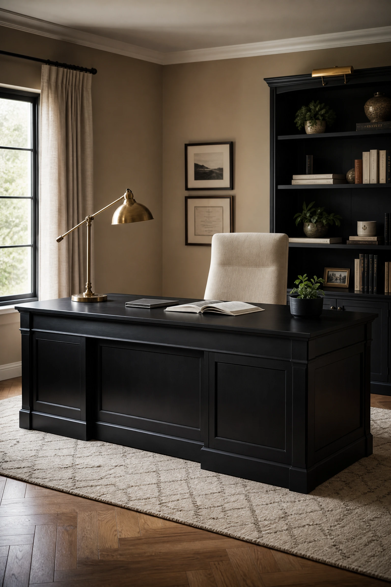
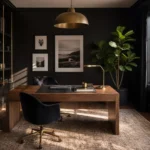
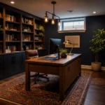
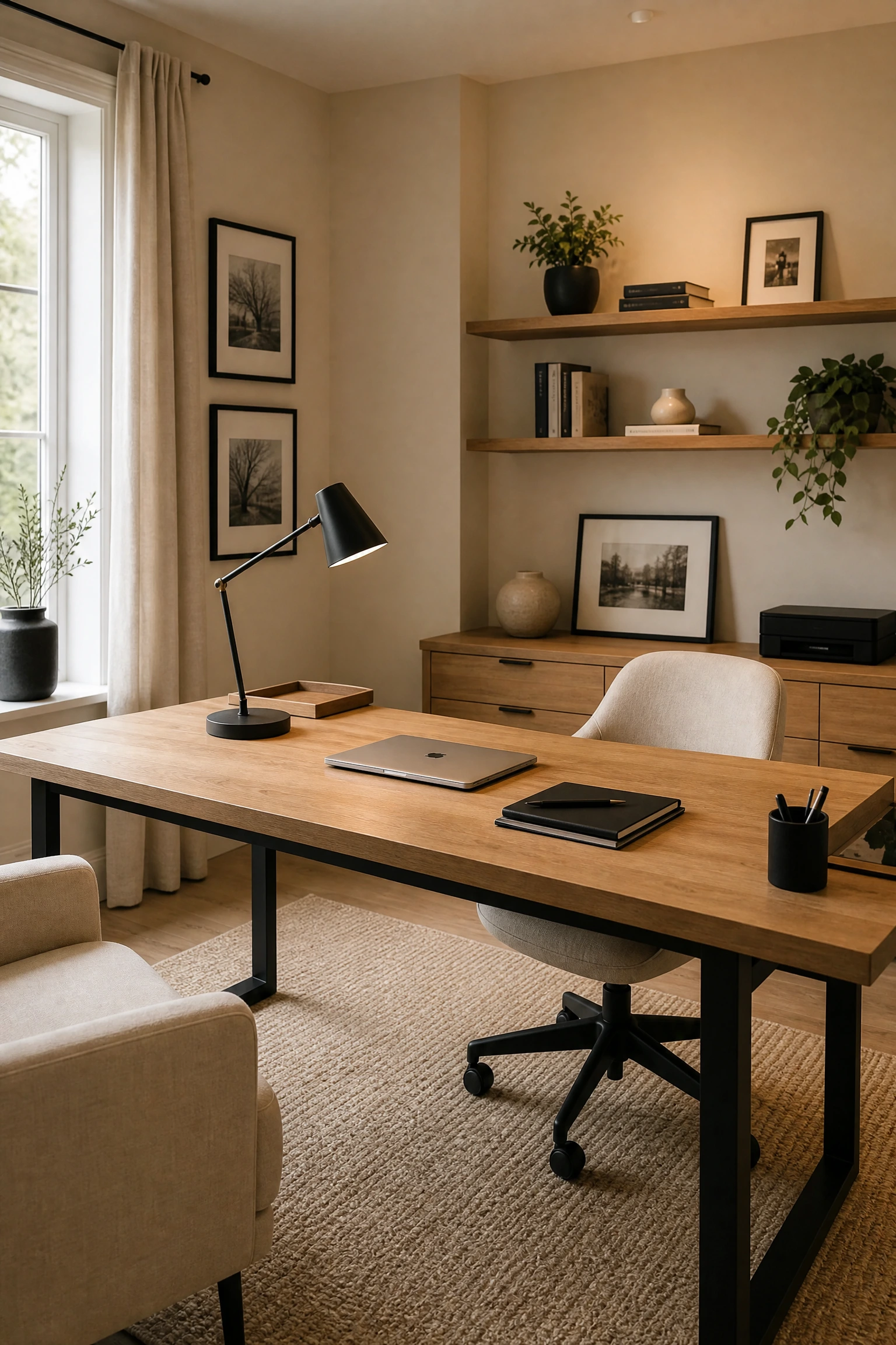
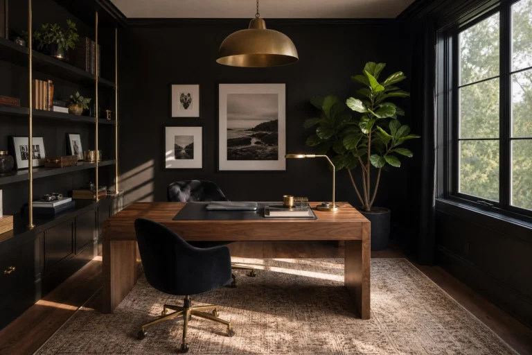
One of the most reliable principles in interior design is using scale contrast to create visual drama, and nowhere does this work better than in a home office with an oversized black desk set against beige walls. The idea here is that the desk becomes a true focal point, not just a surface you work on. A large, matte black writing desk or executive desk in a warm-beige room creates an immediate sense of purpose. The dark mass of the desk grounds the room and gives it weight, while the surrounding beige walls keep things from feeling oppressive. In practice, this works best when the desk is positioned so it has some breathing room on at least two sides. Pair it with a linen or cream upholstered desk chair rather than another black seat, as this breaks the visual heaviness slightly and introduces texture. Add a warm brass or matte gold desk lamp to catch the light, and layer a beige or cream geometric rug underneath to define the zone. This is not an idea for a very small room, where an oversized desk can feel suffocating rather than commanding.
Designer Advice: Leave at least 36 inches behind your chair for a pulled-back work position, and an oversized desk in a tight space creates frustration, not focus.
2. The Power of Negative Space: Minimalist Beige Walls With Black Line Art
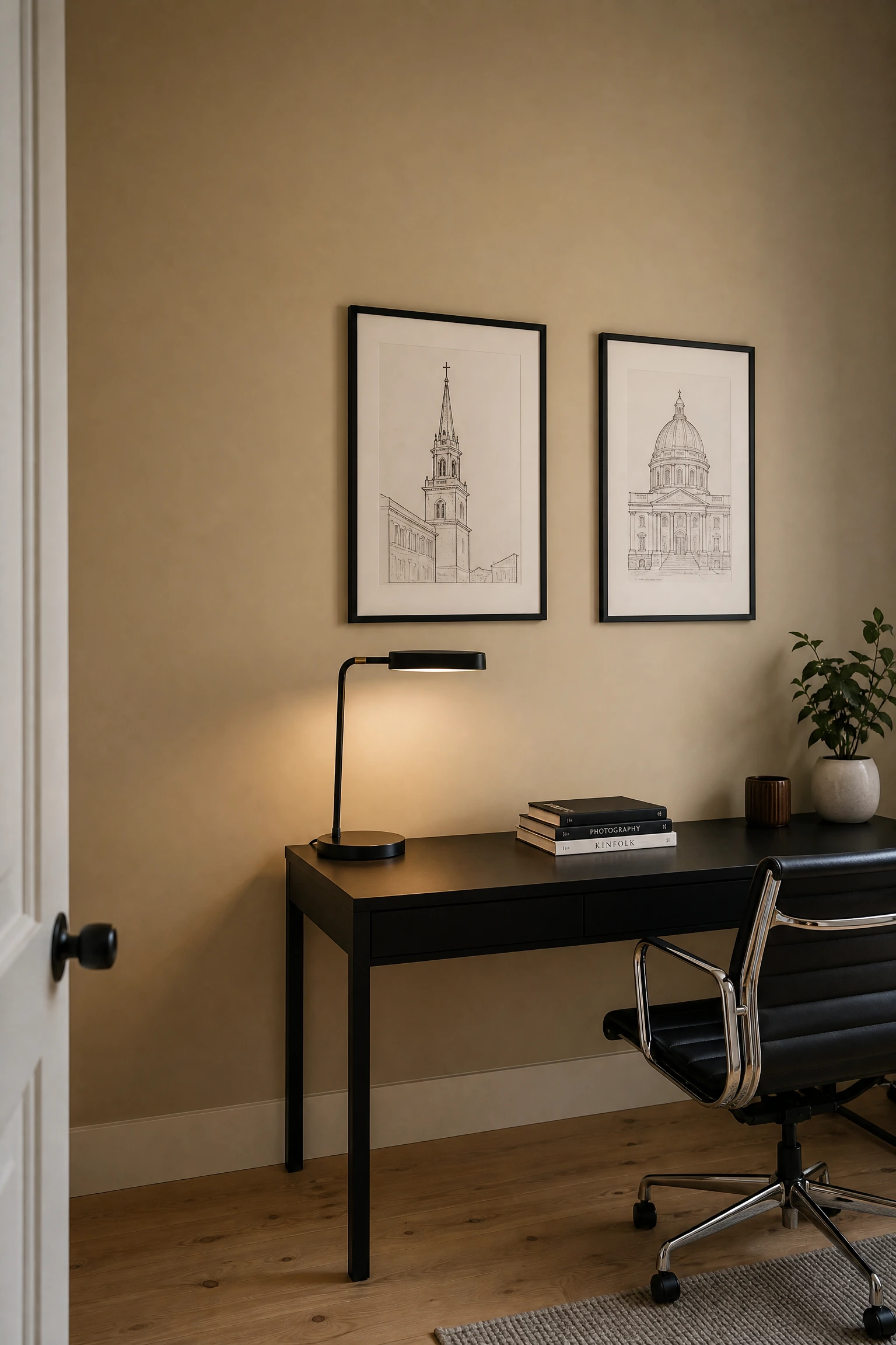
Negative space is the principle of using intentional emptiness to let key elements breathe and register more strongly, and it is one of the most underused tools in home office design. Beige walls are perfect for this because their warm neutrality recedes naturally, making whatever you place against them pop without needing to compete. Black line-art prints or architectural sketches in thin black frames on a beige wall are a great example of this working in real life. The art does not need to be large or numerous. One or two pieces, positioned thoughtfully rather than scattered across every wall, will do more for the room than a gallery wall packed with competing frames. Keep the surrounding wall bare, resist the urge to fill every inch, and the room will feel intentional and intentional rather than busy. This approach works in almost any size office, and the prints themselves can be very affordable from independent print sellers.
Quick Tip: Use frames with a very thin black profile rather than chunky ones. Thin frames let the artwork lead, not the hardware.
3. Layered Lighting and Color Temperature: Warm Beige vs. Cool Black Fixtures
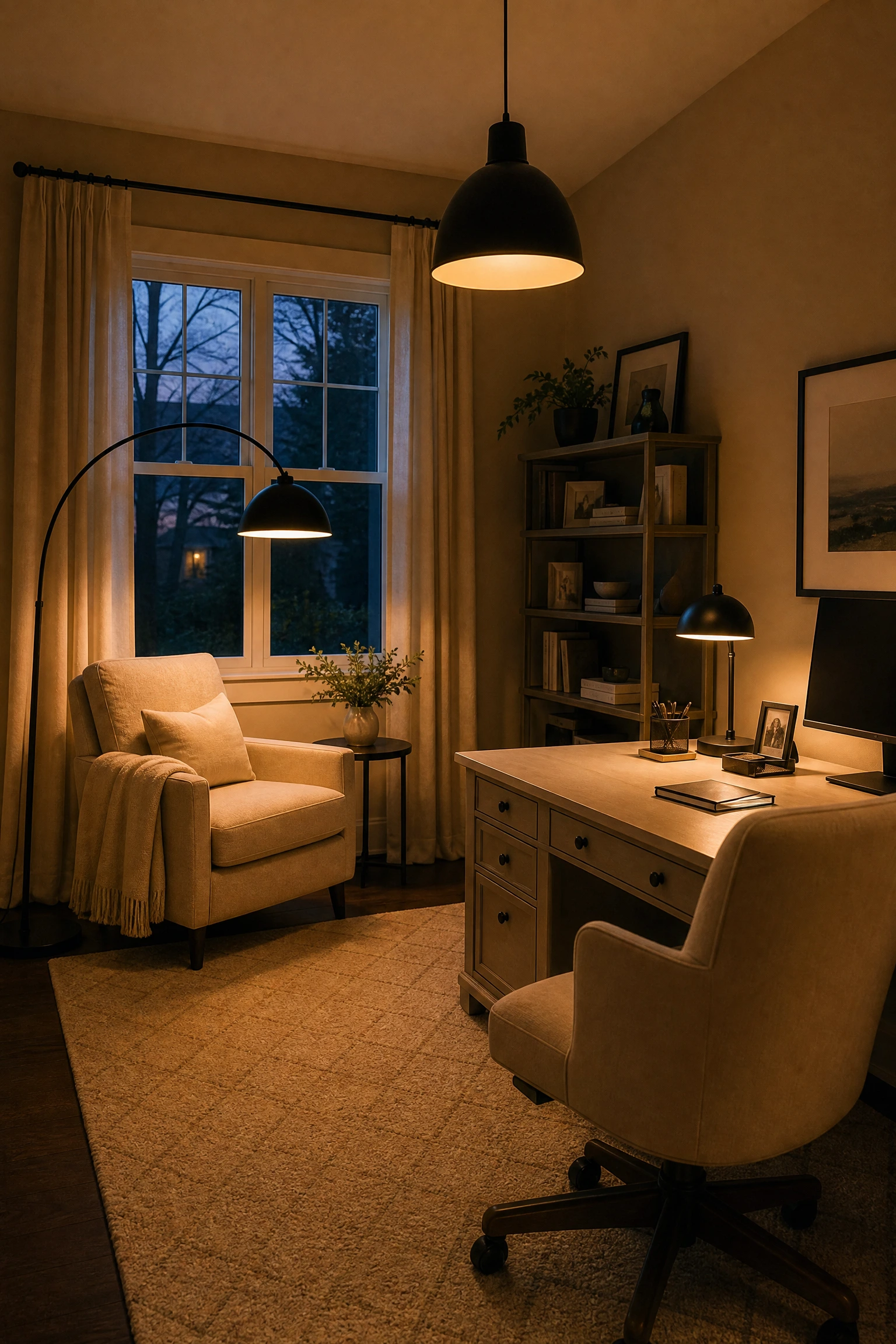
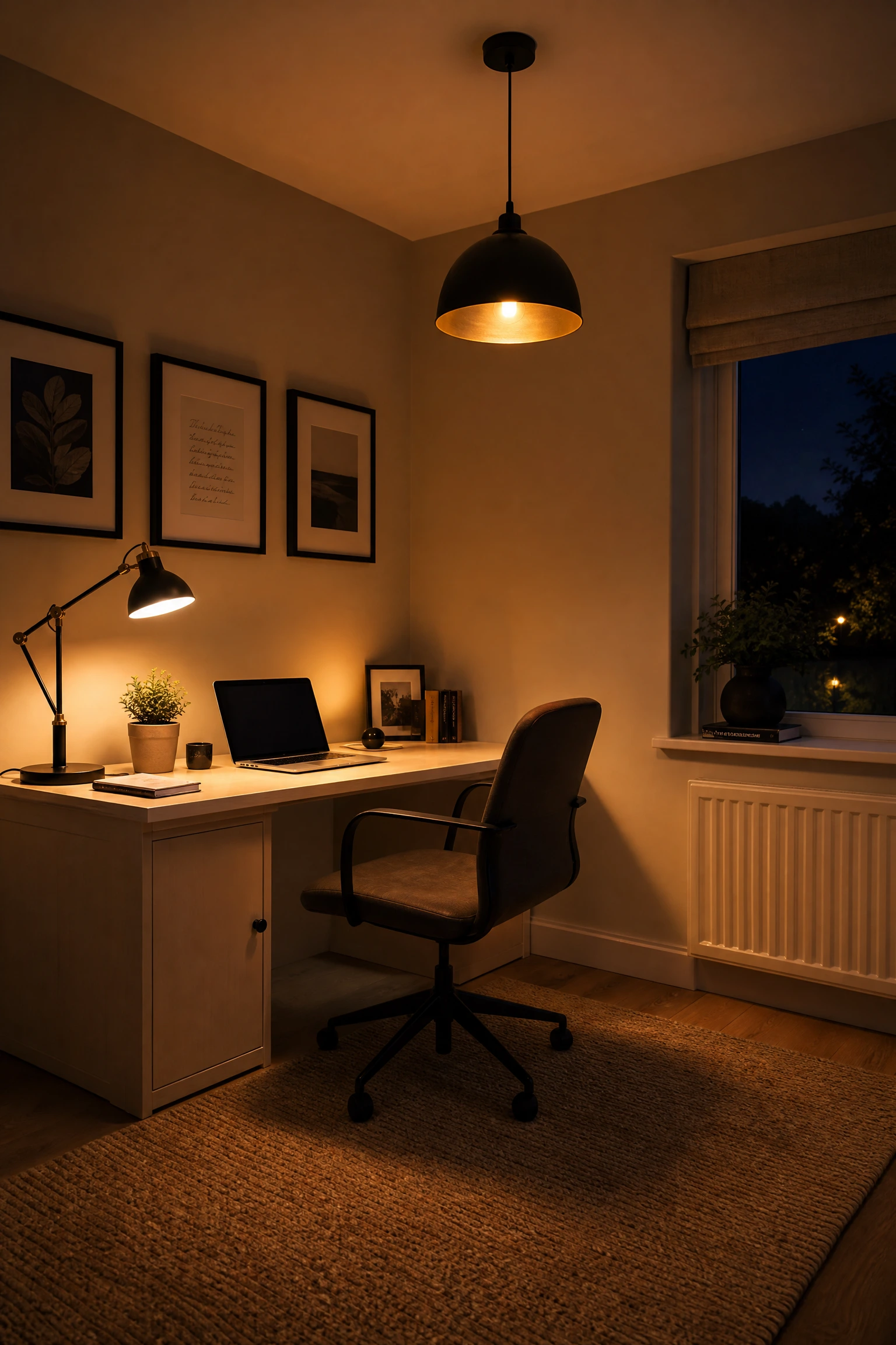
Color temperature is a concept that most people do not consciously think about, but it shapes how comfortable and productive a space feels. Beige tones in walls, flooring, or upholstery naturally read as warm, which means the lighting you choose either reinforces that warmth or fights against it. Pairing warm-toned beige with black fixtures that emit a slightly warmer bulb temperature, around 2700K to 3000K, creates a layered lighting setup that feels cohesive. A black arc floor lamp positioned behind your desk chair, a black pendant light overhead for ambient light, and a small black table lamp on a side surface together give you layered lighting that covers task, ambient, and accent all at once. In practice, layered lighting reduces eye strain far more effectively than a single overhead fixture, which casts flat, harsh light across the whole room. The black fixtures themselves add visual punctuation to a beige-heavy room without requiring you to repaint or reupholster anything.
Pro Move: Swap any cool-white bulbs in your office for warm white ones. It takes two minutes and makes a beige and black room feel 10 times more intentional.
4. Visual Weight and Balance: Floating Black Shelves on a Beige Accent Wall
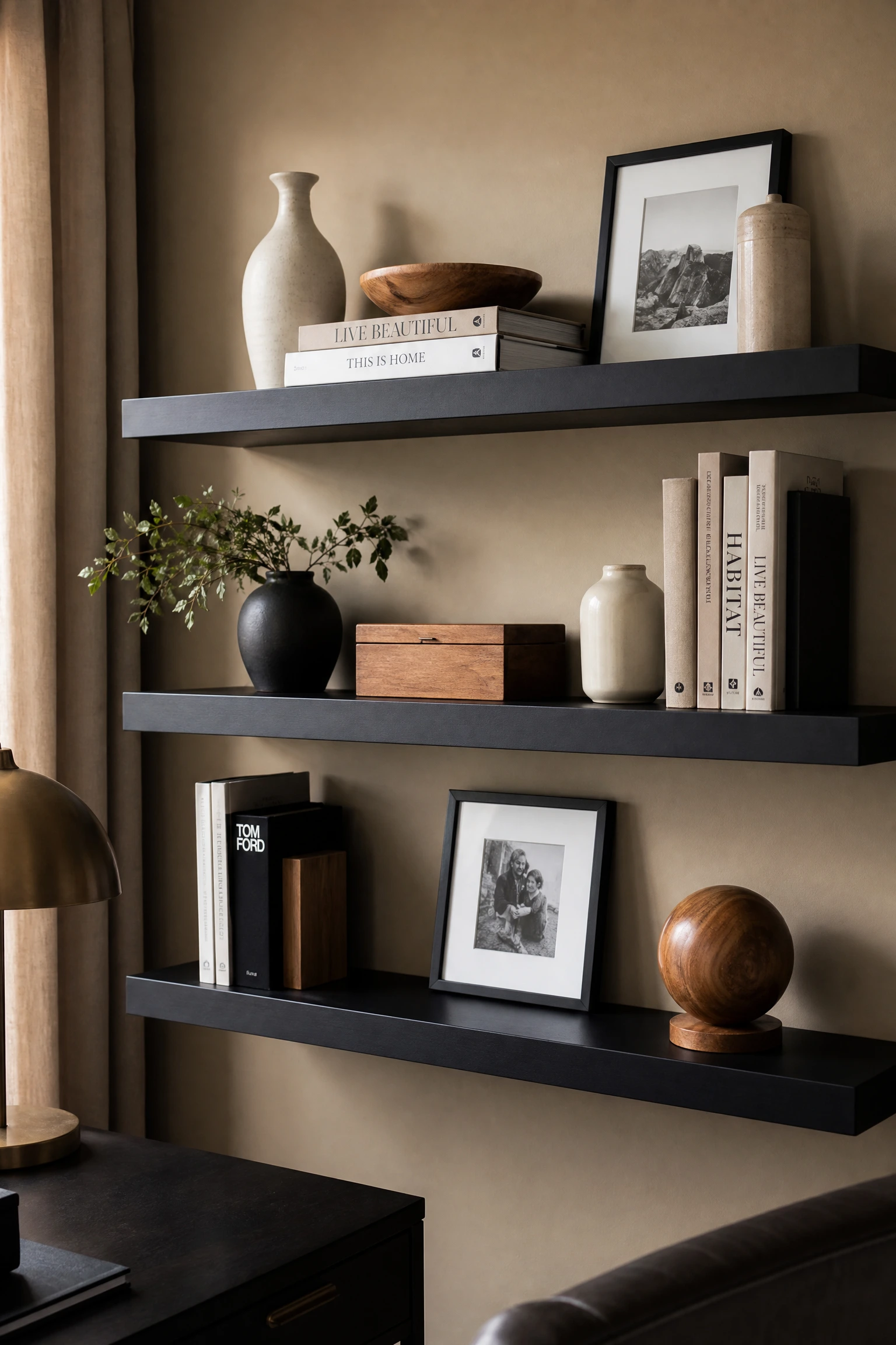
Visual weight refers to how heavy or light an element appears relative to the rest of the room, and balancing it is what separates a thought-out design from one that feels off without you knowing why. Floating black shelves on a single beige accent wall are a perfect example of using visual weight deliberately. The shelves themselves carry significant dark mass, but because they are mounted rather than floor-based, they appear lighter than a standing bookcase would. The beige wall behind them keeps them from reading as too heavy. What you put on the shelves matters a lot here. Keep objects to a roughly 60/40 ratio of beige or warm neutral items to black or dark accents, such as a mix of cream ceramic vases, natural wood objects, and a couple of matte black bookends or small black-framed photos. Avoid loading the shelves with brightly colored items or too many competing textures, as this breaks the palette immediately. This setup works especially well in a small office where you need vertical storage but do not want a bulky bookcase eating into floor space.
Heads Up: Floating shelves require proper wall anchoring into studs. A sagging shelf full of books is both a design disaster and a safety issue.
5. Material Contrast: Warm Beige Linen Against a Matte Black Desk Surface
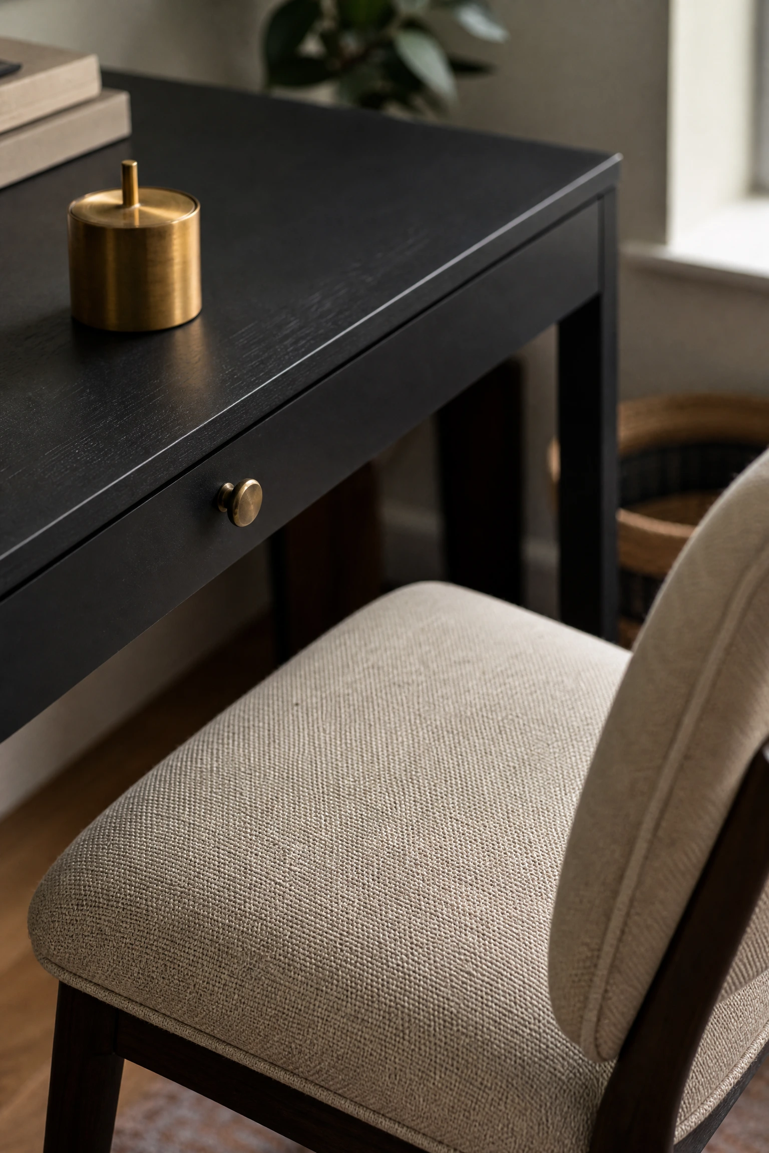
Material contrast is what gives a room tactile richness, and in a beige and black office it is one of the most effective tools available. The combination of warm beige linen upholstery against a matte black desk surface works because it hits multiple contrast points at once: color, texture, and sheen level. Matte black surfaces absorb light and read as sleek and solid. Linen, on the other hand, is soft, slightly textured, and has a gentle visual warmth that keeps the room from feeling sterile. A beige linen upholstered task chair, desk chair, or even a small linen ottoman positioned in the office creates exactly this tension in the best possible way. You can extend this principle to a beige linen Roman blind on the window against a black metal curtain rod, or a linen pinboard mounted in a black frame. This look is popular in Japandi-adjacent interior styles right now and feels genuinely current without being popular right now in a way that will date quickly.
Reality Check: Linen upholstery does mark and stain more easily than performance fabrics. If you have kids or pets sharing your office, consider a linen-look boucle or a stain-resistant linen blend instead.
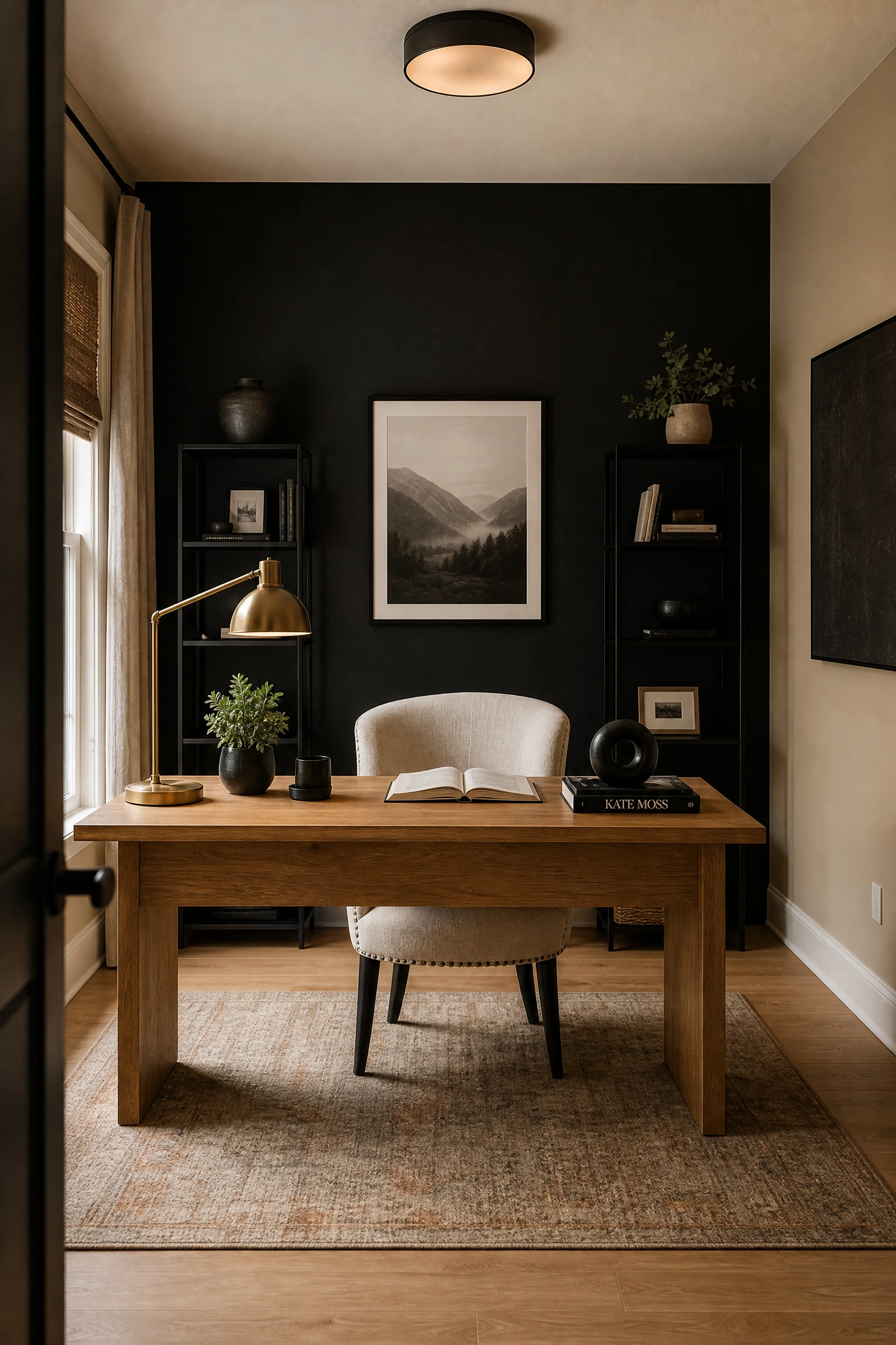
A focal point is the first thing your eye lands on when you enter a room, and in a home office it should almost always be the desk wall. Painting the wall directly behind your desk in a deep matte black while keeping the other three walls in a warm beige creates an instant, high-contrast focal point that makes the whole room feel deliberate and designed. This is a technique frequently used in professionally designed home offices and featured in design publications like Architectural Digest and Elle Decor. The black wall does not have to be solid paint, either. Black limewash, black board-form concrete texture paint, or even black panelling all achieve the same effect with added texture. Keep the desk itself lighter in this scenario, perhaps natural oak or a warm walnut finish rather than another black piece, so the wall gets to be the statement rather than competing with the furniture. The beige walls on the surrounding sides prevent the room from feeling cave-like, and the contrast actually makes the space feel larger by drawing the eye back.
Designer Advice: Use a flat or matte finish on the black accent wall, not eggshell or satin. Matte absorbs light and looks intentional, while a sheen on a dark wall reveals every imperfection.
7. Proportion and Scale: Slim Black Metal Frames in a Beige Gallery Wall
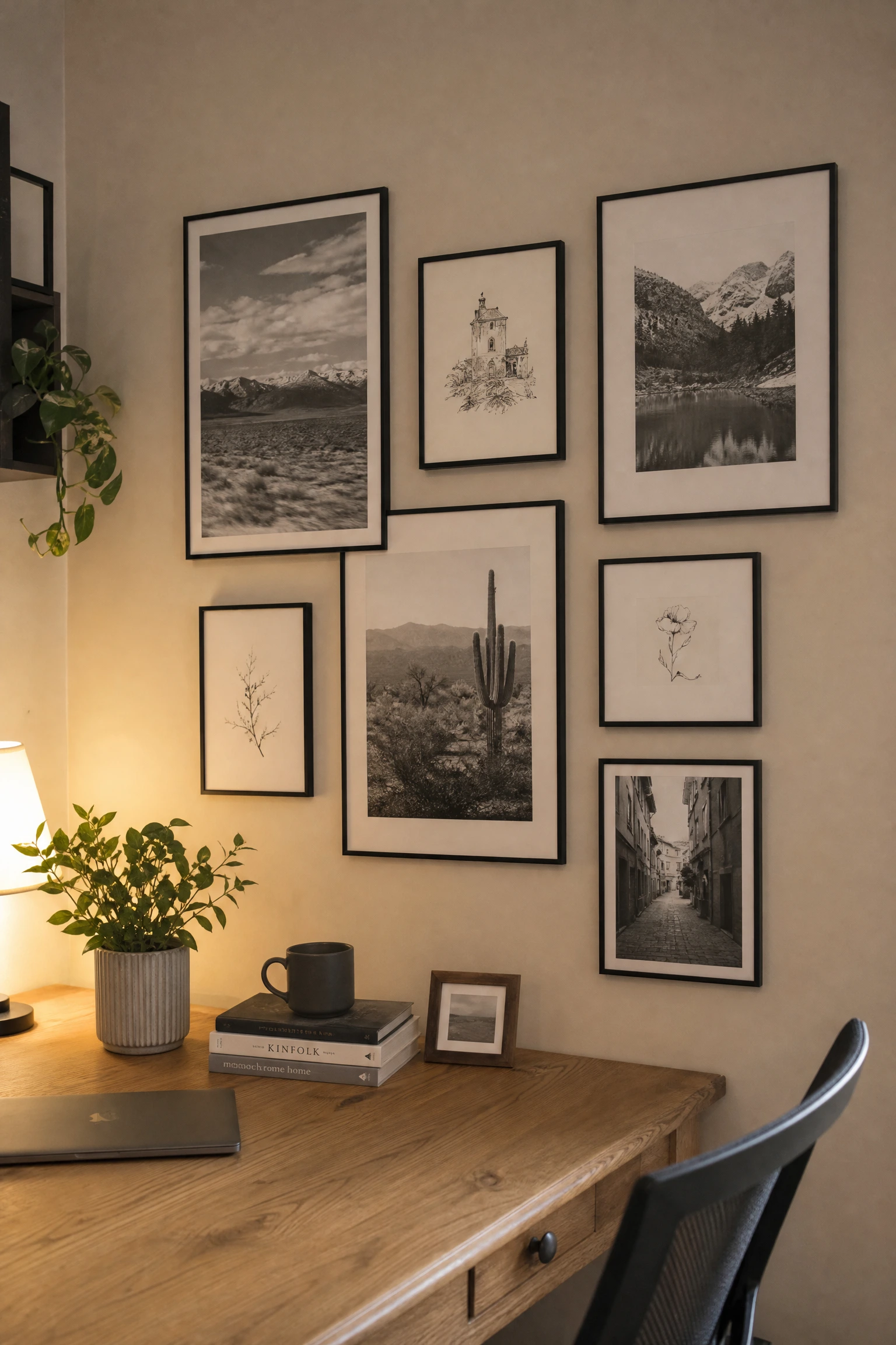
A gallery wall can go wrong quickly if the proportions are off, but done well in a beige and black palette it adds personality without chaos. The key principle here is proportion, using frames that are all slightly different sizes but share the same slim black metal profile, so the collection feels cohesive even with varied content. In a beige office, a gallery wall works best on the wall to the side of your desk rather than directly behind it, so it does not compete visually with your screen when you are on video calls. Fill the frames with a mix of simple black and white photography, clean architectural drawings, or abstract black ink prints on cream paper. The consistency of the black frames and the tonal similarity of the artworks ties it together. Budget-wise, this is one of the most affordable ways to introduce personality into a beige and black office. Frames from IKEA or Target in a uniform black finish look just as intentional as much more expensive options when arranged thoughtfully.
Quick Tip: Before committing to nail holes, arrange your frames on the floor first and photograph the layout. It is much easier to adjust composition before anything goes on the wall.
8. Texture as a Design Tool: Black Cane Furniture in a Warm Beige Office
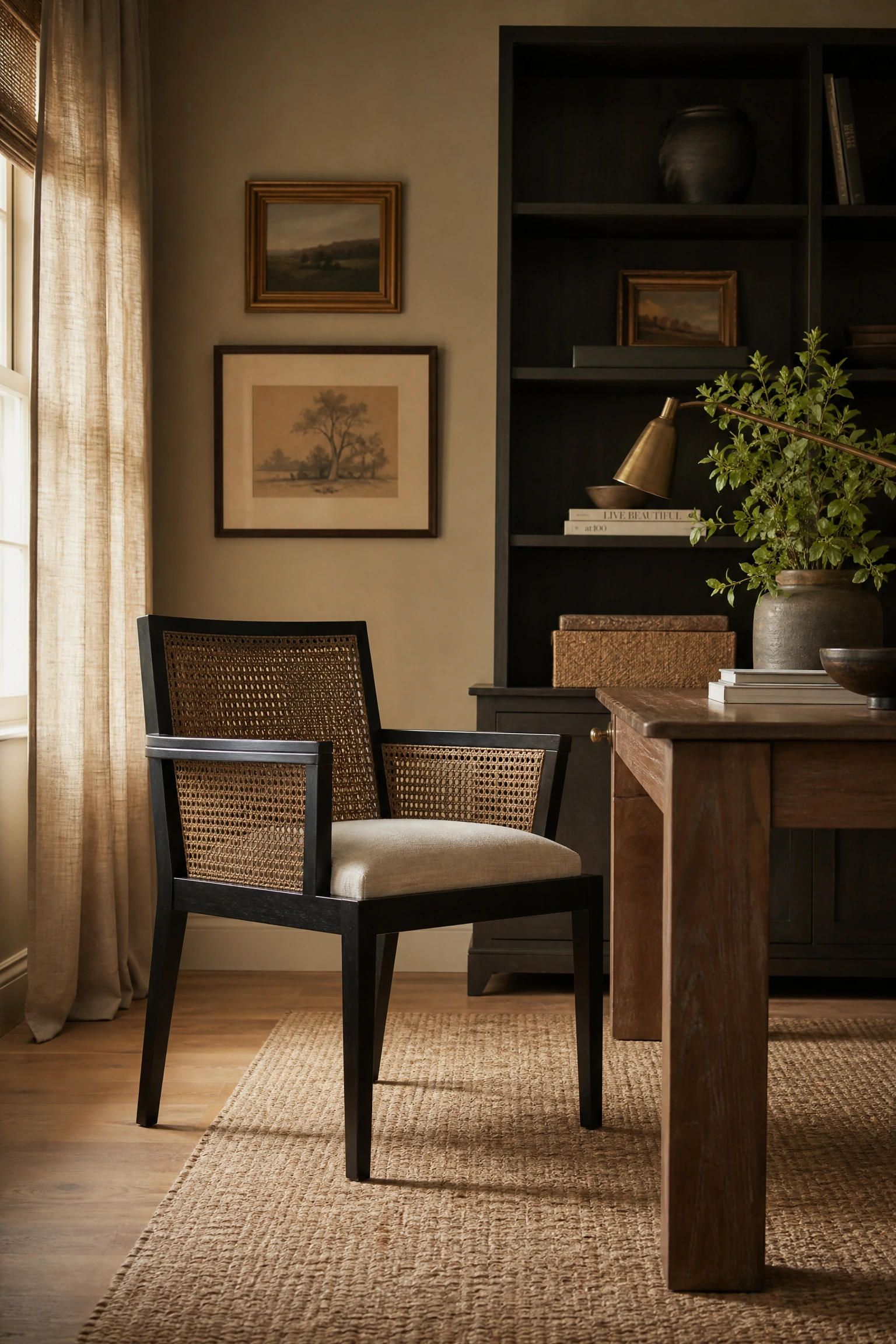
Cane and rattan furniture has been having a sustained moment in interior design, and the reason is simple: it introduces organic texture that softens harder, more modern elements. In a beige and black home office, a black-painted cane desk chair or a cane-front storage unit introduces a layer of visual complexity that prevents the palette from feeling flat. The woven pattern of cane catches light differently at different times of day, which makes the room feel alive in a way that solid surfaces cannot. Cane furniture also works at almost every budget level, with good options available from furniture retailers like World Market and Pottery Barn, as well as secondhand sources where older pieces can be repainted. The combination of the natural woven texture and the black paint finish reads as genuinely sophisticated without feeling too trend-dependent. If the desk chair is black cane, keep the seat pad in beige or cream linen to soften the look and add comfort for longer working sessions.
Reality Check: Cane chairs are not always the most ergonomic option for long work days. Use one as a secondary or accent chair rather than your primary desk seat if you sit for hours at a time.
9. The Grounding Effect: A Black and Beige Area Rug to Define the Workspace
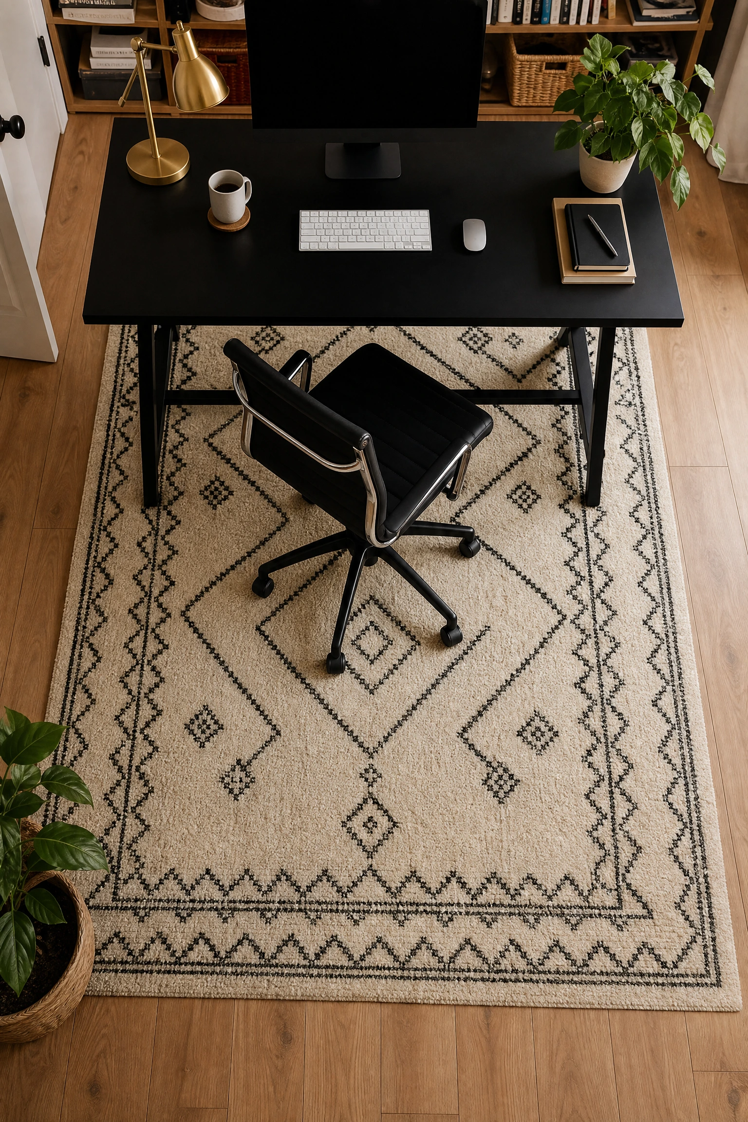
In open-plan spaces or larger rooms where a home office shares the floor with other zones, a rug is not optional. It is the primary design tool for defining the workspace as its own area. The principle at play is called zone delineation, and a well-chosen rug creates a visual boundary that tells the brain this is where work happens. A black and beige geometric rug, or a cream rug with a black abstract pattern, anchors the desk and chair in a defined zone while reinforcing the color palette across the floor plane. In a dedicated home office room, a rug still does important work by adding acoustic softness (open offices can be surprisingly echo-y on hard floors) and warmth underfoot during colder months. For a beige and black office, go for a rug with a flat or low-pile weave rather than a thick shag, as the latter tends to collect dust and can look too casual for a work setting. A jute rug with a black woven border is a particularly good budget-friendly option that hits both the color palette and the texture brief.
Pro Move: Place a rug pad underneath, as it stops the rug from migrating when you roll your chair back and forth, which is one of those small annoyances that turns into a big one surprisingly fast.
10. The Warmth Anchor: Beige Grasscloth Wallpaper as an Office Feature Wall
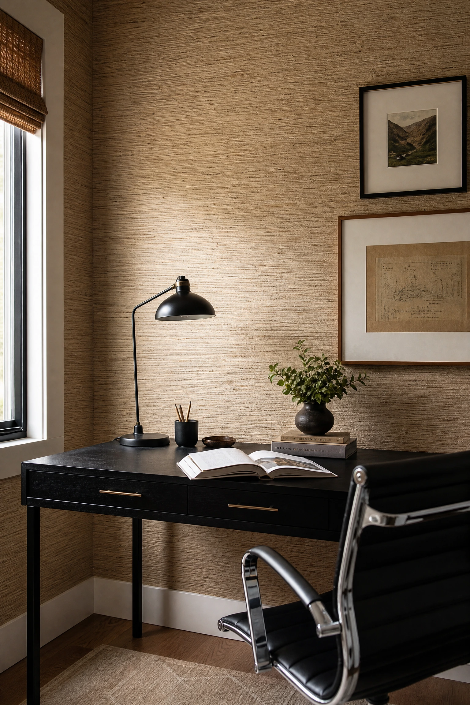
Grasscloth wallpaper is one of those materials that photographs beautifully but is even better in person, because the woven texture catches light in a way that flat paint never can. Using beige grasscloth on one feature wall, typically the one your desk faces or the one behind it, immediately lifts the room and introduces a level of warmth that goes beyond what paint can achieve. Against black furniture or black accents, the natural fibrous texture of grasscloth provides exactly the right softening element. The color temperature of beige grasscloth shifts slightly depending on the light throughout the day, moving between honeyed warm tones in morning light and cooler sand tones in the afternoon, which keeps the room from ever looking one-dimensional. This is a mid-range to investment-level choice, since good grasscloth wallpaper and professional installation are not cheap, but it is extremely durable once applied and does not need to be replaced as frequently as painted walls that get dinged or marked.
Heads Up: Grasscloth is not scrubbable. Marks and moisture stains cannot be cleaned off easily, so keep it away from the area directly behind your desk if you tend to lean back frequently.
11. Proportion Rules: Tall Black Bookcases in a Beige Office
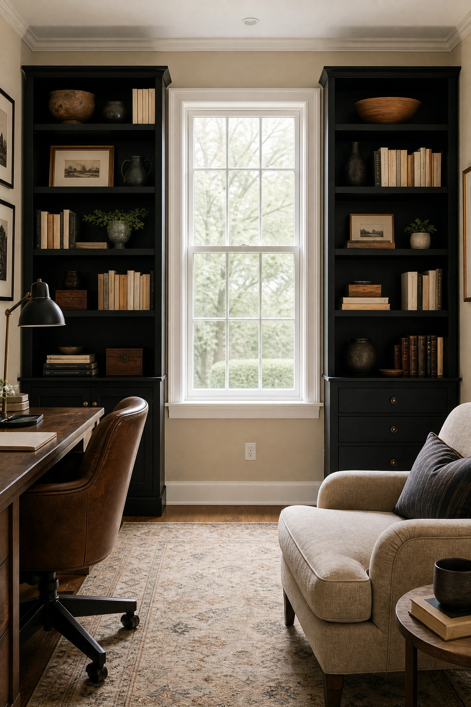
Tall furniture draws the eye upward and makes a room feel larger, which is why interior designers often recommend vertically proportioned bookcases over wide, low ones in spaces where ceiling height is a strength. In a beige and black home office, a set of tall black bookcases flanking a window or a door create a sophisticated library feel that is hard to achieve any other way. The visual weight of the tall dark bookcases is balanced by the lightness of the beige walls and the natural light coming in from the window between them. For the bookcase styling, use the same 60/40 neutral-to-dark ratio mentioned earlier: cream and natural-toned books, a few warm wood objects, and some black or dark-toned ceramics interspersed throughout. Avoid the temptation to organise books purely by spine color in a rainbow arrangement, as this tends to look decorative rather than functional and can read as a bit dated. IKEA’s Billy bookcases in black are a genuinely excellent and very affordable starting point for this look.
Designer Advice: Remove the dust jacket from hardcover books and display the cloth-bound cover instead, as it creates a much more cohesive, editorial look on open shelving.
12. Sensory Calm: A Neutral Beige and Black Color Ratio of 70/30
One of the practical questions people always have about a beige and black palette is how much of each color to actually use, and the answer that works consistently in interior design is roughly 70 percent beige and 30 percent black. This ratio ensures the room feels warm and open rather than heavy or dramatic, while still giving the black enough presence to register as a deliberate design choice rather than a random dark accent. In a home office context, this might look like beige walls, beige or cream upholstered seating, and light oak or warm wood flooring making up the 70 percent, with a black desk, black light fixtures, black frames, and black hardware on storage units making up the 30 percent. If you go too far in either direction, say 90 percent beige with a single black lamp, the black reads as accidental. If you tip toward 50/50, the room starts to feel heavy and a bit corporate in a way that is not always comfortable for a home setting. The 70/30 split is the sweet spot.
Reality Check: Paint and fabric swatches always look different in the store than in your actual room. Test beige paint samples in your specific light before committing, since the same beige can look pink in one room and yellow in another.
13. Wabi-Sabi in a Beige and Black Office: Celebrating Imperfect Textures
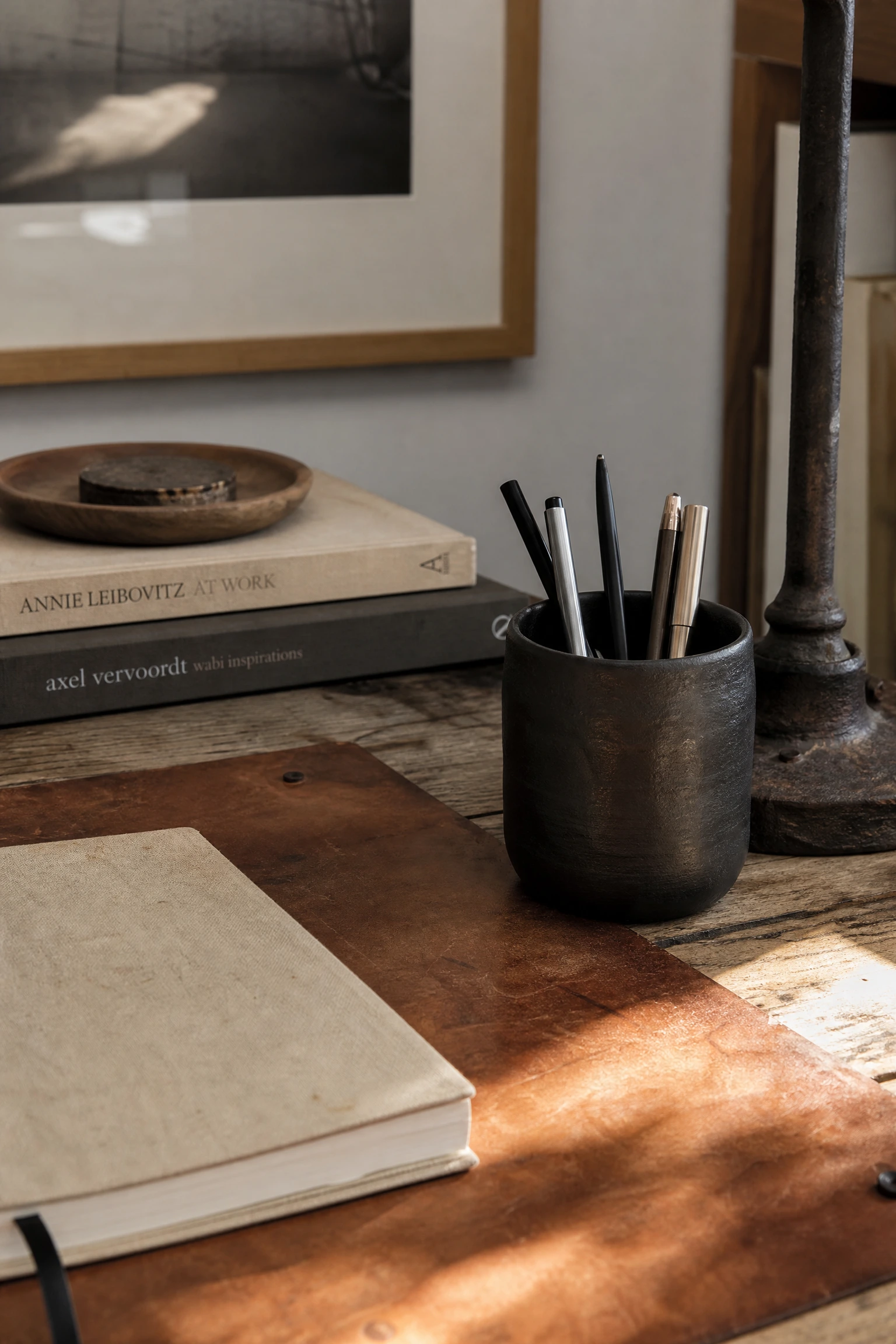
Wabi-sabi is the Japanese design philosophy of finding beauty in imperfection and impermanence, and it translates surprisingly well into a beige and black home office when applied with intention. The idea is to choose materials that show the passage of time and handcraft rather than aiming for everything to look factory-perfect. A hand-thrown matte black ceramic mug on your desk, a deliberately aged leather desk mat in a warm tan, a slightly imperfect beige linen curtain with visible weave variation, or a black iron lamp base with a raw, slightly uneven finish all bring this sensibility in. The result is a workspace that feels genuinely lived-in and personal rather than like a showroom. Wabi-sabi works particularly well in home offices because it takes some of the performance pressure off the space. It does not need to look perfect. It just needs to feel right. This approach also lends itself to budget-friendly thrift and secondhand shopping, since items with wear and patina are exactly what you are looking for.
Pro Move: A beeswax or linseed oil finish on any secondhand wooden furniture instantly gives it a warm, intentional look rather than a worn-out one.
14. The Reading Nook Within the Office: A Beige Chair and Black Side Table
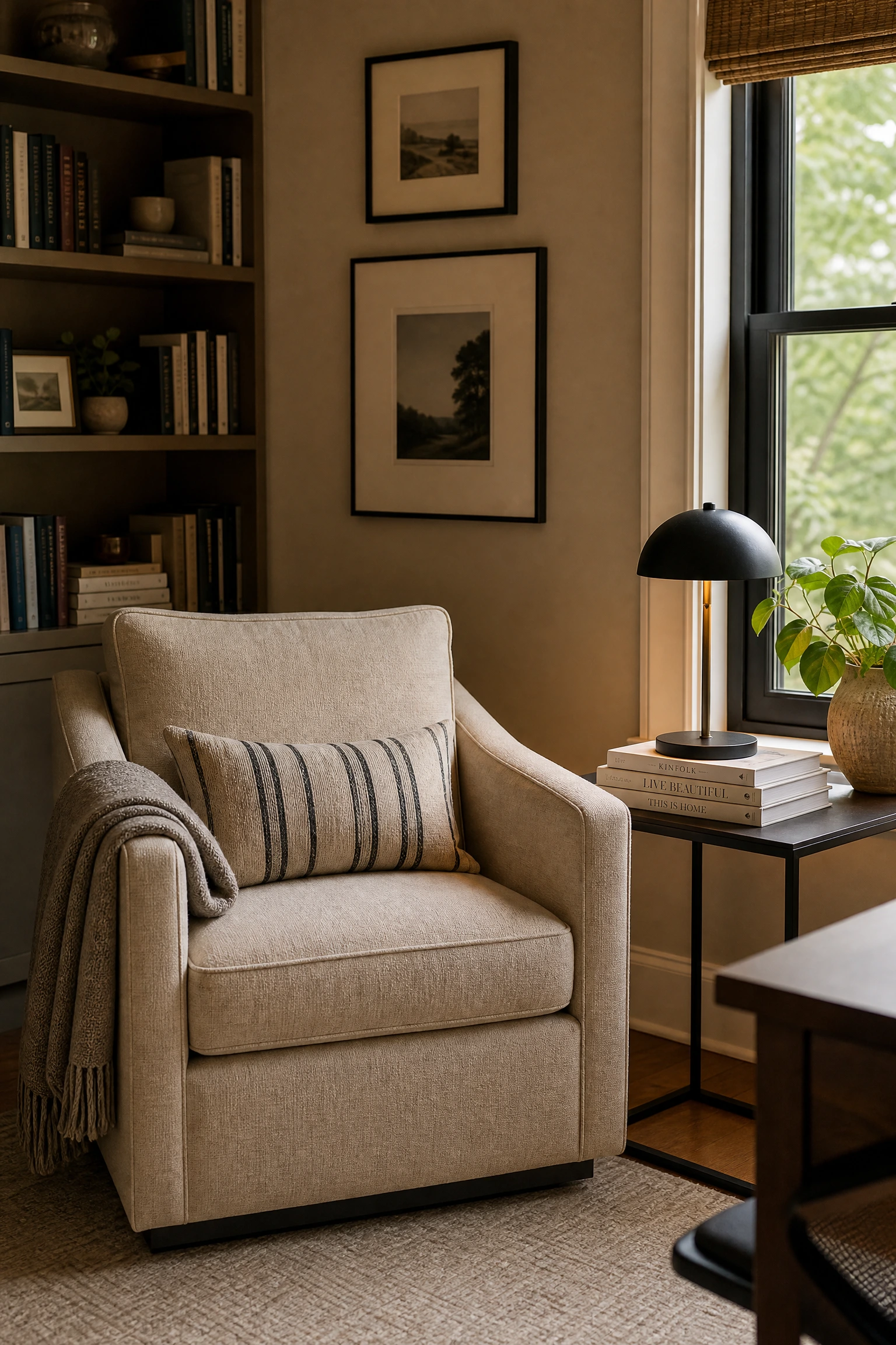
The best home offices have a moment of pause built into them, a spot that is not about the screen or the task list. It is about thinking, reading, or just stepping away from the desk for a few minutes. A beige upholstered armchair tucked into a corner with a slim black side table beside it creates this within the office without requiring a separate room. The chair does not need to be large. Even a compact linen armchair in a warm sand tone takes up very little floor space but adds enormous character and functionality to the room. A small black side table or black drum stool serves as a surface for a lamp, a notebook, or a cup of tea. From a design standpoint, this secondary zone prevents the office from feeling single-purpose and one-dimensional. It also gives the room a residential quality that makes it more pleasant to spend extended time in, which is a real and practical benefit for anyone working from home full-time.
Quick Tip: If floor space is tight, a black wall-mounted folding shelf can substitute for a side table and folds flat when not in use.
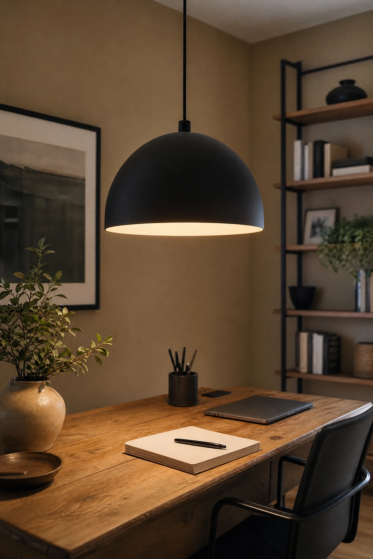
15. Lighting Drama: Black Pendant Lights Over a Beige Workspace
Pendant lighting in a home office is still relatively unusual, which is exactly why it works so well as a design statement. Most people default to a ceiling flush mount or a floor lamp, and while both are functional, neither creates the kind of intentional atmosphere that a well-chosen pendant does. A black dome pendant or a black ribbed glass pendant hung low over the desk zone does two things simultaneously: it directs focused light onto the work surface in the same way a task light would, and it acts as a visual anchor that makes the desk feel like a defined, designed space rather than a spot where furniture happened to land. Against beige walls and a warm-toned interior, a matte black pendant with a warm bulb reads as architectural and confident. If you have access to an electrician and can add a pendant where there is currently only a flush mount, this is one of the best single investments you can make in a home office design. For renters, a black plug-in pendant is a genuinely good alternative.
Heads Up: Pendant placement matters enormously. Hang it too high and it loses all drama, and too low and it becomes a hazard. Aim for around 60 to 65 inches from floor to bulb over a desk.
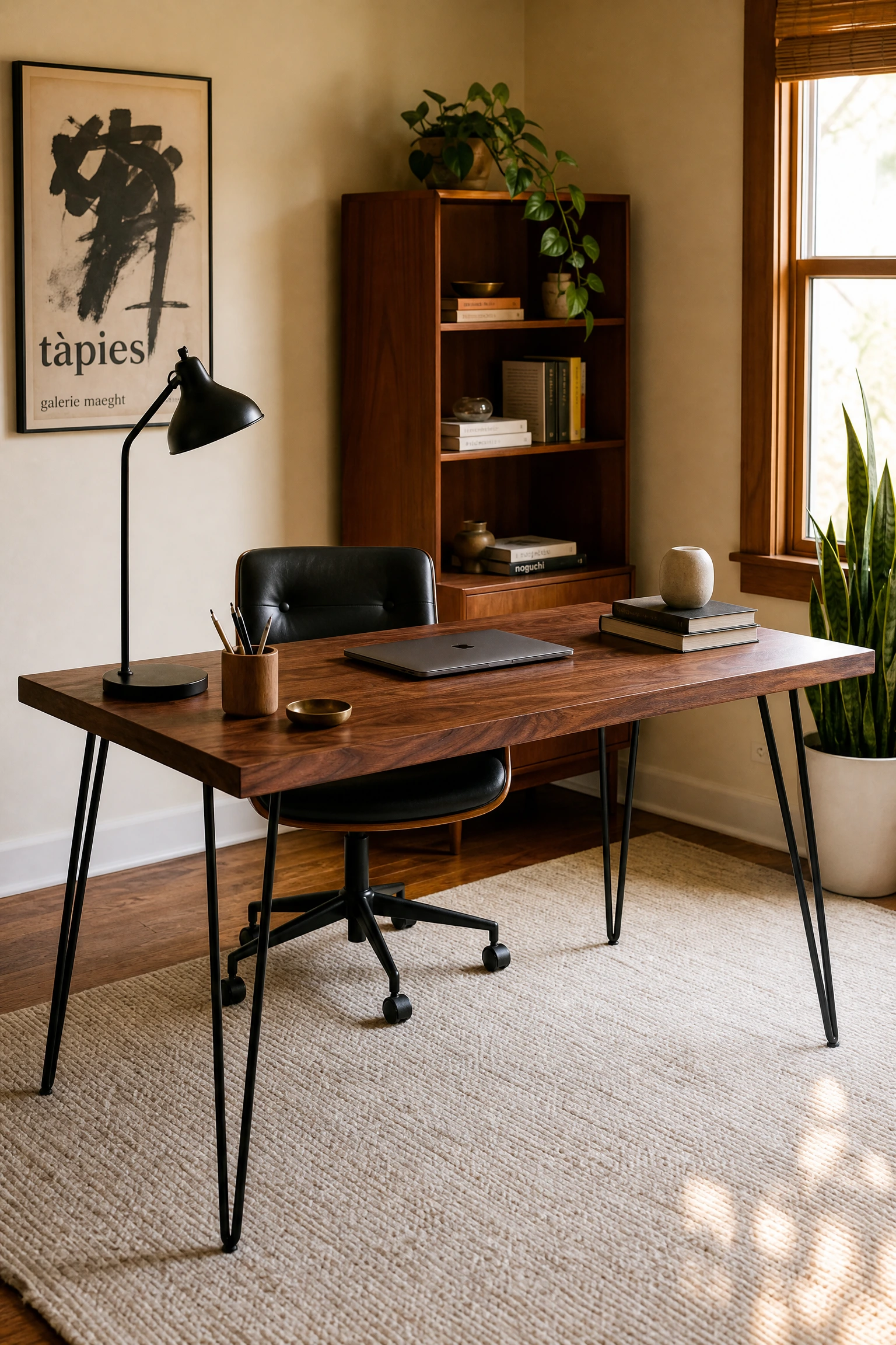
16. The Mid-Century Touch: Walnut and Black in a Beige Office
Mid-century modern design has proven its longevity, and it works particularly well in a beige and black office because the warm wood tones of walnut add a third element that bridges the gap between the warmth of beige and the coolness of black. A walnut-topped desk with black metal hairpin legs, paired with beige walls and a cream wool rug, is one of those combinations that consistently looks more expensive than it costs. The warm amber undertones of walnut read as a natural extension of the beige palette while the black metal legs introduce the structure and contrast that prevents the room from looking entirely without edge. Mid-century modern furniture is also widely available at secondhand markets and thrift stores, where genuine vintage pieces from the 1950s and 1960s can be found at surprisingly low prices relative to their quality. The style also holds its value well if you choose to resell later, which makes it a smarter investment than trend-driven furniture.
Designer Advice: Real walnut and walnut veneer look very similar at normal viewing distances but differ significantly in cost. Veneer on a solid wood base is a perfectly legitimate and durable option.
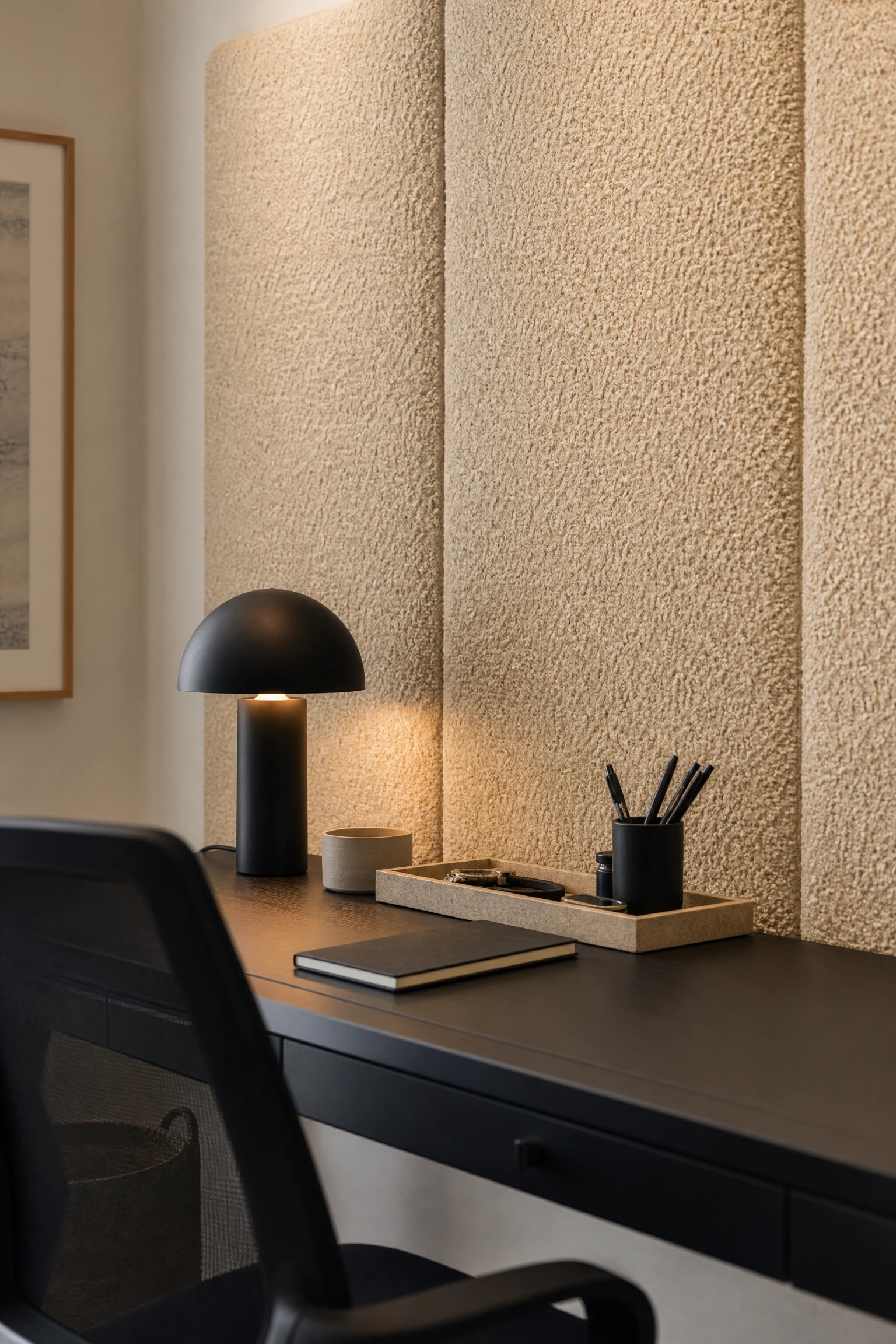
17. Acoustic Design: Beige Boucle Wall Panels Behind a Black Desk
Acoustic panels in a home office serve a practical function: they absorb sound and reduce echo, which matters a lot on video calls and during long focus sessions, but they do not have to look industrial or boring. Beige boucle fabric panels mounted directly behind the desk create a textured, soft backdrop that does genuine acoustic work while also looking genuinely good. The looped texture of boucle fabric has significant sound-absorbing properties, and in a beige tone it adds warmth and tactile richness to what might otherwise be a flat, uninspiring wall. Against a black desk and black chair, the creamy, soft texture of boucle creates a beautiful material contrast. These panels can be DIY’d for a relatively modest cost using acoustic foam wrapped in boucle fabric and mounted on a wooden frame, or purchased ready-made from companies specializing in acoustic design. This idea is particularly valuable in rooms with hard floors and minimal soft furnishings, where echo can be a real problem.
Pro Move: Even just two or three panels covering around 20 percent of the wall surface makes a noticeable difference in echo reduction. You do not need to cover the whole wall.
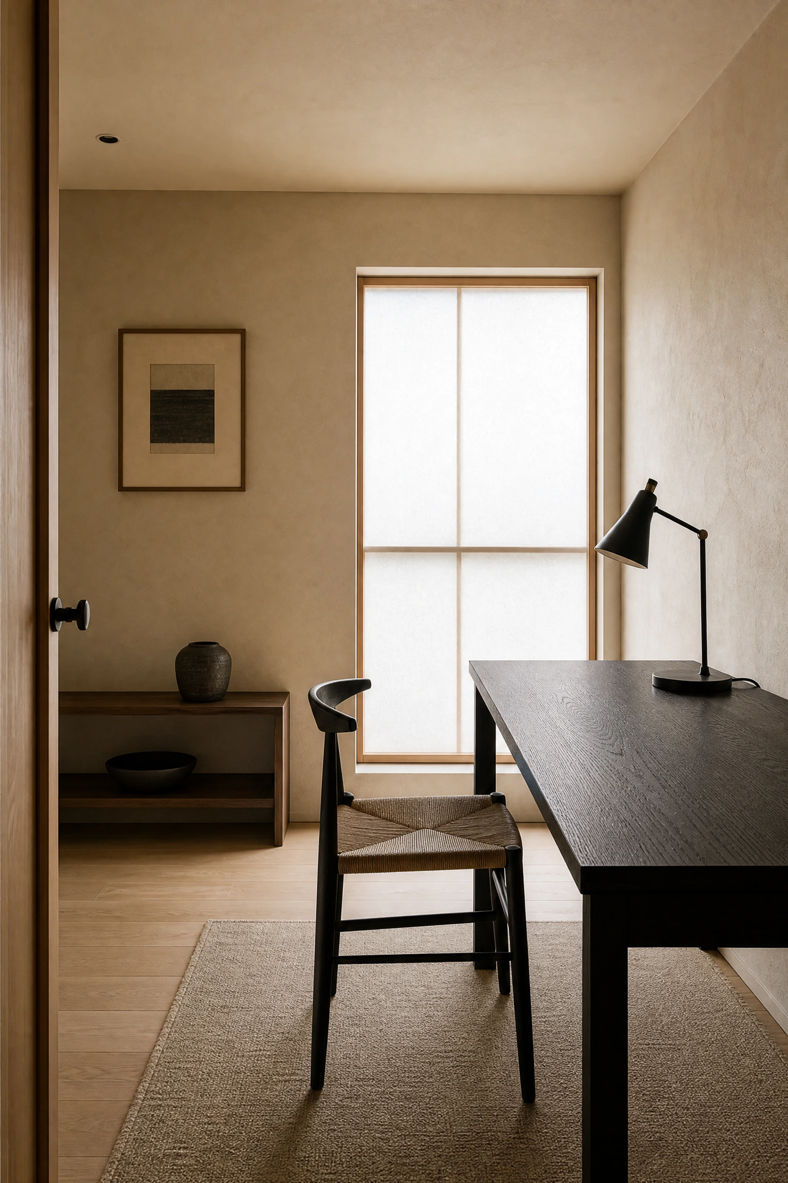
18. Japandi Influence: Beige Plaster Walls With Black Oak Furniture
Japandi is the design movement that blends Japanese minimalism with Scandinavian warmth, and it has been one of the most consistently popular interior styles over the past several years. In a home office, it translates into beige or warm white plaster-effect walls, black-stained oak furniture, and an almost disciplined restraint with accessories. The plaster-effect wall finish, whether real lime plaster or a high-quality plaster-effect paint, introduces the kind of subtle organic texture that is central to the Japandi aesthetic. Black-stained oak is a better choice than painted black furniture in this context because the grain of the wood shows through the stain, keeping the material feeling natural and honest rather than industrial. The rest of the room should be kept deliberately spare: one desk, one chair, one light, a small number of thoughtfully chosen objects. In practice, the Japandi approach to a home office means that organisation and storage are handled with careful intention, since clutter is the antithesis of the style.
Reality Check: Japandi looks easy but requires consistent editing. The style breaks down quickly when surfaces start accumulating paper, chargers, and everyday clutter, so investing in good concealed storage is non-negotiable.
19. The Art of Layering Neutrals: Sand, Cream, and Bone Alongside Black
One mistake people make with a beige and black office is treating beige as a single, uniform color when in reality the most interesting neutral rooms use multiple tones within the warm neutral family. Sand, cream, bone, warm white, and greige all sit in the same broad family as beige, and layering them creates depth without introducing color contrast that disrupts the calm of the palette. The trick is to vary the tones across different surfaces and materials: cream linen on the chair, a warm bone rug, sand-toned walls, and natural oak or rattan accents. The black elements then cut through all of these warm layers with clean, clear contrast. In practice, this is a much more interesting and liveable result than a room that is a uniform single shade of beige, which can read as flat or even slightly gloomy in low natural light. This layered neutral approach is common in high-end interior design projects and is very achievable at any budget by shopping across material categories.
Quick Tip: Bring fabric and paint samples into your actual office space at different times of day before buying. Neutral tones shift dramatically between morning and evening light.
20. Biophilic Design in a Black and Beige Office: Greenery as the Third Color
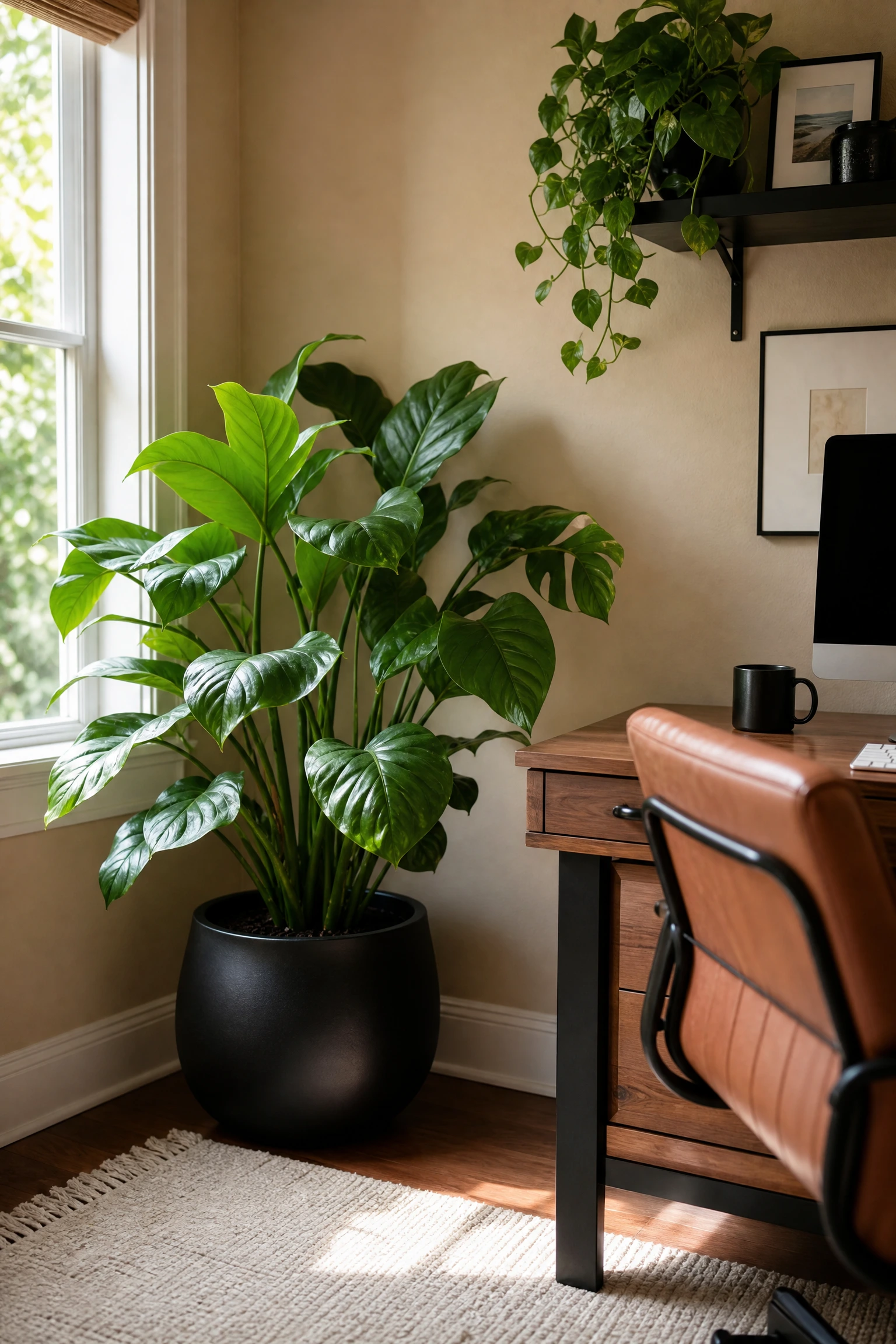
Biophilic design is the principle of incorporating natural elements into interiors to support wellbeing, reduce stress, and improve focus, and the research behind it is solid enough that major architectural firms now include it in workplace design guidelines. In a beige and black home office, introducing plants as a deliberate third color element works beautifully because green sits harmoniously between the warmth of beige and the depth of black without disrupting the palette. A large leafy plant in a black matte ceramic pot beside the desk, a trailing pothos on a black floating shelf, or a small sculptural fiddle-leaf fig in the corner all bring life and visual movement to what might otherwise feel like a static space. Beyond aesthetics, plants genuinely do improve air quality in enclosed spaces, though the effect is more modest than some marketing suggests. If natural light in your office is limited, opt for low-light tolerant plants like ZZ plants, snake plants, or heartleaf philodendrons rather than sun-hungry varieties.
Heads Up: Black ceramic pots can get very warm if placed in direct sunlight, which may stress plant roots. Keep black-potted plants slightly back from south-facing windows.
21. The Detail That Finishes It: Black Hardware on Beige Storage Units
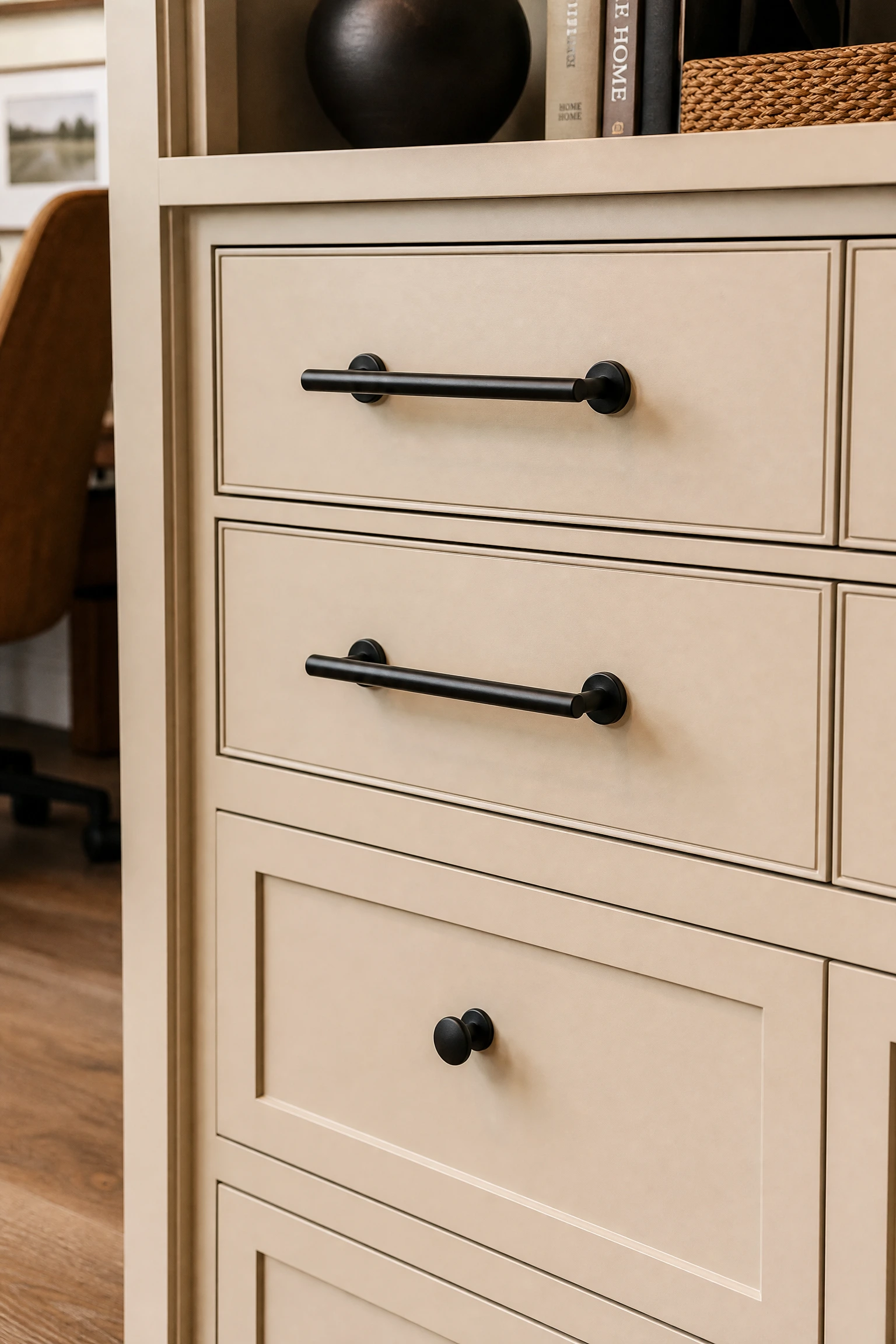
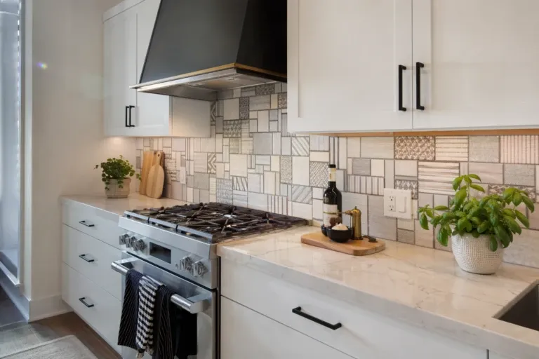
Hardware is one of those details that very few people plan for in advance but that makes an enormous difference to how finished and considered a space looks. Swapping the standard silver or gold hardware on beige or cream storage cabinets, drawers, or filing units for matte black hardware is one of the fastest and most cost-effective ways to pull a beige and black office together. Matte black bin pulls, cup pulls, or bar handles on a cream-painted built-in or a beige filing cabinet create a clean, graphic quality that feels intentional and modern. This is particularly effective on IKEA furniture, where a simple hardware swap on a KALLAX unit or a PAX wardrobe can make a budget piece look genuinely high-end. The cost per handle or knob is usually modest, and the installation requires nothing more than a screwdriver. It is the kind of update that takes an afternoon and immediately changes how the whole room reads.
Pro Move: Buy one or two extra handles beyond what you need. Matte black finishes can vary between production batches and you may need a replacement later that matches exactly.
22. Moody and Functional: A Black Pegboard Organiser on a Beige Wall
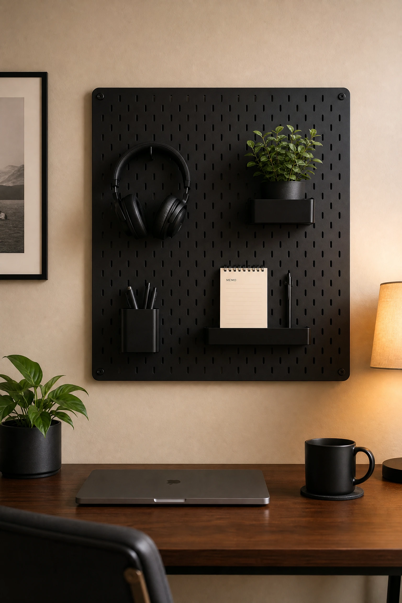
The pegboard has been a practical studio staple for decades, but when executed in matte black and mounted on a warm beige wall, it crosses from purely functional into genuinely decorative territory. The graphic, grid-like pattern of the pegboard itself becomes a design element, and the ability to customise what hangs on it means the arrangement can evolve over time without any additional cost. A black pegboard mounted above the desk or on a side wall provides storage for frequently used items such as headphones, a small plant, a calendar, and office supplies, while keeping them off the desk surface. Against a beige wall, the matte black of the board reads as a deliberate architectural choice rather than a tool shed necessity. IKEA’s SKADIS pegboard is a particularly good starting point and is available in black at a very accessible price point. The key is to be selective about what you hang, keeping the arrangement relatively spare so the grid pattern of the board itself remains visible.
Designer Advice: Paint the pegboard hooks and accessories in the same matte black as the board. Using the original silver hooks breaks the visual cohesion immediately.
23. Warmth Through Lighting Temperature: Amber Bulbs in Black Fixtures
The difference between a home office that feels like a place you want to spend time and one that feels like a waiting room often comes down to a single variable: the color temperature of the lighting. Cool white or daylight bulbs, which sit in the 5000K to 6500K range, are often recommended for productivity because they mimic natural daylight, but in a warm-toned beige and black interior they create a colour clash that makes the room feel off without you necessarily knowing why. The beige tones in the walls, furniture, and textiles are designed to read as warm, and cool-white light counteracts that warmth and drains the colour from them. Amber or warm white bulbs in the 2700K to 3000K range work with the beige palette rather than against it, making the whole room feel more cohesive and genuinely restful to be in. If you need higher light levels for focused work, add more warm-toned sources rather than switching to cooler bulbs.
Reality Check: If you do video calls frequently, test how warm bulbs affect your on-screen appearance. Very warm light can cast a yellow tone on skin tones in camera, and you may need a neutral daylight ring light specifically for calls.
24. The Final Layer: Personal Objects in Beige and Black That Tell Your Story
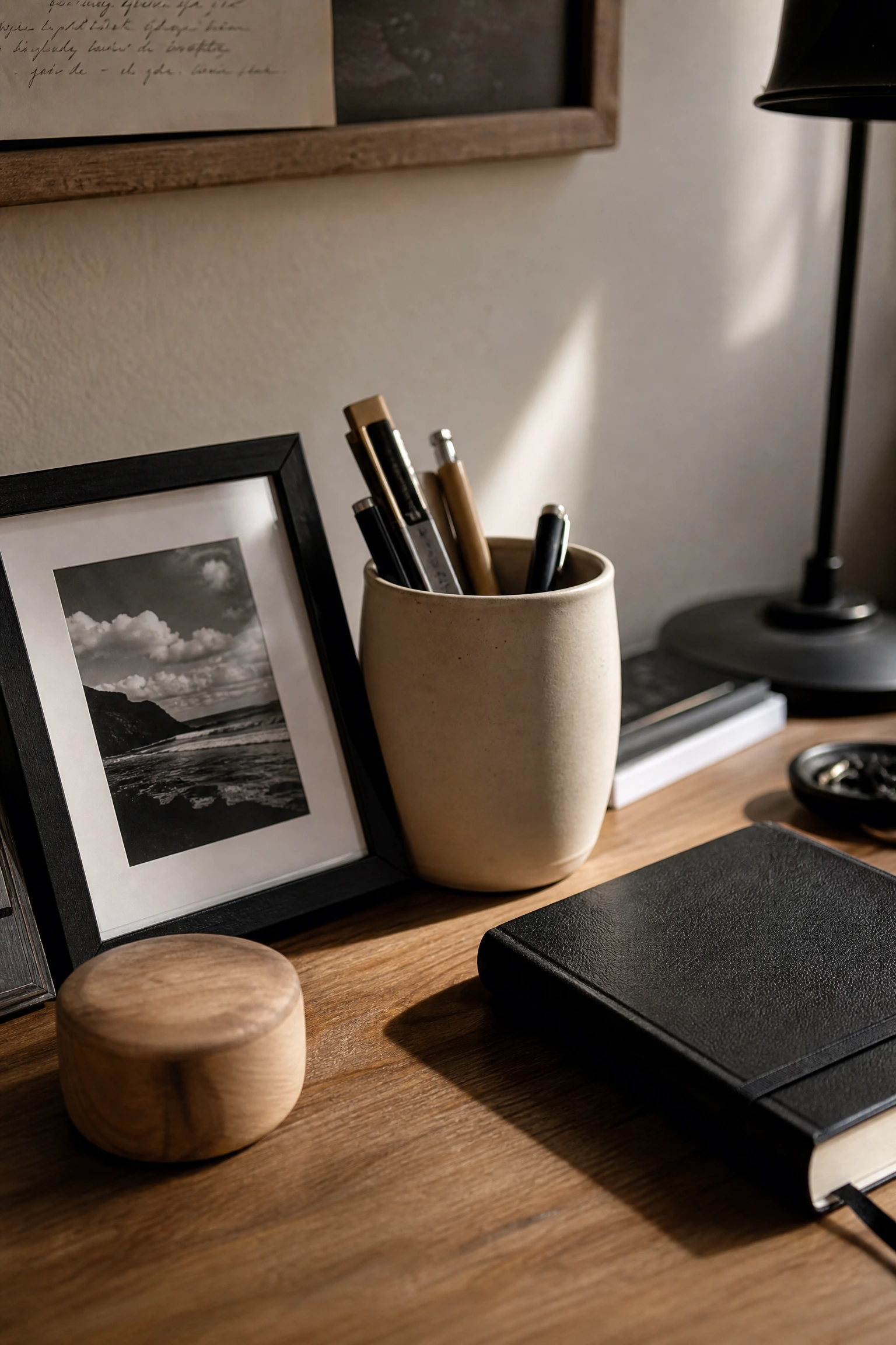
The finishing layer of any well-designed home office is the personal one, and in a beige and black palette, this is where you have the most latitude to express something specific about yourself. The guiding principle is that personal objects should either fit within the existing palette, adding to its depth, or be a single deliberate departure that reads as a choice rather than an afterthought. A small collection of black-and-white photography from travels, a beige or terracotta pot holding pencils, a black leather-bound notebook always open on the desk, or a family heirloom in a warm wood tone all feel at home in this palette. What to avoid is a scattering of bright-coloured items that each pull the eye in a different direction, turning a considered design into visual noise. In practice, the easiest way to personalise a beige and black office without disrupting it is to choose objects that have meaning but also work tonally, because the most personal object in the room is useless as a design element if it makes everything else around it look wrong.
Quick Tip: Rotate personal objects seasonally to keep the space feeling fresh. Swap lighter, creamier accessories in summer for richer, deeper beige and warm black objects in winter.
Bringing It All Together
A beige and black home office is not just a colour scheme. It is a whole approach to designing a workspace that feels calm, considered, and genuinely yours. What makes this palette so enduringly popular among designers and homeowners alike is its flexibility. It works in a sprawling dedicated study just as well as in a compact spare bedroom or a corner of an open-plan living space. It suits minimalist sensibilities and more layered, textured aesthetics equally well. And because beige is such an inherently accommodating colour, it plays nicely with almost any wood tone, metal finish, or secondary material you want to introduce.
The ideas in this article cover everything from the big structural decisions, like a black accent wall behind the desk or tall black bookcases anchoring the room, to the smaller, more affordable updates, like swapping hardware or adding a warm-toned bulb. Not every idea will suit every space or every budget, and that is fine. The best result comes from starting with the principles of contrast, proportion, material layering, and lighting temperature, and letting them guide you toward the specific choices that work for your room. A few of these ideas executed well will do more for your home office than all 24 of them done halfway. Start with what matters most to you, whether that is storage, ambiance, or that one perfect reading chair, and build outward from there.
Frequently Asked Questions
What shade of beige works best with black in a home office?
Warm beige tones with a slight yellow or peachy undertone tend to work better than cooler greige tones, which can look slightly muddy when paired with black. Good options include Accessible Beige by Sherwin-Williams, Pale Oak by Benjamin Moore, and Jute by Benjamin Moore. Always test paint samples in your specific room and check them at different times of day before committing.
Is a beige and black home office too dark for productive work?
Not if you approach the lighting correctly. The key is to keep the beige elements in the majority (around 70 percent) and use warm-toned layered lighting with sufficient brightness for task work. A dark accent wall or black furniture does not make a room feel dark if the overall balance of light, pale tones, and well-placed lighting is managed well.
How do I stop a beige and black office from looking boring or generic?
Texture and material variety are the answer. When both the beige and black elements are flat, smooth, and uniform, the result can read as bland. Introduce variation through materials such as boucle, linen, cane, plaster-effect walls, matte ceramics, and leather, and the same basic palette suddenly has a lot more going on.
Can I use beige and black in a small home office without it feeling claustrophobic?
Yes, as long as you keep the darker elements concentrated rather than scattered. A small office with beige walls, lighter furniture, and black accents through hardware, frames, and light fixtures will feel grounded and polished without feeling heavy. Avoid painting a small room’s four walls black, and use mirrors strategically to bounce light around the space.
What flooring works best in a beige and black home office?
Light to mid-tone wood floors in a warm oak or honey tone are the most versatile choice, as they work naturally with both the beige and black elements. Pale stone-effect tile works well too. Very dark flooring can tip the room toward feeling heavy unless the walls and furniture are particularly light. If you have dark floors already, a large beige or cream area rug will do a lot to balance the visual weight.
How much should I expect to spend to achieve a beige and black home office?
The range is genuinely enormous. You can achieve a cohesive beige and black office for a few hundred dollars by working with what you already have, making small targeted updates like new hardware, a new rug, a can of paint, and a couple of new light fixtures. At the other end, a fully fitted office with custom built-ins, grasscloth wallpaper, and high-end furniture can run into the tens of thousands. Most people land somewhere in the middle, spending around $1,000 to $3,000 for a considered full-room update.