There is a reason so many people keep coming back to beige, black, and white when they are planning a home office. It is not that they cannot think of anything else. It is that this palette does something very specific and very useful: it holds everything together without demanding attention. The beige softens what would otherwise be a stark contrast between black and white, and the result is a workspace that feels both focused and genuinely comfortable to spend time in. That combination is harder to pull off than it sounds, and getting the proportions right makes all the difference.
What follows is not just a list of things to put in a room. Each idea here is organized around a real design tension that comes up when working with this palette, and the solution that actually resolves it. These ideas are meant to give you a clear reason for every choice, not just a look to copy.
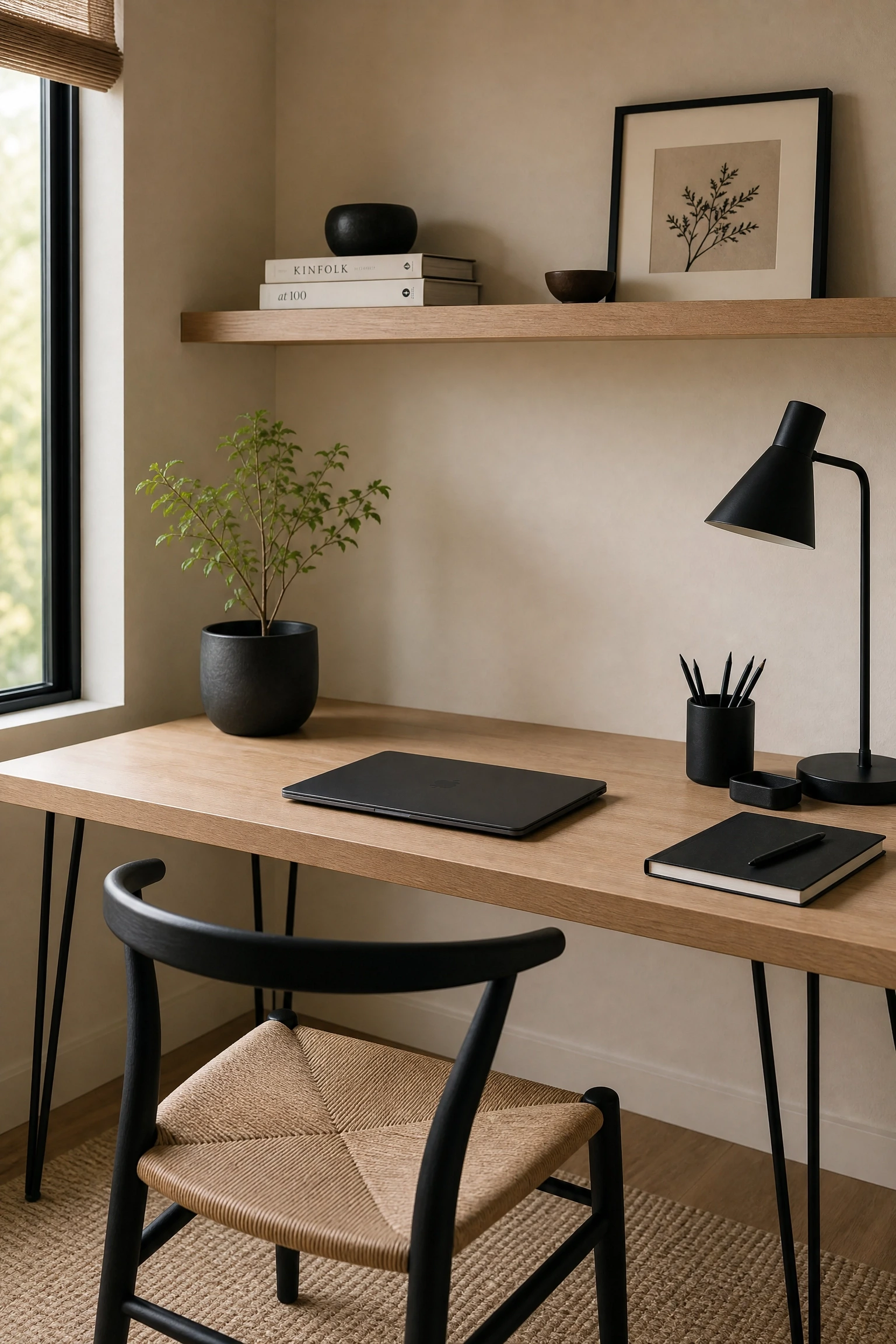
1. Use Beige Walls to Give Black Furniture Room to Breathe
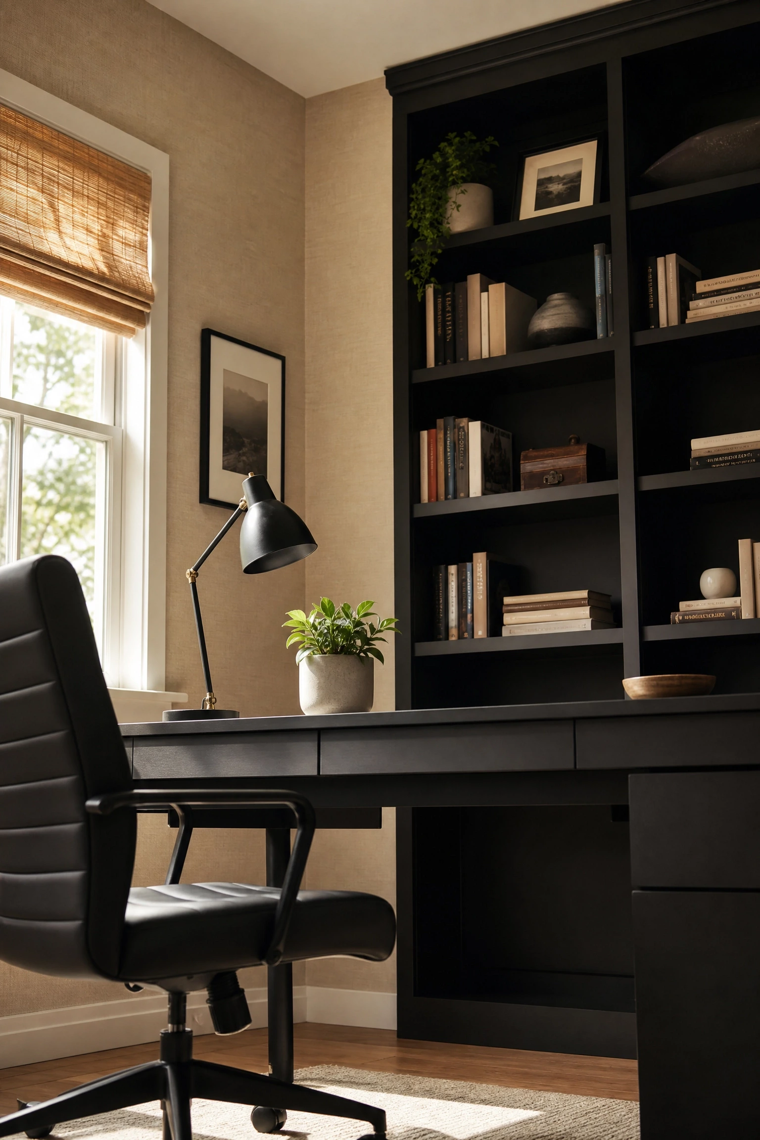
The most common mistake in a black and white office is going too hard on the contrast right out of the gate. Black furniture against white walls creates a visual tension that can feel more like a showroom than a place where you actually want to sit and think for hours. Beige walls solve this directly. When you paint the walls in a warm linen or parchment tone and bring in a matte black desk and shelving, the black reads as grounded and intentional rather than harsh. The warmth in the beige acts as a buffer, pulling the composition together the way a good editor pulls a manuscript together: it takes out the noise so the good parts can land. This works especially well in north-facing rooms that tend to read cool and flat, because the beige compensates for the lack of warm light. Look for beige tones with a slight yellow or greige undertone rather than anything that pulls pink, which can fight with the black. Mid-range option: Benjamin Moore’s Pale Oak or Sherwin-Williams Accessible Beige are both well-tested in this kind of palette.
Pro Move: Test your beige in the actual room at different times of day before committing. A tone that looks soft at noon can look dingy by 4pm in a north-facing space.
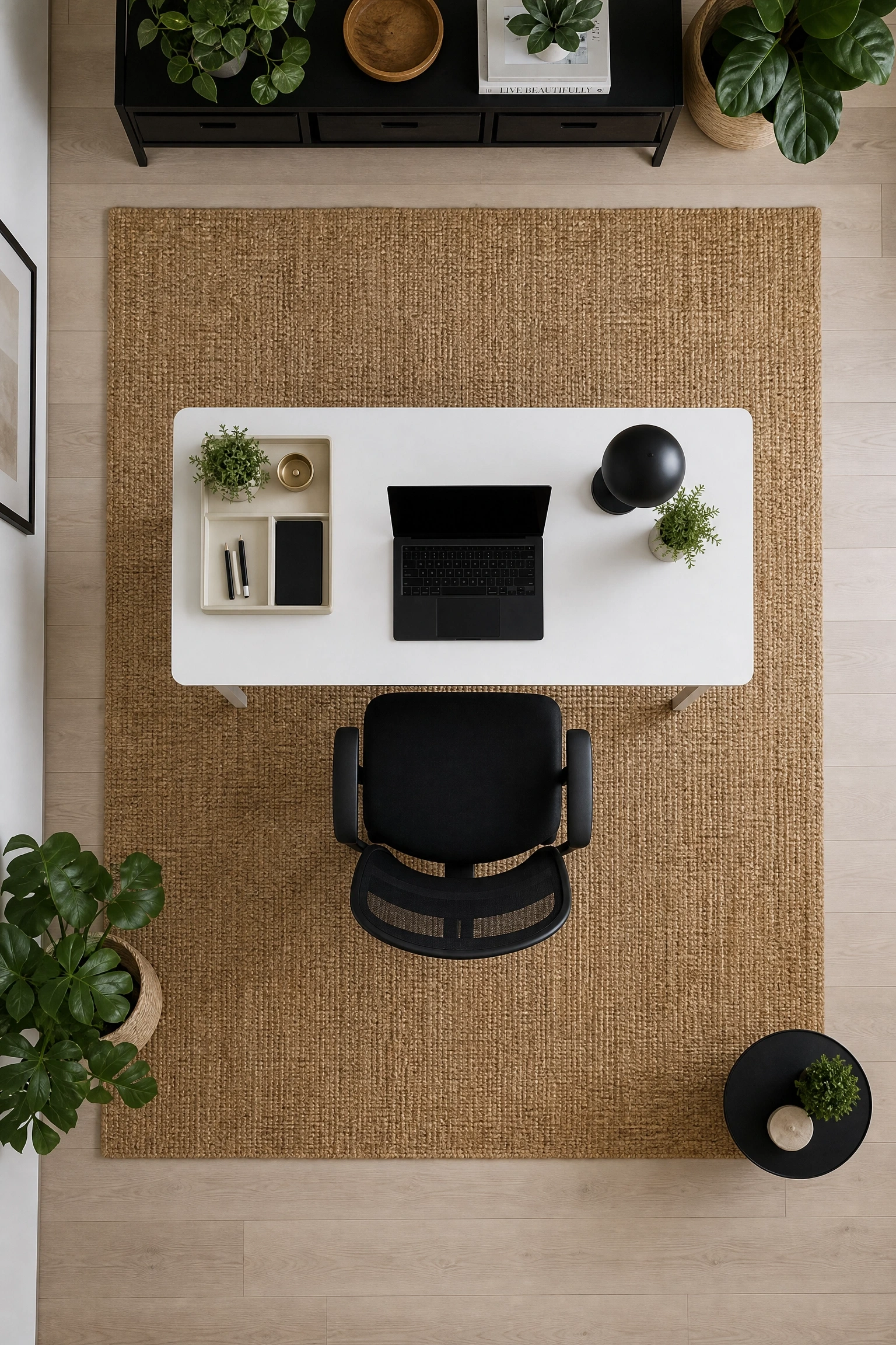
2. Anchor the Room With a White Desk and Let Beige Do the Layering
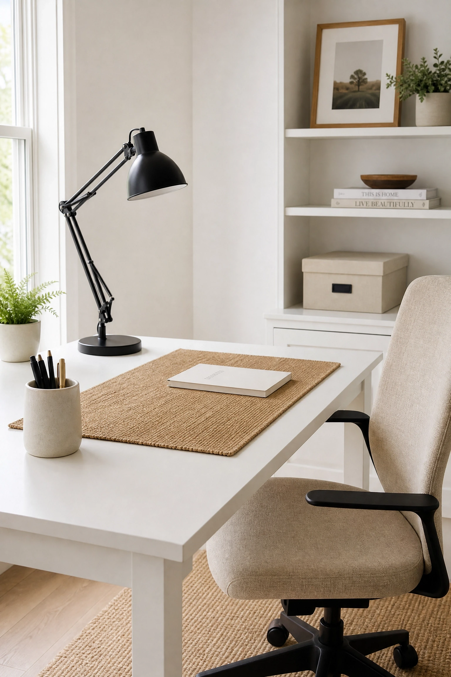
A white desk is one of the best investments you can make in a small home office because it reflects light and keeps the room from feeling closed in, but a white desk against white walls gives you nowhere for the eye to rest. The fix is to let beige carry the layering work around it: a beige linen desk chair, a natural jute or wool rug underneath, cream-colored storage boxes on the shelves. The white desk becomes the clean focal point, the black shows up in the task lamp, monitor stand, and picture frames, and the beige components fill everything in between with texture and warmth. In practice, this setup reads far more polished than a purely monochrome space because it has depth without visual clutter. The key is keeping the beige elements in similar tonal families so the layering feels intentional rather than accidental.
Designer Advice: Stick to natural materials for your beige layers: linen, jute, raw cotton, or light wood. Synthetic beige in the same space often reads as beige-adjacent rather than beige, and the tonal mismatch is more noticeable than you would expect.
3. Solve the Cold Monitor Glow Problem With Warm Beige Textiles
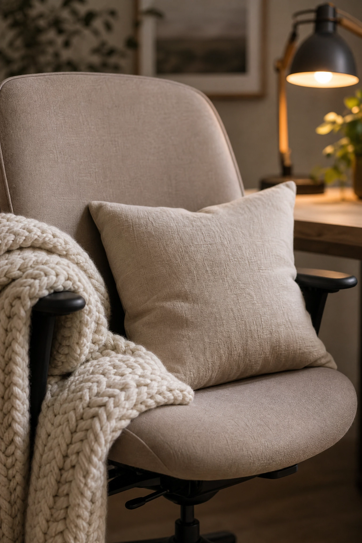
Anyone who has spent a full workday in a high-contrast black and white room knows the eye fatigue that sets in by mid-afternoon. The issue is not just screen brightness. It is the constant visual switching between very dark and very light surfaces in the periphery, which keeps the brain working harder than it needs to. Beige textiles are one of the most practical tools for reducing this: a chunky-knit cream throw over the chair back, a warm wool cushion, a set of linen curtains in oat or sand. These do not just look nice. They introduce a mid-tone buffer in your field of vision that reduces the contrast your eyes are managing. Layered lighting helps too, specifically a warm-toned desk lamp (look for bulbs around 2700K color temperature) paired with ambient overhead light, but the textiles are the faster and cheaper fix.
Heads Up: Cool-white LED bulbs (5000K and above) will flatten out your beige tones and make the palette feel colder than it should. Warm white or soft white bulbs are worth the swap.
Most people go straight to black furniture when they want to add drama to a home office, but black furniture is expensive, heavy-looking, and hard to move around if your layout needs to change. A more flexible approach is to make black the architectural element: black window frames, black door hardware, a black-framed gallery wall, black light switch covers, and black curtain rods. These cost a fraction of replacing furniture and they do something black furniture cannot easily do, which is give the room a sense of structure without adding visual weight at floor level. Pair this architectural black with white walls or white painted built-ins and beige textiles, and the result is a room that feels designed from the ground up rather than assembled from a furniture catalogue.
Quick Tip: Matte black hardware reads more sophisticated in this palette than glossy or satin. The flat finish keeps the black from competing with whatever light source you have in the room.
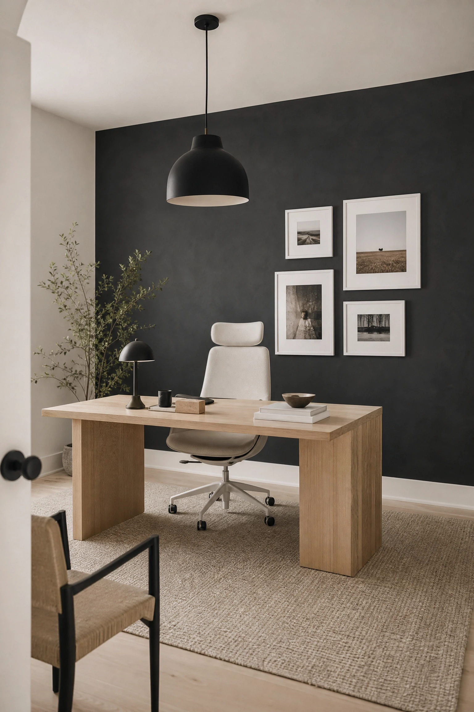
5. Use a Black Accent Wall to Create Focus Without Closing the Room In
A full black accent wall behind the desk does something very specific in a home office: it creates a visual boundary that helps you mentally separate work from the rest of the home. The concern most people have is that it will make the room feel smaller, and that is a legitimate concern in a room under about 120 square feet. In a larger space, though, a matte or limewash black wall behind the desk with white walls on the remaining three sides and beige flooring or a large beige rug actually increases the sense of depth. The wall recedes rather than advances when it is matte rather than satin or gloss, and the warm beige underfoot keeps the space from reading as cold. If a full black wall feels like too much, a black paint-dipped lower third (a color block from floor to wainscot height) delivers the same sense of grounding with considerably less commitment.
Reality Check: Dark accent walls amplify any clutter on or around your desk. If your desk tends to get messy, a bold black backdrop will make that more visible, not less.
Pure black and white palettes tend to read as cool and modern, which is great for focus but can feel sterile over the course of a long workday. Natural wood tones, particularly lighter ones like white oak, ash, or unfinished pine, sit very naturally alongside beige and act as a bridge between the black and white elements. A white oak desk surface on black metal legs is a classic combination in Japandi and Scandinavian design for exactly this reason: the wood introduces warmth and organic texture without disrupting the palette. In a beige-black-white office, the wood can show up in the desk, in open shelving, or even in a simple wooden tray on the desktop, and it will consistently pull the space back toward comfort every time it risks feeling too stark. This is an investment-friendly approach because even a small wooden element, a single floating shelf or a bamboo desk organizer, does the job.
Designer Advice: Avoid very red or orange-toned woods like cherry or teak in this palette. They will fight the beige rather than complement it. Stay in the light, cool-to-neutral wood family.
7. Fix a Choppy Layout by Using a Beige Rug to Define the Work Zone
One of the most common layout problems in a home office is the sense that the desk and chair are just floating in the room with no real connection to the space around them. A large beige or natural fiber rug solves this immediately by defining the work zone as its own territory within the room. The rug creates a visual floor plan that tells the eye where the workspace begins and ends, which is particularly useful in open-plan rooms or multipurpose spaces where the office shares real estate with a guest bed or a reading nook. In a beige-black-white scheme, a rug in oatmeal, warm ivory, or a subtle black-and-cream geometric pattern anchors the desk and chair without pulling the eye away from the wall color or the architectural details. For most standard home office setups, a 5×7 or 6×9 rug is the minimum needed to create a convincing zone. Anything smaller tends to look like a bath mat that got lost.
Quick Tip: Place the front legs of both the desk chair and any additional seating on the rug. Having all four legs off the rug breaks the zone; having all four legs on looks correct.
8. Solve Shelf Styling With the Rule of Three Tones
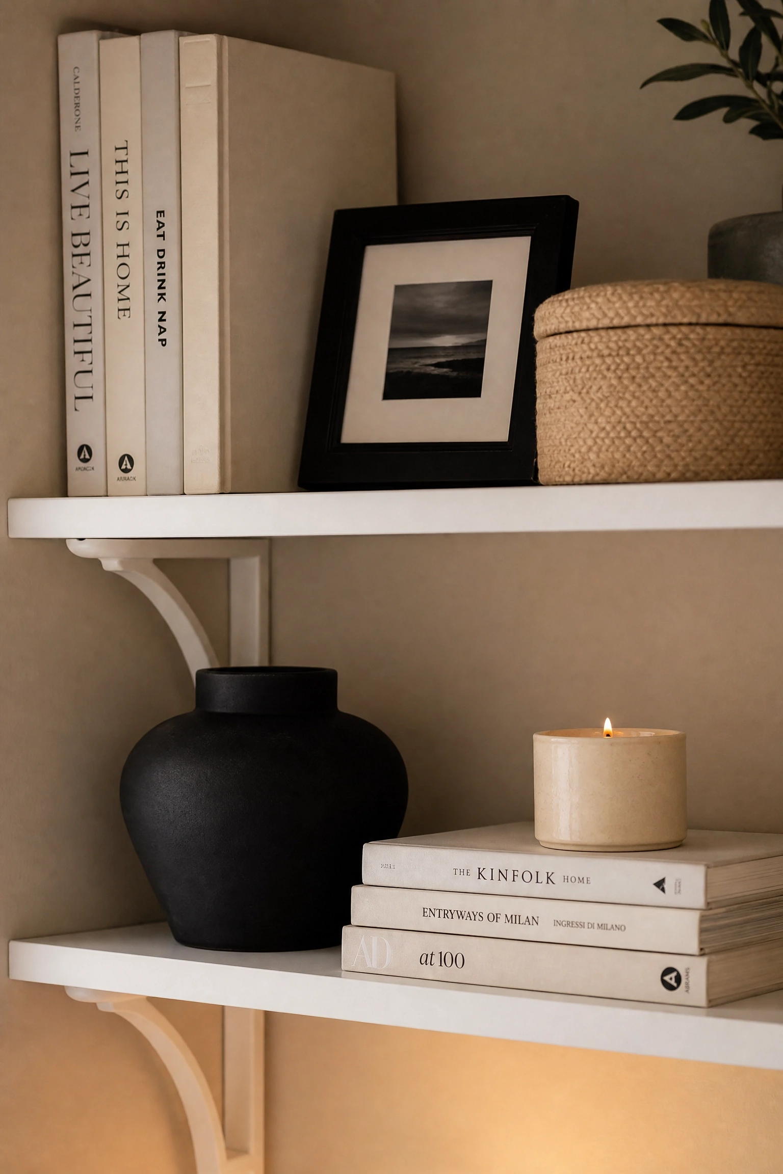
Open shelving in a home office can look either pulled-together or chaotic, and the difference usually comes down to how you organize color on the shelves rather than how many things you put on them. In a beige-black-white office, the rule of three tones applied to shelf styling keeps things coherent: white for books or binders (use book wraps or dust jackets in white or cream), black for frames and object accents, and beige or natural materials for soft elements like woven baskets, ceramic vessels, or wooden bookends. This three-tone discipline means that even a densely packed shelf reads as intentional rather than cluttered because the eye can always find a pattern. It also makes it easier to add or remove items without upsetting the whole composition. Interior designers call this visual rhythm, and it is the same principle that makes a well-laid-out magazine page feel restful even when it is full of content.
Pro Move: Remove or cover book spines that are in colors that clash with your palette. A few rows of backwards-facing books in a white or kraft paper wrap immediately improve the look of any shelf.
9. Bring in Black Through Lighting Fixtures to Add Drama Overhead
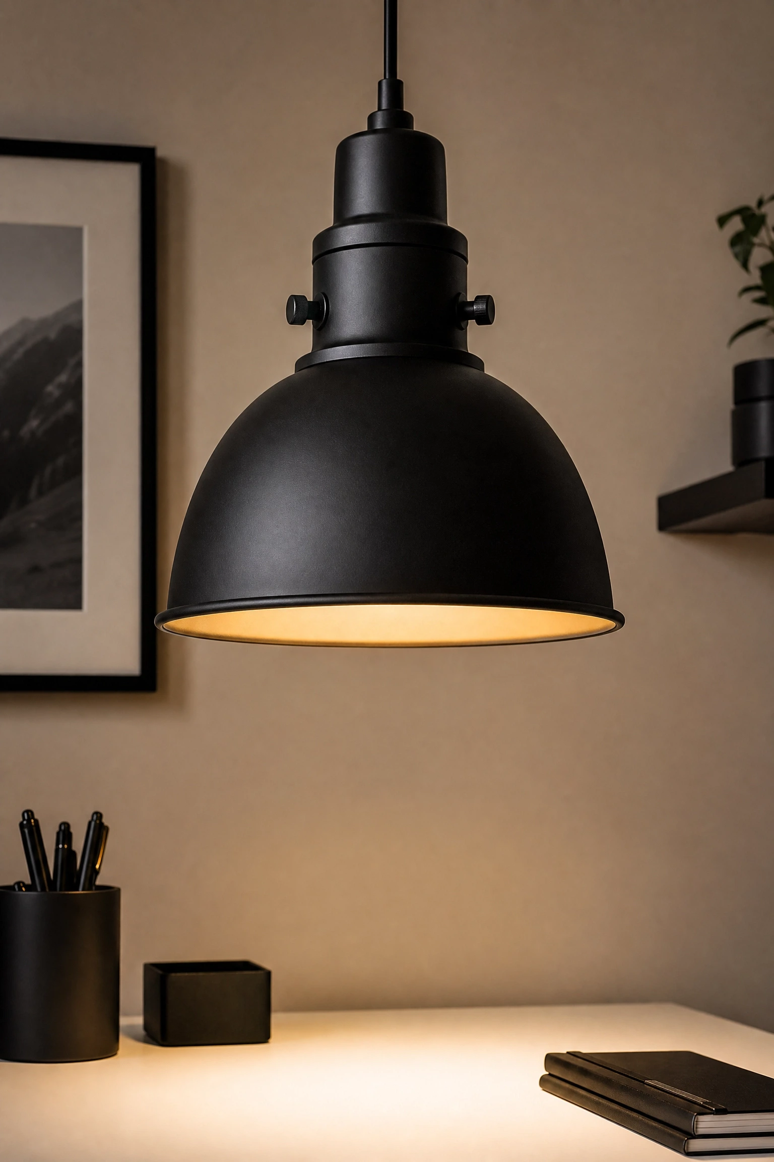
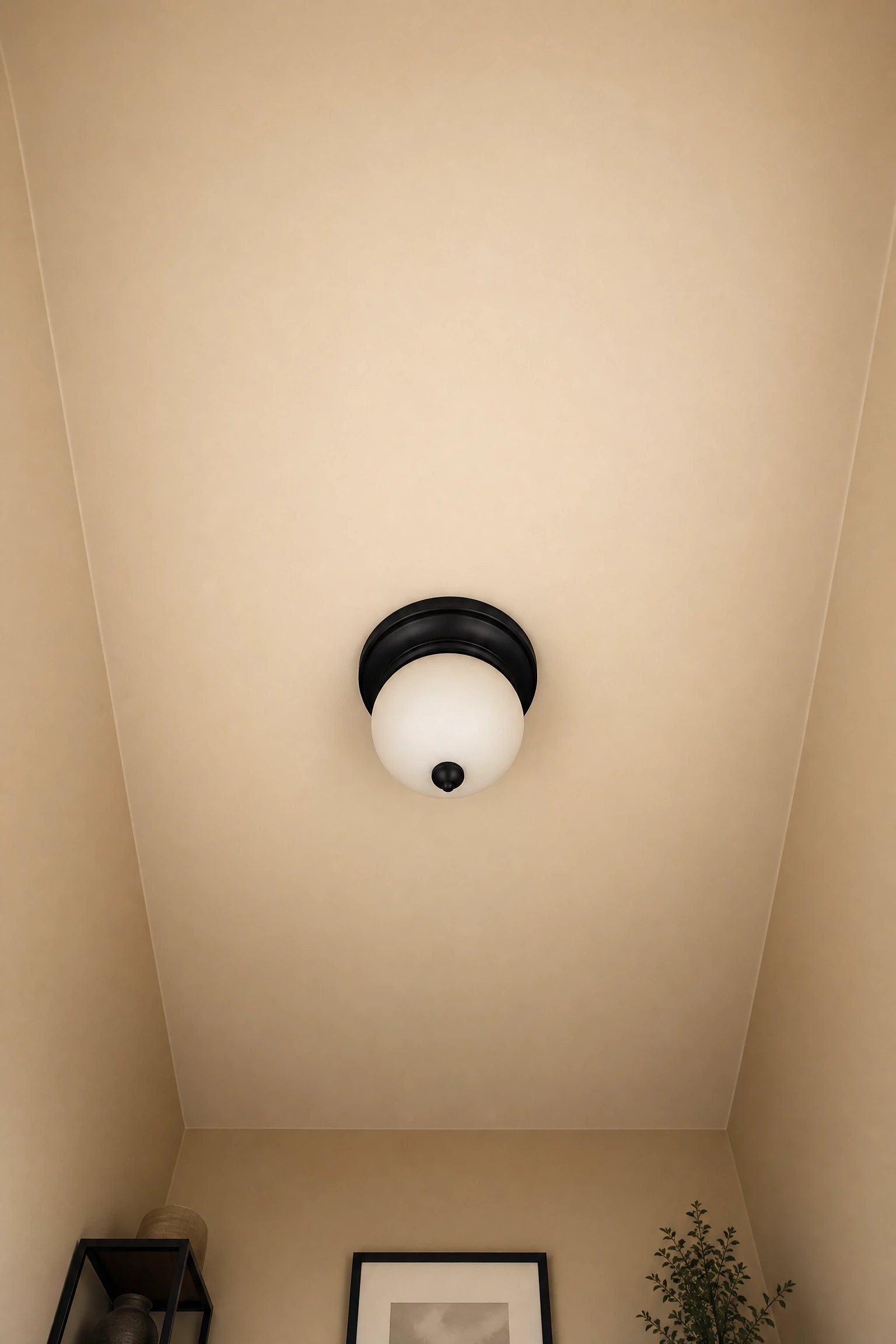
Ceiling and wall lighting is the most underused design element in home offices, and it is also one of the most impactful. A matte black pendant over the desk or a pair of black wall sconces flanking a floating shelf adds visual weight at a level that does not compete with the desk surface or the floor space, which keeps the room feeling open. In a beige-black-white palette, black lighting fixtures also serve a structural function: they pick up the black in the window frames or hardware and carry that thread upward into the room, which makes the palette feel planned across the full volume of the space rather than just at eye level. Budget-friendly options in matte black have become much more widely available in recent years, particularly from brands like Kichler, Globe Electric, and Amazon Basics, so this is no longer a renovation-level investment.
Heads Up: Make sure any pendant or sconce you choose is rated for the wattage of your bulb. Black pendants with tight shades can trap heat if used with high-wattage incandescent bulbs.
10. Use White Built-Ins to Make a Small Office Feel Much Larger
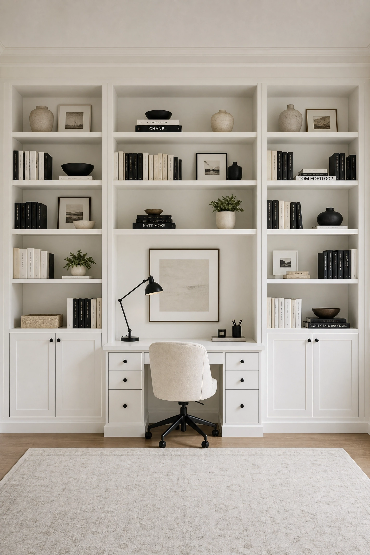
Floor-to-ceiling white built-in shelving and cabinetry is one of those ideas that genuinely changes the perceived size of a room, not just the storage capacity. When the shelving is painted the same white as the walls, it visually expands the room because the eye cannot tell where the architecture ends and the furniture begins. In a beige-black-white home office, this works particularly well when the built-ins frame the desk on either side: the desk becomes the focal point, the built-ins recede, and the black accents on handles, frames, and objects give the whole wall depth and definition without adding bulk. This is admittedly on the higher end of the investment scale if you are going custom, but IKEA’s Billy and Sektion systems, painted white and fitted with black hardware, replicate the effect at a fraction of the cost and are widely used by interior designers working on tighter budgets.
Designer Advice: Use semi-gloss or satin paint on built-ins, not flat. It is easier to wipe clean and reflects light in a way that emphasizes the white and makes the space feel brighter.
11. Solve the Ugly Cable Problem With Beige Cable Management
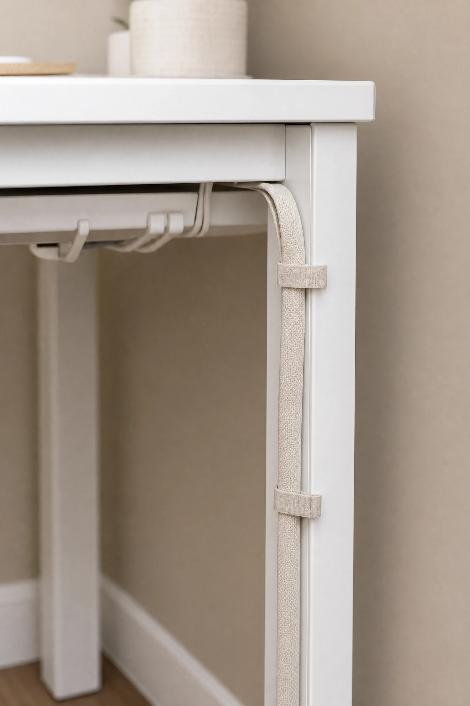
Cables are the thing that consistently undermine an otherwise well-decorated home office, and the reason most cable management looks wrong is that it is done in black or grey against a surface that is a completely different color. In a beige-black-white office, beige or cream cable channels and ties blend into the wall or desk surface far more naturally than black ones do, unless the cables are running along a black surface specifically. Fabric cable covers in linen or cotton are available from a number of home organization brands and do a genuinely good job of making the power situation look less like a problem and more like a deliberate choice. Cable clips in a warm ivory tone can be found for under ten dollars and stick to the back of most desks without damage. It sounds like a small thing, but visible cable management done in the wrong color is one of the fastest ways to undercut a palette you have spent real money and effort building.
Reality Check: No cable management system works unless you commit to putting things back correctly every time. If you are not that person, a closed desk with drawers or a cable box is a more honest solution.
12. Use Black and White Art to Do the Heavy Lifting on Empty Walls
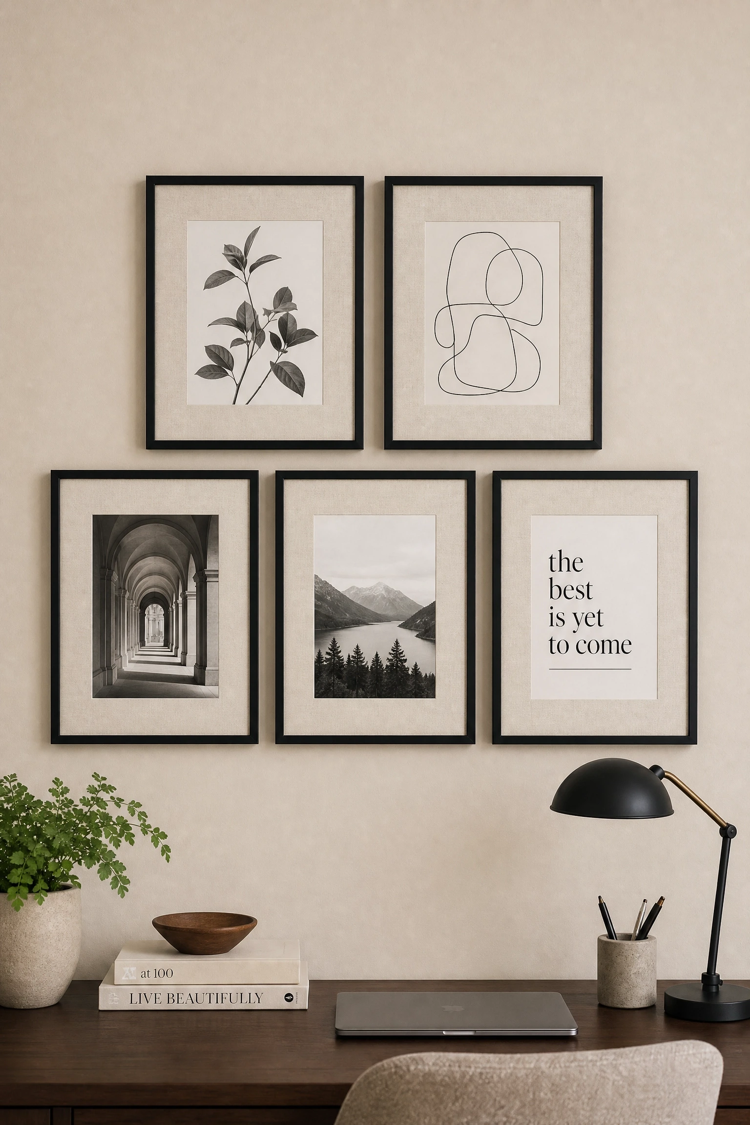
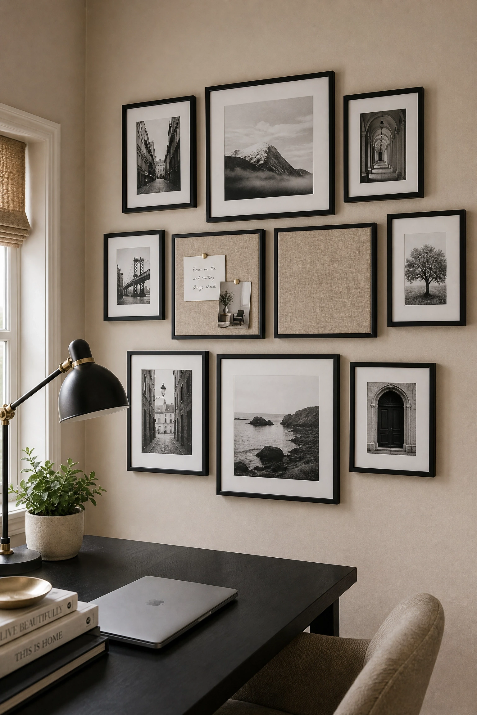
An empty wall in a home office is a missed opportunity, but the wrong art choice can also pull the palette in a direction you did not intend. Black and white photography or line art is the safest and most effective choice for a beige-black-white office because it reinforces the palette without introducing new colors that compete with it. In practice, a gallery wall of three to five black-framed prints in a consistent style, whether that is botanical illustration, architectural photography, or abstract line drawing, does two things at once: it adds visual interest to the wall and it anchors the black from the frames into the composition so the dark elements feel distributed rather than concentrated at one point in the room. Beige linen mattes inside the frames add a layer of warmth and make even inexpensive prints look considered. Printing your own art from sites like Unsplash or Society6 keeps this very affordable.
Quick Tip: Odd numbers of frames always read more naturally on a wall than even numbers. A group of three or five is easier to arrange than two or four.
13. Choose Beige Linen Drapes to Soften the Window and Filter the Light
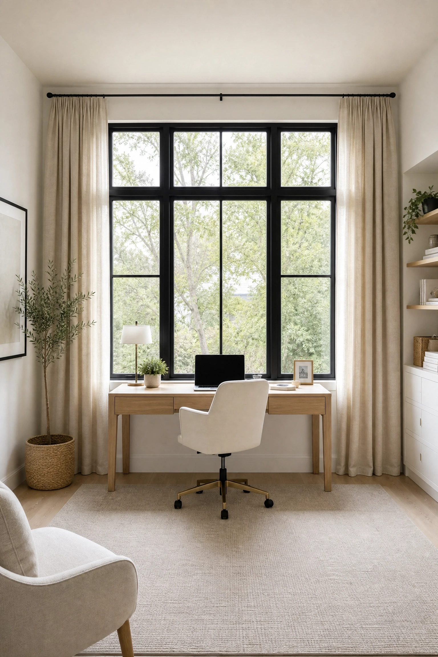
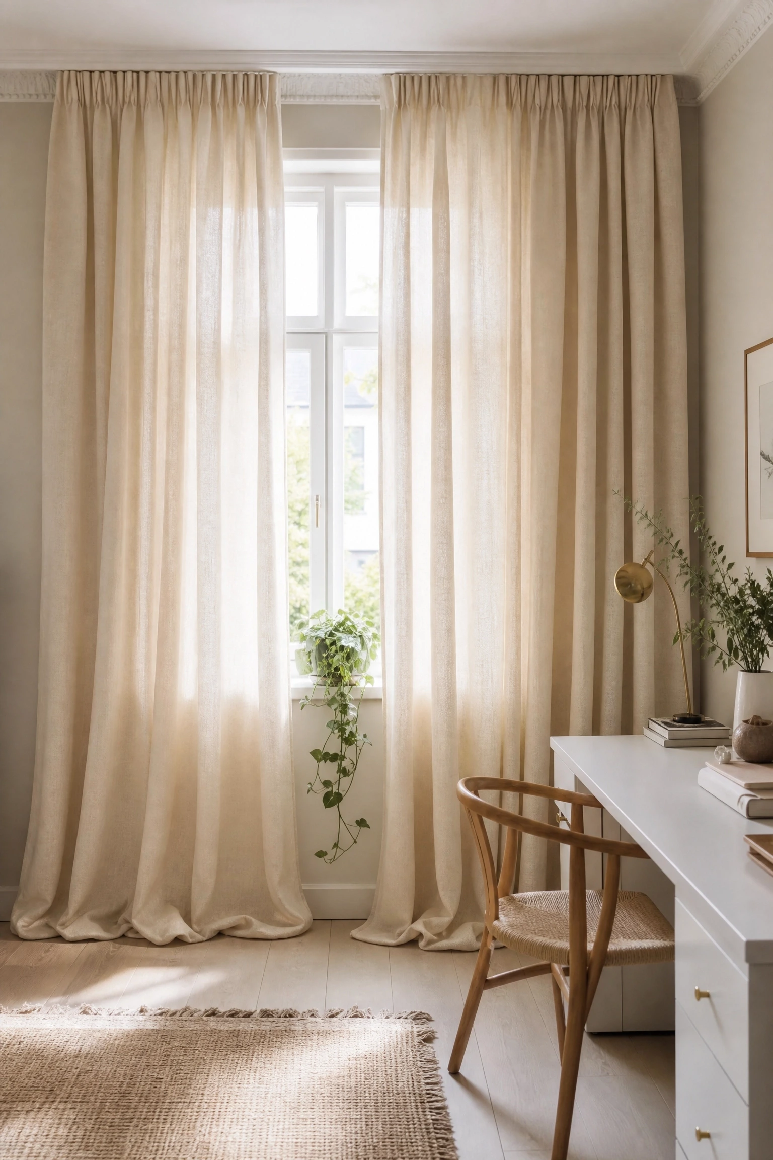
Windows in a home office are a double-edged situation. Natural light is good for energy and focus, but uncontrolled direct light hitting a monitor creates glare that makes it impossible to work. Beige or oat linen drapes handle both sides of this problem better than most other window treatments: they filter without blocking, they add texture to what is usually a flat wall, and they pull the beige from the rest of the room up to the window level so the palette feels consistent across the vertical plane of the space. Linen also has a relaxed structure that makes even a budget curtain panel look intentional, which is not something you can say for polyester. Hang the rod close to the ceiling and let the panels fall to the floor to make the window look taller and the ceiling feel higher. This is a detail that professional designers use constantly and that costs very little extra to execute correctly.
Pro Move: Hang curtain rods four to six inches above the window frame and extend them six to eight inches beyond the frame on each side. The window will look significantly larger without any structural change.
14. Add Depth With a Beige and Black Geometric Rug Pattern
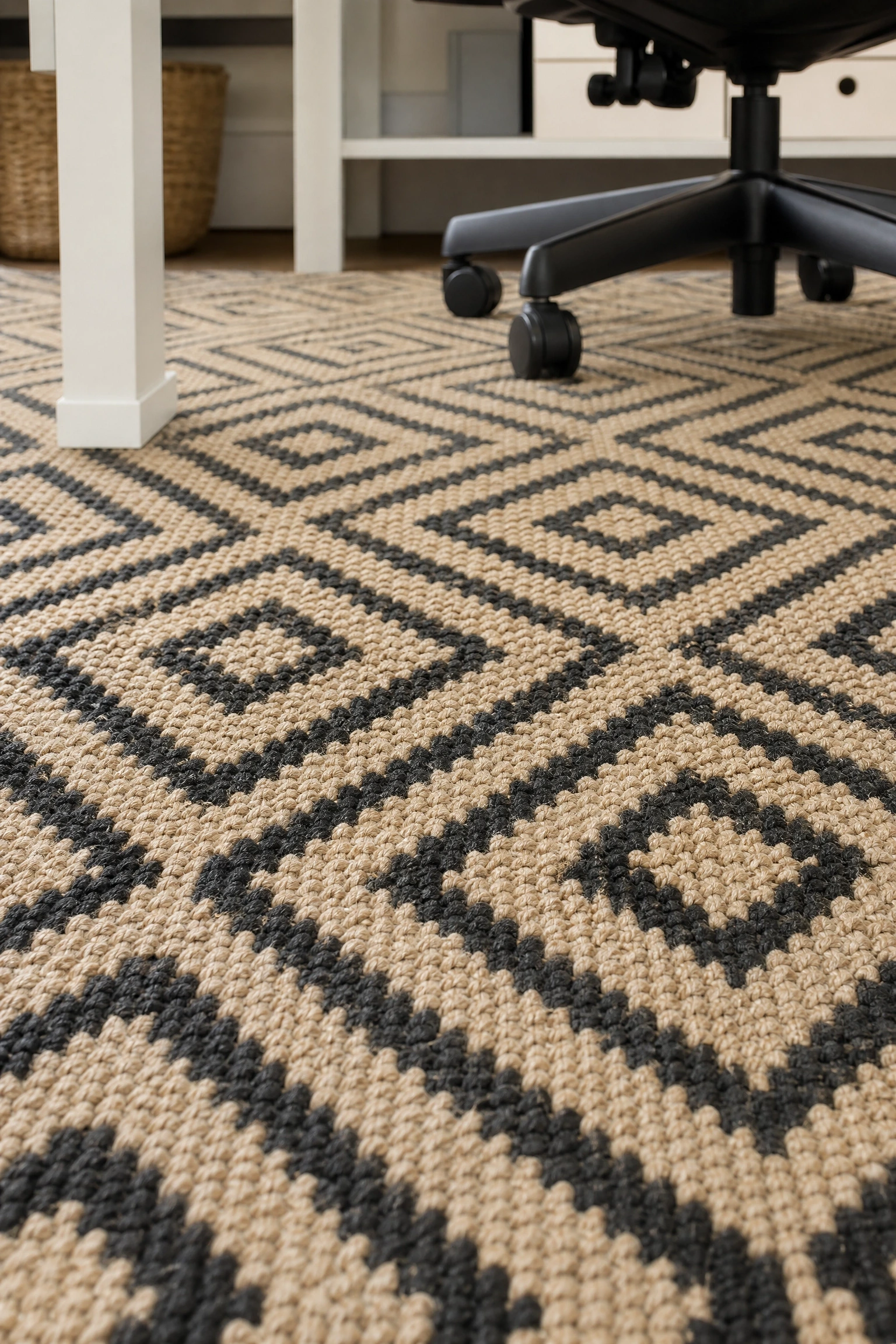
A solid beige rug is a reliable choice, but a rug with a geometric pattern in beige and black does considerably more work in the room. Pattern on the floor introduces depth and visual interest at the base of the space, which frees up the walls and desk surfaces to stay cleaner and less decorated without the room looking sparse. In a beige-black-white office, a small-scale geometric like a diamond repeat, a Greek key border, or a trellis pattern keeps the palette locked while adding the kind of layer that makes a room feel finished rather than just furnished. Wool flatweave rugs in these patterns tend to work better in office settings than pile rugs because they are easier to roll a chair on and more durable under daily foot traffic. High-low pile rugs and shaggy textures look great in photographs but are genuinely frustrating to use with a desk chair.
Heads Up: If you are using a standard office chair with wheels, pair any rug with a clear polycarbonate chair mat. Without one, the wheels will damage the rug and the chair will be harder to move.
15. Create a Reading or Thinking Corner With a Black Accent Chair and Beige Throw
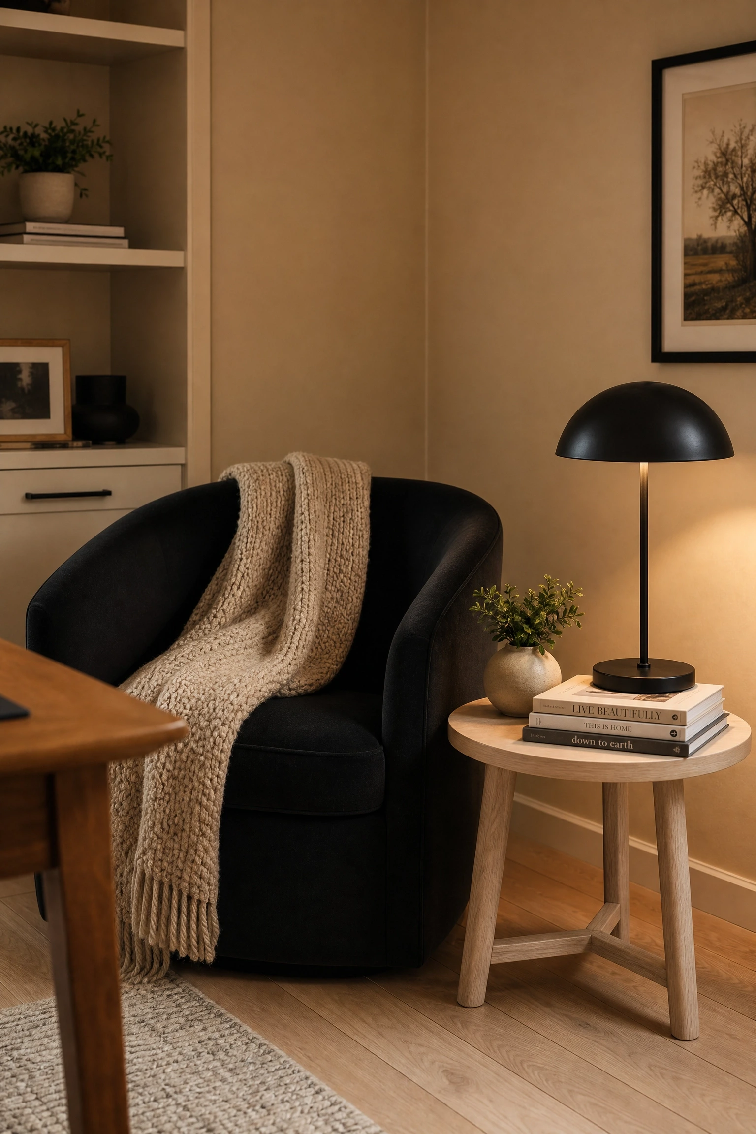
Not every moment of work happens at a desk, and having a separate chair in the office for reading, thinking, or video calls changes how the space feels and functions in a meaningful way. A black accent chair, whether that is a mid-century modern armchair, a bouclé slipper chair in charcoal, or a simple black leather reading chair, creates a clear second zone in the room that the desk area does not have to carry alone. Drape a beige or cream chunky-knit throw over the back and add a small side table in natural wood or white, and this corner becomes the most visually warm and inviting part of an otherwise structured palette. It also photographs well if you ever want to use the space as a backdrop for video calls or content creation. This idea works best in rooms that are at least 120 square feet so the chair does not crowd the desk zone.
Designer Advice: The accent chair does not need to match the desk chair in style. In fact, a slight style contrast between the two, pairing a modern task chair with a more traditional reading chair, adds the kind of visual tension that makes a room look intentional rather than matched.
16. Use White Pegboards or Grid Panels to Keep the Wall Functional and Clean
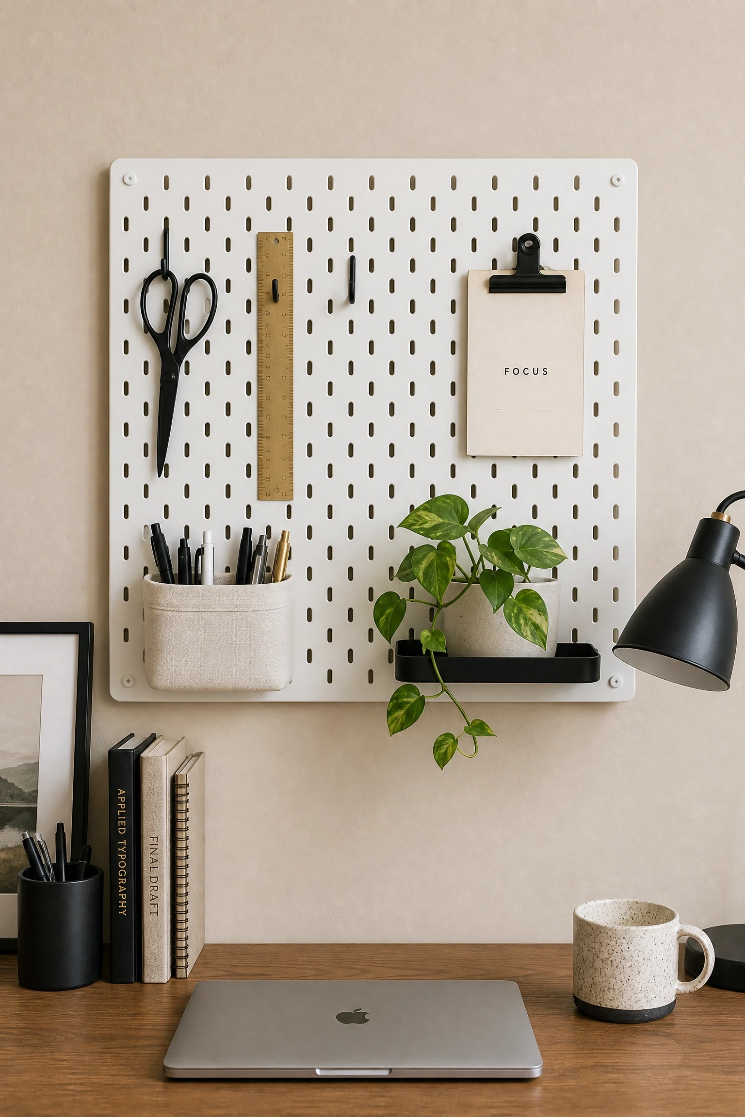
Pegboards have been a fixture in studios and workshops for decades, and the reason they have found their way into home office design is simple: they keep frequently used items at arm’s reach without requiring a drawer or a surface. In a beige-black-white office, a white pegboard or a white powder-coated grid panel mounted above the desk keeps the palette clean while adding a layer of organization that a shelf cannot match. The key is in the accessories: black pegboard hooks and holders reinforce the black in the palette, and small beige linen baskets or cream ceramic cups for pens and scissors bring in warmth at close range where you spend most of your visual attention. This setup is particularly effective in small offices where every inch of wall space needs to earn its place.
Quick Tip: Arrange pegboard accessories by function in zones, writing tools in one area, tech accessories in another, so the board looks structured rather than randomly hung.
17. Bring Beige in Through the Ceiling for a Cohesive, Enveloping Feel
Most home office ceilings are painted standard white and left alone, which is fine but also a missed opportunity. Painting the ceiling in a very soft beige, one shade lighter than the wall color, does something that is hard to describe until you see it in person: it makes the room feel wrapped and complete rather than open-topped and unfinished. This works particularly well in lower-ceilinged spaces where a stark white ceiling can feel too bright against darker walls. In a beige-black-white office with beige walls, matching the ceiling to a slightly lighter version of the wall beige removes the hard line where wall meets ceiling and makes the room feel taller and more cohesive. It is a half-day painting project that costs nothing extra and consistently reads as more sophisticated than the default.
Reality Check: This technique works best when the ceiling beige is lighter than the walls, not darker. A ceiling darker than the walls will lower the perceived ceiling height and make the room feel compressed.
18. Use a Monochrome Gallery Wall as a Functional Pinboard Alternative
Pinboards and whiteboards are practical but they are also the fastest way to make a home office look temporary and unfinished. a collected monochrome gallery wall of art, prints, and framed mood images serves the same psychological function of keeping ideas and inspiration visible, but it does so in a way that is deliberately decorative. In a beige-black-white office, rotating prints in and out of frames as your projects and priorities change keeps the wall dynamic without requiring a complete redecoration. Black frames with white or beige mattes in a consistent size (all 8×10 or all 5×7) give you a system that is endlessly flexible. Some designers add one or two cork or linen pinboard squares within the gallery arrangement so practical notes can coexist with the intentional pieces without the whole wall reverting to the visual chaos of a traditional office pinboard.
Pro Move: Plan your gallery wall on the floor before hanging anything. Arrange the frames on a paper template traced onto kraft paper, then transfer the template to the wall for perfect placement.
Putting It All Together
A beige, black, and white home office works best when you stop thinking of the three colors as separate decisions and start thinking of them as a system. Beige handles warmth and softness. Black delivers structure and definition. White reflects light and keeps the space open. When each element is doing its specific job, the room holds together without effort.
The ideas in this article are designed to be mixed and matched rather than used all at once. Start with the elements that solve the most pressing problem in your current space, whether that is too much contrast, a lack of warmth, a cluttered shelf, or a desk that floats without anchor. Get those right first, then layer in the more decorative choices like the gallery wall or the accent chair. The best version of this palette is not the one that has the most ideas from this list; it is the one that feels like it was designed specifically for the person working in it.
Budget-wise, the most impactful changes here are almost all low-cost: new paint, beige linen curtains, a reorganized shelf, a warm-toned bulb swap, and a rug that actually fits the desk zone. The high-investment pieces, built-ins, custom millwork, a statement pendant, come later and land much better once the foundational palette decisions are already working.
Frequently Asked Questions
What shade of beige works best in a black and white home office?
Warm beige tones with a slight yellow or greige undertone tend to work best. Look for shades like Accessible Beige by Sherwin-Williams, Pale Oak by Benjamin Moore, or Linen White by Benjamin Moore. Avoid beiges that pull pink or lavender, as these can clash with the stark contrast of black and white elements. Always test your sample in the actual room at multiple times of day before committing.
How do I keep a beige, black, and white office from looking boring?
Texture is the answer. When your palette is limited to three tones, texture is what creates visual interest. Layer in linen cushions, a jute or wool rug, woven baskets, ceramic vessels, and raw wood surfaces. These introduce variety without introducing new colors. Pattern helps too, specifically a geometric rug or graphic art prints, because pattern adds movement that a flat monochrome palette cannot provide on its own.
Can a beige, black, and white office work in a small space?
Yes, and it often works better in small spaces than bolder palettes do. The key is to keep the walls and larger surfaces in white or very light beige so the room reflects as much light as possible. Save the black for small, specific elements like hardware, frames, and light fixtures. Avoid large black furniture in a very small room because it will reduce the perceived space significantly.
What kind of lighting works best in this palette?
Layered lighting is ideal. That means combining an overhead ambient source, a task lamp on the desk, and some form of accent lighting such as a shelf light or wall sconce. Choose bulbs in the 2700K to 3000K color temperature range for a warm white light that enhances the beige tones. Cool white or daylight bulbs above 4000K will flatten the beige and push the palette toward grey.
What flooring works best in a beige, black, and white office?
Light hardwood floors in a natural or blonde tone are ideal because they reinforce the warmth of the beige without adding a competing color. If your flooring is already a mid-tone or darker wood, a large beige or oatmeal area rug will bring the palette down to the floor level effectively. Avoid very dark flooring paired with a black accent wall, as this combination can make the room feel heavy.
Is this palette appropriate for a creative or design-focused workspace?
Absolutely, and it is actually a favourite among graphic designers and art directors for a specific reason: the neutral palette means nothing in the room competes with the work on the screen. When your environment is beige, black, and white, your monitor becomes the most colourful thing in the room by default, which is genuinely useful if you are making color-sensitive decisions for work. The space also photographs cleanly, which matters if you share your workspace online or use it as a backdrop for content.