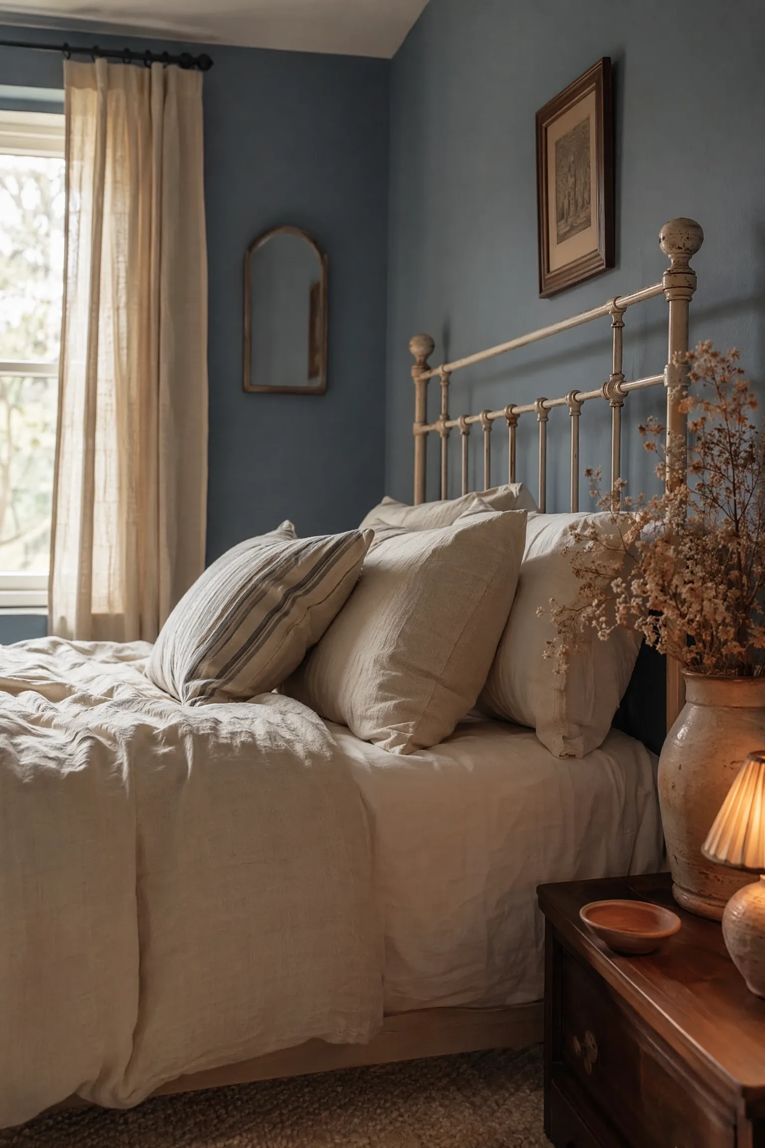
There is something about blue that just works in a bedroom. It is one of those rare colors that can feel completely different depending on how you use it: moody and dramatic in deep navy, breezy and light in powder blue, or quietly sophisticated in dusty slate. In practice, the reason blue keeps showing up in professionally decorated bedrooms is simple. It lowers the visual temperature of a room, which helps the brain settle down after a long day. Working with blue gives you more creative range than almost any other color.
The ideas here cover everything from full room overhauls to small, affordable changes that shift the whole mood of a space. They are organized by style category so you can skip straight to the look that matches your taste. Each one covers the colors, furniture, lighting, textures, and specific details that actually make the look work, not just in theory but in a real room where someone actually sleeps. Take what applies to your space and leave the rest.
Soft and Serene: Light Blue Bedrooms That Calm the Mind
1. Powder Blue Walls With Warm White Linen Bedding
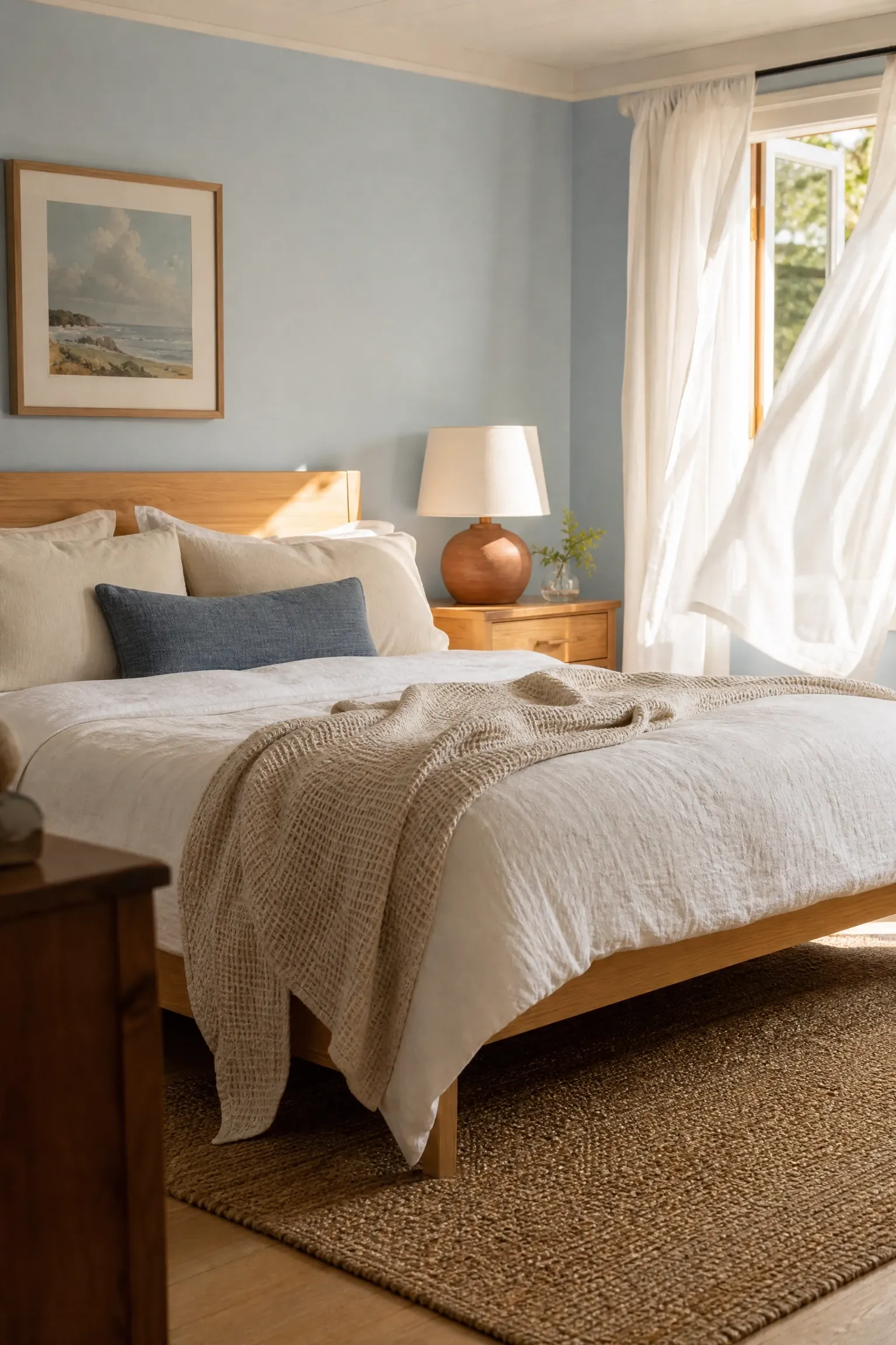
Powder blue walls sit right at the edge of blue and grey, which makes them incredibly easy to furnish without overthinking the palette. Pair them with warm white linen bedding rather than bright white, because warm white has just enough cream in it to keep the room from feeling clinical. A natural oak bed frame or blonde wood nightstands add warmth at floor level, which grounds the lightness of the walls. For lighting, choose bulbs in the 2700K range so the evening glow leans amber rather than cool, which plays beautifully against the blue. Layer the bed with a textured waffle-weave throw in oatmeal or sand and add a jute rug underneath to bring in some earthiness. This combination works especially well in north-facing rooms where natural light is limited, because powder blue reflects what light there is without making the room feel cold.
Designer Note: If the room feels too flat after painting, add one piece in a terracotta or warm rust tone, such as a ceramic lamp base or a small throw pillow. It creates just enough contrast to make the blue read as intentional rather than default.
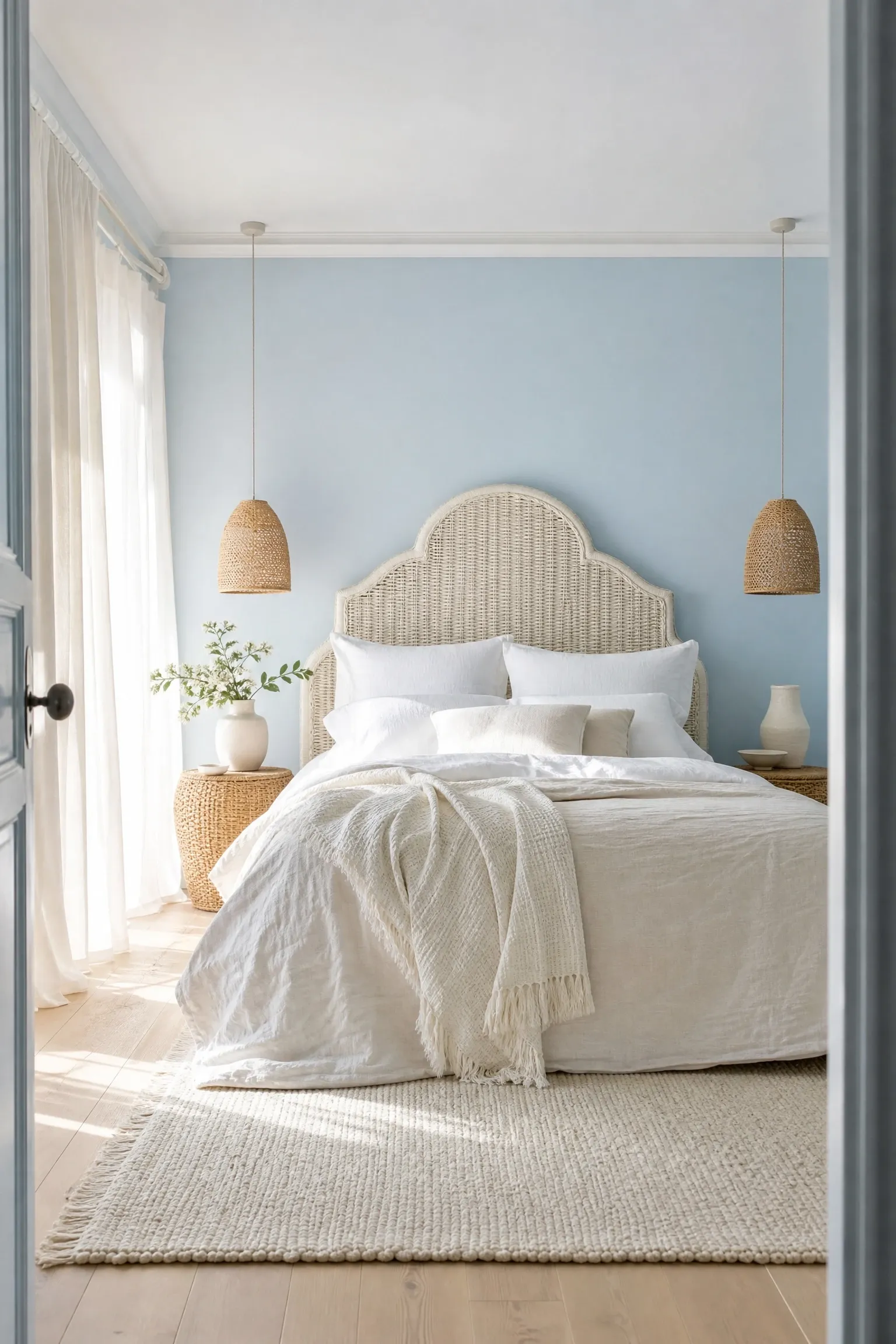
Sky blue is a touch brighter and more saturated than powder blue, and it pairs naturally with cream and natural materials for a look that feels like a relaxed coastal cottage without going full nautical. A cream-painted rattan or cane headboard is one of the best investments for this style because it adds organic texture while keeping the visual weight low, which matters a lot in smaller bedrooms. Keep the walls in sky blue and use cream for the bedding, curtains, and trim to build the layered tonal effect. A simple pendant light with a rattan shade above each nightstand adds warmth and ties the natural materials together. One thing that works really well here is keeping the floor pale, either with a whitewashed wood floor or a cream wool rug, so the eye moves freely around the room. This setup is genuinely budget-friendly since rattan furniture is widely available and far less expensive than upholstered alternatives.
Designer Note: Avoid going too white with the accents. Stark white against sky blue looks unfinished. Cream, linen, and warm ivory will always look more considered.
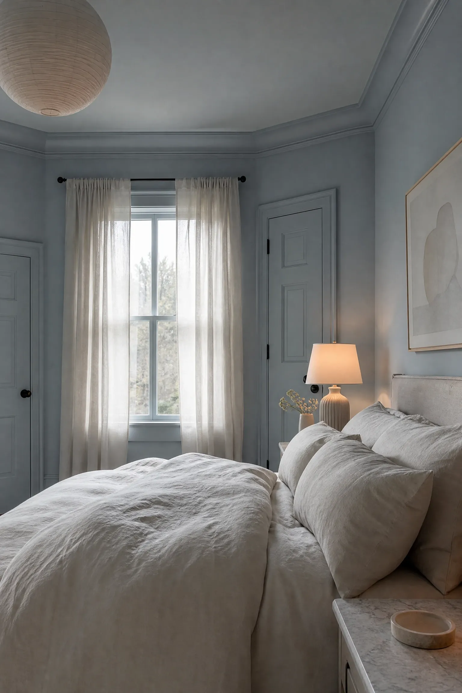
Color drenching, which means painting the walls, trim, ceiling, and even doors in the same or very similar shade, has been one of the most talked-about techniques among professional designers over the last couple of years, and pale blue is genuinely one of the best colors for it. The trick is to use two or three slightly different values of the same pale blue rather than one flat shade on every surface. Paint the walls one shade, the trim a slightly lighter version, and the ceiling the lightest of the three. This creates subtle dimension without breaking the envelope of color. Furnish the room with pieces in natural linen, stone, and bleached wood to keep the palette grounded. This approach works particularly well in bedrooms with good natural light, and it does require careful color matching, so it is worth spending time on paint samples before committing.
Designer Note: Farrow and Ball’s Lulworth Blue and Borrowed Light are two shades that work beautifully together for a tonal drench. They sit in the same family but have enough difference in value to create depth.
4. Dusty Blue Japandi Bedroom With Wabi-Sabi Accents
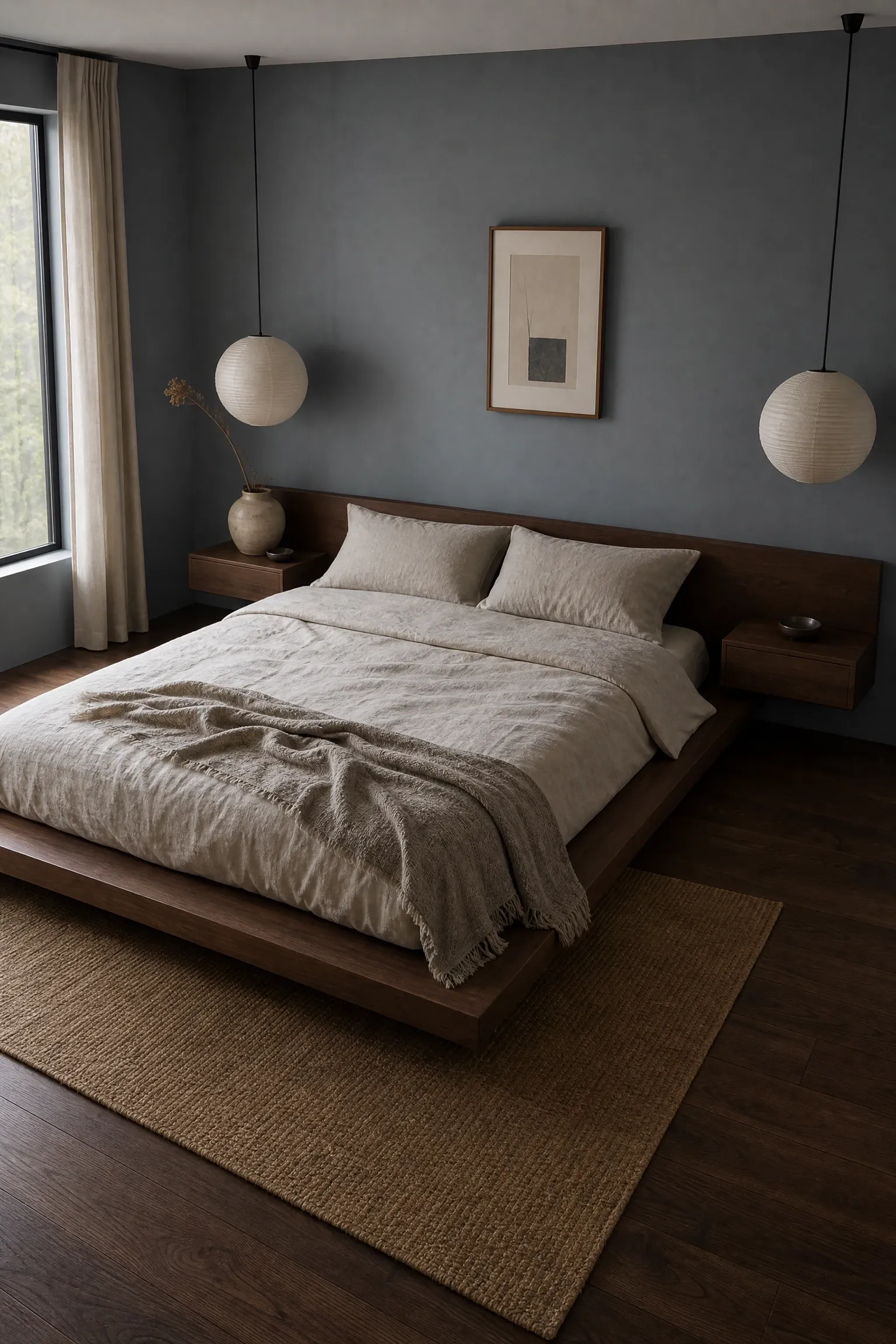
Japandi is the blend of Japanese minimalism and Scandinavian simplicity, and dusty blue is a near-perfect fit for its restrained, contemplative palette. The key to pulling off Japandi with blue is choosing a shade that has grey and muted ash undertones rather than anything bright or clear. Think of it as blue seen through fog. Keep the furniture low to the ground: a platform bed in dark walnut or matte black, minimal floating nightstands, and absolutely no unnecessary ornamentation. Wabi-sabi principles mean that handmade imperfection is welcome here, so a hand-thrown ceramic vase, a linen duvet with visible texture, and a rough-edged stone tray on the nightstand all add character in exactly the right way. Lighting should be warm and indirect, with paper or linen lampshades that diffuse rather than direct the light. This look tends to be mid-range in cost because quality minimal furniture is not cheap, but it is built to last.
Designer Note: Resist the urge to add decorative accessories. In Japandi, negative space is part of the design. A room that feels slightly underfurnished is usually closer to the mark than one that feels complete.
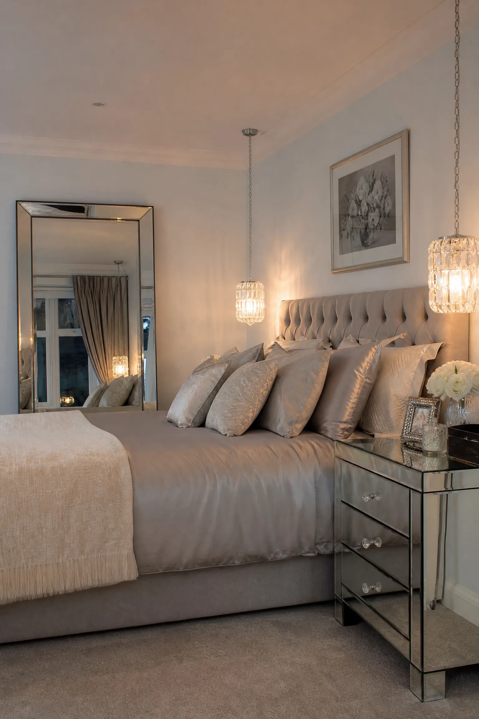
This combination reads elegant and slightly Art Deco in the best way. Icy blue, which is a very pale blue with a slight grey-silver undertone, pairs beautifully with brushed silver hardware, mirrored furniture, and glass accessories. A mirrored bedside table reflects the cool tones back into the room and makes a smaller space feel significantly larger because of the way it bounces light. Keep the bedding in silver-grey silk or a high-thread-count cotton sateen to maintain the cool, polished feel. Hang a large framed mirror above the headboard or use a full-length mirror leaned against one wall to add depth. Crystal or glass pendant lights at each side of the bed add a fine, sparkly quality that fits the palette without feeling over the top. This is one of the more investment-level looks on this list, largely because quality mirrored furniture and good bedding are not cheap.
Designer Note: Add one warm element, such as a cream throw or a small brass detail, to prevent the room from feeling like a hotel lobby. The contrast keeps the look personal rather than sterile.
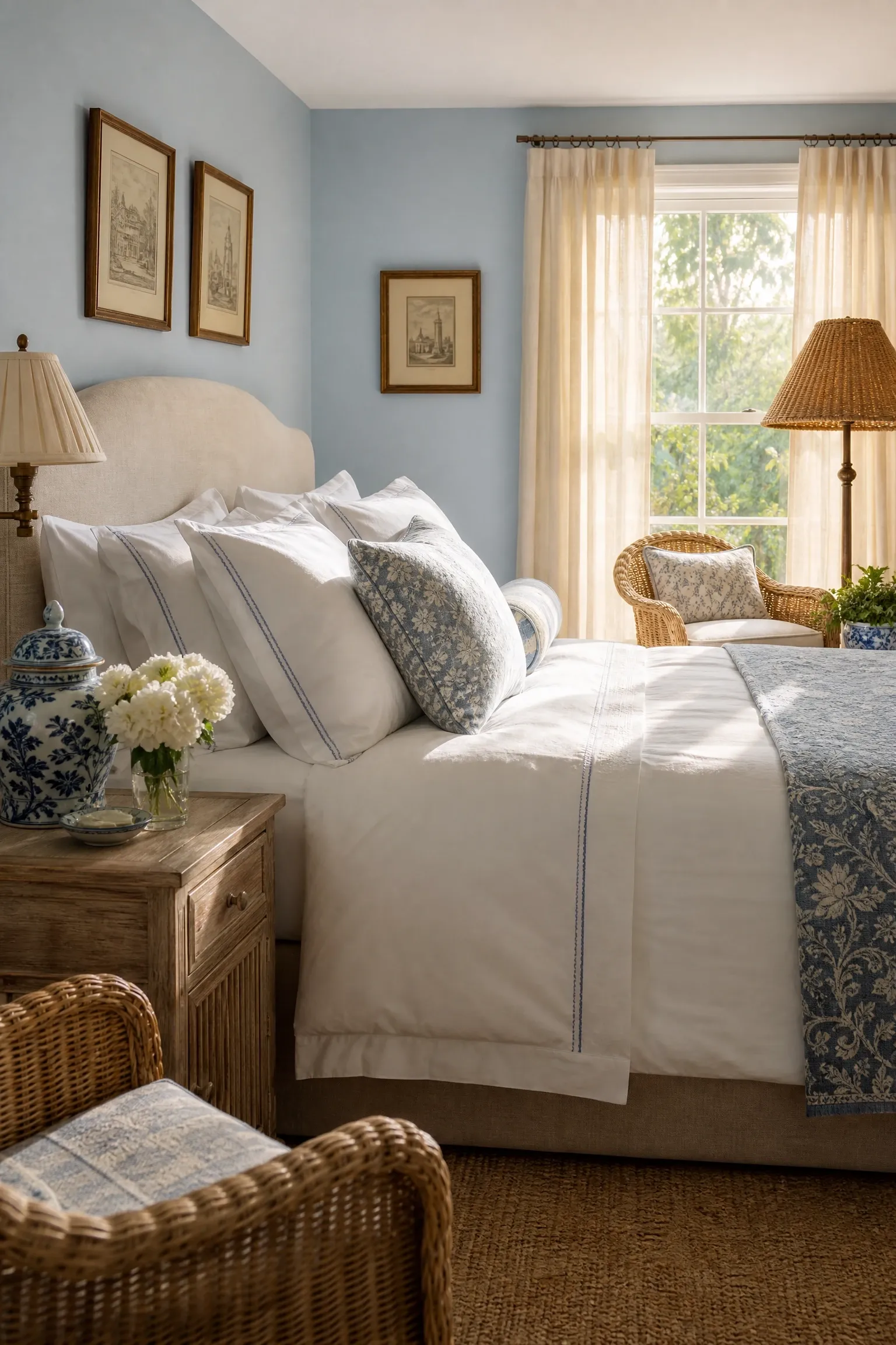
Coastal grandmother style has moved from a social media trend into something that genuinely holds up as a decorating approach, and the bedroom is where it shines most. The foundation is simple: crisp white bedding layered generously, pale blue walls, and a mix of collected, meaningful objects rather than matching sets. Blue and white ginger jars on the nightstand are the signature accessory of this style, and they work because they bring in pattern and height without cluttering the space. Wicker or rattan furniture, light-filtering linen curtains, and subtle nautical touches like a rope-wrapped mirror or a small driftwood sculpture all feel right at home. The palette tends to be blue, white, cream, and sandy beige with nothing too bold or modern. This is a comfortable, accessible style to achieve at various price points because much of the character comes from collected and vintage pieces rather than expensive new furniture.
Designer Note: Shop antique markets for the ginger jars and accessories. Genuinely old pieces carry more visual character than reproductions and are often cheaper.
7. Modern Coastal With Cerulean Blue and Bleached Wood
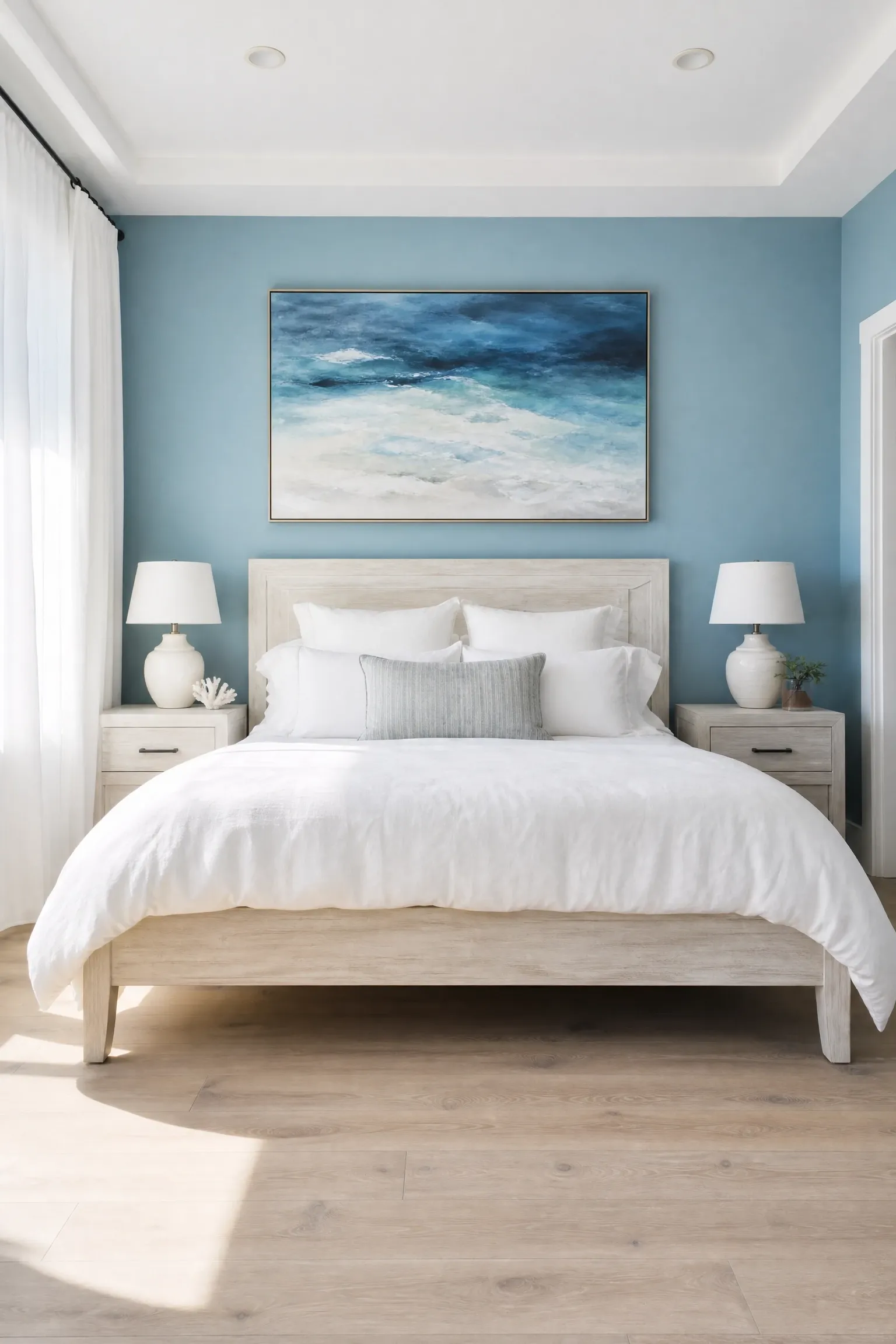
Modern coastal is the cleaner, more contemporary version of the classic beach house look. It drops the collected-cottage aesthetic in favor of sharp, deliberate design choices, and cerulean blue is the color that drives it. Cerulean sits between sky blue and cobalt, bright enough to feel energetic but blue enough to stay relaxed. Pair it with bleached or whitewashed oak furniture for the main pieces, since the washed finish ties back to seaside driftwood without being literal about it. Keep accessories minimal: a linen duvet in white or soft ivory, simple ceramic lamps in off-white, and one large piece of abstract art in ocean tones above the bed. Linen or cotton voile curtains filter light softly without blocking it, which keeps the room connected to the outdoors during the day. In practice, this look benefits from generous natural light, so it is best suited to rooms with good-sized windows.
Designer Note: Avoid shells and anchors. Modern coastal gets its feel from color and material, not from literal ocean imagery. That restraint is what separates it from the dated seaside B&B look.
8. Navy and Sand Coastal Retreat With Striped Textiles
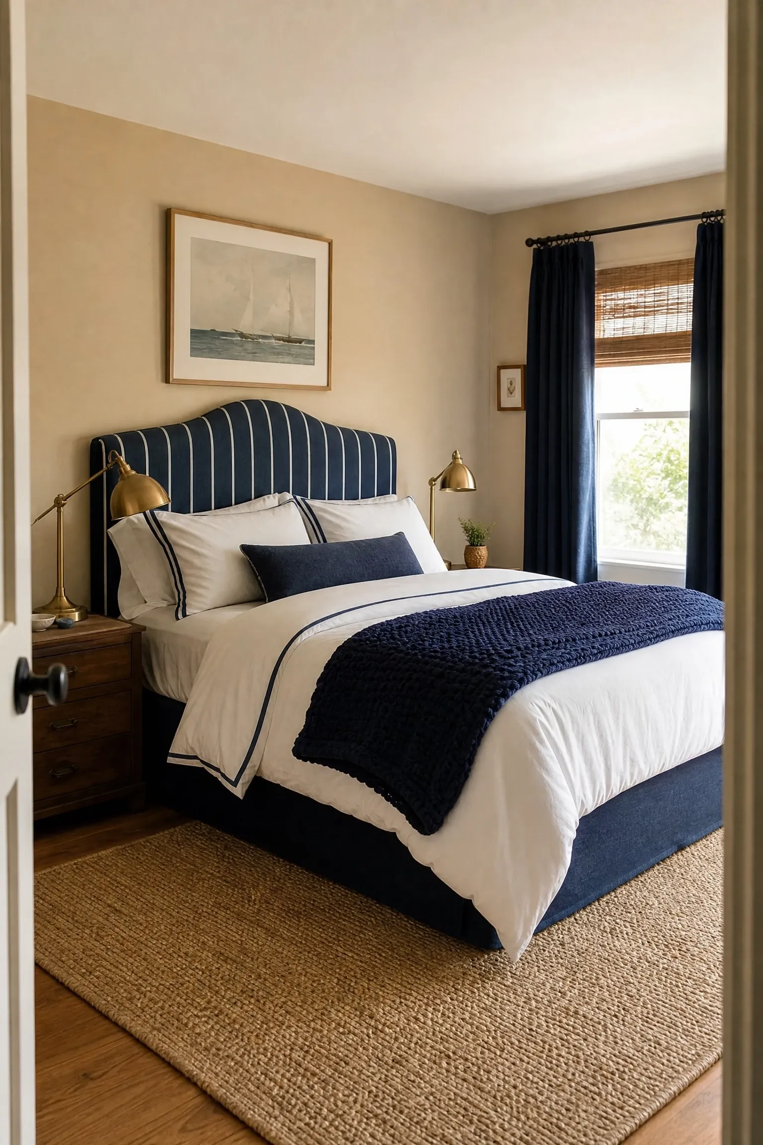
Navy and sand is a pairing with serious staying power. The contrast between the deep, anchoring navy and the warm, airy sand keeps the room feeling balanced rather than heavy, which is the main challenge with any navy bedroom. Use sand or warm taupe on the walls and bring the navy in through the bedding, headboard, and curtains so the walls stay light and the room does not close in. Striped textiles are at home here: a navy and white French ticking stripe on the headboard or throw pillows reads as classic without being fussy. A sisal or jute rug brings in the sandy texture at floor level, and natural wood furniture in a medium warm tone completes the look. Brass hardware on the furniture and light fittings adds a warm metallic note that works perfectly against both navy and sand. Keep the lighting warm rather than cool to stop the navy from reading as cold.
Designer Note: This palette works in rooms of almost any size, but in smaller rooms, keep the navy below the waist line of the room. Use it in furniture and lower accents rather than on all four walls to avoid closing the ceiling down.
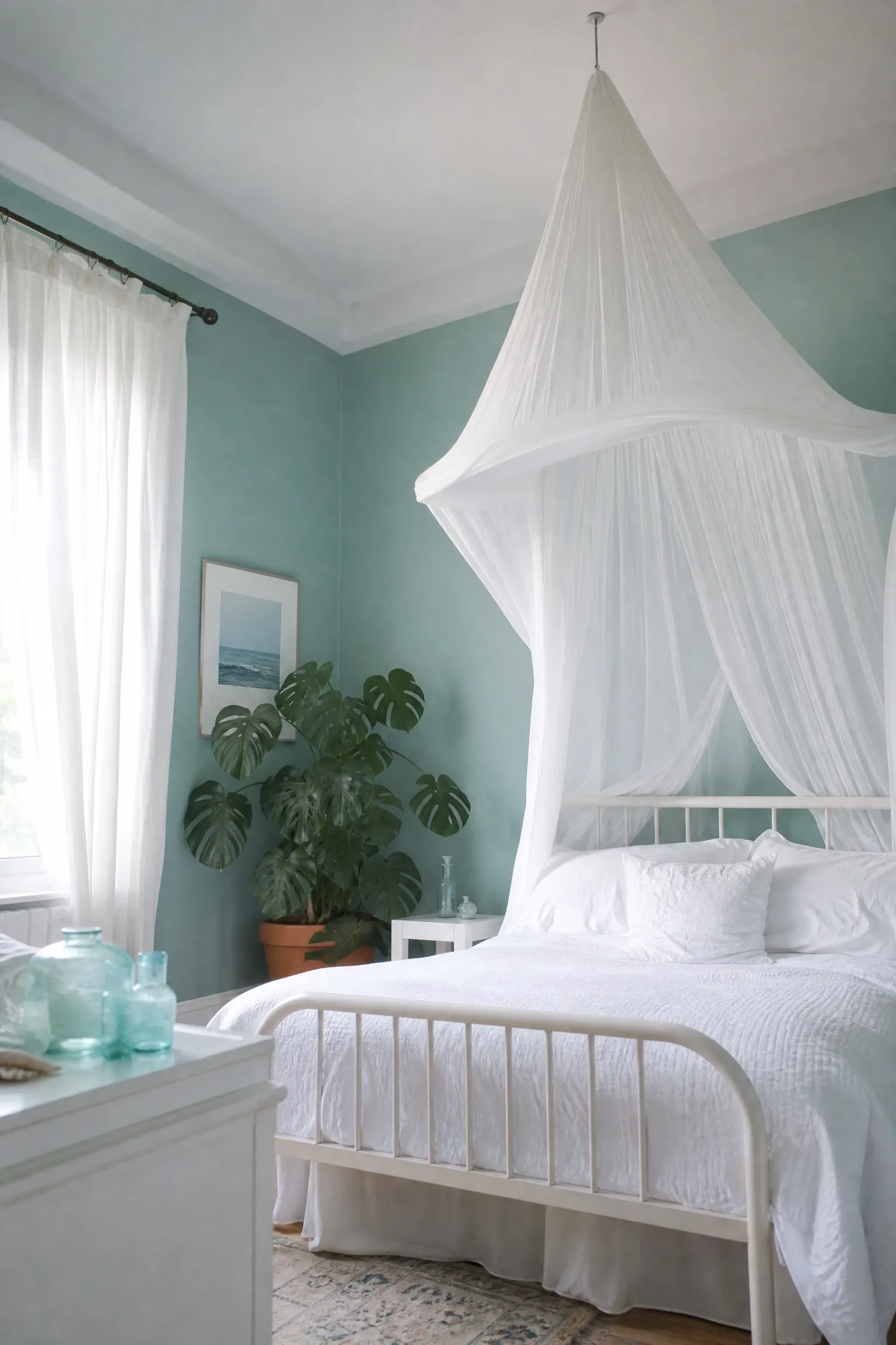
Aqua sits at the crossover between blue and green, which gives it a naturally tropical, water-like quality that is perfect for a light, dreamy bedroom. The combination of aqua walls and a sheer white fabric canopy above the bed creates a focal point that is genuinely beautiful and surprisingly affordable to put together. You can hang sheer curtain panels from a ceiling hook above the bed frame without any specialist fittings. Keep the rest of the room simple and light: white bedding, minimal white or wicker furniture, and flowing white linen curtains that reach the floor. A large potted monstera or palm in the corner adds a natural green element that echoes the green undertone of the aqua walls without clashing. Glass or sea-glass accessories in complementary blue-green tones on the dresser tie the palette together cleanly.
Designer Note: Aqua can veer green in certain lighting. Always test the paint in the actual room before committing, especially if the room gets a lot of afternoon sun, which tends to pull the green out of it significantly.
10. Coastal Indigo With Batik Textiles and Woven Accents
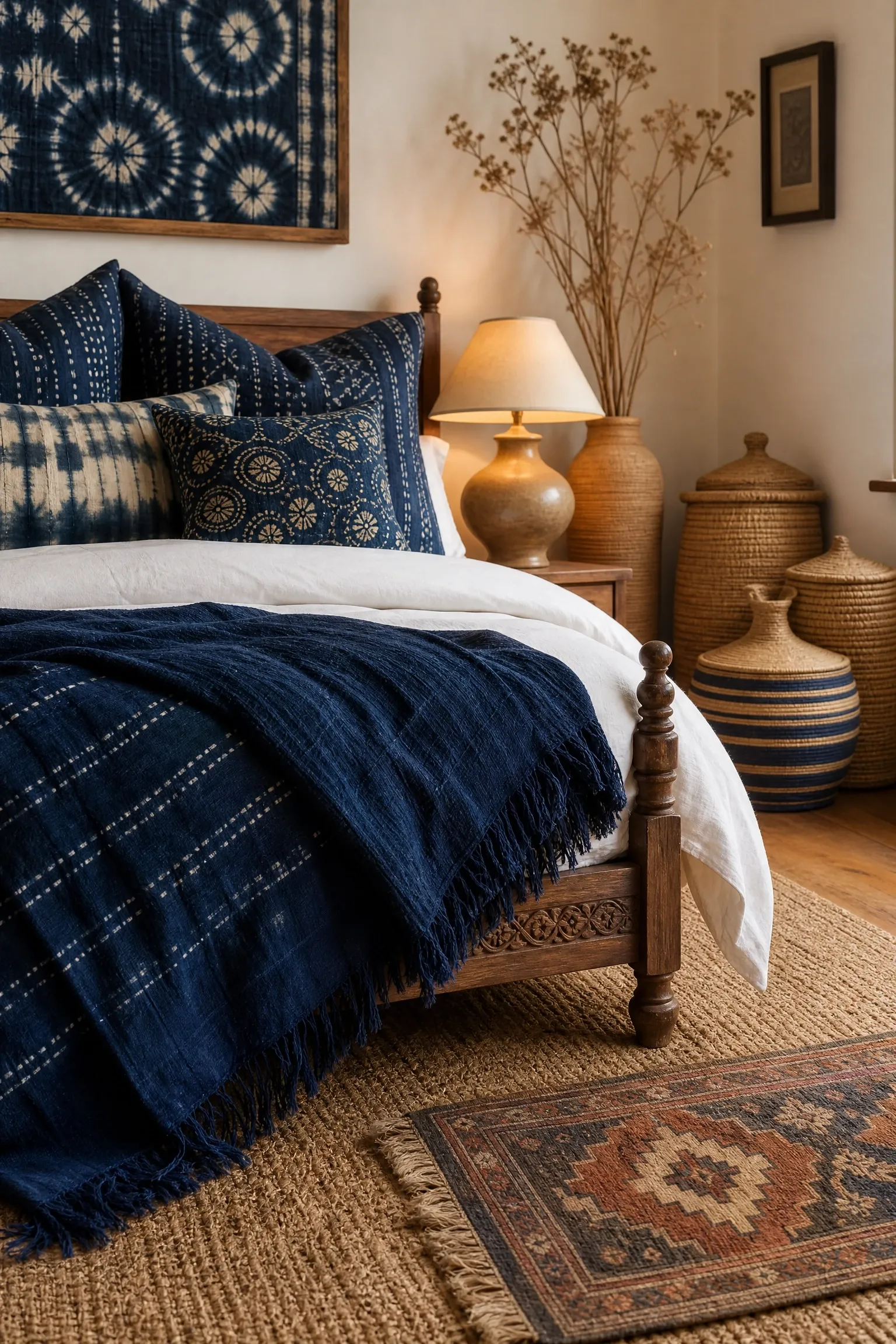
Coastal indigo is a more considered, globally influenced take on the traditional coastal palette. Indigo has deep roots in craft traditions across Japan, West Africa, and South Asia, and when used in a bedroom with handmade textiles and woven accents it creates a space that feels well-traveled and genuinely layered. Use indigo as an accent rather than a wall color, bringing it in through batik or shibori-dyed cushion covers, a block-printed duvet cover, and a deep indigo throw at the foot of the bed. Keep the walls in a warm natural white or very pale sand so the indigo reads clearly against a clean backdrop. Woven baskets, a jute or cotton dhurrie rug, and a solid wood bed frame with carved detailing all support the aesthetic without pulling attention from the textiles.
Designer Note: The risk with this look is veering into cultural pastiche. Keep it grounded by choosing genuinely handmade or fair-trade textiles rather than fast-fashion knockoffs, which tend to look hollow even when the pattern is right.
Bold and Dramatic: Deep Blue Bedrooms That Make a Statement
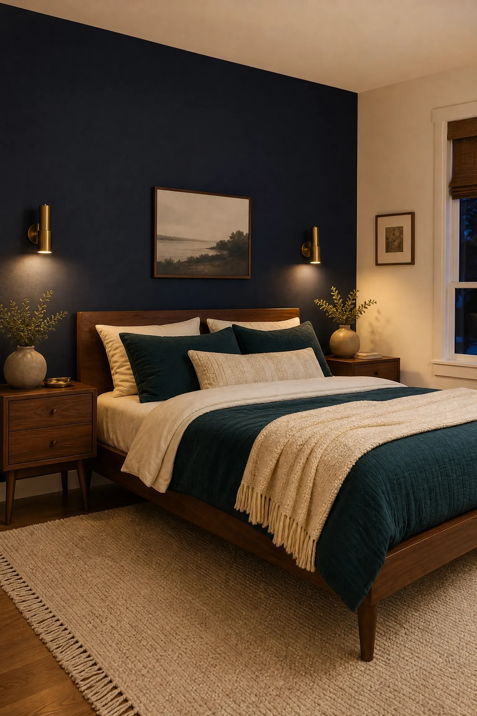
A single navy feature wall behind the bed is one of the most reliable ways to give a bedroom a designer look without a full repaint. The wall becomes a backdrop that makes the bed the clear focal point of the room, which is exactly where you want the eye to land. Against a navy wall, warm walnut furniture looks exceptional. The deep reddish-brown of walnut wood has enough warmth to keep the navy from reading as cold, and the combination has a mid-century modern elegance that feels current rather than dated. Use cream or warm white on the remaining three walls and ceiling to keep the room bright. Layer the bed with textured bedding in deep teal, burnt amber, or warm cream, and add a statement pendant or wall-mounted sconce on each side of the bed so the navy wall gets lit from below and the lamp glow shows against it.
Designer Note: Choose a navy with brown undertones rather than purple undertones for this look. Benjamin Moore Hale Navy and Sherwin-Williams Naval are both reliable choices that sit on the warm side of navy.
12. Inky Blue Walls With Brass Hardware and Velvet Textures
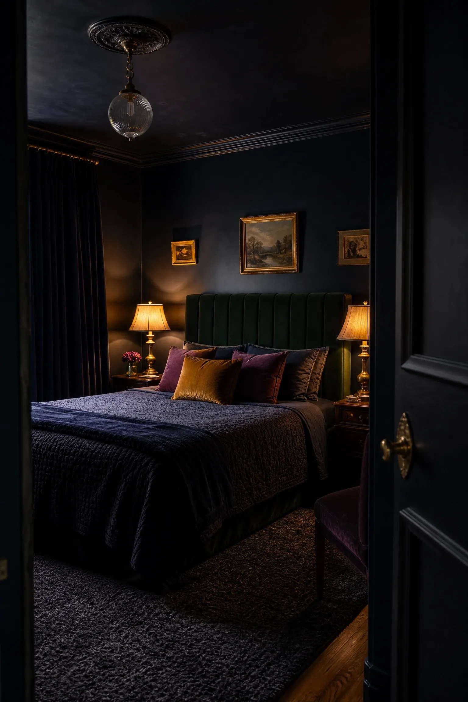
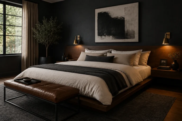
Inky blue, the kind that sits between deep navy and near-black, is one of the most sophisticated wall colors you can choose for a bedroom. Designers have been using it to create intimate, cocoon-like rooms for years, and the combination with brushed brass hardware is particularly striking because the gold warmth of brass pops brilliantly against a very dark background. For this look, commit fully: paint all four walls and the ceiling in the inky blue to build the full envelope of color. Then layer in velvet: a velvet upholstered headboard in deep teal or forest green, velvet cushions in jewel tones like amber or plum, and velvet curtains in a complementary dark tone. Brass bedside lamps with fabric shades in amber or cream bring warm pools of light into the darkness, which is exactly how this kind of room should be lit. This is a high-commitment look that can feel oppressive in rooms with very little natural light.
Designer Note: Use a high-sheen or eggshell finish rather than flat matte for very dark walls. It reflects a small amount of light back into the room, which dark flat paint simply absorbs entirely.
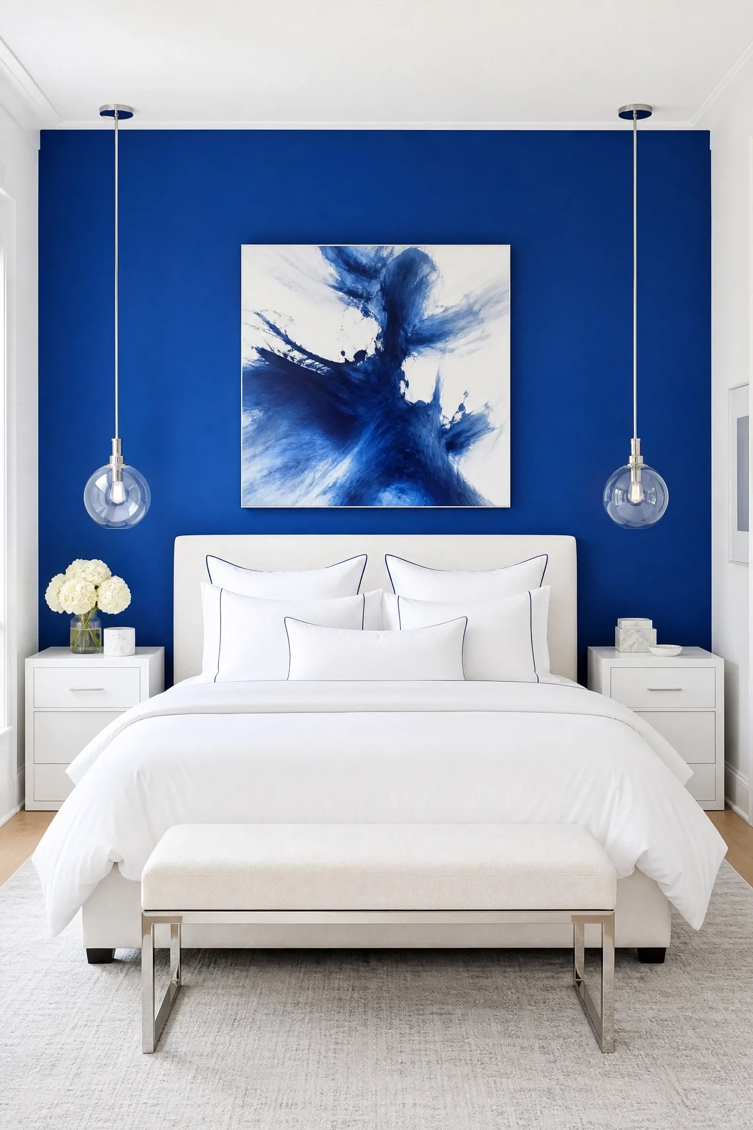
Cobalt is the boldest and most saturated blue on this list, and it demands a confident hand. Rather than using it on all four walls, painting just the wall behind the headboard in cobalt and keeping the remaining surfaces in warm white is the most wearable approach, since cobalt all around can become overwhelming quickly. The good news is that cobalt is one of those colors that looks genuinely expensive against the right partners: white marble or stone accessories, chrome and glass light fittings, and crisp white high-thread-count bedding all respond beautifully to it. A monochrome art piece in blues and whites above the bed keeps the palette tight and intentional. This look is one that benefits from scale, meaning it looks better in a room with high ceilings and a generous bed, because the proportions of the cobalt wall need to feel commanding rather than squeezed.
Designer Note: Cobalt is very sensitive to undertones. Most cobalts lean purple in evening artificial light, so always view paint samples after dark with your actual light bulbs before committing.
14. Prussian Blue With Terracotta and Earthy Accents
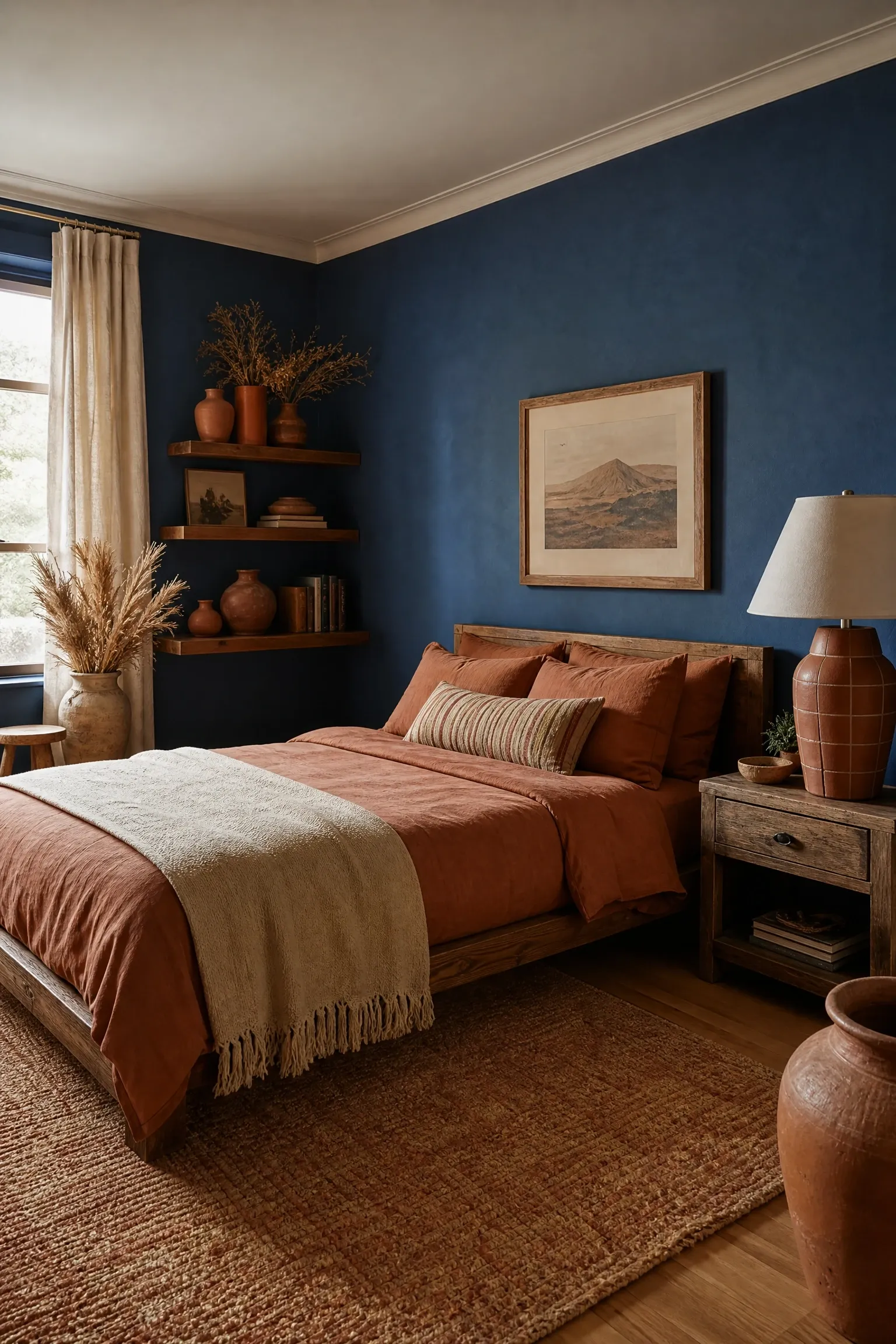
Prussian blue is a historical pigment color, deep, slightly greenish, and immensely rich, and it has had a genuine revival among interior designers working in warmer, earthier palettes. The combination of Prussian blue with terracotta is unexpected enough to feel original but rooted enough in color theory to work. The warmth of terracotta stops the deep blue from feeling cold or oppressive, and together they sit in a palette that feels ancient and current at the same time. Use Prussian blue on the walls and bring terracotta in through clay pots, warm clay-toned textiles, and perhaps a terracotta tiled lamp base. A sisal or wool rug in a warm oatmeal or earthy red ties the floor to the rest of the palette. Unfinished linen, rough-glazed ceramic, and natural wood complete the material story. This combination works in any room size but is particularly effective in smaller rooms because the warmth of the terracotta prevents the dark walls from closing in.
Designer Note: Keep the ceiling lighter than the walls here, either in white or the palest version of the Prussian blue. A dark ceiling above dark walls in a small room can feel genuinely suffocating.
15. Midnight Blue With Pink and Gold Art Deco Touches
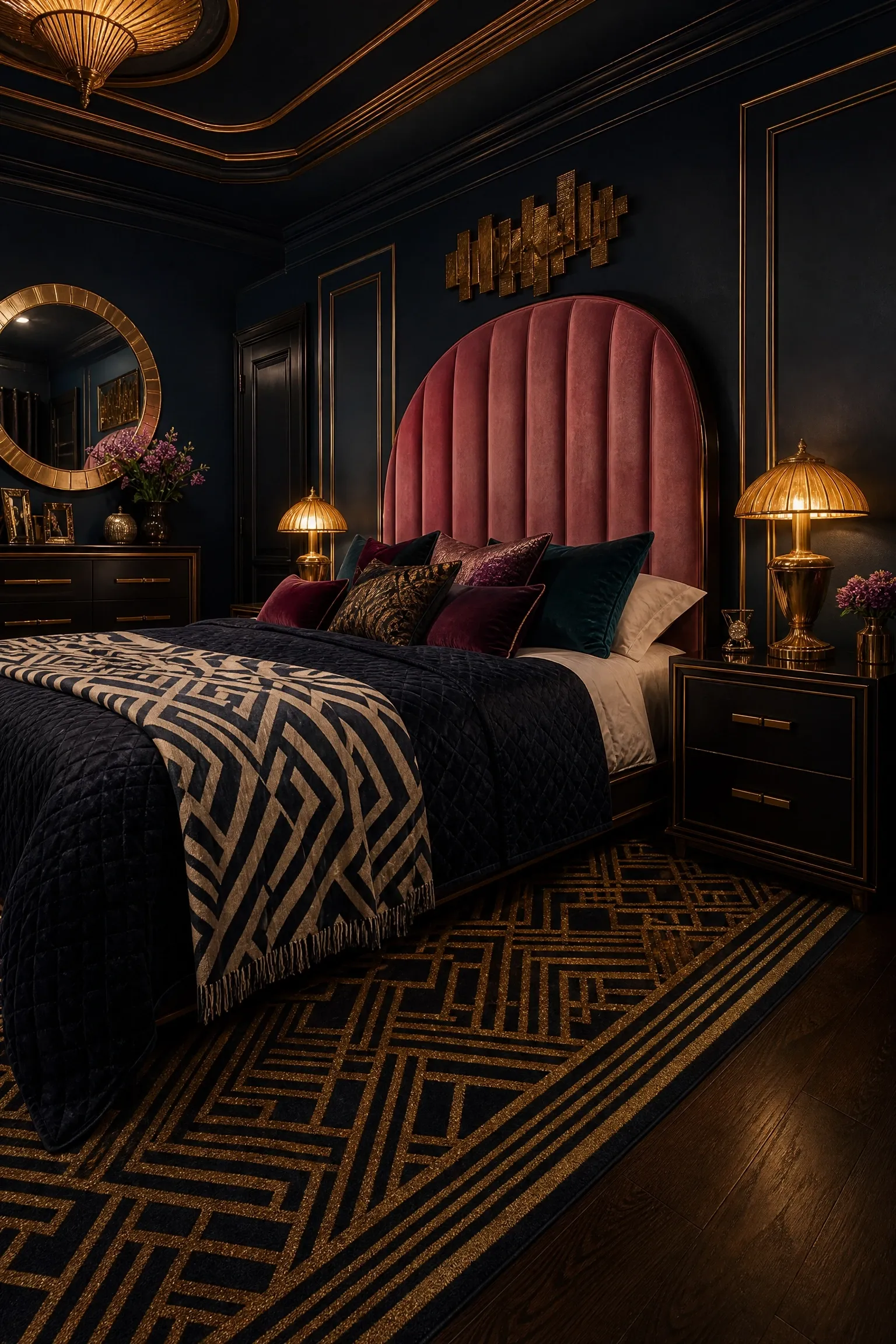
Art Deco interior design pairs bold color with geometric form and luxurious materials, and midnight blue is perhaps the most natural color for this style in a bedroom context. Use midnight blue on the walls and ceiling for the full envelope effect, then build the glamour through the furniture and accessories. A tall, curved velvet headboard in dusty rose or blush pink introduces the complementary pink tone and the curved Art Deco silhouette at the same time. Gold or brass details should be everywhere: bedside lamps with geometric brass bases, a gold-framed mirror above the dresser, and gold cabinet hardware throughout. Geometric patterned rugs in navy, gold, and cream pull the palette together underfoot. A glass and brass chandelier or a glamorous pendant with amber glass drops overhead creates the kind of statement lighting this style demands. This is an investment-level look, and keep in mind that the dark walls and rich accessories can make it feel overwhelming in rooms under about 200 square feet.
Designer Note: The ratio matters in Art Deco. Roughly 70 percent blue, 20 percent gold, and 10 percent pink is a useful starting point. Too much pink tips it into romance; too much gold tips it into opulence.
Mixed Palettes: Blue Combined With Other Colors for Depth
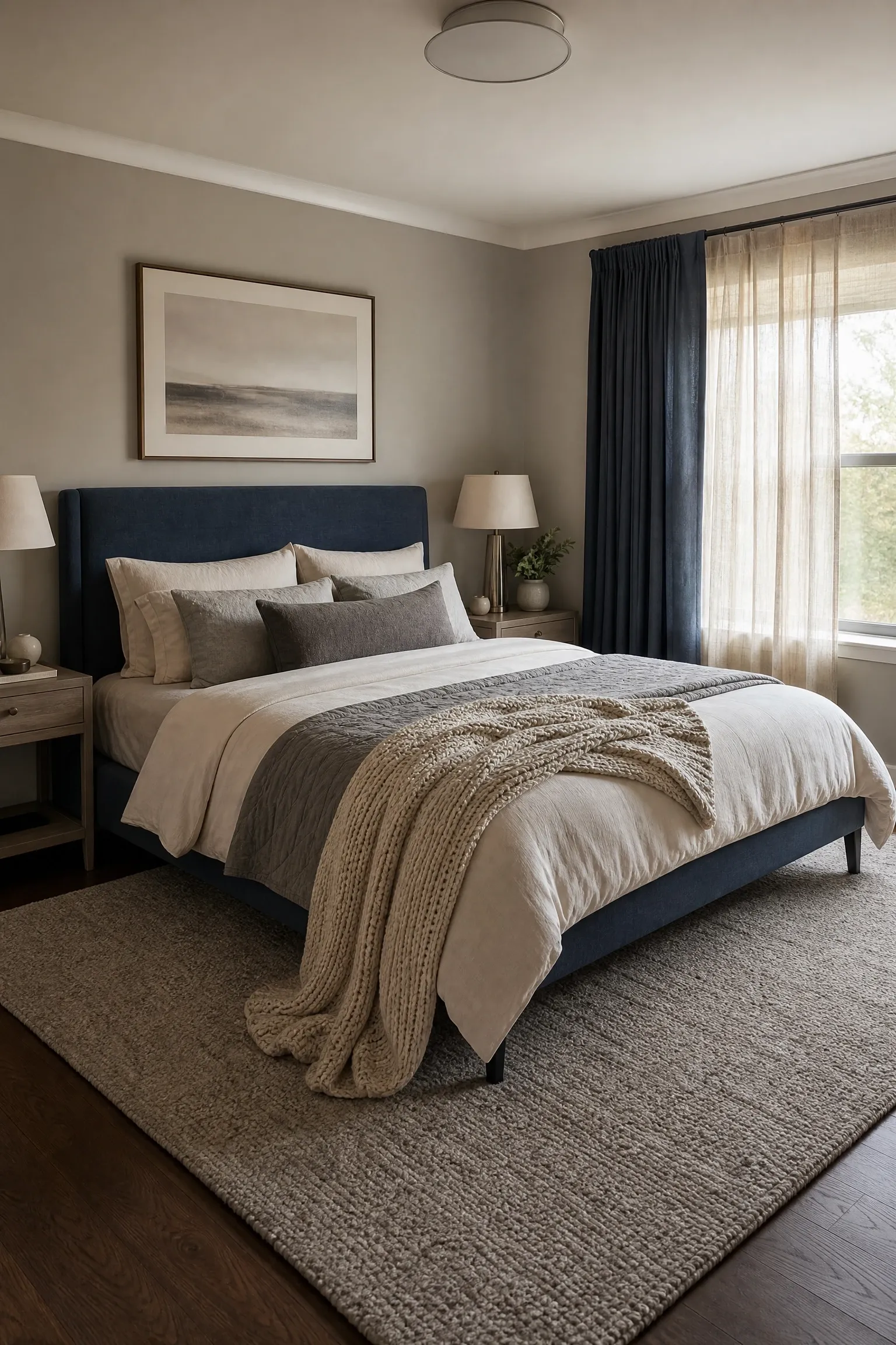
Steel blue is a utilitarian, unpretentious shade with grey undertones that makes it feel contemporary and calm without screaming for attention. When paired with greige, which is the perfect blend of grey and beige, the result is a bedroom palette that feels mature, considered, and incredibly easy to live with. Use steel blue on one or two walls and greige on the rest, or keep the walls all greige and bring the steel blue in through the upholstered headboard, curtains, and layered cushions. The layered neutrals approach means building depth through varying textures rather than contrasting colors: chunky knit throws, smooth linen duvet covers, and a plush wool rug all in tones that sit within the blue-grey-beige family. Brushed nickel hardware and matte stone accessories complete the palette cleanly. This is a great choice for couples who cannot agree on a bold color, since it is universally appealing without being bland.
Designer Note: The biggest risk with a blue-greige palette is that it ends up feeling forgettable. Add one moment of stronger color, even just a single deep teal cushion or a warm amber candle, to give the eye something to land on.
17. Blue and Sage Green With Biophilic Design Elements
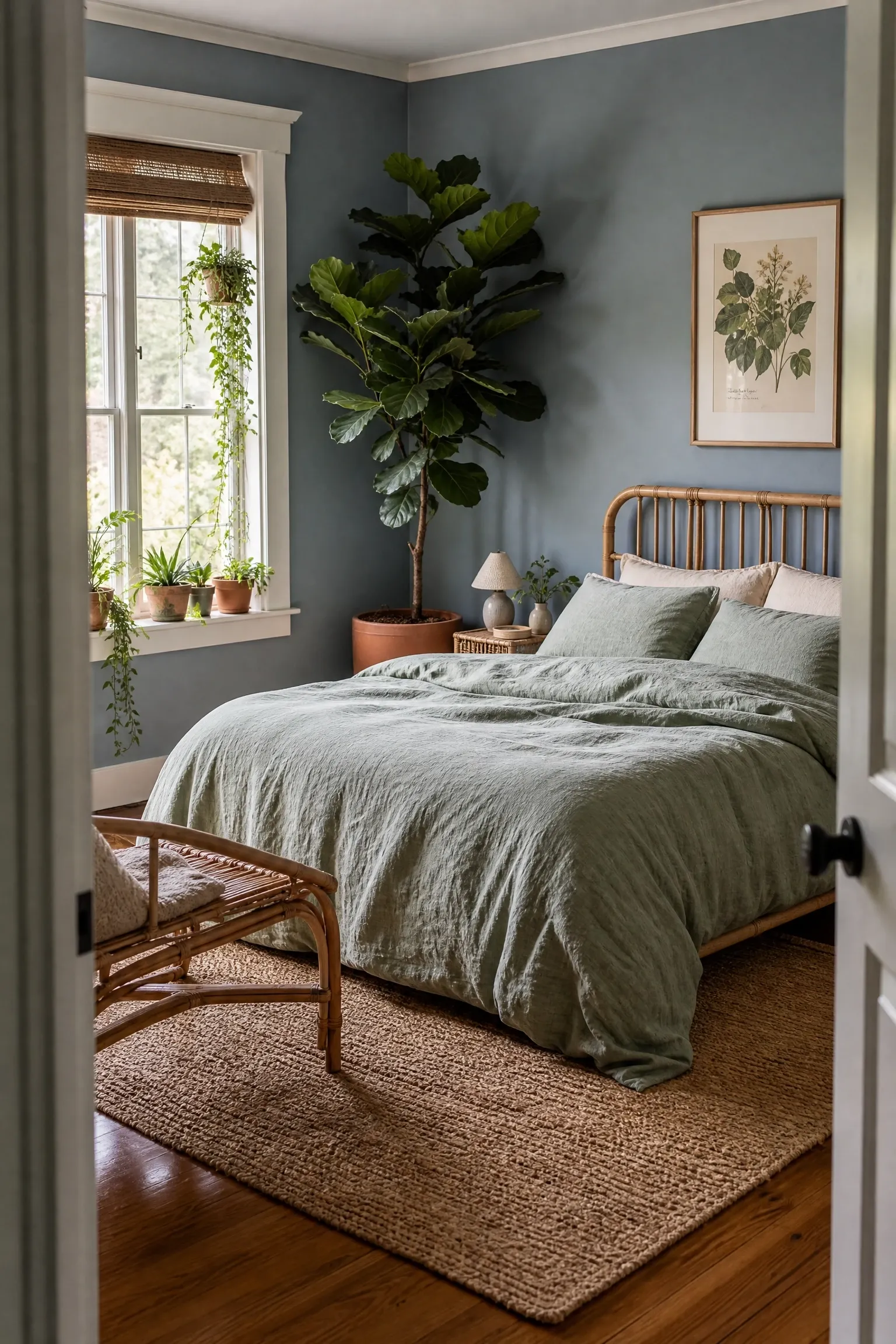
Blue and sage green is an analogous color pairing, meaning the two colors sit next to each other on the color wheel, which is why they feel so naturally harmonious together. This combination works beautifully in bedrooms designed around biophilic principles, which is the design approach that seeks to connect the interior with the natural world. Use a muted, dusty blue on the walls and bring the sage green in through bedding, plants, and soft furnishings. Real plants are central to the look: a large fiddle-leaf fig or a grouping of smaller plants in terracotta pots adds life and oxygen in equal measure. Natural materials matter here: rattan, jute, linen, and unfinished wood all reinforce the connection to the natural world. A large landscape photograph or abstract botanical print in blue-green tones above the bed serves as both art and a continuation of the palette. This is an affordable look to put together since the plant elements are accessible and the color palette requires nothing elaborate.
Designer Note: Be intentional about plant placement. A single large plant usually reads better than several small ones scattered around, because the large plant has genuine visual weight and presence.
18. Blue and Mustard Yellow With Mid-Century Modern Furniture
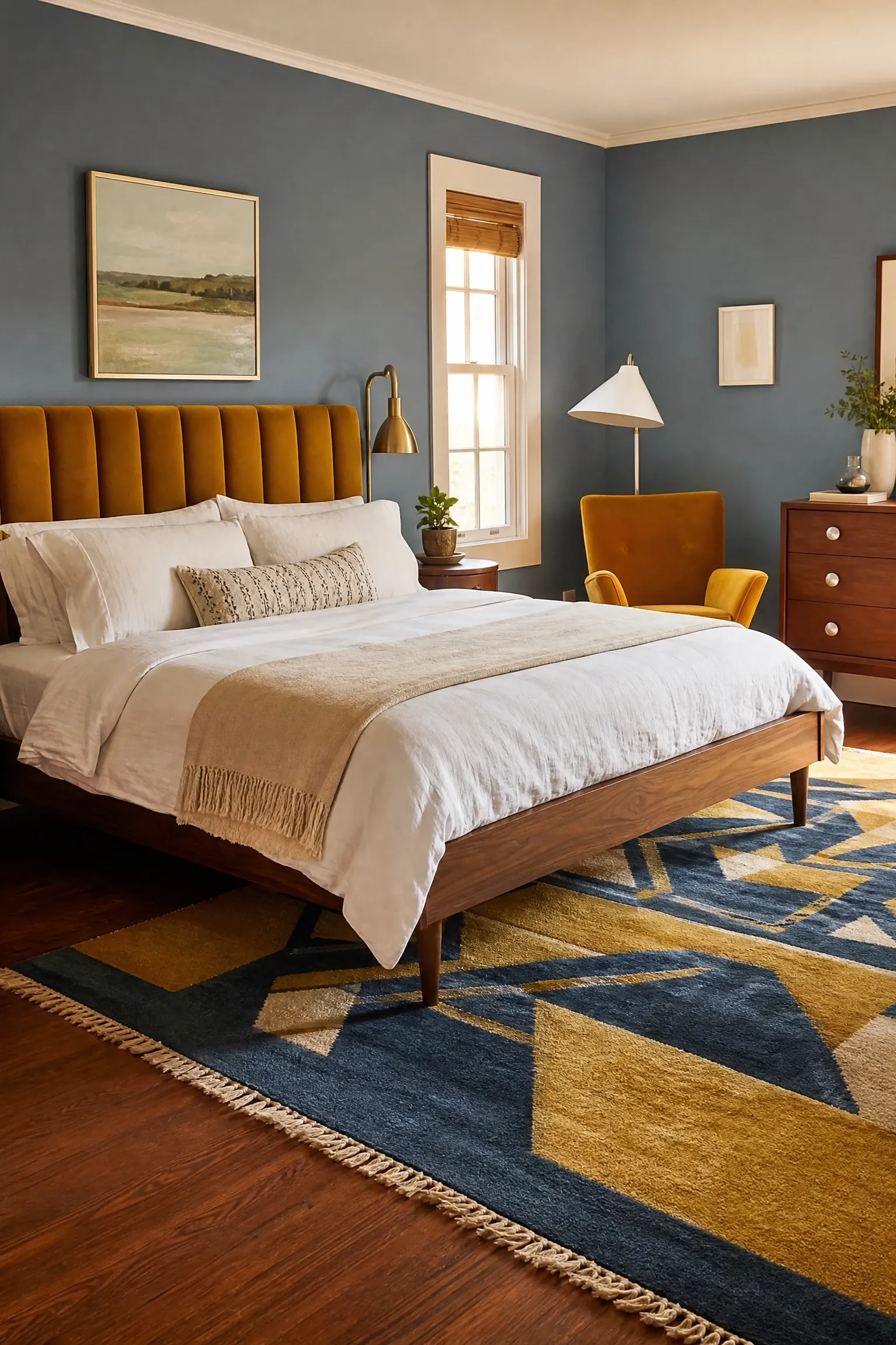
Blue and mustard yellow is a complementary color pairing that mid-century modern designers used with great confidence, and it still looks fantastic today when the proportions are right. The key is to use blue as the dominant color and mustard as the accent, not the other way around. Use a medium dusty blue on the walls, a walnut or teak bed frame with tapered legs in true mid-century modern style, and bring the mustard in through the upholstered headboard, a velvet accent chair in the corner, and a geometric patterned rug with both colors. Keep the bedding simple in white or warm ivory so the bold pairing reads clearly without competing with itself. A tulip or cone-shaped floor lamp in white with a brass base completes the era. This is a look worth committing to fully, because going halfway with it tends to produce a result that feels inconsistent rather than stylish.
Designer Note: The quality of the furniture matters significantly in mid-century modern rooms. A cheap walnut veneer bed frame will undermine the whole palette. Where budget is limited, prioritize getting the bed frame right and save on accessories.
19. French Blue and Warm Linen for a Relaxed European Feel
French blue has a particular quality that is hard to describe but easy to recognize. It is warm, saturated, and slightly faded, like a well-loved painted shutter or a piece of antique pottery. Paired with warm linen in natural undyed tones, it creates a bedroom that feels as though it has been decorated slowly and thoughtfully over time rather than all at once. Use French blue on the walls and pull the rest of the room back to natural linen bedding, a wooden or iron bed frame in a pale washed finish, and simple cotton curtains in cream or unbleached linen. Terracotta accessories, dried botanicals, and a woven wool rug in warm off-white all sit comfortably in this palette. Layered lighting with a small bedside lamp in a warm tone and a simple overhead pendant keeps the room from feeling flat in the evening. This is a thoroughly accessible and affordable palette to put together.
Designer Note: French blue changes significantly depending on the light. In morning light it reads bright and cheerful; in afternoon sun it deepens considerably. Test the paint at different times of day before committing.
20. Blue and Black With High-Contrast Geometric Art
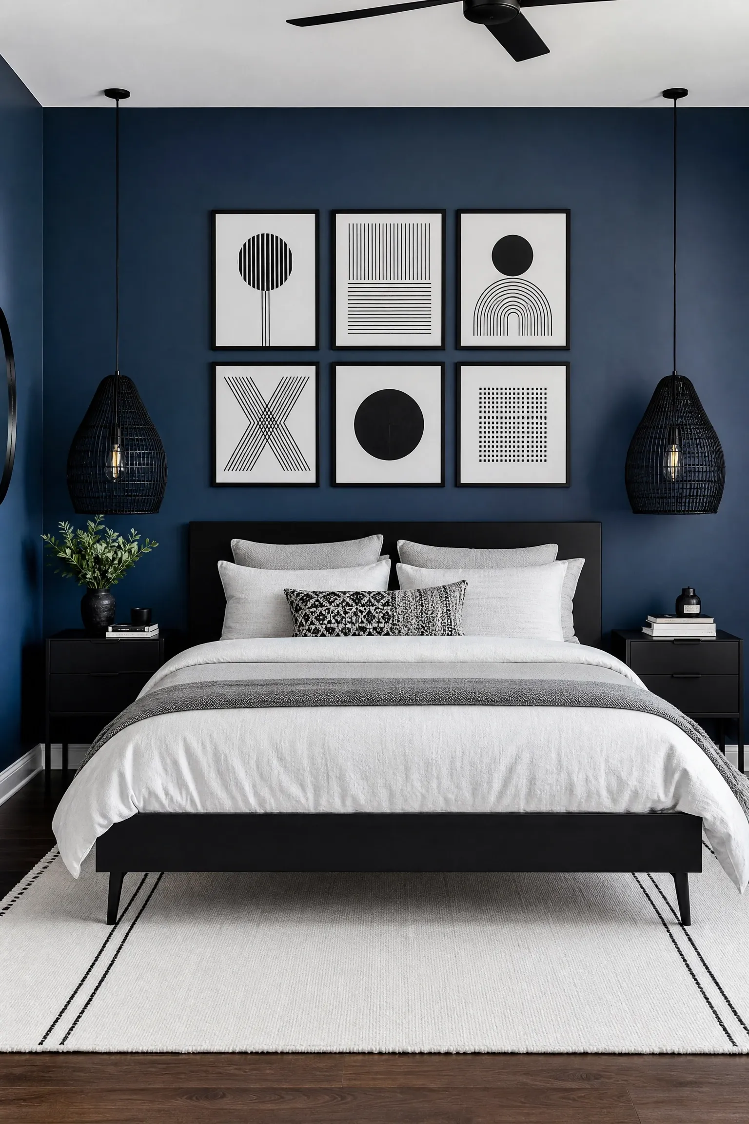
Blue and black is an underused combination in bedrooms, possibly because black feels intimidating as a design choice, but used selectively it gives a blue bedroom a sharp, editorial quality that sets it apart from more predictable palettes. Use a rich, saturated blue on the walls and bring black in through the bed frame, pendant light shades, picture frames, and small accessories. A gallery wall of geometric line art prints in black and white above the bed creates a strong visual statement without needing expensive original artwork. Keep the bedding in white or very light grey to prevent the room from becoming too heavy. Black matte hardware throughout, from door handles to cabinet pulls, ties the accent color together consistently. This look leans contemporary and suits people who prefer a bedroom with a strong design identity rather than one that fades into the background.
Designer Note: In a blue and black bedroom, clutter becomes very visible because the contrast picks up every misplaced object. This look demands tidiness to maintain its intended effect.
Texture and Pattern: Blue Bedrooms With Character and Depth
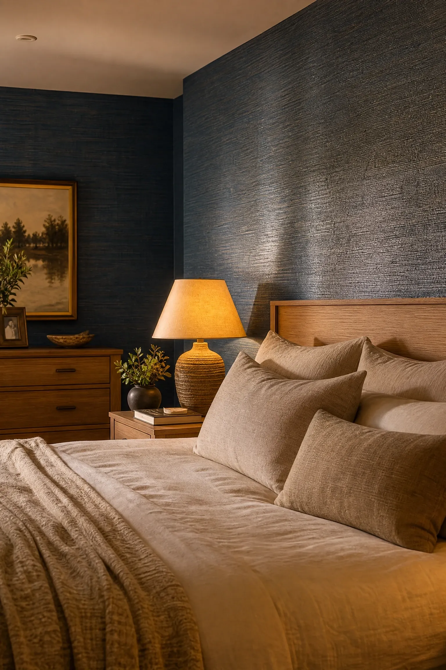
Grasscloth wallpaper in blue is one of those choices that photographs beautifully and looks even better in person, because the woven natural fiber gives the walls a dimensional texture that painted surfaces simply cannot replicate. The slight irregularity in the weave pattern gives each wall a handmade quality, which adds warmth even in a deep shade. Pair blue grasscloth with furniture in natural wood tones, cream bedding, and warm brass or gold accessories for a sophisticated, layered look. The wallpaper itself does the heavy lifting in terms of visual interest, so the furniture and accessories can be kept relatively simple. This is a higher-investment choice because quality grasscloth and professional installation are not inexpensive, and keep in mind that grasscloth is not washable and can be damaged by moisture, so it is not ideal for humid climates without good ventilation.
Designer Note: Use grasscloth on three walls or just the headboard wall rather than all four to keep the room manageable. Four walls of textured wallpaper can start to feel claustrophobic unless the room is very large.
22. Blue Floral Wallpaper With Vintage Painted Furniture
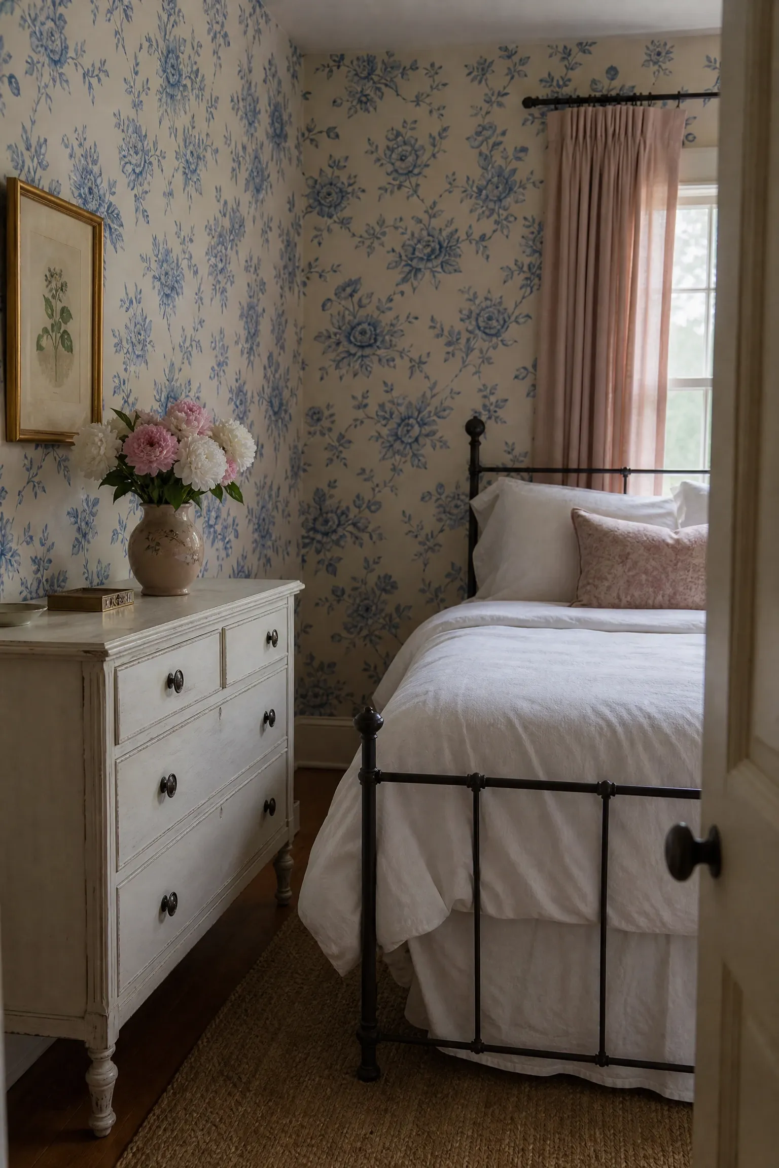
A blue floral wallpaper is one of the most rewarding design choices you can make in a bedroom if you have the confidence to commit to it, because the result is a room with genuine personality and warmth. The key to making it work without it feeling busy is to keep the furniture and bedding largely plain. Paint a vintage dresser or wardrobe in a soft chalk paint in a color drawn from one of the secondary tones in the wallpaper, whether that is a dusty pink, a warm sage, or an antique cream. Keep the bedding in white or very pale neutral linen so it does not compete with the pattern on the walls. Curtains in a plain fabric that picks up one color from the wallpaper, rather than a matching pattern, create a frame around the room without doubling up on the busyness. This is a thoroughly romantic style and it suits rooms where natural light comes in at an angle, giving the paper texture and depth.
Designer Note: Use a single statement wallpapered wall behind the bed if four walls of floral feels like too much. This is a good compromise that gives you the pattern and personality without full commitment.
23. Tonal Blue Striped Bedding With Bold Solid Walls
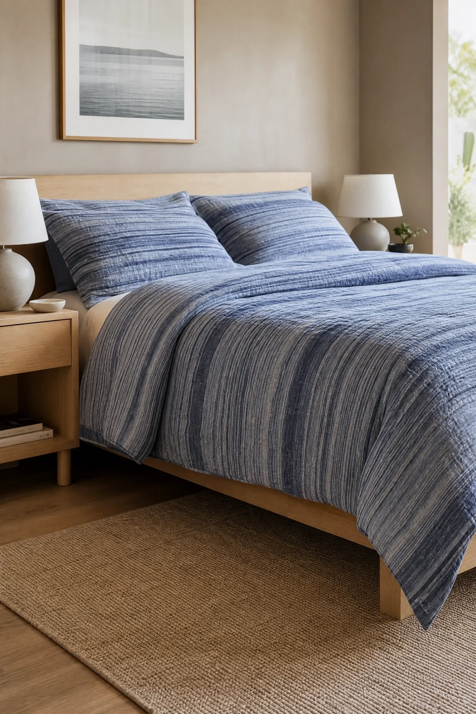
Striped bedding has a long design history in European interiors, particularly French and Scandinavian rooms, where ticking stripes in blue and white have been used on bed linens for generations. The contemporary version of this look uses tonal blue stripes, meaning stripes in two or three shades of blue rather than blue and white, which gives the bed a more refined and collected look. Pair tonal stripe bedding with solid painted walls in a coordinating blue or a warm complementary neutral like greige or warm sand. A simple wooden bed frame in light oak or beech lets the bedding take center stage. The stripe pattern provides all the visual interest the bed needs, so cushions and accessories can be kept to a minimum. This is a very accessible approach for people who are not ready to paint but want to change the feel of the room, since changing the bedding alone can significantly shift the mood.
Designer Note: The scale of the stripe matters. Wide stripes feel bold and graphic; narrow stripes feel more classic and subtle. Choose based on the size of the room and the personality you want the space to have.
24. Blue Painted Ceiling as an Unexpected Focal Point
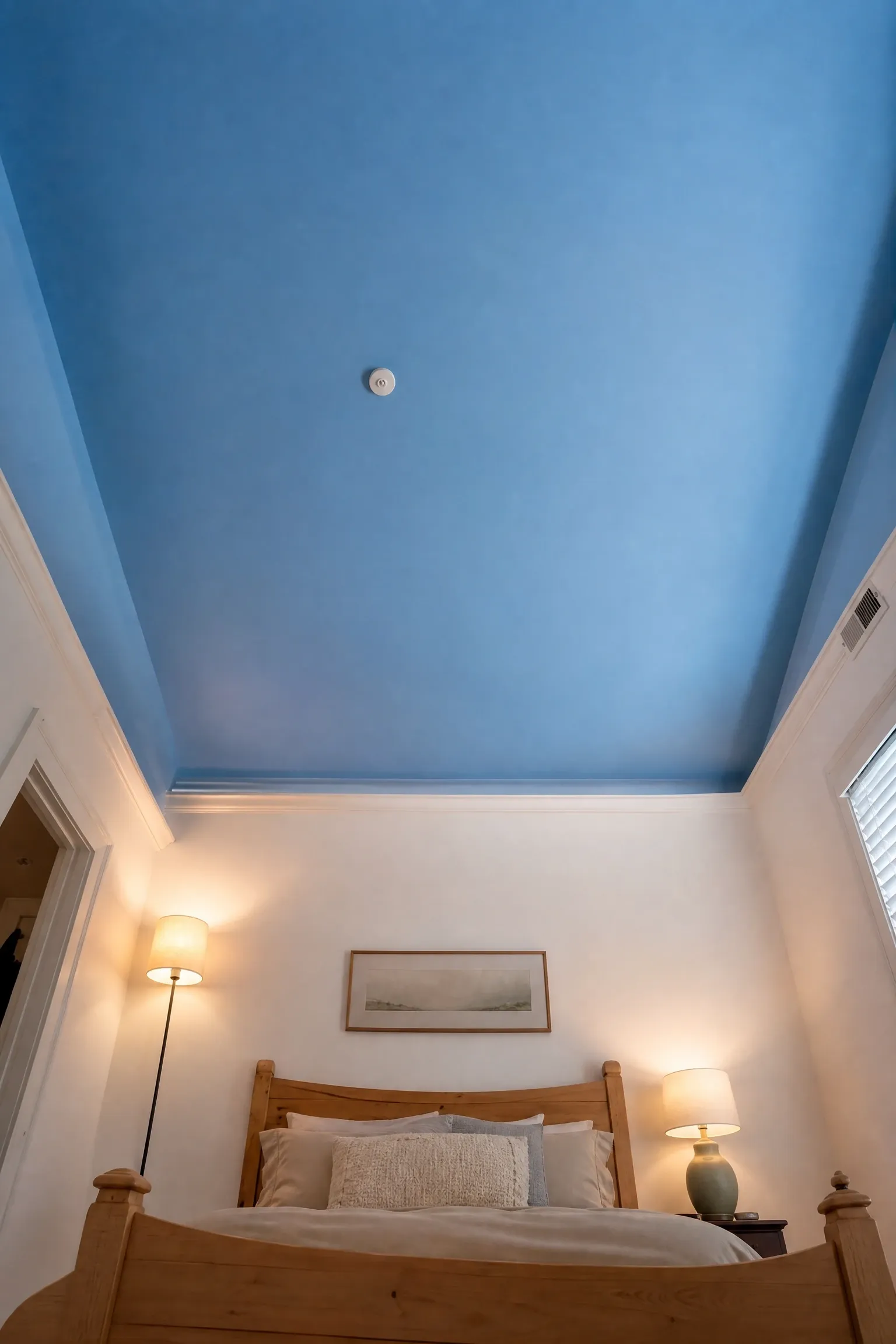
Painting the ceiling blue rather than the walls is a move that more designers are recommending as a way to add color without reducing the perceived size of a room. A blue ceiling works like a sky overhead and creates a surprisingly calming effect without making the walls feel like they are closing in. For this approach, choose a shade that is slightly lighter than a mid blue for the ceiling and keep the walls in white or warm cream. The effect is most powerful in rooms with high ceilings, but even in a standard eight-foot room, a blue ceiling in the right shade adds depth and interest. Add warm, low-level lighting through floor lamps and bedside lamps rather than relying on overhead light, so the blue ceiling becomes part of the atmospheric background of the room in the evening rather than being fully lit and flat.
Designer Note: The ceiling registers differently in a bedroom than in any other room because you look at it horizontally when lying down. It is one of the most underused decorating opportunities in the home.
25. Blue Upholstered Headboard as the Entire Color Statement
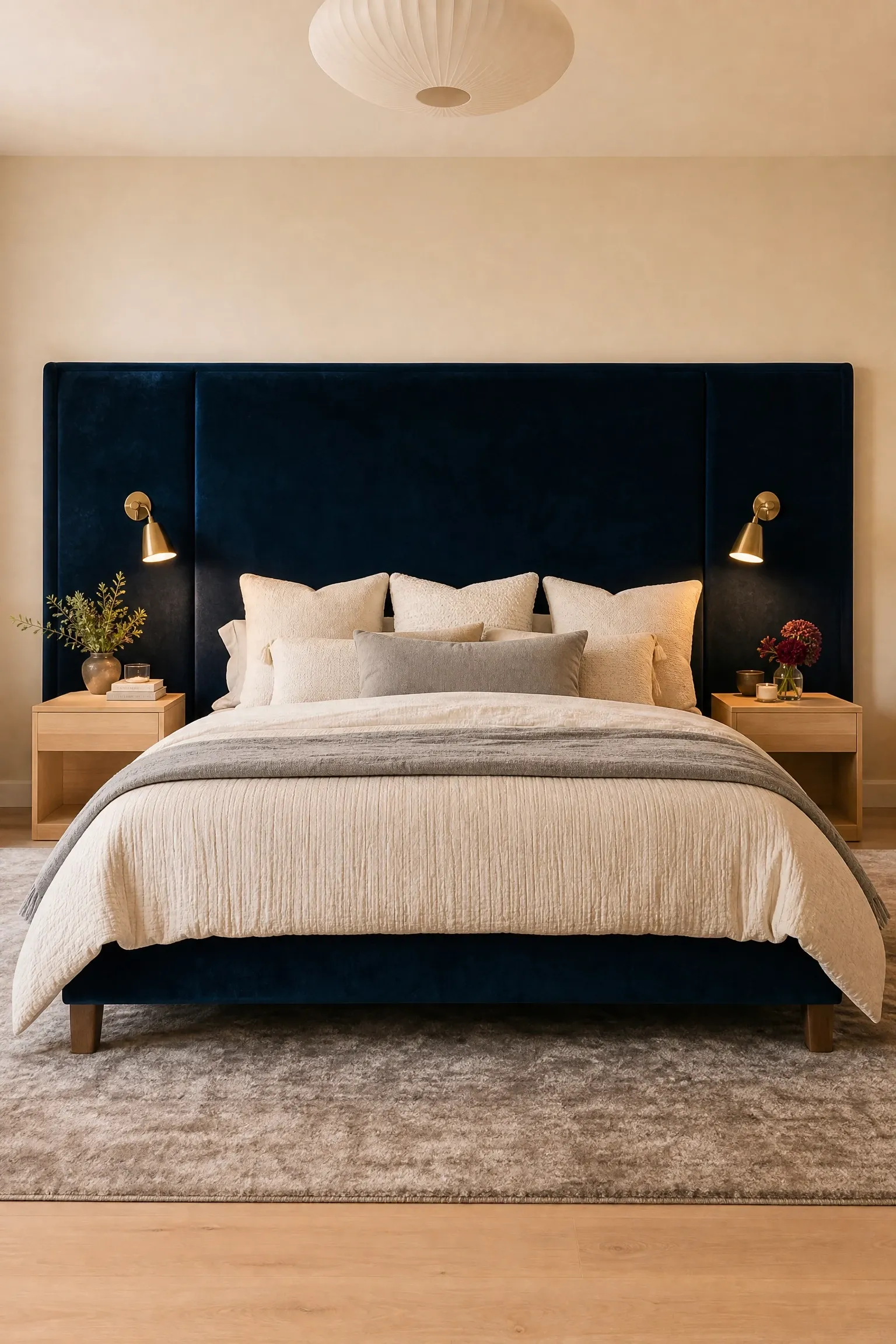
Not every blue bedroom needs blue walls. A large, well-chosen blue upholstered headboard can carry the entire color story of a room and is the single biggest furniture upgrade you can make in a bedroom for the investment. Choose a headboard that is at least as wide as the mattress and tall enough to be seen above the pillows when the bed is made, somewhere between 50 and 60 inches high for a standard room. A deep petrol blue or teal-tinted navy in velvet or a high-quality bouclé fabric will read as a genuine design choice rather than an afterthought. Keep the walls in warm white or soft greige to give the headboard room to breathe. Layer the bed with textured bedding in coordinating tones and use wall-mounted reading lights on each side of the headboard rather than table lamps to keep the visual weight centered on the bed and its frame. This approach works in any size room and is one of the most affordable ways to introduce bold blue without painting.
Designer Note: Scale is everything with a statement headboard. A small headboard on a large wall looks tentative. If you are committing to a bold color, commit to a bold size as well.
Bringing It All Together
Blue is one of the most generous colors you can work with in a bedroom because it genuinely functions across such a wide range of moods, styles, and budgets. The same color family that produces a cozy, candlelit inky-blue cocoon can also give you an airy, sun-filled powder blue retreat, and both are completely valid approaches. The key is to decide what you want the room to feel like before you start choosing shades, because the feeling drives every decision that follows, from the shade of blue to the furniture style to the type of lighting you use.
If you are working with a limited budget, remember that paint, bedding, and a statement headboard can completely shift the personality of a room without touching the furniture at all. If you are ready to invest more, the layered approaches, like grasscloth wallpaper, full color-drenching, or a high-quality velvet upholstered bed, will give you a result that genuinely holds up over time and feels better the longer you live with it. Start with the idea from this list that resonates most, test your paint colors in the actual room at different times of day, and let the space come together intentionally. A bedroom that was carefully considered is always more satisfying than one that was assembled quickly, whatever the style.
Frequently Asked Questions
What is the best shade of blue for a small bedroom?
For small bedrooms, lighter shades of blue tend to work best because they reflect more light and keep the walls from feeling like they are pressing in. Powder blue, sky blue, and pale dusty blue are all good choices. If you prefer a deeper shade, consider limiting the darker blue to a single feature wall behind the bed and keeping the other walls lighter. Mirrored or glass accessories and warm lighting also help small rooms feel bigger regardless of the wall color you choose.
Does blue really help you sleep better?
There is genuine research suggesting that cooler tones, including blue, can help lower heart rate and create a sense of calm, which supports the conditions for sleep. Blue has long been considered a psychologically soothing color, which is a large part of why it is so commonly used in bedroom design. That said, the overall lighting quality in your room, particularly avoiding blue-spectrum light in the evening from screens and overhead fixtures, has a much bigger impact on sleep quality than wall color. Use warm-toned bulbs regardless of which shade of blue you choose.
What colors go best with blue in a bedroom?
It depends on the shade of blue and the mood you are going for. Warm neutrals like cream, sand, greige, and warm white work with almost every shade of blue and are the safest starting point. For more character, deep navy pairs beautifully with warm walnut wood and brass hardware. Pale blues work well with terracotta, warm sage green, and mustard yellow. Cobalt and midnight blue respond well to white, gold, and warm pink in more glamorous or Art Deco-inspired settings. The underlying rule is to balance the temperature of the blue: warm accents for cool blues, and slightly cooler accents for warmer blues.
Is navy blue too dark for a bedroom?
Navy is not too dark for a bedroom, but it does require thoughtful handling. The main risk is that it absorbs light and can make a room feel smaller and heavier. The best way to avoid this is to use navy selectively rather than on all four walls, unless the room is large and well-lit. A navy feature wall behind the bed, navy bedding against lighter walls, or navy in upholstered pieces all deliver the drama of the color without the claustrophobia. Layering the room with warm lighting and light-colored bedding also helps balance the weight of the dark tone.
How do I add blue to my bedroom without painting the walls?
There are several ways to bring blue into a bedroom without committing to paint. A blue upholstered headboard is probably the highest-impact single change you can make. Blue bedding and cushions are the most accessible and reversible option. A blue area rug anchors the room in the color at floor level. Blue curtains frame the window and add color at eye height. Blue artwork and decorative accessories like vases, lamps, and trays introduce the color in small, easily changed doses. You can start with one of these changes and build from there, adding more blue gradually until the room feels right.
What style of bedroom furniture works best with blue walls?
The best furniture style depends on the specific shade of blue and the overall look you are going for. Light and airy blues work beautifully with rattan, cane, and light-toned natural wood in Scandinavian or coastal styles. Deep navy and inky blues pair well with warm walnut, dark wood, and upholstered pieces for a more intimate or mid-century feel. Dusty and muted blues work with the clean, low-profile furniture of Japandi. Bold, saturated blues like cobalt and midnight blue suit the stronger silhouettes of Art Deco or contemporary furniture. As a general rule, warm wood tones prevent blue from reading as cold, which is one of the most common pitfalls in blue bedroom decorating.