Choosing a kitchen cabinet color feels like a bigger decision than it should be, mostly because you know you are going to be living with it for a long time. Paint is technically changeable, but nobody wants to repaint their kitchen cabinets every two years. So the pressure is real. White is the safe choice and it works, but there are a lot of other colors that are just as livable and a lot more interesting.
Here are 15 kitchen cabinet colors that people actually commit to and do not regret.
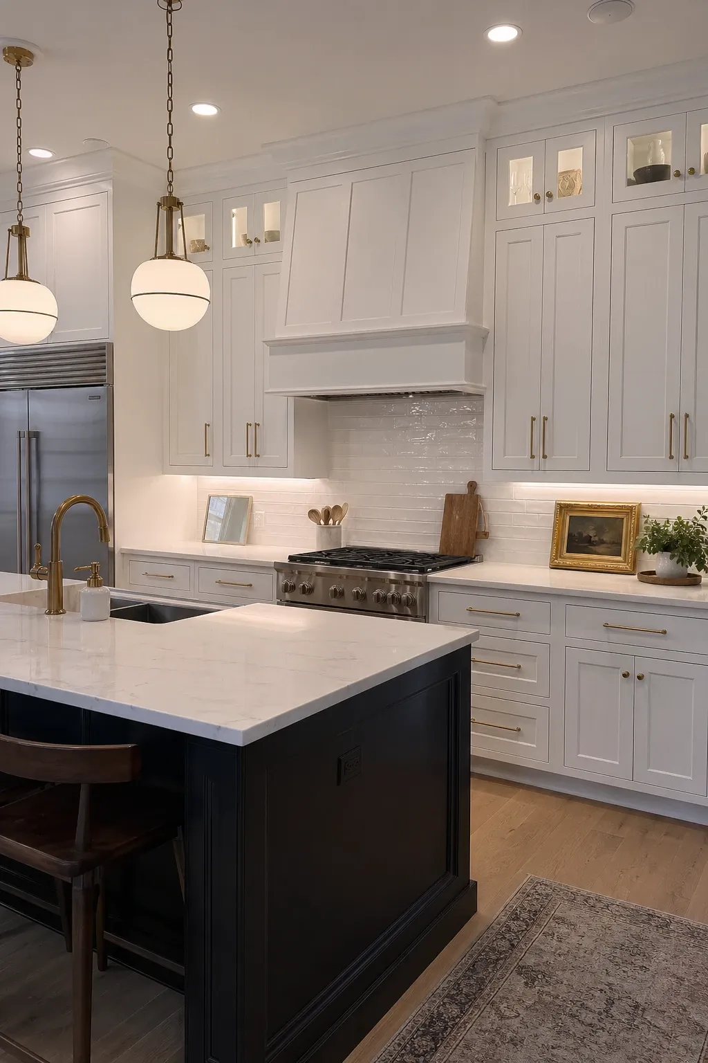
White kitchens are popular for good reason. They make any space feel bigger and brighter, they work with every countertop and backsplash, and they do not go out of style. The key is picking the right white. A pure bright white can feel sterile, while a warmer white with a hint of cream feels more inviting. Most of the best white kitchens are actually off-white, even though they read as white to the eye.
Designer Tip: Test at least three whites in your actual kitchen before deciding. Hold the paint chips against your countertop, backsplash, and flooring. A white that looks perfect on the chip can turn pink or yellow once it is next to your existing surfaces.
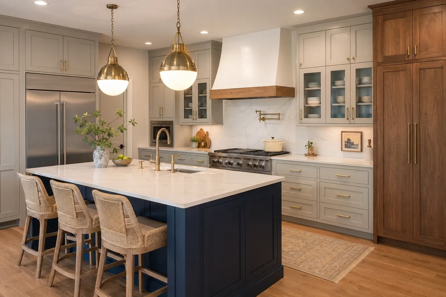
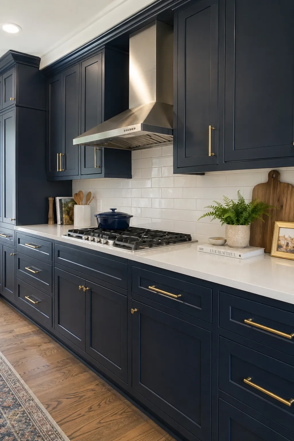
Navy is the most popular non-neutral cabinet color and it has serious staying power. It is dark enough to feel dramatic but blue enough to feel fresh. Navy works with brass hardware, marble countertops, and white walls like it was made for them. It is also forgiving of fingerprints and daily wear, which matters when you are touching cabinet handles dozens of times a day.
Designer Tip: If you are nervous about going full navy, paint just the island or the lower cabinets and keep the uppers white. This gives you the color without the full commitment, and it is easy to repaint one section later if you change your mind.
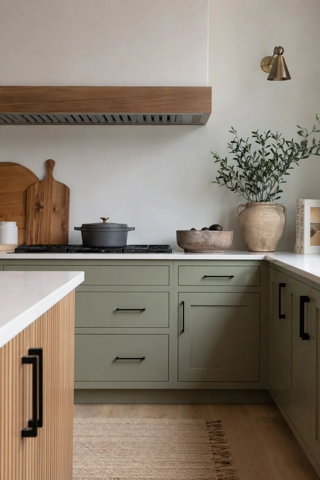
Sage green is having a huge moment and it is not going anywhere soon. It reads as a neutral despite being a color, which means it does not feel risky once it is on the cabinets. It brings warmth and a connection to nature that white simply cannot. Sage pairs beautifully with natural wood, white marble, and brass or black hardware. It makes a kitchen feel calm and grounded.
Designer Tip: Sage green looks different in every light condition. It can look grey in the morning and distinctly green in the afternoon. Always test your sage paint at different times of day before you commit. Natural light versus artificial light makes a big difference with this color.
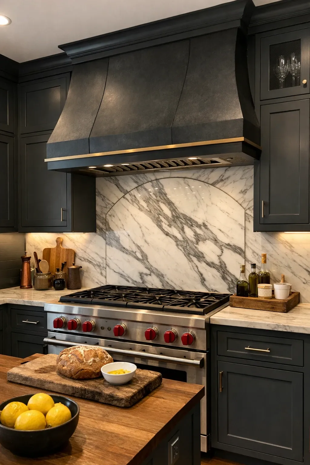
Charcoal is the darker, more sophisticated alternative to the light grey that has been everywhere for the past decade. It is close to black but softer, which makes it more versatile. Charcoal cabinets work well with light countertops and floors because the contrast is dramatic but not as stark as black and white. It is a color that looks expensive regardless of what you spend on the actual cabinets.
Designer Tip: Make sure you have enough light in the kitchen for charcoal cabinets. A dark cabinet color in a kitchen with small windows and no overhead lighting will feel oppressive. If light is limited, use charcoal only on the lowers and go lighter on the uppers.
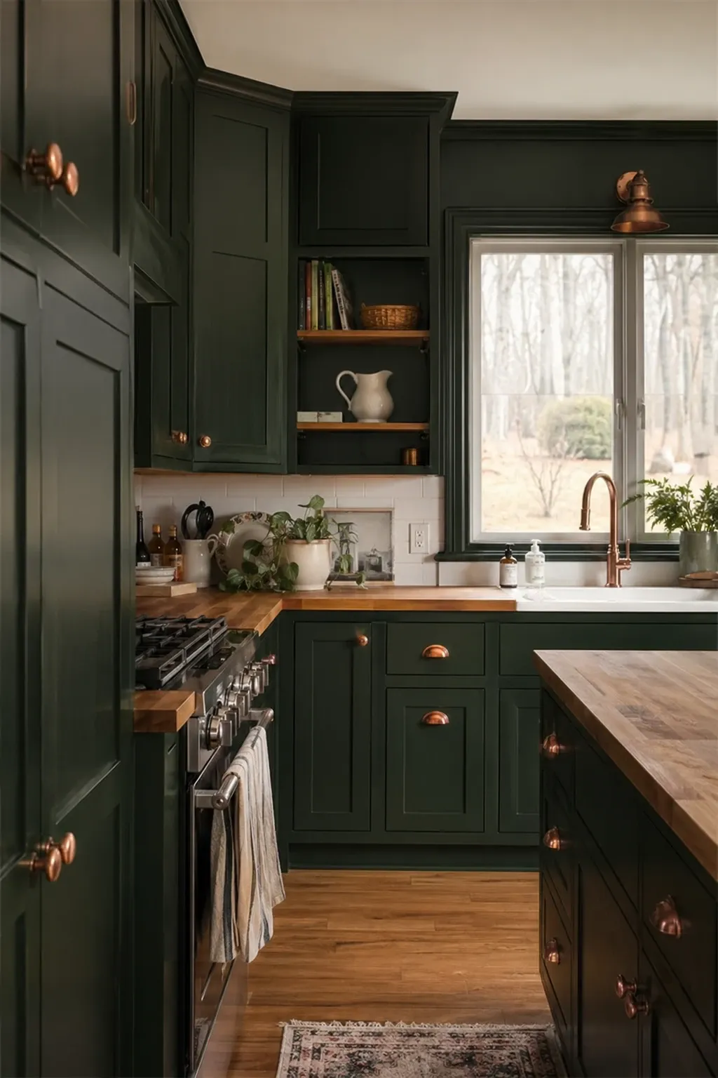
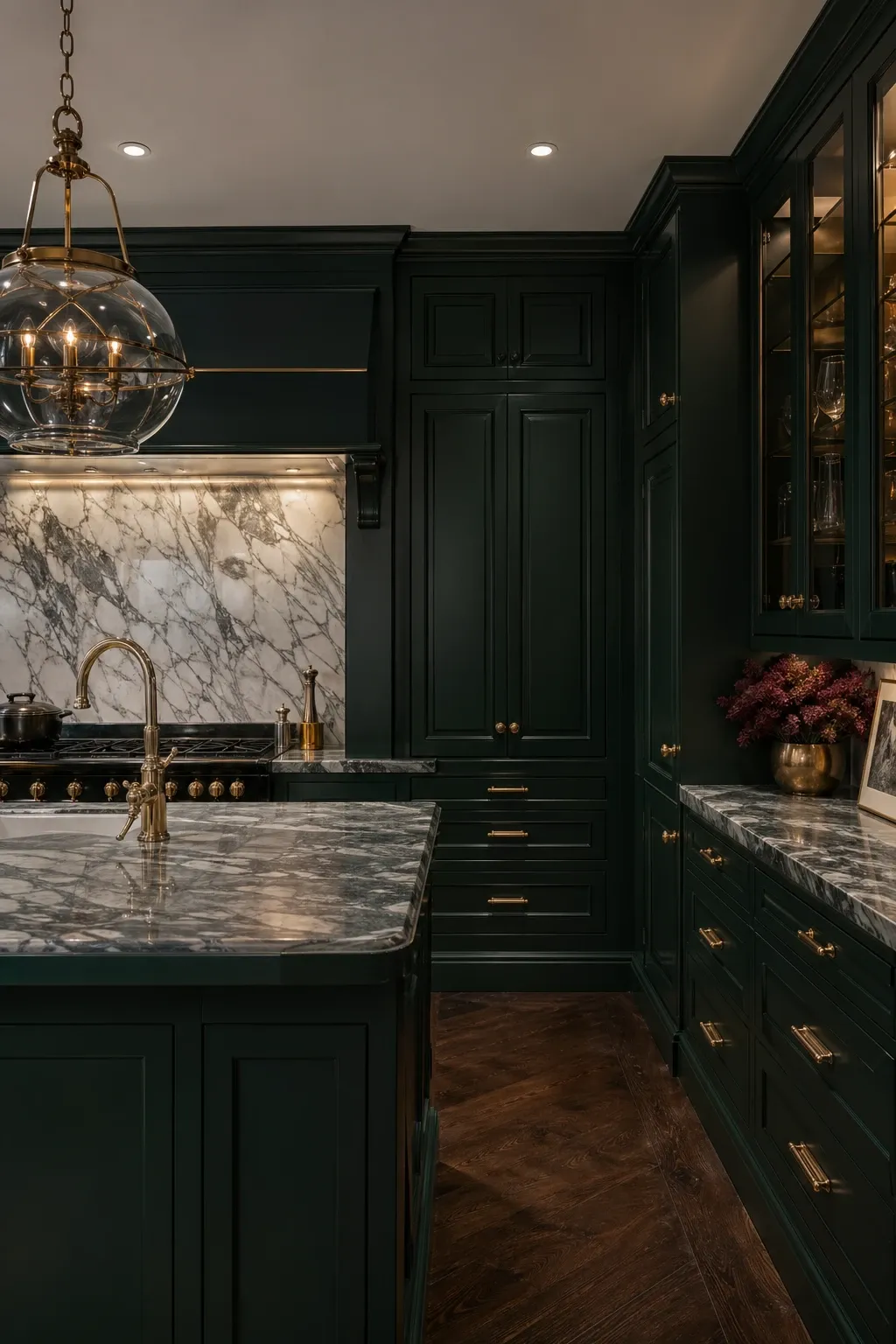
Forest green is bolder than sage and makes a much bigger statement. It feels rich, dramatic, and a little old-world. Paired with brass hardware and a marble countertop, a forest green kitchen looks like it belongs in a renovated English estate. It works best in kitchens with generous natural light because the dark green can absorb a lot of light in smaller, dimmer spaces.
Designer Tip: Forest green and unlacquered brass age together beautifully. As the brass develops its patina, it takes on a greenish tint that mirrors the cabinet color. It is one of the rare cases where aging makes everything look better.
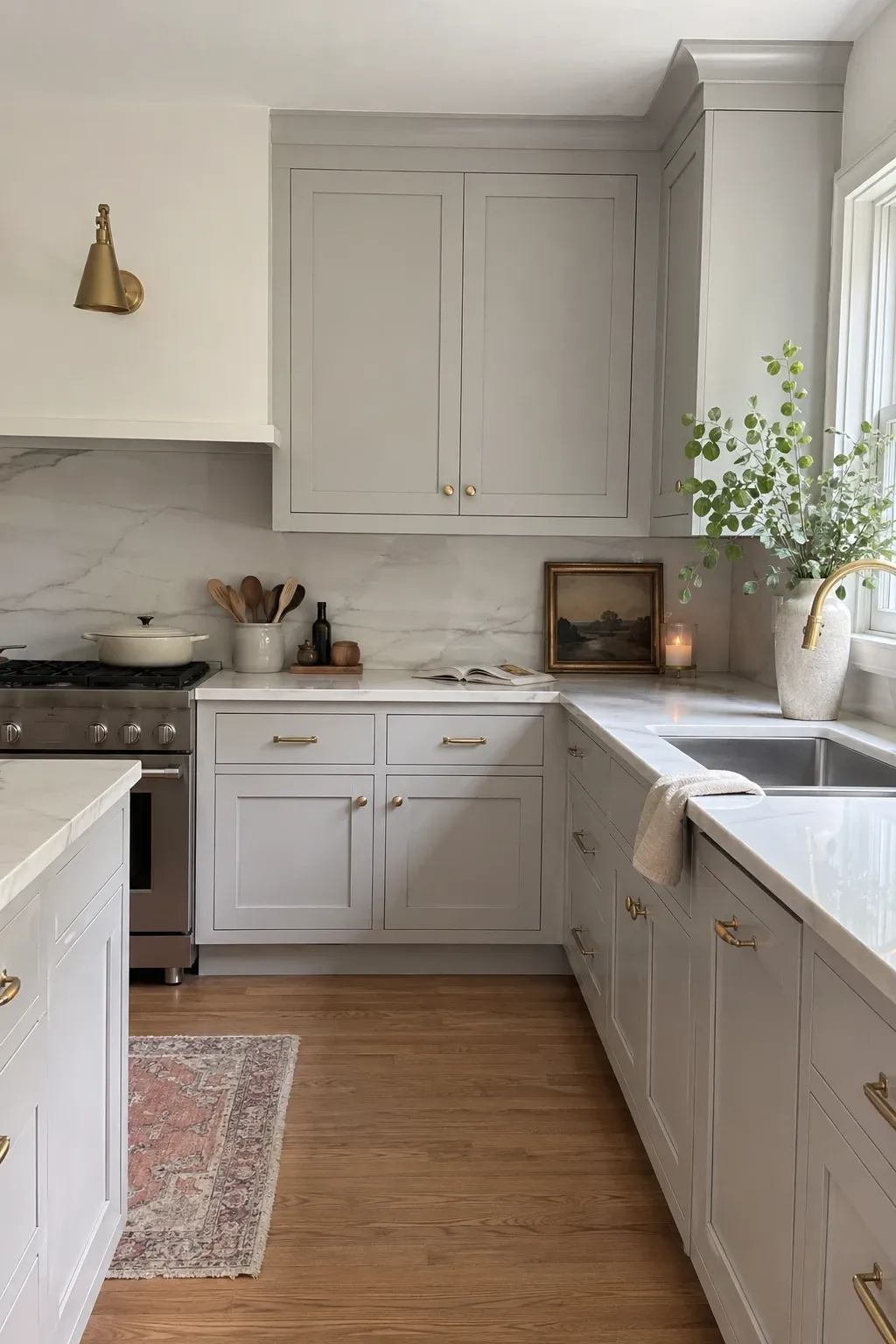
Greige, that grey-beige hybrid, is for people who want something warmer than grey but more modern than beige. It is one of the most versatile cabinet colors because it sits perfectly between warm and cool. Greige works with almost every countertop color and hardware finish. It is also forgiving, hiding scuffs and daily grime better than pure white.
Designer Tip: Pair greige cabinets with a white countertop rather than a grey one. Two greys next to each other can look muddy if the undertones do not match perfectly. White gives the greige something clean to contrast against.
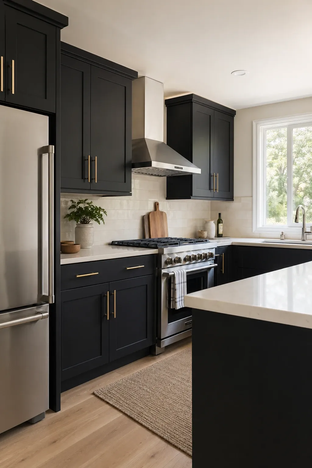
Black cabinets are bold, full stop. They create a dramatic kitchen that feels deliberate and modern. Matte black is more forgiving than gloss because it hides fingerprints and does not show streaks. Black cabinets work best when balanced with lighter elements, a white ceiling, light floors, and a lighter countertop or backsplash. Without those lighter elements, the kitchen can feel too dark.
Designer Tip: In a black kitchen, your lighting needs to work harder. Under-cabinet lights, pendant lights, and recessed cans are all necessary to keep the space from feeling like a dark box. Plan for more light sources than you think you need.
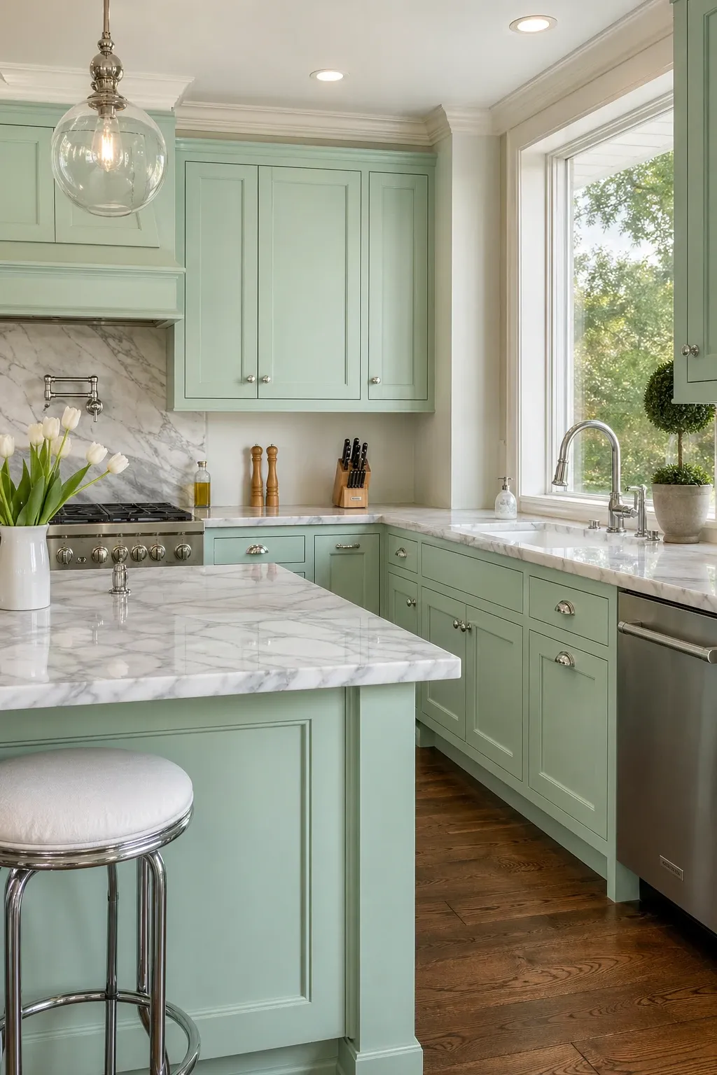
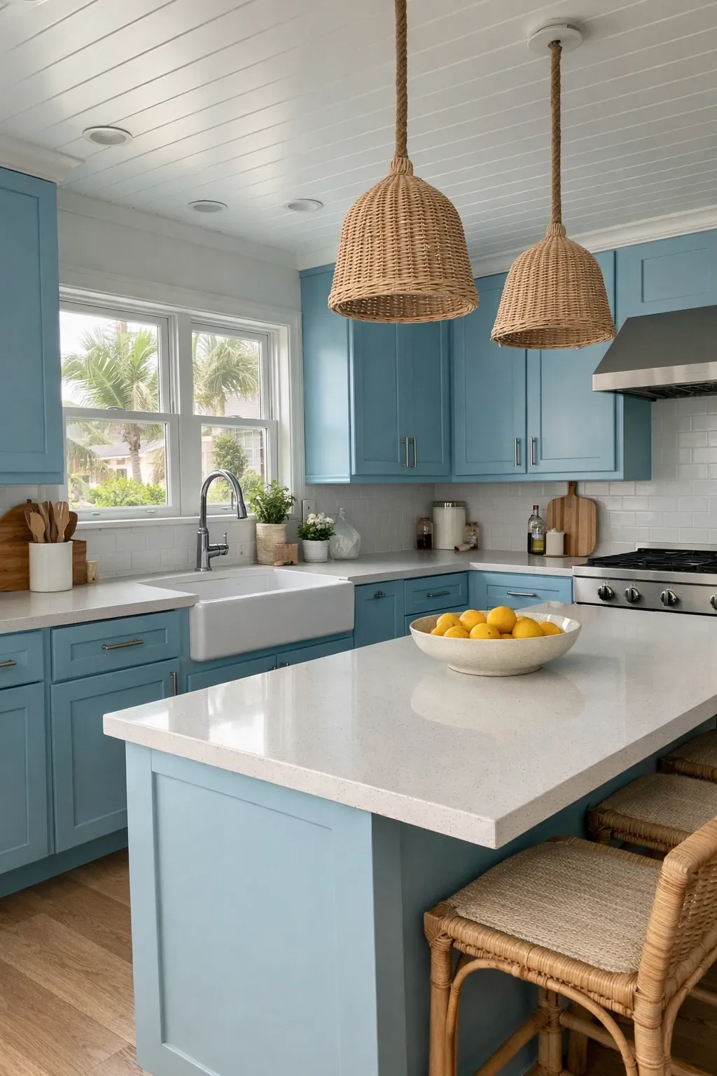
A soft, muted blue on kitchen cabinets brings a calm, coastal quality to the room without going full beach house. Think the color of a faded denim jacket rather than a bright sky blue. It works especially well in kitchens with white marble countertops and natural wood accents. The blue is relaxing without being cold, and it creates a kitchen that people genuinely enjoy spending time in.
Designer Tip: Soft blue cabinets look best with silver or nickel hardware rather than brass. The cool tones of the blue and the silver work together, while brass can feel disconnected from the cool palette unless you also have warm wood tones in the room.
Terracotta is warm, earthy, and unexpected in a kitchen. It is not as common as green or blue, which gives it a uniqueness that those colors have lost through overuse. A muted, clay-like terracotta works best rather than a bright orange. It pairs well with cream countertops, natural wood, and black hardware. The color evokes Mediterranean and Southwest design traditions, which adds a sense of place to the room.
Designer Tip: Use terracotta on the island or a single bank of cabinets rather than the entire kitchen. It is a warm color that can become overwhelming in large doses. As an accent, it adds personality. On every surface, it can feel heavy.
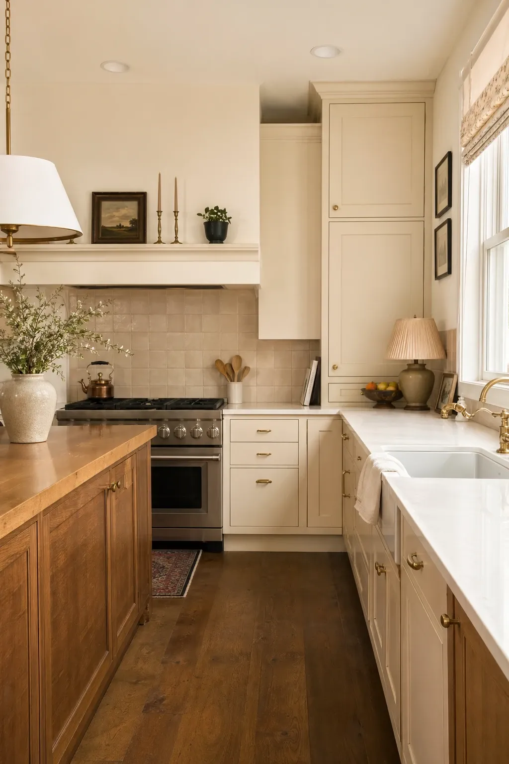
Cream is white’s warmer, more approachable sibling. It feels cozy where white can feel clinical. Cream cabinets work particularly well in kitchens with warm wood floors, natural stone countertops, and traditional or cottage-style architecture. The slight yellow undertone gives the room a glow that pure white cannot achieve. It is one of the most underappreciated cabinet colors.
Designer Tip: Do not put cream cabinets next to pure white walls or countertops. The contrast makes the cream look yellowed and dirty. Pair cream with warm whites, off-whites, or warm-toned surfaces so everything lives in the same color temperature.
Plum is a dark, rich purple-brown that creates a deeply atmospheric kitchen. It reads as almost black in low light and reveals its purple character in sunlight. This is a color for people who want something truly different. Paired with gold hardware and a light stone countertop, a plum kitchen feels luxurious and a little mysterious. It is definitely not for everyone, but the people who choose it tend to love it.
Designer Tip: Balance plum cabinets with plenty of white or cream on the walls, ceiling, and countertops. The light surfaces prevent the room from feeling heavy and let the plum be the star without overwhelming the space.
Olive green sits between sage and forest green and has a warm, brownish undertone that makes it feel very natural. It looks like something that has been around for decades rather than a trendy new color. Olive green cabinets with butcher block counters and black hardware create a kitchen that feels rustic and honest. It is a color that gets better with age and works in both modern and traditional spaces.
Designer Tip: Olive green is one of the few cabinet colors that looks good with both warm and cool hardware. Brass brings out the warm tones. Black or matte nickel emphasizes the green. Choose based on the overall mood you want.
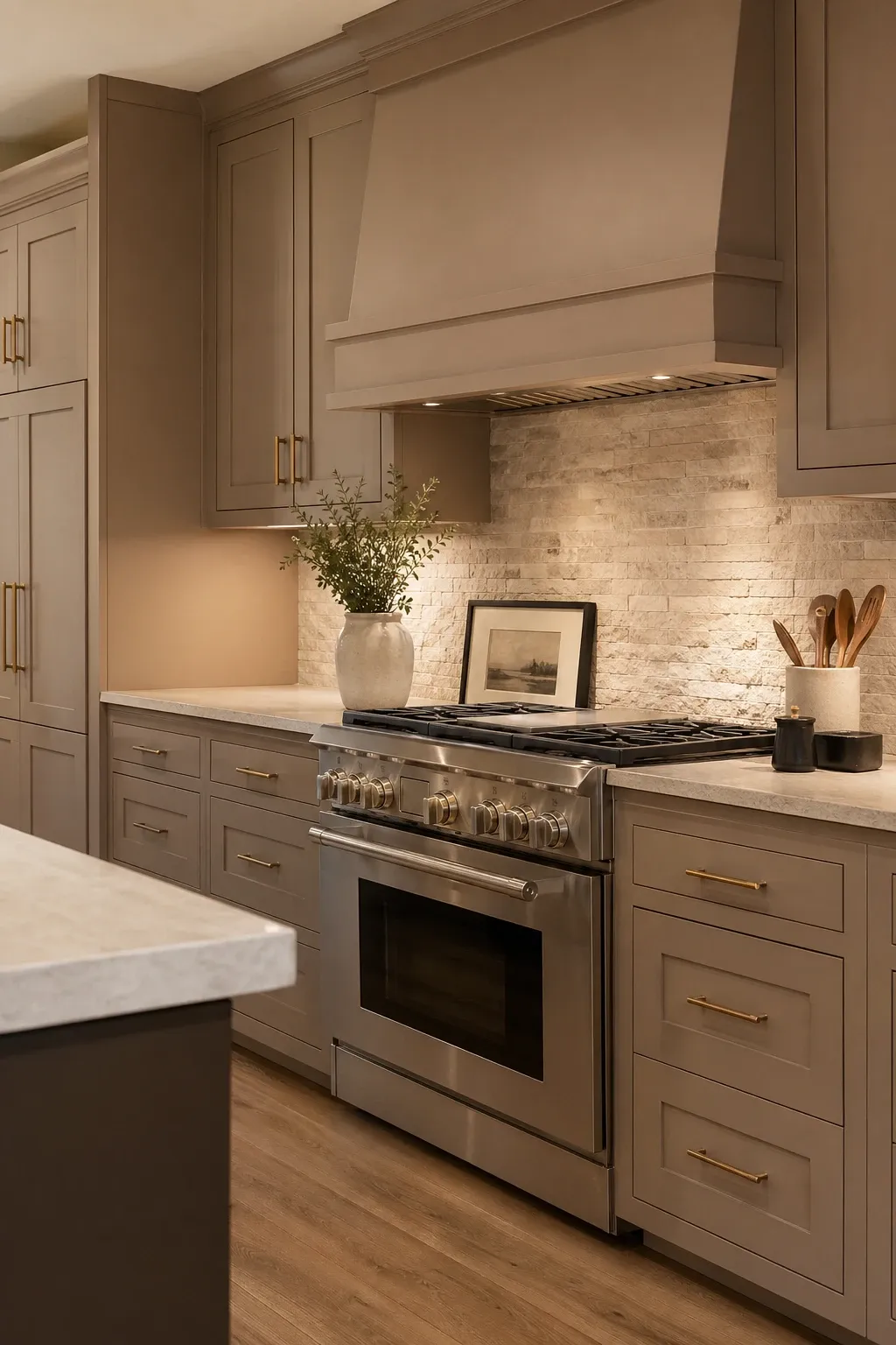
Mushroom is a soft, warm brown-grey that has started showing up in high-end kitchens. It is earthy without being dark and neutral without being boring. Mushroom cabinets create a kitchen that feels warm and enveloping, like being wrapped in a cashmere sweater. It works with marble, concrete, wood, and almost every countertop material because it is genuinely neutral despite being a color.
Designer Tip: Layer different shades of brown and taupe in a mushroom-toned kitchen to create depth. A mushroom cabinet with a slightly lighter countertop and a slightly darker floor creates a tonal gradient that feels sophisticated and intentional.
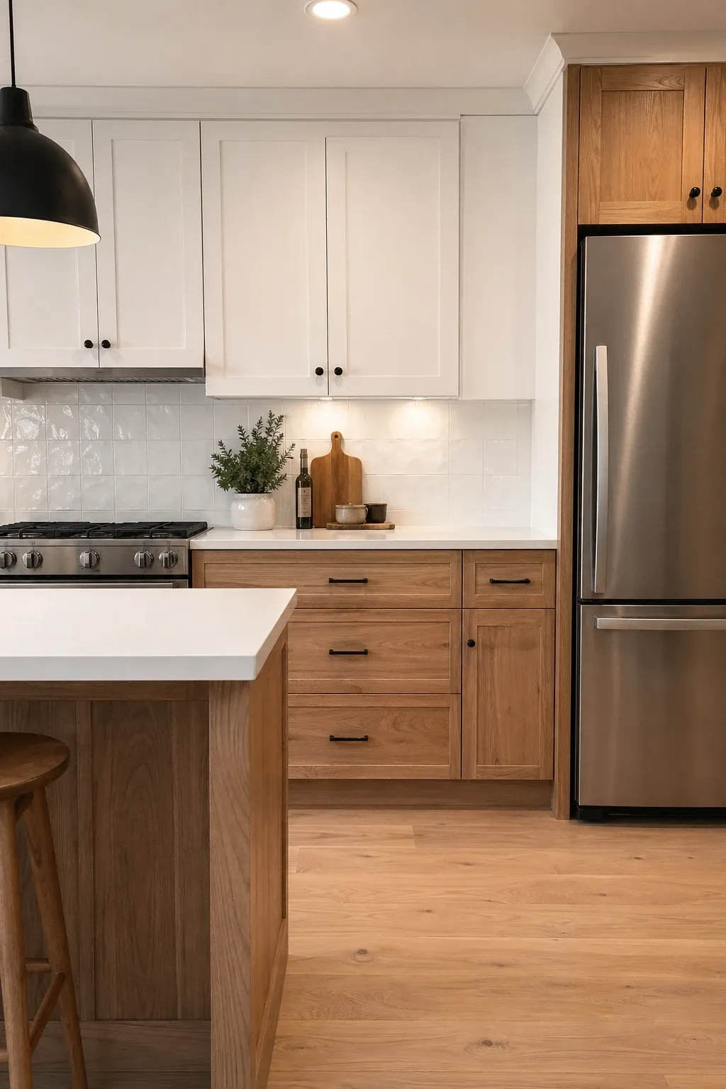
Not technically a single color, but white cabinets mixed with natural wood-front cabinets is one of the best-looking kitchen combinations right now. The white keeps things bright and the wood adds warmth and texture. Usually the uppers are white and the lowers or island are natural wood, but the reverse works too. The wood grain becomes the pattern and the white provides the clean backdrop.
Designer Tip: Use a wood species with visible grain like white oak or walnut. Smooth, grain-free wood fronts lose the whole point of mixing wood with paint. The grain is what adds texture and visual interest to the combination.
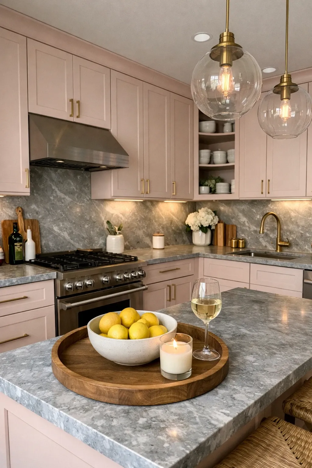
Dusty rose is muted enough to work as a neutral but pink enough to feel fresh and unexpected. It creates a warm, soft kitchen that feels welcoming without being sweet. Dusty rose with marble countertops, brass hardware, and white walls is a combination that looks feminine in the best way. It is a color that photographs beautifully and tends to make people smile when they walk into the kitchen.
Designer Tip: Anchor a dusty rose kitchen with at least one dark element, black hardware, a dark wood floor, or a dark pendant light. Without something dark to ground it, a pink kitchen can feel like a nursery. The contrast gives it sophistication.
The best cabinet color is the one you actually enjoy living with, not the one that looks best on a Pinterest board. If you cook every day, you will stare at your cabinets more than almost any other surface in your home. Pick a color that makes the kitchen feel like a room you want to be in, not one you are just passing through.
Frequently Asked Questions
What kitchen cabinet color has the best resale value?
White and off-white consistently test highest for resale appeal because they are universally inoffensive. Navy and sage green are growing in resale popularity. Very trendy or very bold colors can narrow your buyer pool, but in a well-designed kitchen, most neutral and classic colors will not hurt your resale.
What paint finish is best for kitchen cabinets?
Semi-gloss or satin finishes are the standard for kitchen cabinets because they are durable and easy to wipe clean. Matte finishes look beautiful but show fingerprints and scuffs more easily. If you want a matte look, choose a matte-finish paint that is specifically designed for cabinets and has a hard, washable surface.
Should upper and lower cabinets be the same color?
They do not have to be. Two-tone kitchens with different colors on the uppers and lowers are very popular and look great when done well. The general rule is lighter on top and darker on bottom, but the reverse can work in kitchens with high ceilings. If you do go two-tone, make sure the two colors are clearly different, not just slightly off from each other.
How often do kitchen cabinets need to be repainted?
Well-painted cabinets with proper primer and a good paint product should last 8 to 15 years before needing a refresh. High-traffic areas around handles may show wear sooner. Using a quality cabinet-specific paint rather than wall paint makes a significant difference in durability and longevity.