The studio apartment problem is not the size. It is the bed sitting in the middle of everything, visible to every guest, claiming every square metre, making the room feel like a place where you sleep rather than a place where you live. Every idea in this article solves a real studio problem, not just a decorating challenge.
The Bed-in-the-Room Problem
1. The Joinery Wall That Hides the Fact It’s a Studio
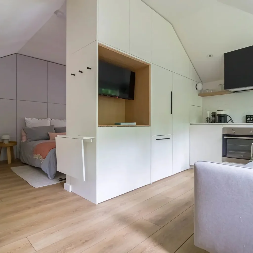
A custom floor-to-ceiling joinery spine built across the width of the studio does the work of a wall without taking the space of one: one face holds the TV and a fold-down desk, the other face is the headboard, and storage is built into the depth of the unit so neither zone loses floor area. The sleeping zone here is fully concealed from the living space and the kitchen, so a guest walking in sees a living room and a kitchen with no immediate clue that the bed is just behind the cabinetry. A freestanding tall bookcase positioned perpendicular to the room achieves a lower-cost version of the same zoning logic for renters who cannot install joinery.
Pro Move: A joinery spine wall can be replicated at any budget: a row of identical open bookcases placed back to back fills with books on one side and a styled shelf on the other, creating zone division at a fraction of the cost.
2. The Slatted Wood Divider That Lets Light Through
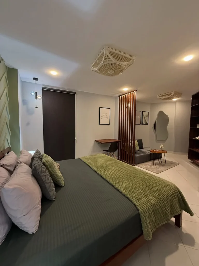
A freestanding slatted wood partition between the sleeping zone and the living area creates visual separation without blocking light or making the room feel enclosed, and it can be installed and removed without any fixings into the wall or ceiling. The green duvet and sage palette here give the sleeping zone its own colour identity distinct from the living area visible through the slats, reinforcing the separation without a physical wall. A fold-down desk mounted on the partition face turns the divider into a productive piece of furniture rather than just a visual barrier.
Quick Tip: A slatted room divider works best when each side has a slightly different colour tone: same family but one shade warmer on the sleeping side and cooler on the living side to create a genuine sense of two rooms.
3. The Crittall Glass Partition That Reads Like Architecture
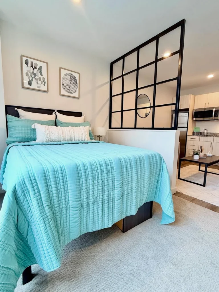
A black steel Crittall-style grid partition between the bed zone and the kitchen and living area creates the feeling of a proper bedroom because the grid pattern suggests architecture rather than furniture, and it allows light to pass freely so neither side becomes dark or enclosed. This type of partition is available as a freestanding unit from budget homeware retailers, making it fully renter-safe, and the black steel frame creates a graphic element that makes the whole room feel designed. The round mirror incorporated into one of the grid panes doubles the visual depth of the sleeping zone.
Designer Advice: A Crittall-style partition only reads as architecture rather than furniture when it reaches close to ceiling height: a half-height partition signals furniture, a full-height partition signals room.
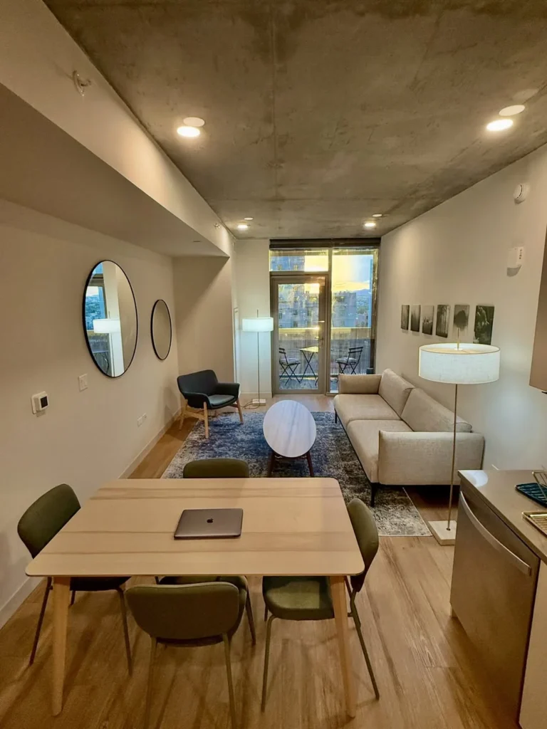
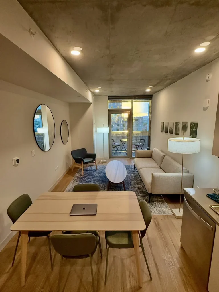
A wood dining table positioned between the kitchen and the living zone with a laptop on it and paired round mirrors on the wall beside it creates a working zone genuinely separated from the sleeping and living areas without any partition. In a studio with a concrete-coffered ceiling like this one, the raw architectural character is strong enough to absorb multiple functions without the room feeling cluttered. The vintage Persian rug beneath the sofa defines the living zone without blocking the sight line through the dining and kitchen area.
Reality Check: In a studio, a dining table that doubles as a work desk is almost always more useful than a separate coffee table and desk: the combined footprint is smaller and the surface is large enough for both functions.
5. The Built-In Banquette That Adds Dining Without Floor Space
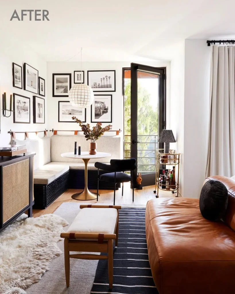
A built-in corner booth with upholstered bench seating and hidden storage beneath it solves the studio’s dining problem more efficiently than a freestanding table and chairs, because no space is needed for chair legs to be pulled out and the under-seat storage is the most cost-effective storage per square metre in any room. The black-and-white photography gallery wall above the banquette and the gold tulip pedestal table create a proper dining zone that reads as a designed space rather than a corner where people squeeze in to eat. A gold bar cart beside the banquette turns the dining zone into a hosting corner that guests gravitate toward naturally.
Pro Move: A corner banquette with lift-up seat storage handles bed linen, seasonal clothing, and oversized items that otherwise have nowhere to go in a studio apartment.
6. The Bar-Height Kitchen Table That Zones Without Walls
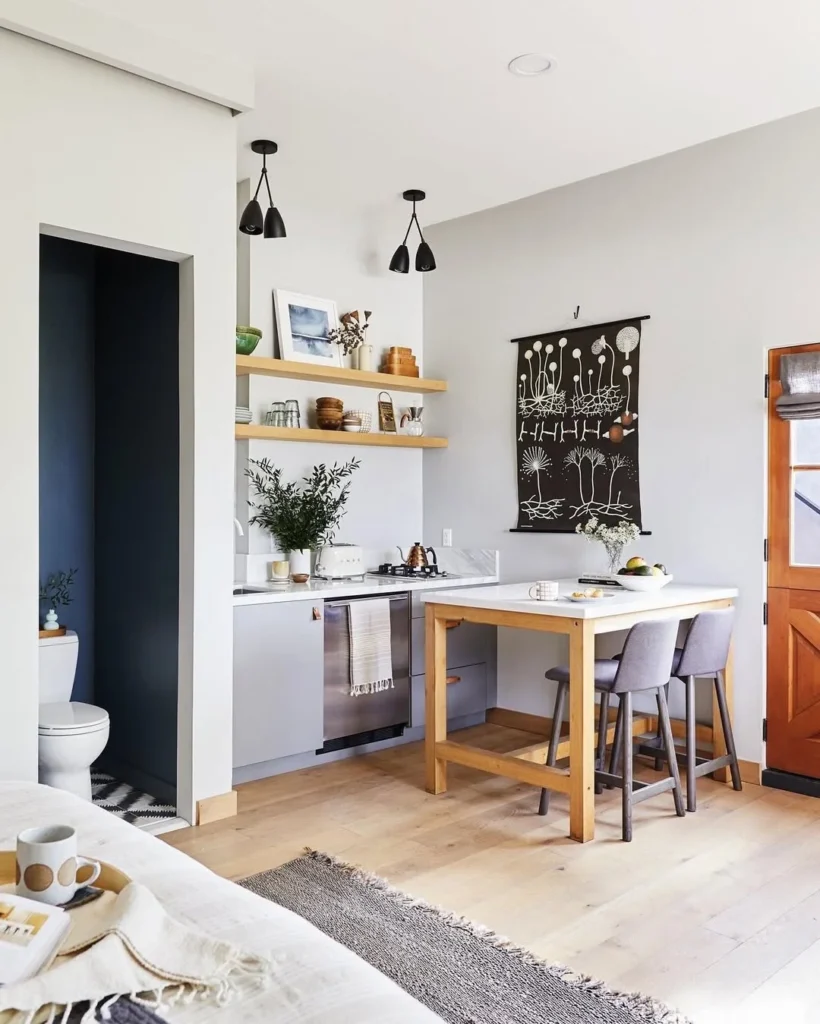
A bar-height wood dining table with stools positioned just beyond the kitchen counter creates a dining zone that is physically connected to the kitchen but visually distinct from the living and sleeping areas, and the raised height means the table doubles as a preparation surface without anyone noticing. The oak open shelving here, styled with ceramics, books, and a botanical wall hanging, turns the kitchen wall into a room-spanning feature that gives the studio a visual anchor as strong as any piece of furniture. Two black pendant lights hung over the table zone define the dining area from above in the same way a pendant over a formal dining table does in a larger home.
Quick Tip: A pendant light hung directly above any surface in a studio apartment defines that surface as a distinct zone without needing walls or partitions.
7. The Bold Colour Sofa That Anchors the Living Zone
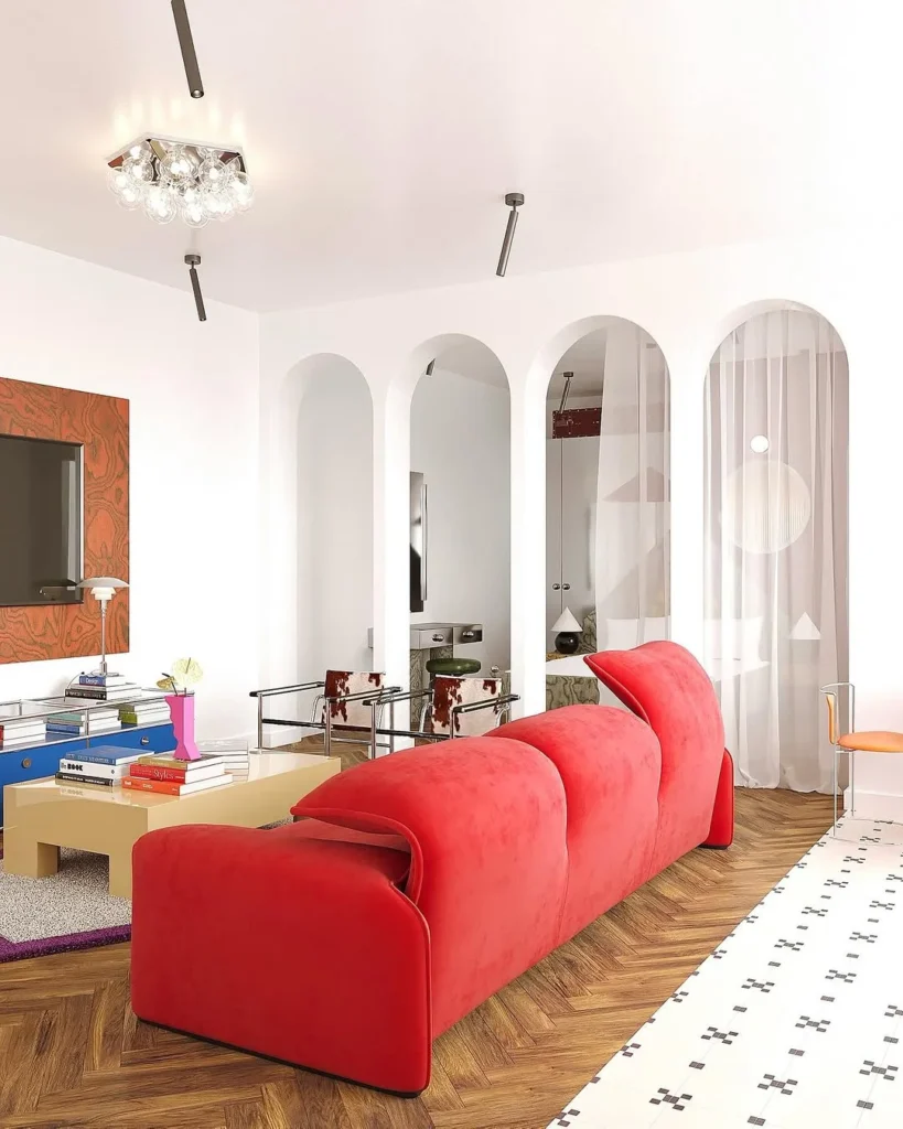
A red velvet modular sofa positioned in the centre of a studio with its back to the bedroom zone and its face to the living zone is the most confident zone-definition move available without any structural intervention, because the sofa’s scale and colour declare the living area so emphatically that zones read as separate even without physical separation. The series of white-painted arched openings in this room already divide the space, and the red sofa mirrors their graphic boldness so furniture and architecture feel like one composition. A plain cream coffee table and herringbone parquet floor keep the rest of the room quiet enough for the sofa to do its work.
Reality Check: A bold-coloured sofa with its back to the sleeping zone and its face to the living zone is the single most effective non-structural room divider in a studio because its visual weight declares the separation without requiring any fixings.
The No-Storage Problem
8. The Mezzanine Shelf That Uses Space Nobody Else Touches
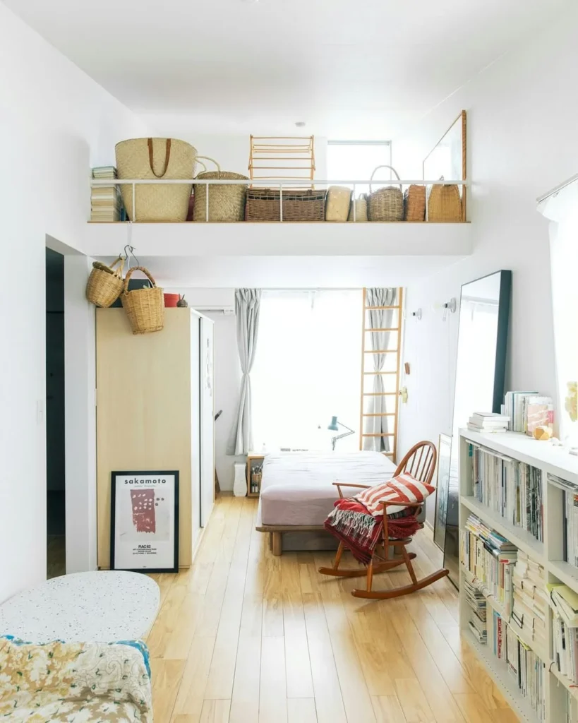
A mezzanine-level shelf running the full width of the room at around 210 cm, accessed by a wooden ladder, turns the dead zone between the top of the wardrobe and the ceiling into genuine storage for baskets, seasonal items, and anything that does not need daily access. In a studio where every square metre of floor space is in permanent competition, moving storage upward rather than outward is the only design decision that genuinely creates more usable floor area. The collection of straw market baskets stored at height here reads as an aesthetic feature from below.
Designer Advice: Use identical baskets or boxes on any high-level storage shelf so the storage reads as a deliberate display from below rather than a chaotic accumulation at ceiling level.
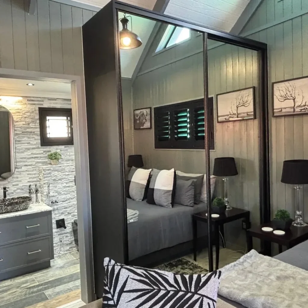
A floor-to-ceiling mirrored sliding wardrobe door stores everything behind smooth panels that add no visual weight and reflects the room so effectively that the spatial perception of the space doubles. Here the mirrored wardrobe reflects the bed, the framed art, and the lamp, creating the illusion that the room continues beyond its actual walls, and the sage green tongue-and-groove timber walls give the reflection a warmth that plain white walls cannot replicate. In a studio where the wardrobe is often the biggest piece of furniture, fitting sliding mirrored doors is the most functional upgrade per pound spent.
Quick Tip: A mirrored wardrobe door must face either a window or a well-lit lamp to work effectively: a mirror reflecting a dark corner adds perceived depth but not light, which makes the room feel both larger and darker.
The Atmosphere Problem
Studio Zone Problems: Quick-Reference Fix Guide
Zone Problem
Best Solution
Cost Level
Renter Safe?
Bed always visible
Floor-to-ceiling curtain track
Low
Yes
No room separation
Crittall-style glass partition
Mid
Yes — freestanding
No zones at all
Slatted wood room divider
Low to mid
Yes — freestanding
No dining space
Bar-height table doubling as desk
Low
Yes
No storage
Mezzanine shelf above wardrobe
Mid
Yes if ceiling allows
Bed dominates room
Built-in joinery spine wall
High
Depends on lease
Working from home
Built-in desk beside kitchen niche
Mid
Yes — freestanding unit
Hosting is awkward
Built-in booth seating with storage
Mid to high
Depends on lease
10. The Ceiling Cove LED That Adds Architecture for Almost Nothing
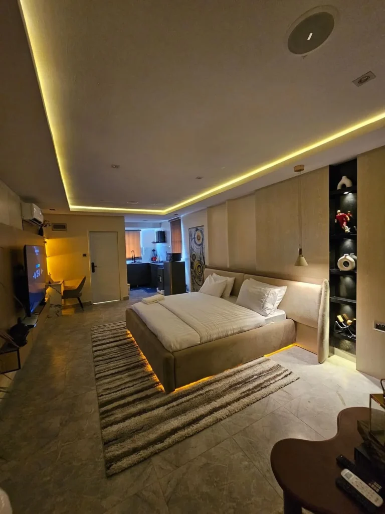
Warm amber LED strip lighting in a recessed ceiling cove changes a studio from a room with a bed in it to a room that feels deliberately designed, because cove lighting is a feature associated with high-specification hotel suites and its presence signals investment and intention regardless of the budget of everything else in the room. In a studio where the ceiling is the one surface completely free of furniture and clutter, indirect cove lighting at the perimeter creates a glow that fills the room from above and makes every surface below look more considered. The built-in display shelving niche lit from behind here adds a second layer of depth that anchors the whole composition.
Pro Move: Warm white LED strip at 2700K in a simple timber batten cove around the ceiling perimeter costs under fifty dollars in materials and produces a hotel suite quality of ambient lighting that no floor lamp or pendant can replicate.
11. The Terracotta Ceiling That Wraps the Bedroom Niche
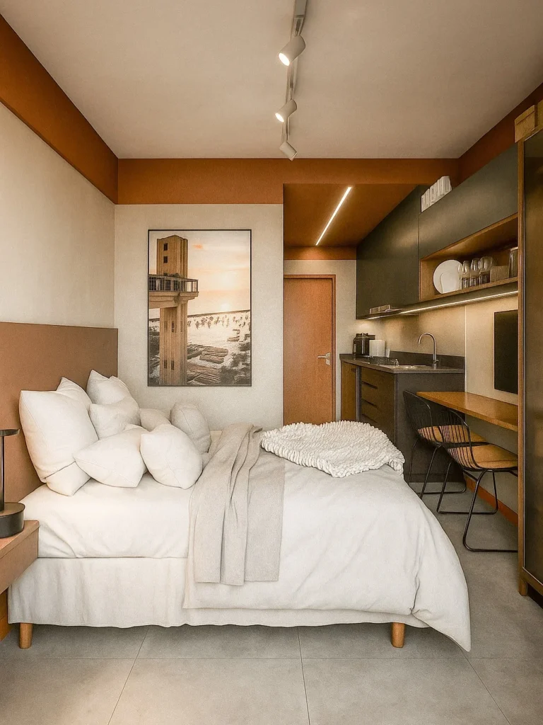
Painting the ceiling and one upper wall section in warm terracotta while keeping the rest of the studio in cream creates a colour-defined zone that the brain reads as a separate room without any physical separation, because colour boundaries in a single space have a surprisingly strong psychological room-defining effect. Here the terracotta zone covers the ceiling and the upper section of the bedroom wall, drawing the eye upward and making the bed zone feel contained and warm while the kitchen and desk area beyond remain light and neutral. Track lighting at the boundary between the two tones directs focused light into the desk and kitchen zone without bleeding warm colour into the workspace.
Designer Advice: Painting a ceiling zone in a studio a different colour creates a room-within-a-room effect with a paint brush: use a warm tone over the sleeping zone and keep the rest of the ceiling white or neutral.
12. The Ornate Wall Niche Feature That Replaces Art Entirely
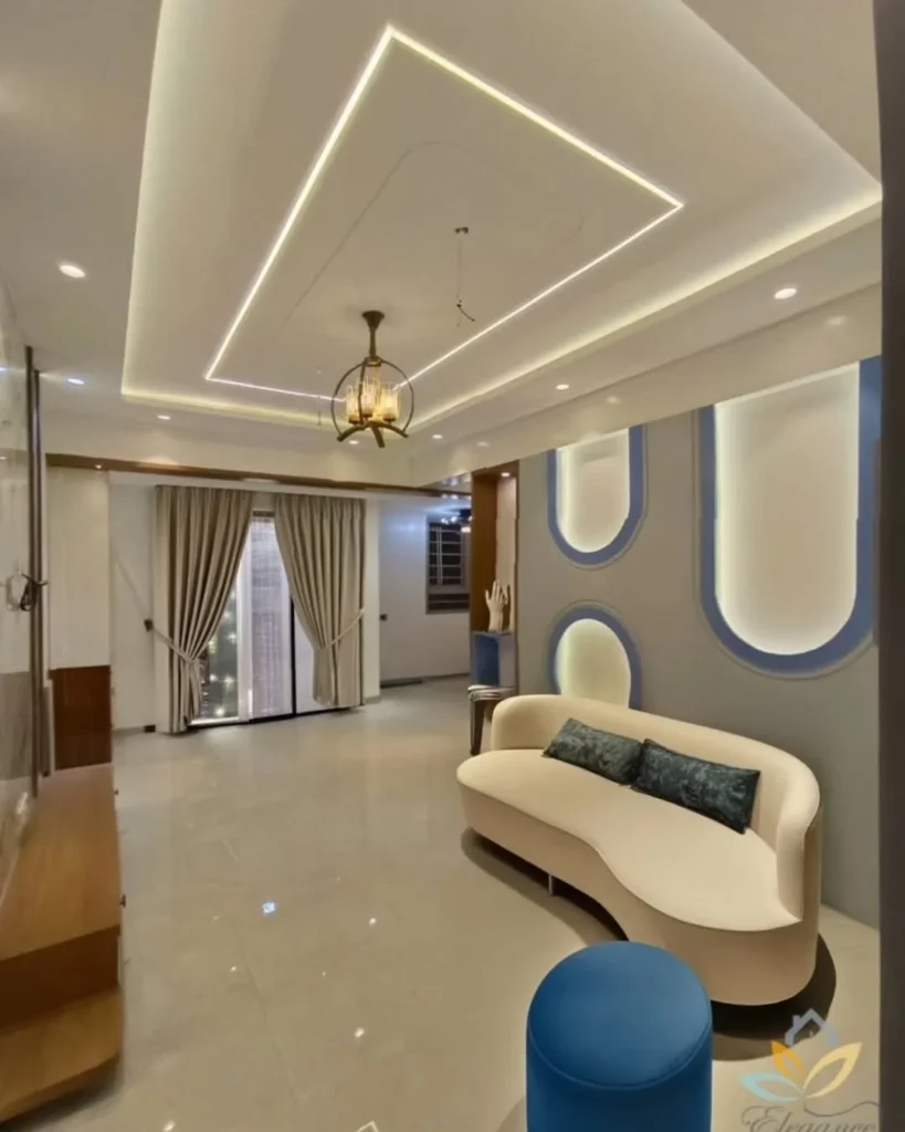
A dramatic wall feature of backlit oval niches in white and blue, fronted by a curved cream sofa, demonstrates that a studio apartment does not have to look like a compromise: this room looks like a hotel lobby area, and that quality comes entirely from the wall feature and the curved sofa silhouette rather than from the size of the space. The oval arched niches with built-in lighting add depth and illumination simultaneously without occupying any floor area, and the blue velvet stool at the sofa’s base introduces the accent colour from the niche outlines into the furniture zone so the room reads as coordinated. An ornate gold pendant above the seating zone gives the studio the vertical centrepiece it needs to feel like a finished room.
Quick Tip: Backlit wall niches can be replicated at low cost using shadow-box picture ledges with LED puck lights inside: the illusion of depth and illumination reads the same from across the room regardless of the material or finish.
13. The Red Accent Studio That Reads as an Intentional Choice
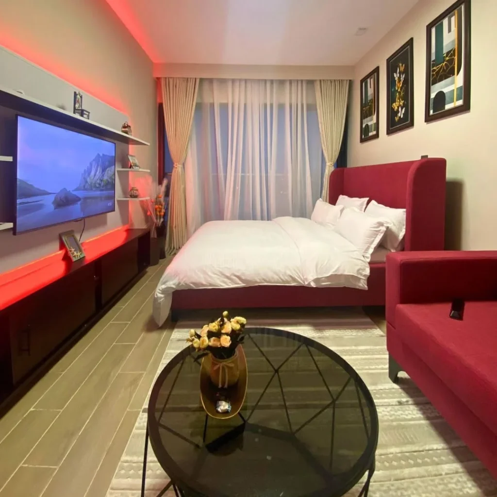
A red upholstered bed frame, a matching red accent chair, white linen, an LED-backlit TV wall, and a glass coffee table create a studio that reads as complete and intentional within a very small floor plan, and the lesson from short-let and hospitality design is that a strong accent colour paired with crisp white linen and a backlit feature creates a room that looks finished from the moment you walk through the door. Gallery art prints in gold frames on the wall above the sofa add the personality layer that lifts the room from practical to personal, and the neutral wall and floor tone keeps the red from overwhelming the space. Choosing one colour and using it in exactly two pieces of furniture, the bed and one accent chair, is the precision that keeps a bold palette from reading as excess.
Reality Check: A studio styled with one strong accent colour used in exactly two furniture pieces and balanced by white linen and neutral walls will always read as more considered than a studio with multiple soft accent colours and no clear focal point.
The Personality Problem
14. The Victorian Loft That Lets the Architecture Do Everything
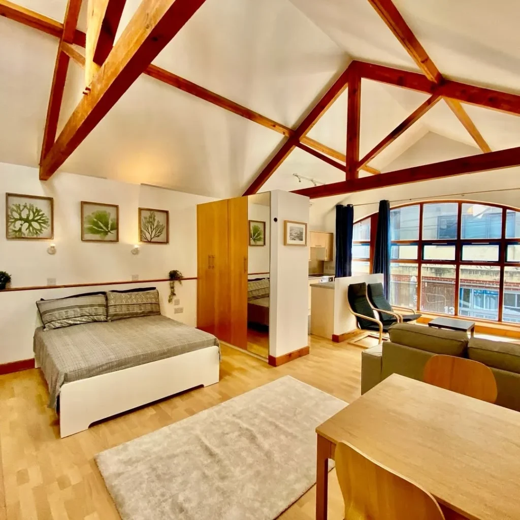
A studio apartment inside a Victorian industrial conversion with exposed red pine roof trusses, an arched warehouse window, and original timber floors has architectural character so strong that the furniture barely needs to do any decorating work, and recognising this is the most important design decision an occupant of such a space can make. The approach here, a daybed used as a sofa, a low coffee table, and three botanical prints on the wall, is exactly right because it lets the structure speak. The arched window and the diagonal lines of the trusses create a room that photographs dramatically from every angle, which means restraint in the furnishing is rewarded rather than penalised.
Heads Up: In a studio with genuine architectural character, exposed beams, brick, or high ceilings, restraint is the best design decision: one good piece of furniture and a few simple objects outperforms a room filled with budget pieces trying to compensate.
15. The Japanese Studio With a Maker Space Built In
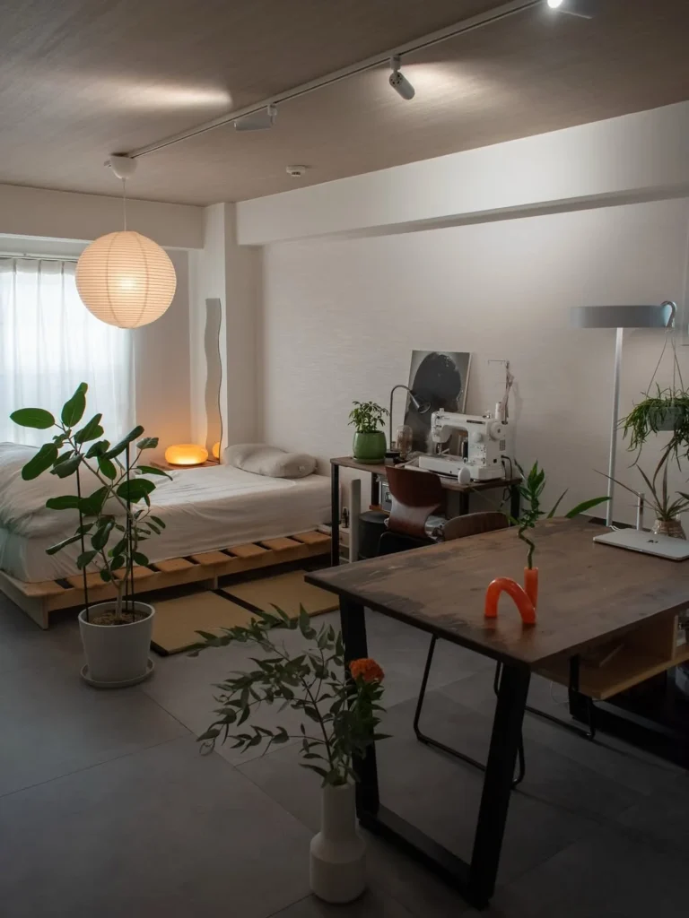
A studio that serves as both a living space and a creative workshop fits two complete programmes into one room by separating them with a visual layer rather than a physical wall: the pallet bed on a tatami platform defines the sleeping zone through material and height, while the live-edge work table on the other side of the Noguchi pendant defines the working zone through scale and function. Plants placed in both zones link the two sides visually without interrupting the floor plan, and track lighting overhead lets each zone be lit independently. Keeping the floor completely clear of objects between zones is critical, because the negative space between the zones is where the room breathes.
Quick Tip: In a studio that doubles as a workspace, place the desk on the opposite side of the room from the bed and use a pendant light over each zone: the different light quality in each area does more to separate them than any physical divider.
16. The Boutique Hotel Suite That Is Actually a Studio
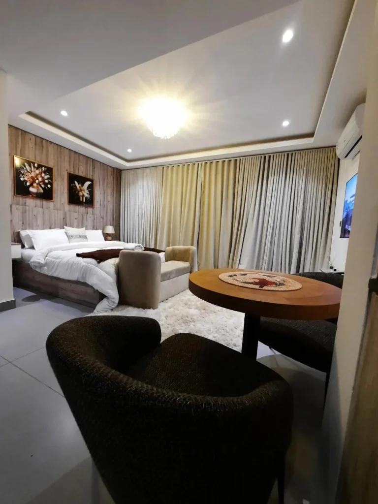
A studio apartment styled with a wood-clad feature wall behind the bed, floor-to-ceiling velvet drapes across the window wall, dark boucle armchairs, and a round wood coffee table creates the atmosphere of a boutique hotel suite rather than a rented studio, because every material in the room is warm, textural, and consistent in tone. The key principle here is that a studio apartment feels generous when the materials are luxurious even if the furniture is modest in scale: dark velvet, warm wood, and soft boucle together communicate richness that size alone cannot deliver. The ceiling tray detail with a central fixture gives the room a finished quality at the top that completes the hotel suite impression.
Designer Advice: In a studio, invest the decorating budget in materials and textiles rather than in furniture: a velvet curtain, a wood panel, and a boucle chair do more for a room’s quality feeling than three pieces of mid-range furniture.
The Blandness Problem
17. The Emerald Velvet Studio With Jewel Tone Confidence
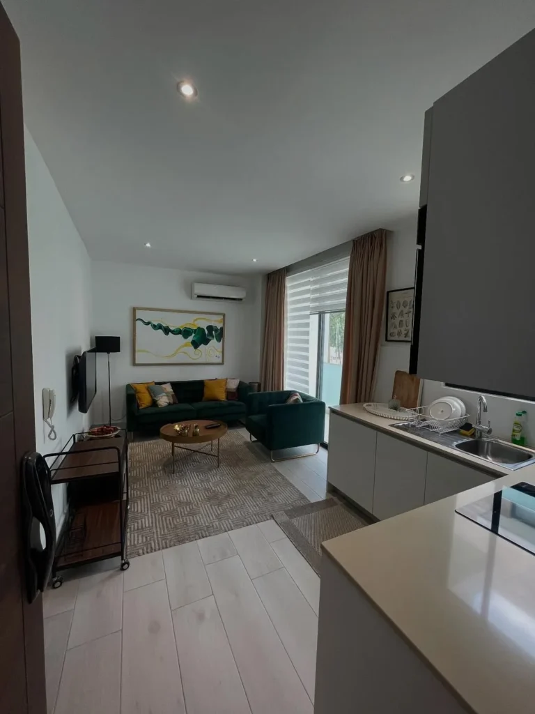
An emerald green velvet L-shaped sectional with mustard yellow cushions against a white wall with an abstract art print above it is the simplest possible recipe for a studio apartment that looks genuinely designed rather than neutrally furnished, because the jewel tone does the entire room’s personality work without requiring additional accessories or layering. The wood round coffee table and the warm tone curtains keep the room grounded so the green sofa reads as a statement rather than an accident, and the integrated grey kitchen behind maintains a visual connection through the shared warm floor tone. Choosing one jewel-tone upholstered piece as the room’s single statement is the fastest route from a neutral studio to one that has a point of view.
Quick Tip: A jewel-tone sofa in emerald, sapphire, or deep burgundy is the most effective single purchase in a studio apartment because it creates instant personality in every photograph and in every visitor’s first impression.
18. The NYC Studio Where Bed and Sofa Share a Palette
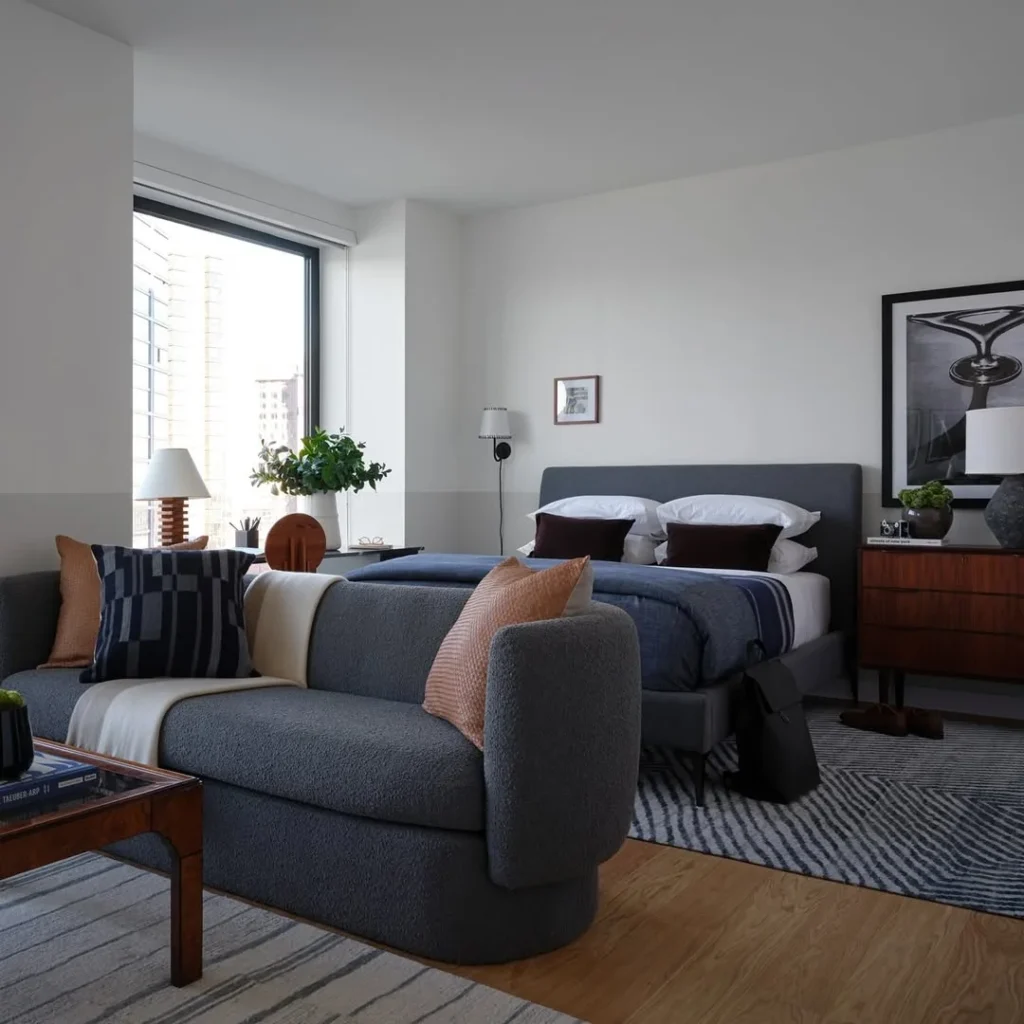
When the bed, the sofa, and all soft furnishings share the same charcoal grey palette across a studio, the sleeping zone and living zone stop competing for visual dominance and start reading as one cohesive, intentional interior where the bed simply happens to be in the room. The charcoal bouclé sofa and matching upholstered bed frame create a monochromatic consistency that the eye reads as a design decision rather than a lack of zoning, and the warm walnut dresser, the blue accent bedding, and the brown leather cushion are all the colour variety the room needs. A window corner with genuine city views is never interrupted by curtains or furniture in this room, which is correct: the view is the art.
Pro Move: In a studio where the bed and sofa share the same colour, every accessory becomes an accent: one warm wood piece, one deep-tone throw, and one plant bring the tonal room to life without competing with the sleeping zone.
19. The Concrete Ceiling Studio That Zones With Mirrors and Rugs
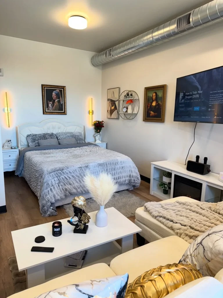
An exposed industrial HVAC duct running the full length of the studio ceiling is an architectural feature that a confident decorator embraces rather than hides, because the raw industrial duct is simply honest and making the room spectacular around it is far more interesting than pretending it does not exist. Gold vertical bar wall sconces on either side of the bed create a warm frame that makes the sleeping zone feel opulent despite the duct above, and a gallery of classical portrait paintings on the wall beside the bed connects the industrial ceiling to old European painting in the kind of unexpected collision that reads as genuine taste. A white sofa, white coffee table, and marble accessories in the living zone keep the room from feeling dark while the gold accessories and warm lamps balance the grey exposed ceiling.
Heads Up: Exposed industrial elements like ductwork, concrete columns, or raw pipework in a studio are design assets rather than problems: embracing them with warm materials and good lighting turns the room’s constraint into its character.
The Hosting Problem
20. The Gallery Wall Studio That Makes the Living Zone the Hero
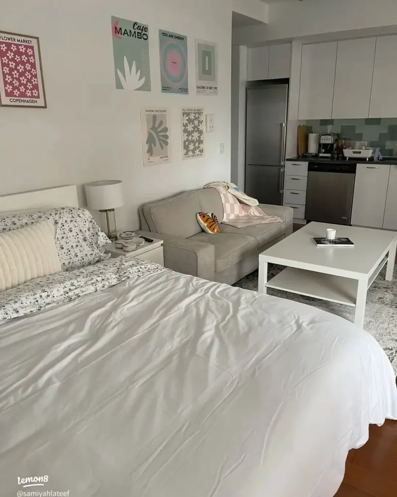
In a studio where the bed is visible from the sofa, the simplest way to make the living zone feel primary is to give it a gallery wall that dominates the shared wall and makes the sofa area feel like the room rather than a corner of a bigger room. Here Matisse-style botanical prints and colourful graphic posters above the sofa area draw every visitor’s eye to the sofa zone rather than to the bed, which is the most important reorientation available in a studio. A small coffee table, a compact grey sofa, and simple white bedding keep the rest of the room neutral enough for the gallery wall to do its work uninterrupted.
Designer Advice: In a studio, place the gallery wall above the sofa rather than above the bed: the art draws attention to the living zone and makes the sofa area feel like the primary room rather than a secondary corner.
21. The South Delhi Studio That Gets the Basics Right
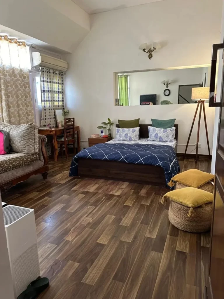
Dark hardwood floors, a navy duvet, a pair of yellow velvet floor cushions, a tripod floor lamp, and a large mirror on the wall: this studio works because every object in it is useful and every object has a quality that justifies its presence, which is the exact discipline that compact living requires. The classic furniture pieces, the dark wood bedframe, the carved wooden sofa, and the turned-leg dining table, give the room a sense of accumulated taste rather than recently purchased furnishing, and the wood floors tie every piece of dark furniture together so the room reads as a composition. A large rectangular mirror beside the bed reflects the window light across the room and adds the spatial depth that a single-room studio needs most.
Quick Tip: A large rectangular mirror positioned beside the bed to reflect the main window light is the most effective and most affordable spatial move in any studio apartment.
22. The Warm West African Studio With Ribbed Textures
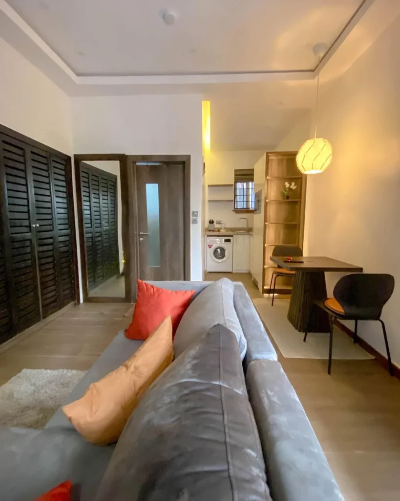
A compact studio with slatted dark wood wardrobe doors, a ribbed wicker pendant light, and a dining nook with a ribbed base dining table creates a room that reads as warm, considered, and complete despite its modest footprint, because the repetition of the ribbed texture across the pendant, the table base, and the wardrobe doors creates a material language that makes the room feel designed as a whole. The grey sofa with bright coral and orange cushions brings the only colour into a largely neutral room and does it with enough confidence that it reads as a design decision rather than an impulse. In practice, repeating one textural detail across three or more objects in a studio is the simplest way to create a coherent interior language.
Designer Advice: Choose one texture and repeat it in three objects in the same room: a ribbed pendant, a ribbed table base, and a rattan wardrobe front will make a studio feel designed before a single cushion or plant is added.
23. The Compact Brazilian Studio With a Ribbed Media Wall
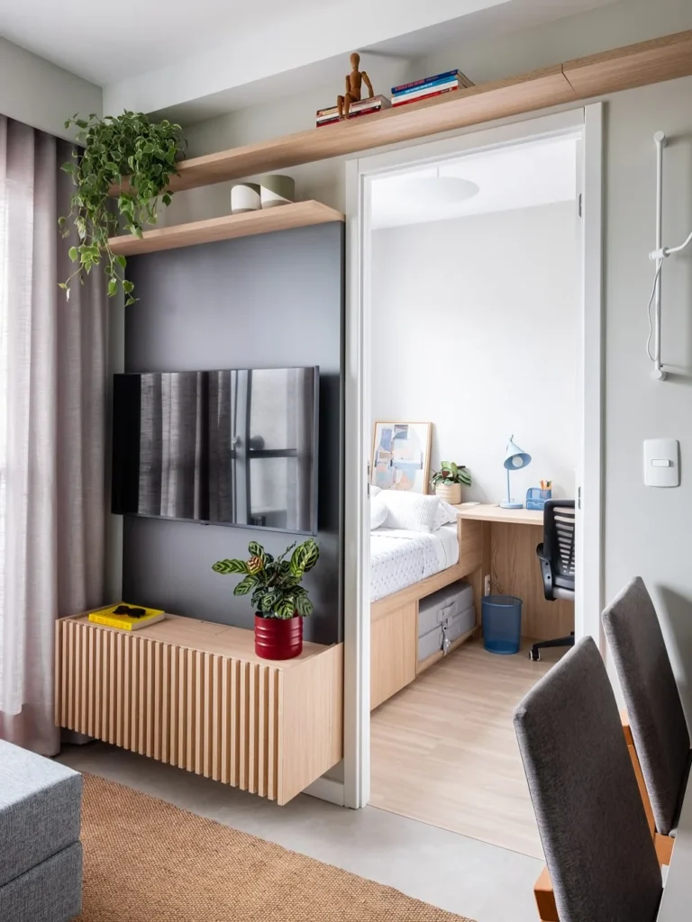
A TV mounted on a dark accent panel with a ribbed wood media unit beneath it, a floating shelf above for plants and books, and a doorway leading to a compact bed and desk room beyond shows how a studio with a separate sleeping alcove can use the main living space purely for relaxing and hosting rather than asking one room to do everything. The ribbed wood media unit is a current design trend in Brazilian and international compact apartment design because it adds texture and warmth to a wall zone traditionally dominated by a flat screen. A trailing pothos on the shelf above the TV softens the hard geometry of the media wall and adds vertical life without occupying any floor space.
Pro Move: A ribbed or fluted wood media unit beneath a wall-mounted TV turns the TV wall from the room’s most unavoidable feature into its most designed surface.
24. The Cabin Studio With a Wood Wall and a Turquoise Accent
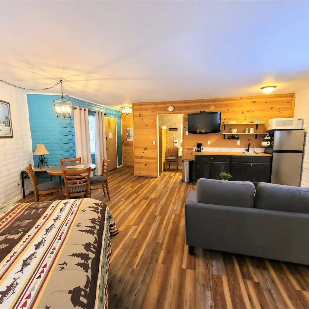
A studio apartment does not have to choose between personality and practicality: the pine-clad feature wall, the turquoise painted brick accent wall, the lantern pendants, and the round dining table with timber chairs here create a cabin warmth that makes the studio feel like a destination rather than a compromise. The kitchen is integrated into the pine wall zone so seamlessly that from the sleeping end the room reads as a warm timber interior rather than a combined kitchen and bedroom, which is the real test of whether a studio’s zones are working. A grey sofa positioned to face the TV on the pine wall and the dining table at the entry creates a natural circulation path that makes the room feel larger by keeping movement logical.
Heads Up: A studio with a strong material theme, whether cabin timber, exposed brick, concrete, or sage plaster, needs to carry that material through all four walls rather than on just one accent wall, so the theme reads as the room’s character rather than a feature added to a neutral box.
25. The Floor-to-Ceiling Window Studio That Earns Its View
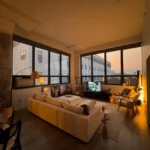
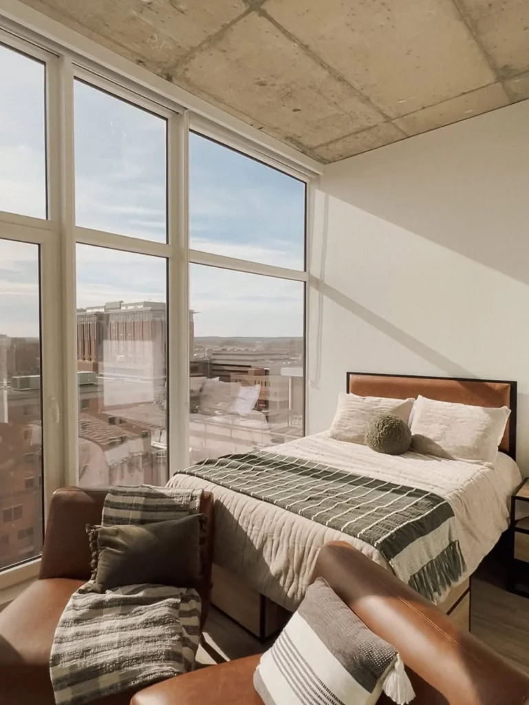
A studio apartment with floor-to-ceiling windows on two adjacent walls and an exposed concrete coffered ceiling has architectural gifts that demand to be honoured: the tan leather headboard bed frame positioned to face the view, the single reading chair placed in the light, and nothing in front of the glass are the three decisions that make this studio look like a luxury hotel room rather than a compact rental. The warm green and white textile palette of the bedding and the throw connects to the outdoor view and extends the visual relationship between the room and the sky beyond the glass. In a studio with any view, the rule is absolute: keep the windows clear, let the view be the focal point, and let the furniture support that rather than compete with it.
Reality Check: If your studio has floor-to-ceiling windows, the furniture arrangement, the palette, and the absence of curtains or blinds during the day are the three decisions that determine whether the view works for the room or gets ignored by it.
26. The Manila Studio That Does It All in One Room
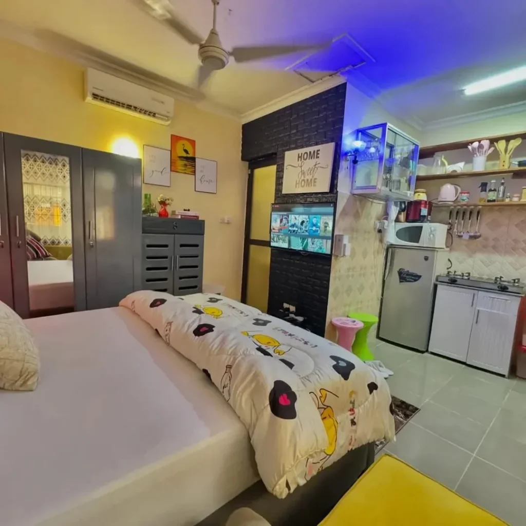
A very compact African self-contained studio demonstrates that the key to making a micro studio feel liveable is giving every object a job and making every zone immediately legible: the 3D brick panel as a TV feature wall defines the entertainment and bedroom zone, the wardrobe defines the sleeping zone, and the kitchen shelving visible to the right defines the preparation zone. Multiple LED light colours at different heights, amber at floor level and cool blue at the ceiling, create depth in a space where depth has to be manufactured rather than inherited. Making every electrical feature visible and prominent in a micro studio, the mirror, the TV, the fridge, the decorative lighting, turns the room’s utilitarian reality into its visual identity rather than apologising for it.
Pro Move: In a very compact studio where every function shares one visible space, lean into the utilitarian reality rather than trying to hide it: visible kitchen appliances, open storage, and prominent lighting all styled with one colour accent create a consistent character that reads as intentional rather than crowded.
What All of These Rooms Share
A studio apartment that works does not happen because you found the right hack or bought the right furniture. It happens because you decided what the room is actually for and arranged it to serve that. Every room in this list made a decision: the bed goes here, the living zone goes there, the kitchen does not compete. Once that decision is made, the styling is straightforward. The difficulty is in making the decision rather than hoping the room will sort itself out.