Black, white and grey is one of those palettes that looks effortless in a magazine and stressful in real life, mostly because there are three very different ways to get it wrong: too stark, too cold, or too flat. The ideas here are organized around which tone is doing the heavy lifting in each look, because that single decision changes everything about how the room ultimately feels.
When White Leads
These ideas use white as the dominant tone, with grey and black playing supporting roles. The effect is bright, open and calm, with depth added through contrast rather than darkness.
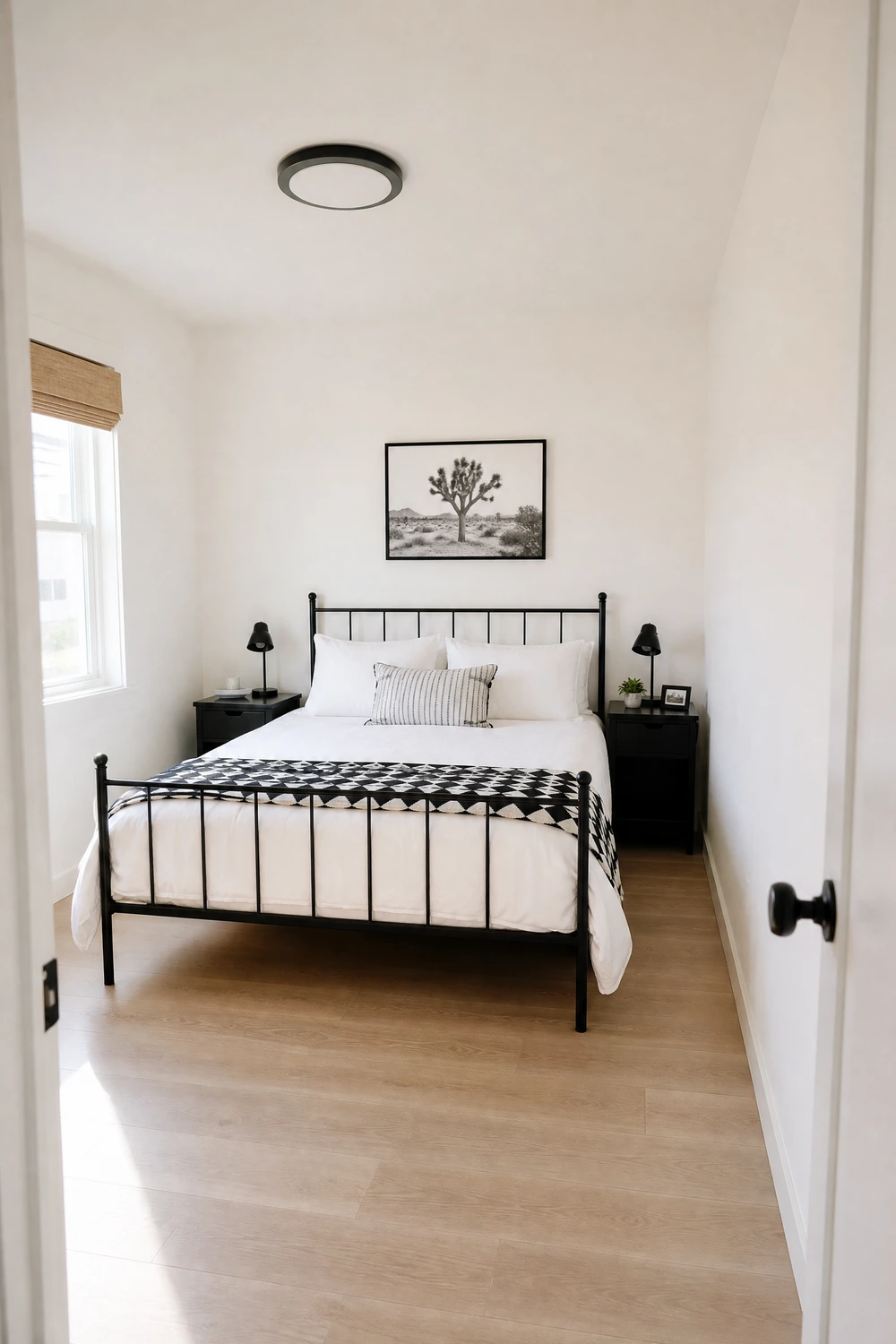
1. Start With a White Foundation and Let the Contrasts Do the Work
White walls, white ceiling and a light timber or white-painted floor give you a blank canvas where every dark element lands with real visual force. In practice, a single black metal bed frame against all-white surfaces creates a stronger graphic impact than a busy mixed room ever could, because there is nothing competing with it.
Pro Move: Use a warm white like Benjamin Moore Chantilly Lace rather than a cold bright white so the room reads as inviting rather than clinical even before you add any furniture.
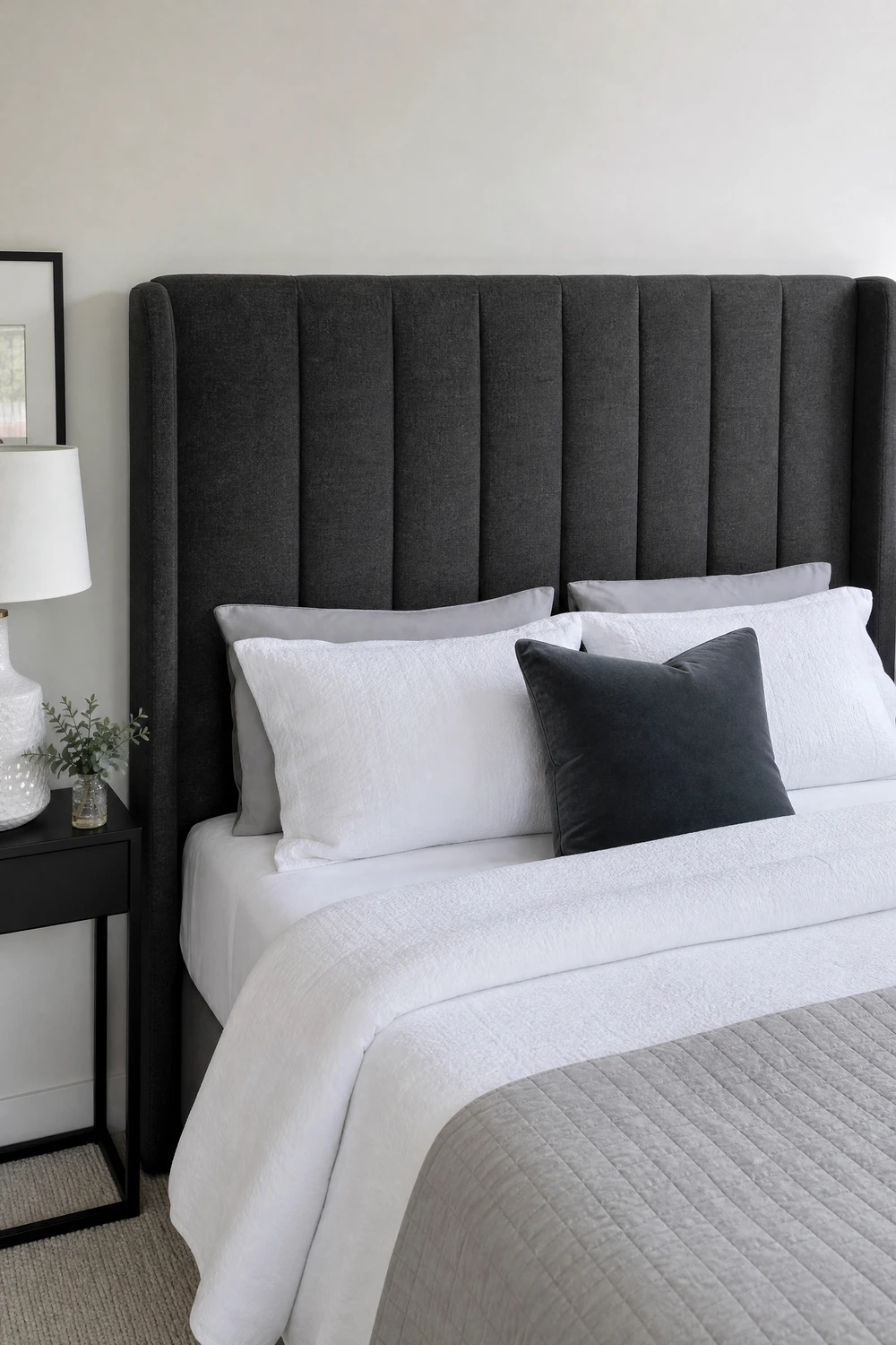
2. White Walls With a Charcoal Upholstered Headboard
A large charcoal grey upholstered headboard centered on a white wall introduces a strong mid-tone anchor without committing to any paint at all. The grey sits between the white and any black accents you add, doing the job of visual bridging that prevents the room from feeling like a stark two-tone graphic.
Designer Advice: Choose a headboard at least two-thirds the width of the bed for the right visual proportion; anything narrower looks like an afterthought against a wide white wall.
3. Crisp White Bedding With a Black Geometric Throw
An all-white bed dressed with a single black and white geometric pattern throw across the foot creates a look that is clean, graphic and hotel-quality without requiring any other decorating decisions. The geometry introduces pattern contrast, and the black thread pulls through to any other black elements already in the room.
Quick Tip: A throw in a bold houndstooth, herringbone or tile pattern at the foot of the bed photographs better than a plain solid one and gives the bedding composition a focal point.
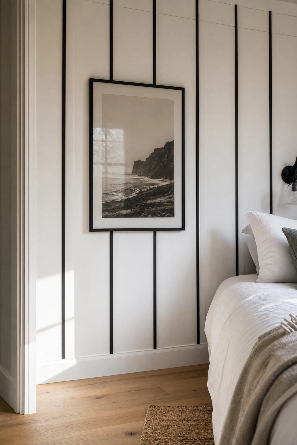
Board and batten or simple shaker-style wall paneling painted white, with the panel groove lines picked out in a very dark charcoal or black, adds architectural detail and texture without touching the dominant white tone. Interior designers use this technique to make a bedroom feel like it has bone structure rather than just four flat painted planes.
Heads Up: This works in rooms of almost any size but reads especially well in taller rooms where the vertical panel lines pull the eye upward and emphasize the ceiling height.
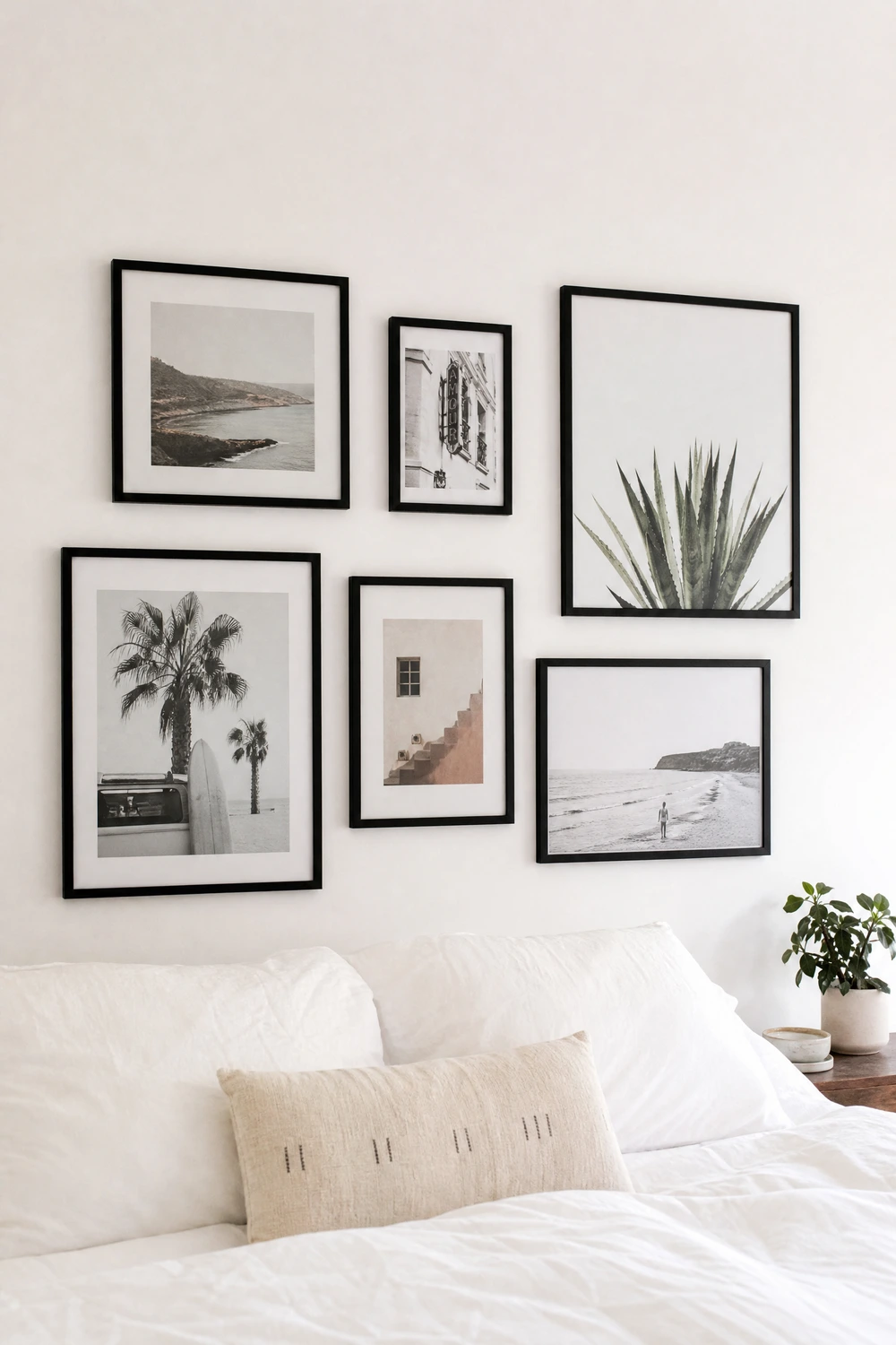
A collection of black-framed prints, photographs or botanical illustrations arranged in a salon-style gallery above or beside the bed turns a plain white wall into the visual centrepiece of the room. In a monochrome palette, what matters most is the consistency of the frames rather than the specific artwork, so matching all frames to the same black finish keeps everything cohesive.
Reality Check: Lay the arrangement out on the floor before you start putting holes in the wall; the composition almost always needs adjusting once you see the actual footprint.
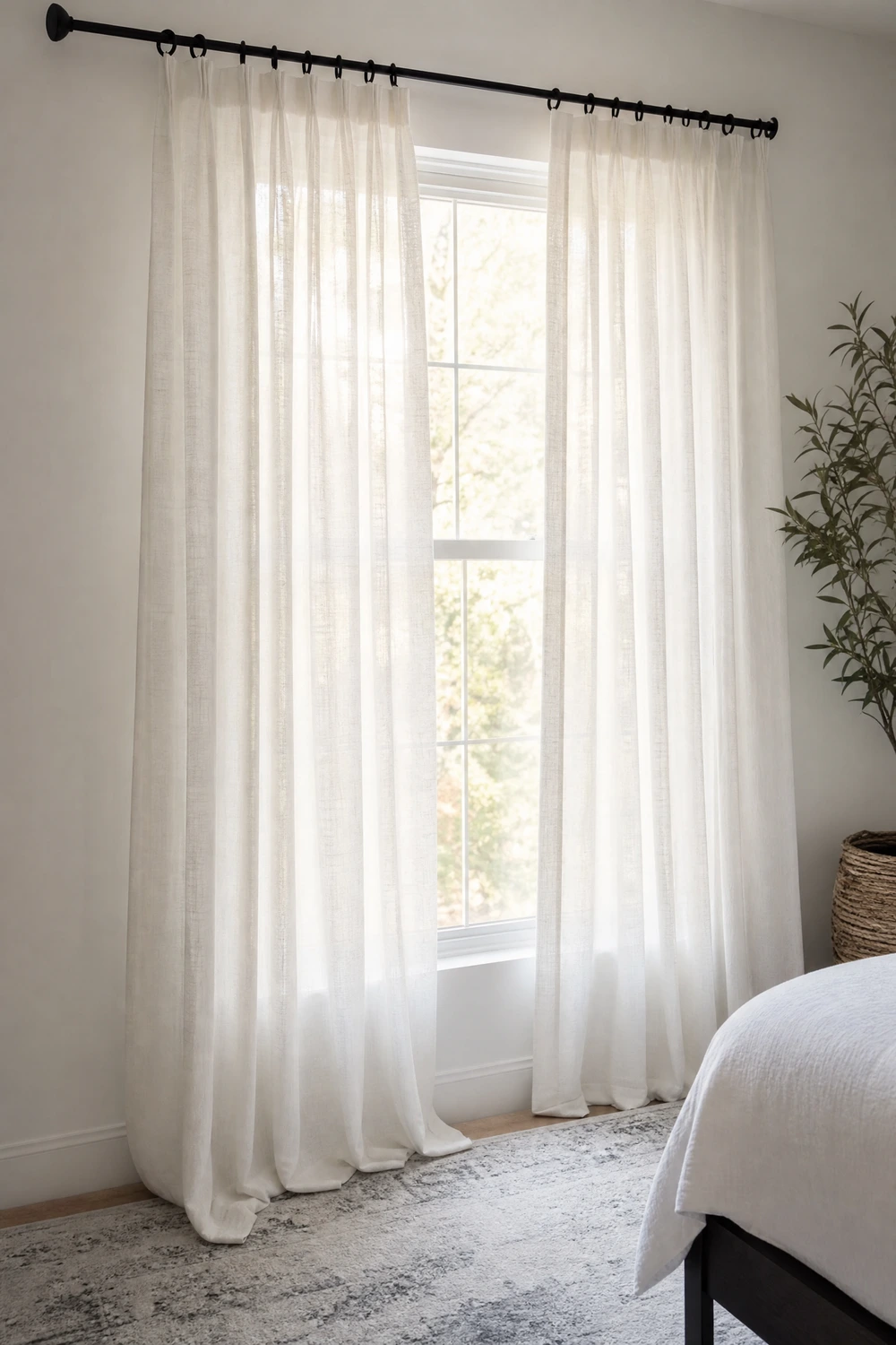
Floor-to-ceiling white linen or cotton curtains hung from a matte black rod with black curtain rings is one of the cheapest and most effective ways to introduce black detail without paint. The contrast at the top of the window draws the eye upward, which makes ceilings feel higher, and the white curtain fabric keeps the room feeling light and airy even when closed.
Budget Note: IKEA LENDA or similar affordable white linen curtains paired with a black RÄCKA rod recreate this look for well under $80 and are nearly indistinguishable from far pricier versions.
7. White Walls With a Soft Grey Area Rug as the Floor Anchor
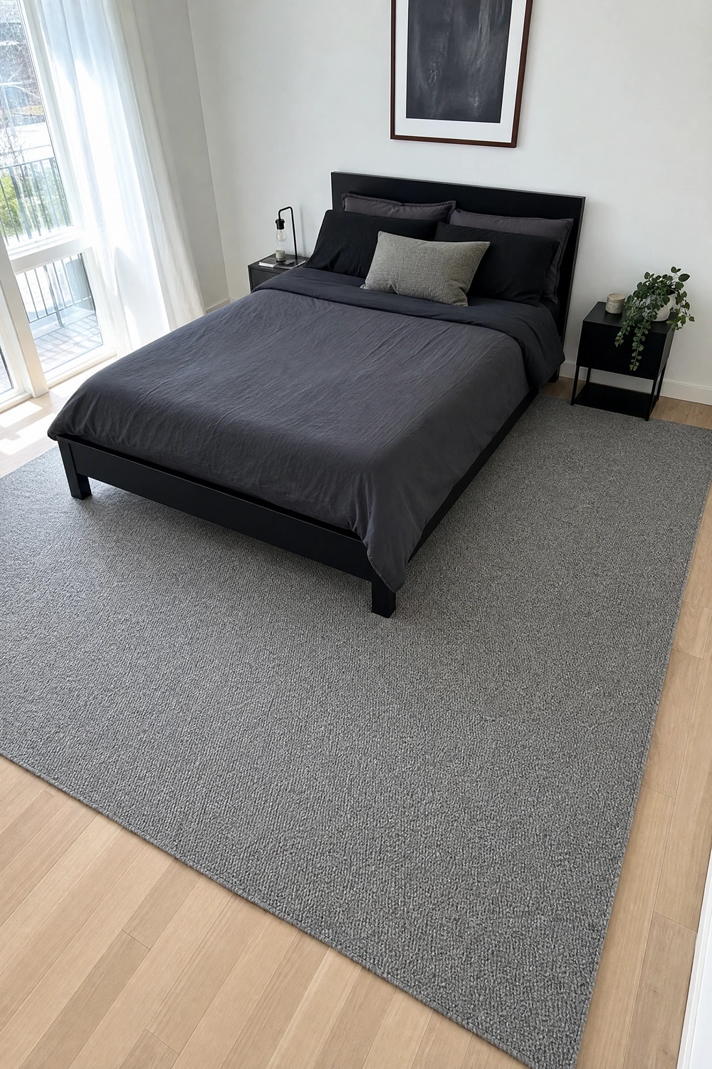
A large mid-grey area rug extending well beyond the bed frame grounds the whole room and creates a defined zone within the white space, which is exactly the visual structure that all-white rooms often lack. The rug does not need a pattern; a plain mid-grey in a textured weave like wool boucle or a flatweave cotton is enough to anchor without competing.
Designer Advice: The rug should extend at least 18 inches beyond each side of the bed and 24 inches beyond the foot; anything smaller undermines the anchoring effect entirely.
When Grey Leads
These ideas put grey in the dominant role. Grey is the most versatile of the three tones but also the trickiest to get right; understanding its undertone is the difference between a room that feels sophisticated and one that feels damp.
8. Understanding Your Grey Before You Paint a Single Wall
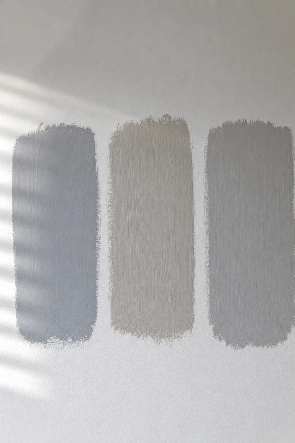
Cool grey leans blue or green and works beautifully with polished chrome, white marble and crisp white bedding, but feels harsh and flat under warm incandescent light. Warm grey leans beige or taupe, reads more forgiving under all lighting conditions and pairs far better with natural wood tones, which is why most interior designers default to warm grey in bedrooms over cool.
Pro Move: Always test grey paint samples on the actual wall you plan to paint and observe them at three different times of day: morning daylight, afternoon sun and evening lamp light before committing.
Grey Undertone Identification Checklist:
☐ Hold the paint swatch next to a piece of pure white paper in natural light
☐ If the grey looks blue or green beside the white, it is a cool grey
☐ If it looks beige or brown beside the white, it is a warm grey
☐ Test it on the wall at three times of day before buying a full tin
☐ Check it under the exact light bulb colour temperature you plan to use in the room
☐ Compare it against your bedding and floor tone before final decision
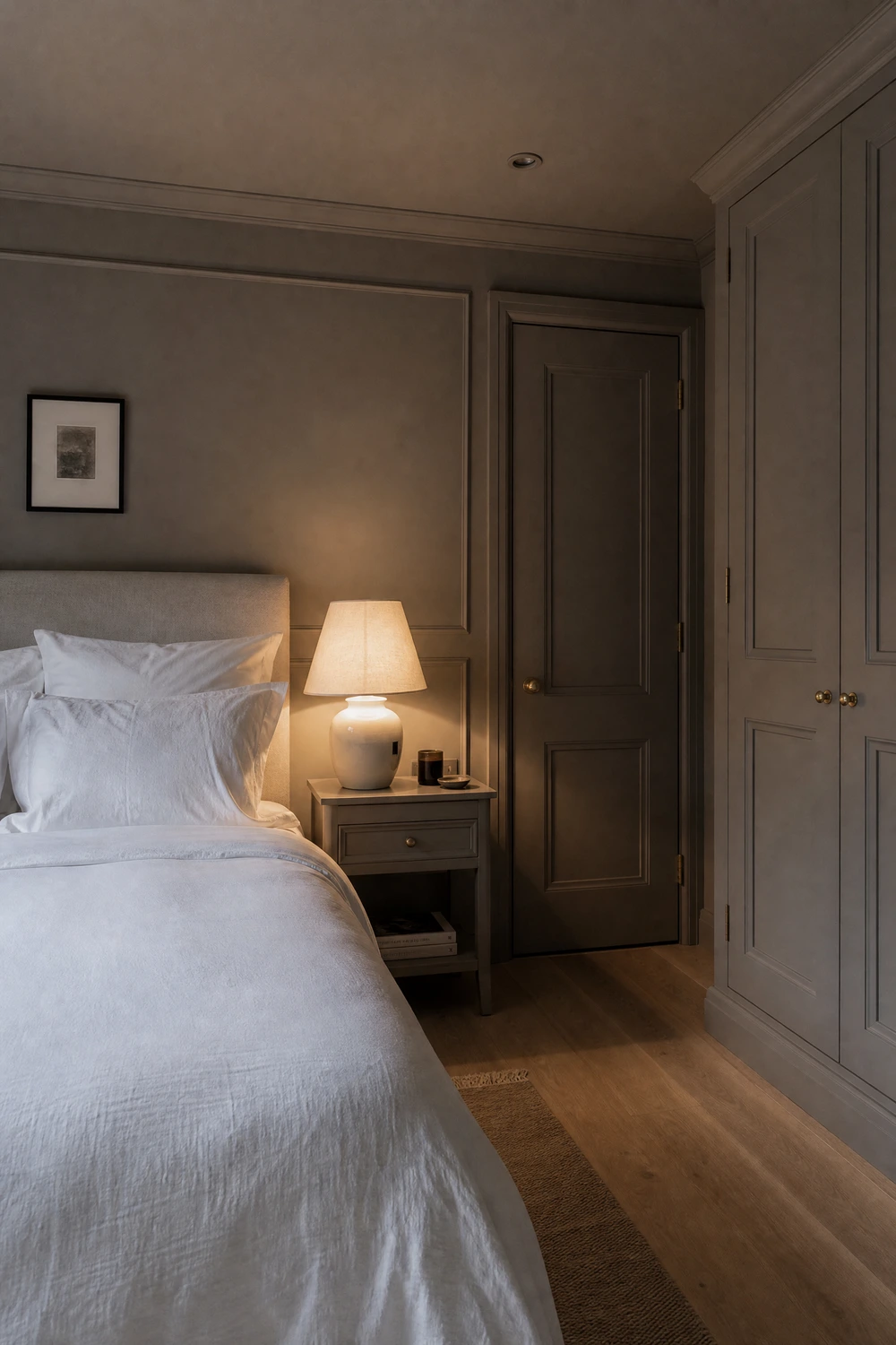
Painting walls, ceiling and even woodwork in the same mid-grey and using crisp white bedding as the single point of contrast creates a colour-drenched effect that feels enveloping and calm rather than cold when done correctly. The key is choosing a grey with enough warmth in its undertone that it reads as cosy under lamp light, and keeping the white bedding genuinely crisp rather than letting it drift into cream.
Heads Up: Rooms below 150 square feet can feel oppressive in all-grey; add a pale timber floor or a white ceiling to prevent the space from closing in.
10. Grey Grasscloth or Textured Wallpaper on the Bed Wall
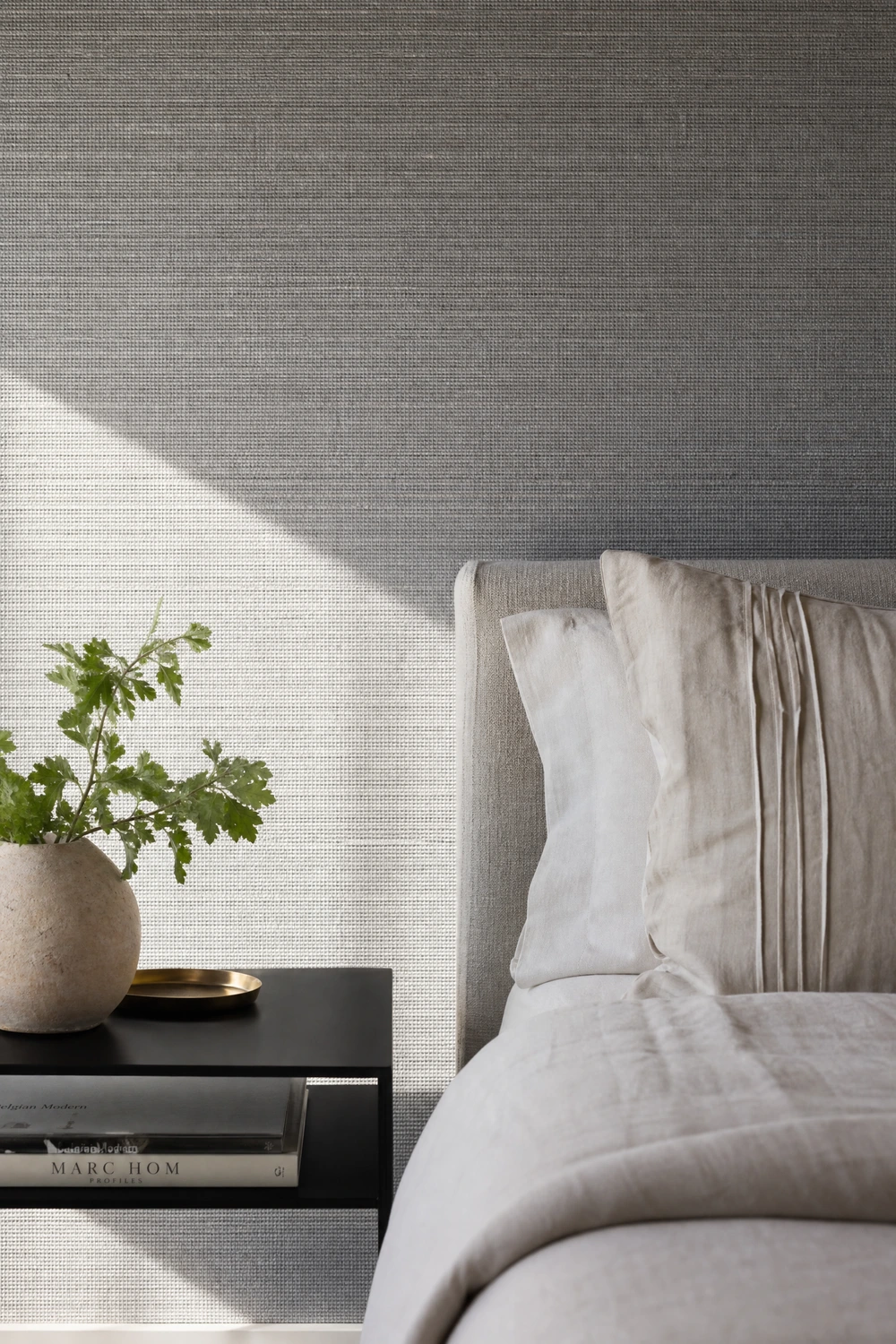
A textured grey wallcovering, whether grasscloth, linen-look or subtle geometric emboss, on the wall behind the bed introduces tactile depth that flat paint simply cannot replicate. In morning light the texture throws fine shadows that make the wall look almost three-dimensional, and the organic variation in grasscloth prevents the grey from reading as flat or lifeless.
Quick Tip: Grasscloth is not washable, so avoid using it in households where children or pets might press against bedroom walls regularly.
11. Layering Three Shades of Grey for a Tonal Monochrome Look
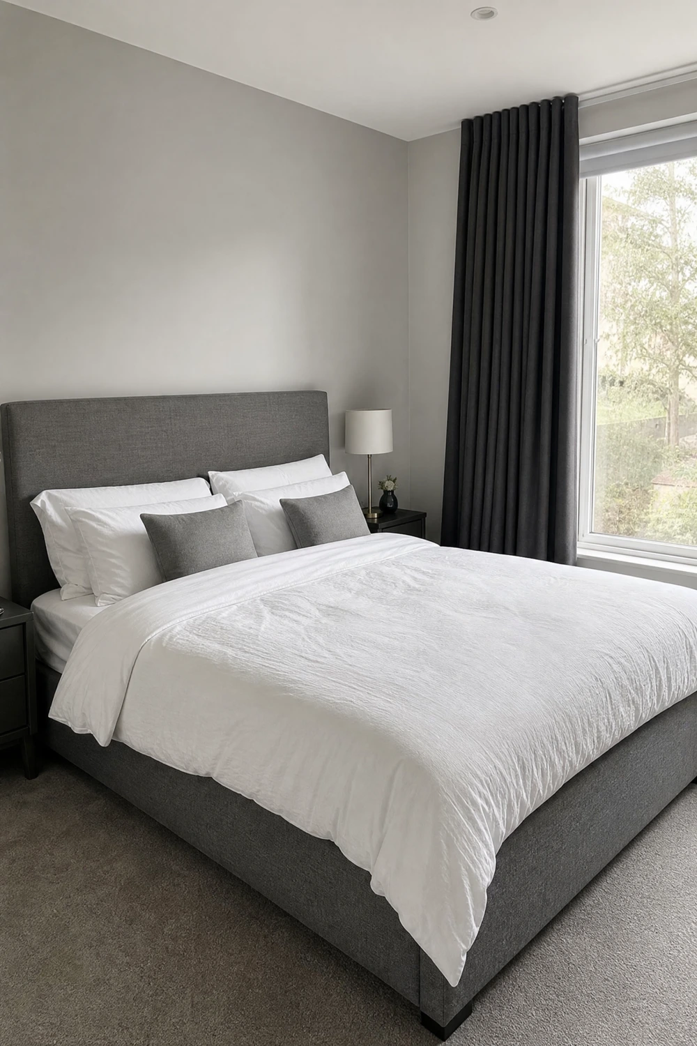
Pale grey walls, a mid-grey upholstered bed and charcoal or graphite curtains create a tonal gradient that moves from light to dark as the eye travels around the room, landing on the darkest tone at the window where it frames the natural light beautifully. This approach works because it gives the eye a clear journey rather than a flat, same-everywhere grey that reads as unfinished.
Designer Advice: Keep at least two full value steps between each of your three grey tones or the layering effect collapses and the room just looks like a grey room that did not quite work.
12. Grey Linen Bedding as the Starting Point for the Whole Room
Starting with grey linen bedding rather than white gives the room a softer, more European and less hotel-like quality that many people prefer for actual sleeping. Linen grey has a natural warmth and texture that standard cotton lacks, and it serves as the central reference point from which you can pull your wall colour, curtain shade and rug tone without the room ever feeling too stark.
Reality Check: Grey linen wrinkles visibly and is meant to; if you like a perfectly pressed bed this is not the right bedding choice and white cotton will serve you better.
13. Grey Velvet Curtains as the Statement Moment in a White and Black Room
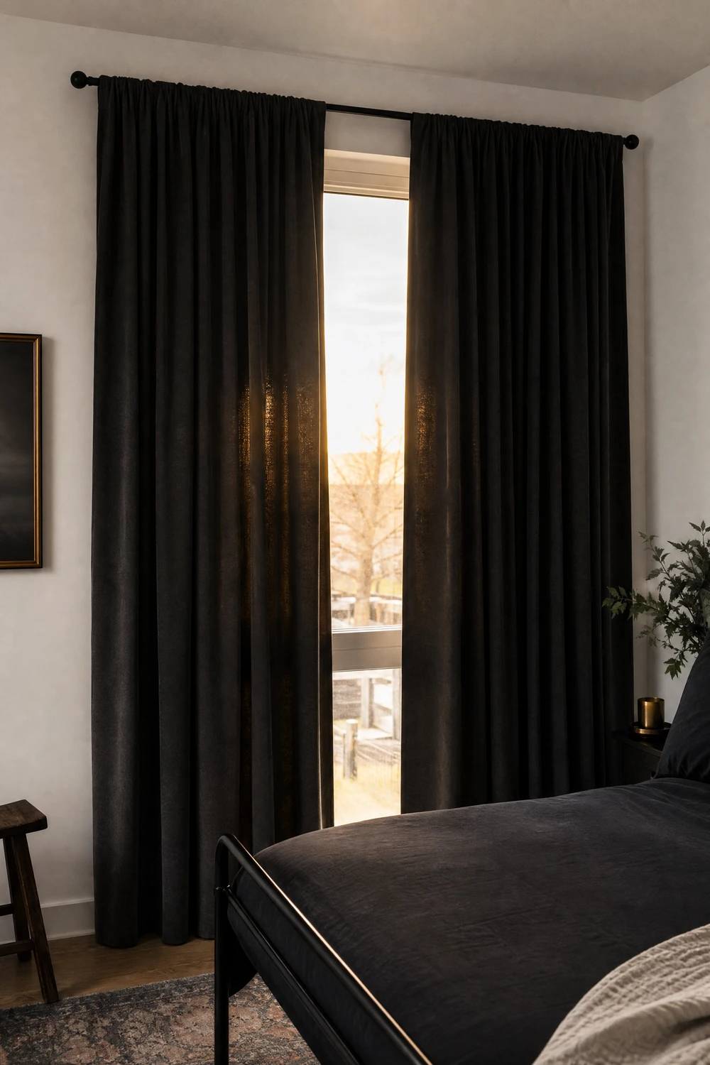
In a room where the walls are white and the furniture is black, a pair of floor-to-ceiling charcoal velvet curtains becomes the one luxurious element that prevents the space from reading as too graphic or too corporate. Velvet absorbs light and changes tone dramatically between morning and evening, which adds a moody dimension to what might otherwise be a very flat contrast palette.
Pro Move: Hang velvet curtains on a matte black rod and mount the rod as close to the ceiling as possible so the fabric draws the full height of the room and maximizes the sense of drama.
When Black Anchors the Room
These ideas use black as the dominant or strongest tone in the space. Done correctly, a black-anchored bedroom feels moody, intimate and genuinely luxurious rather than dark and oppressive.
14. One Matte Black Accent Wall Behind the Bed, Everything Else Light
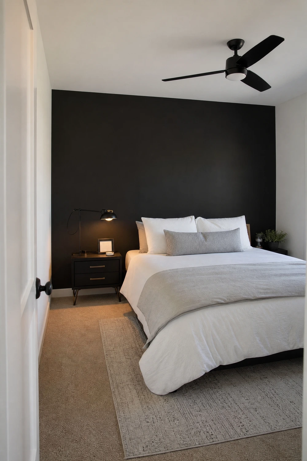
A single matte black wall directly behind the bed with the remaining three walls in white or pale grey is the most commonly recommended starting point for a black-anchored bedroom, and it earns that reputation because it genuinely works. The dark panel creates a strong focal point, makes the bed look intentional and designed, and gives the room a sense of depth that lighter palettes alone cannot achieve.
Quick Tip: Use a flat or matte finish on the black wall rather than eggshell or satin; flat paint absorbs light and reads as richer and more expensive against the lighter surrounding walls.
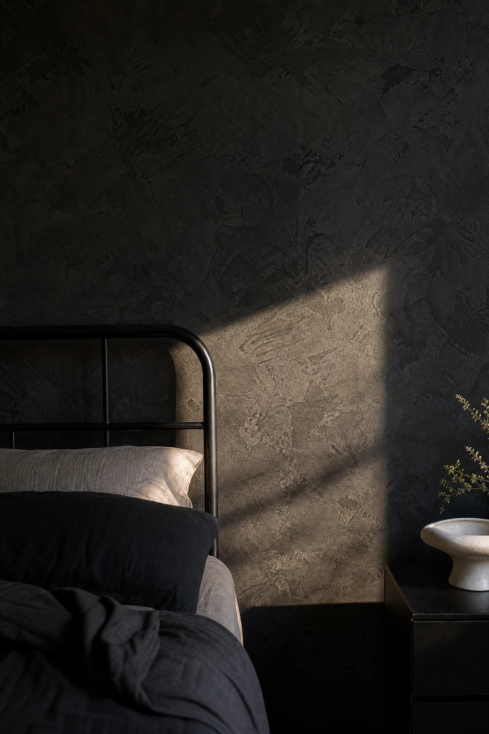
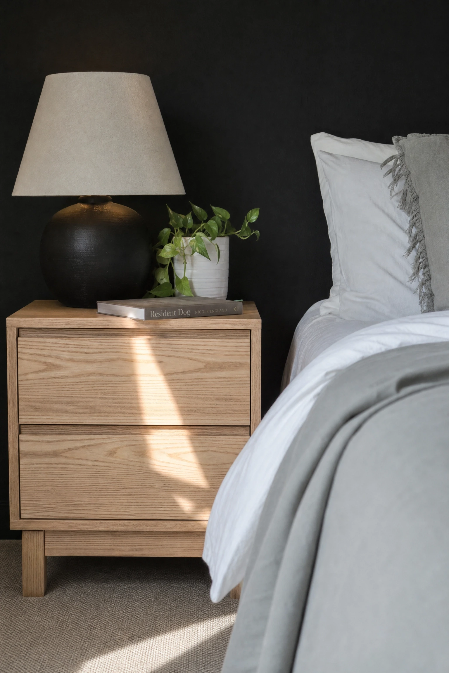
A black or near-black limewash finish on the accent wall adds a layer of organic, irregular texture that changes the wall from a flat dark plane into something that actually has character and depth. The chalky, layered quality of limewash also softens the harshness of pure black, introducing just enough warmth into the tone to prevent the wall from feeling cold or severe.
Designer Advice: Limewash is genuinely DIY-friendly with a little practice; watch two or three application videos before starting and do a test patch in an inconspicuous area to build confidence with the technique first.
16. Black Bed Frame as the Centrepiece of a White and Grey Room
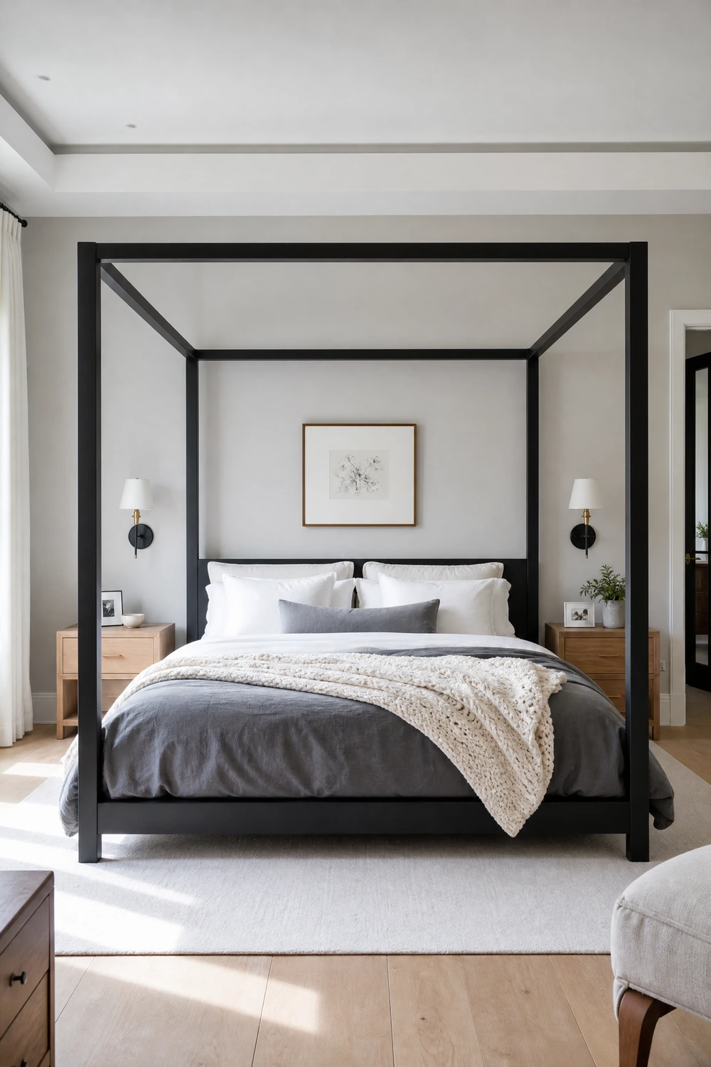
A matte black metal bed frame, whether a simple platform, a slim four-poster or an architectural canopy shape, is the fastest single purchase that pulls a white and grey bedroom into a coherent black, white and grey story. The frame does not need to be ornate; clean, geometric lines in flat black against pale walls read as more contemporary and more deliberate than the fussier options.
Heads Up: Black metal bed frames show dust and fingerprints clearly; factor in a weekly wipe-down if this is a concern before committing to the finish.
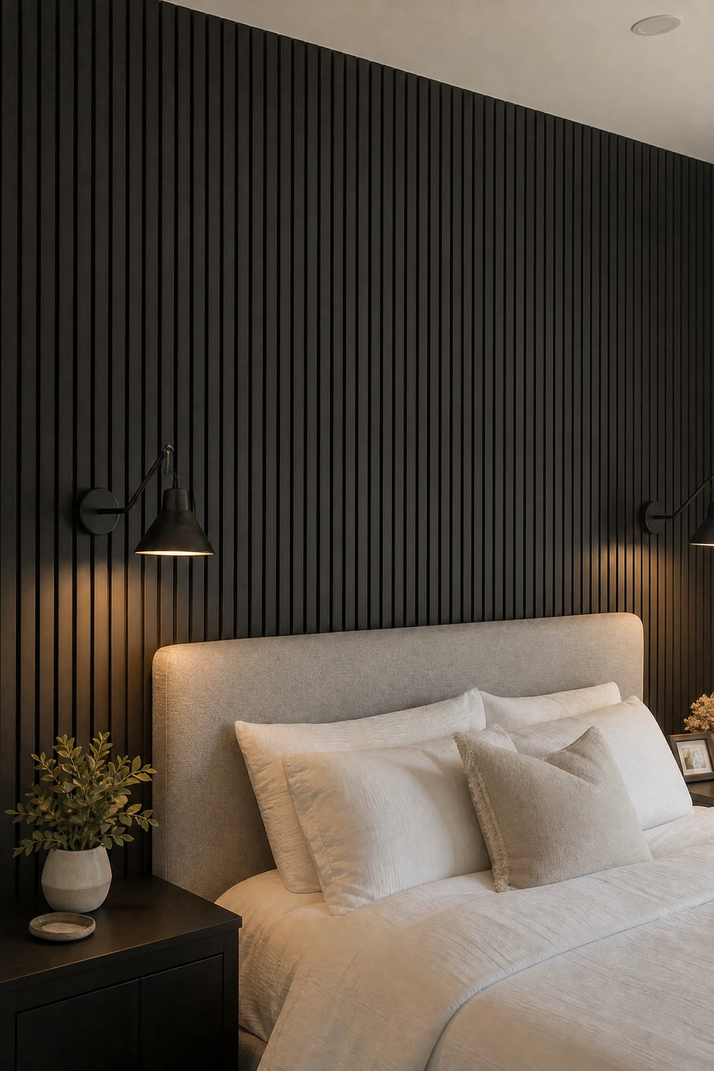
Vertical or horizontal black-painted timber wall paneling behind the bed creates an architectural feature that reads as expensive and considered, adding both texture and depth in a way that flat paint cannot. Ebonized oak or simply black-painted MDF slats cut to even widths and mounted flush both work well; the key is the regularity of the spacing, which is what makes it look designed rather than DIY.
Reality Check: Allow the panels to acclimatize to the room for 48 hours before installing to prevent warping; timber moves with humidity and temperature changes.
18. Black Nightstands Against White Walls for Maximum Contrast
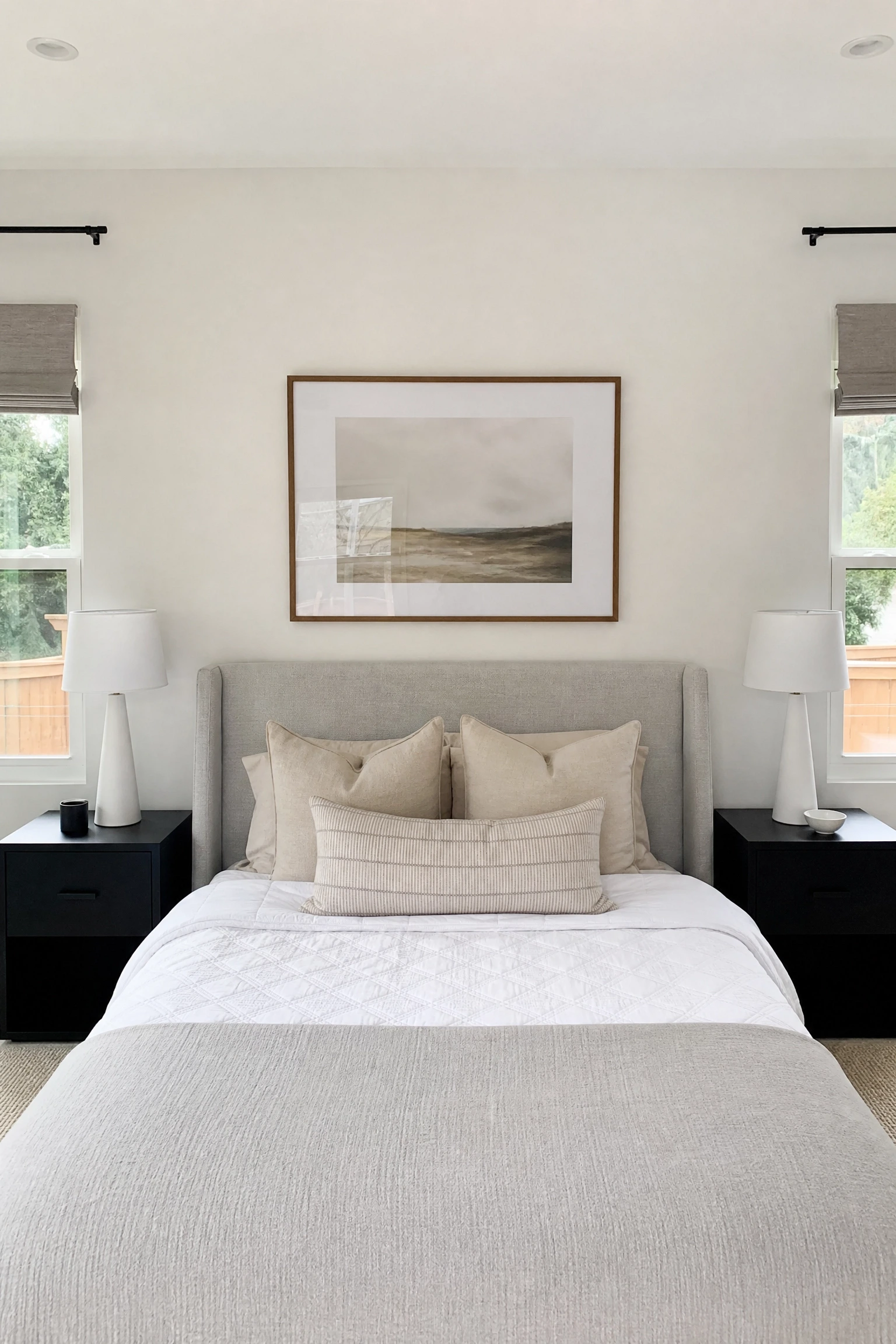
A matching pair of matte black nightstands on either side of a white or grey bed in a white-walled room creates a crisp, symmetrical composition that feels genuinely intentional rather than assembled from whatever was available. The dark nightstands ground the floating quality that pale rooms can have, adding visual weight exactly where the eye naturally rests when looking at a bed.
Quick Tip: Keep the nightstand surfaces minimal: one lamp, one small object and nothing else. In a high-contrast room, clutter on dark surfaces reads far more visibly than in a busy or colourful room.
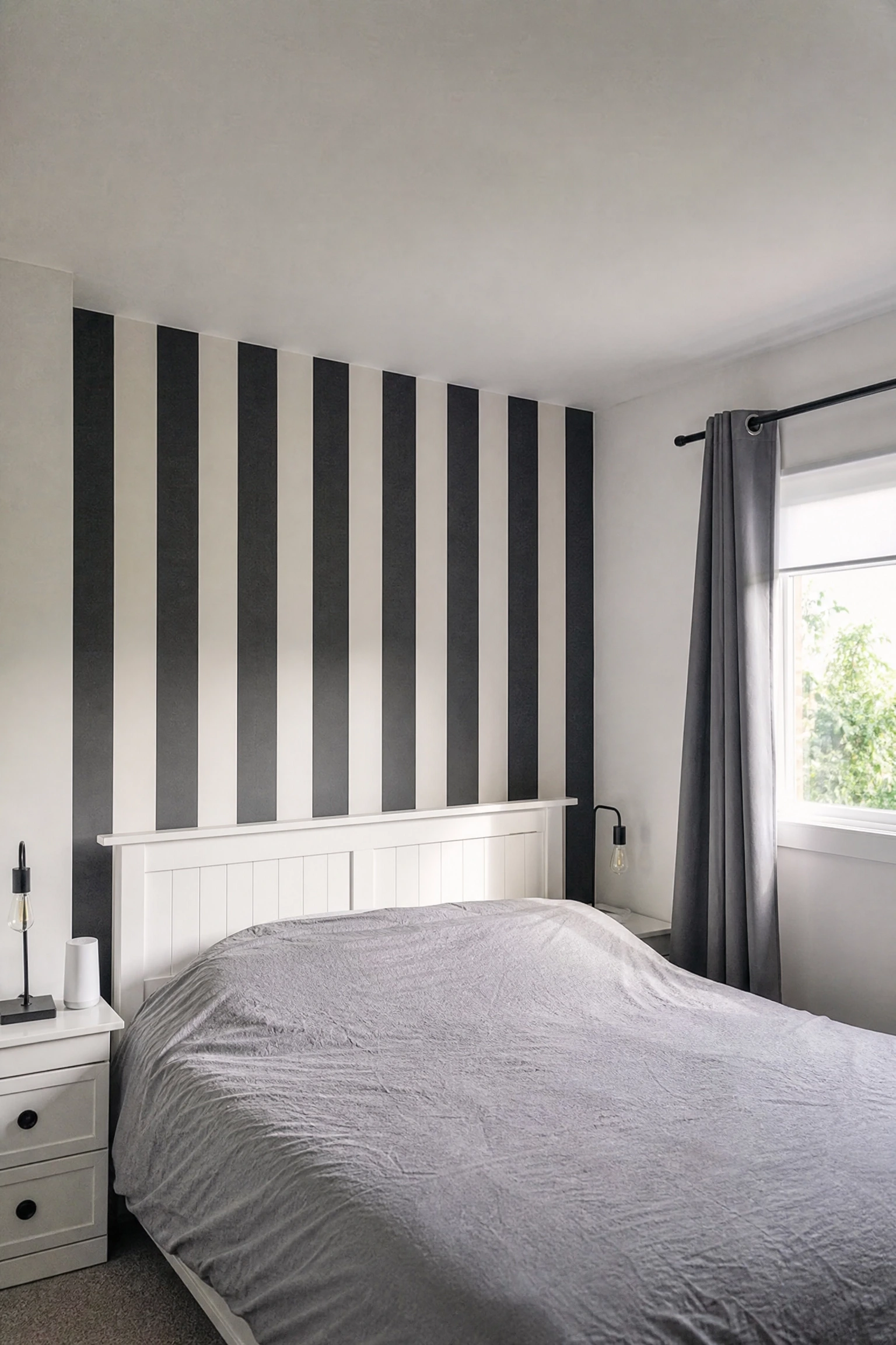
19. Black and White Stripe Wallpaper for Graphic Impact
A bold vertical black and white stripe on the bed wall, whether wide Ticking stripes or bold graphic bands, introduces pattern into the palette without introducing colour, which is exactly what a monochrome bedroom sometimes needs to avoid feeling flat. In practice, vertical stripes also elongate the wall and make low ceilings feel higher, which is a structural bonus on top of the aesthetic one.
Designer Advice: Wide stripes of three inches or more read as bold and contemporary; narrow stripes below an inch can read as dizzying and are harder to live with over time.
The Finishing Details That Make the Whole Palette Work
These final ideas apply across any version of the black, white and grey bedroom. They are the decisions that separate a room that looks designed from one that just looks painted.
A pale timber floor, a rattan bedside table, a wooden bench at the foot of the bed or even a single wooden bowl on the dresser introduces a living, organic warmth that prevents a black, white and grey room from reading as cold or corporate. Wood does not break the monochrome palette; it simply reminds the room that it belongs to a human being rather than a showroom.
Pro Move: Light ash or pale oak in natural finish works best; dark walnut or very rich wood tones read as a competing accent rather than a warm neutral within the monochrome palette.
21. Introduce a Metallic Finish to Add Warmth Without Adding Colour
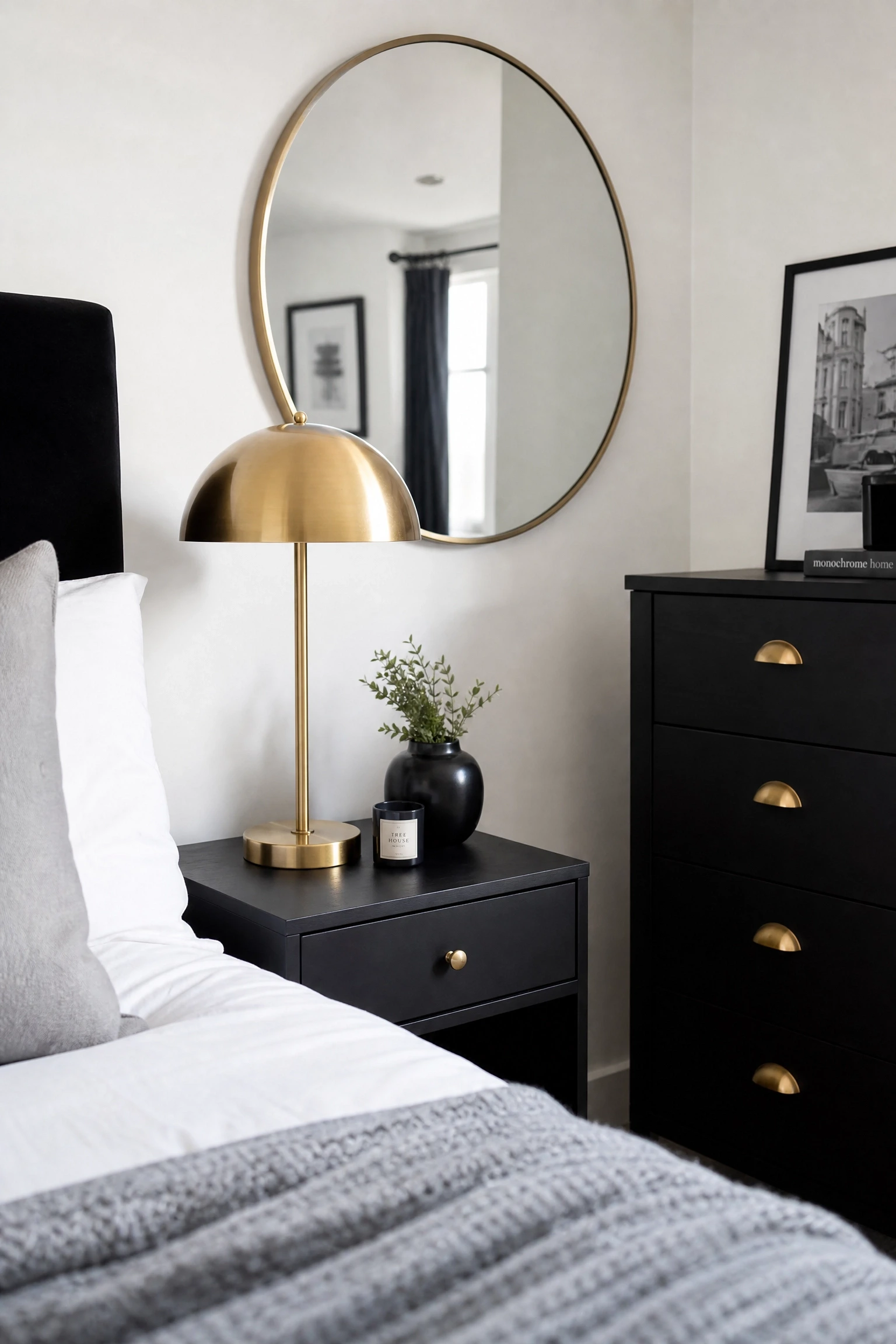
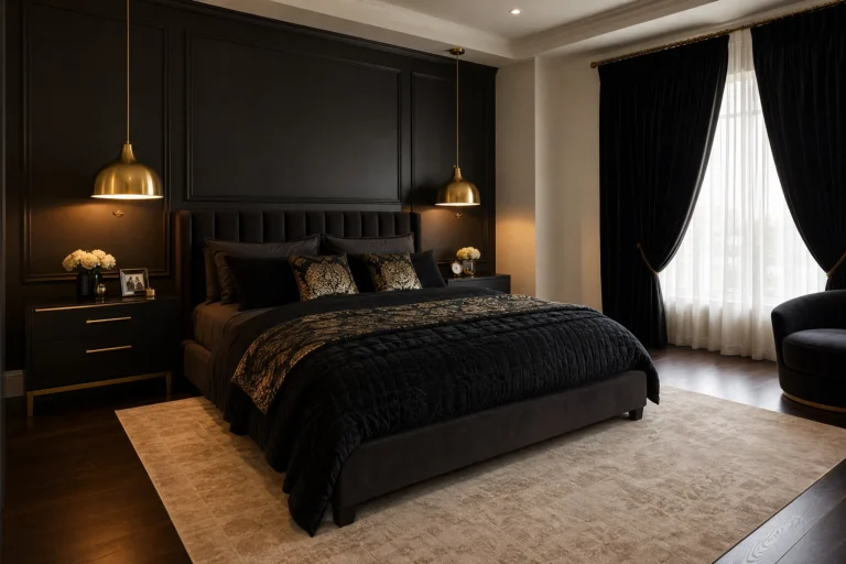
Brushed brass, matte gold or aged silver in your lamp bases, curtain rods, mirror frames and drawer hardware adds warmth and catches the light in a way that standard black and white cannot. The metallic finish technically stays within the neutral family while doing the visual work that a colour accent would do, which is why designers consistently reach for it when a monochrome room needs a lift.
Designer Advice: Pick one metallic finish and use it consistently across every hardware and lighting element in the room; mixing brass and chrome in the same space creates visual noise rather than intentional contrast.
22. Add Texture Through Varied Fabric Weights on the Bed
A smooth cotton sheet, a quilted mid-weight duvet, a chunky knit throw and a velvet cushion cover are all technically grey or white, but they create four different light responses that make the bed feel rich and layered rather than flat and uniform. Professional stylists call this building tactile variety, and it is the single most effective technique for making a monochrome bed look genuinely luxurious.
Quick Tip: A slight variation in grey tone across the layers, for example a pale grey sheet under a warmer mid-grey duvet, reads better in practice than identical-toned layers even within the same monochrome palette.
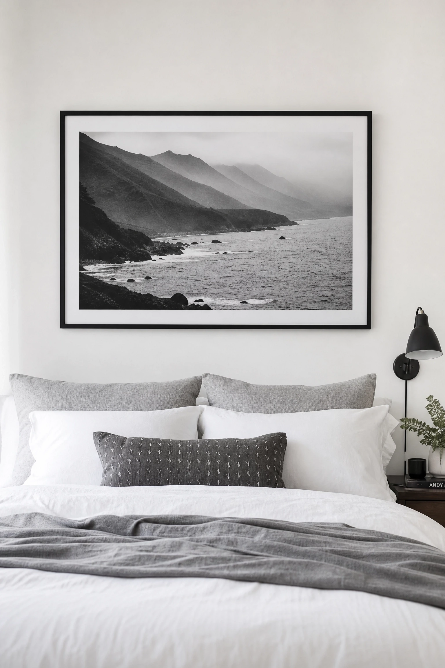
23. Use Black and White Photography as the Art of Choice
Black and white photography in simple black or white frames is the natural art choice for this palette because it extends the monochrome story into the wall decor without introducing colour at all. Large single prints in a simple frame tend to read as more sophisticated than clusters of smaller images, and they age better than trend-driven prints that can date a room quickly.
Heads Up: Avoid printing photographs at home on standard paper; professional printing on matte art paper or fine art cotton stock makes an enormous difference to how the final piece reads on the wall.
24. Layer Lighting for Mood and Function Across the Room
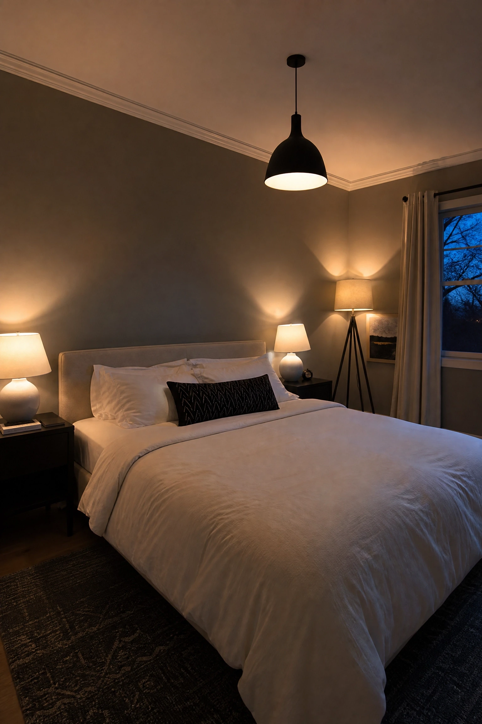
A black or grey bedroom with only overhead lighting will always feel flat and slightly oppressive because harsh downward light kills the shadows and depth that make dark rooms feel intimate. Plan for a ceiling fixture, two bedside lamps and at least one floor or accent lamp so you can choose the right combination for sleeping, reading, getting dressed or winding down in the evening.
Reality Check: Warm white bulbs at 2700K are non-negotiable in a monochrome bedroom; cool white bulbs make grey tones look greenish and black surfaces look washed out and dull.
25. A Statement Mirror in Black or White Frame to Open the Room
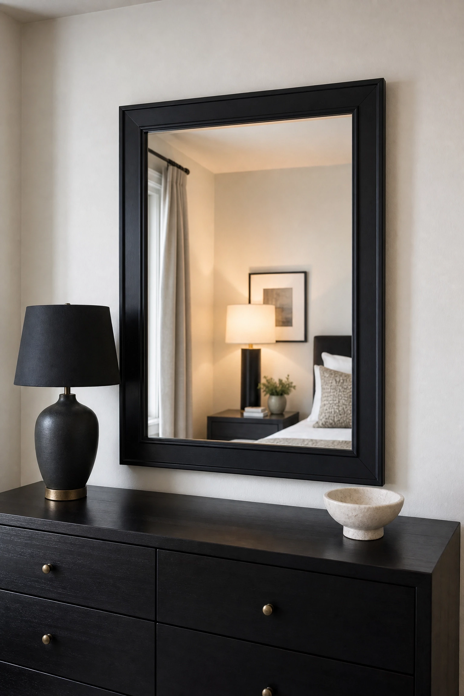
A large mirror in a bold black frame hung above the dresser, leaned against the wall or mounted on the back of a wardrobe door amplifies light, makes the room feel larger and adds a graphic element that functions as both furniture and wall art. In a monochrome room, the mirror frame choice matters as much as the mirror itself; a slim black frame reads as contemporary while an ornate black plaster frame leans more vintage.
Designer Advice: A mirror leaned against the wall rather than hung reads more relaxed and editorial in a bedroom; reserve hung mirrors for rooms where floor space is too limited to lean one safely.
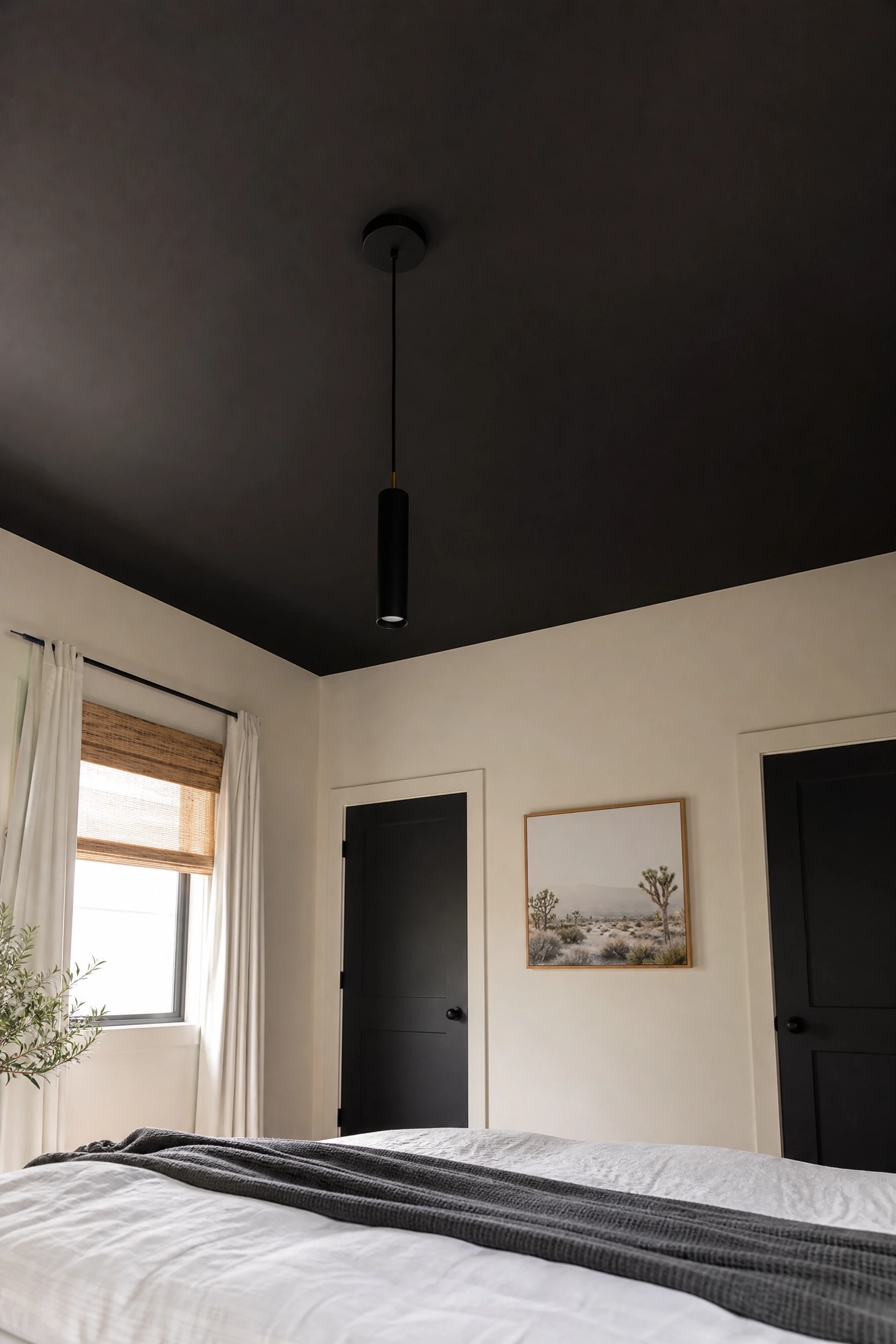
Painting the ceiling matte black while keeping the walls white or grey creates a lowered, intimate canopy effect that makes the bed feel like a destination rather than just a piece of furniture. This works particularly well in rooms with higher ceilings where the dark overhead brings the room down to a more human and comfortable scale, and the contrast with the lighter walls frames the space beautifully.
Heads Up: Rooms with ceilings below eight feet should avoid a full black ceiling as it will feel oppressive rather than cosy; a deep charcoal or a partial treatment above the bed zone only is a better option.
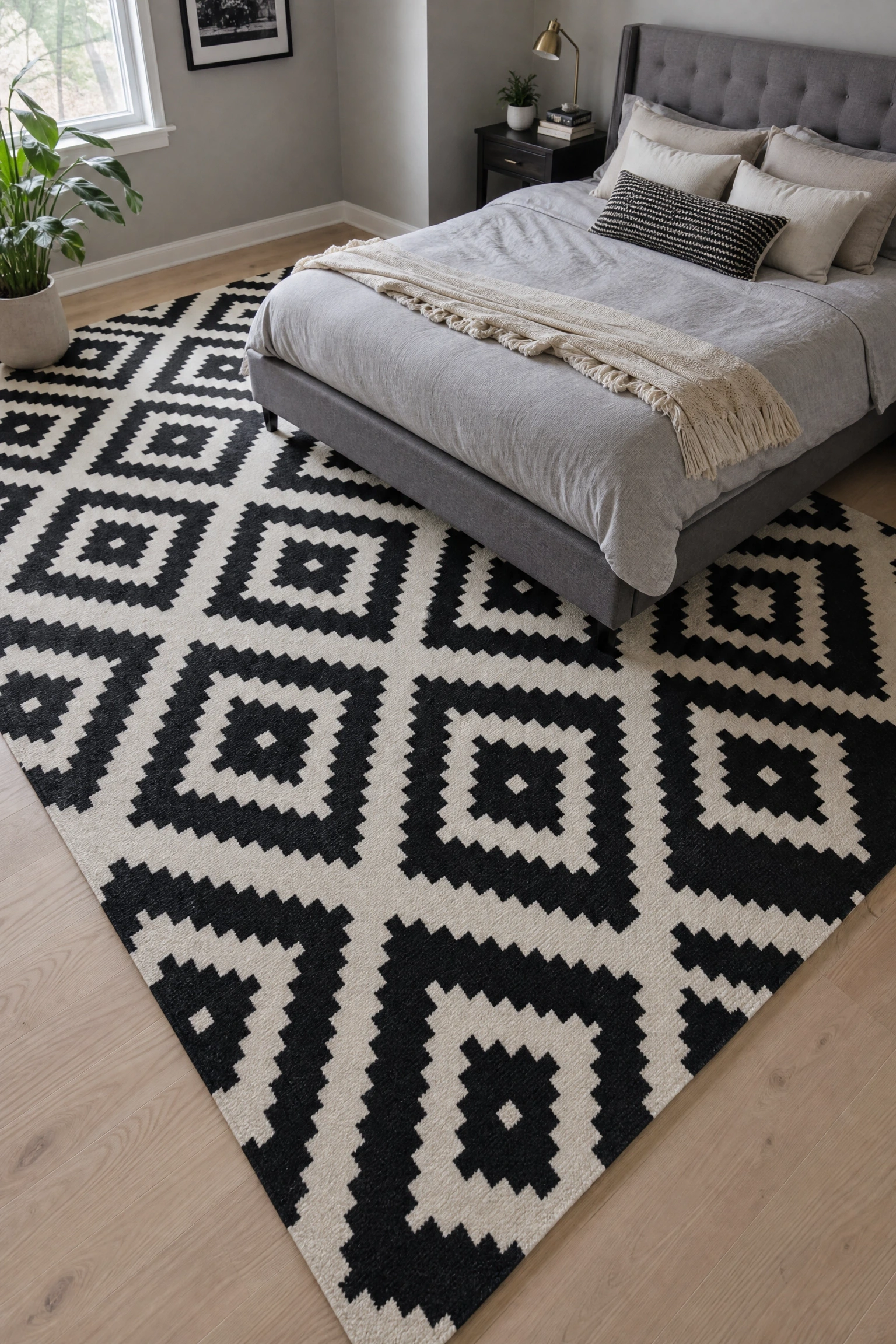
27. Black and White Geometric or Printed Rug to Anchor a Grey Room
A bold geometric or abstract patterned rug in black and white beneath the bed brings pattern into a room that is otherwise entirely solid tones, and because the pattern stays within the same palette it reads as considered rather than busy. The graphic nature of the rug also gives the floor a sense of purpose and design that plain grey or cream rugs in a monochrome room sometimes fail to deliver.
Pro Move: Scale the pattern to the room size: large-scale geometric repeats in bigger rooms, smaller-scale all-over patterns in compact spaces, so the rug reads as proportionate rather than overwhelming.
28. Bring in Plants to Add the One Thing Monochrome Cannot Provide
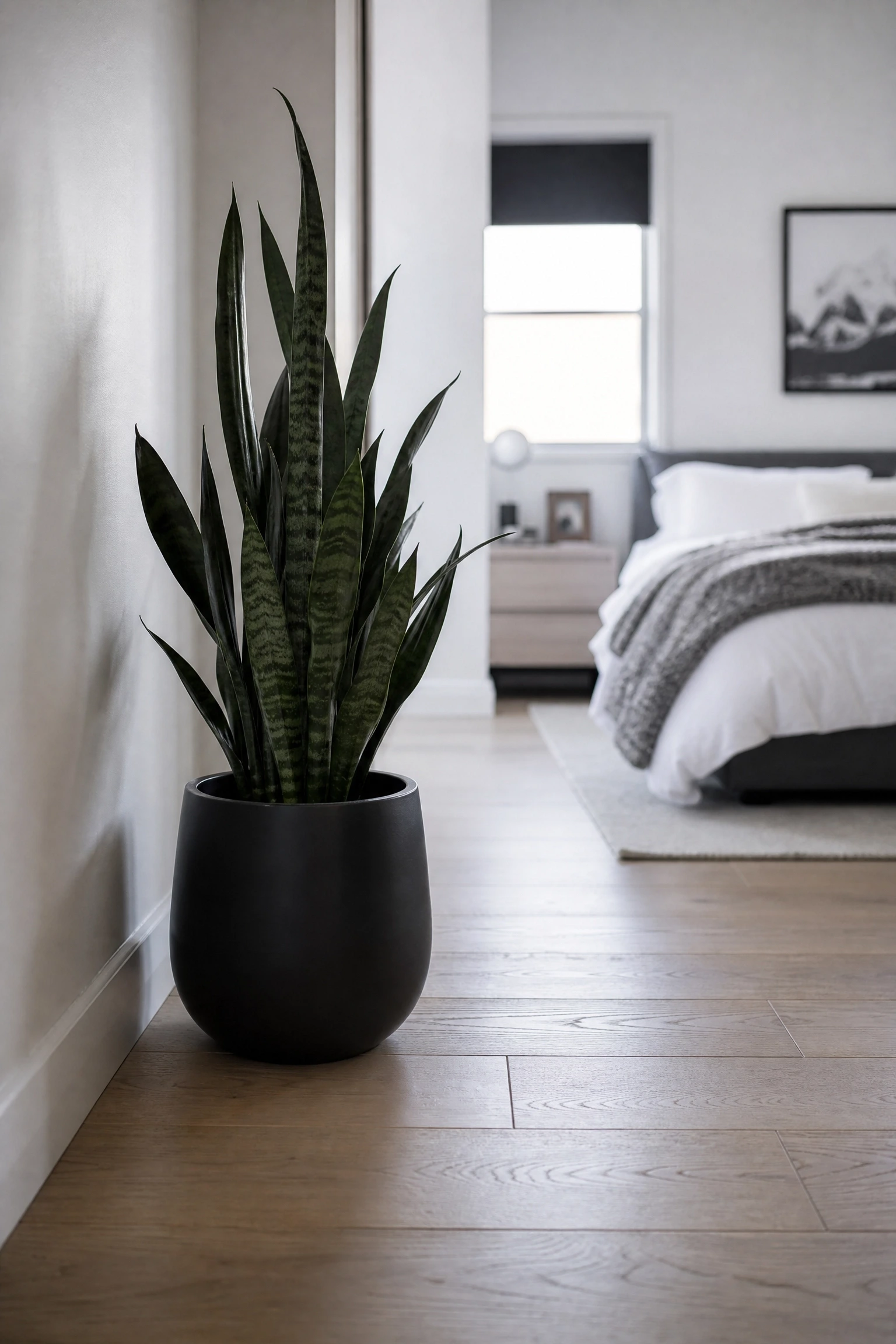
A black, white and grey bedroom is genuinely improved by a single well-placed plant, not because it breaks the palette but because the green introduces a living, breathing element that reminds the room it is inhabited. A tall snake plant in a matte black ceramic pot, a trailing pothos in a white hanging planter or a compact olive tree in a grey concrete pot all work without ever pulling focus from the monochrome story.
Quick Tip: Dark-leaved plants like a ZZ plant or black prince echeveria lean into the monochrome palette even more intentionally and look as though they were chosen by a stylist rather than just placed for greenery.
Bringing It All Together
A black, white and grey bedroom succeeds when one tone clearly leads, the other two support it, and texture does the work that colour cannot. The palette is not limiting; it is one of the most flexible in home decor, able to read as minimal or dramatic, calm or graphic, depending entirely on how you proportion the three tones and what materials you bring in to add warmth and depth. Get the undertones right, layer your lighting deliberately, and choose one quality material in each surface category, and the result will be a room that feels genuinely designed rather than just neutrally painted. Whether you favour the quiet confidence of a white-led room, the moodiness of a black anchor, or the nuanced sophistication of a grey-led space, the ideas above give you a clear, honest roadmap to get there without second-guessing every decision.