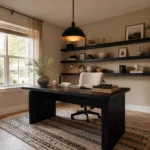
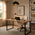
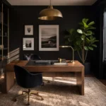
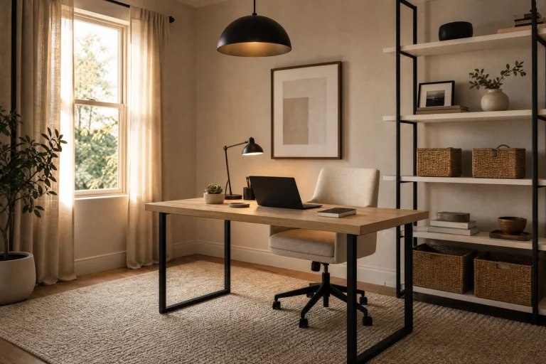
There is something genuinely satisfying about a blue and beige home office that is hard to replicate with any other color pairing. Blue brings focus and a sense of calm purpose, which is exactly what you want in a workspace. Beige brings warmth and keeps things from tipping into cold or corporate. Together they create a palette that feels pulled-together without trying too hard the kind of room that looks like a real person designed it, not an algorithm. This combination gives you a lot to work with, especially if your home office has been staring back at you on video calls for too long.
The tricky part is figuring out how to balance them. Give blue too much real estate and the room can feel chilly, especially in a north-facing space with limited natural light. Let beige do all the heavy lifting and you risk a room that reads as plain rather than polished. The ideas in this article are organized around which color takes the lead because that single decision shapes every other choice you make. Pick your starting point, build from there, and the rest tends to fall into place naturally.
When Blue Takes the Lead
These looks work when you want the color to make a statement blue is the anchor, and beige softens the edges without stealing focus.
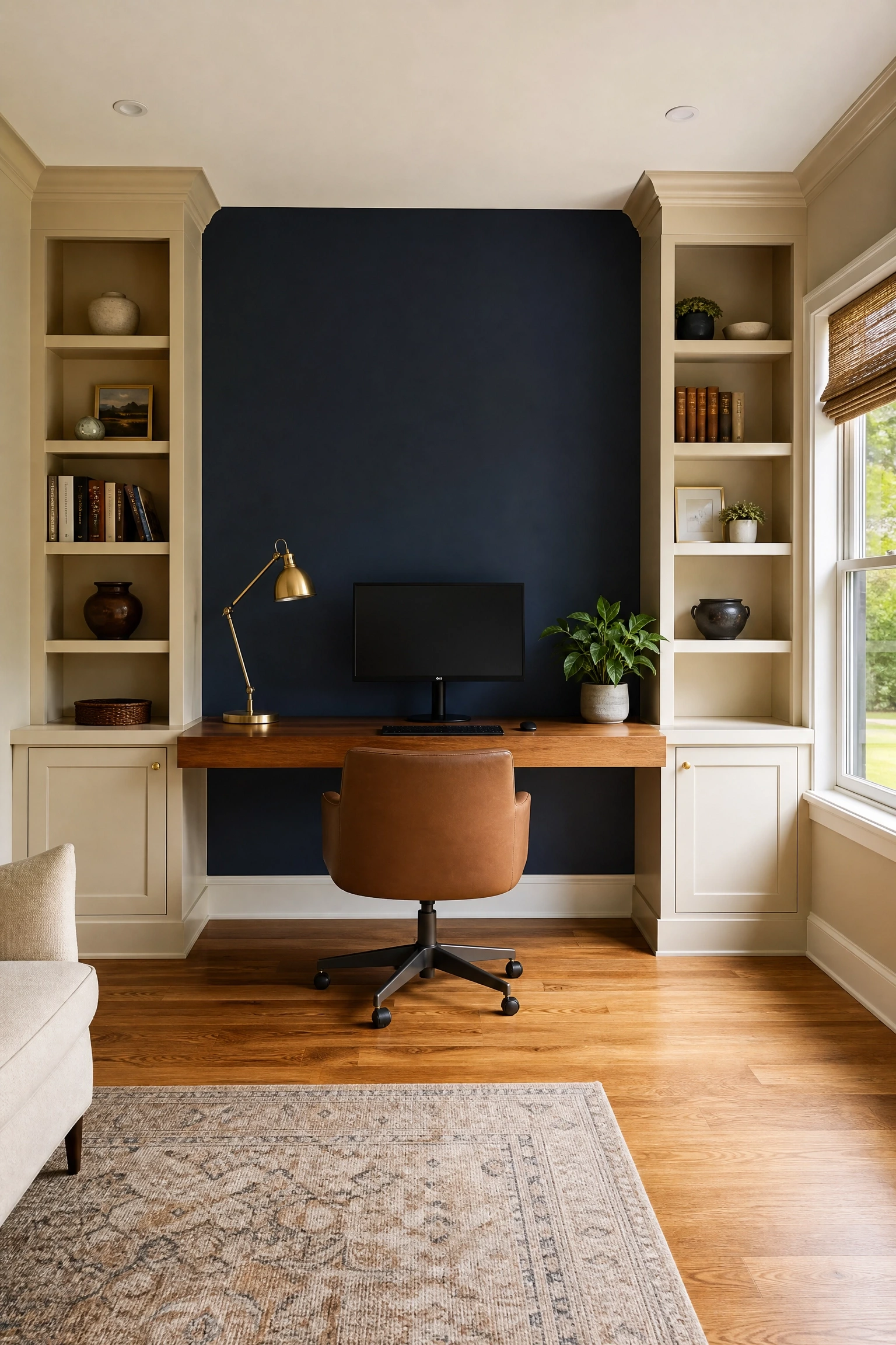
A single navy blue accent wall behind the desk is one of the most reliable design moves in a home office, and it works especially well when the rest of the room leans into warm beige tones through painted millwork, built-in shelving, or even just a beige linen Roman shade. The navy creates a focal point and adds visual weight to the back wall, which makes the desk area feel intentional and anchored rather than like a chair and a laptop pushed against a wall. In practice, the warmer your beige, the better a beige with golden or wheat undertones balances navy beautifully, while a cool greige can make the pairing feel a little flat. Navy Benjamin Moore Hale Navy HC-154 or Sherwin-Williams Naval SW 6244 are both solid choices that photograph well for video calls too.
Pro Move: Paint the accent wall in a flat or matte finish to add depth, and use semi-gloss on the millwork so the two textures create subtle contrast.
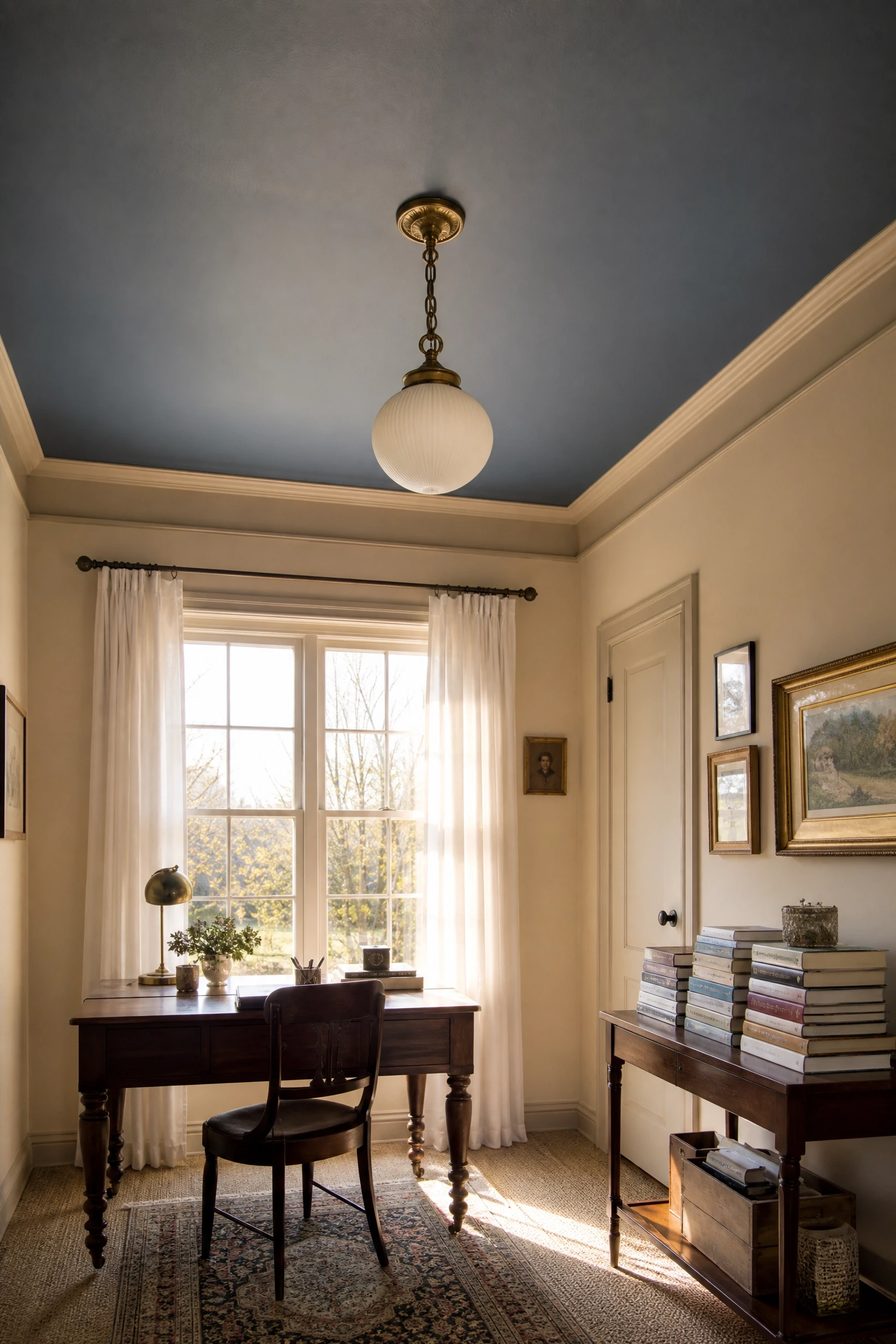
Painting the ceiling a soft slate blue while keeping the walls in a creamy beige is a slightly unexpected move that professional designers have been using for years in studies and libraries. The colored ceiling draws the eye upward and makes the room feel taller, not smaller contrary to what most people assume. It also adds a sense of enclosure and focus when you are sitting at a desk, which helps with concentration during long work sessions. The key is to choose a slate blue that leans toward the muted, gray-toned side of the spectrum rather than a bright or saturated blue, which would clash with warm beige walls. A color like Farrow and Ball Lulworth Blue or a similar muted dusty blue works well here and keeps the overall feel calm and sophisticated rather than playful.
Designer Advice: Match the ceiling color to a throw pillow or desk accessory in the room so the ceiling feels connected to the rest of the space rather than like an afterthought.
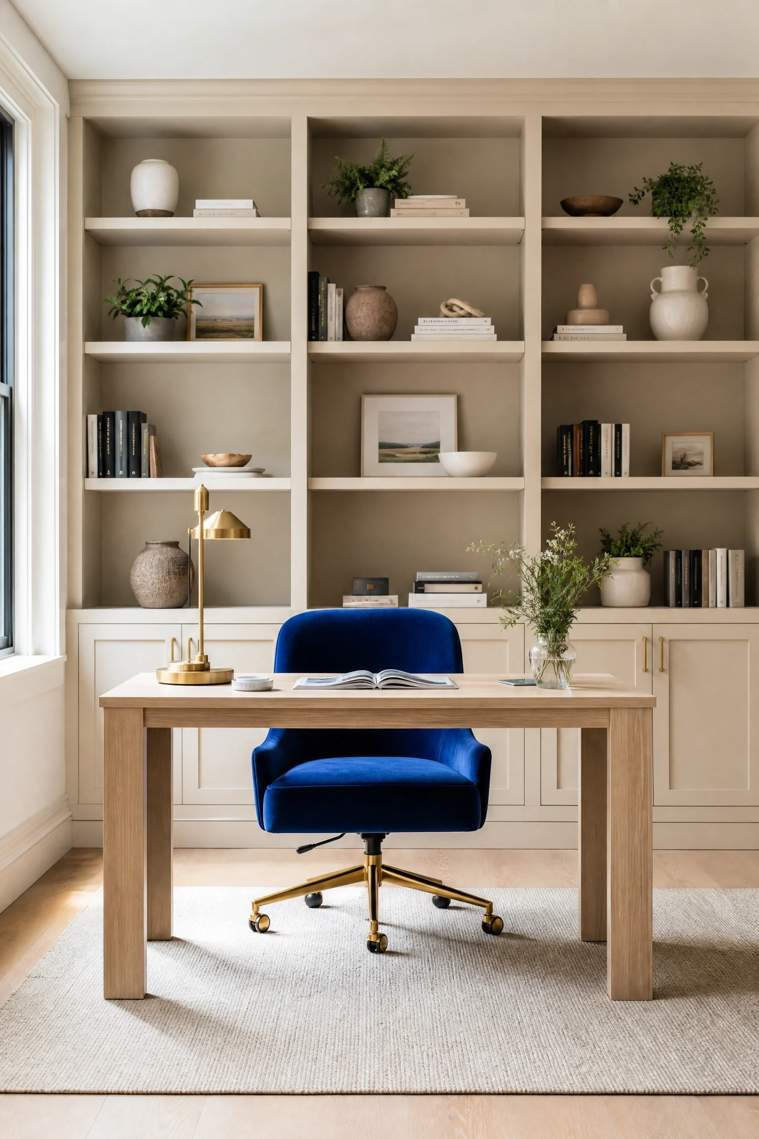
If you are not ready to commit to blue paint, a cobalt blue desk chair against beige built-in shelving or cabinetry is a high-impact, low-risk way to bring the color into the room. Cobalt is a saturated, electric blue that reads as confident and modern, and it works surprisingly well against the warm neutrality of beige because the contrast is clean and graphic. A bouclé or velvet cobalt chair is especially effective the texture softens the brightness of the color. This approach is also budget-friendly if you already have beige cabinetry, since the chair does all the work. Just be aware that cobalt can feel a little overwhelming if you add too much of it; one statement piece is the move, not three.
Heads Up: If your beige has pink or peachy undertones, test the cobalt chair in the space first some cobalt blues can pull purple against warm pinks and look off.
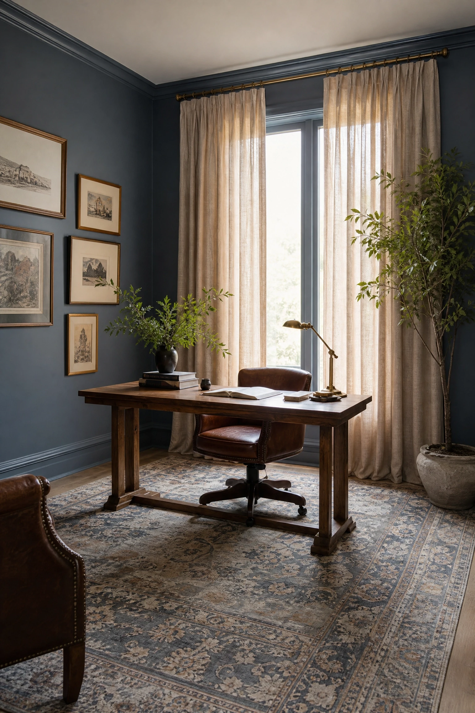
French blue that muted, slightly faded mid-blue with gray undertones is one of the most versatile wall colors for a home office, and it pairs naturally with linen beige drapery in a way that feels effortlessly European and editorial. The softness of the linen fabric takes the edge off a room that might otherwise feel too cool, and the beige grounds the blue without neutralizing it. Floor-to-ceiling drapery panels in a natural linen or cotton-linen blend are the ideal choice here, both because of the visual height they add and because the texture plays beautifully against a painted wall. This look works particularly well in older homes with good architectural bones tall windows, picture rail molding, original floors where the French blue sits comfortably in the history of the space.
Quick Tip: Add a brass or unlacquered brass curtain rod to bridge the warm and cool tones and give the window treatment a finished, considered look.
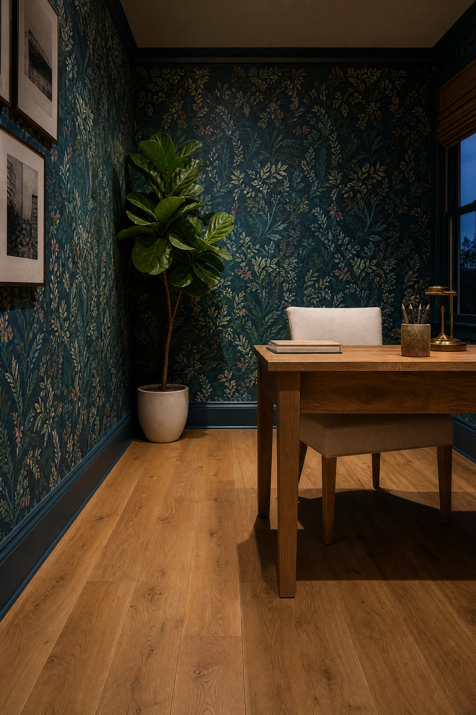
Deep teal, which sits at the intersection of blue and green, makes a bold statement as a wallpaper choice in a home office, and beige or honey-toned oak flooring keeps it from feeling too dark or heavy. This is an investment-level look that pays off in terms of atmosphere the combination reads as rich, collected, and genuinely designed rather than decorated. Botanical or geometric patterned wallpapers in deep teal look particularly striking in this context, especially when paired with a natural wood desk and simple beige or cream upholstered seating. One honest caveat: this look requires a room with decent natural light to avoid feeling cave-like, and it is better suited to a dedicated office than a dual-purpose space like a bedroom-office combo.
Reality Check: If your room gets limited natural light, opt for a teal wallpaper with a satin or sheen finish to bounce more light around the space.
When Beige Takes the Lead
These looks use beige as the dominant color and let blue play a supporting role more accent than anchor, but no less effective.
6. Warm Beige Walls with a Blue and Natural Wool Rug
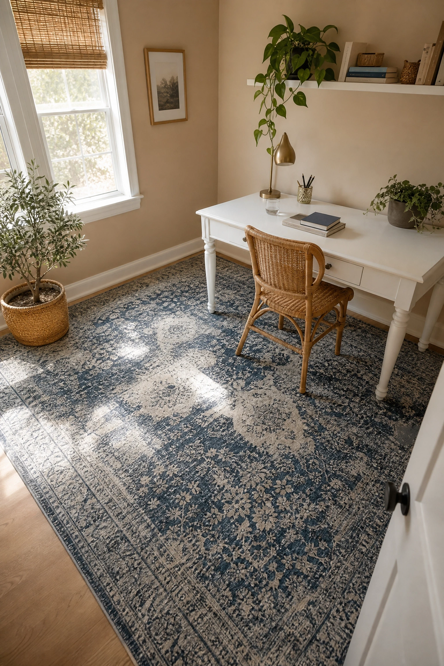
A warm beige wall paired with a blue and natural wool area rug is the easiest entry point into this color combination, and it almost always works. The rug becomes the room’s focal point and introduces the blue in a way that feels organic rather than forced. In practice, rugs with a distressed or low-contrast pattern think faded indigo stripes, soft geometric diamond patterns, or a muted Persian-style design are more effective in a work context than bright, high-contrast patterns because they add visual interest without competing with your focus. A rug with beige, navy, and cream tones together is especially useful because it naturally bridges the wall color and the blue accents, making the room feel like it was planned from the start even if it was pulled together over time.
Quick Tip: Size the rug so all four legs of the desk chair sit on it a too-small rug floats in the room and loses its grounding effect.
7. Beige Linen Walls with Indigo Blue Open Shelving
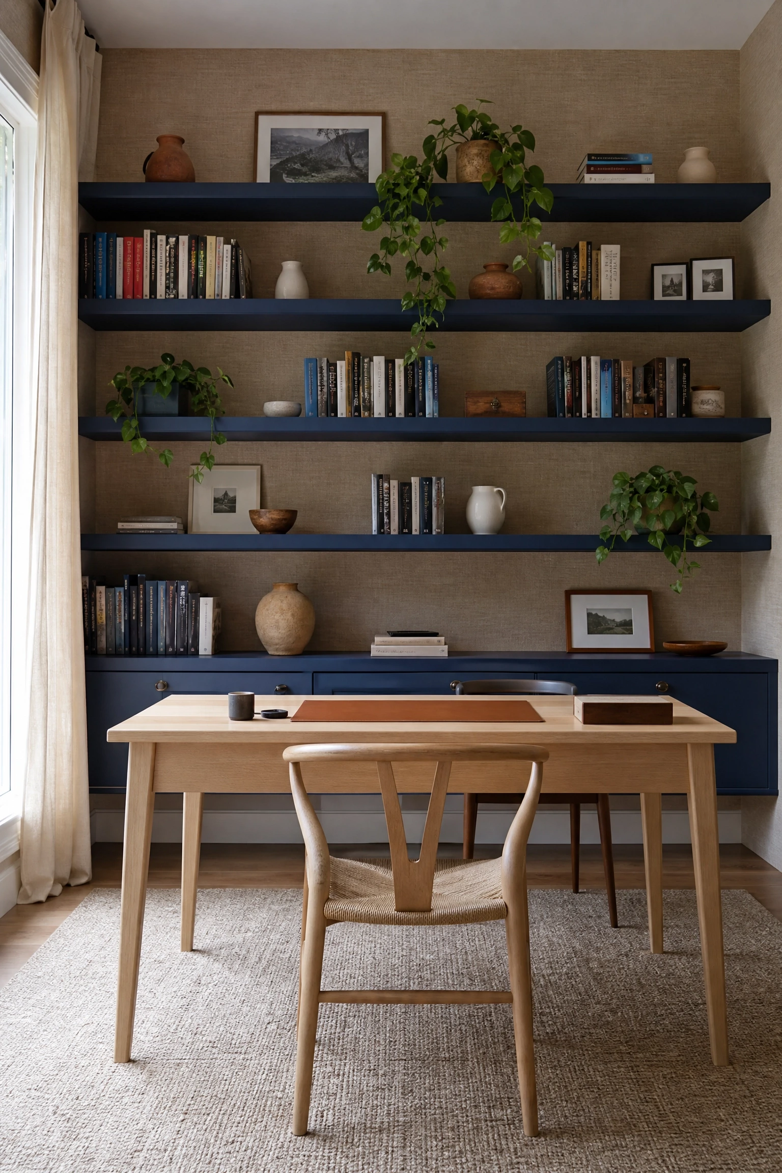
Open shelving painted in a deep indigo blue against beige linen-textured walls creates a look that is both functional and genuinely stylish the kind of office you actually want to sit in for eight hours. Indigo is darker than navy and has a slightly more complex, almost jewel-like quality that makes it read as considered rather than simply bold. The contrast between the soft beige walls and the rich indigo shelving draws immediate attention to the books, plants, and accessories displayed on the shelves, turning your storage into a design element. This works especially well in smaller offices where full wall shelving might otherwise feel oppressive the color distinction between wall and shelf keeps the room feeling open. Affordable options include painting IKEA Billy bookcases or similar flat-pack shelves, which keeps this approach well within budget.
Designer Advice: Style the indigo shelves with a mix of books faced spine-out, one or two small plants, and a neutral ceramic or two to avoid the shelves feeling too heavy or cluttered.
Blue as Accent vs. Blue as Dominant Color: Honest Trade-offs
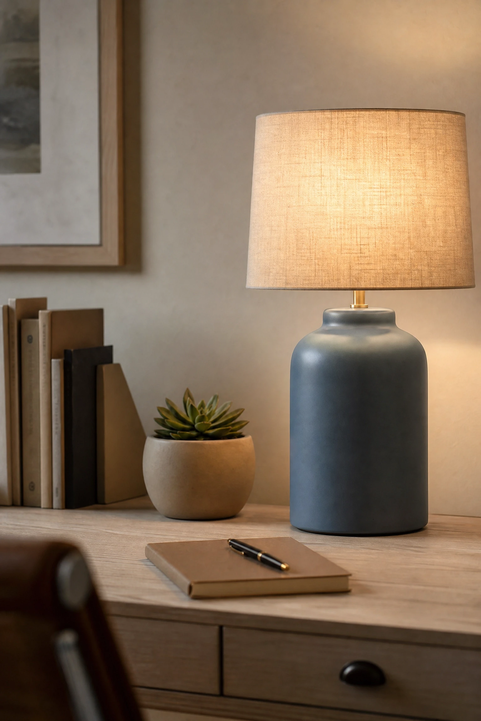
A sandy beige or whitewashed wood desk paired with a steel blue ceramic or linen table lamp is one of those combinations that looks more expensive than it is and works in almost any room. The lamp introduces the color in a small, swappable way which matters if you are still figuring out how committed you want to be to the blue and beige palette. Steel blue in particular is a reliable choice because it bridges warm and cool tones without veering too far in either direction. A ceramic lamp base in matte steel blue with a natural linen or cream shade is the specific configuration that tends to work best here, since the matte finish echoes the soft quality of the beige desk without competing with it. This is an affordable idea that punches above its weight.
Pro Move: Layer a second light source a wall sconce or clip-on reading light alongside the table lamp to avoid the flat, single-point lighting that makes home offices feel like break rooms.
9. Beige Grasscloth Wallpaper with Powder Blue Accessories
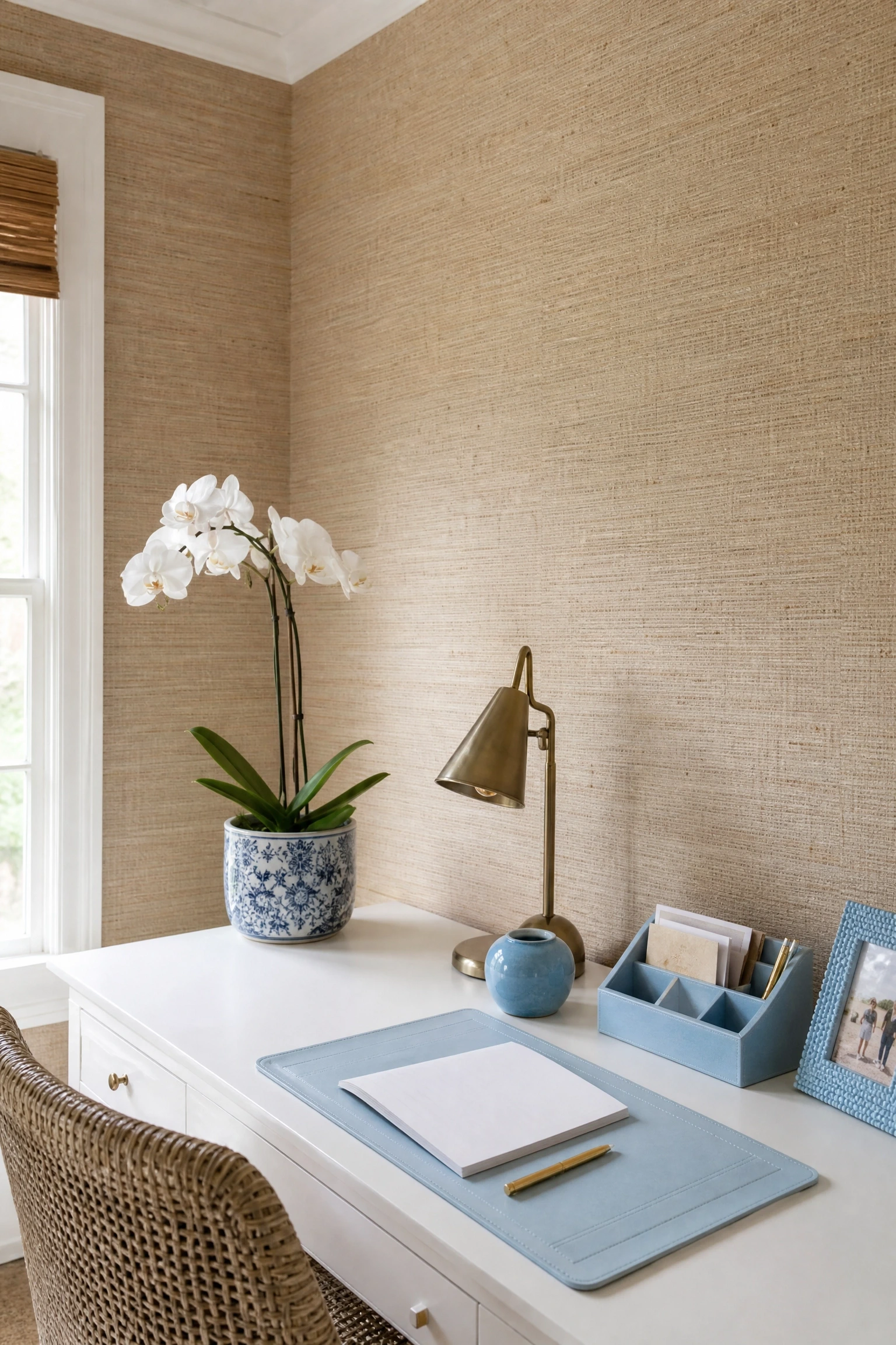
Beige grasscloth wallpaper has a textural richness that flat paint simply cannot replicate, and it creates an incredible backdrop for powder blue accessories like desk organizers, a small ceramic pot, a photo frame, or a decorative tray. The natural, woven quality of grasscloth introduces warmth and organic texture, and powder blue the softest and most muted end of the blue spectrum sits against it without creating any visual tension. This is a look that tends to appeal to people who want the room to feel calm and considered rather than bold, and in a home office context that is often exactly the right call. Grasscloth at the mid-range price point is available from brands like Seabrook or Brewster, and it is easier to install than most wallpapers because the texture forgives minor seam imperfections.
Heads Up: Grasscloth wallpaper is not scrubbable, so it works best in a low-traffic dedicated office rather than a high-contact hallway workspace.
10. Oat Beige Upholstered Desk Chair with Cobalt Throw Pillow
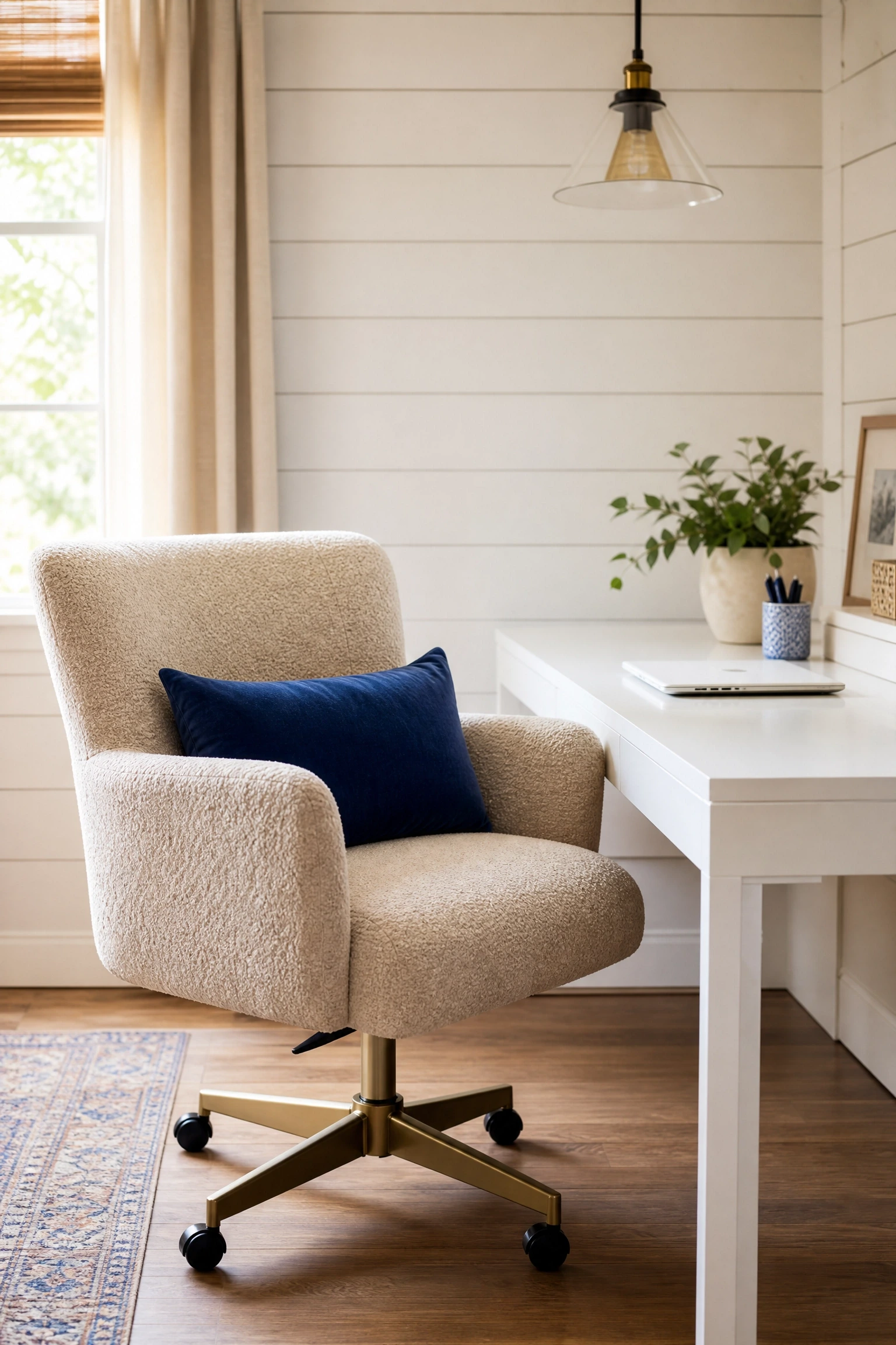
An oat or natural beige upholstered desk chair with a single cobalt blue lumbar or throw pillow is a small-scale version of the blue-leads-beige-follows principle, applied at the accessory level. This combination works because oat and cobalt are far enough apart on the color spectrum to create genuine contrast, but the warmth of the oat fabric stops the cobalt from feeling jarring or cold. From a practical standpoint, it is also a genuinely comfortable and supportive office chair setup many designers will tell you that the single most impactful investment in a home office is the chair, since that is where you spend most of your time. A boucle or performance velvet oat chair paired with a cobalt velvet lumbar pillow is a combination that appears regularly in professionally styled home offices and is surprisingly achievable at mid-range price points.
Reality Check: Make sure the desk chair you choose has proper lumbar support and adjustable height before you fall in love with how it looks a beautiful chair that hurts your back after two hours is not actually a good home office chair.
When Blue and Beige Share the Room Equally
These looks balance both colors so neither dominates the result is a room that feels genuinely cohesive and carefully considered.
11. Dusty Blue Lower Cabinets with Beige Upper Shelves
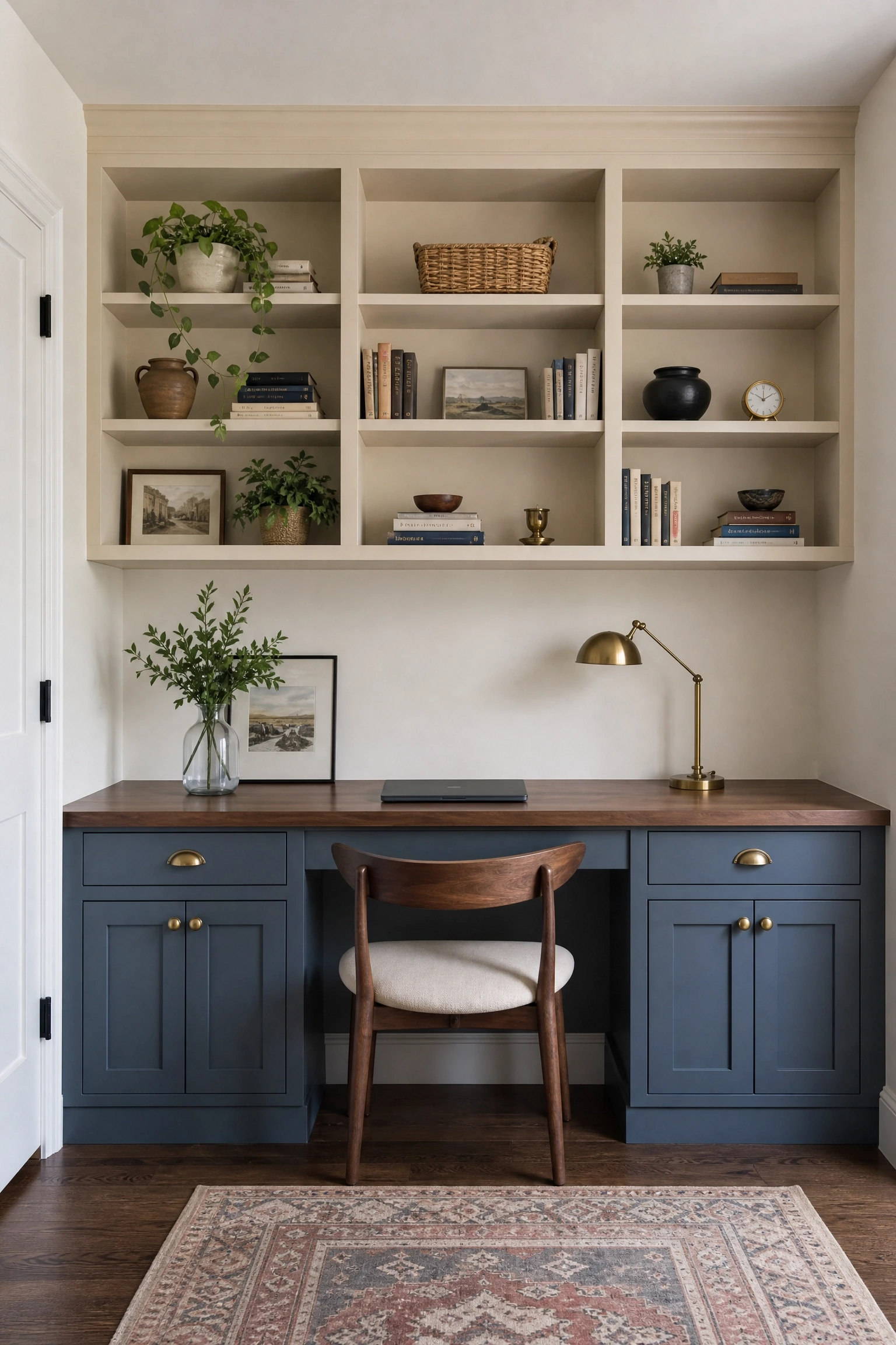
Painting lower cabinets or a built-in credenza in dusty blue while keeping upper shelving or wall space in beige is a split-color approach that has become one of the most popular moves in home office design over the past few years. The reasoning is logical: heavier, denser color at the bottom of a room anchors the space and mimics the way light naturally behaves, while a lighter color above keeps the upper portion of the room airy and open. Dusty blue a muted, slightly gray-toned blue is the ideal choice for this because it is soft enough to live comfortably with beige without creating a jarring contrast. This approach works particularly well in home offices with floor-to-ceiling built-ins, where the color division creates a natural visual transition that the eye follows from floor to ceiling with ease.
Designer Advice: Use the same hardware finish on both the dusty blue and beige sections brushed brass or matte black both work well to tie the two halves of the room together visually.
12. Blue and Beige Geometric Wallpaper as a Feature Wall
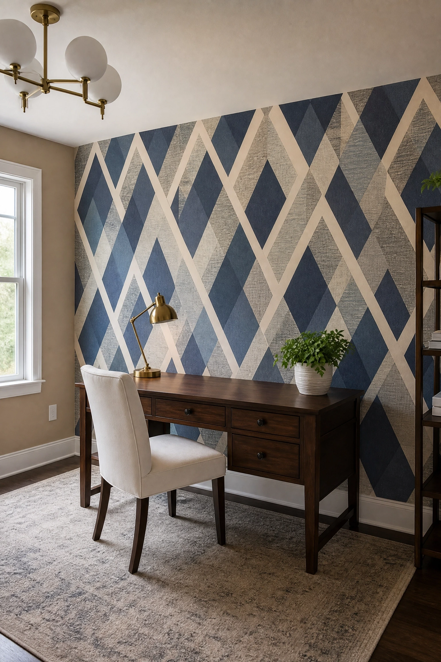
A geometric wallpaper that combines blue and beige tones on a single feature wall is one of the fastest ways to give a home office a designed, editorial feel without committing to a full room renovation. The pattern does the work of balancing the two colors so you do not have to think too hard about proportions or pairings. Look for patterns that include at least three tones a deep blue, a mid-tone dusty blue, and a cream or beige because single-shade patterns can feel flat at scale. Diamond, hex, or wide stripe patterns tend to read better in a work context than very busy or organic patterns, which can make it harder to concentrate. This is also a genuinely renter-friendly idea if you use peel-and-stick options from brands like Tempaper or Chasing Paper, which have improved significantly in quality over the past few years.
Quick Tip: Center the wallpaper pattern on the wall behind your desk so the most complete repeat lands in your sightline it looks deliberate and avoids an awkward cut-off at one side.
13. Blue and Beige Plaid or Check Drapery with White Walls
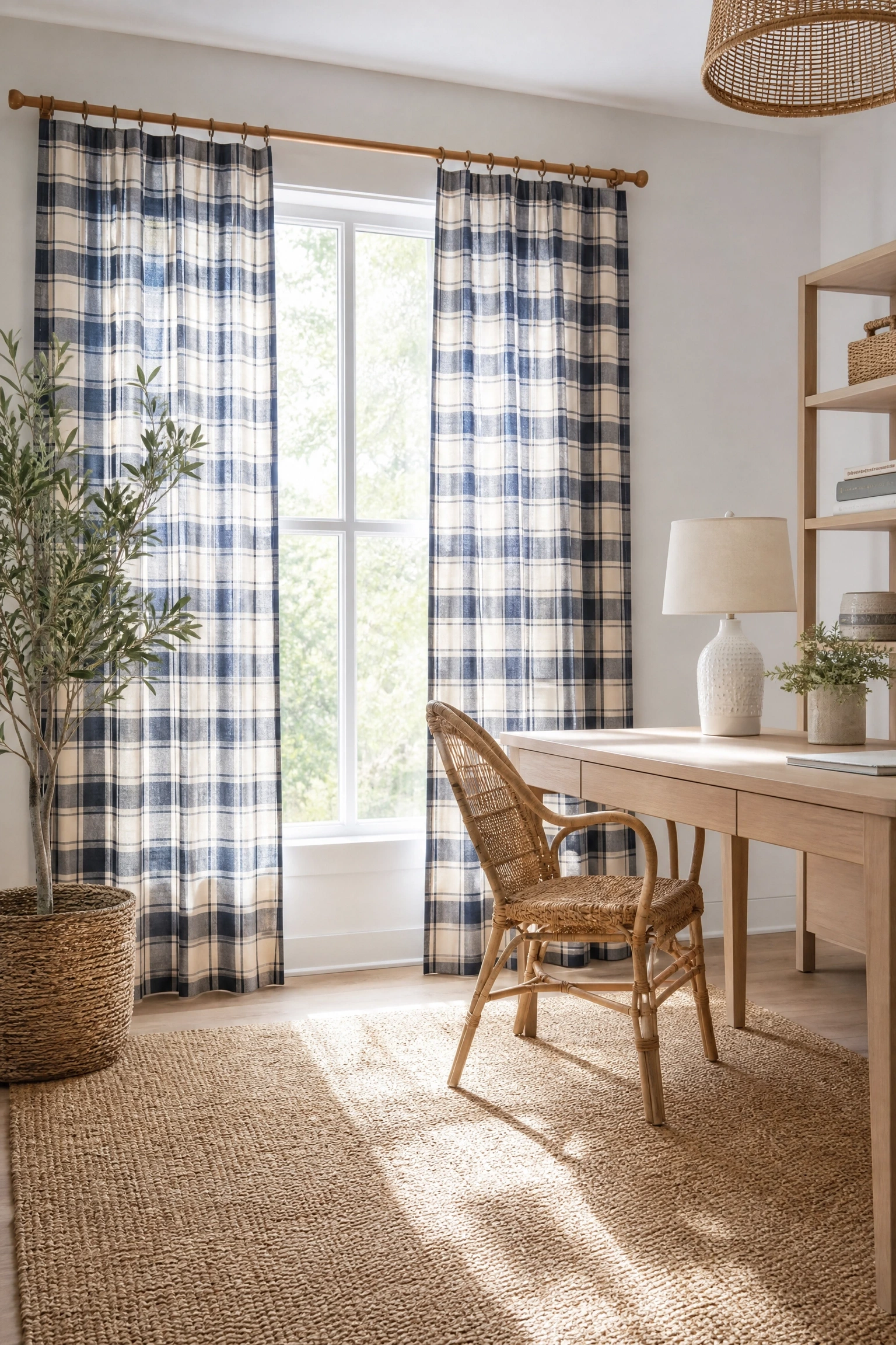
Blue and beige plaid or check drapery on a white wall is a classic combination that never really goes out of style, and it works in a home office because it introduces both colors simultaneously through a single design element. The white wall gives both colors room to breathe and prevents the palette from feeling heavy or closed-in. A large-scale plaid in navy and cream or a soft blue and sand check works better in most home offices than a small-scale gingham, which can feel too casual for a professional context. In terms of fabric, a cotton or linen-cotton blend drapes beautifully and catches light in a way that adds softness to a room full of hard surfaces like desks, shelving, and monitors. This look bridges traditional and transitional styles well and suits a range of home aesthetics from colonial to modern farmhouse.
Pro Move: Hang drapery panels at ceiling height rather than at the window frame it adds perceived ceiling height and makes the window look larger than it actually is.
Blue and Beige Office: Style-at-a-Glance
14. Blue Velvet Ottoman Footrest with Beige Wood Desk
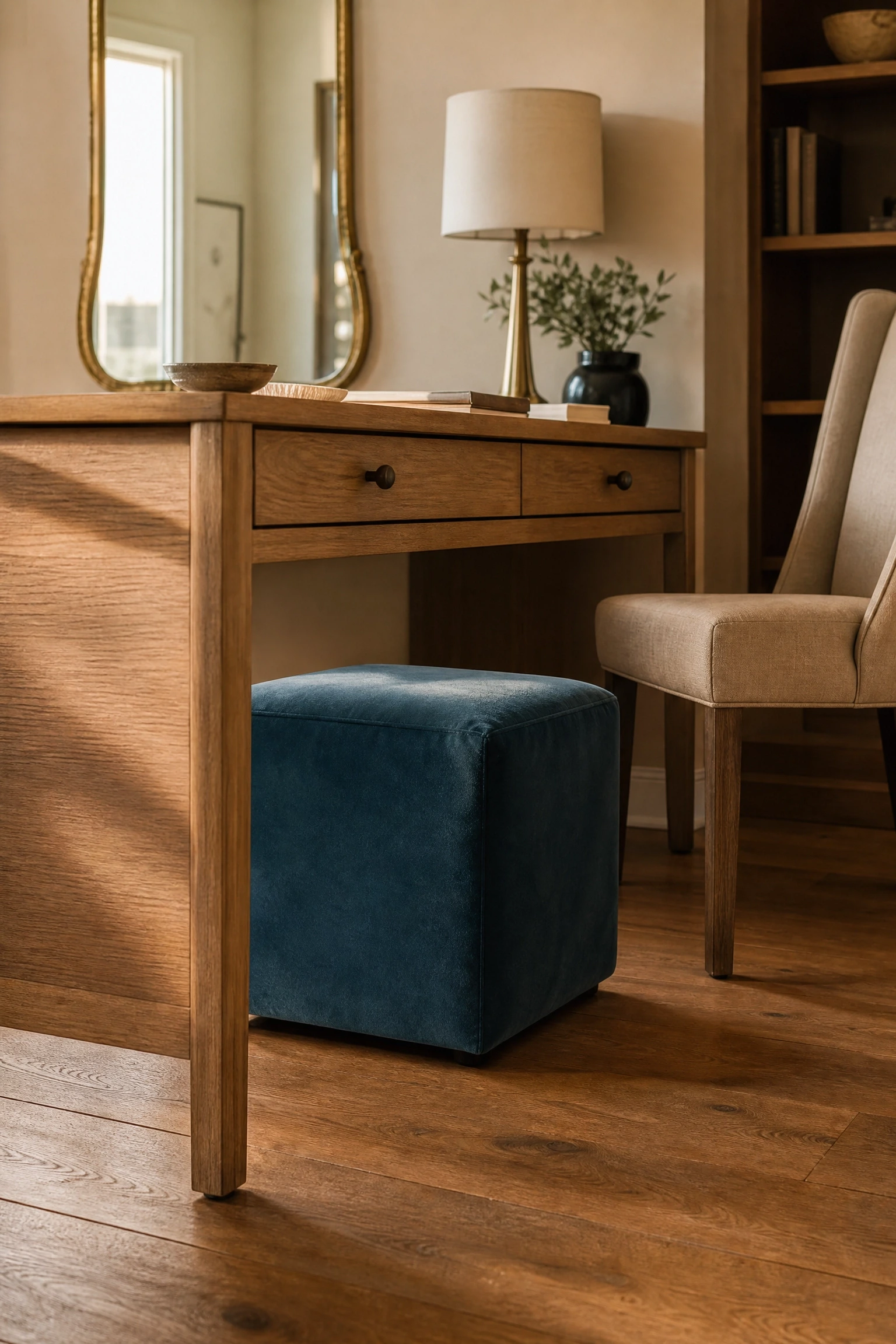
A small blue velvet ottoman used as a footrest under or beside a beige or natural wood desk is a detail-level idea that has a surprising impact on how the room feels overall. It adds a layer of comfort and luxury that most home offices lack, and the velvet texture introduces richness against the matte surface of a wood desk in a way that reads as intentional design rather than an afterthought. Deep teal, navy, or dusty blue all work well in velvet at this scale. This is also a practical investment: a good footrest genuinely improves posture and reduces lower back strain during long work sessions, so it earns its place on function alone before you even consider the aesthetic benefit. Budget-friendly options from IKEA or CB2 make this accessible at almost any price point.
Heads Up: Choose a velvet with a performance or stain-resistant treatment if you have pets or kids who might wander into your office standard velvet shows pet hair and marks easily.
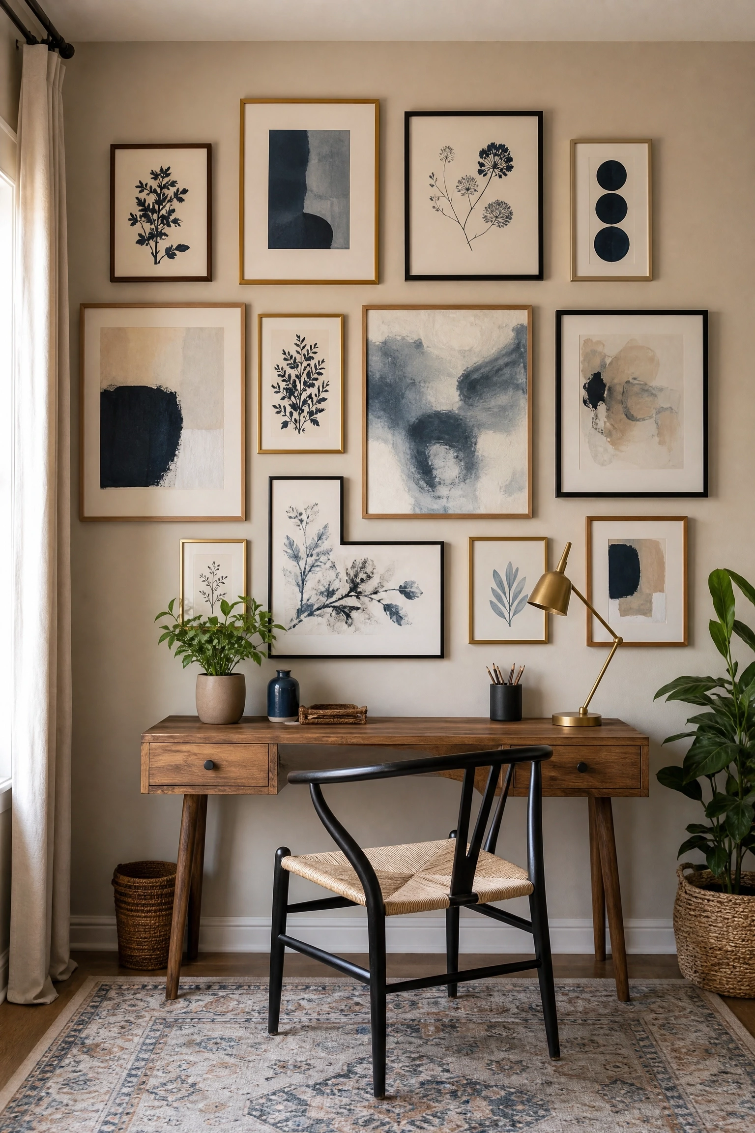
A gallery wall anchored by artwork in blue and beige tones whether botanical prints, abstract paintings, architectural drawings, or photography with a blue and neutral palette is one of the most personal and cost-effective ways to bring this color combination into a home office. The gallery wall also functions as a focal point for video calls, which matters more than most people admit. In practice, the most coherent gallery walls use a mix of frame finishes (natural wood, black, and brass all work with this palette) and vary the print sizes so the arrangement has visual rhythm. Including at least one piece with both blue and beige in the same image helps tie the wall together and reinforces the palette without it feeling forced. Prints from Society6, Desenio, or Minted give you access to good-quality art at accessible price points.
Designer Advice: Lay the gallery wall arrangement out on the floor before committing to any nails spend ten minutes moving frames around to find the configuration that feels balanced, then photograph it as a reference before hanging.
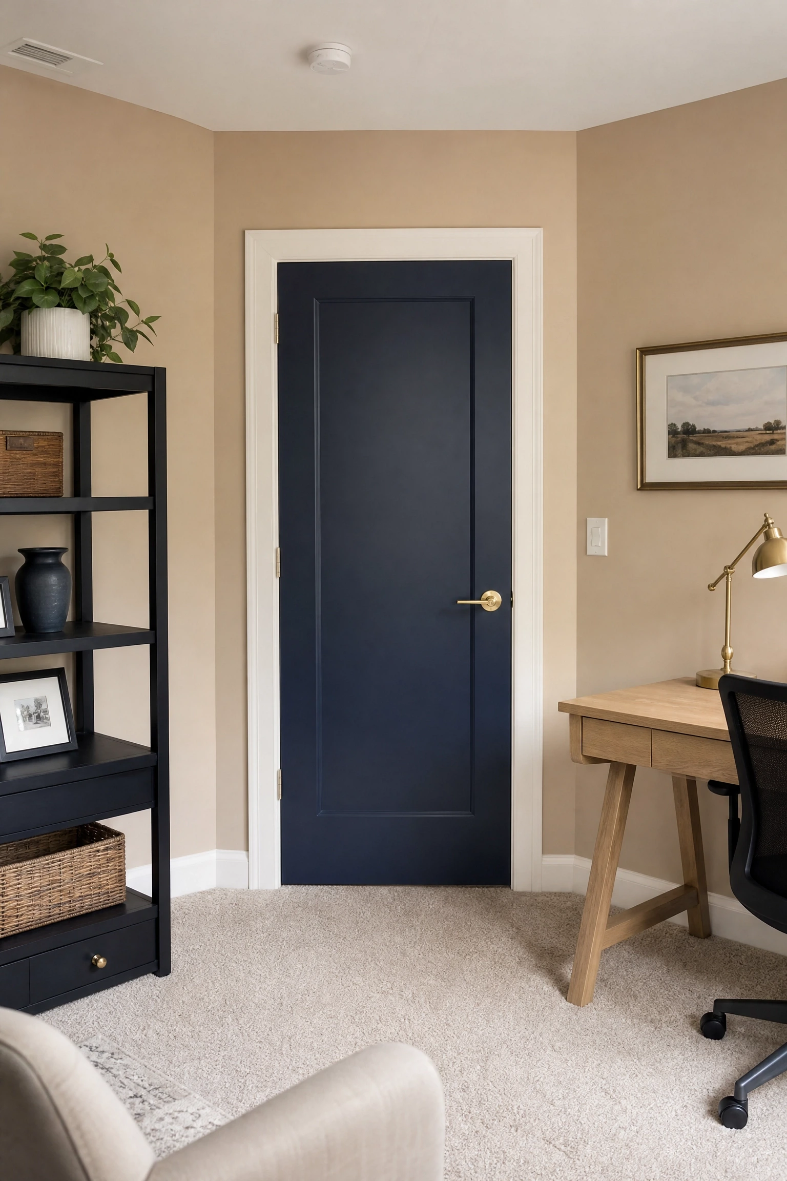
16. Blue-Painted Interior Door with Beige Office Walls
Painting the interior door of a home office in a deep navy or French blue while keeping the walls beige is an architectural detail that adds a huge amount of character to a room without requiring much time or money. Interior doors are often overlooked in home decor, but a painted door functions as a small accent wall and signals that the space has been thought through rather than defaulted to. The contrast of a dark blue door against beige walls creates a moment of drama at the entry point of the room that makes the space feel more significant and considered. This works especially well in offices with standard hollow-core doors that lack any particular character the paint immediately makes them look more solid and intentional. A good quality door paint in a satin finish is more durable than flat and holds up better to the regular contact a door takes.
Quick Tip: Paint both sides of the door the same blue so the color reads correctly whether the door is open or closed.
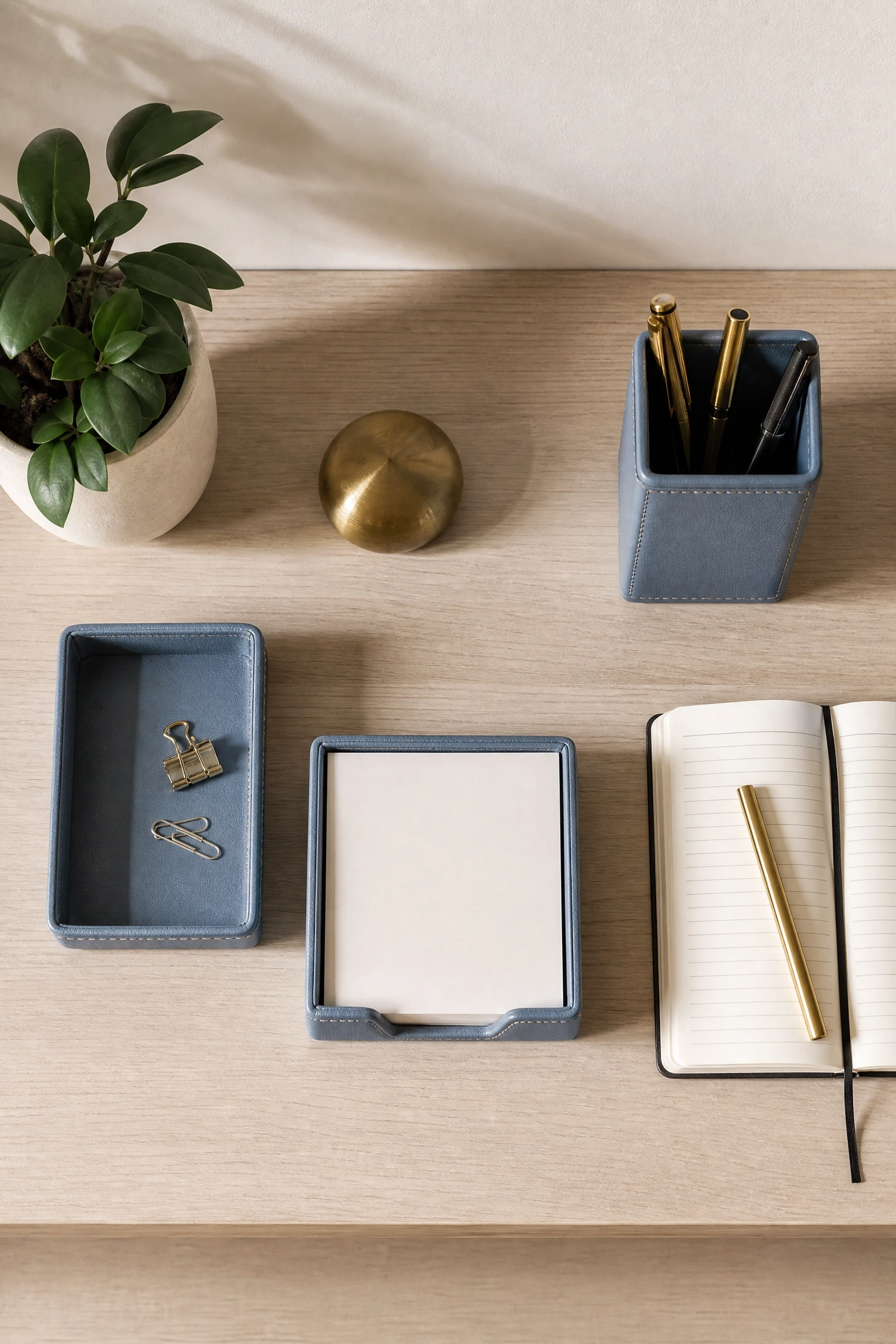
A set of coordinated blue leather desk accessories a pen holder, a small catchall tray, a cable organizer, a notepad holder on a beige desk is a small-scale styling move that lifts the workspace without any structural changes at all. Leather accessories in dusty or slate blue have a quiet sophistication that most desk accessories lack, and a cohesive set makes the desk look intentional rather than collected at random. This is especially effective in home offices that are part of a larger multipurpose room, like a living room or bedroom, where the desk area needs to feel visually distinct and purposeful. Brands like Mark and Graham, Smythson, or more affordable options from Etsy makers offer blue leather desk accessory sets in a range of price points. This is one of the lowest-commitment, highest-impact ideas in this list.
Pro Move: Limit the desk to three or four matching accessories maximum beyond that, the desk starts to feel cluttered even with beautiful objects on it.
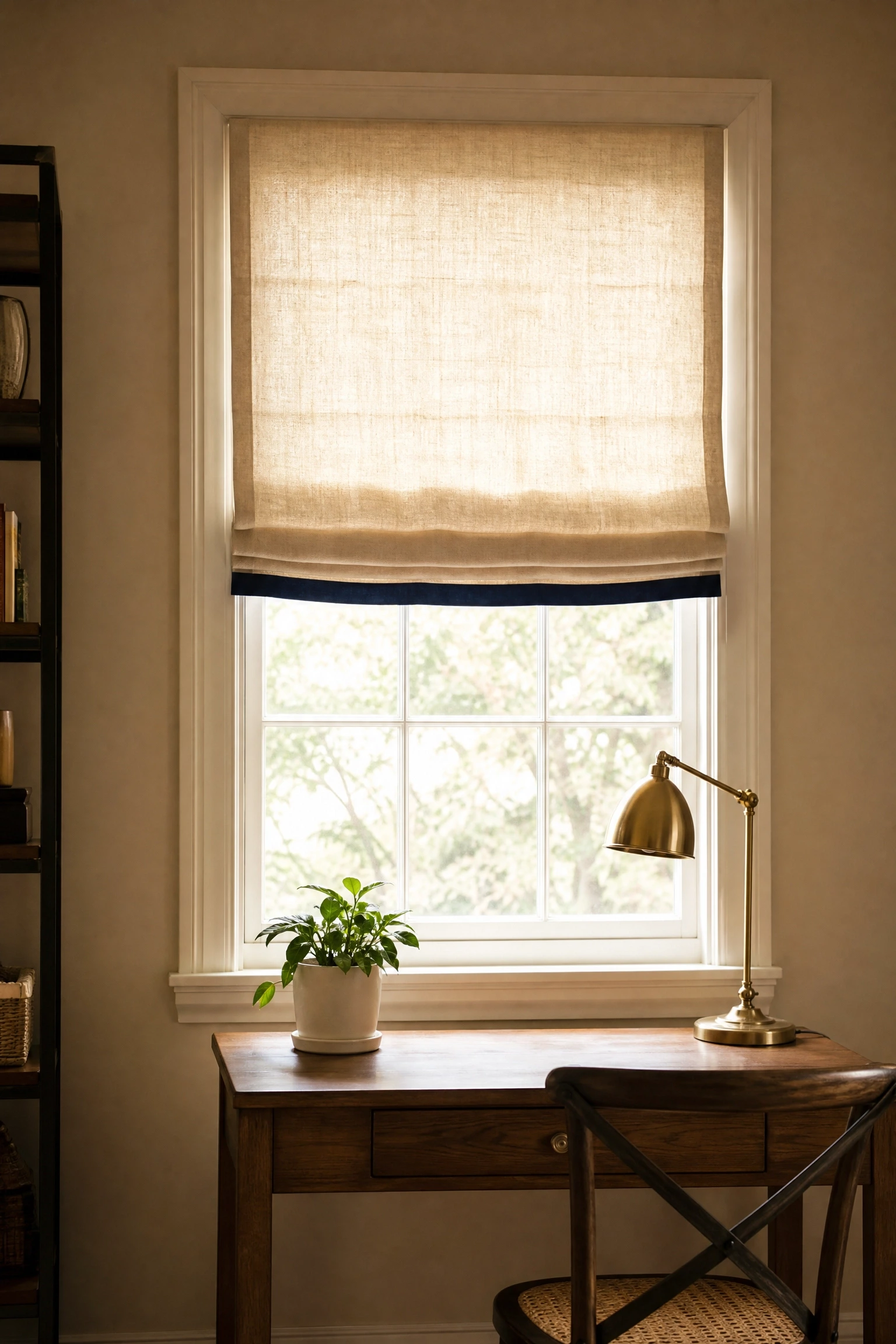
A beige linen or cotton Roman shade with a blue trim, border, or banding detail at the hem is a custom-looking window treatment that ties the palette together in a way that feels tailored and considered. The blue trim pulls the color up toward the window, which is one of the better-lit parts of any room, and reinforces the palette without requiring a lot of blue surface area. Custom Roman shades with contrast banding are available from boutique window treatment makers on Etsy for a reasonable price if you are working with standard window sizes, or you can have them made at a local drapery workroom. Navy, slate, or French blue all work as trim colors against a beige ground the choice depends on the intensity of blue you want to introduce at the window without making the room feel heavy.
Heads Up: Roman shades work best on windows that do not need to open and close frequently for operable windows, layering a beige shade with a blue trim drapery panel is a more practical alternative.
19. Blue and Beige Layered Textiles for a Reading Corner
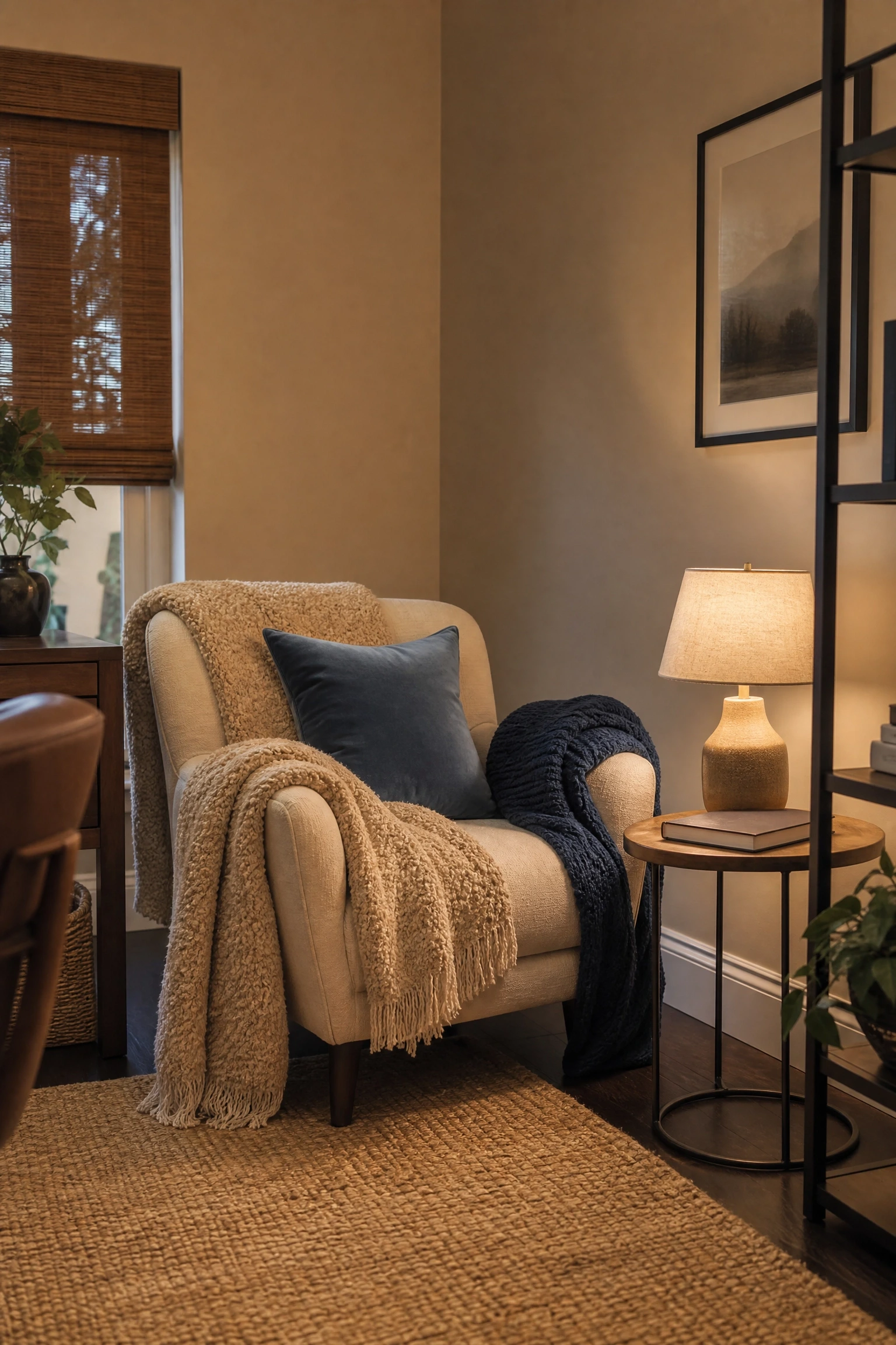
If the home office has space for a small reading chair or a window seat, layering blue and beige textiles a beige boucle throw, a dusty blue cushion, a soft indigo knit blanket creates a secondary zone that makes the room feel more complete and lived-in. A dedicated reading corner in a home office serves both an aesthetic and a functional purpose: it gives you somewhere to step away from the desk when you need to think, read a brief, or take a call without a screen in front of you. The layering of textures boucle, linen, knit, velvet adds depth and warmth to the color palette in a way that painted walls alone cannot achieve. This is a relatively low-budget idea that makes a significant difference in how the room feels on an average work day.
Reality Check: A reading corner only works if the chair is genuinely comfortable a beautiful but stiff chair in the corner of a home office will go unused within a week.
20. Whitewashed Beige Brick with Navy Blue Floating Desk
Whitewashed brick walls whether original brick treated with a diluted white paint wash or a modern brick slip application in a warm beige tone pair beautifully with a navy blue floating desk mounted directly to the wall. The texture of the brick creates an organic, layered backdrop against which the clean, graphic lines of a floating desk read clearly. A navy floating desk has the bonus of space-saving practicality in smaller home offices: mounted to the wall at the right height, it clears the floor and makes the room feel less crowded. This combination works particularly well in converted garage offices, basement workspaces, or any room with exposed or semi-industrial architectural features. Paint the floating desk in a high-quality furniture paint like Annie Sloan or Farrow and Ball for a durable, even finish.
Designer Advice: Install proper wall anchors rated for the weight of your desk and monitor before mounting anything to a brick or plaster wall the aesthetic falls apart immediately if the desk sags or pulls away.
21. Blue and Beige Painted Stripes as a DIY Accent Wall
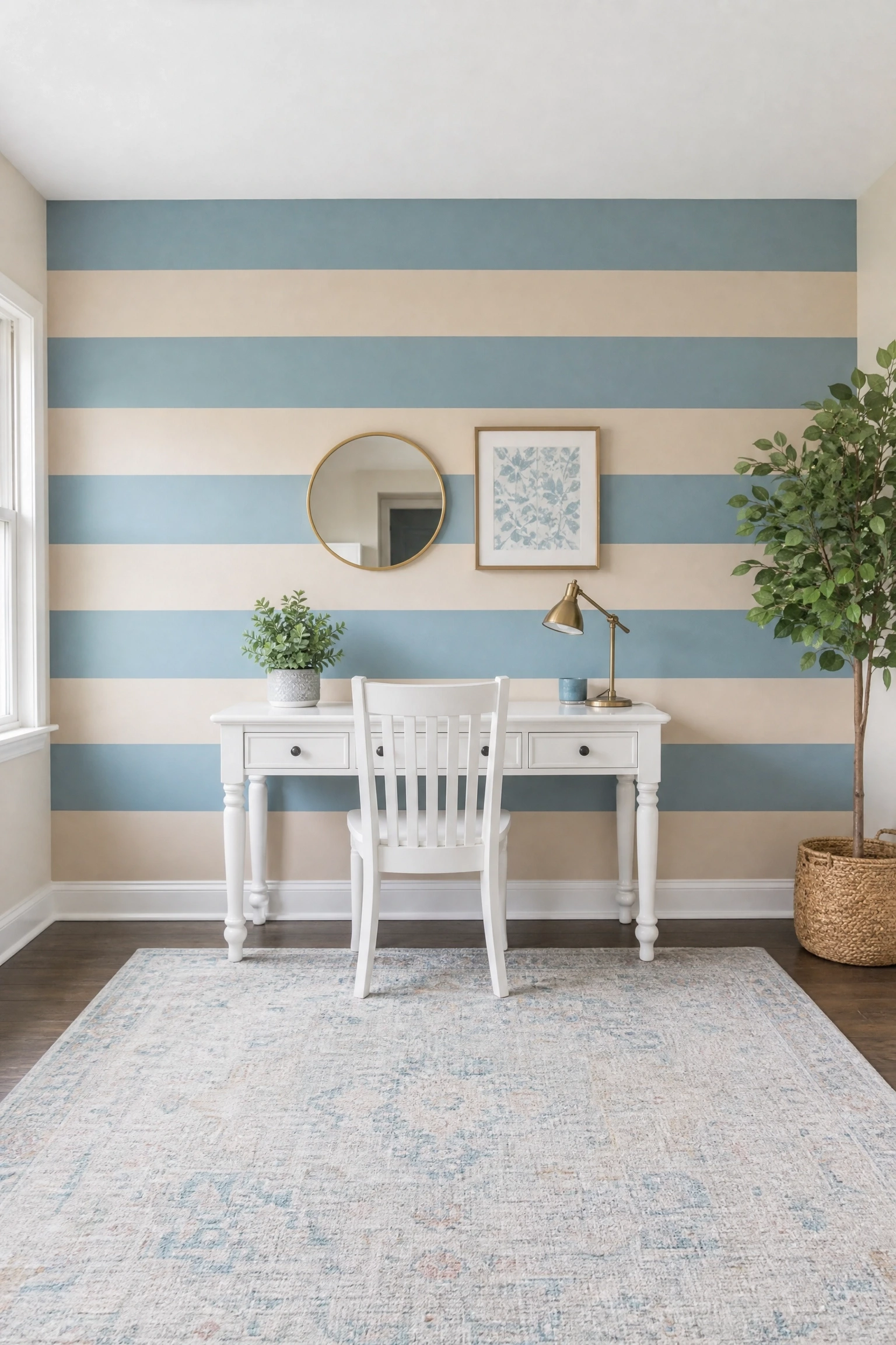
Horizontal painted stripes in alternating dusty blue and warm beige on a single accent wall is a DIY project that costs almost nothing and creates a result that looks far more considered than it has any right to. The key to making stripes look intentional rather than chaotic is proportion: wide stripes of eight to twelve inches look architectural and calm, while narrow stripes start to feel busy and overwhelming in a work environment. Using the same finish (flat or eggshell) for both colors keeps the stripes subtle, while mixing a flat blue with a satin beige adds dimension and makes the texture visible when light moves across the wall throughout the day. This approach is particularly suited to renters who can paint it requires no permanent changes and is one of the easiest walls to paint over when you move out.
Quick Tip: Use a level, painter’s tape, and a pencil to mark every stripe before you open a single can of paint the prep takes longer than the painting, but it is what separates a professional-looking result from a messy one.
22. Coastal Blue and Beige with Natural Rattan and Wicker
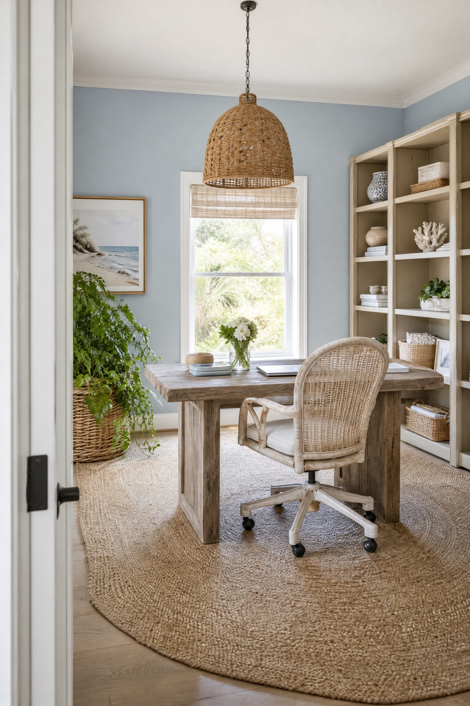
A coastal take on blue and beige in a home office uses soft sky blue or seafoam-adjacent blue tones alongside sandy beige and layers in natural materials like rattan desk accessories, a wicker pendant light, a jute area rug, and weathered or whitewashed wood furniture to create a room that feels breezy and relaxed without tipping into full beach-house kitsch. This works best when the blue stays soft and the beige stays sandy rather than yellow, and when the natural materials are in proportion too much rattan starts to feel like a furniture showroom. For people who work from home and find a stark or overly designed office stressful, a coastal blue and beige palette with organic textures genuinely creates a calmer visual environment, which translates into a more focused and productive work day.
Pro Move: Keep tech and cords organized and hidden in this style a beautiful coastal office undermined by cable clutter and exposed power strips loses its calming quality immediately.
23. Deep Blue and Warm Beige in a Japandi-Inspired Office
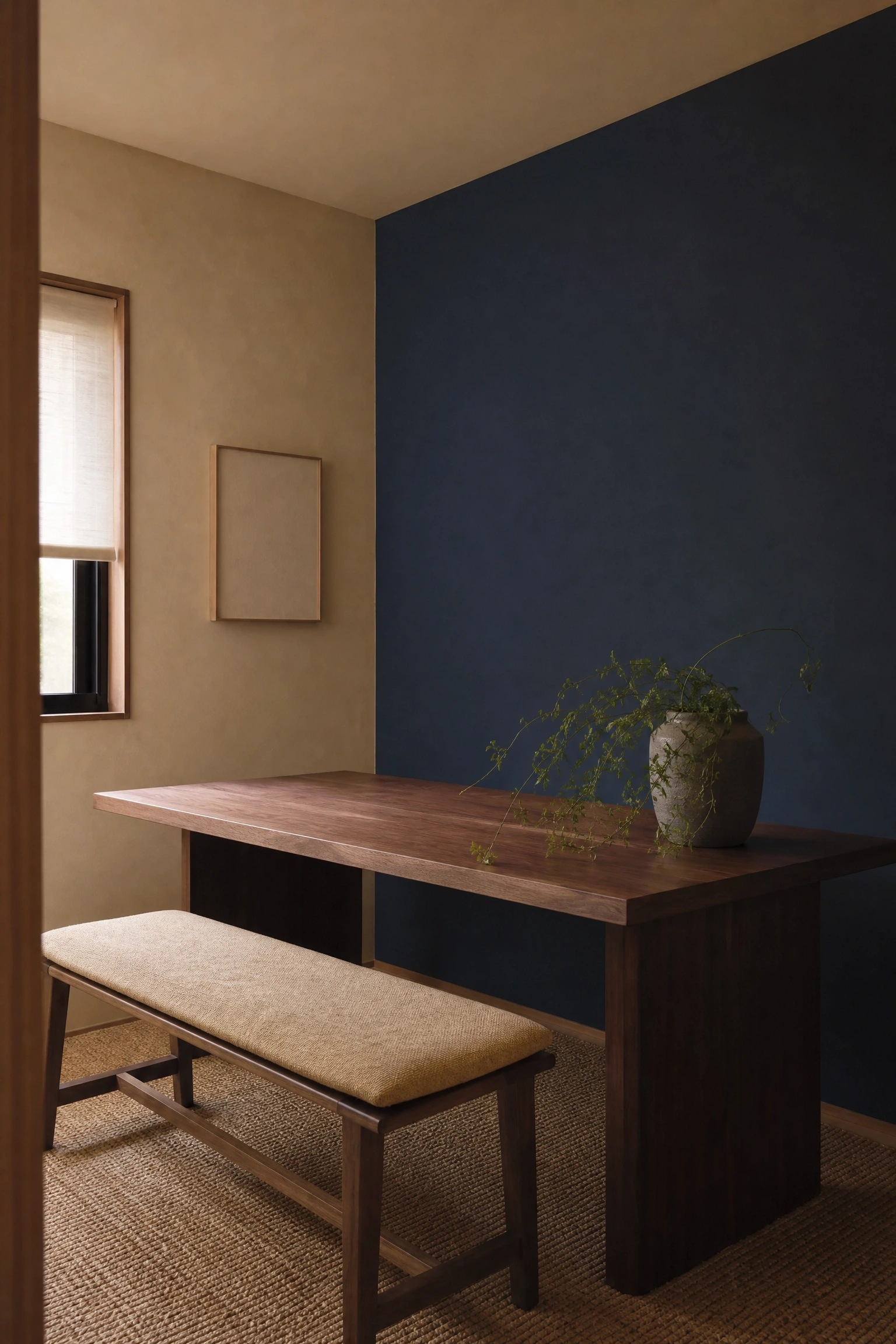
Japandi the design movement that blends Japanese minimalism with Scandinavian warmth is a natural fit for a blue and beige home office when the blue chosen is deep, considered, and used sparingly. Think a single deep indigo or midnight blue wall, a low-profile walnut desk, beige linen cushions on a simple wooden bench, and a carefully edited shelf with one ceramic pot and a single trailing plant. The Japandi principle of wabi-sabi, which embraces imperfection and natural materials, means the beige in this context should feel warm and slightly imperfect rather than pristine a textured linen or natural plaster finish rather than a smooth flat paint. This approach requires real restraint in terms of accessories and objects, but when it works it produces the quietest, most genuinely productive office environment on this list.
Reality Check: Japandi’s restraint only works if you have adequate storage to keep the room clear a minimalist aesthetic with nowhere to put your papers and cables just looks messy, not considered.
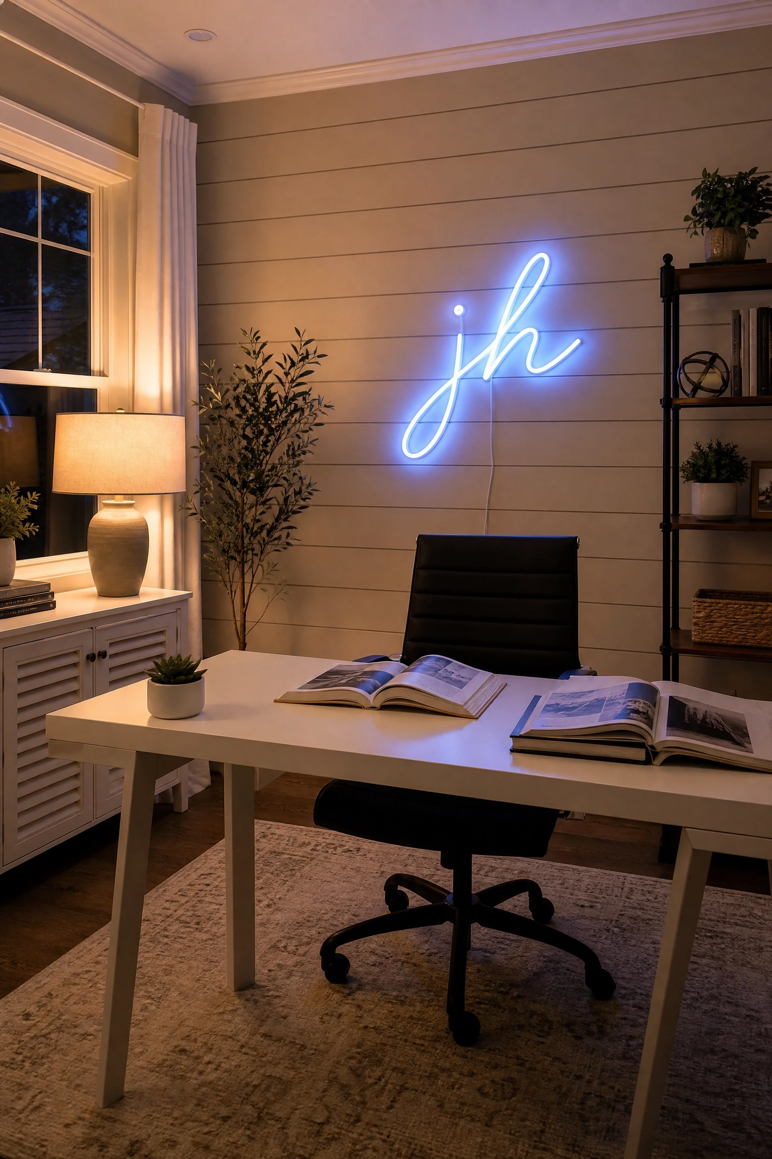
24. Blue Neon Sign or LED Art Against Beige Shiplap
A neon or LED sign in a blue tone your initials, a short word, an abstract shape, or a custom phrase mounted against beige shiplap or a smooth beige wall is the most contemporary and personal idea in this list, and it genuinely works in a home office in a way it might not in other rooms. Neon adds a layer of character and individuality that decor items rarely achieve, and blue neon in particular has a quality that feels atmospheric and interesting rather than gimmicky. The beige shiplap backdrop grounds it without competing, and the natural wood texture keeps the look from feeling too stark. LED neon flex options from Etsy makers are far more affordable than real glass neon and look almost identical in photographs, making this an accessible idea at most budgets. This is a high-personalization move that works best in a dedicated home office rather than a multipurpose room.
Heads Up: LED neon signs emit a low hum that some people find distracting during focus work or video calls test the sound level in the space before committing to a permanent install.
Blue and beige is one of those color combinations that genuinely rewards the effort you put into getting it right. The ideas in this article range from a single lamp swap to a full wallpaper install, which means there is something here regardless of your budget, your timeline, or how committed you are to making a change. The most important decision is still the one this article opened with: figure out whether you want blue or beige to lead, and let that guide everything else. A room where both colors are fighting for dominance tends to feel restless and unresolved, while a room where one color anchors and the other softens almost always feels settled and complete.
If you are starting from scratch, the navy accent wall with warm beige millwork (idea one) or the French blue walls with linen drapery (idea four) are the most reliable starting points both are well-documented in professional interior design and photograph beautifully for video calls, which is a genuine practical consideration for anyone working from home. If you are working within an existing space and want to add the palette without repainting, the blue and beige gallery wall, the cobalt desk chair, or the layered reading corner textiles will take you a long way without touching a wall. Wherever you start, the combination has more range than most people give it credit for and the 24 looks in this article only scratch the surface of what it can do.
Which of these blue and beige home office looks would actually work in your space? Drop it in the comments below.
Frequently Asked Questions
What shade of blue works best with warm beige in a home office?
Warm beige tones those with golden, wheat, or sandy undertones pair most naturally with blues that have some warmth or depth built in, like navy, French blue, or dusty slate blue. Avoid very cool, icy, or electric blues with warm beige as they can clash and make the room feel unresolved. If your beige is cooler and more greige in quality, you have a little more flexibility and can lean toward cleaner, crisper blues like powder blue or cobalt.
Can a home office feel too dark if I use too much blue?
Yes, especially in rooms with limited natural light. Deep blues like navy or teal absorb more light than pale or mid-toned blues, so using them on multiple walls or a ceiling in a north-facing room can make the space feel cave-like. The solution is to balance dark blue surfaces with plenty of warm beige, add layered lighting (desk lamp, overhead, and ambient), and use reflective finishes on shelving or furniture to bounce light around.
What furniture finishes work well in a blue and beige home office?
Warm wood tones walnut, oak, white oak, and rattan work beautifully in a blue and beige home office because they reinforce the warmth of the beige and prevent the blue from reading as cold. Brass and unlacquered brass hardware are particularly effective accent metals in this palette. Matte black hardware also works if you want a more modern, graphic feel. Avoid chrome or silver-toned metals, which tend to pull the palette cooler and can make warm beige look muddy by comparison.
How do I make a blue and beige home office look professional for video calls?
For video calls, a medium-toned blue accent wall behind your desk chair is ideal it reads clearly on camera, creates a clean and professional background, and is distinctive enough to look intentional without being distracting. Avoid very dark blues (they can look black on camera) and very pale blues (they can wash out). Beige walls are also a solid video call background for the same reasons. Add a desk lamp in your sightline to ensure your face is well-lit and separated from the background.
Is blue and beige a good color palette for a small home office?
Yes, when used thoughtfully. The key in a small office is to keep the dominant color light beige walls and light wood furniture make the room feel larger, while blue is introduced through accents like a chair, accessories, or a single feature wall. Avoid painting all four walls in a deep blue in a small space as it will feel significantly smaller. Light powder blue or dusty blue on one wall can actually make a small room feel airier if paired with plenty of beige and white elsewhere.
What plants work well in a blue and beige home office?
Plants with deep green foliage work best in a blue and beige office because the green creates a natural bridge between the warm beige and the cool blue without introducing a competing color. A large fiddle leaf fig, a rubber plant, a pothos trailing from a shelf, or a snake plant in a beige or cream ceramic pot all look right in this palette. Avoid flowering plants with pink, red, or orange blooms they introduce colors that sit awkwardly with both blue and beige in a professional context.