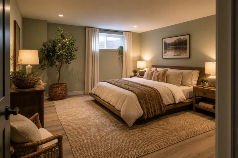
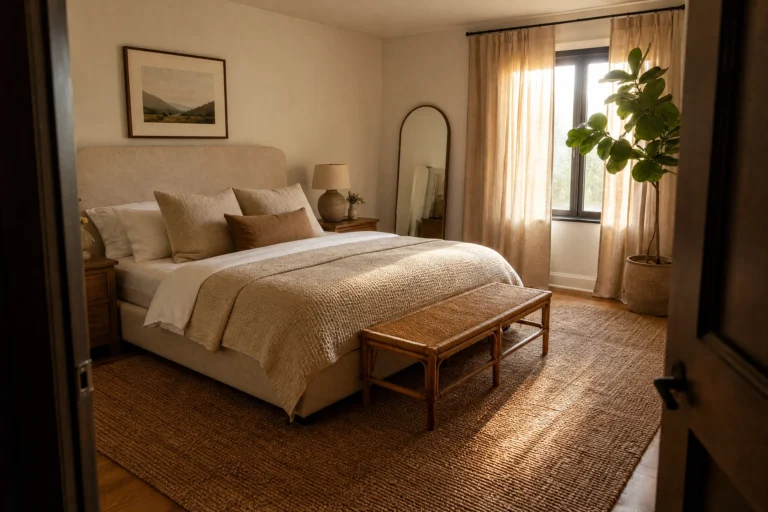
Blue is the most popular bedroom color for a reason. It is calming, it works with almost any furniture, and it does not go out of style. But there is a big difference between a blue bedroom that feels relaxing and one that feels cold or boring. The shade, how much you use, and what you pair it with all matter. I have painted my own bedroom three different shades of blue over the years and finally landed on one that actually helps me unwind at night. Here are 16 blue bedroom ideas that get the calming part right.
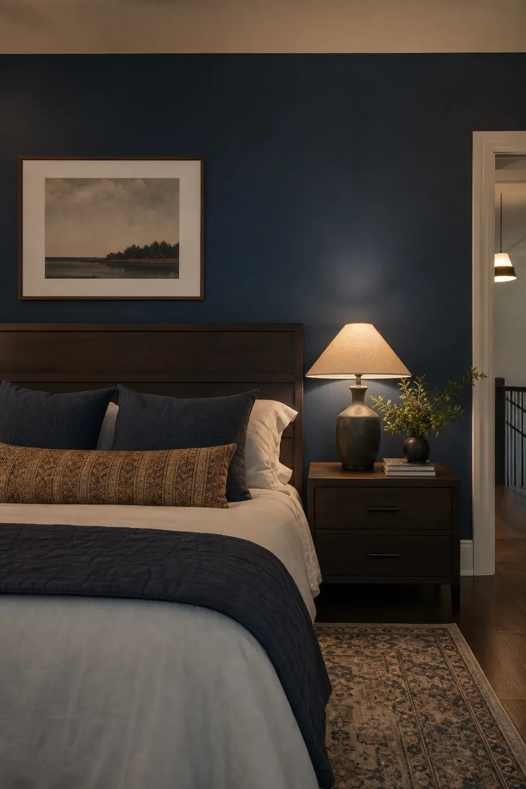
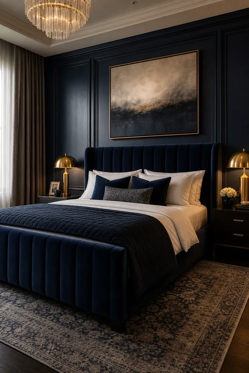
A single navy wall behind the bed creates a moody, cocoon-like feel without darkening the entire room. The three remaining light walls keep the room bright during the day while the dark accent wall sets a dramatic backdrop for sleep. Navy pairs well with white bedding, warm wood, and brass or gold accents. The deep blue acts like a visual anchor that grounds the room.
Designer Tip: Paint the accent wall in a matte or eggshell finish rather than satin or semi-gloss. Dark colors in a shiny finish reflect light and show every wall imperfection. Matte navy looks richer, deeper, and more velvety.
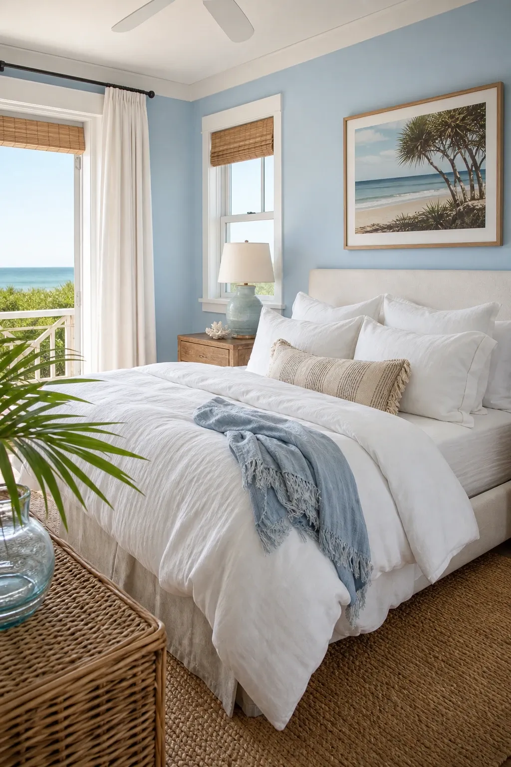
Pale blue walls with white trim, linen bedding, and natural textures create a coastal bedroom that feels like waking up near the ocean. The light blue is airy and calming without being cold. It reflects light beautifully in rooms with windows and stays cheerful even on gray days. Coastal blue bedrooms work in any home, not just beach houses.
Designer Tip: Add texture through woven baskets, a jute rug, and linen or cotton bedding to prevent a light blue room from feeling flat. The textures create warmth and depth that the light color alone does not provide.
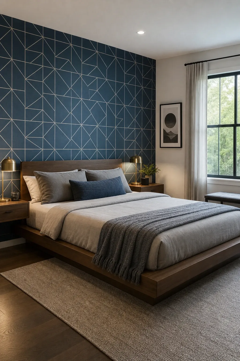
Blue geometric wallpaper or a painted geometric pattern on one wall adds a modern, graphic element to the bedroom. The pattern provides visual interest that a solid blue wall cannot match. Geometric patterns in blue and white, blue and gold, or blue and gray are all calming combinations that keep the room feeling ordered rather than chaotic. This is the option for people who want blue with a contemporary edge.
Designer Tip: Keep bedding and other textiles solid when the wall has a strong geometric pattern. Pattern on the wall plus pattern on the bed plus pattern on the curtains creates visual noise that is the opposite of relaxing.
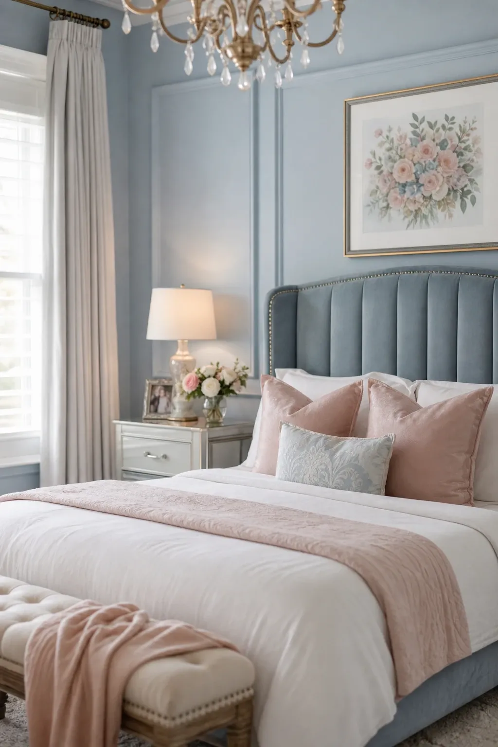
A soft pastel blue on all four walls creates a gentle, enveloping calm that is perfect for sleep. The color is light enough that it does not shrink the room but saturated enough that it reads as blue rather than white. Pastel blue works in bedrooms of any size and any style. It is one of the safest and most universally flattering bedroom colors because it is soothing without being boring.
Designer Tip: Test pastel blue paint samples at different times of day. Pastel blues shift dramatically from morning to evening light. What looks perfect at noon may look gray at sunset or purple under warm artificial light. Buy samples and observe them for a full day before committing.
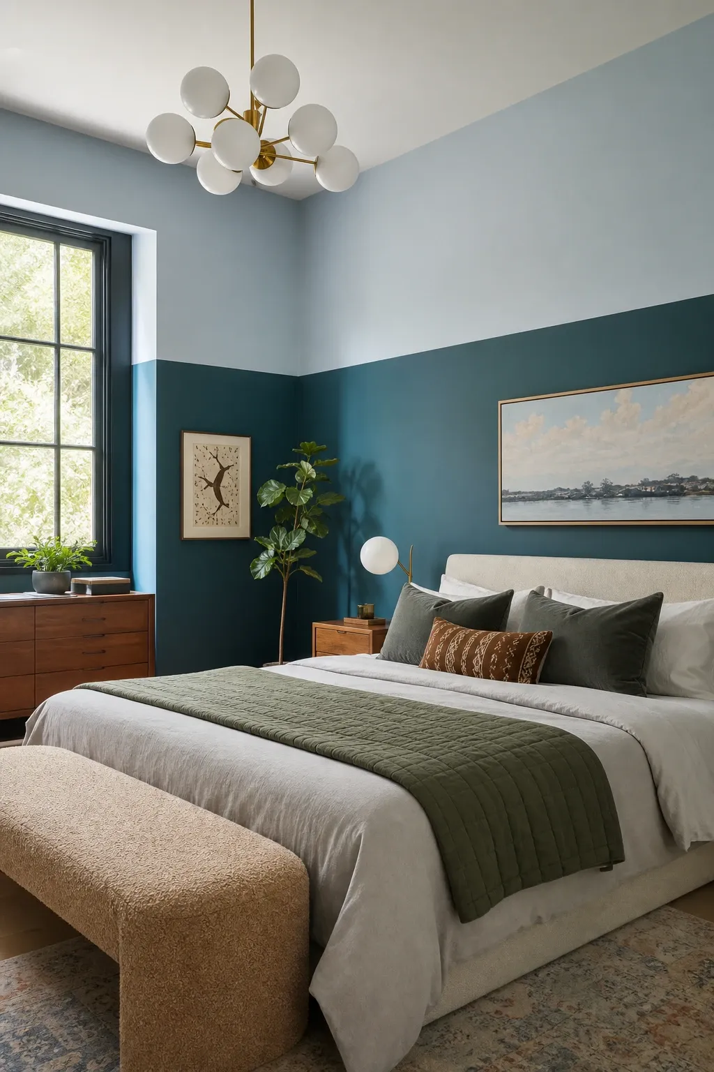
Painting the lower half of the wall a darker blue and the upper half a lighter blue or white creates a two-tone effect that adds visual interest and makes the ceiling feel higher. The color break at about chair-rail height divides the wall into two bands that give the room more dimension than a single color. This technique works especially well in rooms with high ceilings where a single color from floor to ceiling feels too monotonous.
Designer Tip: Use painters tape and a laser level for a perfectly straight line between the two colors. A wobbly dividing line ruins the clean look. The line should be crisp and straight, typically at 36 to 42 inches from the floor.
Indigo walls paired with a velvet headboard and velvet pillows create a bedroom that feels deeply luxurious and cozy. Velvet catches light and adds a subtle shimmer that lifts the dark indigo from heavy to rich. The combination of dark walls and soft velvet textures makes the room feel like a high-end hotel suite. This is the blue bedroom idea for people who want drama and comfort in equal measure.
Designer Tip: Add metallic accents like brass lamps or gold-framed art to break up the darkness of an indigo room. Without metallic or light accents, an all-indigo room can feel oppressive. The reflective surfaces of metal add points of light that keep the room feeling alive.
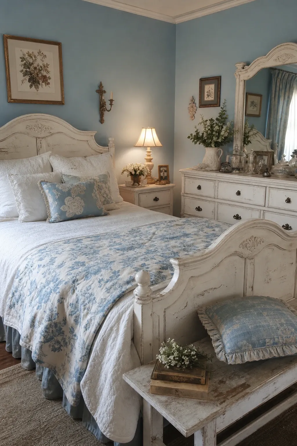
A dusty French blue on the walls with white furniture, toile patterns, and vintage accents creates a bedroom that feels like a countryside retreat in Provence. French blue is a muted, slightly gray shade that is sophisticated and calming. The worn edges of vintage furniture and the soft patterns of toile fabric complement the understated blue and create a room that feels collected and lived-in.
Designer Tip: French country blue rooms look best with imperfect, slightly worn furniture. Brand-new pieces that are too polished clash with the relaxed, aged feel of the color. Shop vintage or choose furniture with a distressed finish to match the mood.
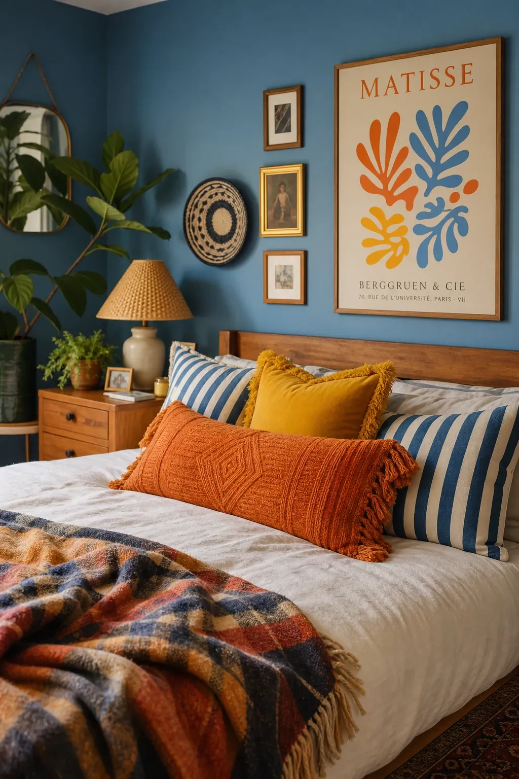
Blue walls or blue bedding paired with pops of yellow, orange, or coral creates an energizing bedroom that is cheerful without being overwhelming. The warm citrus accents prevent the blue from feeling cold. Throw pillows, a vase of flowers, or a piece of art in citrus tones are all it takes. This color combination reminds me of a clear sky over a Mediterranean villa and it always makes me smile.
Designer Tip: Use citrus accents sparingly. Two or three small pops of warm color against a blue backdrop is enough. Too many warm accents dilute the calming blue atmosphere. The ratio should be about 80 percent blue and neutral, 20 percent warm accent.
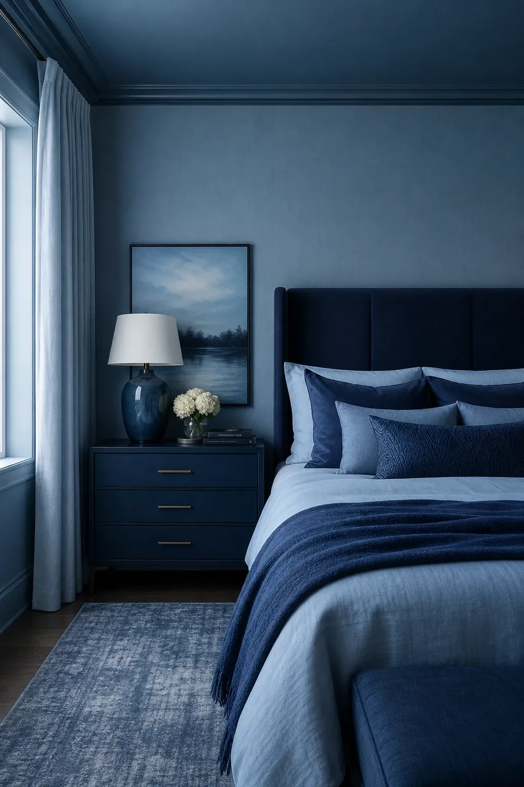
Using multiple shades of blue throughout the room, from pale blue walls to medium blue bedding to dark blue pillows, creates a layered, tonal look that feels cohesive and sophisticated. The monochromatic approach is calming because there is no color clash. Each shade of blue relates to the next, and the gradual shift from light to dark adds depth without complexity.
Designer Tip: Include at least three different shades of blue for the monochromatic look to read as intentional. Two shades looks like you tried to match and missed. Three or more shades shows a deliberate gradient that looks designed.
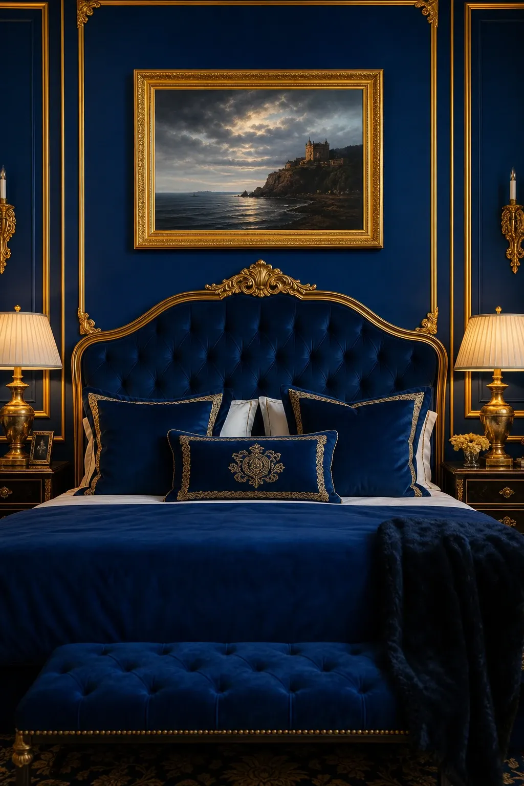
Royal blue walls or a royal blue headboard paired with gold accents creates a regal, glamorous bedroom. The combination is classic and has been used in luxury interiors for centuries. Gold lamps, frames, drawer pulls, and mirrors add warmth and sparkle against the rich blue. This pairing works best in bedrooms that lean formal or maximalist.
Designer Tip: Use warm gold rather than cool silver with royal blue. Gold brings out the warmth in royal blue and makes the room feel inviting. Silver with royal blue reads as corporate rather than bedroom-cozy.
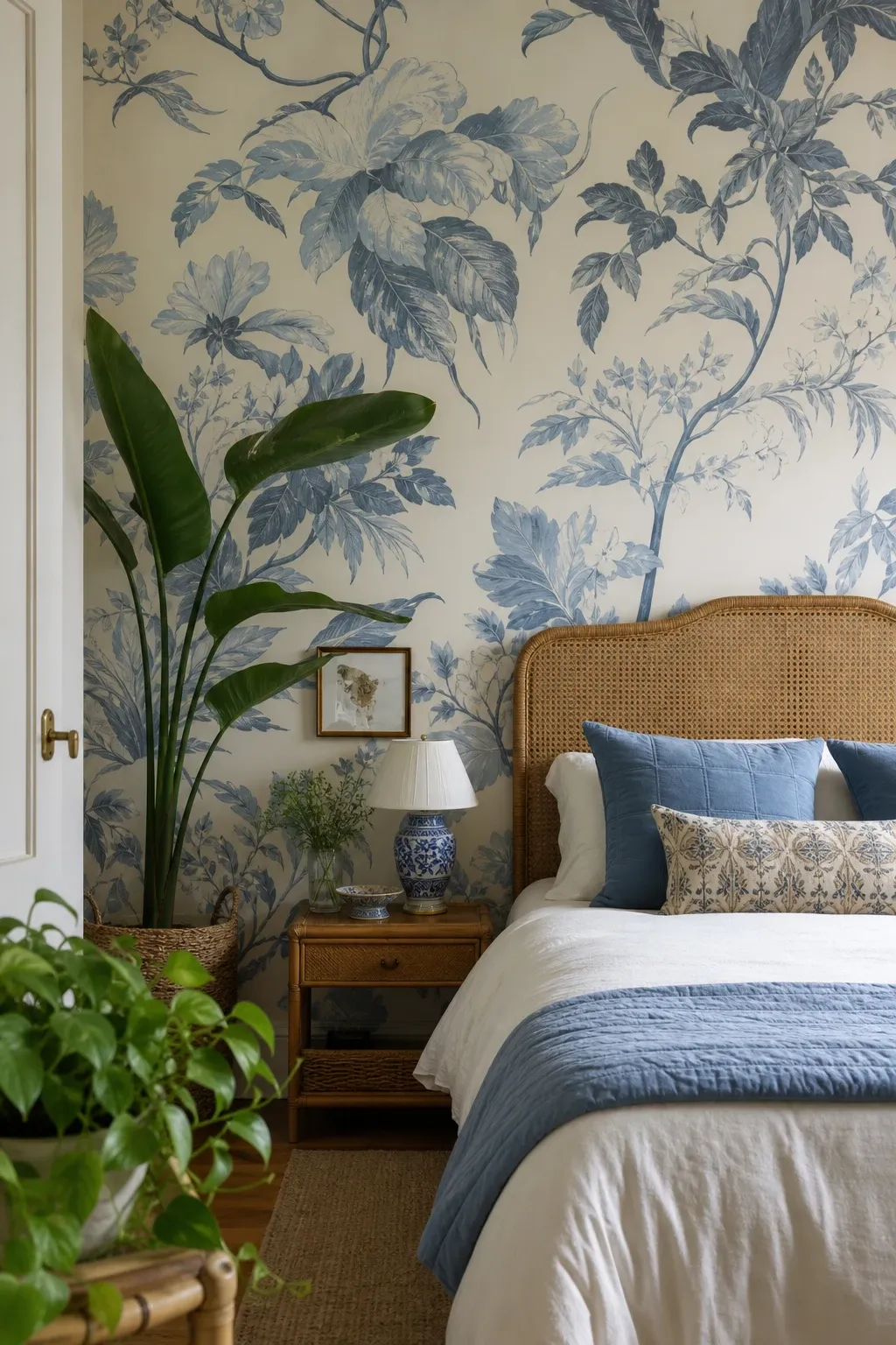
Blue and white floral wallpaper or blue floral bedding brings a garden-inspired softness to the bedroom. The organic curves of floral patterns counteract the straight lines of furniture. Blue florals feel traditional and timeless but can be styled modern with clean-lined furniture. The pattern adds visual richness while staying within the calming blue palette.
Designer Tip: Scale the floral pattern to the room. Large-scale florals work in spacious bedrooms with high ceilings. Small-scale delicate florals work better in compact rooms where a large pattern would feel overwhelming.
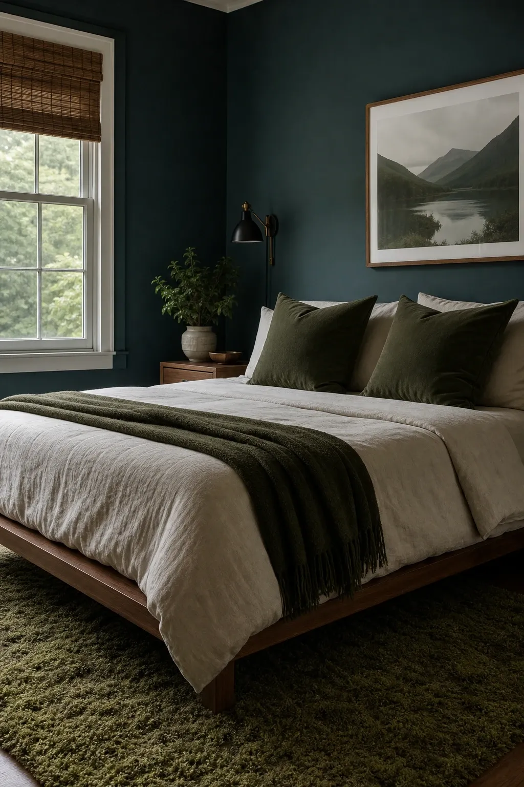
Combining blue walls with green plants, green accents, or a green velvet headboard creates a nature-inspired bedroom that feels like being surrounded by sky and trees. Blue and green are neighbors on the color wheel and share a cool, calming quality. Adding real plants to a blue room amplifies the natural effect and improves air quality at the same time.
Designer Tip: Use teal or blue-green as a bridge color to tie pure blue and pure green together. A teal throw pillow or blanket connects the blue walls to the green plants and prevents the two colors from feeling disconnected.
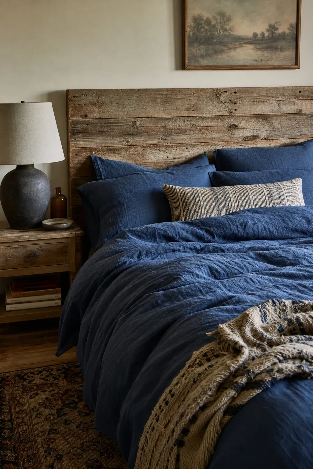
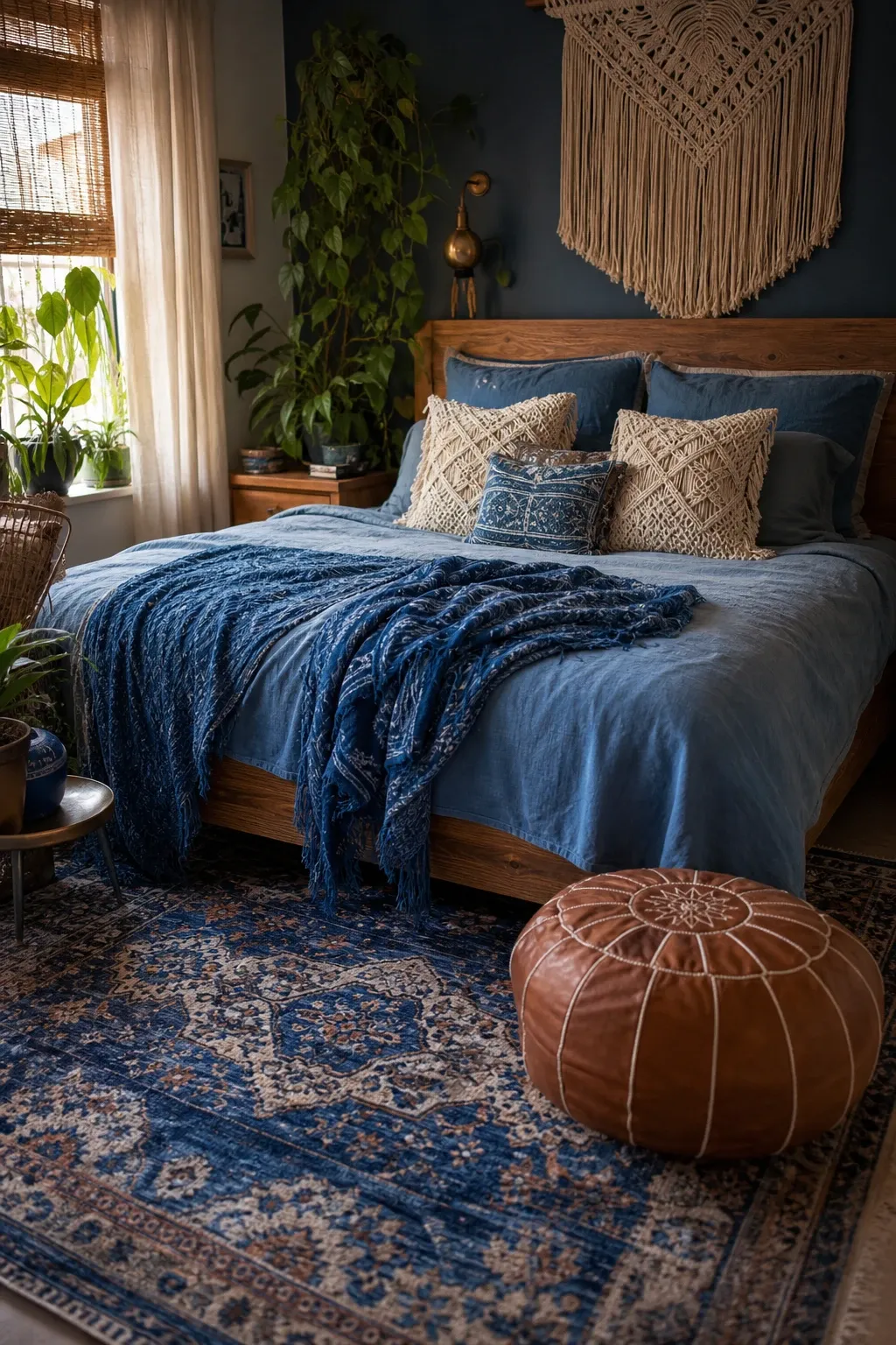
Blue linen bedding on a warm wood bed frame creates a rustic, natural bedroom that feels like a cabin by the lake. The linen texture adds a casual, lived-in quality while the warm wood balances the cool blue. The linen wrinkles are part of the charm and reinforce the relaxed, unpretentious mood.
Designer Tip: Add a cream or white chunky knit throw to the blue linen bedding for contrast and warmth. The light throw breaks up the blue, adds texture, and gives the bed a layered look that is inviting and cozy.
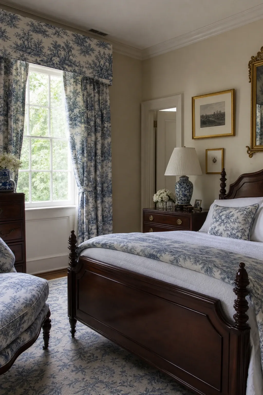
Blue and white toile on the walls, bedding, or curtains brings a classic, storybook quality to the bedroom. The scenic illustrations on toile fabric have a timeless charm. Blue and white toile suits traditional, French country, and even eclectic bedrooms. The detailed scenes give the eye something to explore, making the bedroom feel rich and interesting.
Designer Tip: Use toile on one major surface, either the walls, the bedding, or the curtains, but not all three. Toile on every surface in a small bedroom feels suffocating. One surface in toile with the others in solid blue or white gives the pattern room to breathe.
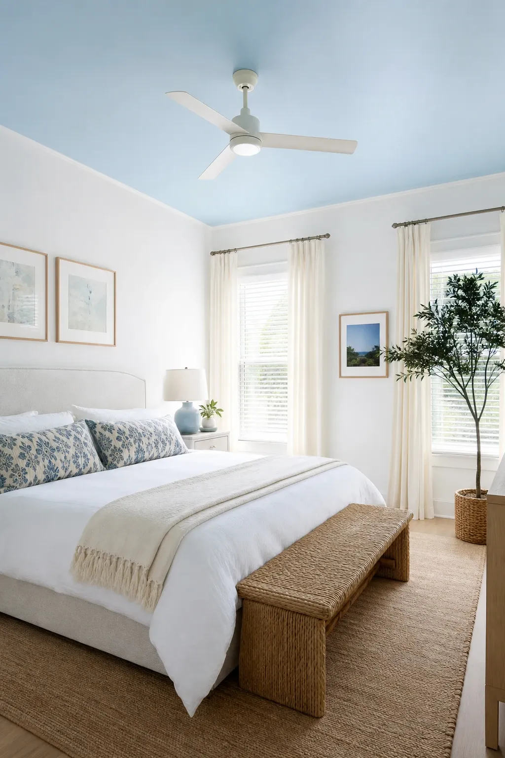
Painting just the ceiling a soft sky blue while keeping the walls white or cream creates a surprising, uplifting effect. You lay in bed looking up at a blue sky. The light blue ceiling also makes the room feel taller because light colors recede. This is a great option for people who want blue in the bedroom but are not ready to commit to colored walls.
Designer Tip: Use a slightly lighter shade on the ceiling than you think you want. Color on a ceiling looks darker than on a wall because of the angle and shadows. What looks like a soft sky blue on a wall swatch can look medium blue when applied overhead.
Layering different blue textiles in various textures, like a blue kilim rug, indigo throw pillows, a blue macrame wall hanging, and blue linen curtains, creates a bohemian blue bedroom that is relaxed and richly layered. Each textile brings a different texture and shade of blue. The collected, mismatched quality is central to boho style and makes the room feel personal.
Designer Tip: Mix blue textures freely but keep non-blue elements neutral. Cream, white, tan, and natural wood let the various blue textiles be the focus. Adding other strong colors to a room full of blue textures creates confusion.
Blue works in the bedroom because it actually helps you relax. Studies have shown that people in blue rooms fall asleep faster and report better sleep quality. Pick the shade and style that matches your taste, test it on the wall or with bedding first, and commit. Your bedroom will feel calmer.
Frequently Asked Questions
What shade of blue is most relaxing for a bedroom?
Soft, muted blues like powder blue, slate blue, and dusty blue are the most calming. Very bright or saturated blues like cobalt or electric blue are energizing rather than relaxing. For sleep, choose a blue that is desaturated and has some gray or green undertone to soften it.
Does blue make a bedroom feel cold?
It can if you do not add warm elements. Balance blue walls or bedding with warm wood furniture, warm white or cream fabrics, and warm metallic accents like brass or copper. The warm materials counteract the coolness of blue and keep the room feeling inviting.
What colors go best with blue in a bedroom?
White and cream are the safest pairings. Gold and brass add warmth. Soft green adds a natural quality. Warm wood tones add rustic warmth. Gray creates a cool, modern look. Avoid pairing blue with too many bright colors, which can undermine the calming effect.
Should I paint all four walls blue?
For light shades, all four walls works well. For dark or bold shades, one accent wall behind the bed is usually enough without making the room feel small. Medium blues can go either way depending on the room size and natural light. When in doubt, start with one wall and add more later if you want more blue.