If you have spent any time browsing kitchen renovation photos lately, you have probably noticed how often acrylic cabinets show up. There is a reason for that. The finish has a polished, clean look that most other materials just cannot replicate, and when it is done right, the whole kitchen feels newer and brighter without needing a single structural change. But there is a lot more variety here than just glossy white doors, and that is what this article is about.
Knowing what your options are will save you a lot of second-guessing later, no matter the scope of your kitchen project. The ideas below cover everything from bold two-tone combos to soft matte finishes, small kitchen tricks, and how to pair acrylic with natural materials so the whole thing does not feel cold or clinical. Each one is a real, workable idea you can actually bring to a cabinet maker or designer.
1. All-White High-Gloss Cabinets for a Bright, Open Feel
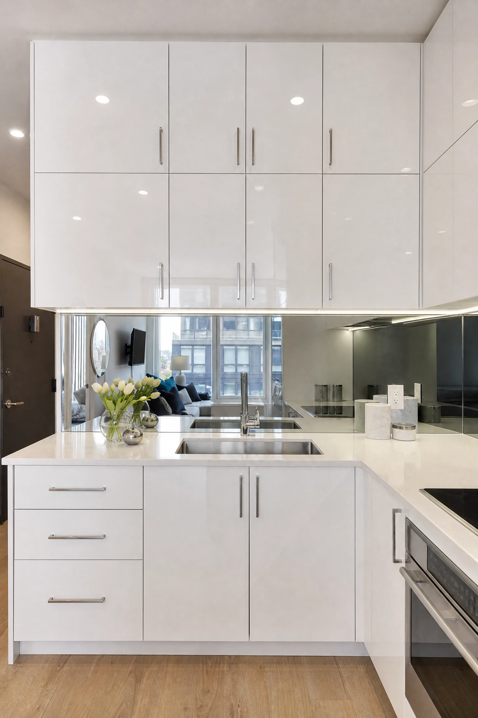
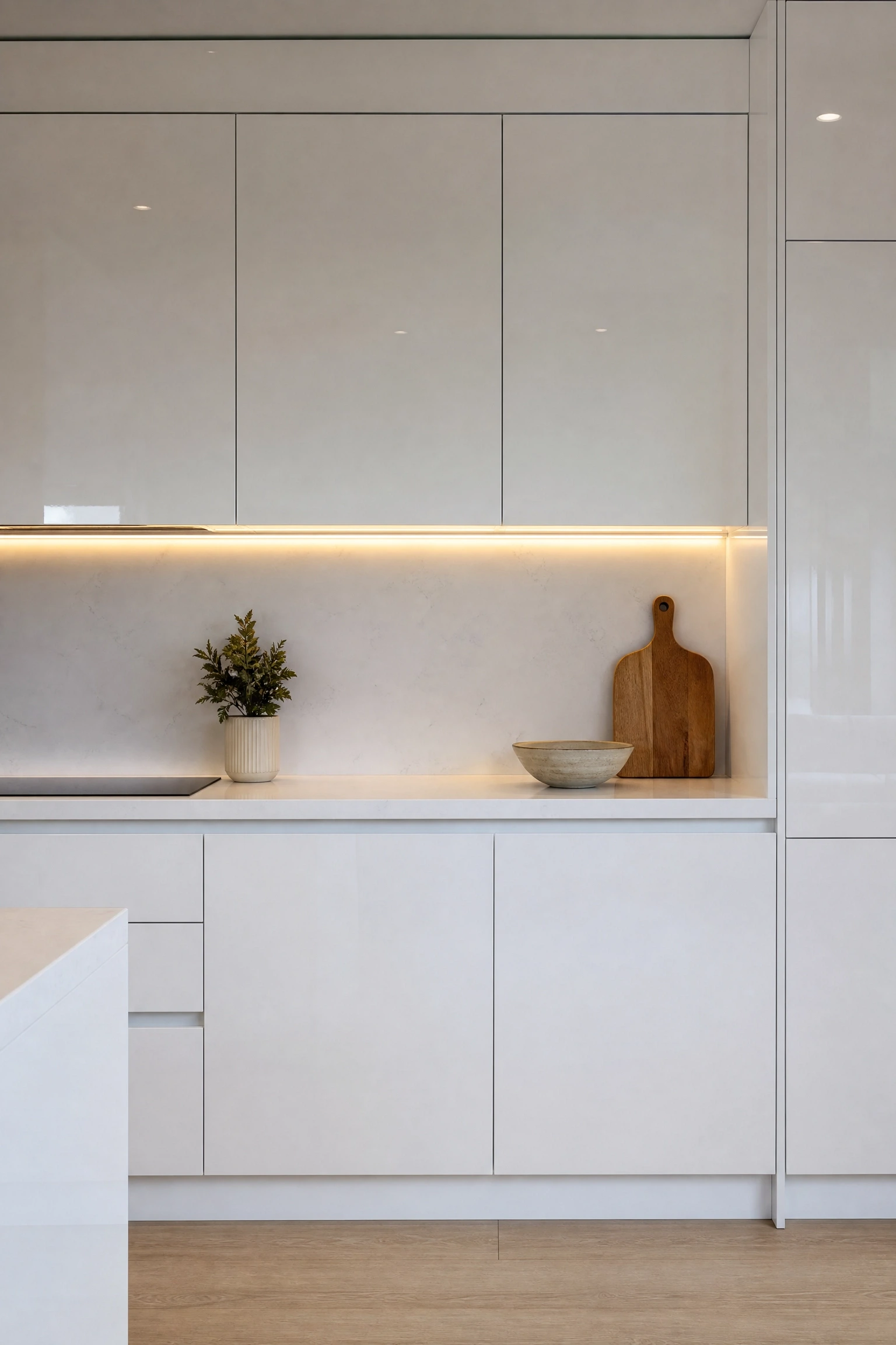
This is the most popular acrylic kitchen setup for a reason, and in practice it works especially well in kitchens that lack windows or feel boxier than you would like. High-gloss white acrylic reflects light back into the room like a mirror, which can genuinely make a small space feel twice as open. The key is pairing it with a slightly warm white rather than a stark cool white, because cool whites under warm kitchen lighting can look slightly yellow over time. For countertops, white quartz with fine grey veining adds just enough visual interest without competing with the cabinet surface. Add brushed nickel or polished chrome hardware, and keep the backsplash simple, either a large-format white tile or a mirrored glass panel that continues the reflective theme. Lighting matters a lot here: under-cabinet LED strips are almost non-negotiable in a full-gloss white kitchen because without them the lower shelves can feel shadowy in contrast to the gleaming upper doors. One thing to be honest about is fingerprints. White gloss shows every smudge, particularly around handles, so if you have young kids or a busy cooking household, you will be wiping these down more than you expect.
Quick Tip: Choose a handleless push-to-open mechanism for white gloss cabinets to keep the surface completely clean and uninterrupted.
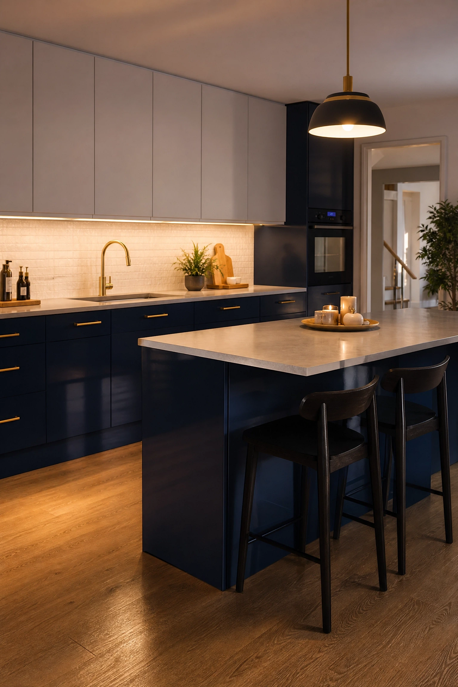
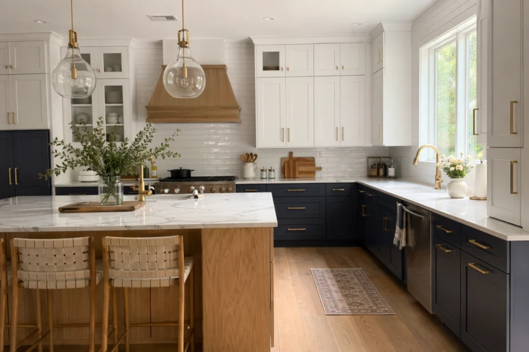
Two-tone acrylic kitchens are having a real moment right now, and this particular combination is one of the most polished versions of the trend. The idea is straightforward: deep navy gloss on the base units, white matte on the upper cabinets. The contrast gives the kitchen a sense of layering that single-colour kitchens simply do not have, and the gloss-on-matte pairing means you get visual depth without the whole room feeling overwhelming. Navy blue acrylic has a colour depth that is hard to achieve with paint, and the glossy version practically glows under warm lighting. Pair this layout with brass or gold hardware on the navy lowers and plain matte black on the uppers to reinforce the tonal split. A white or light grey quartz countertop bridges the two and keeps things from feeling too divided. This combination works particularly well in medium to large kitchens; in a very small kitchen, so much navy can start to close the room in, so consider limiting it to one run of base units rather than wrapping it around the whole space. Budget-wise, this approach is mid-range since you are using two different acrylic finishes, but the visual payoff relative to the cost is genuinely good.
Designer Advice: Run the navy panels all the way to the toe kick for a grounded, furniture-like look that makes the base units feel intentional rather than standard.
3. Sage Green Matte Acrylic for a Calm, Modern Kitchen
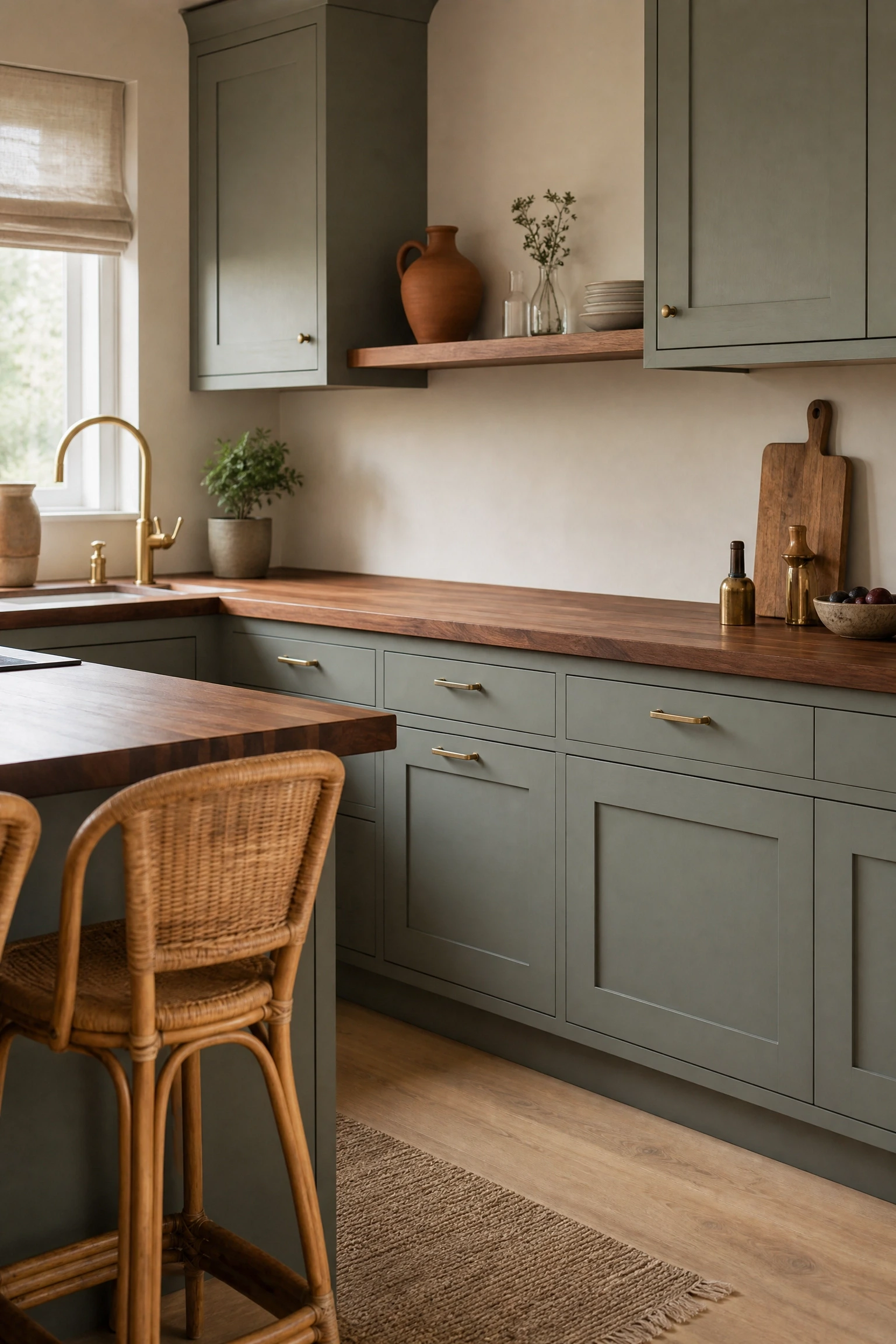
Soft matte acrylic finishes have been gaining traction among designers who want the practicality of acrylic without the high-shine look, and sage green is one of the best colours to use in this format. The matte surface has a slightly velvety quality that reads warm rather than cold, which solves one of the most common complaints about acrylic kitchens. Sage green in particular pairs beautifully with natural materials: a walnut butcher block countertop, woven rattan bar stools, linen Roman blinds, and terracotta or hand-thrown ceramic accessories. The result is a kitchen that feels grounded and lived-in rather than showroom-perfect. Matte acrylic is also notably more fingerprint-resistant than gloss, which makes it a smarter choice for everyday family kitchens. For lighting, warm-toned pendants in brass or antique bronze work well over an island, and open shelving in walnut between upper cabinet runs keeps the look from feeling too closed off. One honest note: sage green is very popular right now, so if you are looking for a colour that will feel distinctly yours in five years, it is worth considering whether you are drawn to it for the right reasons or just because it is everywhere at the moment.
Reality Check: Matte acrylic scratches more visibly than gloss when hit with sharp objects, so be thoughtful about placement near prep areas.
4. Charcoal Grey Gloss Cabinets with Concrete Countertops
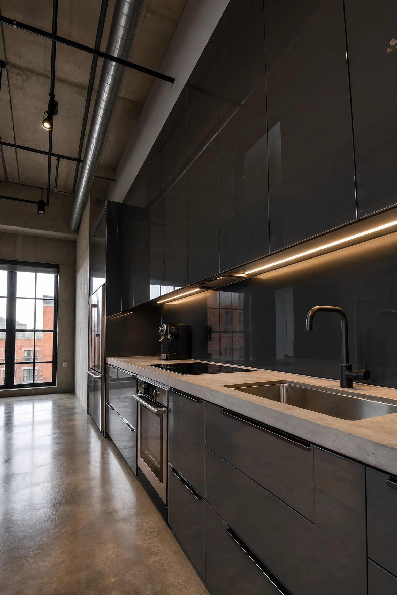
This combination appeals to people who want a kitchen that feels genuinely industrial without going full raw-concrete loft. Charcoal grey high-gloss acrylic has a smoky, sophisticated quality that works really well against a poured concrete or concrete-look porcelain countertop because the matte surface of the concrete provides the perfect textural counterpoint to the reflective cabinet doors. In practice, the room needs good lighting to prevent it from reading too dark: recessed ceiling lights on a dimmer combined with LED strips under the upper cabinets keep everything legible and comfortable. Stainless steel appliances fit this aesthetic naturally, and an integrated stainless steel sink and tap set makes the whole kitchen feel cohesive rather than assembled from parts. Hardware in matte black or gunmetal grey continues the industrial mood without feeling forced. This is a look that suits open-plan spaces particularly well because the dark cabinetry can be anchored by the lighter tones of the living or dining area adjacent to it. It is an investment-level approach since quality concrete countertops are not cheap, but the combination has a longevity that more trend-driven kitchens do not always achieve.
Pro Move: Add a mirrored or smoked glass splashback behind the hob to reflect light back into the charcoal kitchen without breaking the dark palette.
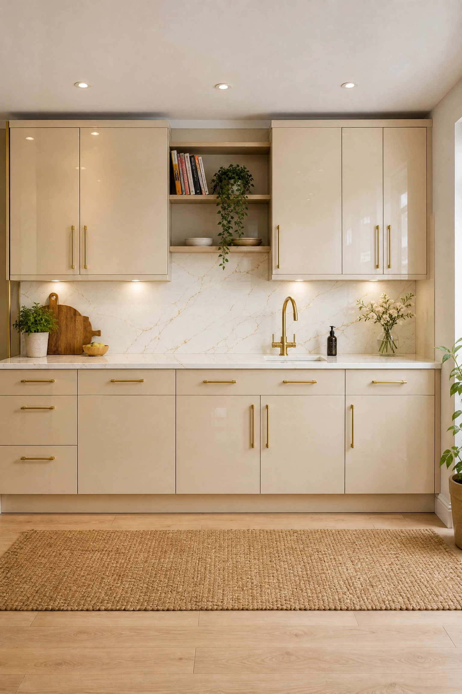
5. Cream Acrylic Cabinets with Warm Brass Hardware
Cream acrylic is an underrated choice that gets overlooked in favour of pure white, but in a kitchen setting it is actually easier to live with. The slight warmth in the tone means it plays better under incandescent or warm LED lighting, and it reads much more relaxed and less clinical than a bright white. High-gloss cream acrylic with substantial brass bar handles is a combination that professional designers frequently use in high-end kitchens because it has a quiet confidence that does not need to shout. For countertops, a creamy white or light beige marble-look quartz with warm gold veining ties the whole palette together and keeps the scheme feeling cohesive. A woven jute rug in the cooking zone, some open shelving in a warm white finish, and a few clusters of trailing plants soften the overall look and prevent it from feeling austere. This approach works in both modern and more traditional kitchen layouts, which makes it one of the more versatile acrylic colour choices. Budget note: cream acrylic is typically standard pricing with most manufacturers, so you are not paying a premium for the colour itself.
Quick Tip: Use a cream grout with any tiled backsplash rather than stark white, so the whole wall area reads as one warm, unified zone.
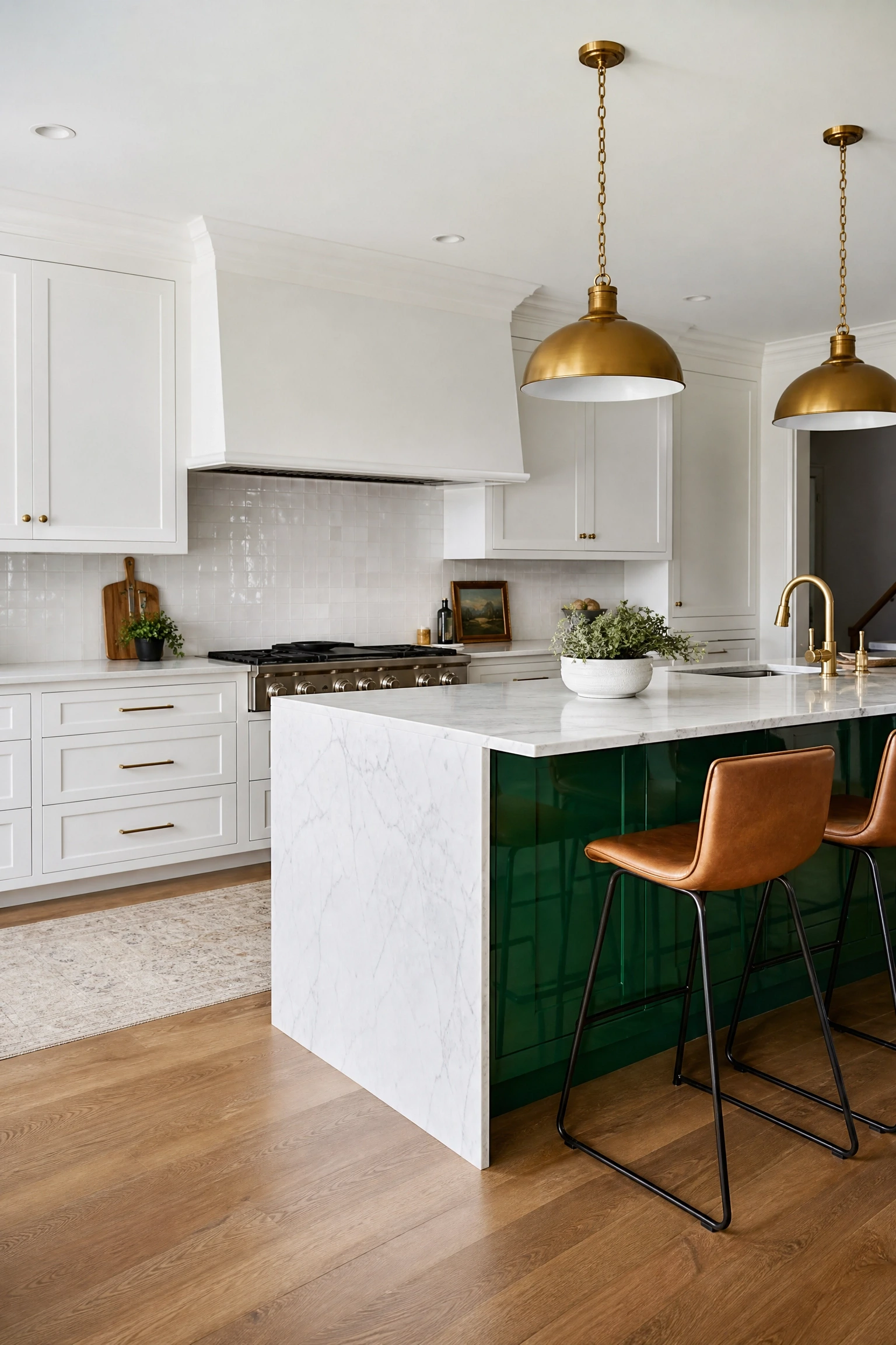
One of the most effective ways to use a bold colour in an acrylic kitchen is to limit it to the island and keep the surrounding cabinetry much quieter. Emerald green gloss acrylic on a kitchen island is a genuine statement, but because the rest of the kitchen stays in white or off-white, it never tips over into being overwhelming. The island becomes a piece of furniture in its own right, which is exactly how the best-designed kitchens treat it. Pair the emerald island with a white marble or white quartz countertop that has very subtle green or grey veining to echo the colour below. Brass pendant lights hanging over the island connect the green to the warm tones in the room, and white metro or zellige tiles on the walls behind the surrounding cabinets keep the backdrop clean. Bar stools in a natural linen or warm camel leather ground the island without adding more colour. This is a mid-to-high-budget idea depending on the size of the island, but it is one of those design choices that photographs beautifully and holds its appeal over time because the boldness is controlled.
Designer Advice: Keep the island countertop the same material as the perimeter countertops for a sense of continuity, even when the cabinet colours differ.
7. Soft Blush Pink Matte Cabinets for a Contemporary Look
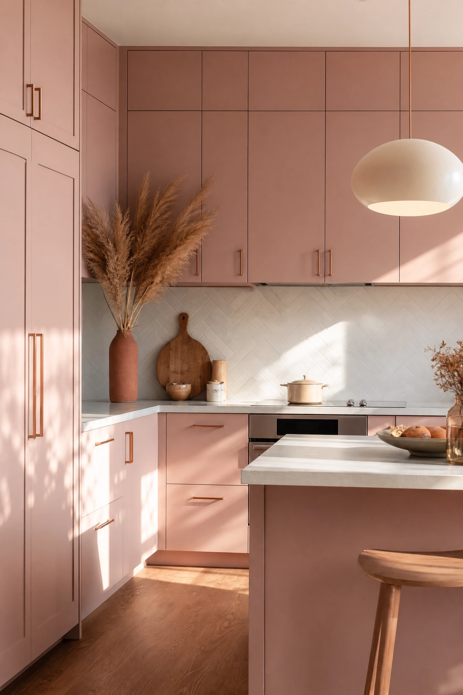
Blush pink in a kitchen sounds like a risky choice, but a desaturated, dusty blush in a matte acrylic finish reads more like a warm neutral than a fashion colour. This is a look that has been appearing in design publications and high-end showrooms with increasing frequency because it manages to feel feminine without being sweet or overwhelming. The matte finish is critical here; gloss blush would feel much more costume-like. In practice, pair dusty blush cabinets with white or pale grey countertops, brushed copper or rose gold hardware, and a white herringbone or subway tile backsplash. A concrete-effect floor tile in warm grey or pale terracotta grounds the scheme without adding more colour. For accessories, natural wood chopping boards, cream ceramics, and dried flower arrangements fit this palette really well. Lighting in warm white rather than cool white is essential, since cool-toned lighting can shift the blush toward a more clinical pink that loses the warmth you are after. This is a look that suits people who want something a little different from the standard grey-and-white kitchen without committing to something they will quickly tire of.
Heads Up: Blush acrylic can look very different under showroom lighting versus your actual home lighting, so always request a sample panel before ordering.
8. Black Gloss Acrylic for a Bold, High-Drama Kitchen
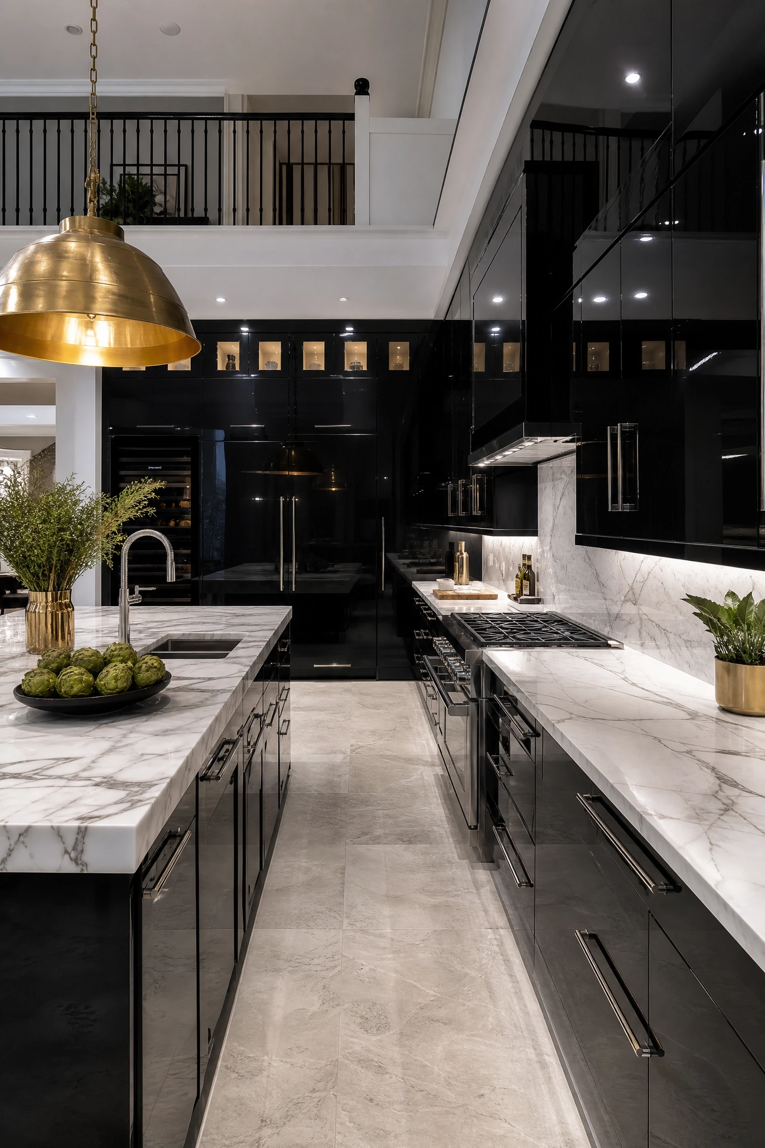
Full black gloss acrylic kitchens are not for everyone, but when they work, they are genuinely impressive. The key is scale: this look needs a kitchen that can absorb dark surfaces without feeling claustrophobic, which typically means a room with good ceiling height, generous windows, or an open connection to a lighter living area. Black high-gloss acrylic reflects every light source in the room, which means the kitchen actually feels alive rather than heavy if the lighting is well considered. Recessed spotlights, under-cabinet LEDs, and a large statement pendant over the island are all important here. Counter materials should be either a dramatic white marble with bold veining, or a very light concrete, to give the eye somewhere to rest. Hardware in polished chrome or brushed gold works well against black without feeling expected. One practical note worth flagging: black gloss shows every speck of dust, water mark, and grease splatter, so the cleaning commitment is real. Most designers recommend matte black as the more liveable everyday alternative if you want the drama without the upkeep, but gloss black has a visual power that matte simply cannot replicate.
Reality Check: Black gloss kitchens require consistent upkeep. Budget for a quality microfibre cloth and a streak-free spray you use weekly, not occasionally.
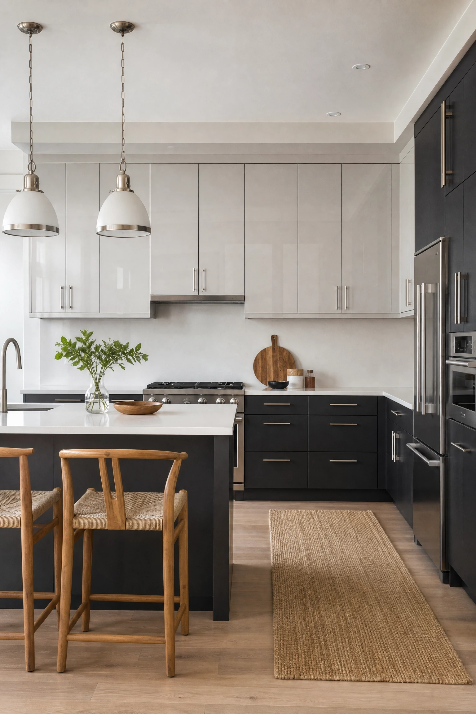
Grey-on-grey two-tone kitchens sound like they could be monotonous, but when you pair a light pearl grey gloss on the uppers with a deep charcoal or slate grey matte on the lowers, the result is a kitchen that feels polished and considered without relying on colour contrast at all. The tonal shift does the visual work instead. This approach suits people who love the clean, contemporary acrylic look but want something more subdued than the navy-and-white or green-and-white alternatives. In practical terms, the lighter upper cabinets keep the kitchen from feeling visually heavy, while the darker base units hide dirt and scuffs far better than lighter alternatives. A mid-tone grey or warm white quartz countertop sits comfortably between the two tones. Brushed stainless steel or satin nickel hardware works well here because it does not compete with either shade. Add warmth through timber-framed bar stools, a jute runner, or a hanging herb garden in terracotta pots. This is a reliable, mid-range option that appeals to buyers when it comes time to sell, which makes it a smart investment for anyone thinking about resale value.
Pro Move: Use the same grey in two different sheen levels, such as gloss on top and matte on the bottom, rather than two different shades, for a subtle and sophisticated split.
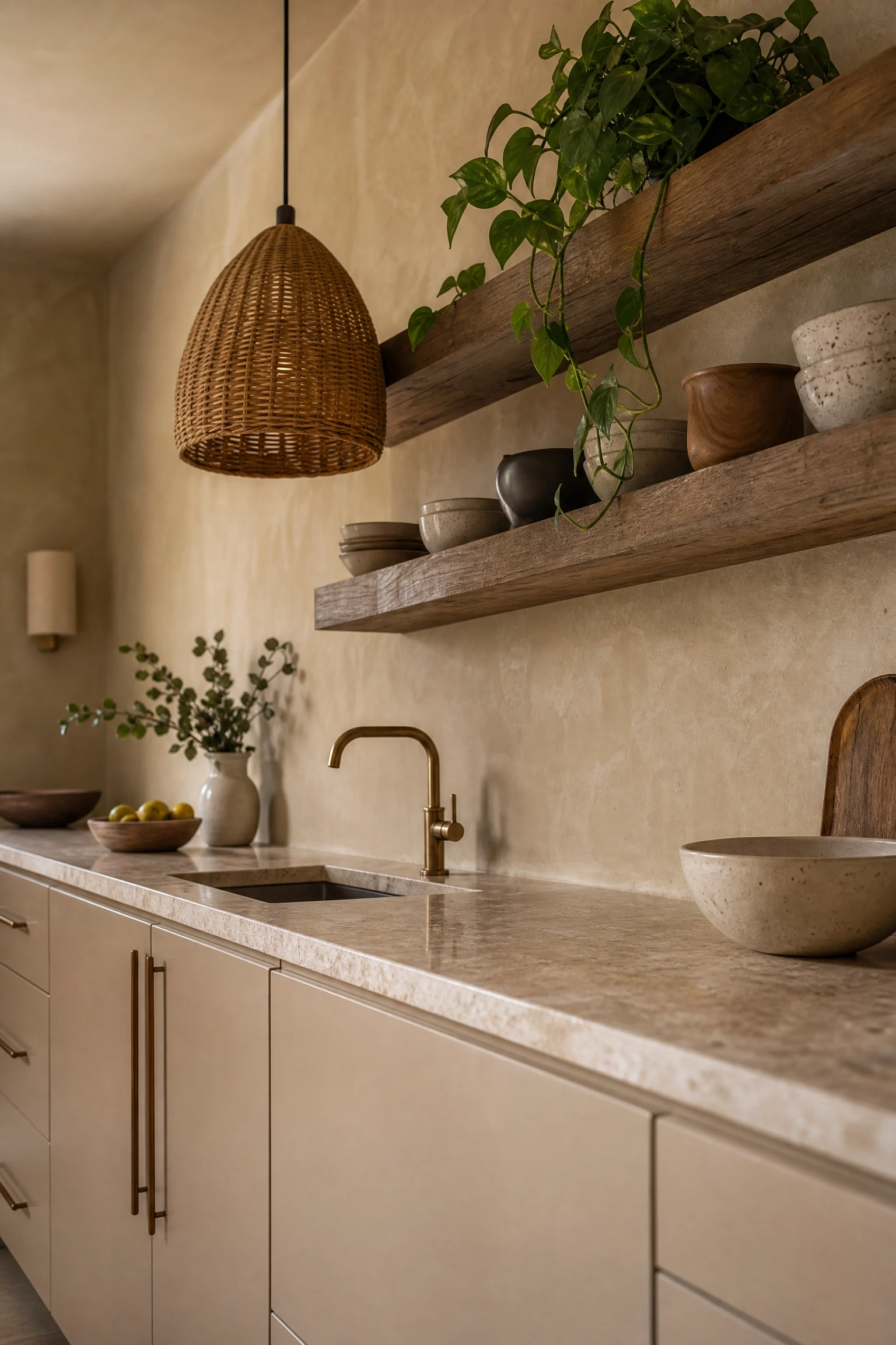
Warm beige acrylic and limewash walls might not be the first combination that comes to mind when you think of acrylic kitchens, but this pairing is genuinely beautiful in person. The acrylic gives you the clean, wipeable surface you need in a kitchen, while the textured limewash wall introduces the kind of handmade, organic quality that prevents the room from feeling too finished or sterile. Choose a warm sandy beige for the cabinets, either in a satin gloss or a soft matte, and pick a limewash colour that is a shade or two darker or lighter than the cabinet for tonal depth. Rattan pendant lights, a stone or travertine countertop, and open shelving in reclaimed timber bring in layers of natural texture that work beautifully alongside both the acrylic finish and the limewash surface. This is a kitchen aesthetic with a strong Wabi-sabi and Japandi influence: the idea that imperfection and warmth are more comfortable to live in than spotless perfection. It is a mid-range budget approach since limewash paint is relatively affordable, but the textural contrast it delivers feels far more expensive than it is.
Designer Advice: Keep the limewash to one accent wall or the area behind open shelving rather than covering every wall, which allows it to act as a backdrop rather than overwhelming the room.
11. Cobalt Blue Gloss for a Kitchen That Makes a Statement
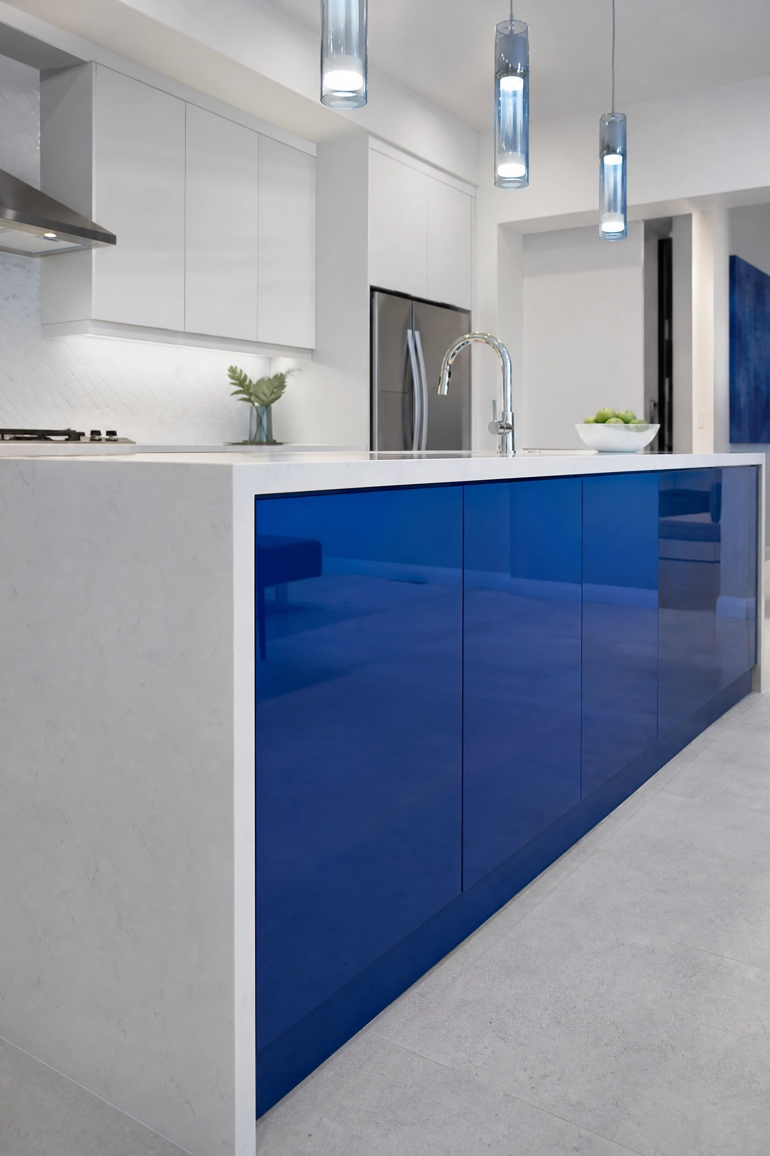
Cobalt blue high-gloss acrylic is the kind of choice that takes a bit of confidence, but it is one of the most striking options available and works in ways that softer blues simply do not. The intensity of cobalt combined with the reflective quality of the gloss finish creates a kitchen that feels genuinely custom, not like something from a showroom catalogue. This colour works best in a Scandi-influenced or European slab-door kitchen layout where the clean lines let the colour do all the visual work without competing elements. Pair cobalt blue with crisp white countertops, polished chrome fixtures, and a white or light grey tile backsplash. The contrast is sharp and intentional. One design trick that works particularly well is using cobalt only on the island or a single bank of base units while keeping the remainder of the kitchen in white, which is how many kitchen designers ease clients into a bold colour choice. Lighting here should be cool-to-neutral white rather than warm, since warm-toned light shifts cobalt toward a slightly purple hue that is not as appealing. This is a statement kitchen and it is priced accordingly, especially with gloss acrylic, but it has the kind of personality that sets a home apart.
Quick Tip: Pair cobalt acrylic cabinets with a waterfall island countertop in white quartz for a clean, architectural finish that frames the colour beautifully.
12. Handleless Acrylic Cabinets with Push-to-Open Mechanisms
This is less about colour and more about one of the most practical and aesthetically satisfying features available in acrylic kitchen design: the fully handleless setup. When you combine high-gloss acrylic panels with push-to-open hinges or recessed J-pull profiles, the result is a completely uninterrupted surface that looks genuinely smooth from across the room. In practice, this works best with lighter acrylic colours since dark handleless cabinets in a busy kitchen can end up with visible pressure marks around the push points over time. The appeal of this format is particularly strong in small kitchens because the absence of hardware means nothing interrupts the visual flow, and the eye reads the entire run of cabinets as a single clean surface rather than a series of individual doors. It also simplifies cleaning significantly since there are no hardware crevices to deal with. The mechanism itself adds some cost to the project, since quality push-to-open hardware is not the cheapest component, but it is worth the investment if a clean aesthetic is a priority. This format is strongly associated with European-style minimalist kitchens and is featured frequently in Scandinavian and German kitchen design.
Heads Up: Push-to-open mechanisms can loosen over time with heavy daily use, so factor in an annual check and adjustment by a cabinet installer to keep doors aligning properly.
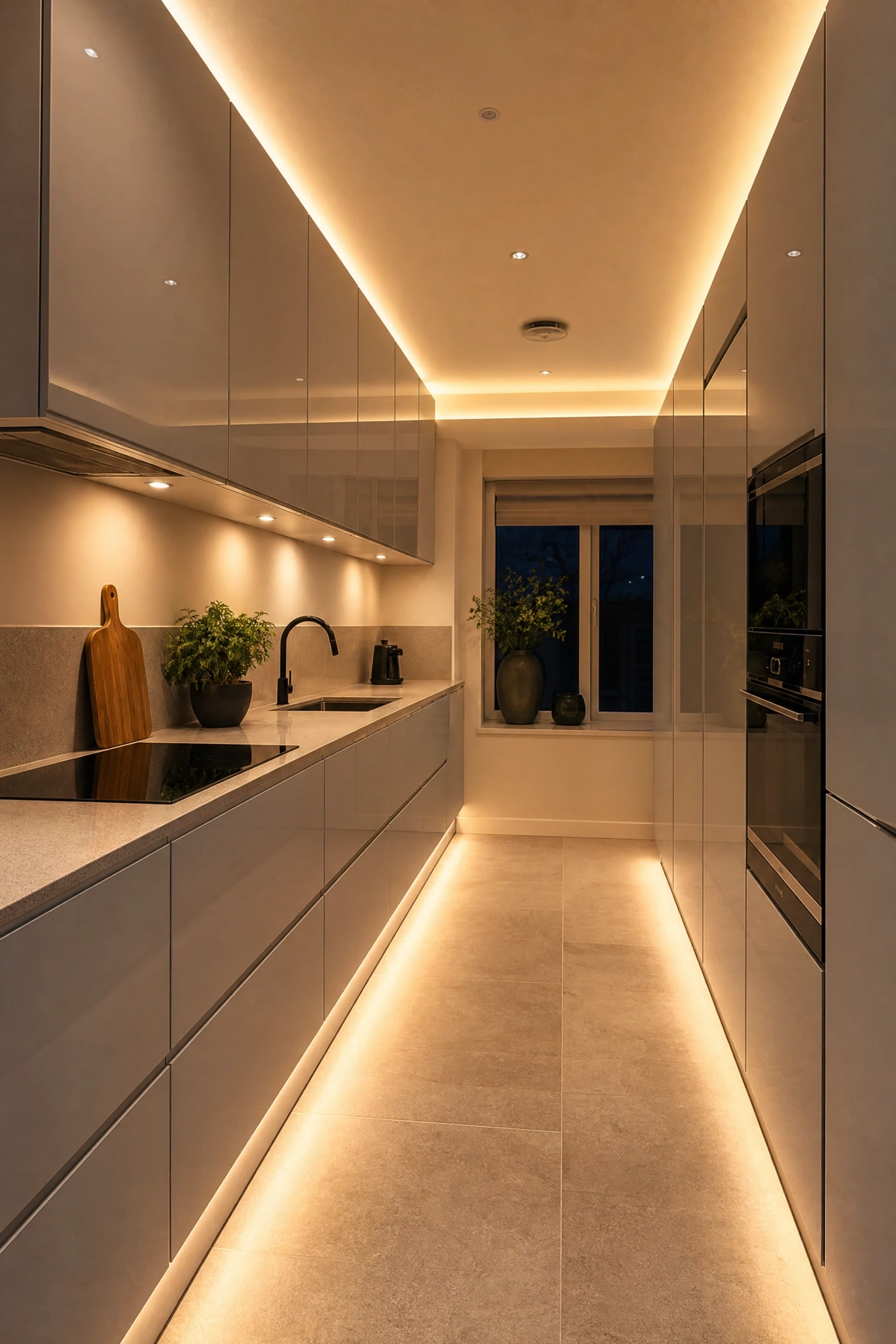
Incorporating LED strip lighting directly into the cabinet structure is one of the most effective ways to make acrylic kitchens look genuinely high-end, and it is more accessible in terms of cost than it used to be. The reflective surface of gloss acrylic responds beautifully to light: a warm LED strip running beneath the upper cabinets bounces off the lower counter surface and fills the whole workspace with an even, flattering glow. But the more design-forward approach is to run LED strips inside glass-fronted upper cabinets or along the top of tall pantry units so the light spills gently upward toward the ceiling, a technique called up-lighting that makes the room feel taller and more spacious. In kitchens where ceiling height is generous, this can be a dramatic and architectural detail. Choose LEDs with a colour temperature of around 2700K to 3000K for a warm, comfortable kitchen ambience rather than the cooler tones that can make a kitchen feel more like a commercial space. The acrylic cabinet surface amplifies whatever light quality you choose, so it is worth spending a little more on quality dimmable LEDs rather than the cheapest option. Dimmable strips allow you to shift the kitchen from a bright workspace during cooking to a softer, more atmospheric setting for dining.
Pro Move: Install a separate LED circuit for under-cabinet task lighting and a second for accent up-lighting, so you can control them independently for different times of day.
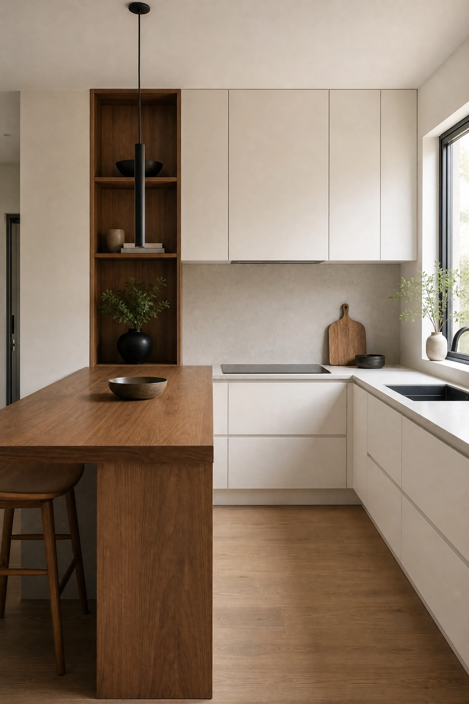
One of the best arguments for acrylic in a kitchen is how well it pairs with natural timber, and this combination is one of the most requested looks among homeowners who want a kitchen that feels modern but not cold. The formula is straightforward: gloss or matte acrylic for the majority of the cabinet fronts, with open shelving, a floating breakfast bar, or a timber-wrapped island providing the natural warmth. White or light grey acrylic against blonde oak or American walnut timber is particularly effective because the contrast between the smooth, synthetic surface and the raw, warm grain of the wood is visually interesting without feeling forced. In practical terms, keeping the timber elements away from the main cooking and washing areas is sensible since solid timber requires more maintenance in humid zones. Instead, use timber on open shelving for plates and decorative objects, on a breakfast bar peninsula, or as a band of feature panelling on the island. A well-made Japandi-style kitchen often uses exactly this combination: clean acrylic cabinetry alongside considered timber details, with negative space and restraint doing as much visual work as the materials themselves.
Designer Advice: Match the undertone of your timber to the undertone of your acrylic. Warm-toned wood paired with cool-toned grey acrylic can create an unintended clash that is hard to fix without replacing materials.
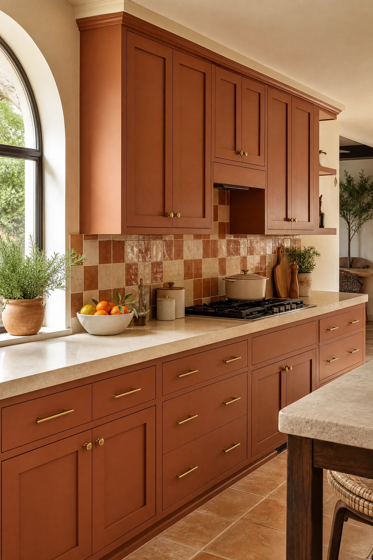
Terracotta is one of those colours that feels completely at home in a kitchen because of its association with clay, pottery, and food, and in a matte acrylic finish it becomes a surprisingly sophisticated cabinet colour. The key is choosing a terracotta that leans toward a warm brick-red rather than a bright orange, since the more muted version ages much better in a kitchen setting. Pair terracotta matte acrylic with cream or warm white countertops, unlacquered brass hardware that develops a patina over time, and a zellige or handmade terracotta tile backsplash that introduces texture and colour variation. A limewash or plaster-finish wall in a complementary warm off-white pulls the whole room together. This is a kitchen that feels deeply personal and handcrafted, and it works particularly well in homes with warm natural light, older architectural details, or a Mediterranean and Moroccan influence. Terracotta acrylic is not widely available at the budget end of the market, so this tends to sit in the mid-to-high price range, but for a kitchen that genuinely feels like nowhere else, it is a worthwhile direction to explore.
Reality Check: Bold earthy tones like terracotta can be polarising for future buyers, so if resale value is a priority, consider using it only on an island or a single accent wall of cabinetry.
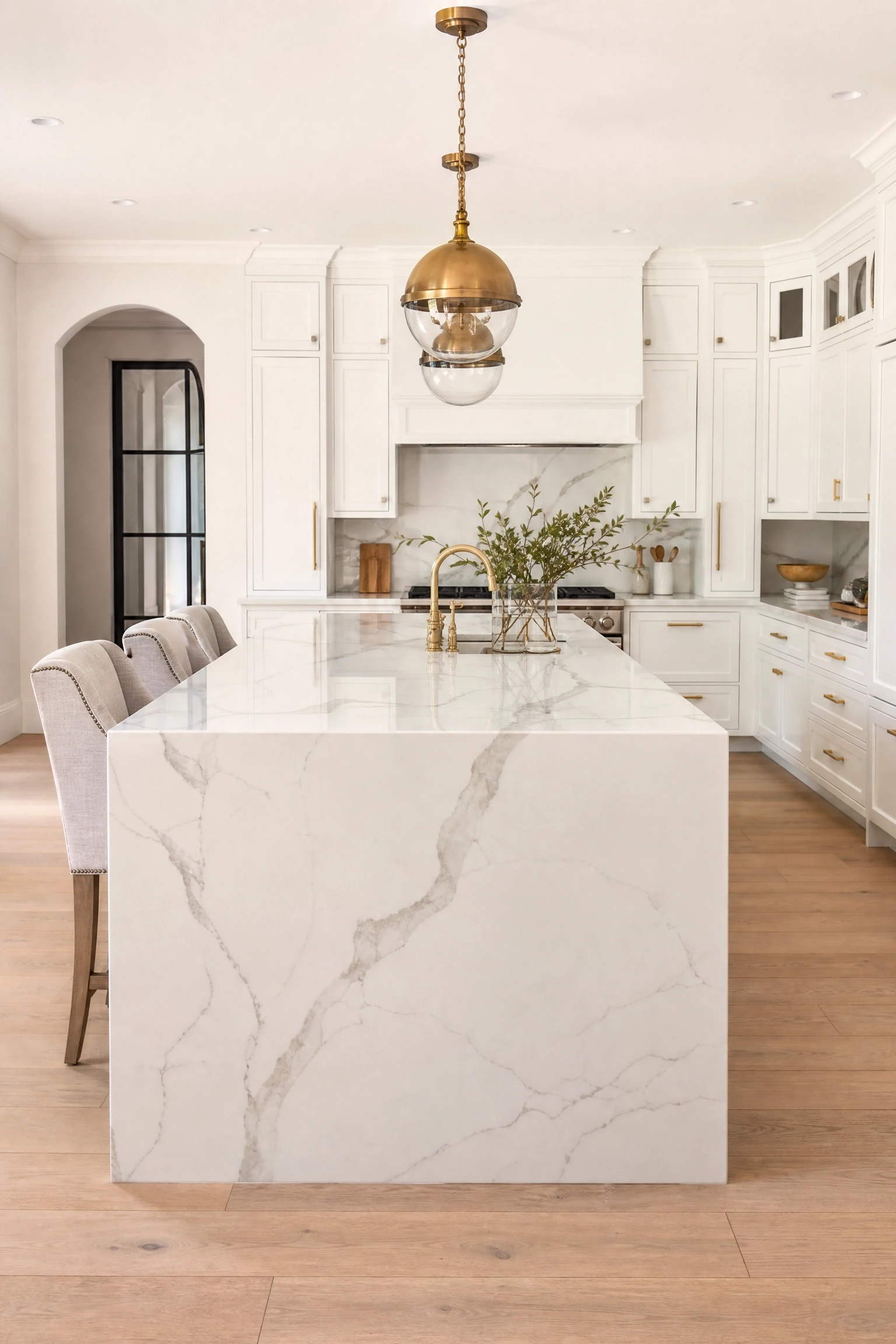
A waterfall island, where the countertop material flows over the sides of the island all the way to the floor, is one of the most architectural details you can add to a kitchen, and it pairs particularly well with acrylic cabinetry because both have that sense of clean, precise finish. In practice, the island cabinet fronts are typically done in a contrasting or complementary acrylic colour to the perimeter cabinetry, and the waterfall countertop in marble or marble-effect quartz wraps over it and down the sides like a solid slab of stone. The visual weight of the stone countertop balances the reflective lightness of the acrylic doors beneath, and the result is an island that genuinely functions as a design centrepiece. White acrylic island cabinets with a Calacatta marble waterfall countertop is the version that appears most often in high-end design publications, but the same format works beautifully with navy, charcoal, or dark green acrylic too. This is an investment-level idea since waterfall edges require precision cutting and installation, but in a kitchen that will be photographed, shown to buyers, or simply enjoyed daily, it delivers significant visual value.
Quick Tip: Keep the waterfall countertop material the same throughout the kitchen rather than using it only on the island, which ties the whole room together and justifies the investment.
17. Pastel Yellow Acrylic for a Cheerful, Bright Kitchen
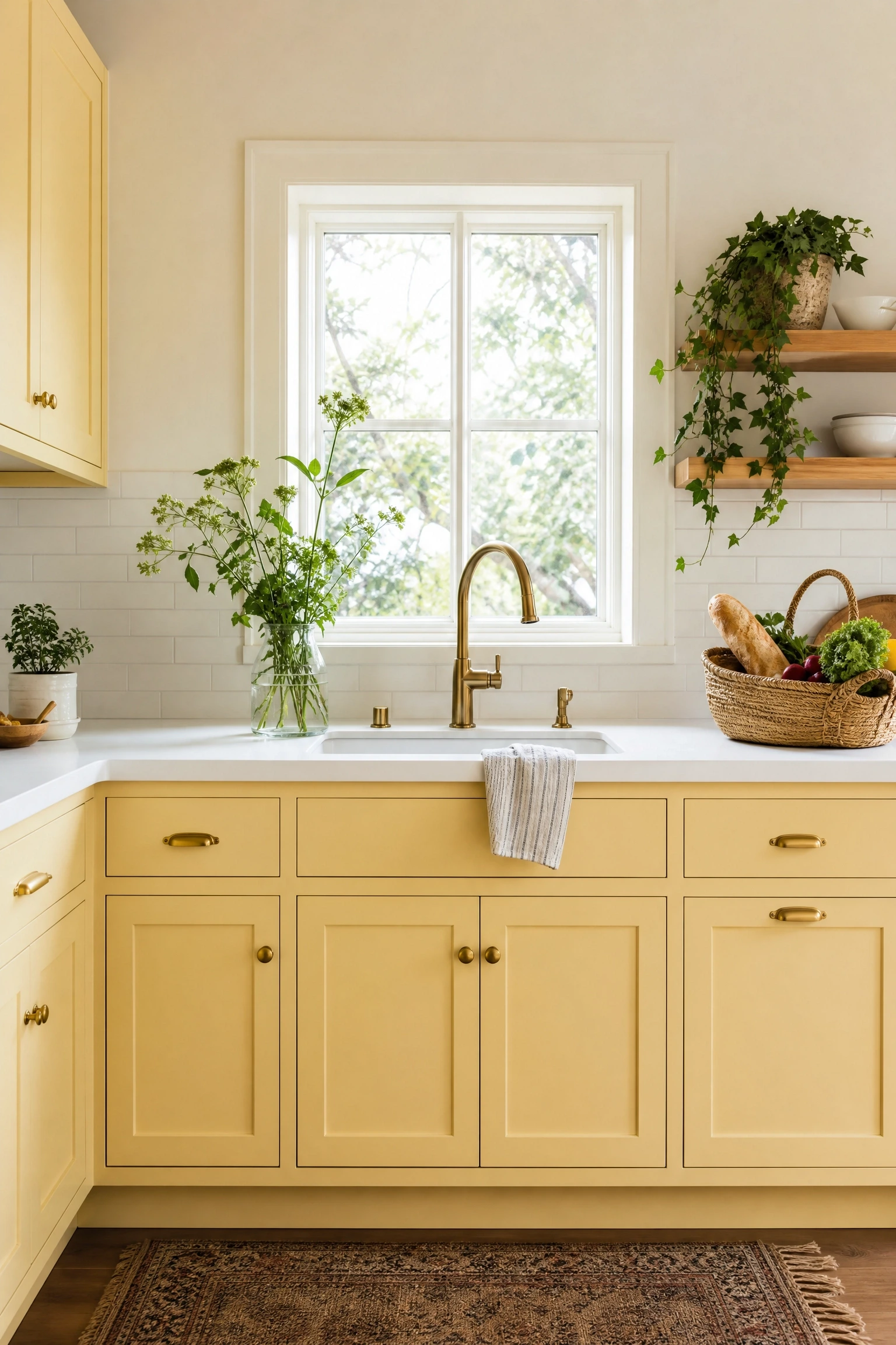
Pastel yellow is one of the most underused acrylic kitchen colours, which is part of what makes it a good choice for anyone who wants a kitchen that feels genuinely happy and optimistic without going in the direction of white or grey. The right shade is a soft, buttery yellow with a hint of cream rather than a bright primary yellow, and in a matte or satin acrylic finish it reads as warm and welcoming rather than loud. This colour works especially well in smaller kitchens that face north or east, where natural light can be limited, because the yellow warm tones compensate for what the daylight does not deliver. Pair pastel yellow acrylic with white countertops, brushed brass hardware, and a white or very pale grey subway tile backsplash. Keep other colours in the room to a minimum so the yellow does not compete, and bring in texture through woven baskets, a wooden fruit bowl, and a few trailing plants. Lighting should be warm white rather than daylight-balanced to keep the yellow reading at its best. This is a mid-range option in terms of cost and a good choice for rental kitchens or homes where the owners want personality without a large financial commitment.
Designer Advice: Test a large sample of the yellow acrylic in your actual kitchen at different times of day before committing, because yellow is highly sensitive to natural and artificial light shifts.
18. All-Matte Black Acrylic for a Moody, Minimal Kitchen
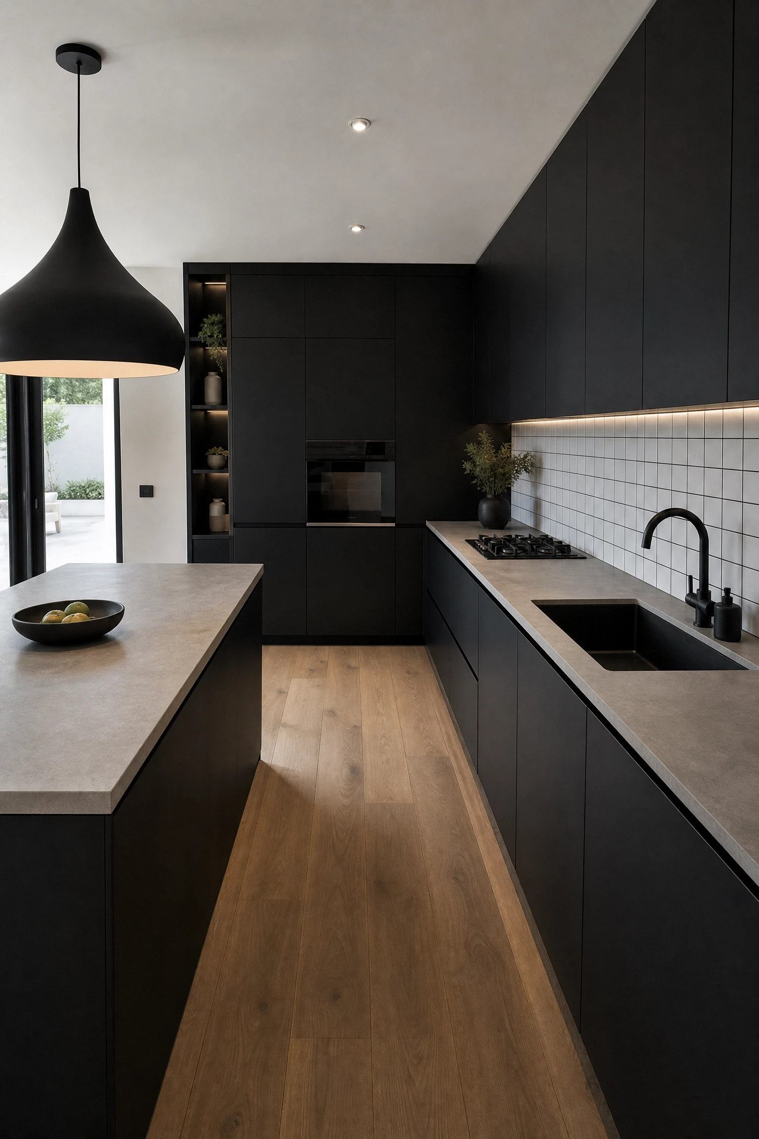
Where full gloss black is high-drama, all-matte black acrylic is something quieter and arguably more interesting. The non-reflective surface absorbs light rather than bouncing it, which gives the kitchen a soft, velvety depth that is very different from the hard shininess of gloss. This is a look associated with contemporary minimal design, and it suits people who want a kitchen that feels restrained and considered rather than flashy. In practical terms, matte black acrylic is significantly more forgiving than gloss in terms of fingerprints and cleaning, which makes it a more realistic everyday choice for a dark kitchen. Pair matte black cabinets with a pale concrete or white stone countertop, a brushed black or matte black tap and sink, and black or very dark grey grout in the tile backsplash to keep the visual continuity. The lighting in a matte black kitchen needs to be quite deliberately considered: recessed lighting alone will not be enough. Under-cabinet strips, pendant lighting over work surfaces, and a feature light over the dining area if the kitchen is open-plan all work together to ensure the room stays functional and not just atmospheric.
Heads Up: Matte black acrylic shows chalk dust, flour, and white food residues more visibly than darker residues, which can be surprising if you do a lot of baking.
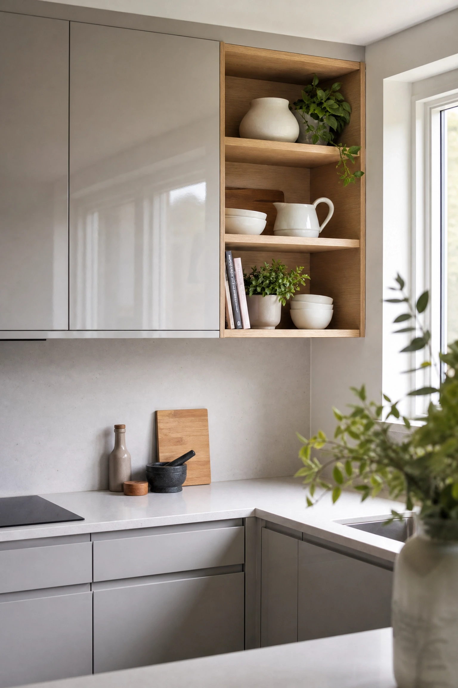
Full acrylic cabinet kitchens can sometimes feel a little closed off and monotonous if every single wall is covered in matching doors, and one of the most effective design moves to break this up is replacing a section of upper cabinets with open shelving. The shelves themselves can be in timber, painted MDF, or even a contrasting acrylic colour, and the result is a kitchen that has both the practical storage of closed cabinets and the visual openness of a more relaxed, lived-in space. In practice, position the open shelving on a section of wall that gets natural light so the items on the shelves are well-lit and the visual depth created by the open space is maximised. Use the open sections to display intentional items only, meaning a small number of ceramics, a few cookbooks, some glassware, and perhaps a plant or two rather than everyday functional items. The contrast between the smooth, glossy acrylic cabinet doors and the more casual, layered look of open shelving gives the kitchen a personality it would not have with closed cabinetry throughout. This approach also helps manage budget since open shelving costs significantly less than a full set of cabinet doors.
Reality Check: Open shelves in a kitchen near the hob collect grease and dust faster than you expect. Factor in a quick wipe-down of the shelves and everything on them at least once a week.
20. Dusty Teal Acrylic for a Fresh Take on Blue-Green
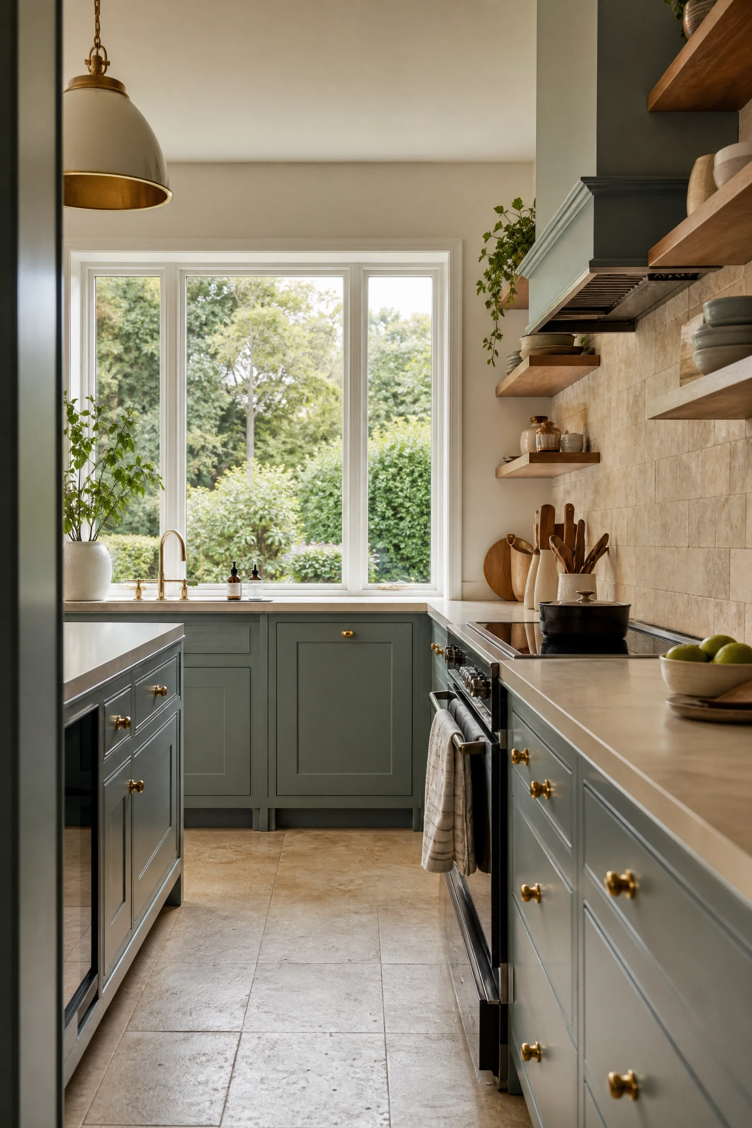
Dusty teal sits somewhere between blue and green, and in a matte or satin acrylic finish it is one of the most interesting colour choices currently appearing in contemporary kitchen design. It has the depth of navy without the heaviness, and the organic quality of sage green without the softness, which means it suits a wider range of interior styles than either of those colours on their own. Pair dusty teal acrylic with a warm off-white or cream countertop and antique brass hardware to bring out the warmth within the teal. A natural limestone or travertine tile backsplash adds texture without adding more colour, and floating timber shelves on one wall prevent the scheme from reading too matchy. This colour works particularly well in kitchens that connect to outdoor spaces, such as garden-facing kitchens with large windows or doors, because the teal bridges the gap between interior and exterior colour palettes in a way that feels considered rather than accidental. It is a mid-range option in terms of cabinet cost and works well in both small and large kitchen formats.
Pro Move: Bring a small dusty teal accessory, such as a ceramic jug or a linen tea towel, into the room before ordering to test how the colour reads in your specific light conditions.
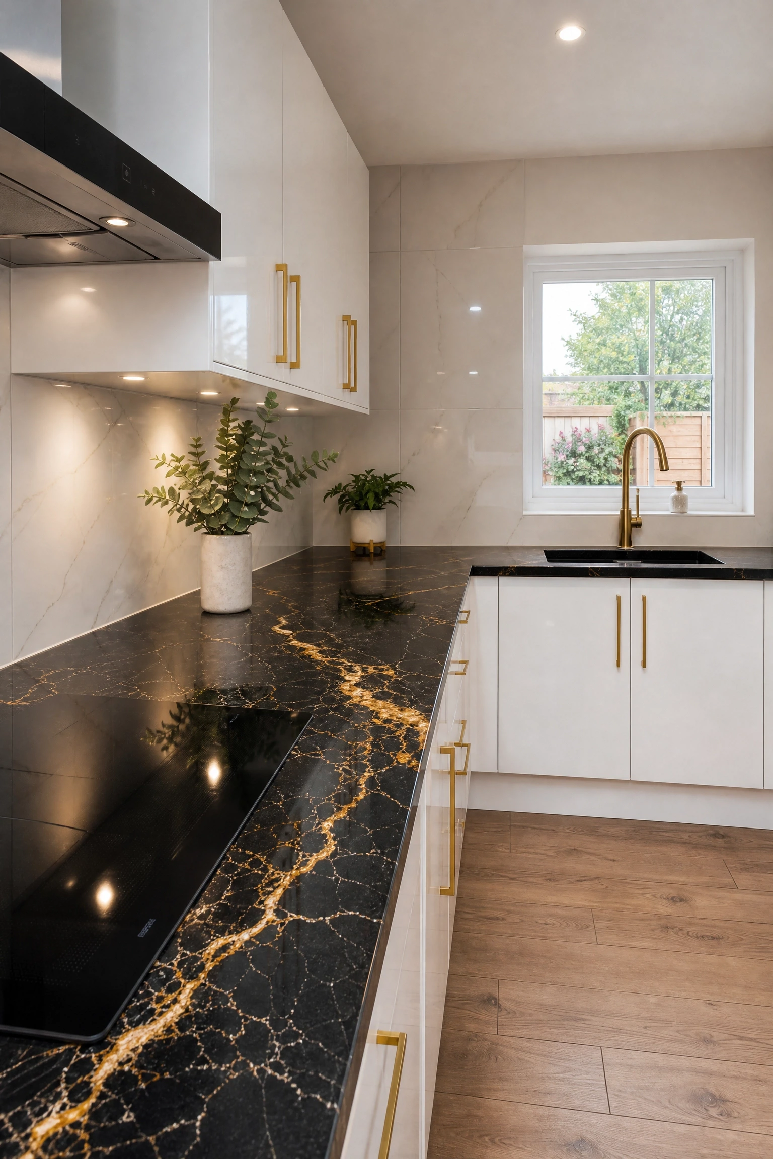
21. Acrylic Gloss White with Gold Veined Black Countertops
This combination has appeared in some of the most shared kitchen images online over the past couple of years, and in person it is easy to understand why. Glossy white acrylic cabinets are clean and bright, but on their own they can feel a little predictable. A dramatic black quartz countertop with bold gold or amber veining changes the entire personality of the room. The contrast is sharp and high-impact, and the gold tones in the countertop connect beautifully to brass or gold hardware on the cabinet doors. In practice, this works best when the backsplash is kept very simple, either plain white tile or a large-format white porcelain slab, so the countertop remains the clear focal point of the room. Pendant lighting in brushed gold or antique brass over an island amplifies the gold tones in the stone and ties the whole scheme together. This is a kitchen that reads as luxury even at a mid-range budget if the countertop is chosen well, since good-quality quartz can convincingly replicate the look of genuine marble at a fraction of the cost. The combination suits both open-plan living spaces and more enclosed kitchen formats.
Designer Advice: Choose a countertop where the veining is bold and directional rather than scattered, as this gives the kitchen a more deliberate, architectural quality.
22. Soft Grey-Green Acrylic in a Scandi-Style Kitchen
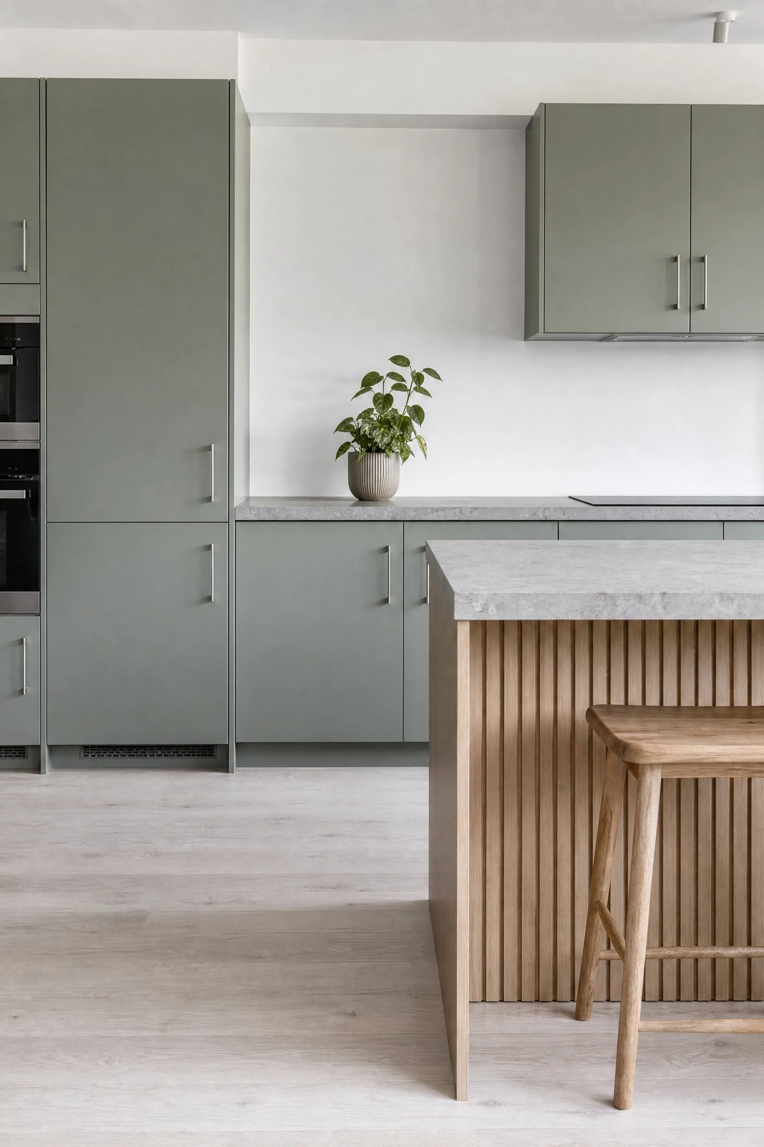
Soft grey-green is a colour that barely registers as a colour from a distance, which is exactly the point. In a Scandi-inspired kitchen, the whole aesthetic is built around restraint, natural materials, and colours that feel calm rather than assertive. A soft grey-green matte acrylic cabinet finish achieves this in a way that pure white cannot, because it introduces just enough warmth and character to prevent the kitchen from feeling sterile. Pair grey-green acrylic with pale Scandinavian-style oak veneer details, simple bar handles in brushed stainless steel, and a white or light grey stone countertop. The floor should ideally be in a light natural material, pale concrete, white-washed oak boards, or large-format stone, to maintain the airy Scandinavian quality. Keep accessories minimal and intentional: a few carefully chosen ceramics in neutral tones, a single potted plant, and a clean-lined kitchen mixer in white or cream. This is a kitchen that values negative space as a design element, meaning the empty areas of the room matter as much as the filled ones. It is a mid-range budget option and one of the better resale choices in the acrylic colour palette.
Quick Tip: Pair grey-green cabinets with a white ceiling and white walls, not off-white or cream, to preserve the light Scandinavian quality and stop the room from feeling too tonal.
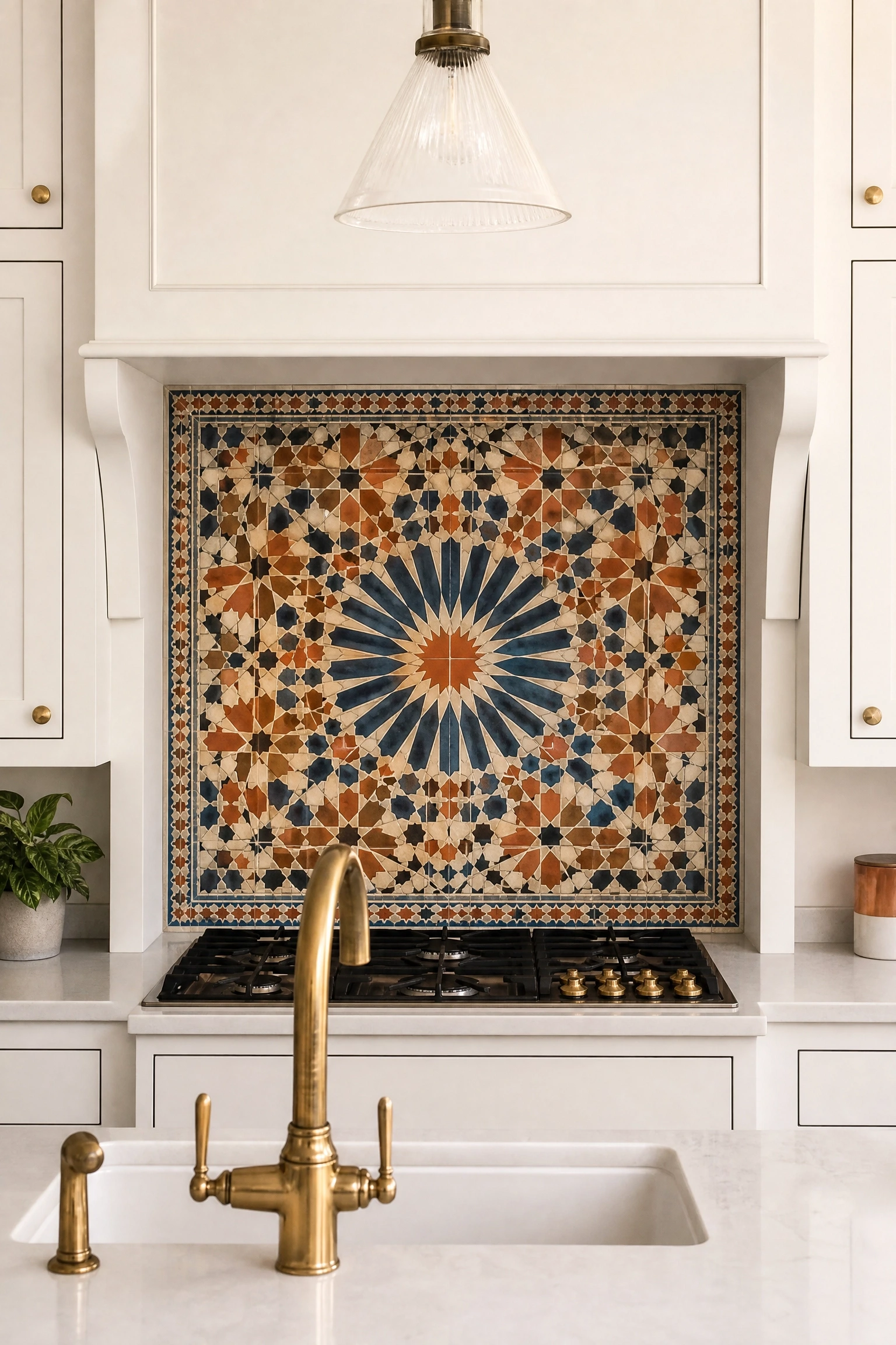
Rather than letting the cabinets do all the work, this approach uses the acrylic cabinetry as a clean, quiet backdrop and makes the backsplash the primary design statement in the kitchen. In practice, this means choosing a neutral acrylic colour, white, cream, pale grey, or matte black, and then specifying a backsplash in a material that would normally feel too bold or busy if paired with busier cabinetry. Handmade zellige tiles in a mix of terracotta, rust, and cream, a slab of veined marble, a hand-painted Moroccan tile panel, or a large-format printed glass backsplash with a botanical or geometric pattern all become possible when the cabinets are deliberately understated. The reflective quality of gloss acrylic cabinets actually enhances a statement backsplash by bouncing light back onto the tile surface, which makes the colours and textures appear richer and more vibrant. This is a smart approach for anyone who wants personality in the kitchen but is nervous about committing to a bold cabinet colour, since backsplash tiles are a less permanent and often more affordable element to replace if your taste changes. Mid-range budget with high visual payoff.
Heads Up: Commission a full tile layout drawing before installation to ensure the pattern on a statement backsplash centres correctly on the wall and does not end with an awkward cut tile at either edge.
24. Biophilic Kitchen with Acrylic, Plants, and Natural Light
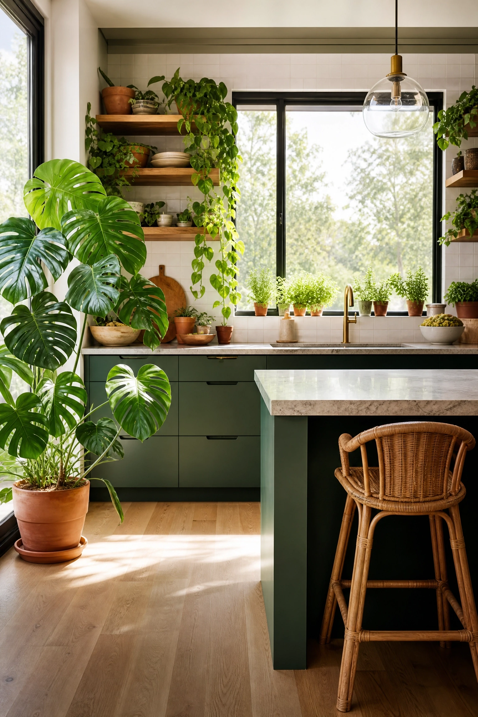
Biophilic design, the intentional incorporation of nature into interior spaces, is one of the strongest trends in kitchen and home design right now, and acrylic cabinets are a surprisingly good fit for this approach. The clean, low-maintenance surface of acrylic means you do not have to worry about moisture from plants or humidity from cooking damaging the cabinet finish the way it might with painted timber. Choose an acrylic colour that connects to nature: a warm forest green, a soft clay, a dusty sage, or even a very pale natural stone shade. Then layer in real plants wherever space allows: trailing pothos along open shelving, a large monstera in a pot near a window, potted herbs in a window sill, and a few succulents on the countertop. Natural light should be maximised wherever possible with lightweight linen curtains or no window treatment at all. A stone or timber countertop, a ceramic undermount sink, and woven baskets for storage complete the picture. This type of kitchen scores well with buyers who are interested in wellness-oriented living and works beautifully in homes with access to a garden or courtyard.
Designer Advice: Install grow lights under one section of upper cabinetry if your kitchen gets limited natural light. They extend the hours your plants can thrive and add a warm ambient glow to the countertop below.
Acrylic kitchen cabinets offer more design range than most people realise when they first start researching the material. Once you move beyond the standard gloss white option, you are looking at a format that can deliver anything from a dramatic, moody black kitchen to a soft, natural-feeling sage green space with matte finishes and timber accents. The key is treating the cabinet finish as one piece of a larger room rather than the only decision that matters. The countertop, hardware, lighting, backsplash, and flooring all need to work together with the acrylic surface rather than competing against it.
Before you commit to any of the ideas above, get samples. Acrylic finishes look different at various times of day and under different light sources, and a full-size sample panel held against your actual wall and countertop will tell you more than any screen image. Talk to a cabinet maker who works with acrylic regularly and ask them which manufacturers they trust, since quality varies significantly at the manufacturing level and a poor-quality acrylic finish will not hold up over time the way a well-made one will. With the right choices in place, an acrylic kitchen is genuinely one of the most rewarding investments you can make in your home.
FAQ
Are acrylic kitchen cabinets durable enough for everyday use?
Yes, provided you choose a quality product. High-grade acrylic is resistant to moisture, UV fading, and daily wear. The substrate matters too: acrylic applied over a solid MDF or plywood base will perform significantly better than over a cheaper particleboard core. Ask your supplier about the substrate before ordering.
Do acrylic cabinets scratch easily?
Gloss acrylic can show fine scratches from abrasive cleaning products or sharp objects dragged across the surface. Matte acrylic tends to hide minor surface marks better than gloss. Either way, avoid scouring pads and use a soft microfibre cloth for daily cleaning. High-quality acrylic is generally more scratch-resistant than cheaper alternatives.
How do you clean acrylic kitchen cabinets?
A damp microfibre cloth and a mild, non-abrasive cleaner is all you need for everyday cleaning. Avoid bleach-based products and anything with ammonia, as these can cloud or dull the surface over time. For gloss surfaces, a dry buff with a clean cloth after wiping removes water marks and restores the shine.
Can acrylic cabinets be repainted or refinished?
Unlike timber cabinets, acrylic surfaces are not suitable for conventional repainting at home. If a panel is damaged, the most practical solution is usually to replace the affected door rather than attempting a surface repair. This is worth factoring into your decision if your kitchen gets very heavy use.
What is the difference between acrylic and high-gloss laminate?
Acrylic is a polymer applied directly to the substrate and has a deeper, more glass-like finish than laminate. High-gloss laminate uses a printed film with a gloss overlay and tends to look slightly flatter in comparison. Acrylic also typically holds its colour depth better over time. The cost difference reflects this: acrylic is generally more expensive than laminate.
Are acrylic cabinets suitable for humid kitchens?
Yes, acrylic performs well in humid environments. The non-porous surface does not absorb moisture, and a quality acrylic finish will not warp or swell the way an untreated timber surface can. That said, the substrate beneath the acrylic still matters. A well-sealed MDF or moisture-resistant plywood substrate combined with a quality acrylic finish gives you the best protection in a kitchen with high humidity levels.