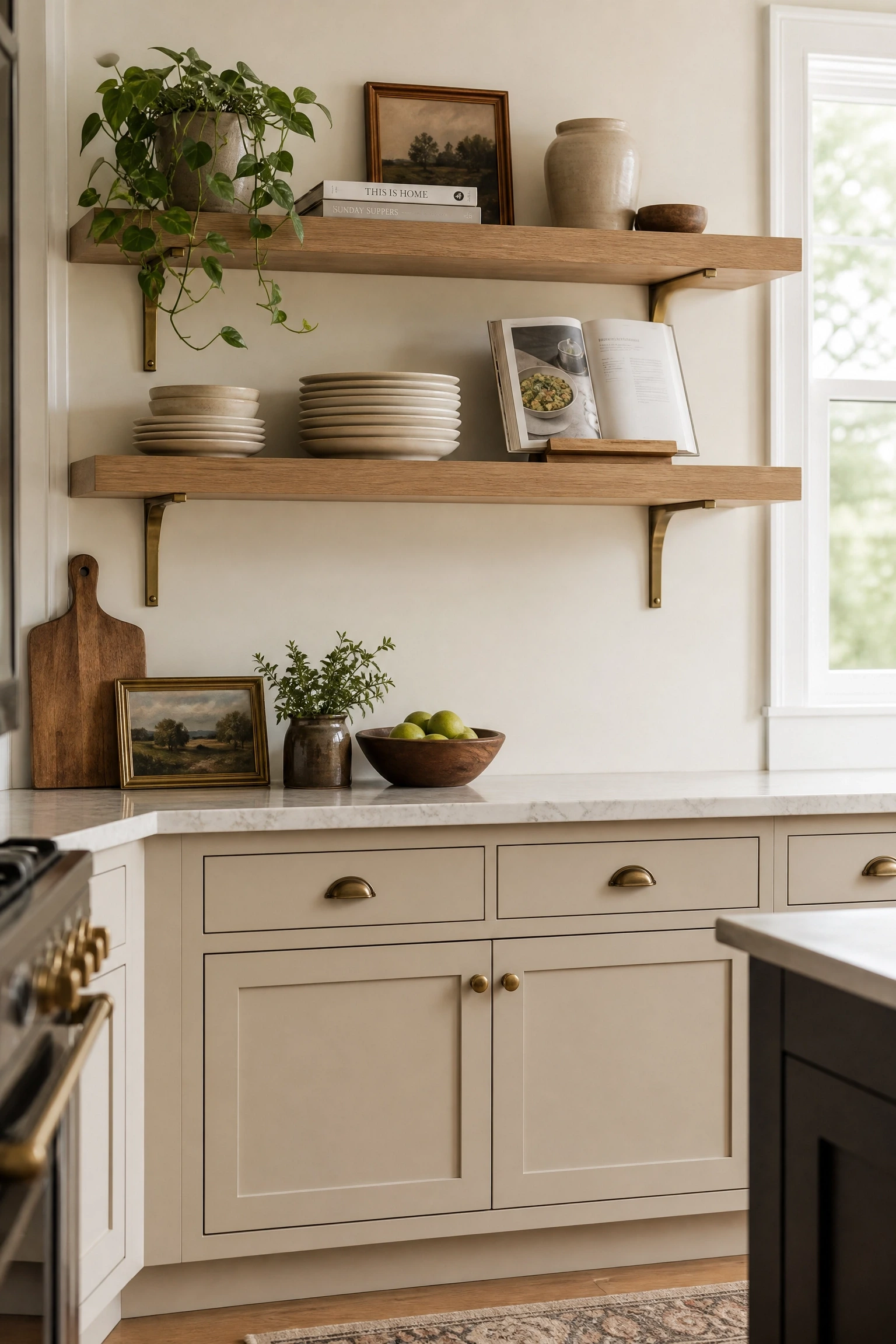
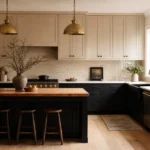
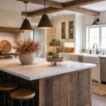
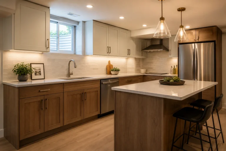
If you have been scrolling through kitchen inspiration photos lately and keep stopping at the same warm, soft, almost-neutral cabinet color, there is a good chance you are looking at Accessible Beige. Sherwin-Williams SW 7036 sits right between greige and sandy beige, with a Light Reflectance Value of 58, meaning it holds its own in both bright and dim spaces without washing out or going muddy. What makes it genuinely useful as a cabinet color is that it picks up warmth from wood floors and stone countertops while still reading as clean and composed, a balance that is genuinely hard to find in a single paint color.
That said, Accessible Beige is not a fix for every kitchen. North-facing rooms with cool, flat light can pull out a slightly green undertone that surprises people who only tested the color in the paint store. And if your floors have strong pink tones, the combination can feel off without some thoughtful layering. The ideas below are written for real kitchens with real lighting and real budgets, covering a wide range of styles so you can find the approach that actually fits your space.
1. Accessible Beige Lowers with Crisp White Uppers
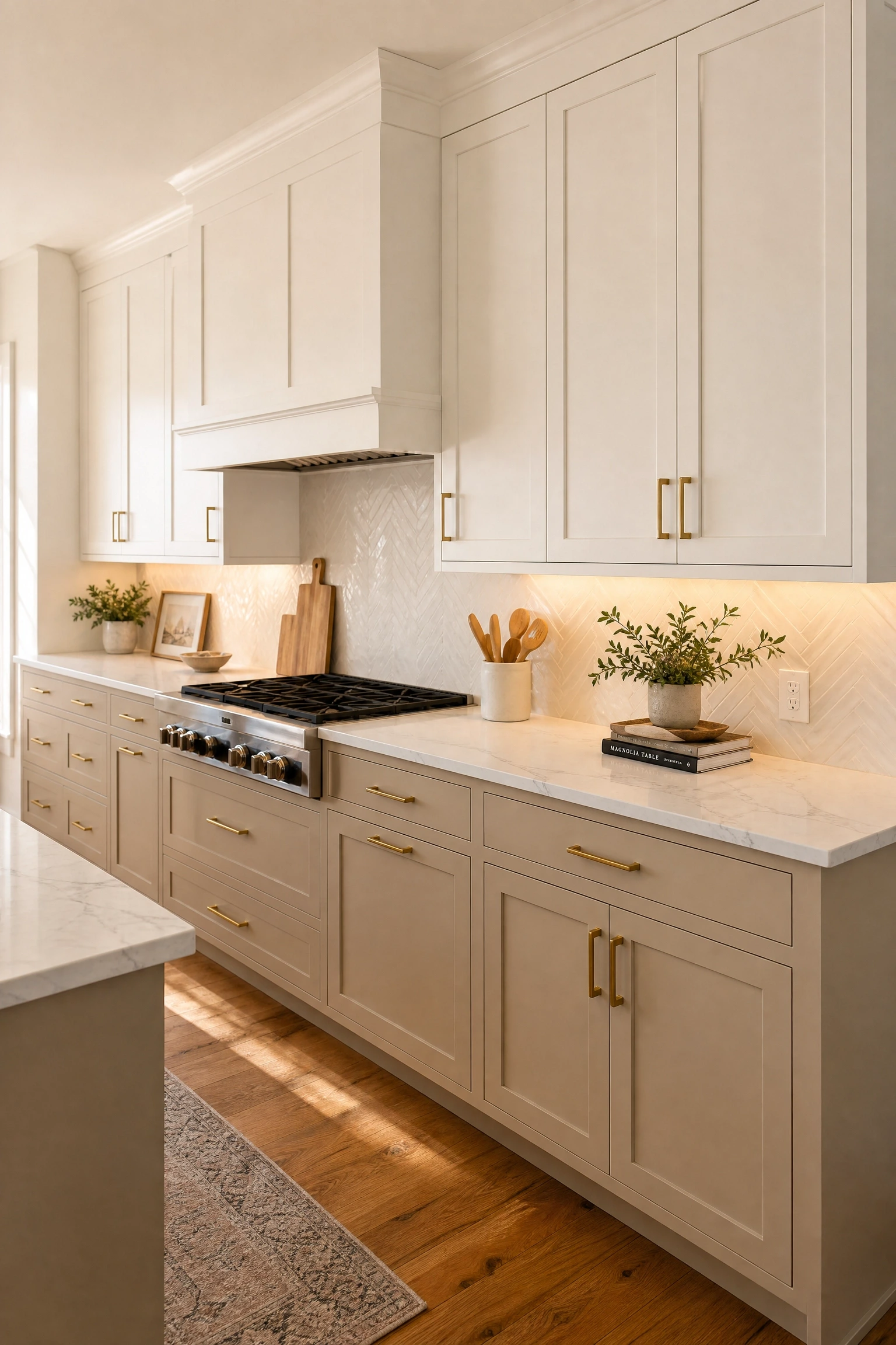
Limiting Accessible Beige to the lower cabinets while painting uppers in a warm white like Sherwin-Williams Alabaster or Benjamin Moore White Dove creates a two-tone effect that feels designed rather than accidental. In practice, the contrast is subtle enough that the kitchen reads as cohesive, but it adds enough dimension to avoid the flat same-color-everywhere look. Pair this with a honed marble or light quartz countertop to bridge the two tones, and add brushed brass pulls to both upper and lower doors so the hardware unifies the palette. Under-cabinet LED strips at 2700K reinforce the warmth of the beige without making the white uppers look yellow. This approach works especially well in smaller kitchens because keeping the eye-level area light visually expands the room.
Pro Move: Hold your white upper paint sample against the Accessible Beige lower sample in your actual kitchen light before committing, because some whites pull lavender or cool gray next to warm beige.
2. Shaker-Style Doors with Unlacquered Brass Hardware
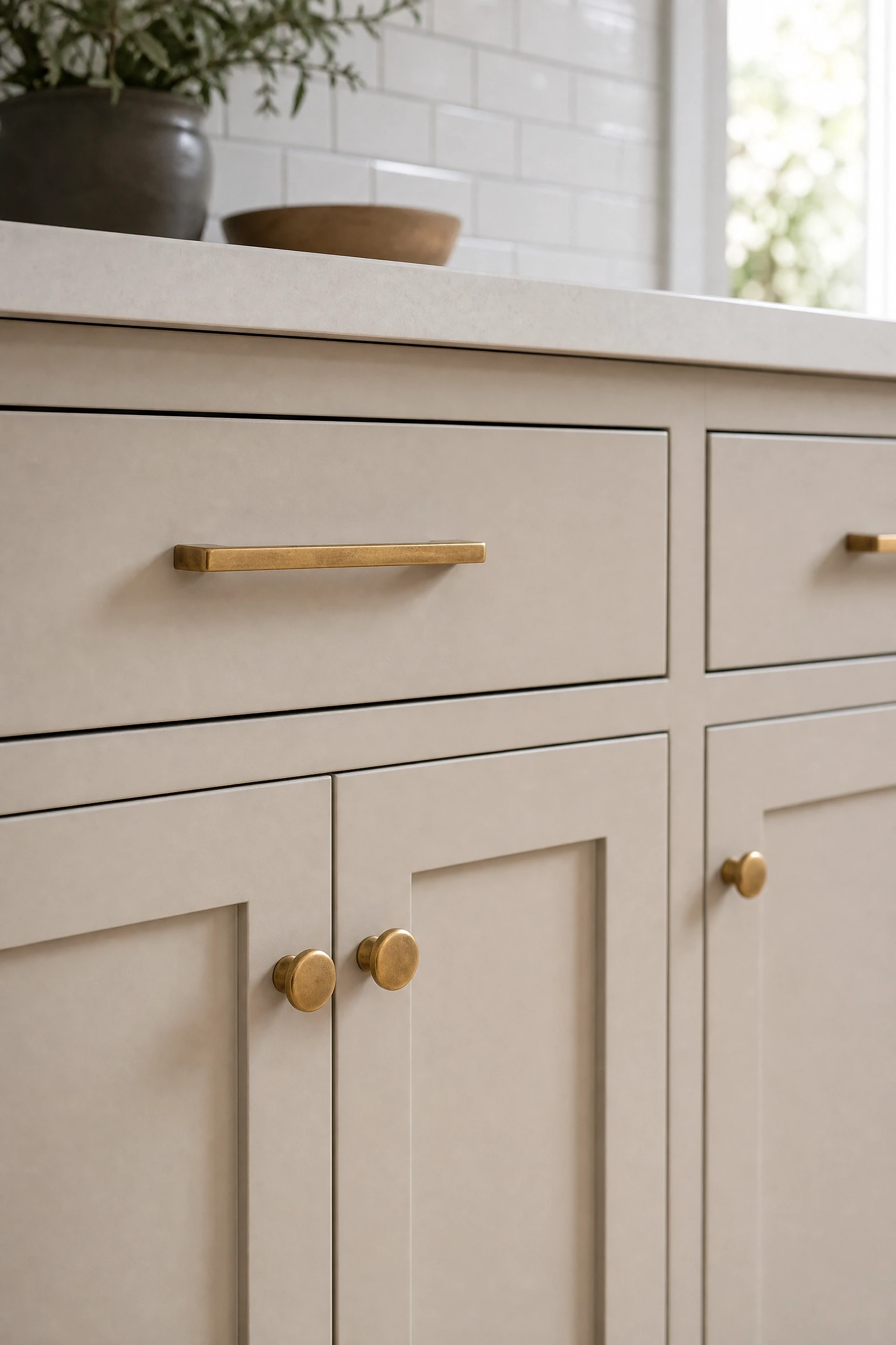
Shaker cabinet doors are the most popular door profile in North American kitchens right now, and Accessible Beige on shaker doors has a particularly lived-in, European cottage quality that pairs beautifully with unlacquered brass hardware. Unlike polished or satin brass, unlacquered brass develops a natural patina over time, so handles and knobs slowly darken in a way that makes the kitchen feel authentic rather than showroom-perfect. Interior designers often recommend this pairing because the warm metal and warm beige share the same undertone family, so nothing fights for attention. Keep the backsplash simple, either white subway tile or a natural stone mosaic, and you can find good unlacquered brass pulls starting around fifteen dollars per piece.
Designer Advice: Buy a few extra pulls when you order, because unlacquered brass from the same batch will patina at the same rate, and replacements from a later production run may not match after a year of aging.
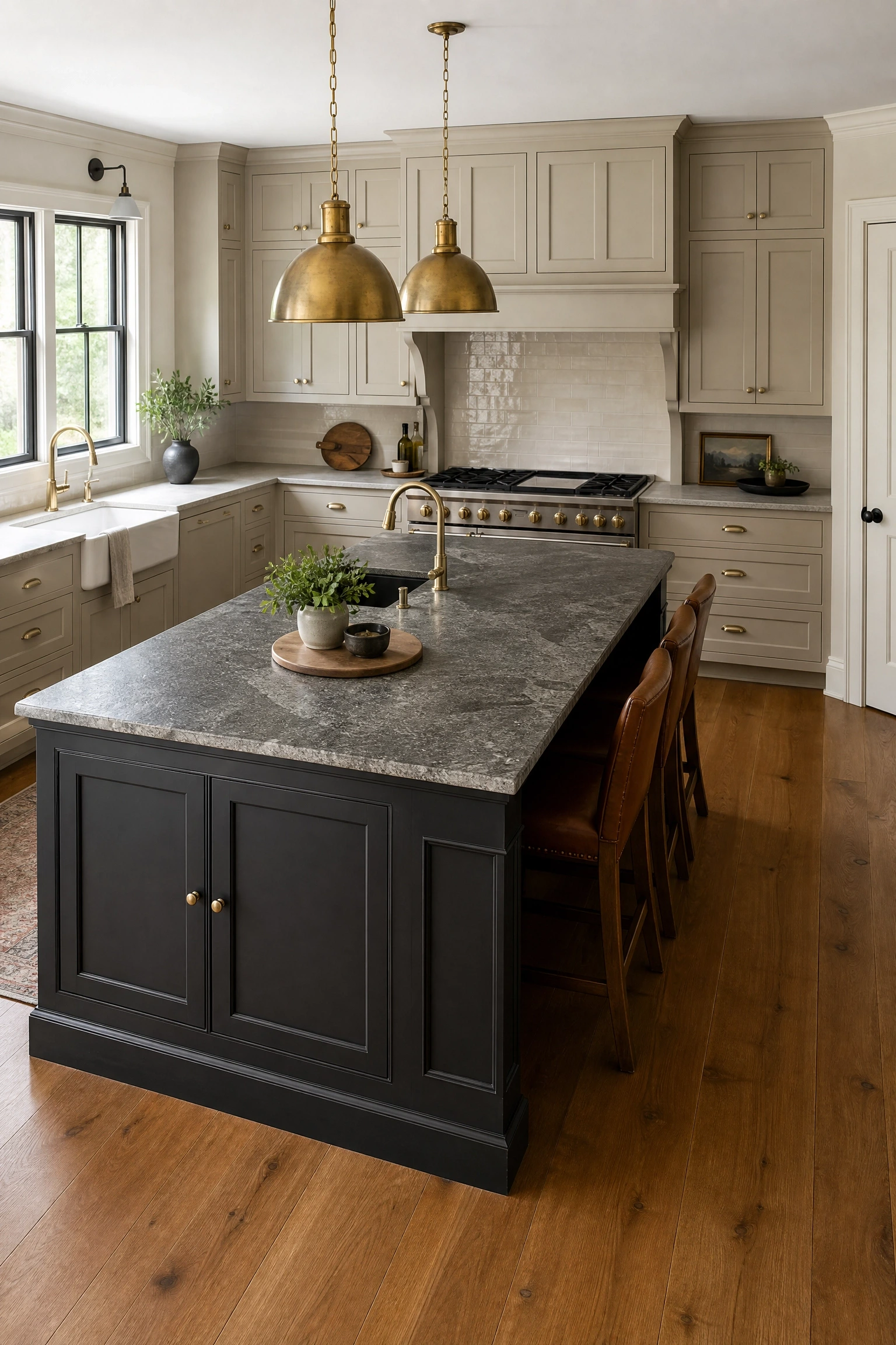
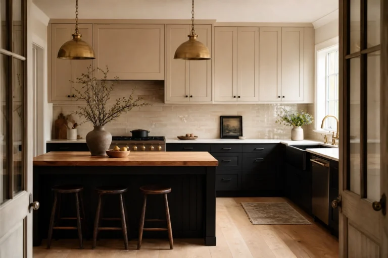
Painting a central island a dramatically darker color than the perimeter cabinets is one of the most effective ways to add depth without touching the rest of the room. Accessible Beige perimeter with Sherwin-Williams Iron Ore or Peppercorn on the island works because both colors share warm undertones, so the contrast feels intentional rather than jarring. The island reads as a piece of furniture within the kitchen rather than just another cabinet run. For the countertop, leathered granite or dark quartzite continues the contrast story while adding texture, and warm aged brass pendants above the island tie the two tones together. This idea works best in kitchens at least twelve feet wide so the dark island has enough breathing room.
Heads Up: In kitchens with low ceilings, a very dark island can make the room feel smaller. Consider a dark stain on wood rather than full charcoal paint to get contrast with less visual weight.
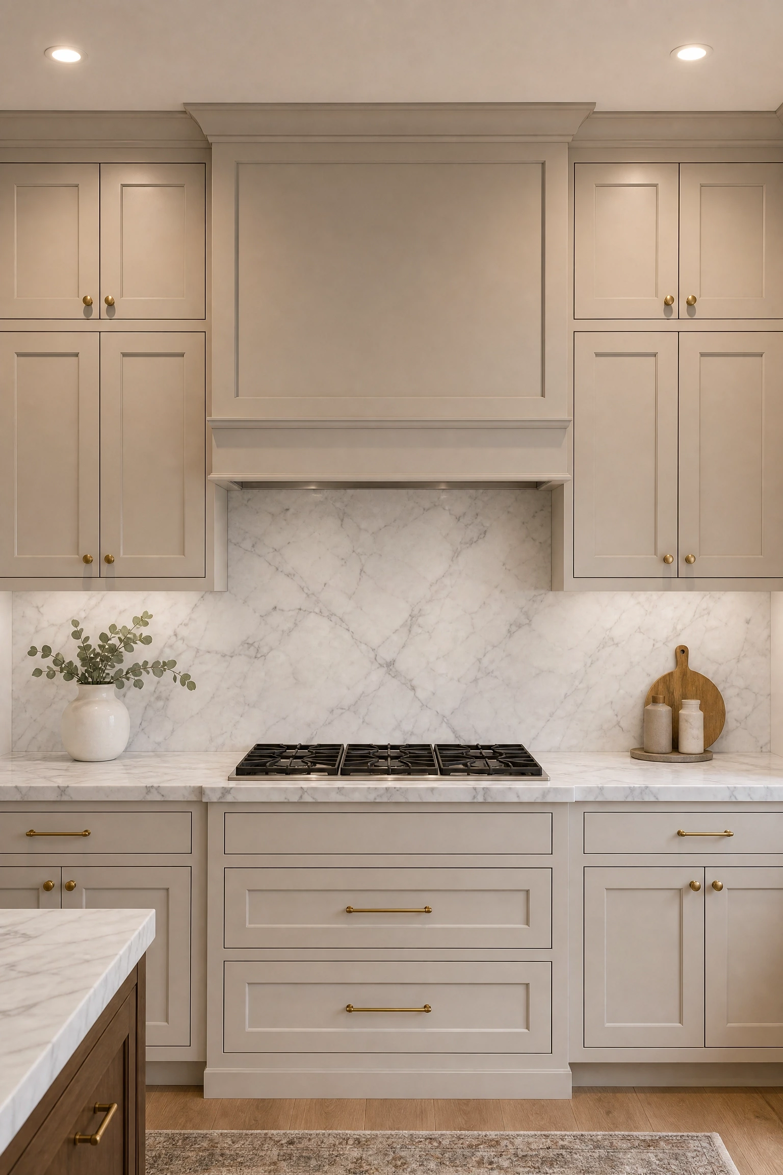
Carrara marble with Accessible Beige reads as genuinely luxurious without feeling cold, because the soft gray veining pulls out the gray undertone in the beige rather than clashing with it. Running the marble all the way up the backsplash as a slab eliminates grout lines and makes the kitchen feel more smooth. This is an investment-level approach since genuine Carrara slabs can run from sixty to over two hundred dollars per square foot, but Carrara-look porcelain or quartz brings the same visual result at a fraction of the cost. Satin brass hardware works beautifully here because it adds warmth to what could otherwise feel like a cool, museum-like palette. One honest limitation: real Carrara marble requires annual sealing and etches easily from acidic liquids like vinegar or lemon juice.
Reality Check: If you cook frequently with acidic ingredients, choose a porcelain slab that mimics the Carrara look. You get ninety percent of the beauty with none of the maintenance anxiety.
Mixing closed Accessible Beige cabinets with open shelves in natural white oak breaks up a kitchen that could otherwise feel heavy or monotonous. White oak has a tight grain and a warm honey tone that sits naturally alongside Accessible Beige without either material dominating. Open shelves work best flanking the range hood or on a single wall rather than replacing all the uppers, because full open shelving requires disciplined organization to avoid looking chaotic. Make shelves at least two inches thick to look substantial, use floating brackets in unlacquered brass or oil-rubbed bronze, and style them with a mix of everyday items and a few plants rather than purely decorative pieces that collect grease. This combination has a strong presence in Japandi and organic modern kitchens right now.
Quick Tip: Seal open wood shelves with a food-safe matte finish rather than high-gloss varnish so the wood looks natural, and wipe them down weekly with a barely damp cloth to prevent grease buildup.
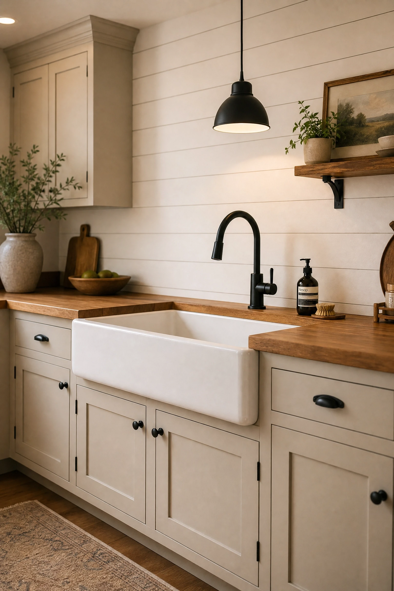
The combination of Accessible Beige cabinets, a fireclay apron-front sink, and white shiplap on an accent wall is a defining look for modern farmhouse kitchens and still works because every element stays warm and soft. A fireclay apron sink in matte white adds a handcrafted texture that suits the organic quality of Accessible Beige better than polished stainless. Matte black hardware on cabinets, faucet, and light fixtures adds enough contrast to keep the look from becoming too washed out. Butcher block countertops reinforce the farmhouse warmth while adding a practical prep surface that improves with age. This is a budget-accessible direction since shiplap can be achieved with simple pine boards painted in Pure White.
Designer Advice: Run shiplap boards horizontally rather than vertically to make low ceilings feel taller and to avoid the look tipping from farmhouse into barn siding.
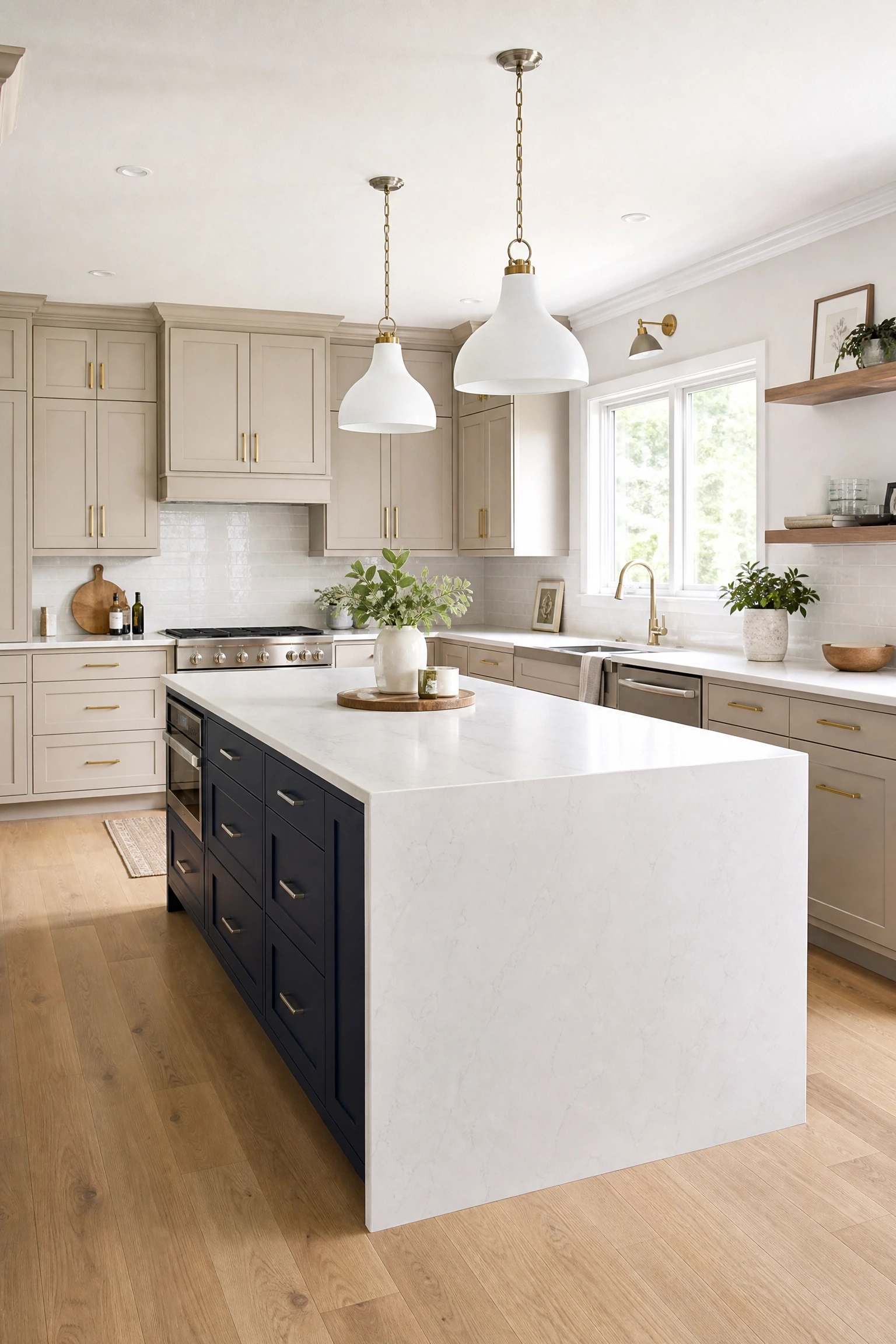
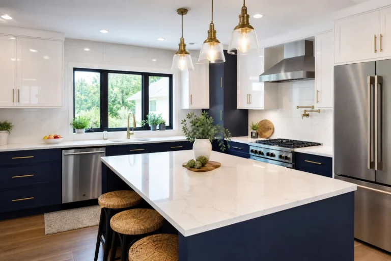
For a bolder contrast than dark gray, pairing Accessible Beige perimeter cabinets with a navy blue island introduces a striking color story while keeping the overall palette warm and grounded. Sherwin-Williams Naval or Benjamin Moore Hale Navy lean slightly warm rather than icy, which keeps them from clashing with the beige undertones. A white marble or light quartz island countertop acts as a visual pause between the two strong colors. Brushed nickel hardware on the navy island and brass on the perimeter cabinets keeps each zone distinct while still feeling coordinated. This look photographs extremely well, though in person it reads more quietly than it does in design magazine photos.
Pro Move: Paint cardboard samples of both colors and hold them side by side in your kitchen light for a full day before committing, because navy can pull blue-green or blue-purple depending on your light source.
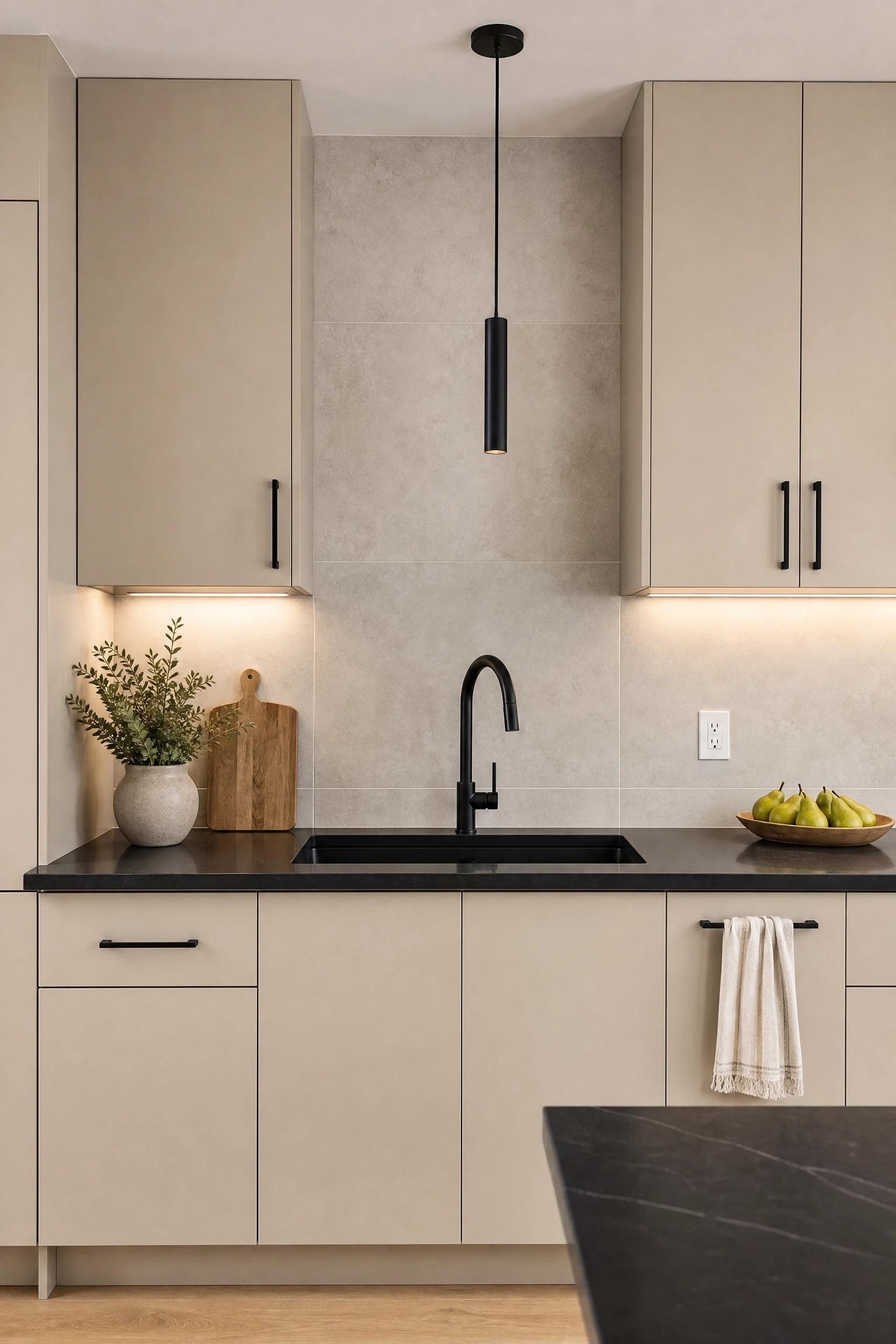
Pairing soft Accessible Beige cabinets with an almost-black quartz countertop like Silestone Eternal Noir creates a high-contrast look that feels modern without being cold, because the beige keeps the room warm even when the stone is very dark. Flat-panel cabinet doors rather than shaker style lean into the contemporary quality of the dark stone. Matte black fixtures and cabinet hardware create a unified dark accent thread that makes the contrast feel purposeful. A light warm-gray large-format porcelain backsplash provides visual relief between the beige cabinets and dark counter. Worth noting: very dark quartz shows fingerprints and water spots more obviously than lighter surfaces.
Heads Up: In small kitchens, very dark countertops can feel enclosing. Balance the dark stone with light walls and strong under-cabinet lighting to keep the space feeling open.
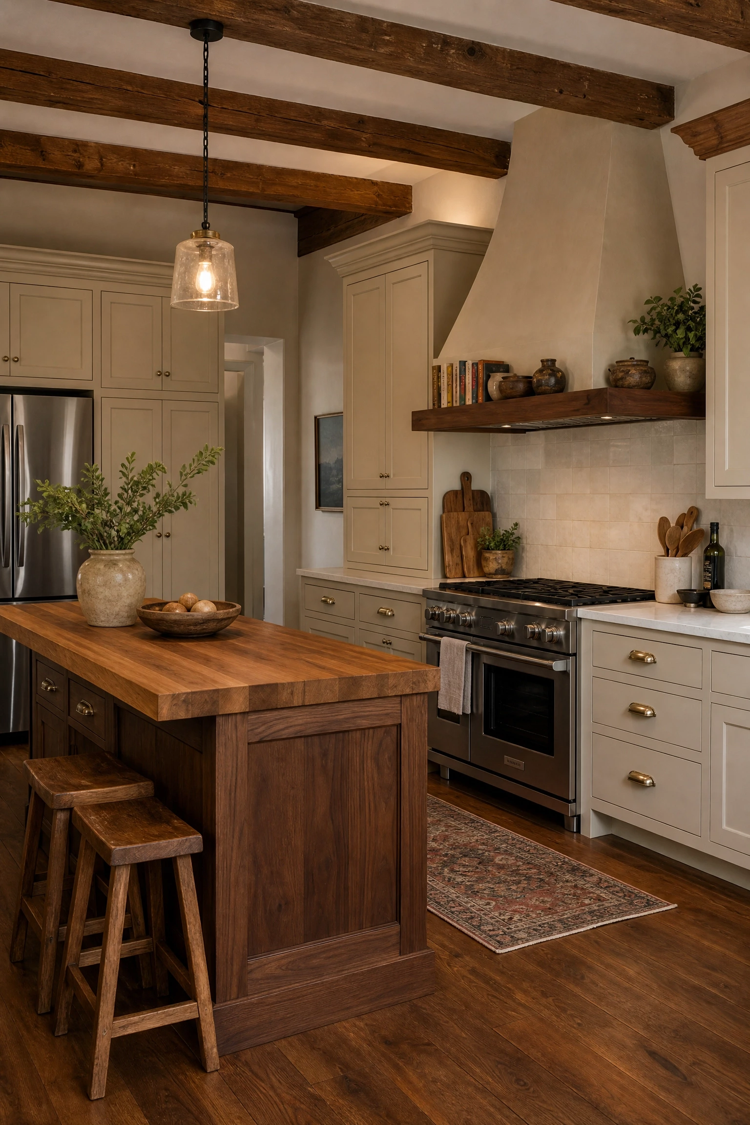
Bringing in warm wood elements alongside Accessible Beige cabinets is one of the most natural pairings in kitchen design because both materials share the same earthy, organic warmth. Medium to darker wood tones, walnut, aged oak, or warm cherry, work better than very light or blonde wood, which can blend too closely with the beige and lose the contrast. A walnut floating shelf above the range adds richness and texture without structural changes, and antique or salvage wood elements give the kitchen a story that brand-new materials cannot replicate. This approach works for nearly any kitchen style and is accessible across budget levels since wood accents can be added gradually over time without a full renovation.
Quick Tip: Avoid floors with strong pink or red undertones alongside Accessible Beige cabinets because the combination can push toward orange. Opt for floors with gray, golden, or brown undertones instead.
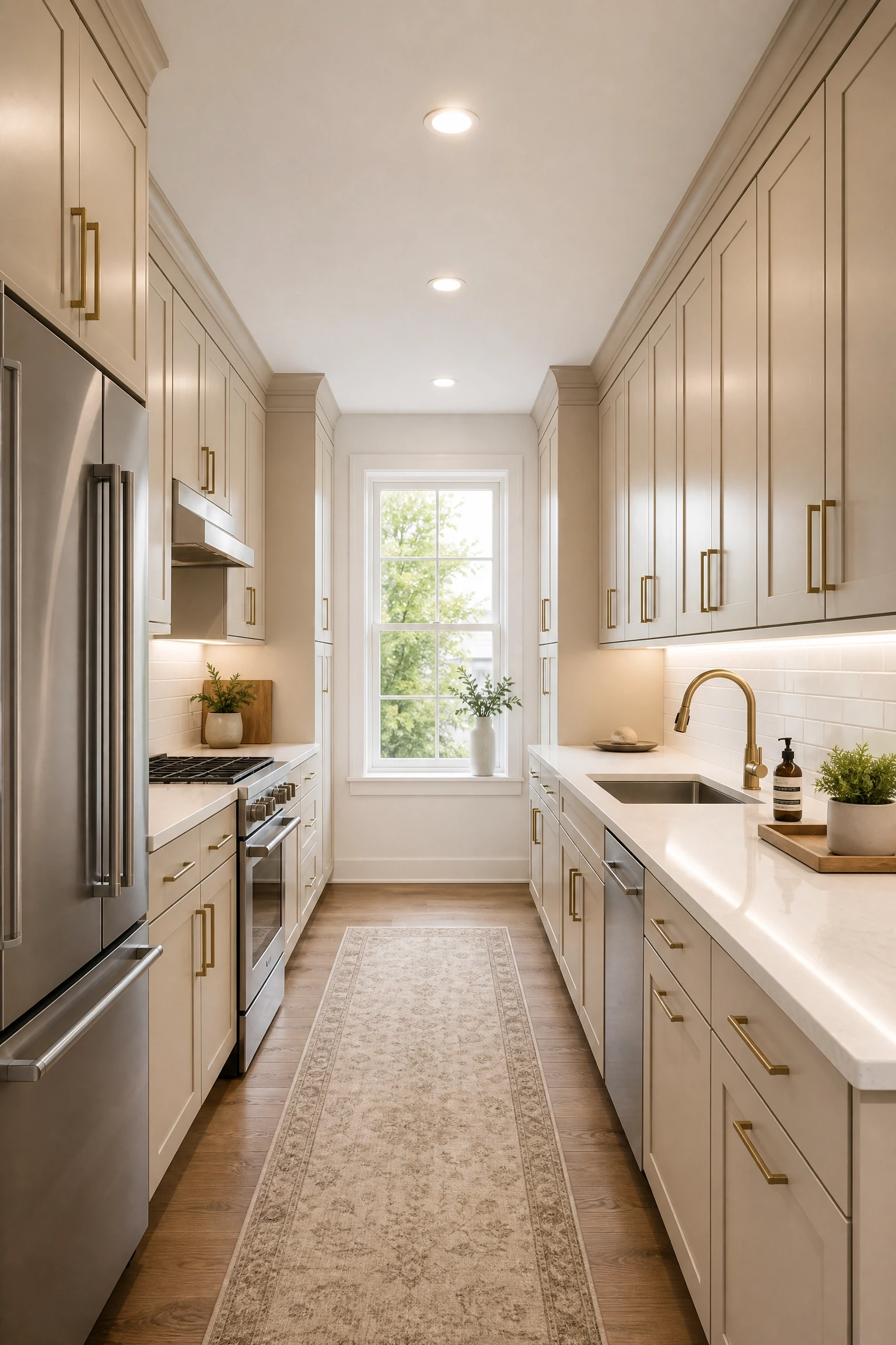
Galley kitchens benefit from Accessible Beige more than almost any other layout because the soft warm neutral keeps a tight corridor from feeling clinical the way white can, while avoiding the heavy, enclosed feeling that darker colors produce in narrow spaces. Painting cabinets Accessible Beige on both sides and carrying the color all the way to ceiling-height uppers creates a continuous warm envelope that makes the narrow room feel intentional rather than cramped. Light countertops in white or cream quartz bounce light down the length of the kitchen, and a white subway tile backsplash running the full length of both walls adds a clean vertical line that increases perceived height. Recessed LED ceiling lighting combined with under-cabinet strips is essential because galley kitchens rarely have a natural light source at both ends.
Reality Check: Skip pendant lights in a galley unless the ceiling is at least nine feet high. In lower-ceilinged galleys, pendants interrupt the sightline and make the narrow space feel even more confined.
11. Matte Black Fixtures with Accessible Beige Cabinets
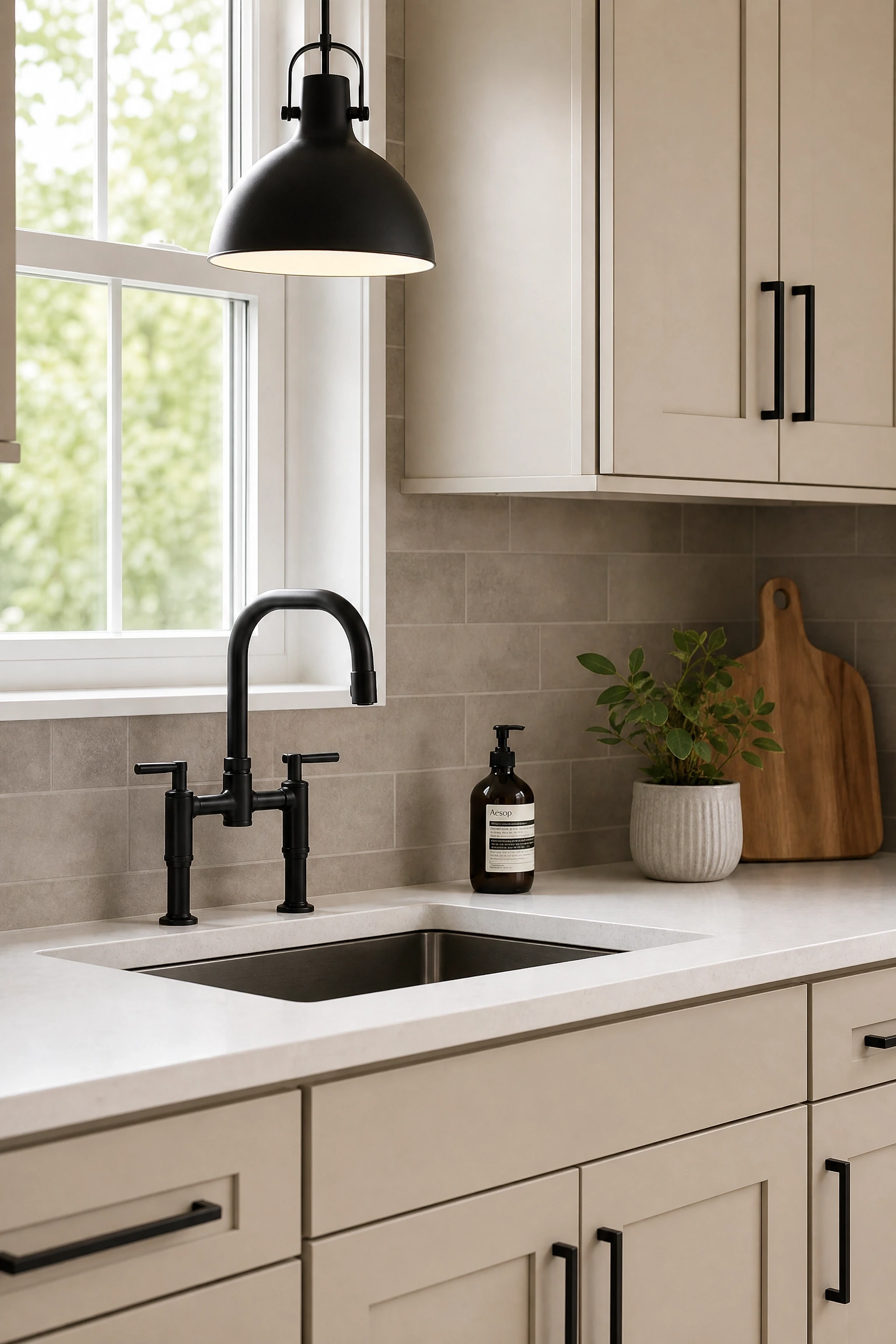
Matte black faucets, handles, light fixtures, and cabinet hardware with Accessible Beige cabinets has become one of the most consistent designer recommendations in the past few years, and it holds up in real kitchens because the contrast is crisp without being harsh. Matte black reads as grounded and modern, and against the softness of Accessible Beige it has a graphic quality that prevents the kitchen from feeling too soft or country-style. The practical bonus is that matte black hides water spots and fingerprints much better than polished finishes. Commit to matte black across all hardware in the kitchen, faucet, cabinet pulls, pendant shades, and window hardware, so it reads as a deliberate design choice rather than a mismatched accident.
Designer Advice: If you are mixing matte black with a warm metal elsewhere, like a brass faucet on a bar sink, limit the mixing to one deliberate accent so it looks layered rather than unplanned.
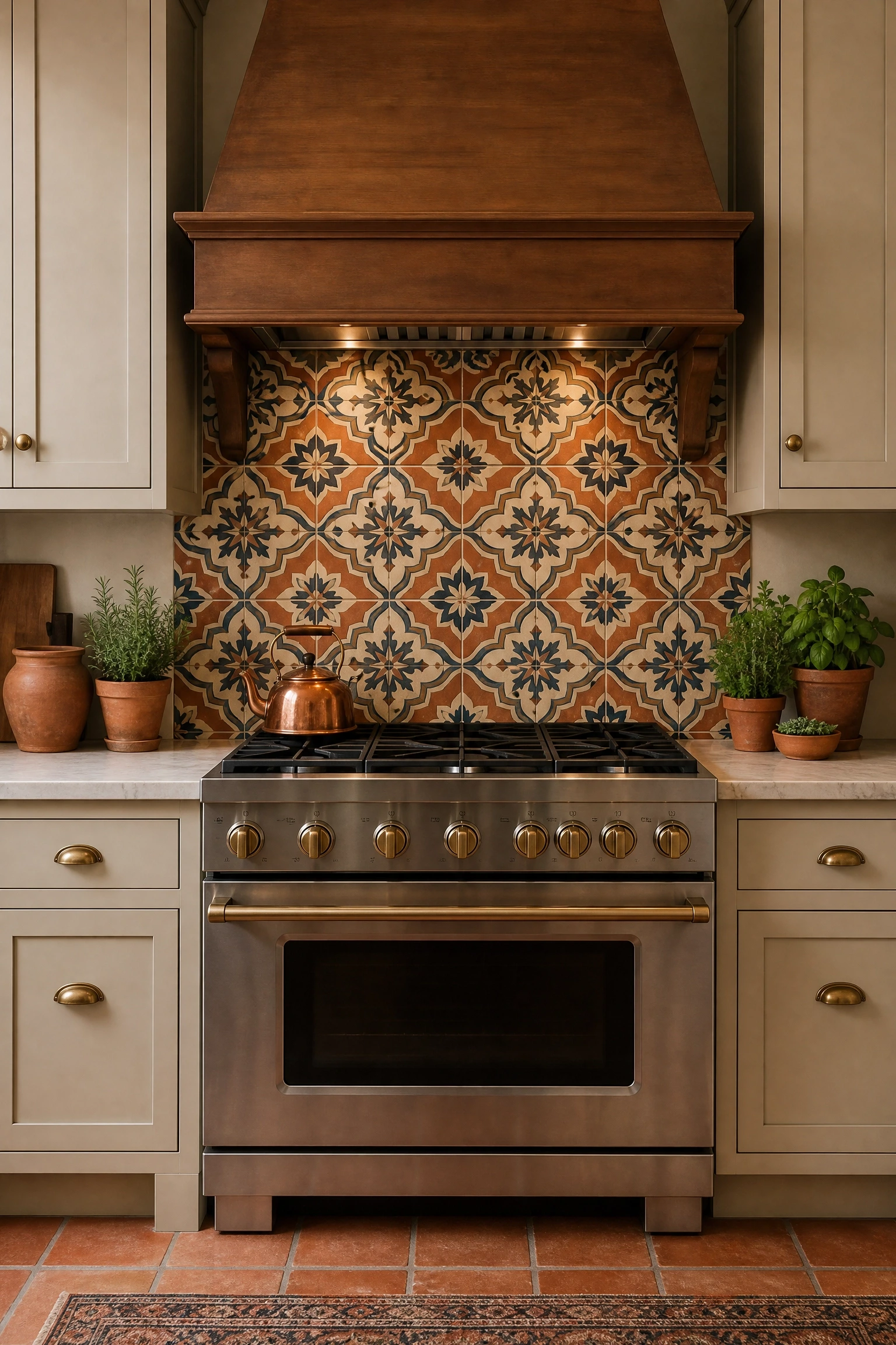
If Accessible Beige feels too safe on its own but you still want its warmth as a foundation, introduce a bold pattern in the backsplash while keeping the cabinets in the quiet beige. Moroccan encaustic tile in warm terracotta, navy, and cream placed behind the range or across the full backsplash area becomes the clear focal point while the beige cabinets act as a calm backdrop. Genuine handmade Moroccan cement tile has an authentic surface quality but is porous and requires sealing. A porcelain version mimics the look with much less maintenance. Pair this with warm wood shelving and simple matte black or oil-rubbed bronze hardware so nothing competes with the busy tile pattern.
Pro Move: Order a sample tile and hold it against your Accessible Beige paint chip in your actual kitchen light before buying. Some Moroccan colorways can pull the beige toward orange depending on your specific room lighting.
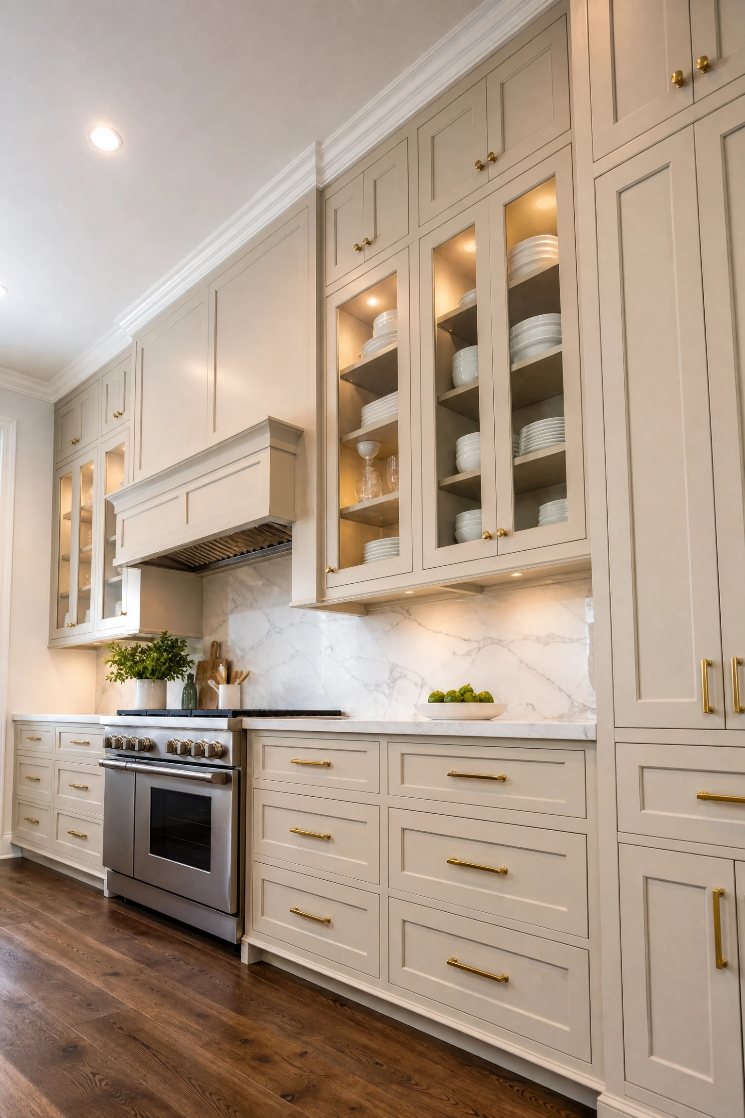
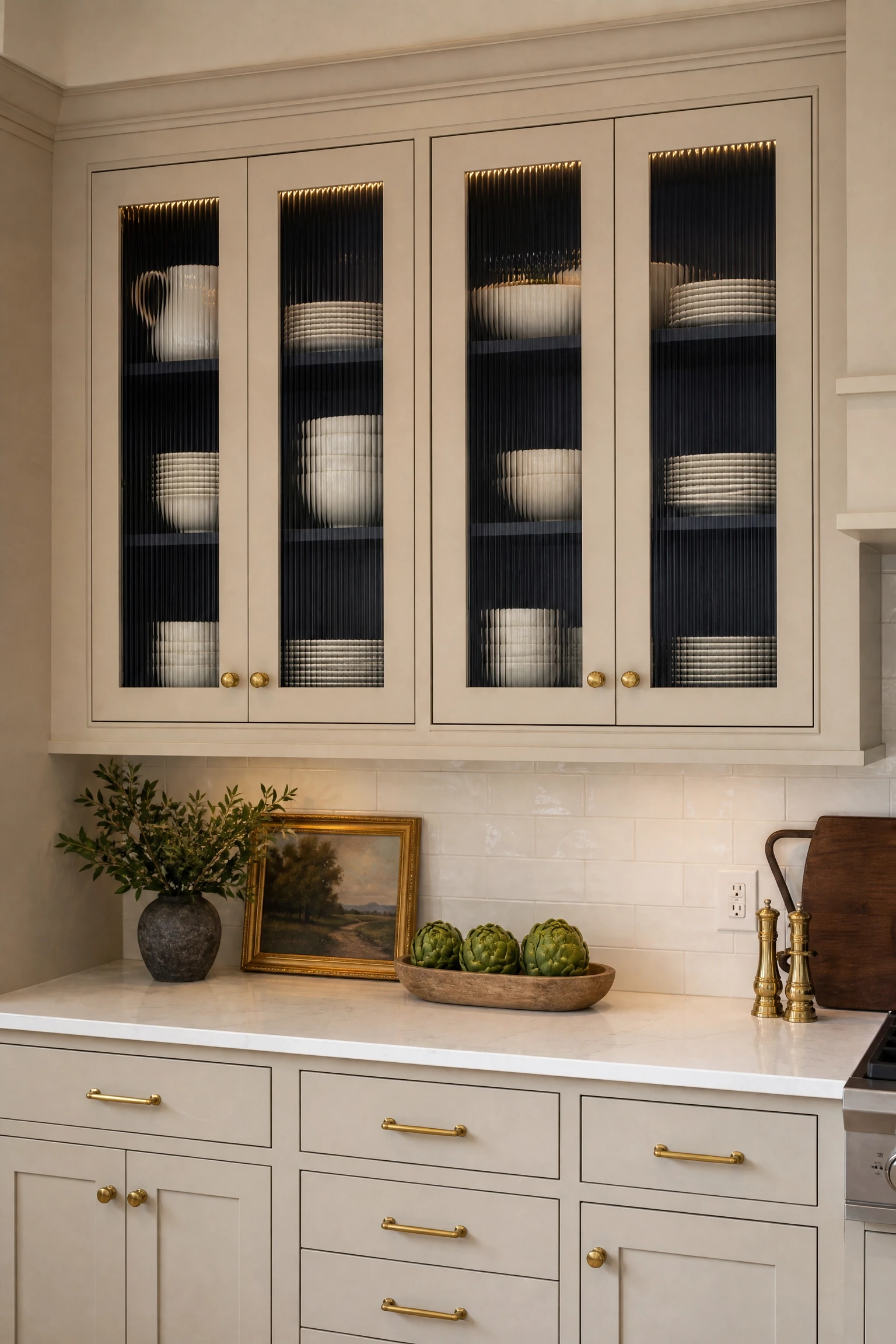
Cabinets that run all the way to the ceiling finished with crown molding make Accessible Beige look considerably more expensive and custom than standard cabinet heights. The crown molding eliminates the awkward gap where dust and grease collect, and with the warm neutral running all the way up, the kitchen takes on a cocooning quality that feels luxurious without being dark or dramatic. Glass-fronted upper cabinet doors on some ceiling-height sections add visual variation and let you display dishes without making the full height feel like a solid wall. Interior LED strip lighting inside glass-panel cabinets creates a warm ambient glow in the evening. This is an investment-level approach if replacing existing shorter cabinets, but a worthwhile one in kitchens with eight-foot or taller ceilings.
Heads Up: In rooms with ceilings above ten feet, all-beige cabinets running to ceiling height can feel overwhelming. Break it up with a contrasting interior cabinet color or glass panels at the top portion to prevent the room feeling top-heavy.
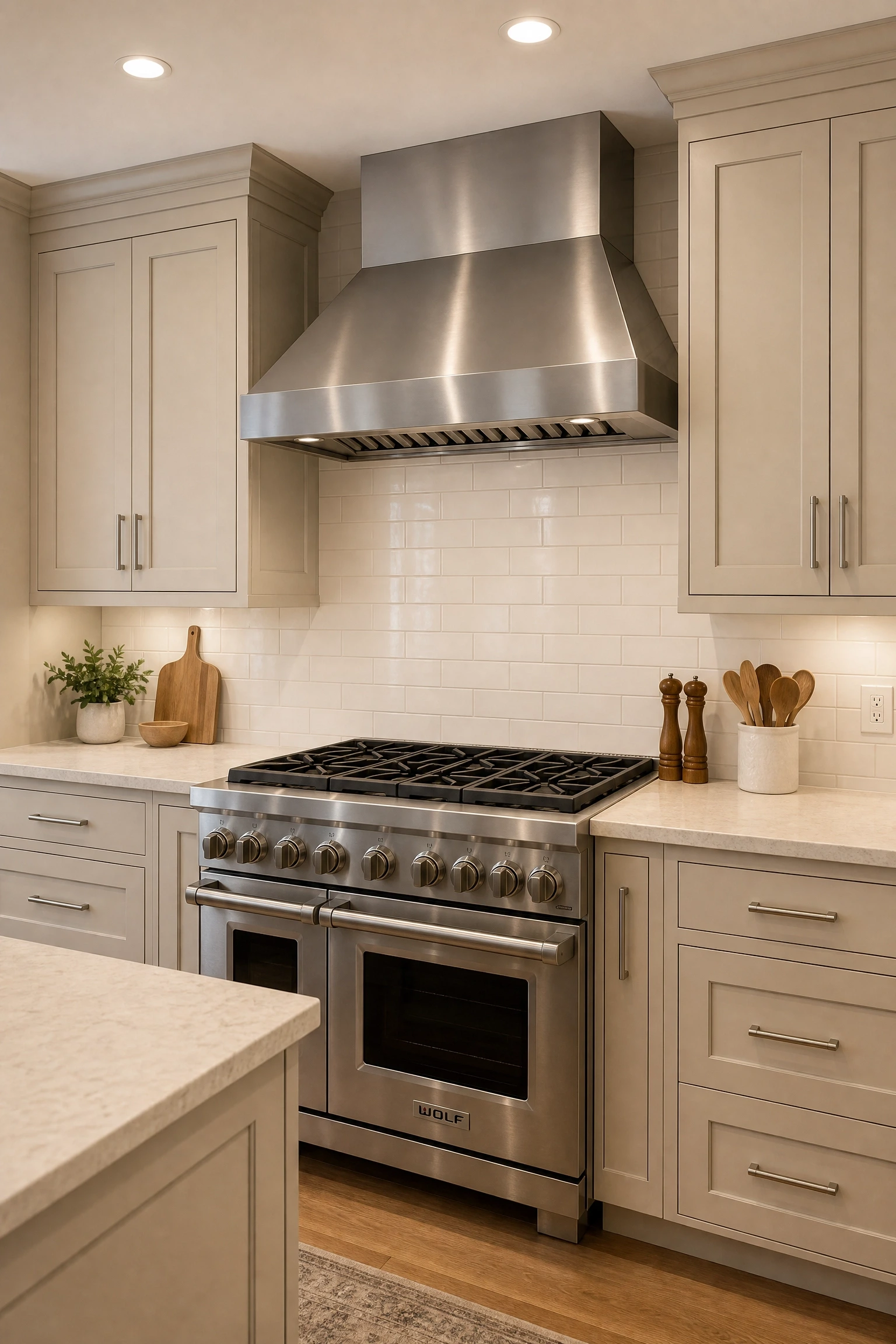
Stainless steel appliances introduce a cool silver-gray note that prevents Accessible Beige from feeling too sweet or country-house, and the contrast is gentle enough to suit homeowners who want a kitchen that feels modern but not cold. Professional-style ranges with large stainless knobs look especially strong against Accessible Beige because the range becomes a clear focal point without extra effort. A warm light stone countertop, creamy quartz or honed limestone, bridges the warm beige cabinets and cool metal appliances so neither side of the palette feels disconnected. Cabinet hardware in brushed nickel maintains the cool metal thread throughout. Stainless appliances hold their value well in a kitchen renovation and are unlikely to date as quickly as colored appliances.
Quick Tip: Wipe stainless appliances with the grain of the metal using a microfiber cloth to avoid circular scratches, and use a dedicated stainless cleaner rather than general kitchen spray.
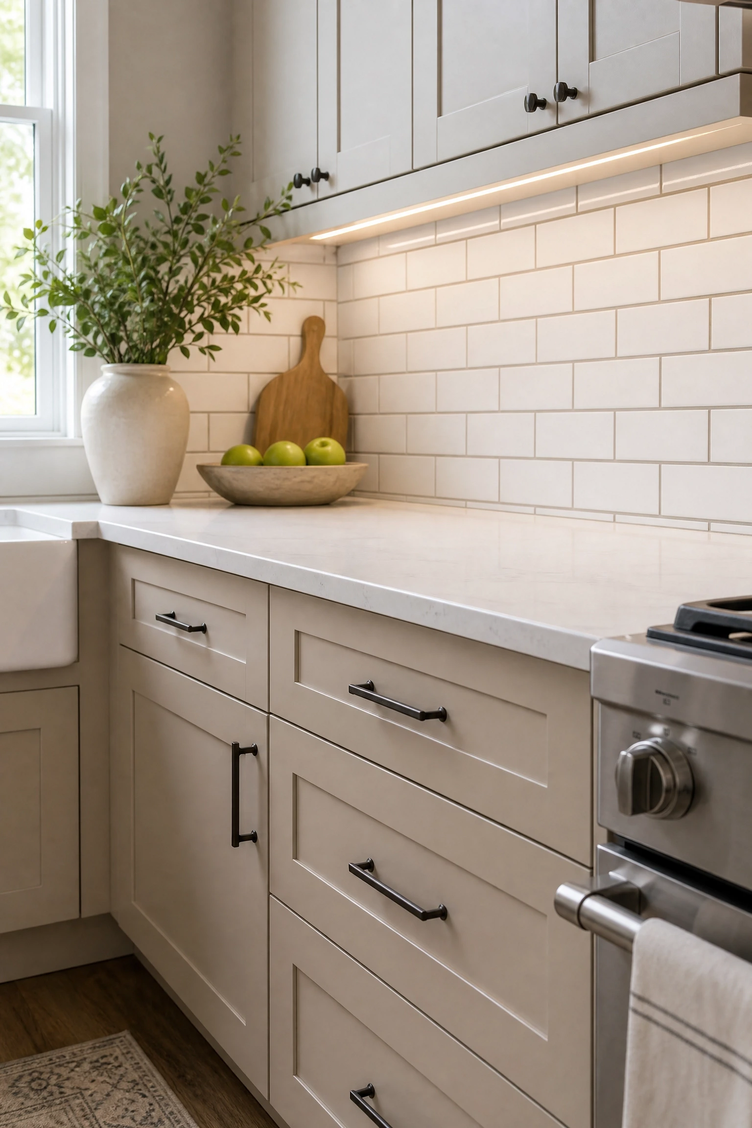
White subway tile behind Accessible Beige cabinets is sometimes dismissed as too basic, but it is one of the cleanest, most satisfying combinations in a kitchen because both elements share a warm white-to-cream tone family. The key to improving it is the grout choice: a warm gray or greige grout pulls the tile toward the beige rather than leaving it looking clinical and cold. Tile format matters too. A classic three-by-six in a brick pattern is appropriate, but a four-by-twelve in a stacked vertical bond reads as more contemporary and makes low ceilings feel taller. Under-cabinet lighting is especially valuable here because it illuminates the tile surface and brings out the warm grout tone in a way that overhead light alone does not show.
Designer Advice: Avoid bright white grout with Accessible Beige cabinets. The contrast between cool white grout and warm beige makes tile look dirty even when it is clean. Always go one shade warmer than your instinct for the grout color.
16. Organic Modern Kitchen with Textured Plaster Walls
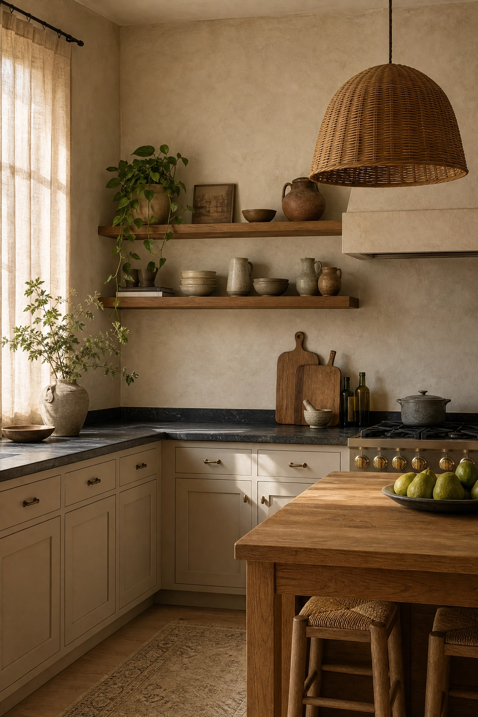
An organic modern kitchen pairs Accessible Beige cabinets with textured limewash or plaster walls, natural fiber pendant lights, and raw material finishes to create a space that feels hand-crafted and deeply warm. The plaster or limewash in a tone very close to the Accessible Beige creates a tonal effect where wall and cabinets blend into a single warm color story. Concrete countertops or honed soapstone reinforce the raw, artisan quality of the look, and oiled wood shelving adds another organic layer. Rattan or wicker pendant lights above the island complete the tactile, earth-toned palette. This direction suits home cooks who genuinely enjoy an imperfect, lived-in aesthetic, because every surface in this kitchen will show use in a way that actually improves the look over time.
Reality Check: Limewash and plaster walls behind a cooking area require a food-safe sealer to protect against grease and moisture. Factor in the sealer cost and reapplication every few years when budgeting for this approach.
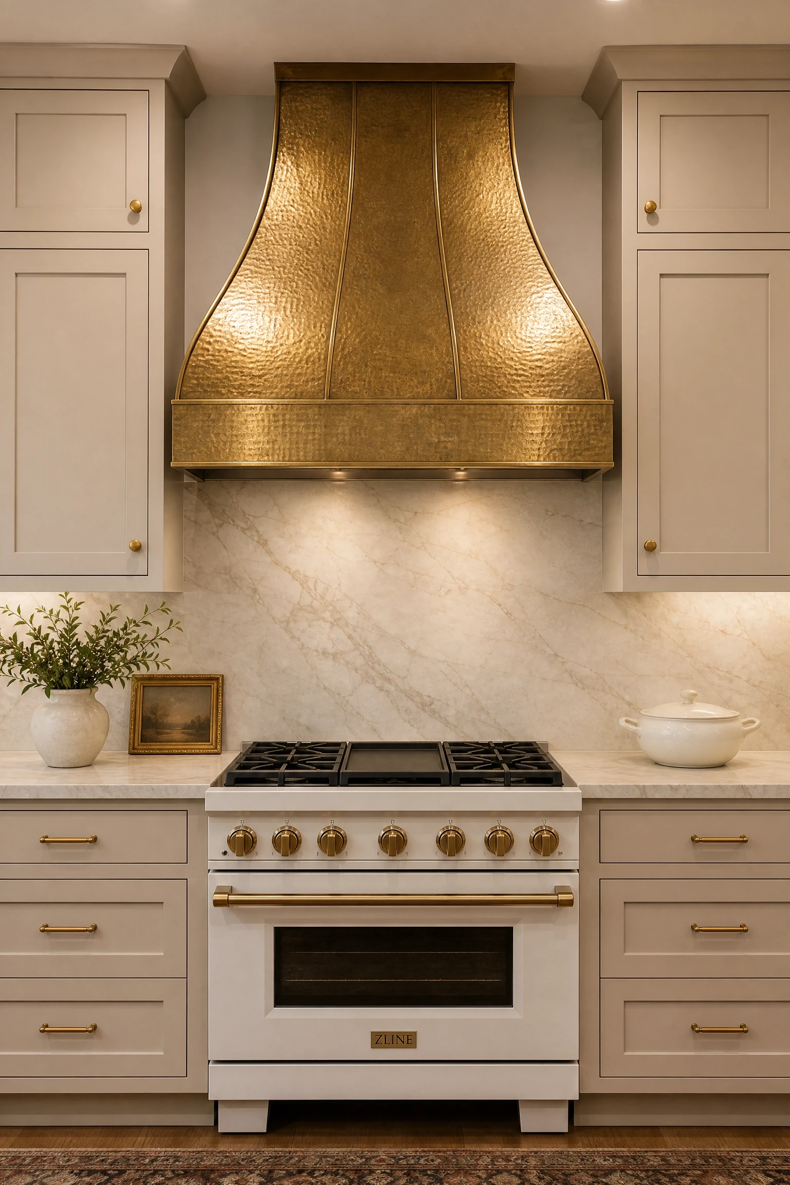
A custom range hood in hammered or aged brass above the range becomes the clear focal point of the kitchen and pulls the warm undertones of Accessible Beige forward in a way that makes the whole room feel richer. The hood works best when it is the only piece of warm metal in a large, prominent finish, with the rest of the hardware in a quieter brushed brass rather than polished. Warm cream or veined beige marble countertops are natural companions. Custom metal range hoods typically start around eight hundred dollars and can run much higher, but ready-made options in aged brass or copper come in at more accessible price points. Kitchens with high ceilings benefit most because the hood can be made taller without overwhelming proportion.
Pro Move: If a custom metal hood is outside your budget, a painted wood hood box in Accessible Beige with a brass insert panel on the front gives a very similar visual effect at a fraction of the cost.
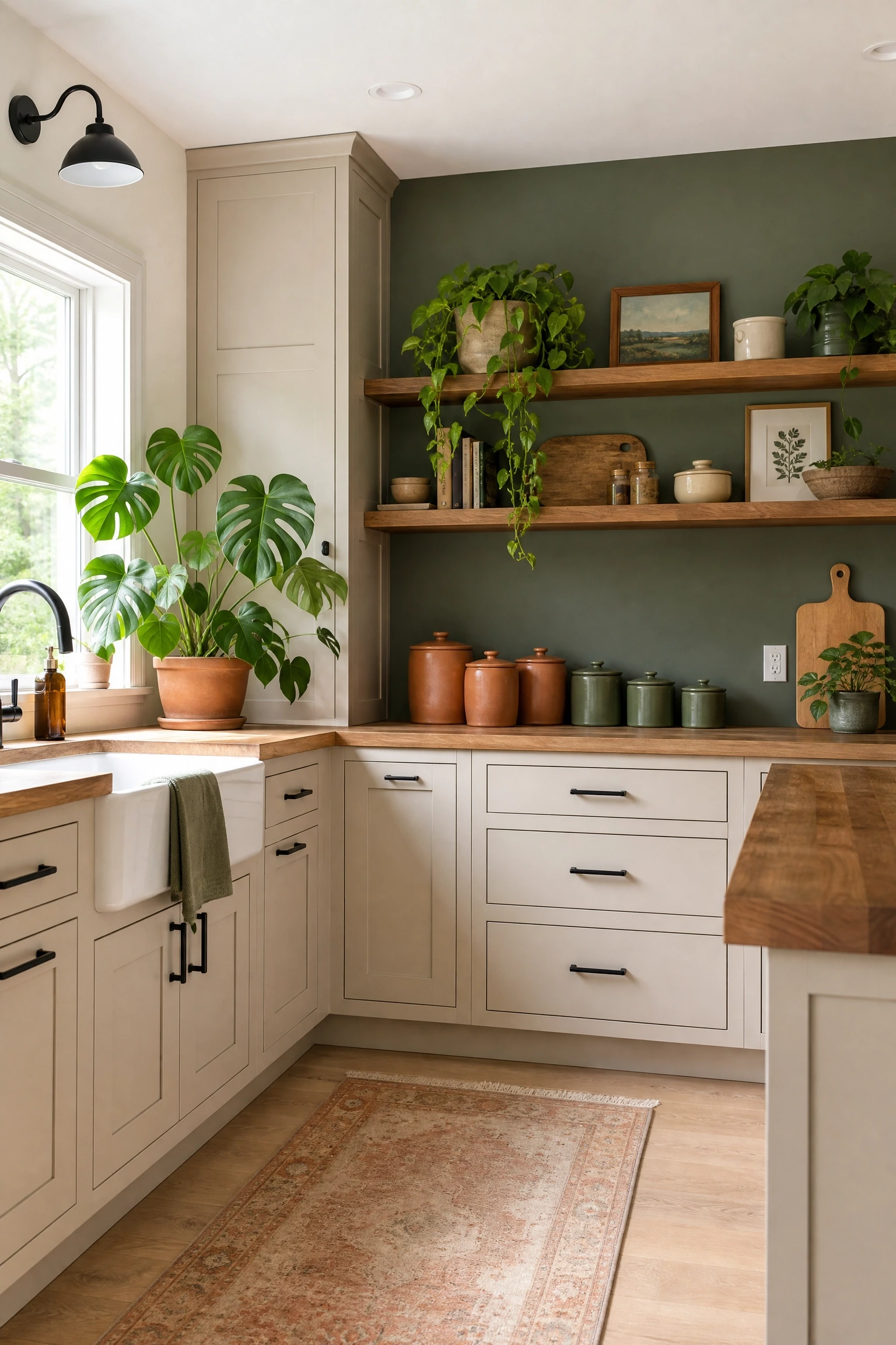
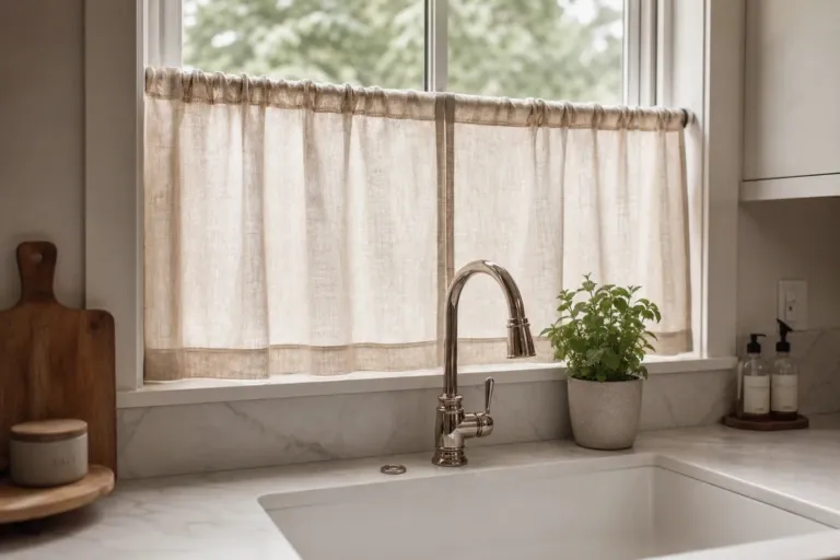
Accessible Beige has a very slight natural green undertone that only becomes visible under certain lighting, and one way to work with that quality is to introduce actual green into the kitchen through plants, an accent wall, or green-toned accessories. A deep olive, sage, or eucalyptus green on a single wall behind open shelving creates a botanical quality that makes the beige cabinets feel earthy and intentional. Large-leaf plants like monsteras on the counter or in a corner add living color without any construction. Green terra cotta pots, a sage linen window valance, or matte green ceramic canisters are lower-commitment ways to introduce the accent. This direction suits kitchens with a lot of natural light and is one of the most affordable ideas in this list.
Heads Up: In north-facing kitchens, pairing green accents with Accessible Beige can amplify the green undertone significantly. Test the pairing in your actual kitchen light before committing to a full wall.
Swapping a few solid upper cabinet doors for glass-front panels makes Accessible Beige kitchens feel more open and layered without any structural changes to the cabinet boxes. Reeded or fluted glass, which has a ribbed texture that obscures the interior slightly, adds visual interest to the cabinet door while hiding organizational chaos inside. Clear glass works best when the cabinet interior is painted in a contrasting color, deep navy, charcoal, or forest green on the back panel, so display items pop against a deliberate backdrop. Interior LED strip lighting inside glass-front cabinets creates a warm ambient glow in the evening that lifts the kitchen from purely functional to something that feels more intentional. This is a mid-range modification since it involves replacing door fronts only, not entire cabinet boxes.
Designer Advice: Limit glass-front uppers to one or two cabinet sections rather than the entire upper run. Full glass uppers require near-perfect organization every single day, which is rarely sustainable in a real family kitchen.
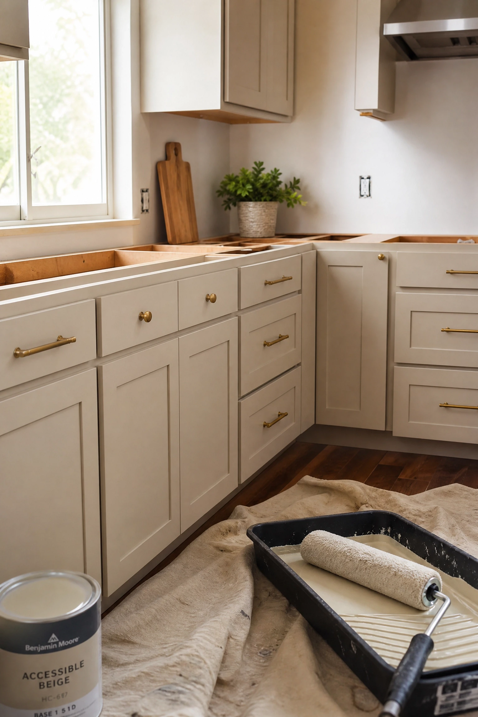
Painting existing cabinet boxes in Accessible Beige is one of the highest-impact, most budget-accessible kitchen upgrades available. The right process makes all the difference: clean cabinets thoroughly with a degreaser, sand lightly to rough up the surface, apply a bonding primer for slick surfaces, and finish with satin or semi-gloss Accessible Beige for a result that can hold up five to eight years with normal care. A professional cabinet painter using spray application produces a smoother, more factory-like finish than a brush or roller can achieve in most home conditions, and the typical cost runs between one thousand and three thousand dollars depending on kitchen size. Replacing hardware at the same time, going from old bronze knobs to unlacquered brass pulls, compounds the visual impact dramatically at very low additional cost.
Quick Tip: Always remove cabinet doors from their hinges and paint them flat on sawhorses. Drips and uneven coverage are almost impossible to avoid when painting vertical surfaces freehand.
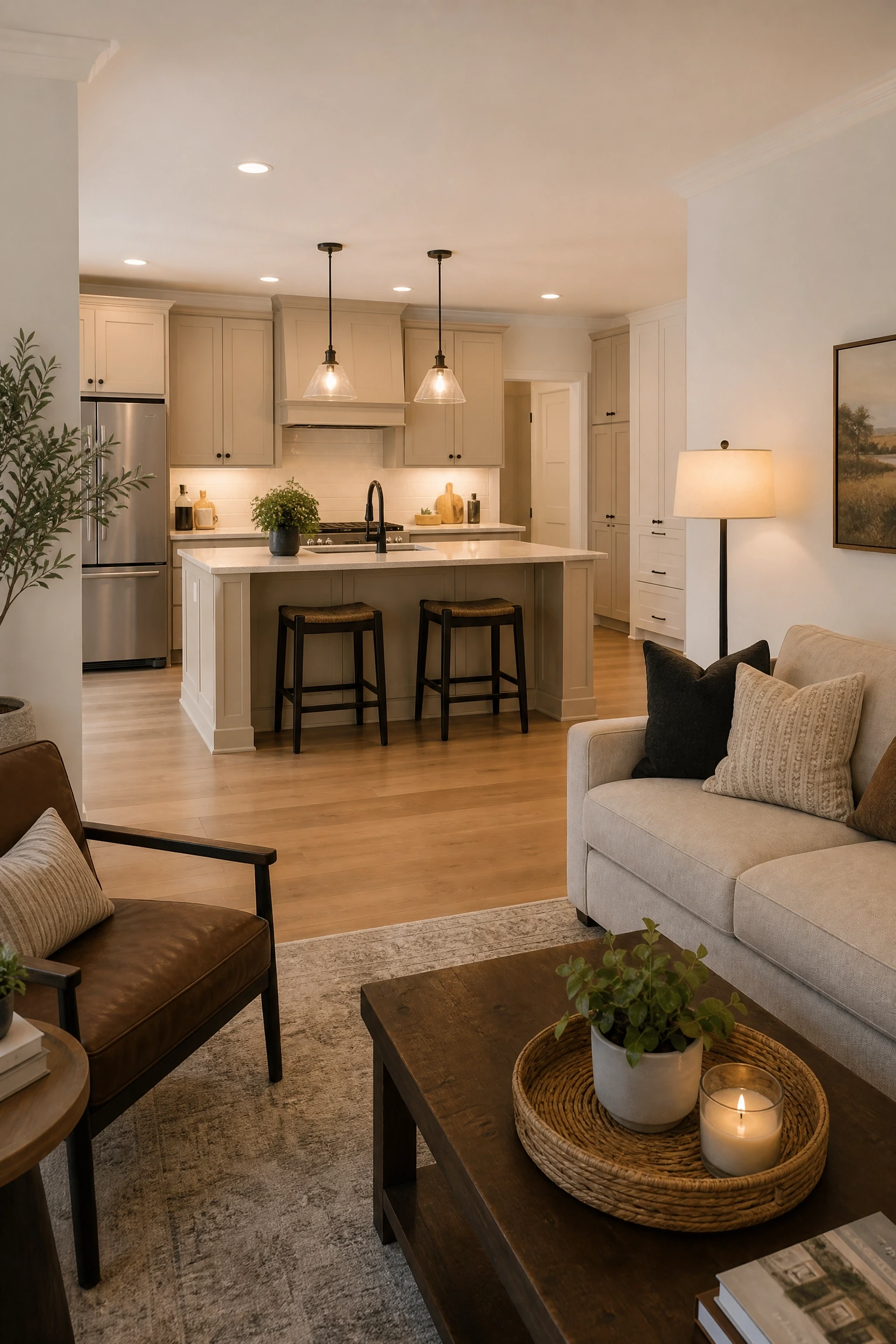
When the kitchen is open to a living or dining area, Accessible Beige cabinets have a particular advantage because the warm neutral flows naturally into adjacent spaces without creating a jarring color shift. The key is carrying the Accessible Beige tone into the connected area through a complementary wall color, something like Shoji White or Accessible Beige itself on adjacent walls, so both spaces feel designed as a single environment. A consistent flooring material running through both zones, warm hardwood or large-format tile in a warm tone, reinforces the connection visually. Lighting should be layered in both zones at the same warm color temperature so the connected spaces feel equally cohesive when both are lit in the evening.
Reality Check: In very large open-plan spaces, Accessible Beige on cabinets alone will not warm the entire area. The walls, floors, and soft furnishings all need to carry warm tones or the cabinet color will look isolated and disconnected.
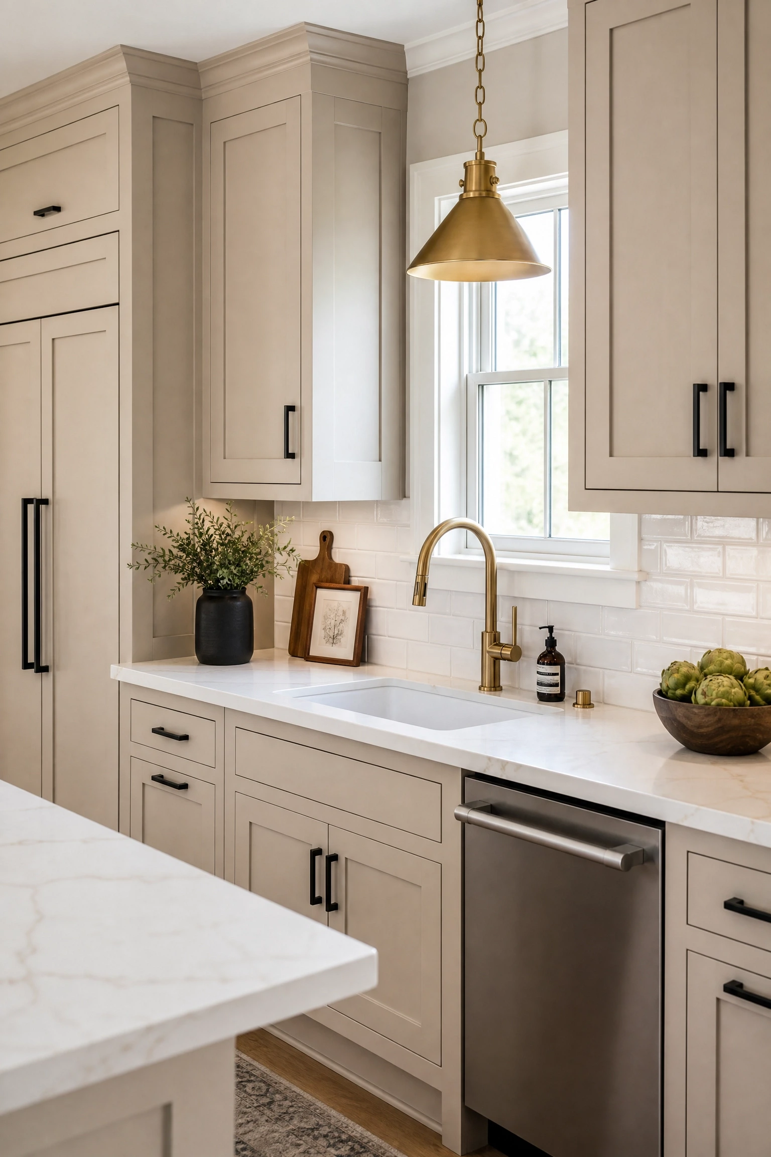
Transitional kitchens sit comfortably between traditional and contemporary, and Accessible Beige is one of the best cabinet colors for this style because it avoids the extremes of both palettes. Intentionally mixing two metal finishes, matte black on cabinet pulls and unlacquered brass on the faucet and light fixture, creates a collected, collected quality that feels more personal than matching every metal perfectly. This mix works because the contrast between the two metals reads as deliberate layering rather than indecision, especially when each metal appears in at least two places. Shaker doors in Accessible Beige, a warm white quartz countertop with subtle veining, and a simple beveled subway tile backsplash complete the transitional look without pushing it too far toward either style extreme.
Designer Advice: When mixing metals intentionally, always repeat each metal at least twice in the room so every finish appears to have a reason for being there. One lonely piece of polished nickel in a room full of brass will always look like a mistake rather than a choice.
Conclusion
Accessible Beige has earned its reputation as one of the most versatile cabinet colors available precisely because it does not try to do too much. It sits in a warm, soft middle ground that allows countertops, hardware, backsplash tile, and flooring to take center stage while the cabinets provide a steady, welcoming foundation. Whether you pair it with a classic shaker door and brass hardware combination or something more unexpected like a dark contrast island or a Moroccan tile backsplash, the beige does its job without demanding attention.
The most important thing to take from this list is that Accessible Beige looks different in every kitchen, and that is entirely the point. Test a painted sample on your actual cabinet surface in your actual light before committing, because what reads as warm honey in the showroom may read as slightly green or flat in a north-facing kitchen. Consider your floors, your natural light, and the overall warmth of your home when choosing companion materials. If you are working with a limited budget, remember that a professional cabinet paint job and new hardware can deliver most of the visual impact of a full renovation at a fraction of the cost.
FAQ
Is Accessible Beige a good color for kitchen cabinets?
Yes, Accessible Beige is genuinely one of the better neutral cabinet colors because it sits between warm beige and cool gray, giving it flexibility across different kitchen styles and lighting conditions. It works especially well with warm wood floors or natural stone, and it holds up in both traditional and transitional design styles. The main thing to watch is your lighting: north-facing rooms can pull out a subtle green undertone, so always test a sample in your actual kitchen before painting.
What hardware looks best with Accessible Beige cabinets?
Unlacquered brass and matte black are the two most popular hardware choices and both work for different reasons. Unlacquered brass shares the warm undertone of Accessible Beige and develops a natural patina that suits the color’s organic quality. Matte black creates a crisper, more modern contrast. The main hardware to avoid is anything with cool chrome or icy silver tones, which can make the beige read as dull rather than warm.
What countertop colors go with Accessible Beige kitchen cabinets?
White and cream quartz or marble are the most popular choices because they brighten the kitchen while contrasting gently with the beige. Black or very dark quartz creates a more dramatic look suited to modern kitchens. Butcher block and warm wood countertops reinforce the earthy, organic quality of Accessible Beige. Avoid countertops with strong pink tones since they can clash with the warm undertones of the cabinet color.
Can you use Accessible Beige cabinets in a small kitchen?
Yes, and it often works better than white in small kitchens because the warmth of Accessible Beige makes the space feel intentional and cozy rather than just small. Pair it with light countertops, under-cabinet lighting, and a simple backsplash to keep the room feeling open. Very dark countertops or backsplashes in a small kitchen with Accessible Beige can tip from cozy into enclosed, so use those elements carefully.
What wall colors work with Accessible Beige kitchen cabinets?
Warm whites like Alabaster or Shoji White by Sherwin-Williams and White Dove by Benjamin Moore are the safest choices because they share the same warm undertone family. Soft sage or eucalyptus green on an accent wall can bring out the slight green undertone of Accessible Beige in a way that feels botanical and intentional. Avoid cool grays and stark bright whites on the walls, which can make the beige look muddy.
Does Accessible Beige work in modern kitchens?
It can, but it requires the right companion elements to stay contemporary. Flat-panel cabinet doors instead of shaker style, matte black or brushed nickel hardware, dark quartz countertops, and a large-format tile backsplash all pull Accessible Beige toward a more modern aesthetic. The color itself is neutral enough to work across many styles, and it is the door profile, hardware, and countertop choices that ultimately determine whether the kitchen reads as modern or traditional.