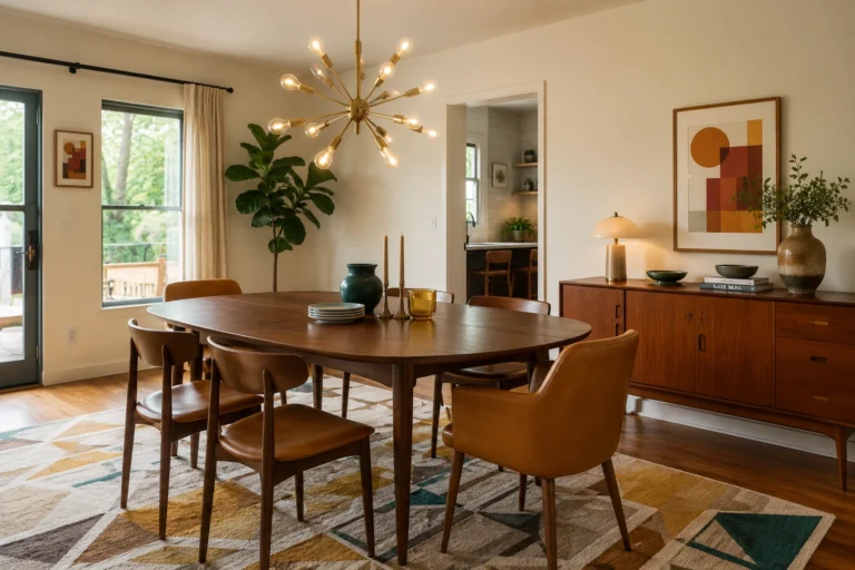
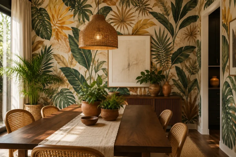
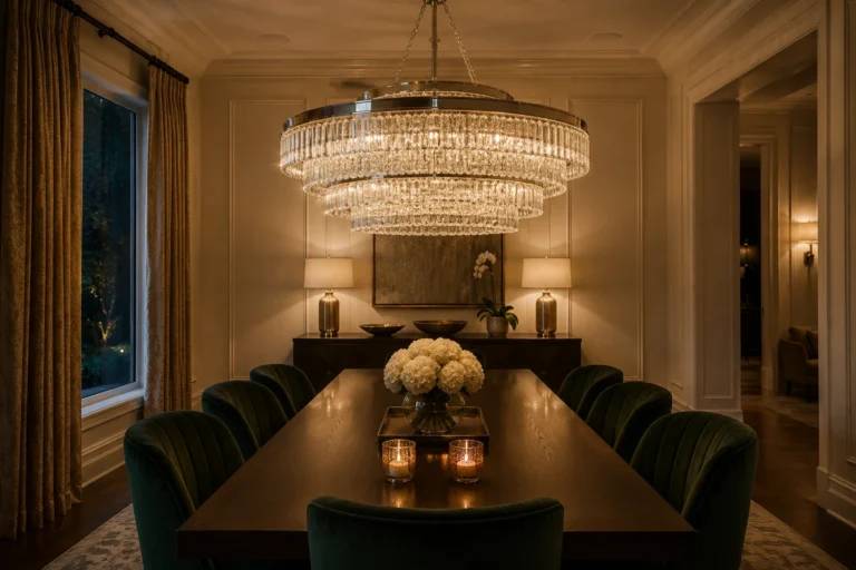
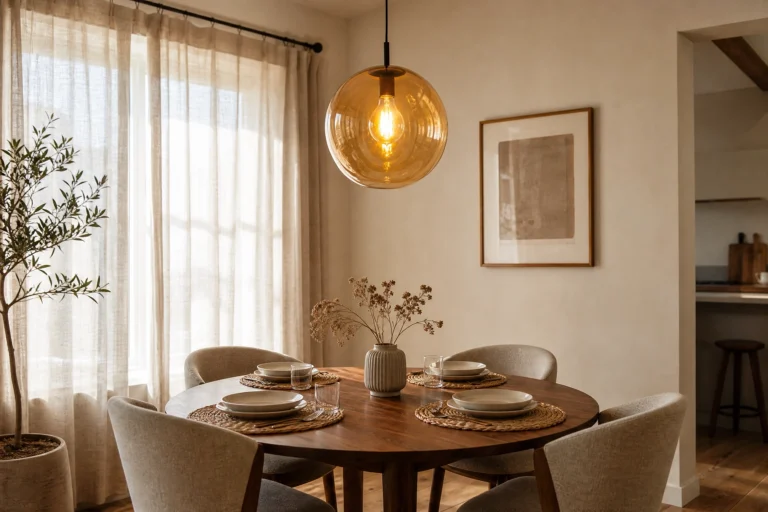
Paint does more work in a dining room than most people give it credit for. It is where birthdays get celebrated, Sunday dinners stretch into evening conversations, and ordinary Tuesday nights turn into something worth remembering. Yet so many dining rooms are painted the same shade of agreeable beige that nobody chose with intention. If your dining room feels a little flat or forgettable, there is a good chance the walls have something to do with it. The right paint color does not just sit in the background. It shapes how people feel when they walk in, how long they linger at the table, and whether the whole room feels worth pulling out the good dishes for.
This collection covers 22 paint color ideas organized by the mood each one creates, from warm and welcoming to bold and dramatic. A quart of sample paint costs about $8, and testing two or three colors on your actual wall in your actual light beats any amount of screen-scrolling. Each idea includes specific color recommendations, furniture and material pairings, lighting notes, and a practical designer tip to help you actually pull it off.
Warm and Welcoming: Colors That Make People Want to Stay
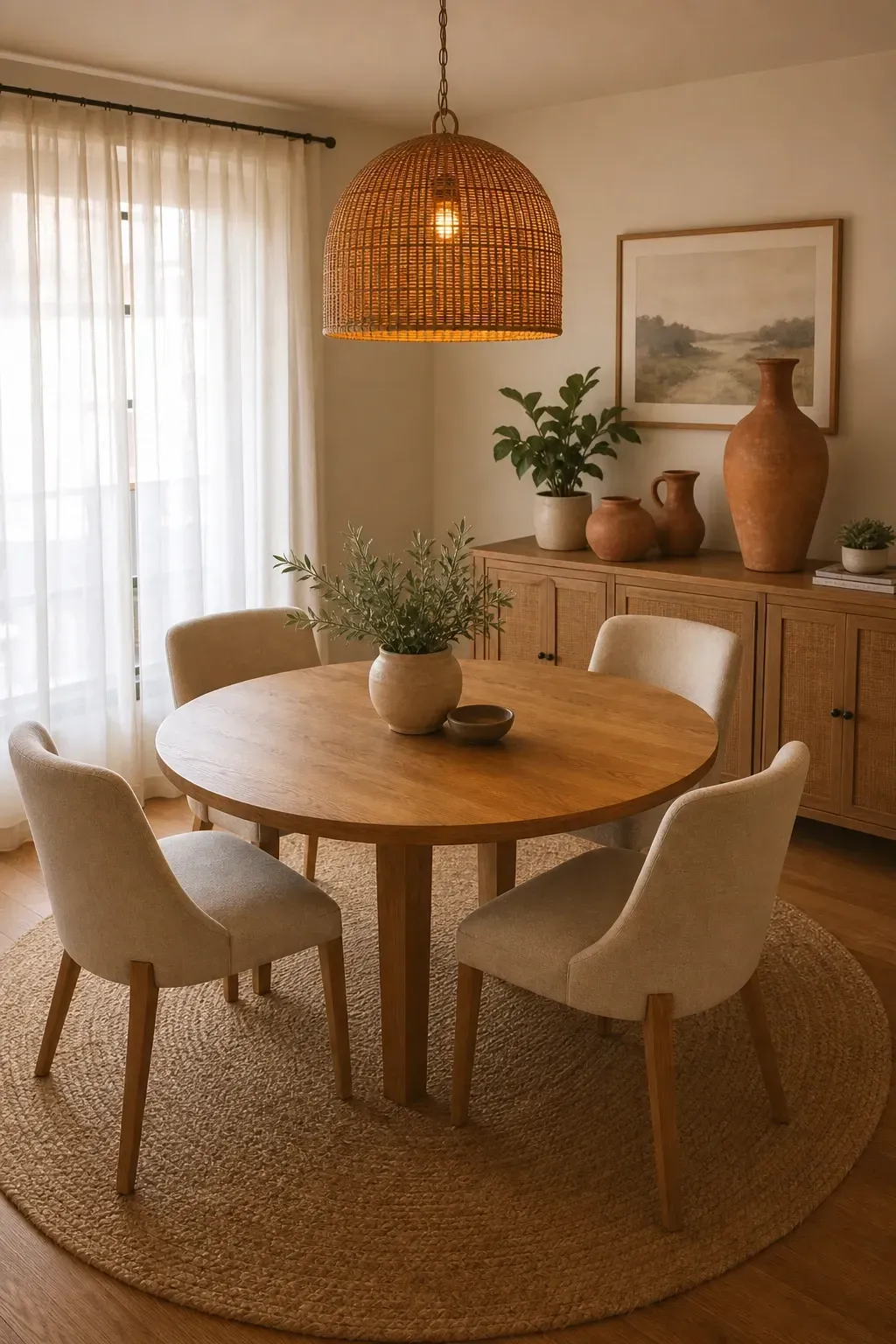
Creamy ivory is not plain white. It carries a warmth that plain white cannot match, and in a dining room it reads as soft, inviting, and genuinely comfortable rather than stark or cold. Try Benjamin Moore’s White Dove or Sherwin-Williams Alabaster on the walls and pair them with a round oak or walnut dining table, linen upholstered chairs, and a jute or wool rug underfoot. The combination feels effortlessly natural. Layer in pendant lighting with amber bulbs rather than cool white to keep the warmth consistent throughout the evening. Add in a few terracotta or rust-toned accessories like a ceramic vase or a set of earthenware plates on open shelving to ground the palette without breaking from its calm, cohesive feel.
Designer Tip: Test your ivory shade in the evening under your actual dining light before committing. Some creamy whites can pull green or pink depending on bulb temperature, and the dining room is almost always used at night.
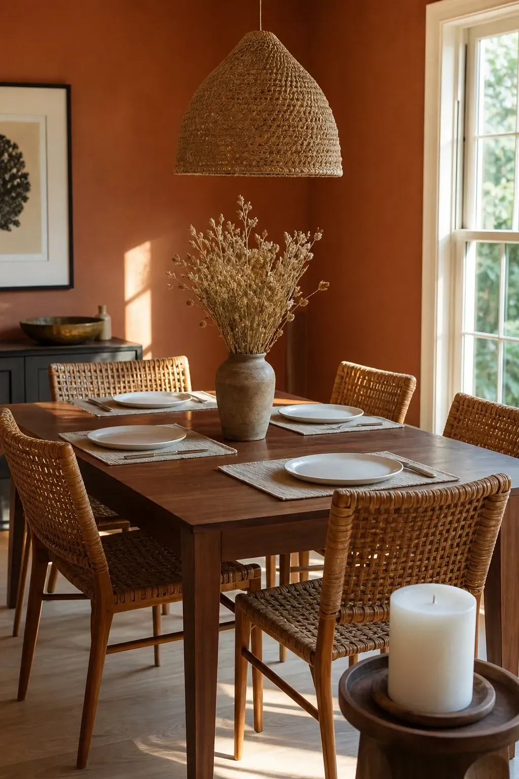
Terracotta is having a well-deserved moment and it works especially well in dining rooms because it is one of those colors that feels good to eat next to. It has the warmth of clay, the earthiness of brick, and just enough richness to make a room feel pulled together without veering into anything too of-the-moment. Benjamin Moore’s Terra Mauve or Farrow and Ball’s Red Earth are two shades worth sampling. Keep the furniture simple: a dark walnut table, rattan or cane-back chairs, and a linen tablecloth in off-white or sand. For lighting, a woven or rattan pendant shade diffuses light beautifully against terracotta walls and adds to the organic, gathered quality of the room. Finish the space with dried botanicals in a tall clay vase and a few chunky white candles for a dining room that feels genuinely warm from every angle.
Designer Tip: Terracotta looks best in rooms with at least some natural light. In a north-facing dining room with no windows, lean toward a lighter terra-cotta or pair it with a warm-toned mirror to bounce light around the space.
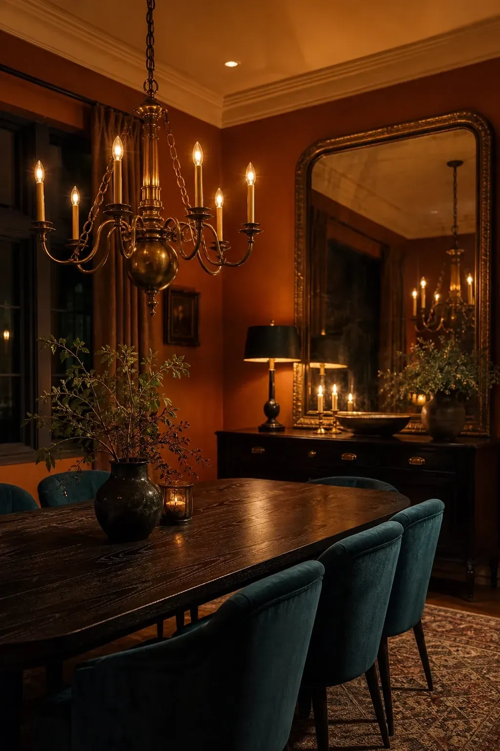
Burnt amber sits somewhere between gold and copper on the color wheel, and it brings a richness to dining rooms that feels both historic and very current. Think of a Moroccan-inspired palette done in a clean, modern way: amber walls with a dark espresso dining table, brass cabinet hardware, a brass chandelier, and velvet dining chairs in deep teal or hunter green. The contrast between the warm amber and the cool accent colors gives the room visual interest without making it feel chaotic. Sherwin-Williams Fired Brick and Benjamin Moore’s Brandied Melon are both great starting points. Add a large antique-style mirror on one wall to reflect the candlelight and give the illusion of more space.
Designer Tip: Brass fixtures and amber walls are a natural pairing, but avoid going overboard. Choose one or two brass statement pieces like a chandelier and a sideboard handle rather than mixing in every brass item you own.
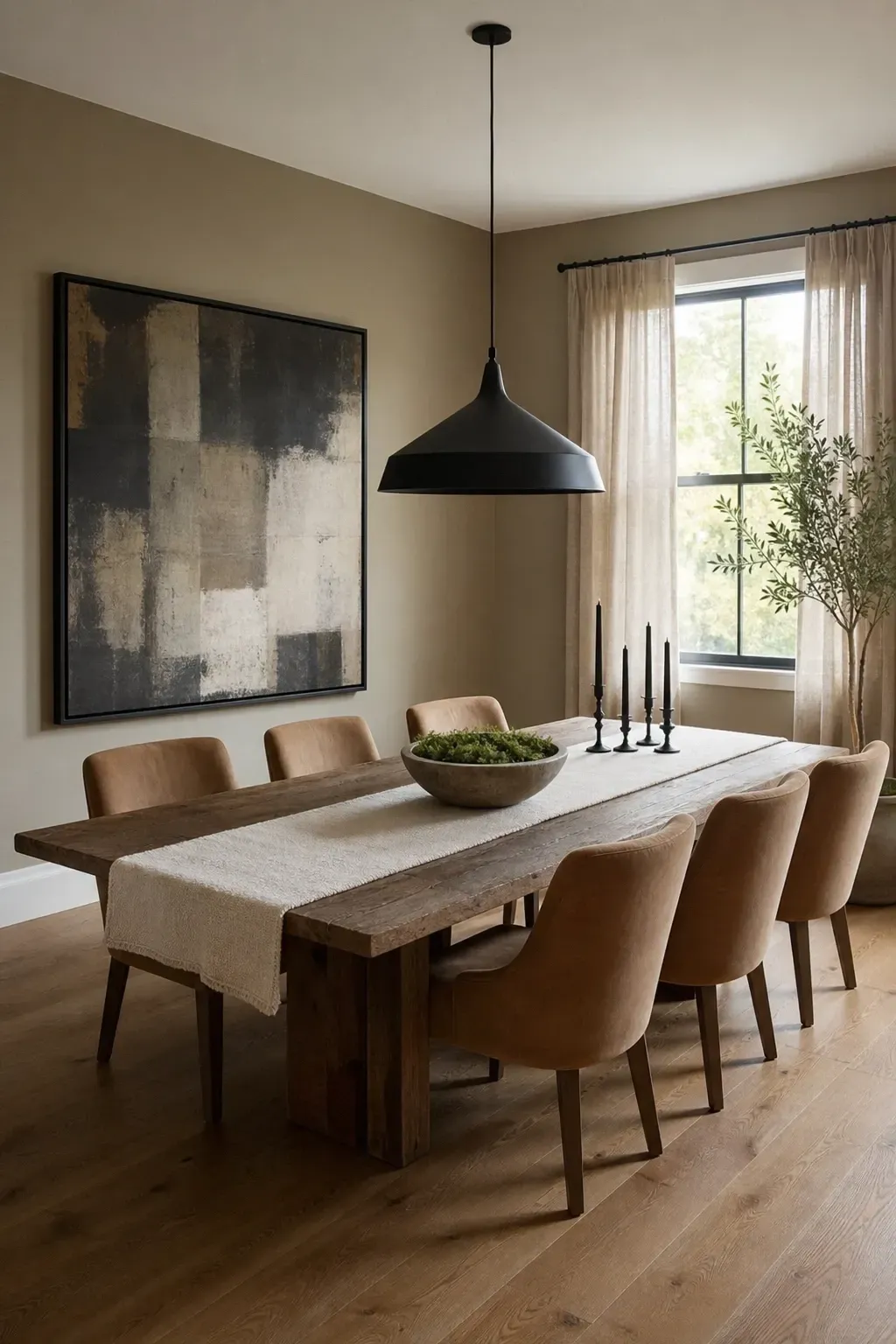
Greige is the neutral that actually works in every lighting condition, which makes it ideal for a dining room that switches between bright daytime meals and dim candlelit dinners. The key is choosing one that leans warm rather than cool, otherwise it can read as an uninspiring gray. Sherwin-Williams Accessible Beige or Benjamin Moore Revere Pewter are both classics that have proven their staying power because they look genuinely sophisticated in real homes rather than just on color swatches. Pair greige walls with a chunky reclaimed wood dining table, upholstered chairs in a warm stone or camel fabric, and a statement light fixture in matte black or aged bronze. Layering in soft textiles like a thick wool runner and linen curtains adds warmth and keeps the look from reading too corporate or generic.
Designer Tip: Greige can sometimes look flat without contrast. Add at least one dark anchor element like a matte black pendant light or a dark-framed piece of artwork to give the palette some depth.
Calm and Sophisticated: Colors That Feel Polished Without Trying Too Hard
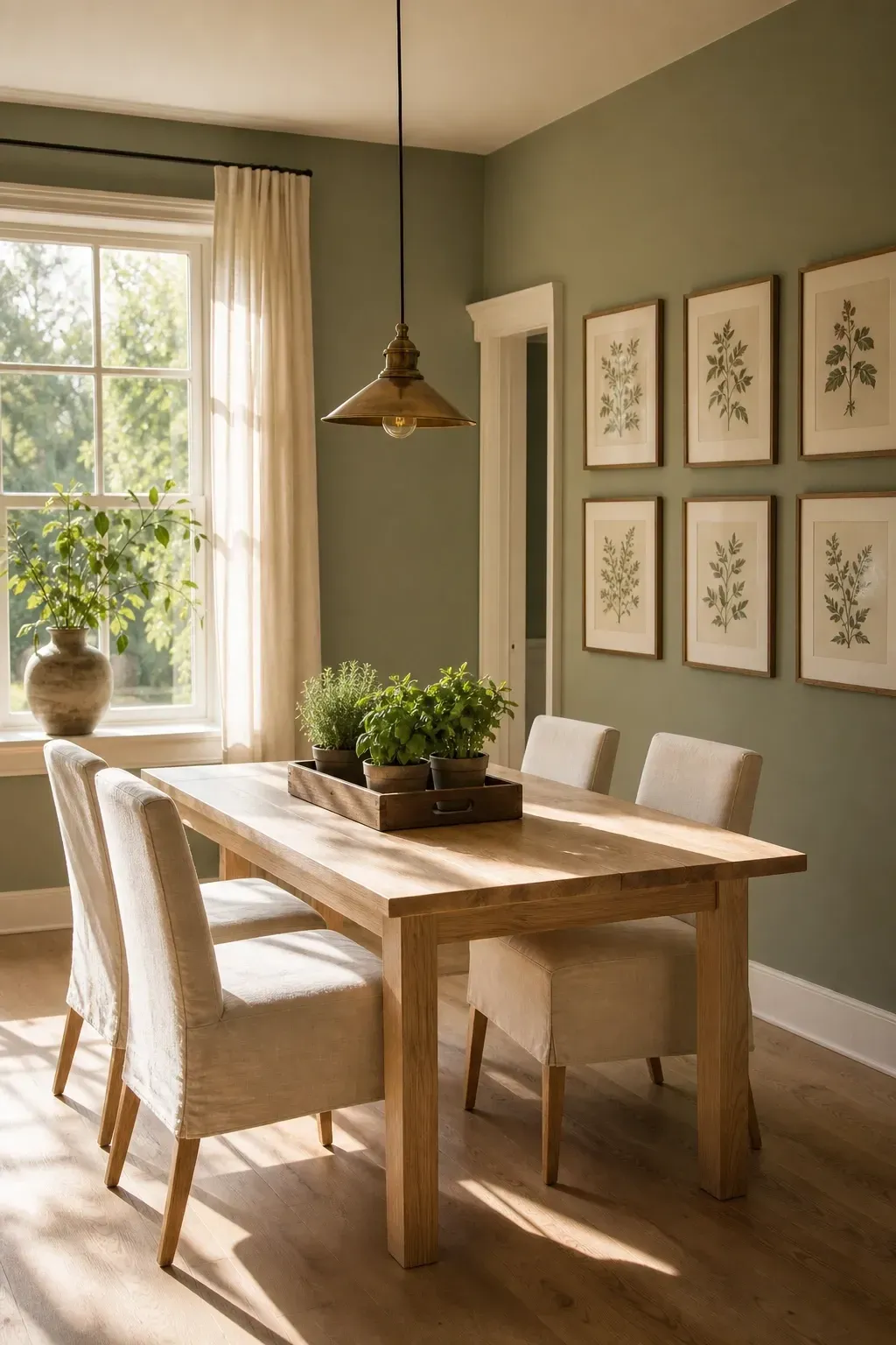
Sage green has become a go-to for interiors designers who want a color that reads as both fresh and settled, and it works especially well in dining rooms because it pairs so naturally with the organic materials that make a dining space feel complete. Choose a dusty, muted sage rather than a bright or minty green for a more sophisticated outcome. Farrow and Ball’s Mizzle or Sherwin-Williams Privilege Green are both excellent options with enough gray in them to feel grounded. Pair with light ash or birch wood furniture, linen or cotton upholstery in off-white, and simple brass or bronze hardware on any cabinets or sideboards. A cluster of potted herbs or a simple botanical print on the wall feels right at home with this palette.
Designer Tip: Sage green and natural light are best friends. If your dining room gets good afternoon sun, this color will look absolutely striking from around 3pm onward when the light hits the walls at an angle.
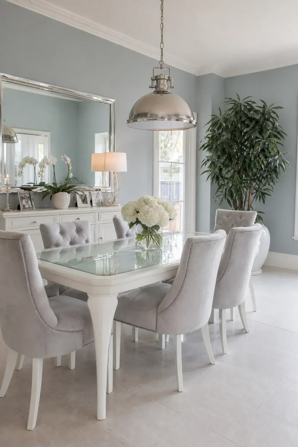
A pale blue-gray brings a quiet elegance to a dining room that is hard to achieve with most other colors. It is not bold, it is not plain, and it has this ability to make a room feel clean and composed without feeling cold or clinical. Benjamin Moore’s Silver Lake or Farrow and Ball’s Moles Breath are both worth considering depending on how warm or cool you want the overall feeling to be. This palette pairs beautifully with white painted furniture, a glass or acrylic dining table for a lighter look, and chairs in a pale velvet or soft cotton fabric. Add in silver or polished nickel fixtures for lighting and hardware to keep the cool, serene quality of the room consistent throughout.
Designer Tip: Balance the cool palette by adding warmth through natural wood elements like a wooden serving bowl, cutting board decor, or driftwood sculpture on the sideboard.
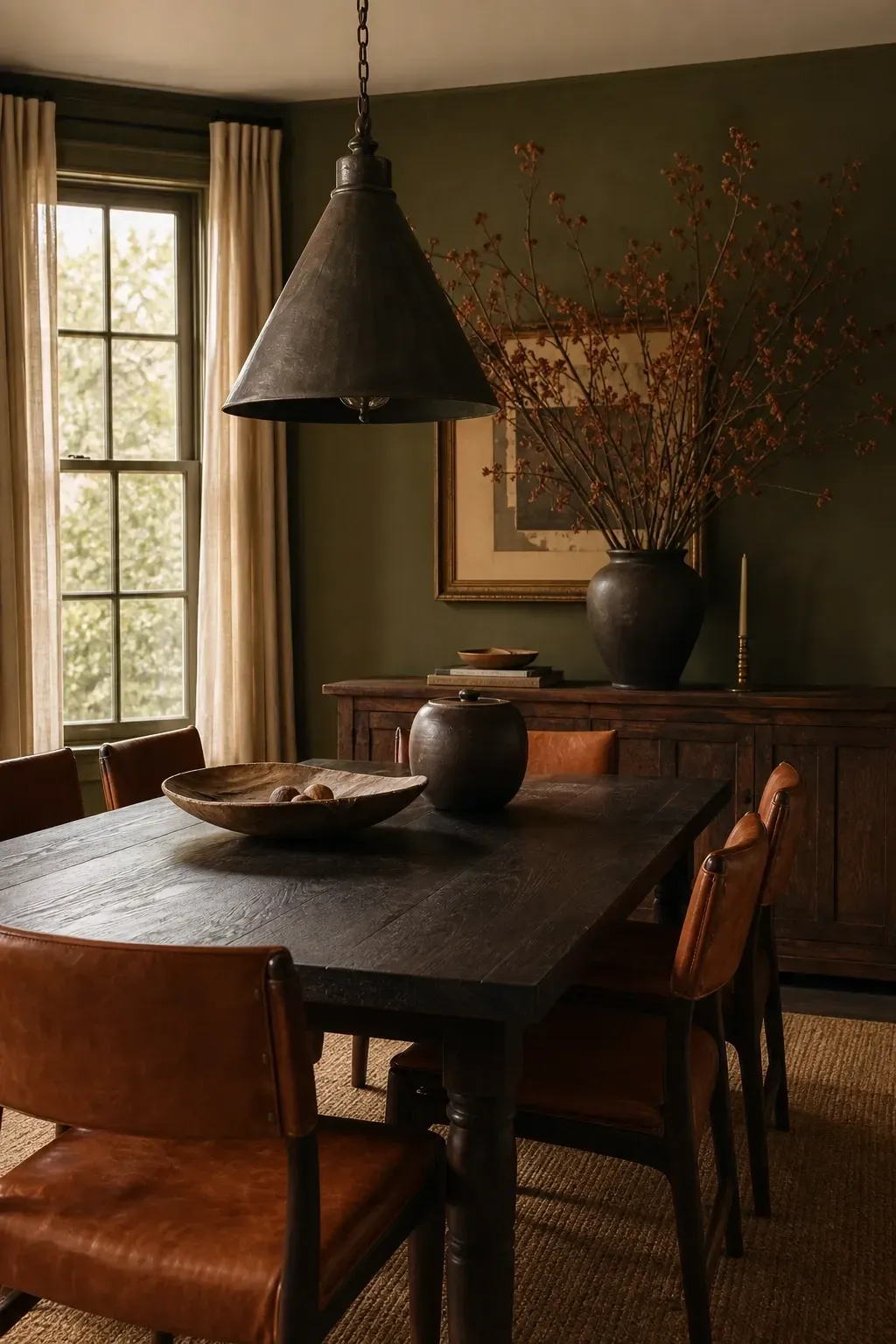
Muted olive is one of those colors that photographs beautifully and looks even better in person. It has earthy depth without the heaviness of darker greens, and in a dining room it creates a sense of warmth and character that is genuinely hard to replicate with any other shade. Sherwin-Williams Oakmoss or Benjamin Moore’s Dried Thyme are two shades that strike the right balance between green, brown, and gray. Pair with a dark stained oak table, leather or faux leather dining chairs in cognac or camel, and a large pendant light in an aged iron or bronze finish. Linen curtains in a deep cream or natural flax color add softness without breaking the earthy, grounded quality of the room.
Designer Tip: Olive walls and cognac leather are one of the most underrated pairings in dining room design. If leather feels too formal, try cognac faux leather or a camel-toned boucle on the dining chairs instead.
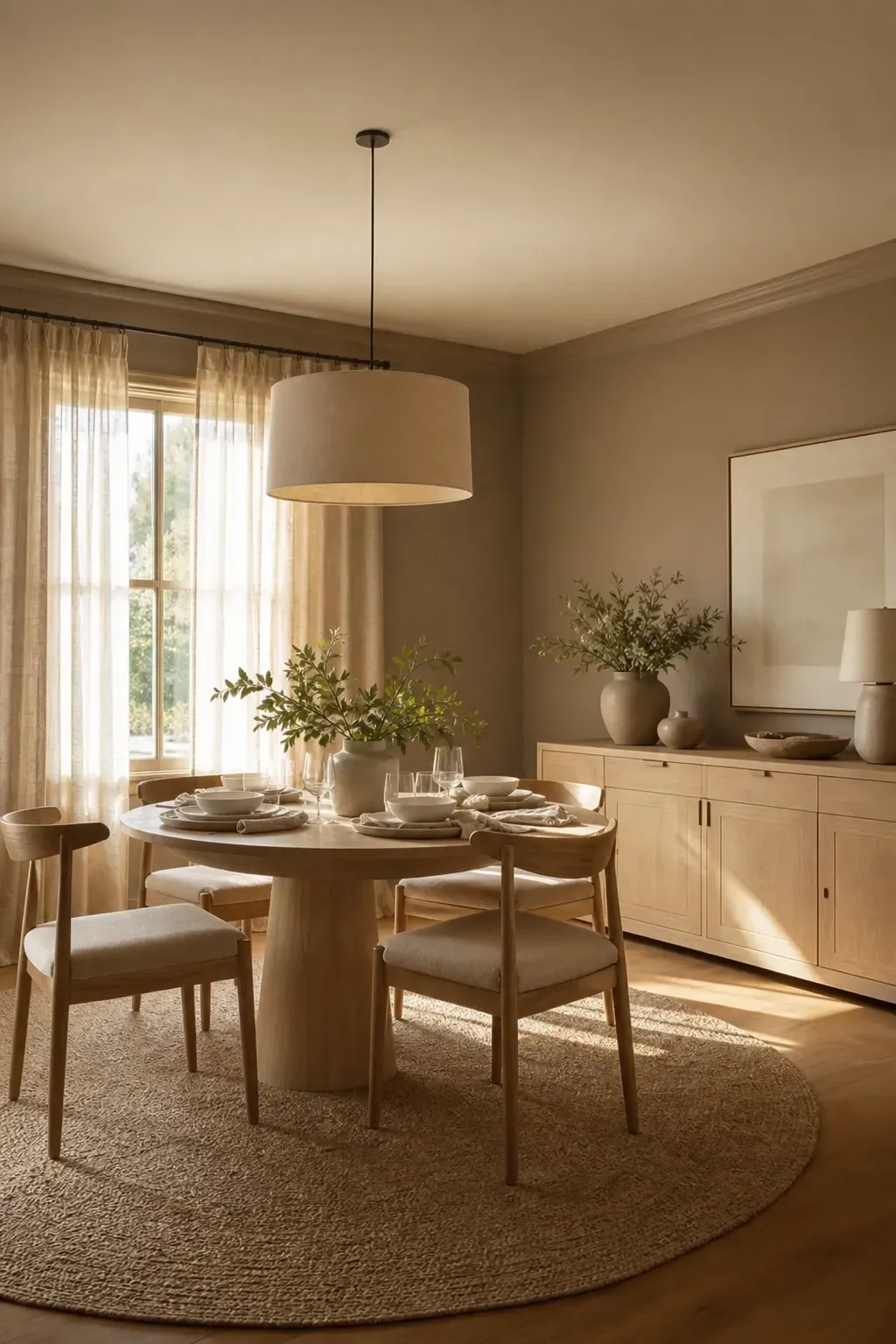
Taupe done well is not boring. The problem is that most people choose a taupe that is too gray or too beige, and it ends up looking like a missed decision rather than a deliberate one. Choose a taupe that has a warm undertone, something with a hint of pink or peach rather than cool gray, and the result is a dining room that feels soft, welcoming, and quietly refined. Benjamin Moore’s Pale Oak or Sherwin-Williams Accessible Beige sit in this category. Pair the walls with white oak furniture, chairs in a natural linen fabric, and layered table linens in shades of cream, ivory, and warm white. A linen drum shade pendant light keeps the natural, textural feel going from floor to ceiling.
Designer Tip: Avoid cool-toned metals like chrome or brushed nickel with warm taupe. Stick to brushed gold, aged brass, or matte black hardware and fixtures to keep the palette feeling cohesive.
Bold and Dramatic: Colors That Make Dinner Feel Like an Event
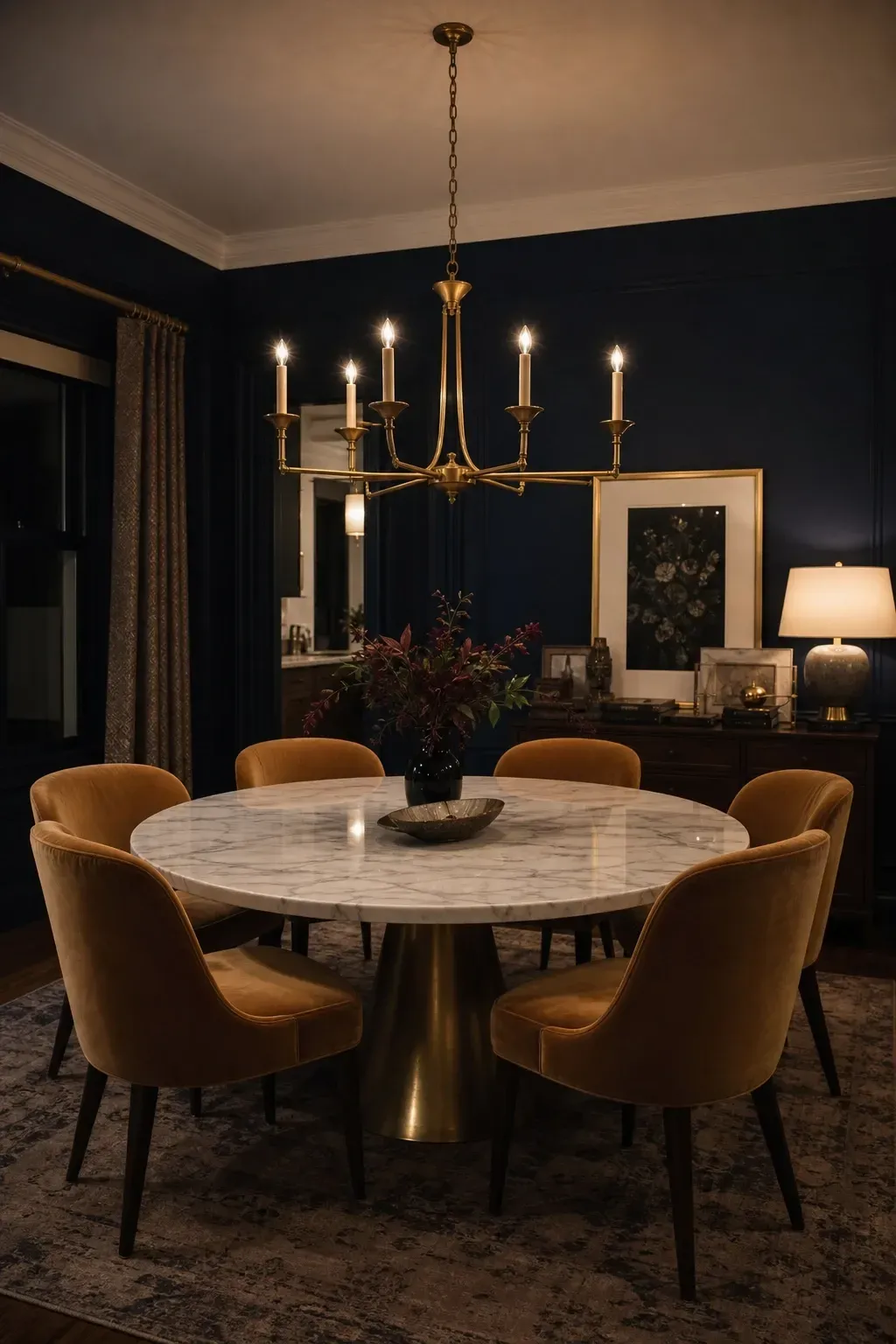
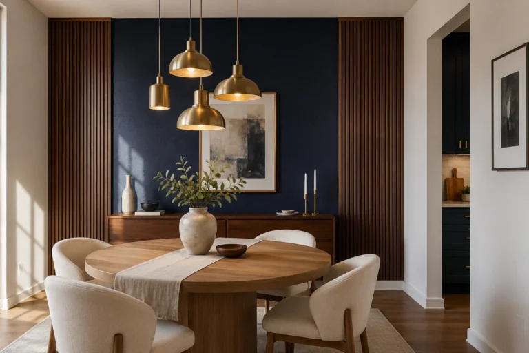
Navy blue in a dining room is one of those choices that sounds intimidating until you see it in person. It creates an incredible sense of intimacy, making a dining room feel like a proper destination rather than just a room with a table in it. Benjamin Moore’s Hale Navy or Sherwin-Williams Naval are both excellent choices with enough depth to feel genuinely dramatic without sliding into black. Pair deep navy walls with a white or cream painted ceiling to keep the space from feeling too closed in, and use a round white marble dining table with upholstered chairs in warm camel or blush velvet. A statement chandelier in aged gold or polished brass completes the look and adds the glamour the palette calls for. If your budget allows, consider painting the ceiling in a slightly lighter shade of the same blue for a full color-drenching effect that feels intentional and high-end.
Designer Tip: Navy dining rooms need good artificial lighting because the walls absorb light. Install a dimmer on your chandelier and add a sideboard lamp or two to keep the room bright enough for actual dining without killing the moody atmosphere.
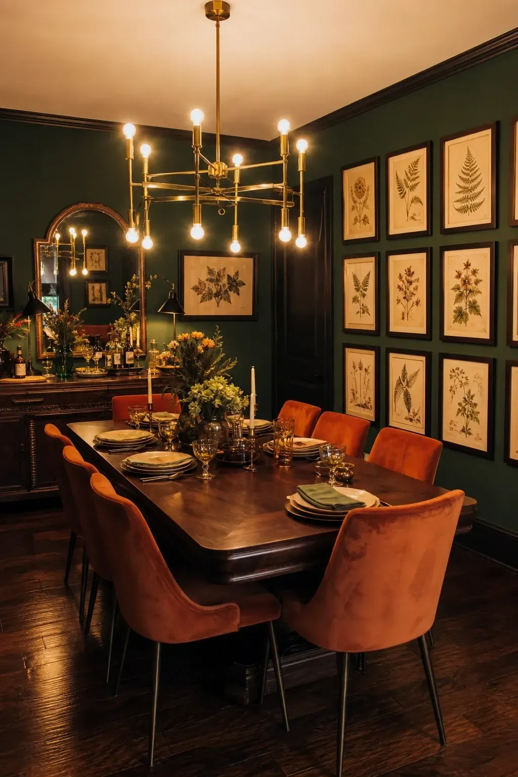
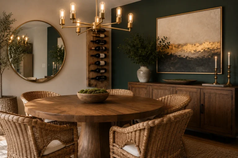
Forest green dining rooms have appeared on every major interior design platform in recent years, and the reason is simple: the color works. It has warmth, depth, and a connection to nature that makes a dining room feel grounded and alive. Farrow and Ball’s Hunter Green or Sherwin-Williams Cascades are both rich, saturated greens worth sampling. The best pairings for forest green are dark wood furniture in walnut or mahogany, velvet dining chairs in rust or mustard, and a bold brass chandelier that stands out against the dark walls. Consider adding a gallery wall of botanical prints in dark wood frames, which reinforces the rich, nature-forward feel of the color without needing to rely on lots of plants or greenery.
Designer Tip: Forest green looks best with warm-toned fabrics and metals. Pair it with rust, gold, or mustard rather than cool blues or silvers, which can make the room feel cold and disconnected.
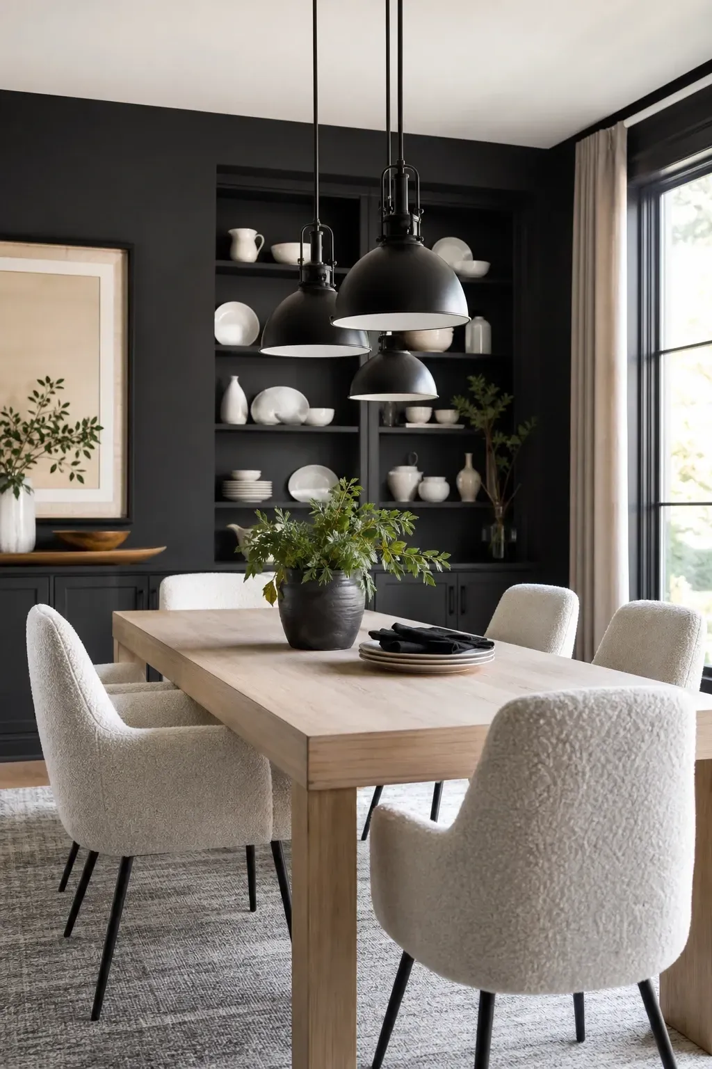
Charcoal is not the same as black, and that distinction matters in a dining room. It is rich and moody without completely blocking out the light, which means you can use it on all four walls without the space feeling like a cave. Sherwin-Williams Grizzle Gray or Benjamin Moore’s Silhouette are two strong options with slightly different undertones, the first leaning cool-green and the second a more neutral warm gray. The key to making charcoal work in a dining room is using lighter, natural contrast elements: think a light oak or ash dining table, chairs upholstered in a soft cream or warm white boucle, and open shelving painted in the same charcoal with bright white ceramics displayed on top. The contrast is striking and feels modern without being cold.
Designer Tip: If the idea of all-charcoal walls feels too much, start with just one feature wall behind the sideboard or buffet. It gives you the moody effect with a much lower commitment.
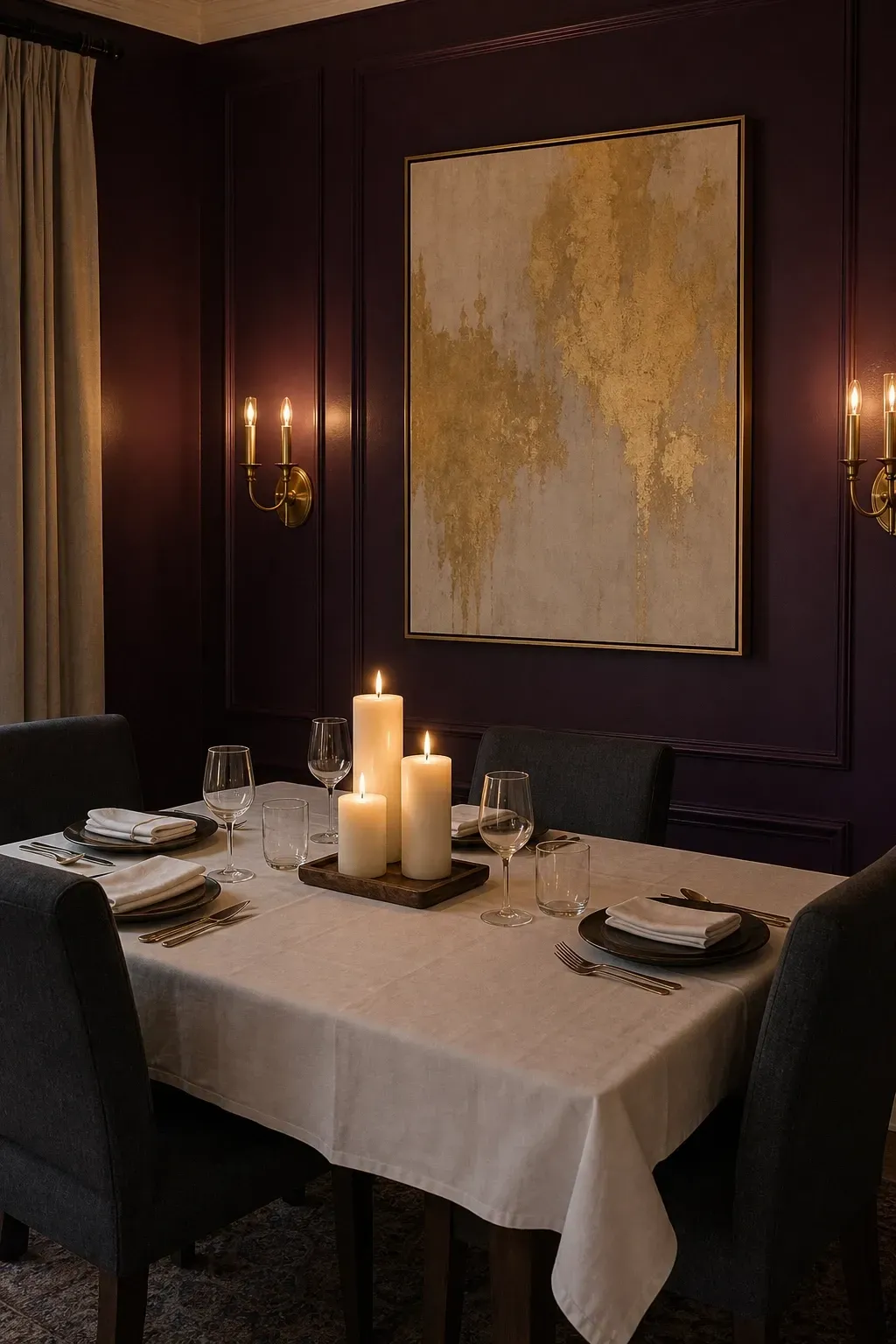
Deep plum is one of the most underused dining room colors and one of the most spectacular. It reads as rich, opulent, and completely unexpected, which makes a dining room feel genuinely special rather than decorated. Farrow and Ball’s Pelt or Sherwin-Williams Concord Grape are both deep, saturated plums with slightly different undertones. Keep the rest of the room restrained: a simple dark wood table with a glass top, chairs in a charcoal or black fabric, and brass or gold light fixtures that catch the light against those dramatic walls. White or off-white table linens create the contrast needed to stop the room from feeling overwhelming, and a few large white pillar candles at the center of the table look striking against the deep purple backdrop.
Designer Tip: Deep plum is a confident choice. Commit to it fully rather than hedging with too many lighter elements that fight the color. The magic happens when you let the walls lead.
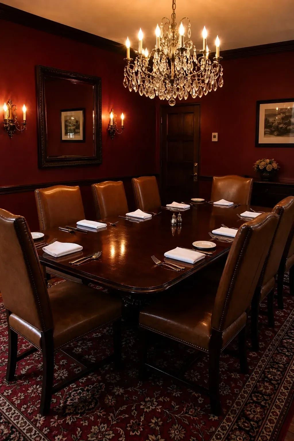
Burgundy is one of the classic dining room colors for a reason: it creates warmth, appetite, and a sense of occasion all at once. Used in traditional homes for centuries, it has come back into fashion in a more modern, pared-back interpretation that feels current rather than stuffy. Benjamin Moore’s Caliente or Sherwin-Williams Vintage Wine are both deeply saturated reds with enough brown in them to read as sophisticated rather than aggressive. Use a substantial dark wood dining table with tall-backed chairs in a natural leather or linen fabric, and bring in soft lighting through wall sconces and a central chandelier rather than harsh overhead downlights. The result is a room that feels like it belongs in a boutique restaurant rather than a standard suburban home.
Designer Tip: Burgundy walls and dark wood furniture can make a room feel heavy if not balanced properly. Use a lighter ceiling, a large mirror, and strategic lighting to keep the room from feeling too enclosed.
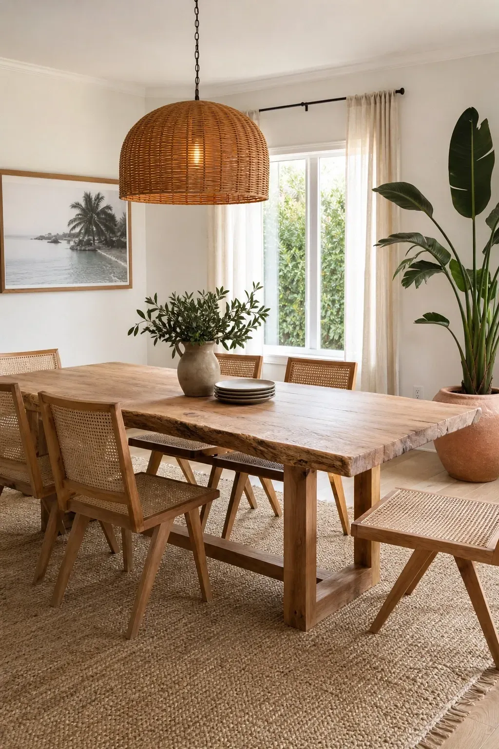
Soft white is not a cop-out. When done correctly it is one of the most versatile and genuinely pleasing dining room choices, especially in smaller spaces or rooms that get a lot of natural light. The key is to choose a white with a slightly warm undertone rather than a pure bright white, which can feel harsh and dental-office-like. Farrow and Ball’s All White or Benjamin Moore’s Chantilly Lace are both beautiful options that have a brightness to them without the cold clinical edge. Pair soft white walls with natural materials: a raw-edge wood dining table, cane or rattan dining chairs, a sisal or jute rug, and linen curtains in a warm off-white. Add a terracotta pot with a large leafy plant in the corner and pendant lighting in a natural material like woven bamboo or rattan.
Designer Tip: In an all-white dining room, texture becomes your best design tool. Vary the materials as much as possible: rough wood, smooth ceramics, woven textiles, and glossy glassware all working together is what keeps the room from feeling plain.
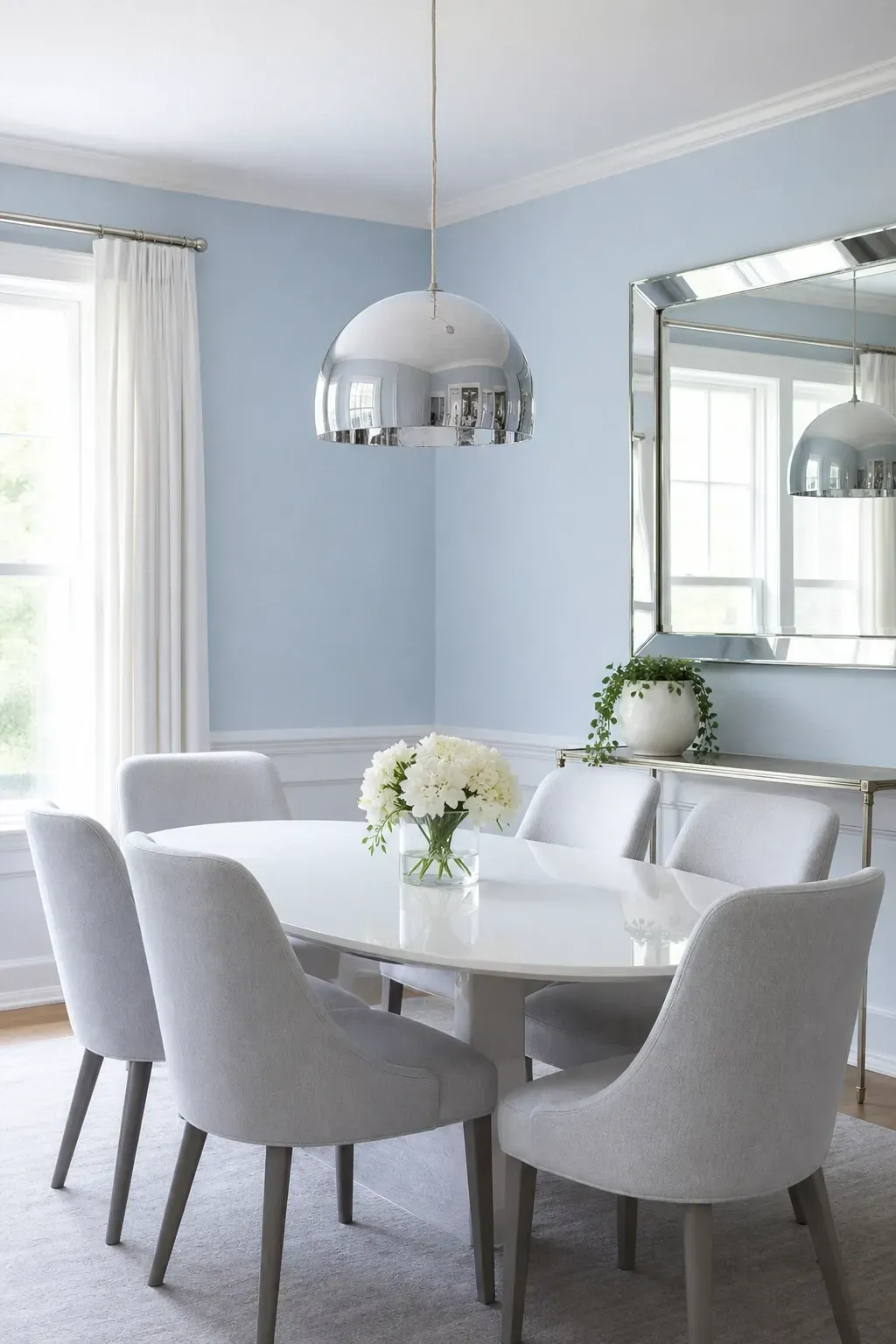
Powder blue is one of those dining room colors that makes people stop and take notice without knowing exactly why. It has a softness that feels restful and a freshness that keeps the room from feeling too serious. Benjamin Moore’s Whispering Spring or Sherwin-Williams Sky High are both delicate, airy blues that work in this space. Pair powder blue walls with a white lacquered dining table, chairs in a white or pale gray fabric, and a large rectangular mirror in a slim silver or chrome frame to amplify the light. Metallic silver or chrome light fixtures add a touch of polish without making the room feel overdone. Bring in a single plant in a white ceramic pot and a simple linen table runner in soft gray or natural white for a dining room that feels genuinely put together.
Designer Tip: Powder blue can lean cold in north-facing rooms. Warm it up by choosing soft white warm-toned bulbs rather than daylight bulbs in your light fixtures.
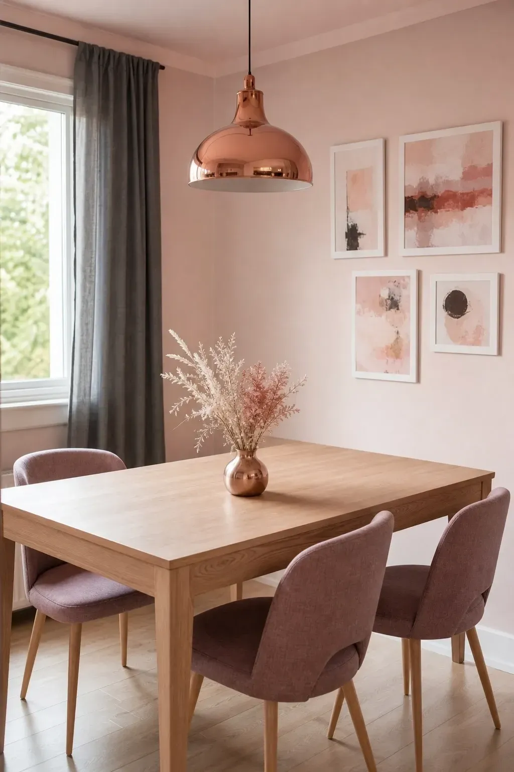
Blush pink in a dining room is not as bold as it sounds. In its pale, muted form it reads more like a warm neutral than a color, and it has the remarkable quality of making everyone in the room look slightly better in it, which is always a welcome quality at the dinner table. Farrow and Ball’s Setting Plaster or Sherwin-Williams Mellow Coral are both pale pinks with enough warmth and subtlety to avoid reading as a child’s bedroom. Pair with warm white furniture, a light wood dining table, and chairs in a dusty mauve or warm rose fabric. Copper or rose gold fixtures and hardware tie the palette together beautifully, and a collection of pink-toned artwork in simple frames adds personality without adding clutter.
Designer Tip: To stop blush pink from feeling too sweet, introduce one darker grounding element: a charcoal linen curtain panel, a slate-colored rug, or a dark wood console behind the dining chairs.
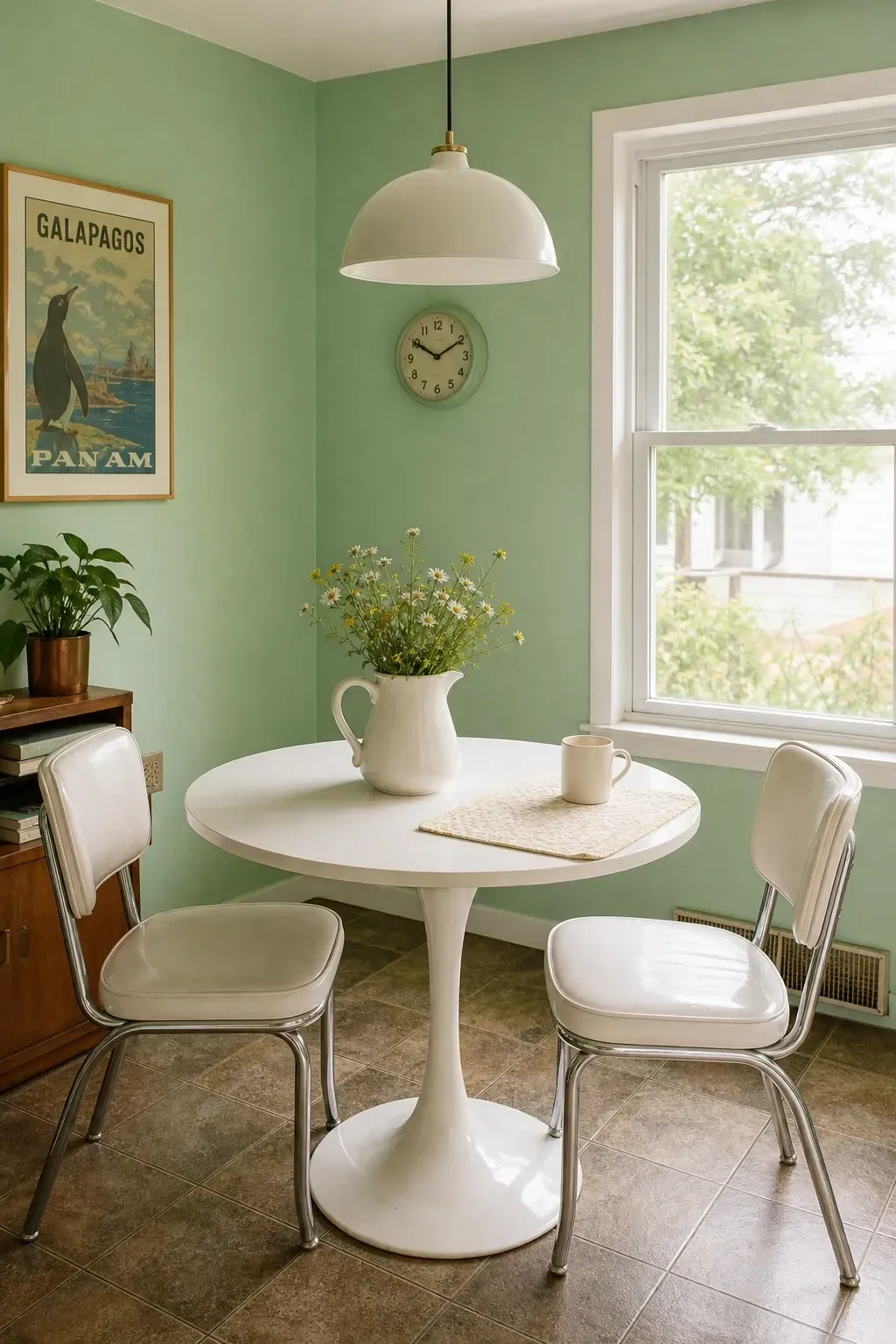
Mint green is best suited to smaller dining rooms or eat-in kitchen areas where the fresh, slightly retro quality of the color feels right at home. Think of a 1950s breakfast nook brought up to the modern day: mint green walls, a white round pedestal table, chrome leg chairs with a white vinyl or leather cushion, and a simple dome pendant light in white or chrome above the table. Sherwin-Williams Watery or Benjamin Moore’s Spearmint Patina are both fresh, clean mints that sit on the lighter end of the spectrum. Keep accessories simple: a white pitcher with some wildflowers, a glass cake dome with something inside, and a cotton place mat in a natural cream.
Designer Tip: Avoid using too many colors with mint. Let it be the star and build the rest of the room around white and chrome, with at most one natural wood element to soften the retro look.
Earthy and Grounded: Colors That Feel Rooted and Real
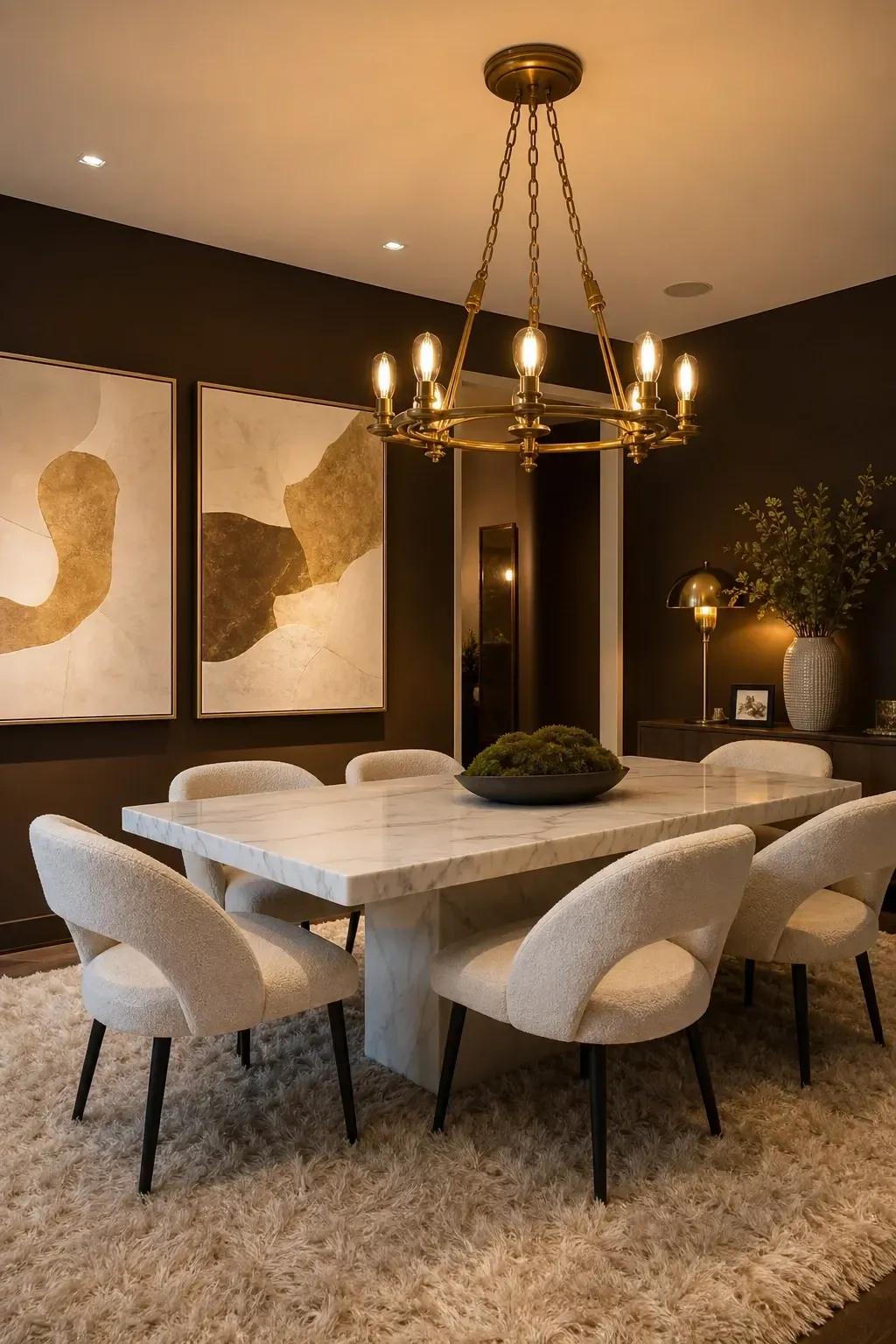
Brown is making a full comeback in interior design circles, and dining rooms are one of the best places to use it. Deep mocha or chocolate brown walls create an enclosing, cave-like warmth that makes a dining room feel like a genuinely private, special space. Sherwin-Williams Hot Cocoa or Benjamin Moore’s Silhouette-adjacent darker shades like Van Buren Brown are worth exploring here. Pair with cream or off-white upholstered chairs, a natural stone or white marble dining table, and a statement chandelier in gold or antique brass that catches the warm light against those rich walls. A sheepskin or shaggy cream rug underfoot adds tactile warmth, and a few large-format abstract prints in cream and gold tones on the wall complete the look.
Designer Tip: Chocolate brown walls demand proper lighting. Use at least three different light sources: overhead, table level, and an accent light, to keep the room feeling warm rather than dim.
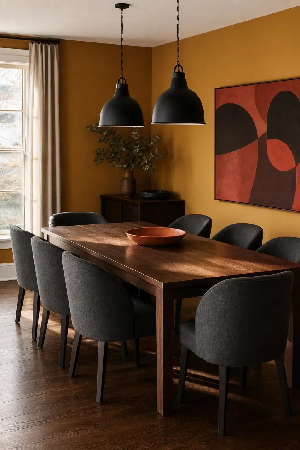
Mustard yellow is one of the most energizing dining room colors in the right space. It is not the sharp, bright yellow of a child’s playroom but a deep, golden mustard that feels sophisticated and deliberately chosen. Benjamin Moore’s Aganthus Green-adjacent yellows or Farrow and Ball’s Babouche are good options that sit in that golden, saturated sweet spot. Pair mustard yellow walls with charcoal gray upholstered chairs, a dark walnut or oak dining table, and matte black pendant lights above the table for a combination that is modern, bold, and genuinely interesting. Keep accessories in earth tones: rust, terracotta, and deep brown to keep the palette grounded rather than chaotic.
Designer Tip: Mustard yellow reads very differently in natural and artificial light. Sample the color at both times of day before making a decision, especially if you use the dining room most often in the evening.
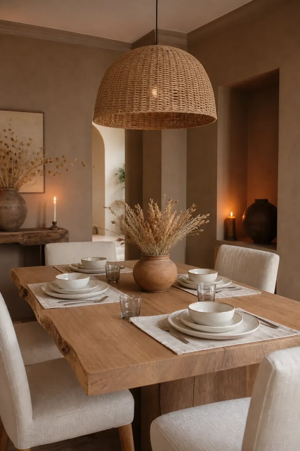
Clay is the color equivalent of a handmade ceramic pot: warm, imperfect in the best possible way, and deeply satisfying to be around. It sits somewhere between beige and terracotta and carries a softness that makes a dining room feel rooted without being heavy. Benjamin Moore’s Hathaway Gold or Sherwin-Williams Antique White shifting toward a clay base are both worth exploring. Pair clay walls with raw-edge furniture in a light wood, chairs in a warm cream or natural fabric, and overhead lighting in a woven natural material. Keep the tabletop simple: linen place mats, hand-thrown ceramic tableware, and a simple bunch of dried flowers in a short clay pot make the most of the earthy quality of the walls.
Designer Tip: Clay walls look especially beautiful by candlelight. Keep a collection of mismatched pillar candles on the table or sideboard to make the most of this color at dinner time.
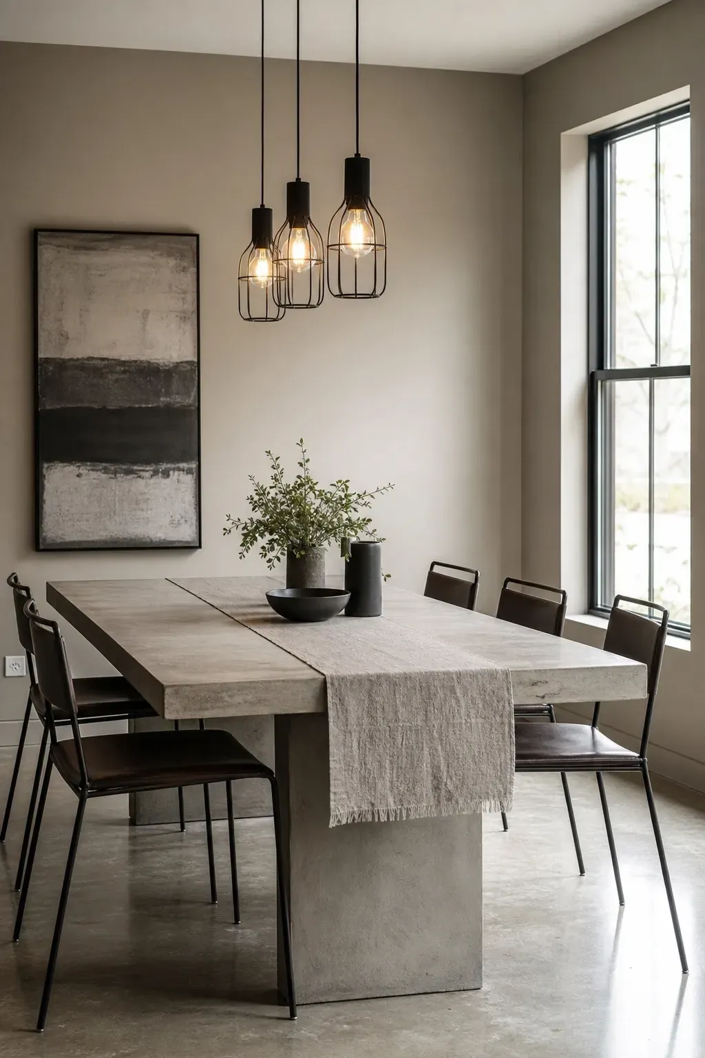
Mushroom gray is cool gray’s warmer, more approachable sibling. It has enough gray in it to feel modern and restrained but enough warmth to avoid the clinical, corporate feel that true gray can bring to a dining room. Farrow and Ball’s Elephant’s Breath or Sherwin-Williams Dovetail are both sophisticated mushroom grays that work across a range of dining room styles. In a contemporary dining room, pair mushroom walls with a concrete or stone dining table, dark metal chair frames with a leather or linen seat pad, and a simple industrial-style pendant cluster above the table. In a more traditional space, use white painted furniture and floral or geometric textile accents to soften the palette.
Designer Tip: Mushroom gray is one of the few colors that transitions naturally between the kitchen and dining room in open-plan spaces. It provides visual continuity without making the entire open area feel like one undifferentiated room.
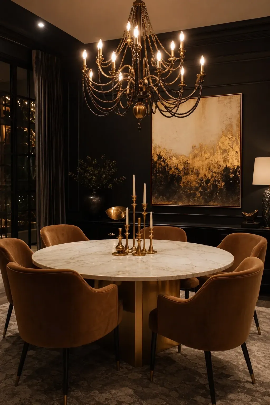
Painting a dining room black sounds extreme but when it is done right, it is extraordinary. The trick is to choose a warm black rather than a pure cold black. Farrow and Ball’s Railings or Off-Black are both blacks with warmth in them that read as deeply atmospheric rather than stark. Keep the furniture and accessories thoughtfully chosen: a large round table in white marble with gold legs, dining chairs in a warm caramel or cream velvet, and a showstopper chandelier in brushed gold or antique brass with multiple arms. The walls essentially disappear and the furniture and lighting become the full focus of the room. A large piece of artwork with gold tones on the wall and some simple gold candlesticks on the table complete a dining room that genuinely looks like something out of a magazine.
Designer Tip: A black dining room needs real commitment to lighting. Dimmers are non-negotiable, and layering at least two or three light sources keeps the room feeling glamorous and intimate rather than gloomy.
Choosing a paint color for your dining room is one of the highest-impact decisions you can make in a home renovation, and it does not have to be as stressful as it sometimes feels. The most important thing is to stop thinking about what is safe and start thinking about what kind of atmosphere you actually want to sit inside every day. Do you want a room that feels like a celebration every time someone sits down? Go bold with navy, forest green, or deep plum. Do you want something that feels genuinely restful and easy to live with? Sage green, warm greige, and creamy ivory are your best bets. Do you want drama, intimacy, and a space that impresses without trying? Charcoal, warm black, and burgundy are all waiting for you.
Whatever you choose, always buy a sample pot first and paint a large swatch directly on the wall. Look at it in natural morning light, afternoon light, and under your evening artificial lighting before making a final decision. Colors behave differently at different times of day and under different bulbs, and what looks perfect in a store or on a phone screen can look completely different on your actual walls. Take your time, trust your instincts, and remember that paint is one of the most forgiving home improvement choices you can make. If it does not work, you simply try again.
Frequently Asked Questions
What is the best paint finish for a dining room?
Eggshell or satin finish is the sweet spot for dining rooms. Flat or matte paint looks beautiful but is notoriously hard to clean, which becomes a problem in a room where food and drinks are always nearby. Eggshell gives you a very slight sheen that holds up to occasional wiping without looking shiny or plastic. Satin is slightly more durable and reflects a little more light, which can be useful in darker rooms. Avoid high-gloss on walls as it tends to highlight every bump and imperfection in the surface.
Should the dining room be the same color as the living room?
Not necessarily, but they should feel like they belong to the same home. In open-plan spaces where the dining and living areas are one room, a consistent color or a subtle variation of the same palette makes sense. In homes where the dining room is a separate space with its own door, you have much more freedom to use a completely different color. In fact, a separate dining room is one of the best places to use a bold or unexpected color because it is a defined, contained space rather than a through-route.
Do dark paint colors make a dining room feel smaller?
Not necessarily, and the idea that dark colors always shrink a room is one of the most persistent myths in interior design. Dark colors can actually create a sense of depth and coziness that makes a room feel more intimate and special rather than smaller. The key is lighting. A dark dining room with good lighting, a large mirror, and thoughtfully chosen furniture can feel dramatic and intentional rather than cramped. If you are nervous about going dark, start with just one wall, usually the one behind the sideboard or buffet, and see how you feel about it before committing to all four walls.
What colors make a dining room feel more formal?
Deep, saturated colors tend to read as more formal: think navy, forest green, burgundy, charcoal, or deep plum. Pairing them with dark wood furniture, upholstered chairs, and proper chandeliers rather than casual pendants adds to the formal quality. Even neutral colors can feel formal when paired with the right furniture: a greige or warm white room with a large mahogany table, tall-backed chairs, and a crystal chandelier can feel just as formal as a dark-walled room done in a more casual way.
How do I choose between a warm and cool paint color for my dining room?
Start by looking at your existing fixed elements: the flooring, any cabinetry, and the furniture you plan to keep. Warm flooring like oak, pine, or cherry wood generally pairs better with warm-toned paint colors. Cool flooring like slate, concrete, or gray tile tends to work better with cool tones. Your lighting also matters: warm-toned bulbs will amplify warm colors and make cool colors feel slightly more welcoming. If you are still unsure, most professional decorators suggest erring toward warm tones in a dining room because warmth promotes comfort, conversation, and the feeling of being gathered together.
Can I paint just one wall in the dining room a different color?
Yes, and a single feature wall is a great way to introduce a bold color without fully committing to it on all four walls. The most effective wall to paint as a feature is usually the one that sits behind the main seating area, the sideboard, or the buffet table, since it acts as a natural backdrop that gets seen by everyone at the table. Choose a color that is a few shades deeper than the surrounding walls for a cohesive result, or go for a complementary color that shares an undertone with the rest of the room. A feature wall in a dining room works best when the furniture against it is placed deliberately, so the whole wall feels like it was designed with that piece in mind.