Aqua is one of those colors that should feel risky but never really does. It sits in that rare sweet spot between blue and green, cool enough to feel fresh but warm enough to actually feel livable. Unlike popular right now paint colors that look great in a mood board and exhausting in real life, aqua tends to age well. It plays nicely with wood, white, gray, coral, and even black, which means you have a lot of flexibility when building a room around it. Start small if you are nervous about color. A set of aqua pillowcases costs under $20 and tells you quickly if the shade works in your light.
What makes aqua especially interesting is how much it shifts based on context. In a bright, south-facing room it looks almost electric. In a darker room with warm lighting, it reads more like a deep seafoam, almost moody. That variability is actually an advantage, not a problem, because you can push it in whatever direction your room needs. The ideas below cover everything from full aqua commitments to quiet, barely-there accents. Some suit large rooms, some were built for small ones, and a few will work in almost any space. Each one is a different approach, so you are not just seeing the same idea repeated with a different caption.
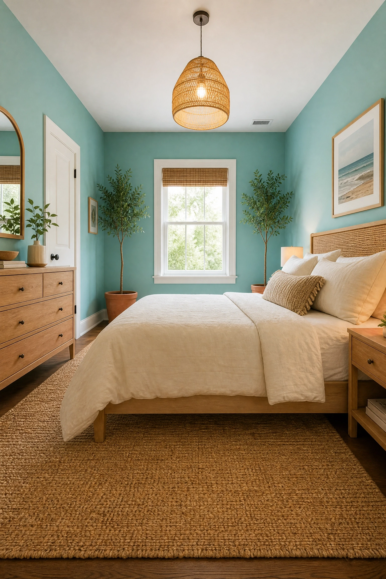
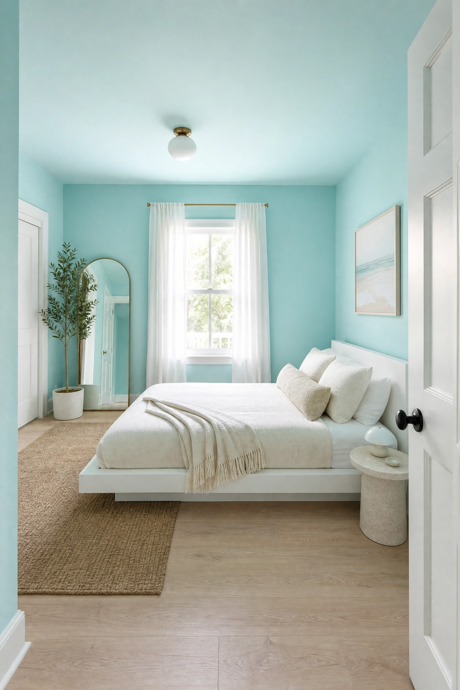
Most people hedge with an accent wall, but in practice, painting all four walls the same aqua creates something more interesting: a room that feels like its own world. This works best in medium to large bedrooms with decent natural light. Choose a mid-tone aqua like Benjamin Moore’s Surf’s Up or Sherwin-Williams Reflecting Pool. Keep the trim white and the furniture light wood or white to avoid visual heaviness. A linen duvet in warm ivory and a jute rug will ground the room without competing with the walls. For lighting, go warm. Cool-toned bulbs will fight the aqua and make the room feel clinical. One thing that works really well here is adding one or two pieces in terracotta or rust, which sit on the opposite side of the color wheel from aqua and create just enough tension to keep the room from feeling flat. This is a mid-range approach since paint is relatively affordable, but the payoff is significant.
Pro Move: Stick to a single finish (eggshell or satin) across all four walls so the color reads consistently in different lighting conditions throughout the day.
2. Aqua Lacquered Furniture as the Room’s Hero Piece
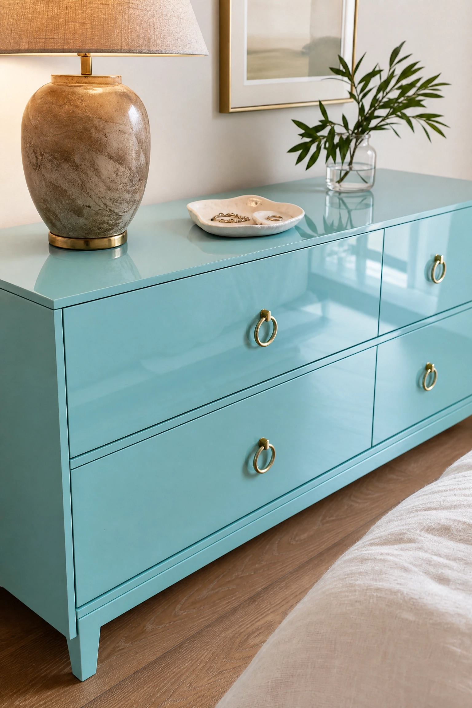
You have seen rooms built around a single statement piece, and aqua lacquered furniture is one of the best ways to do that. A dresser or nightstand in a deep aqua lacquer finish adds color and a layer of sophistication that painted walls cannot quite replicate. The reflective surface catches light differently at different times of day, which keeps the piece interesting. Keep the rest of the room in neutral territory: white walls, natural linen bedding, and a simple wood bed frame. This approach suits anyone who wants color but is not ready to commit to painting. In terms of budget, lacquered furniture ranges from mid-range vintage finds to investment-level designer pieces. Look for secondhand pieces on Marketplace or estate sales and spray lacquer them yourself with a few coats of aqua automotive paint for a fraction of the cost. Just be honest with yourself: lacquered surfaces show fingerprints and scratches more than matte finishes, so this is better in a guest room than a high-traffic primary bedroom.
Designer Advice: The lacquer finish creates a focal point through texture, not just color. Place a simple warm-toned lamp on top so the reflection picks up that warmth and the piece does not feel cold.
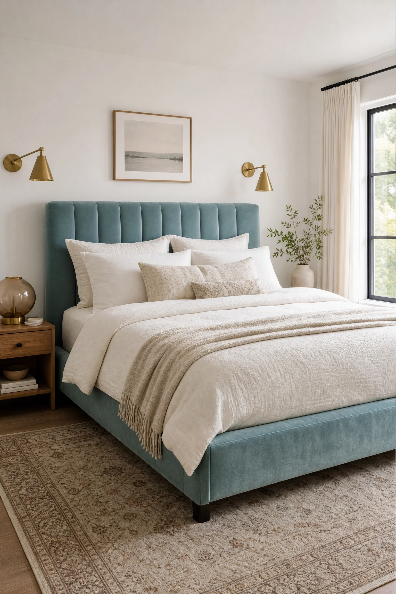
An upholstered bed in aqua velvet or linen is one of the most effective ways to build a room around a single color without feeling like you are decorating a themed hotel room. The bed is already the largest visual element in any bedroom, so giving it color and texture in one move is efficient from a design standpoint. Aqua velvet in particular adds a richness that reads as intentional and considered. Pair it with white walls and warm brass hardware and lighting. Use bedding in layered neutrals: cream, warm white, and soft gray. Avoid matching the bed color in your pillows or throws; variation is what keeps the room from looking like a display model. This works in rooms of most sizes, but if your room is under 120 square feet, go with a tighter headboard profile rather than a full upholstered frame so you do not lose floor space to visual weight. Budget-wise, this is mid-range to investment territory depending on whether you go custom or buy from a home retailer.
Quick Tip: Aqua velvet reads much more blue in artificial light and more green in daylight. Order fabric swatches and view them at different times of day before committing.
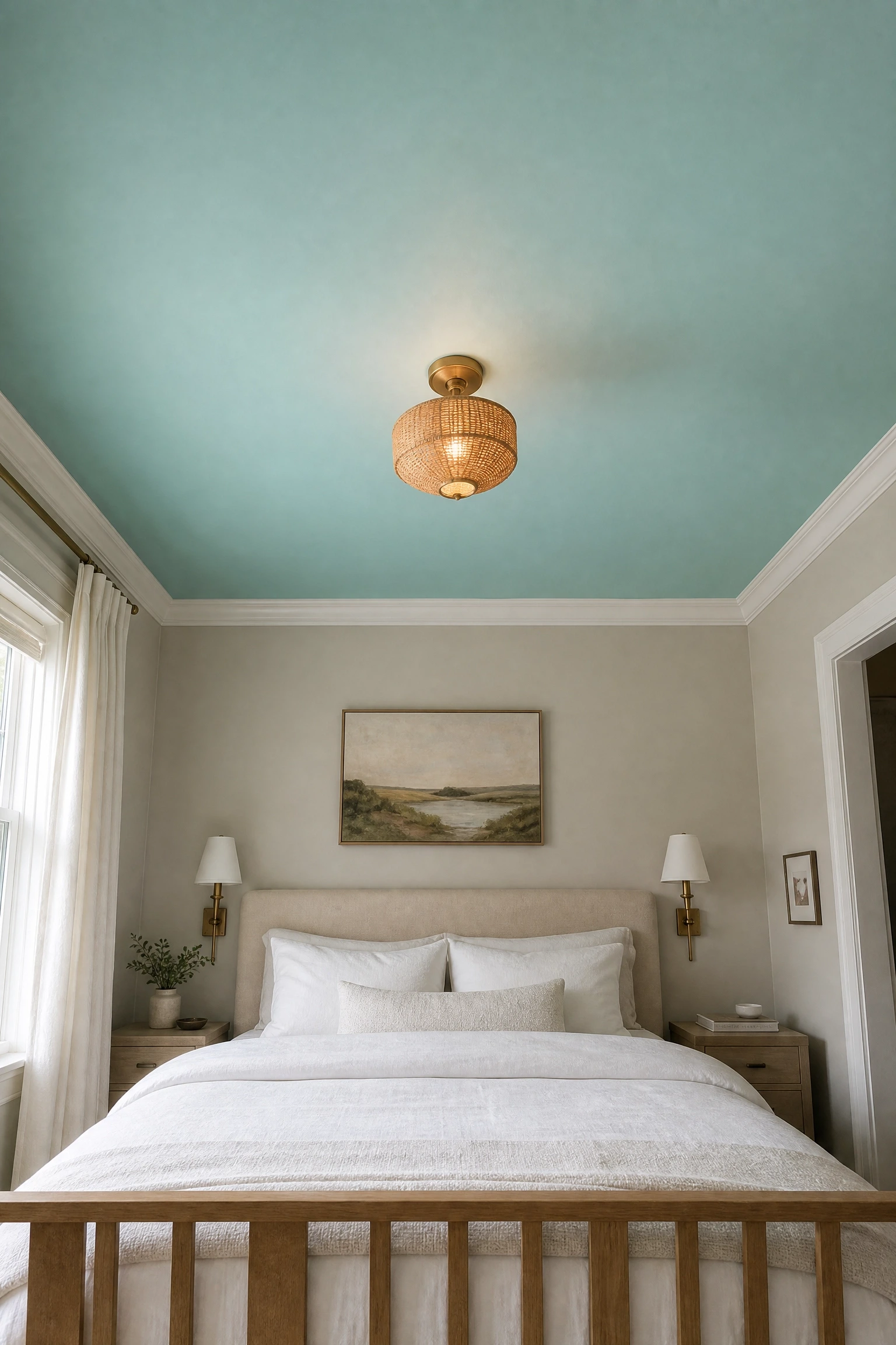
Painting the ceiling a color while leaving walls neutral is a technique designers use to add drama without closing a room in. An aqua ceiling over white or warm greige walls creates a room that feels grounded and airy at the same time. It is particularly effective in rooms with higher ceilings, where most people paint white and ignore the potential entirely. Use a slightly muted aqua rather than a bright one so the ceiling does not feel like an afterthought. Think of colors like Farrow and Ball’s Pale Powder or a custom mix that leans toward sage-aqua. The ceiling becomes a kind of canopy effect that is calming without being visually heavy. The rest of the room can be completely neutral, which means this approach works well if you are renting and cannot paint walls or if you want to try a color without full commitment. Getting a clean ceiling line takes patience and a good angled brush, so factor that into your effort estimate.
Heads Up: If your ceilings are low, skip this idea. A colored ceiling in a room with under eight-foot ceilings can make the space feel compressed rather than cozy.
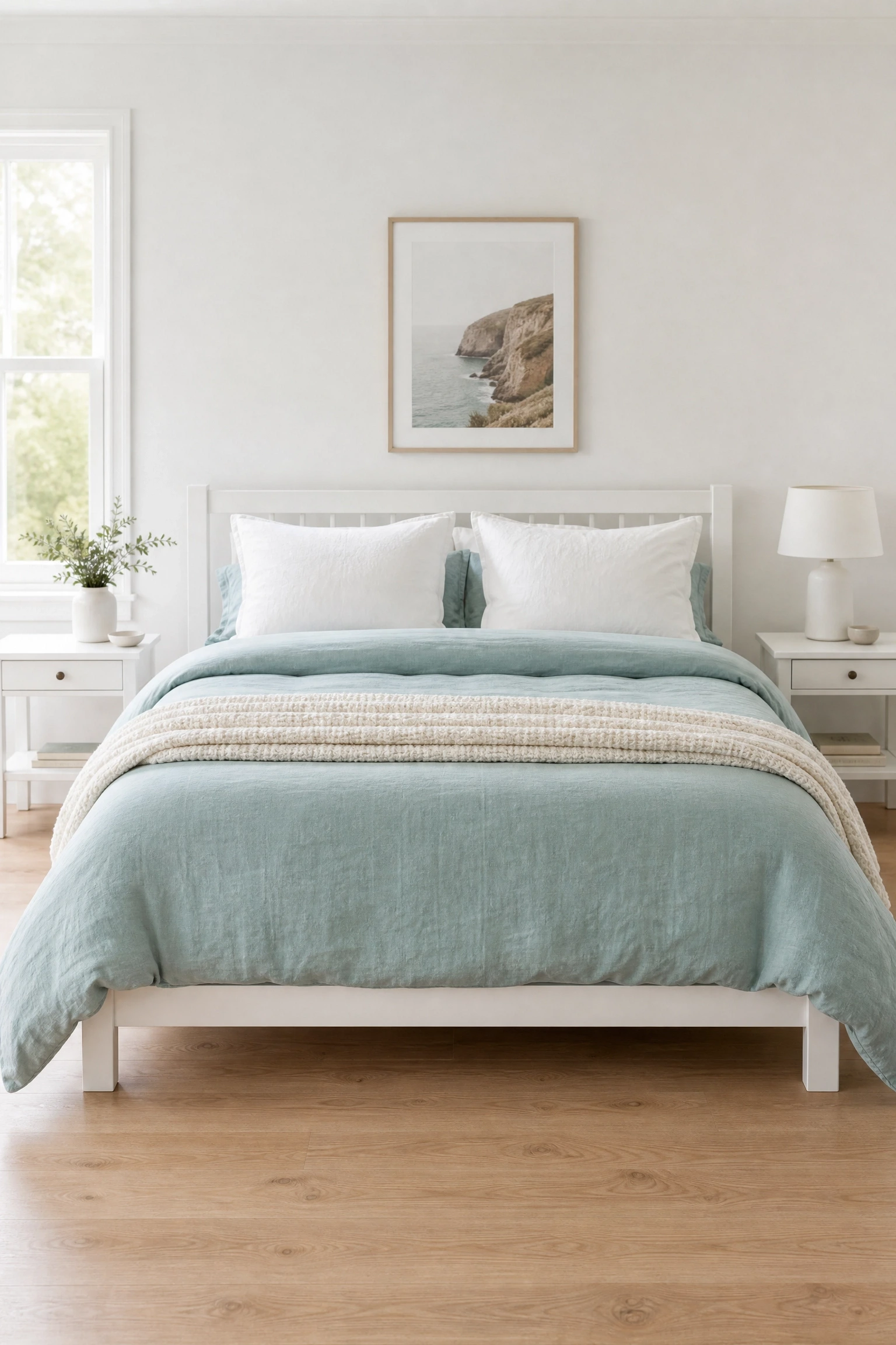
If you are working with a rented space or you are simply not ready to paint, aqua bedding is the most low-commitment, high-impact option available. A duvet or quilt in a solid aqua or a subtle aqua print changes the visual center of the room without touching a single wall. This works best when the bed frame is white, natural wood, or light gray so the bedding gets the attention. Layer with white euro shams and a cream throw so the aqua does not feel like it is floating in isolation. In practice, the most common mistake is buying aqua bedding that is too bright or too saturated. Go for a version that has some gray in it, like dusty aqua or washed seafoam, which holds up across lighting conditions and reads as more considered than a straight turquoise. This is one of the most affordable approaches to adding aqua to a room. Budget: under $100 for most quality cotton duvet covers.
Reality Check: Aqua fades faster than dark colors in the wash. Check that your duvet cover is colorfast before buying, especially if you wash bedding frequently.
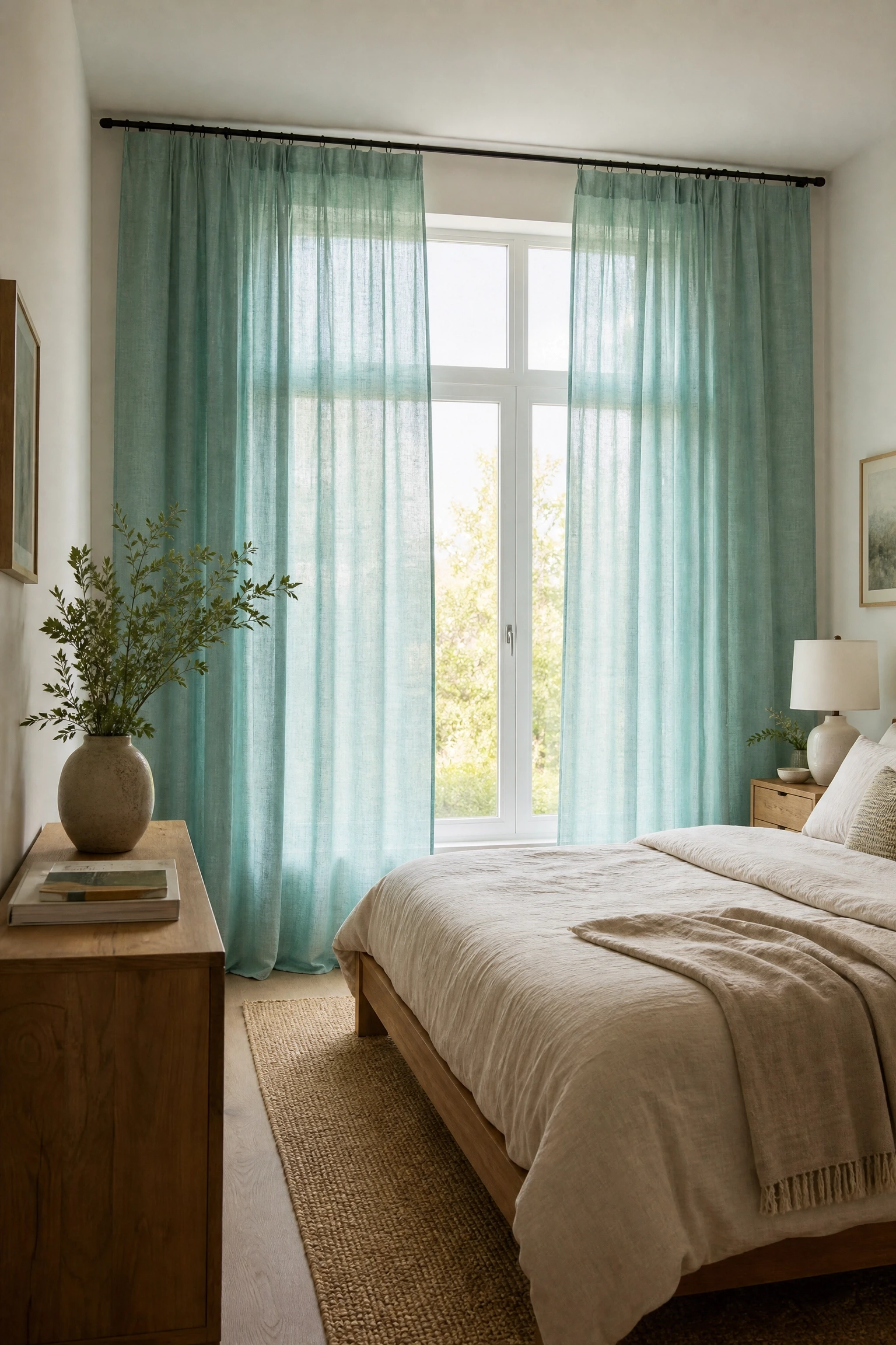
Curtains in aqua are one of those details that can change how an entire room feels, especially if you have windows that face a garden or any outdoor greenery. The aqua reads differently in front of natural light than it does on a wall, taking on a slightly luminous quality that makes the room feel cooler and more open. Choose linen or cotton voile in aqua for a light, breezy effect. Heavier velvet aqua curtains work in the opposite direction, adding warmth and drama. For a bedroom, linen is usually the better call because it filters light beautifully without blackout heaviness. Pair with white or off-white walls and warm wood furniture. One thing to be aware of: aqua curtains in a room with cool north-facing light can feel slightly cold. Balance that with warm-toned lighting at the bedside. This is an affordable to mid-range option depending on fabric quality and whether you buy ready-made or custom.
Pro Move: Hang curtains as high and as wide as the wall allows, not just the window. This makes the aqua color feel intentional rather than decorative.
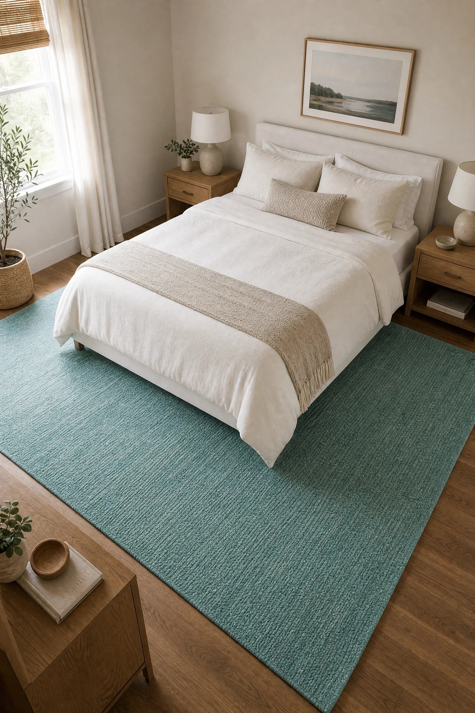
A rug is one of the smartest places to introduce aqua because it grounds the whole room without demanding attention from every angle. An aqua area rug under a neutral bed gives the space a visual anchor and defines the sleeping zone, which matters especially in open-plan or studio layouts. Flat-weave rugs in aqua are easier to clean and work well in minimal, contemporary rooms. A shag or high-pile aqua rug reads softer and more relaxed, suiting a boho or coastal aesthetic better. Avoid matching the rug exactly to any other aqua in the room. A slightly different shade or undertone in the rug actually makes the room feel more layered and intentional. For sizing, go with an 8×10 minimum in most standard bedrooms so the rug sits properly under the bed with nightstand coverage on both sides. Budget: wide range from $80 affordable flatweaves to $600-plus for hand-tufted options.
Designer Advice: In rooms where aqua appears only in the rug, add one small repeating element in aqua elsewhere, a vase, a lampshade, a pillow, so the rug feels like part of a plan rather than a leftover purchase.
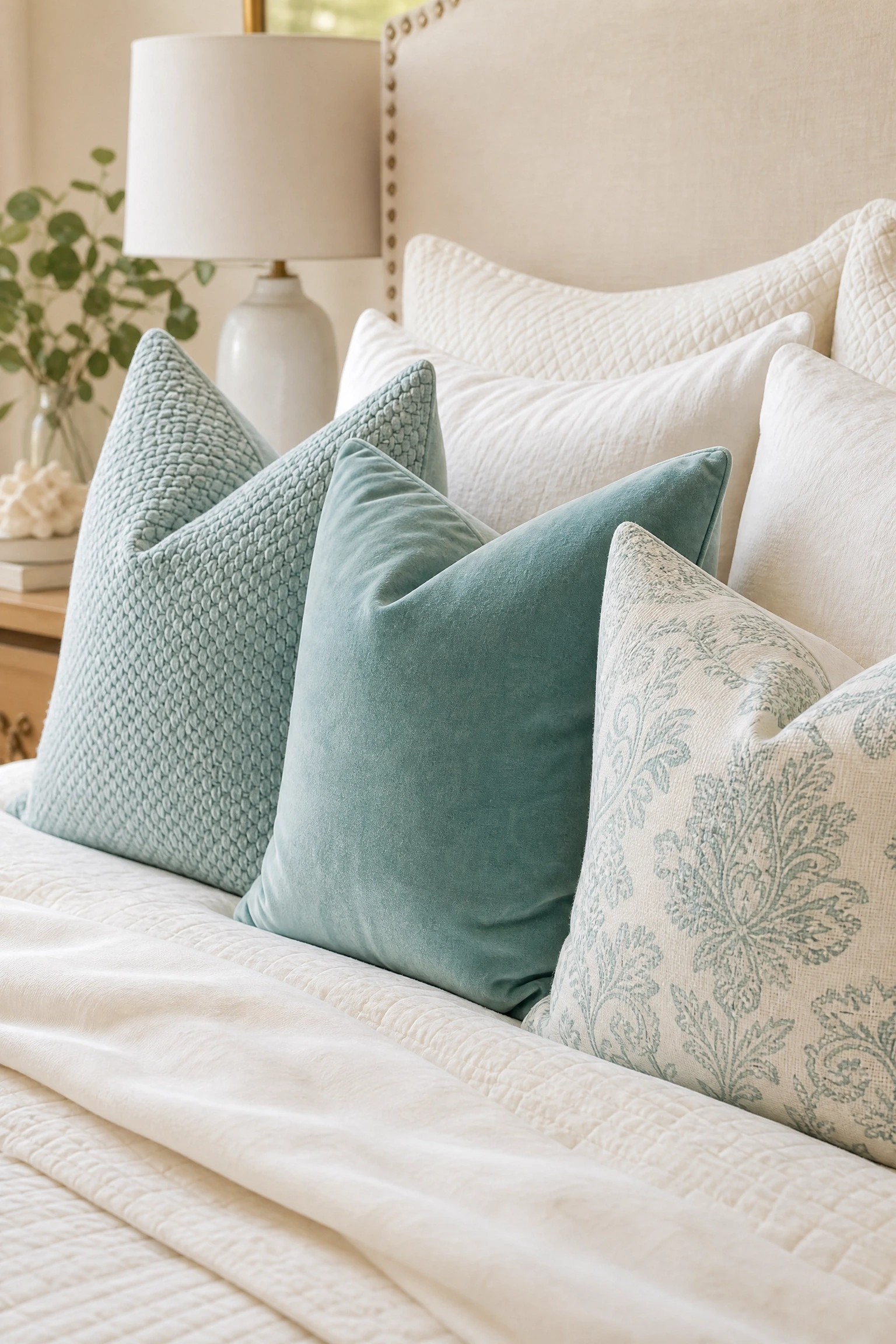
Throw pillows are arguably the fastest and cheapest way to test a color in a room before you commit to anything structural. Aqua pillows work particularly well on beds and sofas in warm neutral tones: cream, oatmeal, camel, and warm white. A layered pile works best when you use aqua in two or three different textures: a woven pillow alongside a velvet one alongside a printed one. The variation in material keeps the grouping from looking like it came out of a set. Size matters too. A large 24-inch aqua pillow reads differently from a smaller 18-inch one, and mixing sizes creates depth. What designers tend to do, and what really works in practice, is use aqua as the bridge color between two neutrals in the pillow arrangement, so it connects the whole grouping visually rather than standing out as the odd one. This is the most budget-friendly aqua option of all, starting at around $20 per pillow.
Quick Tip: Do not buy pillows in the same shade of aqua. Pick one cooler blue-aqua and one warmer green-aqua. The slight variation looks deliberate and gives the arrangement more visual life.
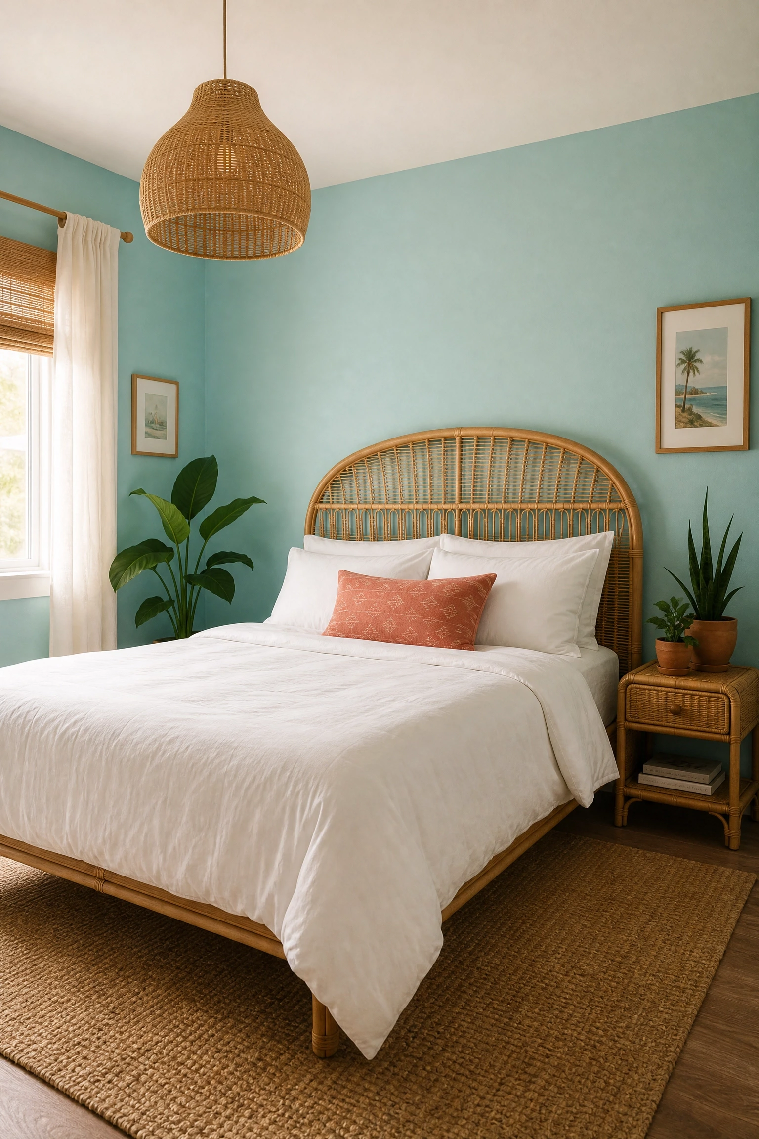
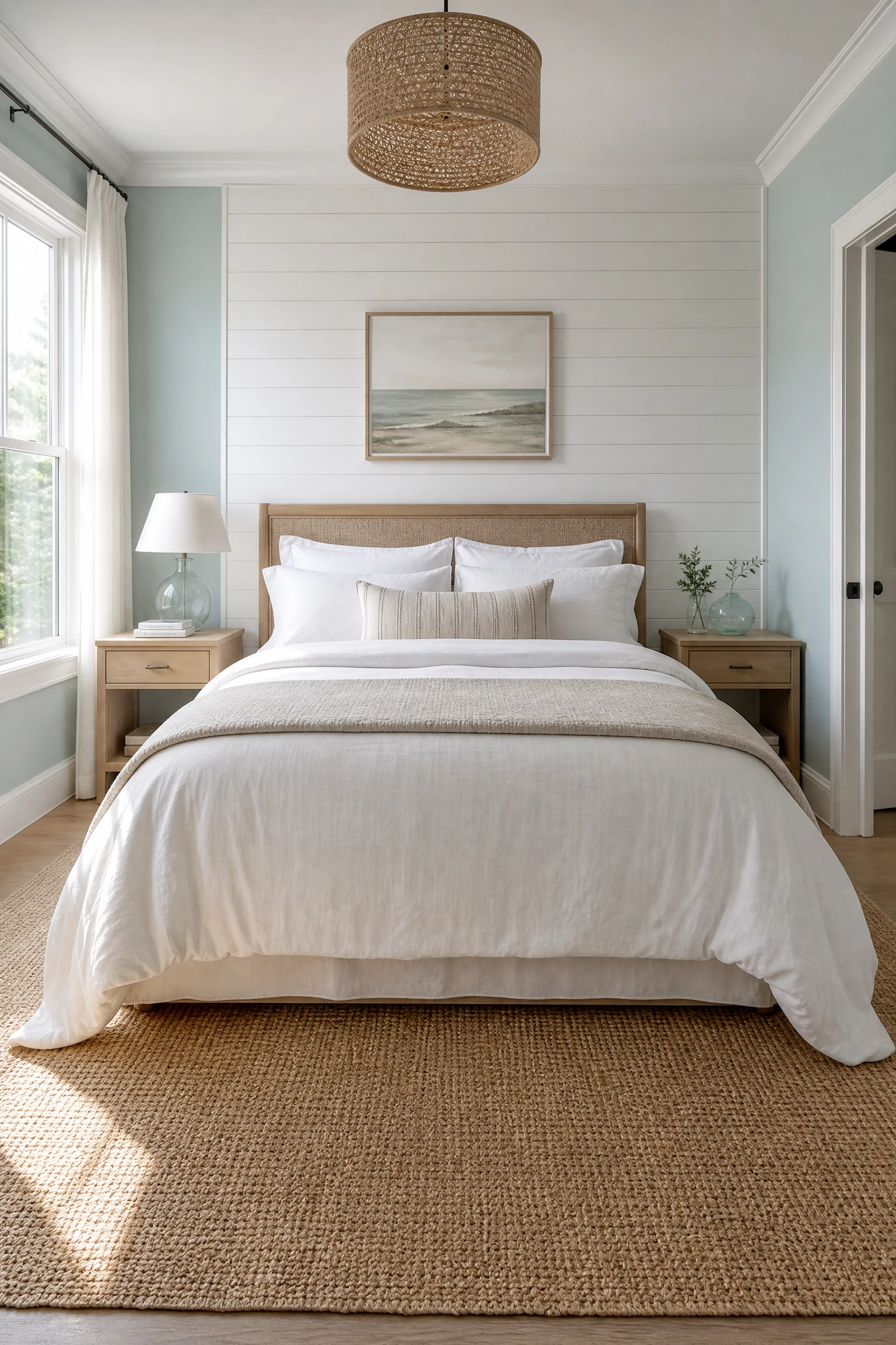
Aqua and rattan is one of those combinations that should feel overdone by now but somehow still works, largely because rattan’s warm honey tones sit at the opposite end of the temperature spectrum from aqua’s cool freshness. The contrast is balanced rather than harsh. Use a medium-depth aqua on the walls, not too pale and not too saturated, and bring in rattan through a headboard, pendant light, or pair of nightstands. Woven jute or seagrass underfoot reinforces the natural material story. White bedding keeps the room light, and plants in terracotta pots add another natural layer. This combination leans boho-coastal, which suits informal bedroom styles and works especially well in homes near water or with lots of natural light. It is also an accessible budget point because rattan furniture is widely available at most mid-range home stores. Be honest about the style fit: this look is casual and warm, not sleek or minimal.
Heads Up: Rattan is not particularly durable in high-humidity environments. If your bedroom runs warm or humid, a solid wood alternative with similar warmth may serve you better long-term.
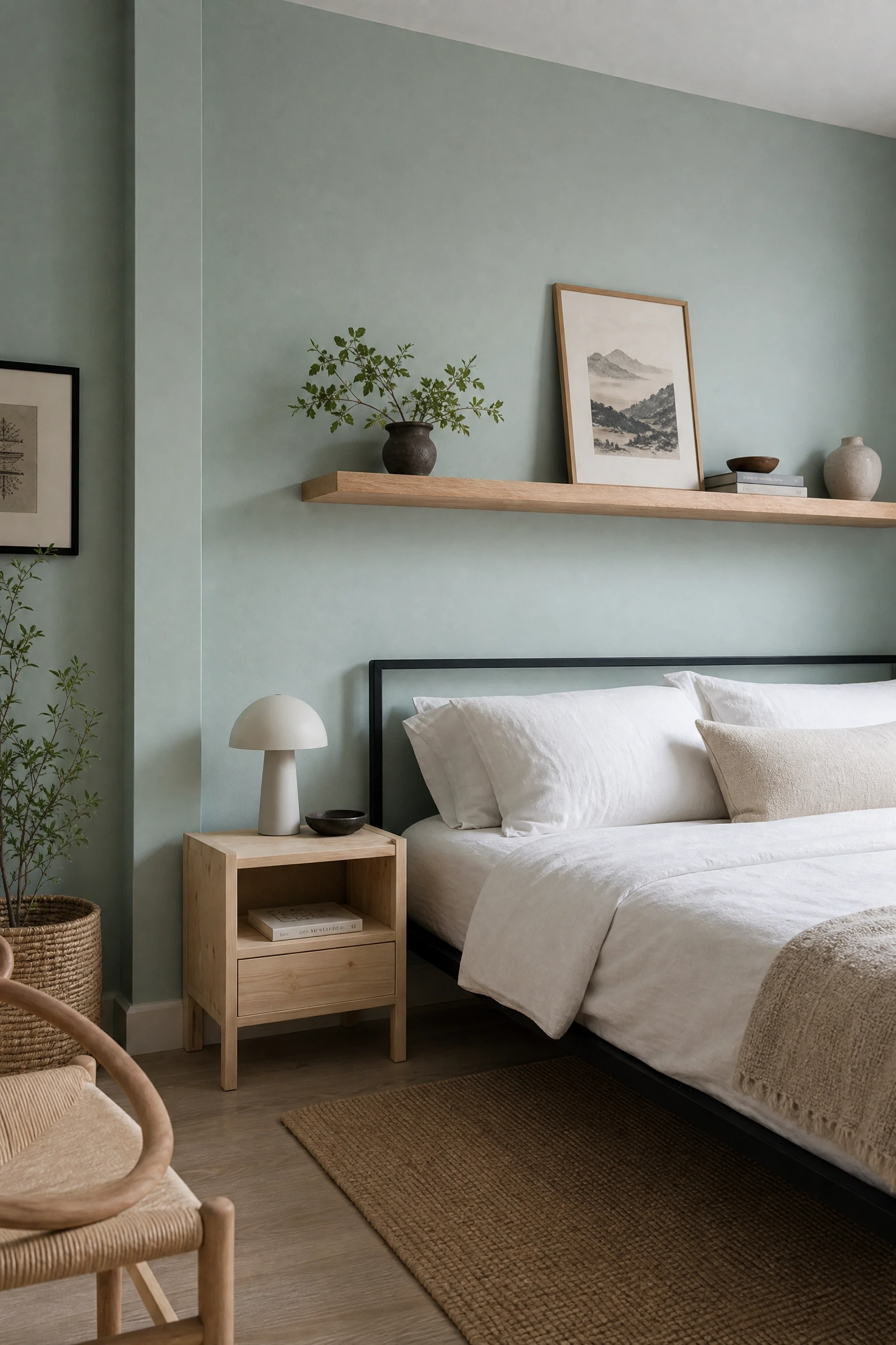
Raw or lightly finished wood against aqua paint creates a pairing that feels honest and grounded rather than decorated. The grain of untreated wood brings warmth and imperfection into a room that could otherwise feel too polished. A white oak floating shelf, a solid pine nightstand, or a reclaimed wood headboard all work beautifully against an aqua backdrop. The key is keeping the wood finish light, bleached or natural rather than stained dark, so it does not add visual weight that competes with the wall color. This approach has a strong Japandi or Scandinavian influence, which is worth noting: if your room leans toward maximalism or traditional decor, it may feel tonally out of place. Layered neutral bedding and simple matte black hardware complete the look cleanly. This is a mid-range approach, with the main cost being the raw wood furniture rather than the paint.
Pro Move: If you cannot find raw wood furniture in your budget, a white-painted piece lightly sanded at the edges can mimic the unfinished quality convincingly.
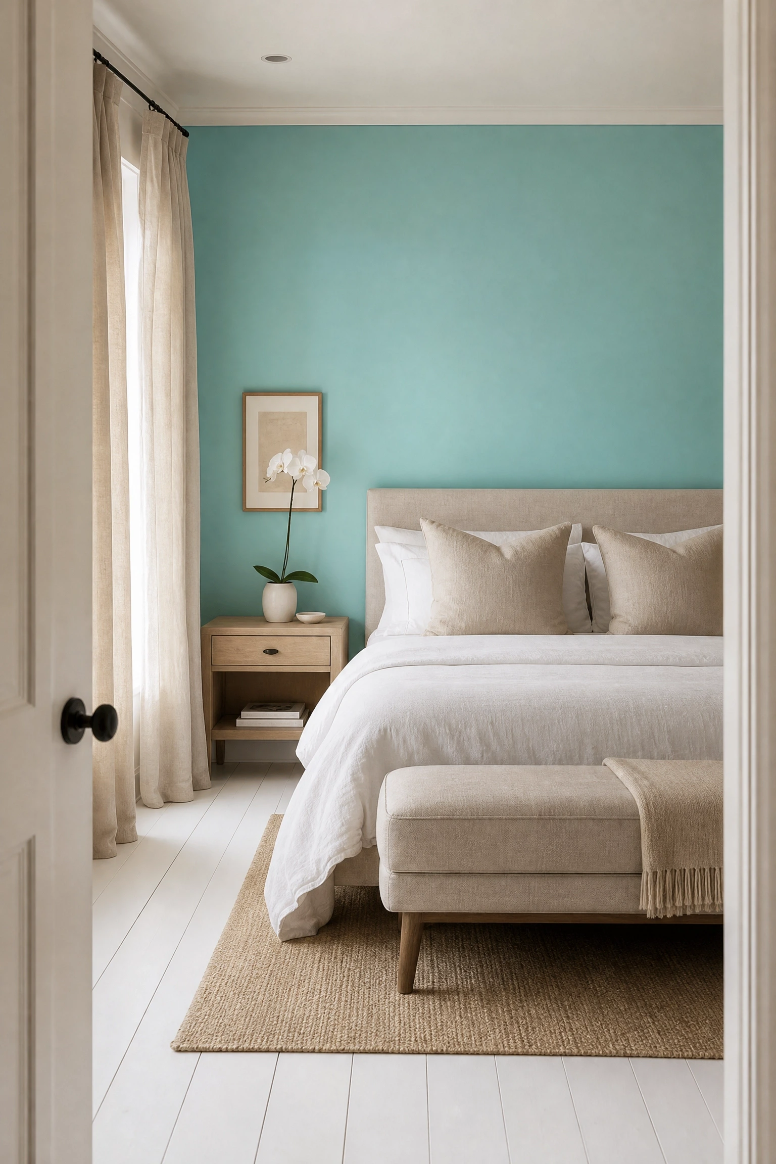
Linen and aqua are a natural pairing because both materials and colors read as effortless. Linen’s slightly rumpled, lived-in quality softens aqua’s brightness and stops the room from feeling too polished or precious. Use aqua on one wall or through bedding and pair everything else in natural linen: curtains, cushions, even an upholstered bench at the foot of the bed. The color palette stays simple, just aqua, linen, and white, but the texture variation does the visual work. This look suits people who want a calm, pared-back bedroom without it feeling sterile. It reads as comfortable and considered without a lot of decorating effort. The honest limitation here is that linen wrinkles, which is part of its charm but may not suit everyone’s aesthetic. Budget-wise this is mid-range, with linen curtains and bedding representing the main cost.
Reality Check: Aqua against natural linen will read more saturated and jewel-toned than aqua against bright white. Pull a large swatch of both side by side before deciding on the aqua shade.
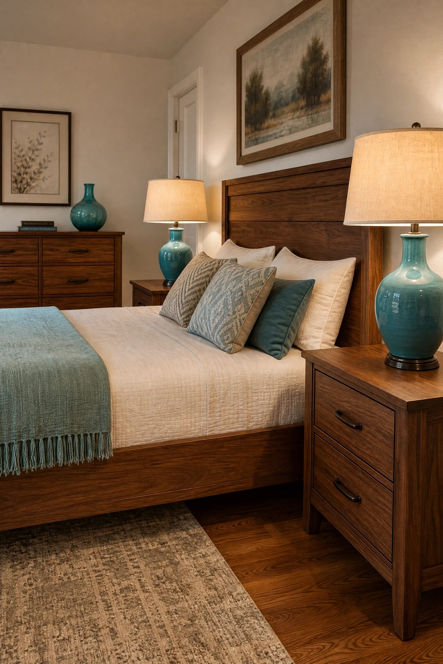
Not every aqua bedroom needs aqua as the dominant color. In a room full of warm wood furniture and tones, a few carefully placed aqua accents can function almost like jewelry: small, purposeful, and disproportionately impactful. A pair of aqua ceramic table lamps, a single aqua vase on a wood dresser, or an aqua glass pendant shade all work in this role. The aqua should appear in at least two places so it reads as intentional rather than accidental, but it should not compete with the warmth of the wood. This approach suits traditional, mid-century modern, or Japandi-style rooms particularly well because those styles already rely heavily on wood tones. It is also the most budget-friendly way to introduce aqua into a room that already has a direction. You are adding accents, not rebuilding the room.
Designer Advice: Place aqua accents at different heights in the room, one at eye level and one lower, to create a sense of the color moving through the space rather than sitting in one spot.
Coastal bedrooms get a bad reputation for drifting into nautical theme parks full of anchors and rope baskets. Aqua done well in a coastal context is actually much quieter. Think soft aqua walls in a washed finish, white plank-style wall paneling as a headboard feature, natural fiber rugs, and bedding in white and sand tones. No anchors, no novelty starfish, no rope light fixtures. Instead, lean on texture: linen, cotton waffle, raw wood, and the occasional piece of sea glass-inspired glass art. This version of coastal is the one that appears in beach houses with real budgets and real interior designers. It is calm and genuinely restful rather than themed. The aqua feels referential to water without hitting you over the head with it. This works best in rooms with decent natural light and a simple furniture plan, ideally without too much clutter.
Quick Tip: Use a slightly gray-toned aqua for walls rather than a saturated blue-green. It will photograph beautifully and feel more sophisticated in person than a straight bright aqua.
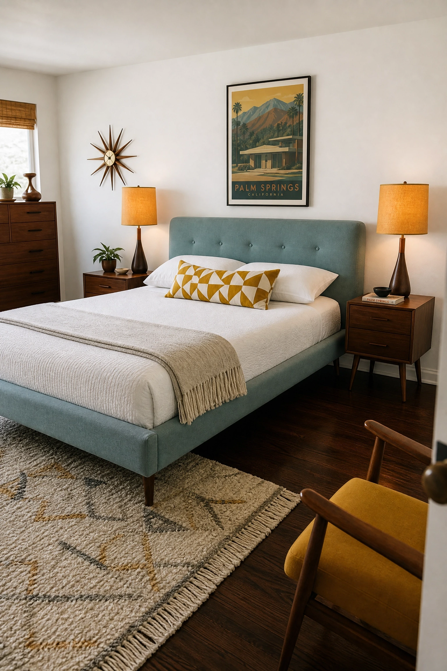
Mid-century modern and aqua are a natural match historically. Think of the furniture catalogs from the 1950s and 1960s, full of teal and turquoise alongside walnut wood and tapered legs. To update this without it feeling like a retro costume, use aqua as an upholstery color on a low-profile headboard or a pair of mid-century accent chairs, rather than on the walls. Walnut or dark-stained wood furniture frames the aqua well. Add warm amber or mustard in small doses through lampshades or a single armchair. Keep patterns minimal, maybe one geometric throw pillow. The design vocabulary here is tight: clean lines, warm wood, restrained color. This is a sophisticated approach that suits people with a real appreciation for the style period, not just the furniture shape. Mid-century furniture at this quality level is mid-range to investment.
Heads Up: Authentic mid-century modern is a disciplined style. Mixing in farmhouse, boho, or coastal elements will undermine the look. Commit to the style or choose a different category.
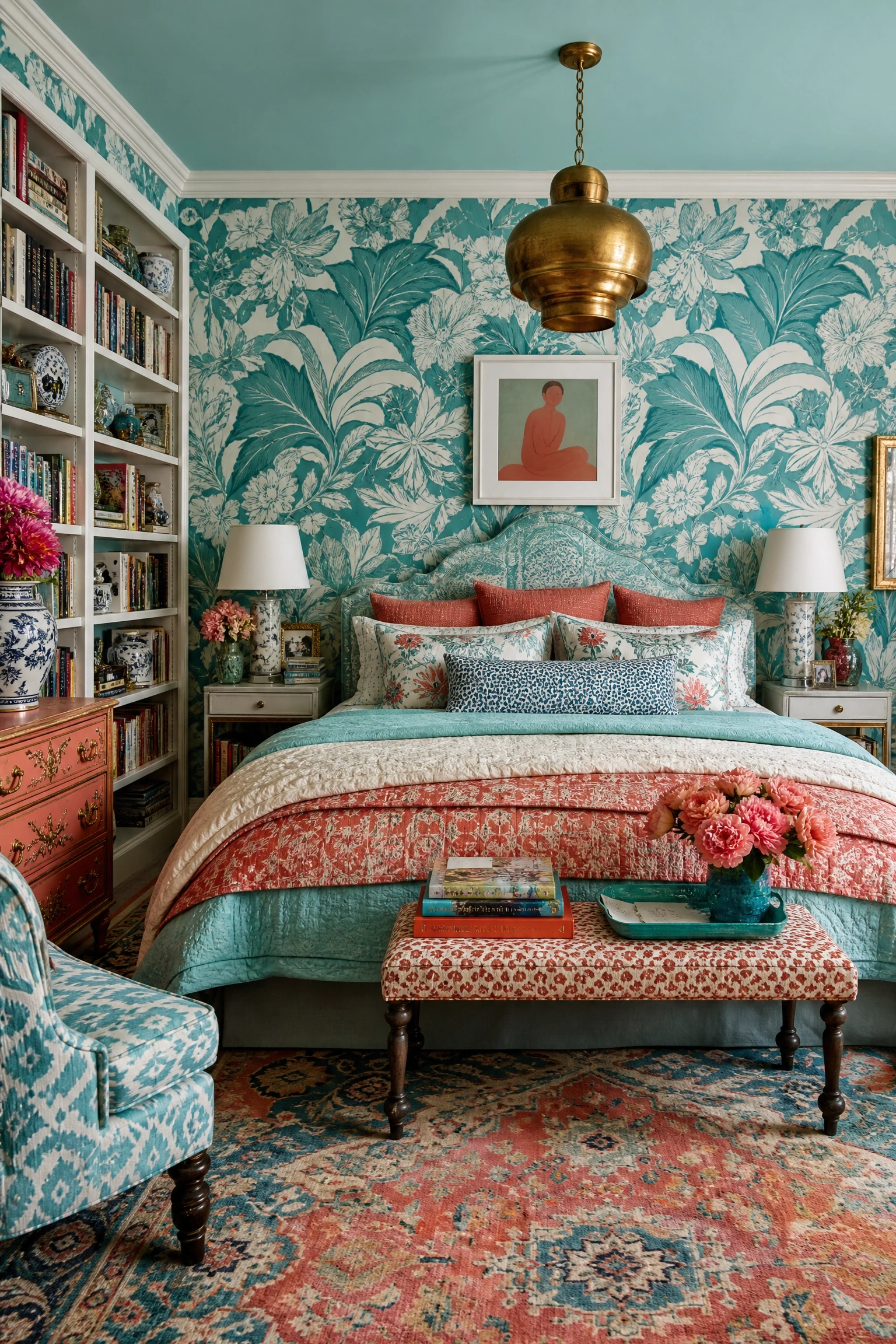
If minimal bedrooms make you feel slightly bored, aqua is one of the best colors to build a maximalist room around because it is bold but not aggressive. Use aqua in patterned wallpaper, perhaps a large-scale botanical or geometric print, and pull colors from that wallpaper into your bedding and curtains. Layering multiple patterns in aqua, coral, and white creates a room that feels rich without feeling chaotic, as long as you keep at least one pattern in a small scale to balance the larger ones. Art Deco or maximalist-eclectic bedrooms benefit most from this approach. A brass or gold light fixture adds warmth and glamour without changing the color story. Be honest with yourself before going this direction: maximalist rooms require confidence and commitment, and editing them down later is more work than editing them up. This approach is mid-range to high budget.
Pro Move: When layering patterns, run the aqua as the connecting color across all of them, even if it is a minor element in some. That thread of consistency is what makes pattern mixing look intentional rather than chaotic.
16. Aqua as the Accent Color in a Dark, Moody Room
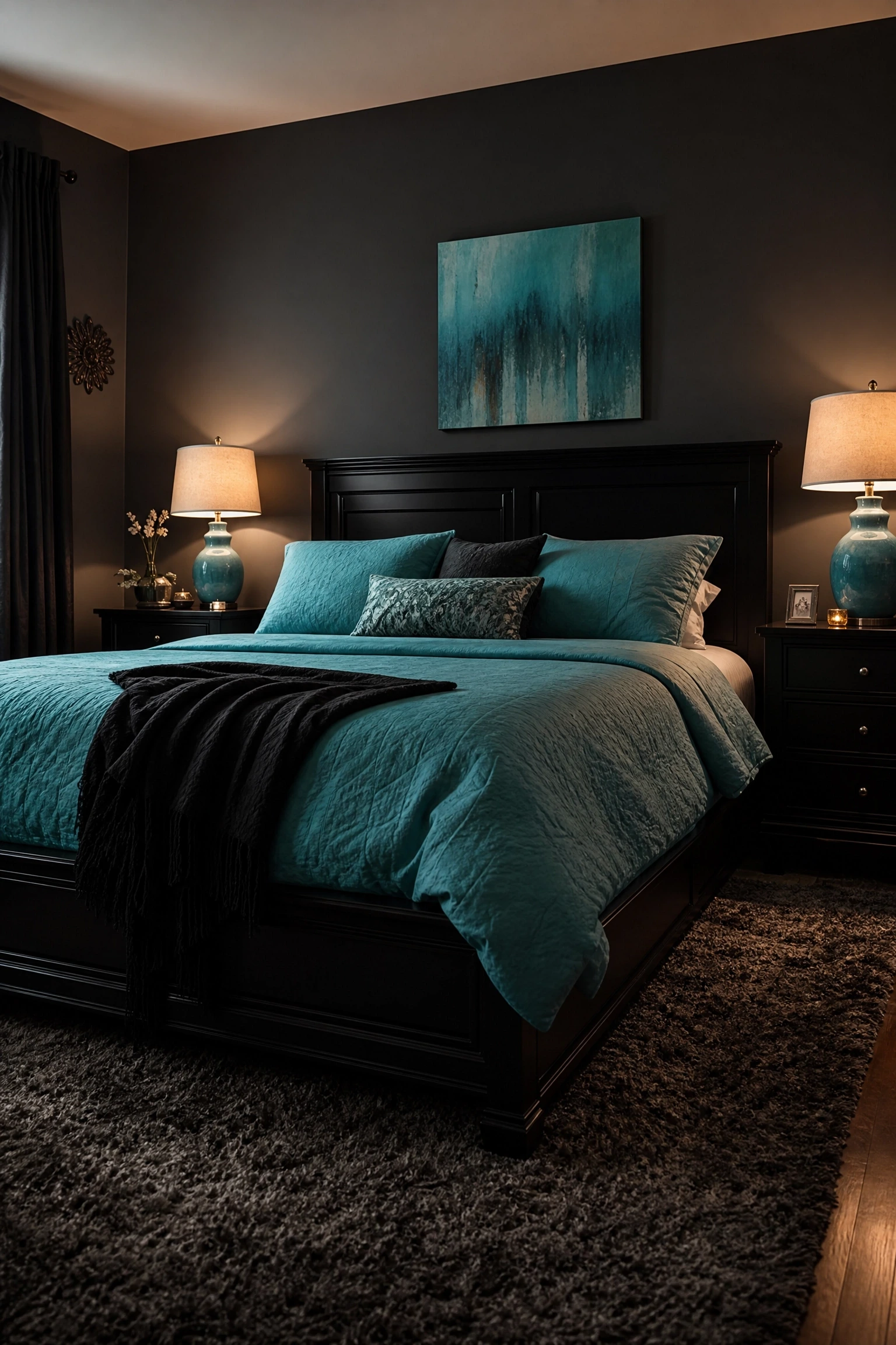
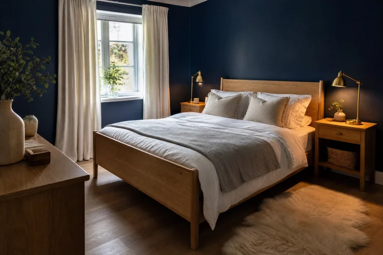
Most aqua bedrooms skew light. But aqua as a pop of color in a predominantly dark bedroom is an underused idea that has a lot going for it. A room with charcoal or deep navy walls, black furniture, and dark linen bedding can feel heavy or oppressive without relief. Introducing aqua through bedding, artwork, or a pair of ceramic lamps creates a visual lift that keeps the room feeling grounded rather than gloomy. The contrast between dark surrounding tones and the brightness of aqua creates focal points without requiring bright walls or light furniture. This works especially well in north-facing rooms or rooms where you want a hotel-level drama rather than a breezy coastal feel. In terms of budget, the approach itself is neutral since you are working around an existing dark room and adding aqua selectively.
Reality Check: In a very dark room, aqua will appear more saturated and intense than it would against light walls. Test a large paint swatch or fabric sample before buying in quantity.
Aqua for Compact and Awkward Spaces
17. Aqua in a Small Bedroom Without Making It Feel Smaller
The common advice is to use only light colors in small rooms, but aqua is one of the few mid-tones that does not close a space in, largely because of its cool undertone. A small bedroom painted in a soft aqua like Farrow and Ball’s Blue Ground will actually feel airier than the same room in a warm beige. The trick is keeping everything else in the room light and simple. White trim, minimal furniture, one light-toned rug, and simple white or cream bedding. Avoid dark furniture or heavy curtains. Natural light should be maximized wherever possible, with sheers rather than blackout drapes. This works in rooms as small as 100 square feet. What does not work is combining aqua walls with heavy, dark furniture in a small room. That combination will feel dense and uncomfortable regardless of the wall color.
Designer Advice: In a small room, run the aqua color continuously on the walls and ceiling. It creates a cocoon effect that actually feels cozy rather than cramped.
18. Aqua in an Alcove or Reading Nook Within the Bedroom
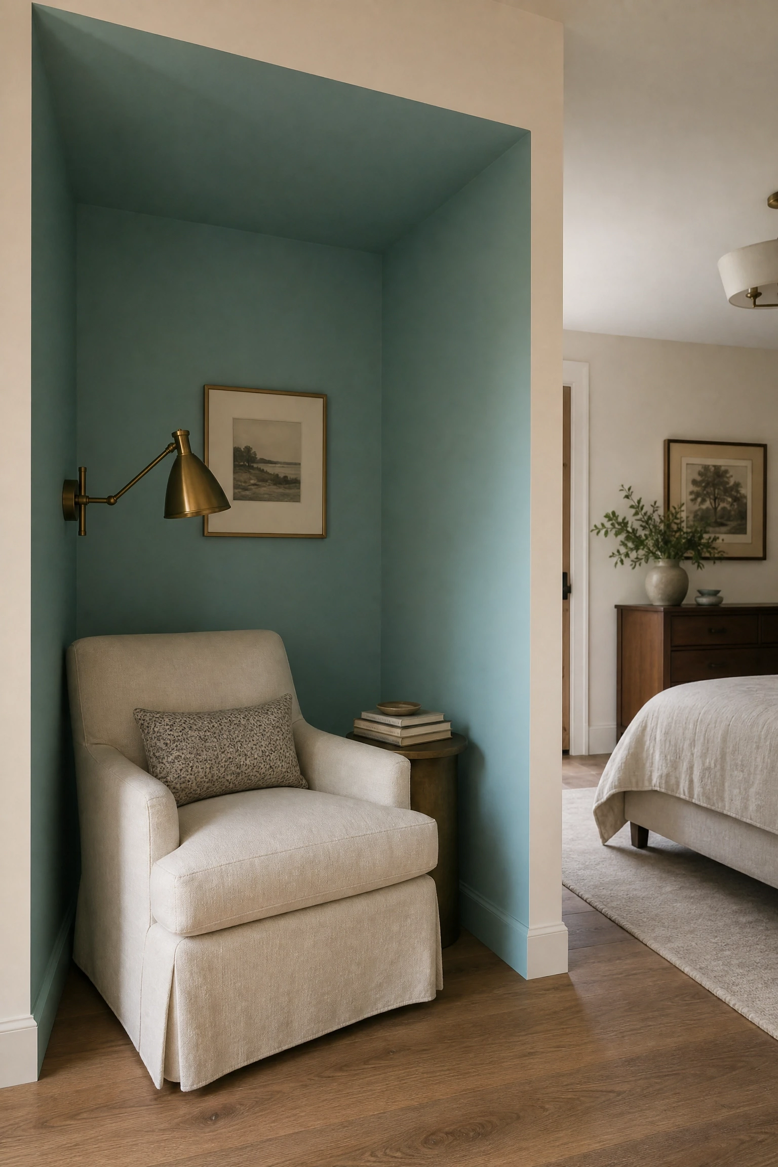
If your bedroom has an alcove, a recessed niche, or a window bay, painting just that area in aqua while keeping the rest of the room neutral is a design technique called color zoning. It uses color to define a specific area without requiring you to paint the whole room. This works particularly well for creating a reading corner or a sitting area that feels distinct from the sleeping area. Add a comfortable chair, a small side table, and a reading lamp inside the alcove. The aqua color wraps around the nook and creates a sense of enclosure that makes the space feel purposeful. This technique suits people who love the look of a colored room but are worried about committing to full coverage. It is also one of the most budget-friendly approaches since you are painting a small, contained area.
Quick Tip: Extend the aqua a few inches onto the ceiling of the alcove as well. That continuation of color overhead reinforces the sense that the nook is its own contained space.
19. Aqua in a Studio Bedroom That Doubles as a Living Space
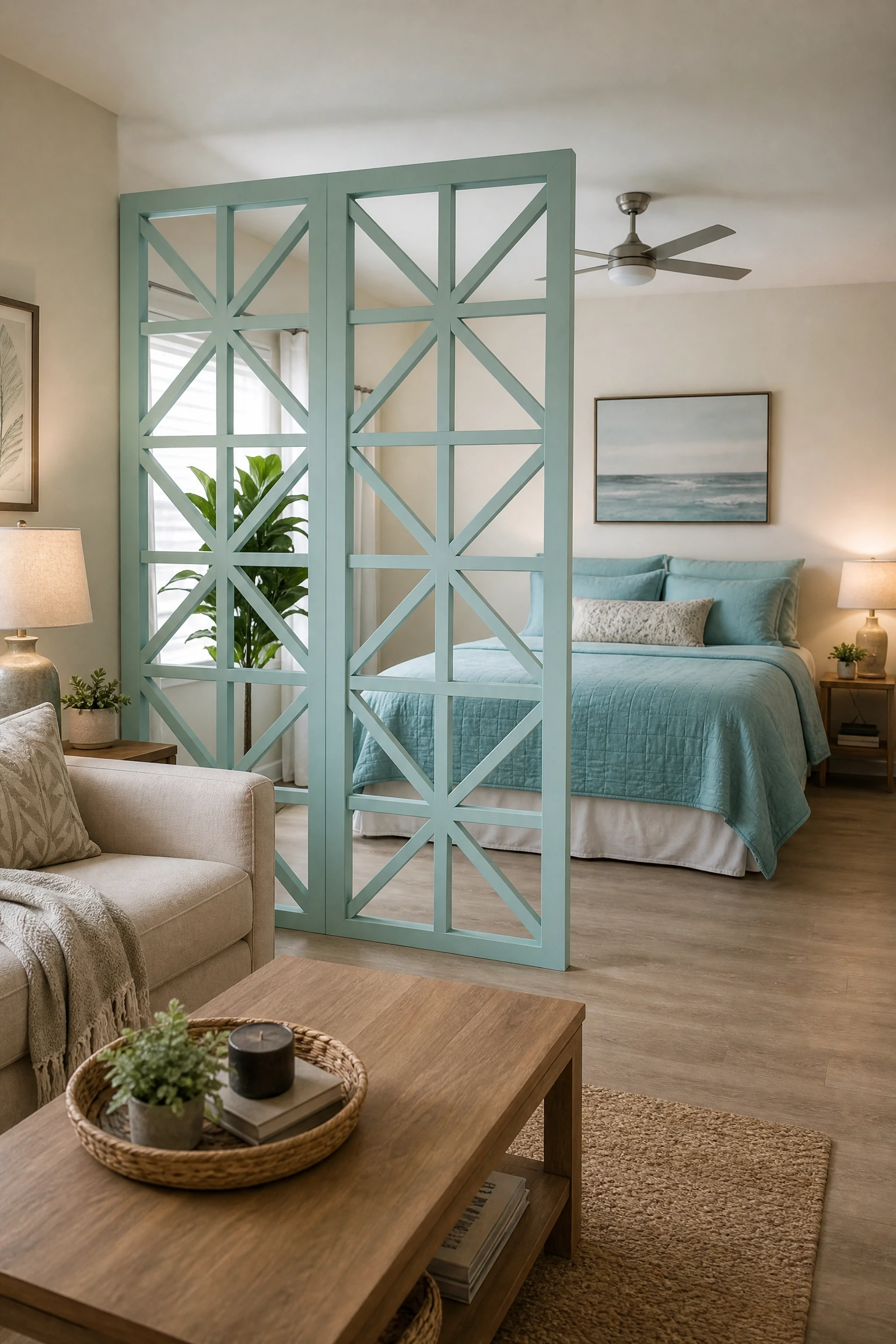
In a studio or open-plan bedroom, color can do a lot of organizational work that furniture cannot. Using aqua specifically around the sleeping zone, through bedding, a rug, or even a painted room divider, visually separates that zone from the living or working area without a physical wall. This is one of the most practical applications of aqua in modern urban living. An aqua-painted portable room divider screen, for example, creates a visual boundary and brings color and character into what might otherwise be a visually flat, cluttered open space. Keep aqua contained to the sleeping zone and let the living area stay in neutral tones. That contrast is what makes the zoning work. This approach is highly budget-friendly since room dividers and bedding are the primary investment.
Heads Up: Aqua room dividers work best in spaces with neutral walls. If your studio already has colored or patterned walls, adding an aqua divider may create too much visual competition.
20. Aqua Furniture in a Primarily White Small Bedroom
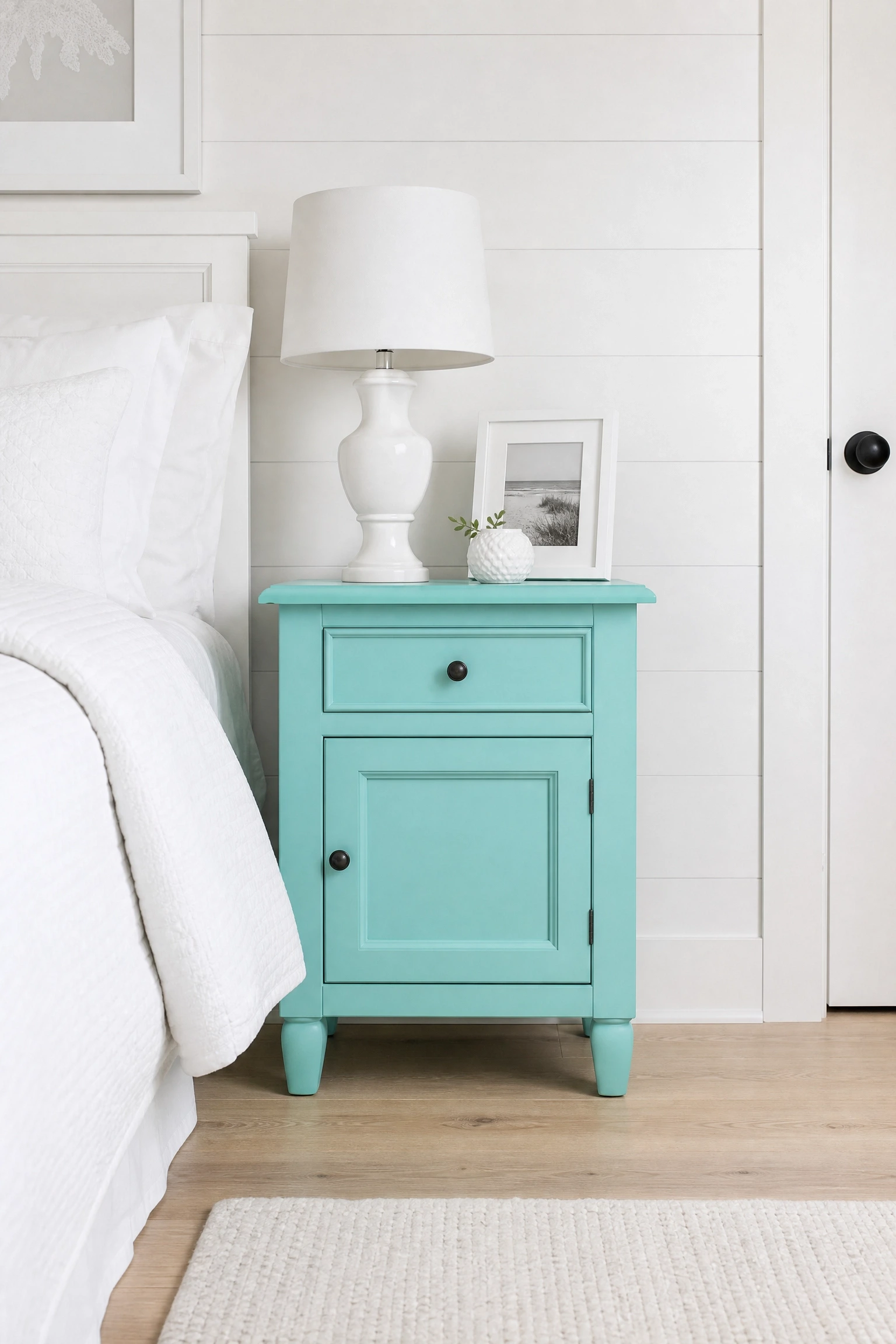
All-white bedrooms can feel fresh but also flat and slightly clinical. A piece of aqua furniture, a nightstand, a small dresser, or even a desk chair, introduces personality without the commitment of paint and without adding visual weight. In a small all-white room, one piece of well-chosen aqua furniture functions as both a color accent and a focal point. It should be the first thing your eye goes to when you walk in. Keep everything else in the room simple: white walls, white bedding, light wood flooring. Do not introduce any other colors. Let the aqua stand alone. This is a disciplined, architectural approach to accent color that is common in Scandinavian-influenced interiors. Budget: this ranges from very affordable if you paint an existing piece in aqua chalk paint, to mid-range if you buy ready-made aqua furniture.
Pro Move: Paint the interior of an open shelving unit aqua rather than the whole piece. The color shows through the objects displayed on the shelf and creates depth without committing the full surface.
Aqua is a genuinely versatile color, and the ideas above cover enough ground that there really is an approach for almost every room, budget, and design style. The most important thing to take away is that aqua does not have to be literal. It does not need to live on every wall or turn your bedroom into a beach house. Sometimes a single piece of aqua furniture or a pile of differently textured aqua pillows is all a room needs to feel coherent and considered.
What tends to separate rooms that look designed from rooms that look decorated is intentionality. Pick one or two ideas from the list above that genuinely suit your existing room, your light conditions, and your lifestyle. Resist the urge to combine too many at once. Aqua works best when it has breathing room. And if you are ever unsure, start small. A rug, a throw, a pair of pillowcases. Live with it for a month. The commitment can always scale up once you know how the color actually behaves in your specific room.
FAQ
What colors go best with aqua in a bedroom?
Aqua pairs well with warm whites, natural linen, warm wood tones, coral, rust, terracotta, and soft gray. Gold and brass hardware add warmth without competing. Avoid combining aqua with other cool tones like lavender or icy blue unless you are going deliberately cool and minimal.
Is aqua a good color for a dark or north-facing bedroom?
It can work, but you need to be careful with shade. A mid-tone aqua in a dark room will appear more saturated than expected. Opt for a lighter, slightly grayed aqua in low-light rooms, and balance it with warm lighting at the bedside and floor level to stop the color from reading as cold.
What is the difference between aqua, teal, and turquoise in bedroom design?
Aqua sits between blue and green and tends to be lighter and more washed in tone. Teal has more green and more depth, reading closer to a rich jewel tone. Turquoise is brighter and more saturated than aqua. For bedrooms, aqua is generally the most livable of the three because it is lighter and less intense, which suits a space meant for rest.
Can aqua work in a very small bedroom?
Yes, and it works better than most people expect. Aqua’s cool undertone keeps it from feeling heavy, unlike warm colors which can close a room in. The key is pairing aqua walls with light furniture, simple bedding, and maximized natural light. Avoid dark furniture and heavy textiles in a small aqua room.
How do I add aqua to a bedroom without painting the walls?
Bedding, curtains, a rug, throw pillows, a painted piece of furniture, or a ceramic lamp are all effective aqua introductions that require no wall paint. These are also reversible, which matters if you rent or change your mind quickly.
Does aqua go out of style quickly?
Aqua has been a popular bedroom color for decades and has never really left. It is not tied to a single trend cycle the way some colors are. Choosing a slightly muted, grayed version of aqua rather than a bright turquoise will help it age better in the long run.