Kitchen Backsplash Ideas for White Cabinets That Actually Work
White kitchen cabinets are like a blank canvas, which sounds nice until you realize you have to decide what goes on the wall behind them. The backsplash is where a white kitchen either comes alive or stays boring. White on white can work if you play with texture, but the real magic happens when you bring in color, pattern, or an unexpected material. The backsplash is usually the most visible stretch of wall in the kitchen, so it is worth getting right.
Here are 15 backsplash ideas for white cabinets that people have actually used and been happy with.
1. White Subway Tile with Dark Grout
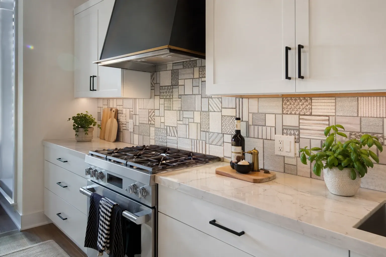
The simplest way to add character to a white kitchen is white subway tile with charcoal or black grout. The dark grout lines outline each tile and create a grid pattern that gives the wall structure and visual interest. Without it, white tile on white cabinets just blends into one flat surface. The grout does all the work here and the result is clean but not boring.
Designer Tip: Go with a sanded grout in dark grey rather than pure black. Pure black grout can feel too harsh against white tile, while dark grey gives you the contrast without the severity.
2. Marble Slab Backsplash
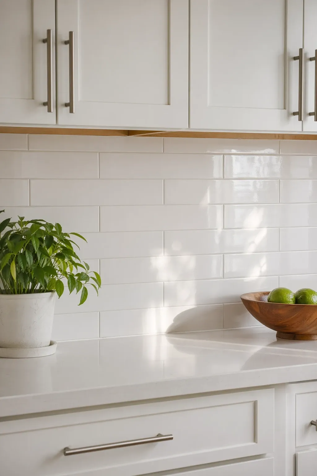
A single slab of marble or marble-look quartz behind the stove and counter creates a seamless, luxurious look. The natural veining of marble adds movement and pattern that no tile can replicate. With white cabinets, a Calacatta or Carrara marble with grey veining looks timeless. The slab format means no grout lines to clean, which is a practical bonus.
Designer Tip: If real marble is out of your budget, porcelain slabs that mimic marble have gotten incredibly realistic. They are cheaper, more stain-resistant, and the look is nearly identical from a few feet away.
3. Blue Zellige Tile
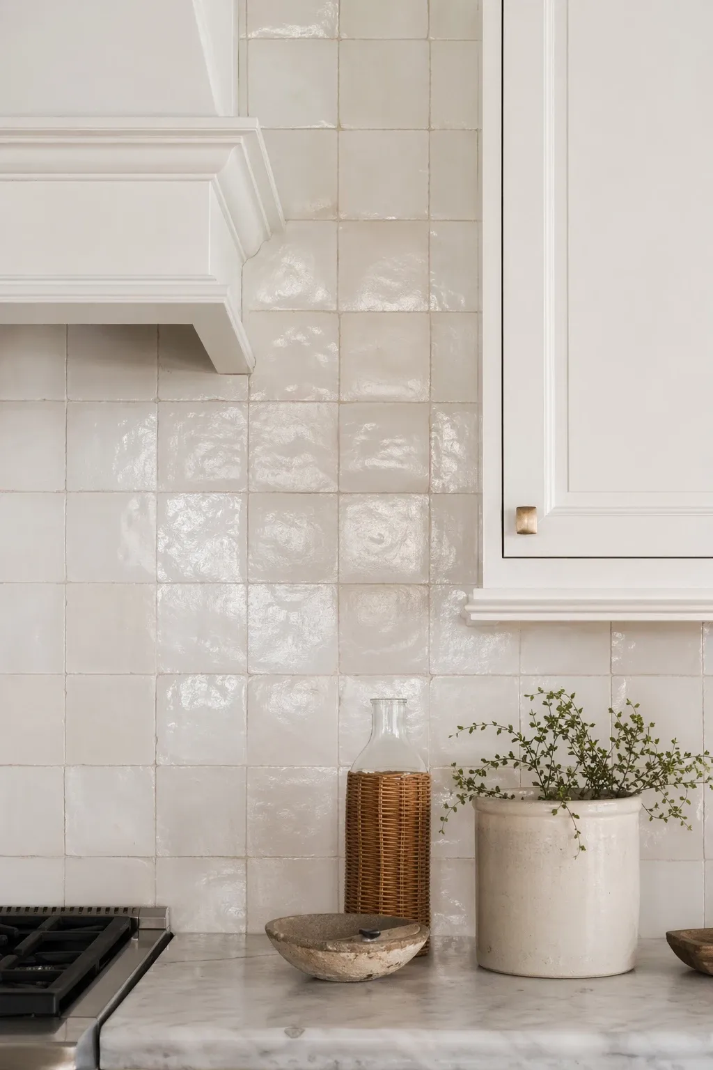
Blue zellige tiles against white cabinets is one of the most striking combinations you can do. Zellige tiles are handmade Moroccan tiles with an uneven, glossy surface that catches light in a way machine-made tiles do not. Each tile is slightly different, which gives the whole backsplash depth and texture. The blue brings color to the white kitchen without being overwhelming because it stays behind the cabinets and counters.
Designer Tip: Zellige tiles have natural variation, so expect some tiles to be lighter and some darker. This is the beauty of the product. If you want a perfectly uniform color, zellige is not the right choice. Embrace the variation.
4. Herringbone Pattern Tile
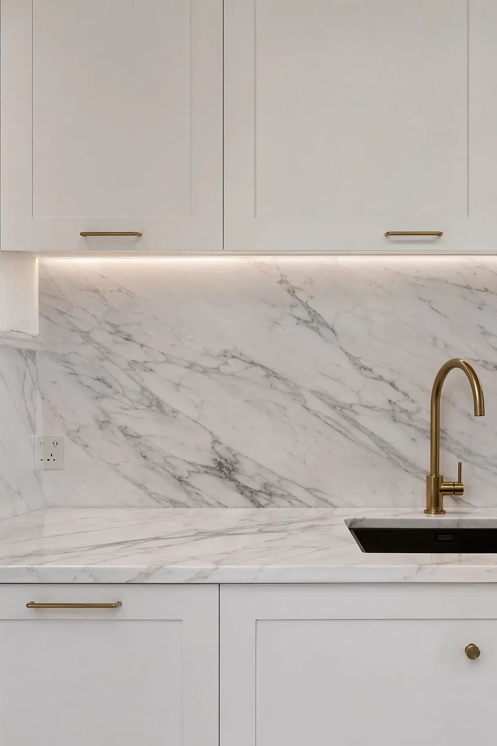
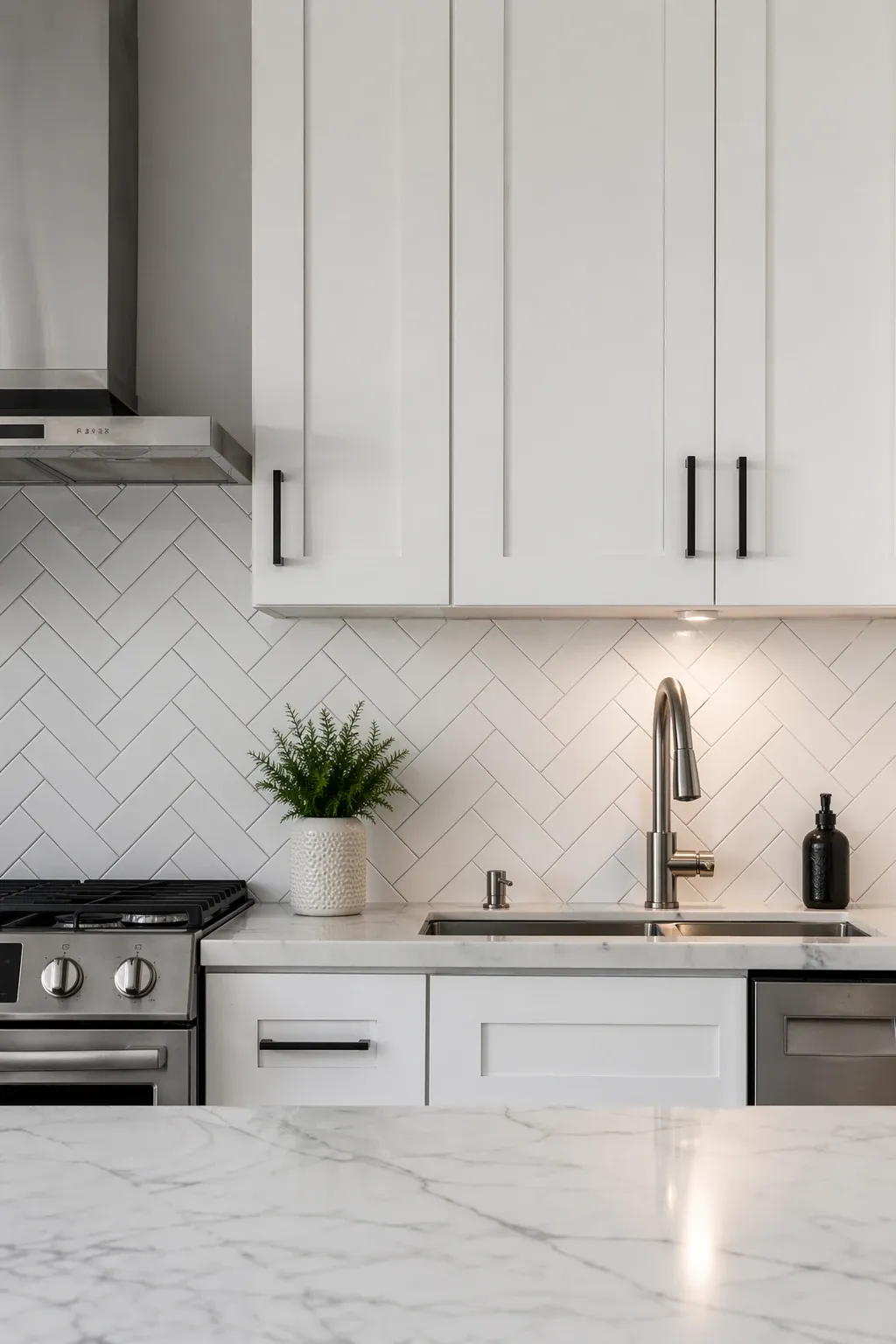
Taking a standard tile and laying it in a herringbone pattern, the V-shaped zigzag, adds movement and sophistication to a white kitchen. The pattern itself creates interest even if the tile color is neutral. White or light grey tiles in herringbone against white cabinets is subtle but effective. For more contrast, try a darker tile or a glass tile that catches the light.
Designer Tip: Herringbone patterns require more cuts and more time to install than a standard grid or brick pattern. Factor in extra tile for waste and extra labor cost if you are hiring it out. The result is worth it, but it is not a budget-friendly layout.
5. Green Tile Backsplash
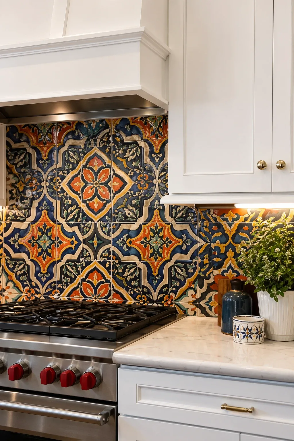
Green is one of the best colors to pair with white cabinets because it brings in a natural, earthy quality that warms up the kitchen. Sage green, hunter green, or emerald all work depending on the vibe you want. Sage is soft and quiet. Hunter is classic. Emerald is bold. Any shade of green with white cabinets and brass hardware is a combination that has real staying power.
Designer Tip: If you are nervous about committing to a full green backsplash, use green tiles only behind the stove as a focal area and a neutral tile on the rest of the walls. This gives you the color impact without covering every surface.
More Looks You'll Want to Steal:





6. Patterned Cement Tile
Patterned cement tiles are a bold choice that turns the backsplash into the star of the kitchen. Geometric, floral, or Moroccan-inspired patterns in black and white or muted colors give the white kitchen a personality that plain tile cannot. The patterns work because the white cabinets stay quiet and let the backsplash be the focal point. One thing to know: cement tiles need sealing because they are porous.
Designer Tip: Keep the rest of the kitchen very simple when using a patterned backsplash. Plain countertops, minimal accessories, and simple hardware. If there is too much going on around a busy backsplash, the kitchen feels chaotic.
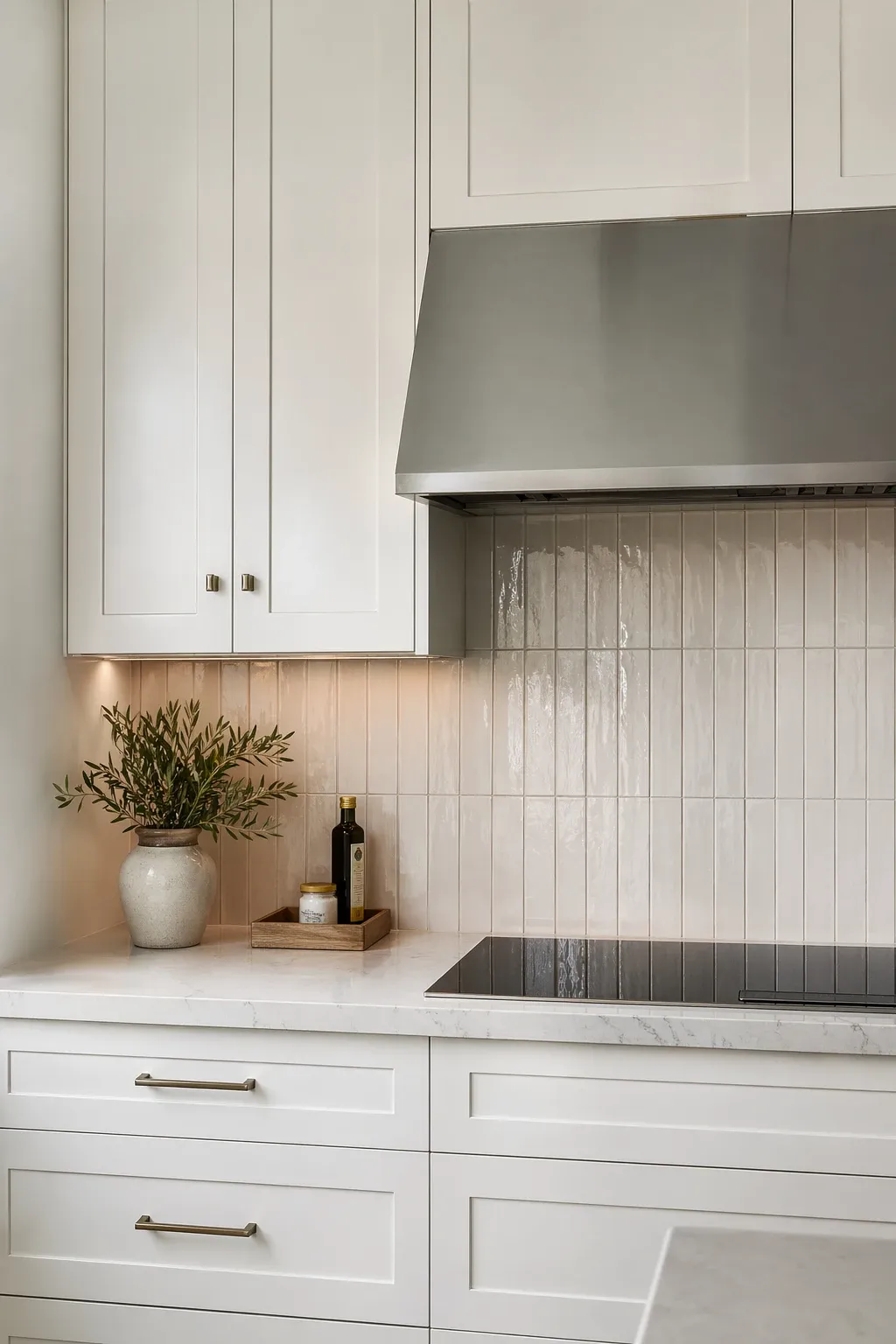
7. Stacked Vertical Subway Tile
Running subway tiles vertically in a stacked pattern rather than the traditional horizontal brick layout gives the backsplash a modern, fresh look. The vertical lines draw the eye upward and make the ceiling feel higher. It is the same tile but the different orientation changes the entire feel. This works especially well in kitchens with open shelving above the counter where you can see more of the tile pattern.
Designer Tip: Use a contrasting grout color with vertical subway tiles to make the grid visible. White tile with white grout in a vertical stack loses the pattern entirely. You need the grout lines to show the layout.
8. Penny Round Tiles
Small round penny tiles in white, grey, or mixed tones add a playful texture that rectangular tiles cannot. The tiny circles create a mosaic-like surface that catches light from different angles. They come on mesh-backed sheets which makes them surprisingly easy to install. The amount of grout visible is higher than with larger tiles, so grout color matters a lot with penny tiles.
Designer Tip: In a white kitchen, try grey or blush penny tiles rather than white. White penny tiles on white cabinets can look like a bathroom. A color shift gives the backsplash its own identity within the white kitchen.
9. Metallic Mosaic Tile
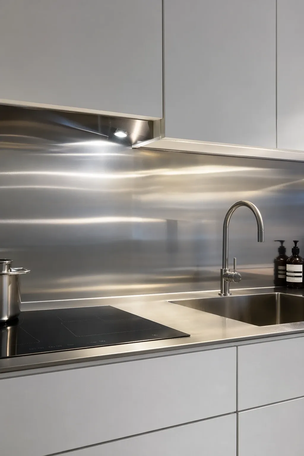
Metallic tiles in stainless steel, copper, or brass bring a reflective quality to the backsplash that bounces light around the kitchen. The metallic surface pairs well with white cabinets because the white provides a clean backdrop that lets the shimmer stand out. Stainless steel reads industrial and modern. Copper reads warm and rustic. Brass reads sophisticated and current.
Designer Tip: Match your metallic backsplash to your cabinet hardware and faucet. If the backsplash is copper but the hardware and faucet are chrome, the metals will fight each other. Consistency across metals pulls the kitchen together.
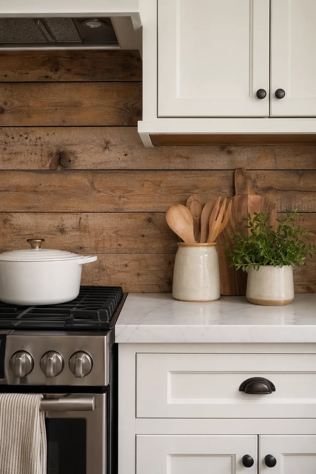
10. Full-Height Backsplash to Ceiling
Running the backsplash all the way from the counter to the ceiling, rather than stopping at the bottom of the upper cabinets, makes the kitchen feel taller and more dramatic. This works especially well on walls with no upper cabinets or on open shelving walls. It is more tile and more labor, but the visual payoff is significant. The uninterrupted surface reads as intentional and high-end.
Designer Tip: If you are extending tile to the ceiling, use a simple tile rather than a busy pattern. A busy pattern covering that much wall space can be overwhelming. A simple tile in a full-height application is dramatic in the right way.
11. Glass Tile Backsplash
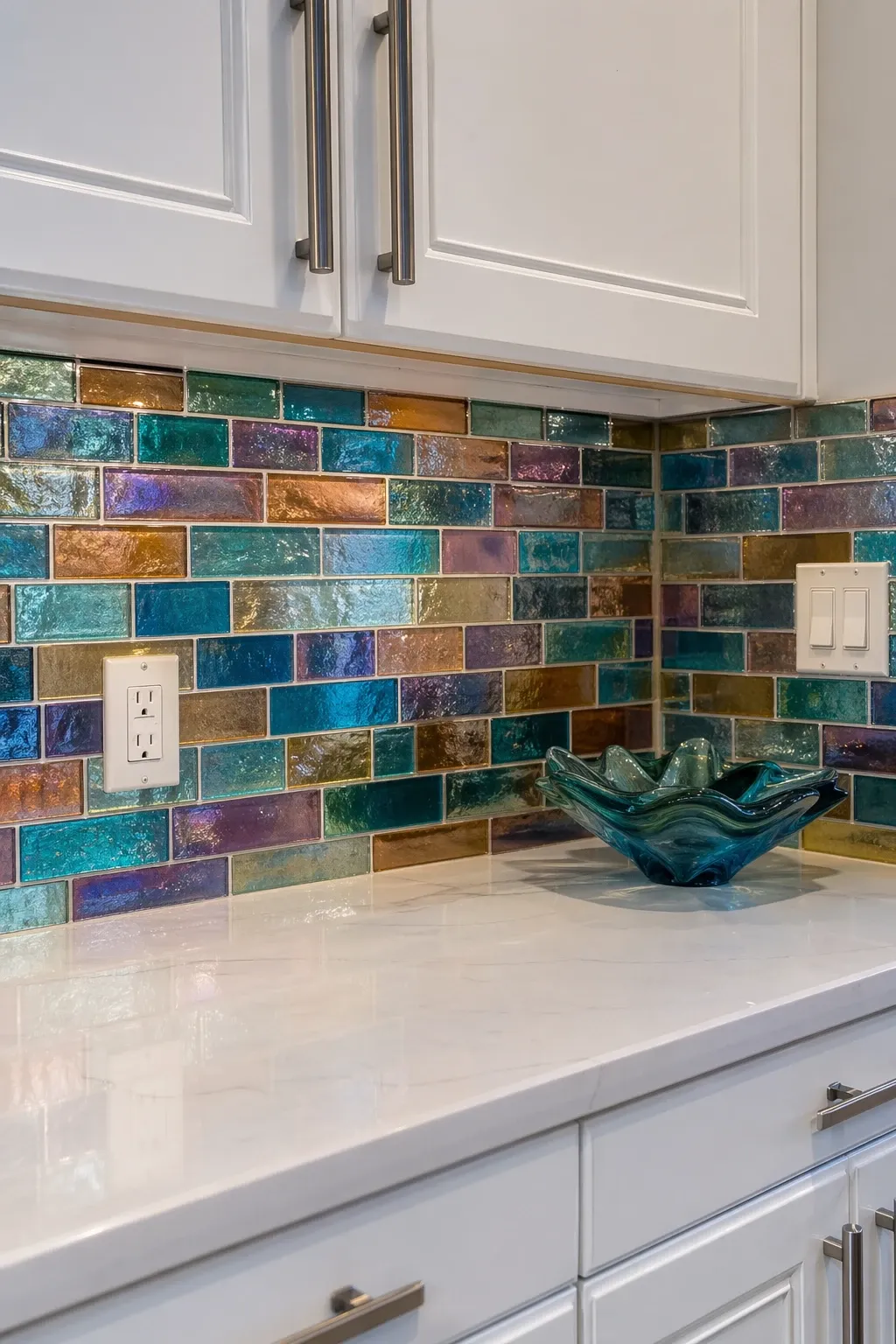
Glass tiles have a luminous quality that ceramic and porcelain cannot match. The translucency of the glass means the color seems to glow, especially with under-cabinet lighting hitting it. Blue, green, and grey glass tiles are the most popular with white cabinets. The glossy surface is also very easy to clean, which is practical for the area behind a stove.
Designer Tip: Glass tile shows every imperfection in the wall behind it. Make sure the wall is perfectly smooth and level before installation. Any bumps, dips, or uneven spots will be visible through the glass.
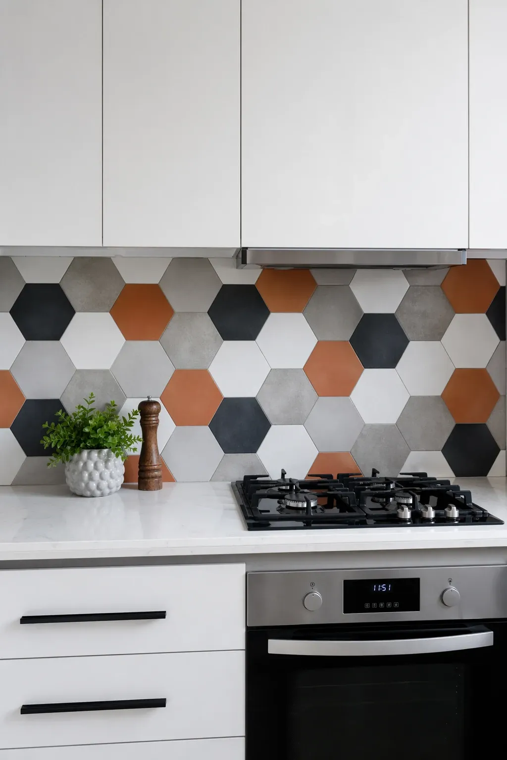
12. Hexagon Tile
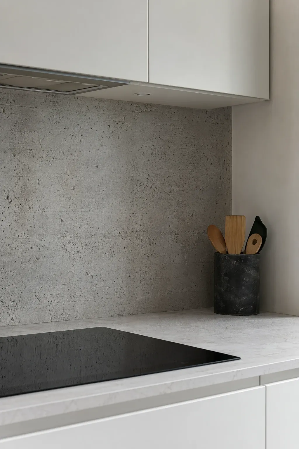
Hexagonal tiles add geometric interest that breaks away from the standard rectangular grid. Small hexagons in a single color create a subtle pattern, while larger hexagons or mixed colors make a bolder statement. The six-sided shape adds visual energy without feeling chaotic, and it works in both modern and traditional kitchens with white cabinets.
Designer Tip: Mix two or three shades of the same color in hex tiles, say, light grey, medium grey, and dark grey, randomly across the backsplash. The tonal variation creates visual depth that a single color cannot achieve.
13. Brick Veneer Backsplash
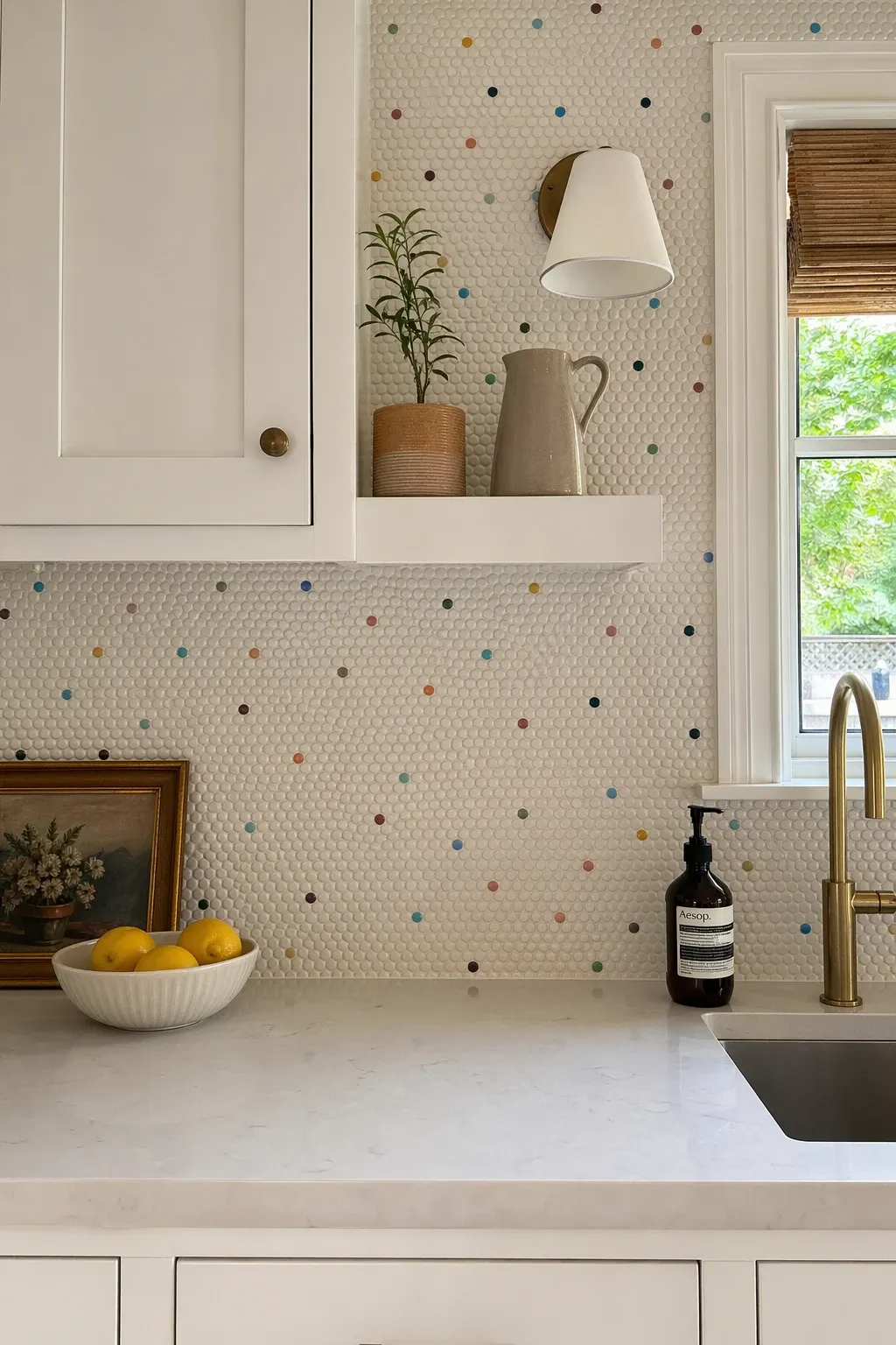
Thin brick veneer on the backsplash adds warmth and rustic texture that pairs beautifully with clean white cabinets. The contrast between rough brick and smooth cabinet fronts creates visual tension in the best way. Whitewashed brick keeps things lighter, while red or brown brick makes a bolder statement. Seal the brick well since it is porous and will absorb grease if left unprotected.
Designer Tip: Thin brick panels are easier to install than individual bricks and look nearly identical. They are lighter, cheaper, and can be cut with basic tools. For a backsplash application, panels are the more practical choice.
14. Bold Colored Solid Surface
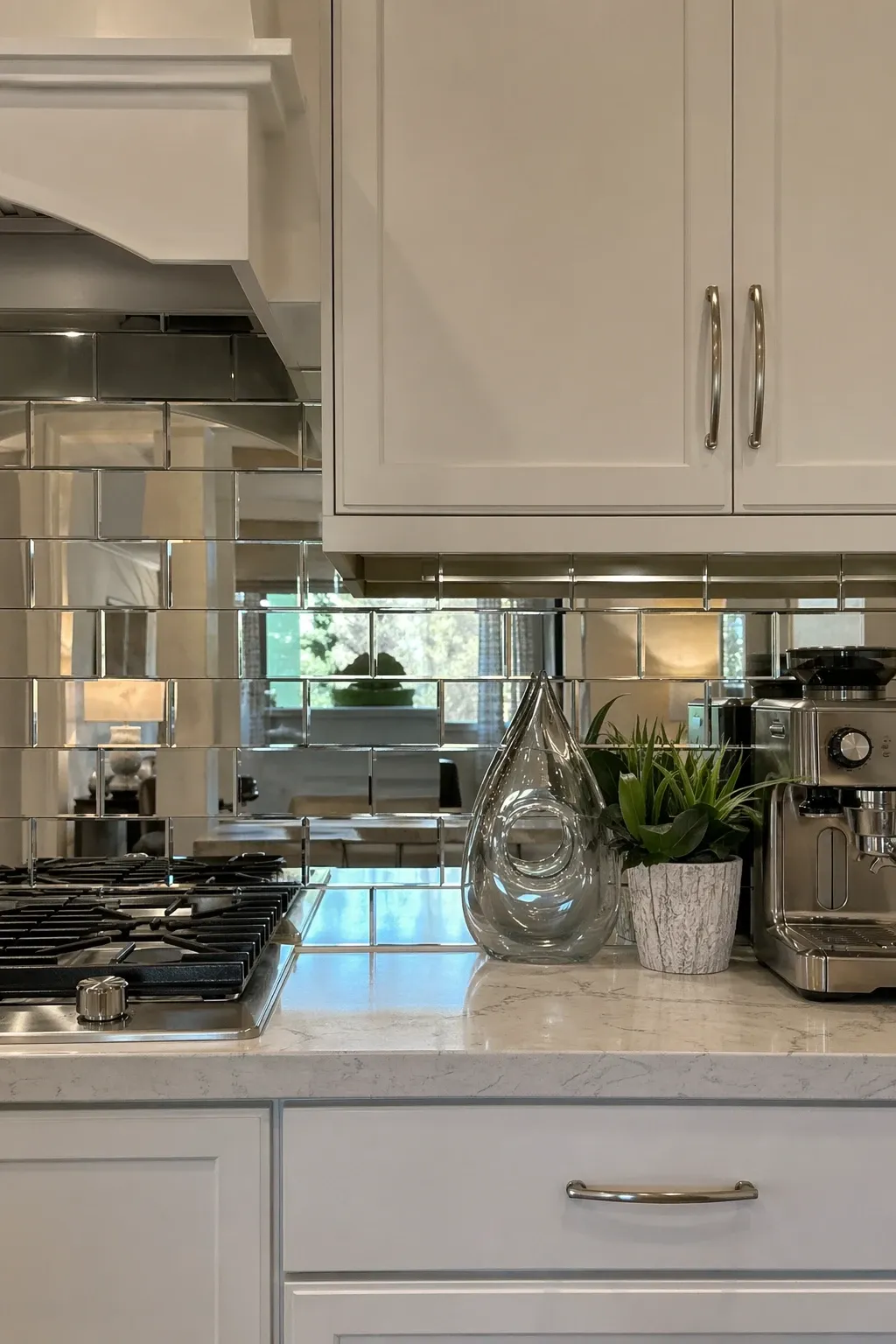
A solid surface backsplash in a single bold color, navy, forest green, terracotta, or even black, turns the space between the cabinets and counter into a strong design statement. White cabinets above and a colored backsplash creates a clean frame around the color that makes it pop. This works well with no grout lines and a smooth, unbroken surface for maximum visual impact.
Designer Tip: Match the backsplash color to one other element in the kitchen, like the bar stools, a rug, or pendant lights. One color connection makes the bold choice feel planned. Without that connection, a bold backsplash can feel random.
15. Natural Stone Mosaic
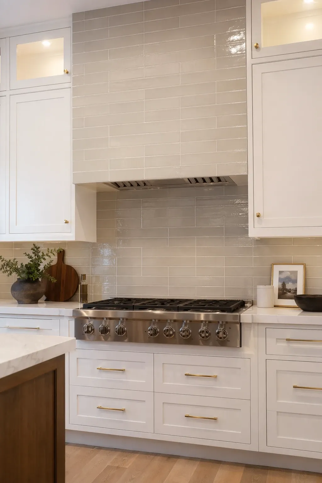
A mosaic of natural stone pieces, marble, travertine, slate, or a mix, adds an earthy, textured quality that manufactured tiles simply cannot replicate. Each stone piece is unique, which gives the backsplash a handmade, artisan feel. Neutral stone mosaics with white cabinets create a kitchen that feels both polished and organic, which is a hard combination to pull off with other materials.
Designer Tip: Seal natural stone mosaics before grouting and again after. Stone is porous and will stain permanently if not sealed. This extra step is essential and not optional, especially behind a stove where oil splatter is inevitable.
White cabinets give you the freedom to go bold or stay subtle with the backsplash. The safest choices are marble or neutral subway tile. The most interesting choices are patterned cement tile, colored zellige, or a bold solid color. Whatever you pick, make sure it works with your countertop since those two surfaces sit right next to each other and need to get along.
Frequently Asked Questions
What is the most timeless backsplash for white cabinets?
White subway tile, marble, and simple hexagon tile have all been popular for decades and show no signs of going out of style. If longevity matters most, these are the safest bets. They are classic enough to outlast trends and work with any countertop or hardware you might change in the future.
Should the backsplash match the countertop?
The backsplash and countertop should complement each other but do not need to match. Using the same material, like extending a marble counter up the wall as a slab backsplash, creates a seamless look. Using different materials that share a color tone works too. What does not work is two different busy patterns right next to each other.
How high should a kitchen backsplash be?
Standard backsplash height is from the counter to the bottom of the upper cabinets, usually about 18 inches. Full-height backsplashes that run to the ceiling create a more dramatic look. Behind the stove, take the backsplash all the way up to the range hood for both practical and visual reasons.