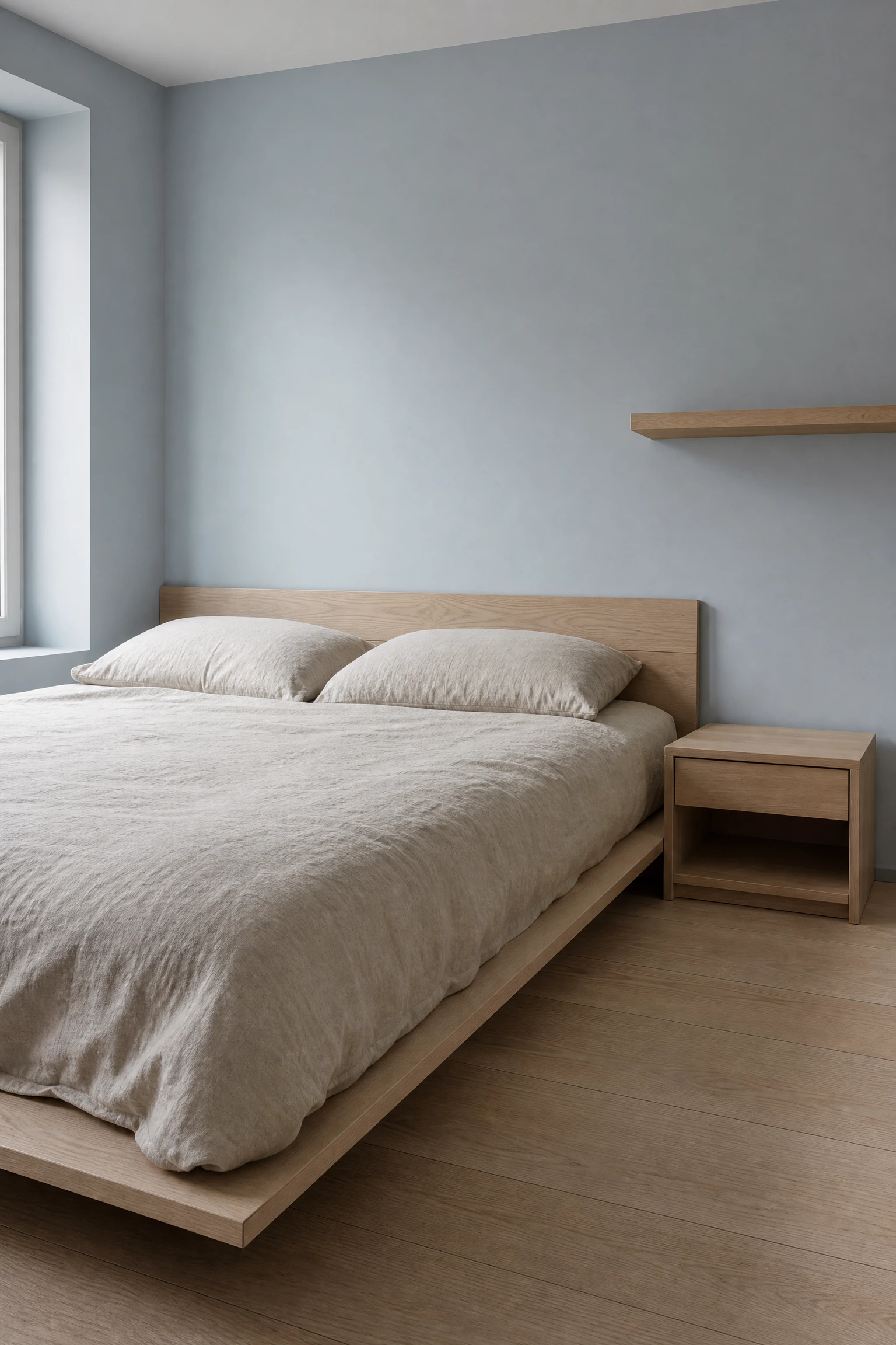
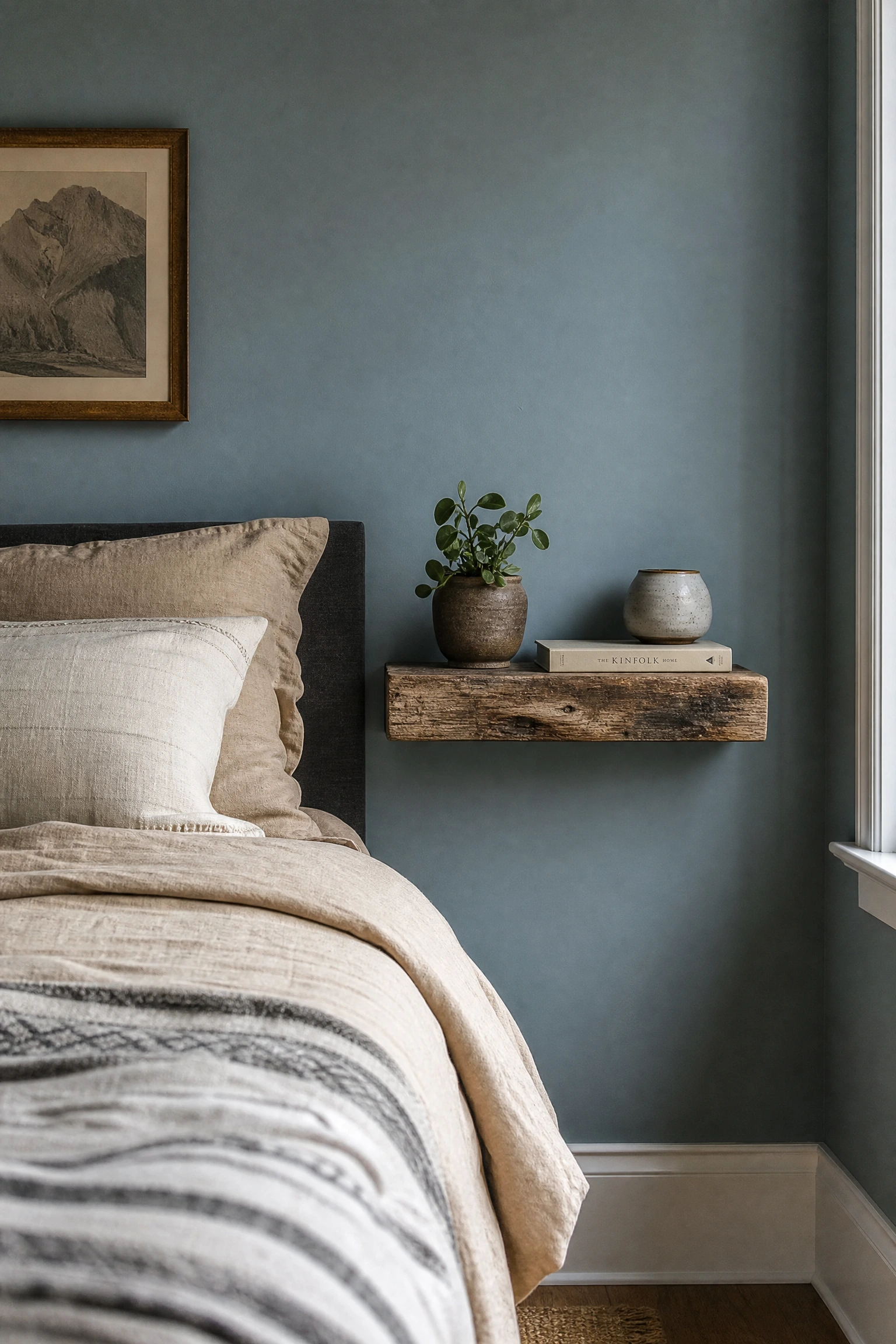
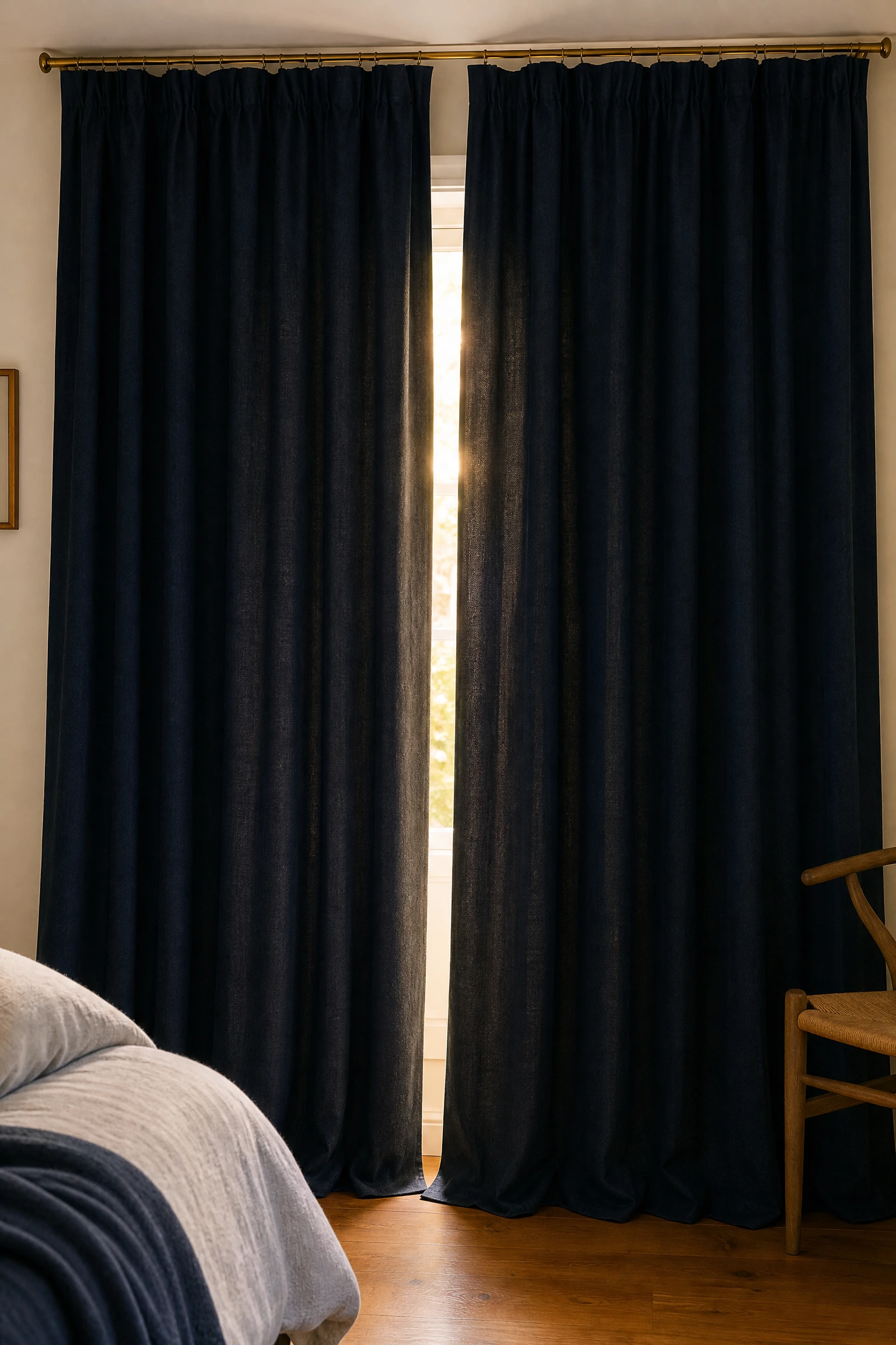
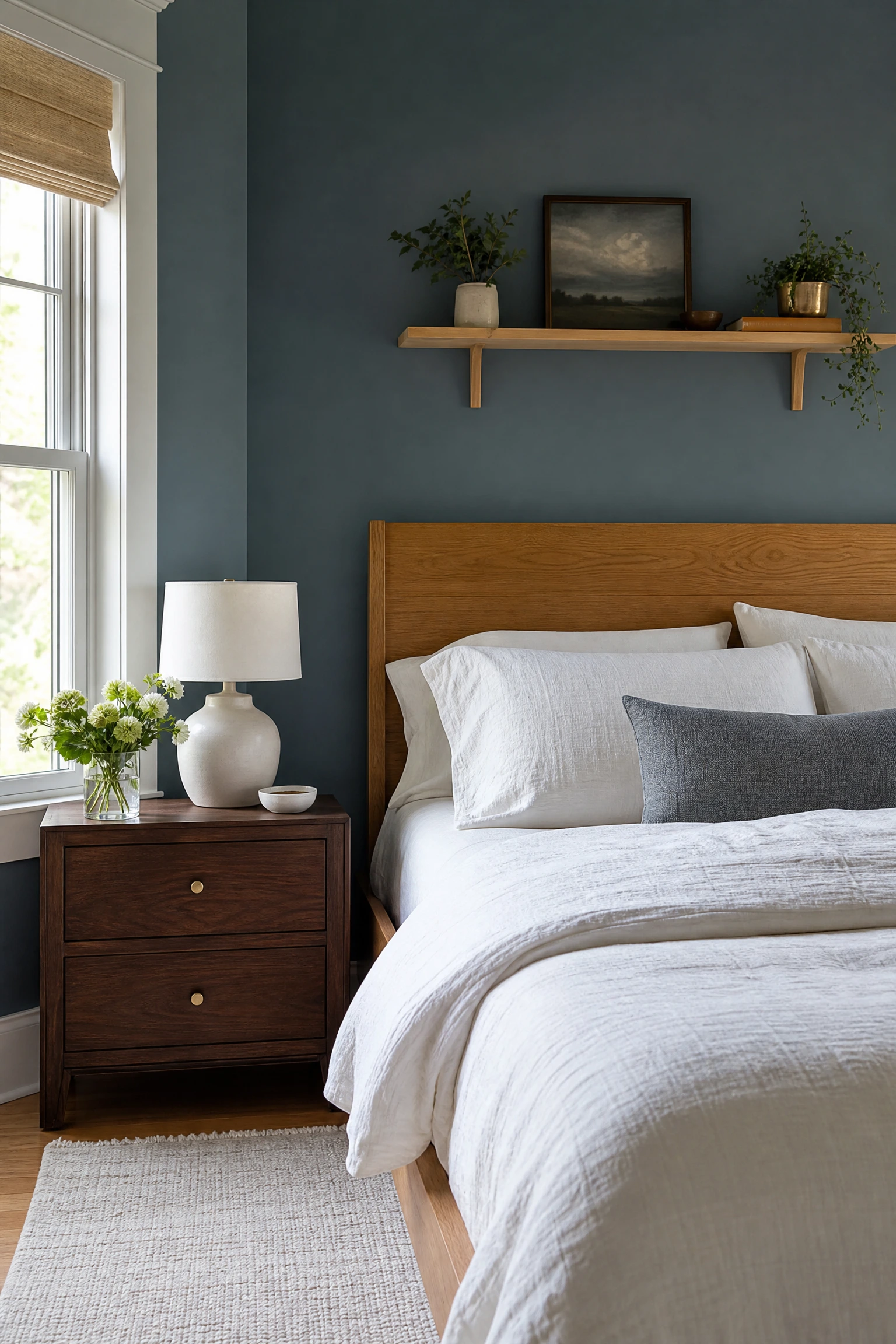
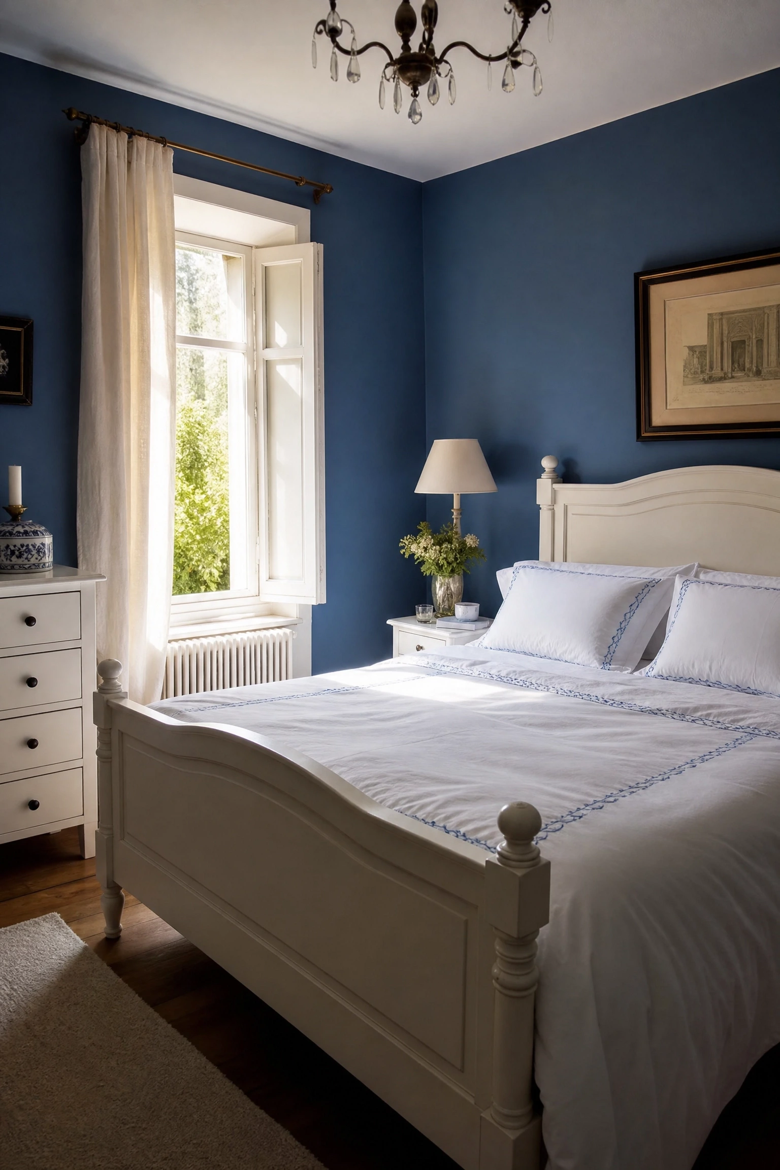
Blue brings calm and wood brings warmth, and when the two meet in a bedroom they do something neither can quite manage alone: they make a room feel genuinely restful without tipping into cold or flat. The real trick is knowing which shade of blue belongs with which wood tone, because not every blue works with every wood and getting that pairing wrong is usually why rooms in this palette end up looking either too clinical or too much like a beach rental.
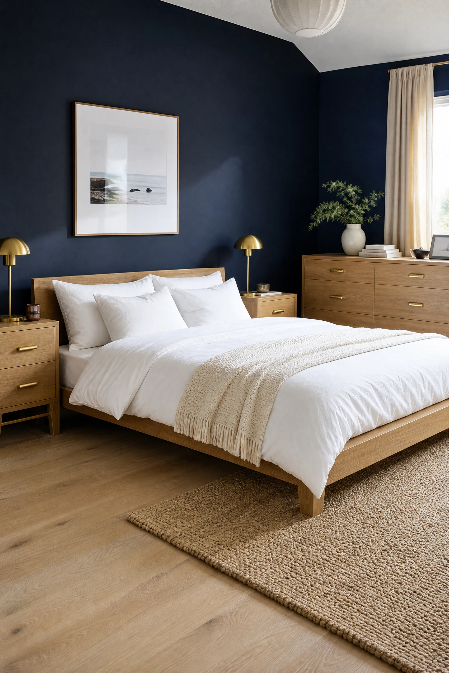
Navy creates one of the most grounded and sophisticated bedroom backdrops available, and pairing it with light oak furniture prevents the depth of the colour from feeling heavy or cave-like. In practice, the pale warmth of oak lifts navy off the wall so it reads as rich rather than oppressive, and the natural grain variation in the timber gives the eye something calm to rest on against the bold colour behind it.
Designer Advice: Choose oak with a matte or satin finish rather than high-gloss lacquer; glossy surfaces bounce navy back into the room and can make the colour feel brighter and harsher than intended.
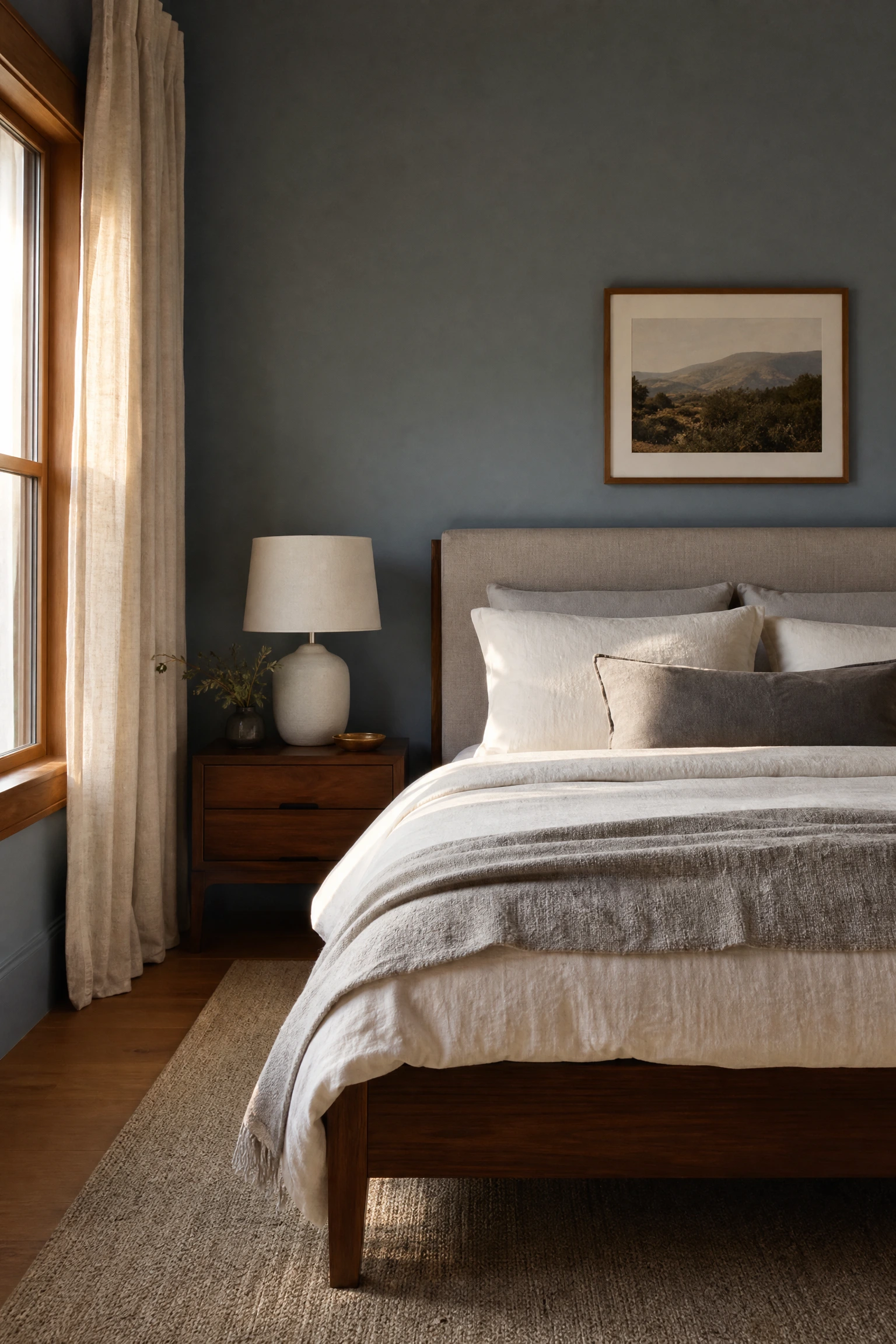
Dusty or muted blue, the kind with a slight grey or green undertone, pairs beautifully with walnut because both tones carry a natural earthiness that keeps the room feeling grounded and warm rather than cool and styled. Walnut has enough red-brown richness to counterbalance blue’s cooler tendencies without the contrast ever feeling forced or decoratively obvious.
Pro Move: Dusty blue and walnut is the pairing that photographs best in lower light conditions, which makes it an excellent choice for rooms that face north or get limited natural daylight.
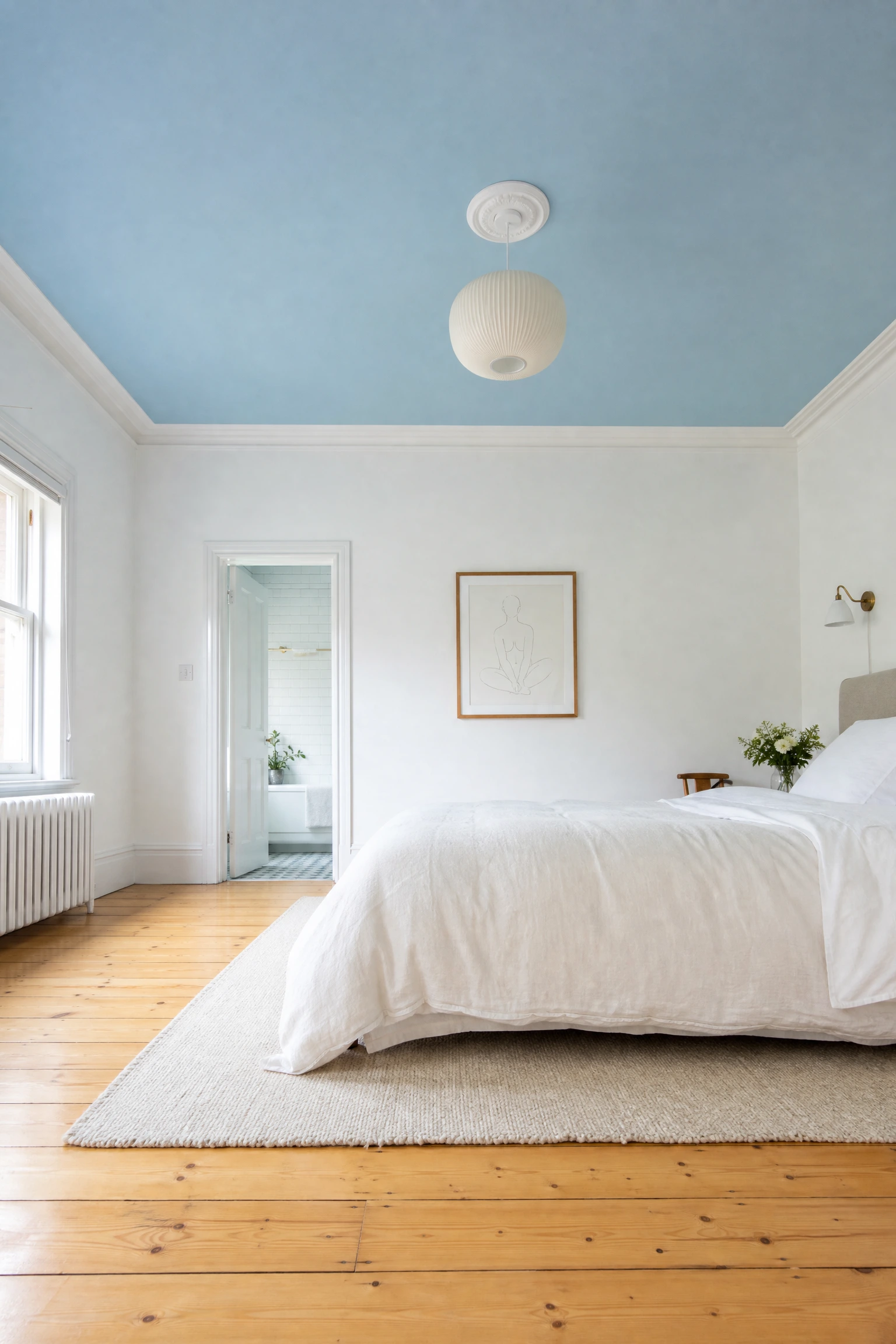
Painting the ceiling in soft sky blue while keeping the walls white or cream and letting a natural pine floor run throughout creates a room that feels open and airy from the ground up. Interior designers sometimes call this the inside-of-a-cloud effect: the pale blue overhead reads as sky rather than paint when it is soft enough in tone, and the honey warmth of pine underfoot keeps it from floating off into the abstract.
Quick Tip: For this to work the blue needs to be genuinely soft, no stronger than a very diluted wash; anything too saturated on the ceiling will feel like you forgot to stop painting and the room will look much lower than it actually is.
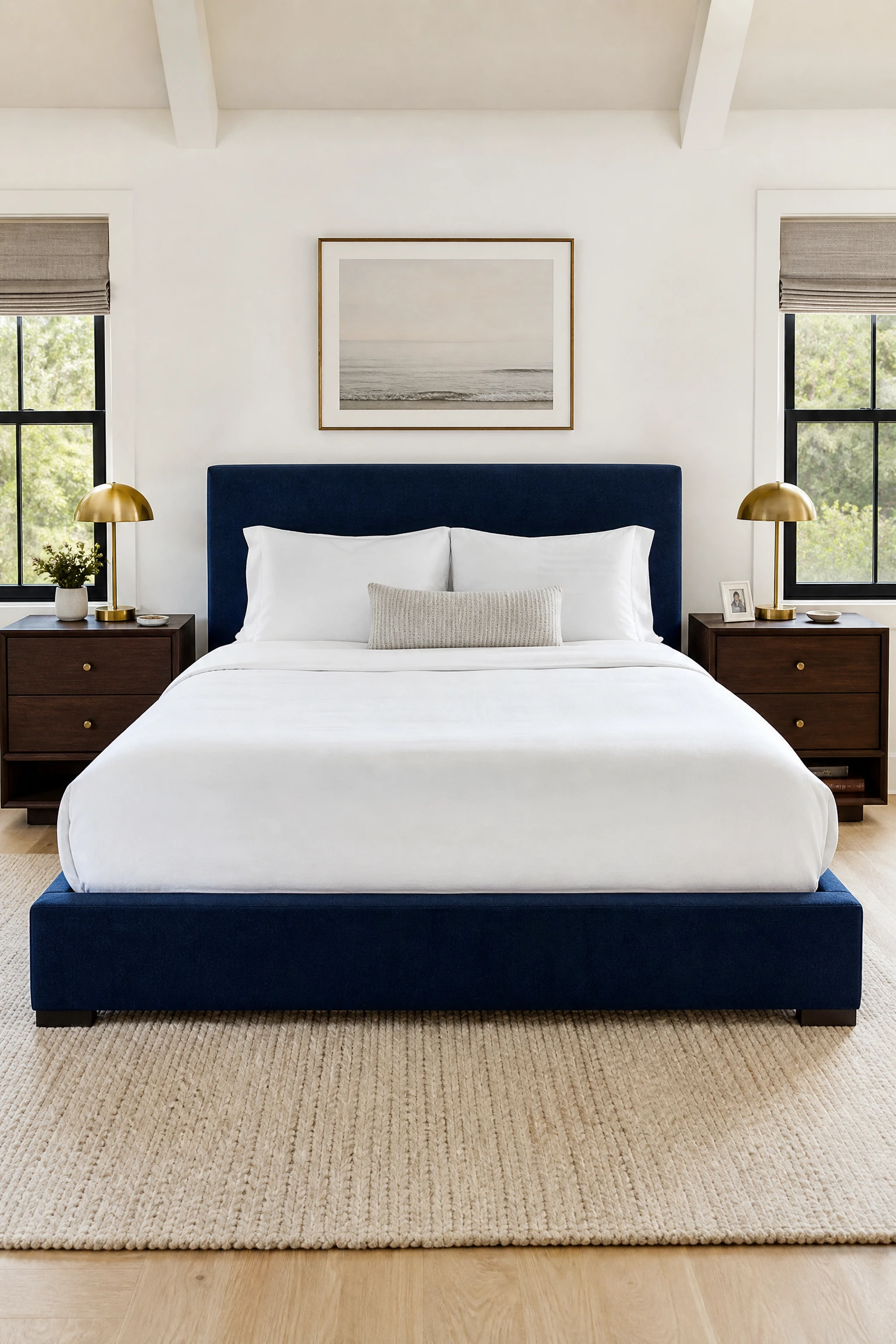
4. Navy Blue Bed Frame Against a White Wall With Dark Walnut Nightstands
A navy upholstered or lacquered bed frame sitting against a white or off-white wall with dark walnut nightstands on either side is one of the most composed and confident looks available in this palette. The white wall acts as a neutral stage, the navy bed delivers the colour moment, and the dark walnut grounds the composition at surface level with a warmth that stops the navy from reading as corporate or cold.
Heads Up: Dark walnut and navy work together because both are deep tones, but the walnut must genuinely be warm-brown in daylight; cooler or greyer dark woods will blend into the navy and lose the contrast entirely.
Design Fact
Research into colour psychology consistently shows that blue environments lower resting heart rate and support sleep onset. This makes blue one of the most physiologically sound choices for a bedroom, provided the blue used is a colour tone rather than a blue-tinted light source, which has the opposite effect on melatonin production.
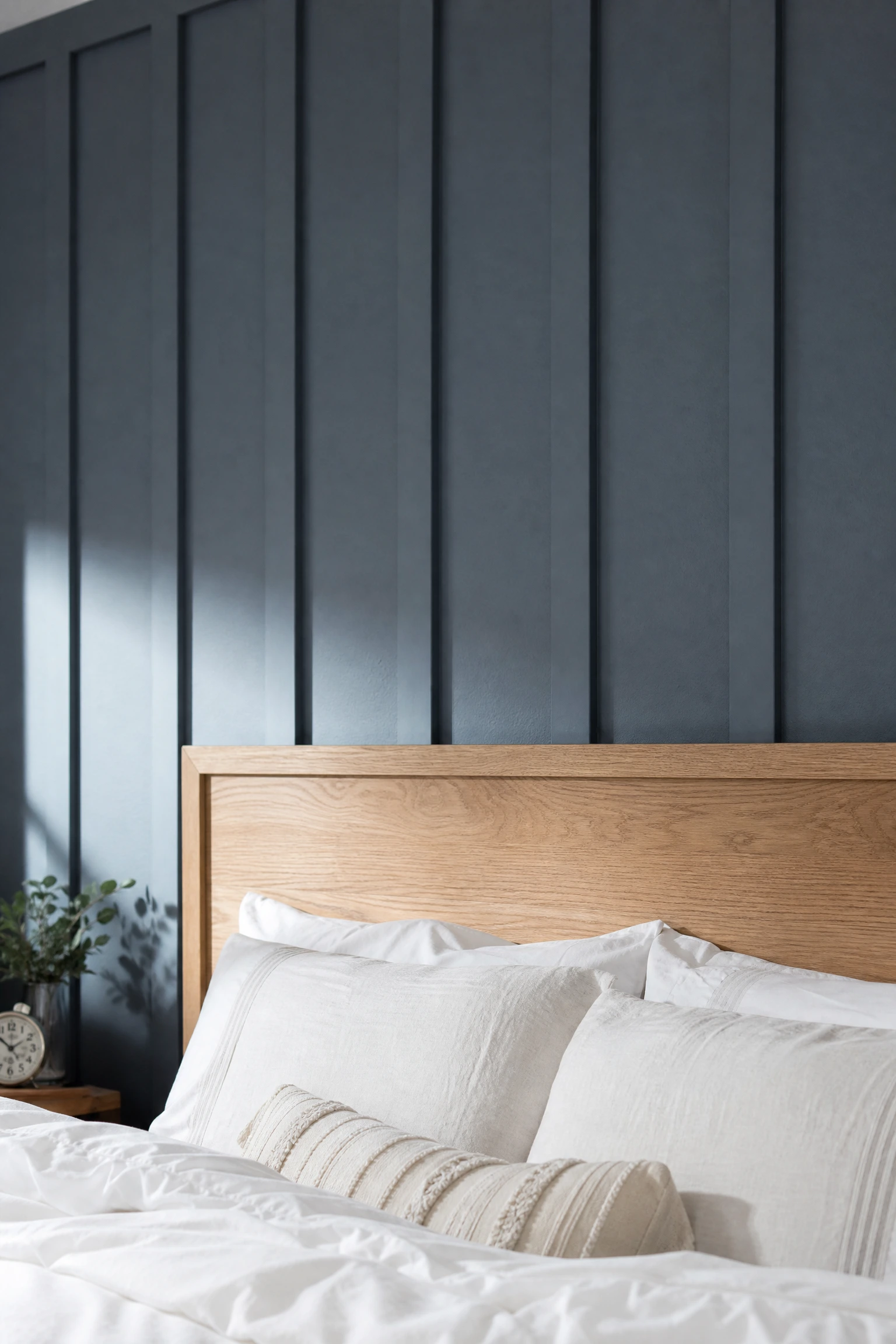
5. Slate Blue Paneled Wall Behind a Raw Oak Headboard
Slate blue wall paneling, whether painted shiplap, board and batten, or simple flat panels, directly behind an unfinished or raw oak headboard creates a textured, layered backdrop that feels considered and tactile rather than flat. The raw or lightly oiled finish on the oak keeps the grain visible and slightly rough, which reads as a deliberate material contrast against the smooth painted surface of the panels behind it.
Reality Check: Raw or lightly finished oak will develop a gentle patina over time and may need a light re-oiling every year or two; it is a living material, not a maintenance-free one, and that honesty is part of what makes it look so good.
6. Powder Blue Walls With Bleached or Whitewashed Wood Floors
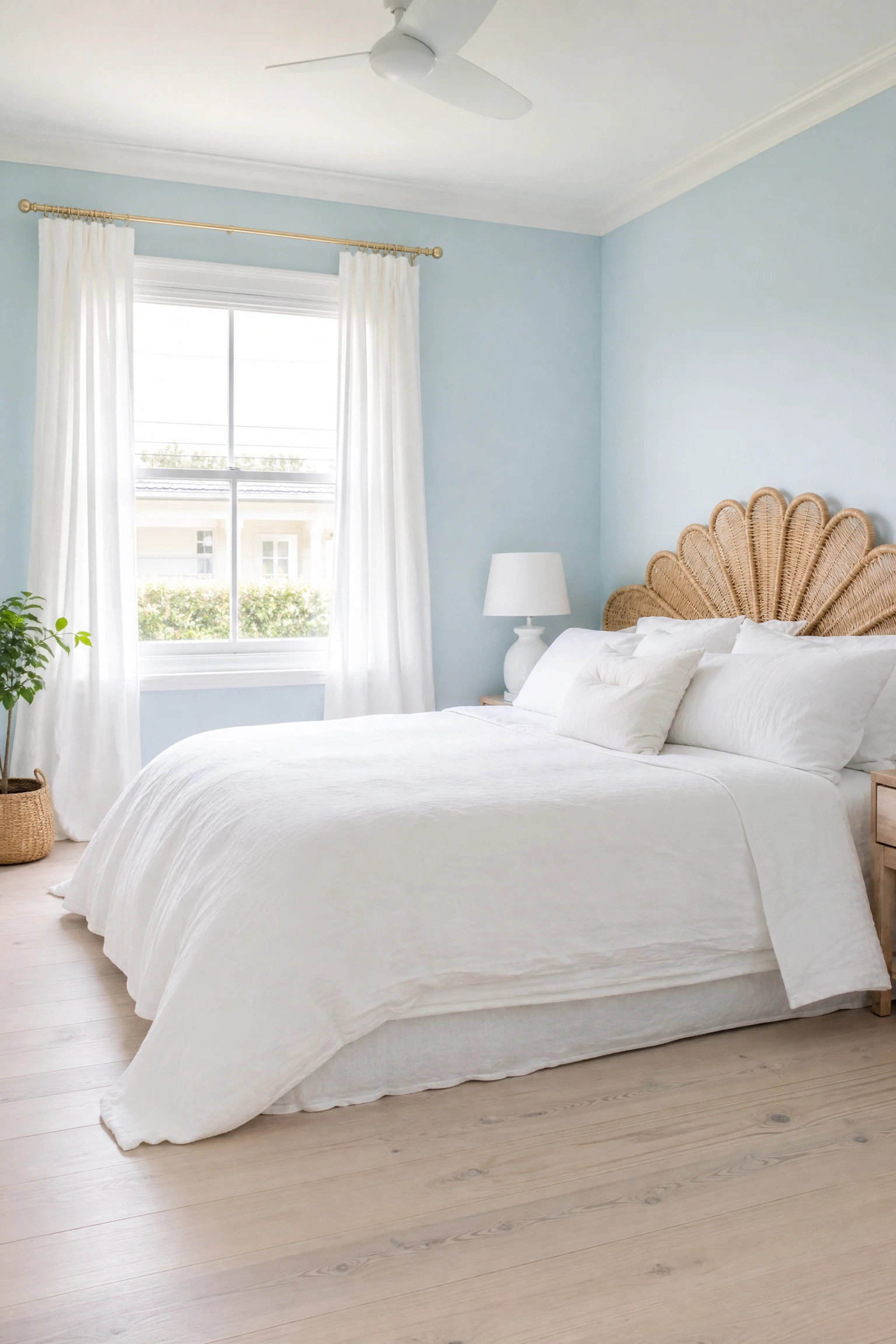
Powder blue, the palest and most whisper-quiet version of the colour, comes alive when the floor beneath it is bleached or whitewashed timber that reflects light upward rather than absorbing it. The combination reads as coastal without defaulting to the nautical cliches of ropes and anchors, and it works particularly well in smaller bedrooms where both the pale wall and the reflective floor keep the space feeling larger than it is.
Designer Advice: Bleached or whitewashed floors need a matte or semi-matte topcoat to maintain their pale tone; a high-gloss finish over whitewashed timber reads as plasticky and loses the organic quality that makes this pairing work.
7. Inky Blue Accent Wall With Warm Bamboo Furniture
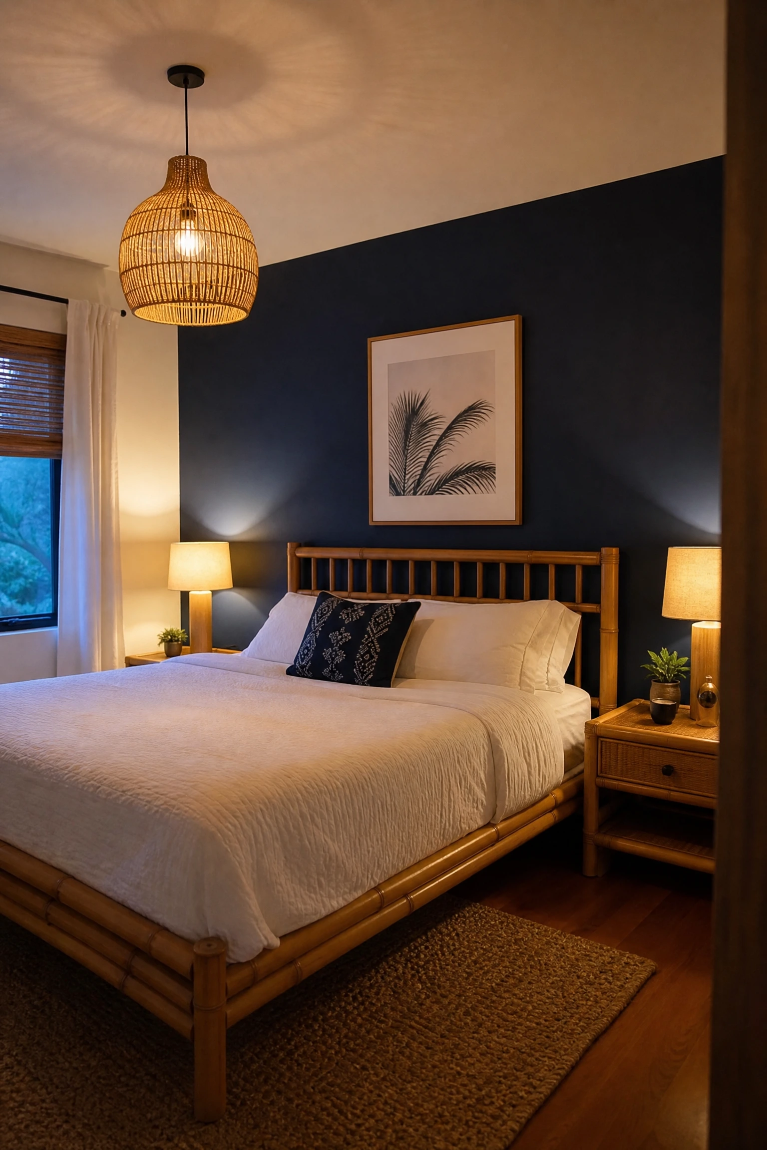
An inky blue or near-midnight accent wall paired with bamboo furniture introduces a natural, slightly exotic material into the palette that is neither as rustic as pine nor as heavy as walnut. Bamboo has a fine, consistent grain and a warm golden tone that sits beautifully against deep blue, and because it is a lighter material visually it prevents the inky wall from making the room feel dense or overly dramatic.
Quick Tip: Bamboo furniture tends to read as more contemporary than rattan or wicker; if your room leans more modern than coastal this is the natural material that fits most comfortably within a sleek, edited space.
Pale blue paint or wallpaper alongside ash furniture, ash floors or ash-toned bedside tables delivers what Scandinavian interior designers call hygge through contrast: the coolness of the blue and the barely-there warmth of the ash create a palette so close in value that the room reads almost as a single tonal experience, which is deeply calming in a bedroom context. In practice, this combination works best when the textiles do the warm lifting through linen, chunky knit throws and natural cotton bedding.
Pro Move: Ash wood with a natural oil finish rather than a lacquer maintains its softness of tone; lacquered ash reads yellower and warmer than the pale, almost grey-white quality that makes it the right partner for pale blue.
9. Teal-Leaning Blue Walls With Reclaimed Wood Shelving
Teal sits at the border between blue and green and pairs exceptionally well with reclaimed or distressed timber because the slight age and variation in the wood echoes the organic complexity of the teal tone itself. A reclaimed wood floating shelf or a salvaged beam headboard against a teal wall makes the room feel layered with history and intention rather than freshly assembled from a catalogue.
Heads Up: Teal is one of the trickier blue shades to sample accurately because it shifts dramatically between natural daylight and warm incandescent light; always test on the actual wall before committing to a full room.
Floor-to-ceiling navy curtains in a room with warm oak or honey-toned timber floors is one of those combinations that requires almost nothing else to feel finished. The navy curtains frame the window and ground the vertical space, and the warm floor running beneath them keeps the room feeling comfortable and human rather than cold and decorative.
Designer Advice: Hang navy curtains from a rod mounted as close to the ceiling as possible and let them pool slightly on the oak floor; this small detail makes the ceiling feel higher and the curtains look custom rather than off-the-shelf.
Steel blue has enough grey in it to sit comfortably alongside multiple wood tones at once, which makes it one of the most practical shades for people who are not starting from scratch and already have existing furniture in different finishes. In practice, the blue acts as a unifying backdrop that visually connects a walnut dresser, an oak bed frame and a pine shelf that might otherwise look mismatched and assembled over time.
Reality Check: Mixing wood tones works when one tone clearly dominates and the others are supporting players; two equally prominent but different woods in a blue room will still look like a mismatch regardless of how good the wall colour is.
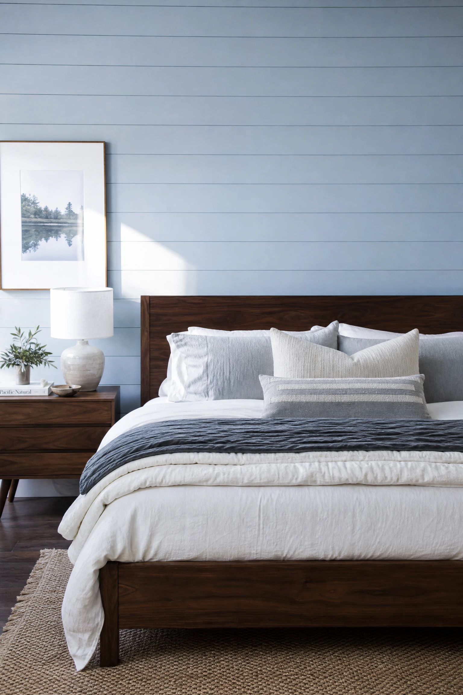
12. Pale Blue Shiplap Wall Behind a Dark Walnut Bed
Pale blue painted shiplap behind a dark walnut bed is a combination that delivers strong visual texture without relying on pattern or print. The horizontal lines of the shiplap create movement across the wall, the pale blue keeps it light enough to recede rather than dominate, and the dark walnut bed frame in front anchors the whole composition with a weight and warmth that prevents the room from feeling too sweet or too coastal.
Quick Tip: Paint shiplap in a flat finish rather than satin; the flat paint makes the groove shadows between boards more visible and the texture reads better across the room.
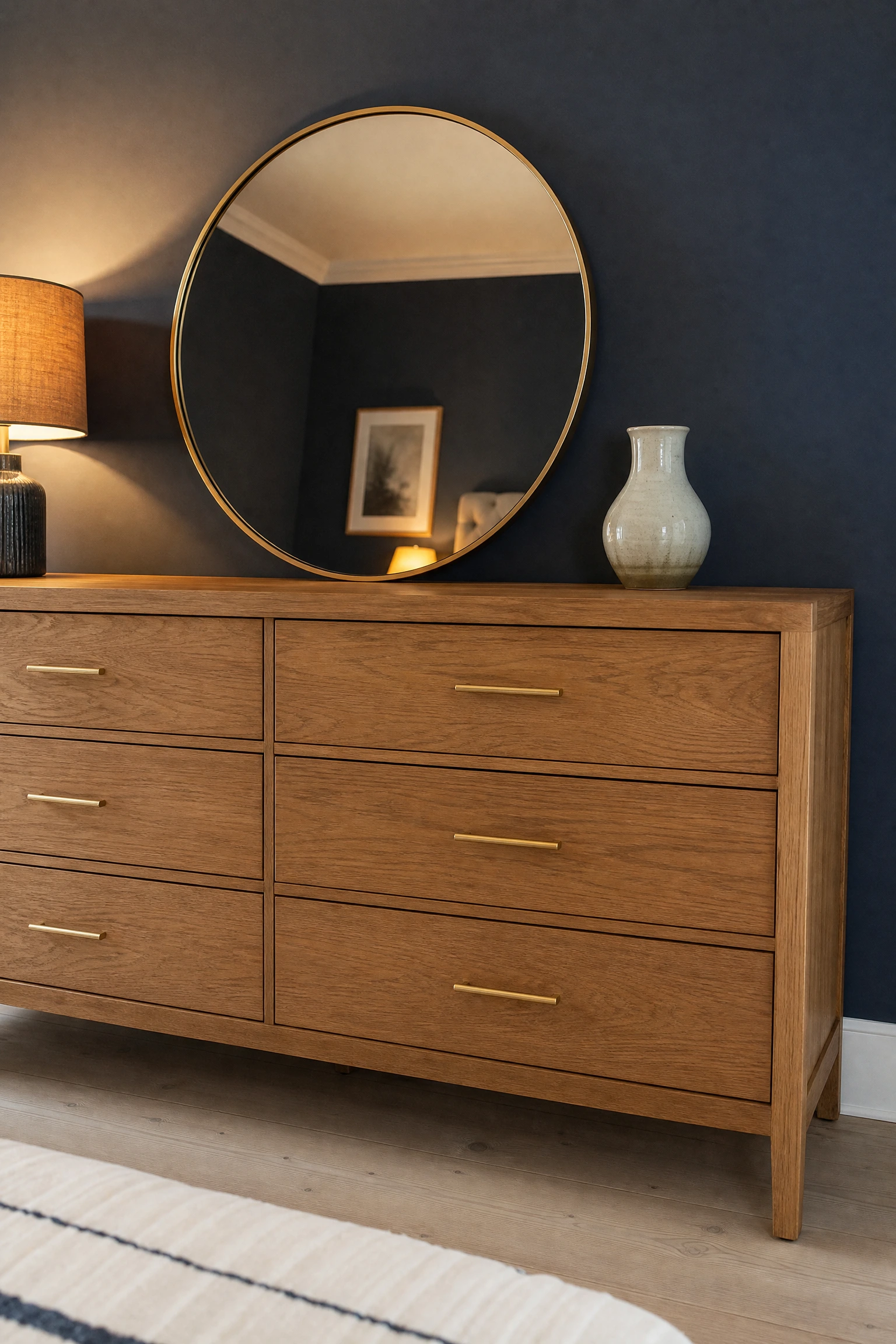
Brass hardware on oak furniture in a navy bedroom is the detail that separates a room that looks considered from one that just looks painted. The warm yellow of brushed brass pulls the oak’s golden tones forward against the navy backdrop and adds a layer of material sophistication that neither oak nor navy delivers alone. Even something as small as swapping the drawer pulls on an existing oak dresser makes an immediate and visible difference.
Pro Move: Brushed brass rather than polished brass is almost always the right call in a blue and wood bedroom; polished brass can read as too shiny and ornate against the natural honesty of the timber and the depth of the navy.
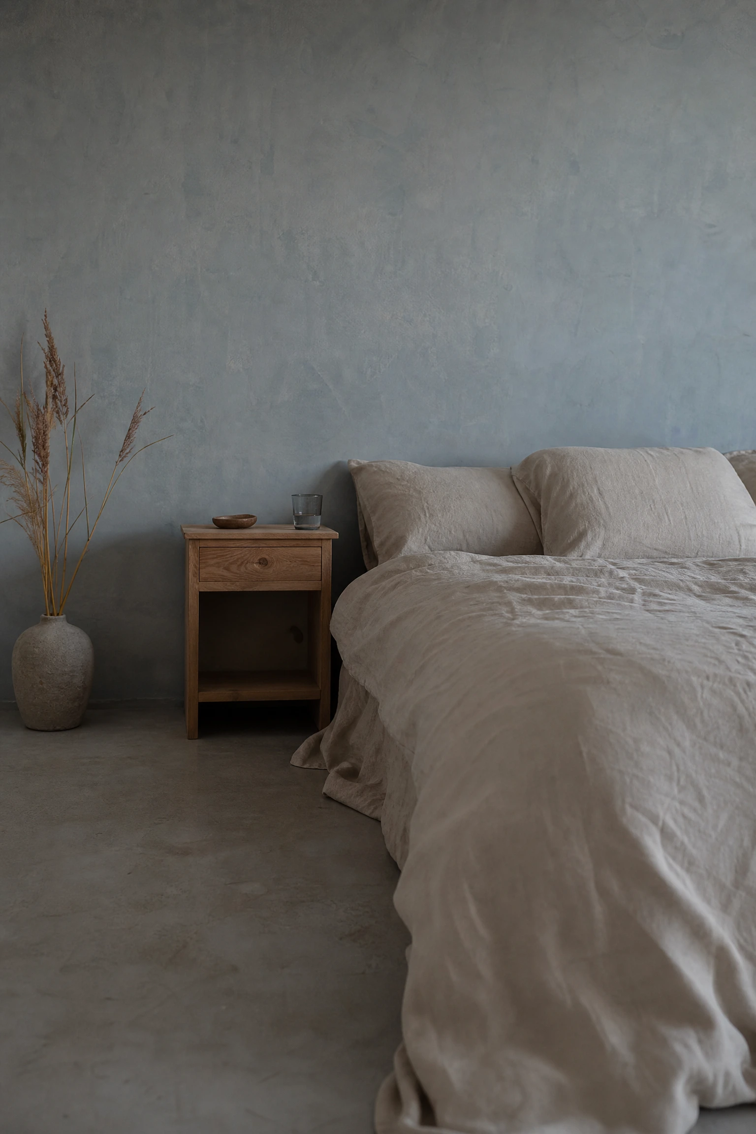
14. Washed Blue-Grey Walls With Unfinished Linen and Wood
A washed or greyed-down blue on the walls with unfinished linen bedding and bare wood furniture creates a room that feels deliberately unprecious and quietly beautiful, the kind of space that looks like it was not trying and yet somehow landed perfectly. This approach borrows from the wabi-sabi design principle of finding beauty in the imperfect and unfinished, and it works in a blue and wood bedroom because both materials, in their more natural and less processed state, share the same honest, organic quality.
Designer Advice: Resist the urge to add metal accents or polished finishes to a wabi-sabi blue and wood room; the beauty of this look comes from the consistency of the matte, unfinished surface quality across every element in the space.
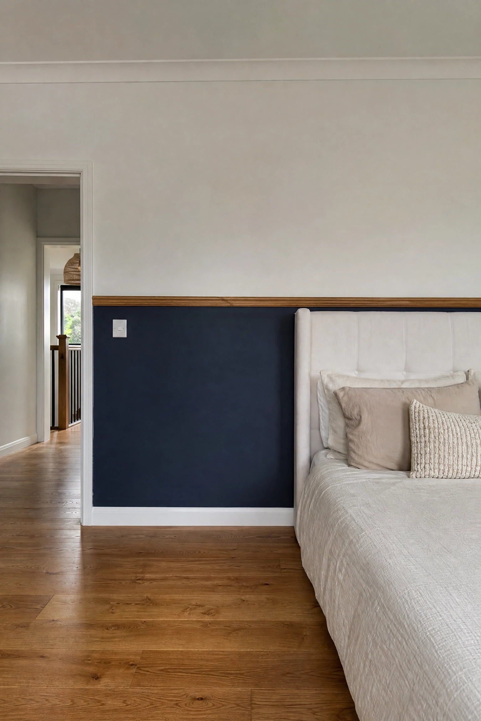
15. Navy Blue Lower Half of Walls With Wood Dado Rail
Painting the lower half of bedroom walls in navy below a timber dado or chair rail, with the upper half in white or very pale blue, is a classic architectural technique that grounds the room visually and makes the ceiling feel higher by putting the darkest tone at the lowest point. The timber dado rail is the key detail that separates this from looking unfinished; it provides a deliberate boundary and introduces a natural material line that connects the wood furniture to the walls.
Heads Up: The dado rail should be painted in a wood stain or left natural rather than painted to match the wall colours; painting it white or navy erases the material moment that makes the whole technique worthwhile.
Before and After: What Adding Wood Does to an All-Blue Bedroom
Before: A bedroom with blue walls, blue bedding and minimal other elements reads as cold and slightly clinical, especially in rooms with limited natural light. The eye has nowhere warm to rest and the room feels as though it is missing something without being able to identify what.
After: The same bedroom with one wood element added, whether a timber bed frame, a warm oak nightstand or a reclaimed wood shelf, immediately feels balanced and inhabitable. The wood gives the eye a warm anchor point and the blue shifts from feeling stark to feeling calm. This is why designers consistently reach for wood when a blue room is not quite working; it is almost always the missing ingredient.
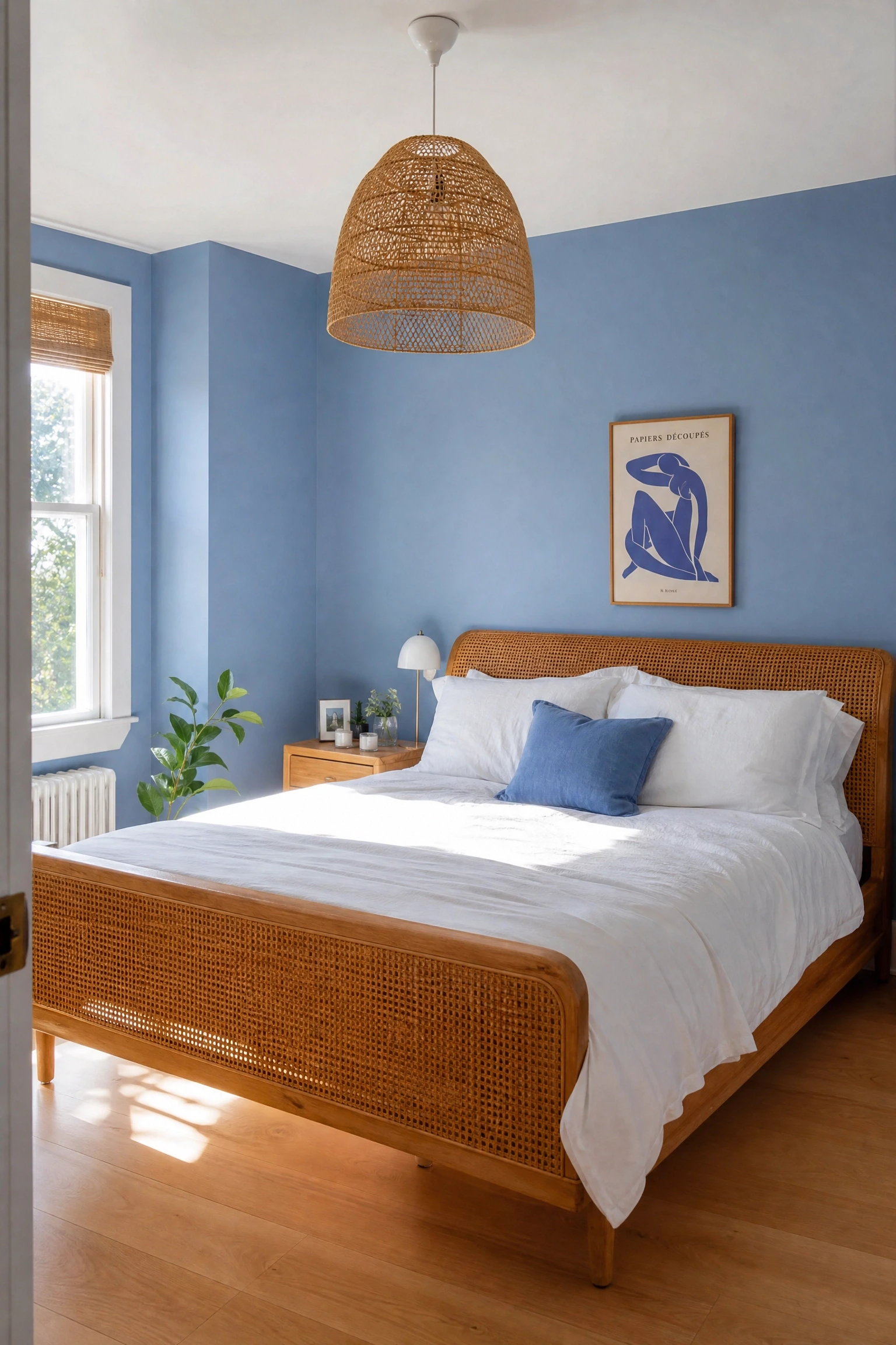
16. Cornflower Blue Walls With a Cane or Rattan Bed Frame
Cornflower blue, a bright but not saturated mid-blue with a slight violet undertone, pairs beautifully with the tight woven texture of cane or rattan furniture. The natural warm-honey colour of rattan brings softness and an artisan quality to a blue room without the visual weight of solid timber, and the combination reads as relaxed, modern and slightly bohemian without tipping into themed territory.
Reality Check: Cane and rattan furniture is less durable than solid timber and can crack or loosen over time in rooms with significant humidity fluctuation; it is a style-first choice rather than a longevity-first one.
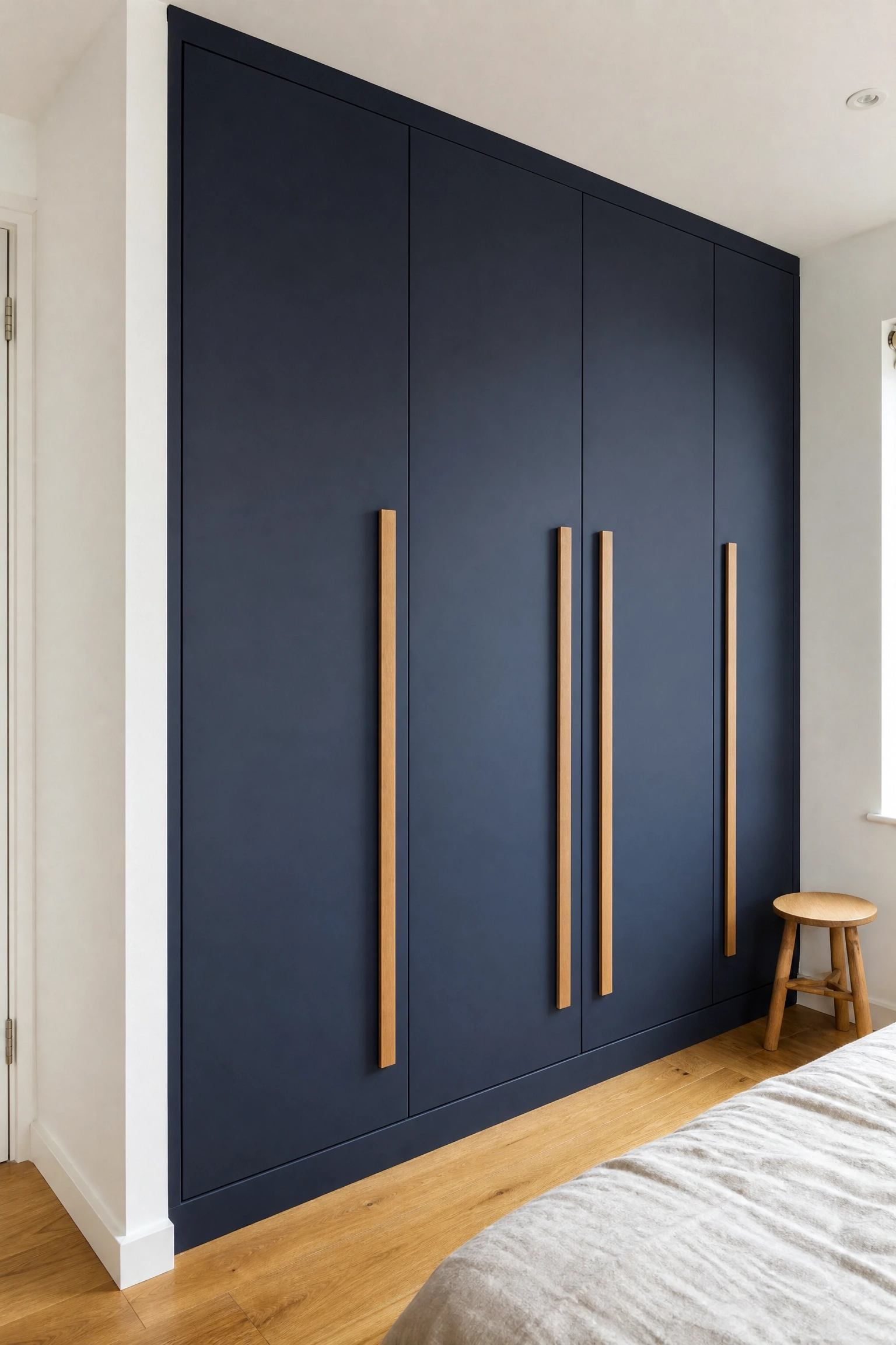
Painting a built-in wardrobe in a deep navy or dark blue and fitting it with long oak or natural wood bar handles is a clever way to bring the blue and wood palette into a practical storage element rather than limiting it to decorative objects. The painted wardrobe reads as a deliberate design feature rather than a utilitarian box, and the timber handles connect it to any other wood furniture in the room without requiring them to match perfectly in tone.
Quick Tip: Use a furniture-specific paint or add a primer coat before painting any flat-pack or laminate wardrobe; standard wall paint on laminate surfaces will chip within weeks of regular door-opening.
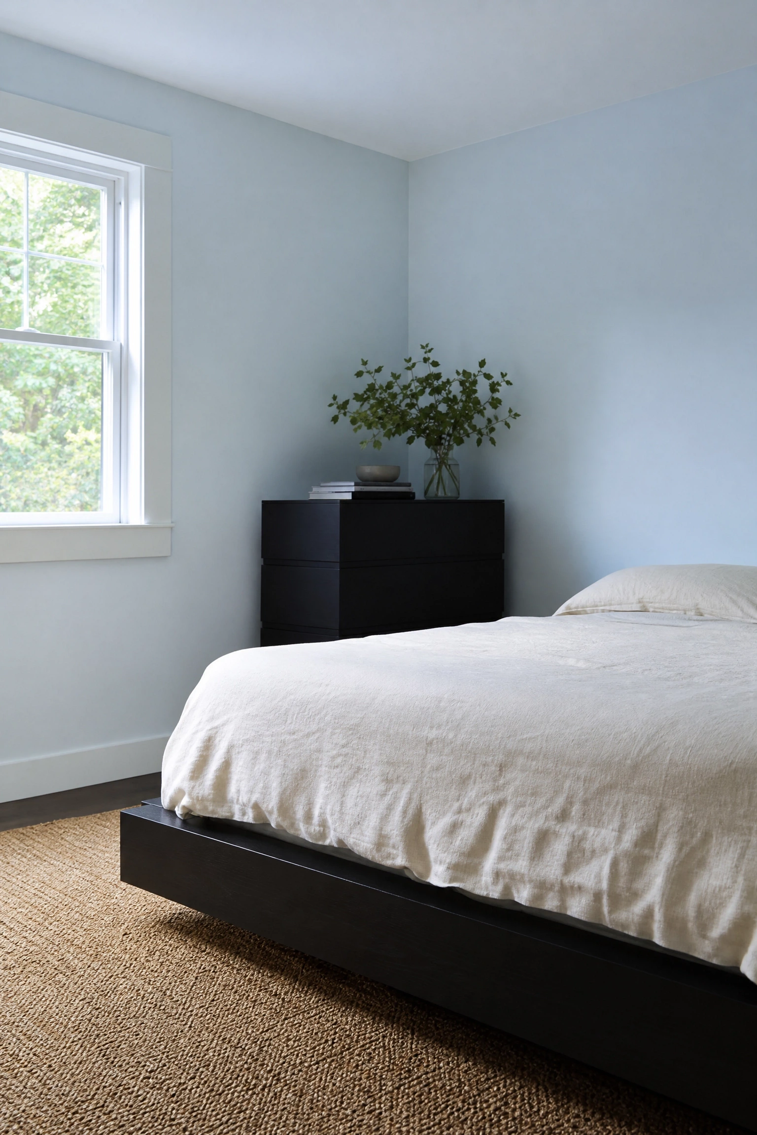
18. Ice Blue Walls With Ebonized or Very Dark Wood
Ice blue, the palest and most ethereal of all blue tones, gains structure and drama when paired with ebonized or very dark wood furniture. The near-white coolness of the blue and the near-black depth of the ebonized timber create a high-contrast pairing that reads as more graphic and architectural than the typical blue and wood combination, which is what makes it particularly well suited to modern or minimalist bedroom styles.
Designer Advice: Keep all other elements in the room pale and simple when using this high-contrast pairing; a cream linen duvet, a jute rug and nothing on the nightstand except a lamp is the right level of restraint for this look.
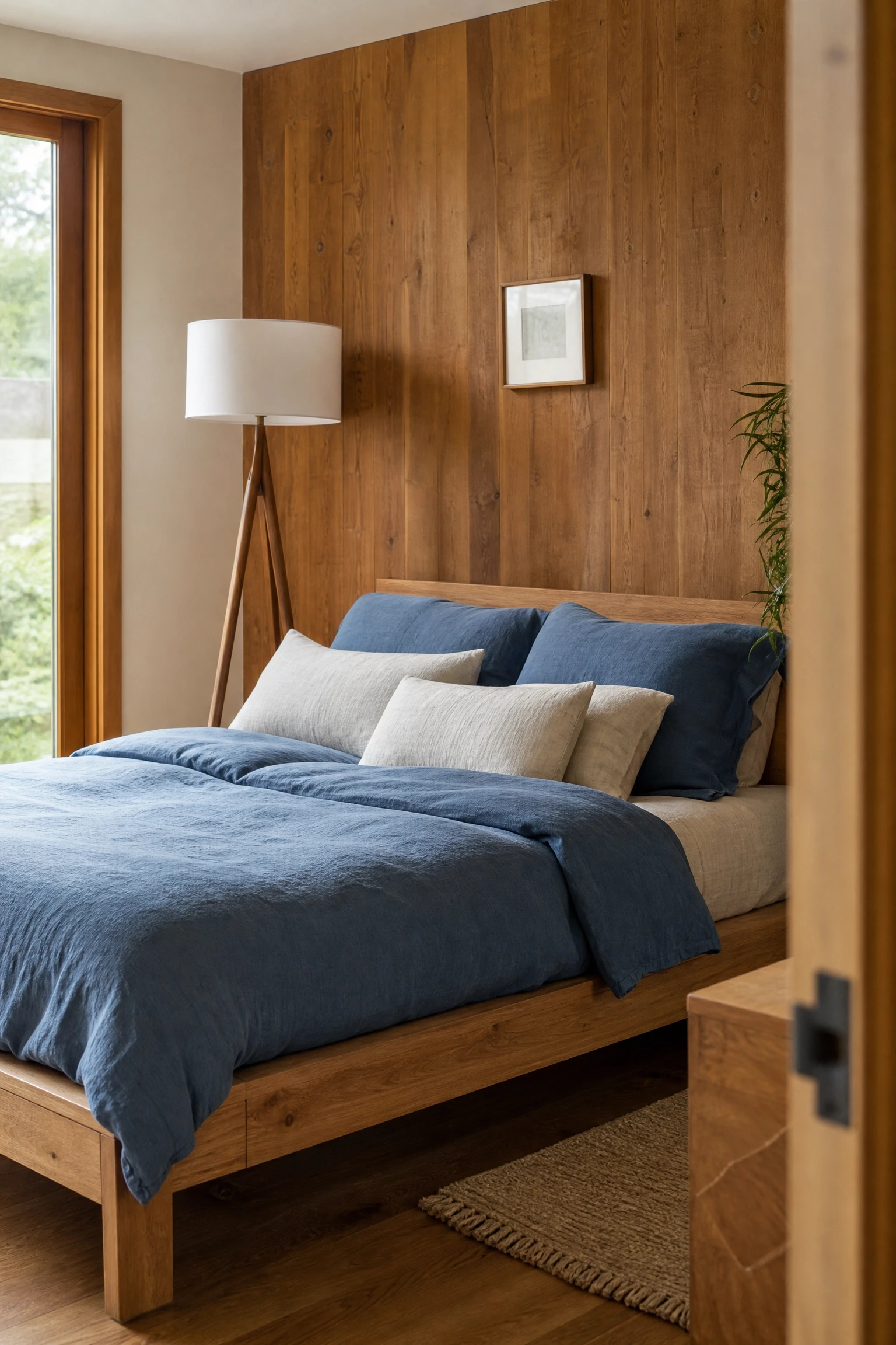
19. Denim Blue Bedding as the Starting Point for a Wood-Heavy Room
If the walls and floors are already wood-toned or neutral, denim blue bedding is the fastest single purchase that introduces the blue side of the palette without requiring paint or renovation. Denim blue in particular has a lived-in, faded quality that suits wood-heavy rooms because it does not try too hard; it reads as a fabric that has been washed many times and belongs in the room rather than arriving from a shop.
Pro Move: Layer denim blue with natural linen in warm ivory rather than crisp white; ivory linen alongside denim blue keeps the bed looking warm and relaxed rather than cool and graphic.
20. Blue-Grey Limewash Walls With Exposed Timber Beams
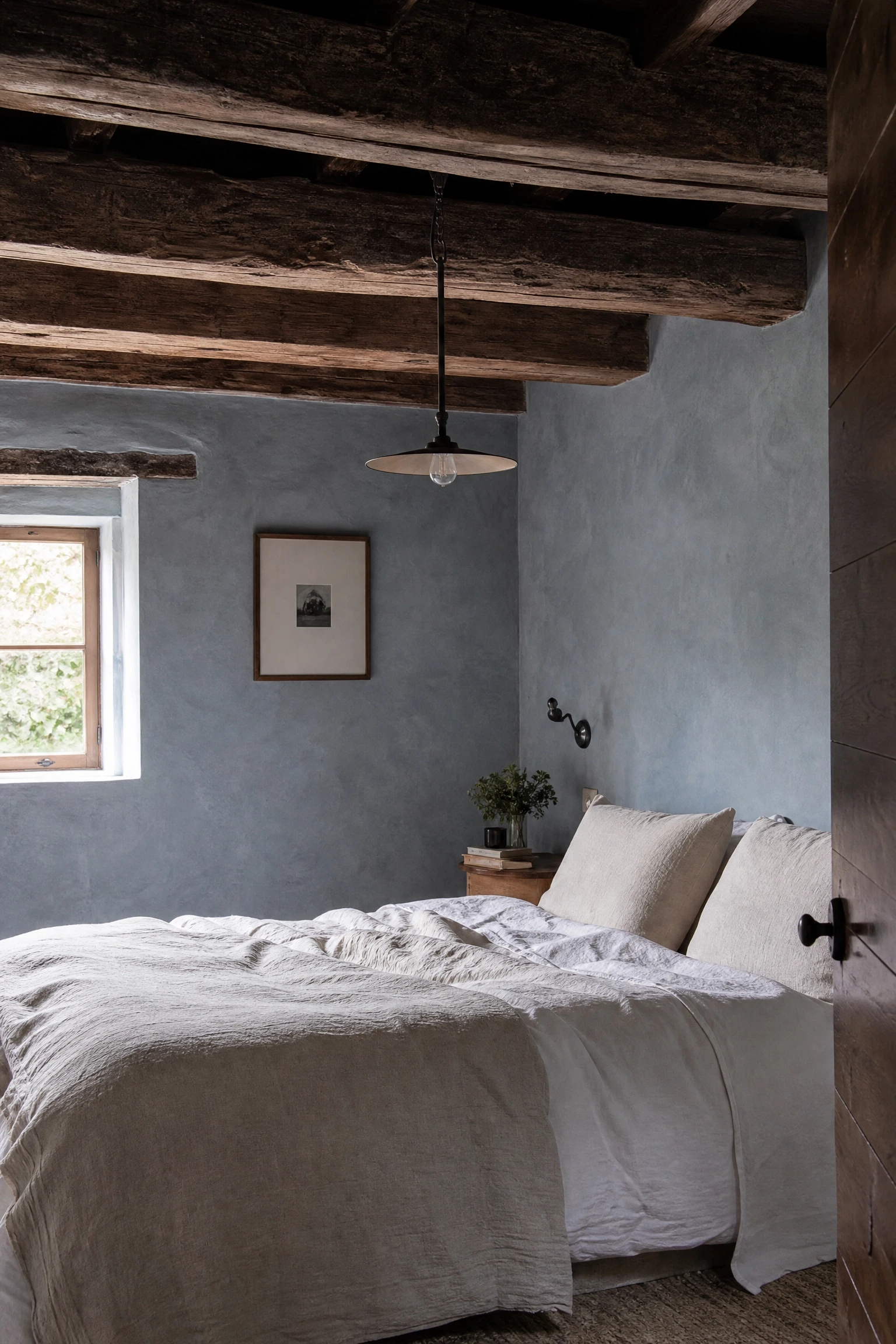
A blue-grey limewash finish on the walls alongside exposed timber ceiling or wall beams creates a look that references old European farmhouses and mountain lodges while feeling entirely contemporary in application. The organic, layered texture of limewash complements the raw and slightly rough quality of the beams, and the blue-grey tone prevents the room from reading as purely rustic by keeping a cool, considered colour quality in the background.
Reality Check: Limewash will look significantly different in photos than in person because the texture only fully reveals itself under raking natural light; always view it in the actual room before deciding whether it reads correctly for your space.
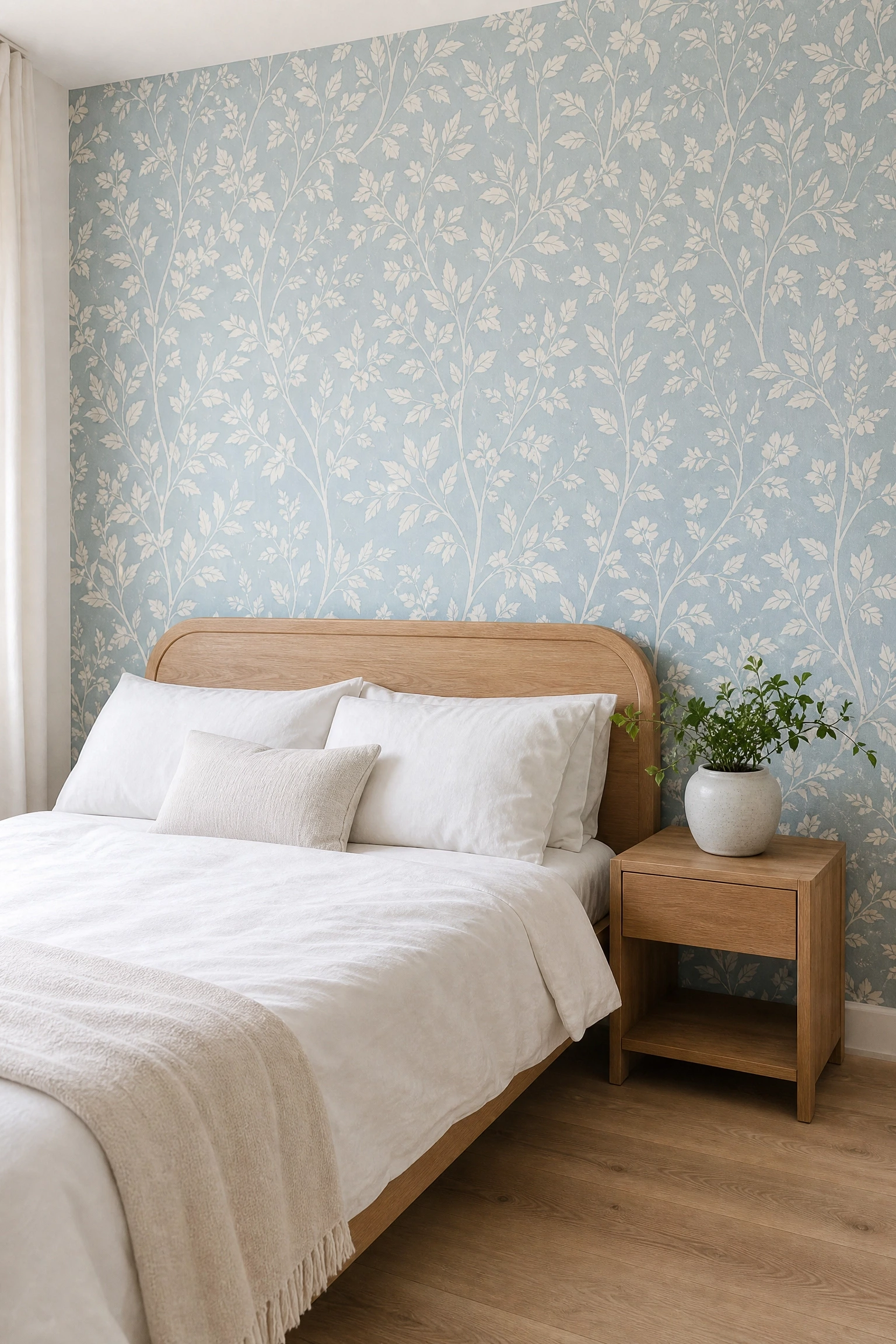
21. Pale Blue Wallpaper With Botanical Print and a Wood-Framed Bed
A pale blue botanical-print wallpaper behind a simple timber-framed bed is one of the most coherent and visually complete combinations available in this palette because the organic shapes of the botanical illustration and the natural material of the wood frame are genuinely from the same visual family. The wallpaper does the decorative work so the bed frame can be simple and unadorned, and the result feels layered rather than busy.
Heads Up: Use wallpaper paste rather than peel-and-stick for any bedroom wall you intend to keep for more than a year or two; peel-and-stick botanical papers tend to lift at the seams in rooms with any temperature variation.
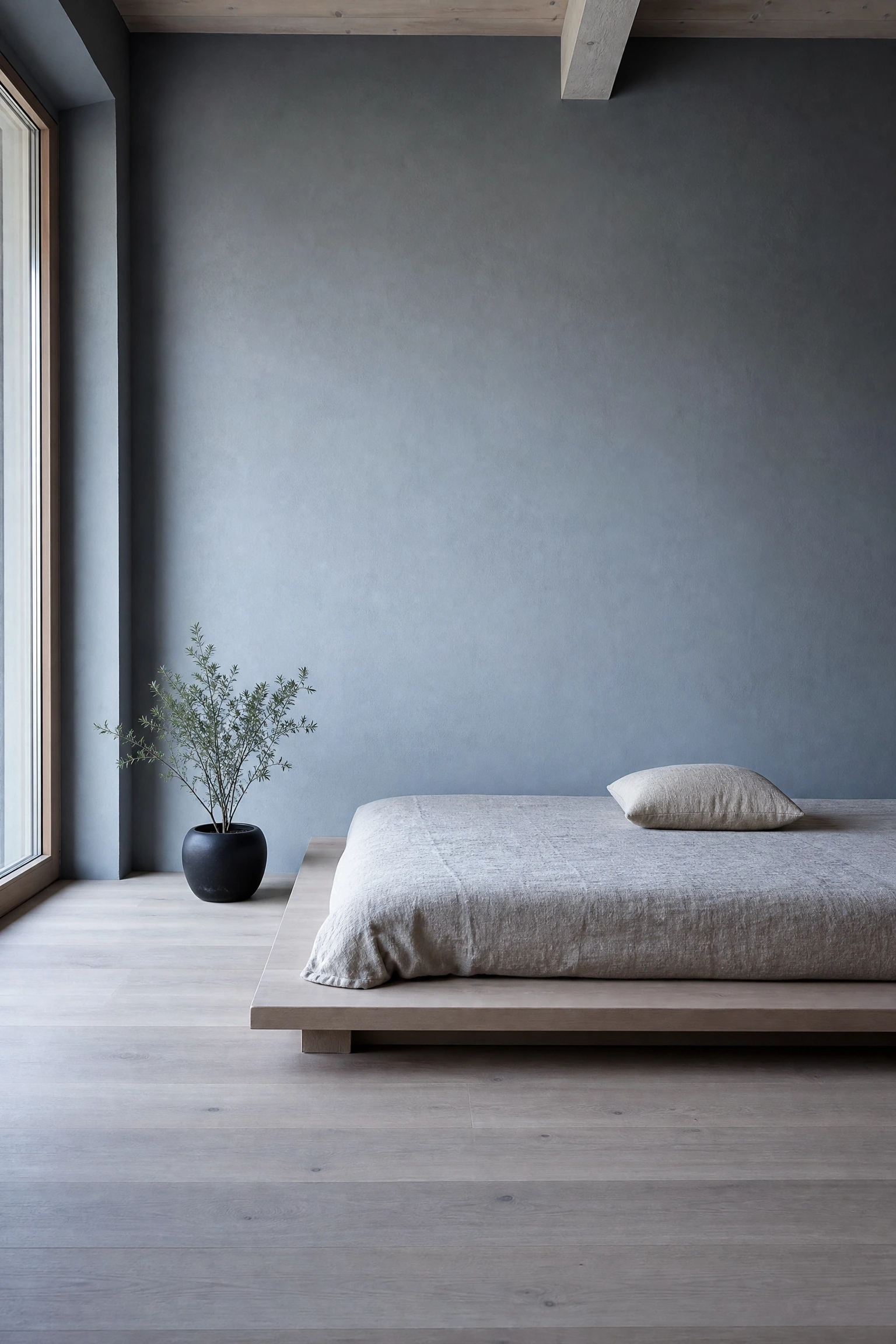
Japandi, the hybrid of Japanese and Scandinavian design principles, is one of the most natural homes for the blue and wood palette because both aesthetics already prize natural materials, restraint and a calm visual weight. In practice, a Japandi-influenced blue and wood bedroom means a very low platform bed in pale ash or oak, one shade of muted blue across the walls, minimal objects, and a single well-placed plant in a ceramic pot as the only decorative gesture.
Designer Advice: Negative space, the deliberate emptiness around and between objects, is as important as the objects themselves in a Japandi room; resist the urge to fill every surface and the room will feel more luxurious for it.
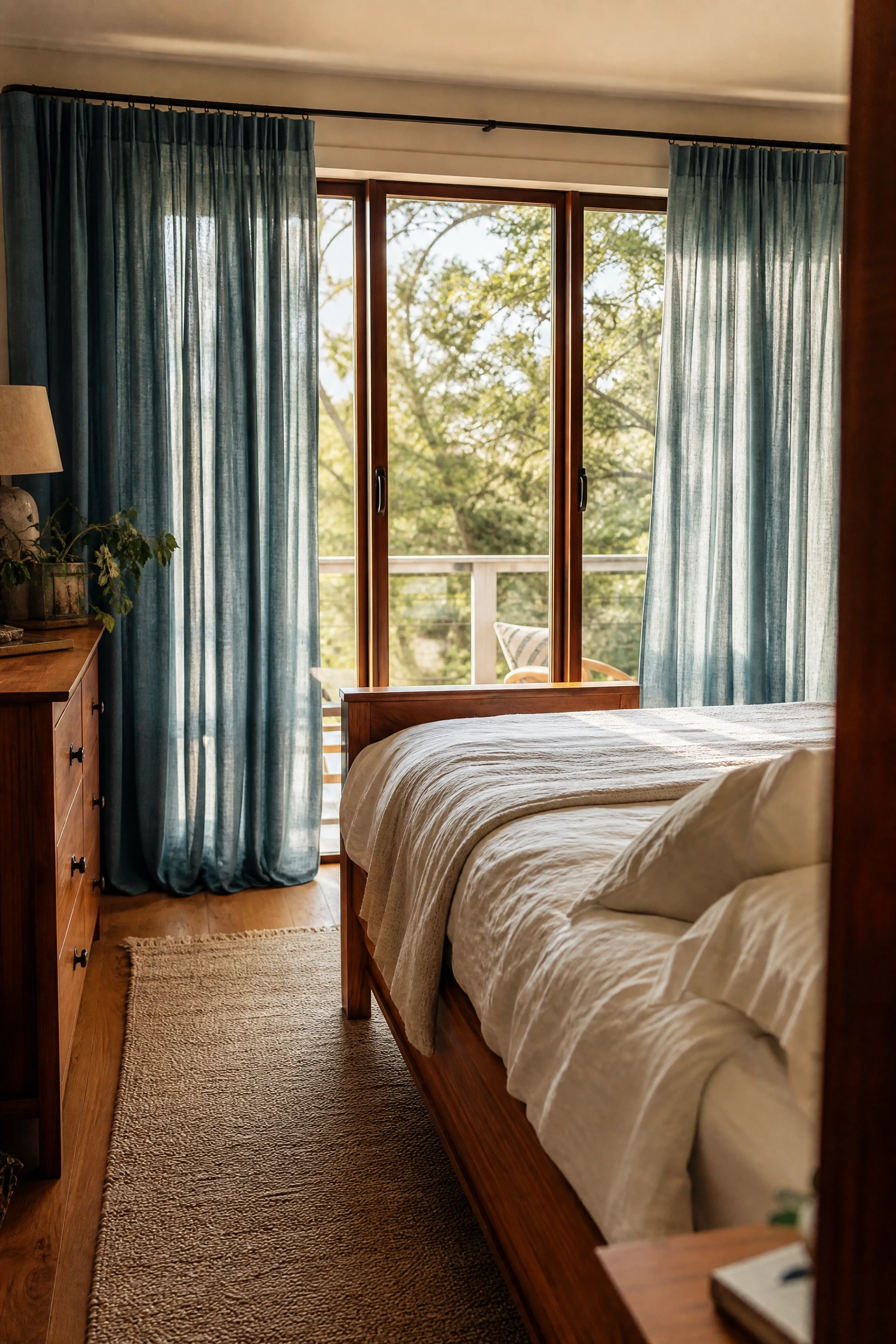
23. Blue Linen Curtains With a Teak or Tropical Wood Bed Frame
Blue linen curtains alongside a teak, mango wood or other tropical hardwood bed frame introduce a slightly warmer and more travel-inspired quality to the blue and wood palette that keeps it from feeling too Scandinavian or too coastal. Tropical hardwoods have a richer, redder warmth than oak or ash, which creates a more complex colour relationship with blue and suits bedrooms that want to feel well-travelled and layered rather than simply calm and edited.
Quick Tip: Look for FSC-certified teak or mango wood to ensure the material is sustainably sourced; tropical hardwood furniture is a worthwhile investment when the provenance is responsible.
24. French Blue Walls With Painted White Wood Furniture
French blue, a rich medium blue with a slight grey-green character that has been used in French country houses for centuries, works beautifully with white-painted timber furniture because the freshness of the white prevents the depth of the blue from feeling heavy. This is a warmer and more characterful take on the blue and wood palette than the cooler Scandinavian version, and it suits older or more characterful properties where the rooms already have some architectural detail to work with.
Reality Check: French blue can shift significantly toward green in rooms with yellow-toned artificial lighting; always test under your actual bedroom light bulbs before committing, and choose a warm white bulb at 2700K to keep the tone reading correctly in the evening.
25. Navy Blue and Natural Rope or Macrame Accents With Driftwood
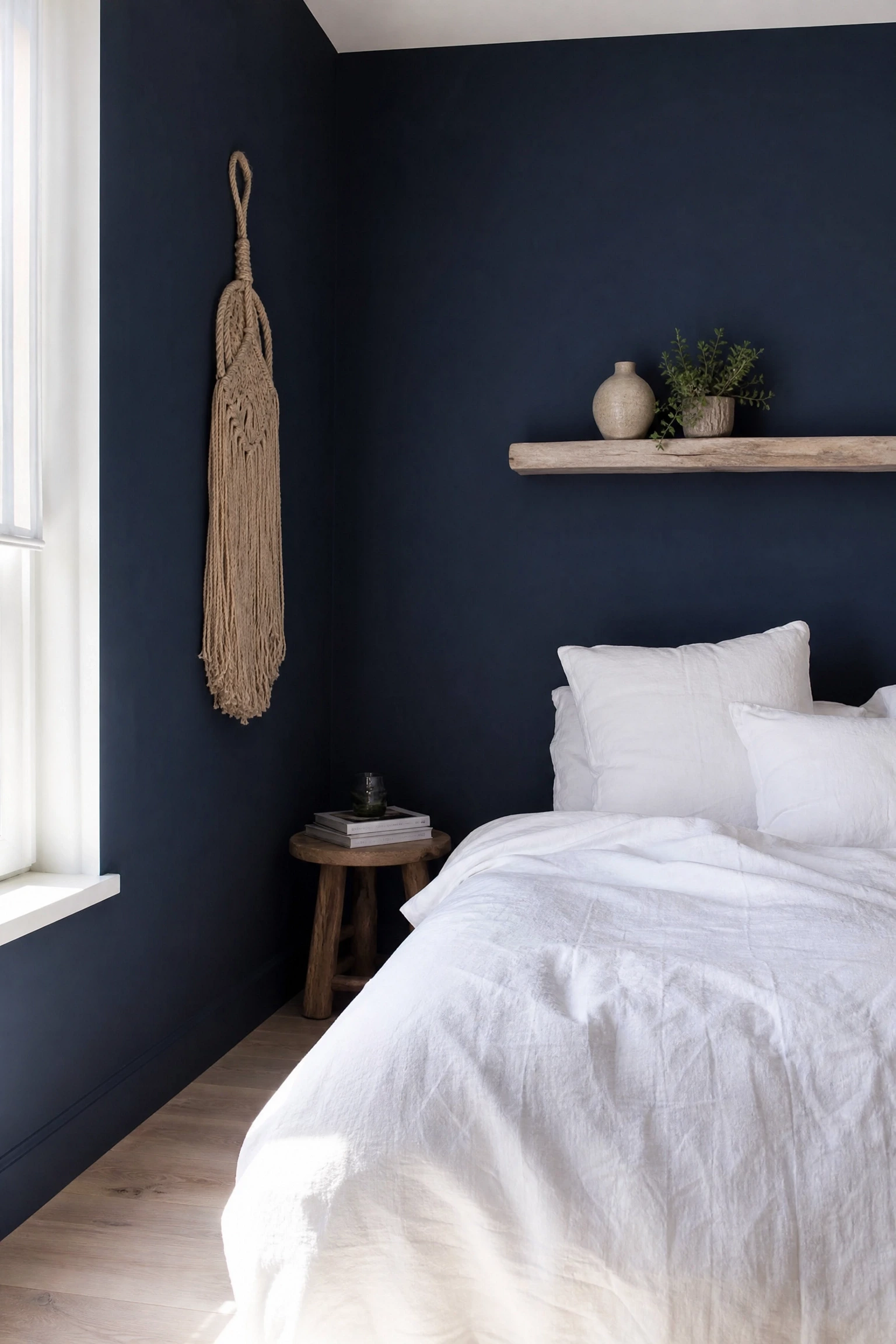
Navy blue with natural rope, macrame wall hangings and driftwood-style timber elements is the coastal version of the blue and wood palette, executed at its most considered rather than its most themed. The key is keeping the rope and driftwood elements minimal, one macrame piece and one driftwood or bleached timber shelf is enough, so the room reads as coastal-influenced rather than as a souvenir shop.
Pro Move: Driftwood-effect furniture bought new tends to look artificial; the same look achieved with genuinely aged, reclaimed or bleached timber reads as authentic and is worth the extra sourcing effort.
26. Blue Colour-Drenched Room With One Warm Wood Floor
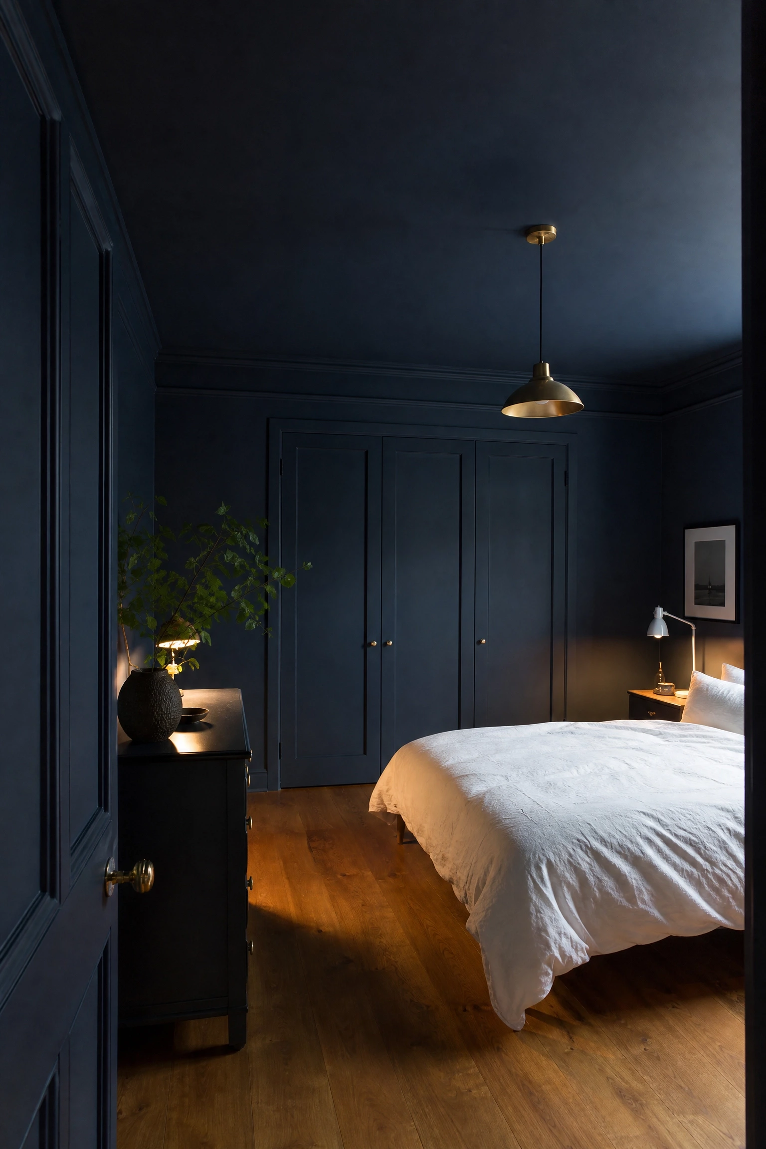
Painting walls, ceiling and all woodwork in the same shade of blue and letting a warm timber floor run through the space as the single uncoated surface creates a colour-drenched effect that is bold, cocoon-like and surprisingly easy to live in once you commit to it. The floor becomes the most important element in the room because it is the one thing that is not blue, and its warmth against the surrounding blue becomes intensely satisfying in a way that a partially painted room never achieves.
Heads Up: Colour-drenching requires a shade of blue with enough warmth in its undertone to read as cosy rather than institutional under artificial light; test with a sample pot under your specific lamp colour before committing.
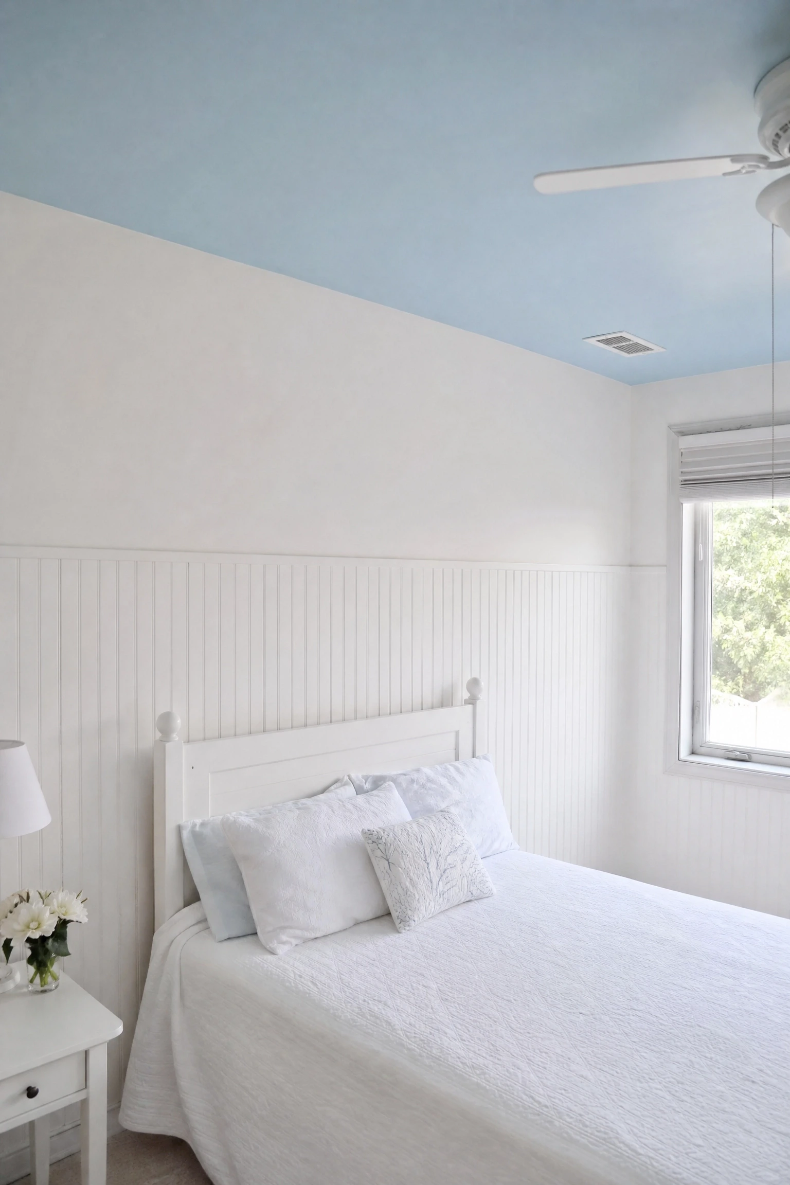
A sky blue ceiling above white-painted wooden beadboard paneling on the lower half of the walls creates a layered architectural quality that makes a plain rectangular bedroom feel as though it has history and character it was not born with. The beadboard introduces fine vertical texture and a painted timber material, the blue ceiling creates the impression of open sky above, and the two together make the room feel taller, airier and more interesting than the dimensions actually allow.
Designer Advice: Keep the beadboard painted white rather than a wood tone so the material reads as a textural element rather than a competing colour; the white surface lets the sky blue ceiling remain the dominant tone without a wood-versus-blue tension developing.
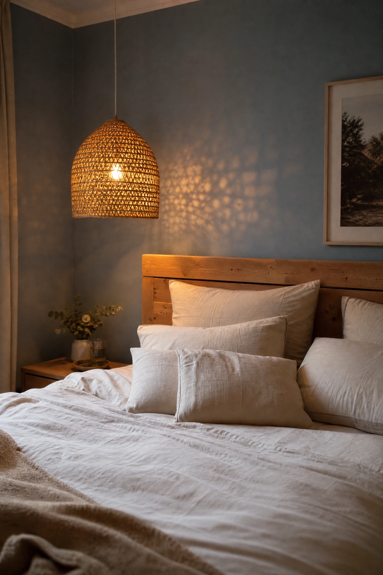
28. Dusty Blue With Rattan Lampshades and a Wooden Headboard
Dusty blue walls with rattan pendant or table lampshades and a simple wooden headboard is a combination that works because all three elements belong to the same family of materials: naturally sourced, slightly imperfect and warm in tone. The rattan shade casts a dappled warm light against the dusty blue wall in the evening, which is one of those details that makes a bedroom feel genuinely beautiful to be in rather than just aesthetically correct in photographs.
Quick Tip: Choose rattan shades with a tighter, more refined weave for a contemporary result; loosely woven or chunky rattan shades read more rustic and casual and suit the combination better in relaxed or boho-leaning rooms than in more refined spaces.
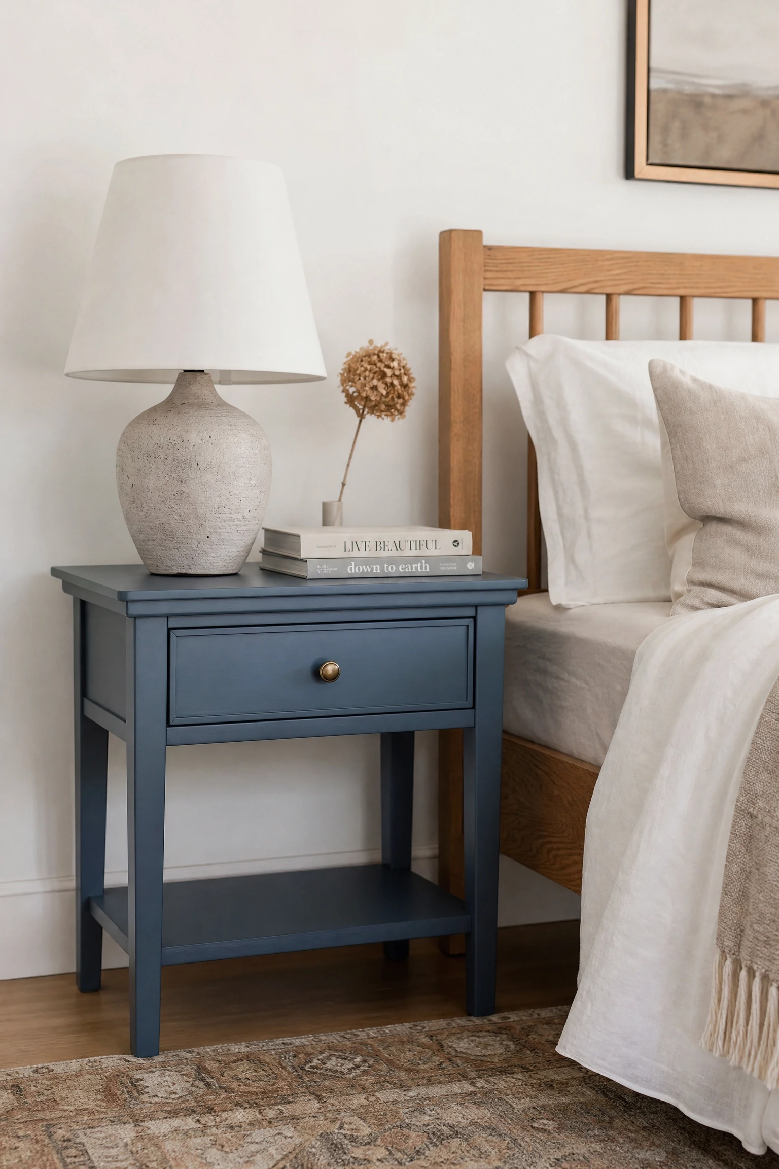
If repainting or buying a new bed frame feels like too much commitment, a single blue-painted or blue-lacquered bedside table in an otherwise warm, wood-toned room is the lowest-risk entry point into this palette. It introduces the colour without altering the room’s character and lets you live with blue alongside your existing wood tones before deciding whether to take the combination further.
Budget Note: A plain timber nightstand painted in a quality furniture paint in your chosen blue shade costs a fraction of a replacement piece and gives you a custom-coloured result that off-the-shelf furniture rarely matches.
Why Blue and Wood Never Really Goes Out of Style
Blue and wood is not a trend in the way that some palettes are; it is a combination that keeps reappearing in interior design because it solves a real problem that most bedrooms face, the tension between making a room feel calm and making it feel warm. Blue handles the calm, wood handles the warmth, and together they deliver both without either quality needing to be sacrificed. The range of pairings above, from icy pale blue with bleached ash to inky midnight with dark walnut, shows just how many different rooms this palette can build and how many different moods it can hold. Even starting with just a painted nightstand and one oak shelf, the balance this pairing creates is one that ages well, photographs beautifully and, most importantly, genuinely feels good to sleep in.