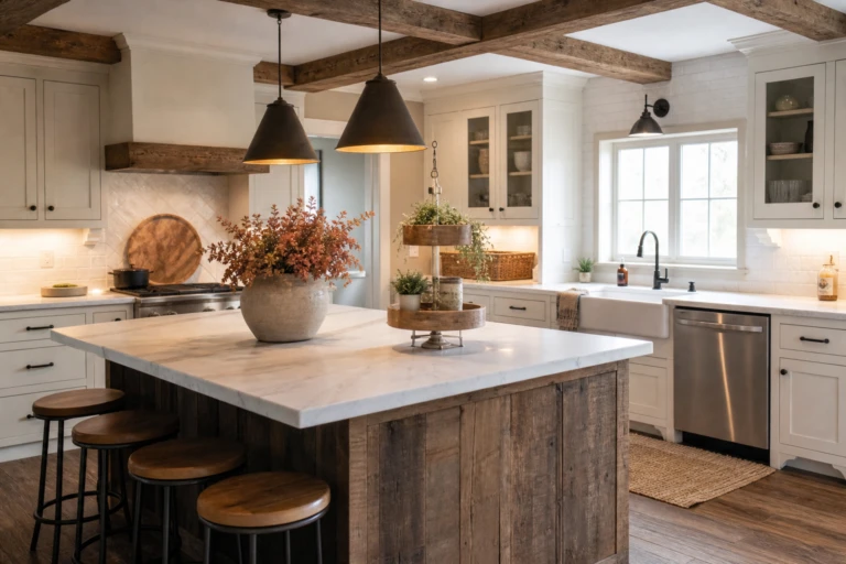
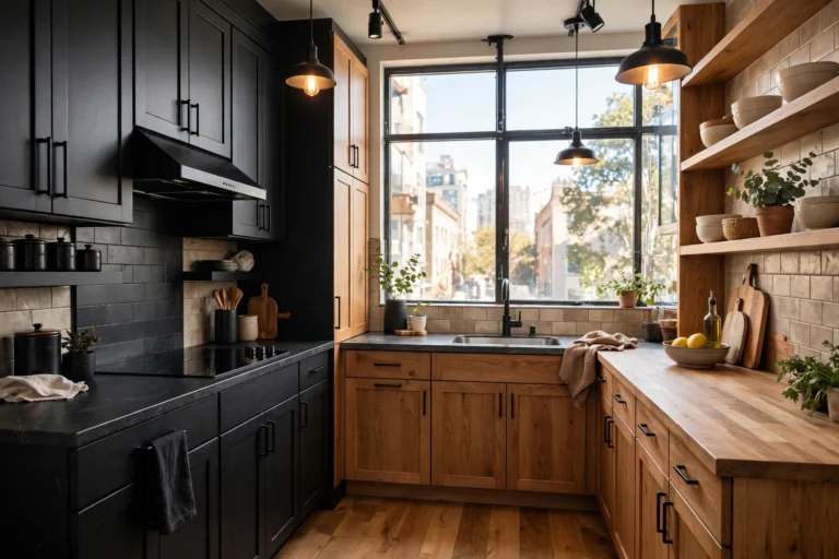
Black and White Modern Kitchens With Perfect Contrast
Black and white is the oldest trick in kitchen design and still the sharpest. No other palette delivers this much clarity with this little risk. But monochrome has a failure mode: without a plan for where the contrast lives, it goes flat, cold, or chaotic. The kitchens that nail it all share one thing: the black and white meet in deliberate places, not everywhere at once. These 23 ideas map exactly where to put the contrast, across cabinets, surfaces, and the small details that make it sing.
Cabinet Contrasts
Cabinets are the biggest surface in the kitchen, so the black-white split here sets the whole room’s tone. Pick one version and commit.
White Uppers, Black Lowers
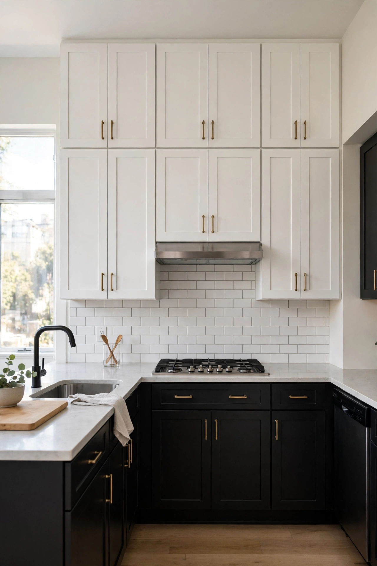
White upper cabinets with black lower cabinets is the classic split. The white above keeps the room bright and the ceiling feeling high; the black below grounds everything and hides the scuffs that white lowers would show. This is the most forgiving monochrome kitchen: bright where you look, dark where life happens. It works in every kitchen size and style. The default for a reason.
Quick Tip: Use the same cabinet door style top and bottom. Matching profiles keep the split looking intentional, not pieced together.
Black Uppers, White Lowers
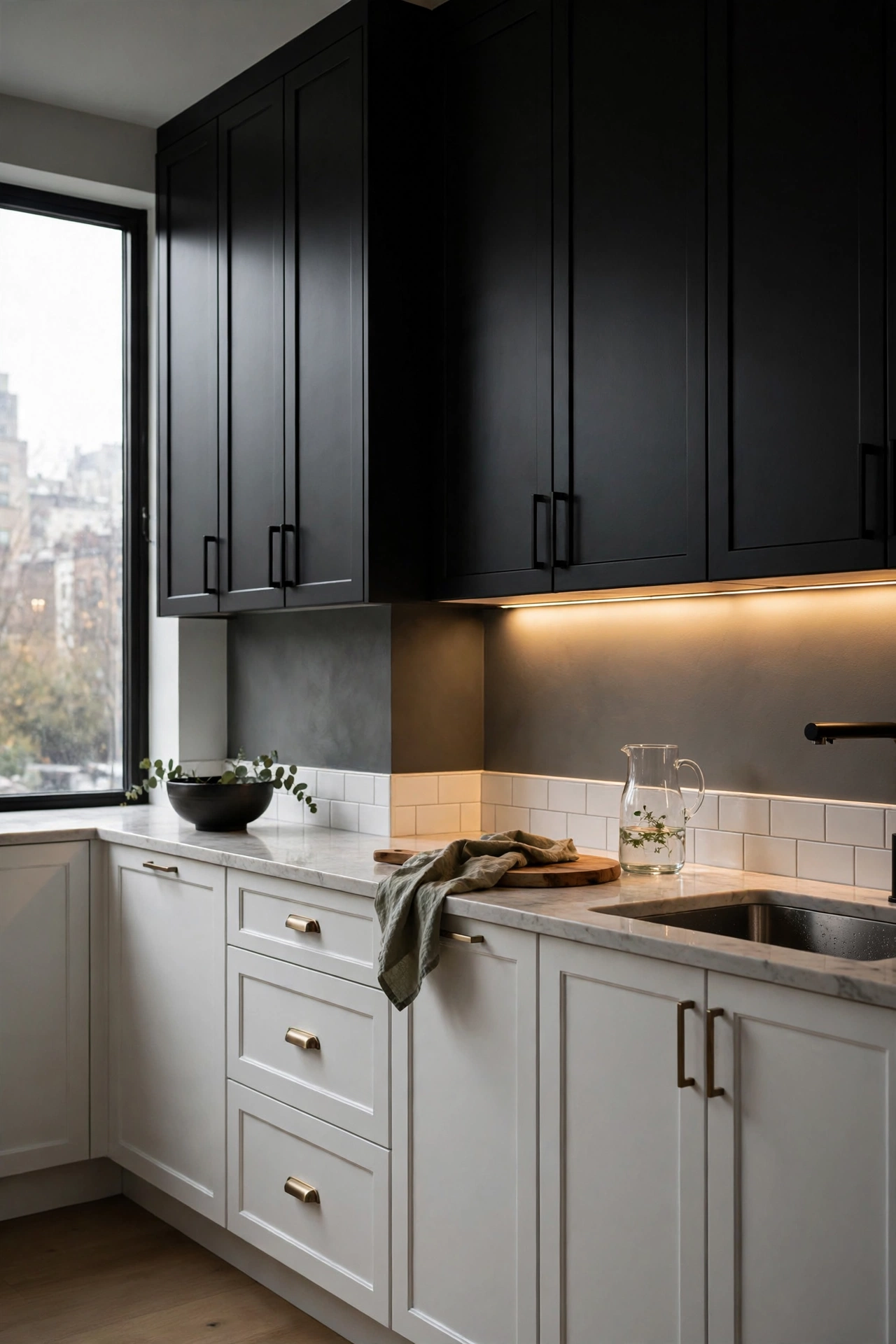
The reversed split, black uppers over white lowers, is bolder and moodier. The dark top draws the eye up and makes the kitchen feel dramatic; the white below keeps the work surfaces bright. This needs good lighting and decent ceiling height to avoid pressing down. In the right space it is spectacular. In a low, dark kitchen it is a cave. Know your room.
Reality Check: Black uppers demand under-cabinet lighting. Without it, the worktop lives in shadow.
All-White Perimeter, Black Island
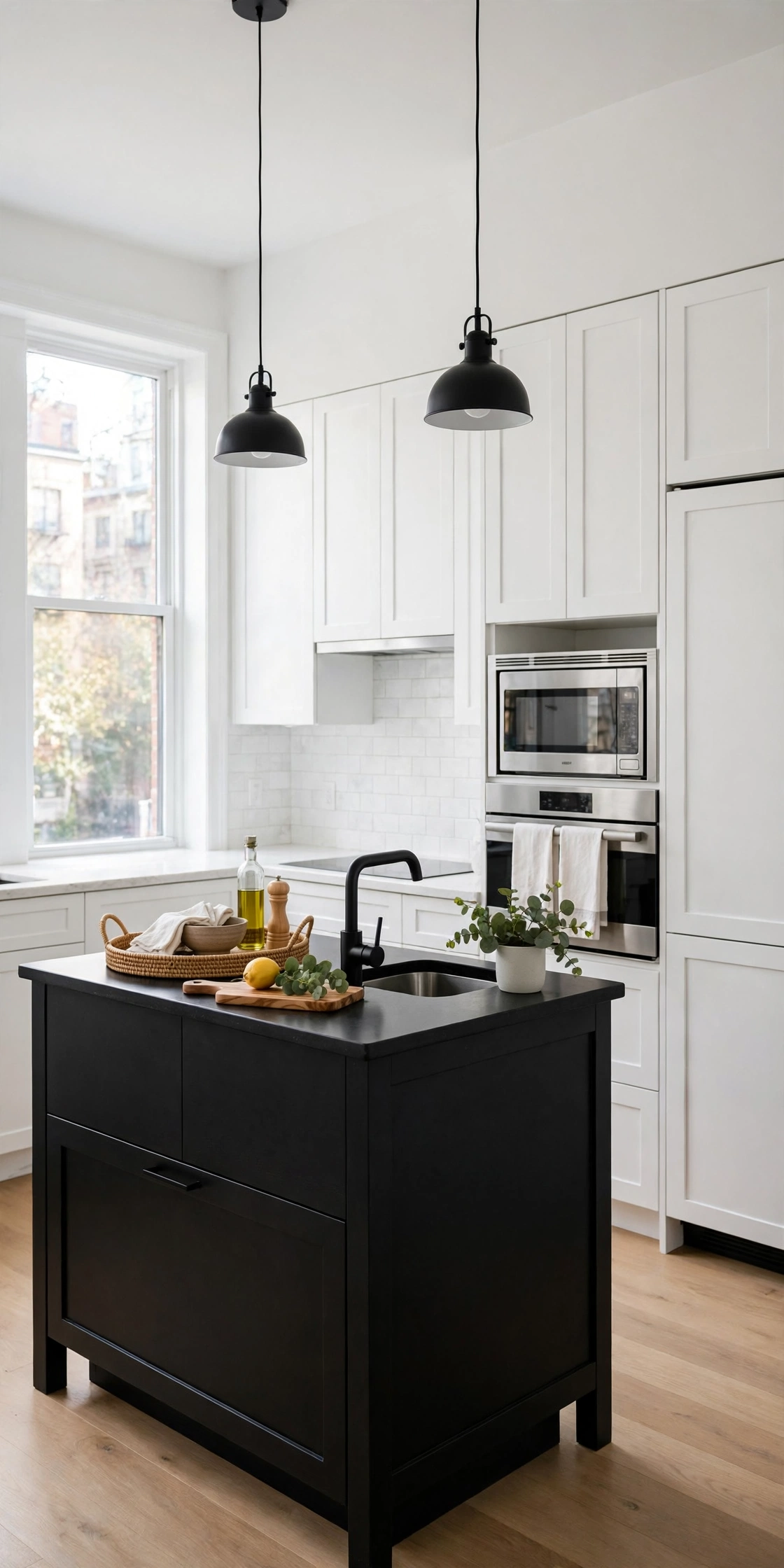
An all-white kitchen with a black island is the safest way to get contrast. The perimeter stays bright and classic; the island provides the single dark anchor. This is also the easiest retrofit: paint or replace just the island. The black island reads as furniture, giving the kitchen a collected feel. Maximum impact, minimum commitment.
Good to Know: A black island shows every crumb. Dark counters on the island hide them; light counters do not.
All-Black Perimeter, White Island
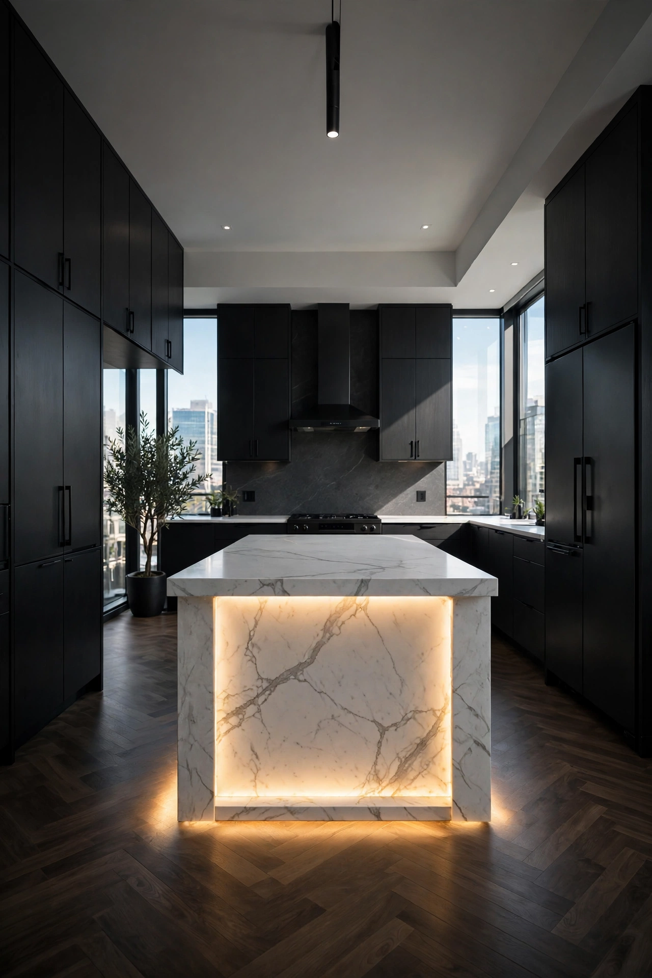
Flip it for drama: black perimeter cabinets with a white island. The dark walls of cabinetry recede; the white island glows in the center like a stage. This is the high-contrast showpiece kitchen. It needs strong lighting and confident styling. Not for the faint of heart, but unforgettable when done well. The island becomes the room’s sun.
Style Note: White waterfall island tops amplify the effect. The continuous white surface is pure sculpture.
Black Tall Units, White Everything Else
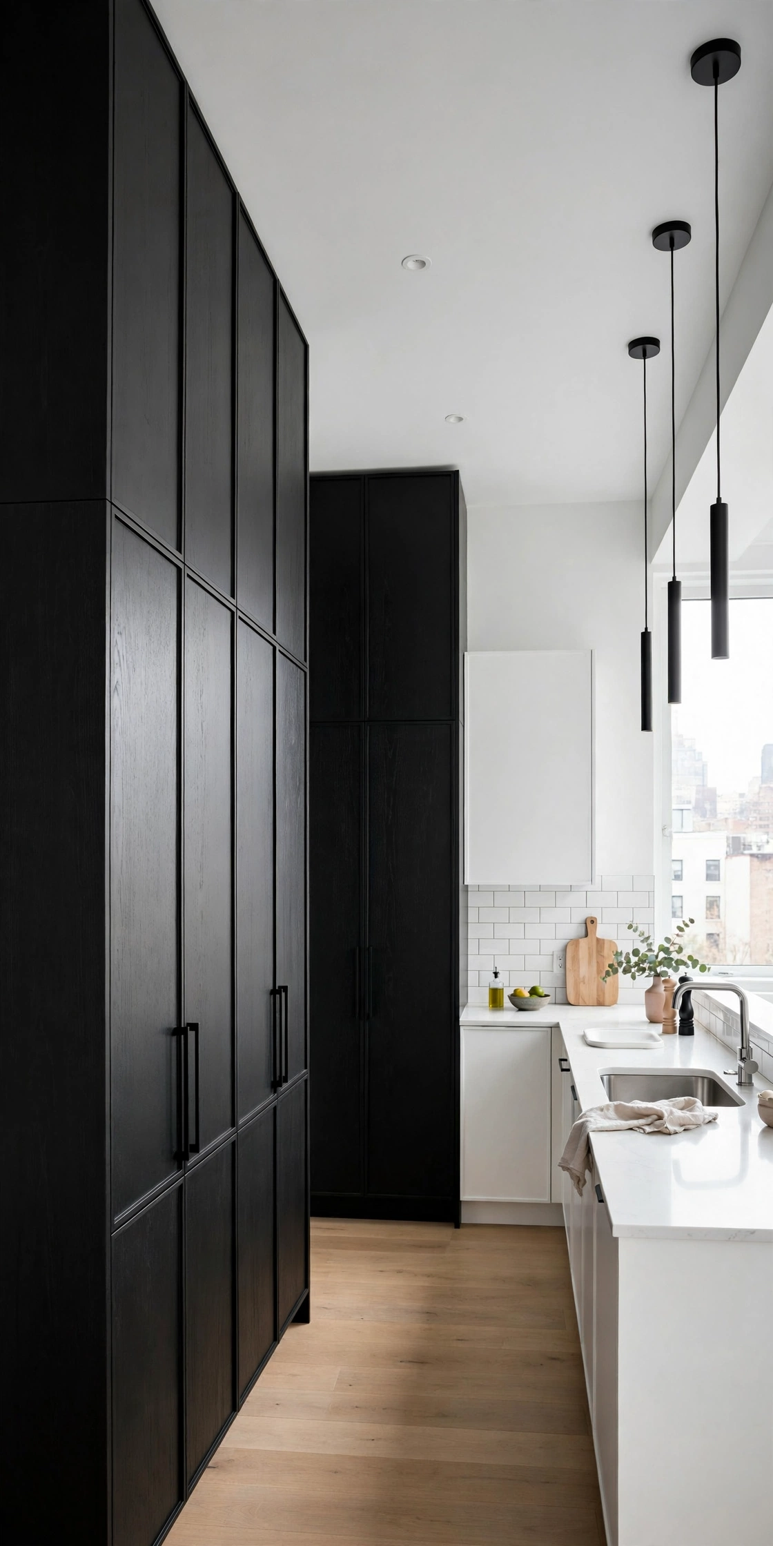
Confine the black to the tall units, pantry wall or oven tower, and keep every other cabinet white. The dark tower becomes an architectural feature rather than a color scheme. This is the most restrained way to use black cabinets: one dark moment in a white room. It adds depth without any risk of gloom. Elegant and easy.
Designer Trick: Run the tall black units wall to wall for a built-in look. Gaps at the sides cheapen the effect.
More Looks You'll Want to Steal:
Two-Tone Corner Break
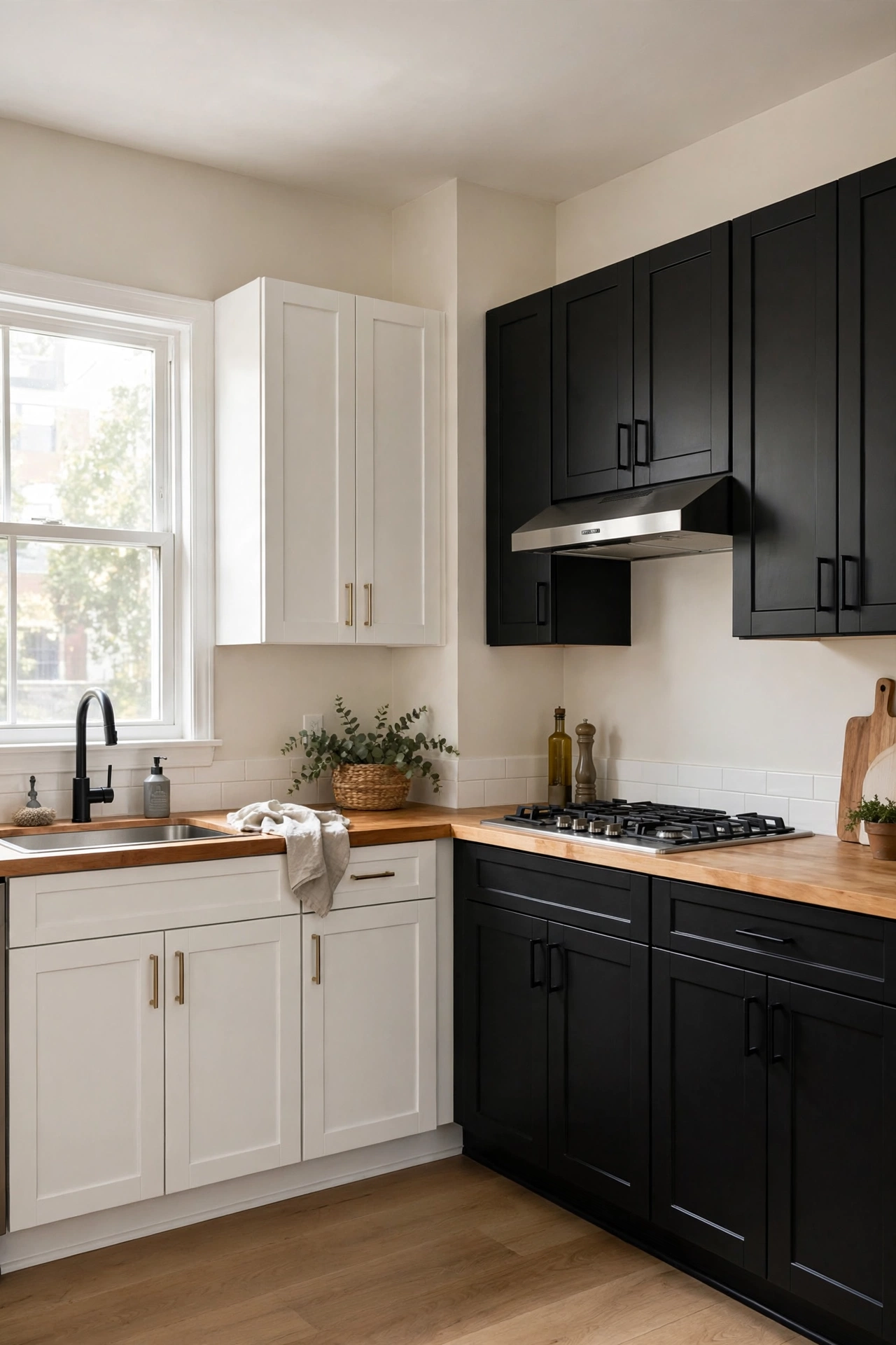
Change the cabinet color at the corner: white on one wall, black on the other. The corner becomes a deliberate design moment instead of an awkward turn. This works beautifully in L-shaped kitchens where the two runs are visually separate anyway. It is unexpected without being strange. The kitchen gains a custom feel from paint alone.
Quick Tip: Put the black on the less-lit wall. Dark cabinets in dark corners look intentional; dark cabinets blocking the window fight the light.
Black Base With White Open Shelves
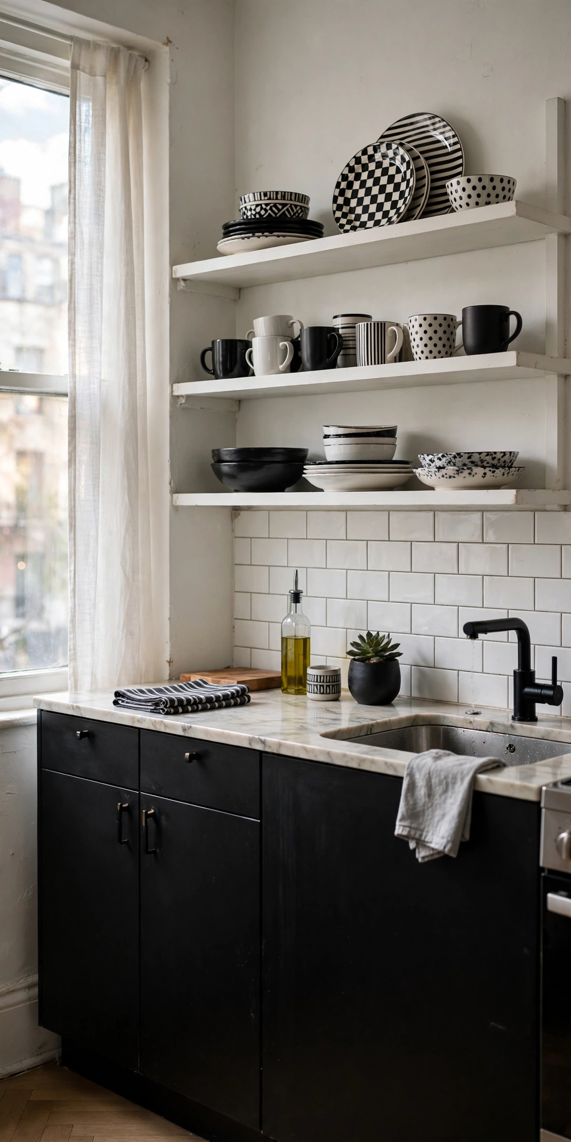
Black lower cabinets with white open shelves above instead of uppers keep the contrast while opening the wall. The shelves lighten the upper half and give you display space. This suits small kitchens where white uppers would feel boxy. Style the shelves in black and white dishware to continue the palette. Open, airy, graphic.
Honest Take: Open shelves in kitchens need regular dusting. If that sounds awful, this idea is not for you.
Handleless Black Slab Cabinets
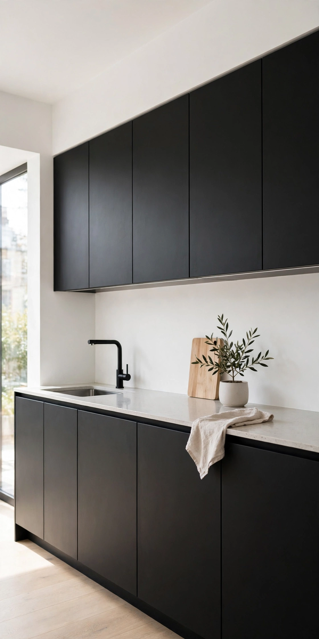
Handleless flat-panel black slab cabinets with white walls around them are the minimalist extreme. The black reads as pure geometry, no hardware to interrupt the planes. Push-to-open mechanisms keep the look clean. This is the most modern version in the article: severe, sculptural, and incredibly chic. It demands perfect installation; gaps and misalignments show mercilessly on flat black.
Worth Knowing: Handleless cabinets and small children are a challenging combination. Plan accordingly.
Where the Contrast Lives: Pick One Lead
| Contrast location | Effect | Best for |
|---|---|---|
| Cabinets | Bold, structural | Full renovations |
| Counters and backsplash | Crisp, clean | Surface refreshes |
| Floor | Graphic, grounding | Statement makers |
| Hardware and fixtures | Sharp, low-risk | Renters, quick updates |
Surface Statements
When the cabinets stay one color, the counters, backsplash, and floor carry the contrast. This is the layer for refreshes rather than full renovations.
White Marble on Black Cabinets
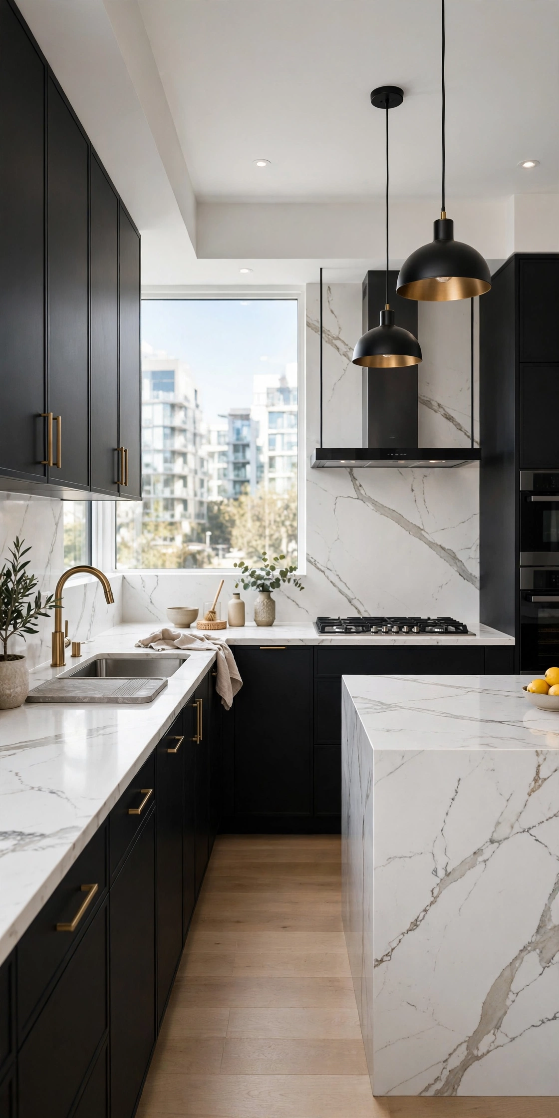
White marble, or marble-look quartz, on black cabinets is the luxury pairing. The stone’s veining softens the black’s severity; the black makes the white glow. This is the kitchen that looks expensive because the materials are doing the talking. Real marble stains and etches; quartz gives the look without the anxiety. Choose based on how you actually cook.
The Cost: Marble-look quartz costs less than real marble and needs zero sealing. For most cooks, it is the smarter buy.
Black Counters on White Cabinets
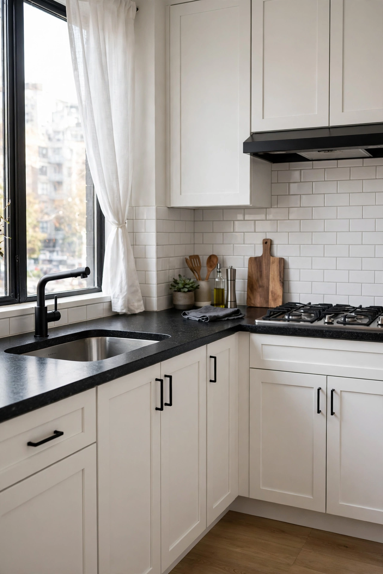
Black countertops on white cabinets invert the expected brightness and look incredibly sharp. Honed black granite or quartz keeps the look soft; polished black turns it dramatic. The dark work surface hides stains beautifully. This is the practical monochrome: the white shows the dirt you need to see, the black hides the rest. Form following function, elegantly.
Good to Know: Black counters show dust, crumbs, and water spots. Wipe down daily or choose a honed finish that forgives.
Checkerboard Floor
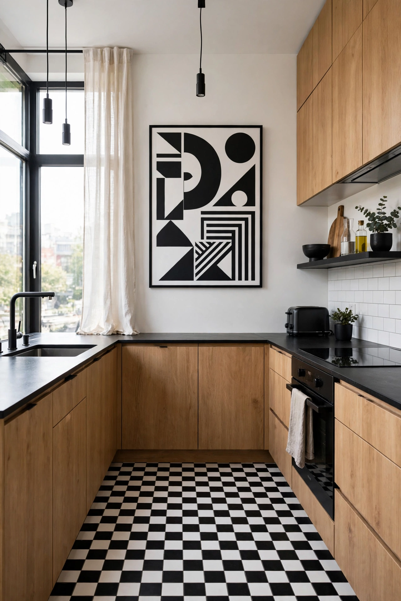
A black and white checkerboard floor is the graphic statement that never ages. It grounds the kitchen with pattern while the cabinets stay quiet. Classic in farmhouse kitchens, striking in modern ones. Large-format tiles keep it contemporary; small tiles lean vintage. The floor becomes the room’s artwork. Everything else can stay simple.
Style Note: Lay the checkerboard on the diagonal in small kitchens. It makes the floor feel larger.
Black Grout, White Tile
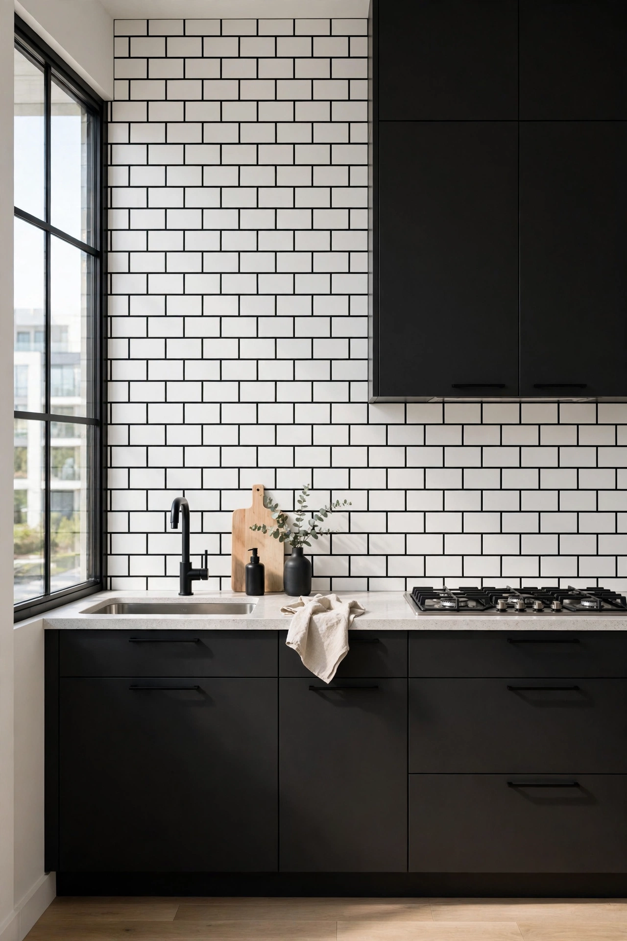
White subway tile with black grout gives you contrast at the backsplash for the price of grout. The dark lines turn a basic tile into a graphic pattern. It is bold, graphic, and very now. The trade-off is maintenance: black grout shows every imperfection in the tile lines, and it can fade unevenly. Seal it well. Small budget, big graphic payoff.
Reality Check: Black grout is unforgiving of sloppy tile work. Hire a good tiler or pick a simpler pattern.
White Tile, Black Grout, Reversed Drama
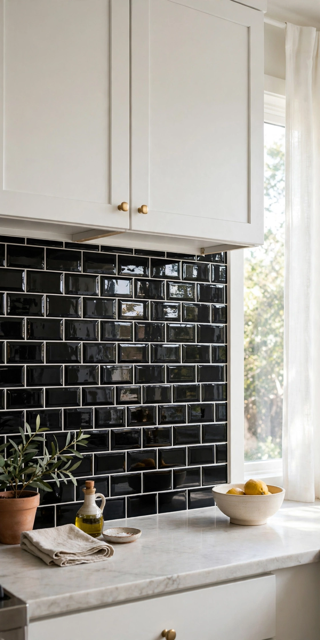
Black tile with white grout is the moodier reverse: a dark backsplash that makes white cabinets pop. Glossy black tile reflects light and looks jewel-like; matte black tile feels soft and modern. White grout on black tile needs sealing and cleaning to stay crisp. This is the backsplash for people who find white tile boring. It is anything but.
Quick Tip: Glossy black tile in a small kitchen bounces light around. Matte black absorbs it. Choose per your light.
Waterfall Island in Contrasting Stone
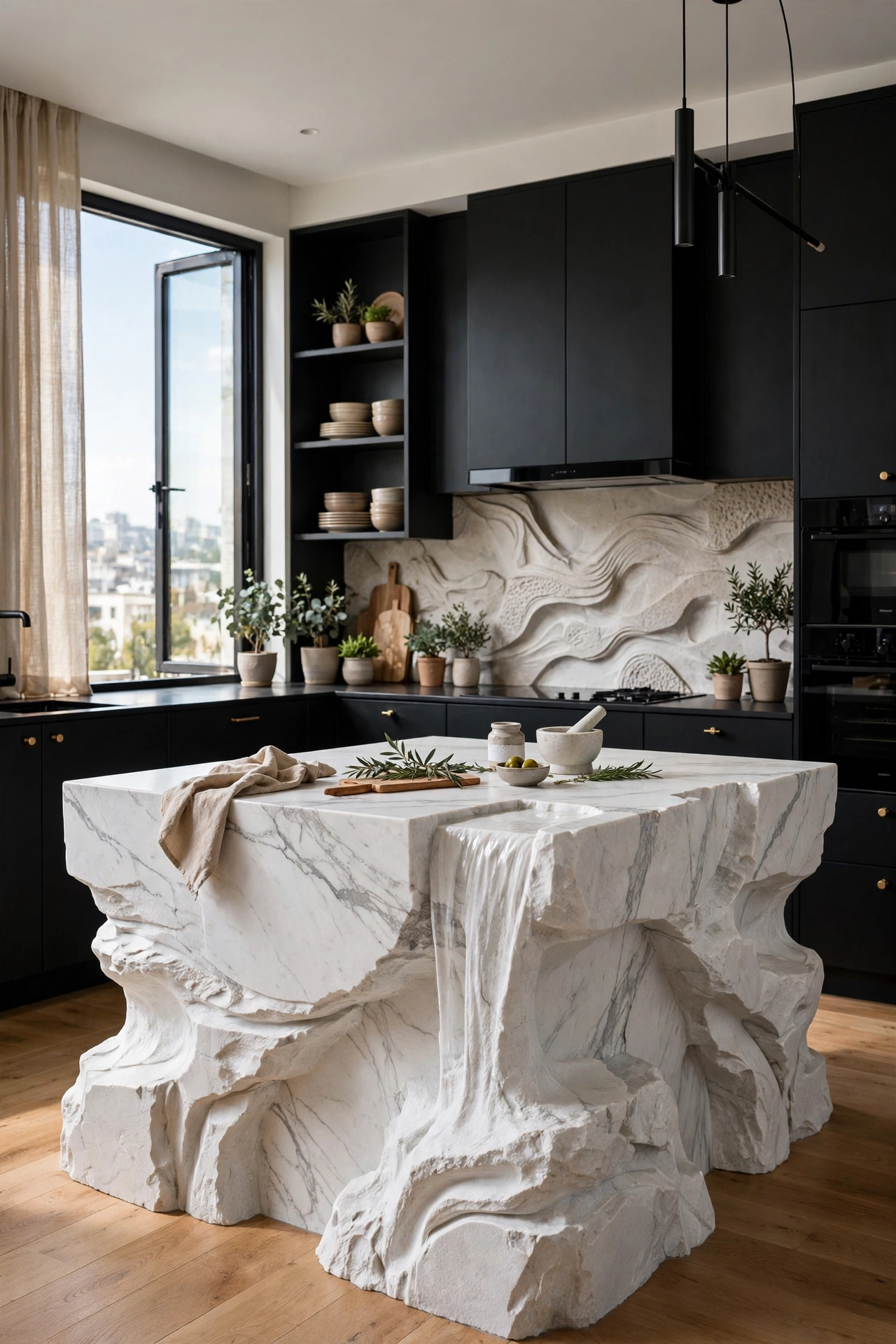
A waterfall island where the stone flows down the sides, in the opposite color from the cabinets, is pure sculpture. White waterfall on black cabinets, or black waterfall on white. The continuous surface draws the eye and makes the island the undisputed focal point. This is a splurge, but it is the detail guests photograph. Stone doing gymnastics.
Worth Knowing: Waterfall edges need precise fabrication. This is not the place to economize on the stone fabricator.
Concrete Gray as the Bridge
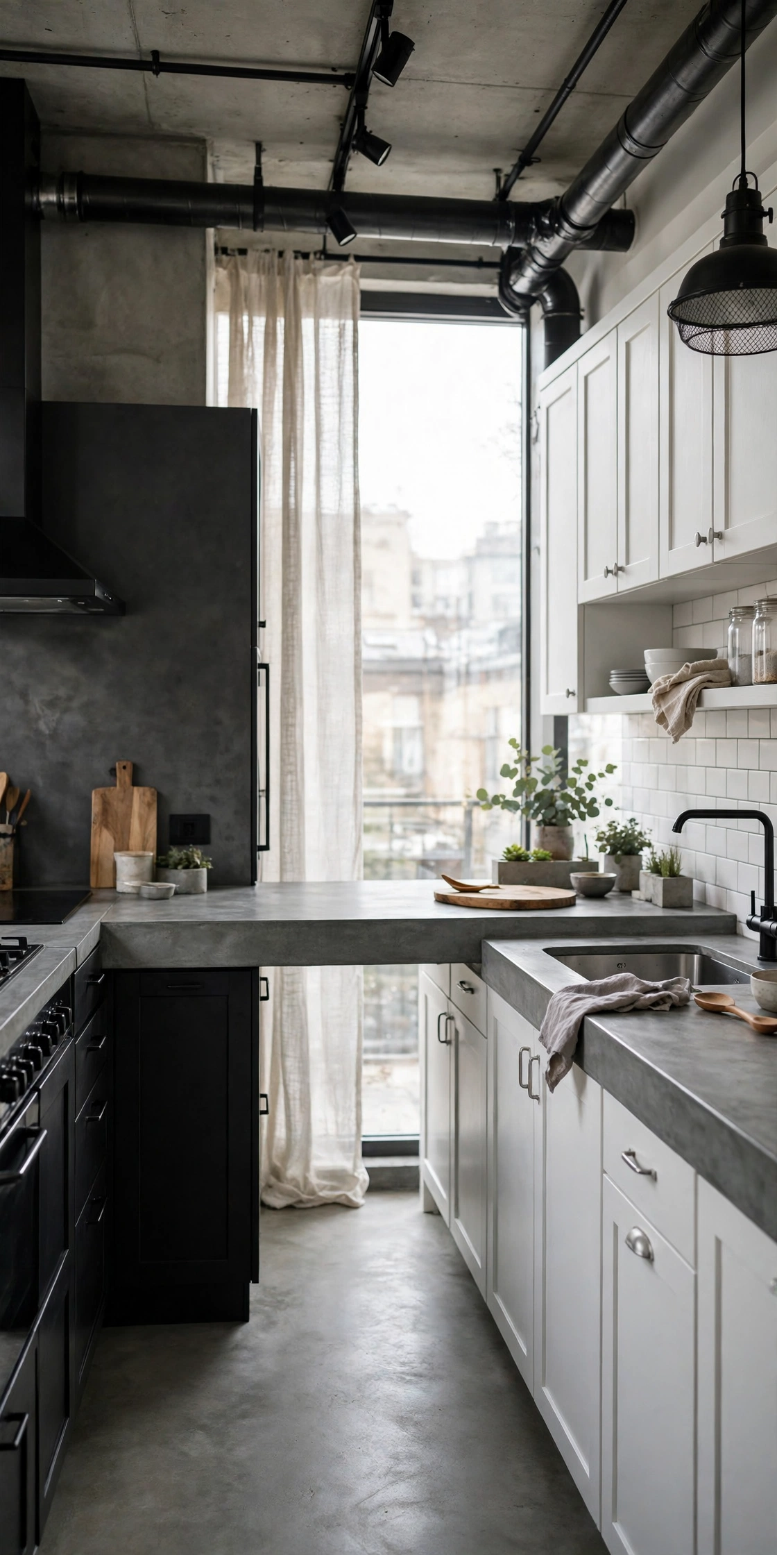
Gray concrete counters or floors bridge black and white without softening the contrast. The gray is literally the mix of the two, so it harmonizes the palette while adding industrial texture. Concrete’s variation keeps monochrome from feeling flat. Seal it properly; unsealed concrete stains. The industrial edge that makes minimalism feel warm.
Honest Take: Concrete develops a patina. If you want pristine forever, choose quartz that mimics concrete instead.
Black Sink, White Surround
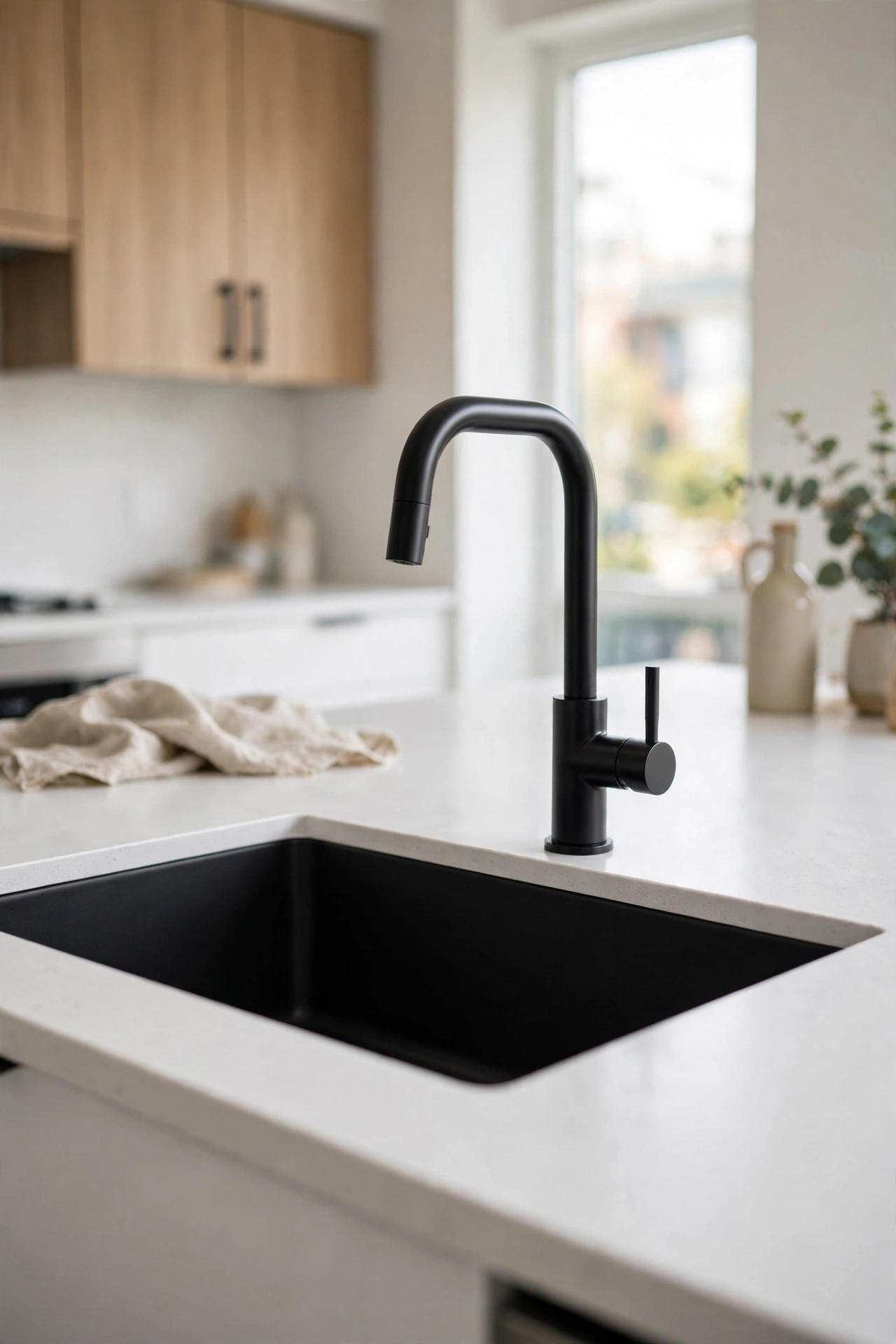
A matte black sink and faucet set into a white countertop is the detail-level contrast that punches above its weight. The dark basin reads as a graphic cutout in the bright surface. Black granite composite sinks hide everything and feel modern. This is a weekend-level swap with a designer result. Small change, sharp outcome.
Good to Know: Black sinks show hard-water spots. Wipe down after use if your water is mineral-heavy.
Warming Up Monochrome
- Wood bar stools or a wood cutting board display break the black-white binary.
- Brass or gold hardware adds warmth without adding color.
- Warm white bulbs, 2700 to 3000K, keep the palette cozy. Cool bulbs turn it clinical.
- A green plant is the oldest trick: one organic shape softens all the geometry.
- Textured textiles, a runner, linen towels, add softness that hard surfaces lack.
Detail Drama
The final layer: hardware, fixtures, and decor. This is where renters and refreshers get their monochrome fix without touching a cabinet.
Matte Black Hardware on White
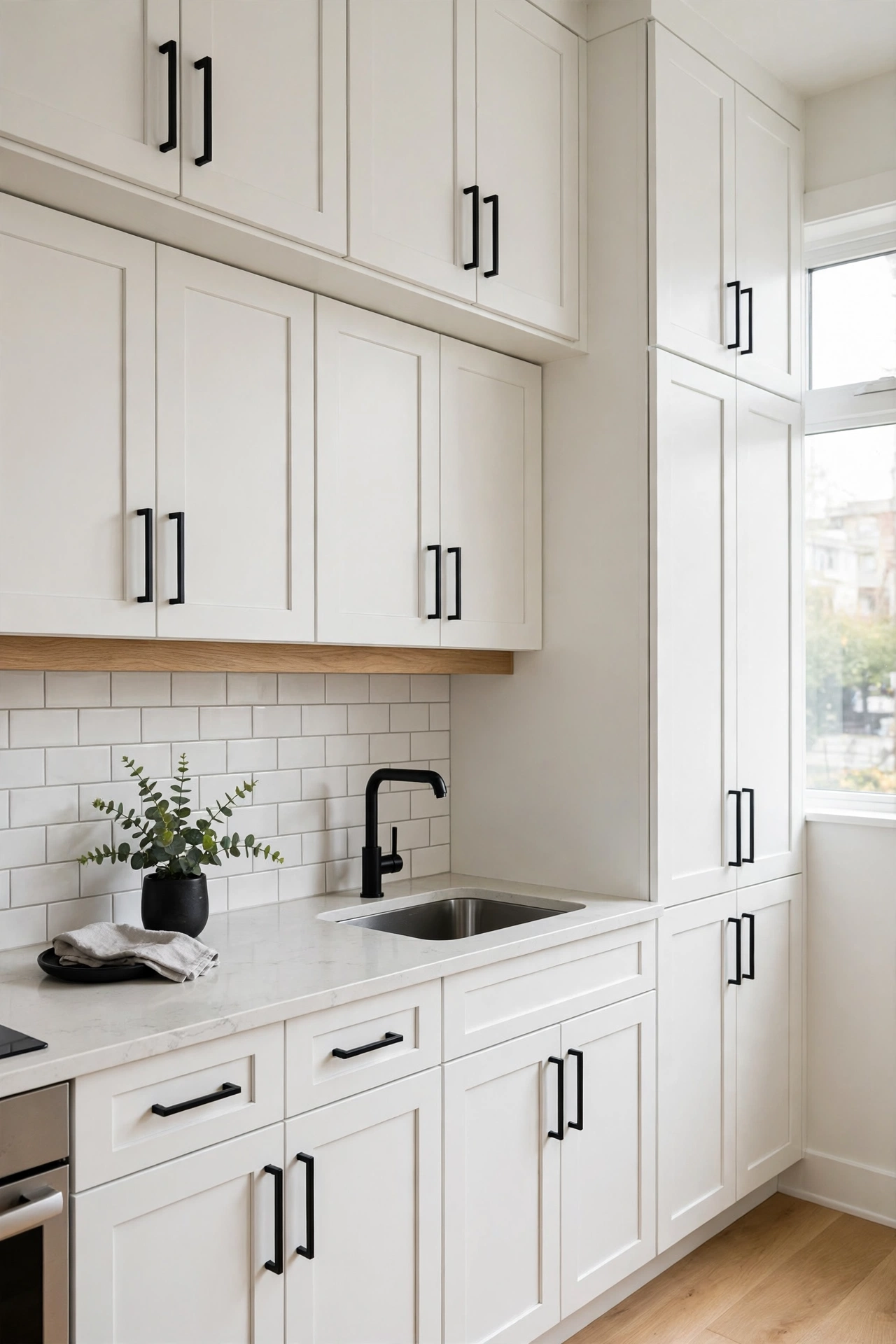
Matte black handles and knobs on white cabinets are the single most popular black-and-white kitchen move. The dark hardware draws crisp lines across the bright doors, defining every cabinet. It is cheap, reversible, and transformative. This is the gateway detail: once you see what black hardware does, you start seeing black everywhere. Twenty dollars a drawer of transformation.
Quick Tip: Replace all of it at once. Half old, half new reads as a repair job.
Black Pendant Lights
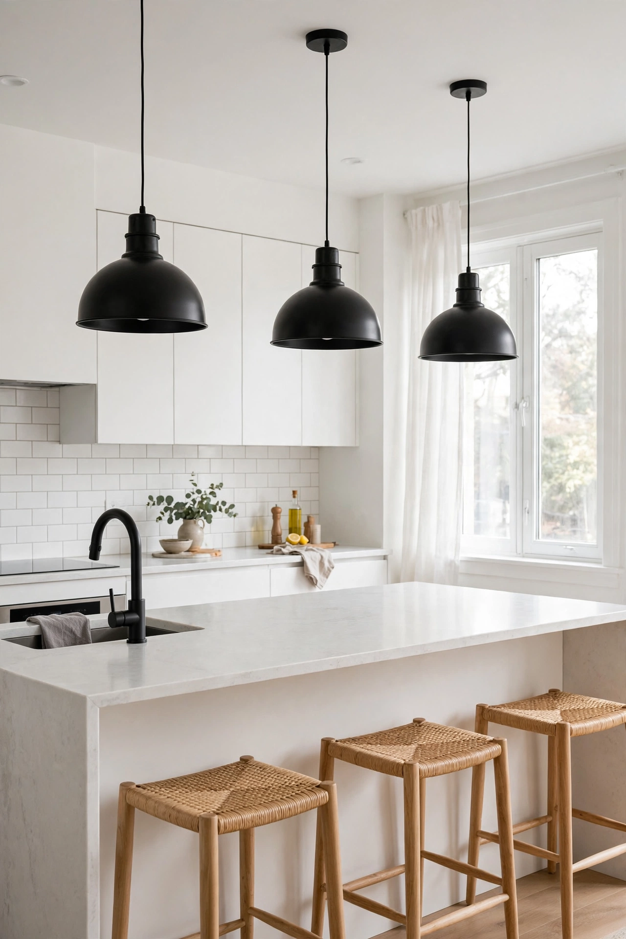
Black pendant lights over the island or table hang the contrast in mid-air. Dome, globe, or cone, the black shades read as sculpture against a white ceiling. They also focus light where you work. Two or three pendants in a row create rhythm. This is the lighting equivalent of the black island: one dark gesture, perfectly placed.
Style Note: Hang pendants 30 to 36 inches above the island surface. Too high and they float; too low and they block sightlines.
Black Faucet Statement
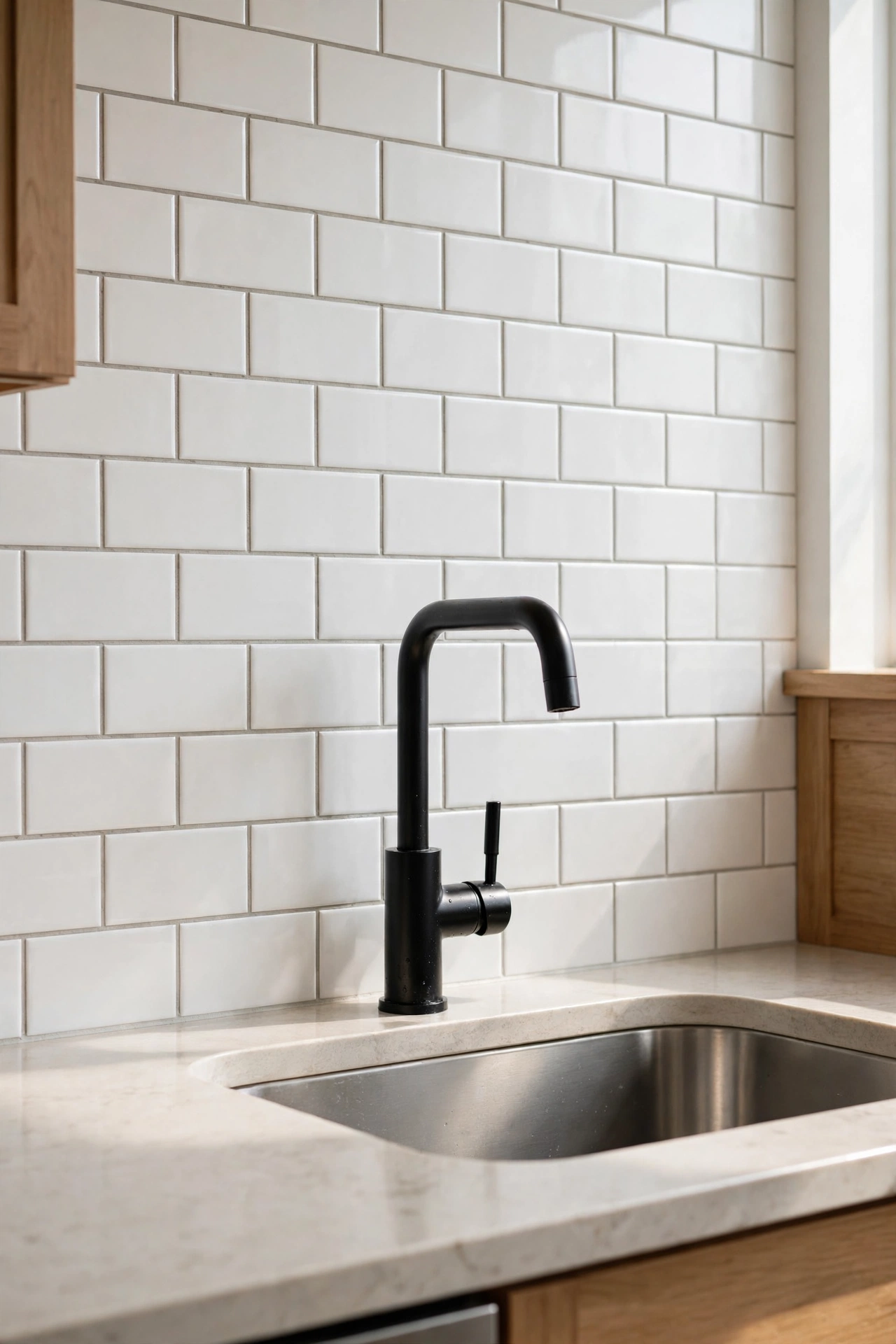
A matte black faucet against a white backsplash is jewelry for the sink. The dark sculptural form draws the eye to the busiest spot in the kitchen. Matte black finishes resist fingerprints and water spots better than chrome. Pair with black cabinet hardware to make it look planned. The hardest-working detail in the room.
Good to Know: Match your black finishes. Matte black faucet with glossy black hardware looks mismatched up close.
Black Range Hood
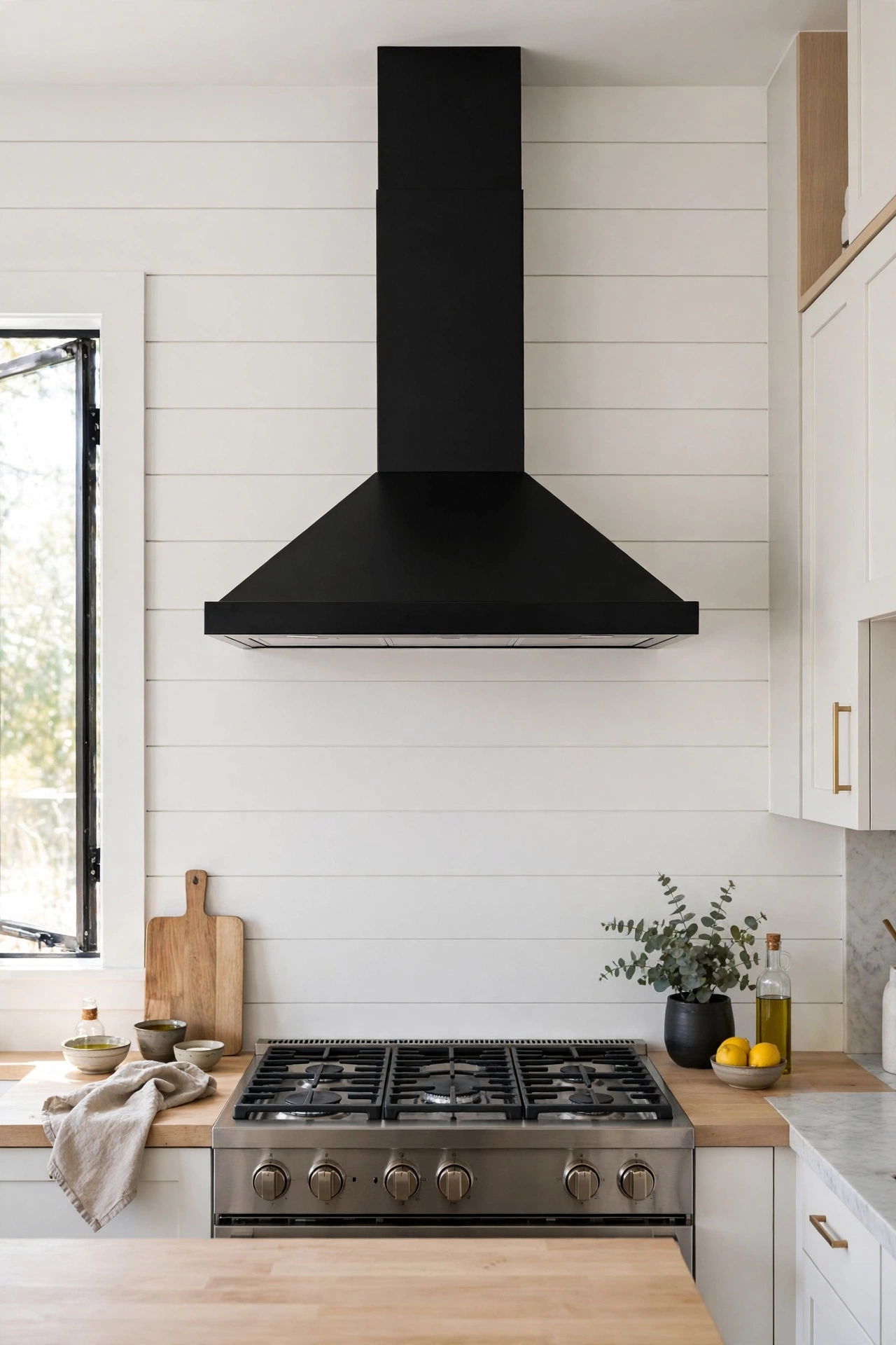
A black range hood on a white wall is the exclamation point of the kitchen. It centers the cooking zone and gives the room a focal anchor. Against white tile or shiplap, the contrast is pure graphic design. This works in every style from modern to farmhouse. The hood is the face of the kitchen; give it something to say.
Worth Knowing: Black hoods show grease. Wipe down weekly or the matte finish dulls.
Monochrome Open Shelving
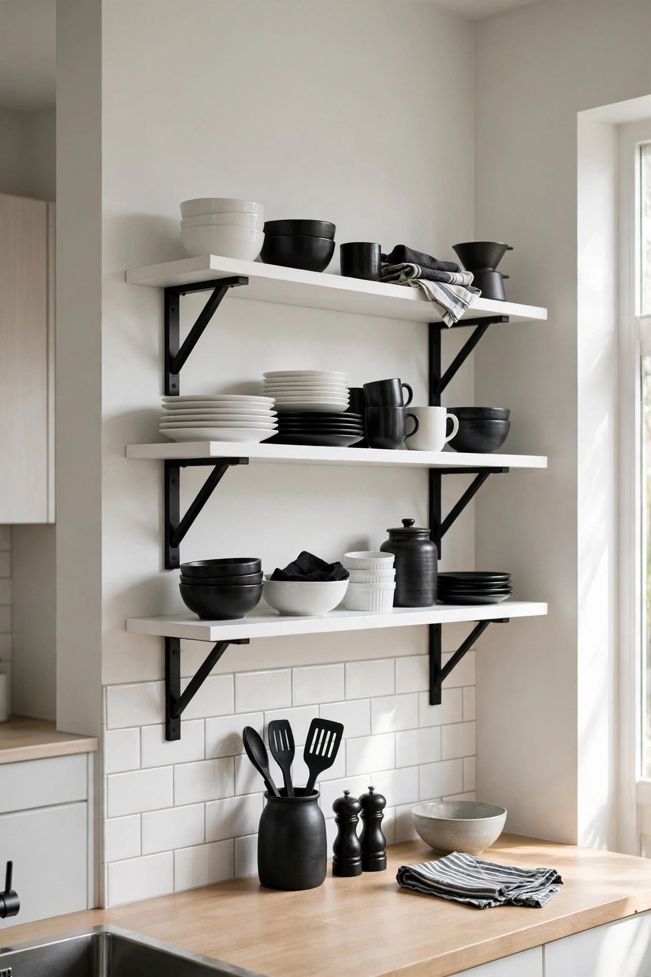
Black brackets with white shelves, or the reverse, styled with black and white dishware, turn storage into decor. The shelves continue the palette onto the walls. This is the detail that makes a monochrome kitchen feel curated rather than just two-toned. Style with restraint: the palette is the decoration. Let it breathe.
Quick Tip: Decant everyday items into black and white containers. The shelf styling then maintains itself.
Black Window Frames
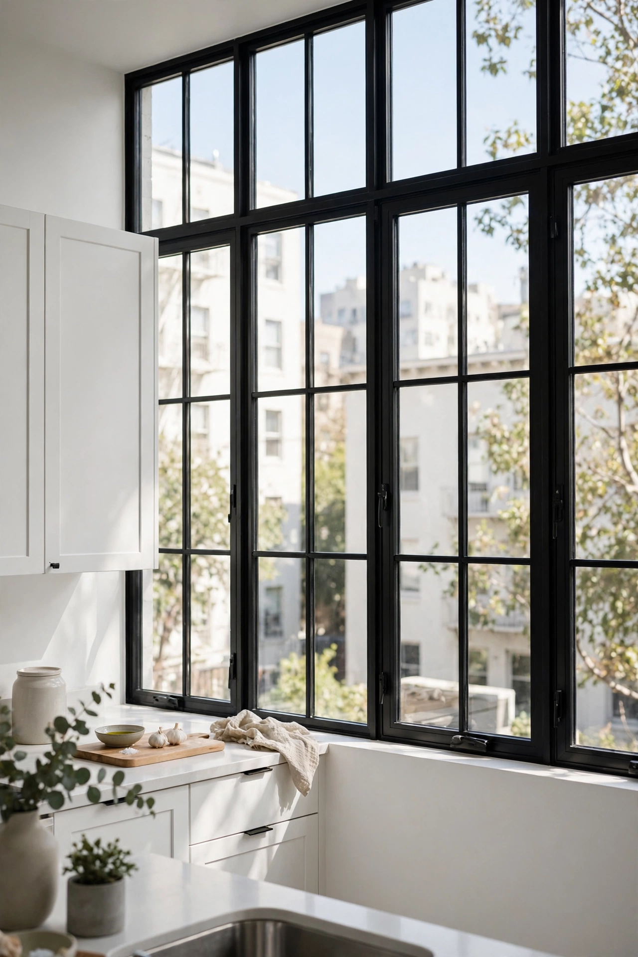
Black window frames, or black trim around the window, outline the view like a picture frame. Against white walls, the dark lines add architecture to an otherwise plain wall. This is a paint-grade upgrade with outsized impact. The view becomes art; the frame makes sure you notice. Details like this separate designed kitchens from assembled ones.
Style Note: This works best when other black details exist in the room. One black window alone can look accidental.
Graphic Black and White Art
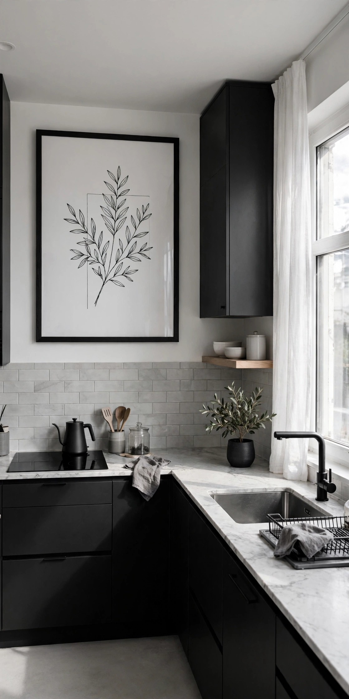
One large black and white art print, photography or abstract, ties the whole palette together on the wall. It is the only decor the kitchen needs. The art echoes the cabinets, counters, and hardware in a single frame. Hang it where you see it from the main work zone. The kitchen’s color story, told in one image.
Honest Take: Kitchens need art too. A blank wall in a designed kitchen is a missed opportunity.
The Monochrome Ratio That Works
In small kitchens, designers lean toward 60 percent white, 30 percent black, 10 percent warm accent like wood or brass. The white keeps the space bright and feeling larger; the black provides the graphic punch; the warm accent stops it feeling sterile. In large, well-lit kitchens you can push toward 50-50. The rule is simple: the smaller or darker the kitchen, the more white should lead.
Contrast With a Plan
Black and white kitchens fail when the contrast is accidental and succeed when it is placed. Cabinets, surfaces, or details, pick your layer and let the other two support it. Keep the ratio tilted toward white in small spaces, warm it with wood and brass, and light it like the graphic statement it is. Two colors, endless kitchens, zero chance of dating. That is the whole promise of monochrome, and it keeps delivering.