Black and white kitchens are crisp. Black and cream kitchens are kind. Cream brings the same contrast as white but with warmth baked in: buttery undertones, softness at the edges, a feeling that the kitchen has been lived in and loved. It is the monochrome for people who find monochrome cold. These 25 ideas are organized by style, from classic cream farmhouses to sleek modern pairings, because cream wears every style differently and black sharpens all of them.
Classic Cream
The traditional register: shaker cabinets, farmhouse sinks, warm details. Black keeps the classic from going sleepy.
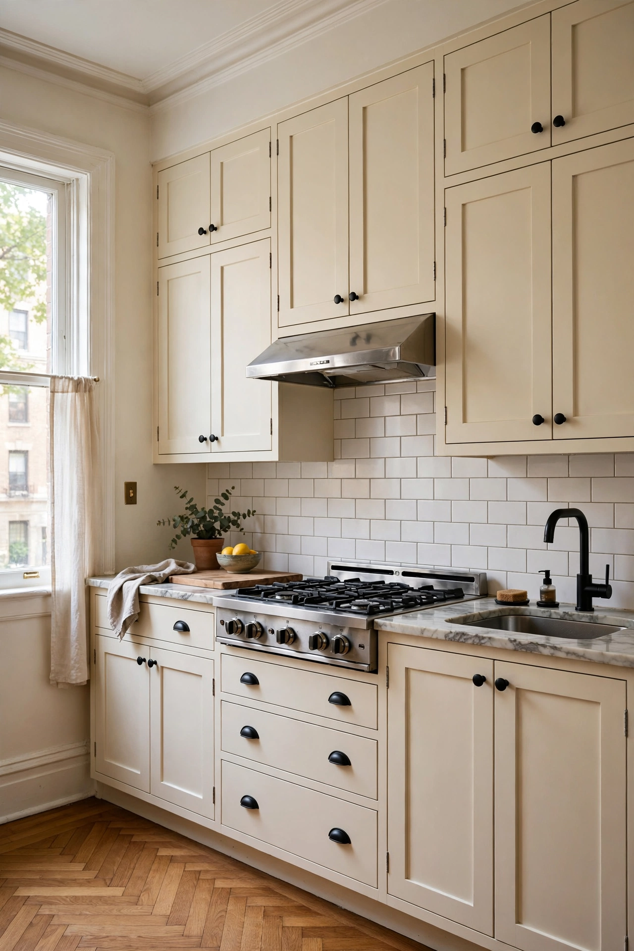
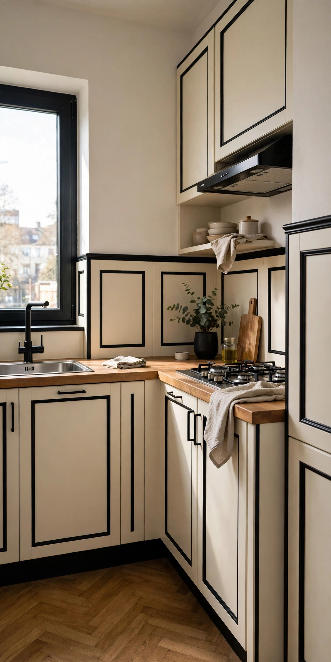
Cream shaker cabinets with matte black hardware are the foundational pairing. The shaker profile says classic; the black handles say now. The dark hardware draws crisp lines across the soft cream, defining every door and drawer. This is the kitchen equivalent of a perfect white shirt with black trousers: it cannot go wrong. Start here and build outward.
Quick Tip: Cup pulls in black on drawers plus knobs on doors is the classic hardware mix. It looks collected, not matched.
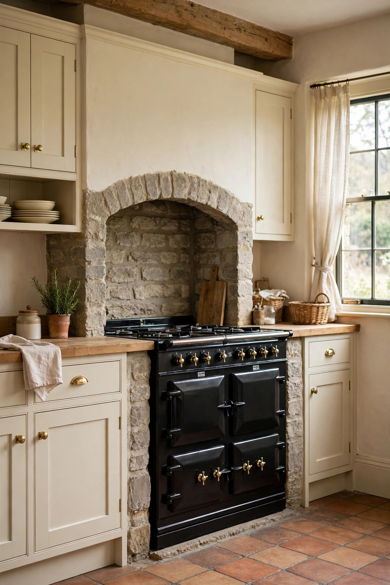
A black range cooker against cream cabinetry is the farmhouse power move. The dark appliance anchors the cooking wall like a hearth. Cream around it keeps the room light; the black range provides the drama. This is the centerpiece that makes the kitchen feel like the heart of the home. Cookers are furniture; choose one with presence.
Good to Know: Black range cookers show dust on top. A quick daily wipe keeps the drama clean.
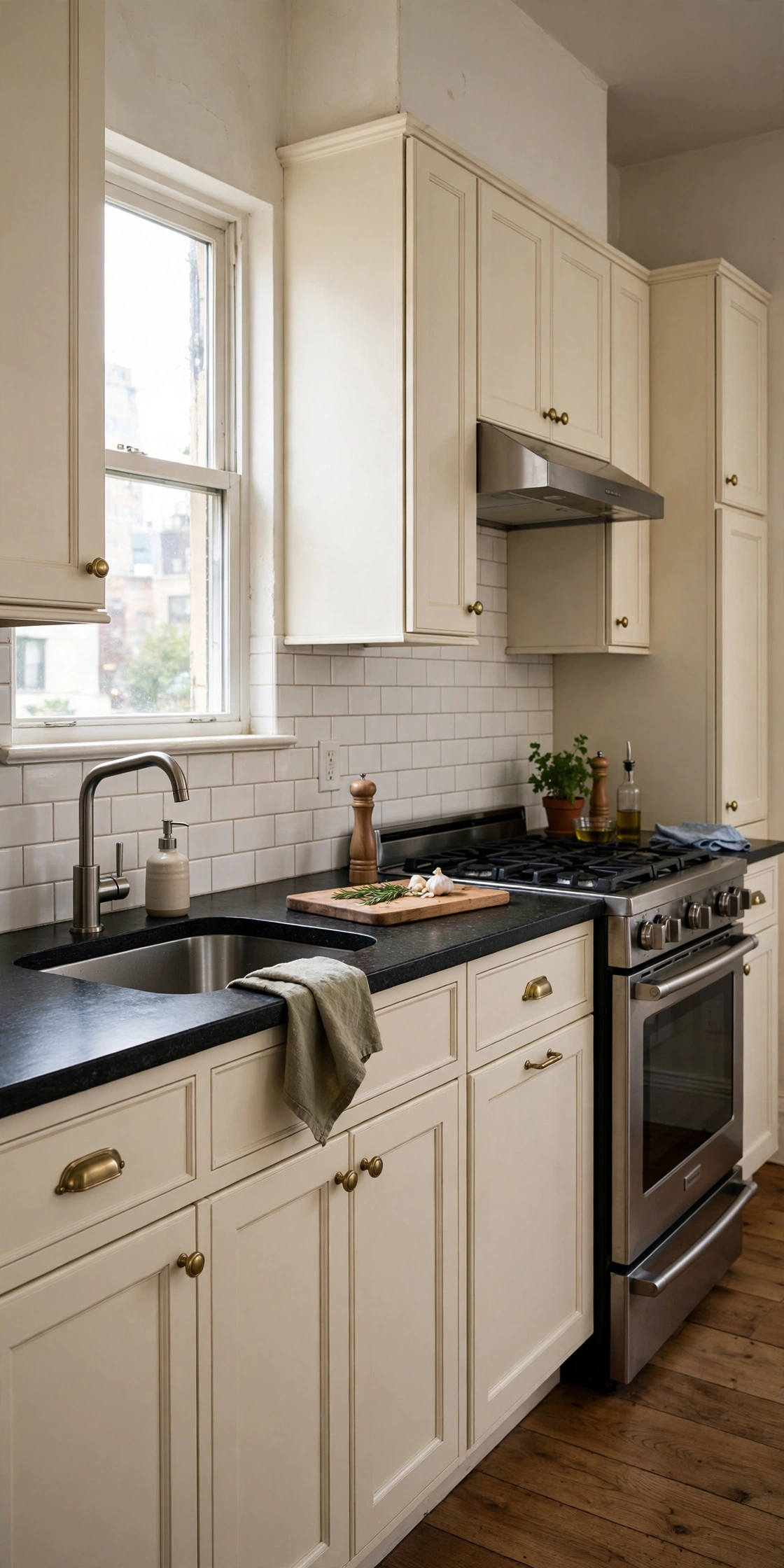
Cream cabinets with black granite or quartz countertops give you the high contrast at the work surface. The dark counters ground the soft cabinets and hide stains beautifully. This is the workhorse version: pretty up top, practical where you chop. Honed black stone keeps the look soft; polished turns it dressy. Either way, the contrast does the decorating.
Reality Check: The Mumsnet debate is real: dark counters hide the mess, light counters show it. Choose per your cleaning habits.
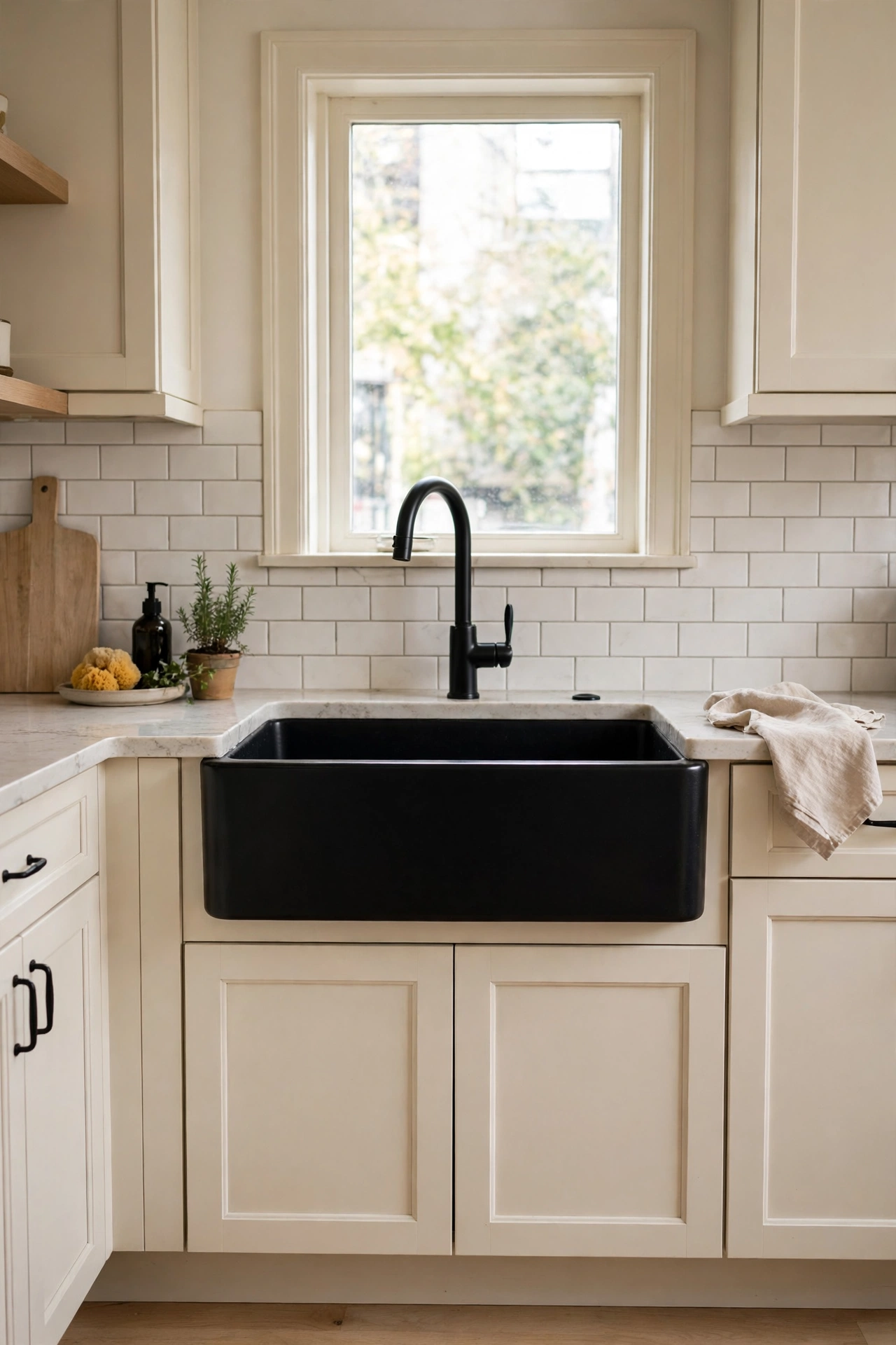
A black farmhouse sink set into cream cabinetry is the detail that stops scrollers. The dark apron front reads as a graphic block against the soft cabinets. Fireclay black sinks are striking and durable. Pair with a black faucet for a coordinated moment. The sink is the most-used object in the kitchen; make it beautiful.
Style Note: A black sink needs a light counter around it. Dark sink in dark counter disappears.
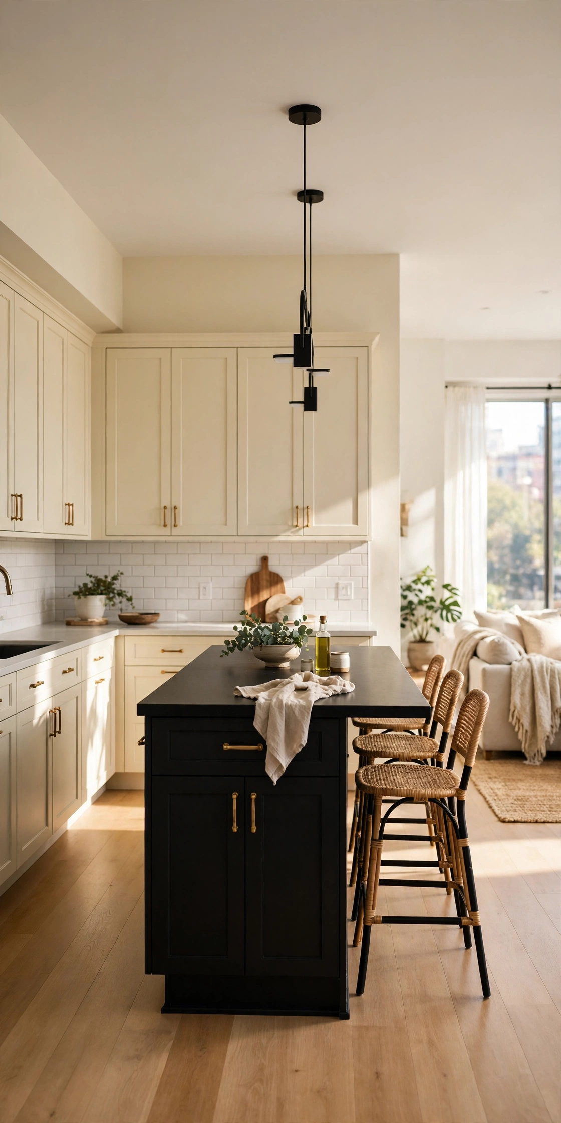
Cream walls and perimeter cabinets with a black island concentrate the dark in one furniture-like piece. The island anchors the room; the cream keeps it airy. This is the lowest-risk way to get the pairing: the island could be repainted in a weekend. In open-plan spaces, the black island also defines the kitchen zone. One dark object, whole room of impact.
Quick Tip: Make the island work harder with contrasting stools in wood or cane, not more black.
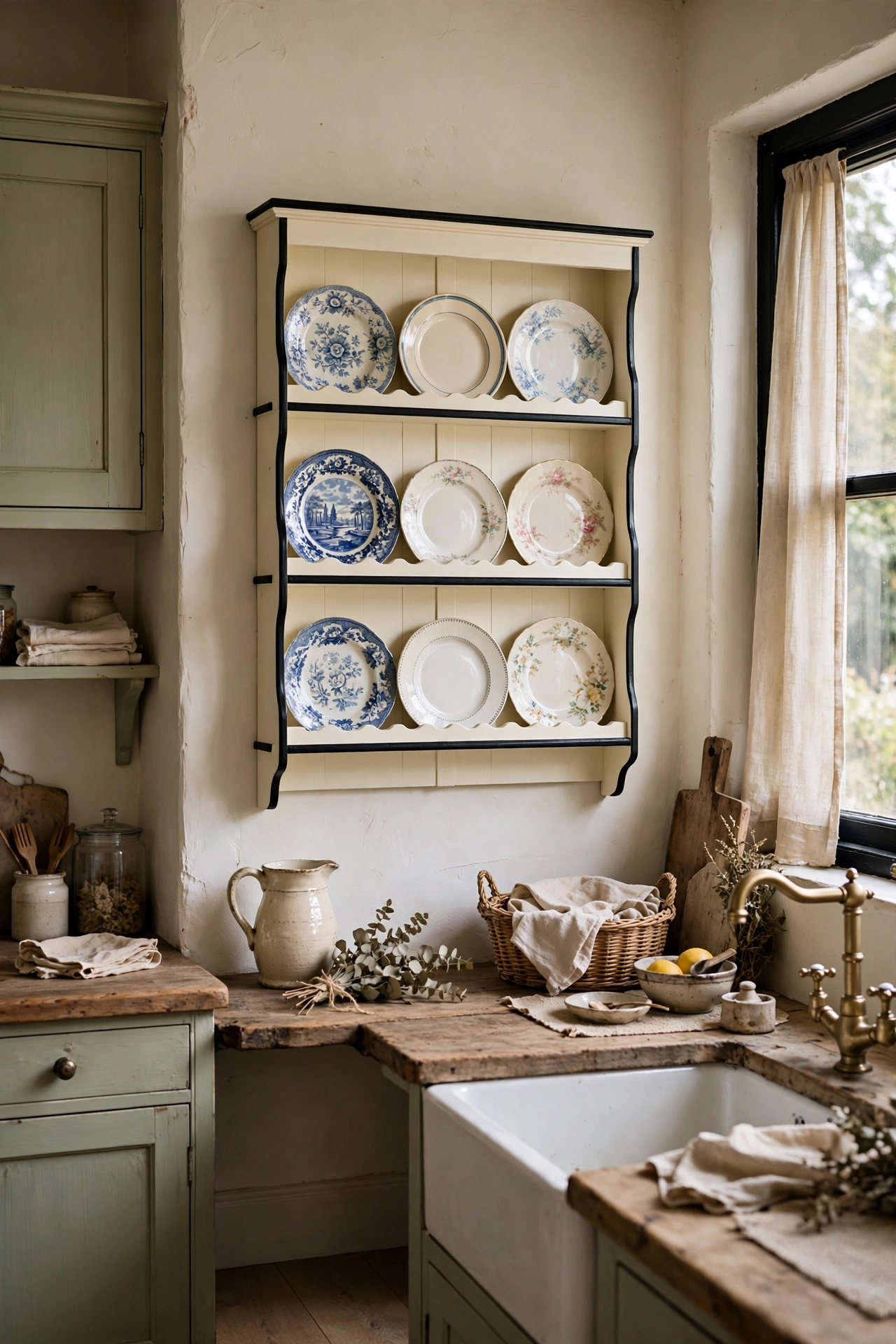
A cream plate rack with black trim, or black brackets, turns dish storage into decor. The open rack displays everyday china; the black details sharpen the soft cream. This is the country-kitchen note that keeps classic cream from feeling bland. Display the good dishes. They were made to be seen.
Good to Know: Plate racks need dusting. If open storage sounds like chores, skip this one.
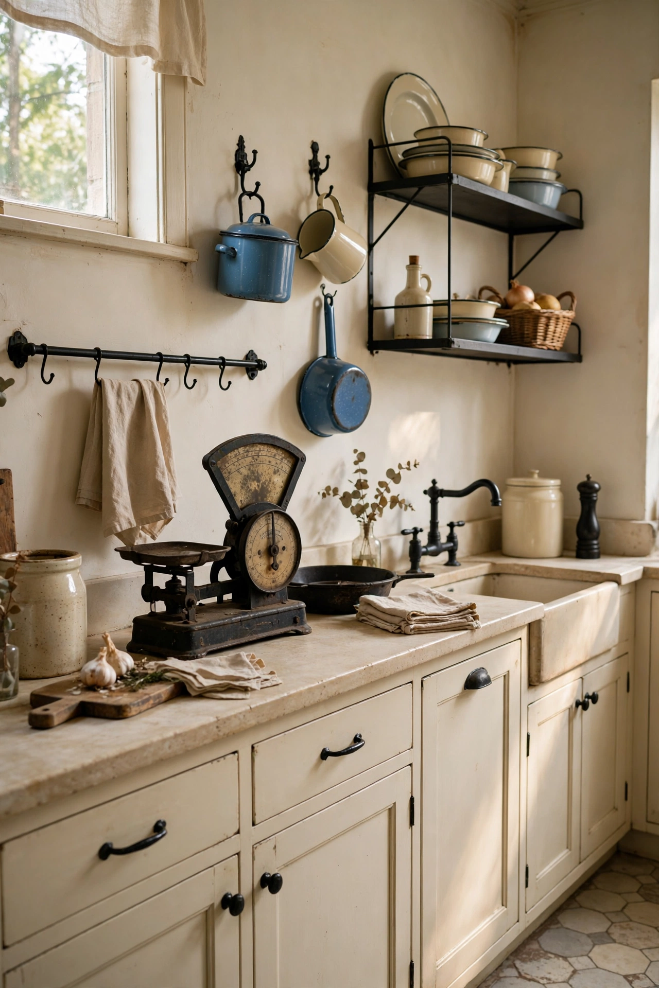
Vintage black accents, an old scale, enamel signs, ironstone with black trim, give a cream kitchen soul. The aged black has patina that new black lacks, and it sits beautifully against soft cream. Flea markets are the source. This is the collected-over-time look that cannot be bought in one shopping trip. Let it accumulate.
Honest Take: One or two vintage pieces add character; ten looks like a shop. Edit ruthlessly.
Cream Shades and Their Undertones
Cream shade
Undertone
Pairs best with
Ivory
Barely warm
Soft black, charcoal
Buttermilk
Yellow warmth
Matte black, brass
Greige cream
Gray-beige
Pure black, modern
Clotted cream
Rich, deep
Gloss black, traditional
Modern Cream
Cream goes contemporary: handleless fronts, sleek lines, minimal fuss. Black keeps it sharp.
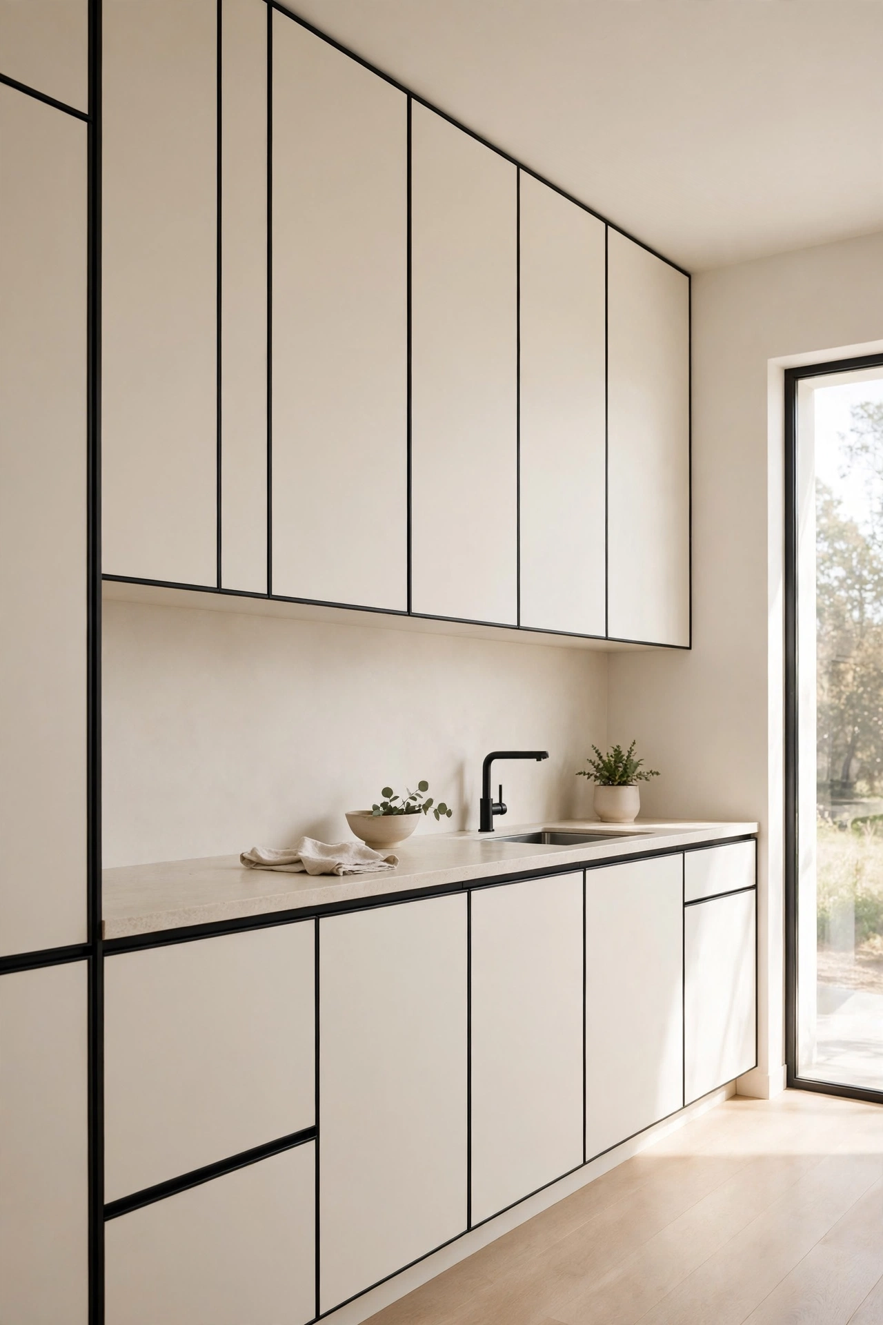
Handleless cream slab cabinets with black trim lines are modern minimalism with a warm heart. The flat fronts read sleek; the cream keeps them approachable. A black shadow gap or black plinth at the base adds the graphic line. This is the kitchen for people who love minimalism but not its coldness. Warm minimalism is a real thing, and this is it.
Worth Knowing: Handleless cabinets and cream show handprints. Keep a microfiber cloth in a drawer.
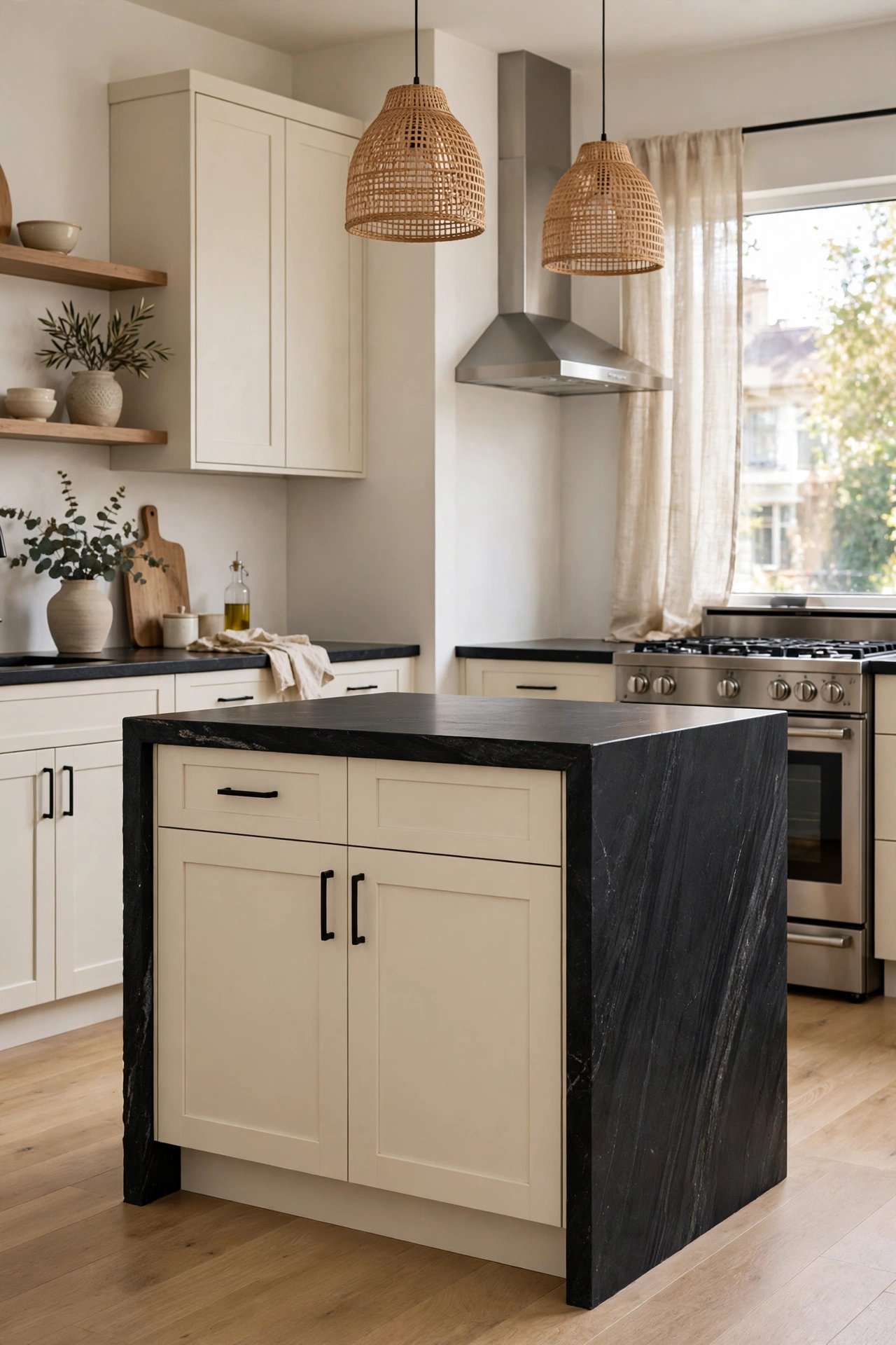
A two-tone island, cream body with black waterfall top, or black base with cream top, makes the island a microcosm of the palette. The island becomes the design statement in an otherwise quiet kitchen. This is for renovators who want one bold gesture. The island is the stage; give it a costume.
Style Note: Waterfall tops in black stone on a cream island are the most photographed version. There is a reason.
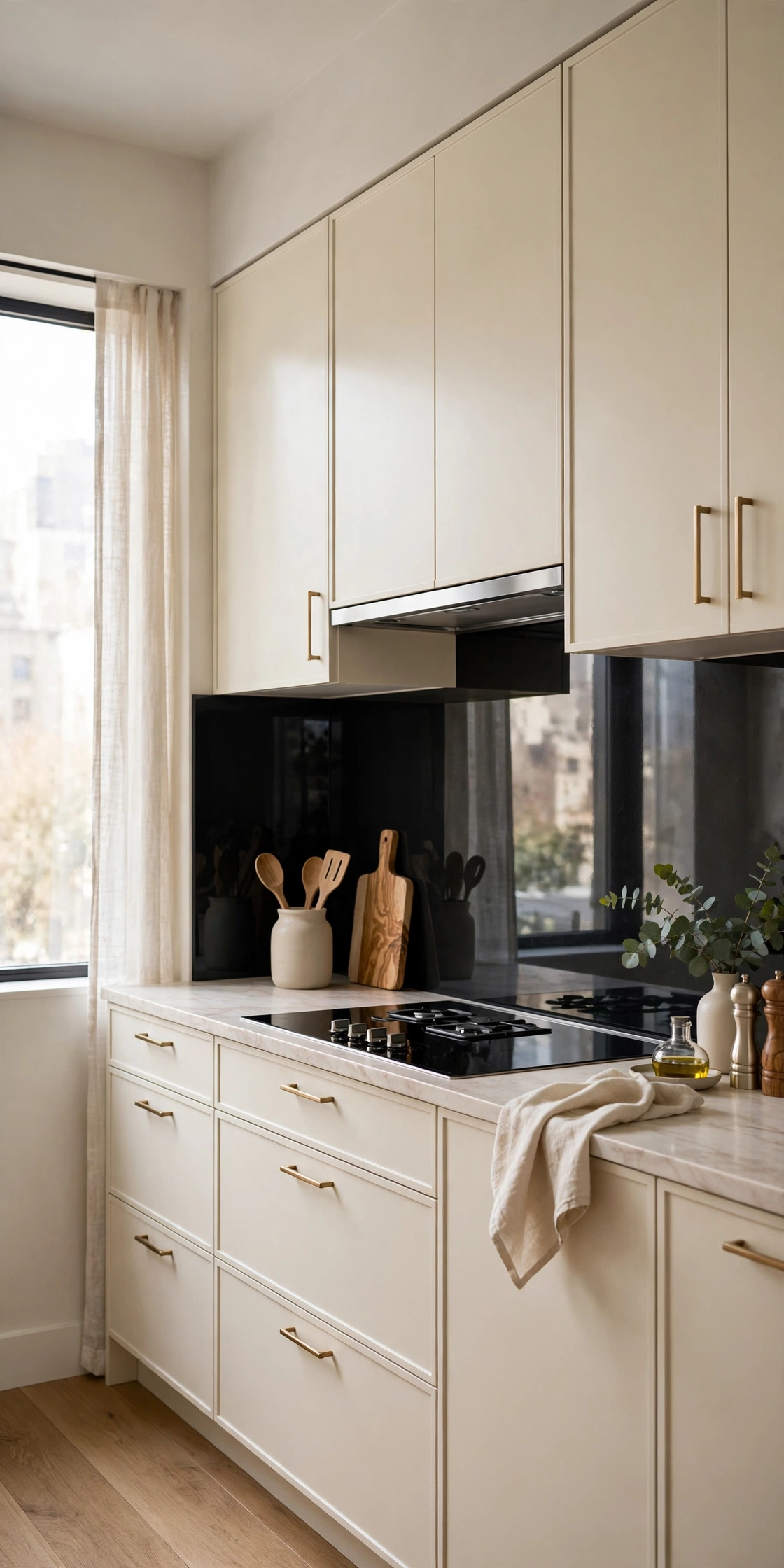
A black glass splashback behind cream cabinets is the sleek modern contrast. The reflective black surface bounces light and looks like a dark mirror. It wipes clean in seconds and never needs regrouting. Against soft cream, the high-tech black is a thrilling juxtaposition. Modern material, classic color. The tension is the design.
Good to Know: Black glass shows every splash while cooking. Wipe as you go or accept the lived-in look.
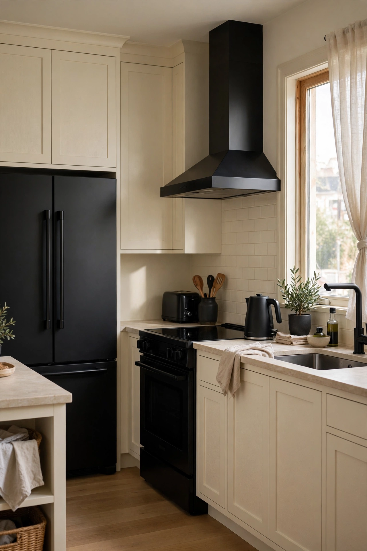
Black stainless or matte black appliances in a cream kitchen give you the contrast without touching the cabinets. The dark appliances read as a deliberate suite against the soft cabinetry. This is the appliance-package upgrade that changes the whole room. When the appliances die, by the way, the kitchen’s color story survives. Built-in contrast, zero renovation.
Quick Tip: Match the black finishes across appliances. Mixed matte and gloss blacks look accidental.
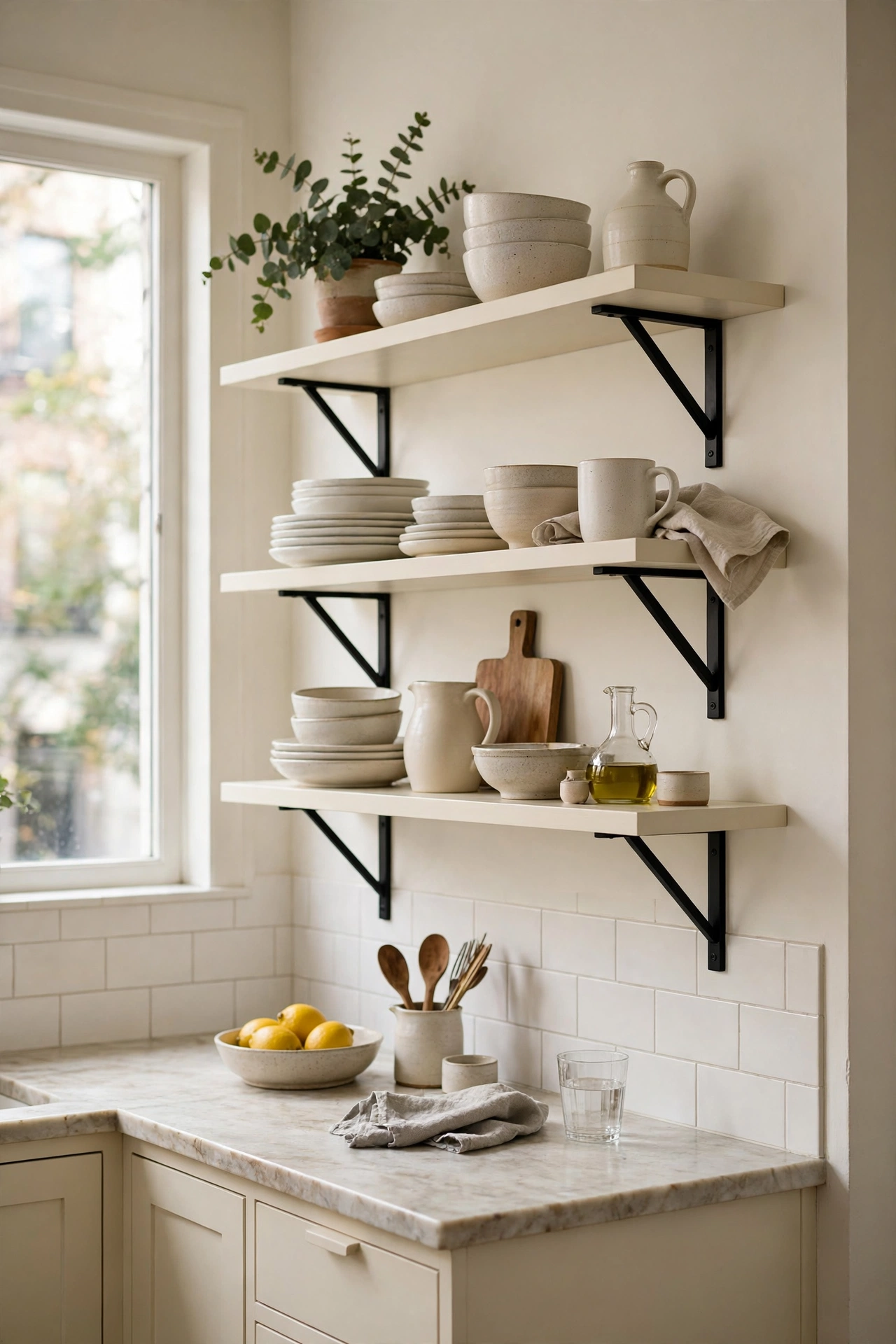
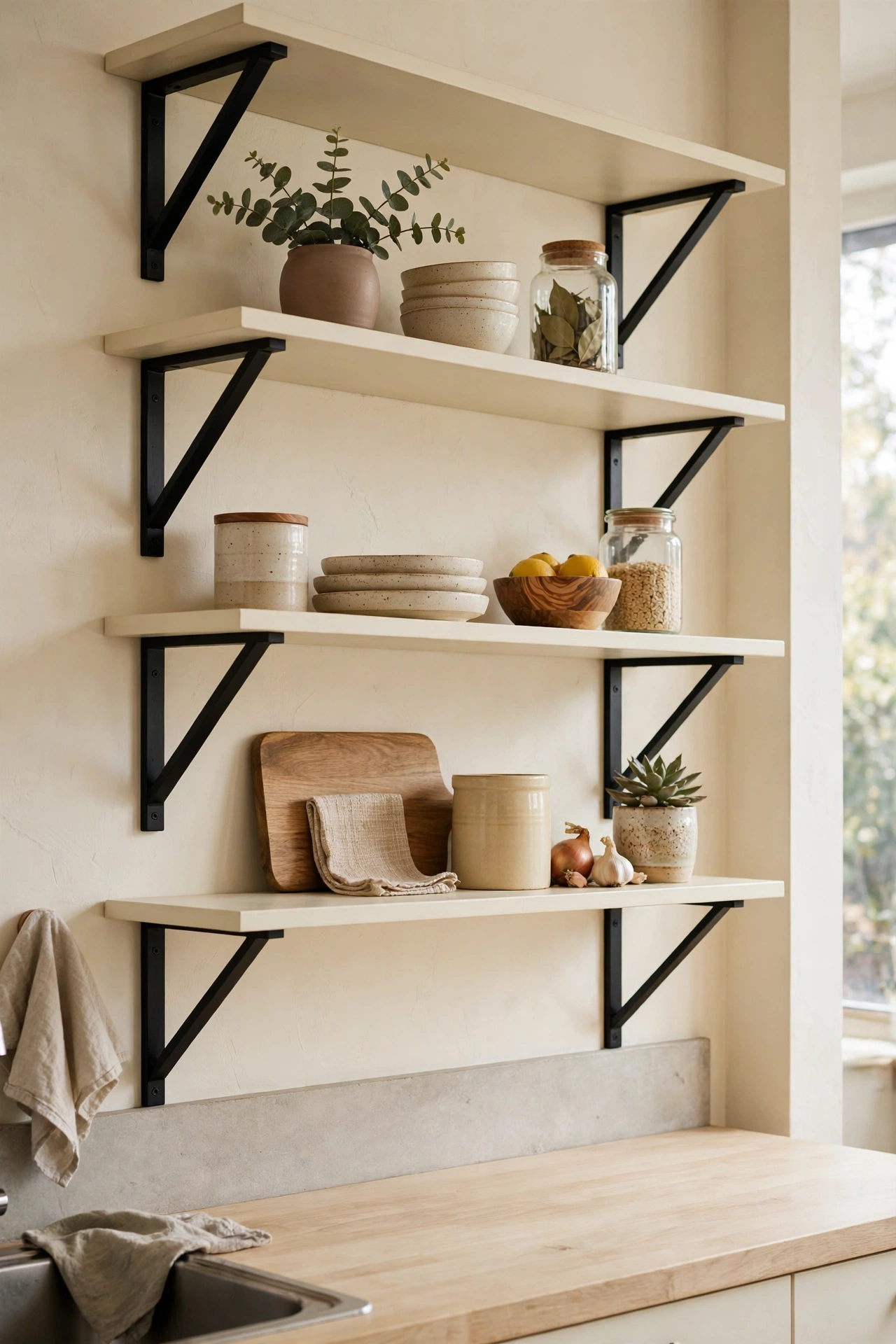
Cream floating shelves on black brackets continue the palette onto the walls. The shelves lighten the upper wall; the brackets add the graphic black note. Styled with cream and black dishware, the shelves become part of the color story. This is the detail that makes a cream kitchen feel designed rather than just painted.
Reality Check: Floating shelves need solid anchors. Kitchens hold heavy things; mount like it.
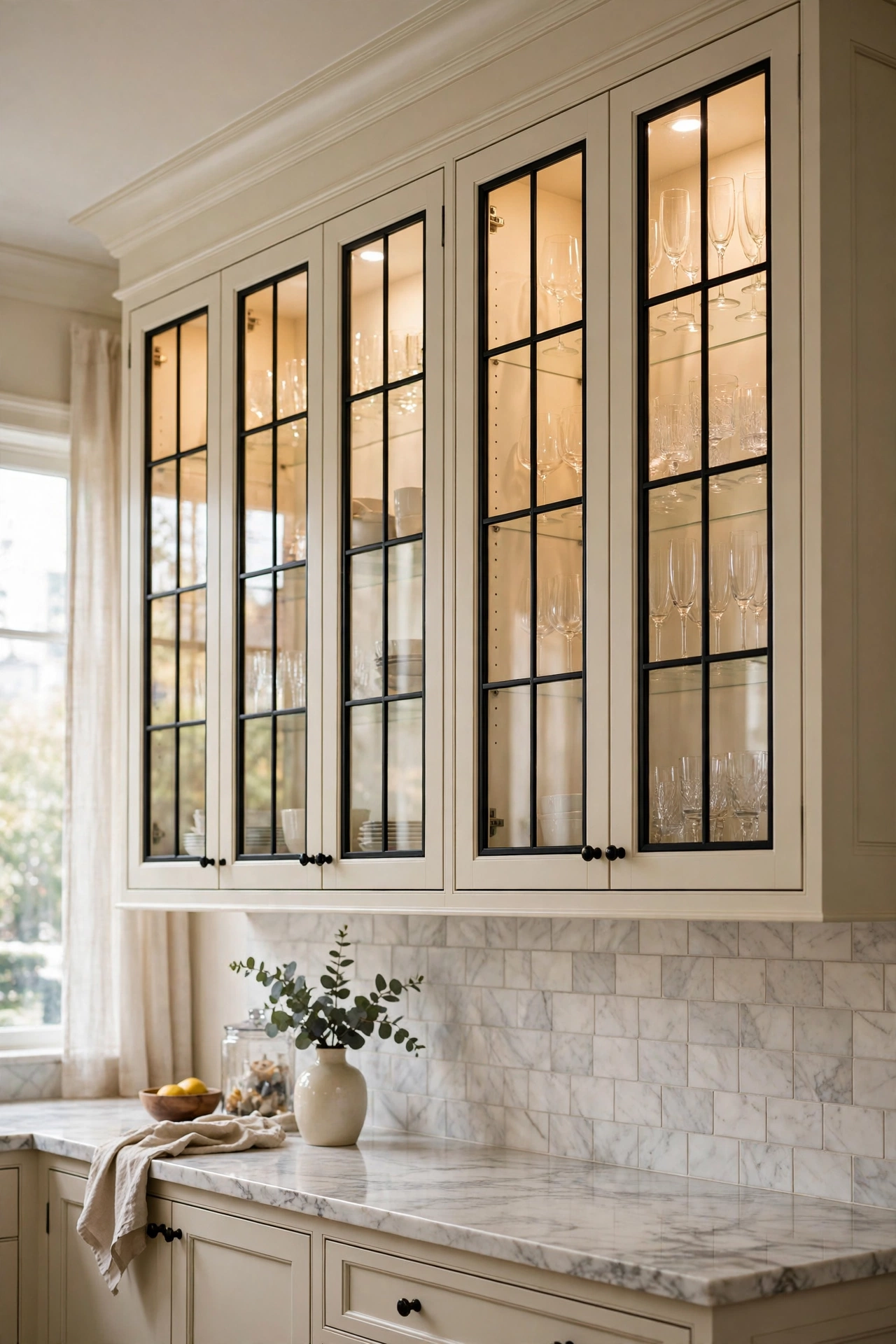
Cream cabinets with black-framed glass doors break up the solid fronts with display space. The black frames draw crisp lines; the glass shows off beautiful dishware. This is the dressiest version of cream cabinetry. Interior cabinet lighting makes the glass glow at night. The kitchen’s jewelry cabinet.
Honest Take: Glass-front cabinets demand curated contents. If your mugs are a chaotic collection, keep the doors solid.
Cream vs White: Why It Matters
White reflects the most light and looks crisp; cream reflects slightly less but adds warmth that white cannot. In north-facing or small kitchens, cream’s warmth can make the room feel cozier without losing brightness. Against black, white gives maximum graphic punch while cream gives a softer, more livable contrast. Neither is better; they are different moods. Pick white for drama, cream for comfort.
Pattern Play
Tile and floors are where black and cream get playful. Pattern loves this palette.
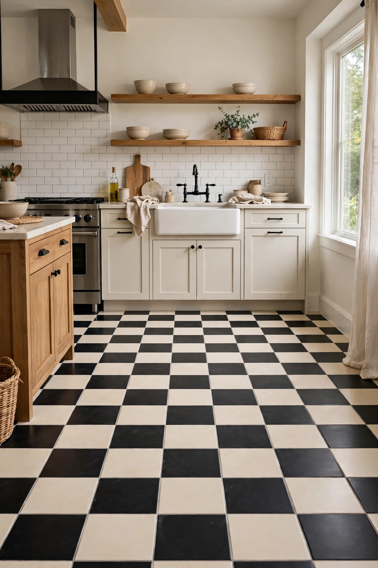
A cream and black checkerboard floor is softer than black and white but just as graphic. The cream squares warm the pattern; the black squares keep it bold. This floor works in every style from farmhouse to modern and never feels dated. It is the hardest-working pattern in the article: classic, forgiving of dirt, and endlessly charming. The floor that makes the kitchen.
Style Note: Cream, not white, squares are what keep this from feeling like a diner. The warmth is the difference.
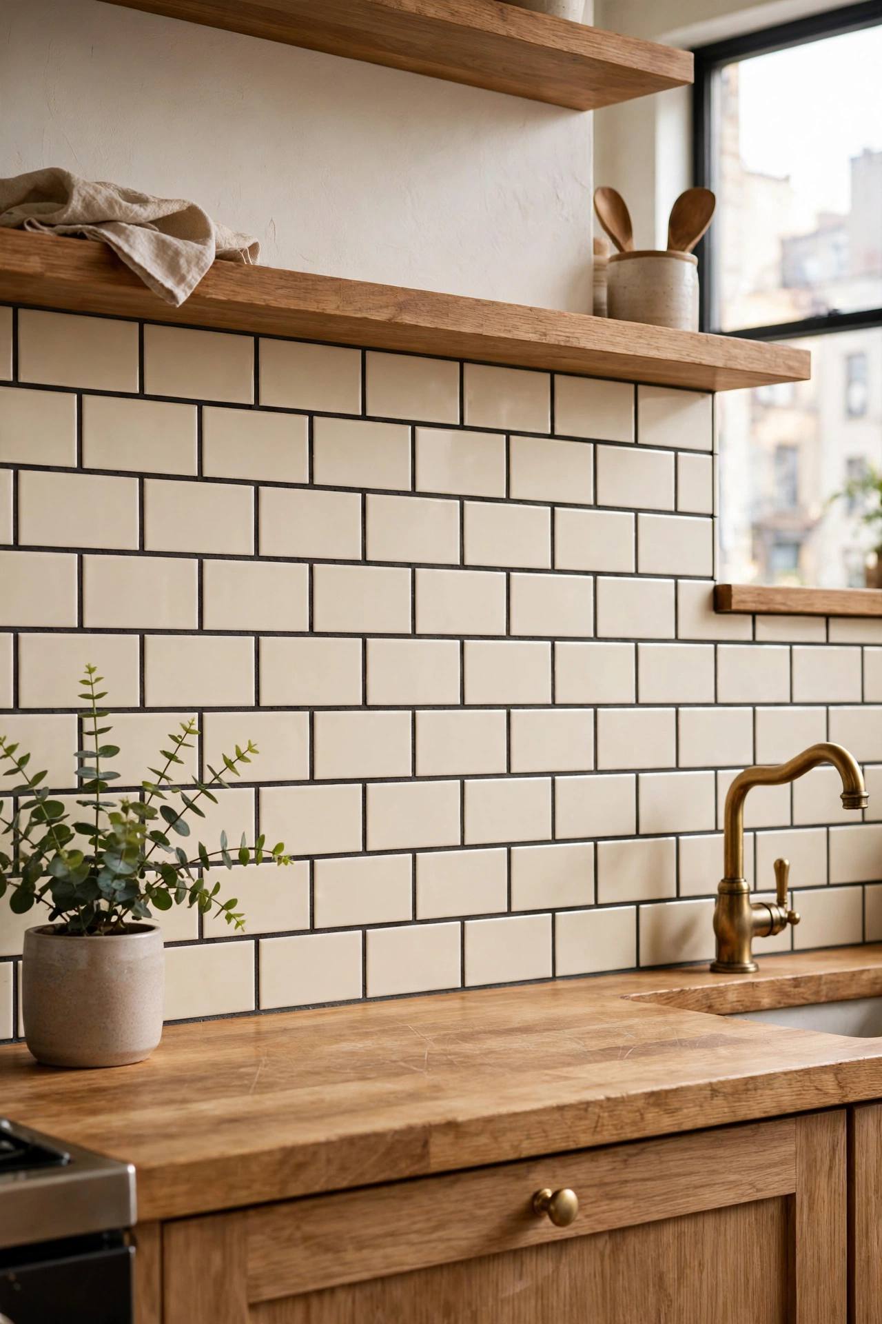
Cream subway tile with charcoal or black grout gives you the graphic backsplash without starkness. The dark grout lines define each tile; the cream keeps it soft. This is the backsplash that looks custom for the price of grout. Seal the grout well. Pattern on a budget, warmth included.
Good to Know: Dark grout is unforgiving of uneven tile lines. A good tiler is worth it here.
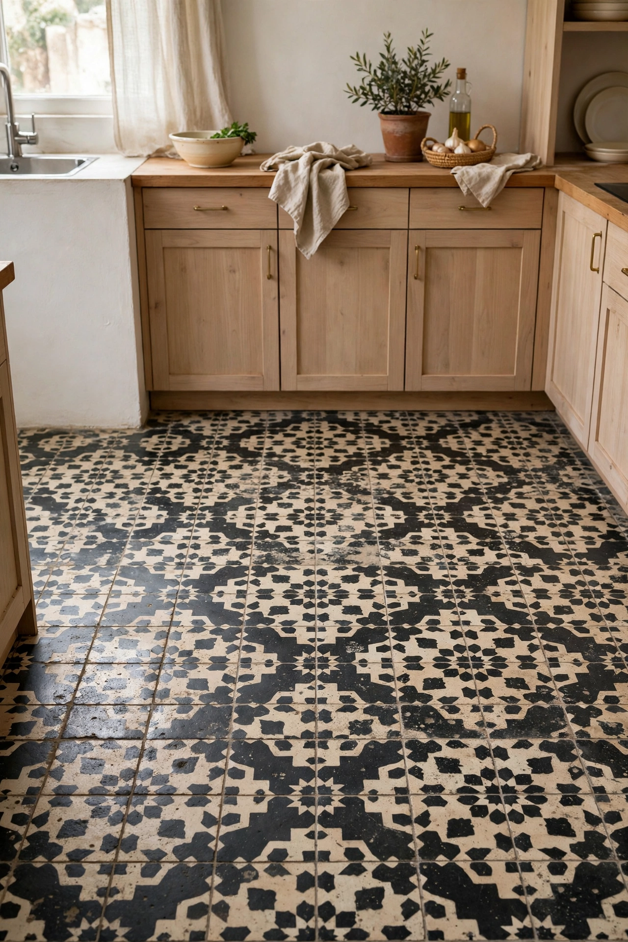
Patterned cement-look tile in black and cream on the floor or backsplash adds artisanal character. The patterns, Moroccan, Victorian, geometric, bring history and craft. Against plain cream cabinets, the tile becomes the room’s artwork. Seal cement-look tile properly. Pattern is a commitment; make it one you love.
Quick Tip: Use patterned tile on one plane only, floor or backsplash, not both. Two patterns fight.
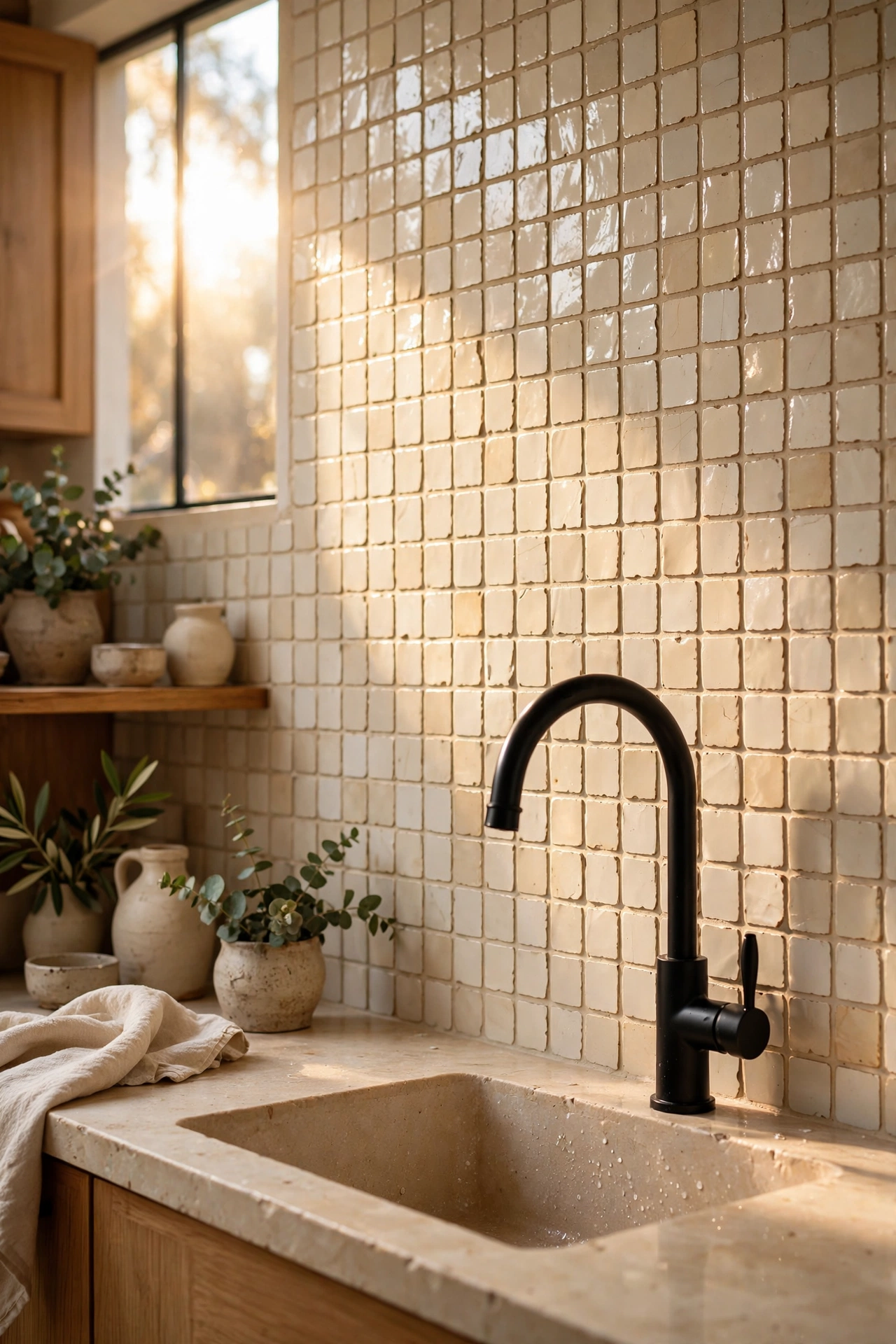
Handmade-look cream zellige tile with its varied, glowing surface, paired with black fixtures, is the artisanal luxury version. The tile’s imperfection is the point: it shimmers and shifts. Black faucets and hardware sharpen it. This is the backsplash for people who notice tile. And once you notice zellige, nothing else satisfies.
The Cost: Real zellige is pricey and tricky to install. Zellige-look ceramic gives most of the effect for less.
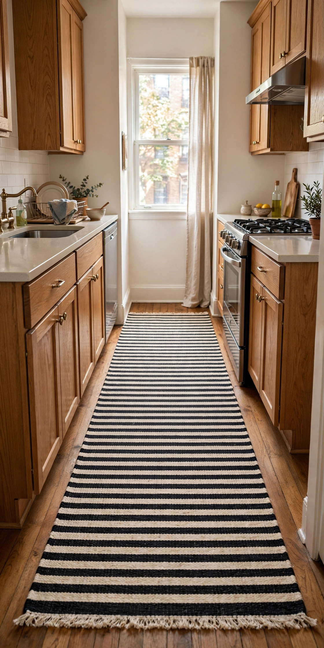
A striped runner in black and cream down the galley adds pattern at floor level with zero commitment. The stripes elongate the kitchen visually. Runners also soften hard floors acoustically and comfort-wise. This is the renter’s pattern play: it rolls up when you move. Small textile, big graphic move.
Good to Know: Flatweave runners handle kitchen traffic best. Avoid high pile near cooking zones.
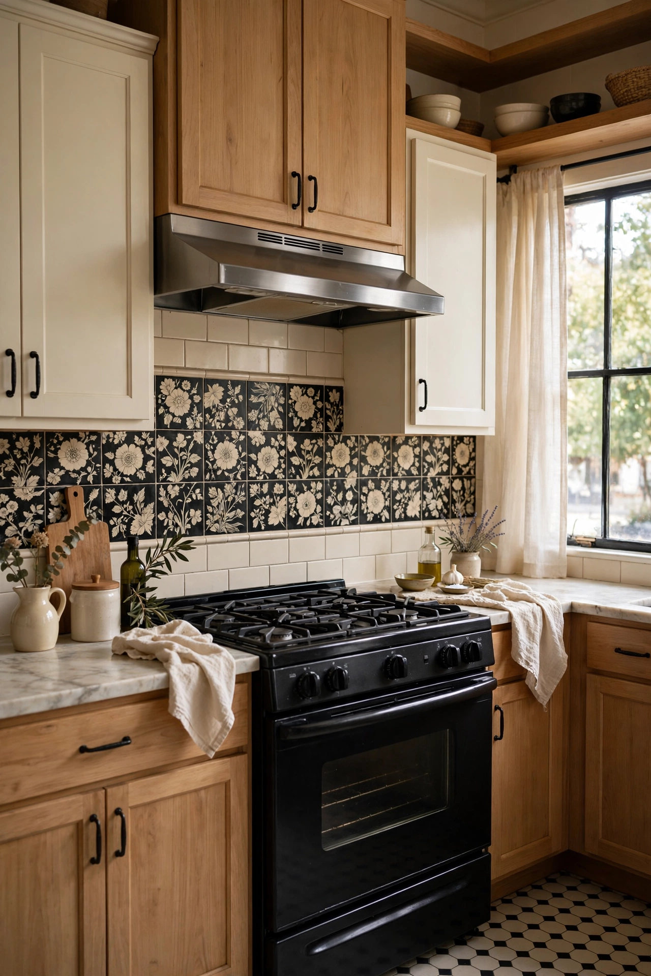
A floral or botanical tile accent, a band behind the range or a feature wall, in black and cream brings romance to the palette. The pattern softens the contrast with organic shapes. Against plain cream cabinets, one floral moment is enchanting. This is the cottage note: sweet but not saccharine, because the black keeps it grounded.
Style Note: Keep the floral to one contained area. A little romance goes a long way.
Black Jewelry
The final layer: the small black details that sharpen every cream kitchen. None require renovation.
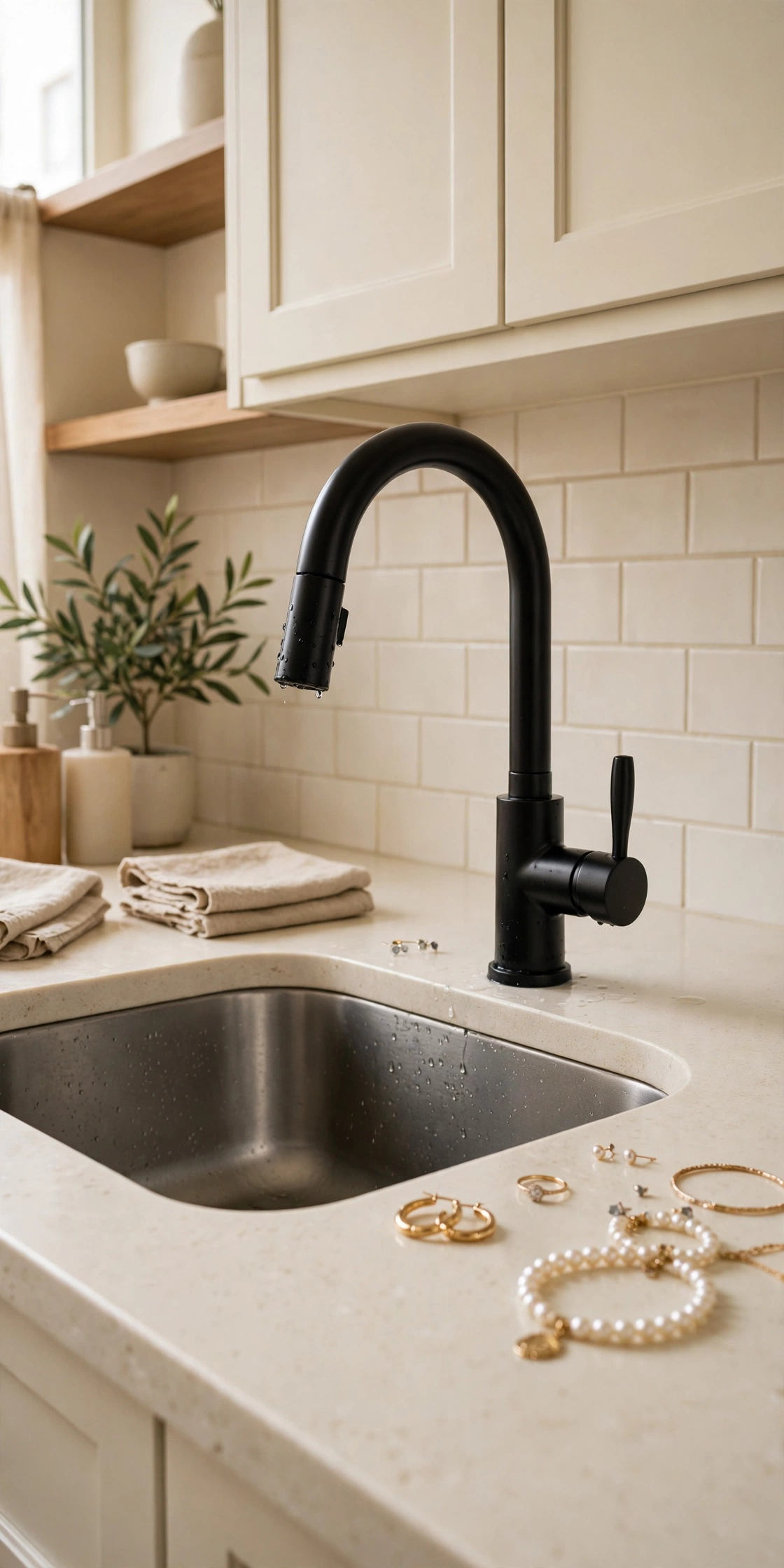
A matte black faucet on a cream counter is the jewelry of the sink. The dark sculptural form pops against the soft surfaces. Matte black resists spots better than chrome and looks deliberately modern. Pair with black cabinet hardware to make it look planned. The hardest-working small detail in the kitchen.
Quick Tip: Match black finishes across faucet and hardware. Mixed blacks look off up close.
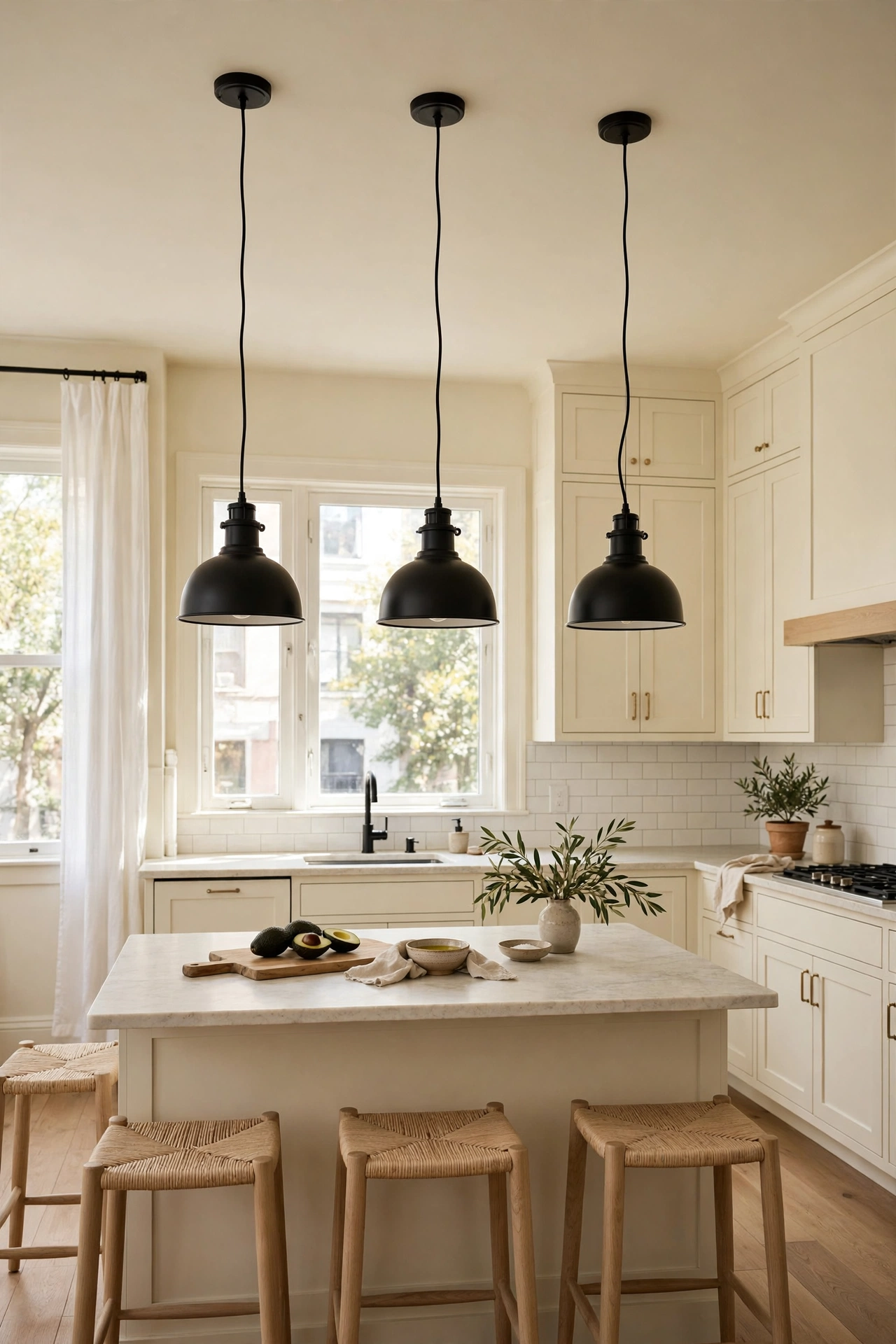
Black pendants over the island hang the contrast in the air. Dome, schoolhouse, or industrial, the black shades read as punctuation against a cream ceiling. They focus light on the work zone and add rhythm in a row. This is the lighting equivalent of black hardware: one dark gesture, perfectly placed, whole room sharpened.
Good to Know: Hang pendants 30 to 36 inches above the island. Too high floats; too low blocks sightlines.
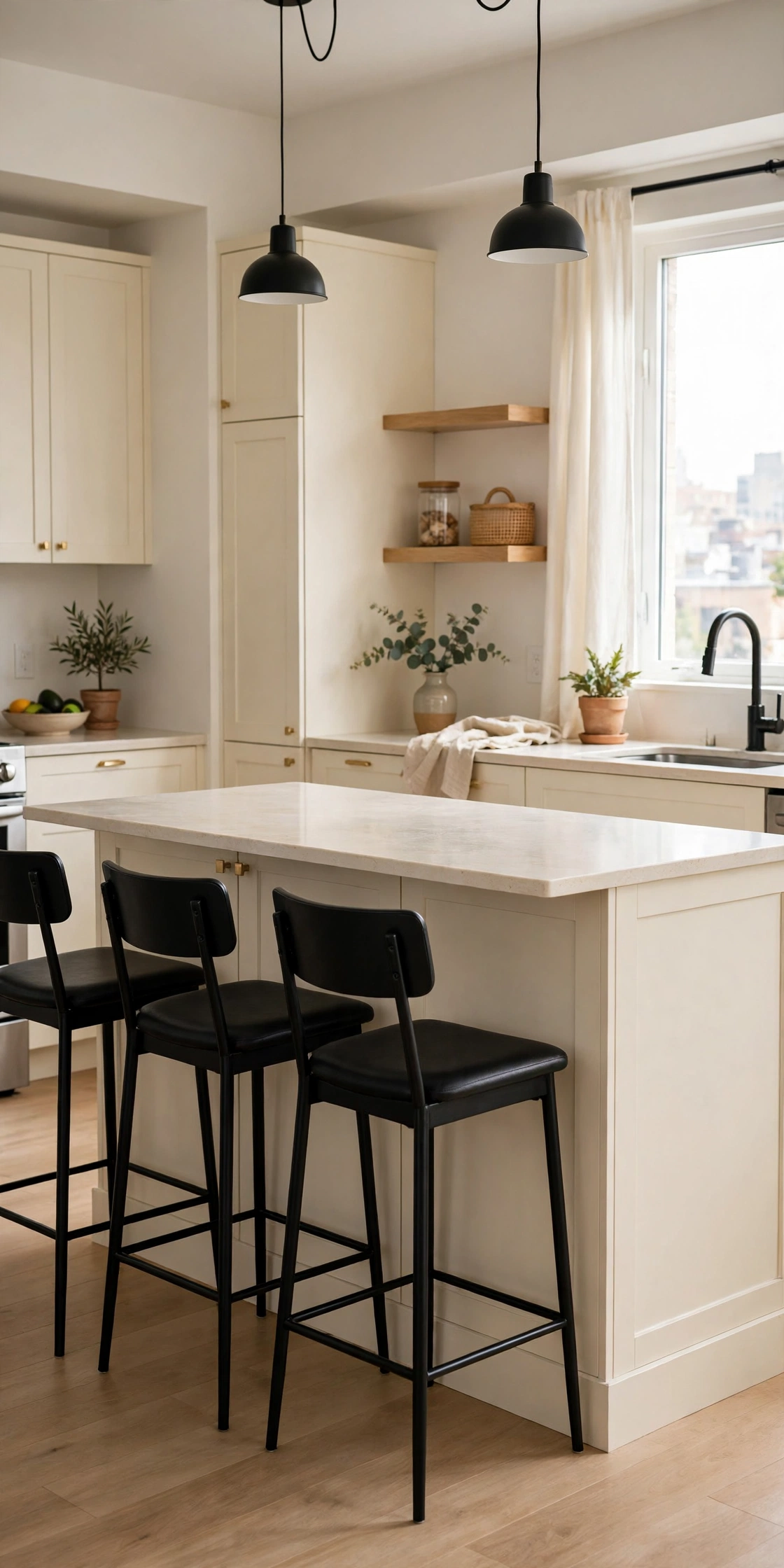
Black bar stools at a cream island are the seating that completes the contrast. Metal Tolix-style stools go industrial; black wood stools go classic. Either way, the dark seats anchor the island’s edge. Stools are styling, not renovation, and they change the room’s whole balance. Never underestimate seating.
Style Note: Backless stools tuck fully under the island. Backs add comfort but need floor space.
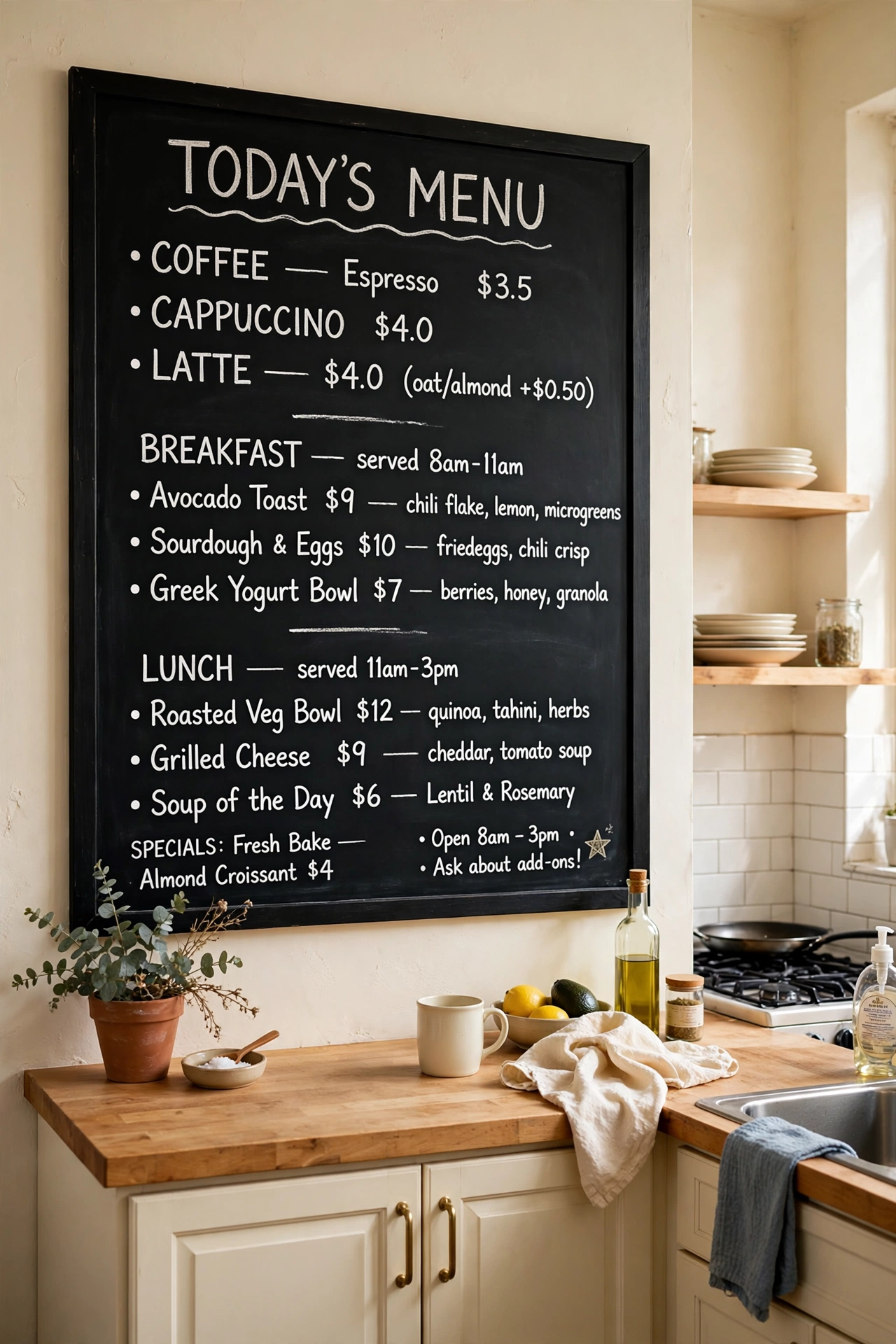
A black chalkboard wall or panel in the cream kitchen adds function and contrast: menus, lists, kids’ art. The dark rectangle is a graphic anchor on the soft wall. Chalkboard paint is cheap and renter-friendlier than tile. This is the playful black: useful, changeable, and completely unpretentious. Write the week’s menu. It feels great.
Honest Take: Chalk dust and kitchens coexist fine, but keep the board away from open food prep.
Black brackets on every open shelf, cream shelves, wood shelves, any shelves, create a consistent graphic rhythm. The repeated black line ties disparate shelves into one design. Brackets are cheap and the effect is architectural. This is the detail that makes open storage look intentional instead of improvised. Rhythm is design.
Quick Tip: Use the same bracket style throughout. Consistency is what makes it read as design.
Cream wainscoting with black trim, or black wainscoting with cream above, adds architectural contrast to the walls. The two-tone wall treatment gives the kitchen a finished, custom feel. This is the wall detail that makes people ask who designed the kitchen. Paint and trim, nothing more. Architecture on a budget.
Worth Knowing: Crisp paint lines need good taping or a steady hand. The contrast shows every wobble.
Keeping Cream Clean: The Honest Guide
Cream shows grease and yellowing more than white in some lights. Ventilate well when cooking.
Wipe cabinet fronts near the range weekly. A degreasing cleaner prevents buildup.
Touch-up paint is essential. Keep a small pot of the exact cabinet color.
Matte finishes hide smudges better than gloss on cream. Choose satin or matte.
Sunlight can yellow some cream paints over years. Quality paint resists this; cheap paint does not.
Comfort Is a Color
Cream is the color of comfort, and black is the color of confidence. Together they make kitchens that are both welcoming and sharp, the rare combination that works for Sunday roasts and Tuesday takeout alike. Pick your cream by its undertone, place your black where it counts, and let the warmth do what white never could. The contrast is still there. It just learned some manners.