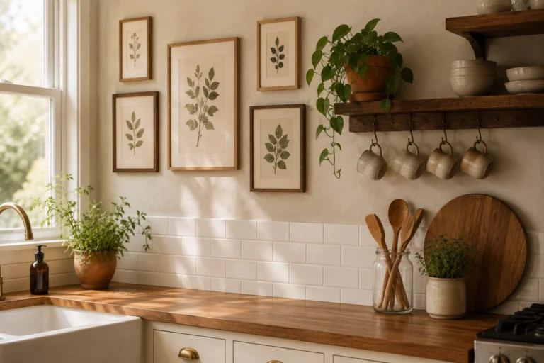
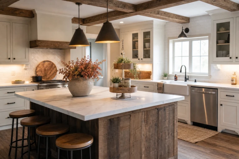
Two-tone kitchen cabinets are one of those trends that started as a risk and became a staple. The idea is straightforward: use one color or finish on the upper cabinets and a different one on the lowers, or one color on the island and something else on the perimeter. When it works, it gives the kitchen depth and personality that a single-color kitchen cannot match. When it does not work, it looks like you changed your mind halfway through a renovation.
The difference usually comes down to the combination you pick and how you divide the colors. Here are 14 two-tone kitchen cabinet ideas that actually look good in real kitchens, not just in renderings.
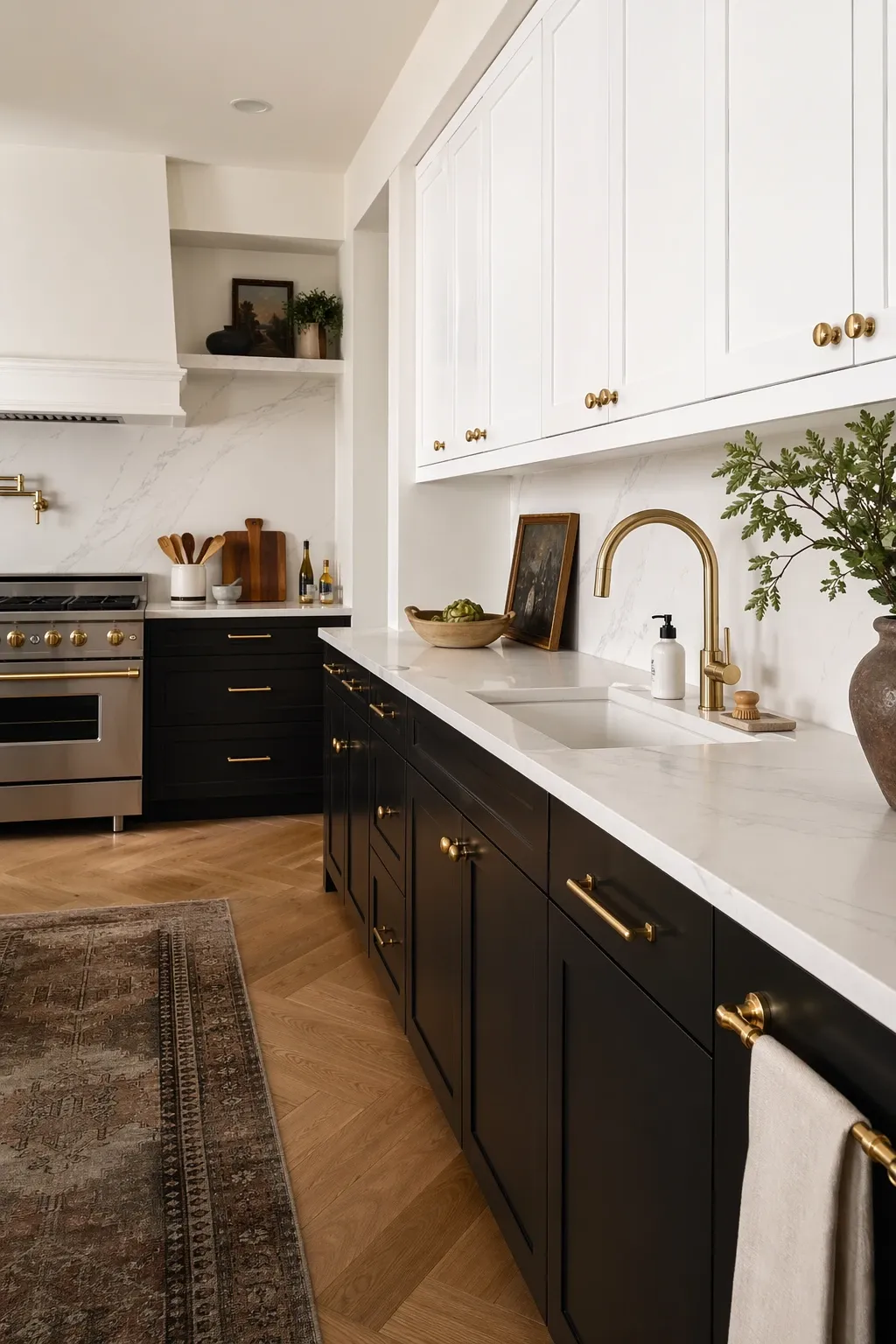
Black lowers and white uppers is probably the most classic two-tone combination. The black anchors the room at the bottom and the white keeps it bright at eye level where you need it most. Matte black is more forgiving than gloss because it does not show fingerprints as badly. This combination works in almost any kitchen style, from modern to transitional.
Designer Tip: Use a warm white rather than a pure bright white for the uppers. Pure white next to matte black can feel stark and clinical. A white with a touch of cream softens the contrast just enough.
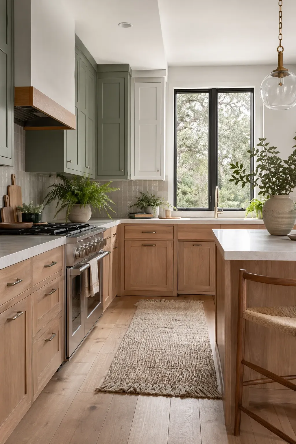
Sage green painted cabinets on the lowers with natural oak uppers or open shelving is a beautiful, organic combination. The green brings color without being overwhelming, and the natural wood grain adds warmth and texture. This pairing feels fresh and contemporary without being trendy in a way that will date quickly. It works especially well in kitchens with good natural light.
Designer Tip: Match the sage green to your backsplash or countertop rather than your walls. The cabinets should relate to the kitchen, not the paint color you can change in an afternoon.
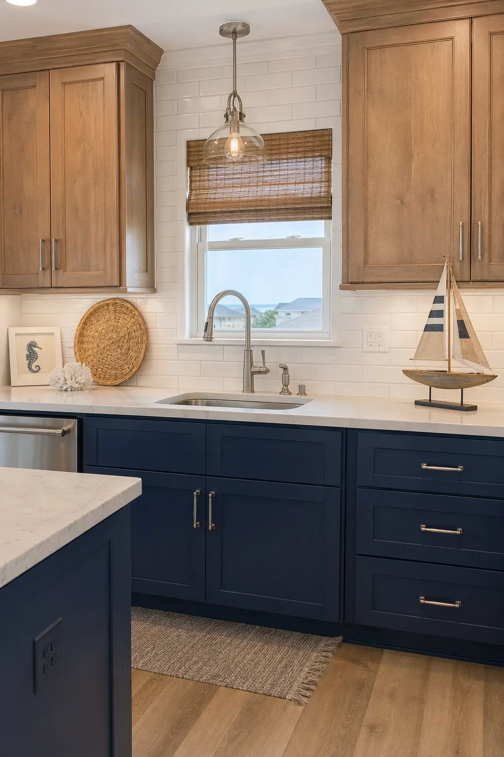
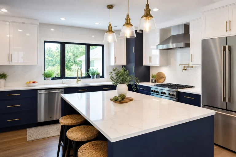
Navy blue has become a kitchen favorite and pairing it with a light, weathered wood tone gives the whole room a coastal quality without being obvious about it. Navy on the island or lowers with a pale driftwood finish on the uppers creates contrast that feels natural and easy. The wood brings lightness where you need it and the navy provides the depth.
Designer Tip: Use brass or brushed gold hardware with this combination. The warm metallic tone bridges the gap between the cool navy and the warm wood, and it adds just enough shine to keep the palette from feeling flat.
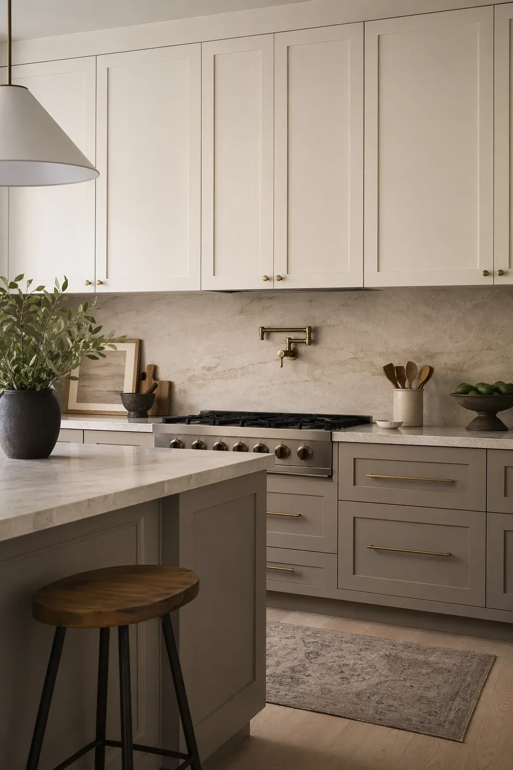
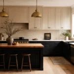
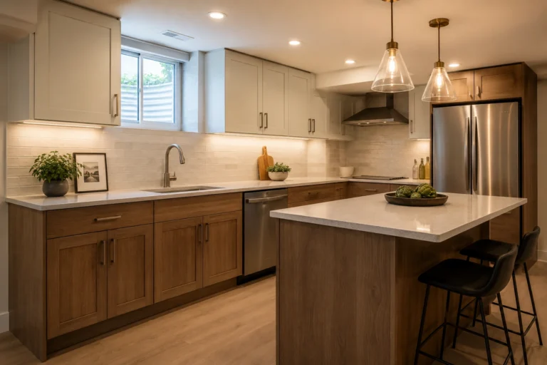
This is the subtle version of two-tone. Greige (grey plus beige) on the lowers with a warm white on the uppers creates a quiet contrast that reads as sophisticated rather than bold. It is a good choice if you want some visual interest but are not ready for a strong color. The two tones are close enough in value that they feel like one palette, but different enough to give the kitchen dimension.
Designer Tip: In a low-contrast two-tone kitchen like this, your hardware and fixtures do the heavy lifting. Black hardware on these muted cabinets gives the room definition. Matching nickel or silver hardware will keep things extremely soft and quiet.
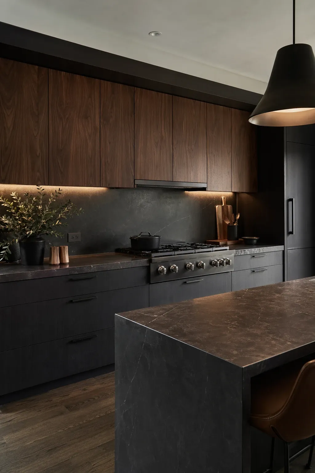
Dark charcoal painted cabinets paired with rich walnut creates a moody, sophisticated kitchen that feels like it belongs in a design magazine. This combination works best in larger kitchens or kitchens with plenty of light because both finishes are dark. The walnut adds warmth that keeps the charcoal from feeling cold, and the charcoal adds a modern edge that keeps the walnut from feeling dated.
Designer Tip: Light-colored countertops are essential with this pairing. White marble, light quartz, or a pale concrete counter provides the visual relief the eye needs in an otherwise dark kitchen. Without that lighter surface, the room can feel heavy.
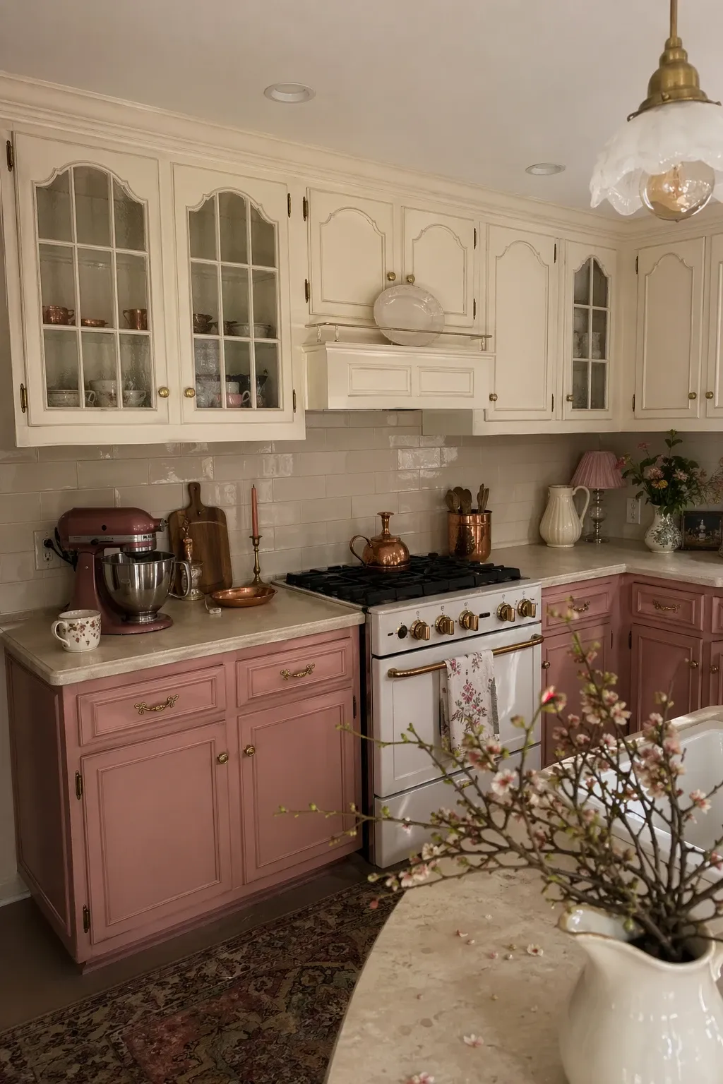
Dusty rose on the island or lower cabinets with antique cream on the uppers creates a kitchen that feels soft, warm, and a little unexpected. This combination works best in kitchens with vintage or cottage style architecture. The muted pink is not as bold as it sounds in practice. It reads as a neutral with personality, especially when paired with brass hardware and a marble or butcher block countertop.
Designer Tip: Test the dusty rose color in your specific kitchen light before committing. Pink tones shift dramatically between natural daylight and artificial light. What looks soft and warm in the morning can look bubblegum pink under cool LED bulbs at night.
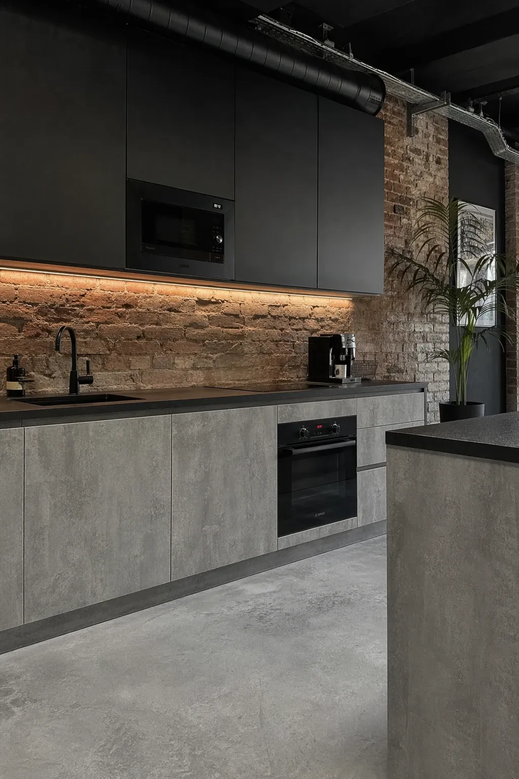
Grey and black together in a kitchen is an industrial-leaning combination that works well in lofts, modern homes, and renovated spaces with exposed elements. The grey keeps things lighter than an all-black kitchen while the black adds definition and weight. Use grey for the bulk of the cabinets and reserve black for the island, a pantry tower, or the range hood surround.
Designer Tip: Add a textured element like a concrete countertop, a metal backsplash, or reclaimed wood open shelving to break up the flat cabinet surfaces. Grey and black are both visually quiet colors, so texture is what keeps the kitchen from looking monotone.
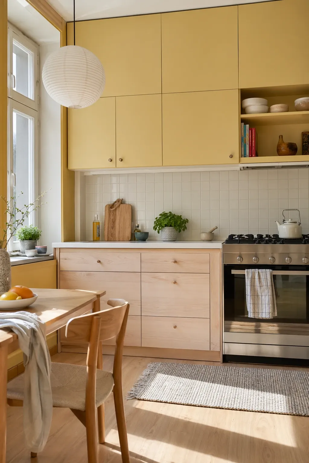
Pale butter yellow with light ash wood is a cheerful, Scandinavian-inspired combination that makes a kitchen feel sunny even on grey days. The yellow should be muted and soft, not bright or saturated. Think the color of old parchment rather than a school bus. Pair it with simple hardware and clean lines so the color is the focus, not competing with fussy details.
Designer Tip: Use the yellow on the island or a single wall of cabinets and keep the rest in the light wood. Too much yellow can overwhelm a kitchen. Used as an accent, it brightens the room without taking over.
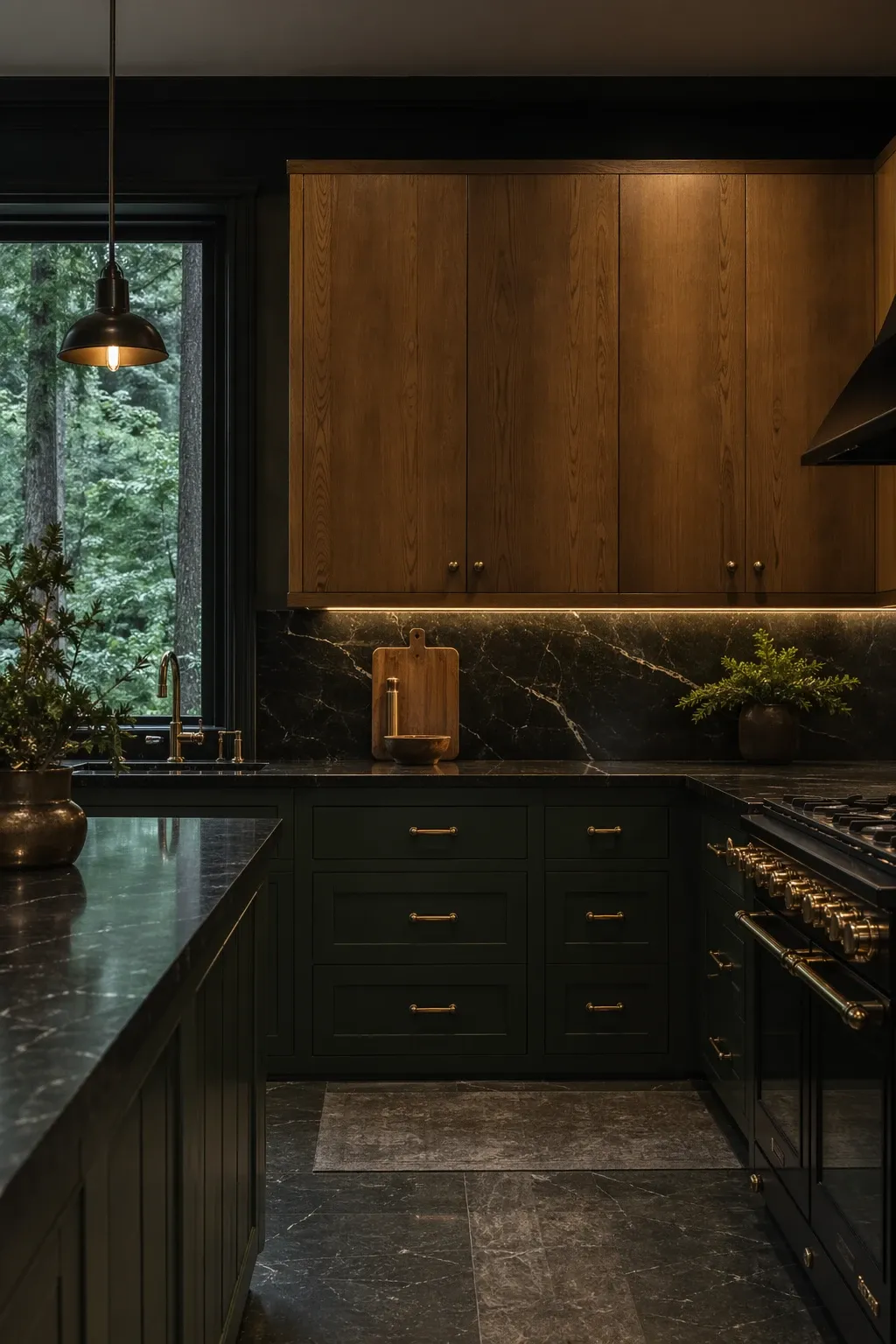
Emerald green is bold, but when you pair it with warm-toned wood that has golden or amber undertones, the combination feels rich rather than risky. The green brings a jewel-like quality and the wood grounds it with warmth. This works best in kitchens where you want a strong design statement. It is not for everyone, but the people who love it really love it.
Designer Tip: Green kitchens look best with unlacquered brass hardware that develops a patina over time. The aged brass softens the look and gives the kitchen a sense of history that matches the richness of the green.
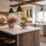
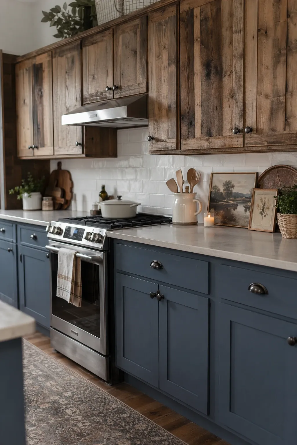
Slate blue on the painted cabinets with reclaimed wood on the island or open shelving gives you a modern farmhouse kitchen that has character. The blue is muted enough to be almost neutral, and the reclaimed wood adds the imperfections and warmth that make the kitchen feel like it has a story. This is one of the easier two-tone combinations to pull off because both elements are naturally forgiving.
Designer Tip: Do not sand and refinish reclaimed wood to perfection. The nail holes, saw marks, and weathered patina are the whole point. If you clean it up too much, you lose the character and might as well have used new wood.
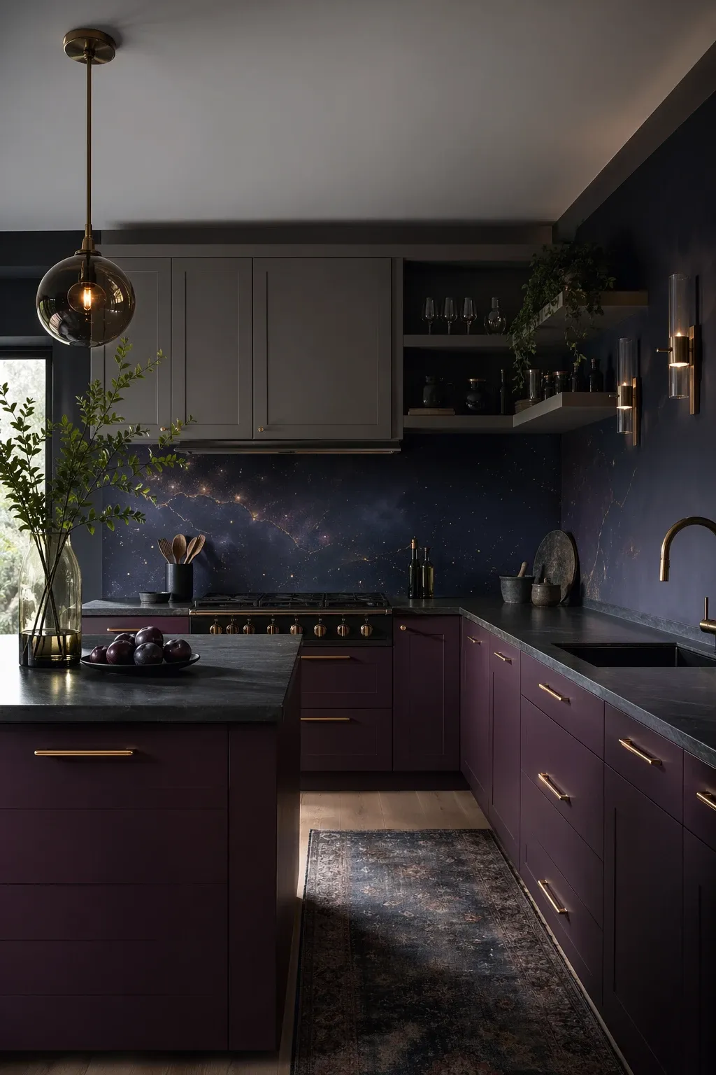
Plum is an underused kitchen color that creates a moody, atmospheric vibe when paired with soft grey. The plum reads as almost black in low light and reveals its purple undertones in natural light, which gives the kitchen different moods throughout the day. The grey balances it out and keeps the room from feeling too dark. This is a sophisticated combination for people who are tired of safe choices.
Designer Tip: White or marble countertops are a must with plum cabinets. The light surface provides contrast and keeps the kitchen feeling breathable. Dark countertops on dark cabinets will make the room feel like a tunnel.
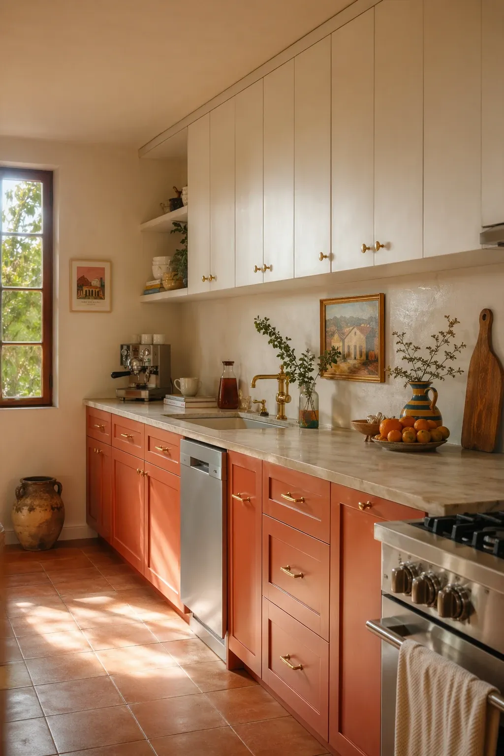
Terracotta cabinets with cream uppers bring a Mediterranean warmth to the kitchen that is hard to get any other way. The earthy orange-brown of terracotta feels ancient and grounded, while the cream keeps things light and airy. This combination looks especially good with hand-glazed tile backsplashes, wrought iron fixtures, and open shelving with ceramic dishes.
Designer Tip: Terracotta paint tones vary widely from orange to brown. Lean toward the browner, earthier end of the spectrum for cabinets. The more orange versions read as trendy and may date faster than the muted, clay-like tones.
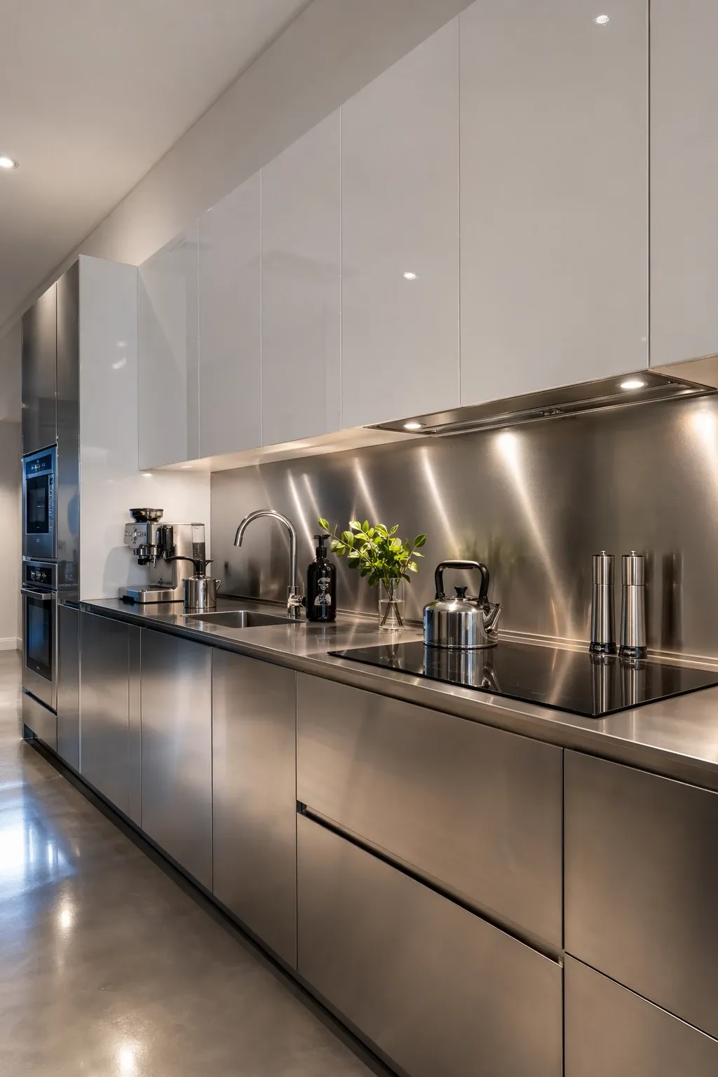
For a kitchen that goes full modern, silver metallic lowers with glossy white uppers create a sleek, almost futuristic look. This is high-maintenance in terms of keeping surfaces clean, but the visual impact is undeniable. It works best in kitchens with minimal clutter and integrated appliances because the clean surfaces are the whole point.
Designer Tip: Handle-less, push-to-open cabinets work best with this combination. Visible hardware breaks up the smooth surfaces and fights against the ultra-modern aesthetic you are trying to achieve.
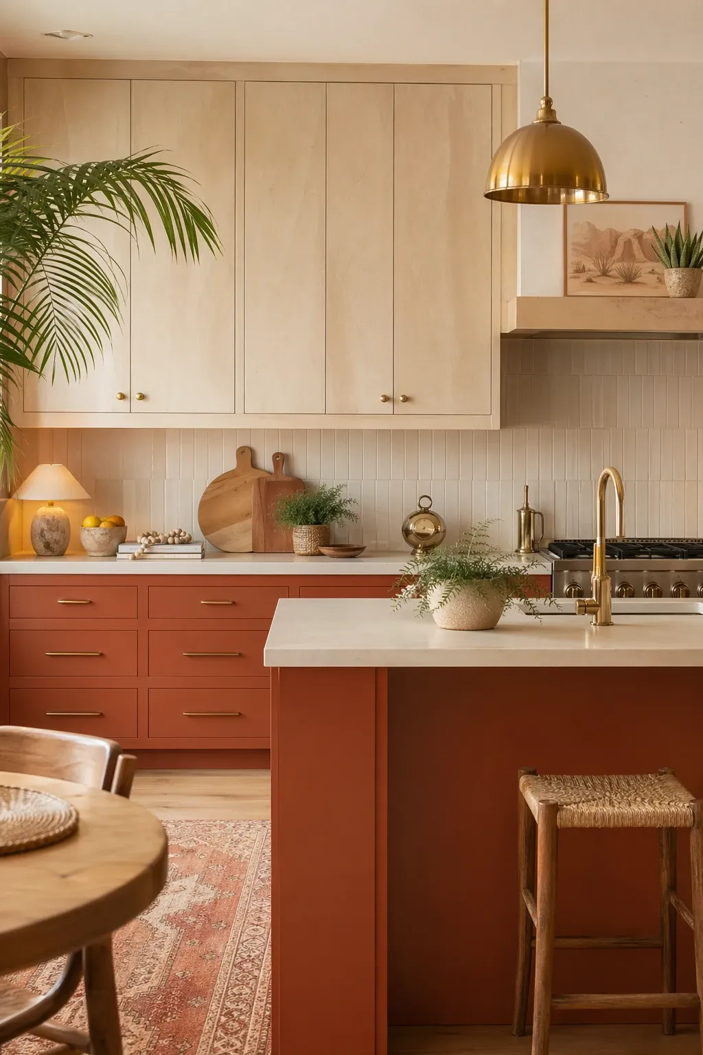
A warm sandstone tone paired with burnt orange accents creates a desert-inspired kitchen that feels warm and inviting. The sandstone serves as the neutral base and the burnt orange adds a pop of warmth that is more interesting than the usual blue or green accent. This works well in homes with Southwest, bohemian, or mid-century modern architecture where warm tones are already part of the design language.
Designer Tip: Keep the burnt orange to 20 percent or less of the total cabinet area. An island, a range wall, or a pantry cabinet in orange is enough. More than that and the kitchen starts to feel like a pumpkin patch.
The most important thing about two-tone cabinets is picking a clear dividing line. Uppers versus lowers is the most common and the easiest to get right. Island versus perimeter is the second most common. What does not work well is randomly switching colors cabinet by cabinet throughout the kitchen. The division needs to follow the architecture, not work against it. Pick your two tones, pick your line, and commit.
Frequently Asked Questions
Should the lighter color go on top or bottom?
In most cases, putting the lighter color on the uppers and the darker on the lowers works best. It mirrors how we see nature, lighter sky above and darker ground below, which feels instinctively right. That said, some combinations work with the darker color on top, especially in kitchens with very high ceilings where the upper cabinets need visual weight.
Can I do two-tone cabinets in a small kitchen?
Yes, but stick to a low-contrast combination. Two colors that are close in value, like white and light grey, add interest without making the kitchen feel busy. High-contrast combinations like black and white can make a small kitchen feel chopped up. The less contrast, the more spacious the room will feel.
What hardware works best with two-tone cabinets?
Using the same hardware on both colors is the safest approach because it ties the two finishes together. If you want to mix hardware, keep the style the same and only change the finish. For example, the same pull shape in black on the dark cabinets and brass on the light cabinets. Mixing hardware styles on top of mixing colors creates too much visual noise.
Will two-tone cabinets go out of style?
The trend of using contrast in kitchen cabinets has been around for decades, even if the specific colors change. A well-executed two-tone kitchen with classic colors like navy and white or green and wood will hold up much longer than one with very trendy colors. The technique itself is not going anywhere.