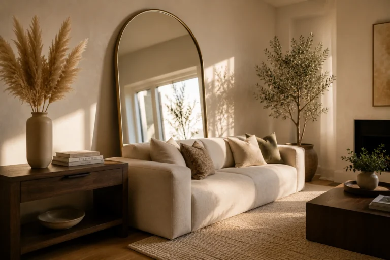
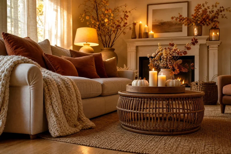
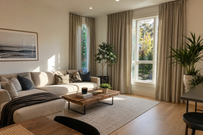
Beige and wood should be the easiest combination in the book. So why do so many beige living rooms end up looking like a waiting room? After years of styling these rooms, I can tell you it is almost never the beige itself. It is the five mistakes below, and every idea here fixes one of them. The good news is that none of these fixes requires a big budget or a full redo. Most of them come down to looking at your room with fresh eyes and making a few deliberate swaps.
When It All Blurs Into One Beige Smudge
This is the number one complaint. Everything sits at the same lightness, so your eye slides off with nowhere to land. You do not need color. You need anchors.
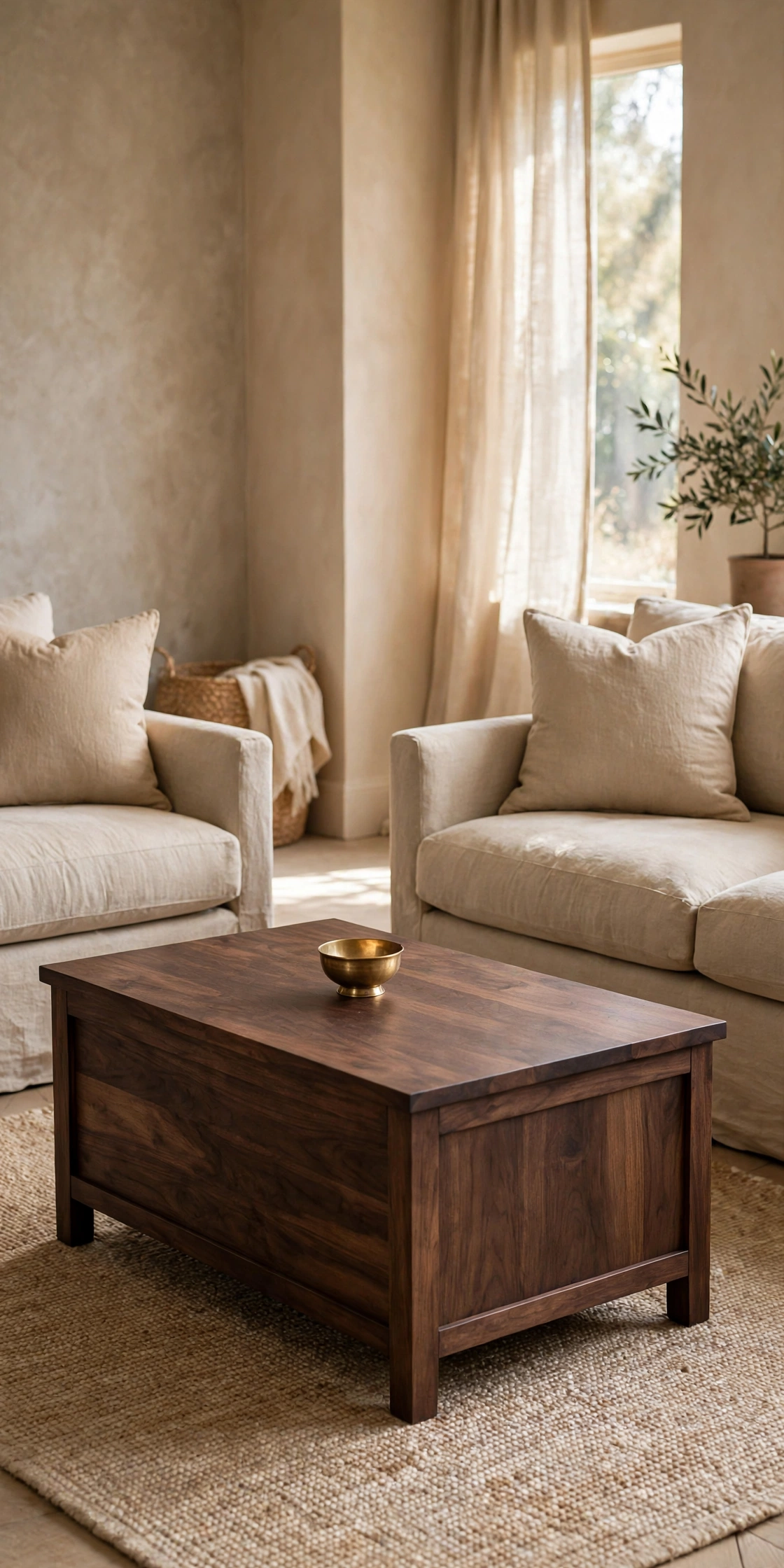
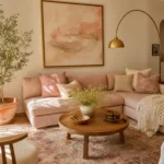
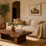
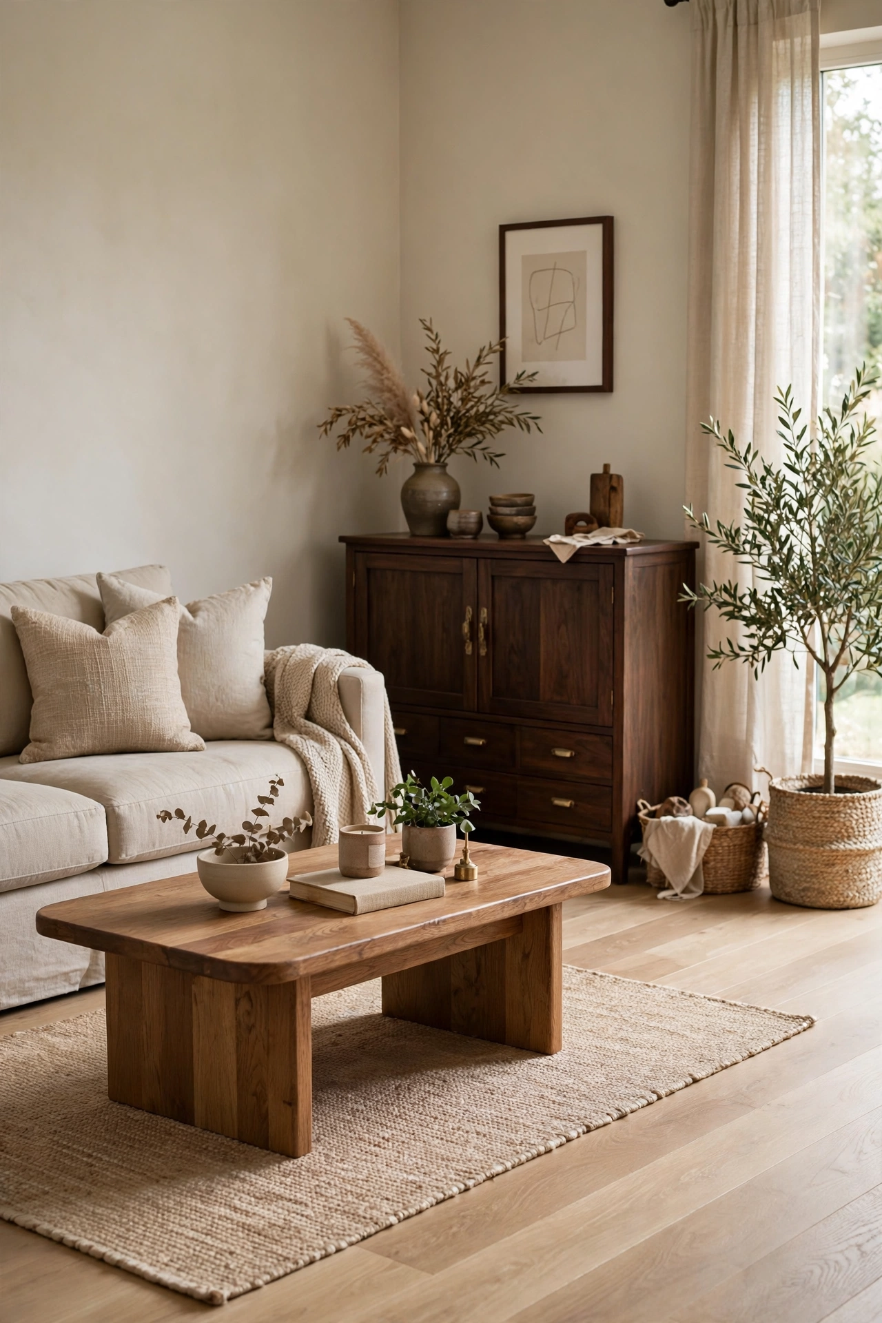
A walnut coffee table in the middle of a beige seating group does more work than any accessory. The dark brown grain pulls the whole palette down a notch and gives the lighter pieces something to sit against. One thing that works really well here is keeping the tabletop mostly clear, because the wood itself is the decoration. In a room this quiet, a busy tabletop just reads as clutter. Walnut sits at the affordable-to-mid-range end of real wood furniture, and secondhand pieces take oil beautifully if the finish looks tired.
Quick Tip: Let the coffee table be the darkest wood in the room and keep every other wood piece a touch lighter.
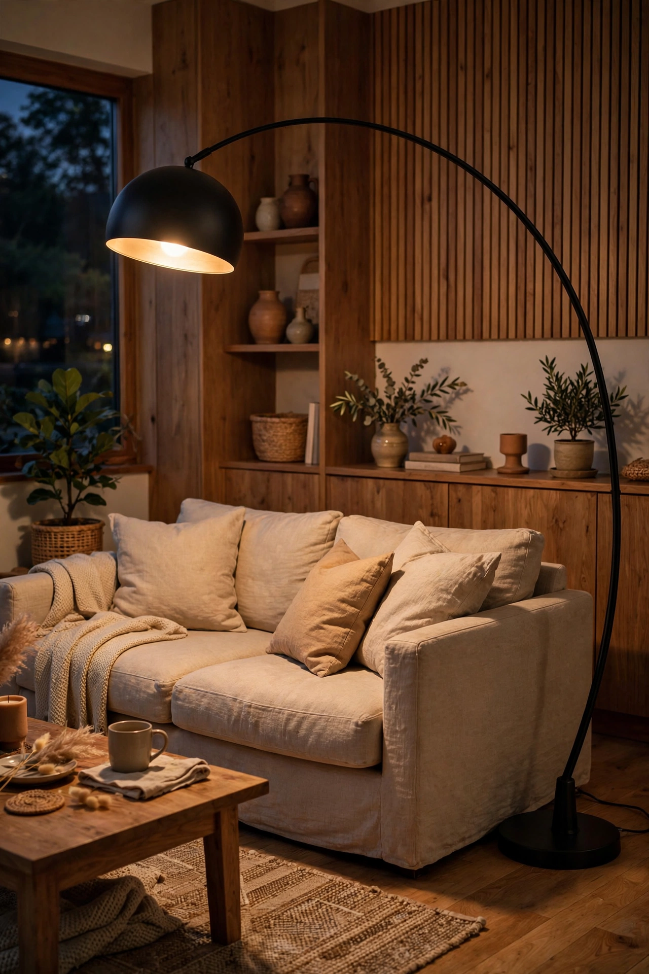
A black arc lamp adds the one thing beige rooms usually miss, a strong vertical line. The curve draws the eye up and across the room, which makes low beige furniture feel intentional instead of flat. Pick matte black rather than shiny, because glossy black can look harsh against soft fabrics. The shade should cast warm light downward, since cool bulbs will make the beige around it look slightly gray. This is one of the cheapest ways to add structure to the room.
Designer Advice: Keep the lamp head above eye level when seated so it lights the seating, not your face.
A single charcoal accent chair gives the room a focal point without starting a whole gray theme. Two would begin to compete with the beige, while one reads as a deliberate punctuation mark. Look for a chair with a simple shape and a nubby fabric, since smooth charcoal can look a little corporate. Place it at an angle to the sofa rather than lined up, because angled seating always looks more relaxed. This is the chair everyone will fight over, so check the seat depth before you fall for the shape.
Reality Check: One dark chair is punctuation. Three dark chairs is a different color scheme.
Chrome and polished nickel lean cool, which is exactly the wrong direction in a warm beige room. Aged brass, bronze, and oil-rubbed finishes pick up the honey tones in the wood and make the whole palette feel richer. You do not need much: a brass picture light, bronze curtain rods, or a small brass bowl on the coffee table. The trick is repeating the finish at least three times around the room so it looks like a choice, not a leftover. Thrift stores are full of solid brass pieces for a few dollars.
Heads Up: Match your metal undertones to your wood undertones, warm with warm, or the room will feel slightly off.
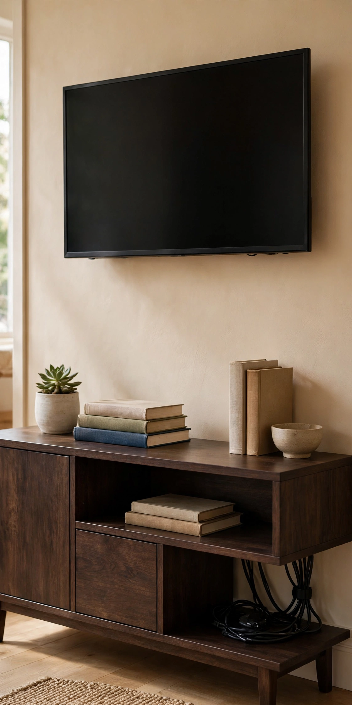
The TV wall is usually the weakest spot in a beige living room, a big dark rectangle floating on a pale wall. An espresso-toned console underneath gives the screen a base and ties it into the room’s wood story. Choose one with closed storage if you can, because visible clutter under a TV doubles the visual noise. Leave a few inches of breathing room on each side rather than spanning the full wall, since a console that is too wide makes the wall feel chopped up. Cable management is not glamorous, but it is what separates a styled wall from a tangled one.
Pro Move: Paint the wall behind the TV one shade deeper than the rest so the screen blends in instead of floating.
Beige is not one color. It leans yellow, pink, or green, and your wood leans warm or cool too. When the two lean opposite ways, the whole room goes dingy and nobody can say why.
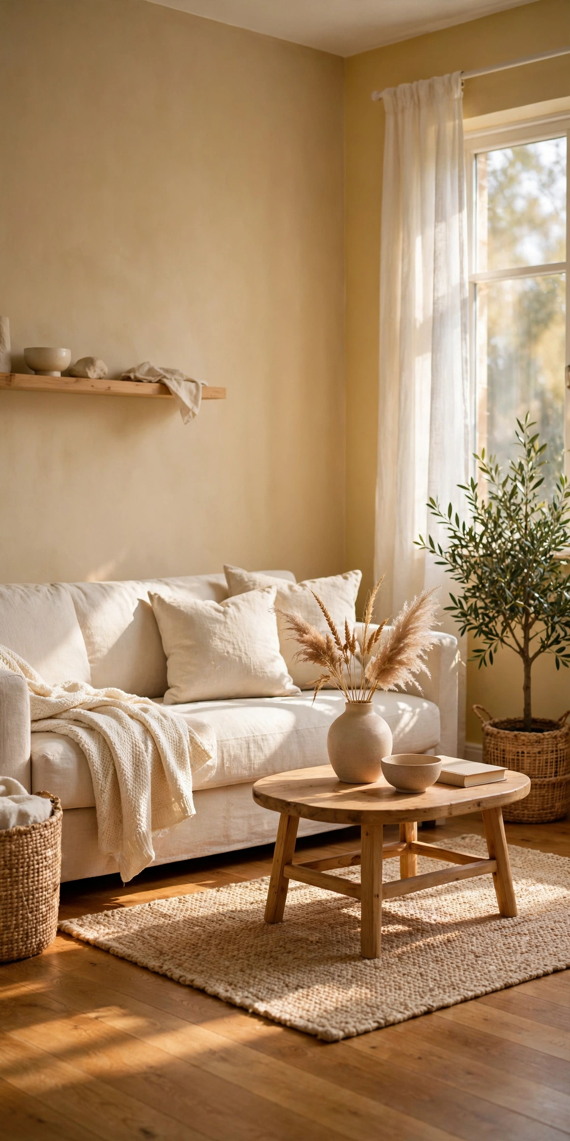
Yellow-based beiges sit beautifully with honey-toned oak floors, because both lean warm and neither fights the other. The pairing feels sunlit even on gray days, which is why it shows up in so many Scandinavian-inspired homes. If your floors are already oak and your walls feel cold, the wall color is usually the culprit, not the floor. Repainting is cheaper than reflooring, and a warm beige sample pot costs less than a takeaway dinner. When the undertones agree, the whole room relaxes at once.
Worth Knowing: Hold paint swatches next to your floor in daylight and lamplight before committing, because undertones shift with light.
If your heart wants gray but your home has warm wood floors, greige with a brown base is the peace treaty. It reads as a soft neutral without the blue-violet edge that makes true grays clash with oak. Look for greiges described as warm or taupe-leaning rather than cool. In my experience, the brown-based ones shake hands with wood while the gray-based ones turn their backs on it. This is the safest wall color for a room where the wood is staying and the sofa might change.
Try This: Compare two greige swatches side by side on the wood. The right one will look calm and the wrong one will look faintly purple.
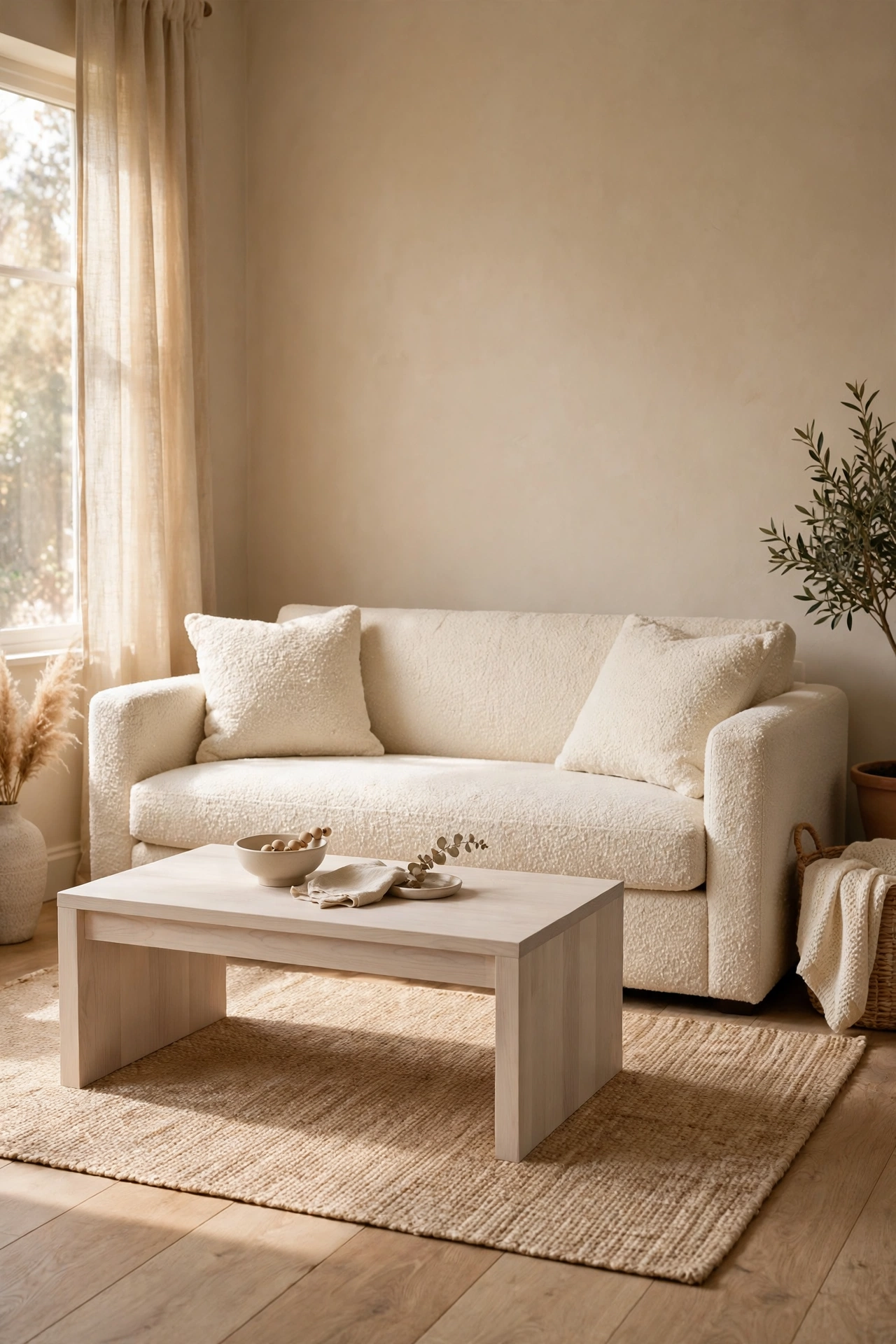
Light-on-light rooms work, but only when the two biggest surfaces sit at different values. A cream sofa against a pale ash coffee table needs at least two shades of separation on the same swatch card, or they melt into one shape. Check it by squinting at the room; if the sofa edge disappears into the table, they are too close. Texture can do some of the separating work, since a nubby cream boucle reads darker than smooth cream linen. When in doubt, darken the smaller piece.
Designer Advice: The squint test never lies. If two surfaces merge when you squint, they need more distance in value.
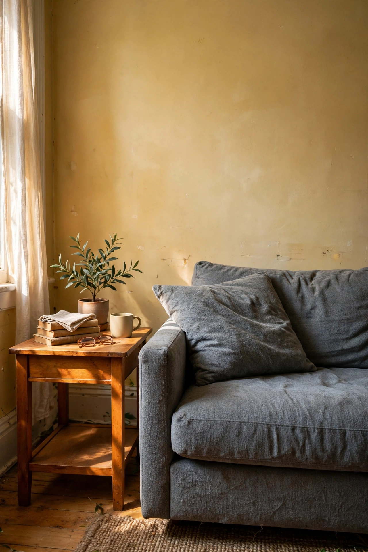
The most common undertone clash I see is a cool gray sofa dropped into a warm beige room. In the showroom under neutral lighting it looks perfect. At home against yellow-beige walls, the violet undertone turns sour and the whole corner looks slightly bruised, especially in afternoon light. Cool undertones need cool company, and beige is simply the wrong roommate. If you already own the gray sofa, warm it up with honey-toned wood, brass, and amber textiles rather than fighting it with more gray.
Honest Take: A sofa you love in the wrong undertone beats a sofa you hate in the right one. Warm the room around it.
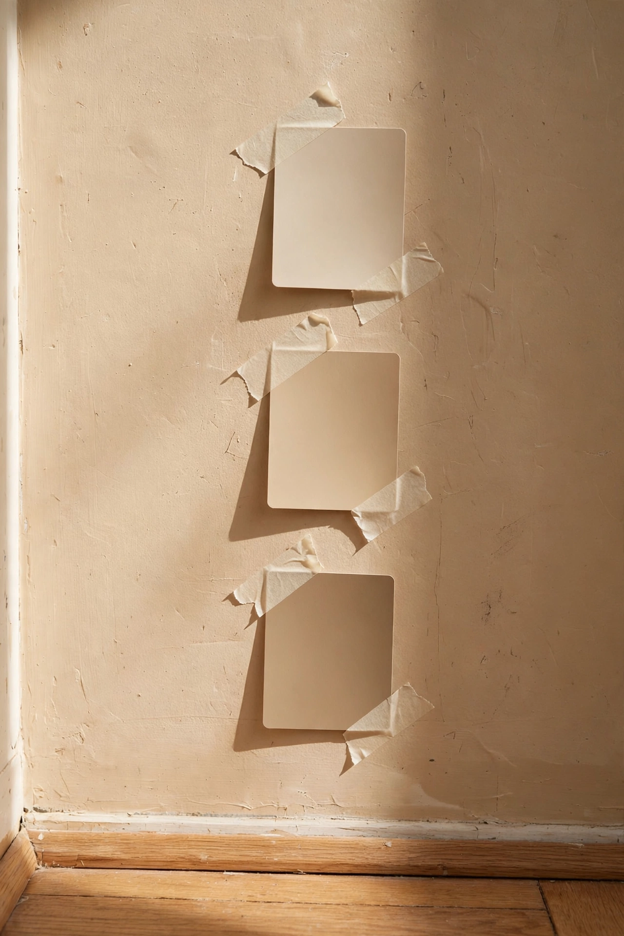
Before you buy a single gallon, tape three beige swatches to the wall next to your wood floor or your biggest wood piece. Look at them in the morning, at midday, and after dark with the lamps on, because beige is a different color in each light. The right swatch will look calm in all three. The wrong one will look pink at noon or green at night, and that is your sign to move on. This tiny habit has saved more rooms than any design rule I know.
Quick Tip: Never judge a swatch on the paint aisle. Judge it taped to your wall, next to your wood, in your light.
The Five-Minute Undertone Test
Tape swatches beside your wood floor, not floating mid-wall
Check morning, midday, and lamplight before deciding
Squint: the winner stays calm, the loser goes pink, green, or gray
Repeat the test on the wall opposite the window too
Buy a sample pot of the winner and paint a full square before the gallon
When It Feels Cold and Bare
Beige rooms go cold when every surface is smooth. The fix is never more beige. It is texture, layers, and light that make you want to sit down.
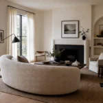
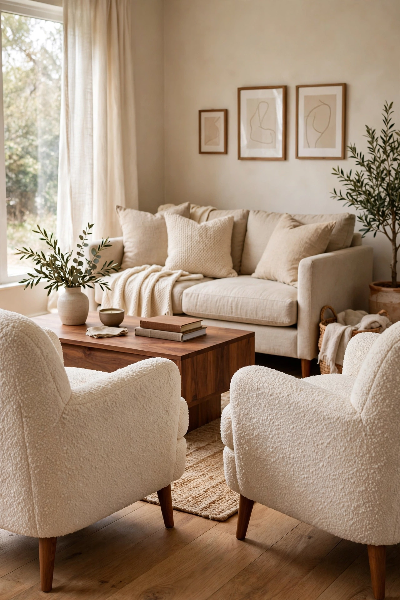
Boucle is the fastest warmth upgrade a beige room can get. The nubby loops catch light and shadow at once, so the chair reads as a slightly deeper tone than the flat fabric around it. Two boucle chairs facing the sofa turn a stiff layout into a conversation spot. The fabric hides everyday wear better than smooth weaves, which matters in a real living room. Budget note: good-looking boucle now exists at flat-pack prices, so this does not have to be an investment piece.
Good to Know: Vacuum boucle with an upholstery attachment rather than lint-rolling it, which pulls the loops.
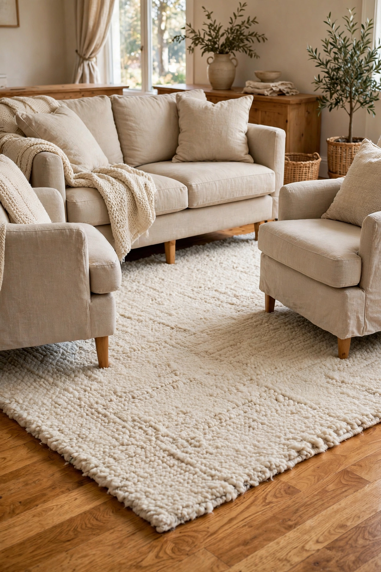
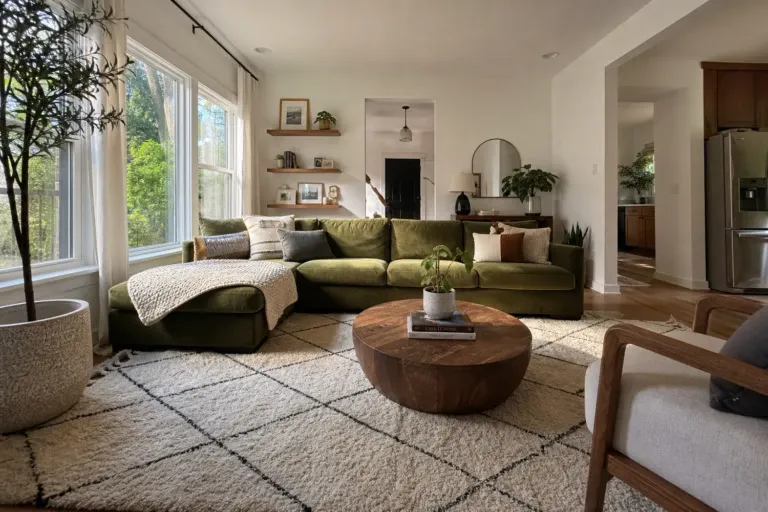
Bare wood floors under beige furniture can make the whole room feel echoey, literally and visually. A thick wool or jute rug anchors the seating and adds the one texture wood cannot give you, softness underfoot. Size it so the front legs of every seat sit on the rug; a rug that is too small makes the furniture look like it is drifting. In high-traffic homes, a flatweave wool holds up better than a deep pile. The rug should be the largest textile in the room, so let it carry any pattern you want.
Reality Check: A too-small rug shrinks the room visually. When torn between sizes, go bigger.
The 2700K Rule
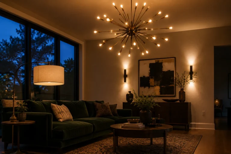
Cool white bulbs (4000K and up) drain the warmth out of beige and make wood look flat. Warm white bulbs around 2700K keep the palette honeyed after dark. It is the cheapest fix in this whole article, about the price of a coffee, and it changes the room more than a new throw pillow.
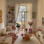
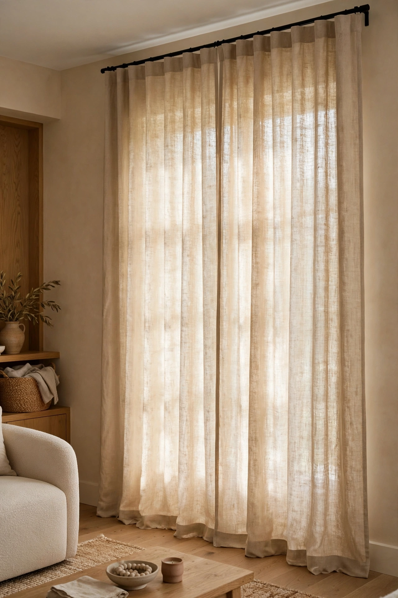
Short curtains chop a wall in half and make beige walls feel stubby. Linen panels hung close to the ceiling and pooling just slightly on the floor add height and a soft, washed texture that flat paint cannot match. Choose a tone a shade deeper or lighter than the wall, never an exact match, so the window reads as its own layer. Unlined linen filters daylight beautifully, though street-facing rooms may want a liner for privacy. Ironing is optional; linen is supposed to look relaxed.
Pro Move: Extend the rod 10 to 15 centimeters past the window frame on each side so the panels stack off the glass.
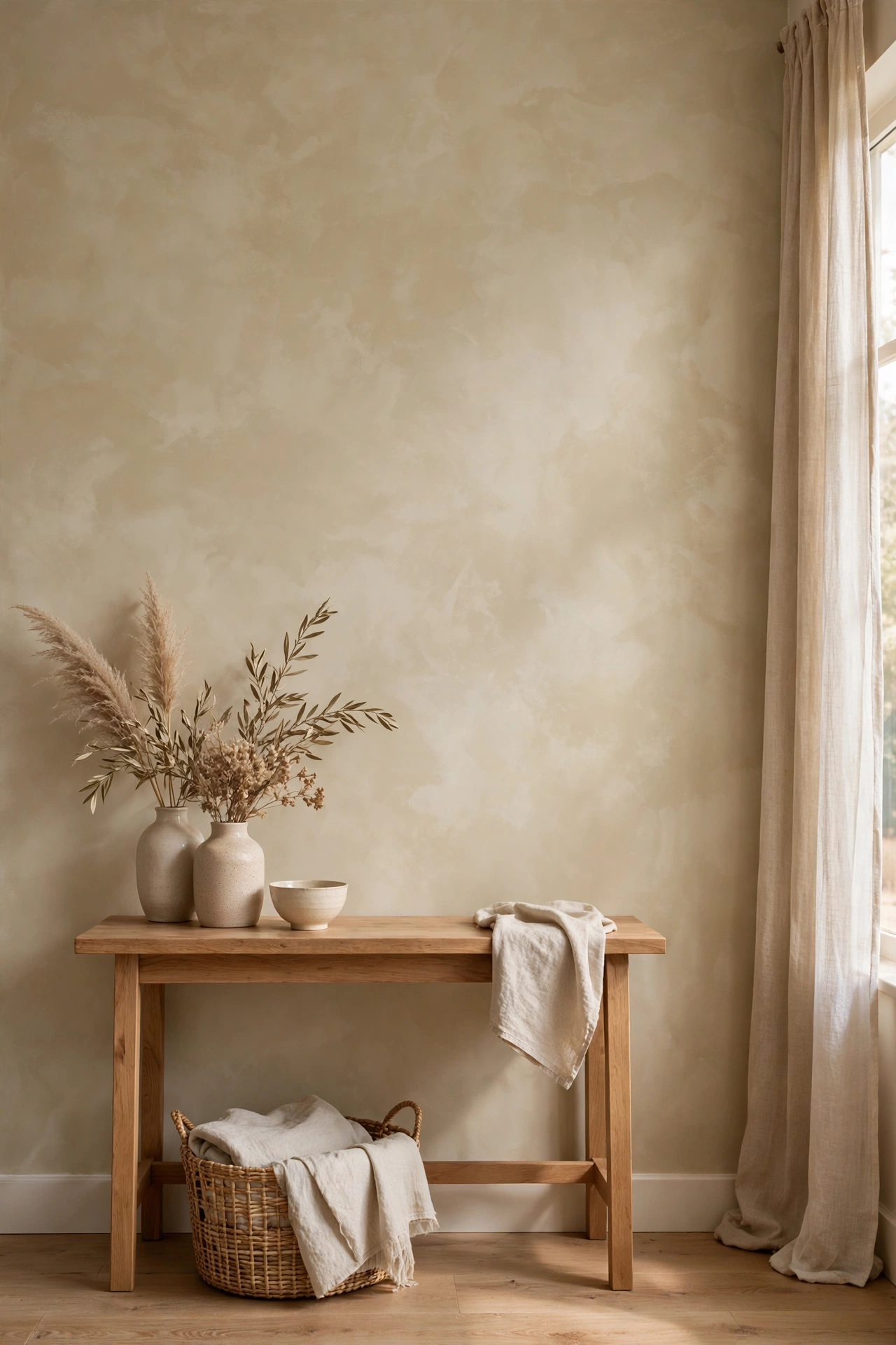
Flat beige paint can look chalky and one-note, especially in rooms with little natural light. A limewash finish in the same beige family adds soft movement and cloud-like variation that makes the wall feel alive. It is forgiving to apply, since the whole point is the uneven, hand-worked look. One accent wall is enough; four limewashed walls can feel busy in a small room. This is a weekend project with a genuinely high-end payoff.
Heads Up: Test limewash on a board first. It dries lighter than it looks wet, which surprises everyone the first time.
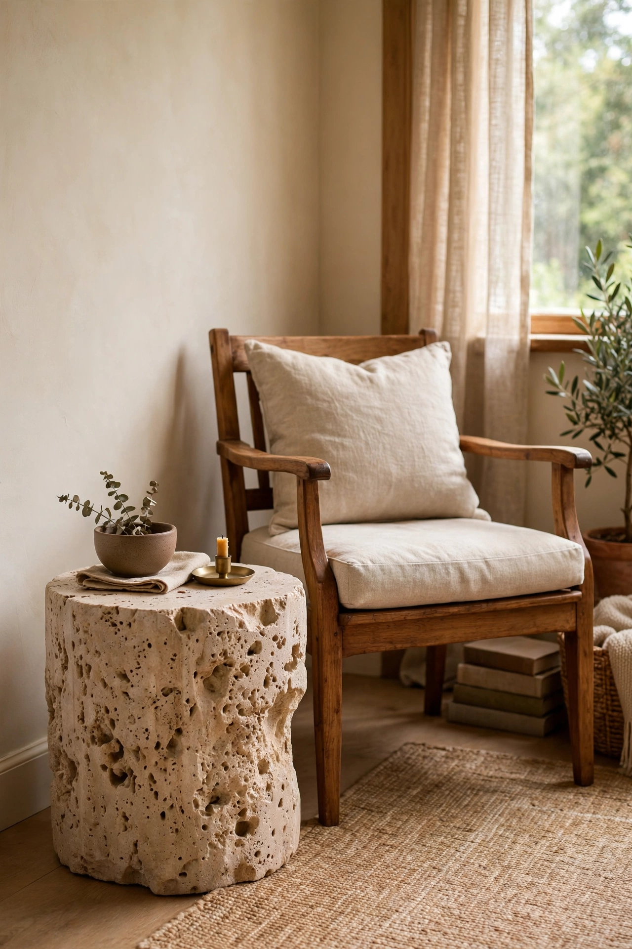
Every beige and wood room needs one cool, hard surface to keep all the warmth from turning mushy. Travertine, with its pitted natural texture, does the job without going cold the way marble can. A small travertine side table next to a wood armchair creates a lovely material conversation. The stone is heavy, so it also doubles as a visual anchor that will not get knocked over by kids or dogs. Honest limitation: travertine stains, so use coasters and skip it if red wine is a regular guest.
Worth Knowing: Honed travertine hides wear far better than polished, and it costs less too.
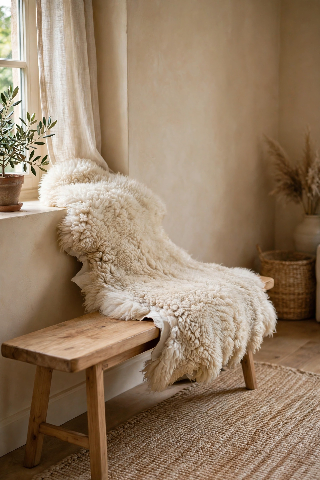
A plain wood bench at the foot of the seating area or under a window is useful but visually hard. One sheepskin thrown over it diagonally softens the whole piece in about five seconds. The long pile adds a texture nothing else in the room has, and it invites people to actually sit there. Real sheepskin lasts for years with occasional shaking out, and good faux versions exist for a fraction of the price. This is the kind of small, touchable detail that makes a room feel finished.
Small Detail: Drape it off-center and a little rumpled. Perfectly centered throws look staged.
When It Looks Dated
Dated beige rooms usually have dated wood: orangey varnish, matchy sets, heavy carving. You do not need new everything. You need wood that looks like now.
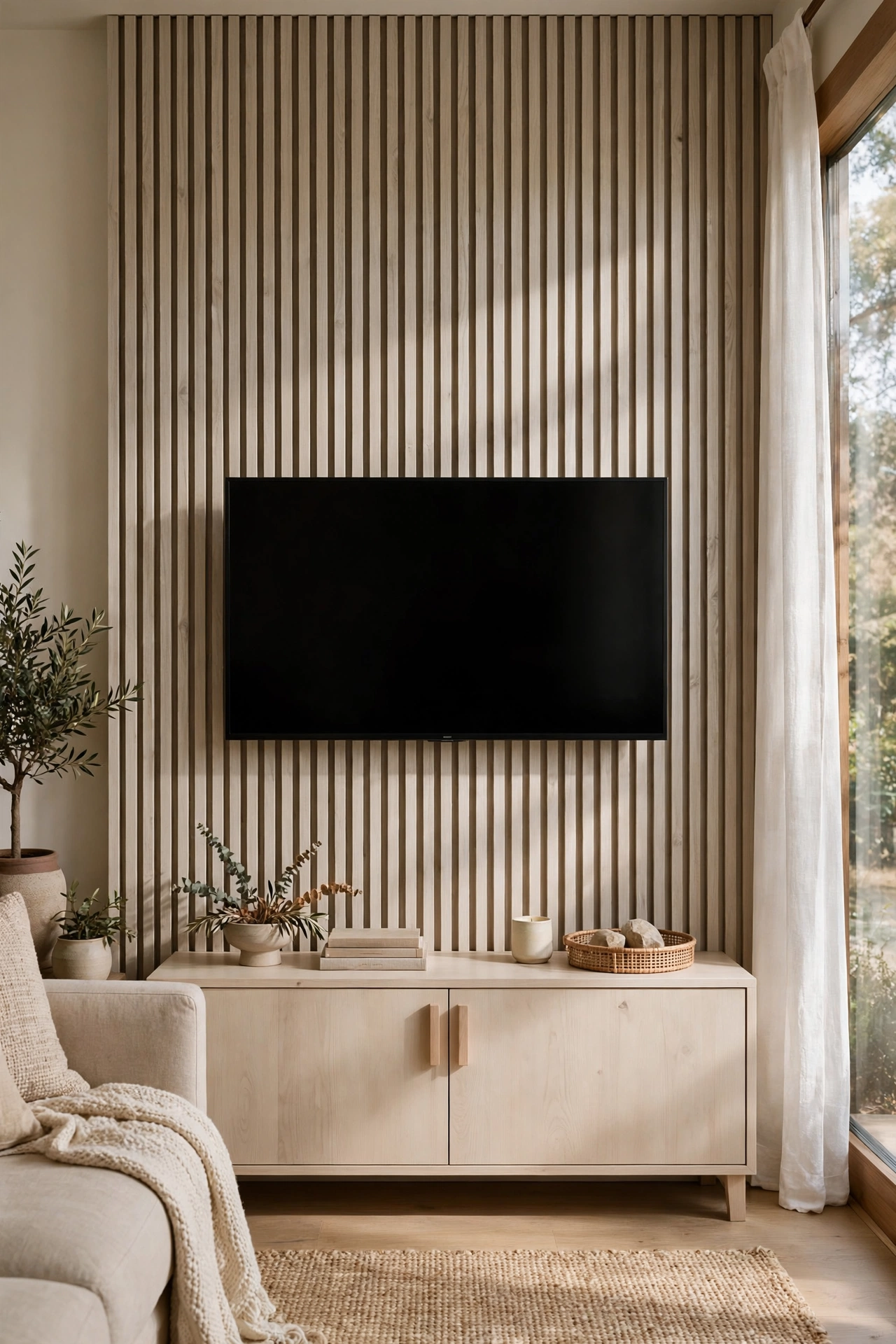
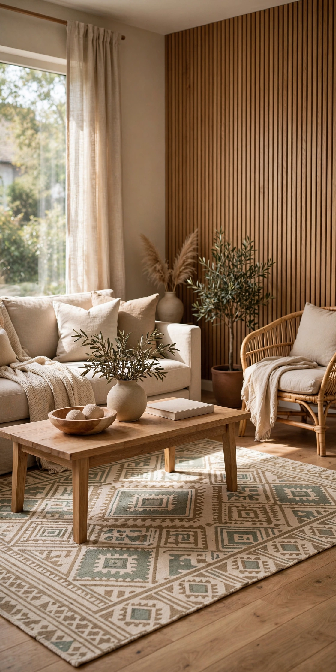
A slatted wood panel in a beige-washed tone turns the TV wall from an eyesore into a feature. The vertical lines add rhythm and a crafted feel that flat drywall cannot match, and the beige wash keeps the wood from going too rustic. Slats also hide cables beautifully if you leave a small gap behind the panel. Prefinished slat panels now come ready to mount, which makes this a one-afternoon project. Keep the finish pale so the wall stays light.
Try This: Run the slats floor to ceiling but only as wide as the console below, so the feature feels proportioned, not random.
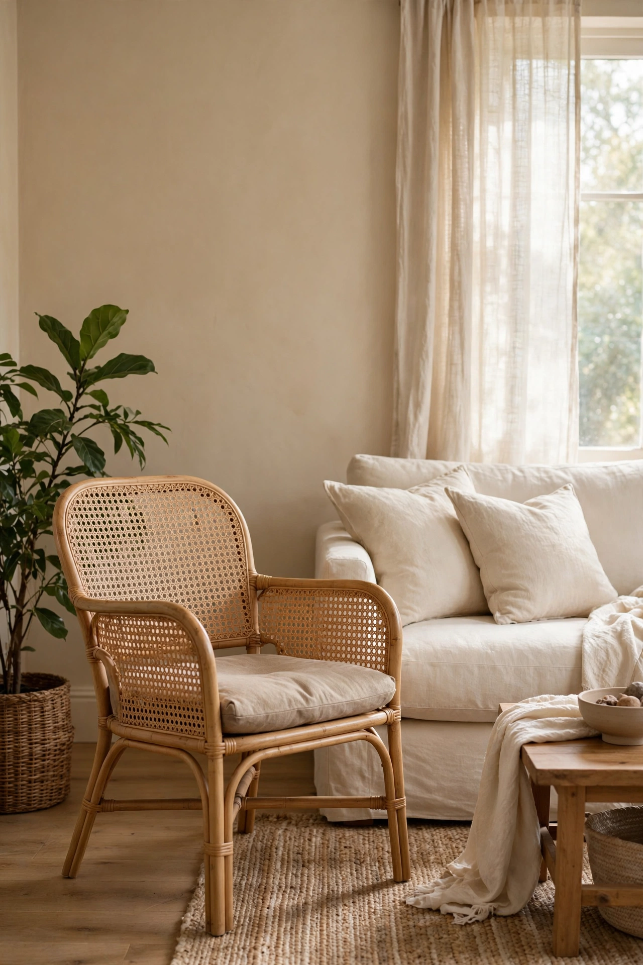
Rattan and cane bring a relaxed, hand-made quality that instantly dates a room forward instead of backward. One cane-back armchair among upholstered pieces adds lightness and a different silhouette, which is exactly what matchy rooms lack. The open weave lets light through, so the chair never feels heavy even in a small space. Check the cane for cracks before buying secondhand, since repairs are fiddly. A plant beside it completes the easy, collected feeling.
Budget Note: Vintage rattan is everywhere secondhand and usually just needs a wipe-down, not refinishing.
Matching every wood piece was the old rule, and it is why so many beige rooms look like a furniture showroom. Two or three wood tones, repeated around the room, look collected and confident. The trick is distribution: each tone should appear at least twice, in different spots, so nothing looks like a mistake. Keep the tones in the same temperature family, all warm or all cool-leaning, to stay harmonious. Start with a light floor, a mid-tone table, and a dark accent, and you have a full range.
Designer Advice: If a wood tone appears only once, it looks like an accident. Twice is a pattern.
Mixing Wood Tones: The Honest Version
Why it works: the room looks collected over time rather than bought in a day, and you can add pieces gradually without matching anything.
What to watch: more than three tones starts to look busy, and tones from opposite temperature families can clash the same way paint undertones do. Keep it to two or three, all warm or all cool.
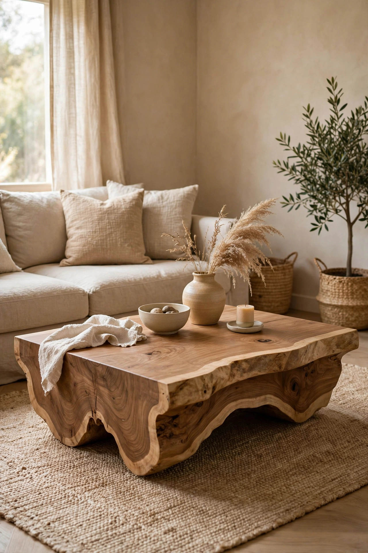
A live-edge wood bench as a coffee table brings an organic, sculptural line into a room full of rectangles. The natural edge is a conversation piece and it breaks up all the straight lines of sofas and rugs. Make sure the top is sanded smooth and sealed, since rough edges snag knit throws and bare feet. In small rooms, a bench you can pull up for extra seating earns its footprint twice over. Pair it with soft textiles nearby so the rugged edge feels balanced, not wild.
Heads Up: Measure your sofa seat height first. A coffee table more than a few centimeters off looks wrong no matter how pretty the wood is.
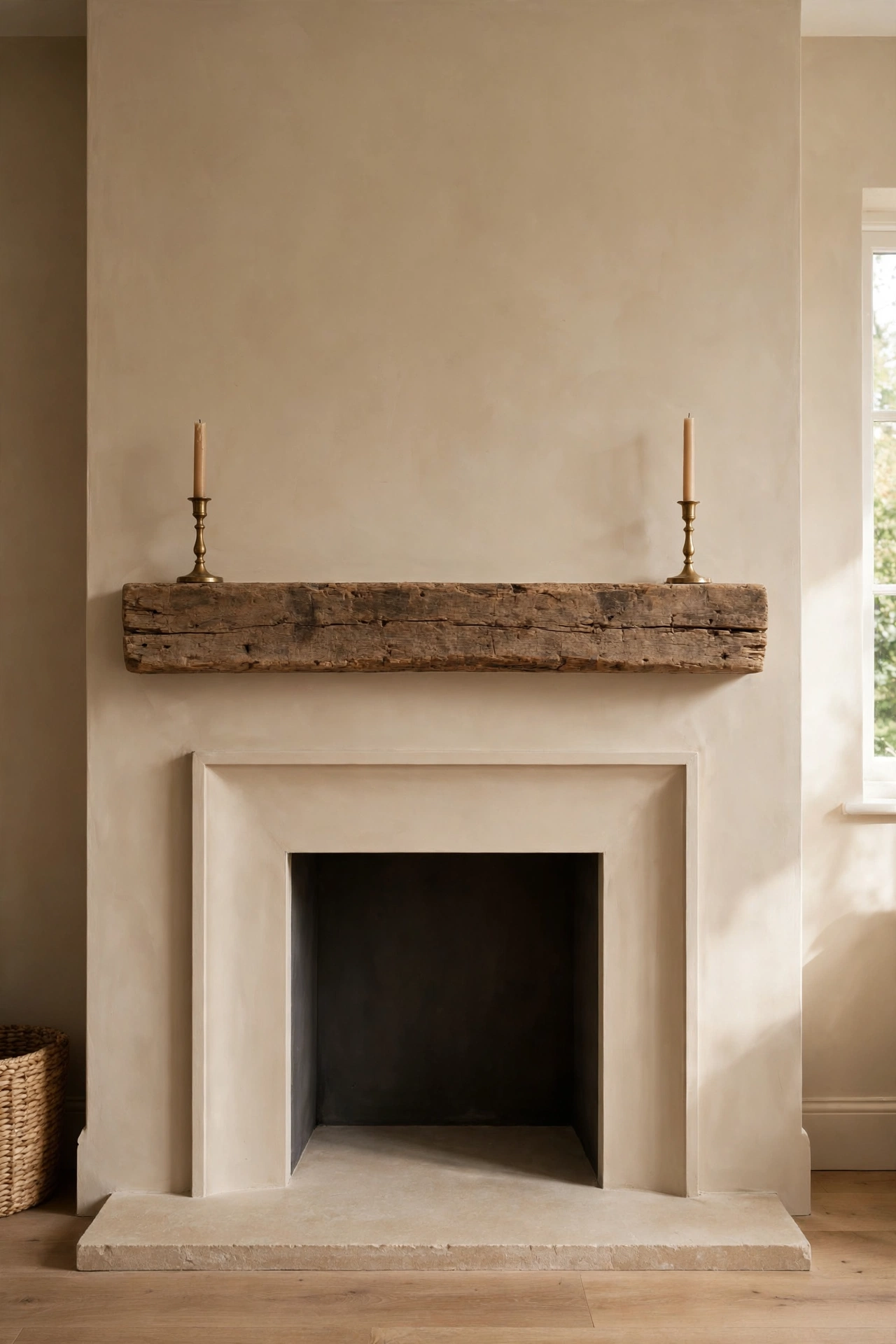
Painting the fireplace surround the same beige as the walls makes the whole wall feel calm and architectural. Then a chunky reclaimed beam across the mantel adds the history and texture the flat paint took away. The contrast between smooth plaster and rough wood is one of the prettiest pairings in a neutral room. Style the mantel sparsely, because a beam this characterful does not need much help. Check that the beam is properly anchored; reclaimed wood is heavier than it looks.
Good to Know: A beam mantel doubles as a display shelf, so keep what sits on it simple and low.
When It Has No Personality
The room is fine and nobody loves it. That is the last complaint, and it is fixed with collected details, not big purchases.
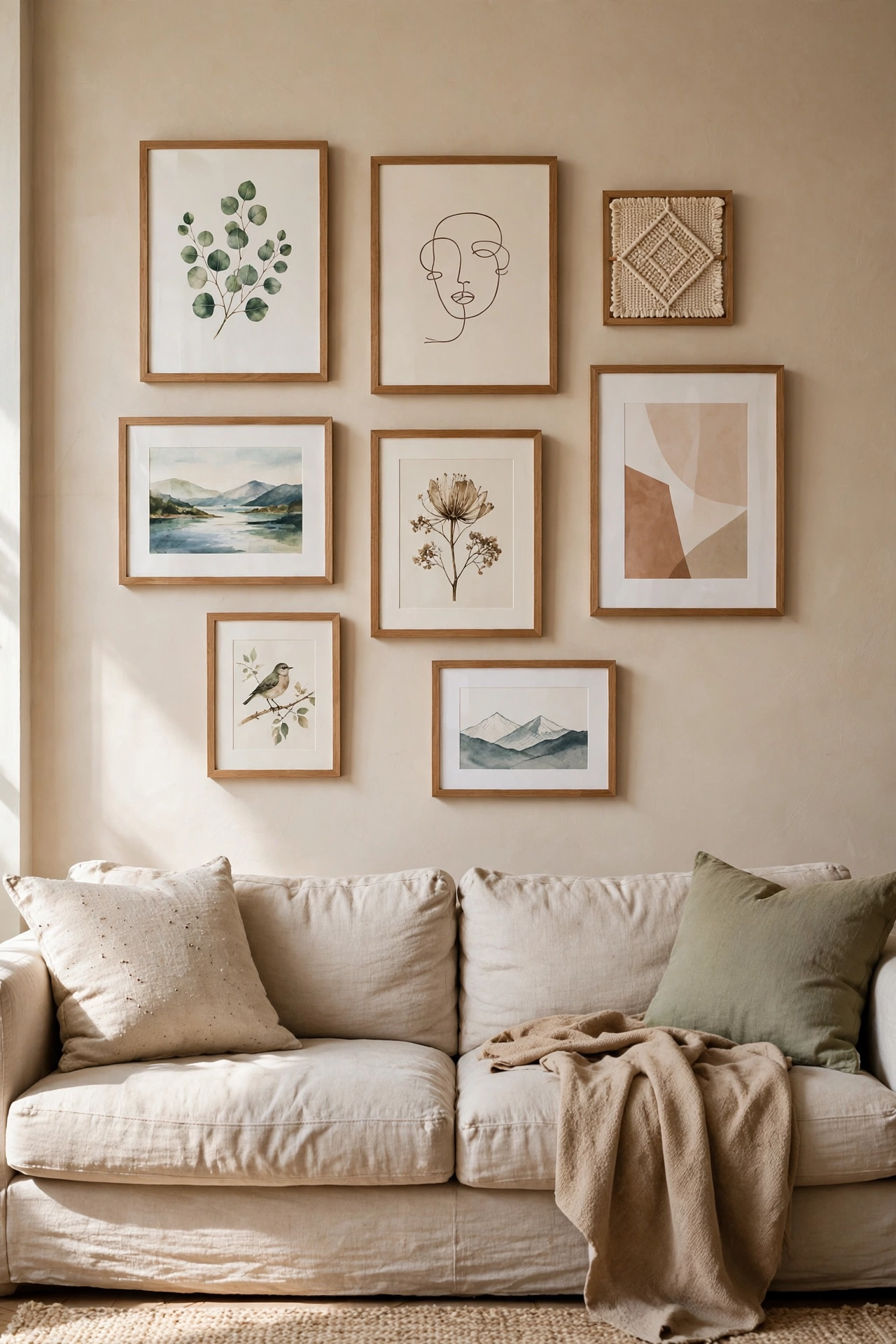
A gallery wall of art in matching wood frames gives beige walls a point of interest without introducing chaos. Keeping the frames consistent lets the art itself vary, which is the professional trick: unity in the frames, personality in the pictures. Mix photography, prints, and one textile piece for depth. Lay the arrangement on the floor first and photograph it, because what looks right at floor level rarely works the same on the wall. Start hanging from the center outward.
Quick Tip: Keep two to three fingers of space between frames. Wider gaps make the grouping fall apart visually.
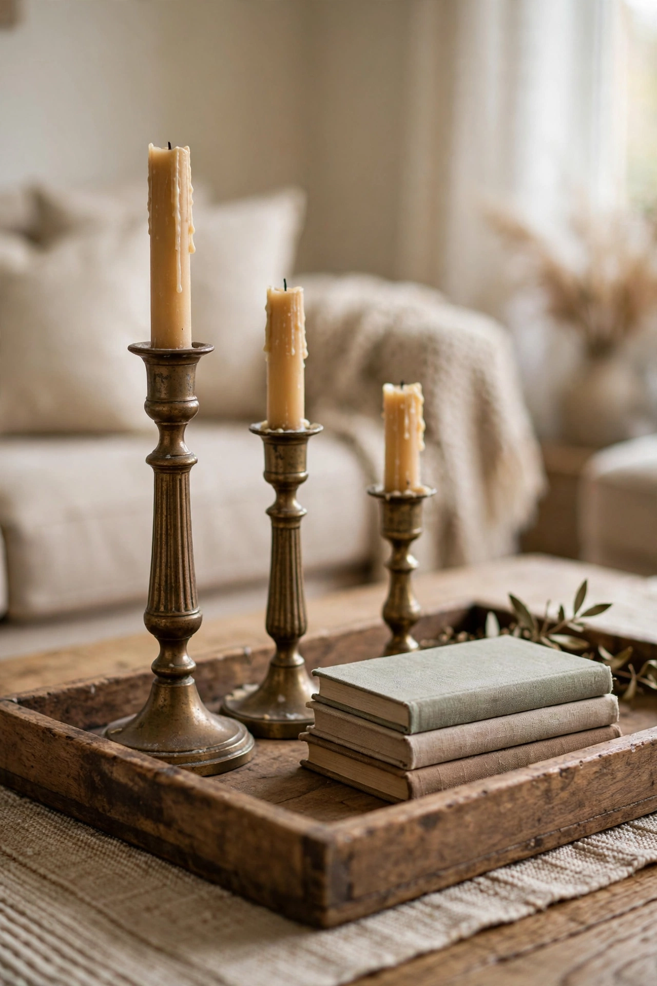
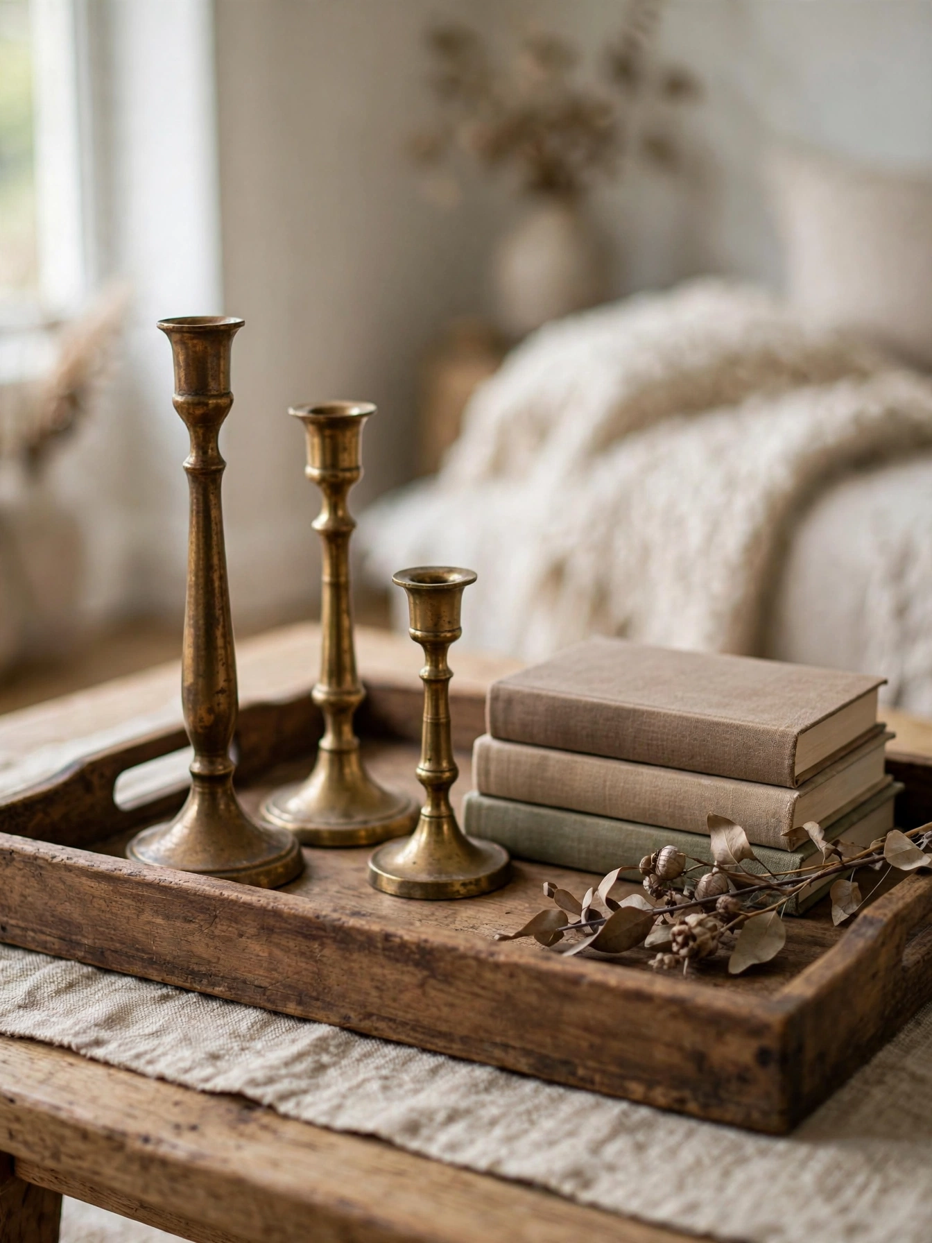
An empty coffee table is a missed opportunity and a cluttered one is a mess. A wood tray corrals the mess into one intentional zone: brass candlesticks of different heights, a small stack of books, and one natural object like a stone or a dried seed head. The tray makes the grouping portable, so you can lift the whole vignette when you need the table. Vary the heights within the tray, because three objects at the same height read as a row, not a composition. This is styling, not shopping, since most of it can come from around the house.
Small Detail: Odd numbers of objects almost always look better than even. Three or five, never four.
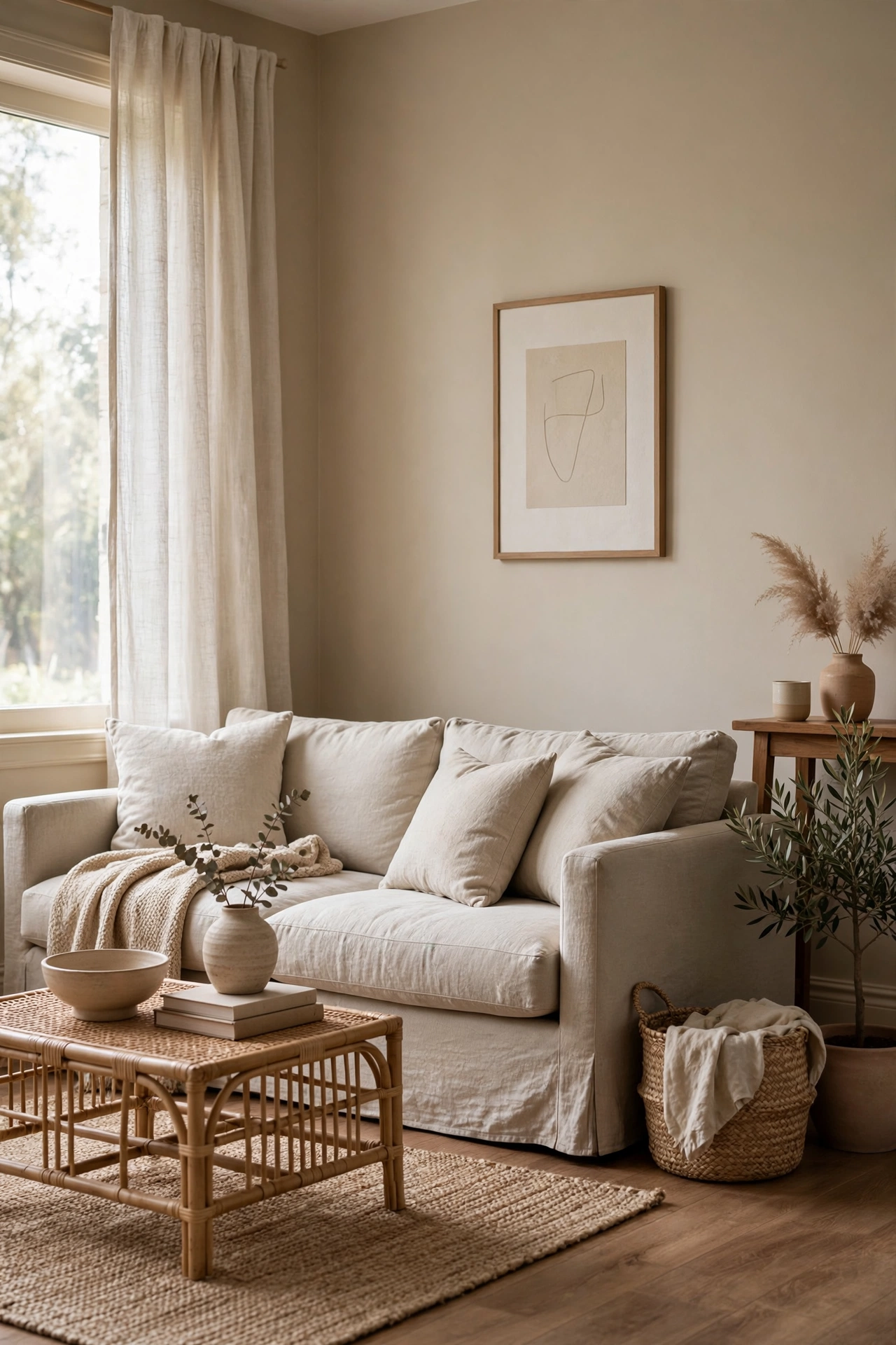
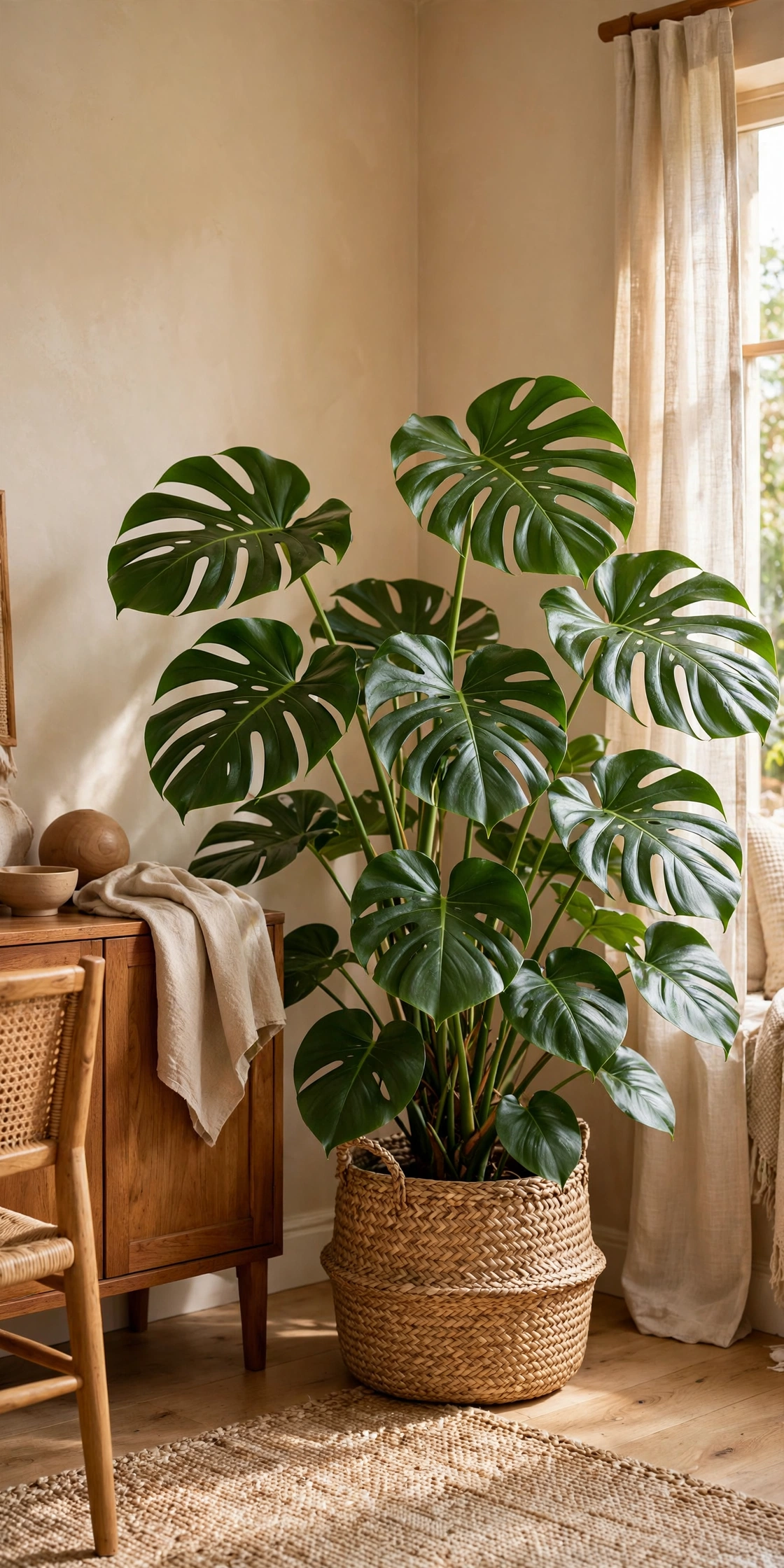
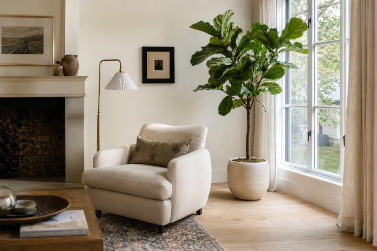
Green is the one color that never fights beige and wood. A large leafy plant in a woven seagrass basket adds life, height, and a texture the room does not have yet. The basket softens the plastic nursery pot and ties the plant into the room’s natural materials. Place it in the brightest corner you have, because a struggling plant in a dark corner just adds guilt. If your light is truly hopeless, a good faux olive tree fools almost everyone from sofa distance.
Honest Take: One big plant beats five small ones. Small plants scattered around read as clutter; one statement plant reads as design.
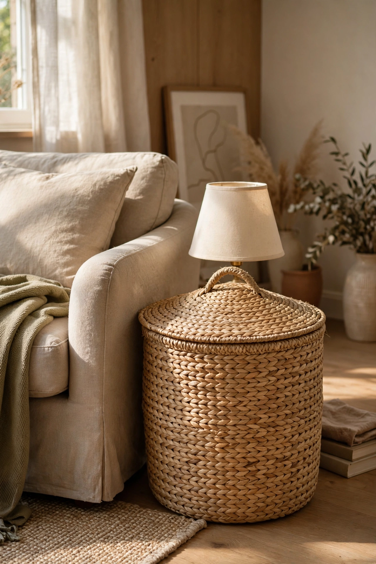
A lidded seagrass or rattan basket next to the sofa works as a side table, a footrest, and hidden storage for throws and remotes. It adds woven texture at seating height, right where the room needs it most. Make sure the lid sits flat and sturdy enough for a lamp or a cup of tea. Two matching baskets flanking a console look intentional; one beside a chair looks collected. Either way, storage that looks like decor is the hardest-working trick in a small living room.
Worth Knowing: Check the basket’s weight limit before putting a heavy lamp on it. Some are sturdier than they look, some are not.
After twenty-five ideas about restraint, here is permission for one joyful exception. A single patterned rug or a pair of bold throw pillows gives the eye somewhere to play and keeps the room from feeling too careful. Keep the pattern’s background in the beige family so it belongs, and let one accent color do the talking. This is also the cheapest piece to swap seasonally, so it is where trends are allowed to visit. Everything else stays calm so this one piece can shine.
Pro Move: Pull your one accent color from the pattern and repeat it once more in the room, a book spine, a vase, a candle, so it looks planned.
The Takeaway
Beige and wood was never the problem. Flat light, clashing undertones, and rooms with nothing to touch were the problem. Fix those, and this quiet combination becomes the warmest room in the house. Start with the complaint that sounds most like your room and work from there. You do not have to do all twenty-six ideas; even three or four will change how the space feels. The best beige rooms are not decorated all at once. They are adjusted, lived in, and slowly tuned until they feel like home.