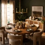
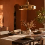
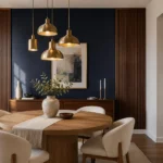
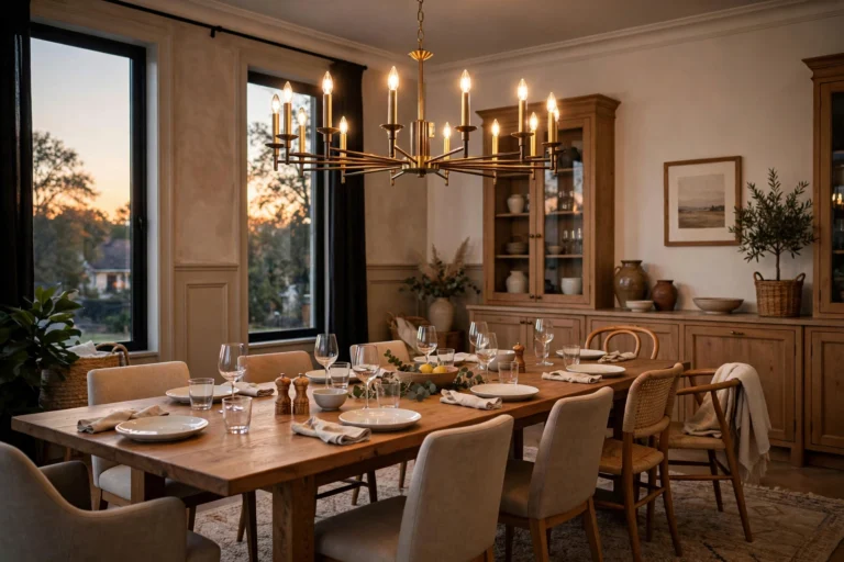
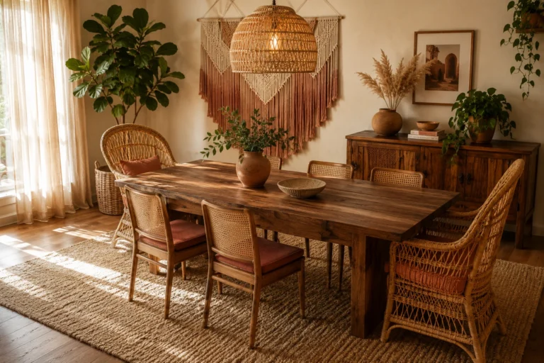
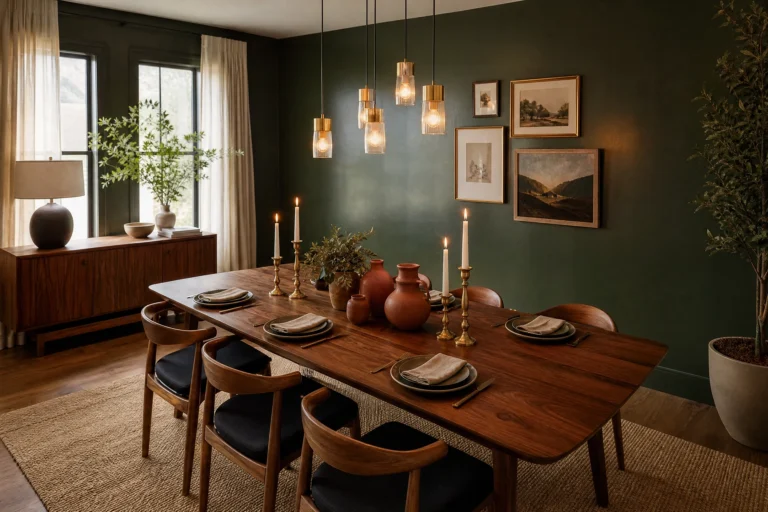
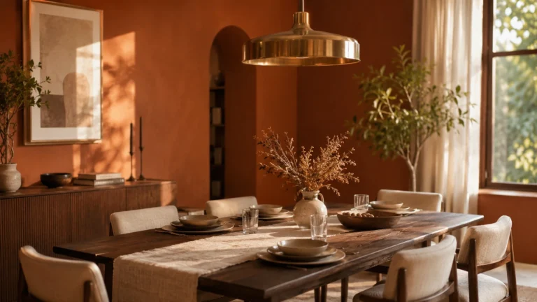
If you have ever stood in your apartment or small home and thought, “where on earth am I supposed to put a dining table,” you are not alone. It’s one of the most common frustrations in smaller living spaces, and the answers you find online are often the same recycled list: get a round table, add a mirror, use light colours. That advice is not wrong, but it barely scratches the surface of what is actually possible when you approach a small dining space with some real creative intention. The truth is, most small dining areas fail not because of a lack of square footage, but because they were not designed around the actual constraints of the space. Once you do that, even the most awkward corner can feel like a spot you genuinely want to sit down and eat in.
This article is built around the specific scenarios that come up most often in small homes and apartments. Each idea addresses a real spatial situation, whether that is a kitchen that bleeds into a living room with no natural divider, a narrow wall that seems useless, or a window nook that is been completely overlooked. You’ll find practical advice that you can actually act on, alongside honest notes about what works and what does not. Some of these ideas cost almost nothing. Others are worth the investment. All of them are designed to help you build a dining zone that feels intentional, not improvised.
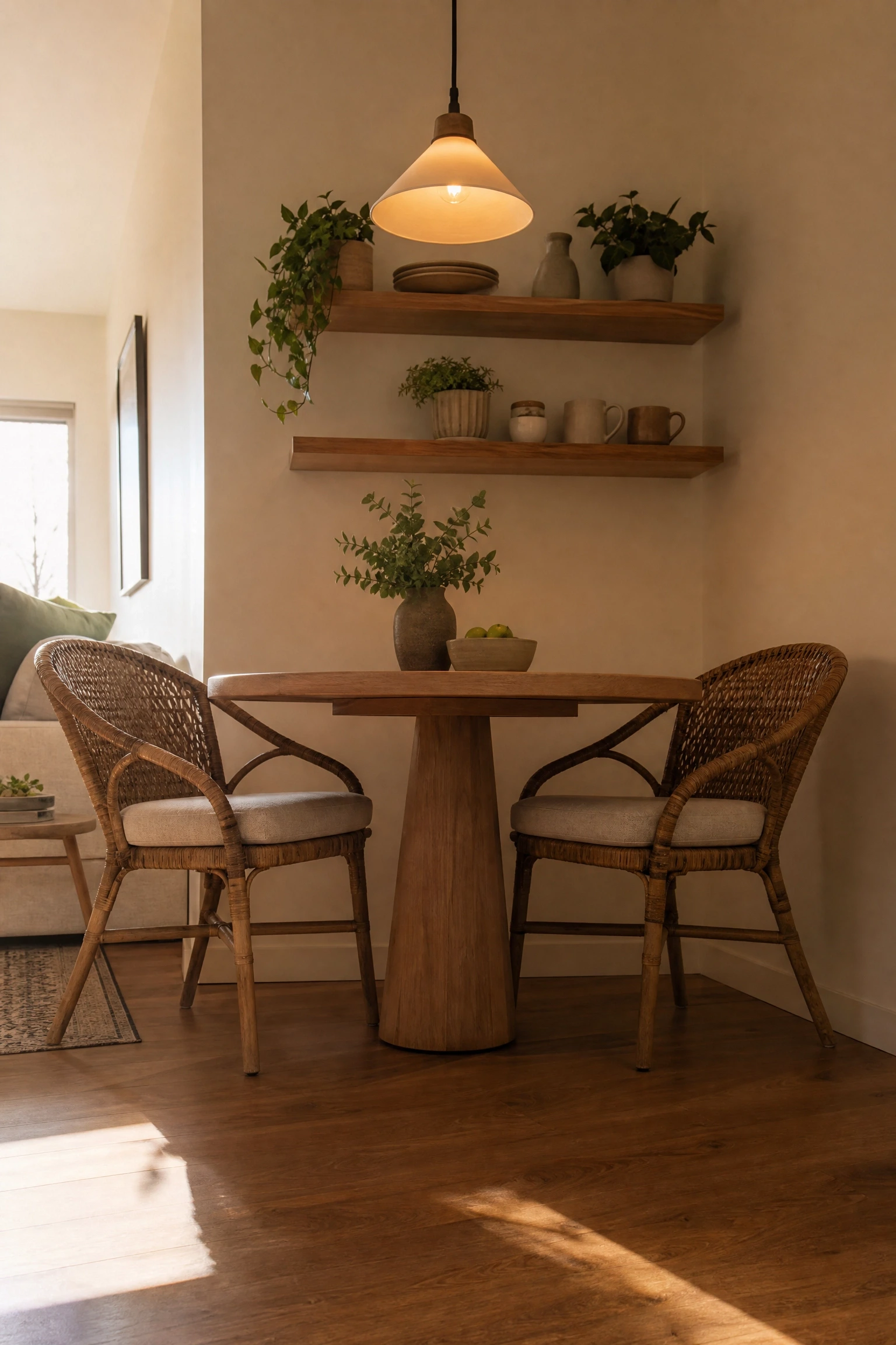
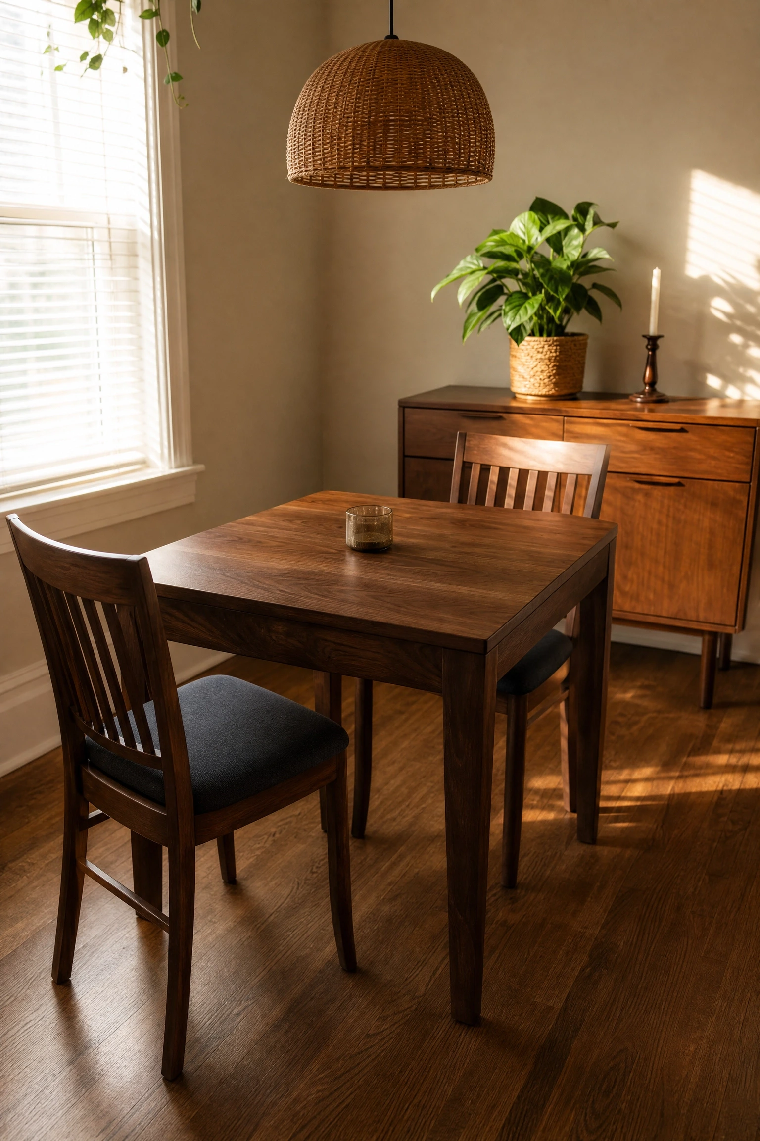
Corners in small homes are almost always wasted, and that is a genuine shame because a corner is actually one of the best spots for a dining zone in a tight space. A small round table tucked into a corner with two chairs angled outward creates a natural enclosure that feels cosy rather than cramped. In practice, a 36-inch round table works well here since it gives enough surface for two people without eating into circulation space. If the corner has wall space above, a pair of floating shelves in matching wood tones adds visual weight and purpose to the zone, making it read as a designed area rather than furniture you just shoved into a gap. Designers often refer to this as creating a “pocket” within an open-plan room, and it genuinely works because it gives the eye a place to land. Keep the chairs light, think rattan or bentwood, so they do not visually fill the corner too heavily. This works best in rooms where the corner is away from high-traffic paths, as crowding a walkway makes the whole thing feel awkward no matter how nice the furniture is.
Pro Move: Hang a small pendant light directly above the table to anchor the corner as a defined zone rather than just a corner with a table in it.
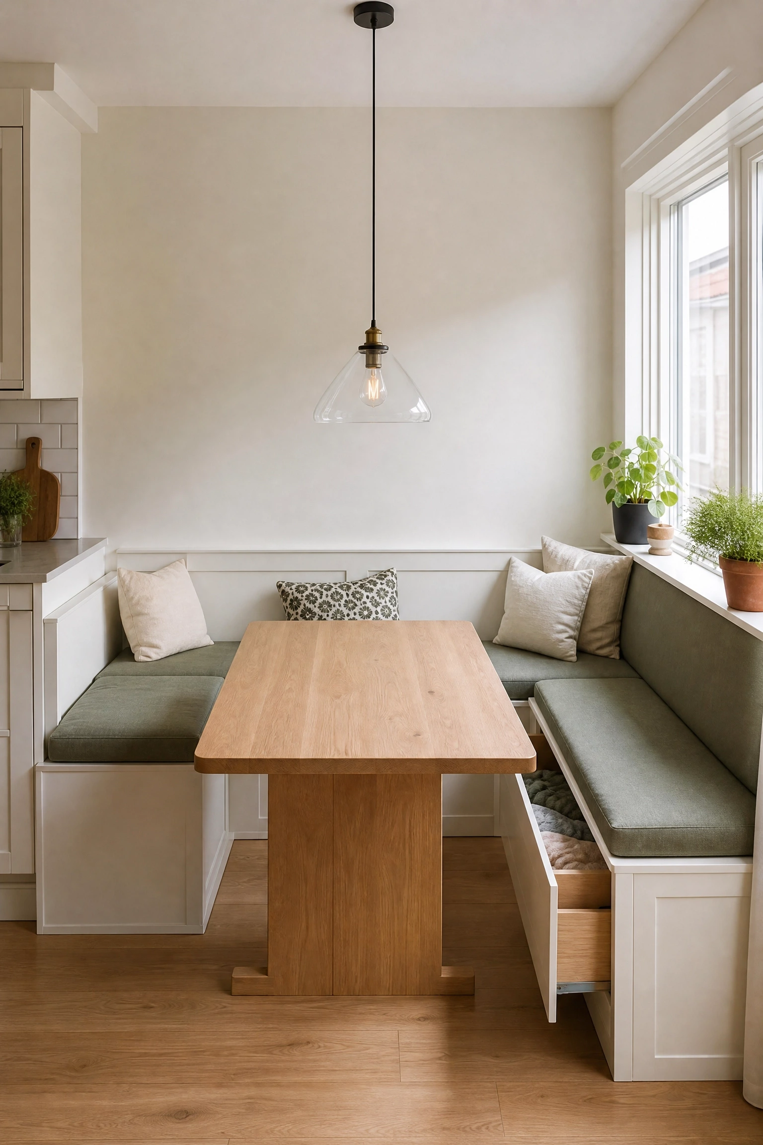
If your kitchen has any kind of alcove, a bump-out, or even a slightly recessed wall area near a window, that is prime banquette territory. Built-in bench seating along one or two walls with a compact rectangular table in the centre can seat four people in a footprint that a standard four-chair setup could never manage. The reason it works so well is that built-in benches do not need chair legs pulling out to accommodate sitting, so the clearance you need is dramatically reduced. In terms of materials, a painted MDF frame with a cushion covered in a durable performance fabric (think Sunbrella or a similar indoor-outdoor textile) keeps this looking sharp without the upkeep anxiety. The underside of the bench is storage gold, lift-up lids or drawers mean you gain back all the square footage you “spent” on seating. This approach is popular in Scandinavian and Japandi-influenced kitchens precisely because it balances function and warmth without taking over the room. It does require some basic carpentry or a skilled handyperson, which bumps the budget, but the payoff in both space and style is significant.
Designer Advice: Use the same wood tone on your banquette frame as your kitchen cabinetry to make the seating feel built in rather than added on.
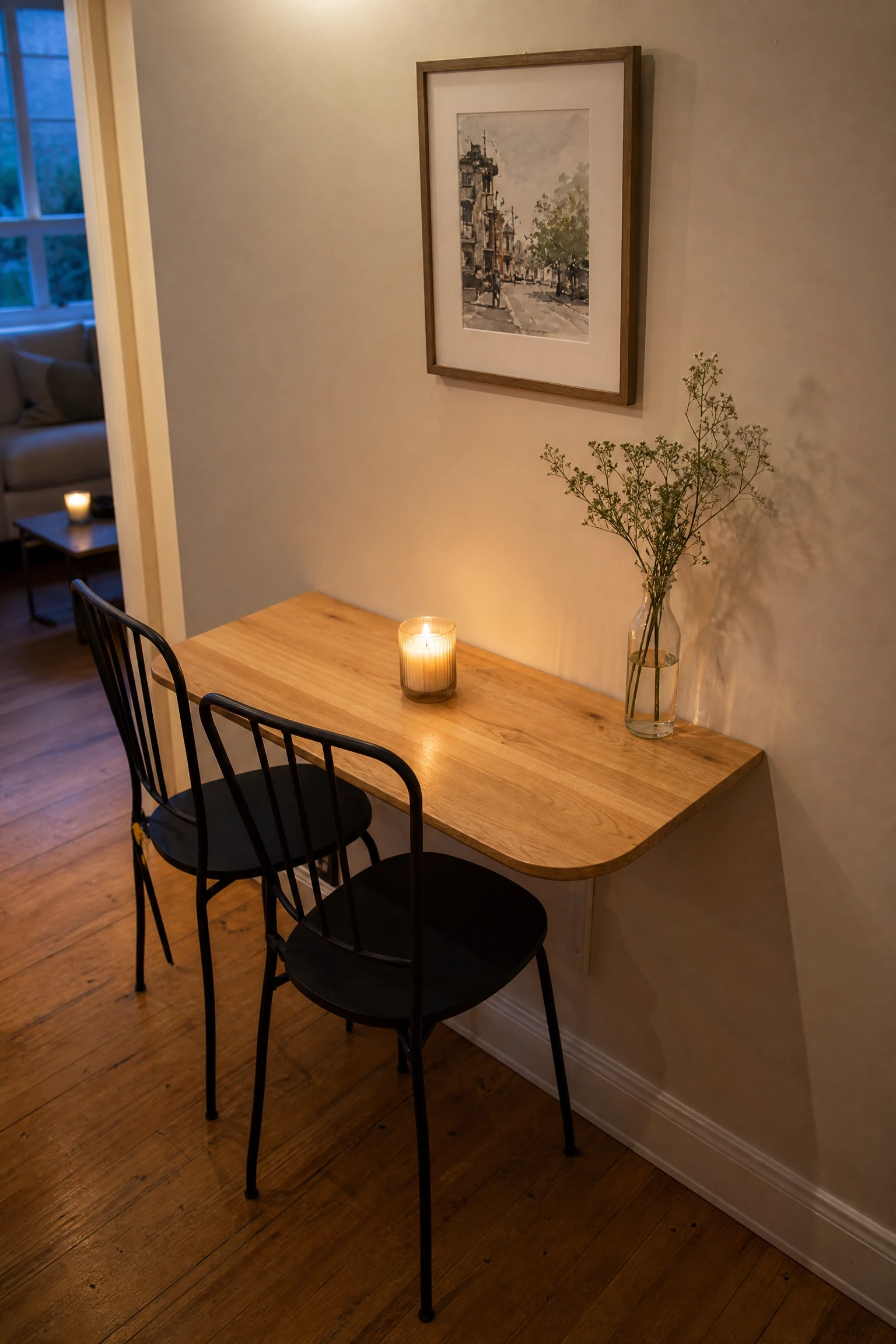
A narrow wall that runs alongside a hallway, kitchen passthrough, or living room edge is often dismissed as useless dining real estate, but a well-chosen drop-leaf table changes that entirely. When folded flat against the wall, a drop-leaf table can be as shallow as 10 to 12 inches, which is barely noticeable. Open one or both leaves and you have a proper dining surface for two to four people depending on the size. The key to making this work aesthetically rather than just functionally is to treat the wall behind it intentionally. A piece of artwork, a small sconce on either side, or even a strip of decorative wallpaper in a panel effect makes the folded table look like it belongs there rather than like something waiting to be used. In practice, this look comes together best when the chairs or stools are also slim, wall-hugging pieces that can be tucked under the table flush to the wall when not in use. Folding chairs are an option, but slim metal bistro chairs work better for daily use because they are sturdy and still disappear visually when pushed in.
Quick Tip: Mount a coat hook or two above the table when it is folded against the wall so the wall functions double-duty during the times you are not dining.
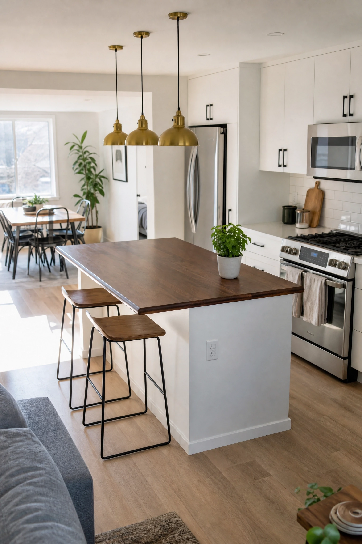
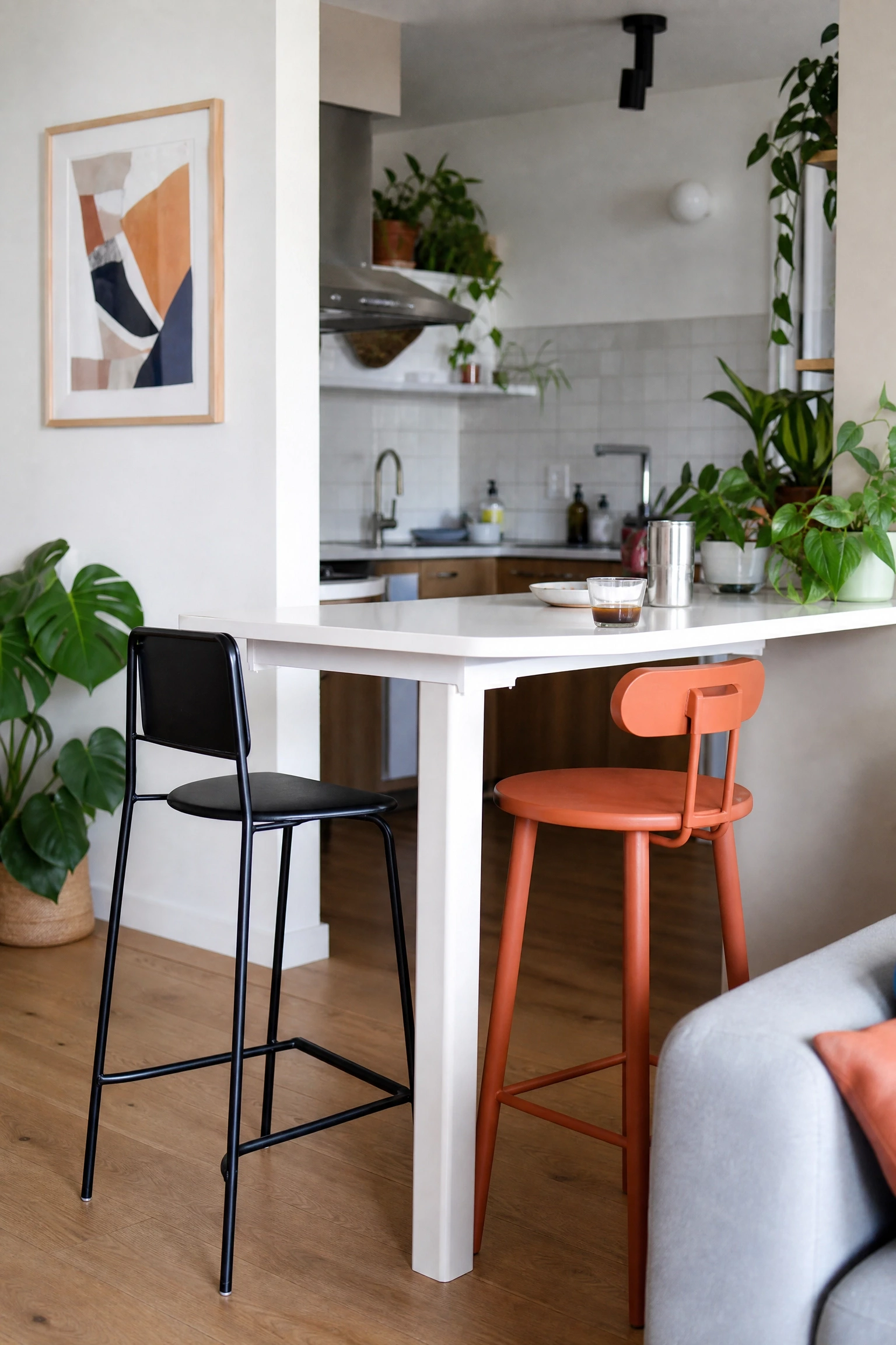
In open-plan apartments where the kitchen and living room share one continuous space, a kitchen island with bar-height seating on one side often does a better job than a separate dining table would. The key distinction here is intentionality: the island has to be sized and styled to function as a dining spot, not just as extra counter space with stools awkwardly pulled up to it. A comfortable bar height is around 42 inches, and the stools should be counter-height with backs rather than backless bar stools, which are fine for a quick coffee but not for a proper meal. Visually, this setup works best when the stools have some design character, mixed materials like a metal frame with a wood or upholstered seat read as considered rather than default. One thing that works really well here is running a strip of pendant lights above the island at lower-than-standard heights (around 28 to 30 inches above the surface) to create the same sense of intimacy and enclosure you would get from a light over a traditional dining table. Worth noting that this arrangement works best for two to three people; hosting a dinner party of six becomes genuinely difficult, so it suits couples and small households more than larger families.
Reality Check: If you are buying an island specifically for dining, size it at a minimum of 40 inches long per two diners so there is enough elbow room for a comfortable meal.
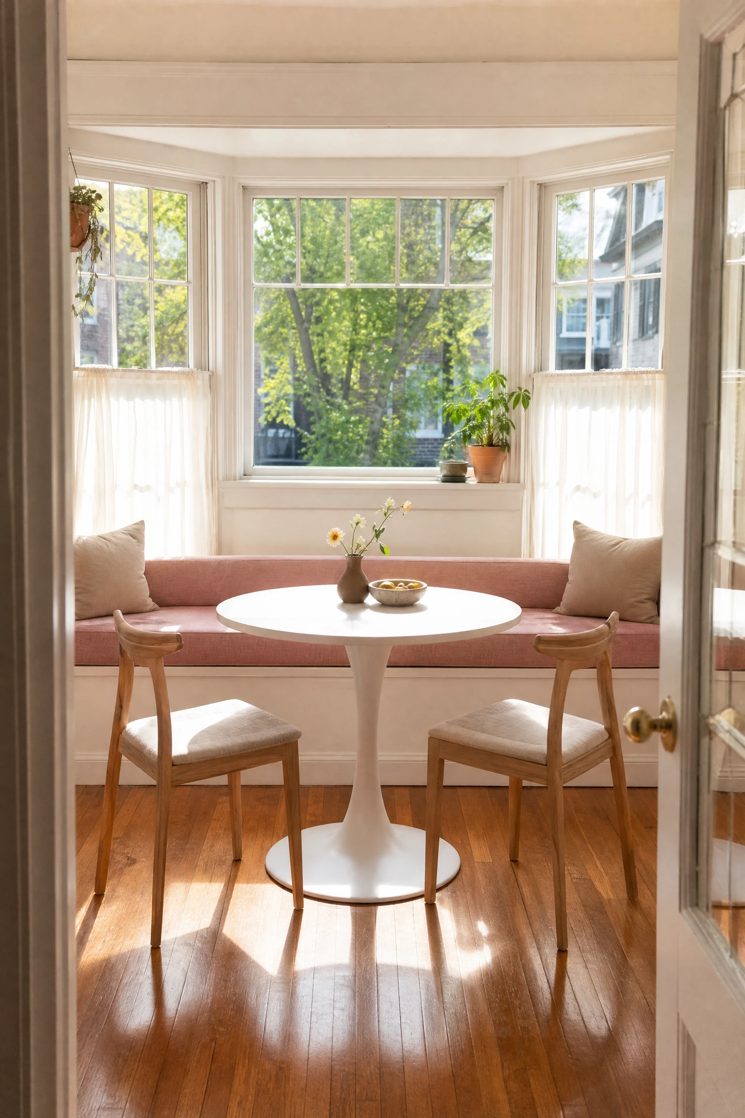
If your home has a bay window or a wide window with a low sill, you have the bones of a dining nook that most people never think to use. A cushioned window seat built along the sill, paired with a small pedestal or tulip-style table, creates a breakfast nook atmosphere that feels genuinely special. The pedestal base is important here because a four-legged table in a tight nook creates a leg-collision problem that makes the whole thing unpleasant to use. Natural light makes food look better and makes eating feel more enjoyable, which is actually one of the most cited reasons people love this setup once they have done it. For the cushion, a fitted custom pad in a performance linen or velvet makes it feel finished, but even a firm foam pad in a removable slipcover works well at a fraction of the cost. One honest limitation: if the window faces west or gets strong afternoon sun, you’ll want a roman shade or sheer curtain to make it comfortable during the peak sun hours, or the glare becomes a real issue during dinner.
Heads Up: Make sure the window seat base is at standard bench height (17 to 19 inches) rather than following the window sill height, which is often too low for comfortable dining.
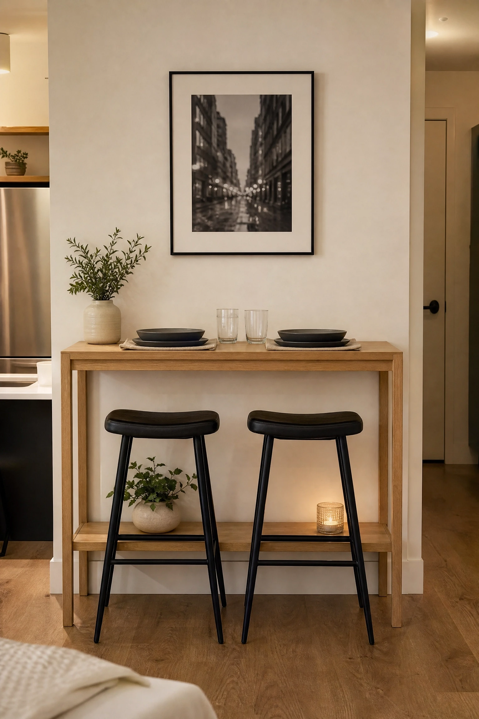
Console tables are typically thought of as entryway furniture, but a slender console at 30 inches high and about 14 to 18 inches deep can absolutely function as a counter-height dining table for one or two people in a very tight space. Think of it as a standing-desk-style arrangement: pair it with a couple of counter-height stools and you have a functional spot to eat without the footprint of a traditional dining table at all. This approach works particularly well in studio apartments where the boundary between kitchen and living space is non-existent. The visual lightness of a console, especially one in a natural oak or painted white finish with tapered legs, means it barely registers as furniture when you walk into the room. Style-wise, this leans into a modern bistro aesthetic that actually suits studio apartments very well. The honest trade-off is that 14 to 18 inches of depth is tight for a full place setting, so this is better suited to casual everyday meals than to a sit-down dinner with multiple courses.
Designer Advice: Choose a console with at least one shelf below the surface so you can keep placemats, napkins, or a small plant there, which makes the piece feel more like a deliberate dining fixture.
7. The Extendable Table That Does Not Look Like a Compromise
Extendable tables have a reputation for looking budget and clunky, and to be fair, a lot of them do. But the category has genuinely improved, and there are now extendable designs that look like solid, well-made tables at every size. The key feature to look for is a self-storing leaf that slides out from inside the table rather than requiring you to pull out a separate stored piece from a closet. In a small dining space, this is the difference between a table that actually gets used in its extended form and one that stays small because getting it extended is too much effort. In terms of sizing, a table that seats two at 36 inches and extends to seat four at 60 inches is the sweet spot for most small dining rooms. Materials matter enormously here: a solid oak or walnut veneer top reads as a proper piece of furniture, while a laminate top immediately signals “temporary,” which undermines the whole effect you are going for. This approach is mid to higher budget for the good versions, but it is worth it because it gives you a dining area that genuinely functions for both daily use and occasional entertaining.
Pro Move: Look for extendable tables where the leaf is the same grain direction as the tabletop – mismatched grain lines are the telltale sign of a cheaper table.
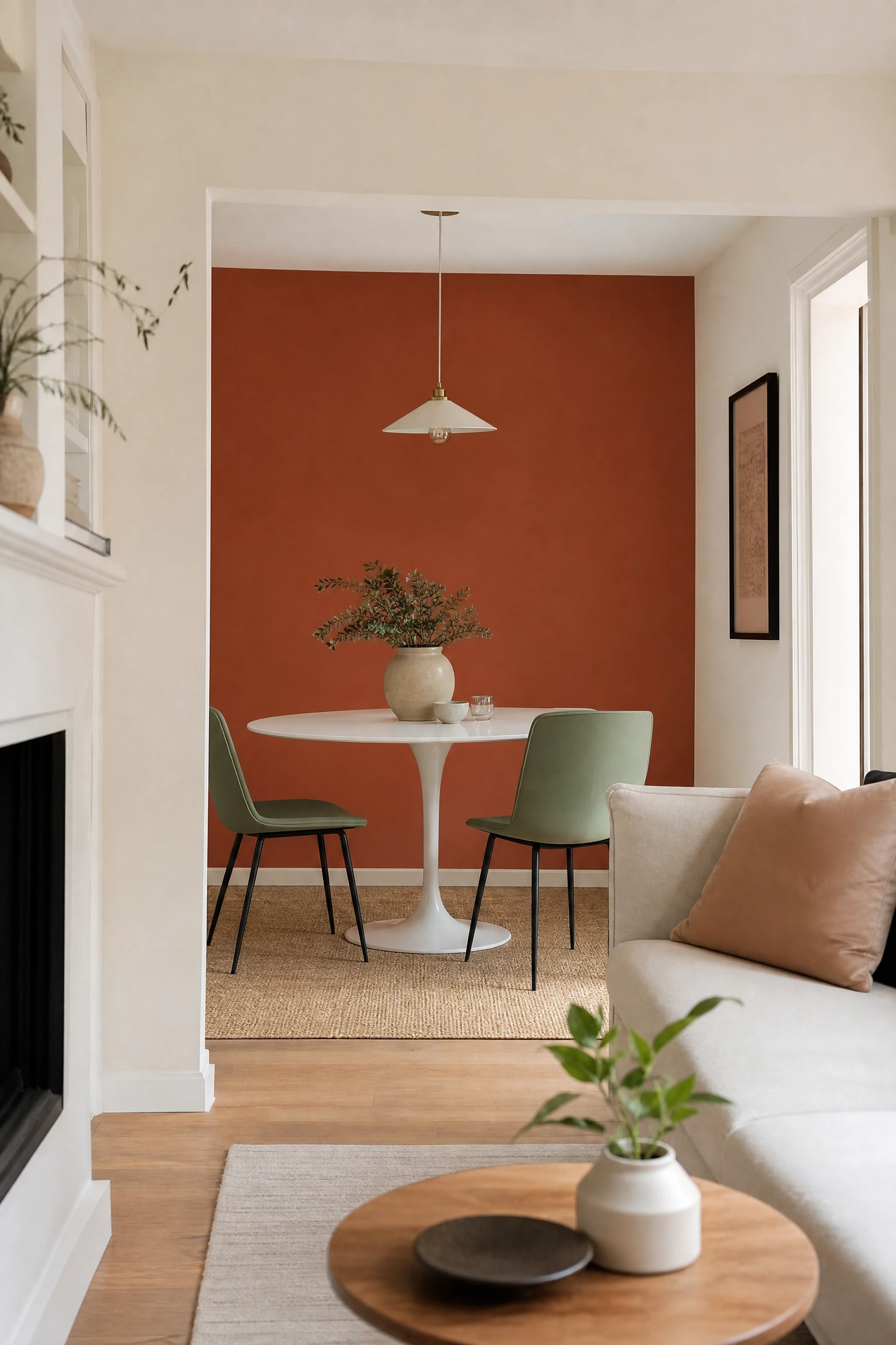
In open-plan spaces where the dining area bleeds into the kitchen or living room with no natural boundary, one of the most effective (and affordable) tricks is painting a single wall behind the dining spot in a distinct colour to create a visual frame for the space. This is sometimes called an “accent wall,” but when done well it functions more like an architectural element. A deep sage green, terracotta, or navy applied to just the wall that backs the dining table signals to the eye that this area is its own zone, not just a place where you happened to put a table. In terms of execution, the colour should be picked up somewhere else in the room, a cushion, a vase, the chair upholstery, so it feels intentional rather than random. This works particularly well in rental apartments where you cannot knock down walls or install built-ins, because it is reversible and costs very little relative to the visual impact. The only caveat is that a very dark shade in a room without good natural light can make the space feel heavy, so pair it with a light-coloured table or chairs to keep the visual balance right.
Quick Tip: Paint the wall to chair-rail height only (around 36 inches) and then run a thin strip of wood moulding as a border for a finished, panelled look that punches way above its price point.
9. Pendant Lighting That Makes a Small Table Feel Important
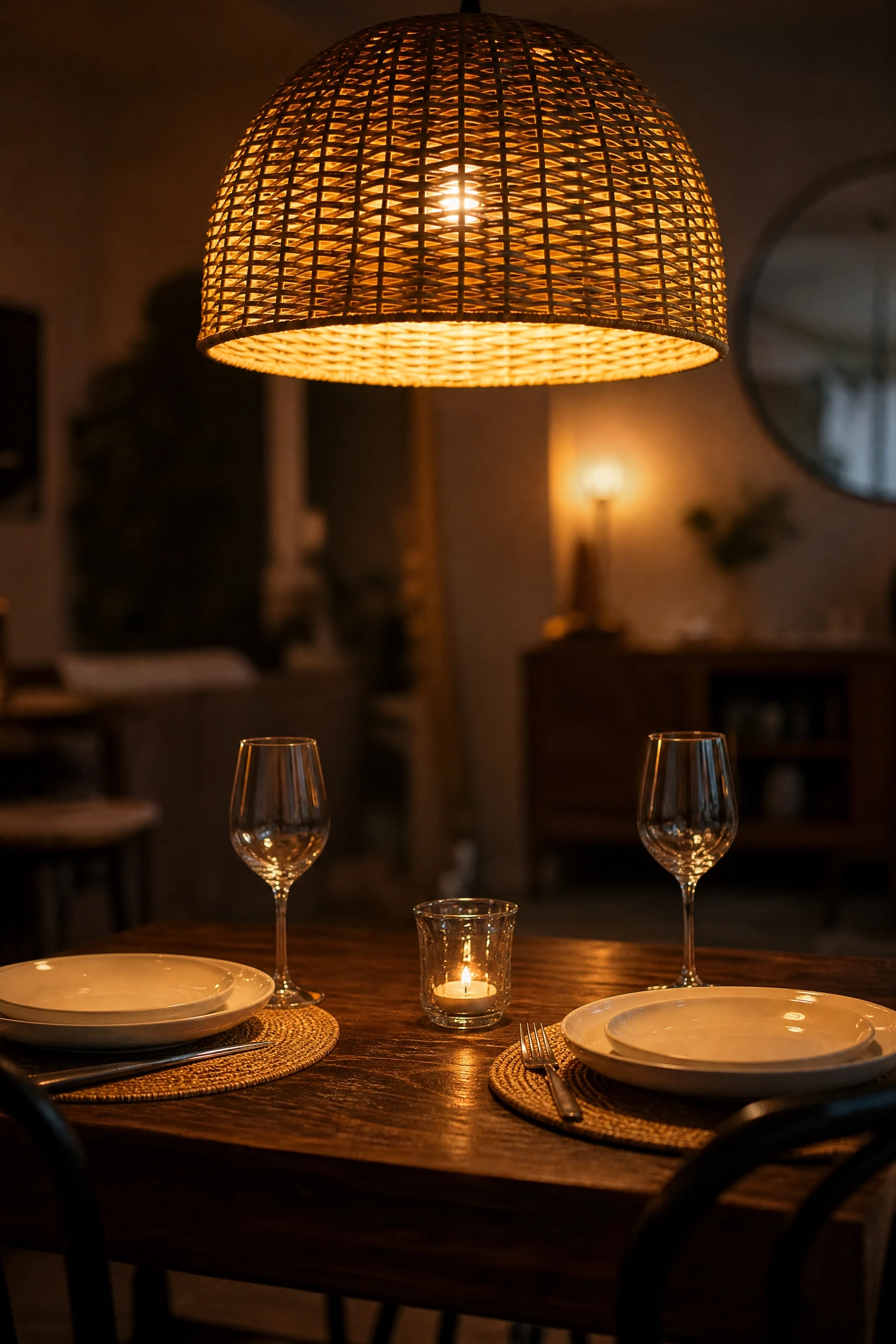
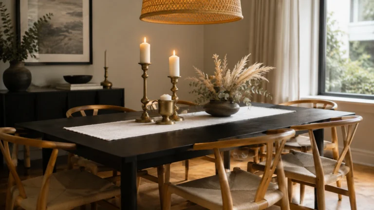
Lighting is probably the most underestimated tool in a small dining space. A bare ceiling light or a generic flush mount makes even a beautiful table feel forgettable, whereas a well-placed pendant at the right height makes even a simple table feel like the centre of the room. The standard rule is to hang the bottom of the pendant 28 to 34 inches above the table surface, which keeps it visually connected to the table without blocking sightlines across it. In a small space, a single pendant with a wide shade in a natural material like rattan, woven jute, or smoked glass adds texture and warmth without adding visual bulk. Cluster pendants, three small pendants on separate cords, are also a strong choice because they feel more designed and artisan without overwhelming the table. One thing that works really well here is putting the pendant on a dimmer switch, because the ability to lower the light for dinner and raise it for daytime tasks is the single most cost-effective way to change the mood of a small dining space. Budget tip: the pendant itself can be affordable if the dimmer and installation are done properly – a $60 rattan pendant on a dimmer often looks more intentional than a $300 fixture on a flat-on switch.
Designer Advice: In a room with low ceilings, use a pendant with an adjustable cord and keep the shade as close to the table as comfort allows – it creates intimacy and draws the eye down, making the ceiling feel less oppressive.
10. Bench Seating on One Side to Free Up Visual Space
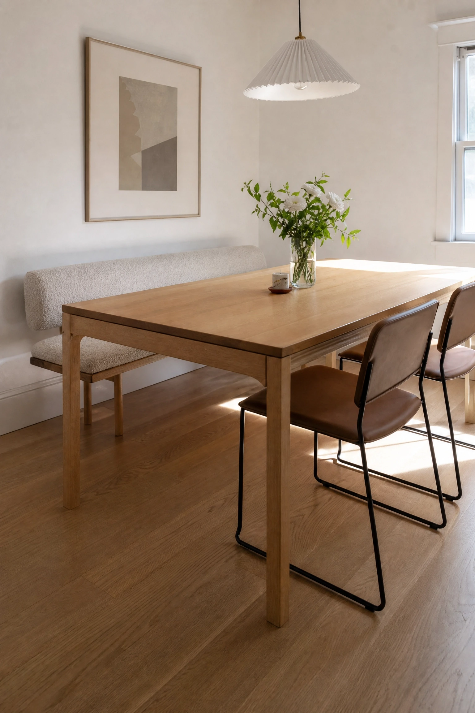
One of the most practical things you can do in a small dining area is replace two of the chairs with a bench along one side of the table. A bench removes two sets of chair legs from the visual equation, which immediately lightens how the space reads. More practically, a bench can be pushed fully under the table when not in use, reclaiming a significant amount of floor space. In use, a bench can also seat three people in the space where two chairs would go, which is useful when you need to squeeze in an extra person for dinner. In terms of style, a wooden bench with a slim cushion reads clean and modern, while an upholstered bench in a boucle or velvet adds softness and warmth. This setup is particularly popular in Japandi and mid-century modern interiors because it sits right at the intersection of function and design. One honest limitation: benches without backs are less comfortable for long meals, so if your household tends to linger at the table, look for a bench with a low back or place it against a wall so people have something to lean on.
Heads Up: A bench works best on the wall side of the table – positioning it against a wall means people have something to rest against, which makes it far more comfortable for an extended meal.
11. A Mirror to Double the Perceived Size of the Space
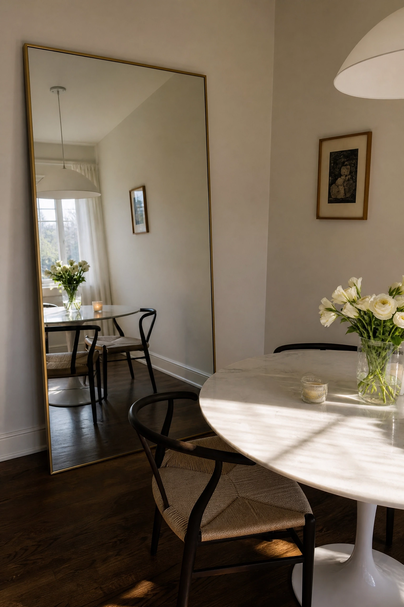
Mirrors in dining rooms are not a new idea, but the way most people use them is too cautious to have much impact. A small decorative mirror hung above the table does very little. What actually works is a large-scale mirror, think 24 by 36 inches minimum, placed on the wall that faces the window or light source, so it reflects the room back at itself and genuinely doubles the sense of depth. In a small dining area, this can make the difference between a space that feels like a closet you eat in and one that feels airy and open. Leaning a large mirror against the wall rather than hanging it is a great option for renters because it requires no commitment and can be moved easily. Gilt or warm brass frames suit more traditional or eclectic dining setups, while thin black metal or frameless mirrors lean contemporary. The one thing to be careful of is reflection content: if the mirror primarily reflects a cluttered kitchen counter or a blank wall, it will not help the way you want it to. Position it so it reflects something interesting, a window, the light from the pendant, or a piece of art.
Reality Check: Avoid placing a mirror directly opposite the dining chairs so diners are not staring at themselves while eating – angle it slightly or position it on a side wall instead.
12. Mixed Chair Heights to Create a Casual Dining Bar
When a dining table doubles as a workspace or homework surface during the day, one of the more creative solutions is to raise the table height slightly (to around 36 inches, which is counter height) and pair it with a mix of counter stools and one standard chair. This creates an informal, café-style vibe that actually suits how most people use their dining space on a daily basis. The standard chair at one end functions as the “anchor” seat for anyone who prefers a more traditional dining posture, while the stools suit the casual use cases. In terms of style, mixing a leather-look stool with a painted wood chair creates that deliberate mix-and-match aesthetic that interior design publications have been featuring heavily since around 2023 and which still reads as current and considered rather than mismatched. This works best in apartments where the dining area is genuinely open to the kitchen, as it echoes the kitchen counter height and makes the two zones feel like they are having a conversation. The limitation here is that it suits a casual household rather than a formal one, and it does not work well if you regularly seat more than three or four people.
Pro Move: Paint one counter stool in a contrasting colour, like a terracotta or forest green, to make the mixed-seating look feel chosen rather than accidental.
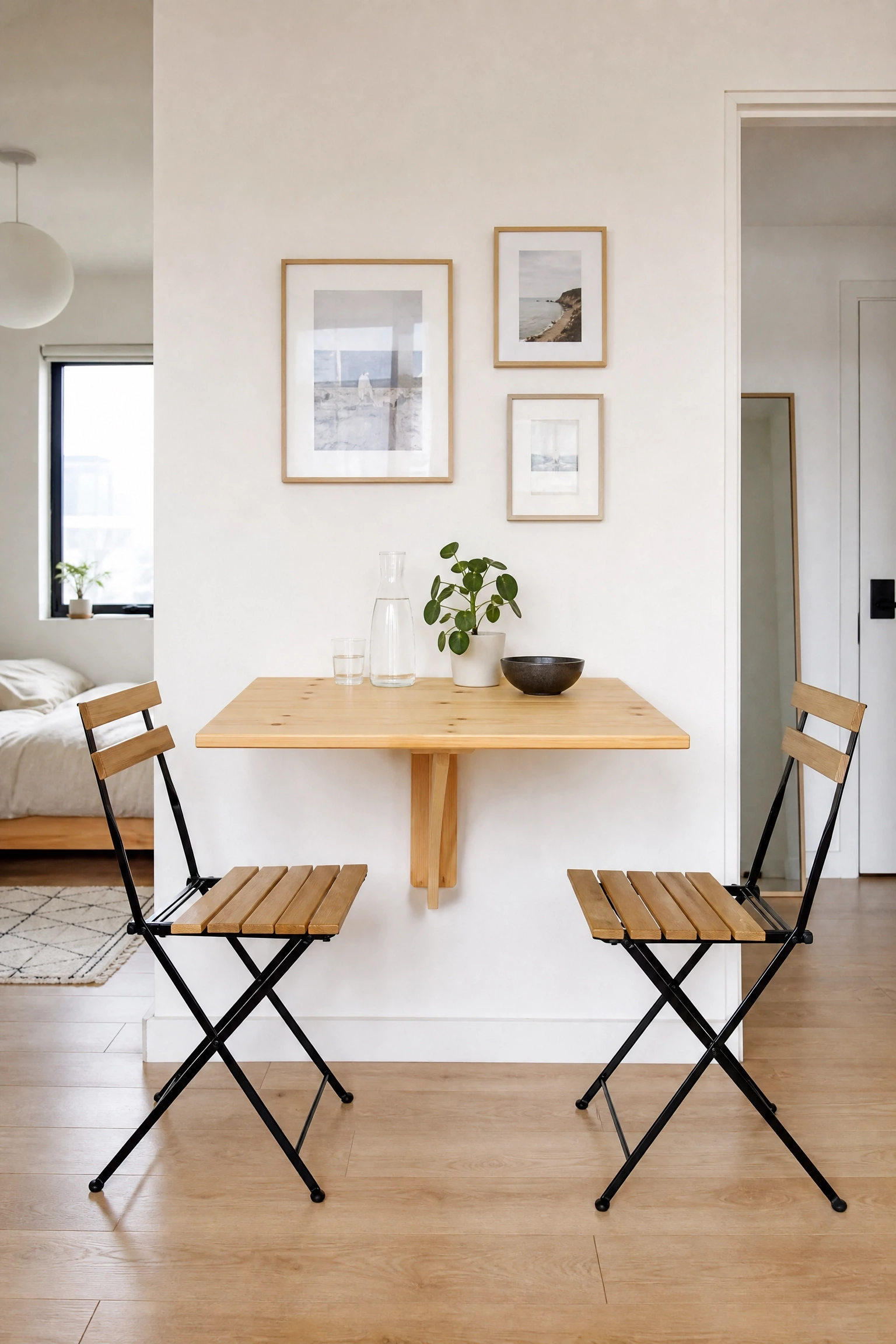
For true micro spaces, studios under 400 square feet or rooms where there is genuinely no spare floor space to give over to a dining area, a wall-mounted folding table is not a compromise – it is the right answer. These tables are mounted to the wall studs at dining height and fold flat to a depth of about 2 to 4 inches when not in use. The better versions have a clean wood surface and a simple hinge mechanism so they look intentional when folded and functional when open. Paired with one or two folding chairs (Hay’s Cank chair and the IKEA Nisse are both well-regarded in this space) that hang on wall hooks beside the table when not in use, you have a complete dining setup that occupies zero floor space 90 percent of the time. In practice, this works best for one or two people who eat at the table rather than hosting regularly. The wall it is mounted to benefits from some decoration when the table is folded, a framed print or a small gallery wall, so the space does not look like an empty wall with a bracket on it.
Quick Tip: Mount the folding table near a window if possible – the natural light makes eating there feel less like a makeshift solution and more like a genuinely pleasant spot.
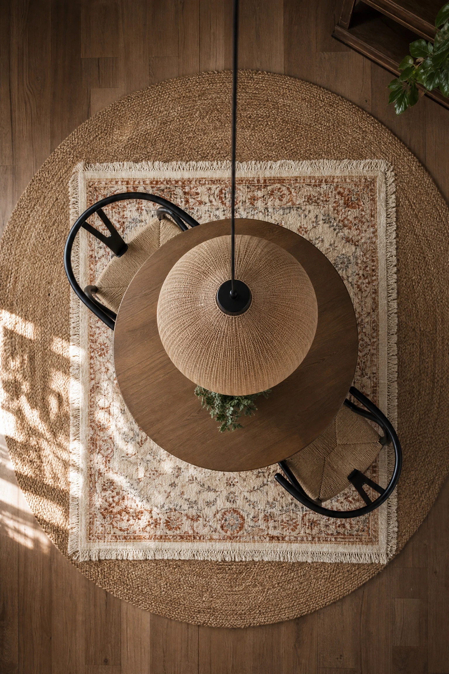
In an open-plan space, a rug under the dining table is one of the most effective ways to define the dining zone without any construction or commitment. The challenge most people encounter is getting the size wrong: a rug that is too small makes the chairs legs hang off the edge when pulled out, which looks and feels odd. The rule of thumb that actually works in practice is to choose a rug that extends at least 24 inches beyond the table on all sides, which means the chairs stay on the rug even when pulled out for sitting. For a 48-inch round table, that is a rug at least 8 feet in diameter. In a layered approach, a natural jute or sisal base layer under a smaller patterned rug adds texture and warmth, and the two layers together read as a more styled and considered zone than a single flat rug. From an E-E-A-T standpoint, the material matters for practicality too: dining rugs need to be either washable (outdoor-style polypropylene rugs work brilliantly here) or treated with a stain-resistant coating, or you’ll spend more time anxious about spills than enjoying the look.
Designer Advice: If budget is a concern, prioritize rug size over rug quality – a large inexpensive rug under a dining table does more work spatially than a small expensive one.
15. Built-In Shelving Behind the Dining Table as a Focal Point
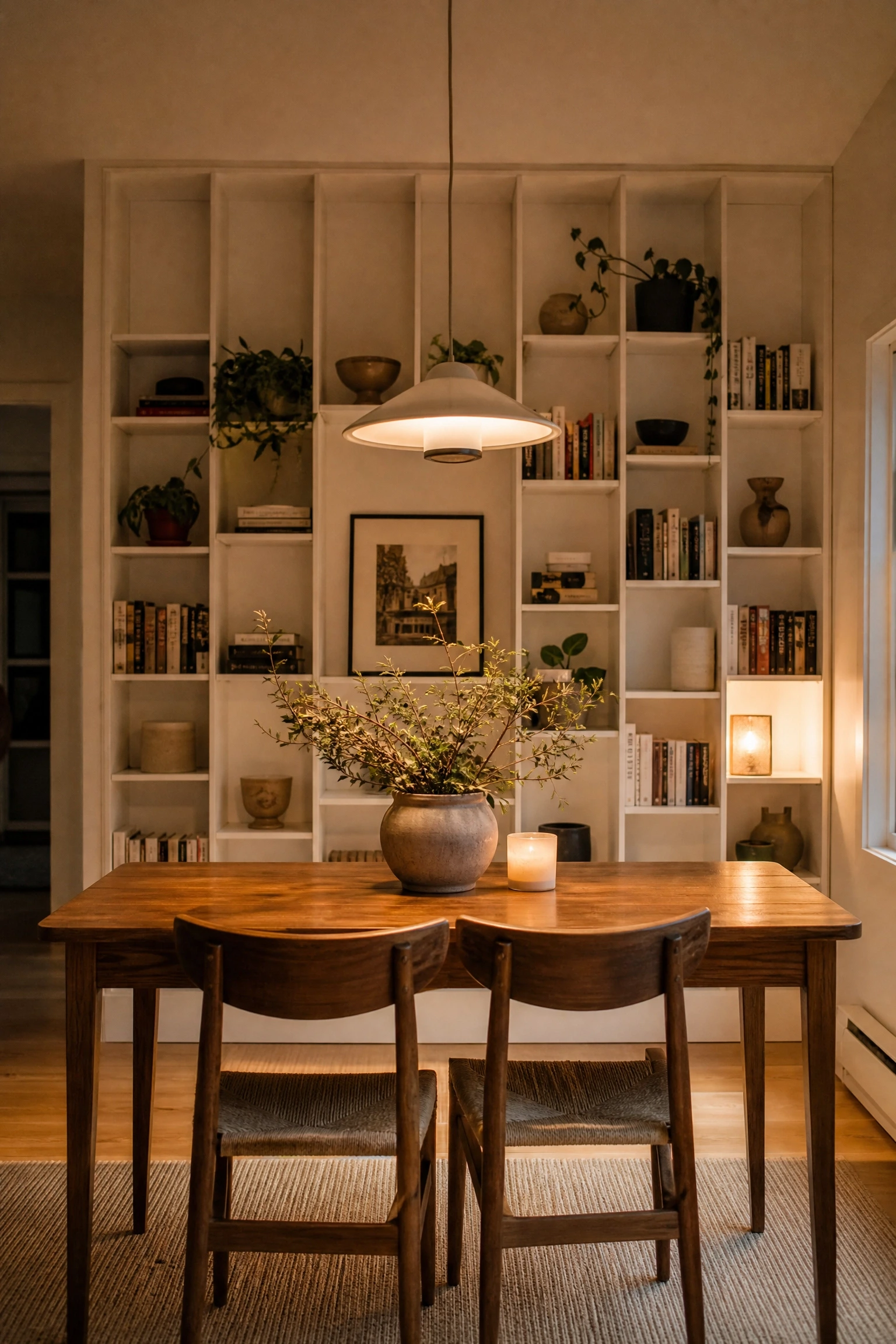
When a dining table sits against a wall, that wall becomes the backdrop for the whole dining experience and most people ignore it completely. A built-in or freestanding shelving unit on that wall, styled with a mix of objects (books, plants, ceramics, a small framed print), turns the dining table into a room feature rather than just a place where you happen to eat. Floor-to-ceiling shelving in a slim depth, around 10 to 12 inches, does not eat into the room significantly but adds enormous visual interest and warmth. In Japandi and modern organic interiors, this kind of backdrop is consistently used to make a dining space feel intentional rather than functional. The styling is important: resist the urge to fill every shelf, negative space is part of the look. A mix of heights, some stacked books, a trailing plant, a ceramic vase, and one or two framed pieces creates depth without clutter. If building in is not an option, a freestanding bookshelf in a complementary finish serves the same purpose at a fraction of the cost and works well in rentals.
Reality Check: Keep anything on the shelves directly behind diners at a low profile – tall or top-heavy objects at head height can feel visually oppressive when you are seated beneath them.
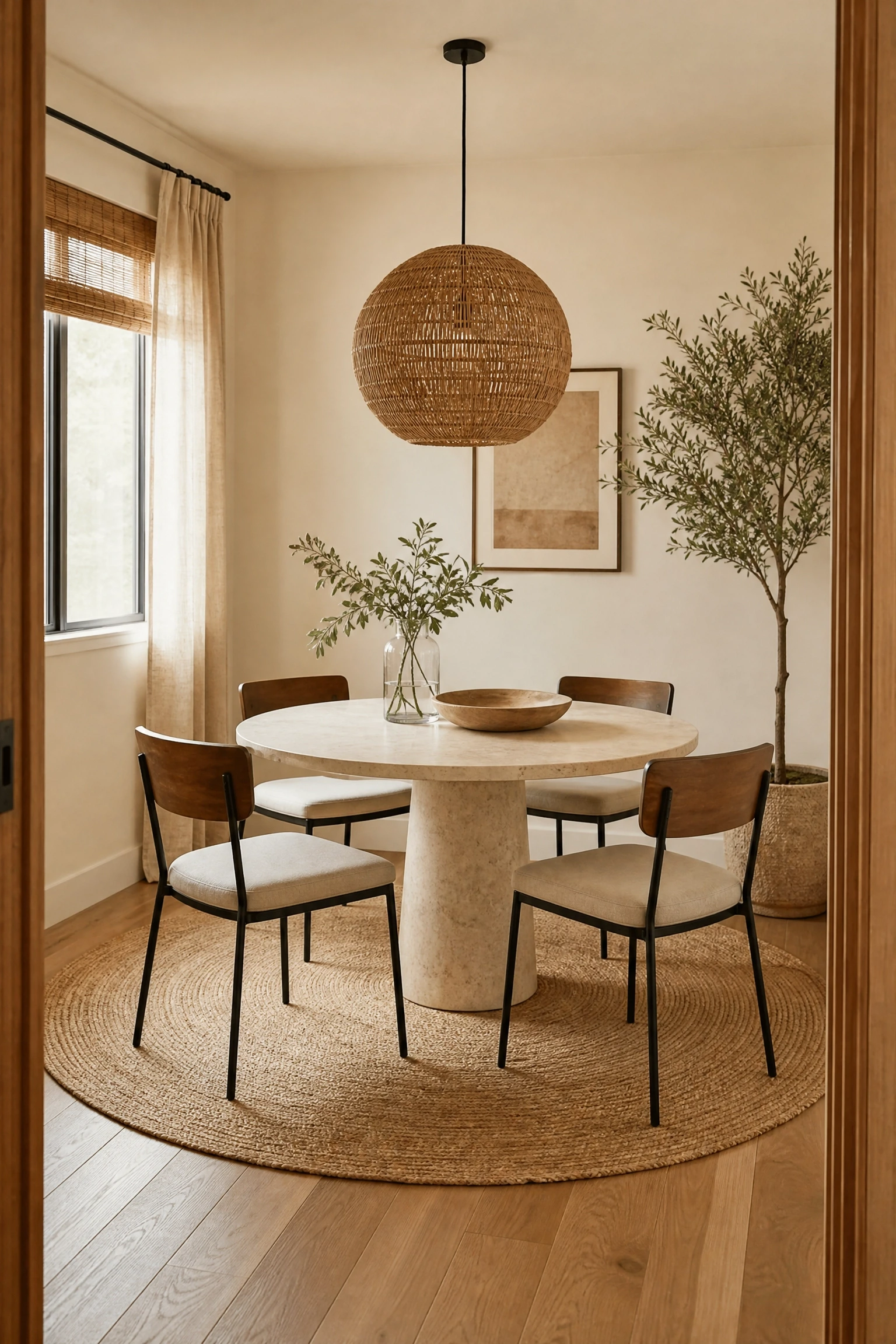
It sounds obvious but the evidence is strong: a round table in a small square or boxy room genuinely improves how the space feels and functions. The reason is visual weight. Four sharp corners on a rectangular table in a room with four corners creates a spatial competition that makes both feel heavier. A round table interrupts that rigidity and introduces a softness that makes the room feel less confined. Proportionally, a 42 to 48-inch round table is the sweet spot for a small dining room – it seats four comfortably without overwhelming the space. The pedestal base is key here because it eliminates corner legs, which means chairs can be pulled in from any angle, making the table much more flexible for different numbers of diners. In 2025, round tables in travertine, marble look, and light oak are consistently showing up in design publications and showrooms, which tells you the trend has longevity rather than just being a moment. One limitation: round tables do not suit spaces that are significantly longer than wide, where a rectangular table will use the room more efficiently.
Pro Move: Pair a round table with a round pendant and a round rug for a cohesive, intentional look that interior designers call “circular repetition,” where the repeated shape unifies the zone.
17. Transparent Furniture to Keep the Space Feeling Open
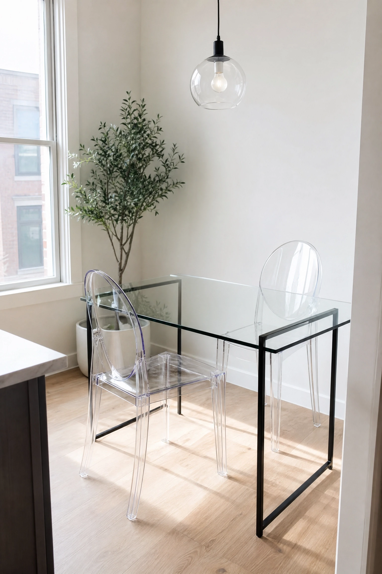
Ghost chairs, acrylic side tables, and glass dining tables are some of the most genuinely useful pieces of furniture in small dining spaces, and they are underused outside of very contemporary interiors. The reason transparent pieces work so well is that they occupy physical space without occupying visual space – your eye passes through them rather than stopping at them, which makes the room feel significantly larger than it is. A glass-top dining table with a simple metal base is one of the most space-efficient choices you can make in a small dining room because the table surface itself disappears visually, leaving the eye focused on the floor beneath it. Kartell’s Louis Ghost chair is the most famous example of this approach, but there are many affordable acrylic and polycarbonate chair options now that achieve the same visual lightness. The practical trade-off is that glass tabletops show fingerprints and require regular cleaning, and acrylic chairs scratch over time, so they suit lower-traffic households better than busy family dining rooms.
Heads Up: If a full glass table feels too cold for your style, use just the transparent chairs with a wood or stone table – you still get the visual lightness without committing entirely to the look.
18. Wall Art That Sets the Mood for the Entire Zone
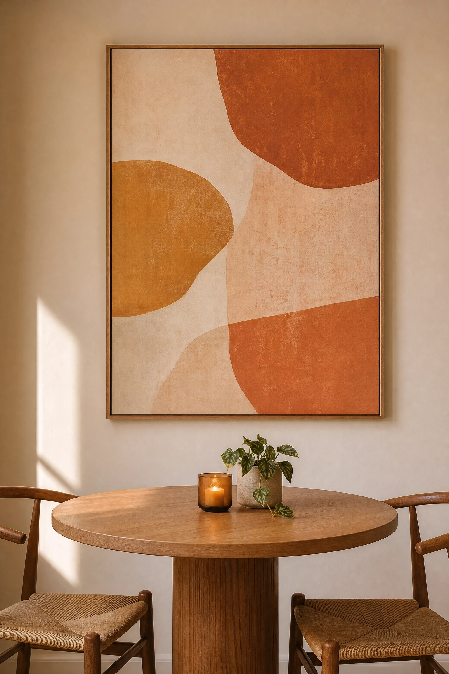
Art in a small dining space does more work than people realise. A well-chosen piece on the wall behind or beside the dining table signals that the space was thought about and styled, not just furnished with whatever was available. In small dining areas, one large statement piece tends to work better than a gallery wall because a gallery wall in a tight space can read as busy and make the walls feel like they are closing in. A print or artwork in warm tones, terracotta, ochre, dusty rose, works particularly well in dining rooms because those colours are linked to appetite and warmth in colour psychology. In terms of scale, the artwork should be roughly two-thirds the width of the dining table it sits above or beside, which is a proportion that creates visual harmony. Budget-friendly options include large-format poster prints from independent illustrators and artists (Society6, Desenio, and Etsy are good sources) in simple frames – a $25 print in a $15 frame from a thrift store can look just as considered as a gallery-bought piece if it is the right image and the right placement.
Quick Tip: Centre the artwork at eye level for a seated person (around 57 to 60 inches from the floor to the centre of the piece) rather than standing eye level, so it feels proportional from where you actually experience the dining space.
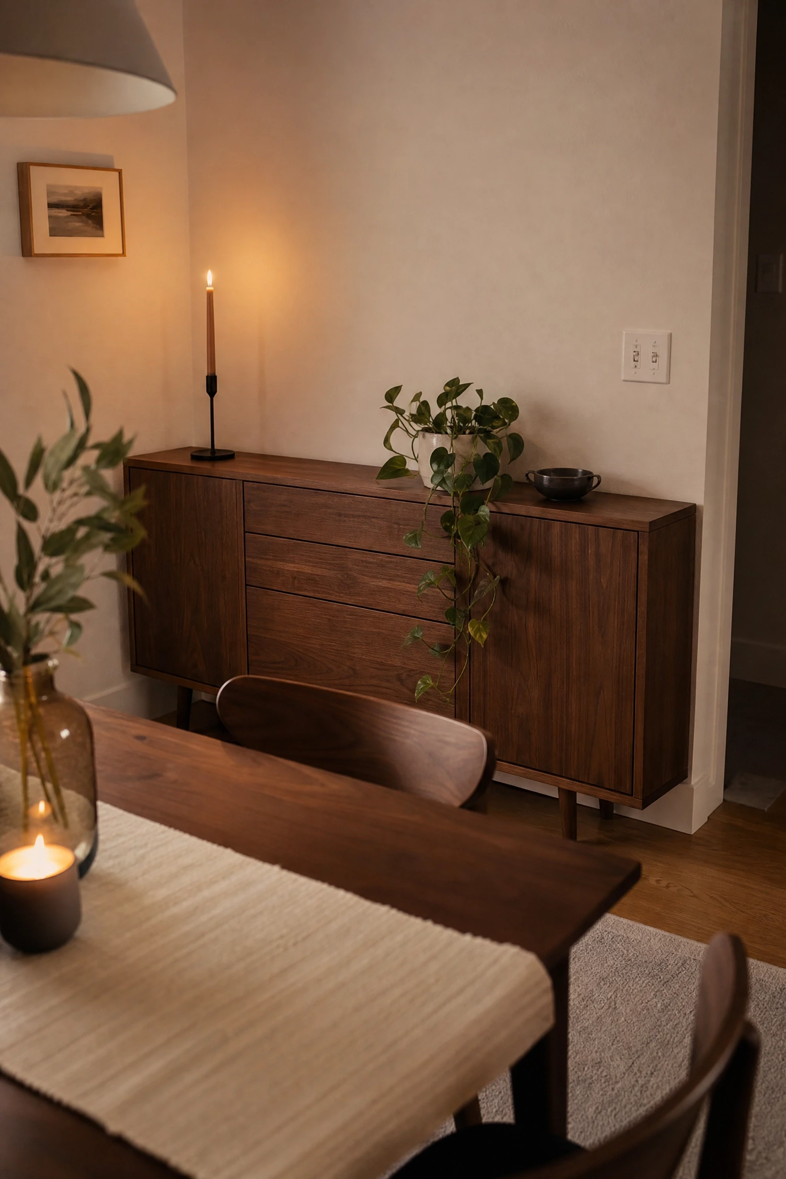
In a small dining area, storage is often the first thing sacrificed because there is no room for a traditional buffet or credenza. A slim sideboard at around 12 to 14 inches deep solves this without eating into the space significantly. The surface of the sideboard serves as additional serving space when hosting, a permanent spot for a candle or plant arrangement on regular days, and the drawers or doors below hold placemats, napkins, candles, and the general clutter that otherwise ends up on the dining table itself. In terms of style, a sideboard in a contrasting finish to the dining table adds visual interest without requiring any additional decorating – a white table with a dark walnut sideboard, or a raw oak table with a painted sage green sideboard, creates that layered, pulled-together look that makes a small dining area feel designed rather than assembled. One thing to watch: sideboards that are too tall (above 36 inches) in a small room start to feel like they are boxing you in. A lower profile at around 30 to 32 inches keeps the room feeling open.
Designer Advice: Style the top of the sideboard in odd numbers – three objects read more naturally than two or four, and varying the height of the objects (tall candle, medium plant, low bowl) creates the kind of composition that makes a space feel styled.
20. Vertical Space: Taking Storage Up Instead of Out
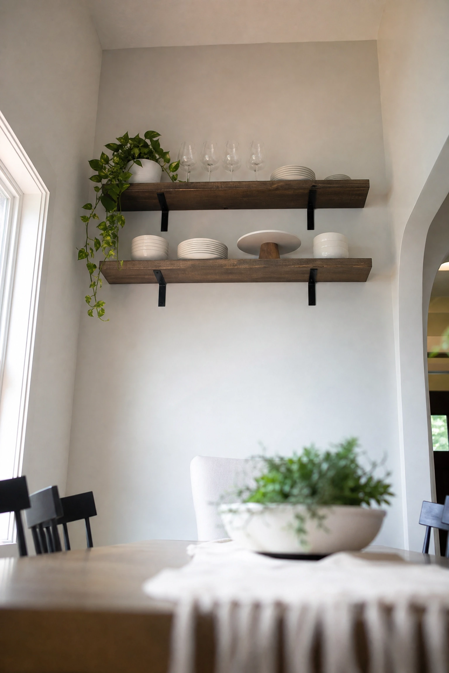
In a small dining space, the instinct is to keep things low and horizontal, but that wastes the most available real estate in any room: the wall above 6 feet. A pair of floating shelves at height, used for wine glasses, good plates, or a collection of ceramics, pulls the eye up and makes the ceiling feel higher. This is a well-known trick in interior design called “vertical line emphasis,” and it works because the human eye follows lines; tall vertical elements make a room feel taller. Practically, storing everyday dining items on high shelves also removes them from counter and table surfaces, which instantly makes the dining area feel less cluttered. Wall-mounted plate racks and wine glass holders mounted in the unused space between the top of the sideboard and the ceiling are particularly useful. The key is to keep the arrangement considered rather than random: matching or complementary ceramics, glasses of the same family, a consistent colour palette. An eclectic jumble at height just reads as storage you ran out of space for.
Reality Check: Only store items you use regularly on high shelves – if you have to get a step stool for everyday glasses, it stops being a functional decision quickly.
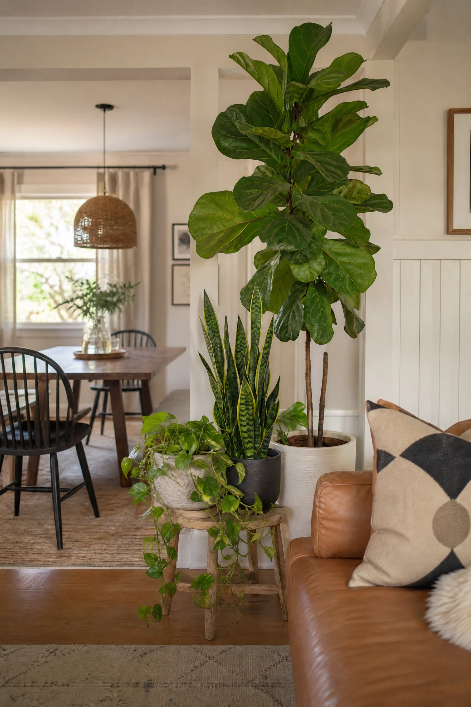
In open-plan spaces where a physical partition is not possible, a cluster of tall plants can do a remarkable job of creating a soft visual boundary between the dining area and the living room. A fiddle-leaf fig, a tall olive tree in a pot, or a grouping of three varying-height plants (a tall floor plant, a medium plant on a stool, a small trailing plant on the table) creates a living divider that adds organic warmth while gently defining the zone. From a design standpoint, plants introduce biophilic elements that are consistently linked to comfort and appetite, which is why you’ll find them used heavily in restaurant interiors as well as residential ones. On a practical level, most people overestimate how much light plants need and underestimate how much a plant in a dining space softens the feel of the whole room. A pothos, a snake plant, or a ZZ plant are all low-light tolerant and fast-growing, so they are good investments if you are not a confident plant keeper. Keep the pots in materials that suit your dining aesthetic, terracotta for warm organic looks, matte white ceramic for Japandi or minimalist styles.
Pro Move: Cluster plants in odd numbers and vary the heights dramatically – a 5-foot floor plant next to a 2-foot table plant next to a trailing plant on a low stool creates far more visual interest than three plants of similar height.
22. A Chalkboard or Cork Wall Panel Behind the Table
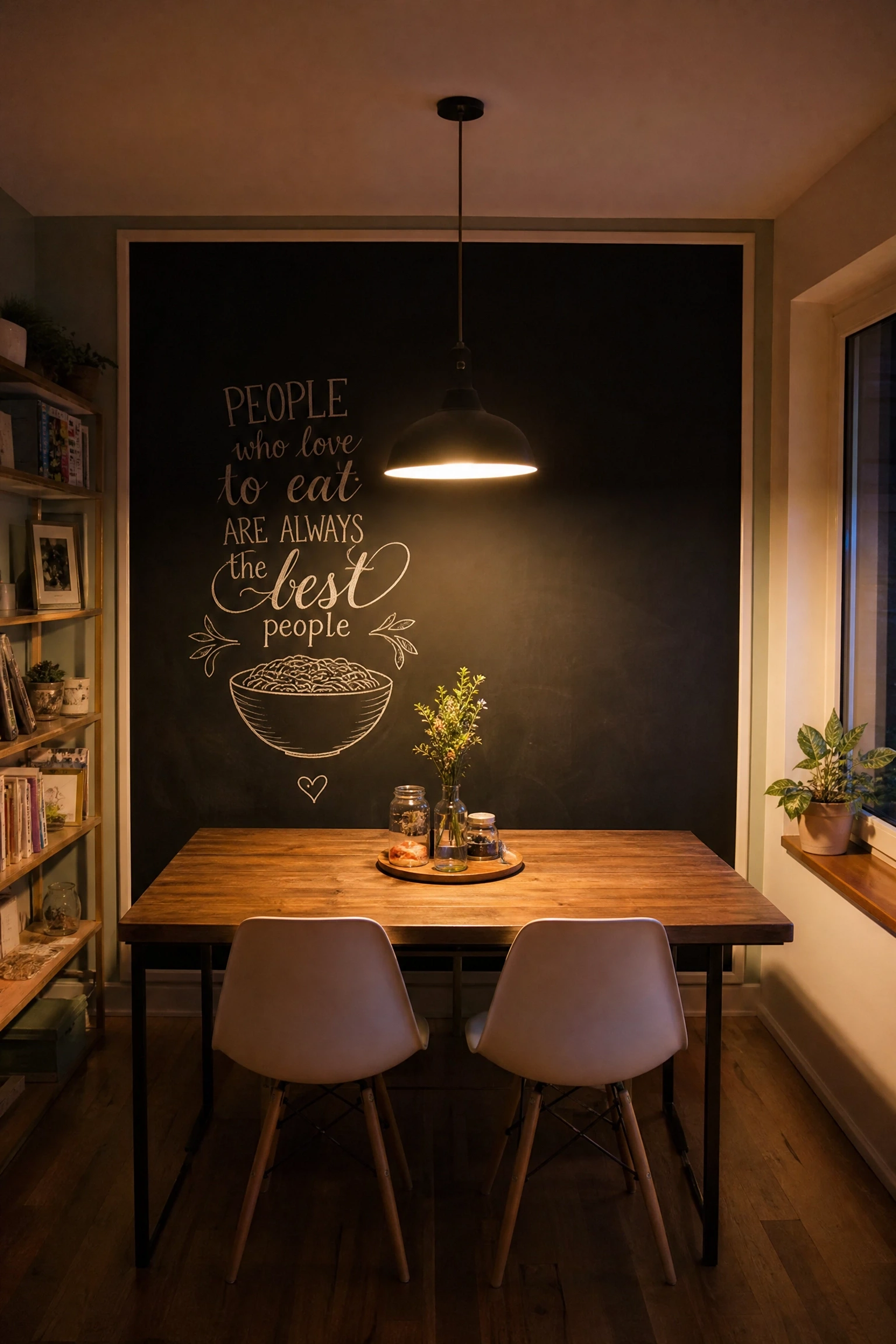
This is one of those ideas that sounds more casual than it looks in practice. A chalkboard wall panel or a large framed cork board mounted on the wall behind the dining table gives the space a lived-in, creative energy that suits contemporary and eclectic home styles particularly well. In homes with kids, a chalkboard wall behind the dining table becomes an activity surface and a spot for menus, family notes, and dinner conversation starters. In homes without kids, it reads more as a design choice, a moody matte-black surface that gives the wall texture and depth. The key to making a chalkboard wall look intentional rather than classroom-y is scale: it should cover most of the wall, not just a small patch, and it benefits from a simple thin frame or moulding border to give it a finished edge. Cork panels work similarly and are particularly good for gathering inspiration images, recipes, and tactile objects that make the dining space feel personal. Budget-wise this is one of the most affordable feature wall options available.
Heads Up: Prime the wall properly before applying chalkboard paint and season the surface with chalk before first use (rub chalk sideways across the whole surface and then erase) to prevent ghosting of the first things you write on it.
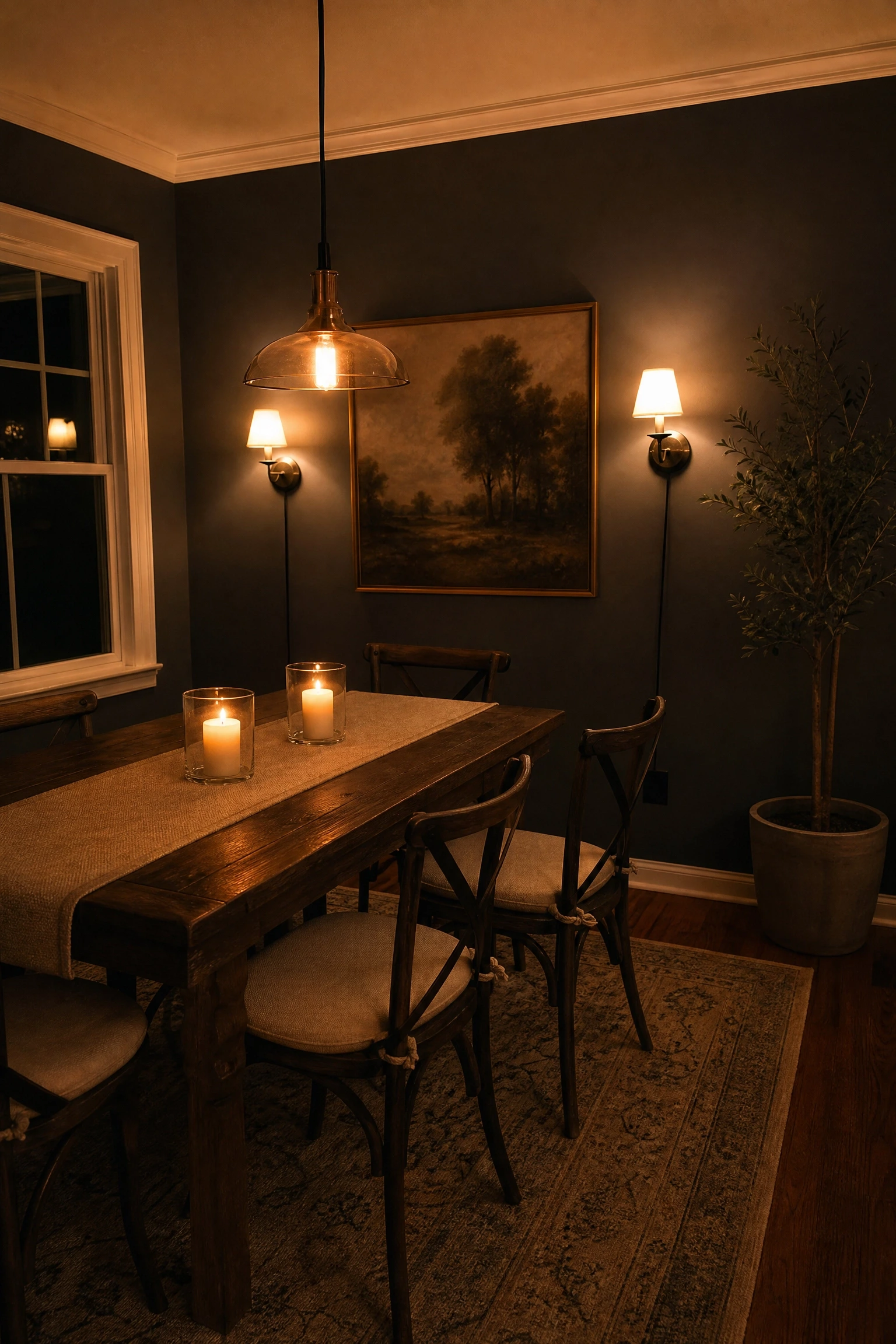
A single overhead light, even a nice pendant, is one-dimensional and makes even a well-furnished small dining space look flat during evening meals. Layered lighting, combining the pendant with at least one or two secondary sources, changes the atmosphere entirely. A pair of wall sconces on either side of the dining area, a candle or two on the table surface, and the main pendant on a dimmer is a combination that creates genuine warmth and depth. Wall sconces do not need to be wired into the wall; plug-in sconces with a cord that tucks behind furniture work just as well and are renter-friendly. Candles are the most underrated element in this mix: even two pillar candles on the table during a weeknight dinner change the atmosphere more than any furniture purchase would. In terms of colour temperature, dining rooms benefit from warm white bulbs in the 2700K range rather than the cool white (4000K+) that feels clinical and unflattering. This is not just an aesthetic preference; cool lighting genuinely makes food look less appetising, which is a functional reason to get the colour temperature right.
Designer Advice: For a two-sconce setup on either side of the dining area, position them at seated eye level (around 60 inches from the floor) rather than at standing height so the light washes the table rather than the ceiling.
24. A Cohesive Colour Story That Makes the Whole Space Feel Planned
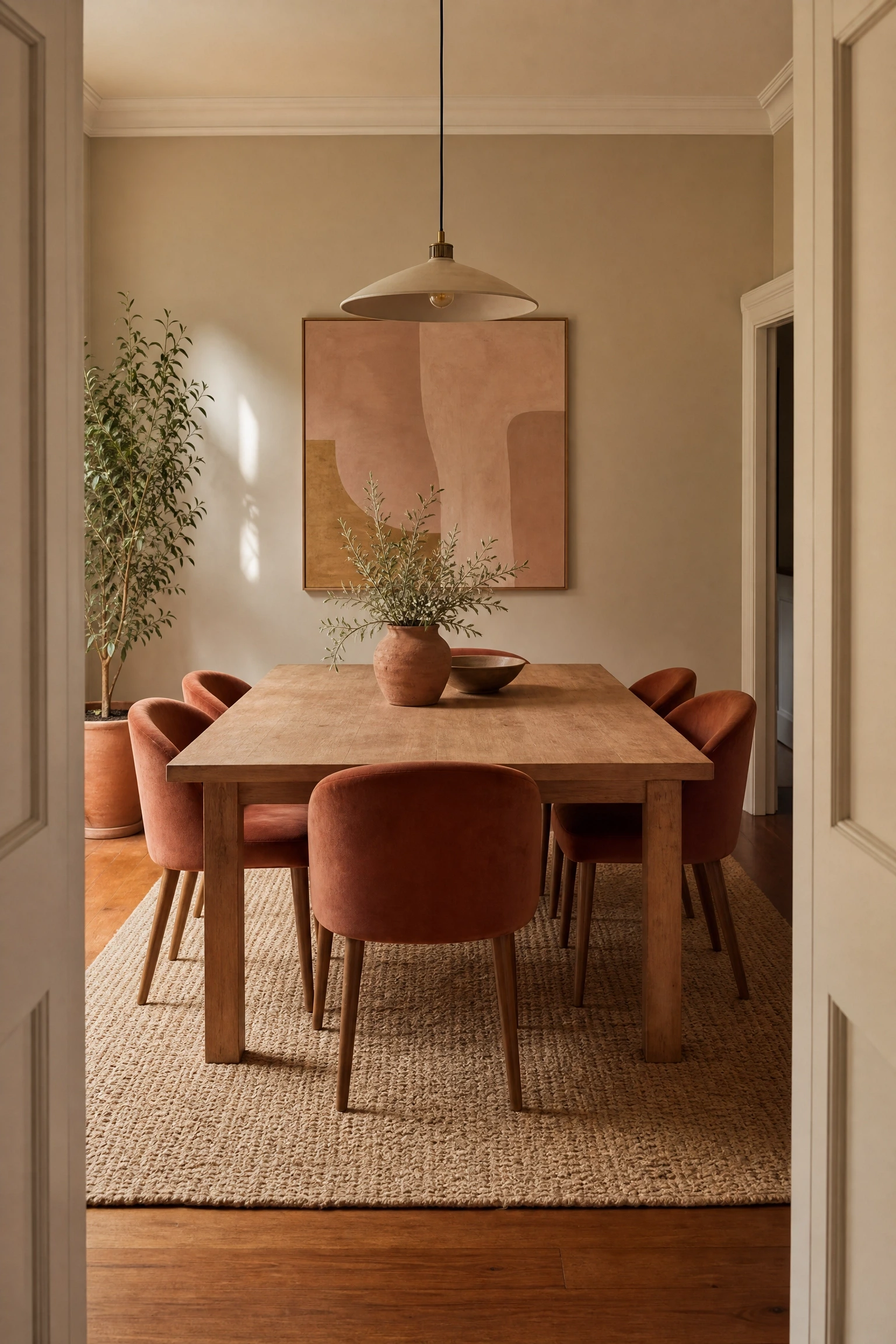
One of the fastest ways to make a small dining area feel genuinely designed rather than assembled piece by piece is to run a cohesive colour story across every element in it: the table, the chairs, the rug, the art, the cushion on the bench. This does not mean everything has to match – in fact, matching is the enemy of interesting. It means every element should share a tonal family. A warm neutral story might pair a raw oak table with terracotta chairs, a cream jute rug, and dusty pink art. A cooler, more contemporary story might combine a white table with sage green chairs, a grey rug, and abstract blue-toned art. What ties it together is intention: every piece has been chosen with the others in mind, and that reads immediately when someone walks into the space. In a small dining area specifically, a cohesive colour story reduces visual noise and makes the space feel larger because the eye does not jump from one contrasting thing to another. This is genuinely the most affordable improvement most dining spaces can make because it is about editing and reframing what you already own, not necessarily buying new things.
Reality Check: Pull every piece out of the dining area and put it back one at a time, only keeping what contributes to the colour story – what is left out is often exactly what was making the space feel chaotic.
Putting It All Together
Small dining spaces do not fail because of their size. They fail because they are treated as an afterthought, furnished without a plan, and left without a defined sense of purpose. The ideas in this article all share one thing: they start with the actual constraints of the space and work from there, rather than trying to impose a standard dining room blueprint onto a room that was never designed for it. Some of these ideas are about furniture choices. Others are about lighting, colour, or simply placing things more deliberately. The ones that will make the biggest difference for your specific space depend entirely on what your space actually looks like and how you use it. A studio apartment needs different answers than a narrow kitchen dining area, and a family of four has different requirements than a couple who rarely eats at home.
The best approach is to pick two or three ideas that address your specific constraints and do those well, rather than trying to implement everything at once. Start with the thing that bothers you most about your current setup – whether that is the lack of a defined zone, the wrong table shape, or lighting that makes the space feel flat – and solve that first. Once one thing is right, the rest tends to follow more naturally. A small dining space done with care and intention can feel just as inviting as a grand dining room, and often more so, because everything in it has been chosen for a reason.
Which of these ideas would actually work in your space? Drop it in the comments below.
Frequently Asked Questions
What is the smallest size dining table that works for two people?
A round table of 30 to 36 inches in diameter is comfortable for two people and is the smallest practical size for regular dining use. Anything smaller starts to feel cramped once you add plates, glasses, and serving pieces. A drop-leaf or folding table in this size range is a good option for very tight spaces because it can shrink further when not in use.
How do I make a small dining area feel bigger?
The most effective combination is a round or glass-top table (which reduces visual mass), a large rug that extends well beyond the table edges, a mirror on one wall to reflect light, and a pendant on a dimmer to make the space feel intimate rather than cramped. Decluttering the surfaces and keeping the colour palette cohesive also does enormous work.
Can I use a kitchen island as a dining table?
Yes, and in open-plan apartments it often works better than a separate dining table. The island needs to be at a comfortable height (42 inches for bar height), with counter-height stools that have backs, and pendant lighting above it to make it feel like a designated dining spot rather than just a counter where you happen to eat.
What type of rug works best under a dining table?
The most practical choice is a flat-weave or low-pile rug in a washable polypropylene or indoor-outdoor material. These handle spills well, are easy to clean, and hold their appearance longer than high-pile rugs in a dining context. Size is more important than material: always go larger than you think you need, with at least 24 inches of rug extending beyond the table on all sides.
Is bench seating a good idea for a small dining room?
Yes, bench seating on one or two sides of the table is one of the most space-efficient seating choices for small dining areas. A bench pushes fully under the table when not in use, seating more people per linear foot than chairs do, and it removes excess chair legs from the visual equation. The trade-off is comfort for long meals, which is solved by positioning the bench against a wall or choosing a bench with a low back.
How do I define a dining zone in an open-plan space without walls?
Use a combination of a rug to anchor the furniture, a pendant light directly above the table to create a defined pool of light, and either a colour accent on the wall behind the table or a cluster of plants to create a soft visual boundary. These three elements together – floor, ceiling, and edge definition – are enough to create a zone that reads as intentional even in a fully open-plan layout.