Grey Living Room Decor Ideas That Actually Work
Grey gets a bad reputation for being boring, but I think that says more about how people use it than the color itself. A grey living room done well feels calm and pulled together without trying too hard. The trick is knowing which grey to pick, what to pair it with, and where to add just enough warmth so the room does not feel like a waiting room.
I have been working with grey in living spaces for years, and the rooms that look best are never all one shade. They layer light and dark, mix soft and hard textures, and let one or two other colors do the talking. Here are 17 grey living room ideas that actually work in real homes.
1. Plush Grey Sofa as the Anchor
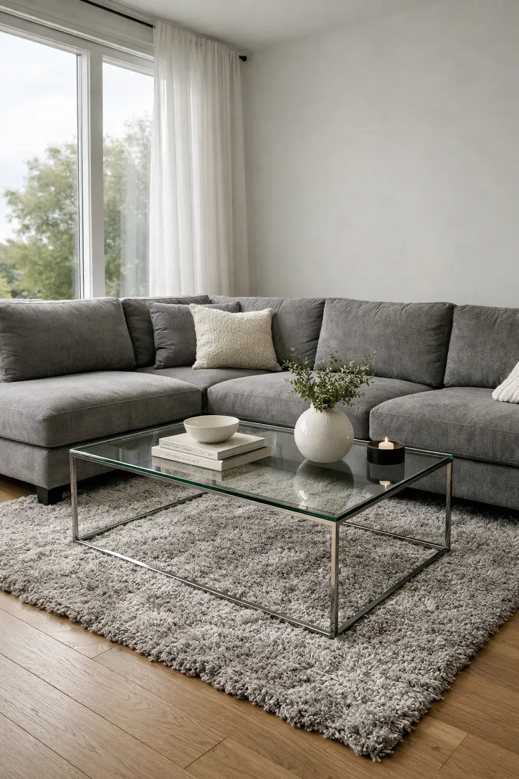
Start with the biggest piece in the room: the sofa. A deep, plush grey sofa gives you a solid foundation that works with almost anything. I like ones with a low back and wide cushions because they look relaxed but still put together. Throw a couple of textured pillows on it, maybe one in cream and one in a muted blue, and you have got a living room that feels finished without overthinking it.
Designer Tip: Go for a sofa fabric with some texture like boucle or brushed linen. Flat grey fabric reads cheap on camera and in person, but a textured weave catches light and looks more expensive than it is.
2. Minimalist Scandi Grey
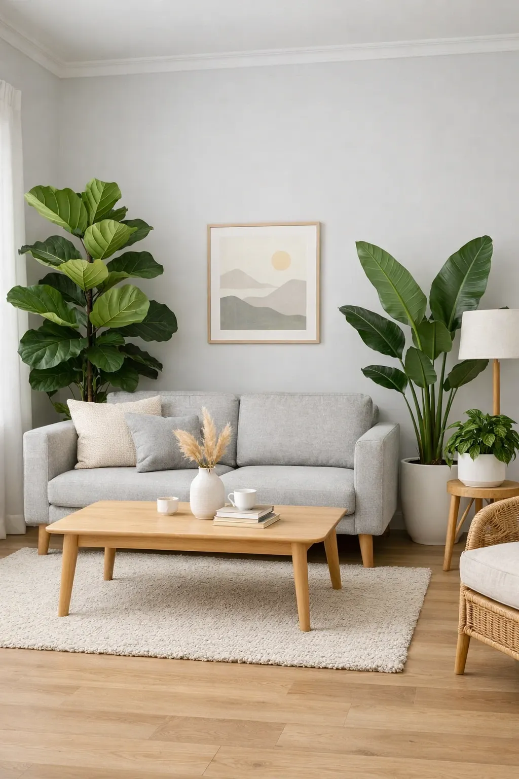
Scandinavian design and grey are basically made for each other. The idea here is to keep things spare but not cold. Light grey walls, a simple sofa in a slightly darker grey, pale wood floors, and just a few carefully chosen objects. A single plant, a wool throw, a stack of books on the coffee table. That is really all you need.
Designer Tip: In a Scandi grey room, your lighting does most of the heavy lifting. Skip the overhead fixture and use a floor lamp with a warm bulb next to the sofa and a pendant light over the reading corner. The pools of warm light keep the grey from going flat.
3. Warm Grey with Natural Wood
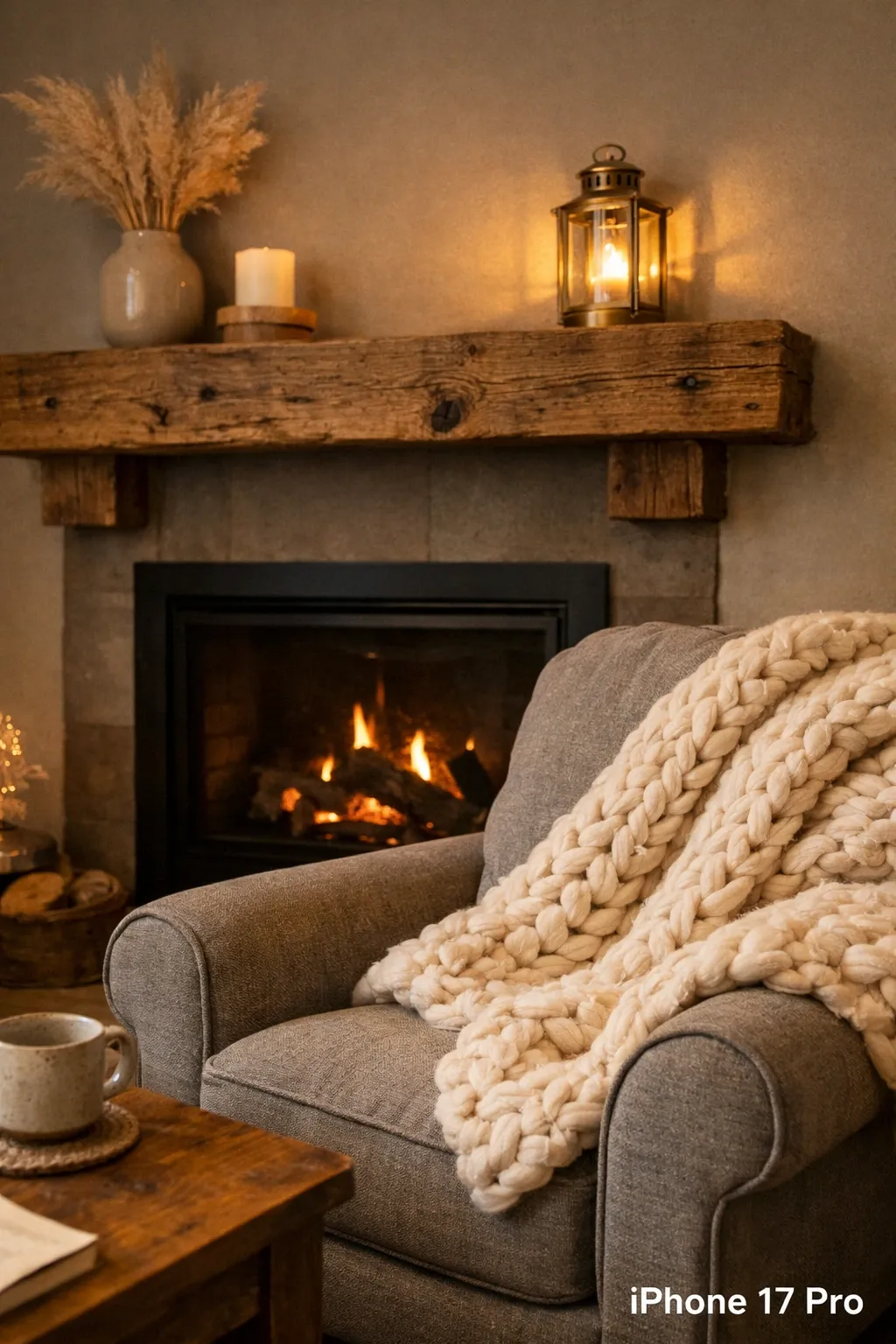
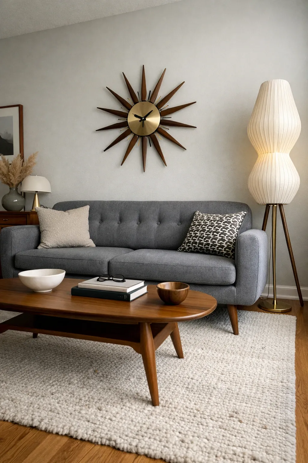
This is probably my favorite combination in any grey room. Warm-toned wood, like oak or walnut, next to a cool grey wall creates this really satisfying contrast. The wood keeps the room from feeling sterile, and the grey keeps the wood from feeling like a cabin. I usually recommend a wood coffee table, floating shelves, or a console as the wood element, not all three at once.
Designer Tip: Make sure your grey has warm undertones if you are pairing it with wood. A grey with blue undertones next to warm wood will fight each other. Greige, which is grey with a hint of beige, is the safest pick here.
4. Grey and Metallic Gold Accents
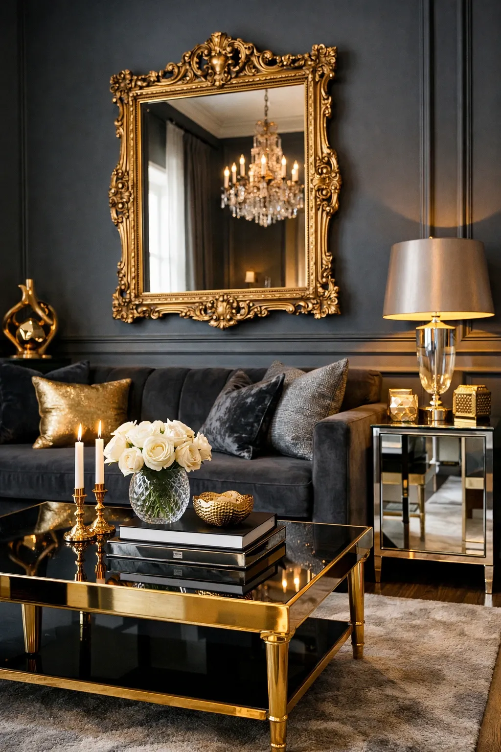
Gold and grey is one of those pairings that sounds like it might be too much, but it works surprisingly well when you keep the gold to small doses. Think a brass floor lamp, gold-framed mirror, or a few metallic candle holders on the shelf. The grey grounds everything and the gold adds a little bit of shine without the room looking like a hotel lobby.
Designer Tip: Stick with brushed or matte gold finishes instead of shiny polished brass. The matte versions look more modern and less formal, which works better in a room you actually live in every day.
5. Bold Animal Print Touches
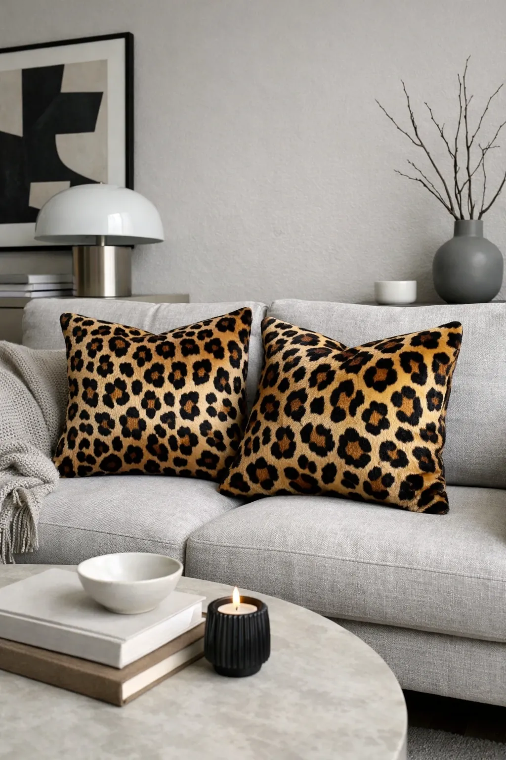
I know, animal print in a grey living room sounds risky. But a leopard or zebra print pillow or a small accent rug on a grey background actually reads as graphic rather than wild. Grey is neutral enough to let the print be the focal point without the room feeling chaotic. The key is limiting it to one or two pieces, not wallpapering the whole place.
Designer Tip: If animal print feels too bold for you, try it in a muted colorway. A grey-on-grey leopard print pillow gives you the pattern and texture without the high contrast. It is a subtle way to add interest.
More Looks You'll Want to Steal:




6. Modern Geometric Patterns
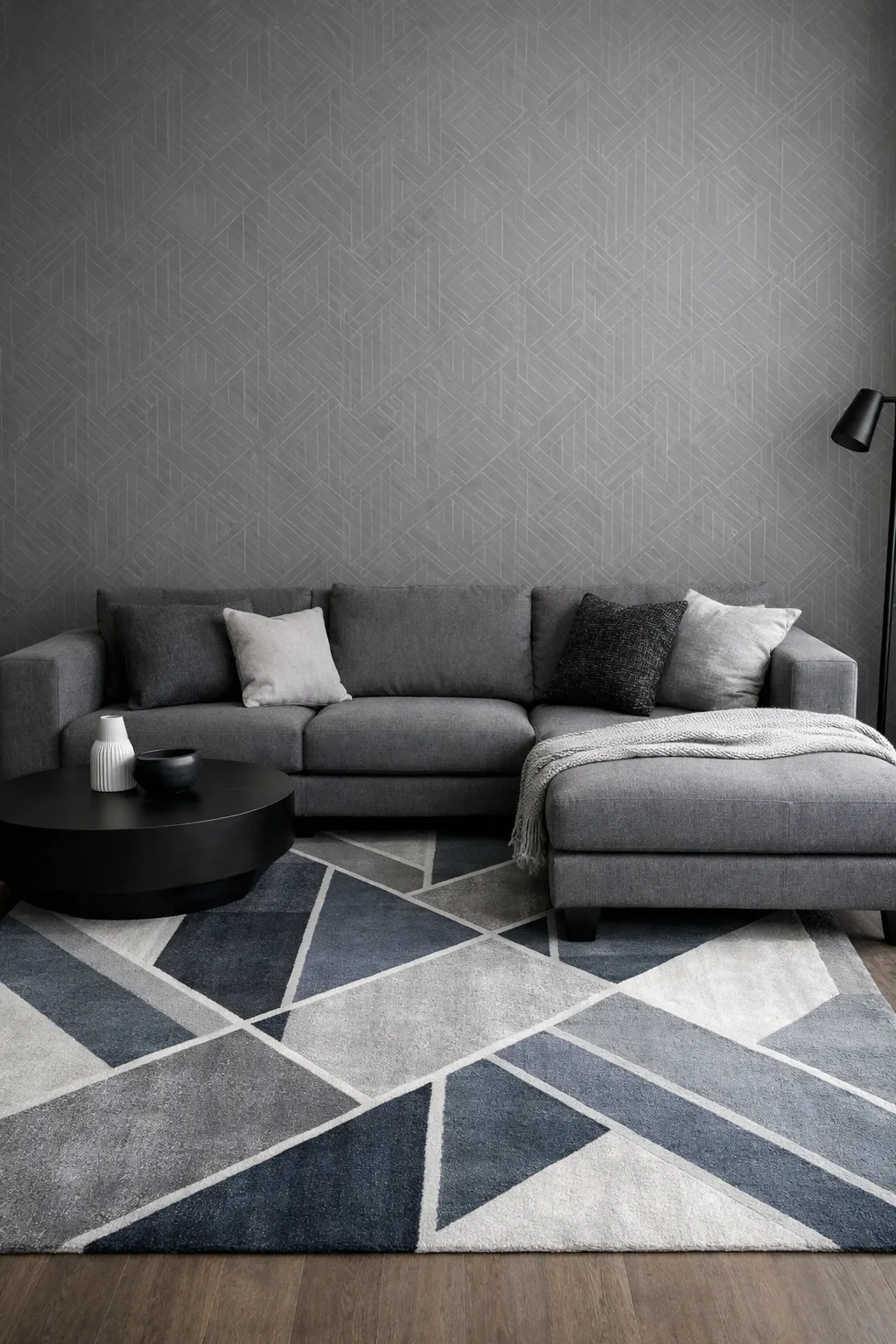
Geometric patterns give a grey room some energy without adding color. I am talking about a rug with a chevron or diamond pattern, throw pillows with angular shapes, or even a geometric tile around the fireplace. The grey keeps the patterns from competing with each other, and the patterns keep the grey from being one flat note.
Designer Tip: Mix your pattern scales. A large-scale geometric rug with small-scale geometric pillows creates depth. If everything is the same scale, the patterns just blur together and you lose the whole effect.
7. Grey Gallery Wall
A medium grey wall is actually the best background for a gallery wall, better than white in my opinion. White walls make every frame fight for attention, but grey lets them sit together more quietly. Mix frame sizes and finishes, black and natural wood look great together, and leave about two to three inches between each frame. The grey backdrop ties it all into one composition instead of a bunch of random things on a wall.
Designer Tip: Start your gallery wall layout on the floor before you hammer a single nail. Arrange everything on the ground first, take a photo of it, and then transfer it to the wall. Saves you a lot of extra holes.
8. Grey and Navy Blue Combination
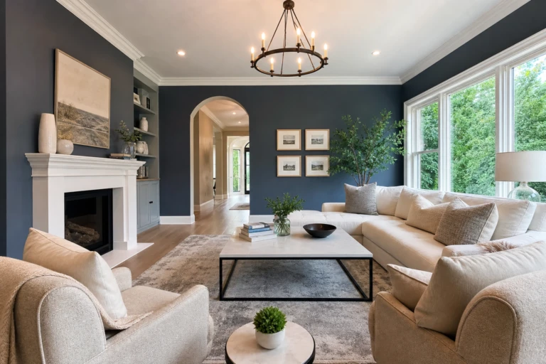
Grey and navy is a combination that always looks intentional. The two colors are close enough in mood that they do not clash, but different enough to create real contrast. I like grey walls with a navy sofa, or a grey sofa with navy pillows and a navy throw blanket. Add some white or cream to brighten it up, because without a lighter accent this pairing can get pretty dark.
Designer Tip: Bring in one warm metallic, like a brass table lamp or copper vase, to break up the cool tones. Without that warm element, grey and navy can feel a bit heavy and office-like.
9. Textured Grey Layers
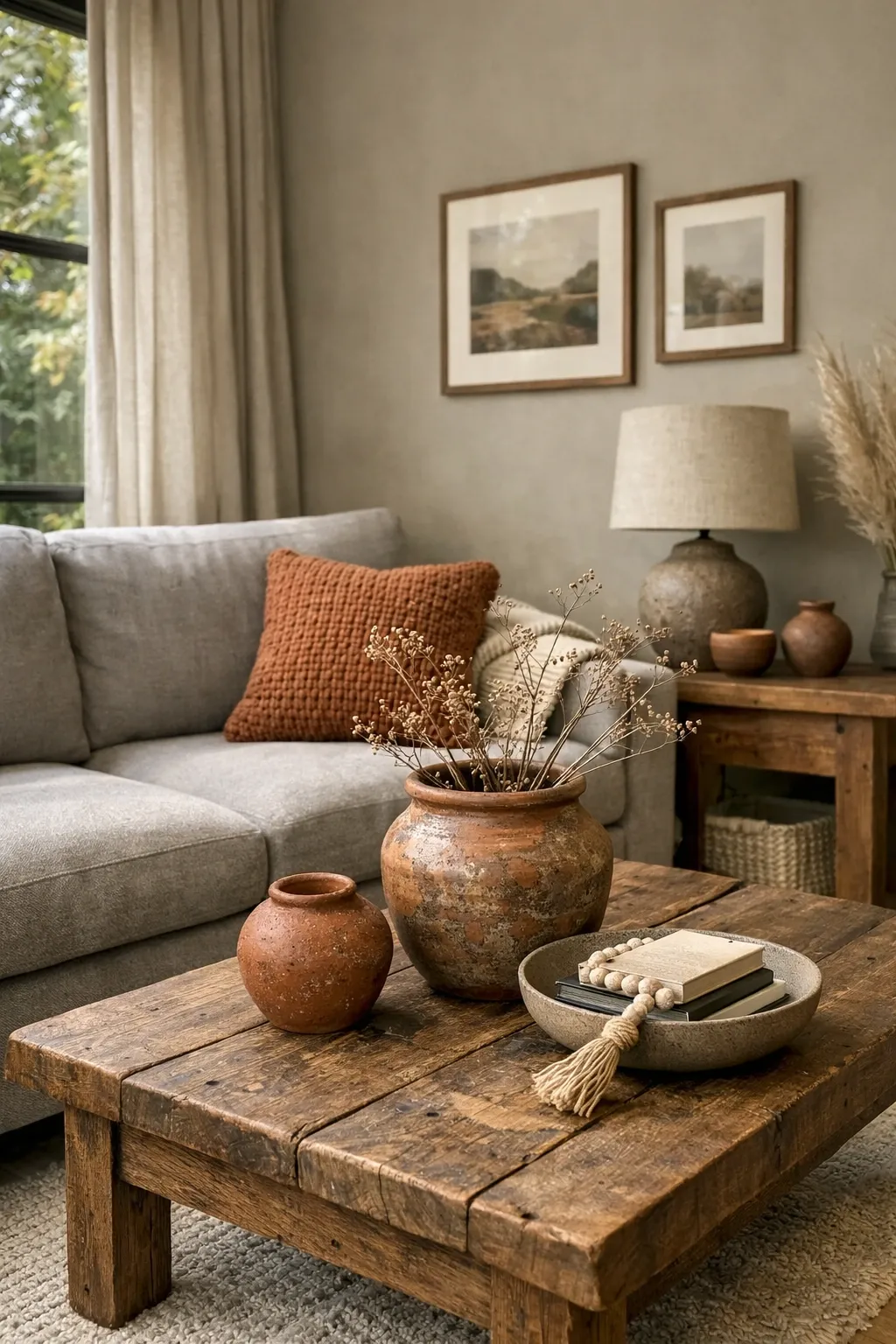
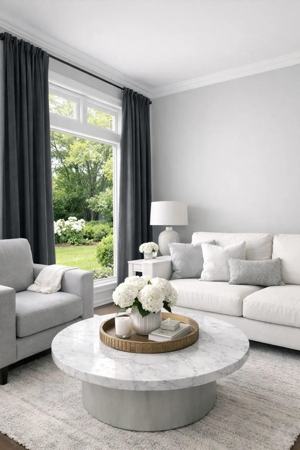
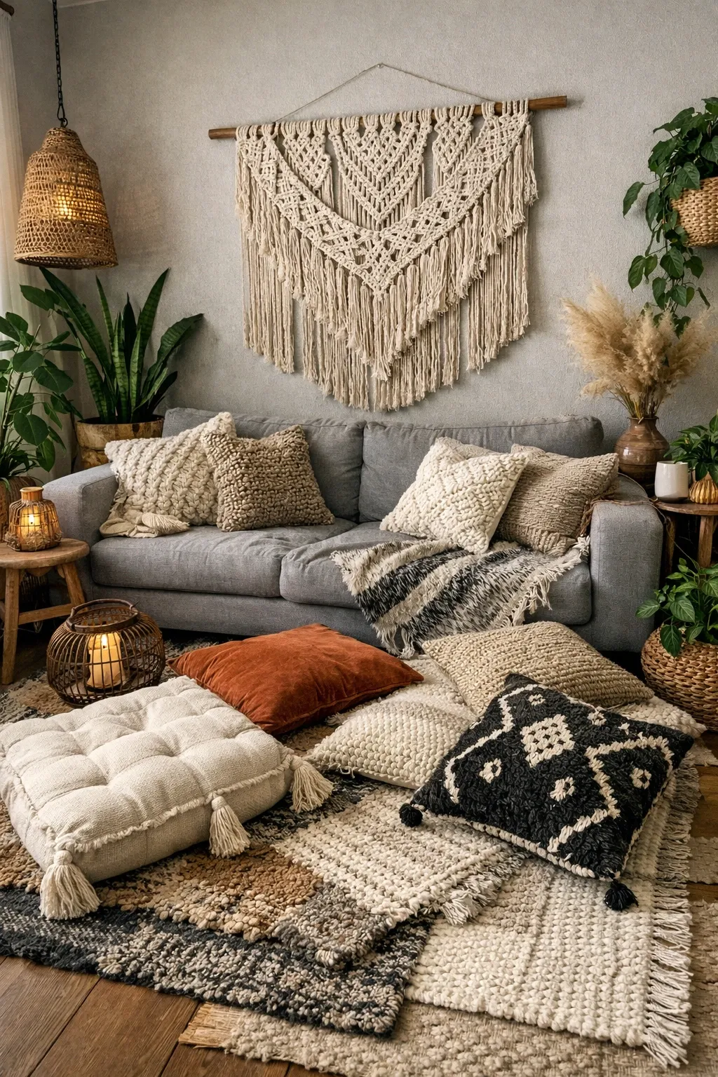
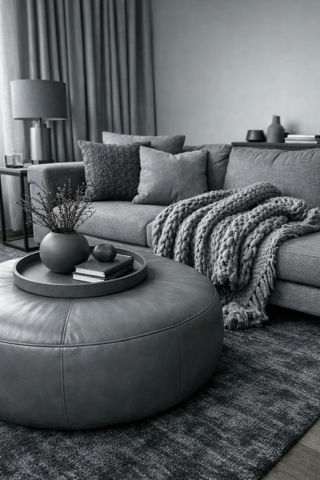
If you want an all-grey room that does not look boring, texture is your best friend. Layer different materials in the same color family: a velvet sofa, a chunky knit throw, a smooth marble coffee table, a woven wool rug. When everything is grey but nothing feels the same to the touch, the room gets this quiet richness that color alone cannot achieve.
Designer Tip: Include at least three different textures in a monochrome grey room. Fewer than that and the room reads as flat. More than five and it starts to feel cluttered. Three to four is the sweet spot.
10. Grey with a Pop of Yellow
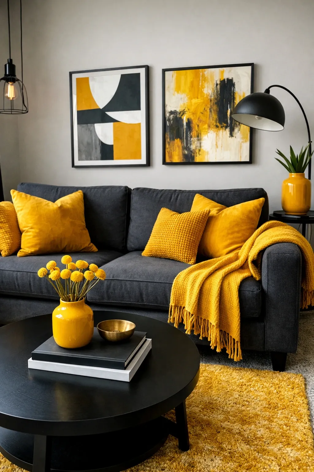
Yellow and grey is a classic pairing for a reason. The yellow brings warmth and life, and the grey keeps it from being overwhelming. I would not go crazy with the yellow though. A mustard throw pillow, a yellow vase, or a piece of art with yellow tones is enough. You want the yellow to feel like a surprise, not like the room is yelling at you.
Designer Tip: Go for deeper mustard or ochre shades of yellow rather than bright lemon. Bright yellow next to grey looks like a caution sign. Mustard looks sophisticated and warm.
11. Industrial Grey Living Room
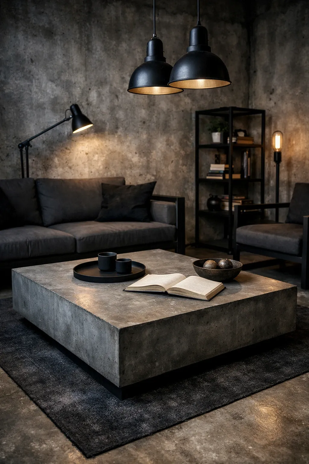
Grey is the natural color of concrete, steel, and exposed ductwork, so it fits right into industrial style without any effort. Pair grey walls or a grey concrete floor with black metal shelving, leather furniture, and Edison-style bulbs. The space should feel a little raw and unfinished on purpose. Do not try to polish it too much or you lose the whole point.
Designer Tip: Soften an industrial grey room with one organic element. A large potted plant, a reclaimed wood bench, or a jute rug stops the room from feeling like a warehouse and makes it a place you actually want to sit.
12. Grey Accent Wall
If painting the whole room grey feels like too much of a commitment, just do one wall. A dark charcoal accent wall behind the sofa or the TV creates focus without taking over the room. Keep the other three walls white or off-white and let that one grey wall do the work. It is an easy way to add depth to a room that feels flat.
Designer Tip: The accent wall should be the wall your eye goes to naturally when you walk in, usually the wall behind the main seating or the fireplace wall. Painting a random side wall grey just looks like you ran out of paint.
13. Coastal Grey and White
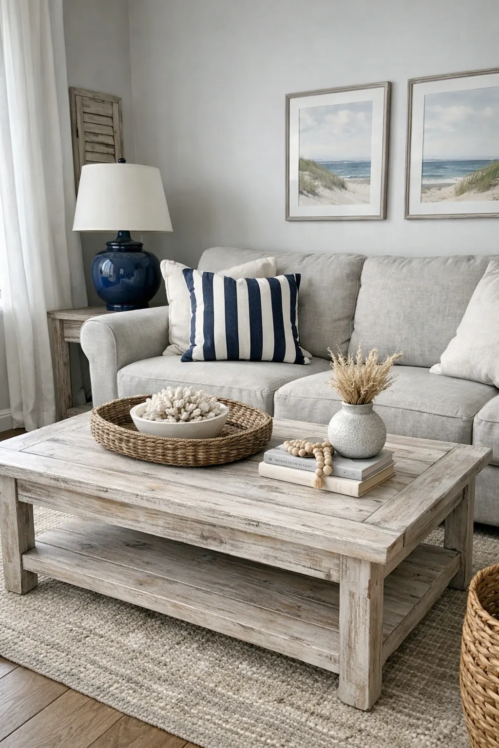
Grey works really well in coastal spaces when you lean into the driftwood-and-fog side of the beach rather than the bright-blue-and-white side. A soft grey sofa, white linen curtains, a weathered wood coffee table, and maybe a few pieces of coral or shells on the shelf. The palette is quiet and natural, and it feels like a beach house for adults rather than a vacation rental.
Designer Tip: Use a blue-grey paint for the walls instead of a warm grey. Something like Benjamin Moore Pale Smoke or Farrow and Ball Light Blue. That cool blue undertone makes the whole room feel closer to the coast without hanging a single anchor on the wall.
14. Grey with Jewel Tones
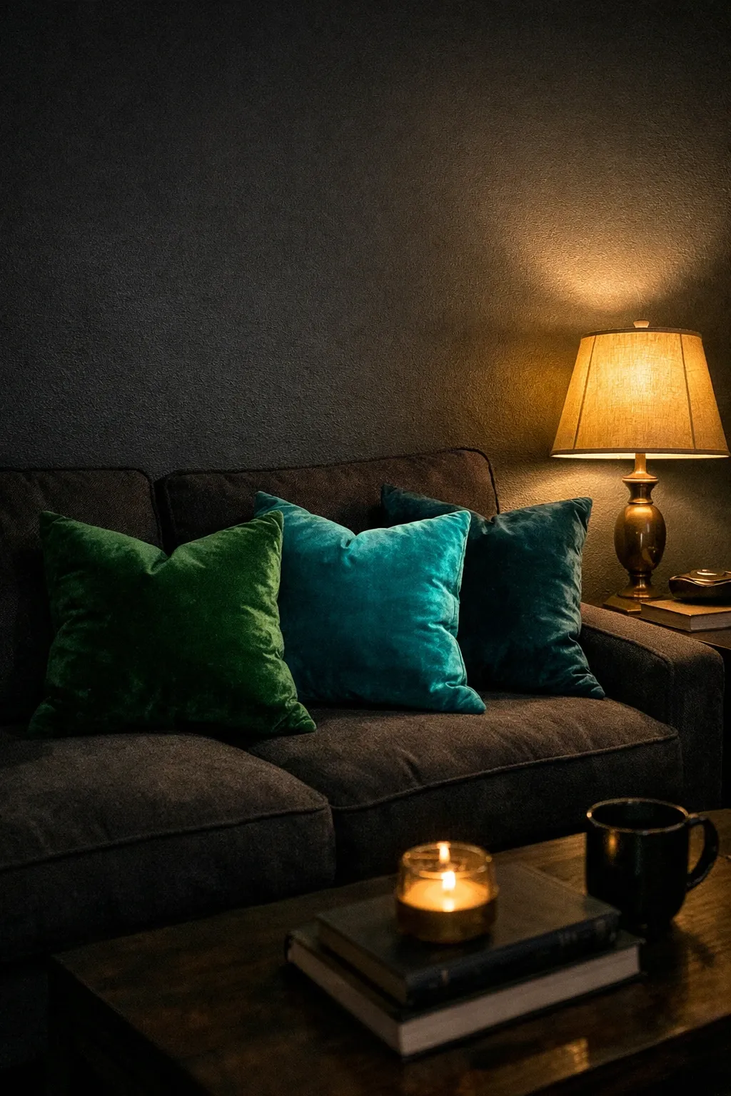
Deep emerald, rich burgundy, or sapphire blue against a grey background is one of the most striking combinations you can do. The grey acts like a stage and the jewel tones are the performers. I love a dark grey sofa with emerald velvet pillows and a burgundy throw. It feels rich and dramatic without being over the top. This is a great direction if you want your grey room to feel moody rather than minimal.
Designer Tip: Limit yourself to one or two jewel tones. If you throw in emerald, burgundy, and sapphire all at once, the grey loses its calming effect and the room starts to feel like a jewel box. Pick one main color and maybe one accent.
15. Grey Fireplace Surround
If you have a fireplace, painting or tiling the surround in grey instantly makes it the focal point without it screaming for attention. A grey stone or grey painted brick surround looks classic and works in both traditional and modern rooms. Keep the mantel simple, a few objects, not a whole display, and let the grey surround frame the fire.
Designer Tip: For a painted brick fireplace, use a flat or matte finish rather than satin or gloss. Matte paint lets you see the texture of the brick underneath, which is half the charm. Glossy paint on brick just looks like a mistake.
16. Light Grey and Blush Pink
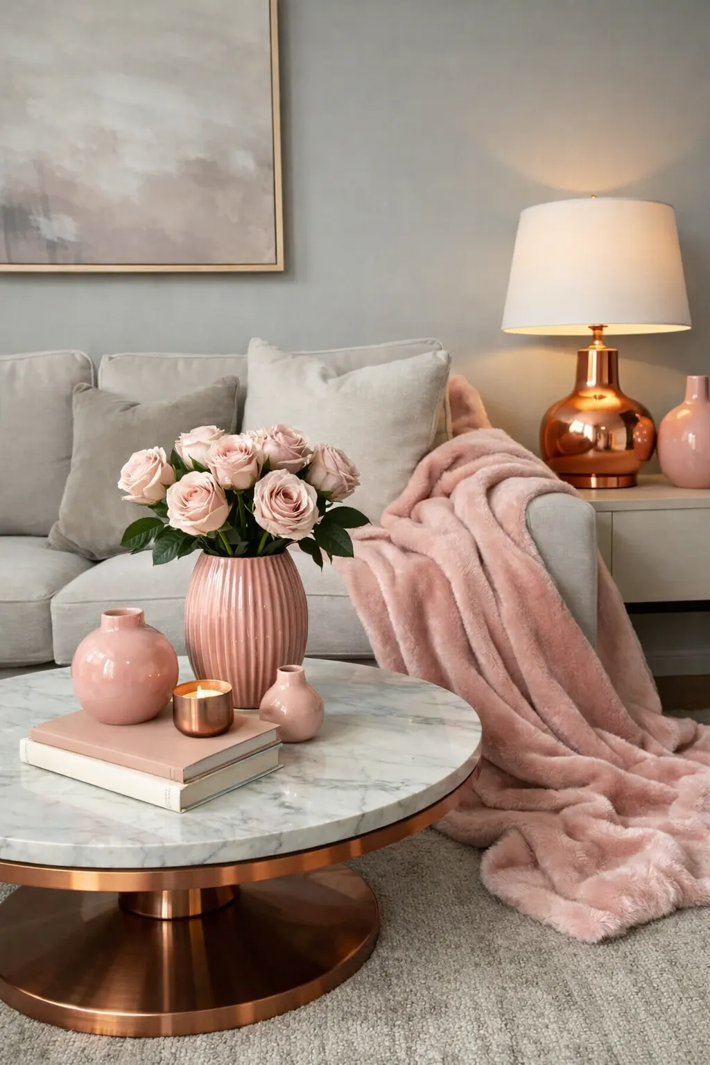
Light grey and blush pink together create a room that feels soft and inviting without being overly feminine. The grey keeps it grounded and the pink adds just enough warmth. I have seen this work beautifully with a light grey sofa, blush pink pillows, and a pink-toned piece of art on the wall. It is a gentle palette that works especially well in smaller living rooms where you do not want anything too heavy.
Designer Tip: Add a darker element like a black picture frame or a dark grey side table to give the room some contrast. Without something darker to anchor it, a light grey and blush room can feel washed out.
17. Dark Charcoal Drama
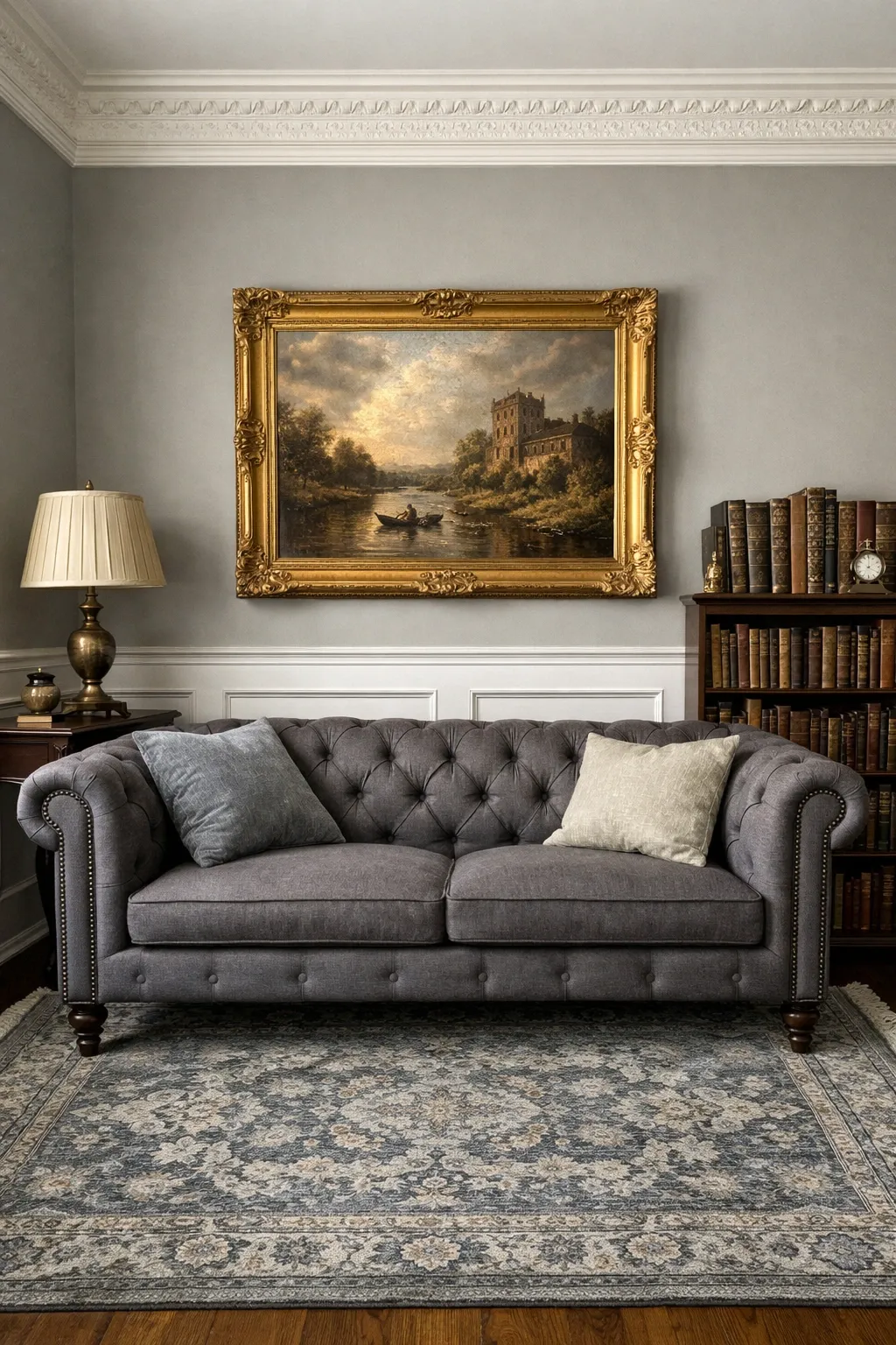
Going dark takes some nerve, but a living room in deep charcoal grey is one of the most striking things you can do. The walls, the sofa, even the curtains in varying shades of dark grey create this cocoon-like feeling that is perfect for rooms where you watch movies or relax at night. You need good lighting to pull it off, plenty of lamps and candles, but the effect is worth it.
Designer Tip: In a dark charcoal room, white or cream accents pop more than they do anywhere else. A white throw blanket, cream pillows, or a light-colored rug on the floor will keep the room from feeling like a cave. Let those lighter pieces breathe against the dark walls.
Grey is one of those colors that you can take in almost any direction depending on what you pair it with and how you light it. The rooms that work best are the ones that treat grey as a backdrop, not the whole story. Add texture, mix in some contrast, and give the room at least one warm element, and you will end up with a space that feels calm, collected, and completely yours.
Frequently Asked Questions
What colors go best with grey in a living room?
Grey pairs well with a wide range of colors. For a warm look, try mustard yellow, blush pink, or warm wood tones. For something cooler and more dramatic, navy blue, emerald green, or deep burgundy work well. White and cream are always safe additions to keep things bright. The most important thing is matching the undertone of your grey to the colors you pair with it.
How do I keep a grey living room from looking cold?
Layer in warm textures like wool, velvet, and natural wood. Use warm-toned lighting instead of cool white bulbs, and choose a grey paint with warm undertones like greige. A few organic elements like plants and woven baskets also help soften the space and add life.
Should I use light or dark grey for a small living room?
Light grey is usually the better choice for small rooms because it reflects more light and makes the space feel larger. That said, a well-lit small room in dark charcoal can feel cozy and intentional rather than cramped. If you go dark, make sure you have enough lamps and light-colored accents to balance it out.
What finish of grey paint works best for living room walls?
Eggshell or matte finishes work best for living room walls. They hide imperfections better than satin or semi-gloss, and they give the grey a softer, more natural look. Save the higher sheen finishes for trim and doors where you want a bit of contrast.